Biophilic Design UI design style
Nature-centered interfaces use organic shapes, botanical imagery, earthy colors, natural textures, and gentle motion.
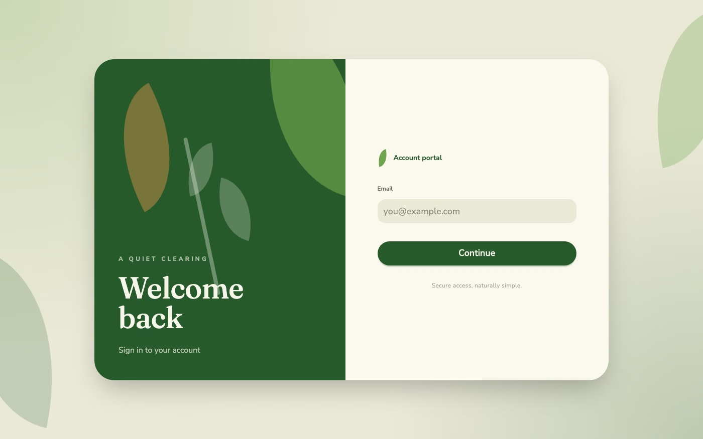
Design overview
- Signature elements
- botanical imagery, organic shapes, earthy palette, natural textures, daylight gradients, gentle motion. In daisyUI themes, set `--noise: 1;`.
- Best suited to
- Wellness, sustainability, hospitality, healthcare, and lifestyle products.
- Layout principles
- Create an open, breathing flow inspired by paths and clearings, alternating broad natural imagery with calm content zones and soft section transitions.
History and origins
A fact-checked account of where this visual language came from, with links to the references used.
- Period
- Conceptual roots in the 1960s–1980s; design field formalized in the 2000s
- Origin
- Environmental psychology, biology, architecture, and interior design
Erich Fromm used “biophilia” in the 1960s, and biologist E. O. Wilson popularized the hypothesis in his 1984 book Biophilia. Stephen Kellert and collaborators later developed biophilic design as a framework for connecting built environments with nature; digital interfaces borrow its imagery and patterns, but cannot reproduce all the spatial and sensory effects studied in architecture.
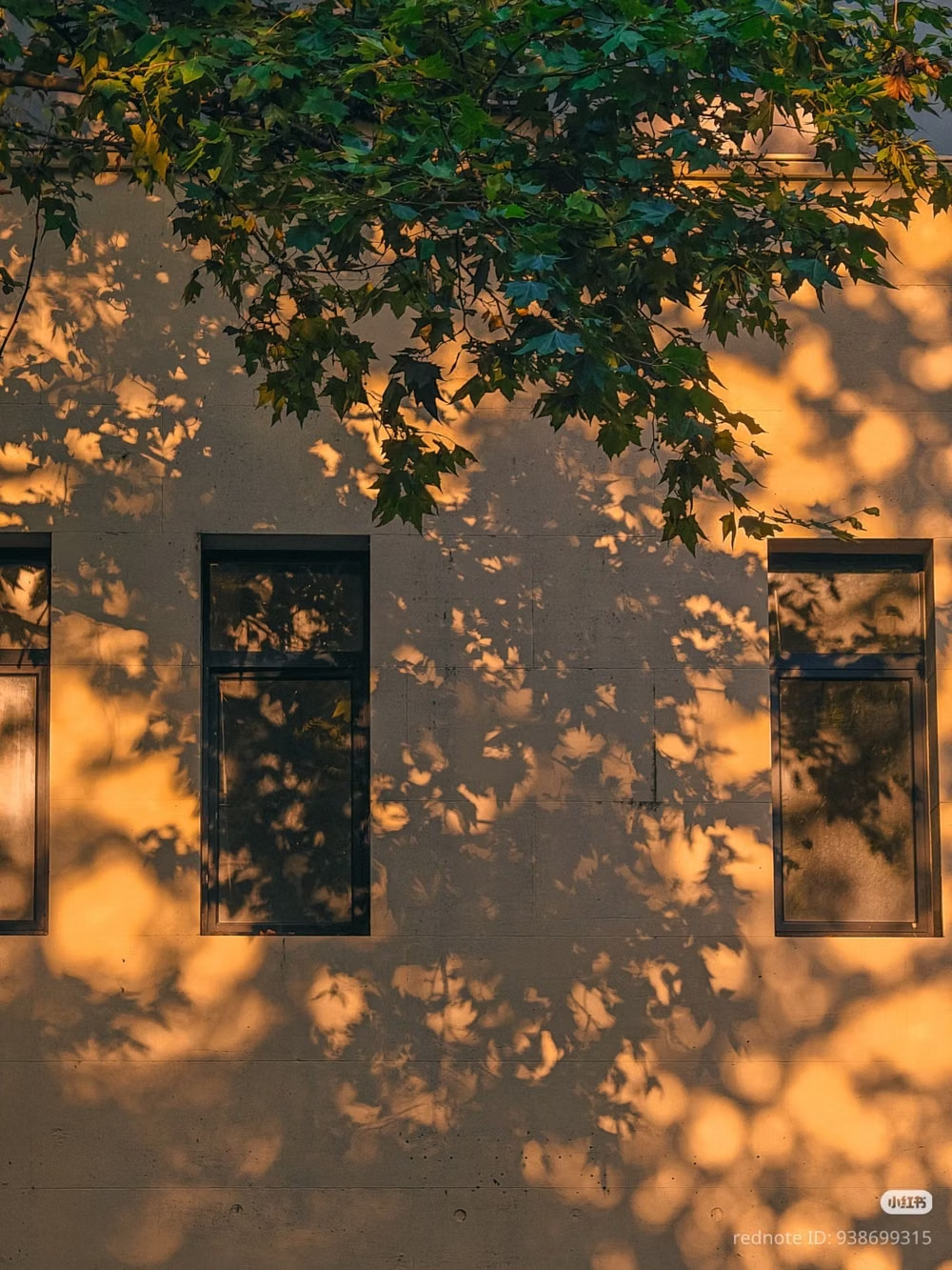
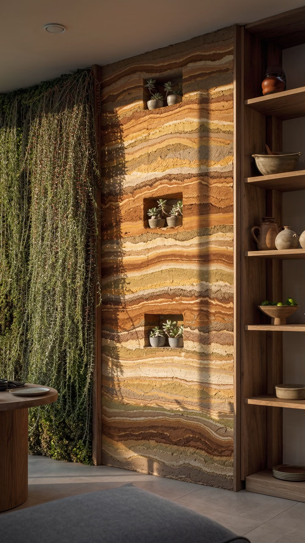
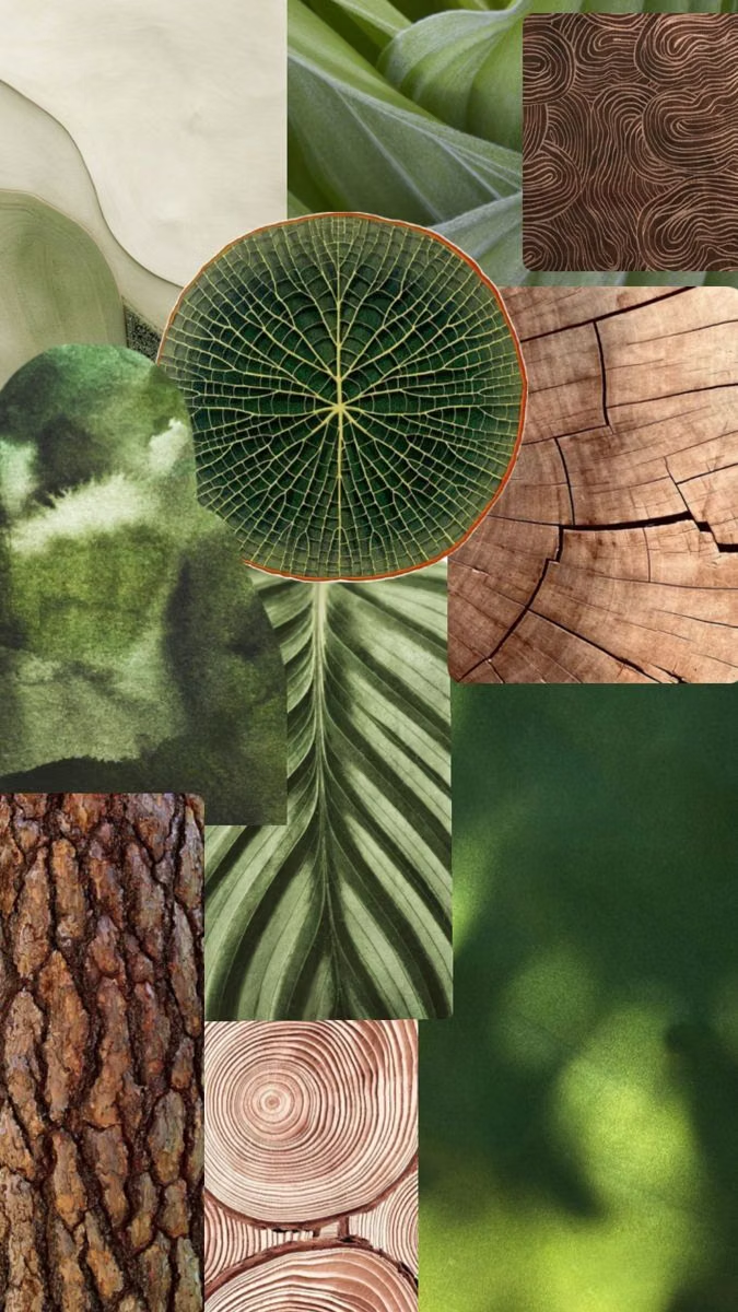
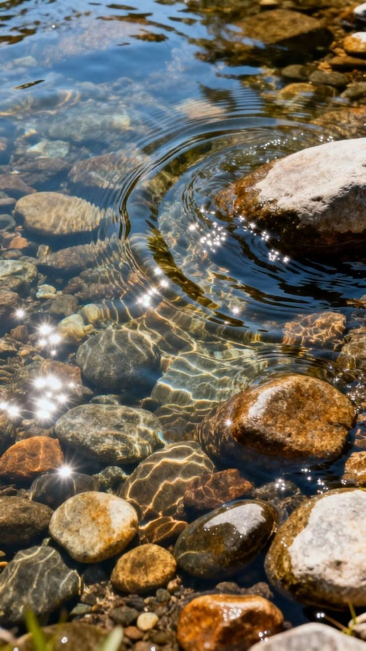
Moodboard and visual references
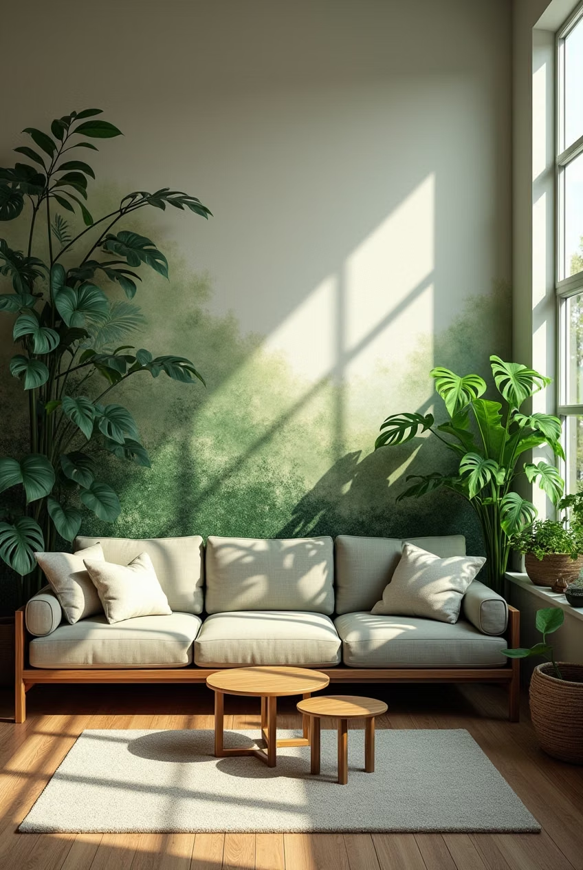
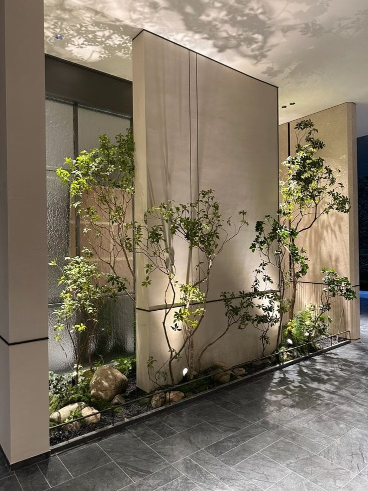
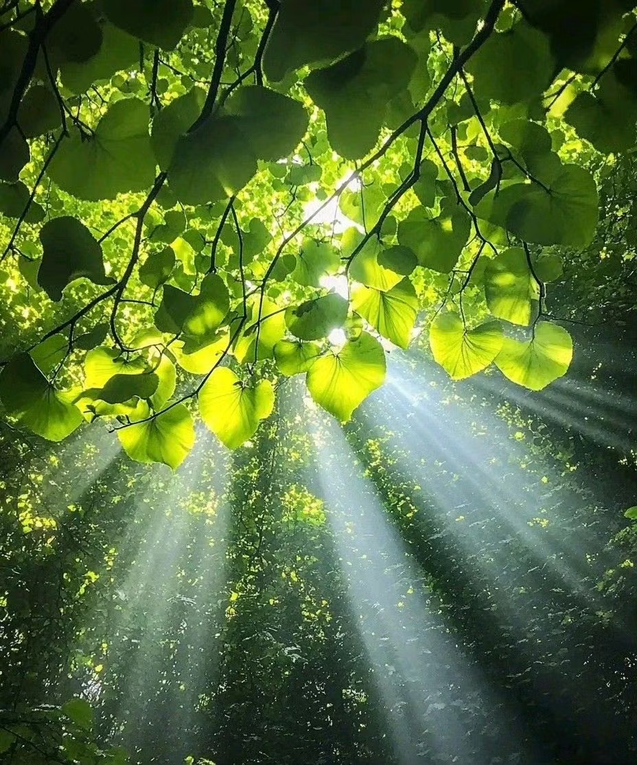
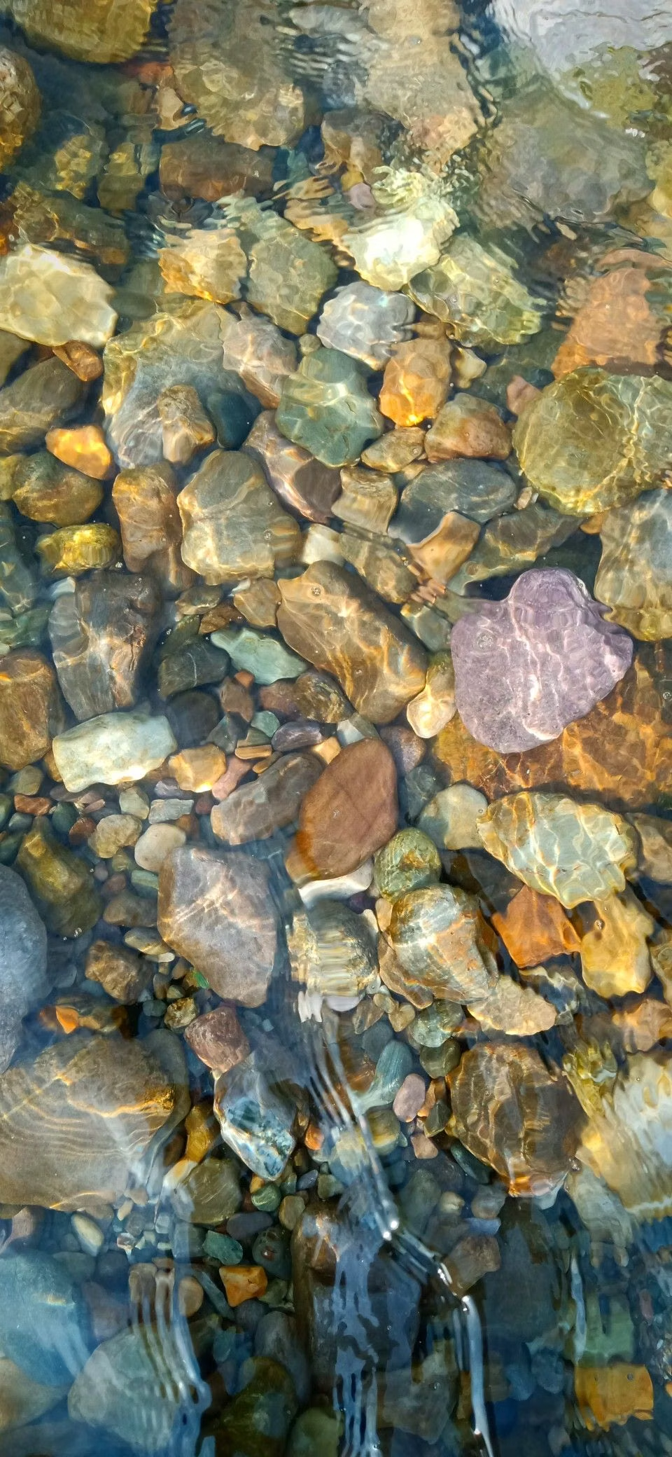
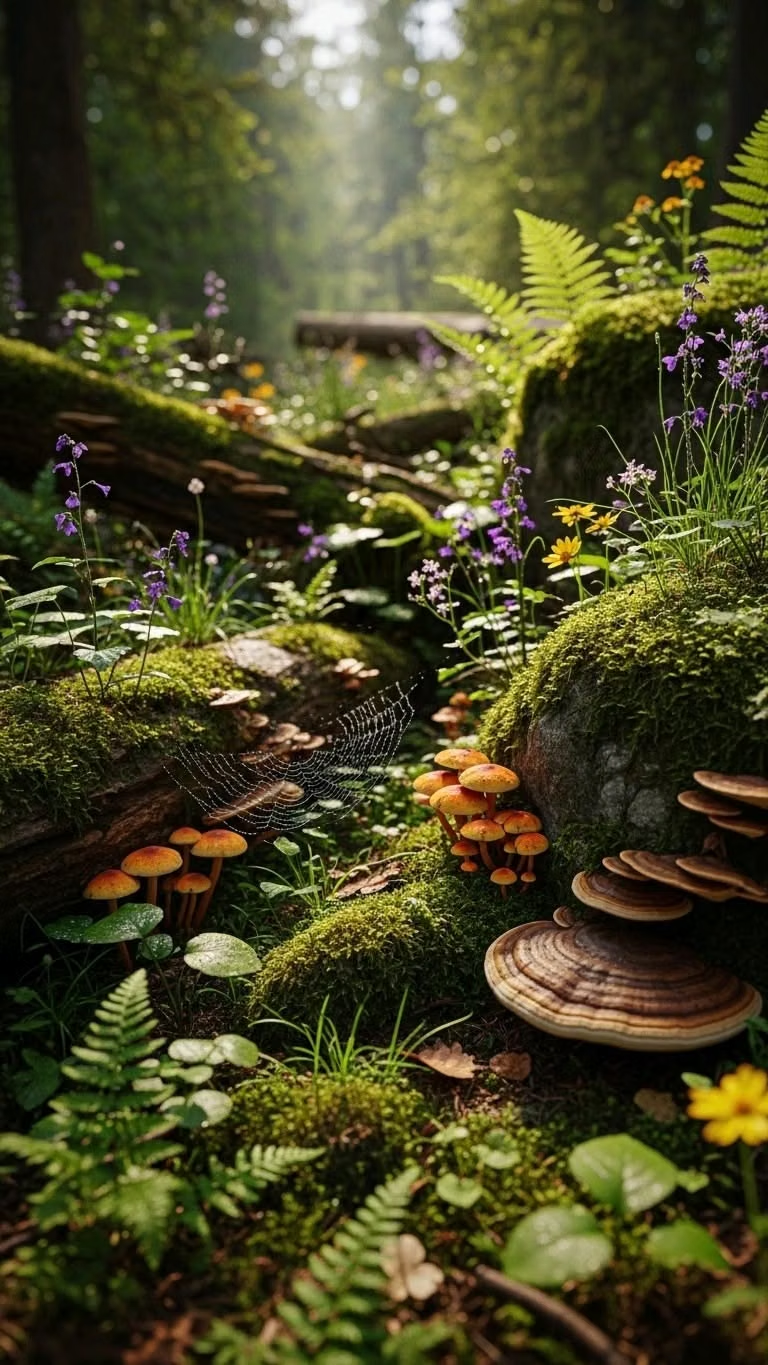
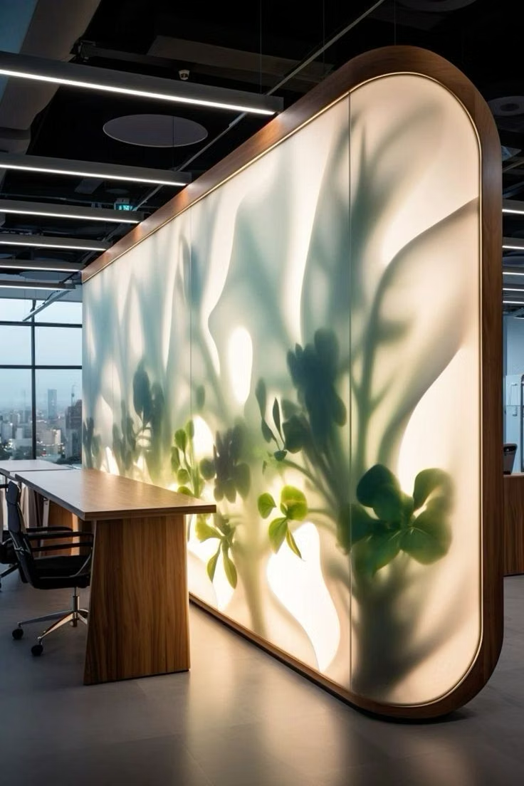
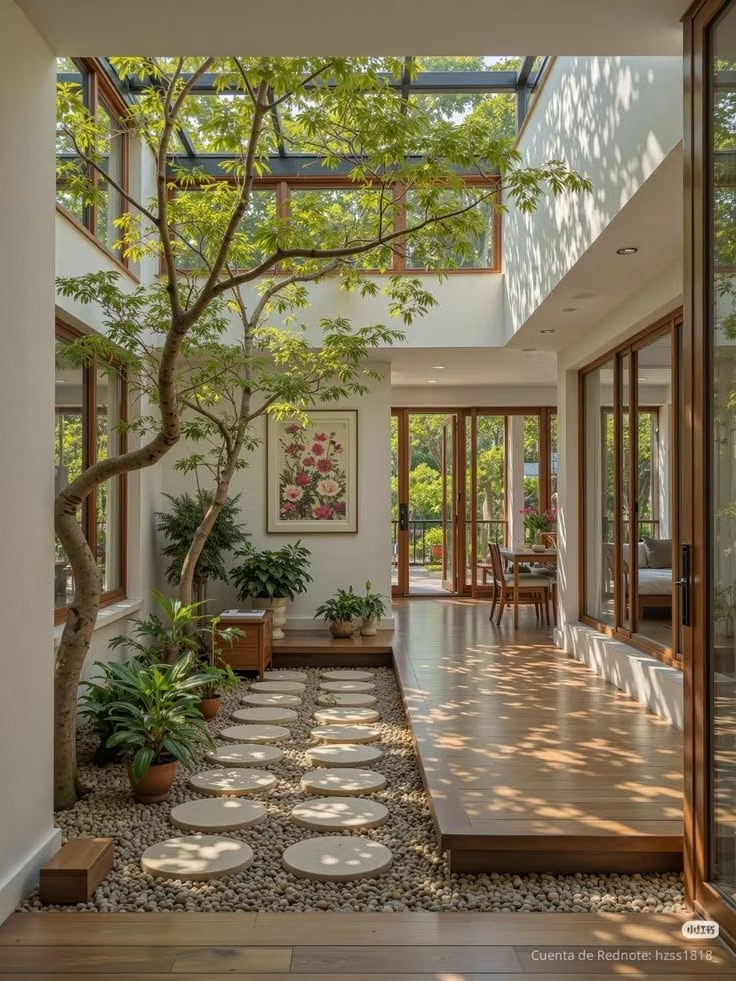
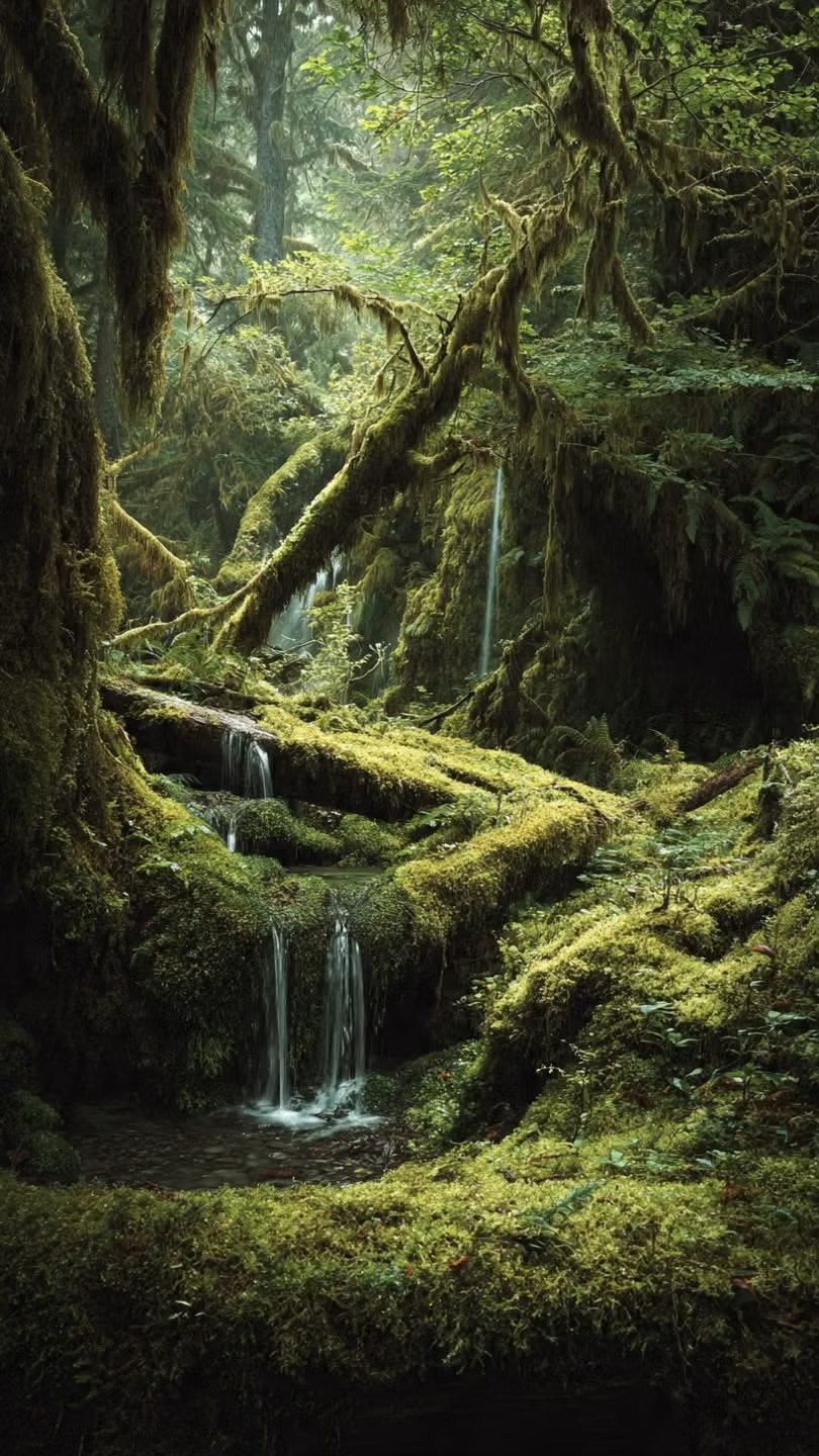
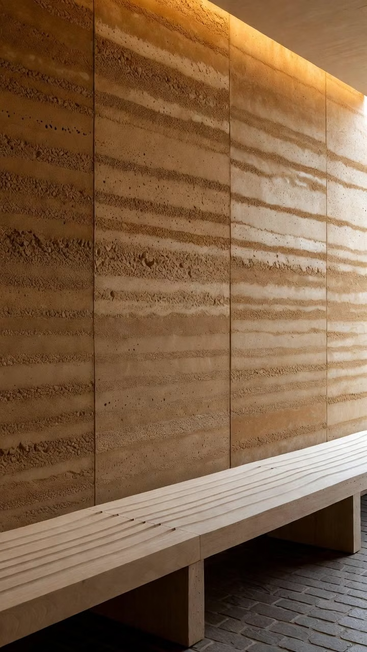
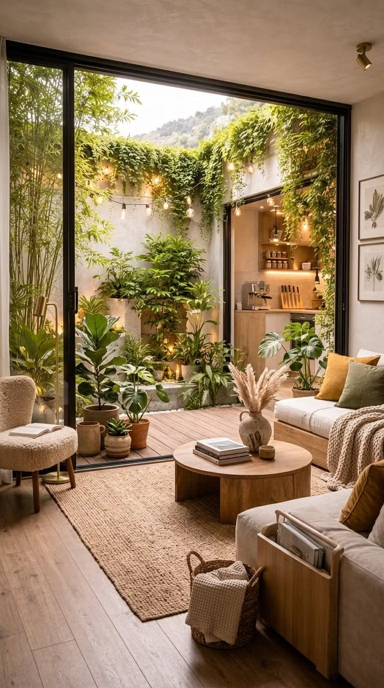
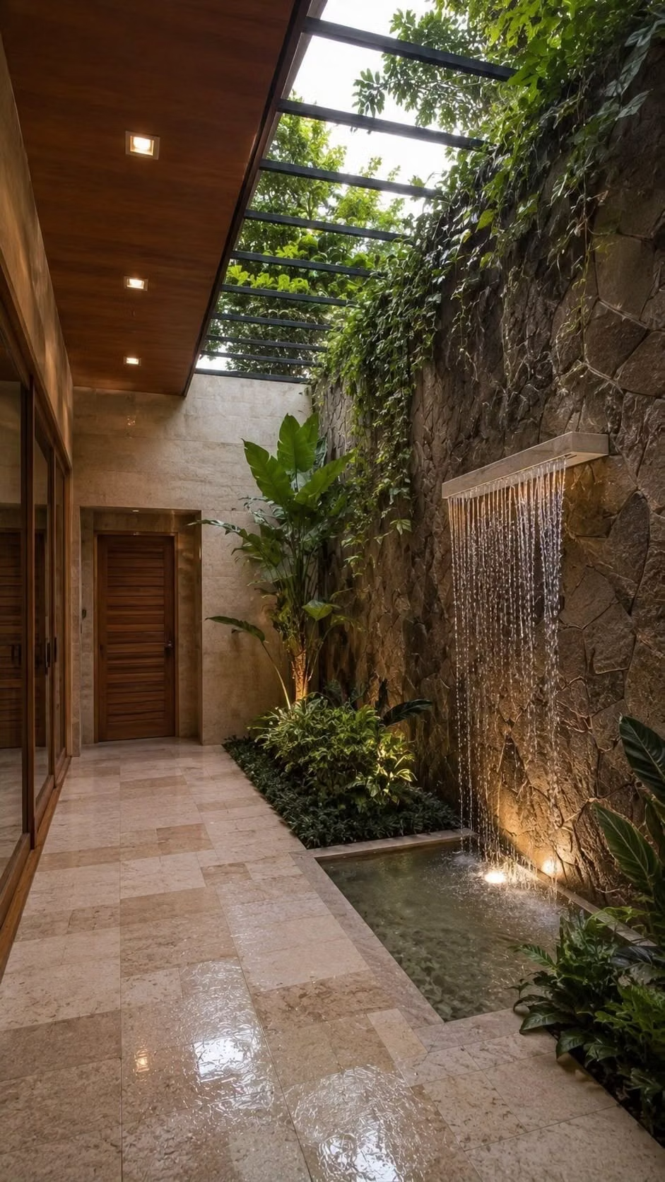
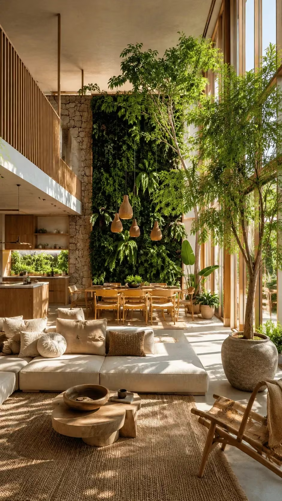
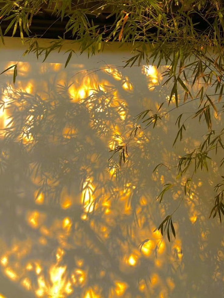
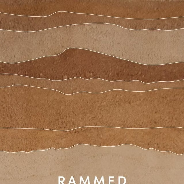
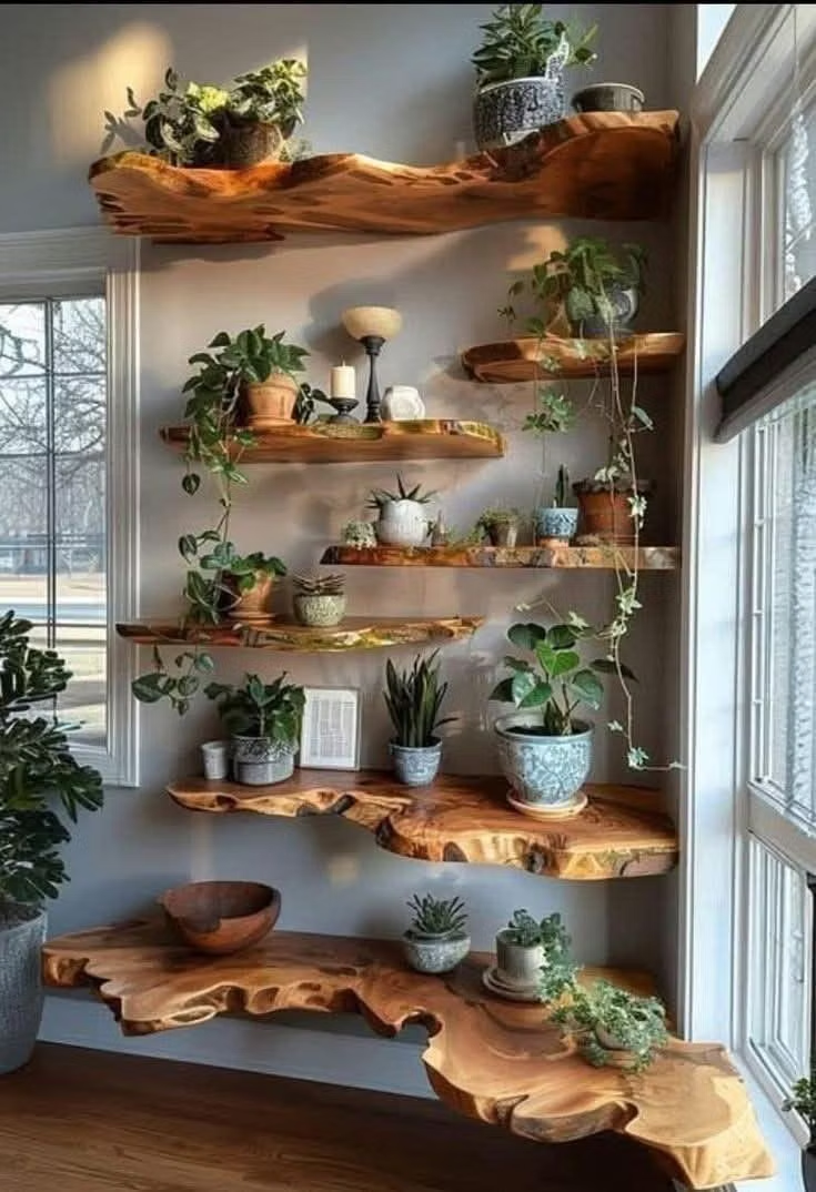
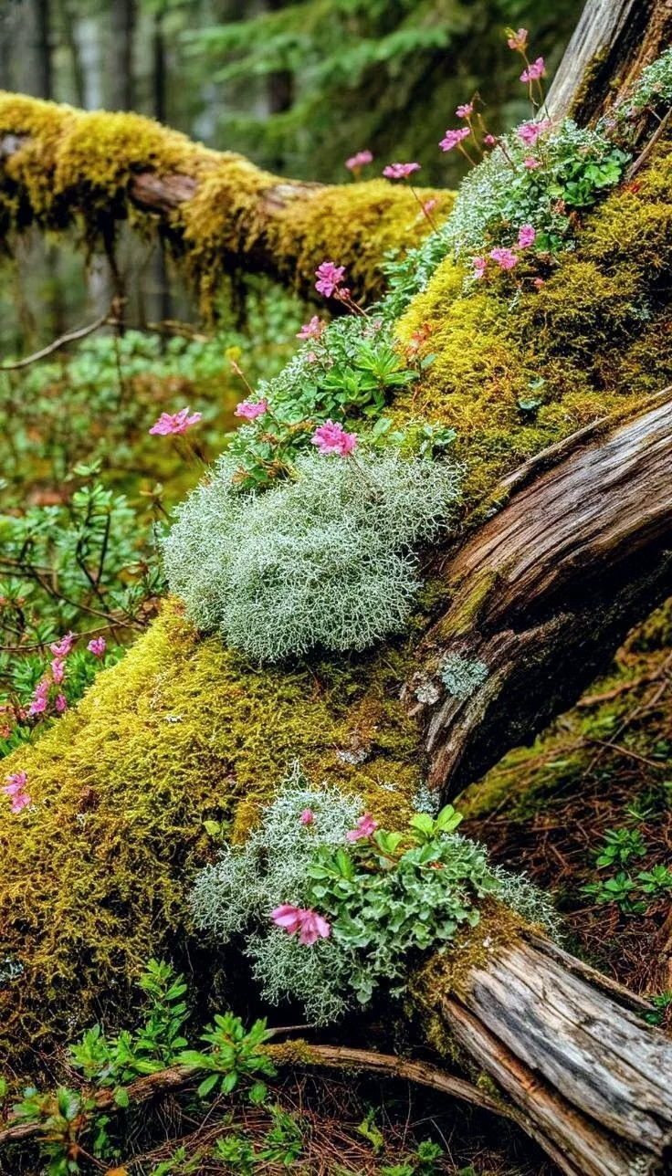
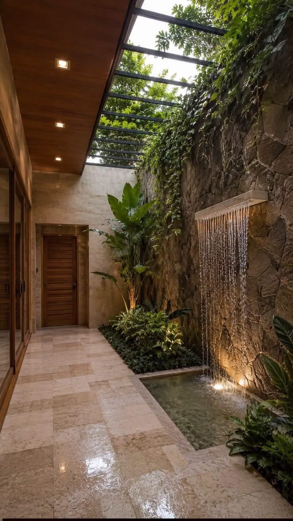
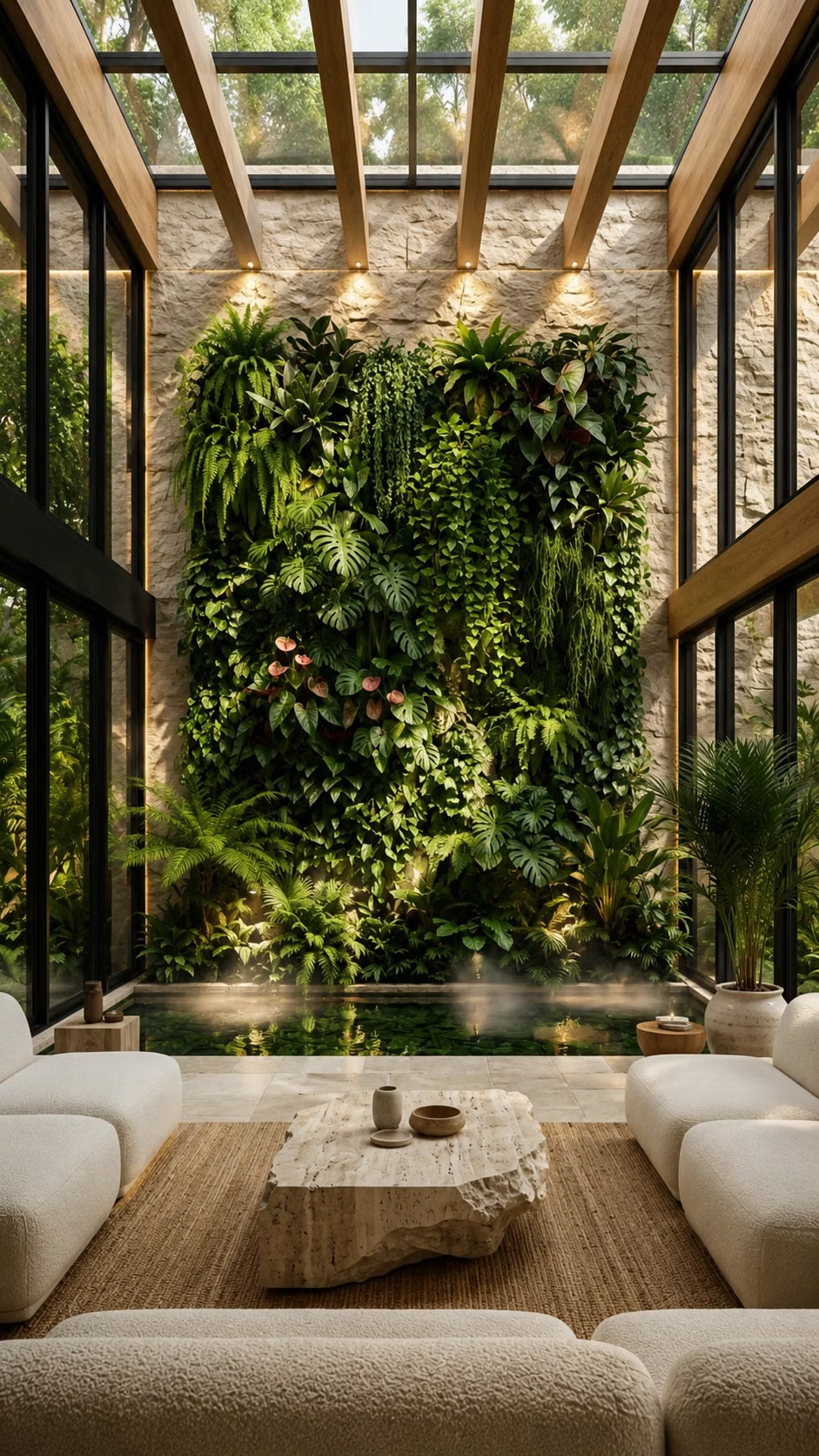
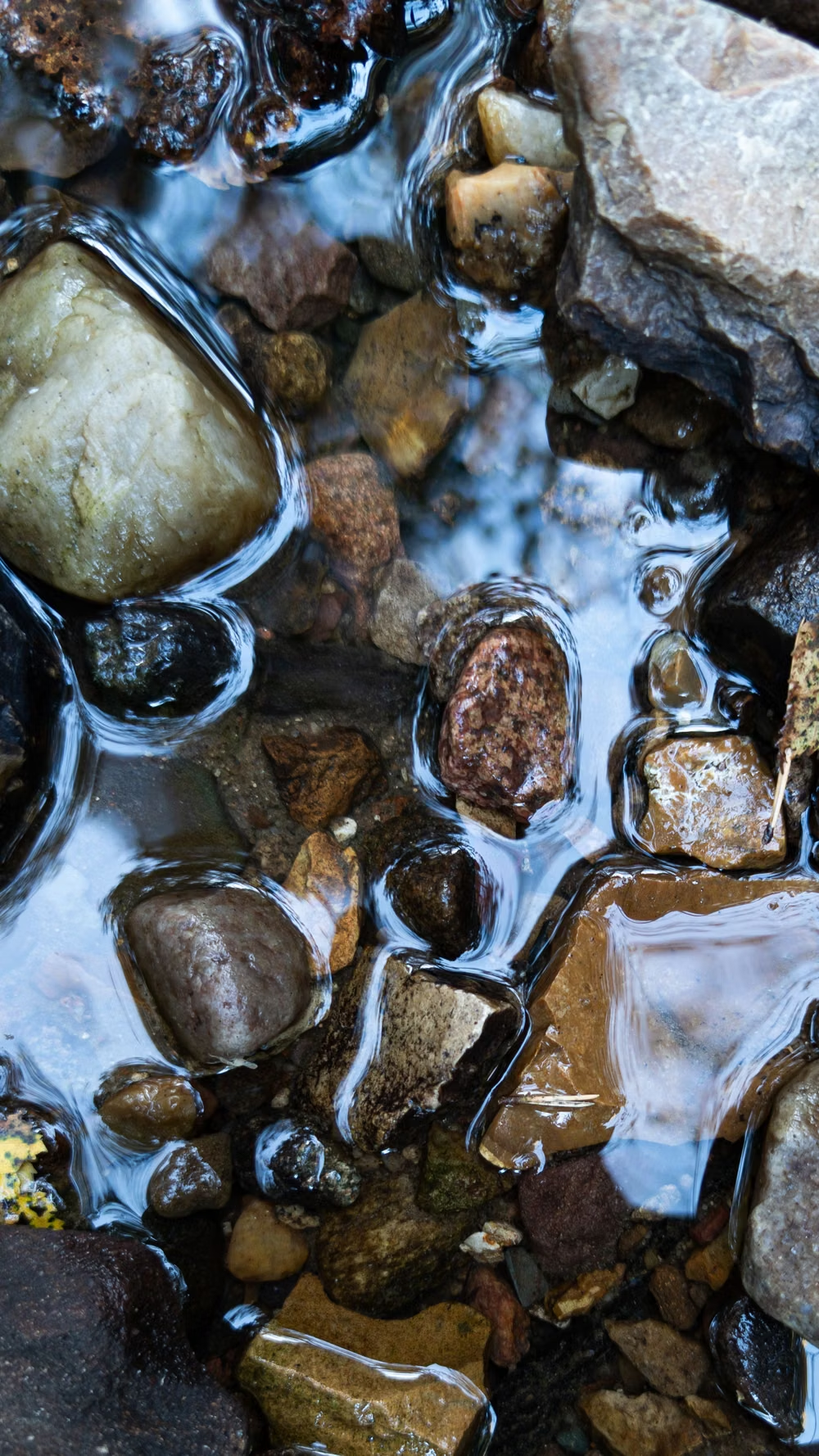
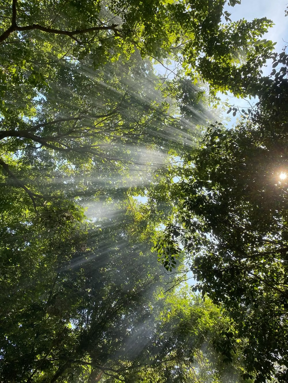
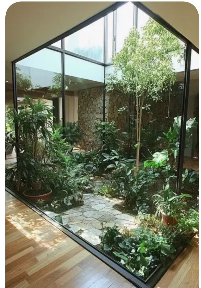
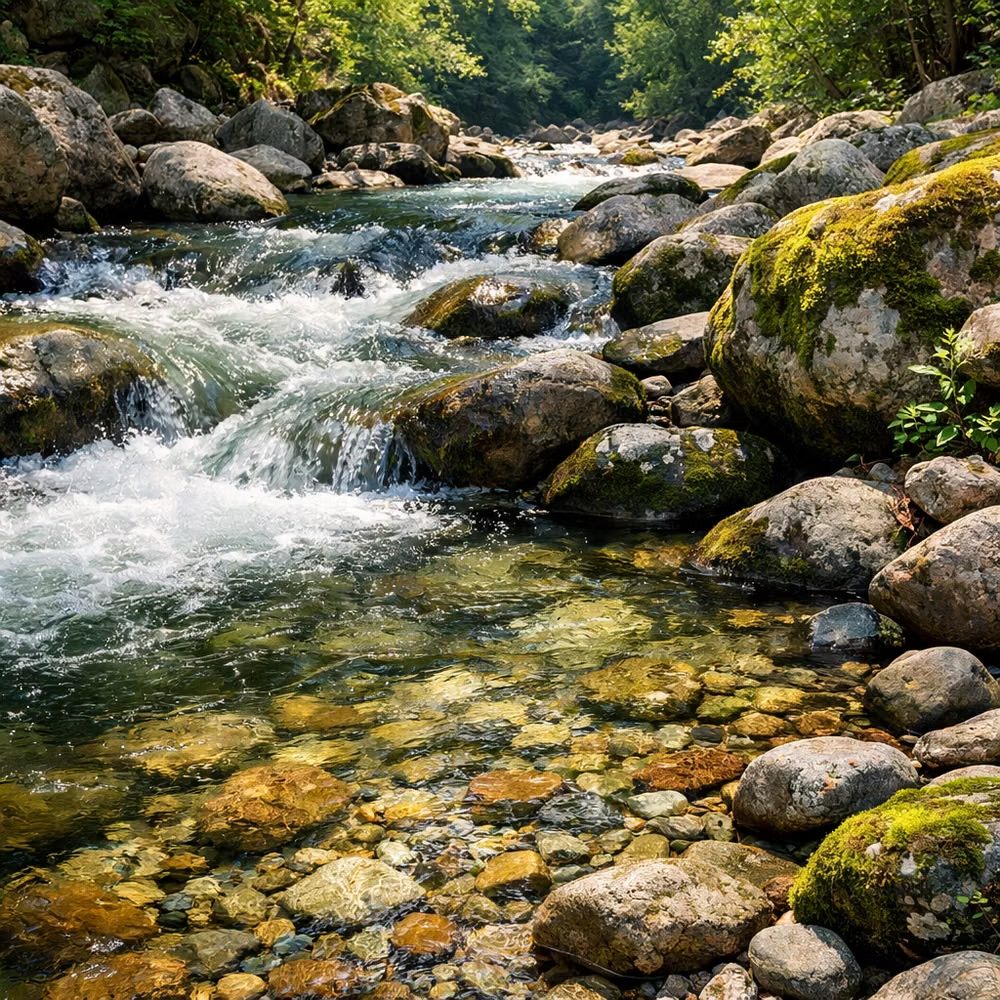
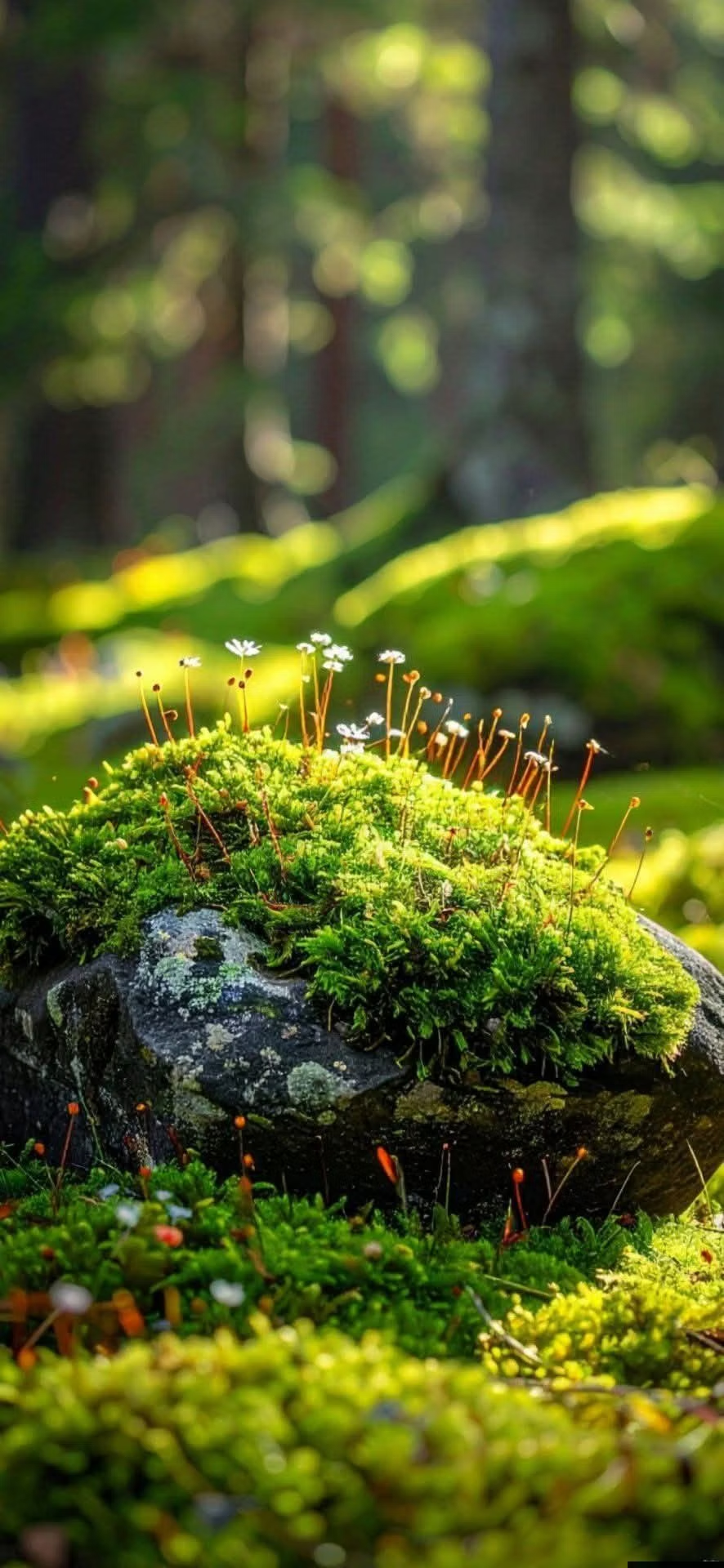
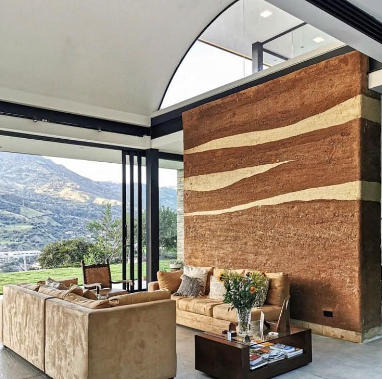
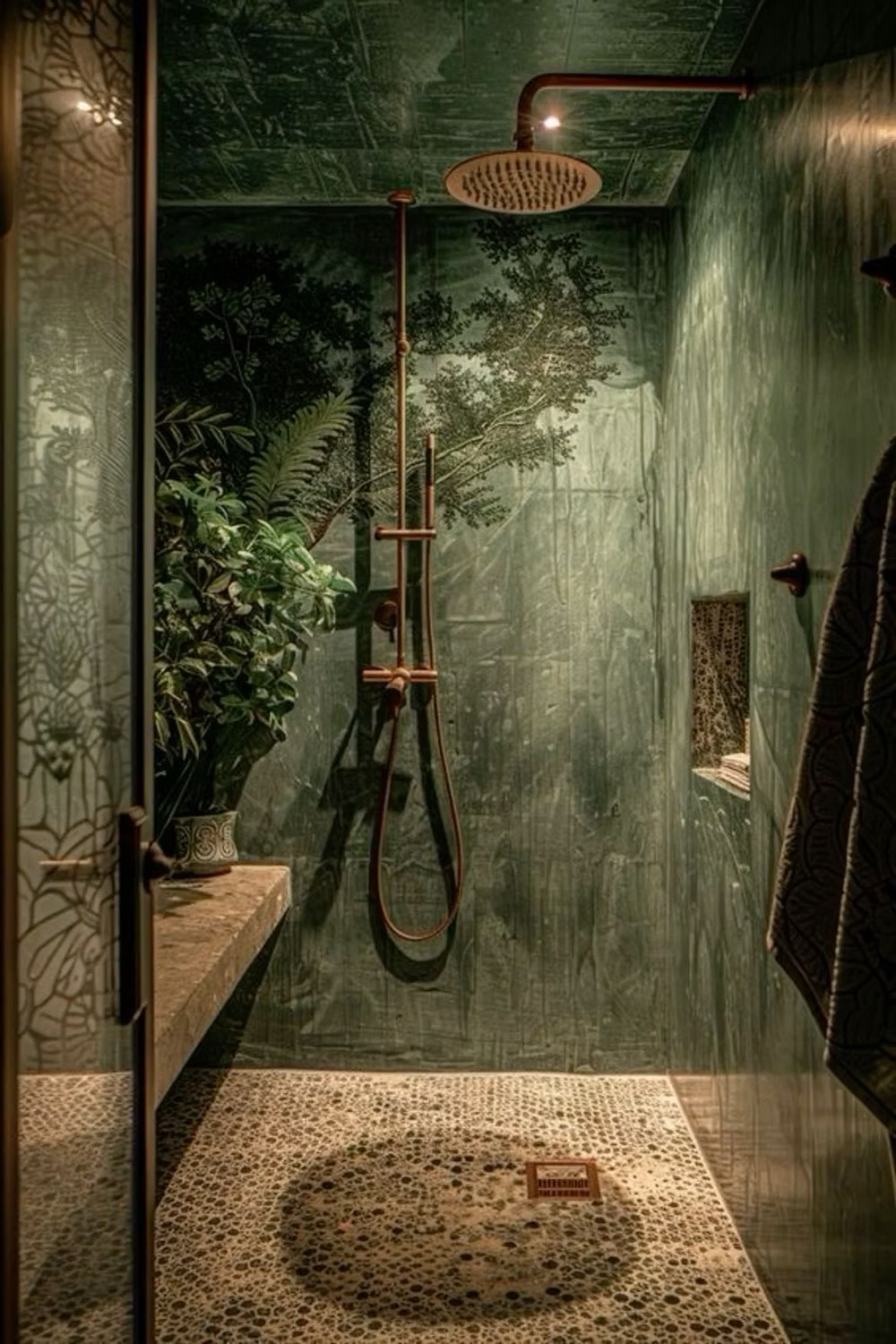
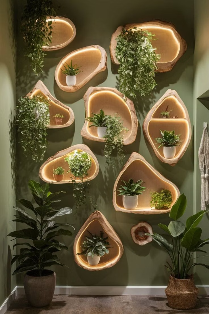
A visual study of the forms, inspirations, materials, colors, type, and cultural references associated with this UI design style.
Design principles and implementation
Use these principles to write a focused AI UI design prompt instead of asking for a vague visual treatment.
Color direction
Build from leaf, moss, clay, bark, sky, and mineral tones, reflecting natural light variation while maintaining accessible text contrast. In a daisyUI theme, use leaf or moss green for `primary`, clay or sky blue for `secondary`, and set `base-100`, `base-200`, and `base-300` to warm mineral white, pale sand, and soft stone.
Imagery direction
Use authentic plants, landscapes, daylight interiors, material close-ups, and human activity in nature rather than generic leaf decoration.
Content density
Keep density low to medium with generous pauses, concise groups, and enough open space to support a restorative tone.
Motion direction
Use gentle breeze, growth, water, sunlight, and breathing-inspired movement at slow amplitude, stopping ambient effects around focused tasks.
Shape language
Use leaf arcs, pebble forms, branch-like dividers, soft asymmetry, and natural material edges without turning controls into novelty objects. In daisyUI themes, set the `--radius-*` variables between `0.75rem` and `1.5rem`.
Typography rules
Choose a humanist sans-serif or organic serif with open forms, relaxed leading, and sentence-case headings that feel calm rather than clinical.
Suggested Typfaces
Fraunces
Fresh daisies glow in warm sunlight
Fresh daisies glow in warm sunlight
1 2 3 4 5 6 7 8 9 0
Lora
Fresh daisies glow in warm sunlight
Fresh daisies glow in warm sunlight
1 2 3 4 5 6 7 8 9 0
Alegreya
Fresh daisies glow in warm sunlight
Fresh daisies glow in warm sunlight
1 2 3 4 5 6 7 8 9 0
Nunito Sans
Fresh daisies glow in warm sunlight
Fresh daisies glow in warm sunlight
1 2 3 4 5 6 7 8 9 0
Cormorant Infant
Fresh daisies glow in warm sunlight
Fresh daisies glow in warm sunlight
1 2 3 4 5 6 7 8 9 0
Build a Biophilic Design interface with daisyUI
The live example translates this direction into daisyUI components and semantic theme tokens.
To generate a full page in the same visual language, give the style name and the design rules above to Blueprint MCP.
Related UI design styles
Compare nearby visual languages that share typography, shapes, use cases, or signature elements.
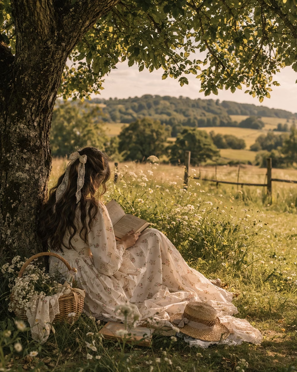
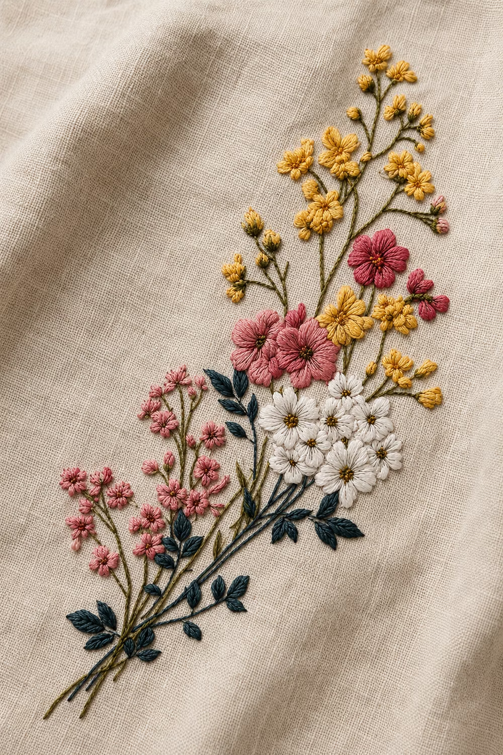
Cottagecore UI design style
Pastoral imagery, florals, handmade textures, gentle serif type, warm domestic details, and romantic rural nostalgia.
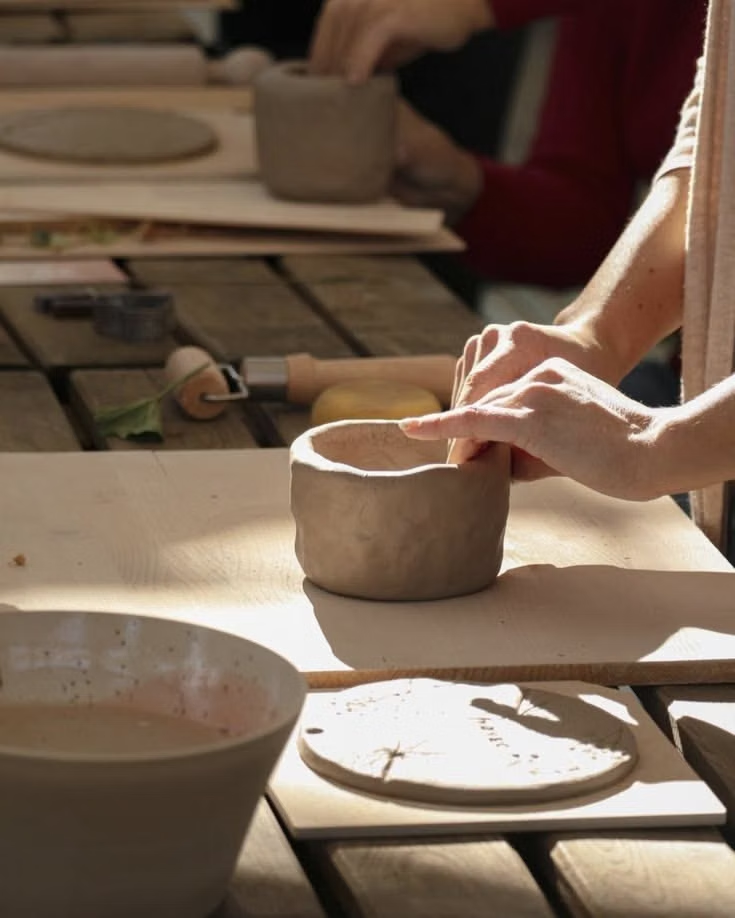
Millennial Beige UI design style
A calm tonal aesthetic layers cream, tan, sand, taupe, and greige with tactile natural details, soft contrast, and intentional empty space.
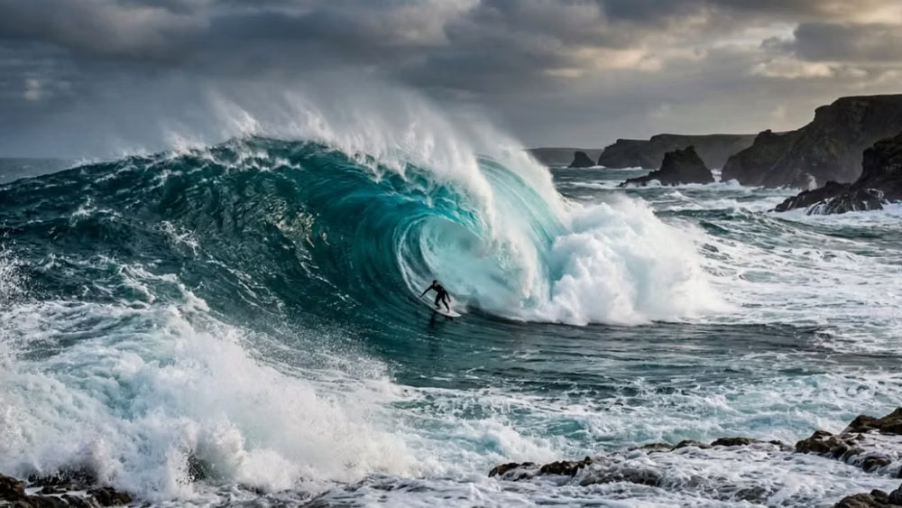
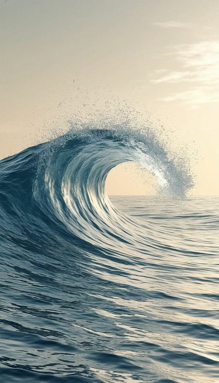
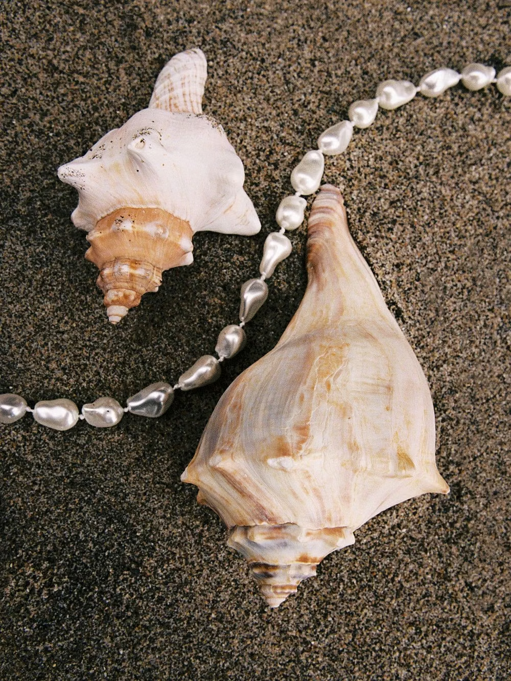
Surf Crush UI design style
The 1999–2008 surf-media craze combines sunlit ocean photography, boards, Hawaiian prints, puka shells, hibiscus flowers, beach hair, and youthful coastal freedom.