How to make AI UI feel less generic
Generic AI UI usually begins with a generic request. Ask for a clean dashboard or a beautiful landing page and the model has to invent the spacing, visual hierarchy, content, colors, type, and component behavior. It fills those gaps with familiar defaults, so different products start to look alike.
A stronger prompt turns taste into decisions. Name the product and audience, then describe the interface as a connected system. Explain how much space separates sections, which shapes repeat, where color carries meaning, how typography establishes hierarchy, and which states each component needs.
Specific direction still leaves room for creativity. The goal is to define relationships and constraints, not place every pixel yourself. When the model understands the visual language and the reason behind each choice, it can make original decisions without losing consistency.
Start with a visual language, not an adjective
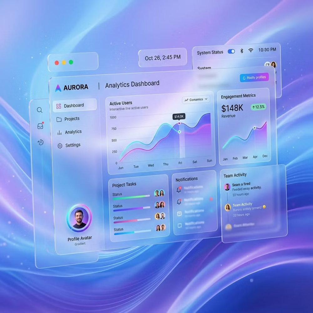
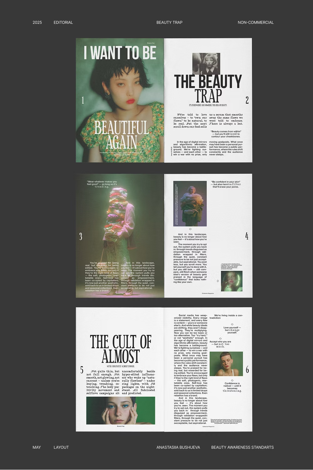
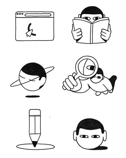
A named direction gives the model a shared vocabulary. These references show how different systems can feel before a page type or component library enters the prompt.

Describe the decisions that shape the interface
Replace broad adjectives with rules your coding agent can apply across every section and state.
Spacing and rhythm
Describe the base spacing unit, section gaps, card padding, and density. For example, ask for an 8px spacing scale, generous 96px desktop section gaps, compact 16px card padding, and tighter spacing around related controls.
Shapes and edges
State whether surfaces are sharp, softly rounded, pill-shaped, inset, clipped, or irregular. Explain where the shape language changes, such as rounded containers with square data cells or hard-edged buttons inside organic sections.
Color palette and roles
Give colors jobs instead of listing attractive hex values. Define the base surface, elevated surface, primary action, muted text, border, success, warning, and error roles. Add contrast rules and say where accent color must stay rare.
Typography and hierarchy
Name the font categories, weight range, scale, line length, and casing. Describe how display headings differ from product labels, body copy, metadata, numerals, and code so the type system carries a recognizable voice.
Design tokens and states
Ask for reusable semantic tokens for color, radius, shadow, spacing, and motion. Include hover, focus, active, selected, disabled, loading, empty, success, and error states so visual decisions survive beyond the first screenshot.
Creative decisions with reasons
Tie each expressive choice to the product. A music archive can use dense editorial captions to reward discovery. A climate dashboard can use luminous ecological surfaces to connect data with the physical world.
Put the system into one usable prompt
Keep the brief concrete, then let the agent solve the composition. This example defines a visual system without prescribing every component.
Detailed prompt example
Build a responsive project dashboard for independent film teams. Use Editorial Design as the primary visual direction. Base spacing on an 8px scale, use 80px section gaps on desktop and 48px on mobile, and keep task controls compact. Pair a high-contrast serif display face with a neutral sans-serif UI face. Use warm paper surfaces, near-black text, one vermilion action color, thin rules, and square cards with occasional circular image crops. Define semantic daisyUI theme tokens for every color role and include hover, focus, loading, empty, and error states. Use real production labels and credits instead of placeholder copy. Build it with daisyUI.Ask the agent to review the result
- Check whether spacing follows the stated scale instead of drifting between sections.
- Confirm the type hierarchy works at mobile and desktop widths.
- Verify every semantic color role has enough contrast and a clear purpose.
- Remove visual choices that do not support the product, content, or interaction.
Let Blueprint MCP guide these decisions
Blueprint MCP turns this process into a guided workflow for your coding agent. It helps establish creative direction, page architecture, component choices, and design rules before implementation.
It also supplies current daisyUI context and finishes with an interface inspection, so the result can be checked against the decisions that made it distinctive.