Hand-Drawn UI design style
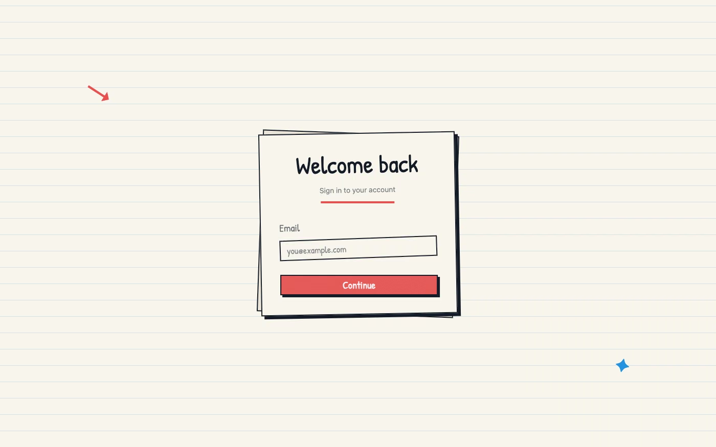
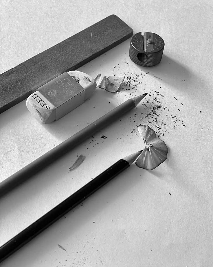
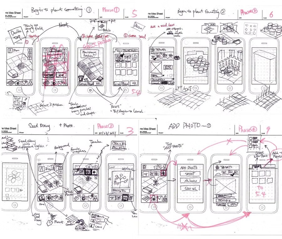
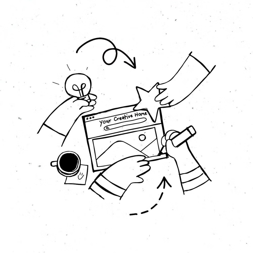
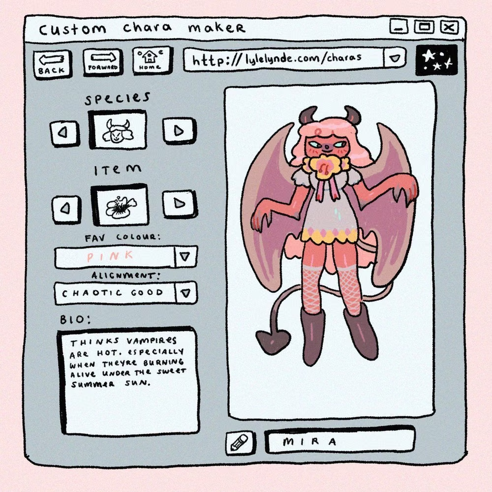
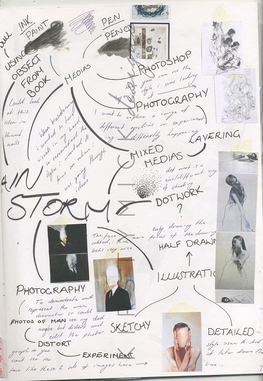
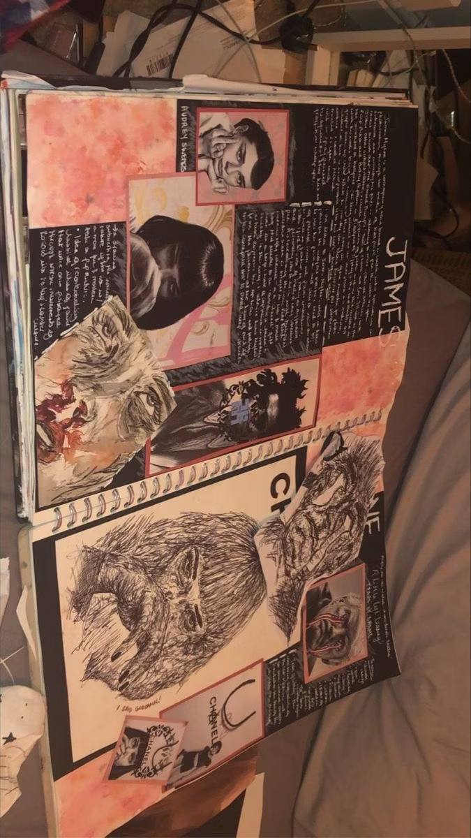
Imperfect lines, sketchy icons, paper textures, handwritten type, and playful annotations emphasize human craft.
Design overview
- Signature elements
- sketchy outlines, handwritten labels, imperfect icons, paper texture, playful arrows, visible human variation. In daisyUI themes, set `--noise: 1;`.
- Best suited to
- Education, journaling, creative tools, children’s products, and personal brands.
- Layout principles
- Use a loose sketchbook grid with playful annotations and arrows, while keeping forms, navigation, and repeated controls aligned consistently enough to use quickly.
History and origins
A fact-checked account of where this visual language came from, with links to the references used.
- Period
- Craft-revival precedents in the late 19th century; digital use throughout the web era
- Origin
- Illustration, lettering, and craft traditions adapted to screens
Hand-Drawn UI is a technique category, not a dated movement. Its claim to visible human authorship echoes the Arts and Crafts reaction against industrial standardization in late-19th-century Britain, while scanners, tablets, and vector tools later made imperfect lines and lettering practical components of digital products.
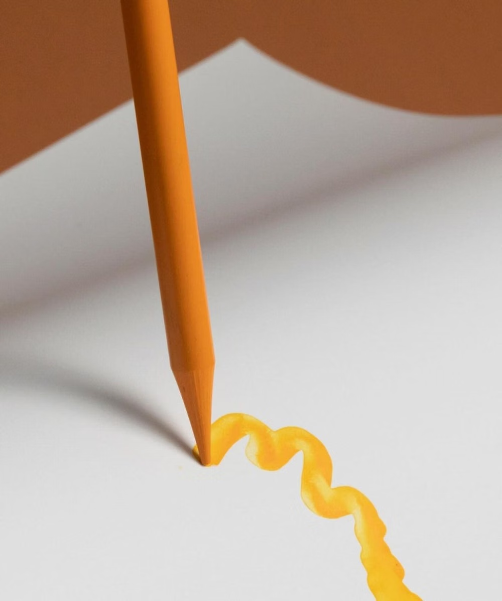
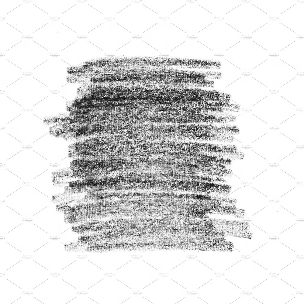
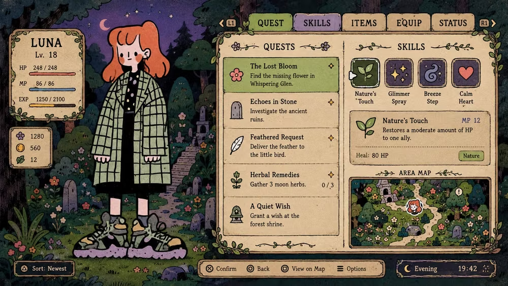
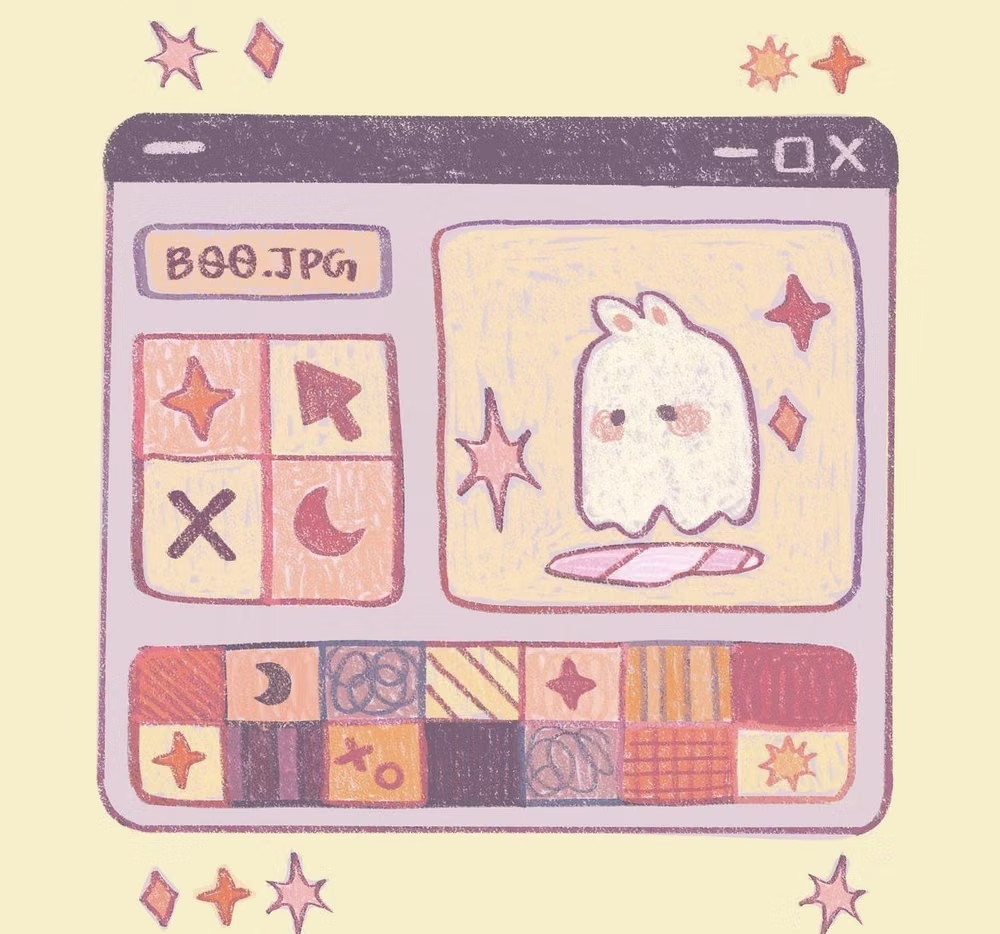
Moodboard and visual references
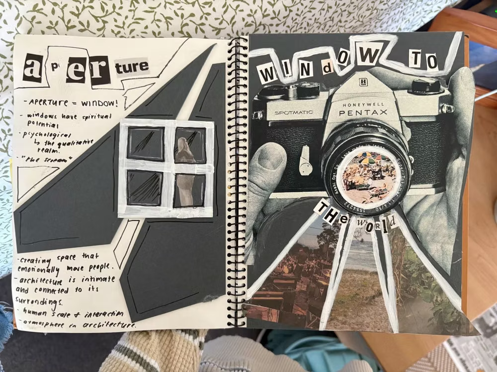
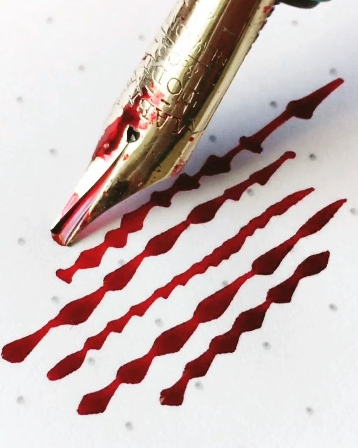
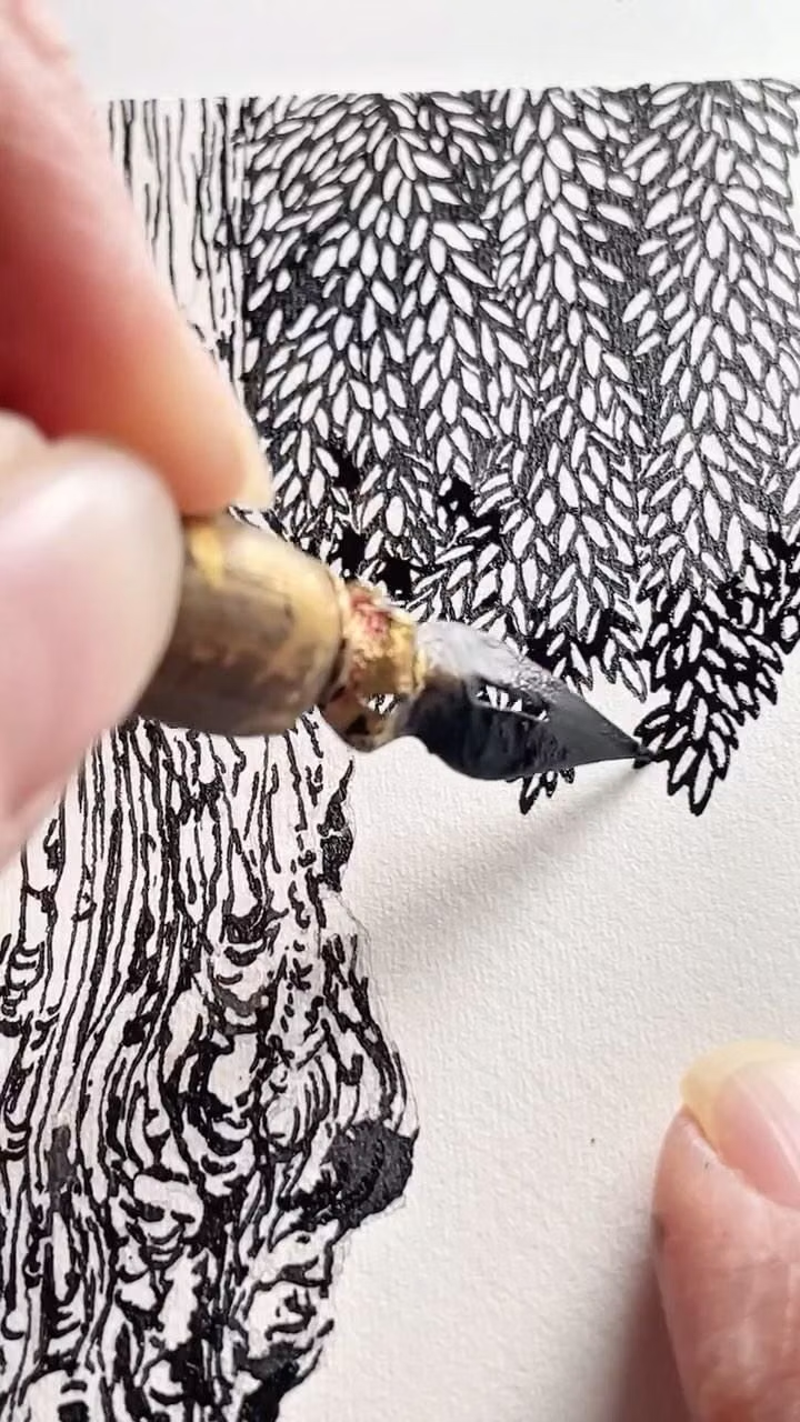
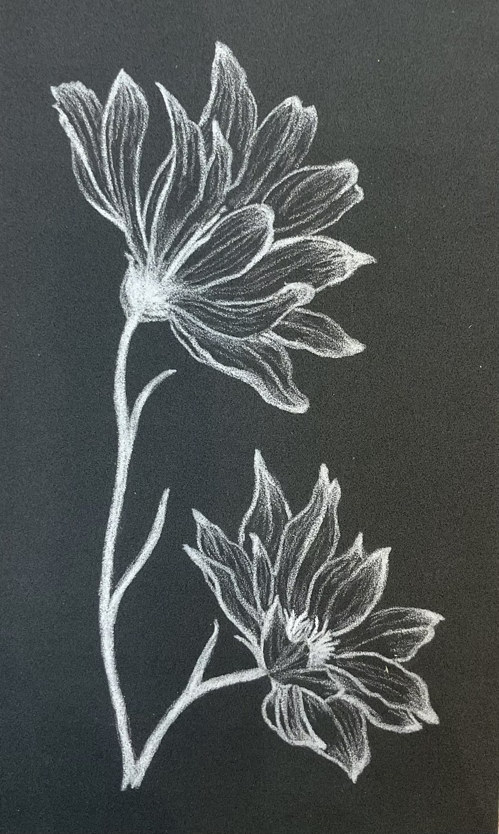
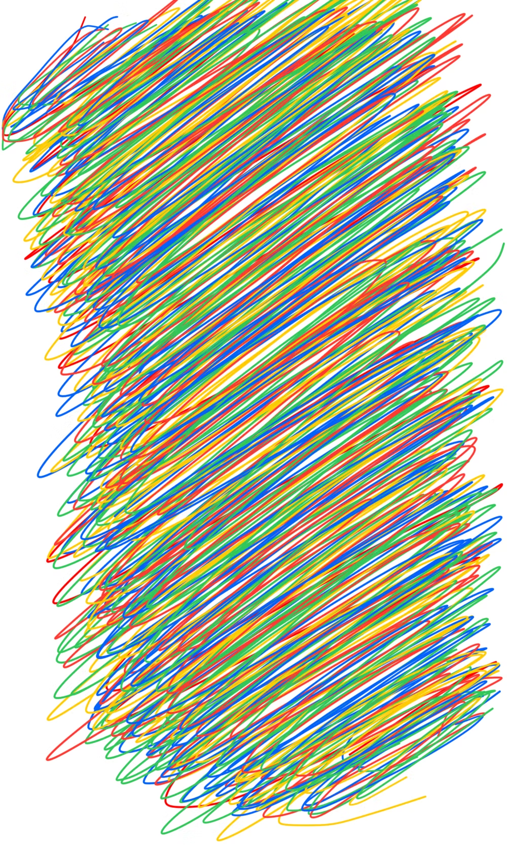
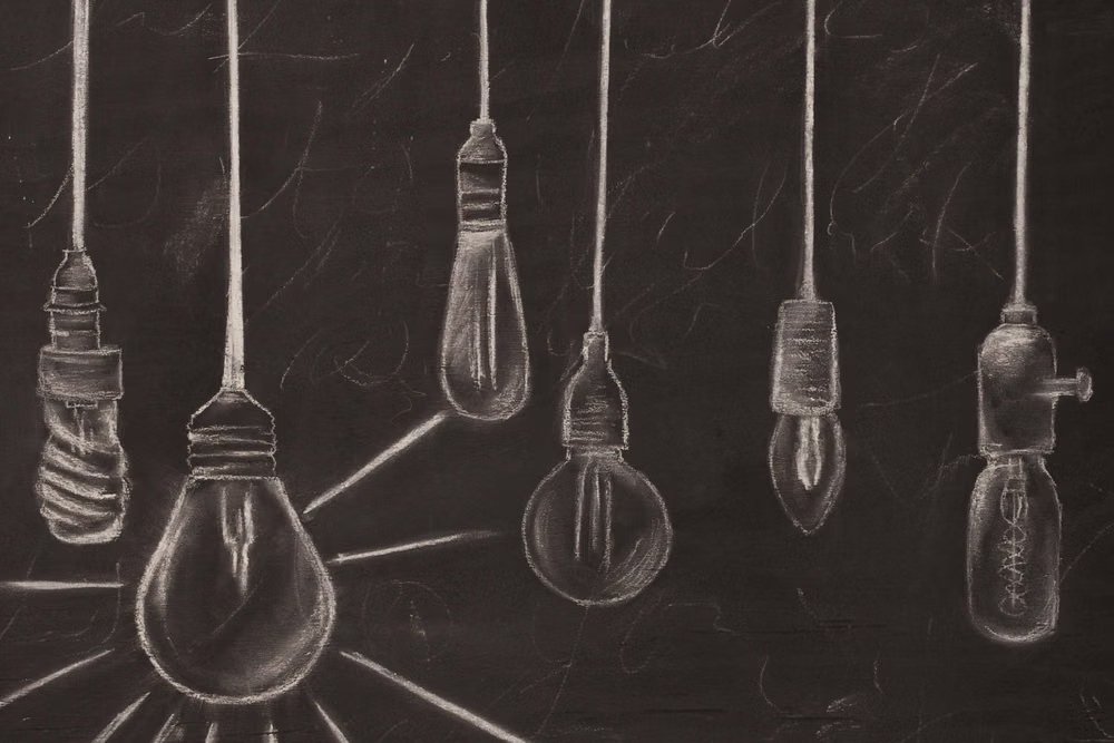
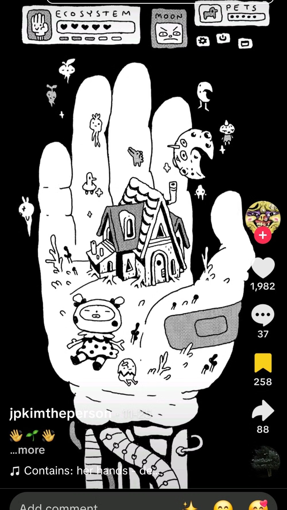
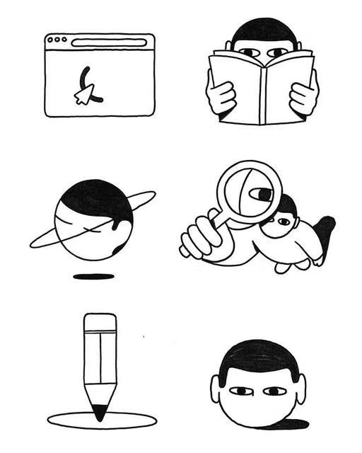
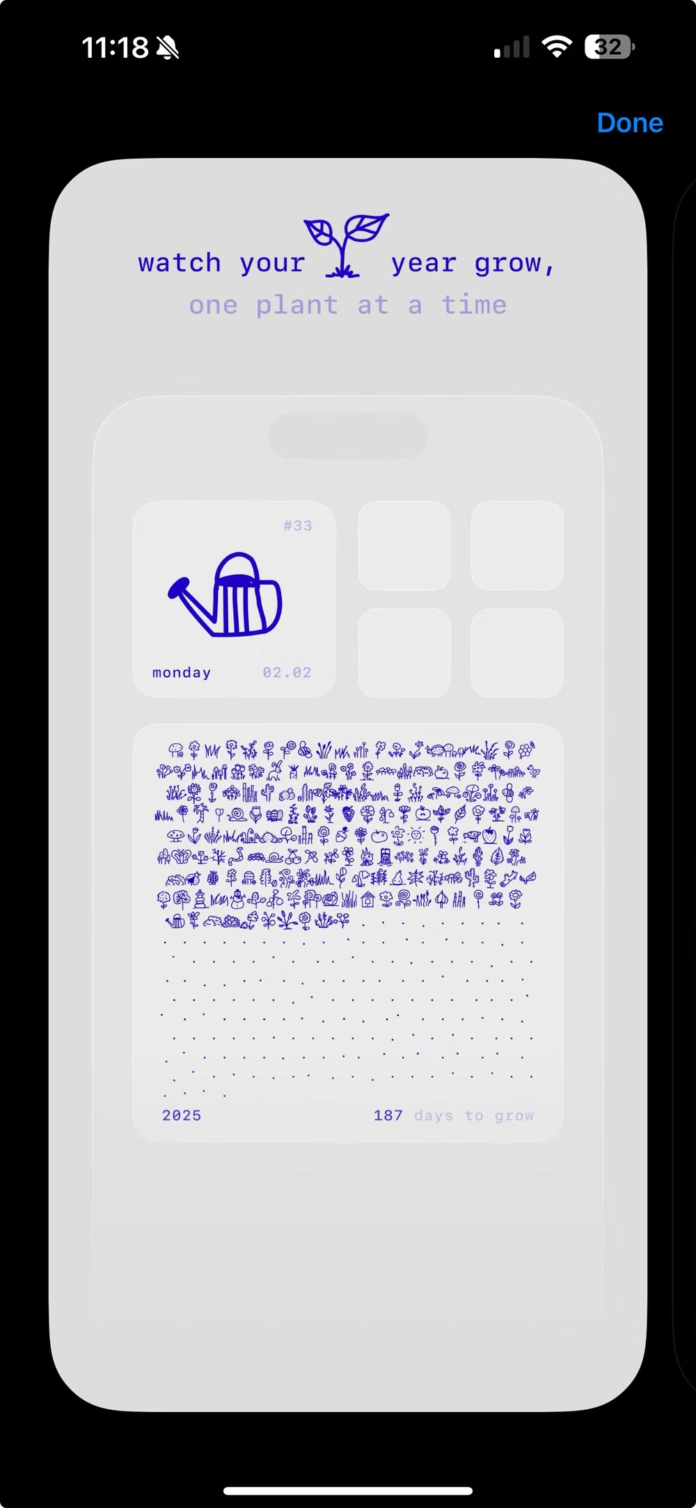
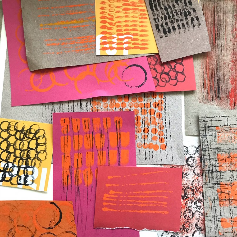
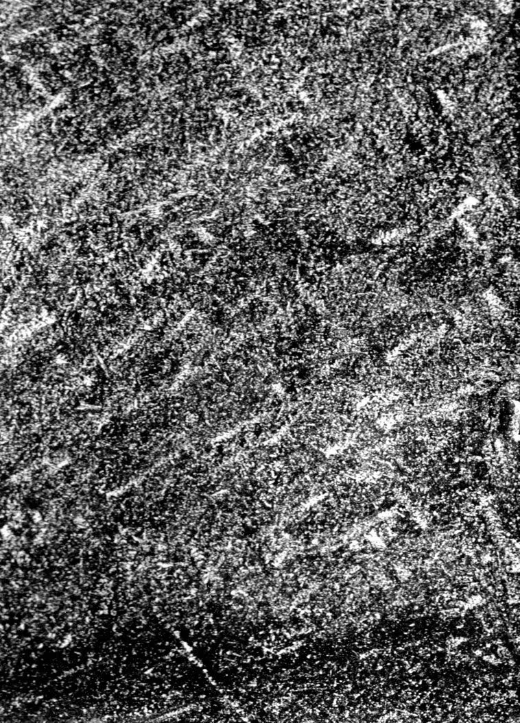
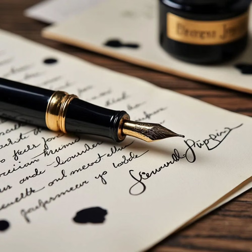
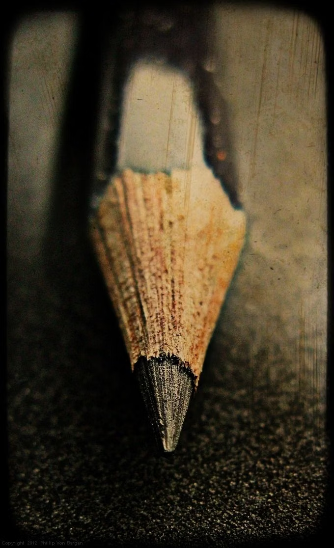
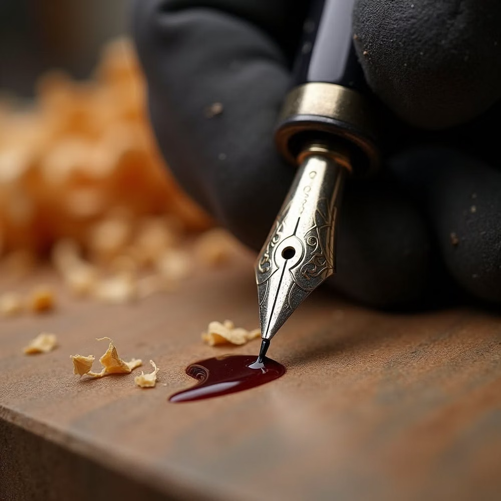
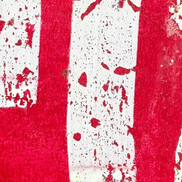
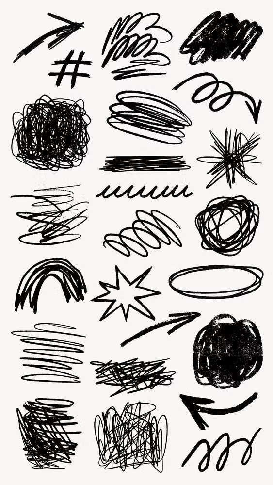
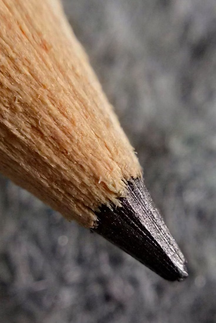
A visual study of the forms, inspirations, materials, colors, type, and cultural references associated with this UI design style.
Design principles and implementation
Use these principles to write a focused AI UI design prompt instead of asking for a vague visual treatment.
Color direction
Work from off-white paper and dark ink, adding a small crayon, marker, or watercolor palette with visible but controlled variation. In a daisyUI theme, use the clearest marker or crayon hue for `primary`, a complementary watercolor tone for `secondary`, and map off-white paper, warm sketch paper, and lightly smudged gray paper to `base-100`, `base-200`, and `base-300`.
Imagery direction
Choose line drawings, annotated diagrams, imperfect icons, and scanned marks that share one hand, tool, and stroke character.
Content density
Keep density moderate, leaving breathing room around strokes and preventing annotations from crossing labels or interactive targets.
Motion direction
Draw lines on, add tiny idle wobble to illustrations, and erase or redraw state changes with brief imperfect timing.
Shape language
Use uneven outlines, hand-drawn boxes, circles, arrows, underlines, and paper edges with deliberate human variance. In daisyUI themes, set the `--radius-*` variables between `0.25rem` and `1rem`.
Typography rules
Use handwritten type for headings and callouts, pair it with a clean body face for longer reading, and avoid shrinking irregular letters below comfortable sizes.
Suggested Typfaces
Patrick Hand
Fresh daisies glow in warm sunlight
Fresh daisies glow in warm sunlight
1 2 3 4 5 6 7 8 9 0
Architects Daughter
Fresh daisies glow in warm sunlight
Fresh daisies glow in warm sunlight
1 2 3 4 5 6 7 8 9 0
Kalam
Fresh daisies glow in warm sunlight
Fresh daisies glow in warm sunlight
1 2 3 4 5 6 7 8 9 0
Caveat
Fresh daisies glow in warm sunlight
Fresh daisies glow in warm sunlight
1 2 3 4 5 6 7 8 9 0
Gloria Hallelujah
Fresh daisies glow in warm sunlight
Fresh daisies glow in warm sunlight
1 2 3 4 5 6 7 8 9 0
Build a Hand-Drawn UI interface with daisyUI
The live example translates this direction into daisyUI components and semantic theme tokens.
To generate a full page in the same visual language, give the style name and the design rules above to Blueprint MCP.
Related UI design styles
Compare nearby visual languages that share typography, shapes, use cases, or signature elements.
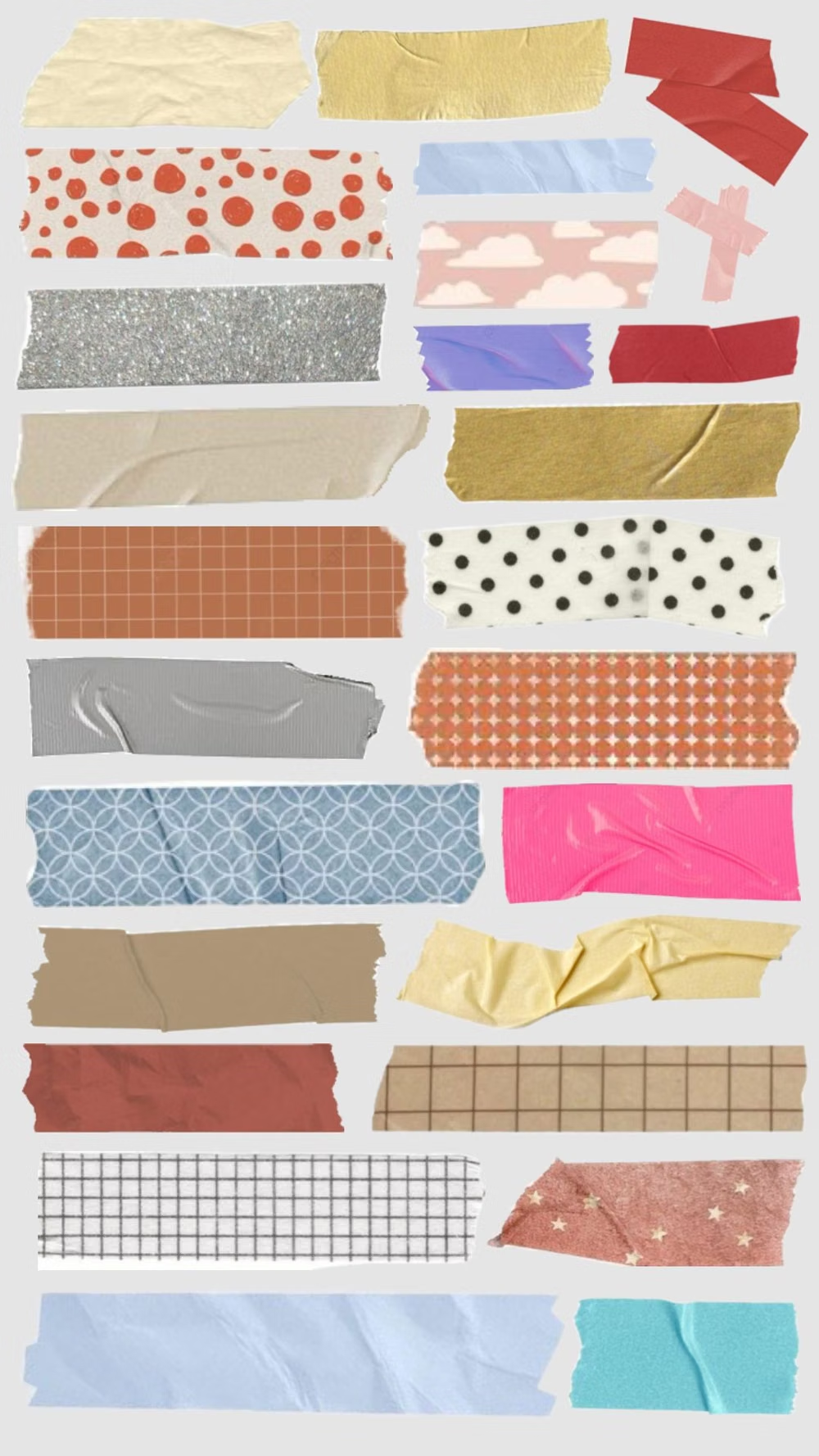
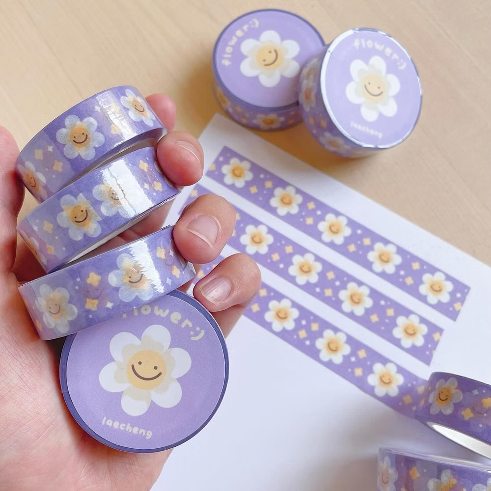
Scrapbook / Sticker UI design style
Stickers, tape, stamps, snapshots, doodles, labels, and layered ephemera create a personal assembled look.
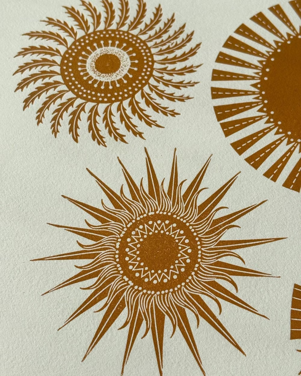

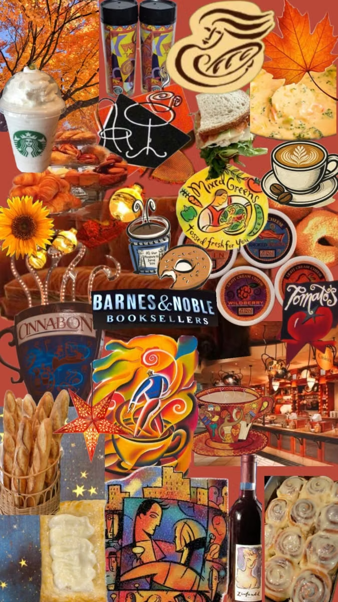
Global Village Coffeehouse UI design style
Earth tones, rough borders, woodcut-like symbols, suns, moons, spirals, natural motifs, and sincere hand-drawn globalism.
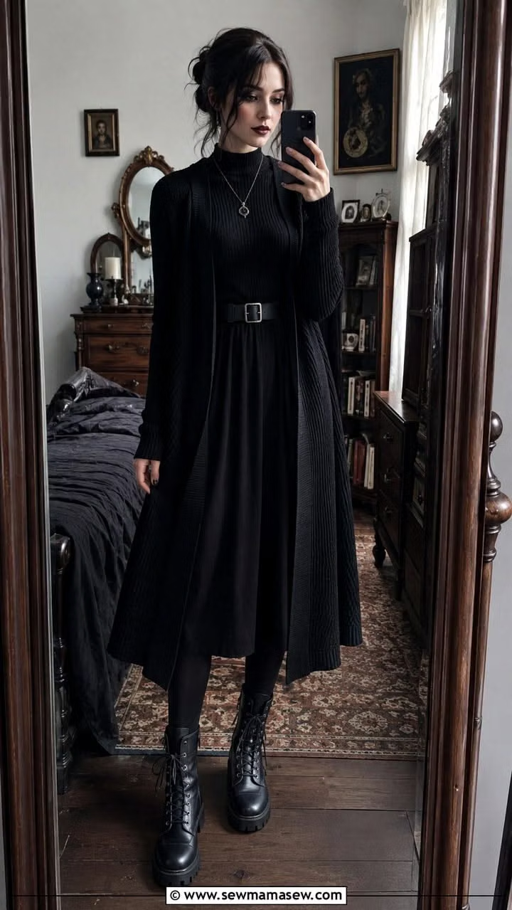
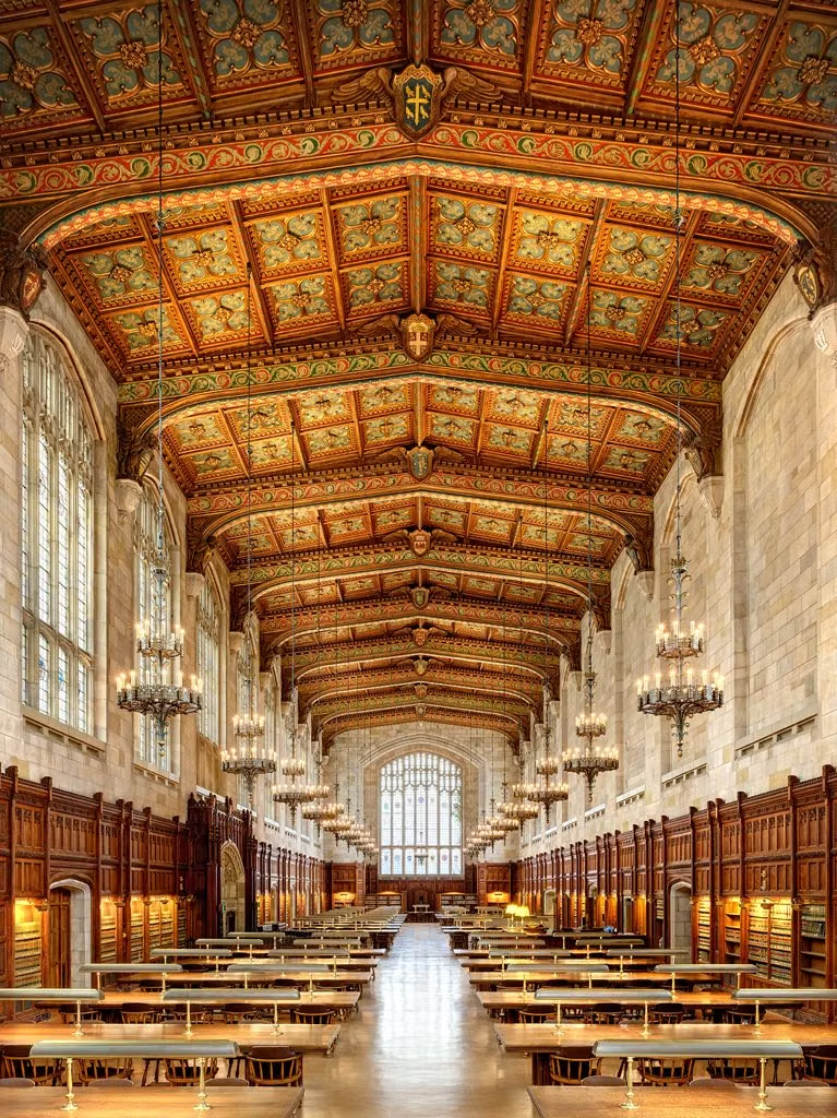
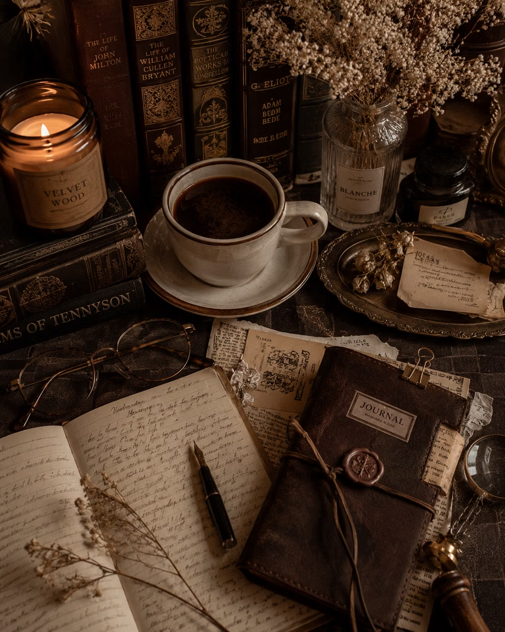
Dark Academia UI design style
Moody scholarly visuals use serif typography, parchment, dark wood, muted earth tones, and archival details.