Scrapbook / Sticker UI design style
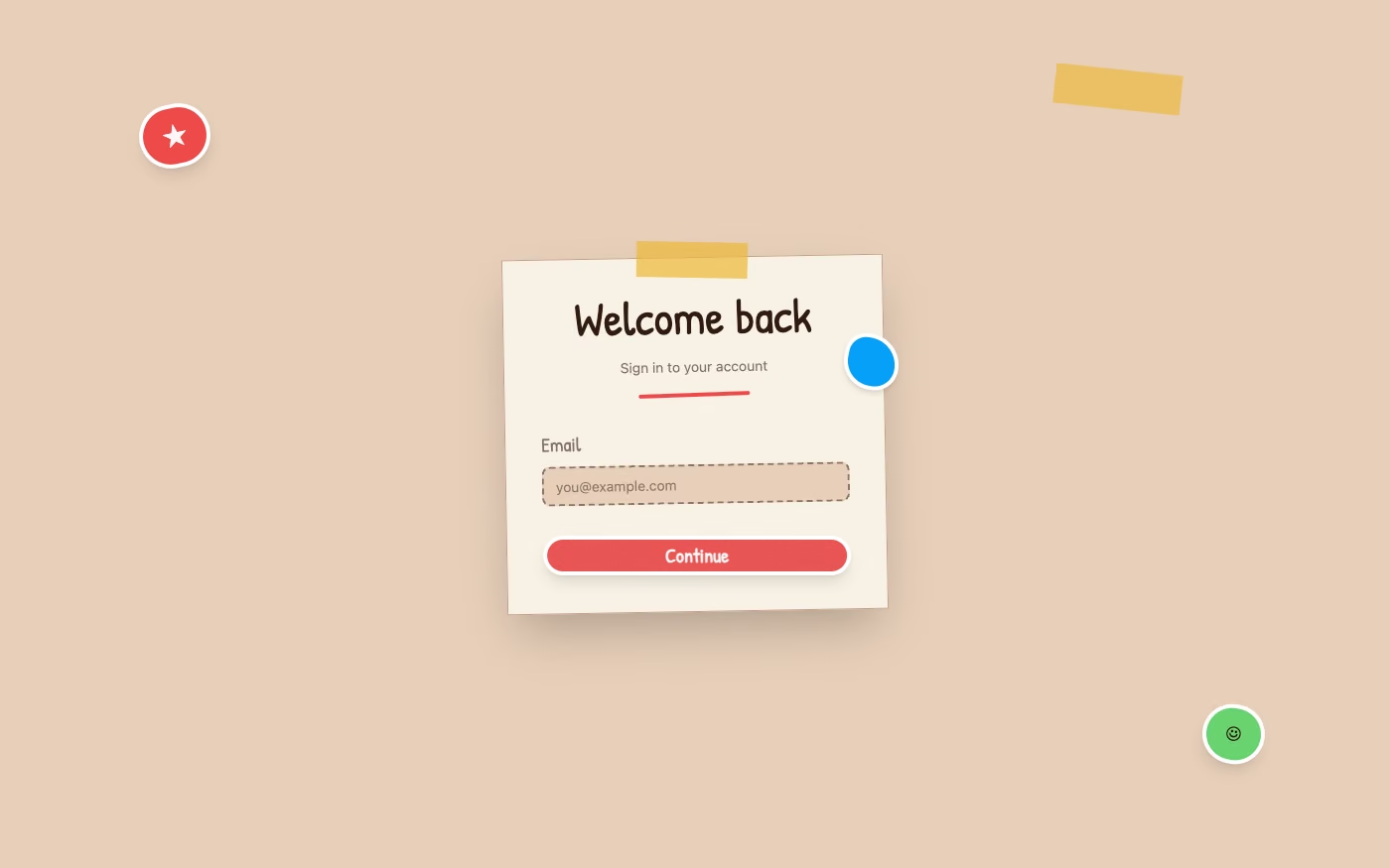
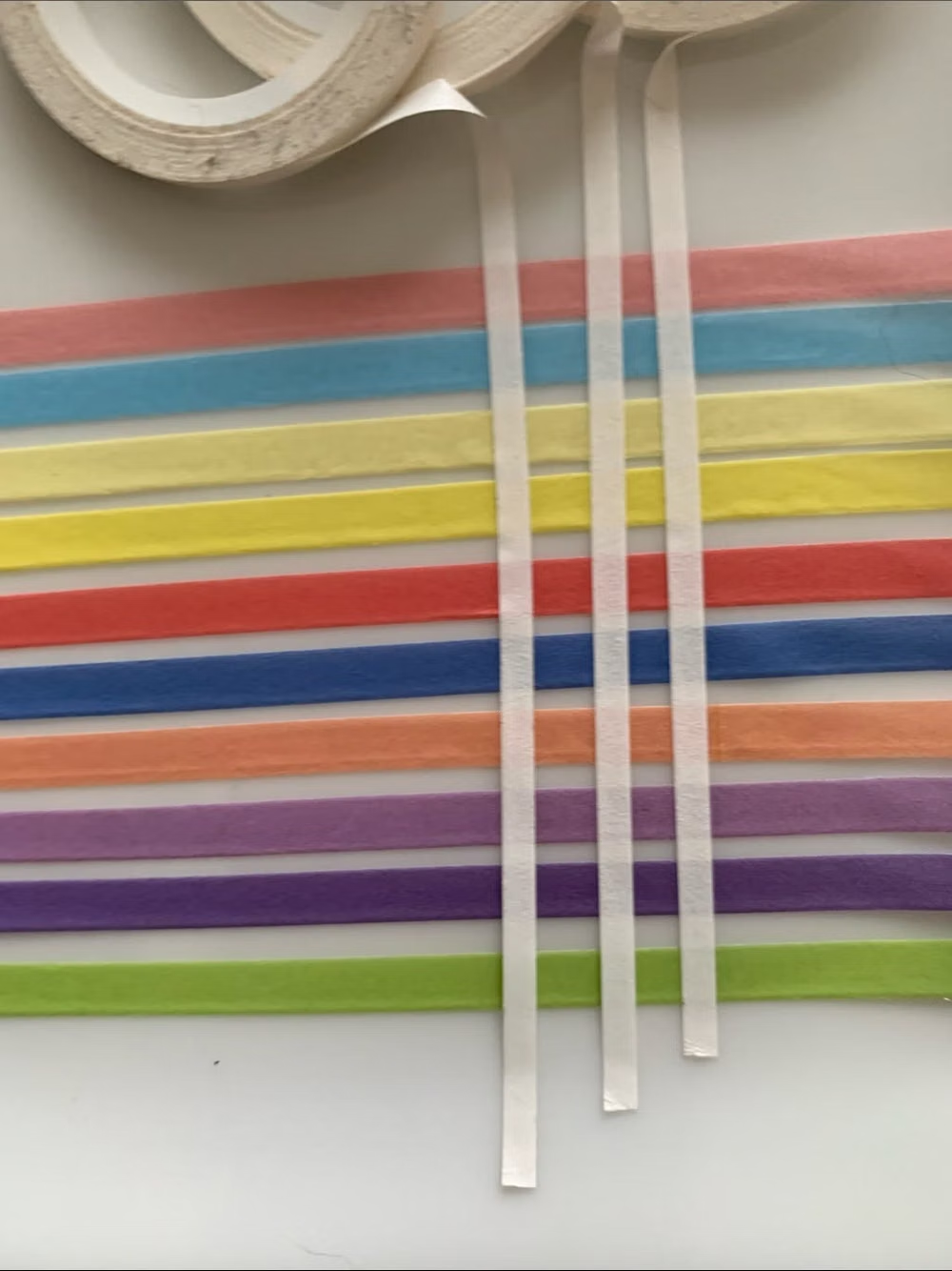
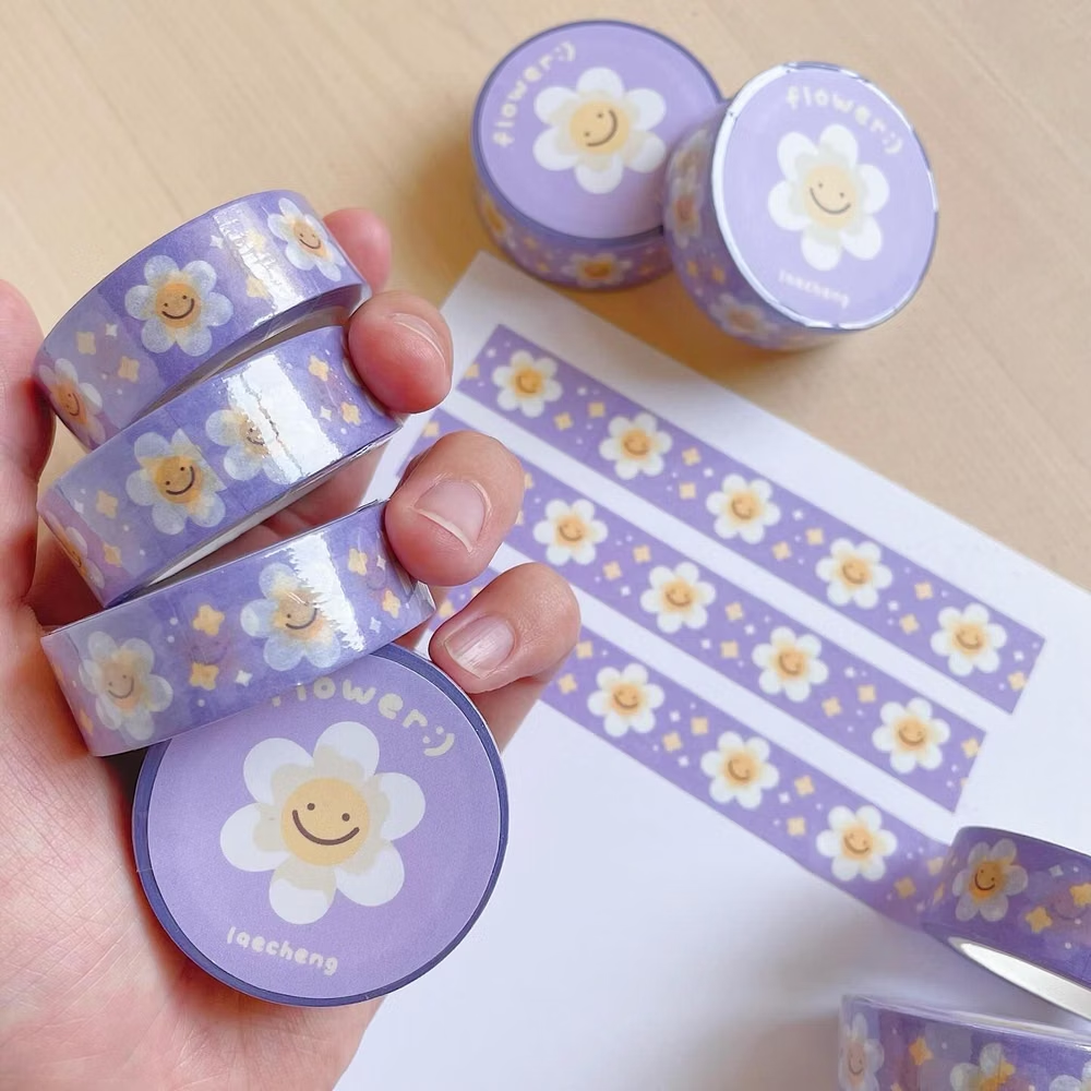
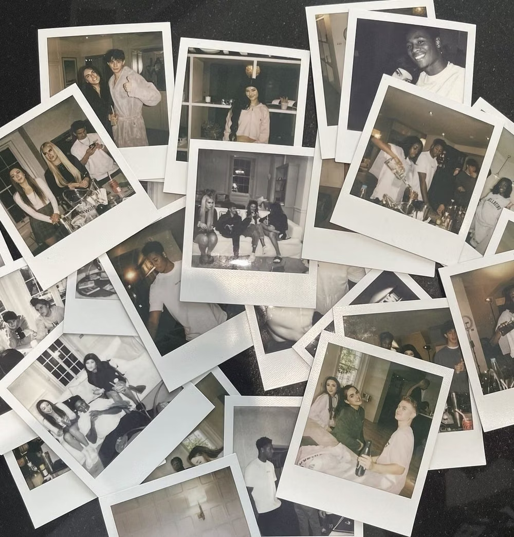
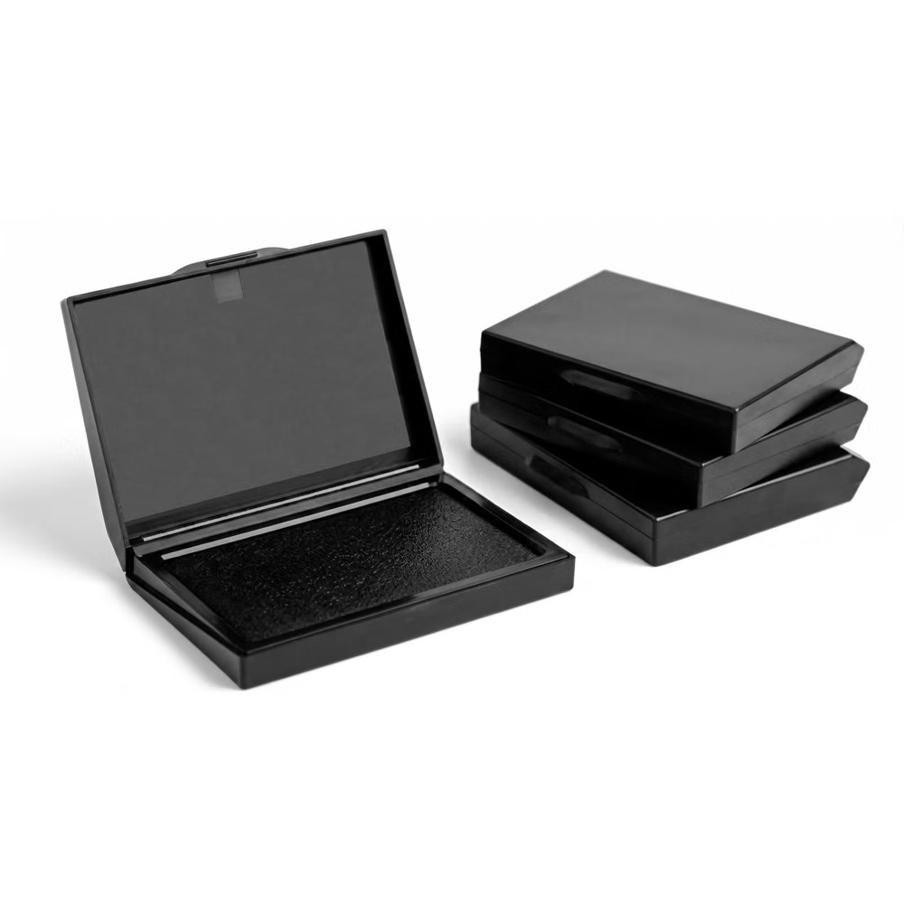
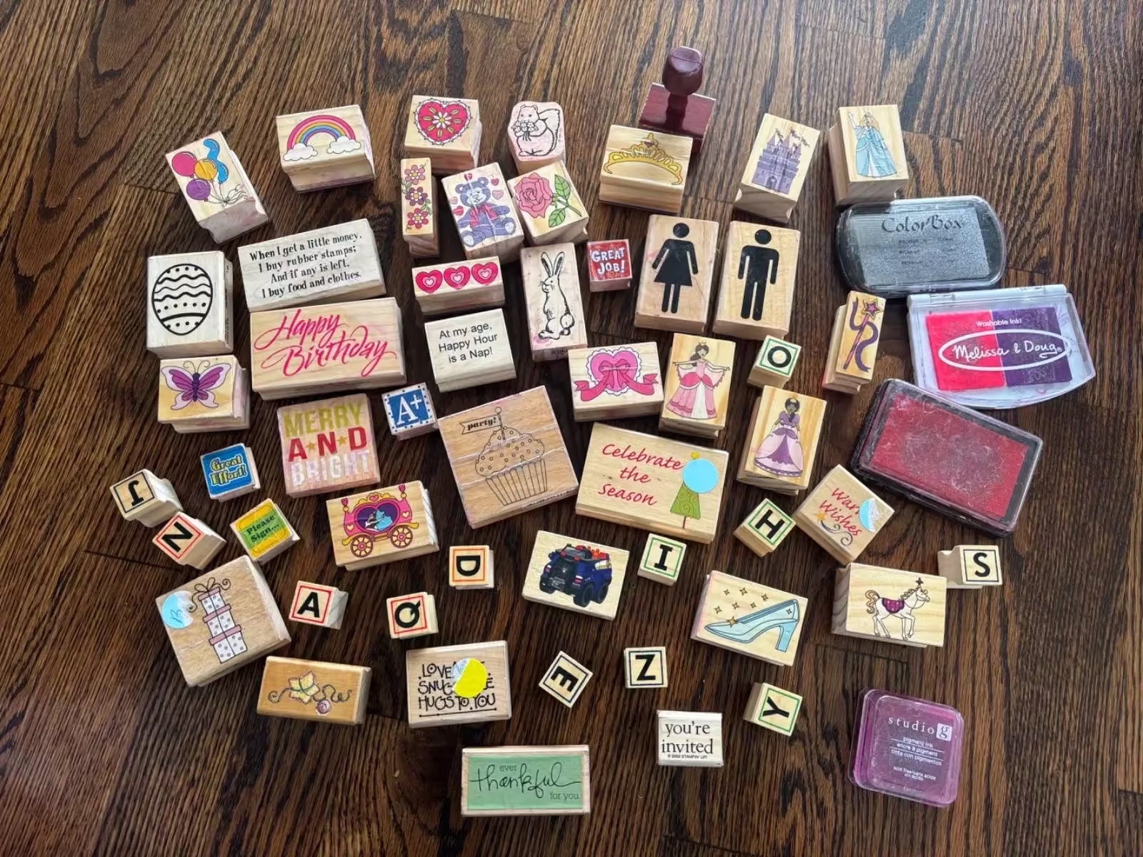
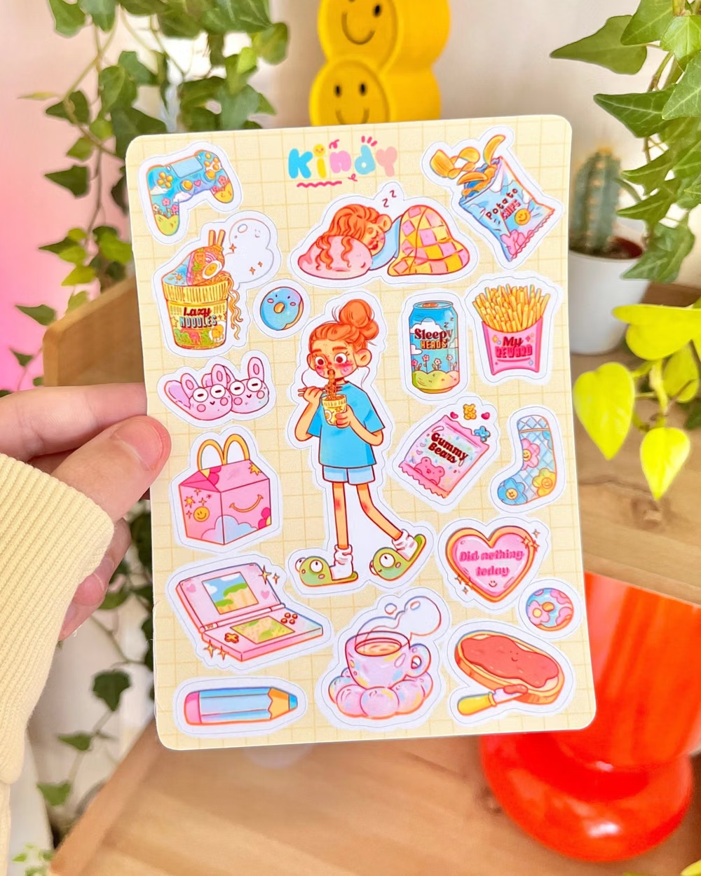
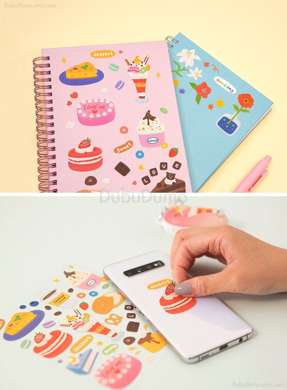
Stickers, tape, stamps, snapshots, doodles, labels, and layered ephemera create a personal assembled look.
Design overview
- Signature elements
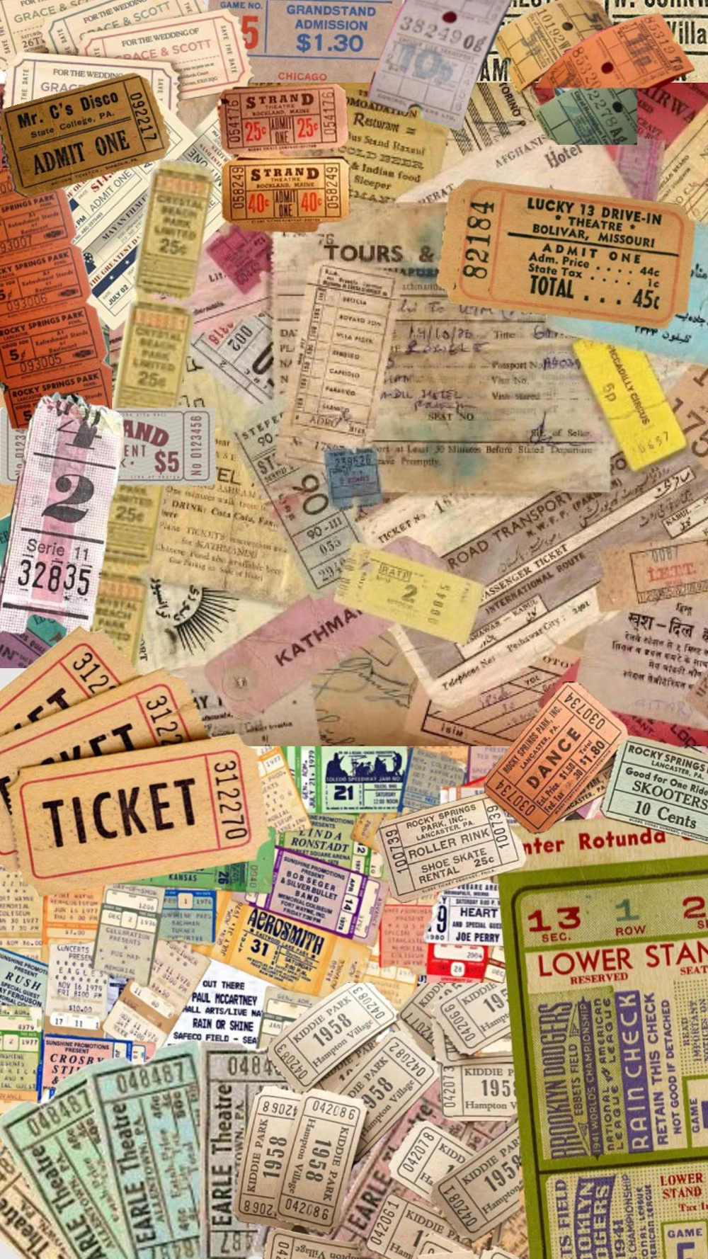
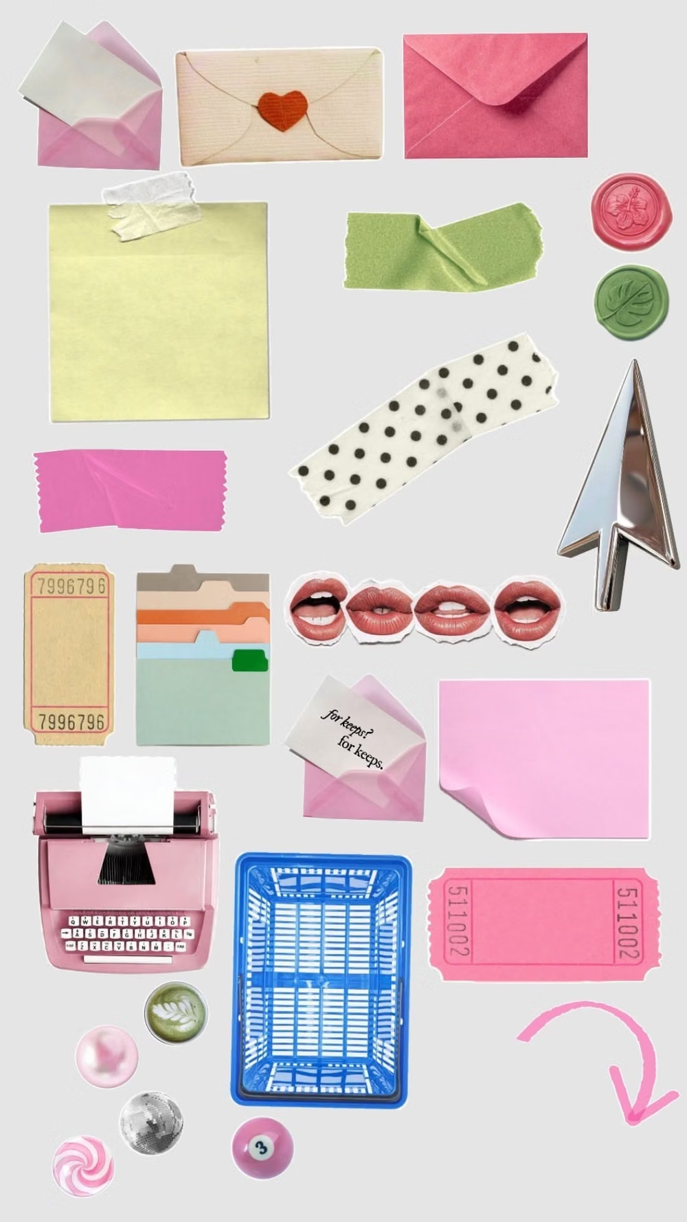
- sticker clusters, masking tape, snapshots, doodles, labels and stamps, layered ephemera. In daisyUI themes, set `--noise: 1;` and `--depth: 1;`.
- Best suited to
- Social products, youth brands, journaling, creator tools, events, and community experiences.
- Layout principles
- Structure pages like journals or pinboards, keep entries chronological or clustered by theme, and place decorative ephemera around rather than across active content.
History and origins
A fact-checked account of where this visual language came from, with links to the references used.
- Period
- 19th-century domestic precedents; digital revival in the 2010s–2020s
- Origin
- Personal albums, fan culture, stationery, and social media
Scrapbooks long predate digital interfaces: 19th-century albums combined clippings, cards, drawings, and personal annotation as assembled records. Sticker UI turns that additive, authored surface into a screen language, shaped more recently by digital journaling, messaging stickers, fandom, and social platforms; it is a contemporary synthesis rather than a single historical school.
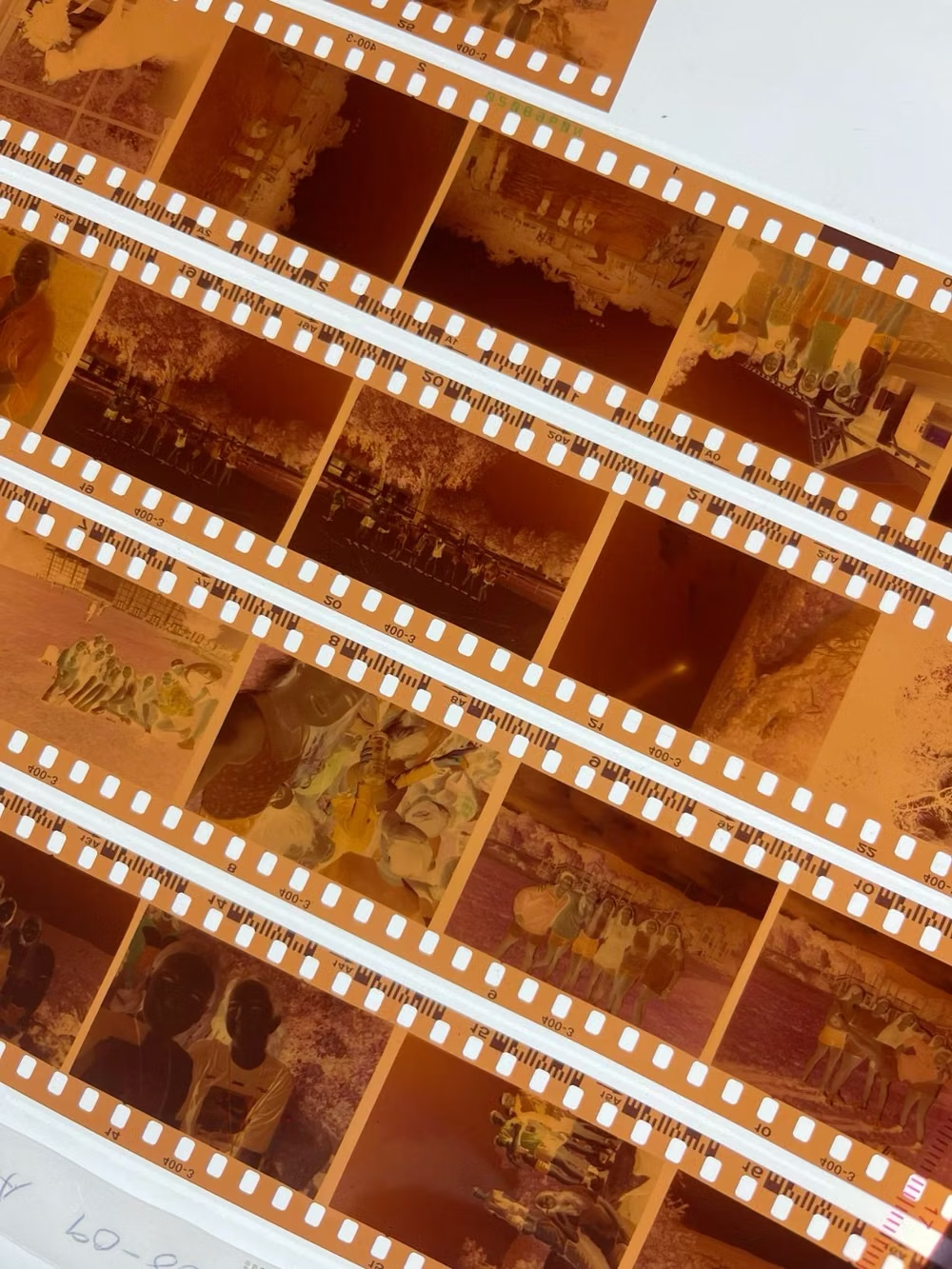
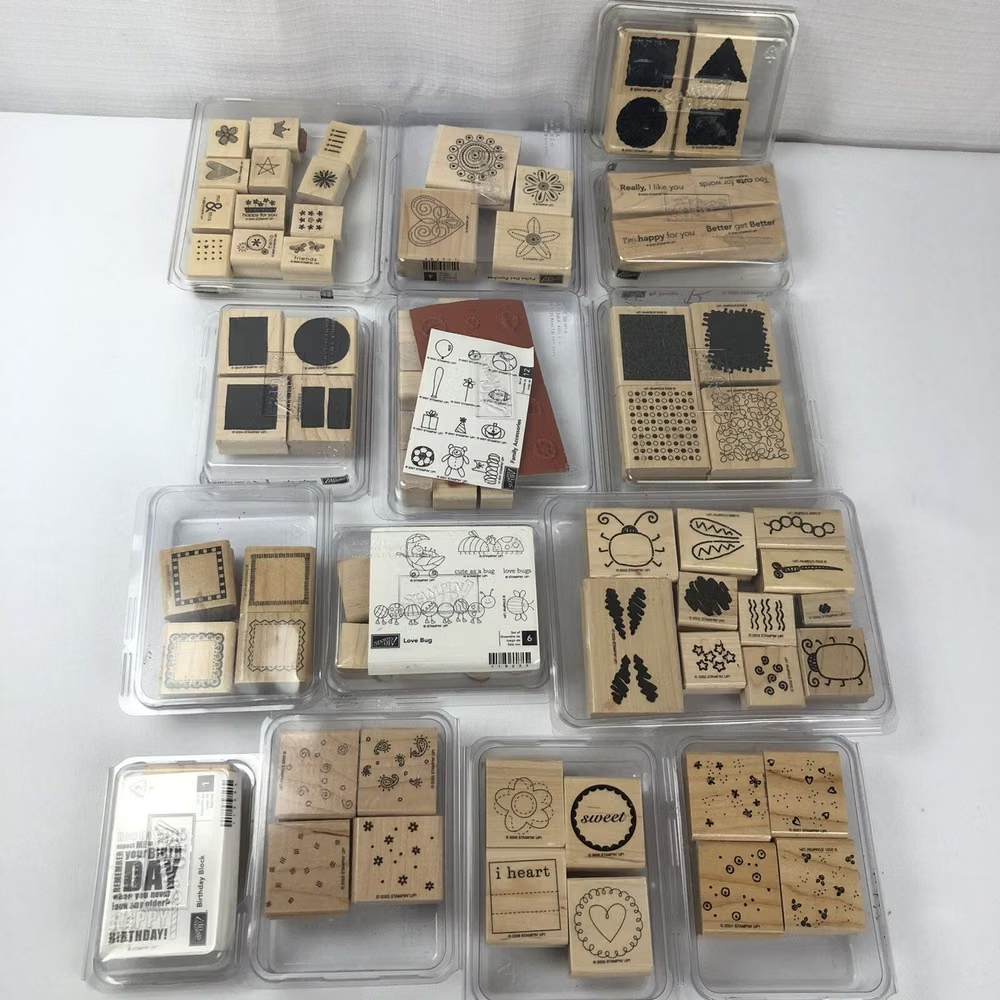
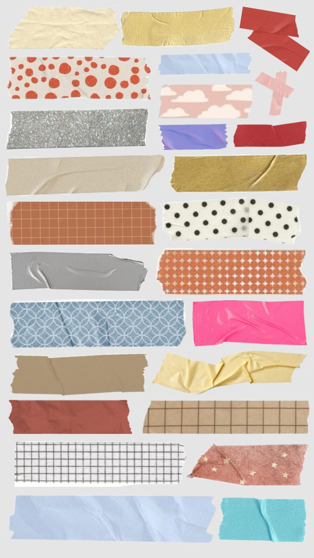
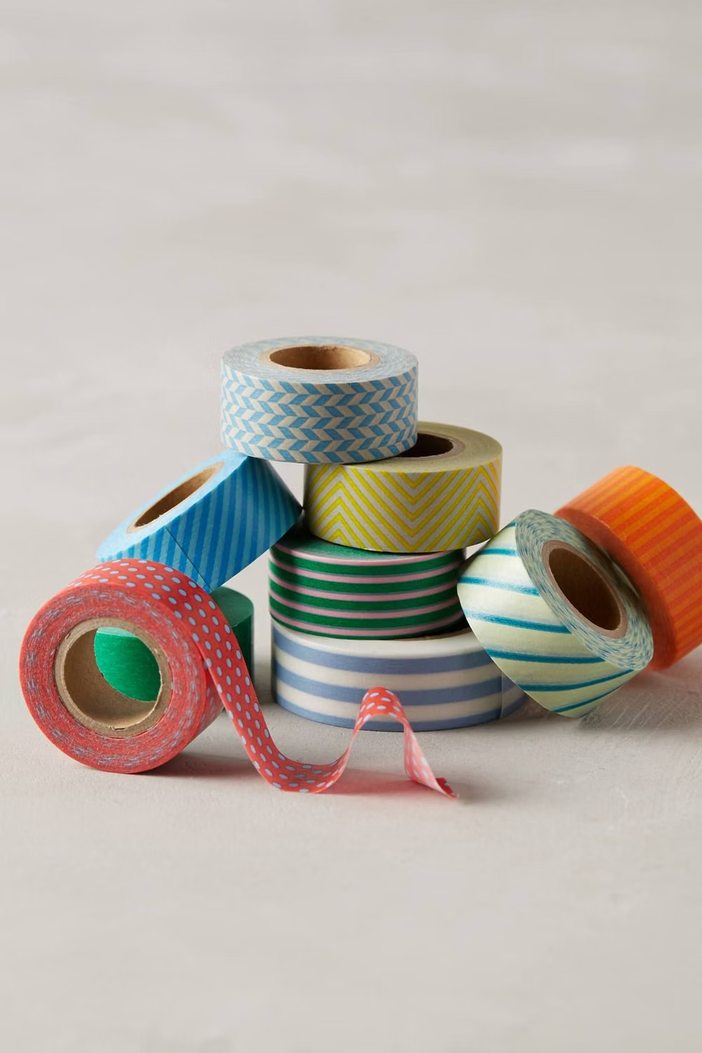
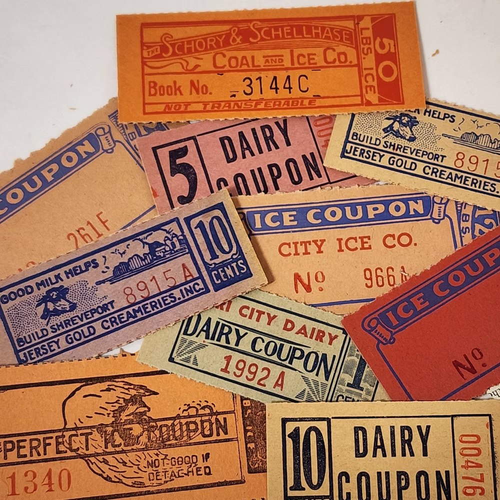
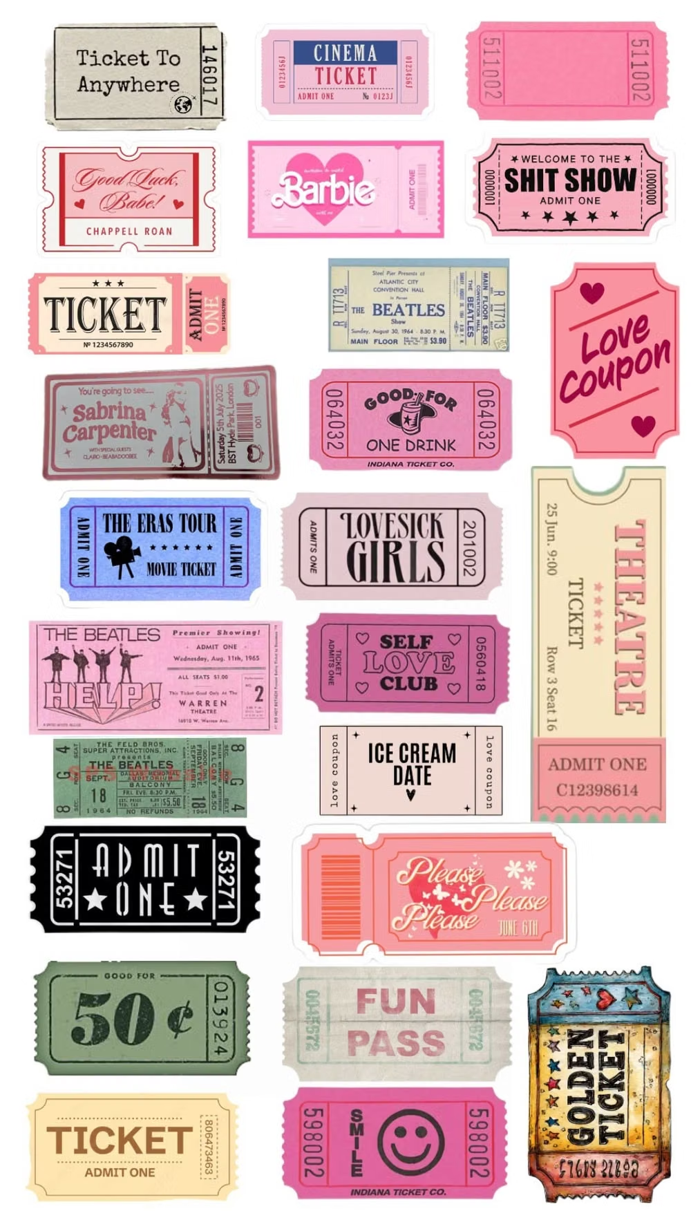
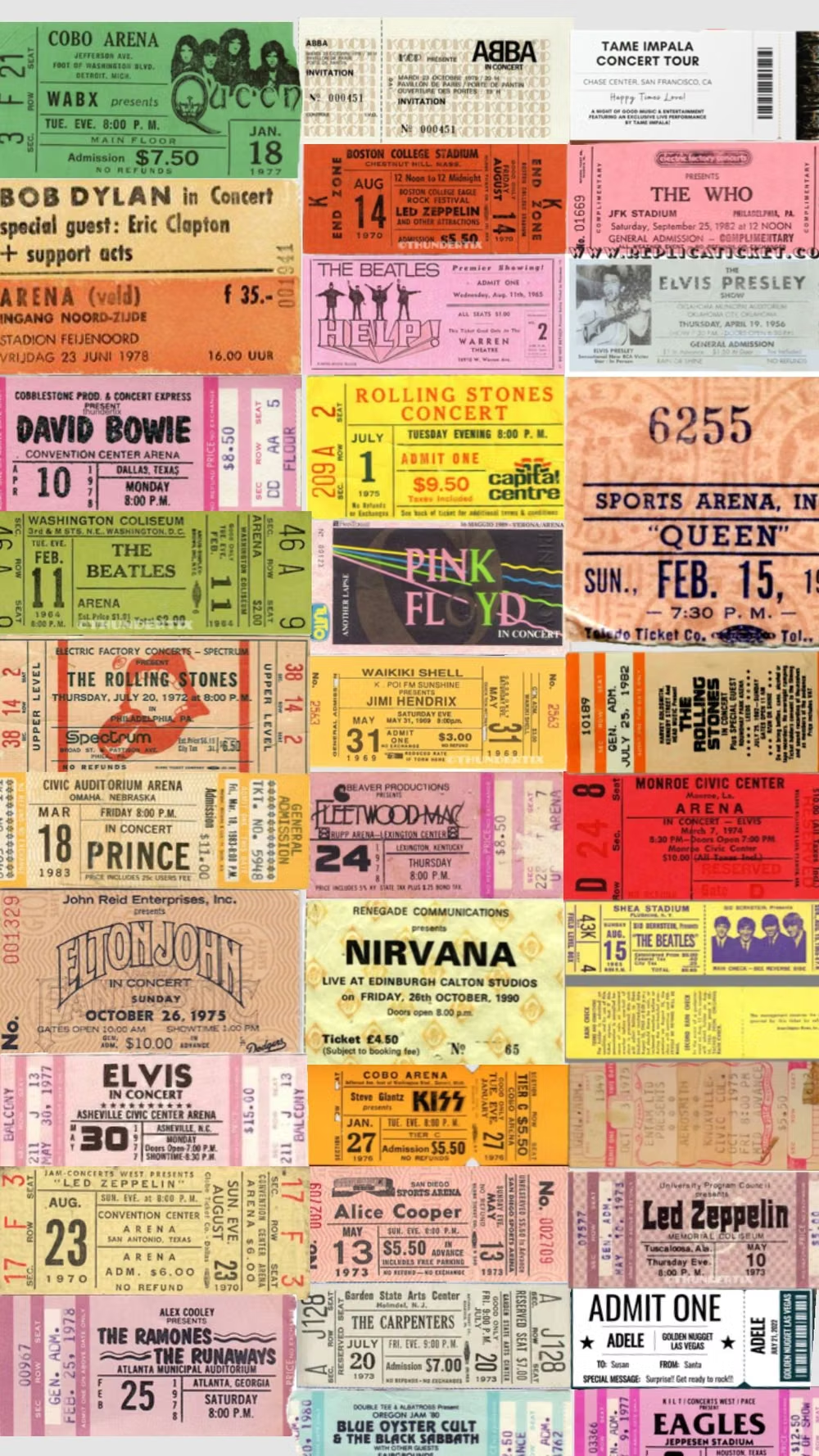
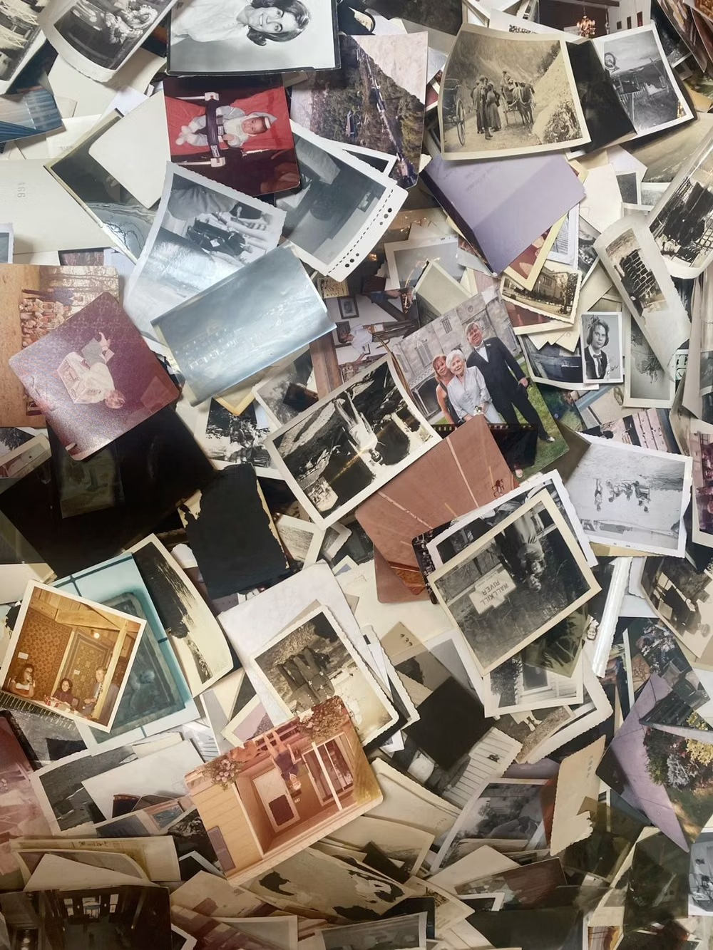
Moodboard and visual references
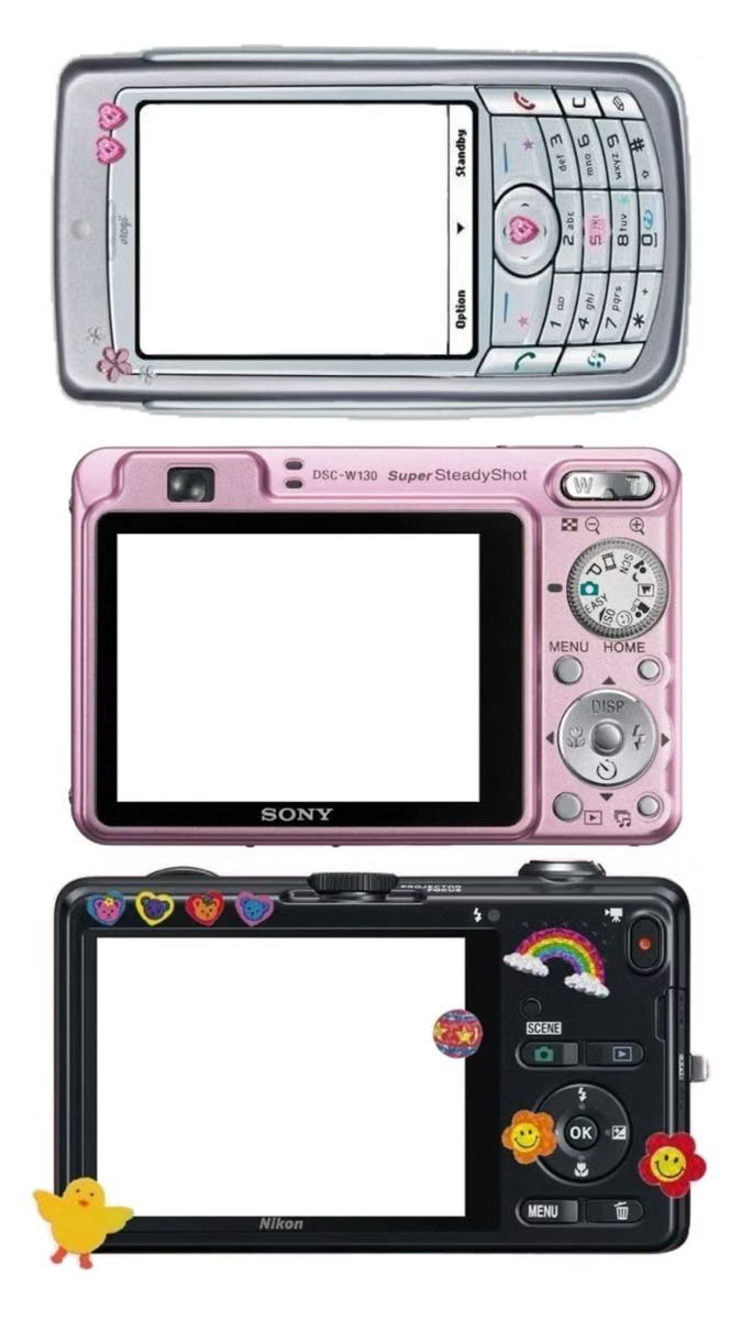
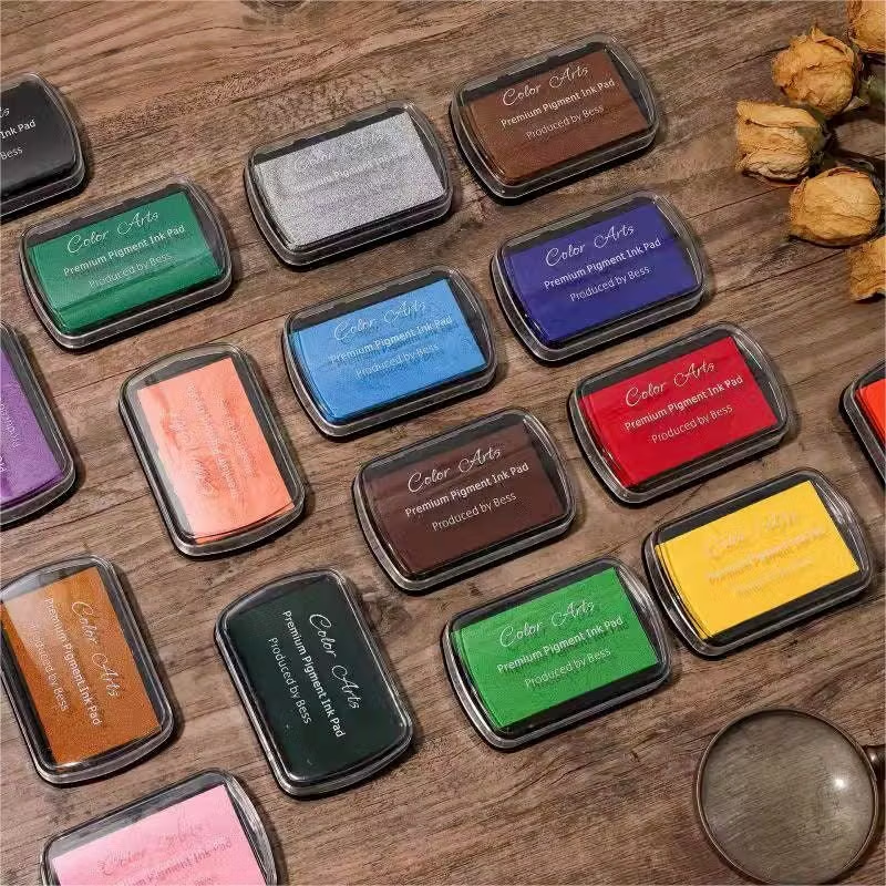
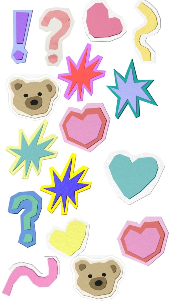
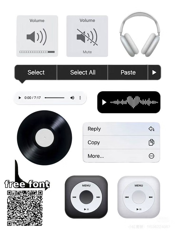
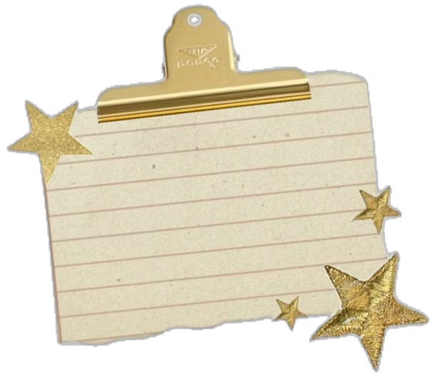
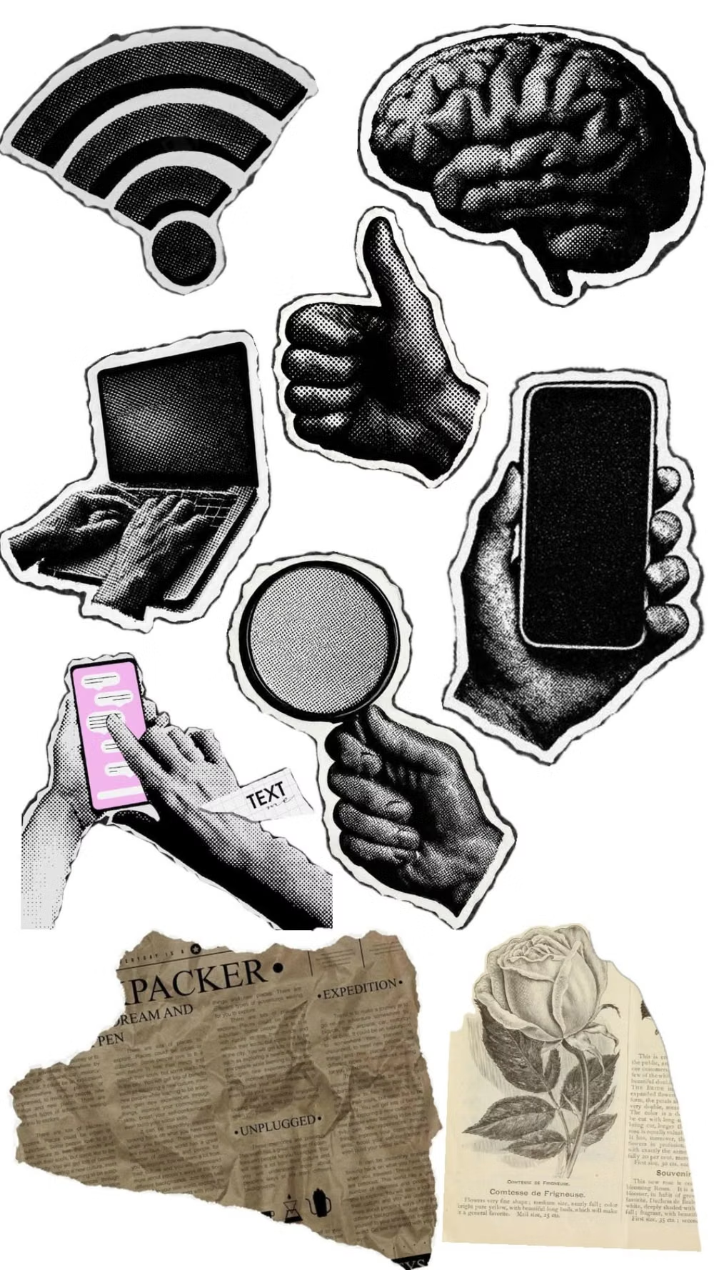
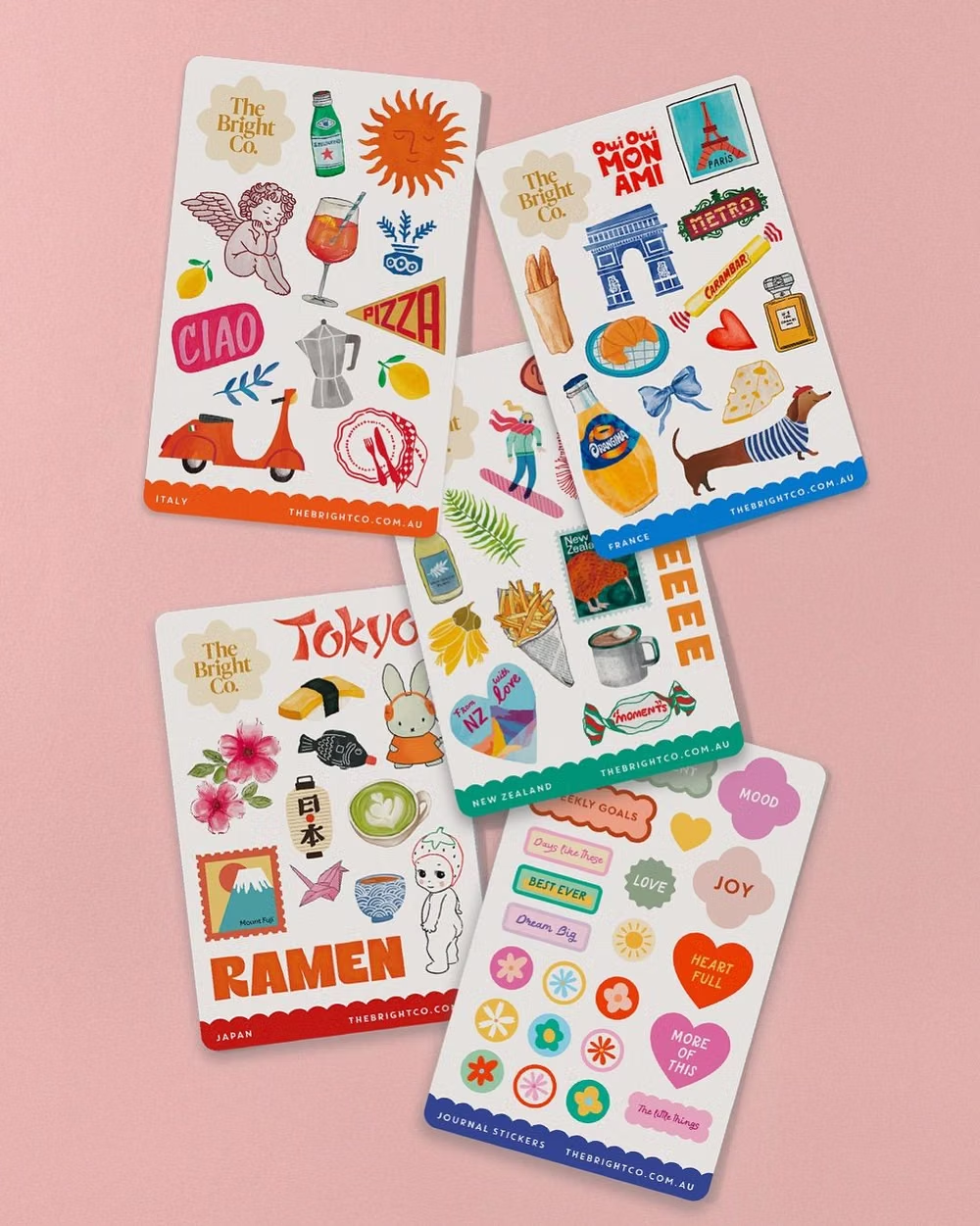
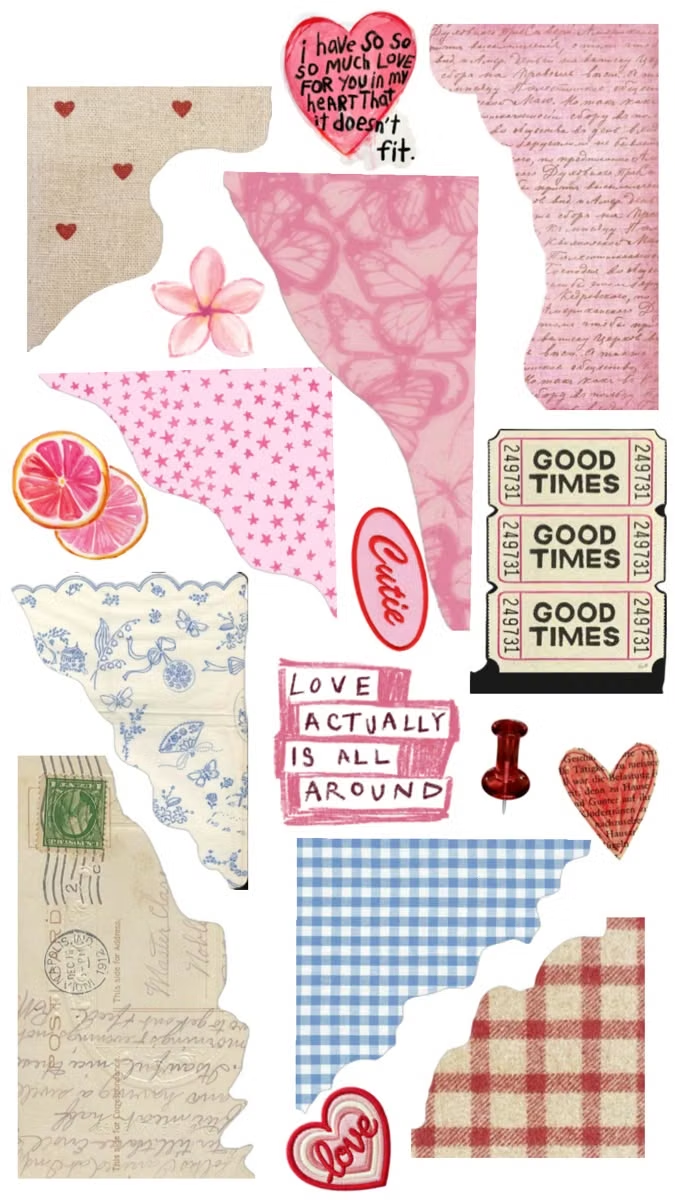
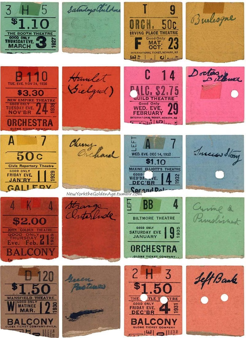
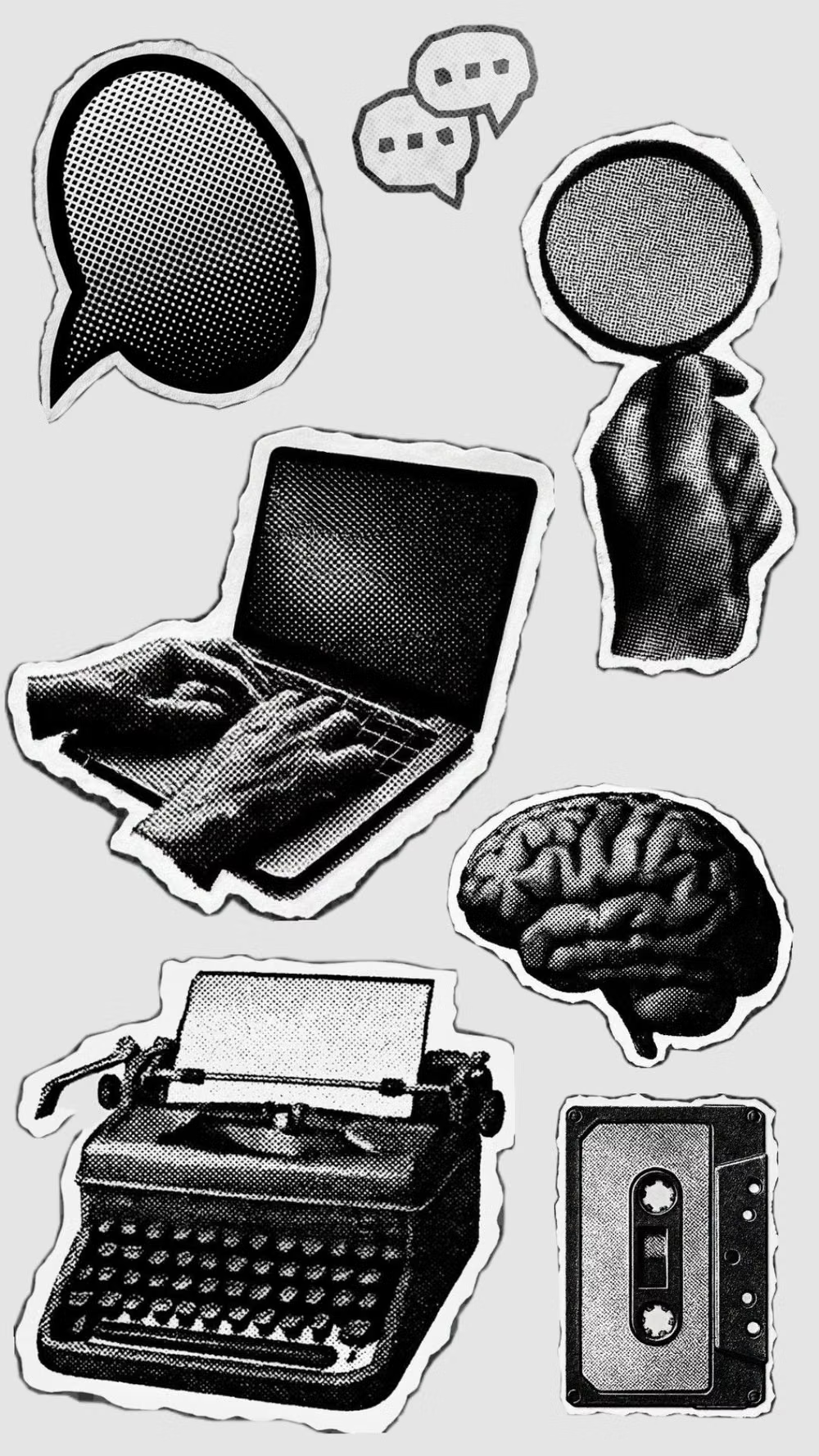
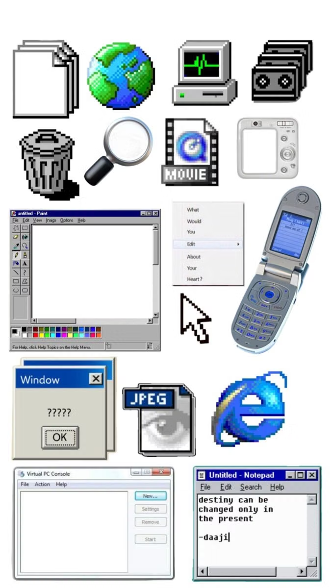
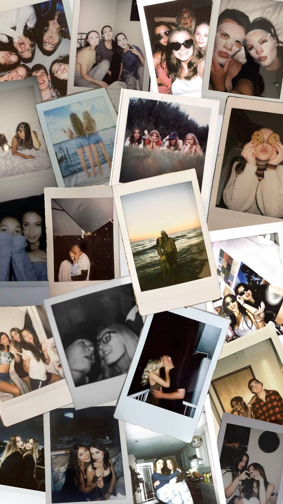
A visual study of the forms, inspirations, materials, colors, type, and cultural references associated with this UI design style.

Design principles and implementation
Use these principles to write a focused AI UI design prompt instead of asking for a vague visual treatment.
Color direction
Begin with warm paper, notebook, or cork neutrals, then add varied sticker colors linked by one recurring ink or tape hue. In a daisyUI theme, use the recurring ink or tape hue for `primary`, one representative sticker color for `secondary`, and set `base-100`, `base-200`, and `base-300` to warm paper, notebook cream, and light cork.
Imagery direction
Use snapshot crops, instant-film frames, doodles, ticket stubs, stamps, tape, and user-generated media with believable scale and layering.
Content density
Use medium to high personal detail, but separate entries with page margins and keep each handwritten callout short.
Motion direction
Peel stickers, press stamps, slide snapshots under tape, and draw doodles in brief tactile sequences triggered by user actions.
Shape language
Use die-cut sticker outlines, scallops, torn notes, tape strips, label makers, and imperfect snapshot rectangles. In daisyUI themes, set the `--radius-*` variables between `0.75rem` and `1.5rem`.
Typography rules
Reserve handwriting for annotations and names, set longer content in a readable sans-serif or serif, and vary rotation without harming scan order.
Suggested Typfaces
Schoolbell
Fresh daisies glow in warm sunlight
Fresh daisies glow in warm sunlight
1 2 3 4 5 6 7 8 9 0
Patrick Hand
Fresh daisies glow in warm sunlight
Fresh daisies glow in warm sunlight
1 2 3 4 5 6 7 8 9 0
Special Elite
Fresh daisies glow in warm sunlight
Fresh daisies glow in warm sunlight
1 2 3 4 5 6 7 8 9 0
Caveat
Fresh daisies glow in warm sunlight
Fresh daisies glow in warm sunlight
1 2 3 4 5 6 7 8 9 0
Gochi Hand
Fresh daisies glow in warm sunlight
Fresh daisies glow in warm sunlight
1 2 3 4 5 6 7 8 9 0
Build a Scrapbook / Sticker UI interface with daisyUI
The live example translates this direction into daisyUI components and semantic theme tokens.
To generate a full page in the same visual language, give the style name and the design rules above to Blueprint MCP.
Related UI design styles
Compare nearby visual languages that share typography, shapes, use cases, or signature elements.
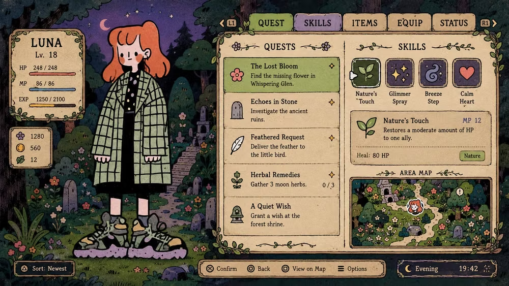
Hand-Drawn UI design style
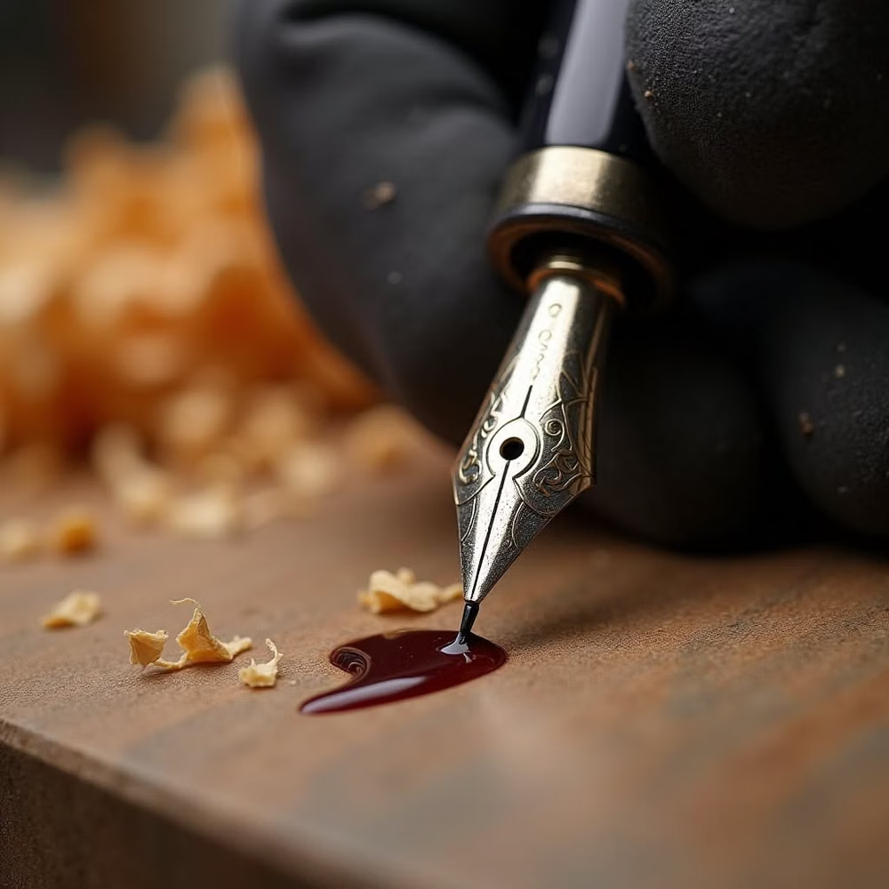
Imperfect lines, sketchy icons, paper textures, handwritten type, and playful annotations emphasize human craft.
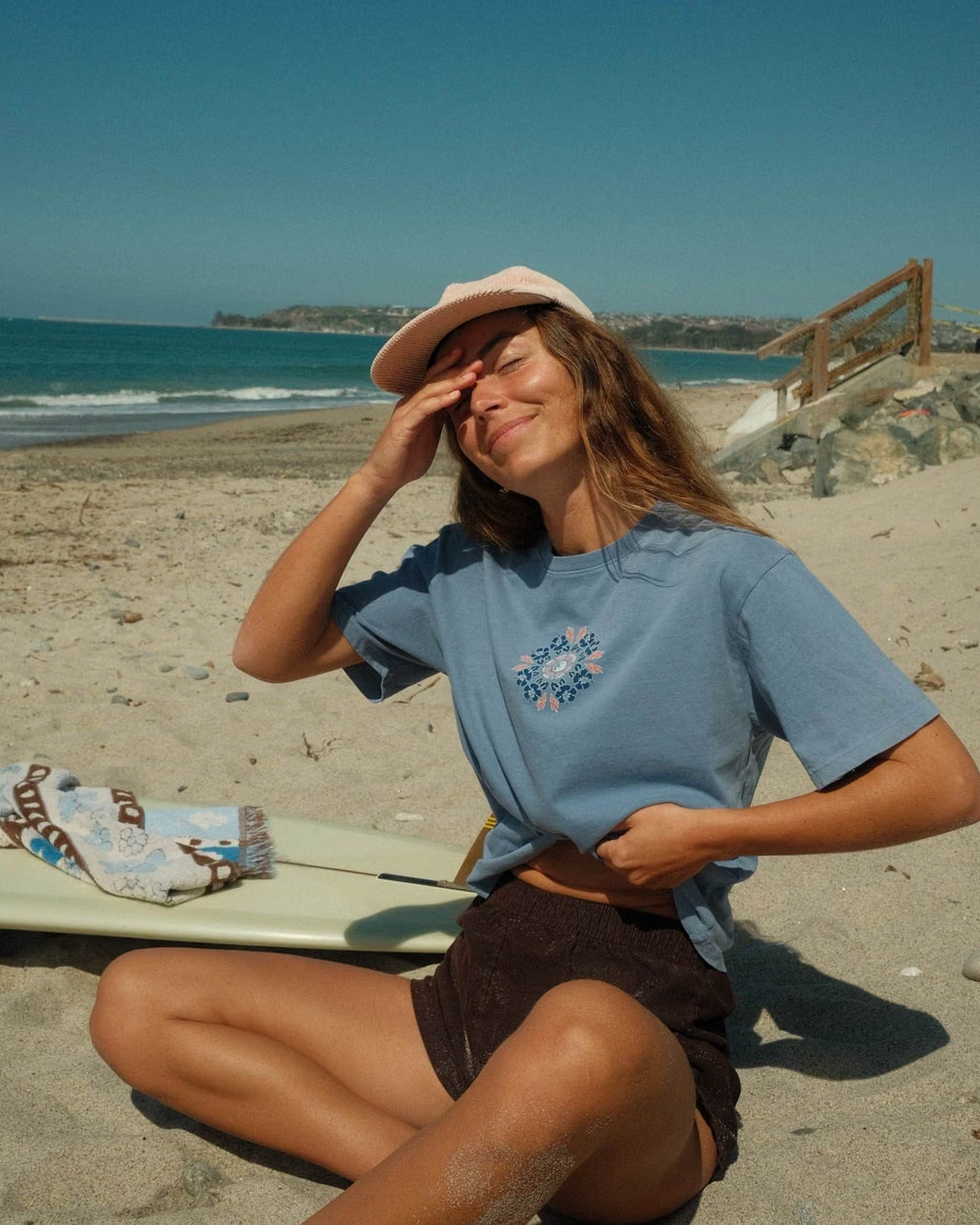
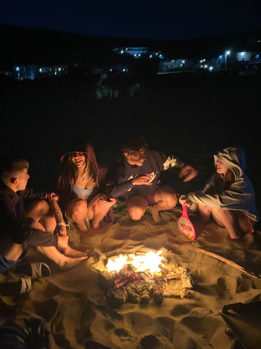

Surf Crush UI design style
The 1999–2008 surf-media craze combines sunlit ocean photography, boards, Hawaiian prints, puka shells, hibiscus flowers, beach hair, and youthful coastal freedom.
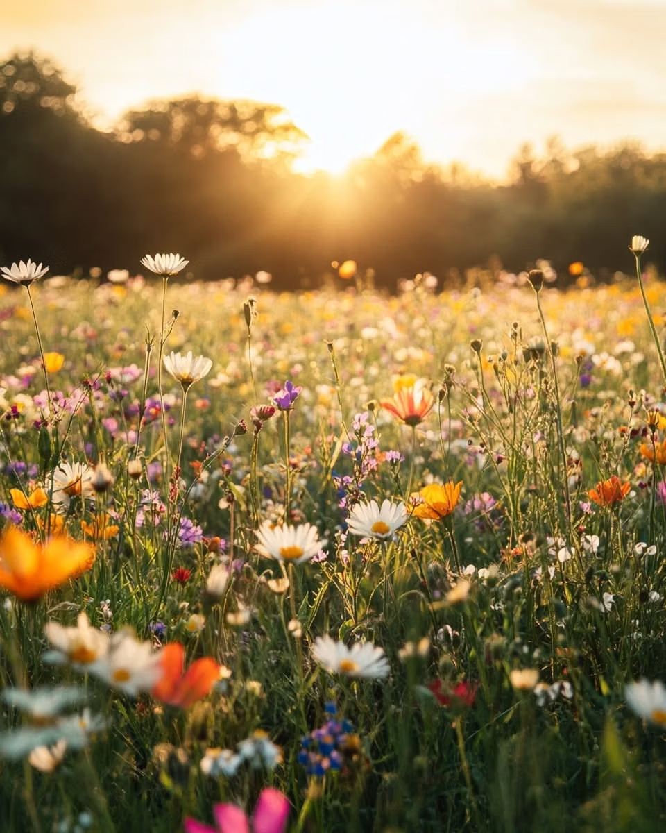
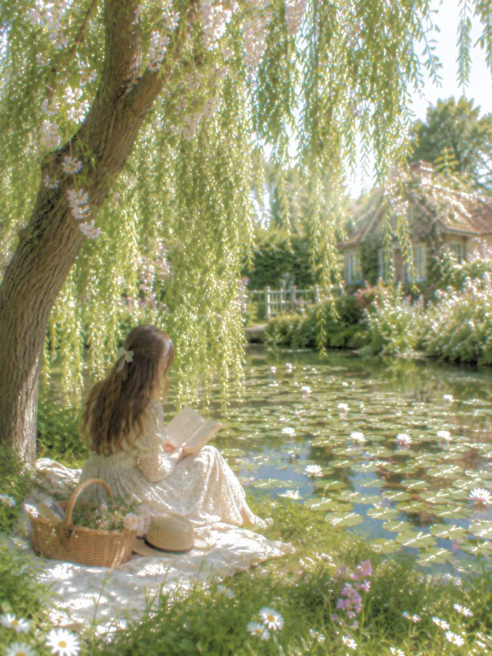
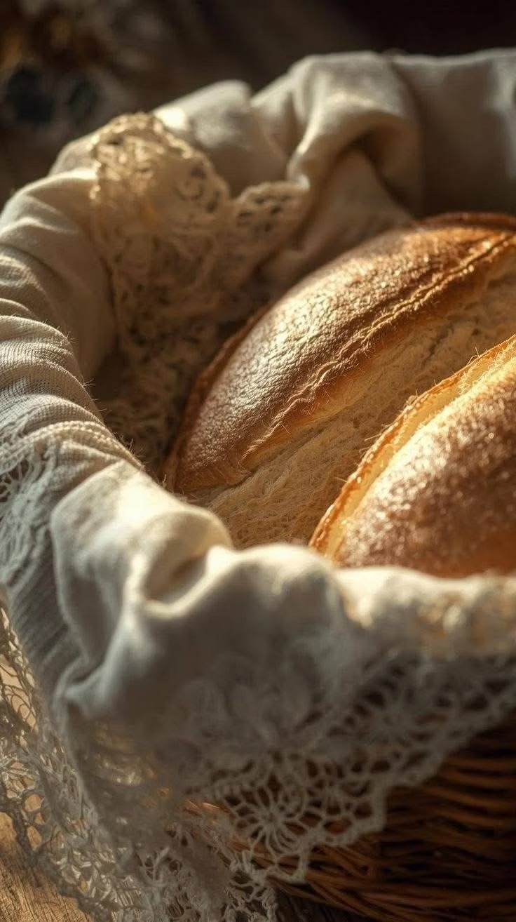
Cottagecore UI design style
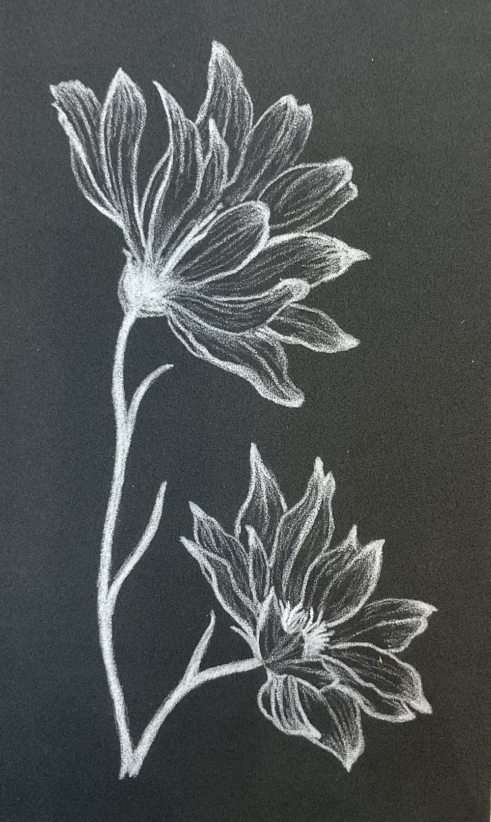
Pastoral imagery, florals, handmade textures, gentle serif type, warm domestic details, and romantic rural nostalgia.