Collage UI design style
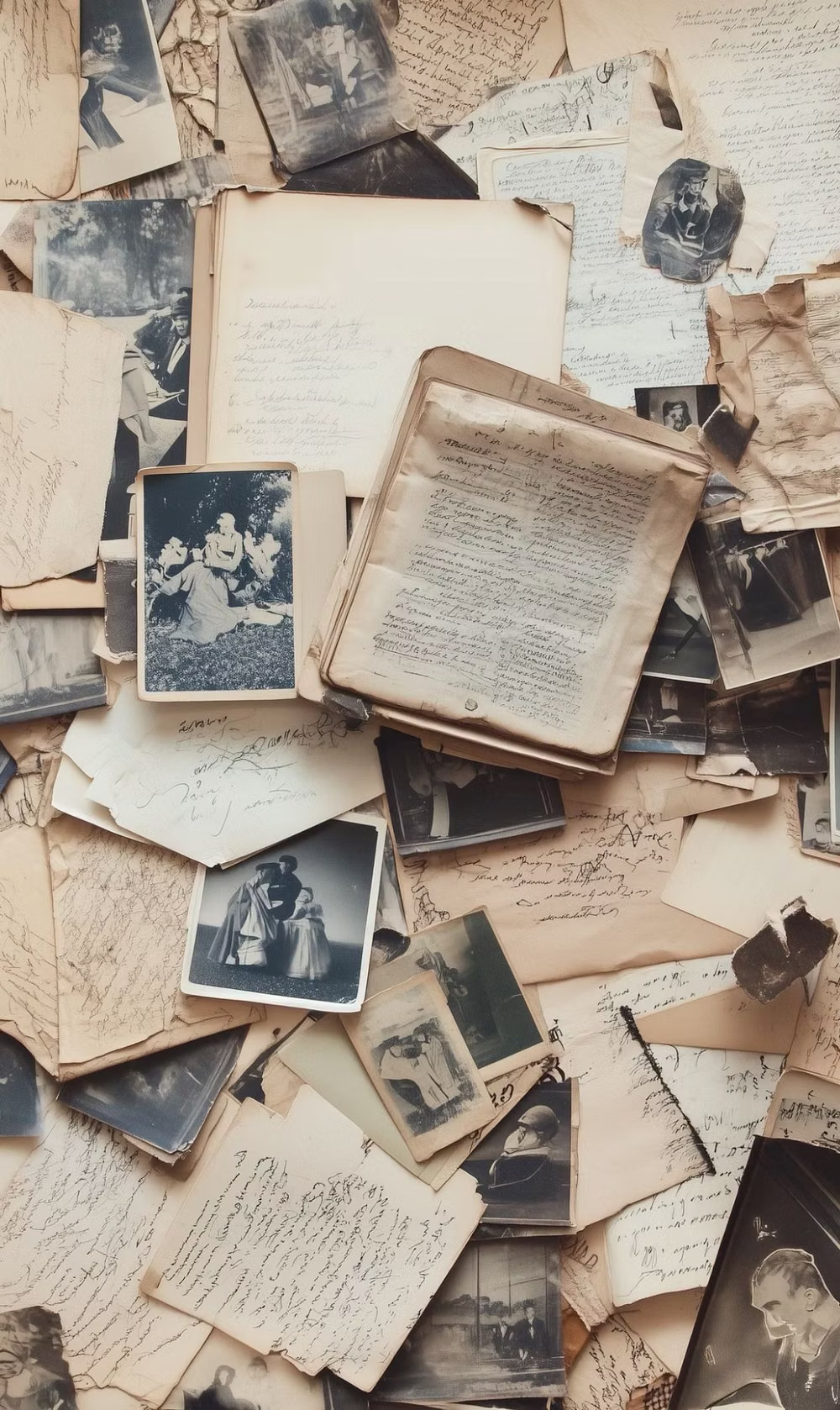
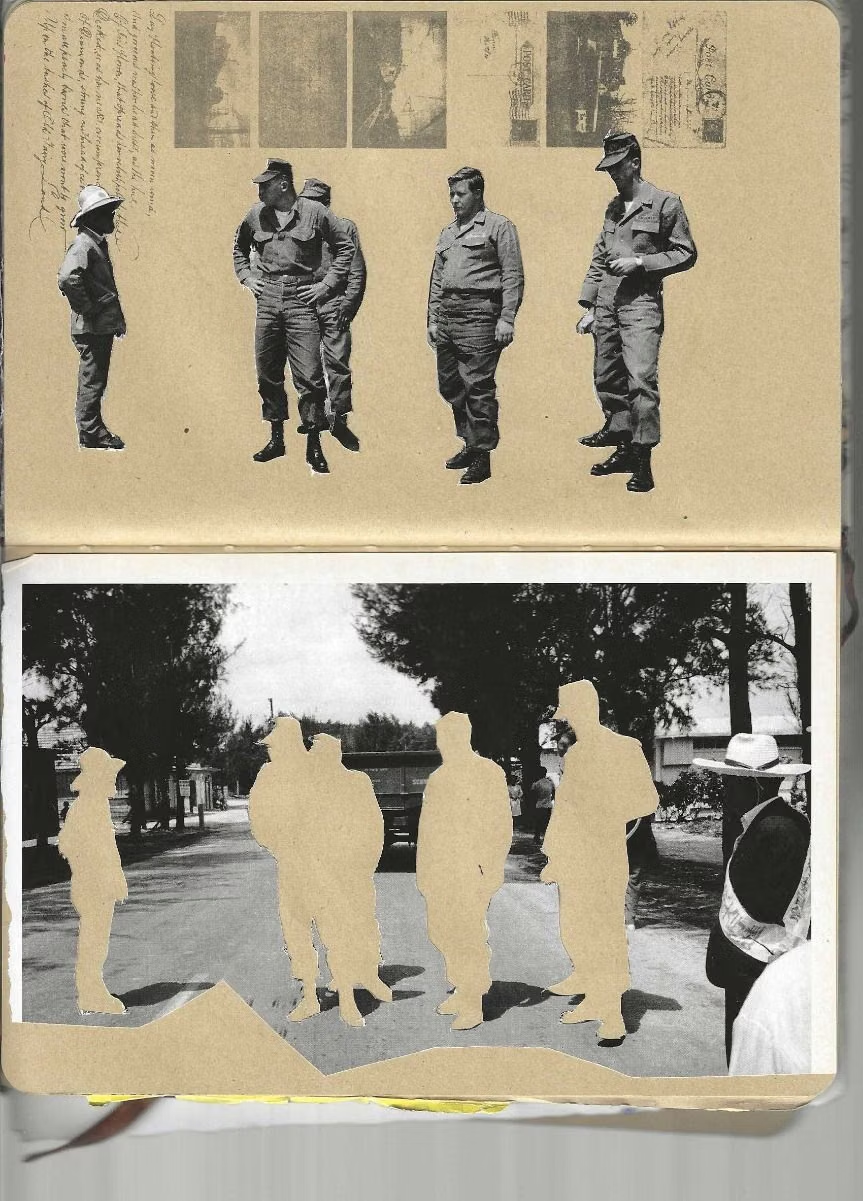
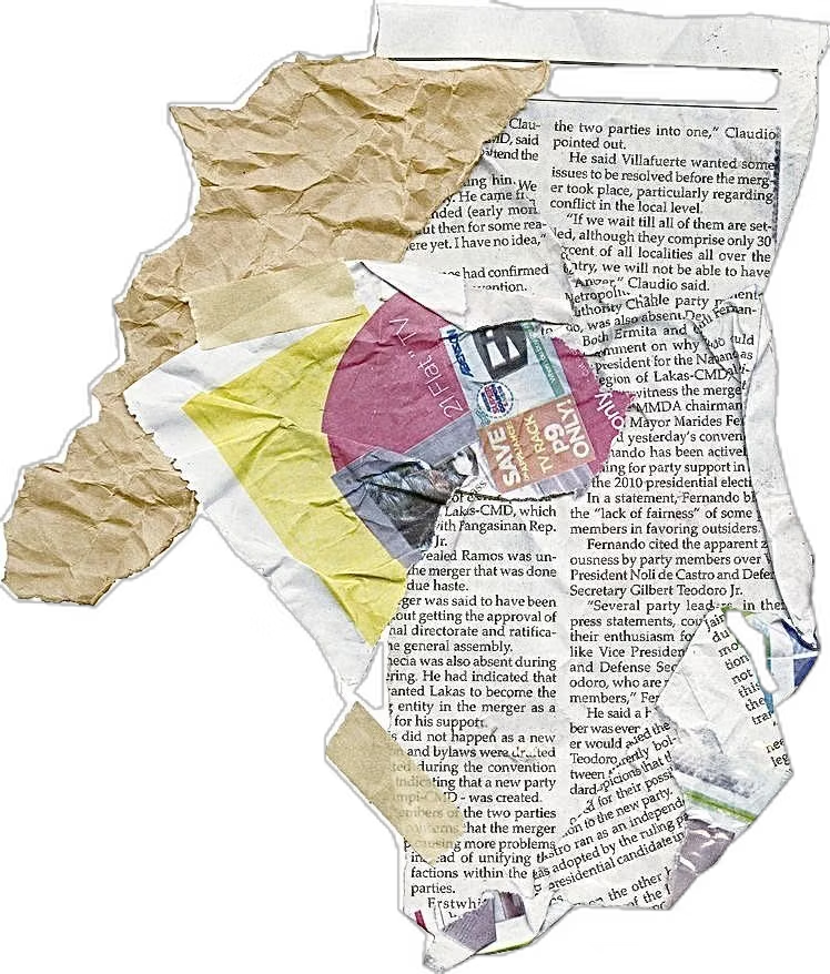
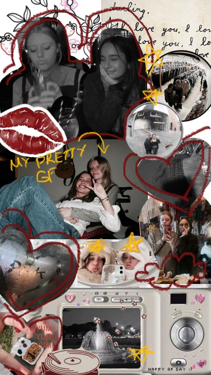
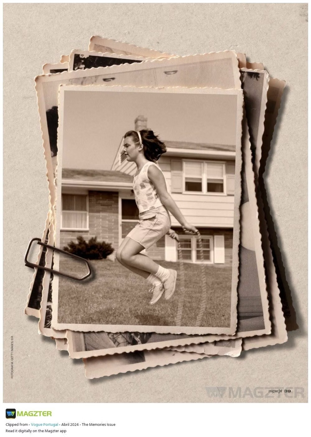
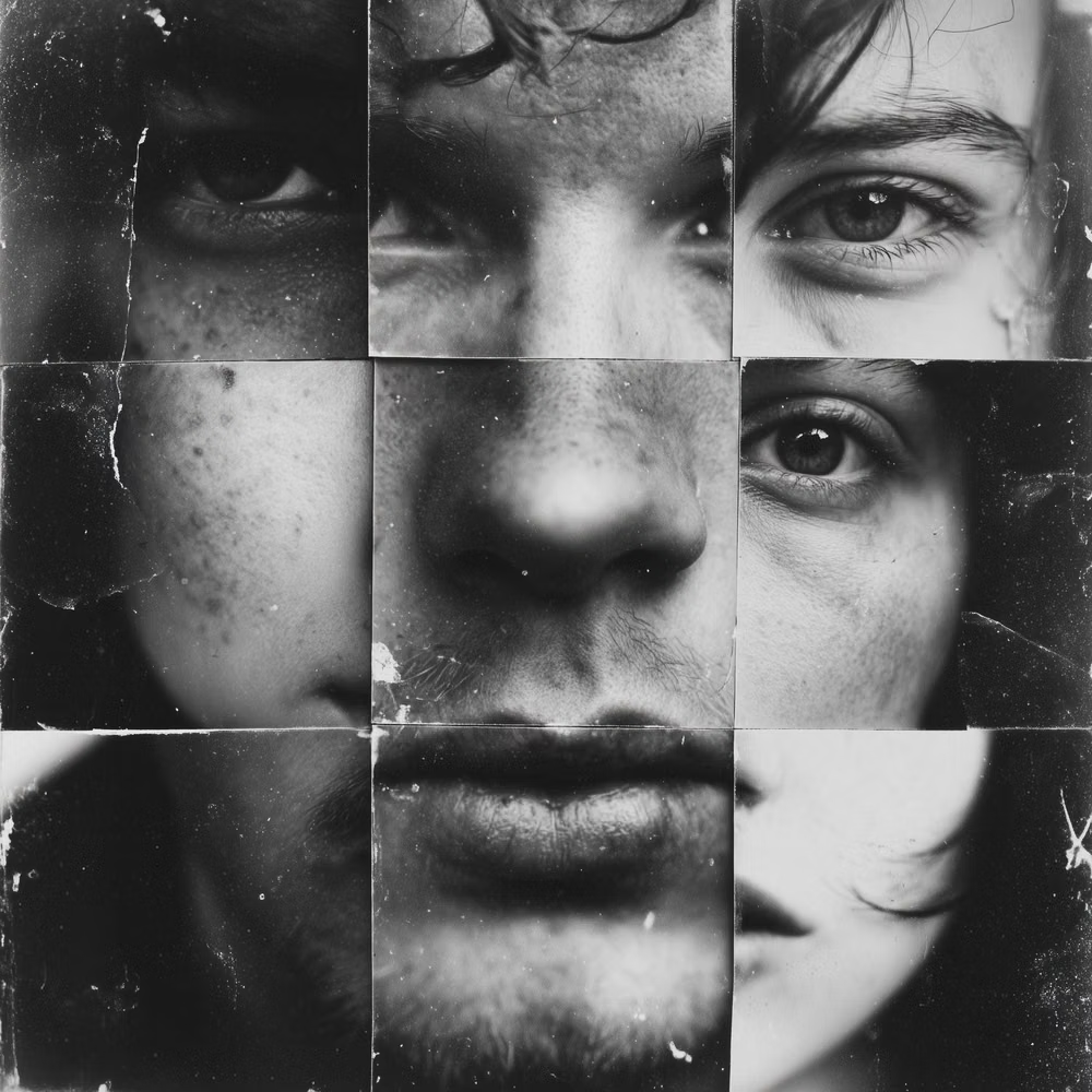
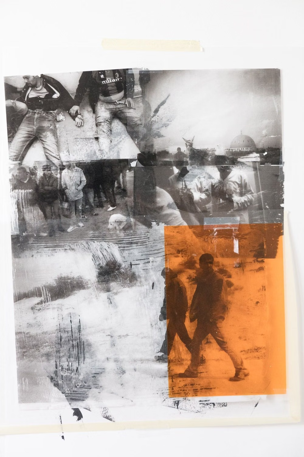
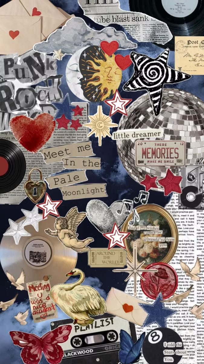
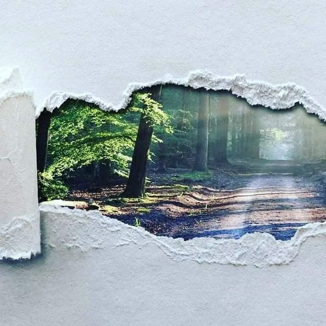
Cutout photography, overlapping fragments, mixed scales, torn edges, and layered media create expressive compositions.
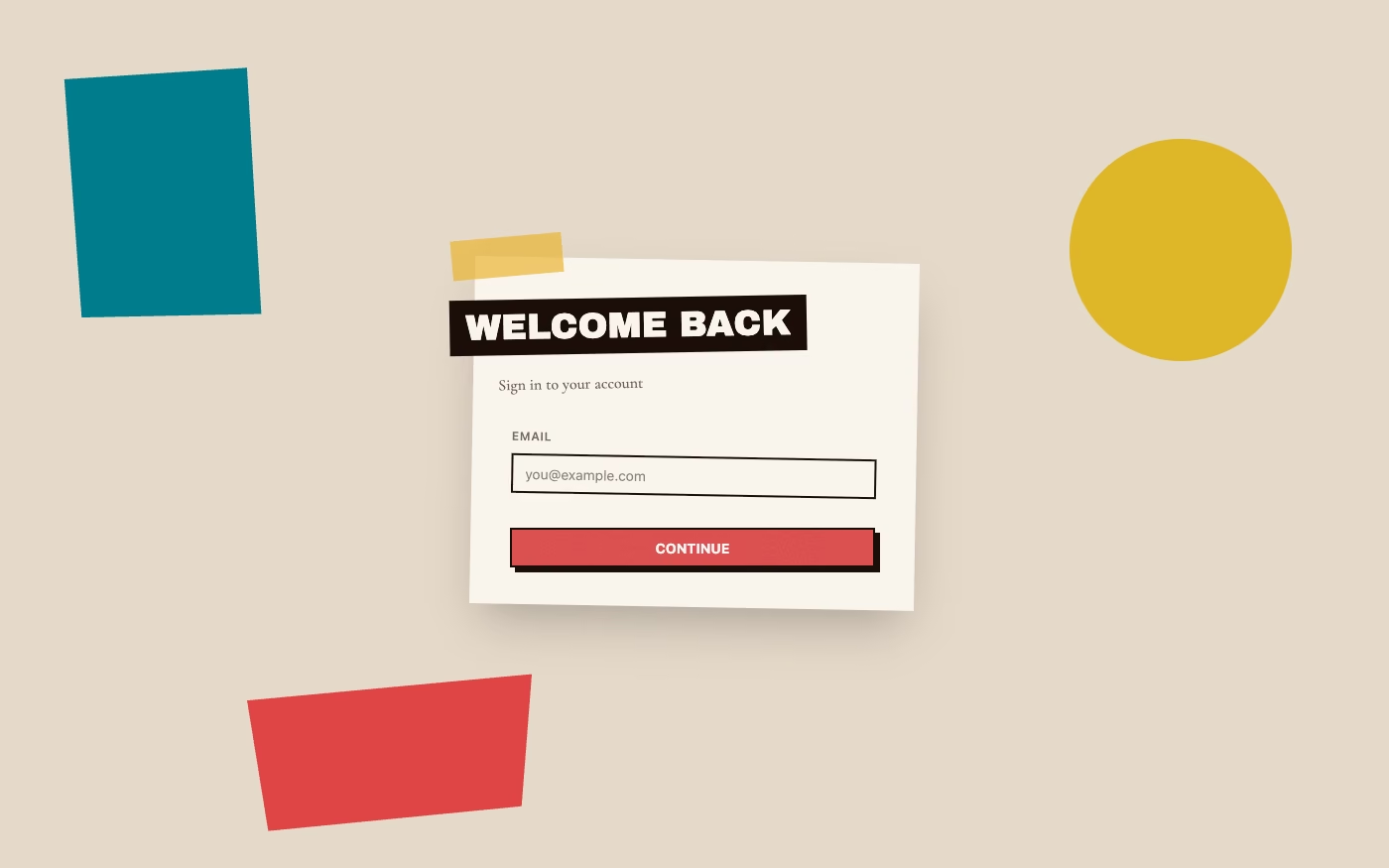
Design overview
- Signature elements
- cutout photography, torn edges, overlapping fragments, mixed media, scale contrast, pasted textures. In daisyUI themes, set `--noise: 1;` and `--depth: 1;`.
- Best suited to
- Editorial, music, fashion, culture, portfolios, and campaign storytelling.
- Layout principles
- Layer fragments around a clear focal cutout, vary scale aggressively, and preserve stable reading anchors beneath deliberate overlaps and off-grid placement.
History and origins
A fact-checked account of where this visual language came from, with links to the references used.
- Period
- Named as a modern-art method around 1912
- Origin
- Paris, in Cubist work by Pablo Picasso and Georges Braque
Collage became a named modern-art practice when Picasso and Braque began attaching paper and other found material to Cubist compositions around 1912. Dada, Surrealism, punk, editorial design, and digital image tools repeatedly extended the technique, so today’s UI collage mixes photography, scans, cut edges, and type within a lineage of deliberate recombination.
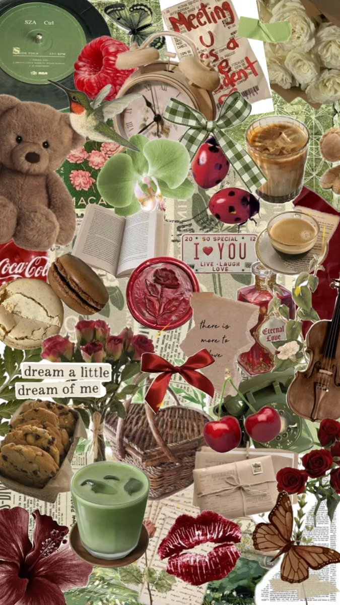
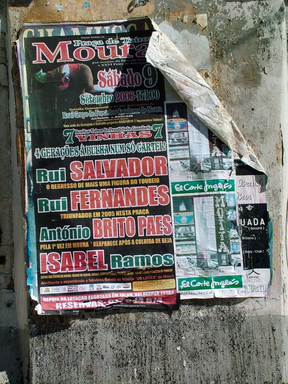
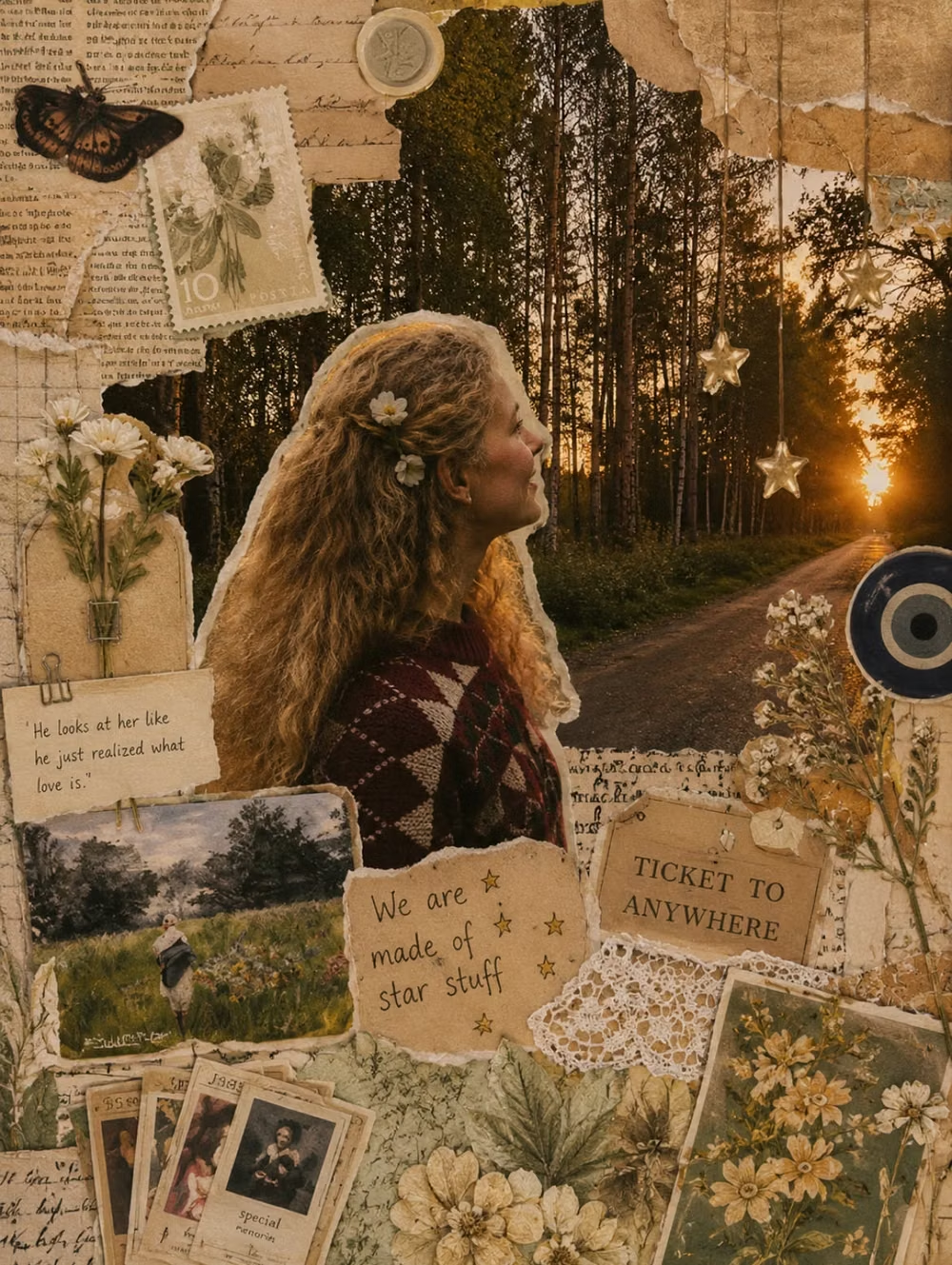
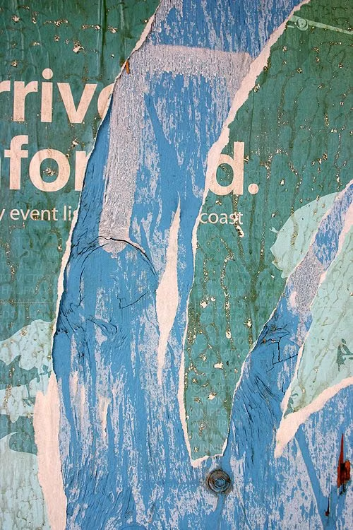
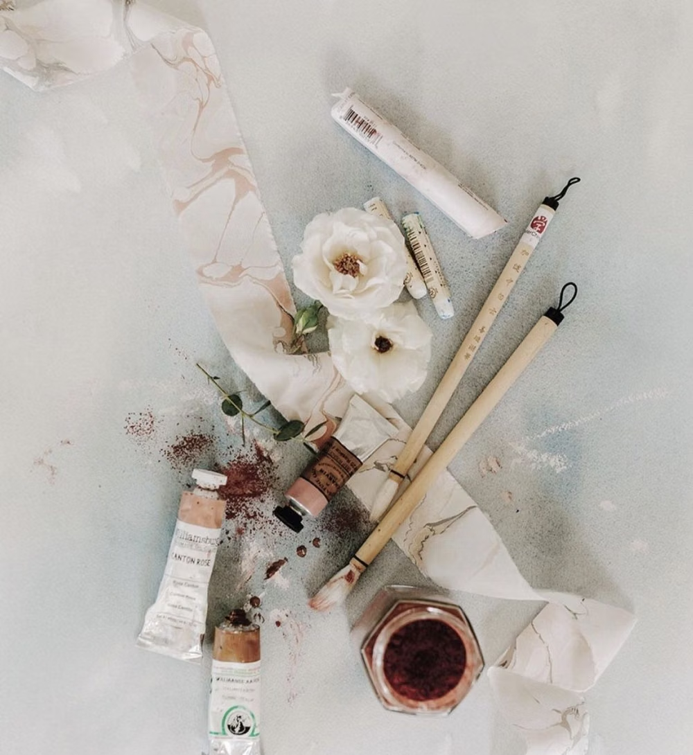
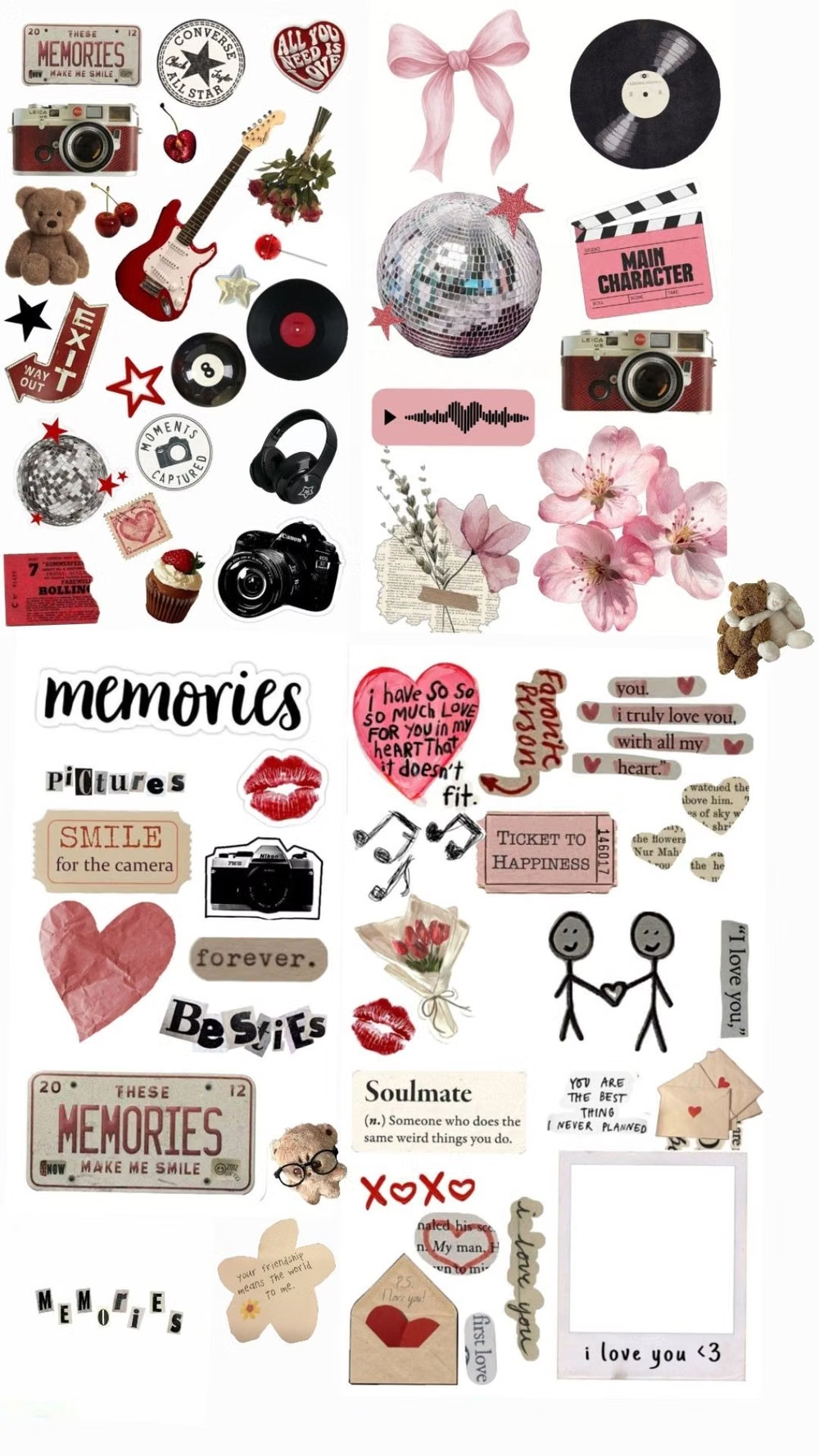
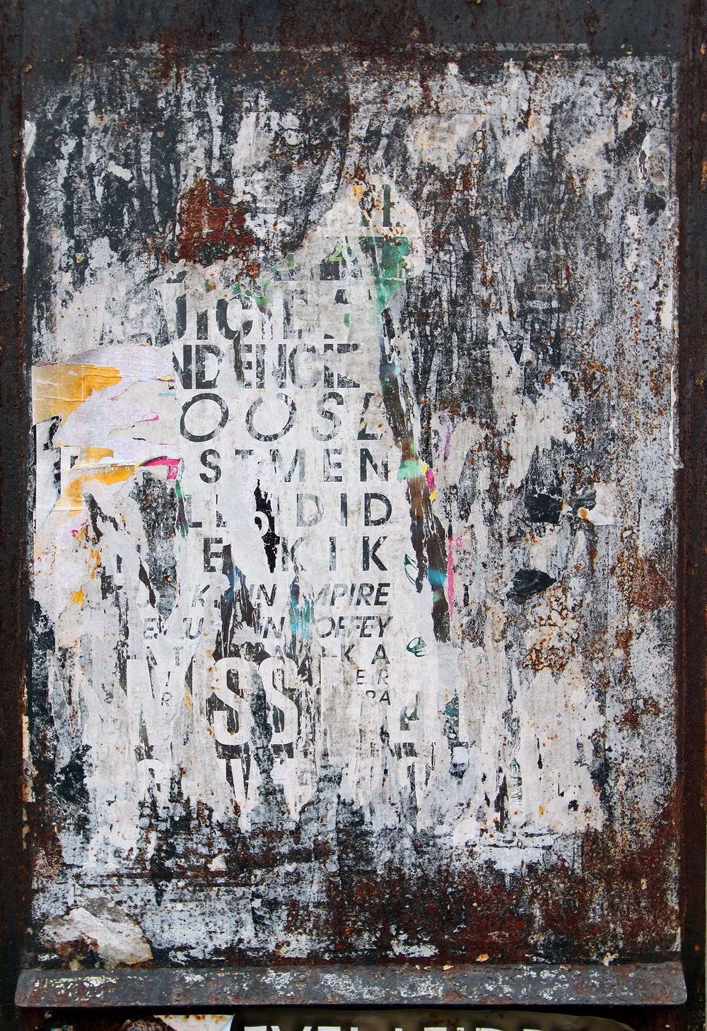
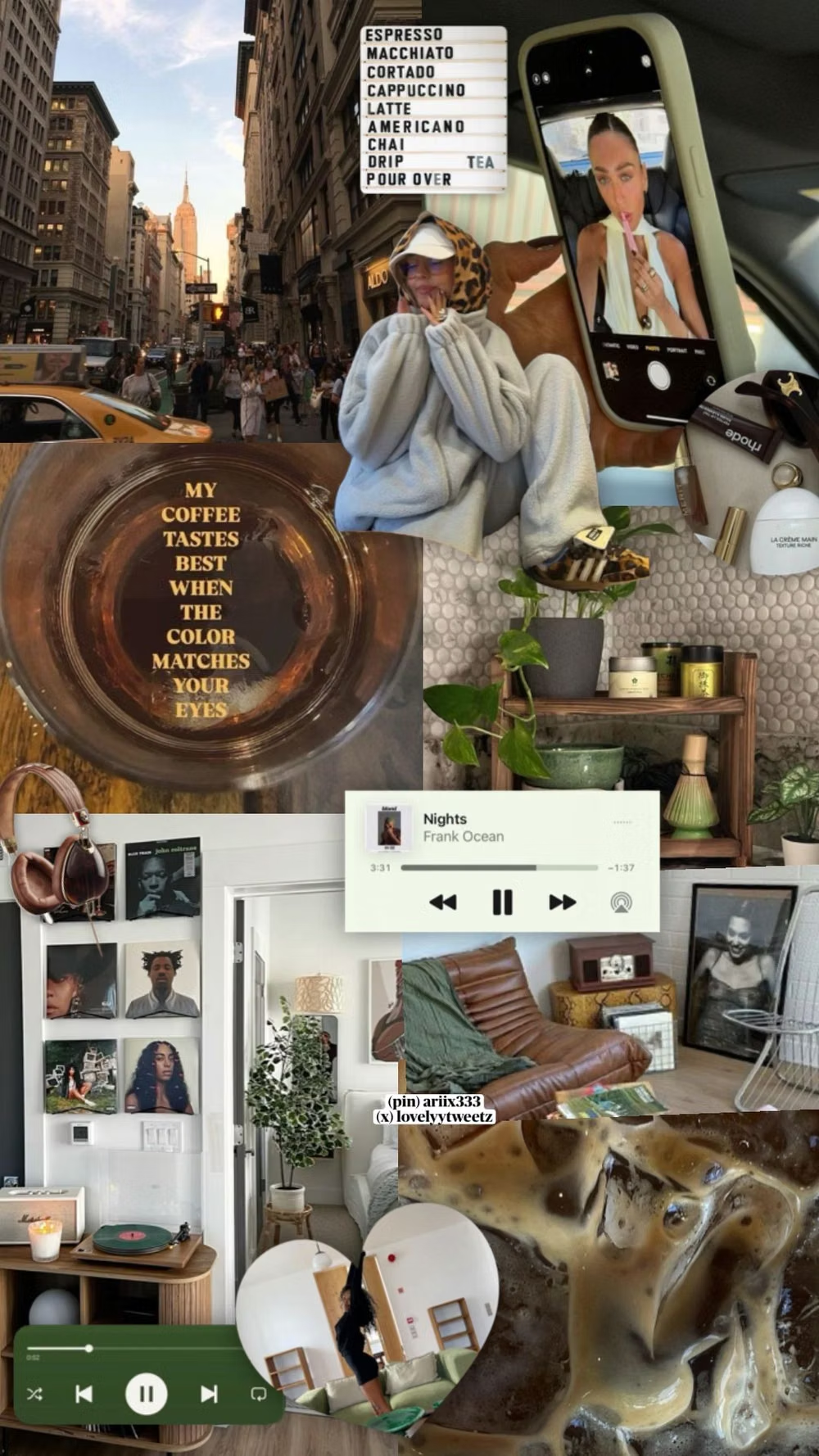
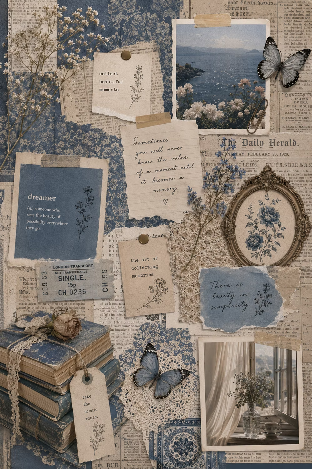
Moodboard and visual references
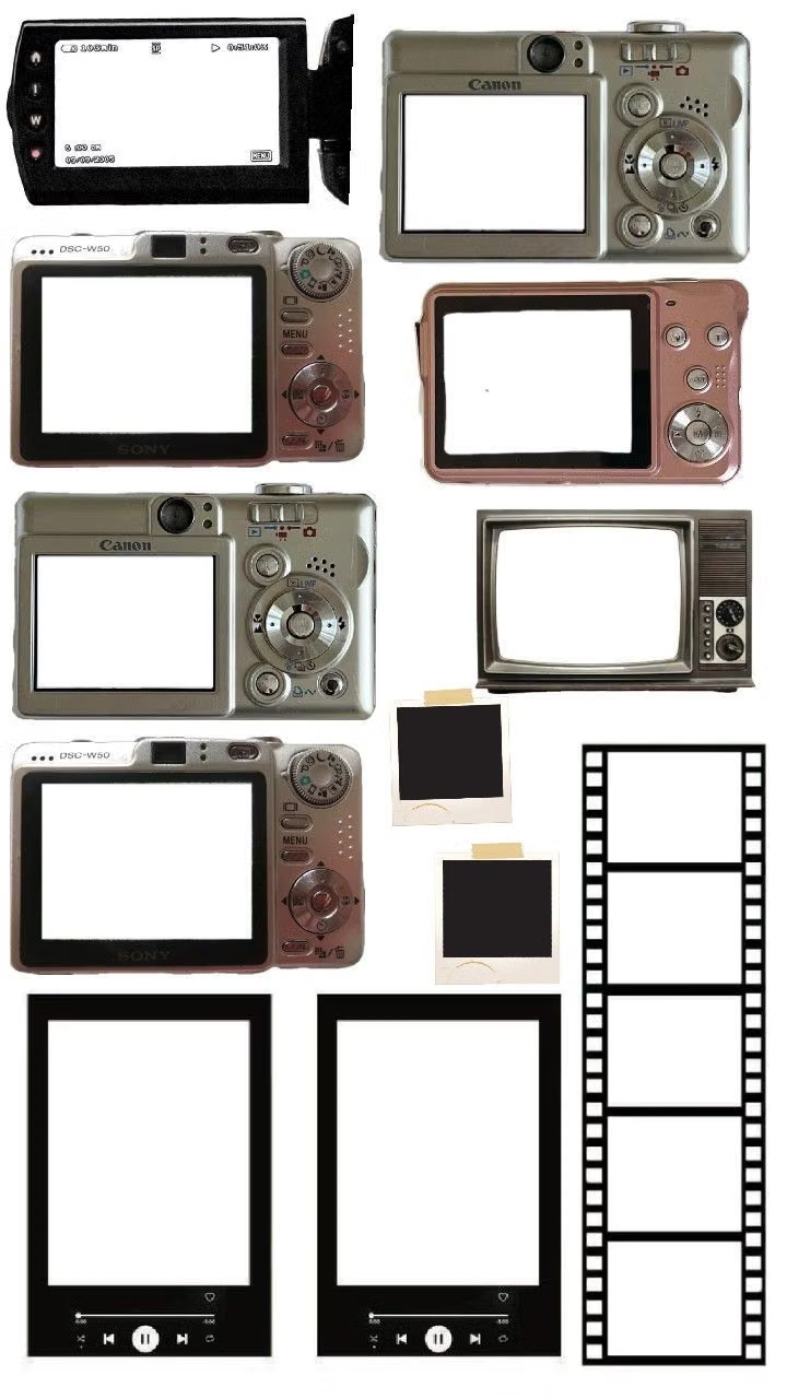
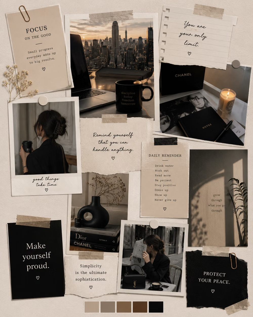
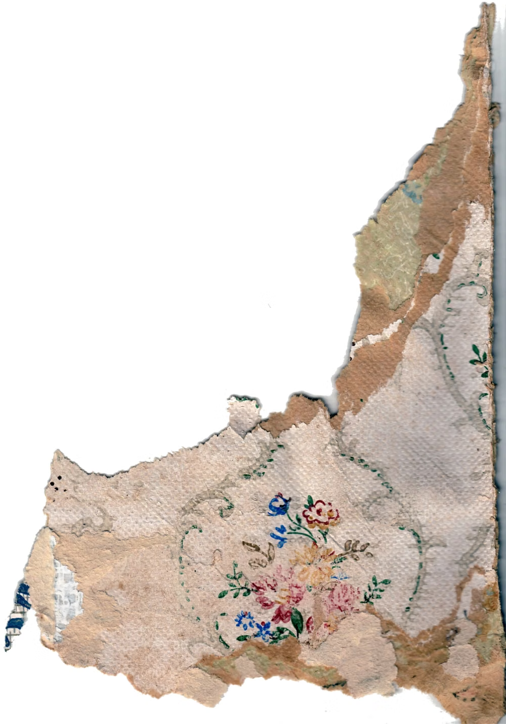
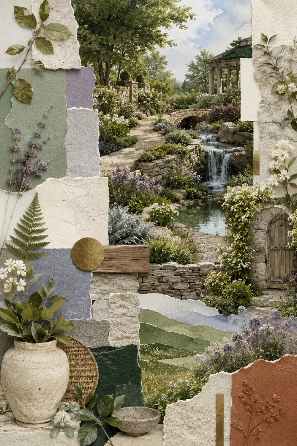
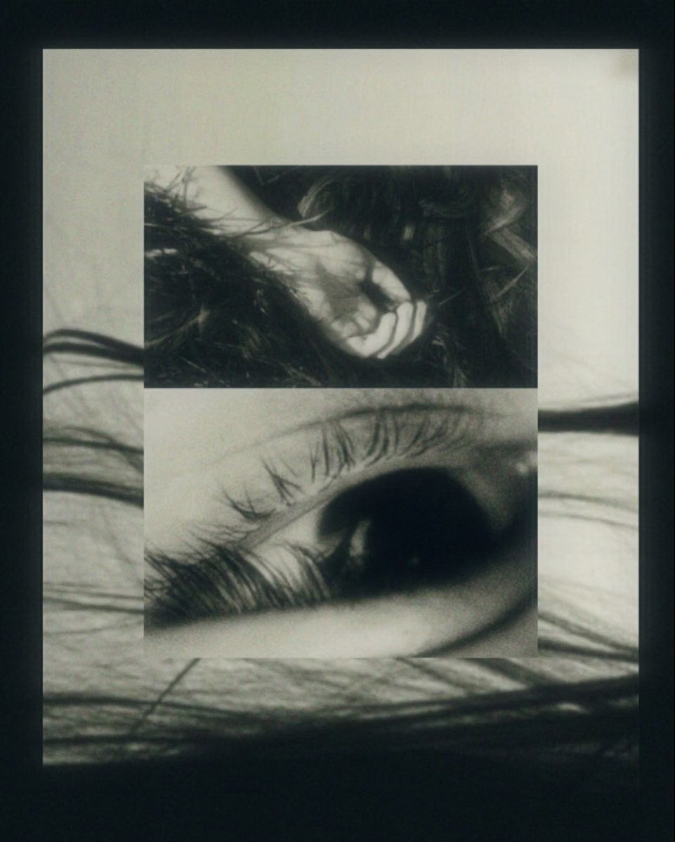
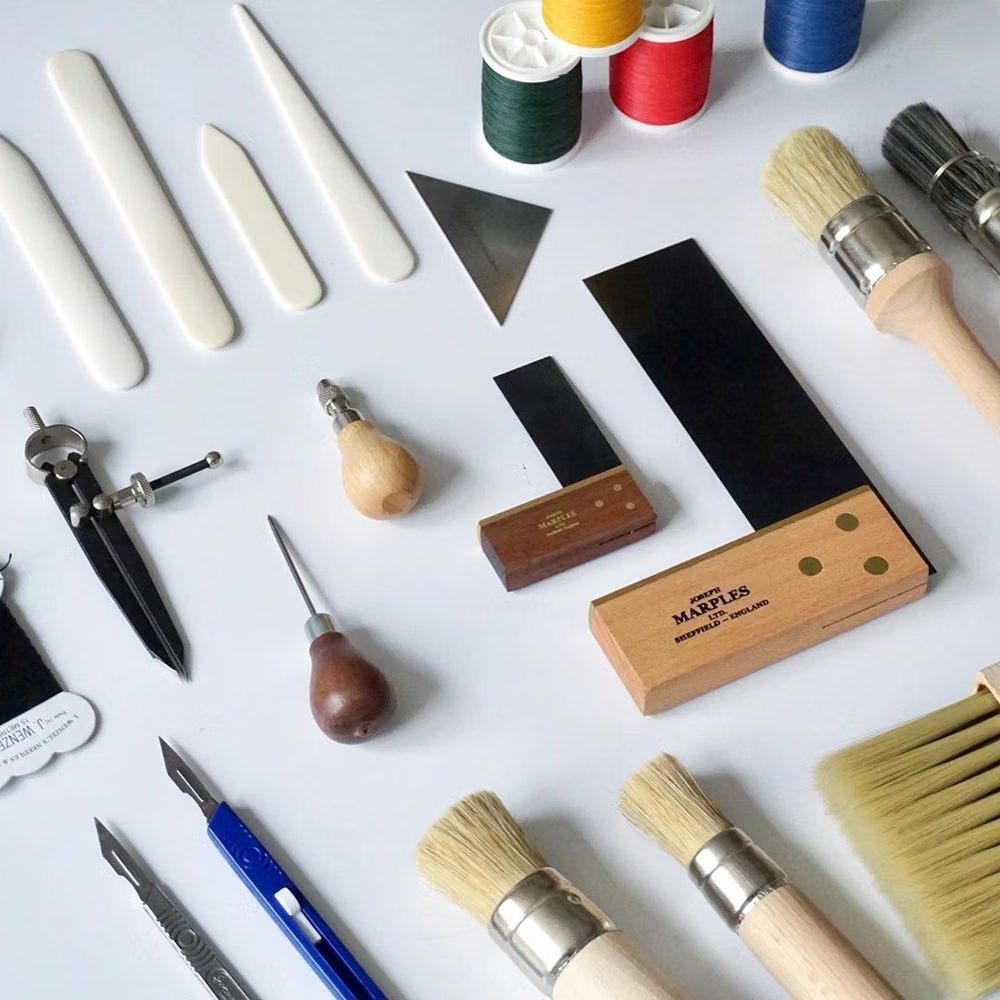
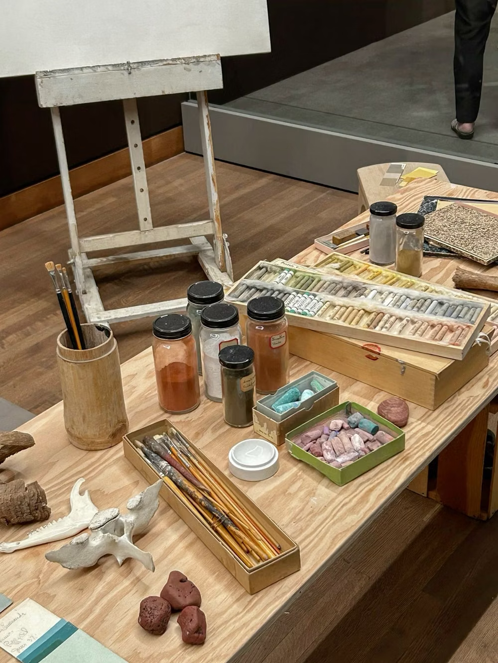
A visual study of the forms, inspirations, materials, colors, type, and cultural references associated with this UI design style.


Design principles and implementation
Use these principles to write a focused AI UI design prompt instead of asking for a vague visual treatment.
Color direction
Pull a small palette from the source photographs, then unify mixed materials with repeated paper tones, ink colors, or one overlay wash. In a daisyUI theme, use the recurring ink or overlay-wash hue for `primary`, a strong photo-derived color for `secondary`, and assign clean paper, aged paper, and shadowed paper tones to `base-100`, `base-200`, and `base-300`.
Imagery direction
Mix cutout photography, scans, handwriting, found print, paint, and torn paper while preserving visible edges and source texture.
Content density
Allow high visual density near focal compositions, but keep copy concise and surround important actions with uncluttered paper space.
Motion direction
Assemble pieces through pasted entrances, small parallax offsets, torn-mask reveals, and stop-frame rearrangements that retain a handmade feel.
Shape language
Use torn contours, taped rectangles, rough circles, irregular masks, and cropped fragments rather than polished component silhouettes. In daisyUI themes, set the `--radius-*` variables to `0` or `0.25rem`.
Typography rules
Mix at most two contrasting display voices with one dependable reading face, using found type for accents and never for essential instructions.
Suggested Typfaces
Archivo Black
Fresh daisies glow in warm sunlight
Fresh daisies glow in warm sunlight
1 2 3 4 5 6 7 8 9 0
Cormorant Garamond
Fresh daisies glow in warm sunlight
Fresh daisies glow in warm sunlight
1 2 3 4 5 6 7 8 9 0
Permanent Marker
Fresh daisies glow in warm sunlight
Fresh daisies glow in warm sunlight
1 2 3 4 5 6 7 8 9 0
Cutive Mono
Fresh daisies glow in warm sunlight
Fresh daisies glow in warm sunlight
1 2 3 4 5 6 7 8 9 0
Syne
Fresh daisies glow in warm sunlight
Fresh daisies glow in warm sunlight
1 2 3 4 5 6 7 8 9 0
Build a Collage interface with daisyUI
The live example translates this direction into daisyUI components and semantic theme tokens.
To generate a full page in the same visual language, give the style name and the design rules above to Blueprint MCP.
Related UI design styles
Compare nearby visual languages that share typography, shapes, use cases, or signature elements.
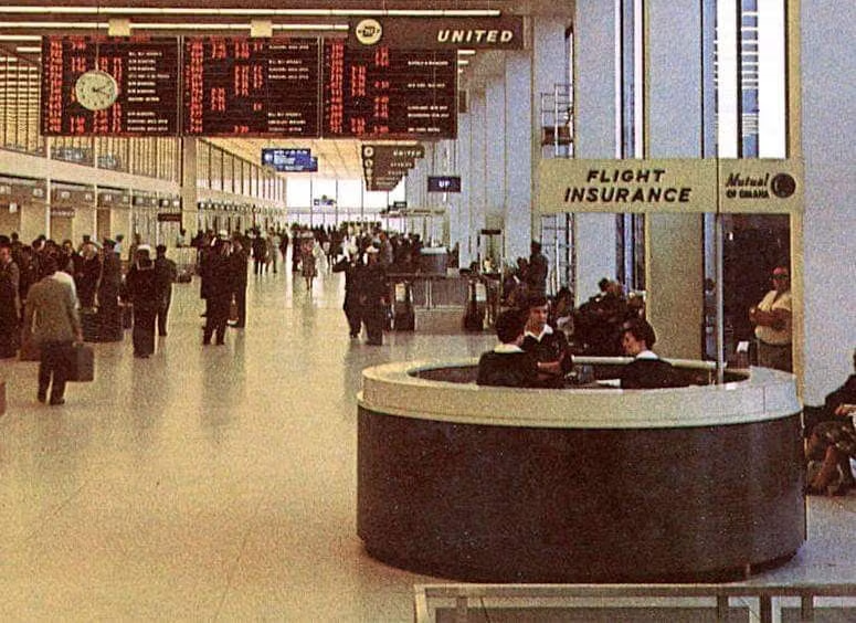
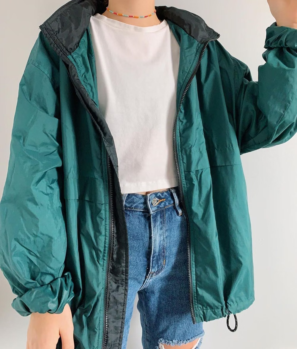
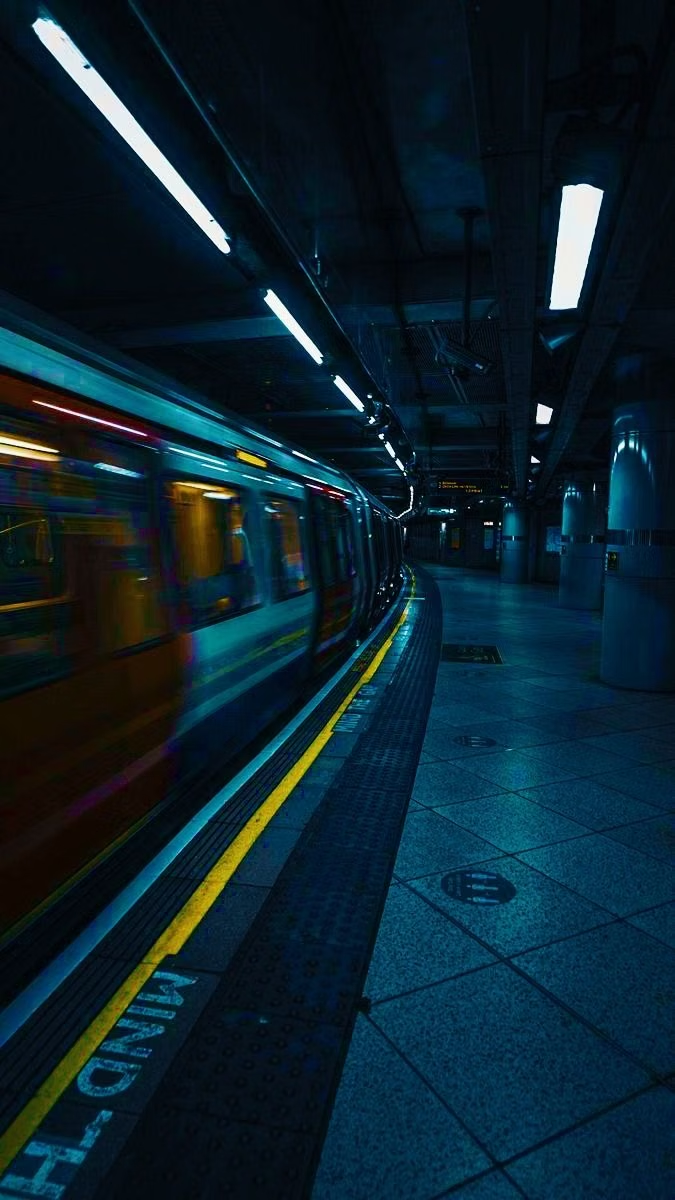
Gen-X Soft Club UI design style
Late-1990s and early-2000s urban futurism softens Y2K gloss through muted color, minimalist typography, blurred photography, and a sterile-meets-organic mood.
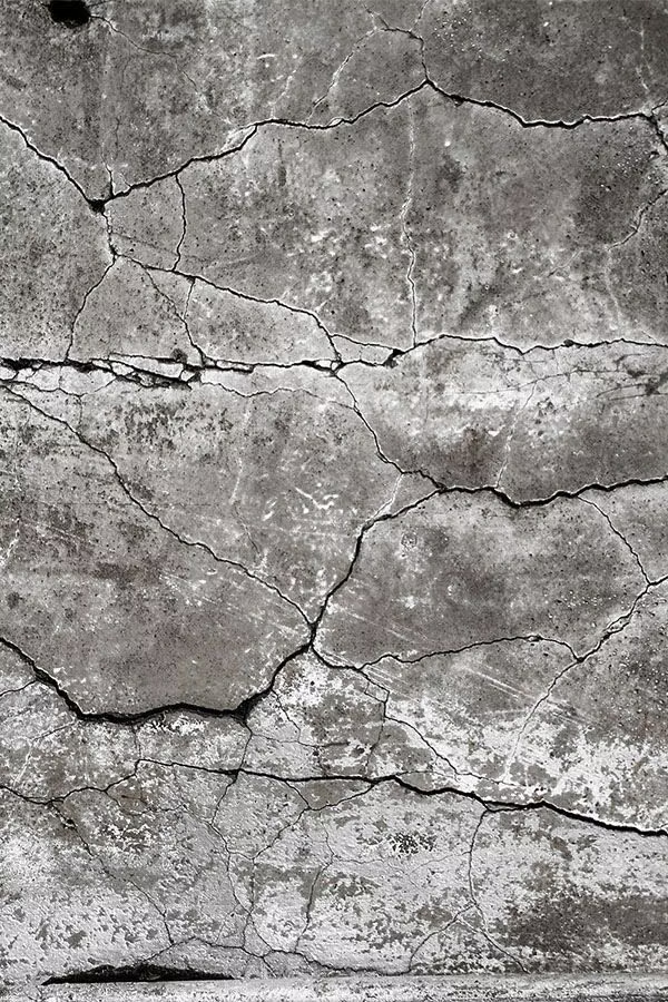
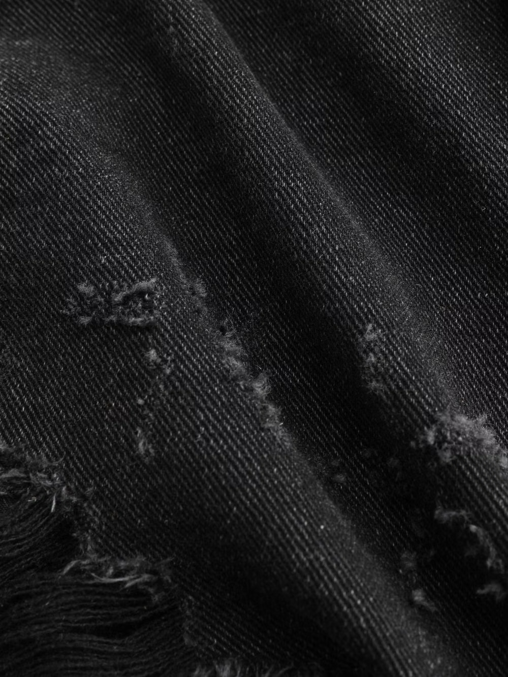
Grunge UI design style
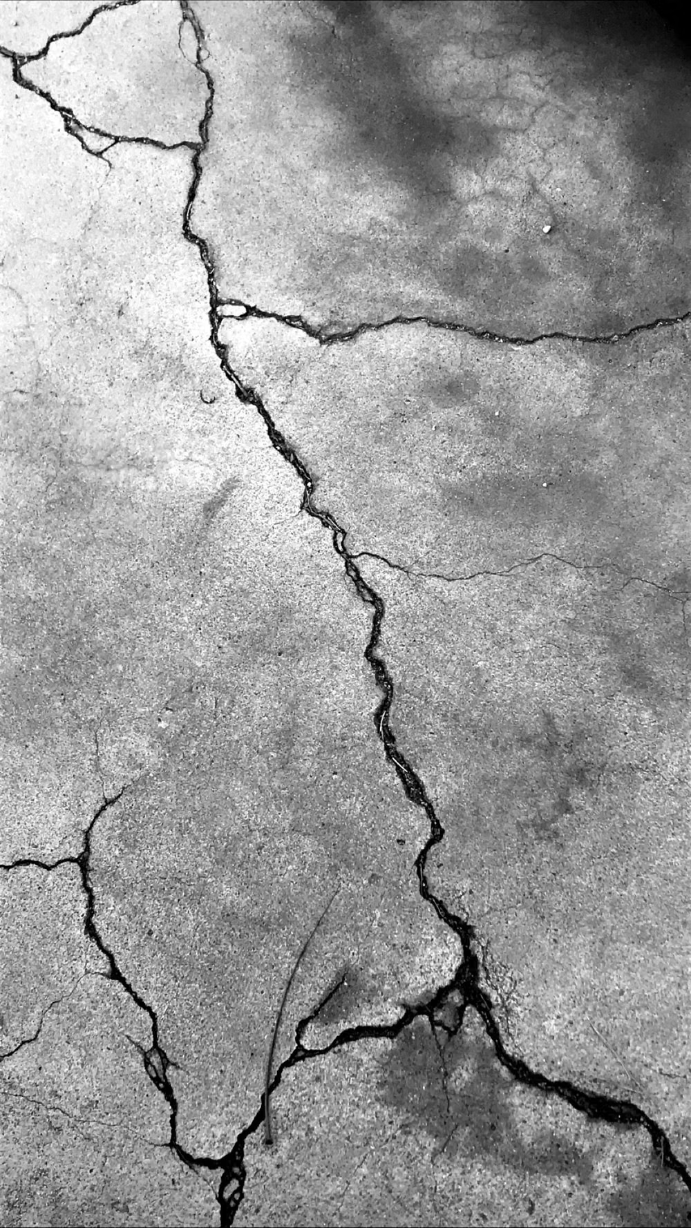
Distressed type, scratches, stains, rough textures, muted or dirty color, and irregular layering create worn intensity.
Sports Brutalism UI design style
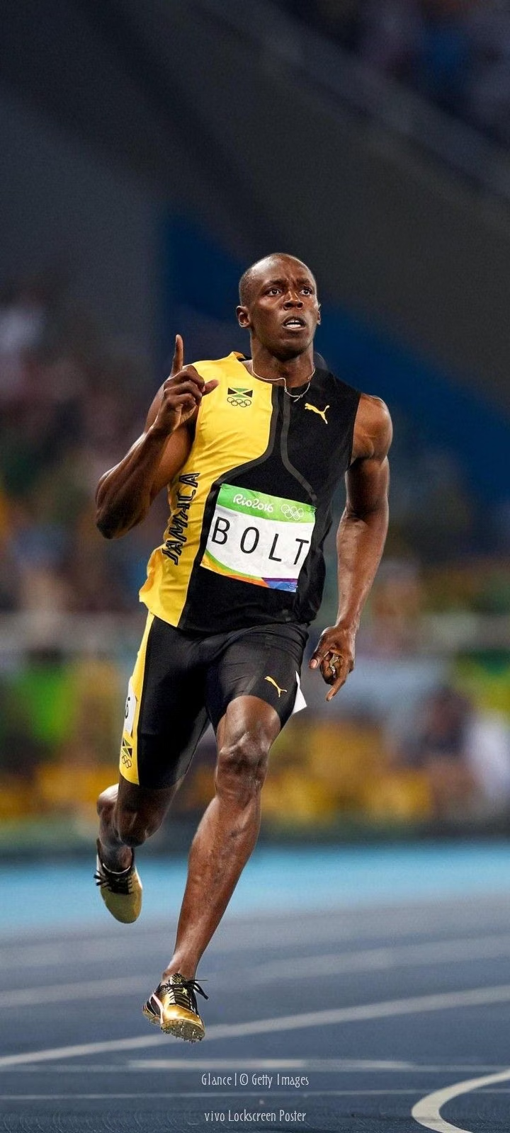
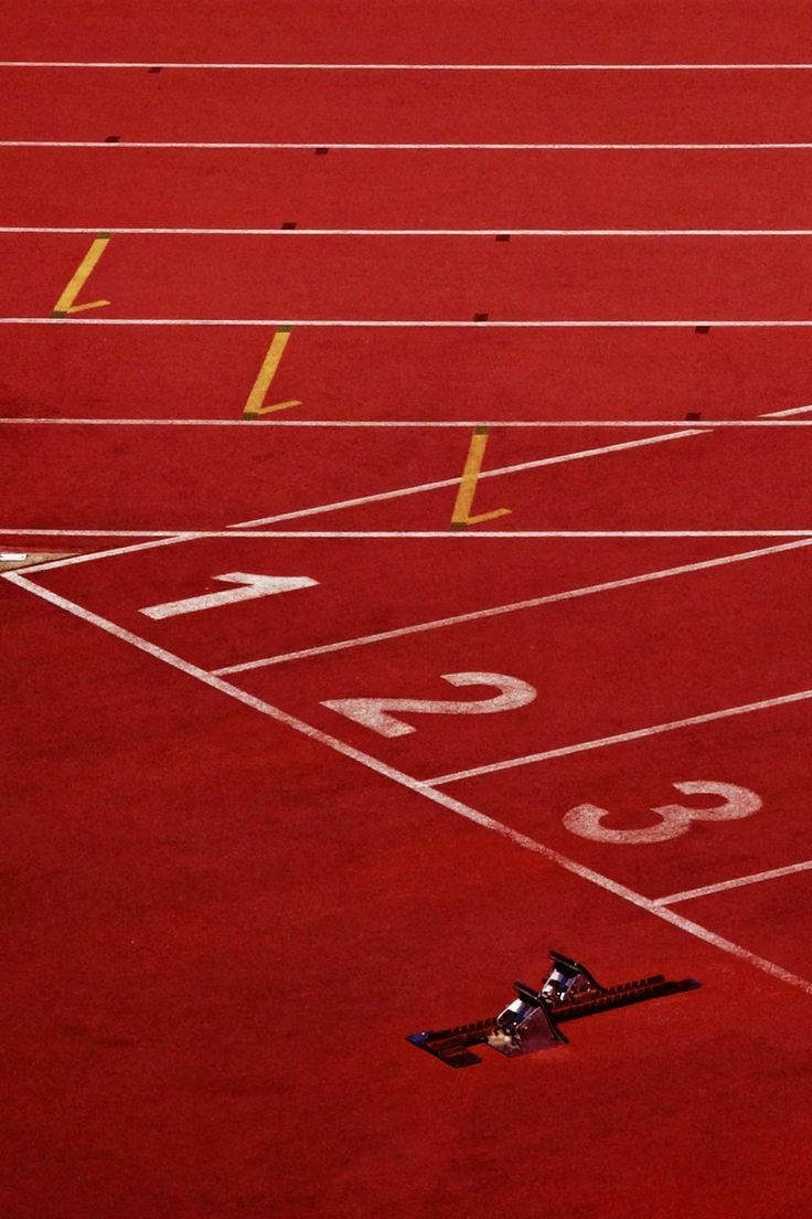
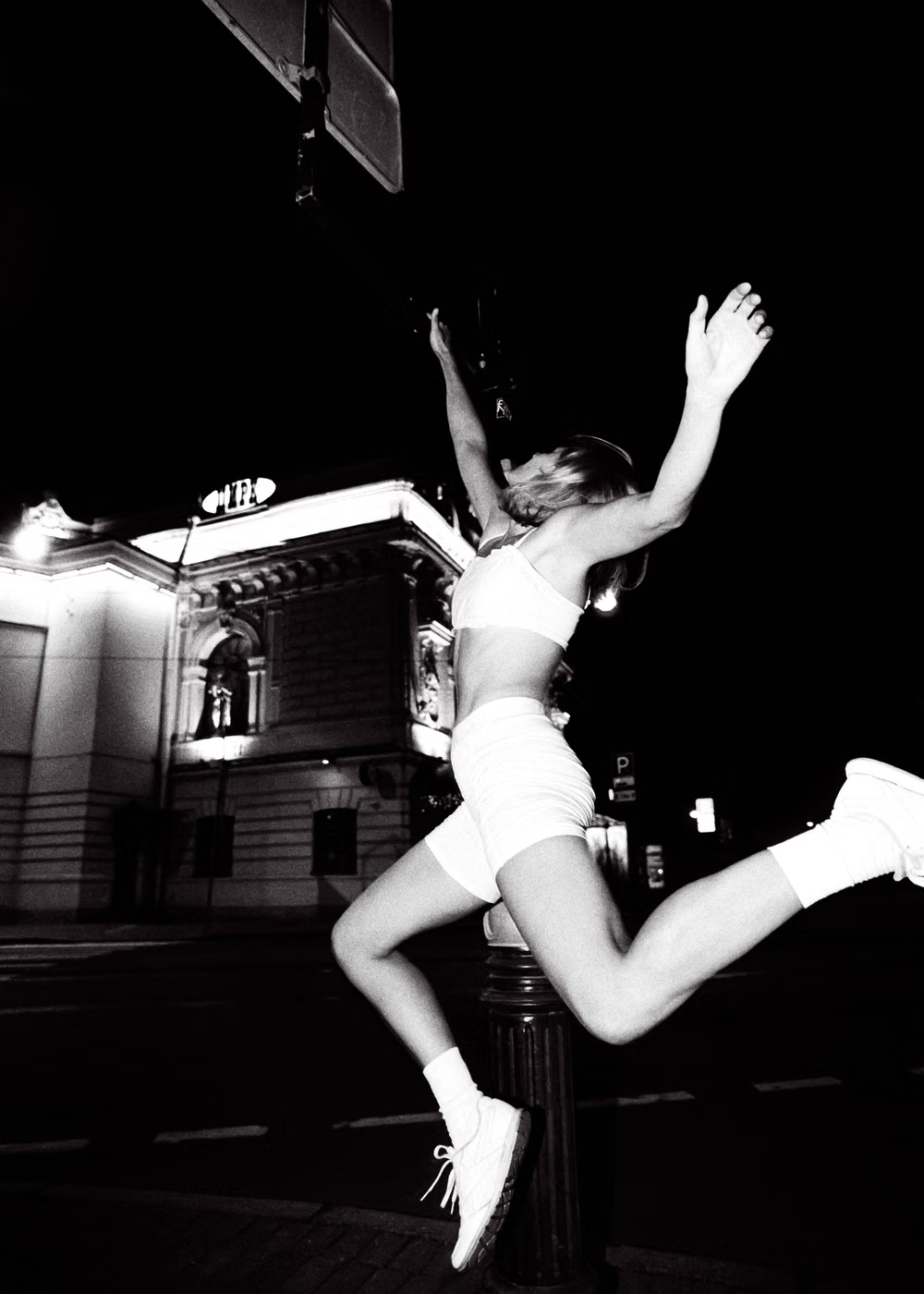
Condensed type, hard grids, scoreboards, halftones, high-contrast photography, oversized numbers, and aggressive overlays.