Grunge UI design style
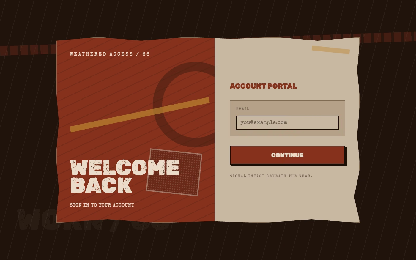
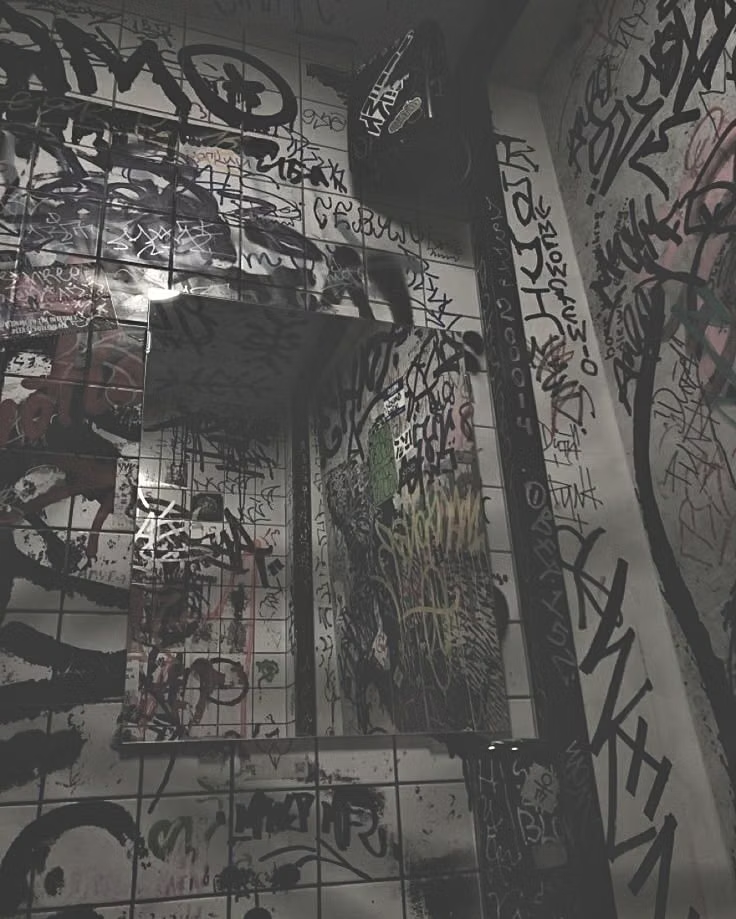
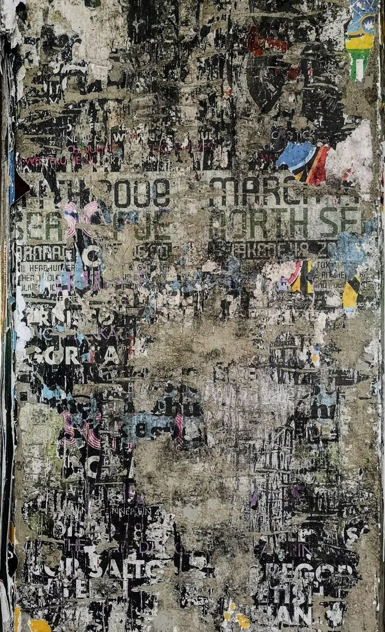
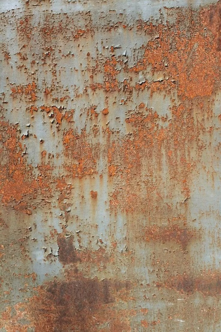
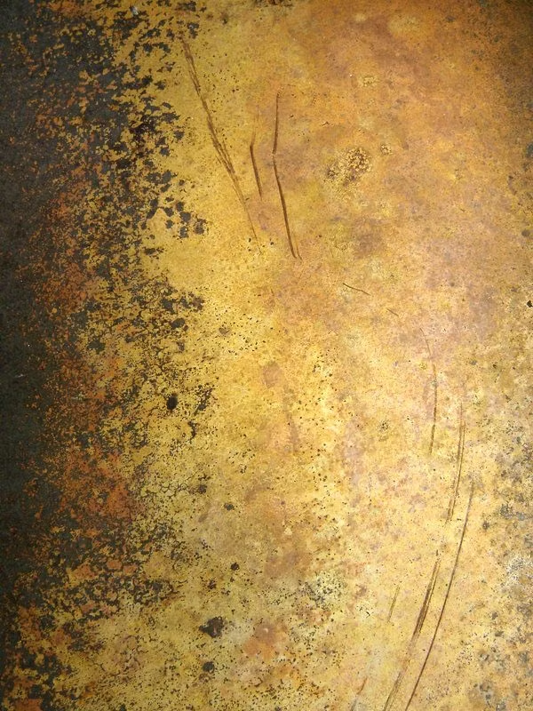
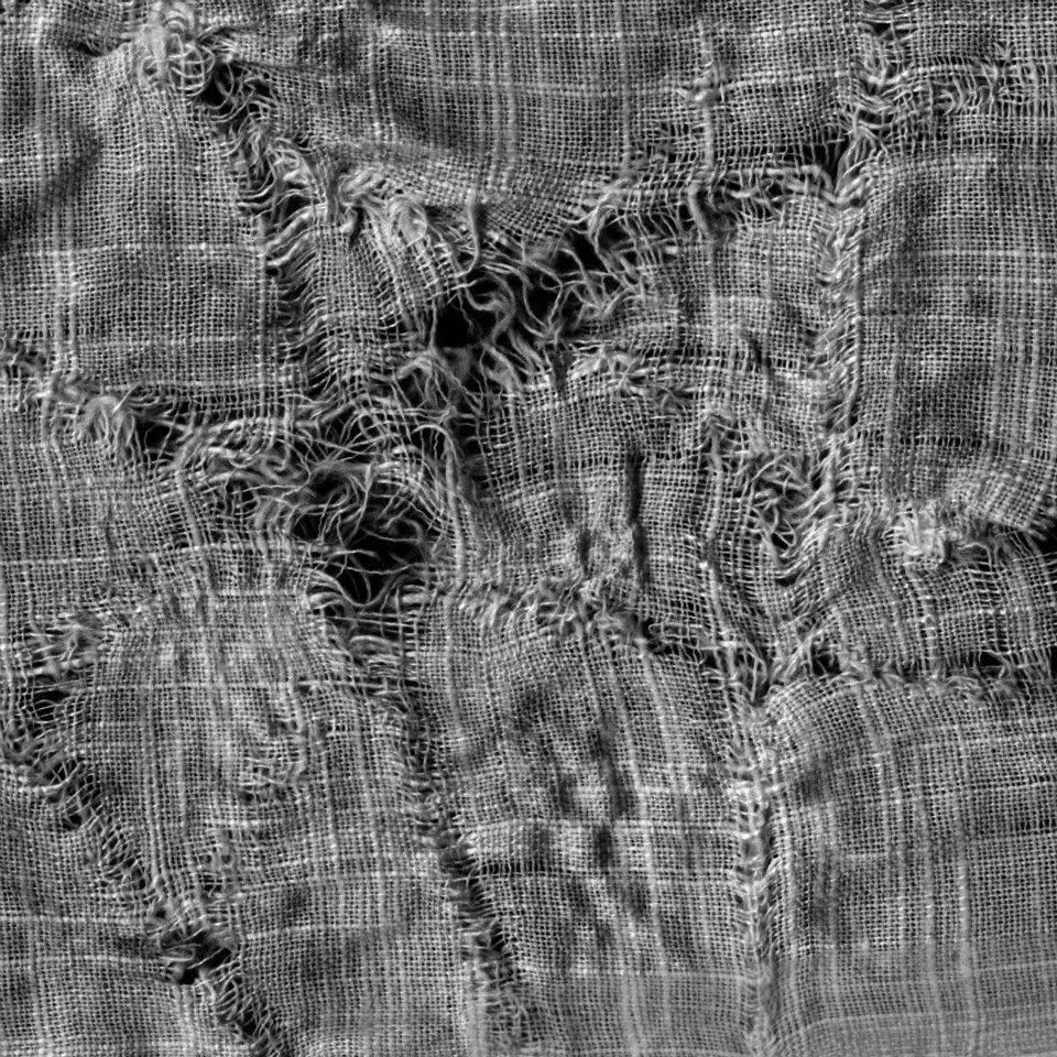
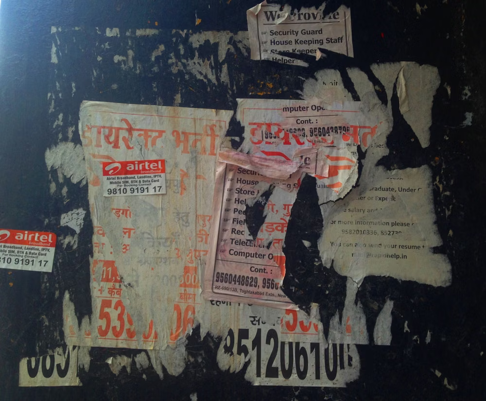
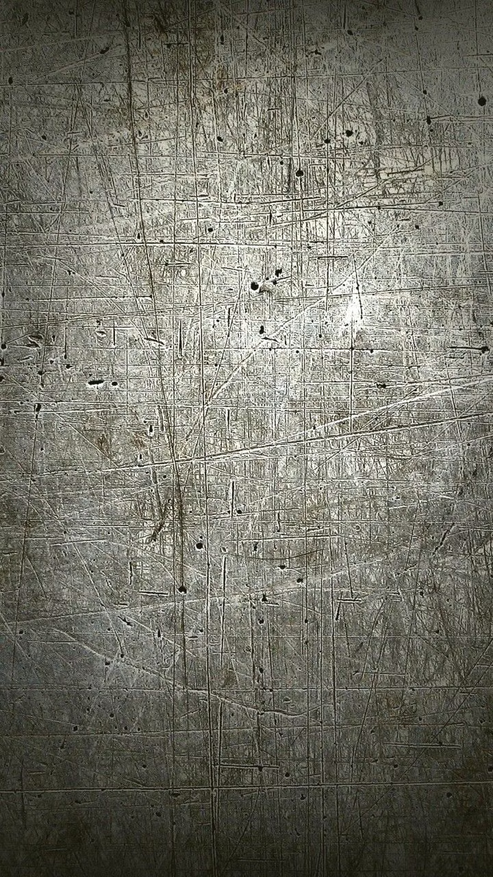
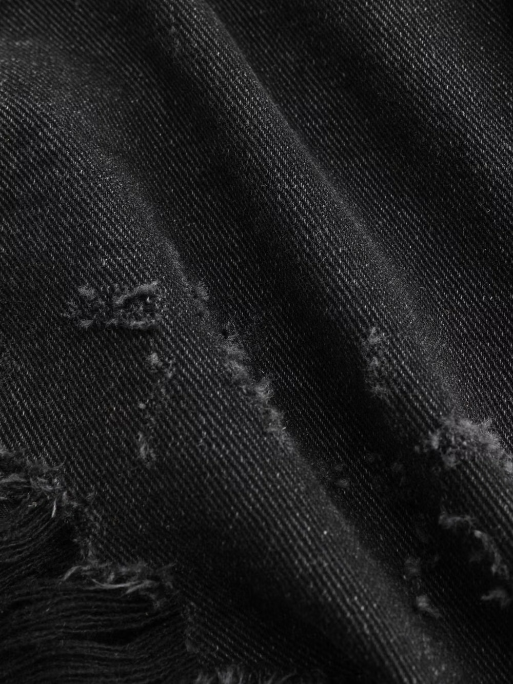
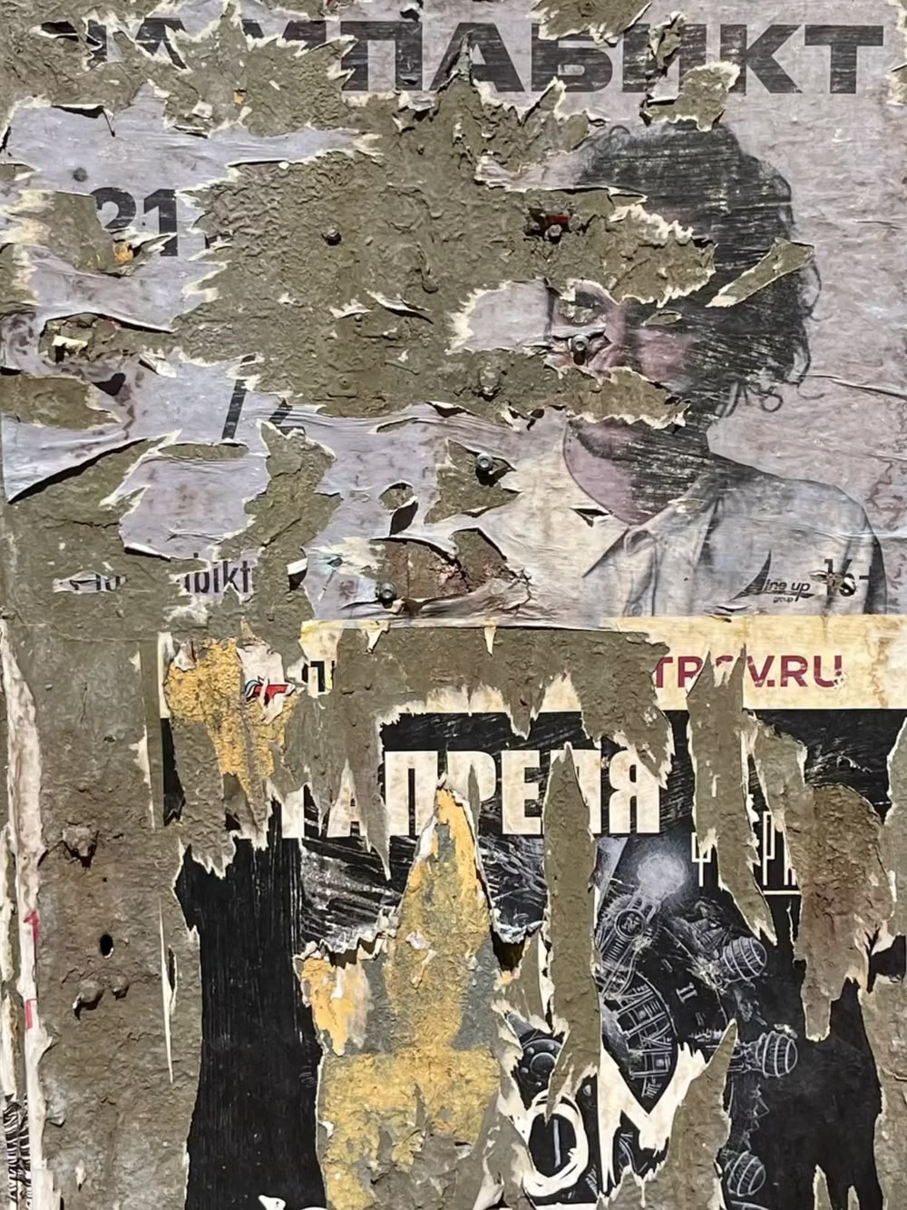
Distressed type, scratches, stains, rough textures, muted or dirty color, and irregular layering create worn intensity.
Design overview
- Signature elements
- distressed typography, scratches and stains, dirty textures, muted colors, irregular layering, worn edges. In daisyUI themes, set `--noise: 1;`.
- Best suited to
- Music, gaming, streetwear, sports, entertainment, and rebellious portfolios.
- Layout principles
- Layer worn panels and irregular media around a stable central column or grid, letting damage erode surfaces without destroying information order.
History and origins
A fact-checked account of where this visual language came from, with links to the references used.
- Period
- Late 1980s–1990s
- Origin
- Alternative music culture and experimental editorial design in the United States
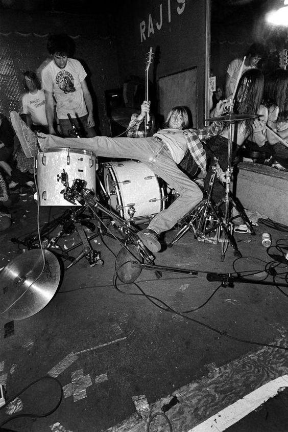
Visual grunge developed alongside alternative music but was not confined to Seattle or album packaging. Distressed type, layered scans, dirt, fragmentation, and unstable layouts entered mainstream graphic design in the 1990s, with David Carson’s art direction of Ray Gun from 1992 to 1995 becoming a prominent reference for expressive, rule-breaking editorial typography.
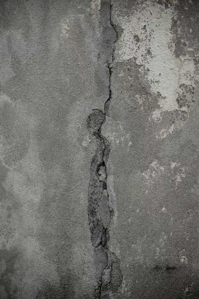
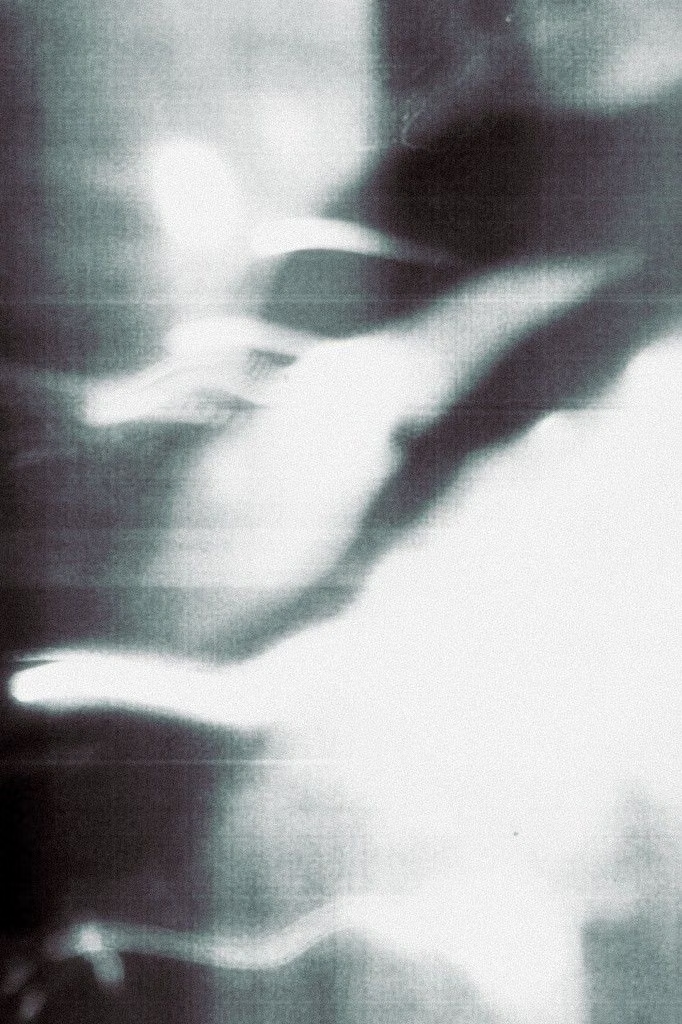
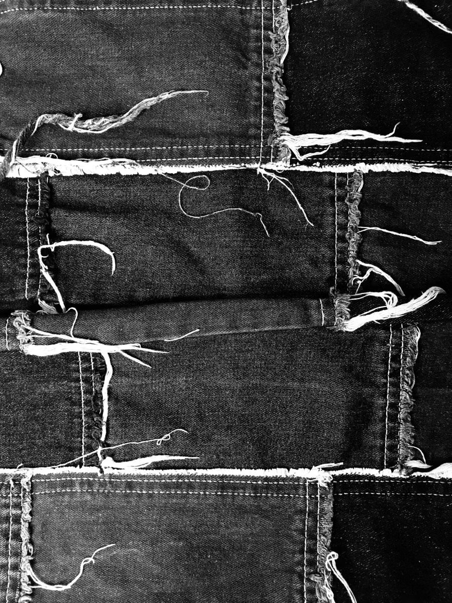
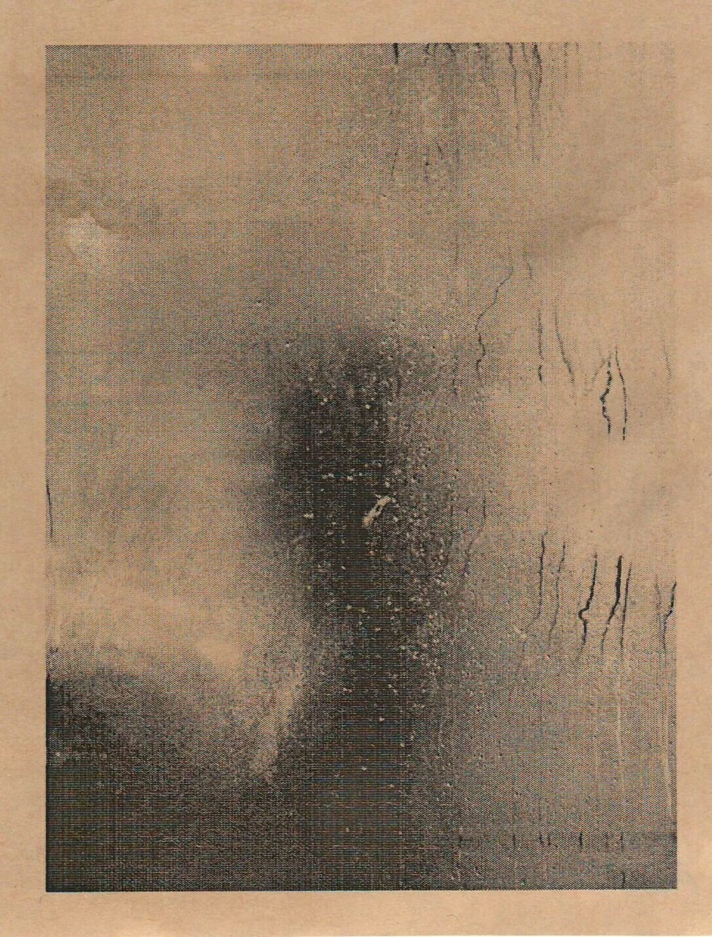
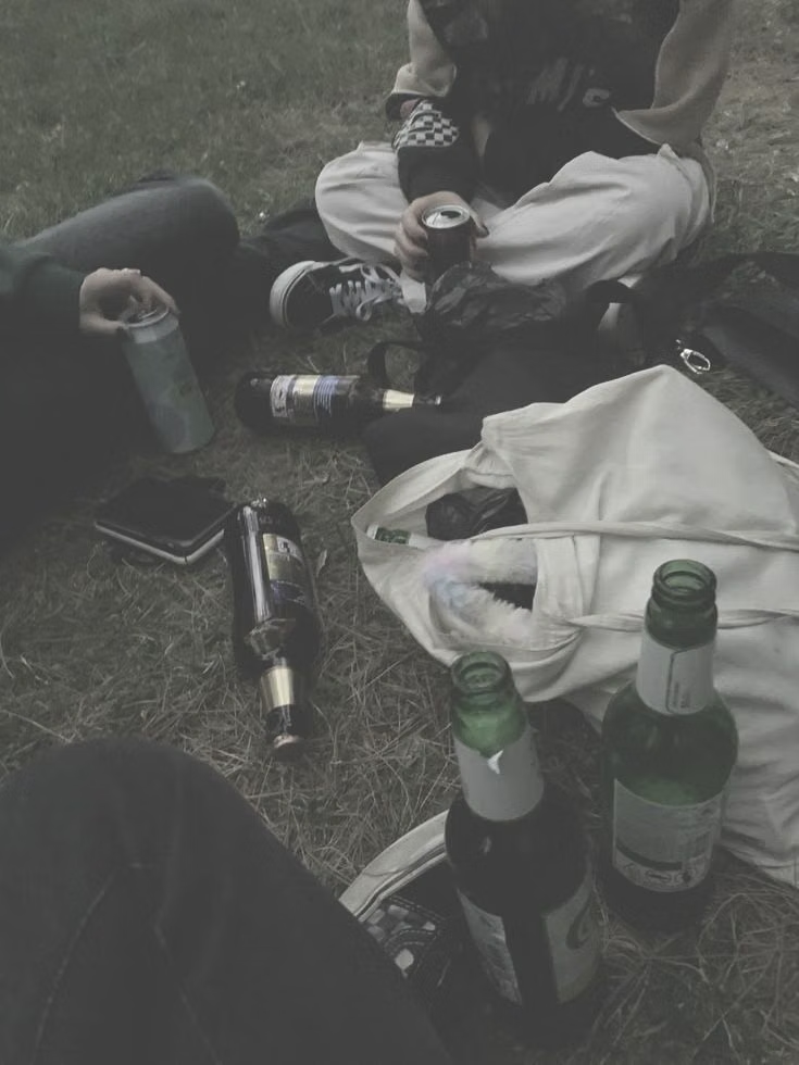
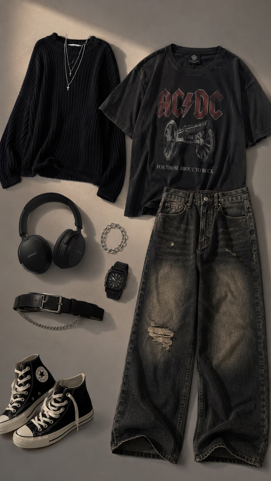
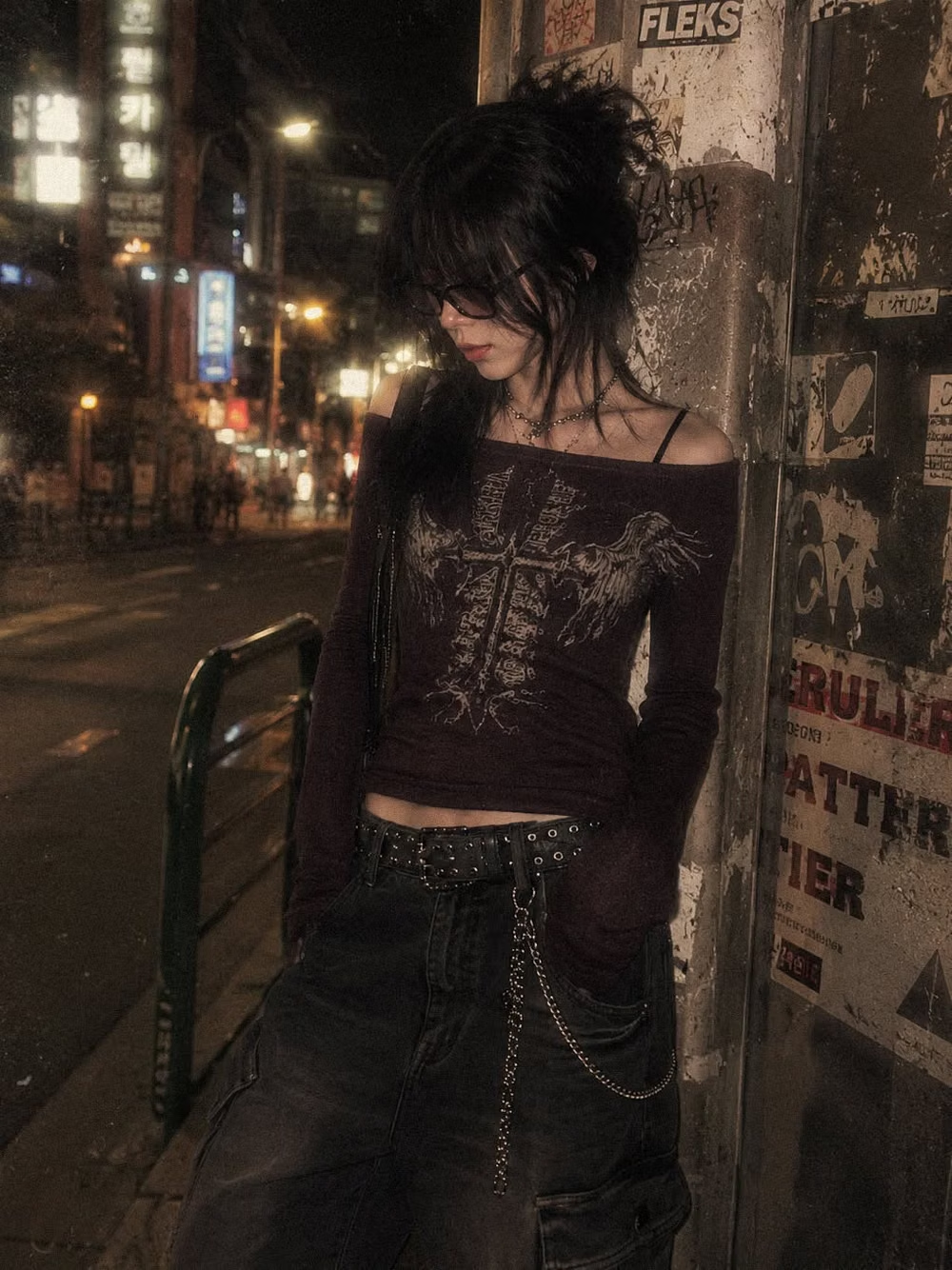
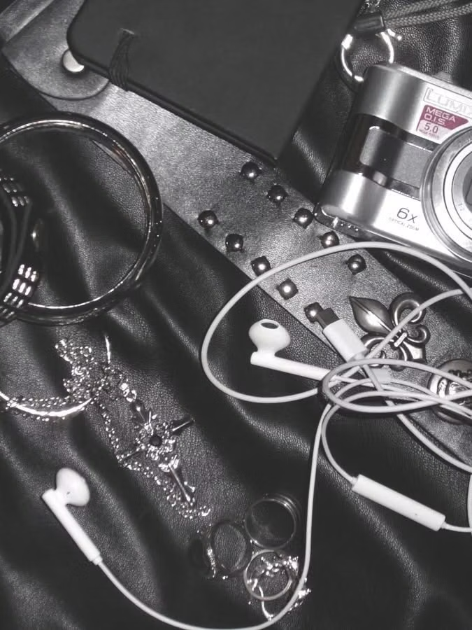
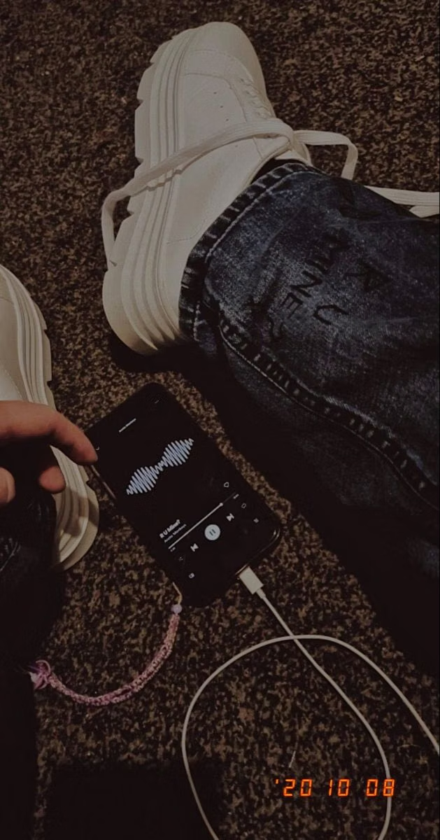
Moodboard and visual references
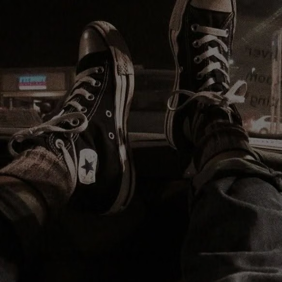
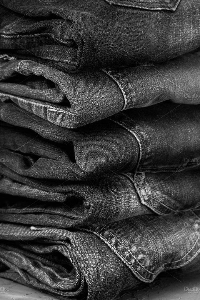
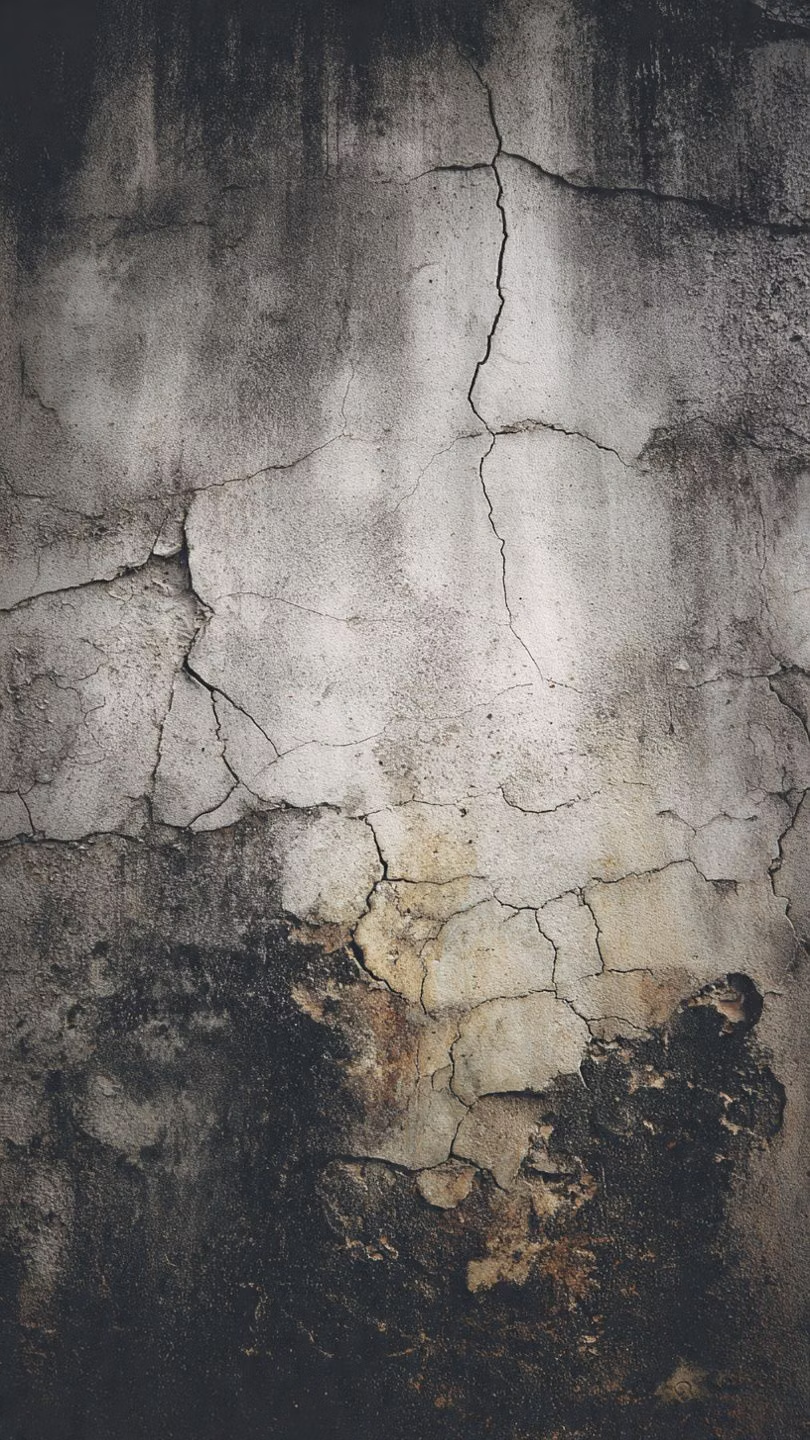
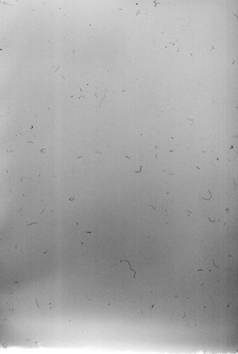
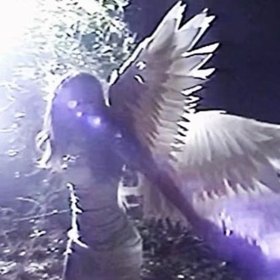
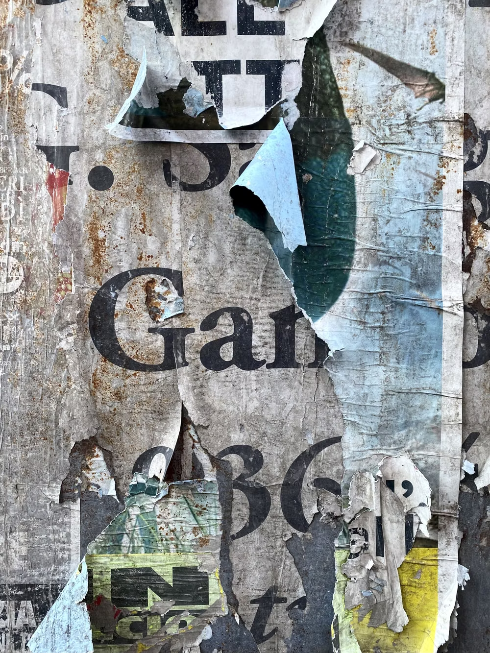
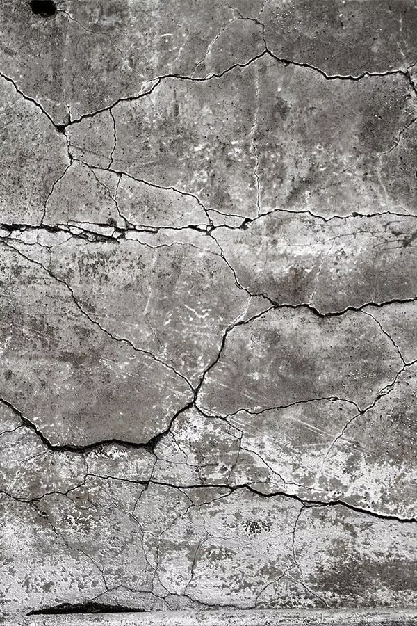
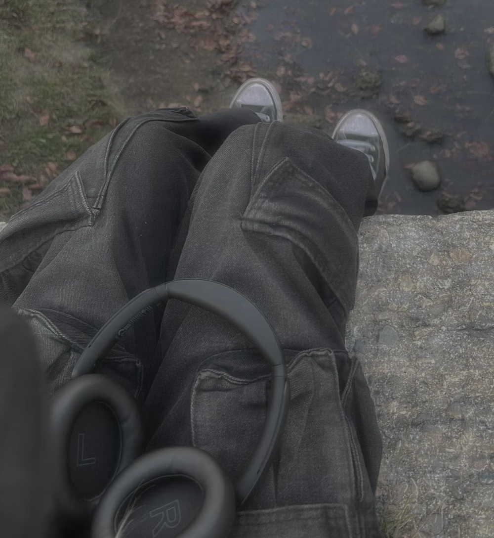
A visual study of the forms, inspirations, materials, colors, type, and cultural references associated with this UI design style.
Design principles and implementation
Use these principles to write a focused AI UI design prompt instead of asking for a vague visual treatment.
Color direction
Use dirty charcoal, rust, olive, burgundy, faded denim, and nicotine cream with low-chroma highlights and occasional raw warning color. In a daisyUI theme, use rust or burgundy for `primary`, faded denim or olive for `secondary`, and assign nicotine cream, stained beige, and muddy taupe to `base-100`, `base-200`, and `base-300`.
Imagery direction
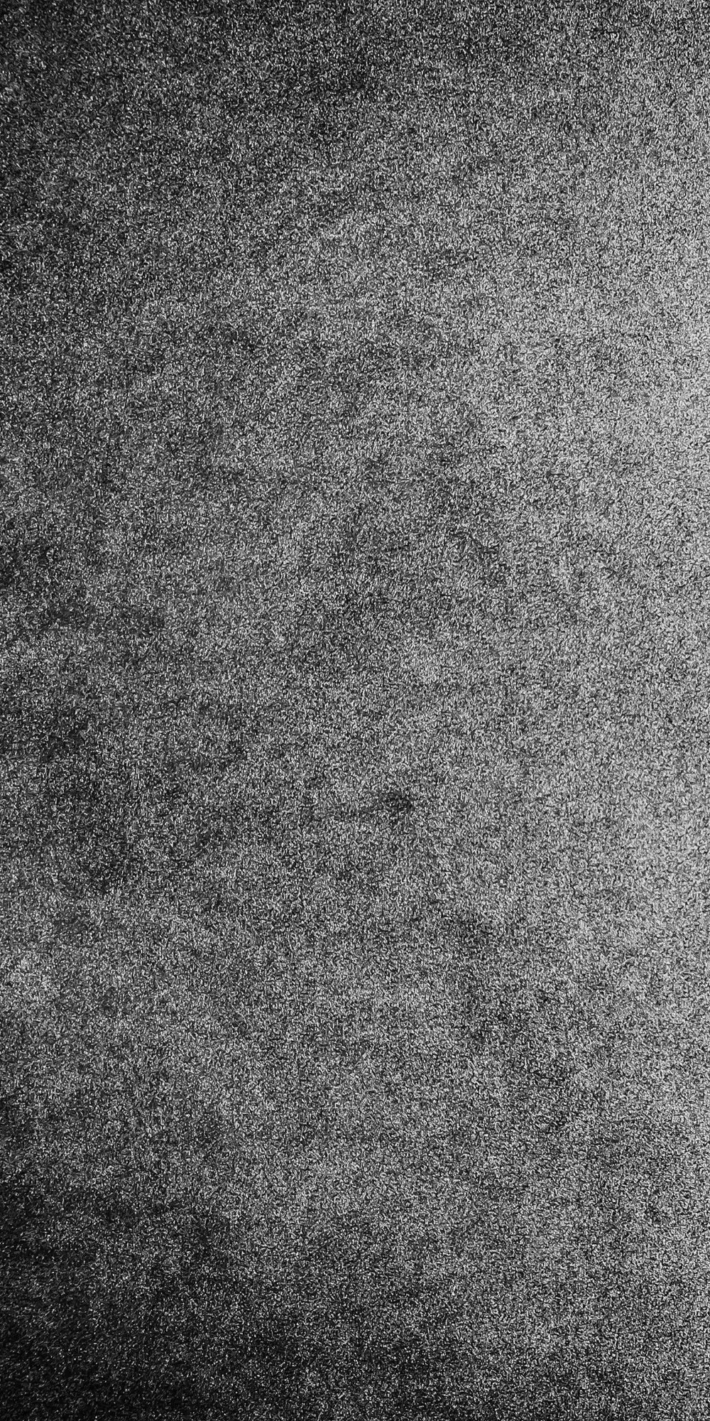
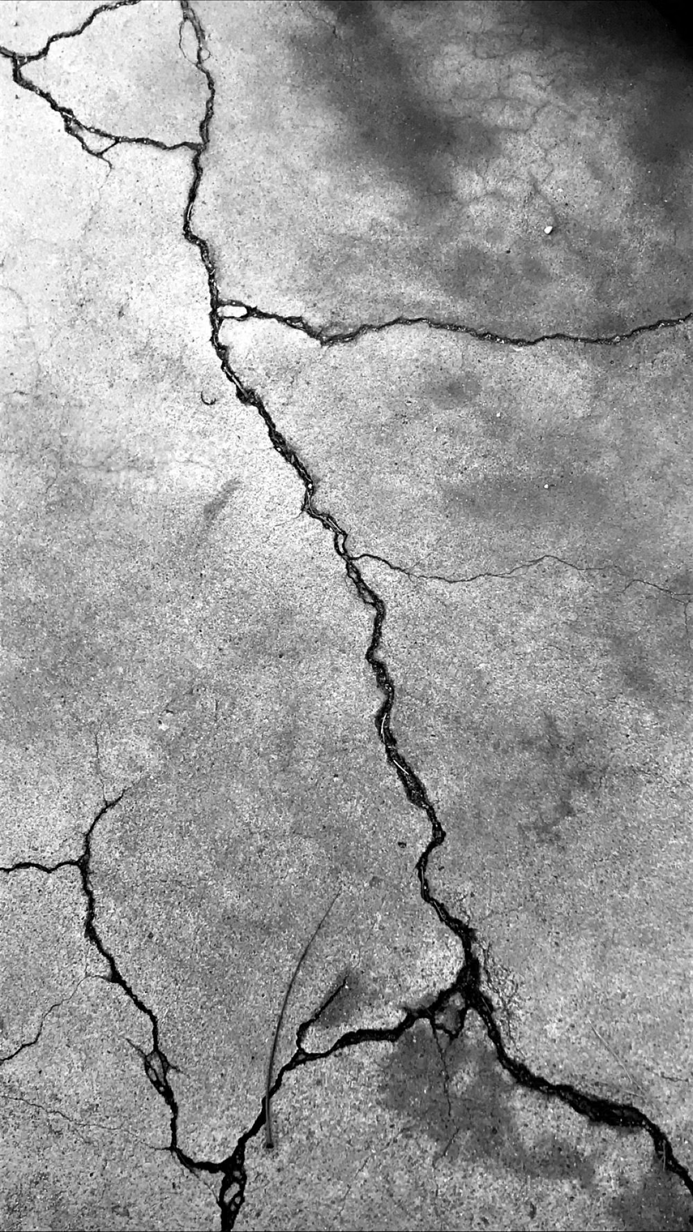
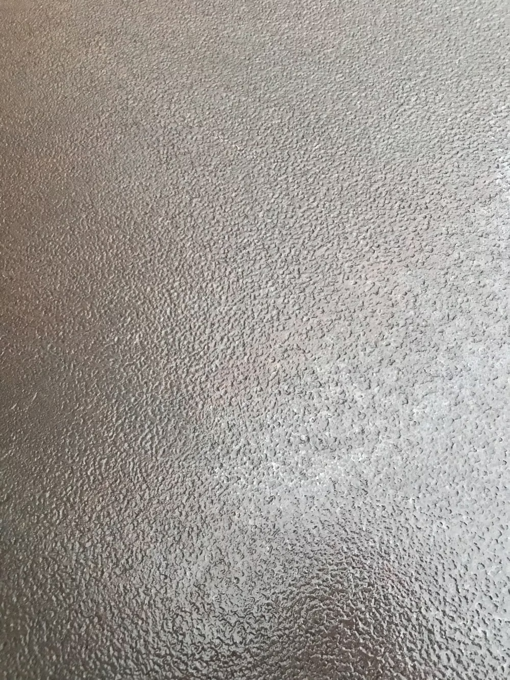
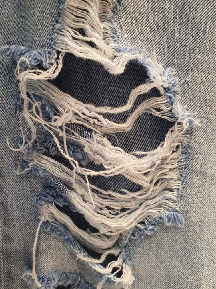
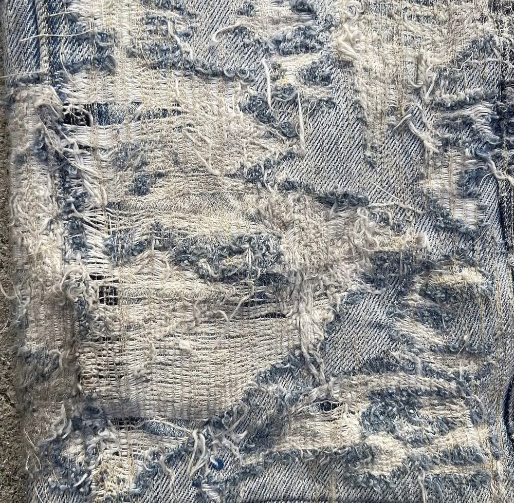
Choose scratched photography, distressed posters, concrete, metal, dust, stains, and weathered fabric with believable material wear.
Content density
Keep content medium to high, using texture around groups while protecting text interiors from excessive noise and contrast loss.
Motion direction
Use brief film flicker, scratch passes, rough judder, dust, and torn reveals sparingly so the interface feels worn rather than broken.
Shape language
Use chipped rectangles, rough masks, uneven borders, stains, tape, and worn edges with little clean geometric perfection. In daisyUI themes, set the `--radius-*` variables to `0` or `0.25rem`.
Typography rules
Reserve distressed, eroded, or metal-inspired type for large headings, then use a sturdy condensed sans or serif for all detailed reading.
Suggested Typfaces
Rubik Dirt
Fresh daisies glow in warm sunlight
Fresh daisies glow in warm sunlight
1 2 3 4 5 6 7 8 9 0
Special Elite
Fresh daisies glow in warm sunlight
Fresh daisies glow in warm sunlight
1 2 3 4 5 6 7 8 9 0
Black Ops One
Fresh daisies glow in warm sunlight
Fresh daisies glow in warm sunlight
1 2 3 4 5 6 7 8 9 0
Metal Mania
Fresh daisies glow in warm sunlight
Fresh daisies glow in warm sunlight
1 2 3 4 5 6 7 8 9 0
Pirata One
Fresh daisies glow in warm sunlight
Fresh daisies glow in warm sunlight
1 2 3 4 5 6 7 8 9 0
Build a Grunge interface with daisyUI
The live example translates this direction into daisyUI components and semantic theme tokens.
To generate a full page in the same visual language, give the style name and the design rules above to Blueprint MCP.
Related UI design styles
Compare nearby visual languages that share typography, shapes, use cases, or signature elements.
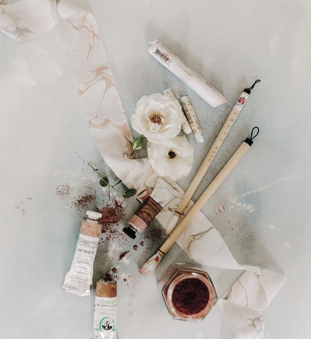
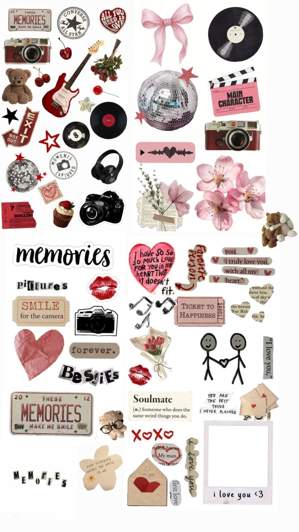
Collage UI design style
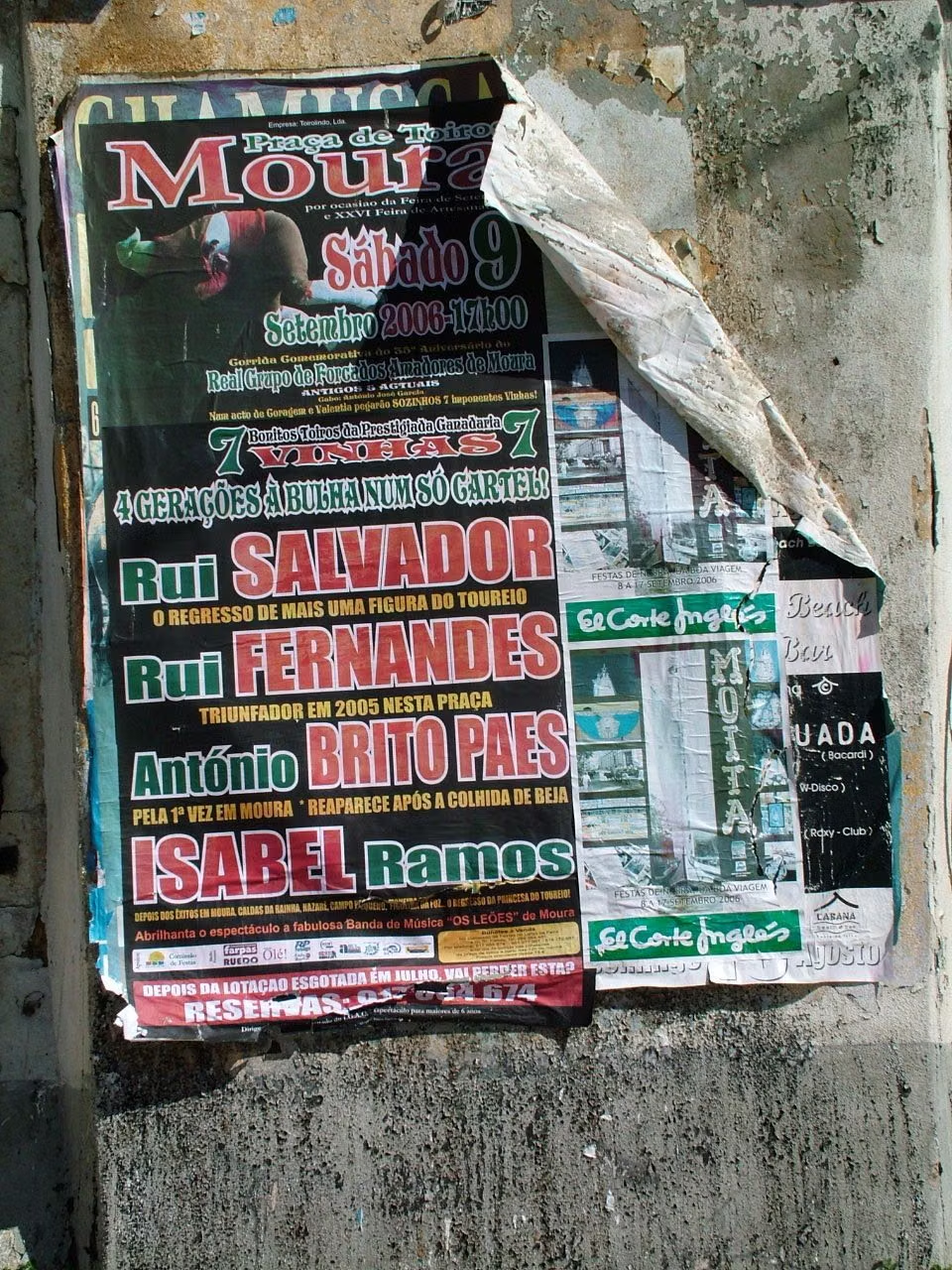
Cutout photography, overlapping fragments, mixed scales, torn edges, and layered media create expressive compositions.
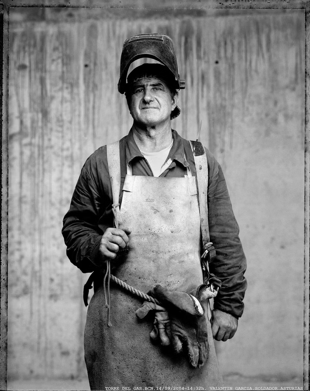
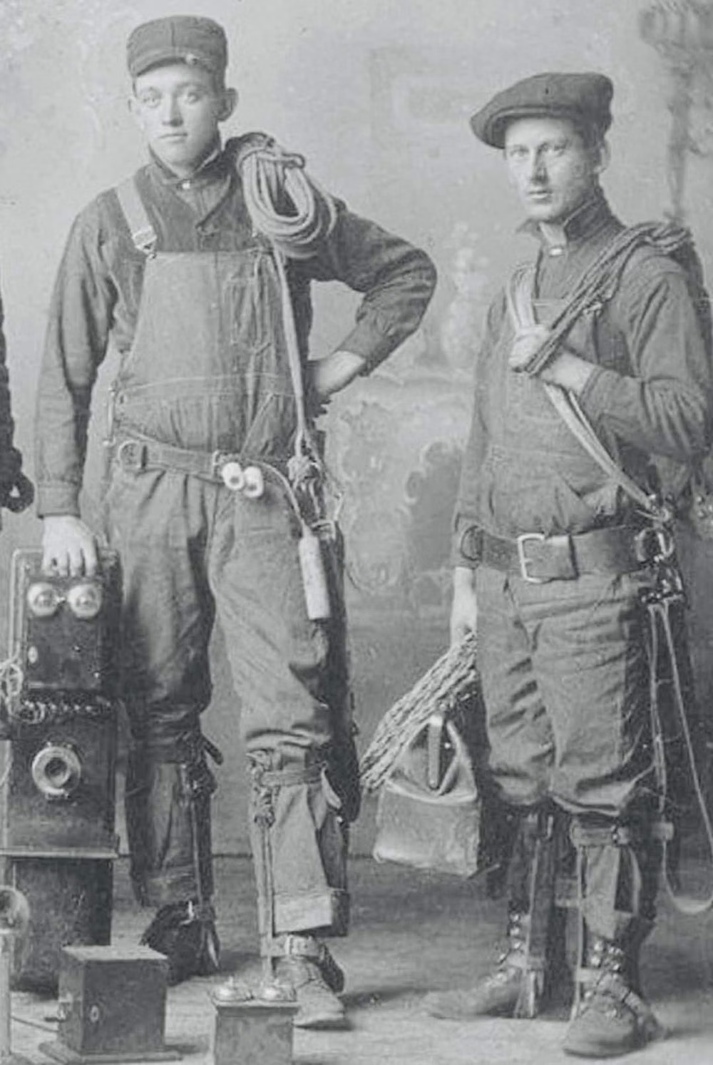
Dieselpunk UI design style
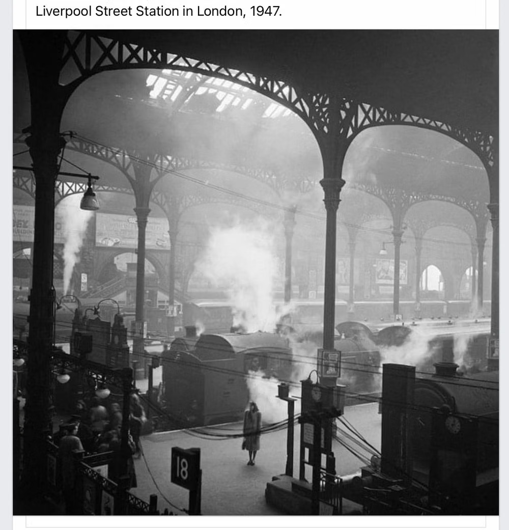
Interwar and mid-century industrial machinery, riveted metal, propaganda graphics, soot, military modernism, and heavy mechanical forms.
Punk / Zine UI design style
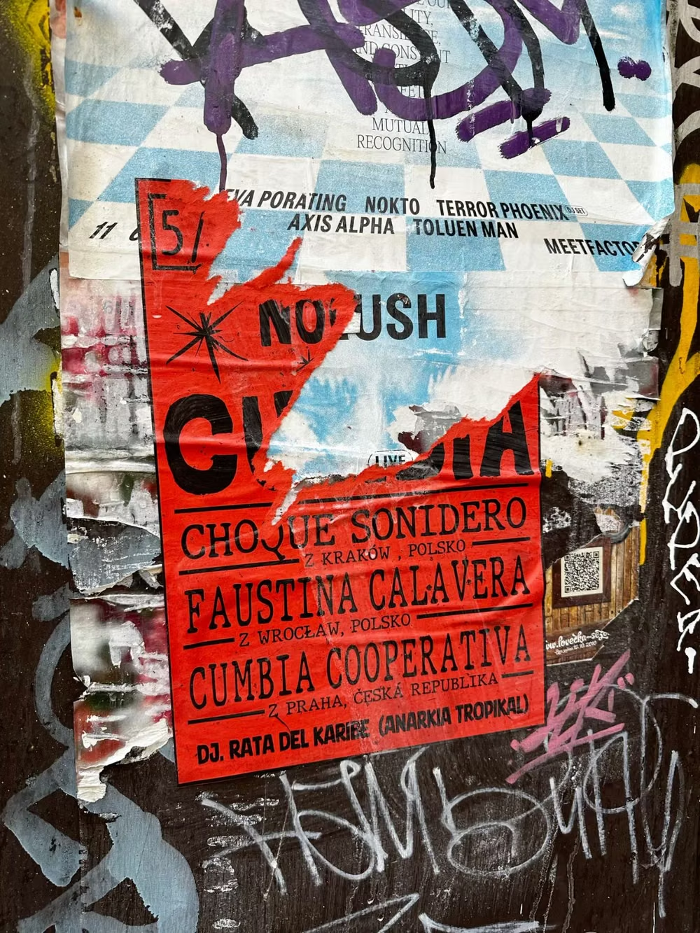
Photocopied textures, ransom-note typography, torn paper, handwriting, stamps, and confrontational DIY energy.