18 UI design trends for 2026
The strongest interface work in 2026 is moving in several directions at once. Some products feel calmer and more structured. Others lean into physical depth, expressive type, handmade marks, or deliberate nostalgia. This editorial selection shows how those signals translate into usable interface systems.
This is a focused view of the full UI design styles catalog, which also includes enduring styles that sit outside the annual trend cycle.
Interfaces feel physical again
Depth has a job now. Translucency, material cues, and spatial layers work best when they clarify hierarchy or interaction instead of decorating every surface.
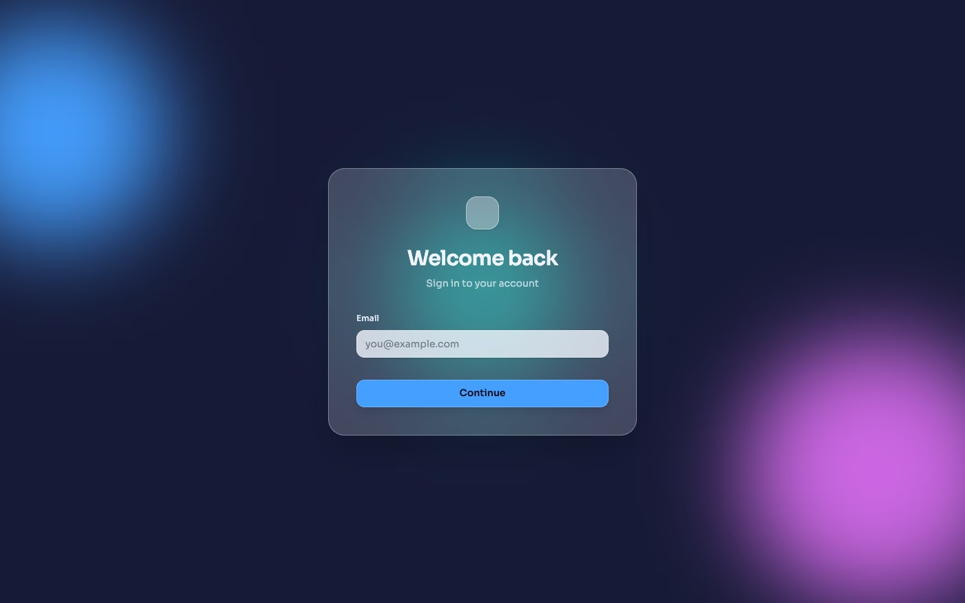
Glassmorphism UI design style
Frosted layers are becoming calmer and more selective, with opaque reading zones protecting contrast.
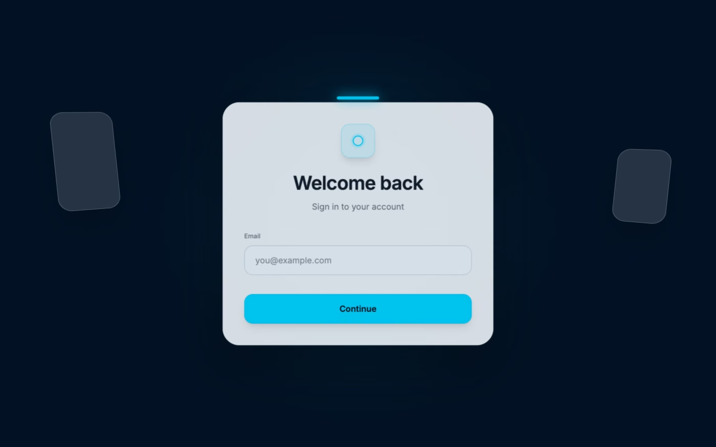
Spatial UI design style
Depth-aware placement and larger targets bring spatial-computing habits into two-dimensional product screens.
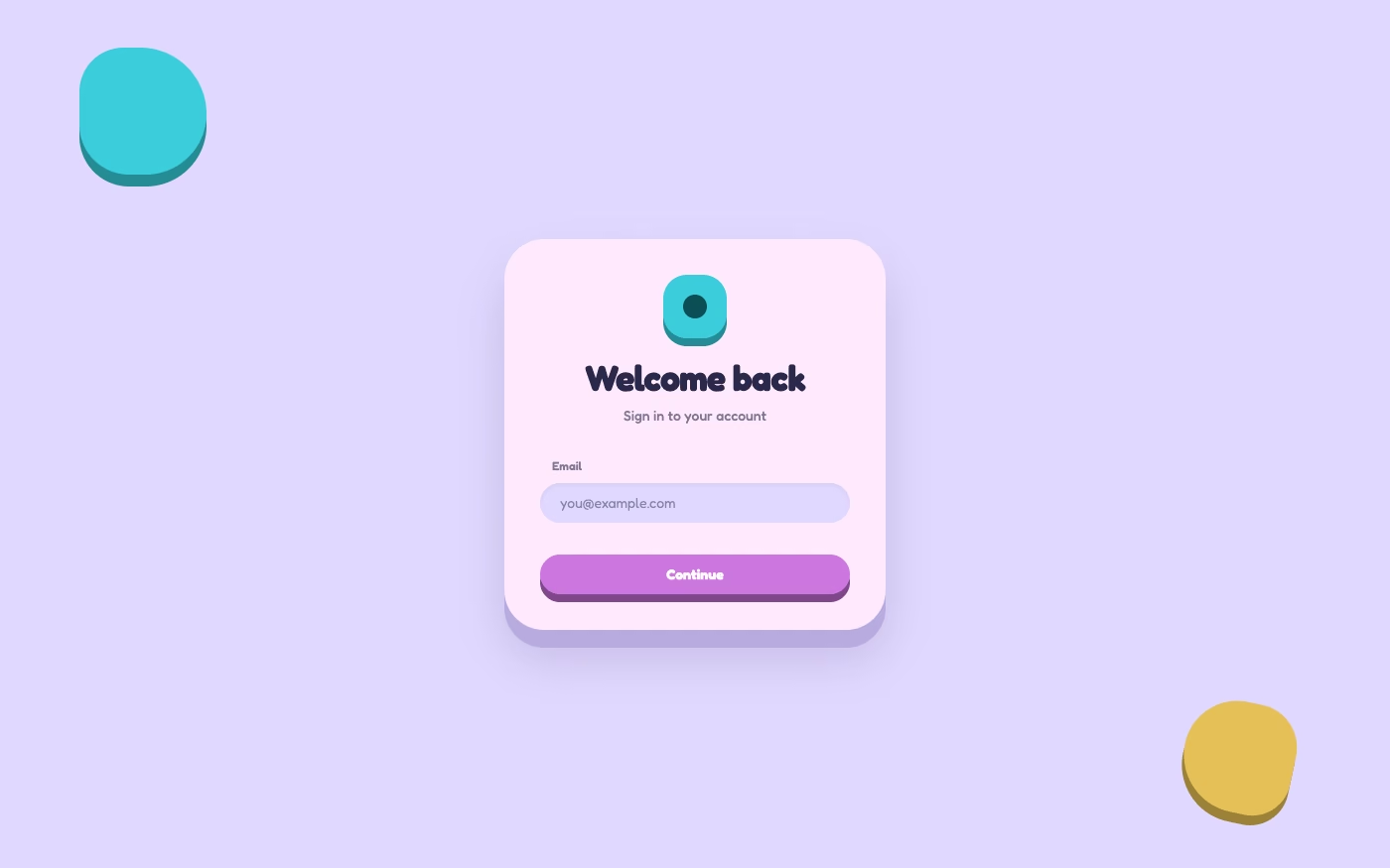
Claymorphism UI design style
Soft volume gives onboarding, education, and friendly consumer products a tactile personality.
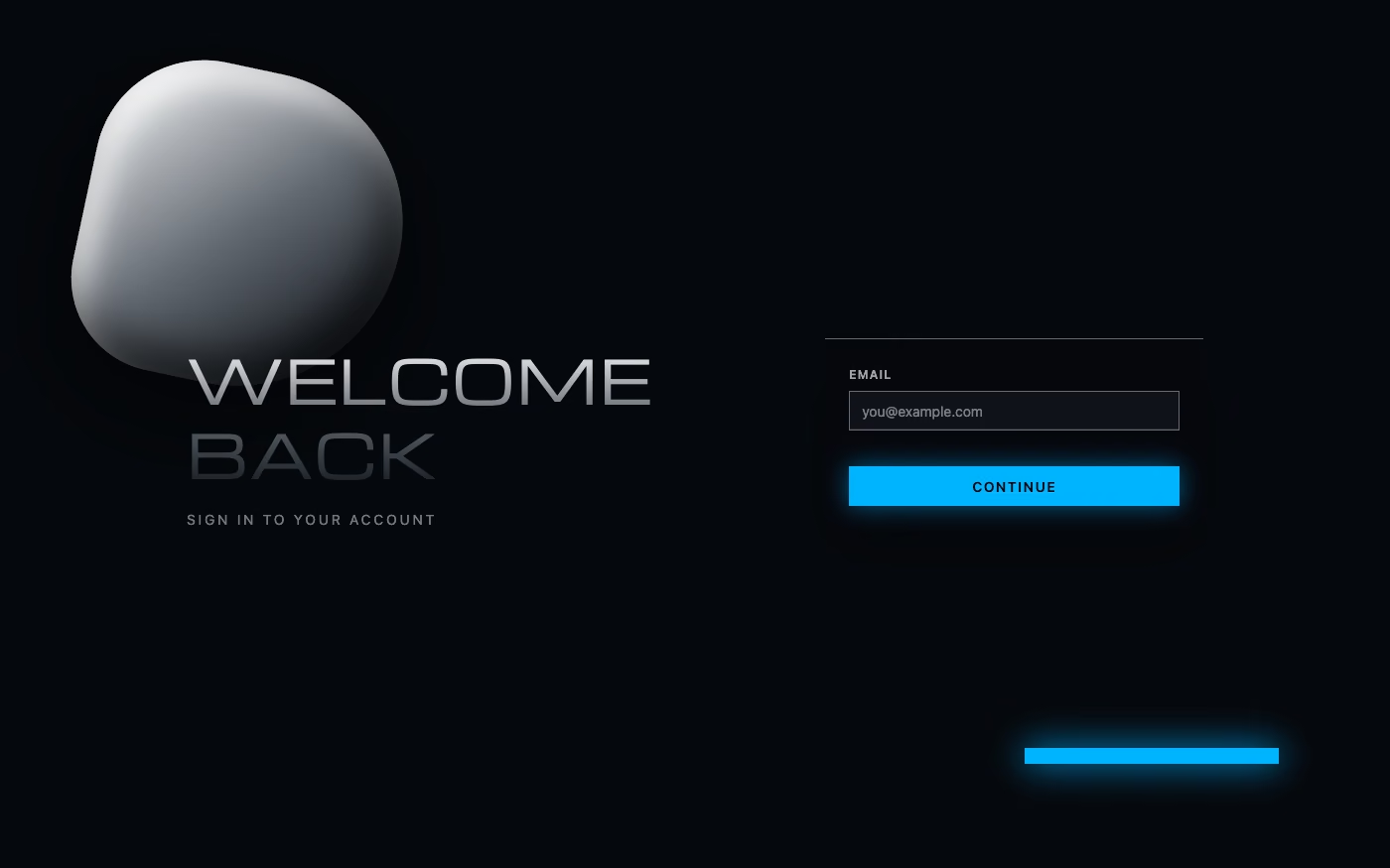
Chrome / Liquid Metal UI design style
Reflective materials remain useful for cinematic launches, fashion, music, and premium technology.
Type and structure carry the identity
A clear grid and a strong typographic voice can replace layers of decorative UI. This direction works because the content itself becomes the composition.
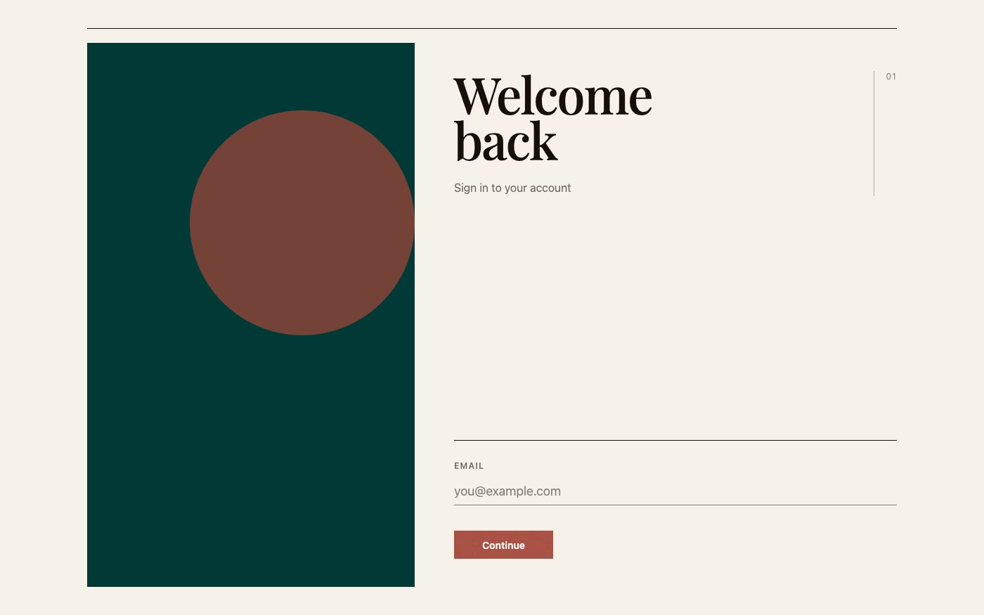
Editorial Design UI design style
Magazine pacing, art-directed imagery, and asymmetric type give product stories an authored rhythm.
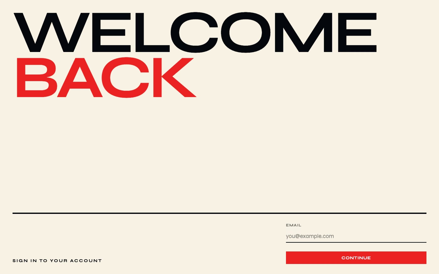
Type-First Design UI design style
Oversized words, contrast, and deliberate line breaks turn typography into the main visual system.
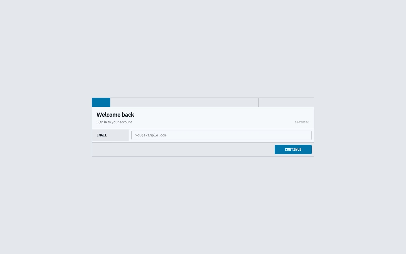
Data-Dense Utilitarian UI design style
Compact, information-rich screens are returning as teams favor speed, legibility, and expert workflows.
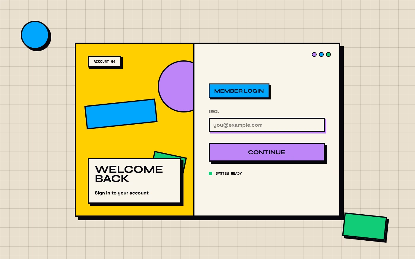
Neubrutalism UI design style
Bold borders and direct color create memorable hierarchy without hiding controls behind polish.
Personality beats generic polish
Handmade texture, ecological references, and nostalgic internet language help products escape the same tidy AI-generated template.
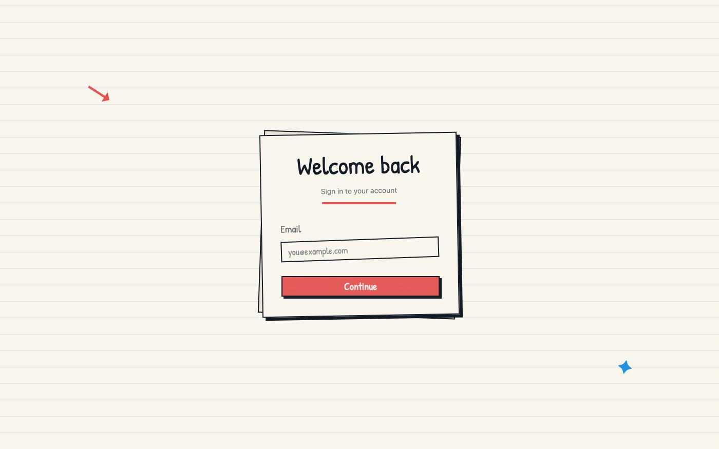
Hand-Drawn UI design style
Sketches and uneven marks add warmth when the interaction structure remains disciplined.
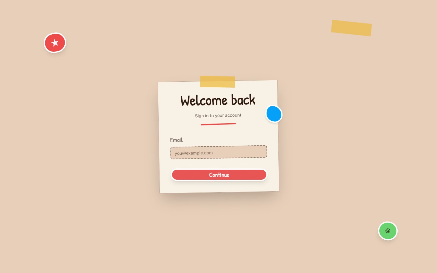
Scrapbook / Sticker UI design style
Layered paper, labels, and cutout imagery make community, culture, and creator products feel collected.
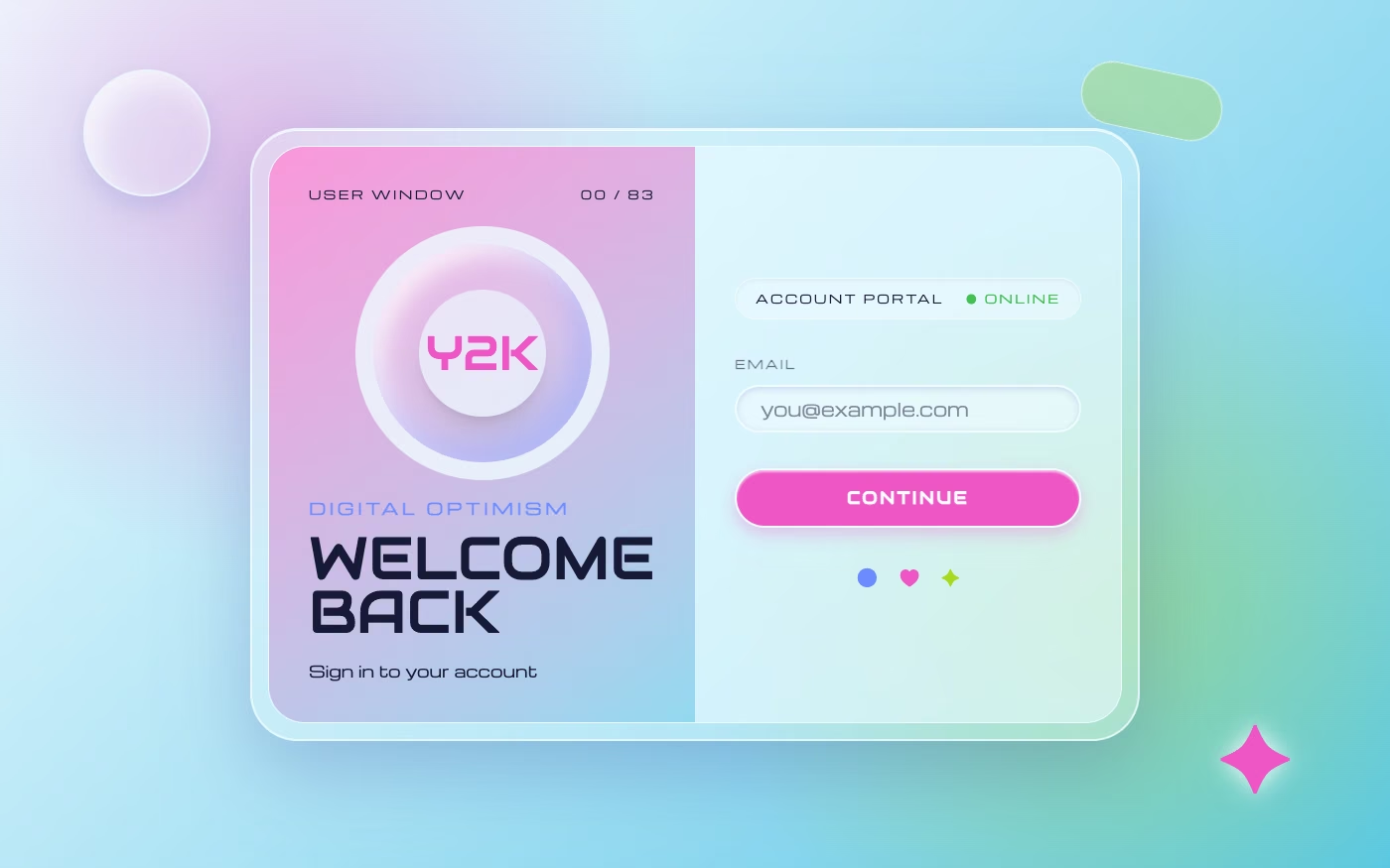
Y2K UI design style
Gloss, chrome, tiny type, and optimistic tech nostalgia continue to influence youth and entertainment products.
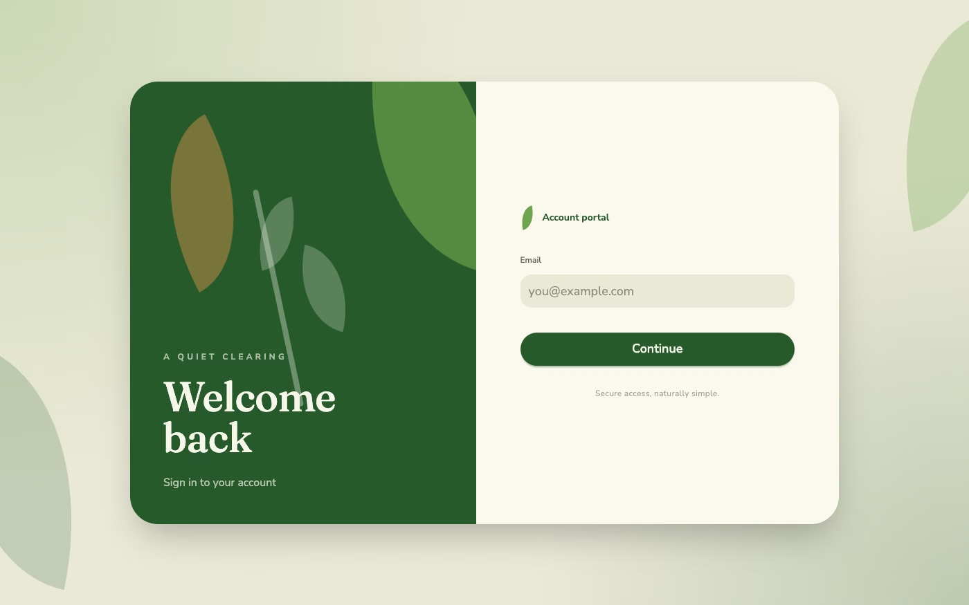
Biophilic Design UI design style
Natural color, texture, light, and organic rhythm offer a calmer counterweight to synthetic software surfaces.
Skeuomorphism finds new materials
Skeuomorphic UI is returning as a family of material languages. The strongest examples use depth, texture, and familiar objects to explain hierarchy or give a product a distinct setting.
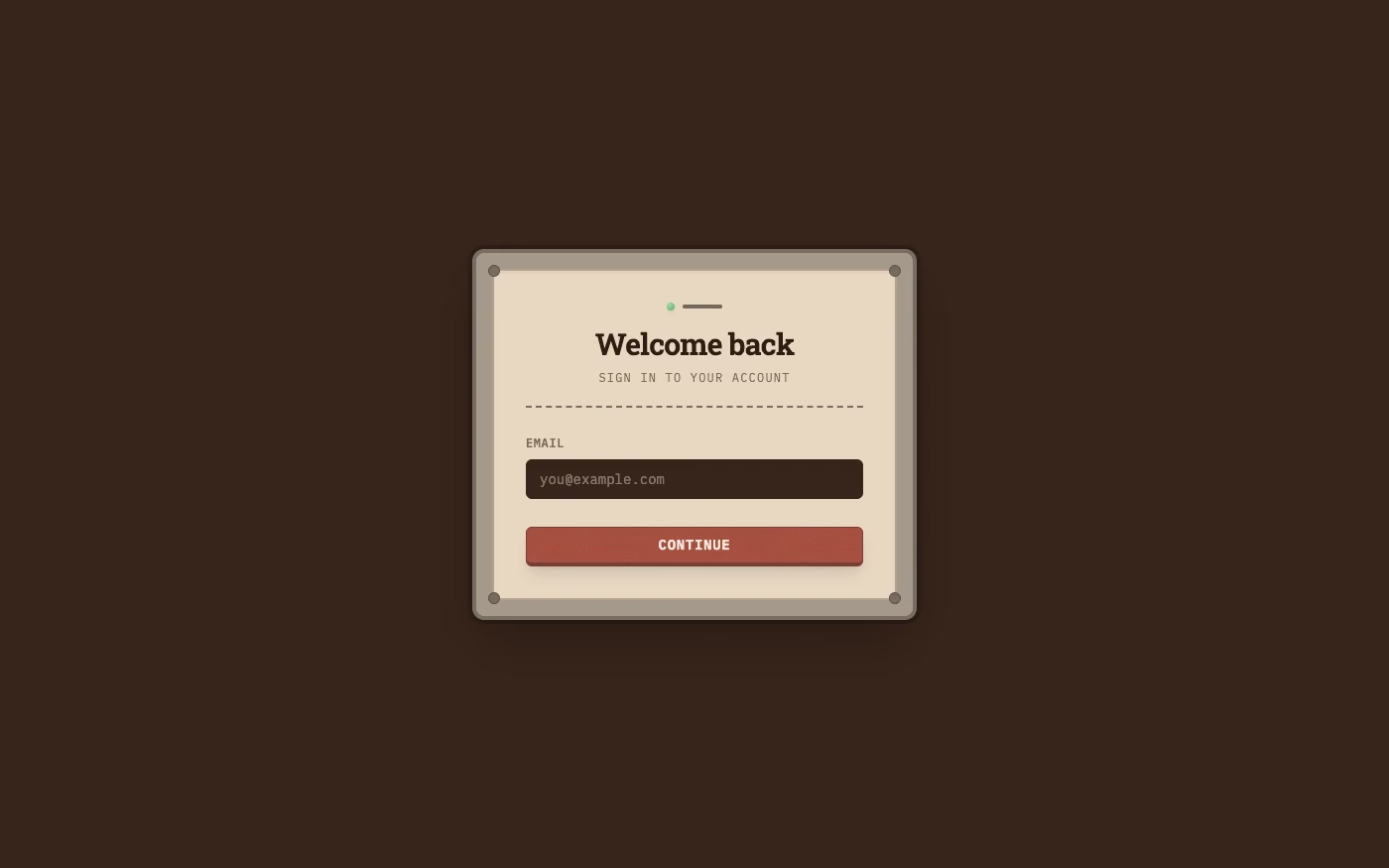
Skeuomorphism UI design style
Recognizable controls, layered surfaces, and physical cues make unfamiliar actions easier to understand.
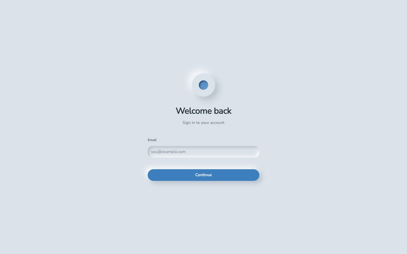
Neumorphism UI design style
Soft extruded controls work best in focused interfaces with strong contrast and unmistakable interaction states.
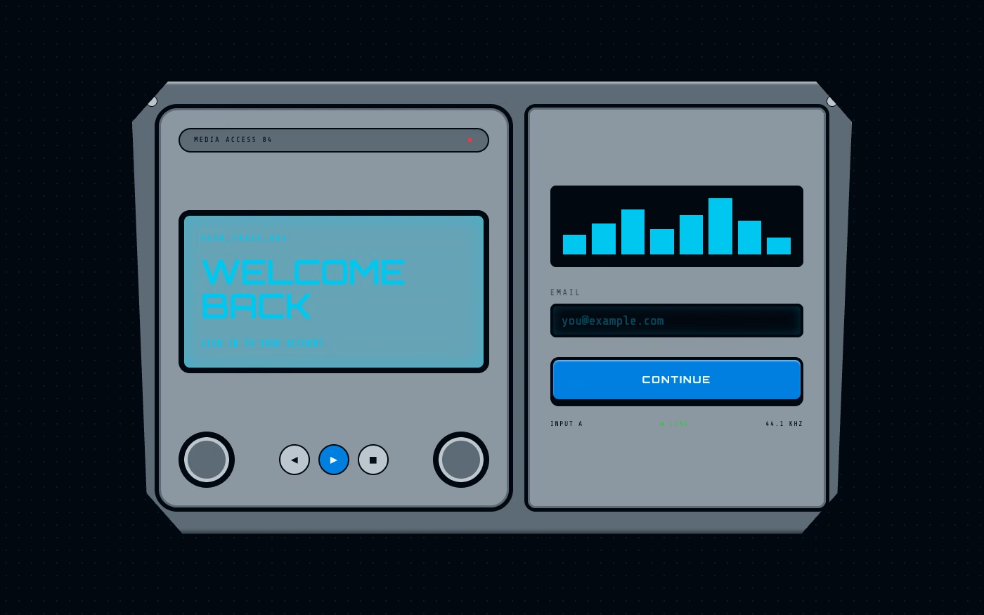
Y2K Techno-Skeuomorphism UI design style
Translucent shells, chrome controls, and compact device metaphors revive an optimistic personal-tech language.
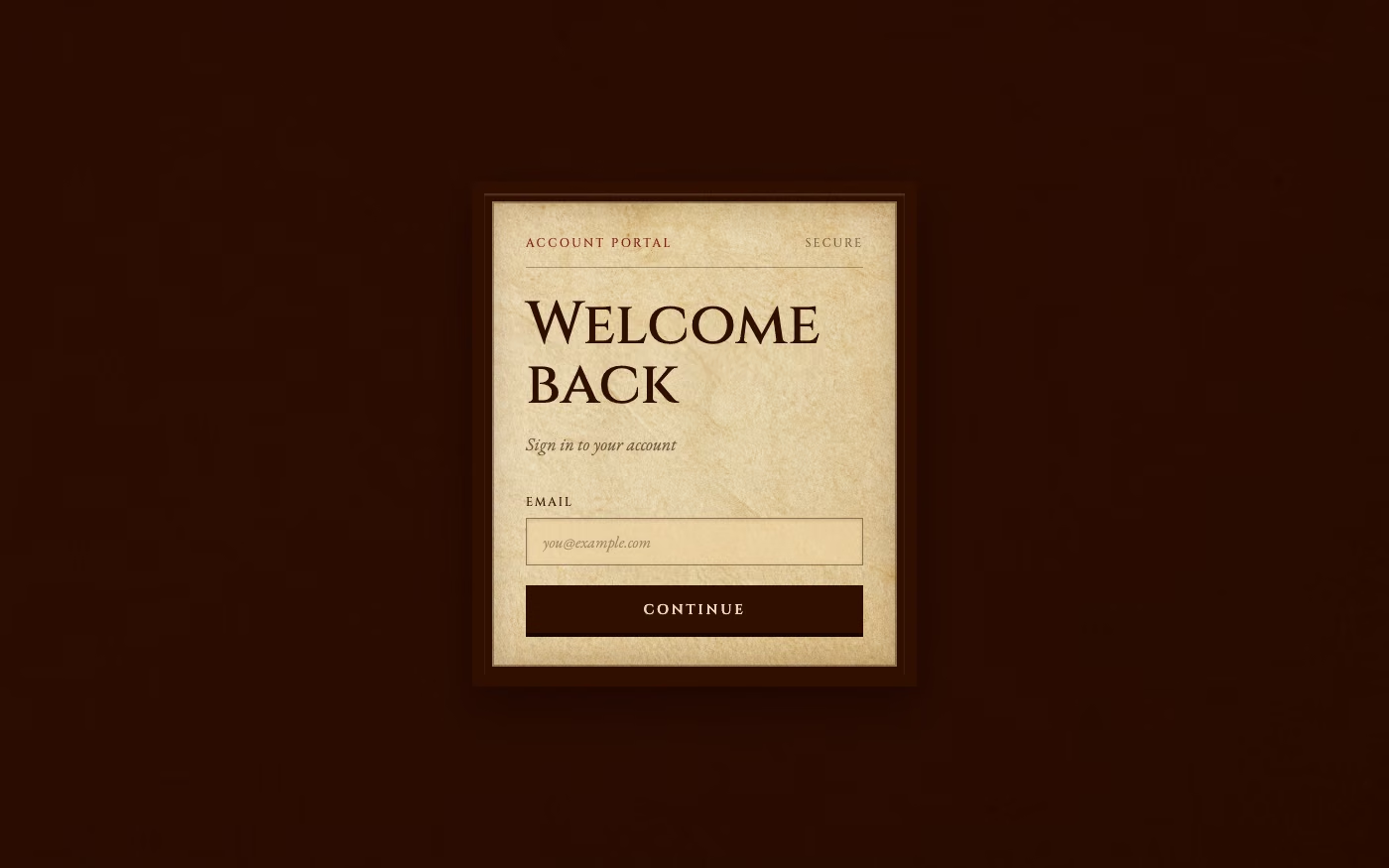
Historical Manuscript Skeuomorphism UI design style
Paper, ink, seals, and archival structures give research, culture, and story products a convincing world.
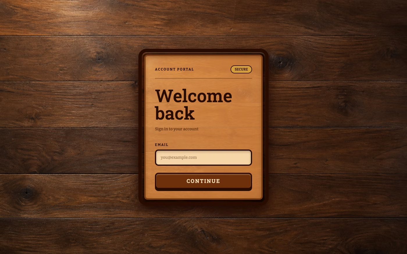
Real-Wood Skeuomorphism UI design style
Wood grain, inset panels, and crafted controls create warmth for audio, hospitality, and maker-focused interfaces.
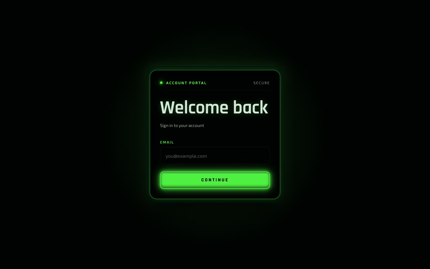
Luminous Eco-Skeuomorphism UI design style
Glowing natural materials combine ecological imagery with tactile controls for climate and wellness products.
Build a 2026 visual direction with Blueprint
Blueprint can match a style to your product, supply current daisyUI component context, guide the page structure, and inspect the finished interface.
Explore Blueprint MCP