Historical Manuscript Skeuomorphism UI design style
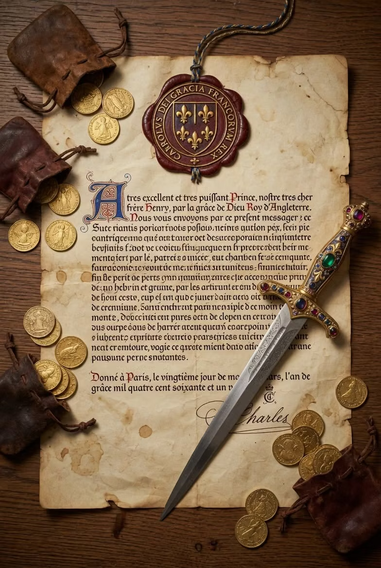
A tactile interface style that makes digital UI feel like a physical artifact from an older era, using the visual language of parchment, ledgers, bound folios, and ceremonial documents. It belongs to the broader skeuomorphic tradition, but with a specifically archival, literary, and old-world character.
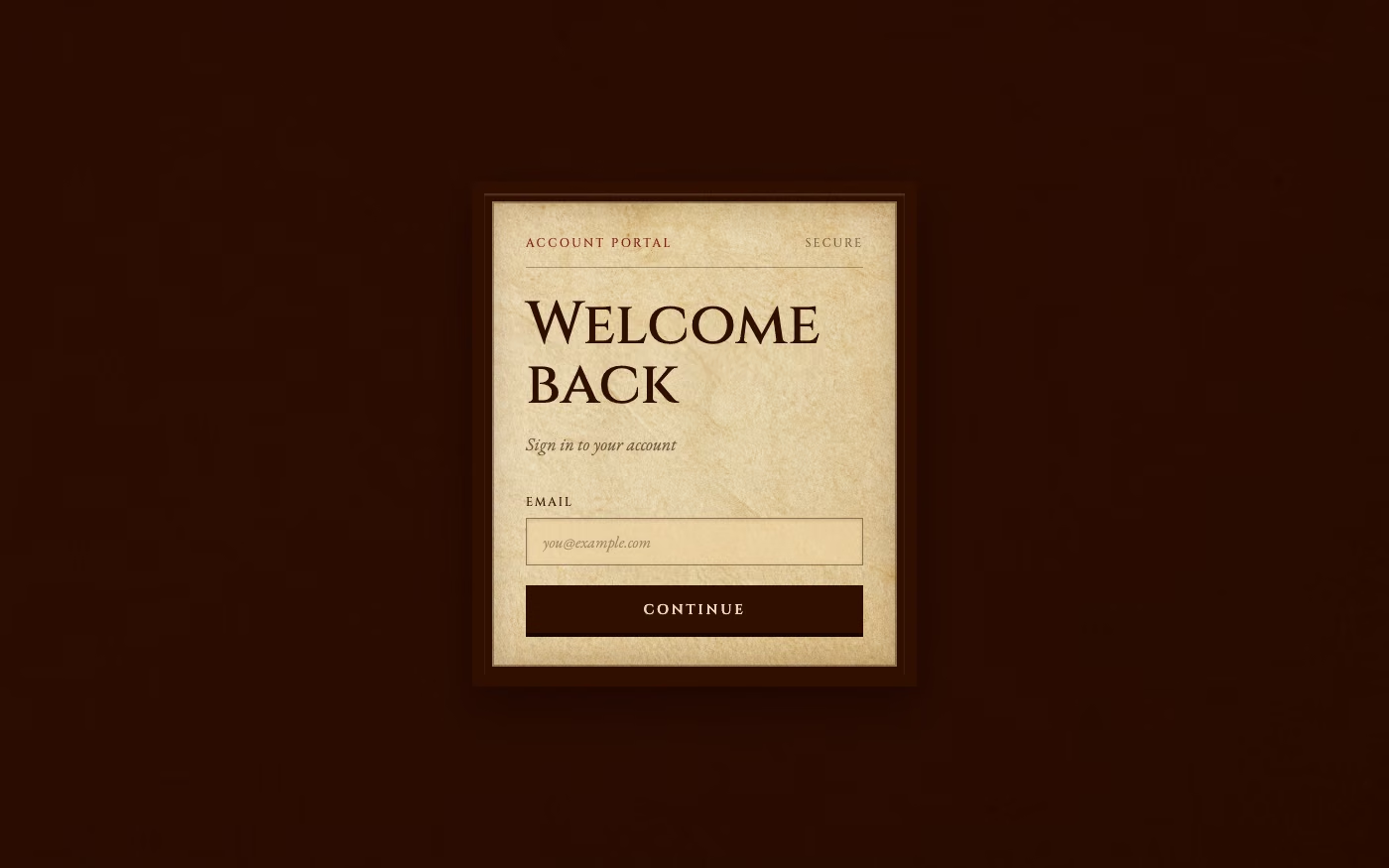
Design overview
- Signature elements
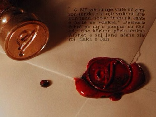
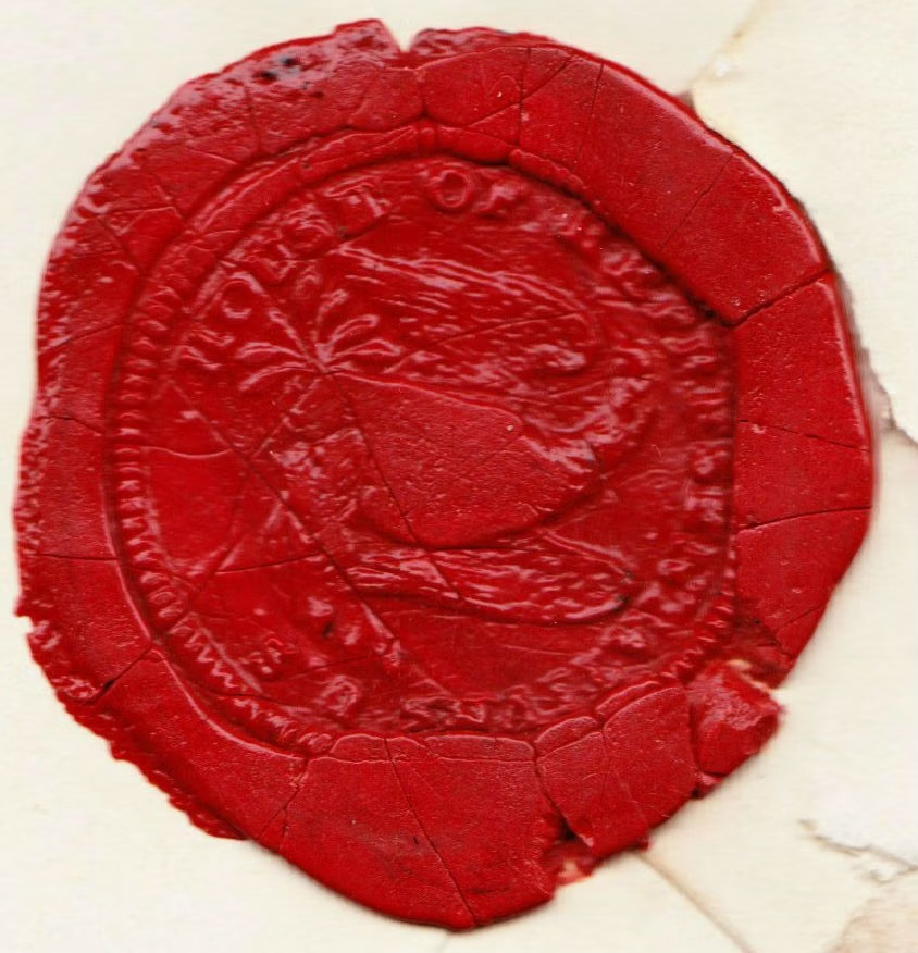
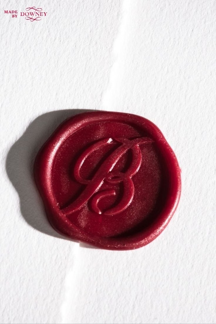
- aged paper textures, leather or wood framing, wax seals, ribbons, page tabs, ornamental dividers, metal corner details, ruled tables, ink-like typography, worn edges. In daisyUI themes, set `--noise: 1;` and `--depth: 1;`.
- Best suited to
- Historical games, educational experiences, museum interfaces, fantasy worldbuilding, simulation dashboards, narrative menus, and culture-focused websites.
- Layout principles
- Design the interface like a physical page, ledger, or bound book, using framed panels, generous margins, formal alignment, tabbed navigation, and compartmentalized sections that feel attached, printed, pinned, or layered onto a surface.
History and origins
A fact-checked account of where this visual language came from, with links to the references used.
- Period
- Medieval manuscript precedents; contemporary digital adaptation
- Origin
- European and Mediterranean manuscript workshops; later interface design
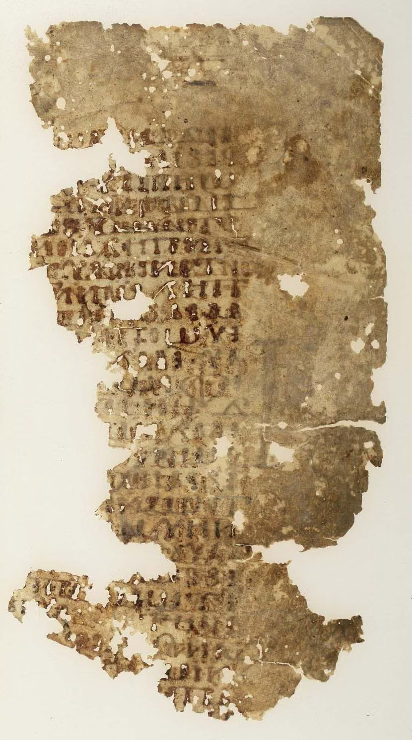
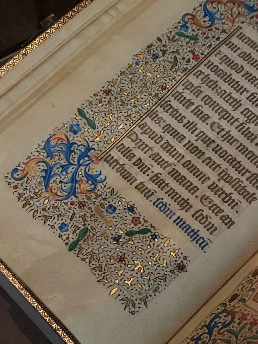
Historical Manuscript Skeuomorphism is a current interface label, not a historical school of UI. It translates parchment, illumination, rubrication, seals, and book structure from hand-produced medieval manuscripts into screen surfaces; its digital mechanism belongs to the much newer skeuomorphic practice of using familiar physical cues to frame interaction.
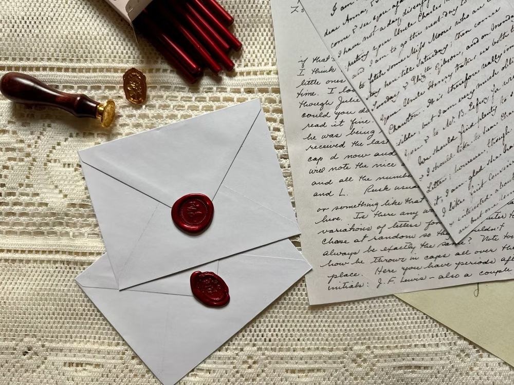
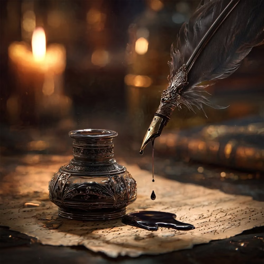
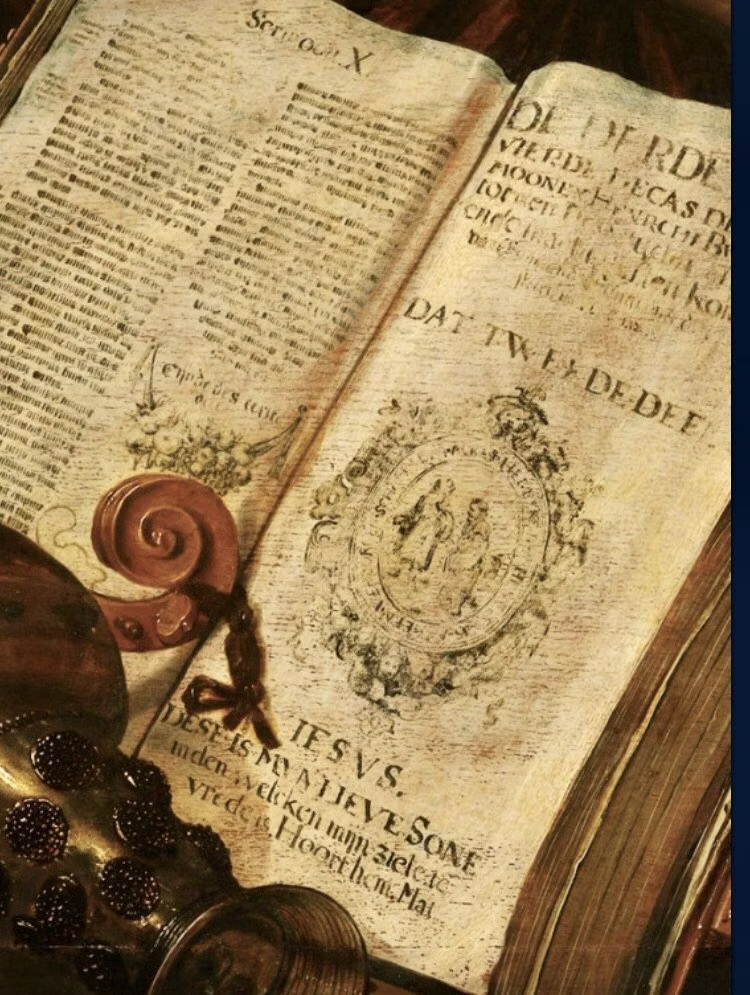
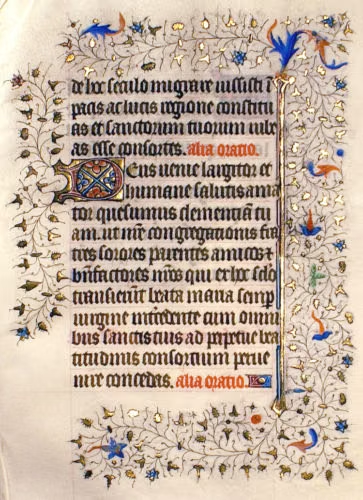
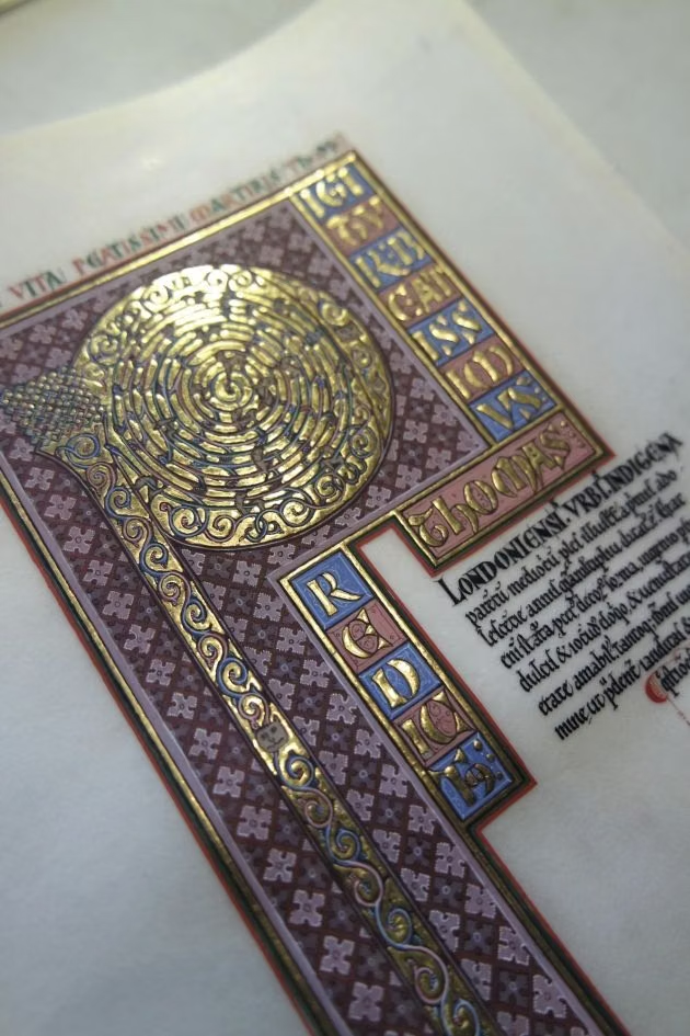
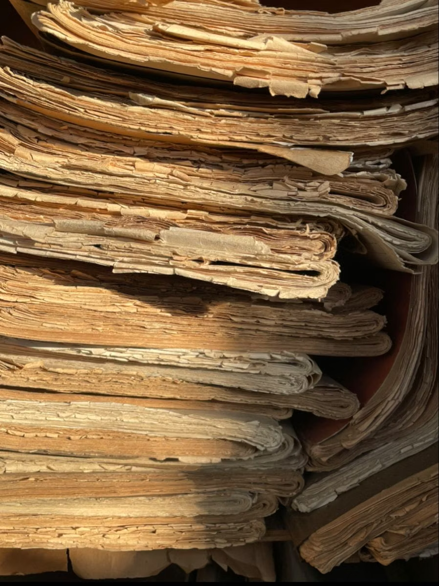
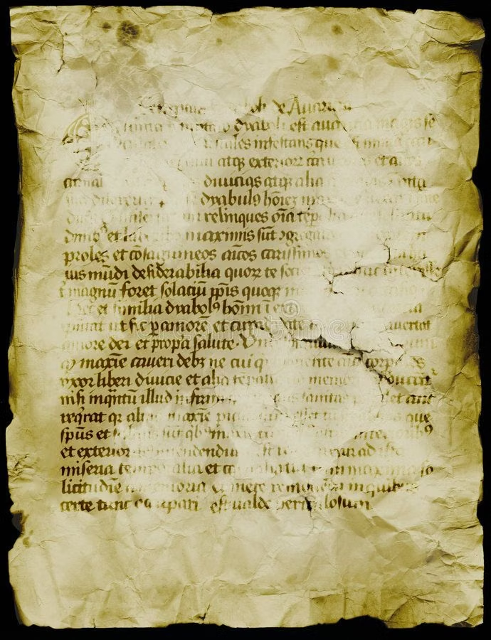
Moodboard and visual references
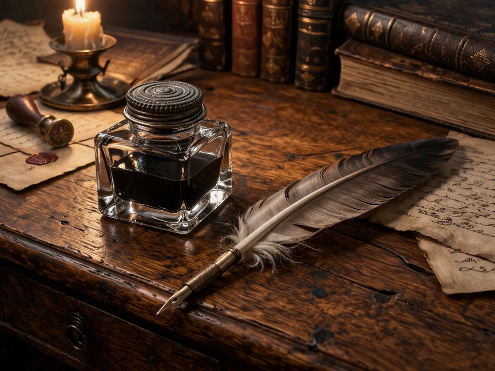
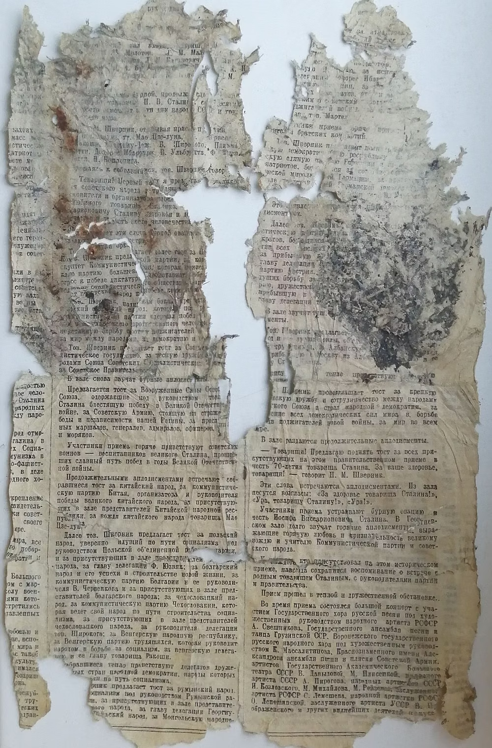
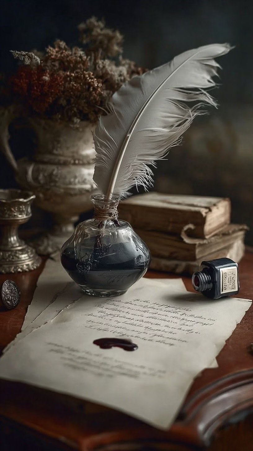
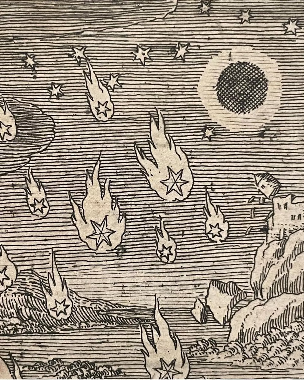
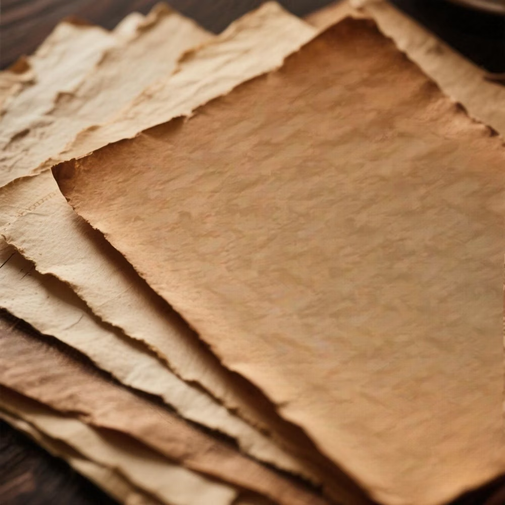
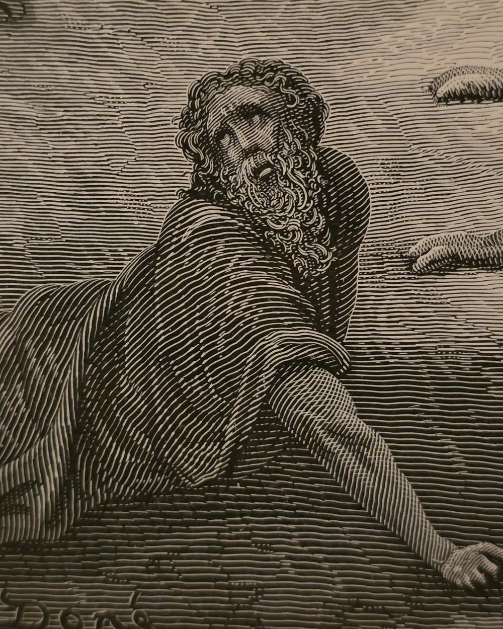
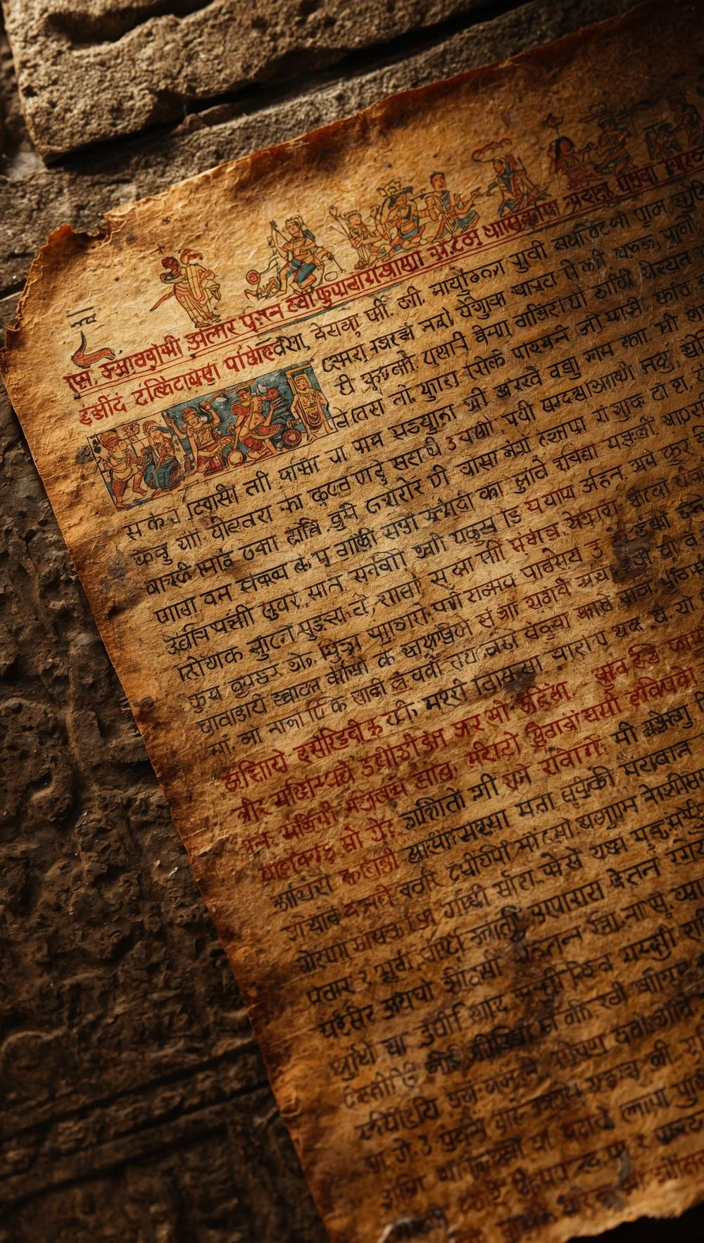
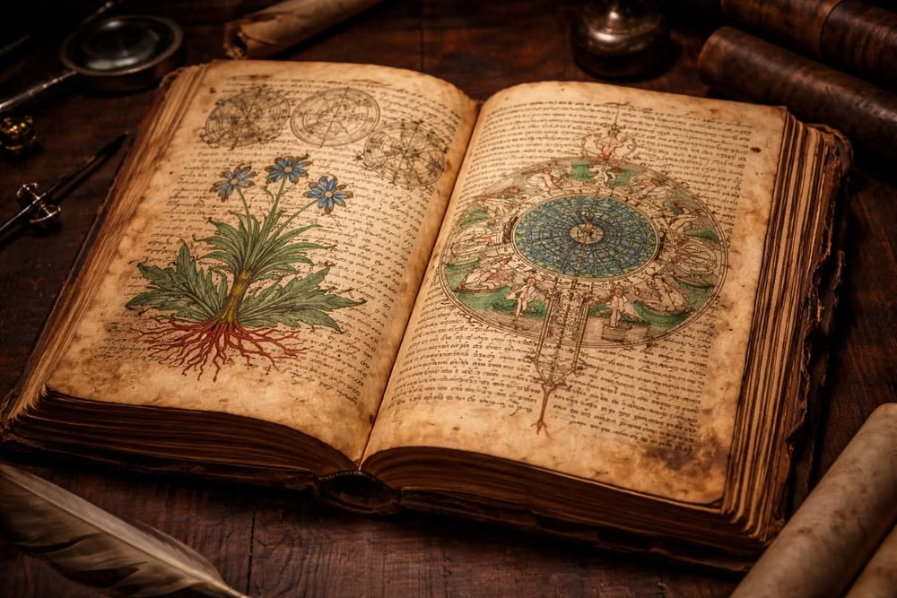
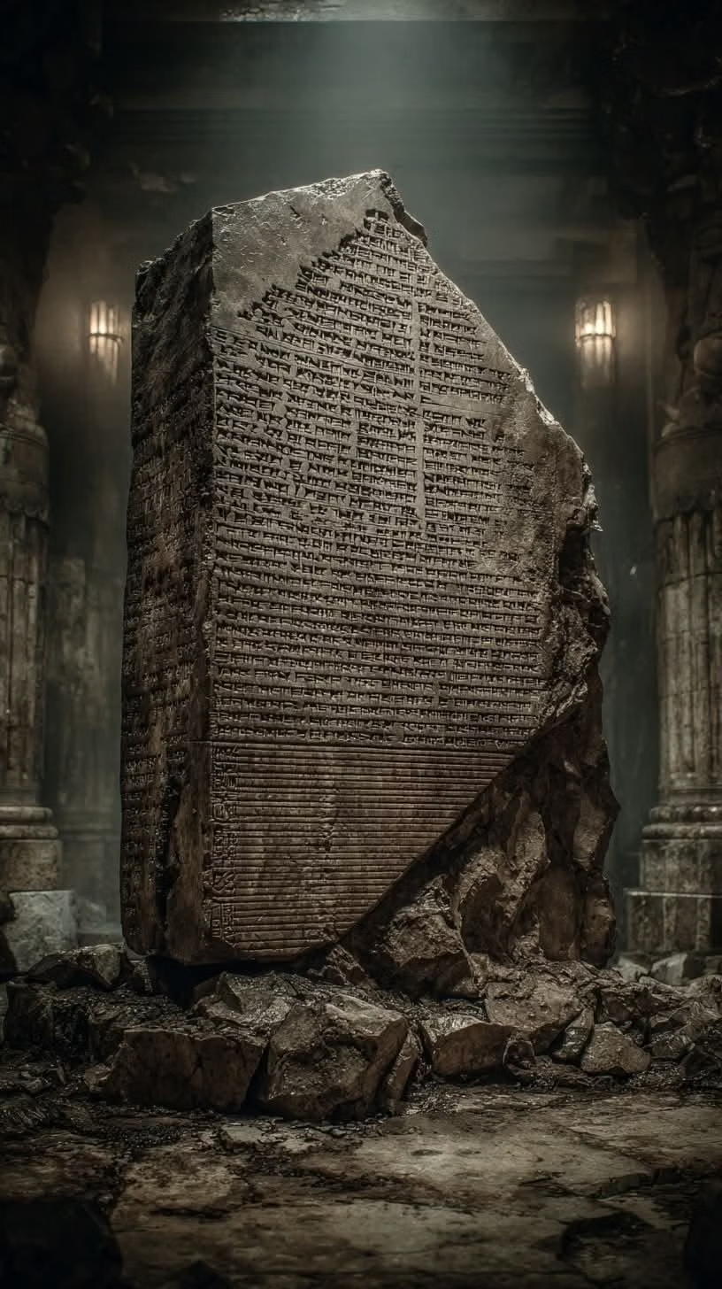
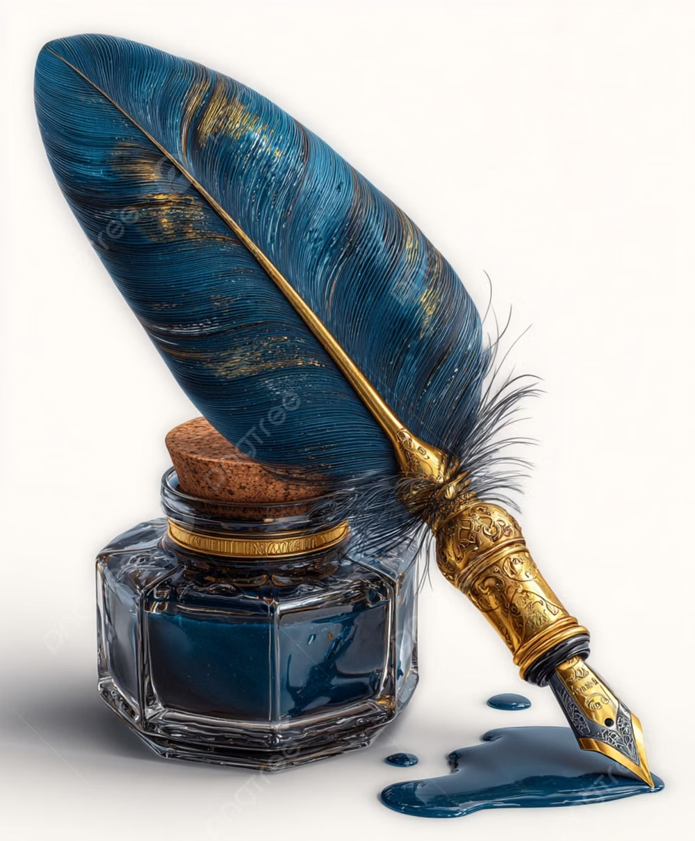
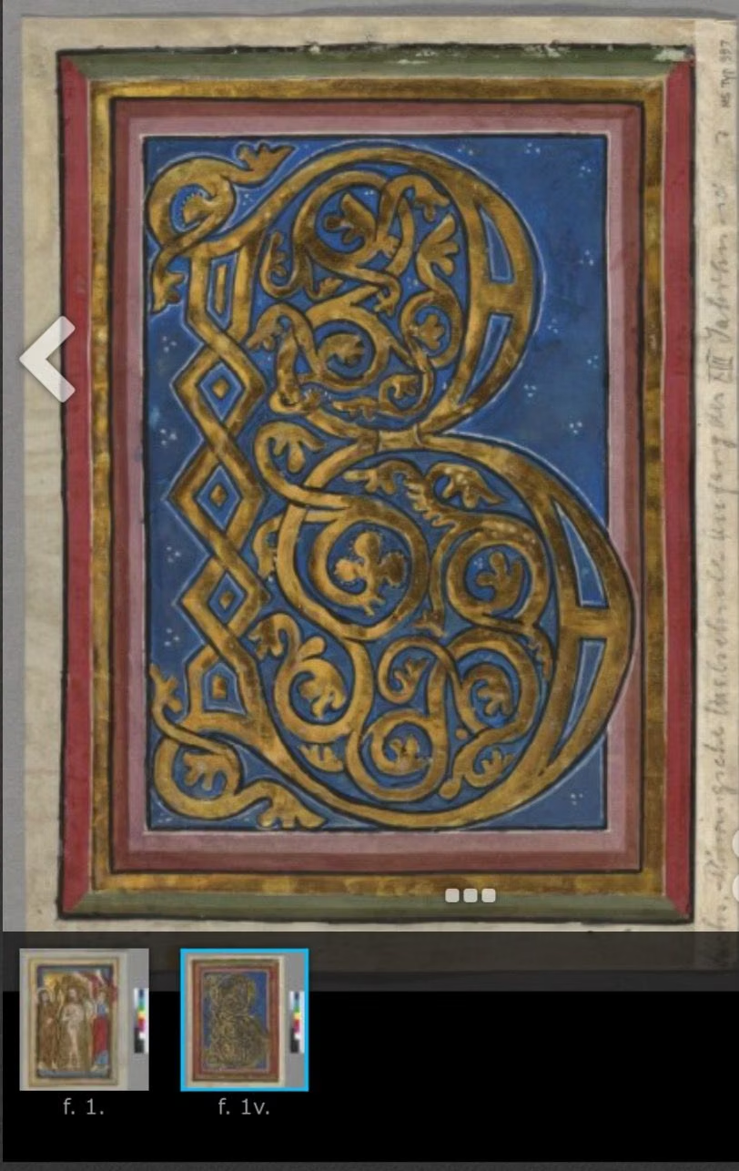
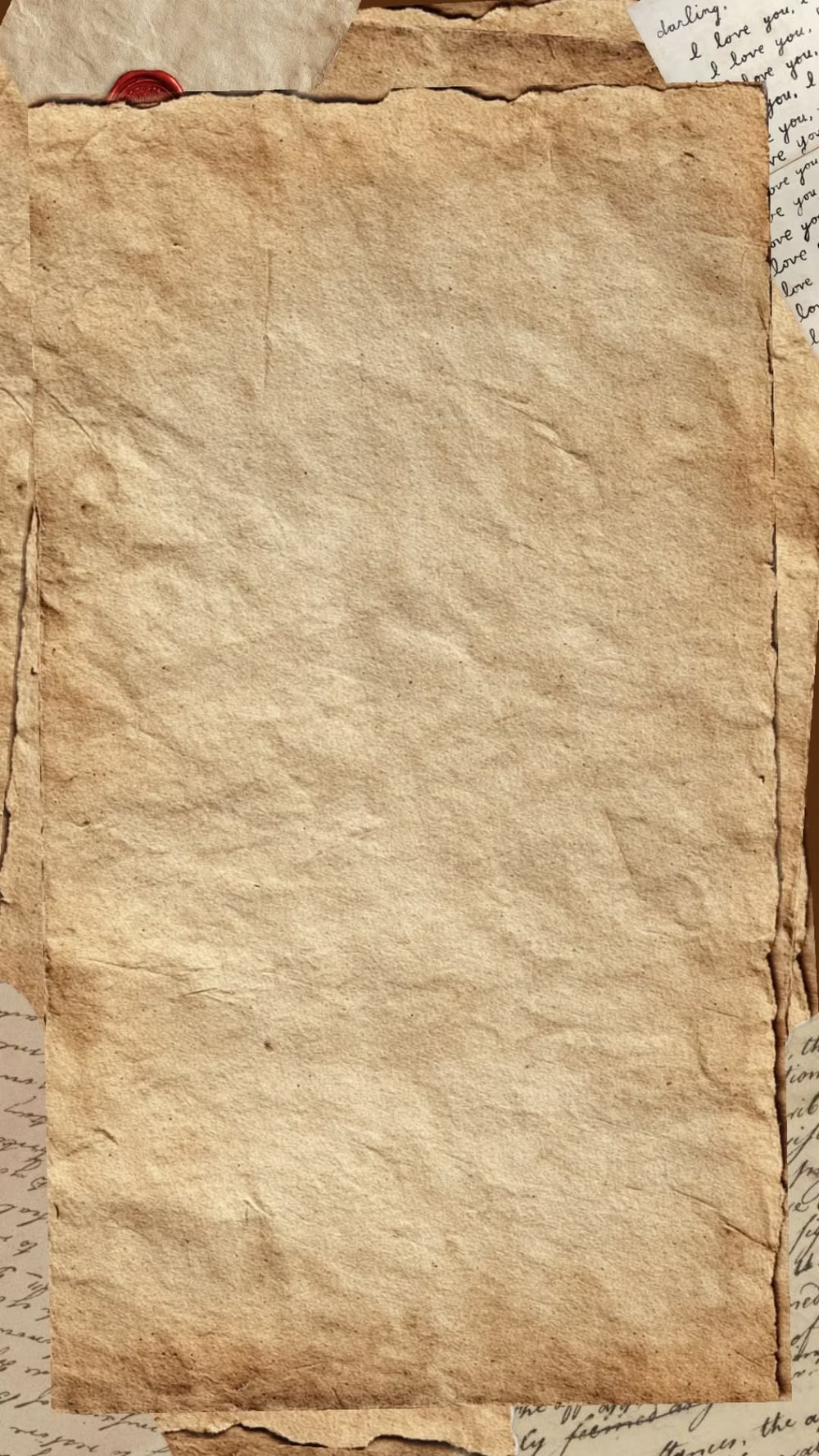
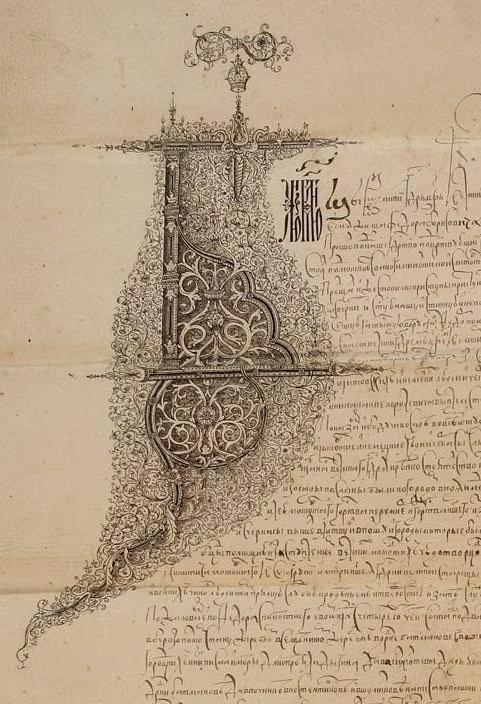
A visual study of the forms, inspirations, materials, colors, type, and cultural references associated with this UI design style.
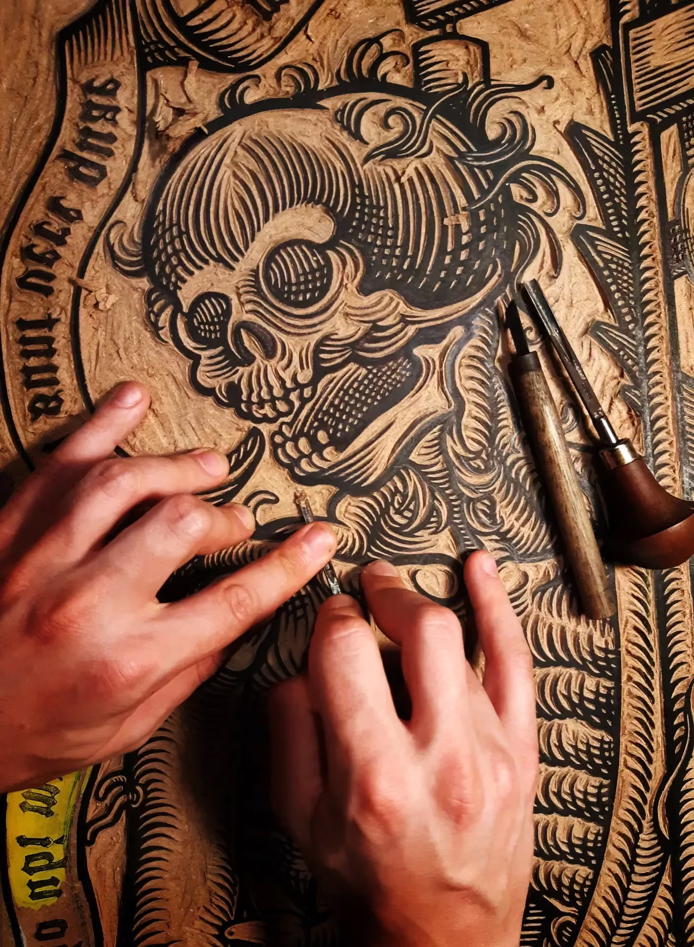
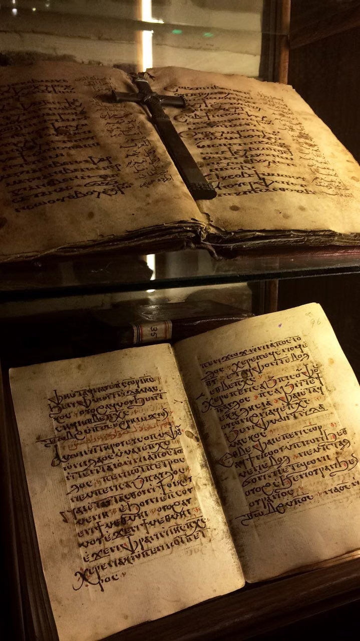
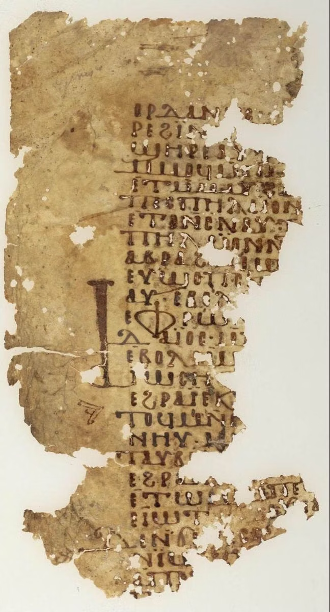
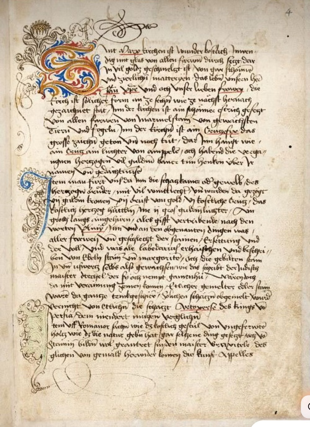
Design principles and implementation
Use these principles to write a focused AI UI design prompt instead of asking for a vague visual treatment.
Color direction
Use muted, material-inspired tones drawn from paper, ink, leather, wood, and metal, with gentle contrast and naturally weathered value shifts rather than crisp synthetic intensity. In a daisyUI theme, use oxblood or archival ink for `primary`, tarnished brass or muted leather for `secondary`, and assign pale parchment, aged paper, and tea-stained paper to `base-100`, `base-200`, and `base-300`.
Imagery direction
Use imagery that feels printed, sketched, engraved, stamped, or mounted on paper, with subtle surface wear, soft depth, and a consistent physical-material treatment.
Content density
Support medium to high information density, but organize it into clearly bounded sheets, labels, columns, and tables so the interface still feels orderly and readable.
Motion direction
Use restrained motion that mimics physical interaction, such as page turning, sliding drawers, unfolding notes, stamped feedback, or slight object lift, avoiding flashy digital effects.
Shape language
Favor rectangular sheets, plaques, labels, medallions, tabs, seals, and decorative flourishes, with slightly imperfect edges, layered borders, and tangible object-like construction. In daisyUI themes, set the `--radius-*` variables between `0.25rem` and `1rem`.
Typography rules
Use elegant serif and calligraphic typography with strong hierarchy, pairing a historical display face for headings with a readable old-style serif for body text, and treat type as if it were printed or written in ink.
Suggested Typfaces
Cormorant Garamond
Fresh daisies glow in warm sunlight
Fresh daisies glow in warm sunlight
1 2 3 4 5 6 7 8 9 0
Cinzel
Fresh daisies glow in warm sunlight
Fresh daisies glow in warm sunlight
1 2 3 4 5 6 7 8 9 0
EB Garamond
Fresh daisies glow in warm sunlight
Fresh daisies glow in warm sunlight
1 2 3 4 5 6 7 8 9 0
IM Fell English
Fresh daisies glow in warm sunlight
Fresh daisies glow in warm sunlight
1 2 3 4 5 6 7 8 9 0
Alegreya
Fresh daisies glow in warm sunlight
Fresh daisies glow in warm sunlight
1 2 3 4 5 6 7 8 9 0
Build a Historical Manuscript Skeuomorphism interface with daisyUI
The live example translates this direction into daisyUI components and semantic theme tokens.
To generate a full page in the same visual language, give the style name and the design rules above to Blueprint MCP.
Related UI design styles
Compare nearby visual languages that share typography, shapes, use cases, or signature elements.
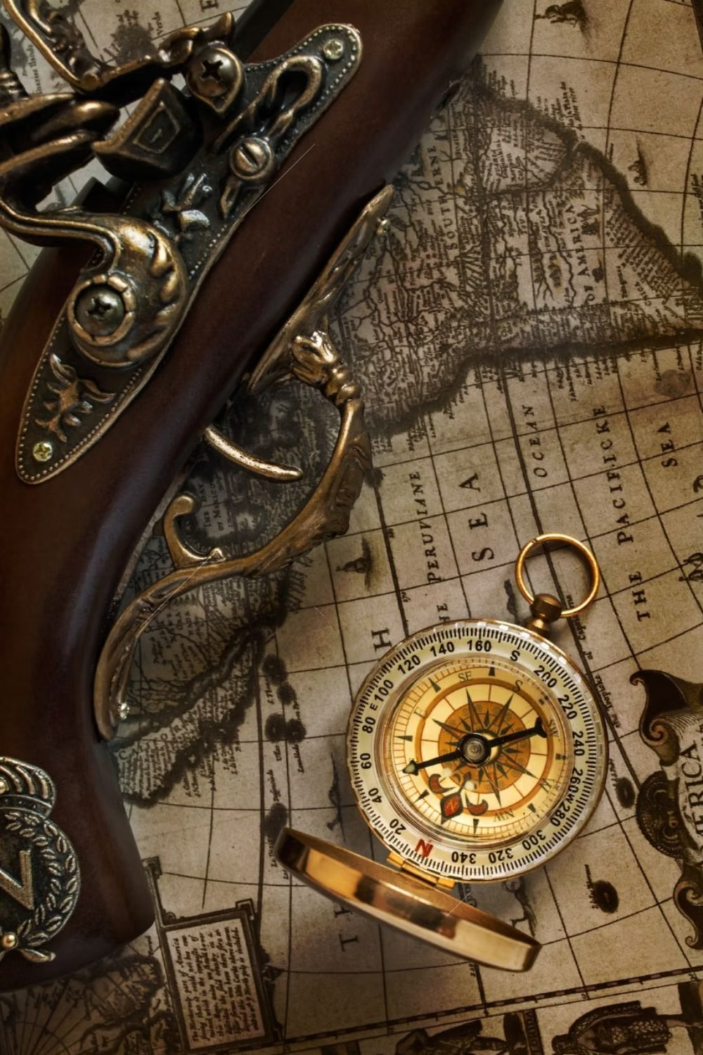
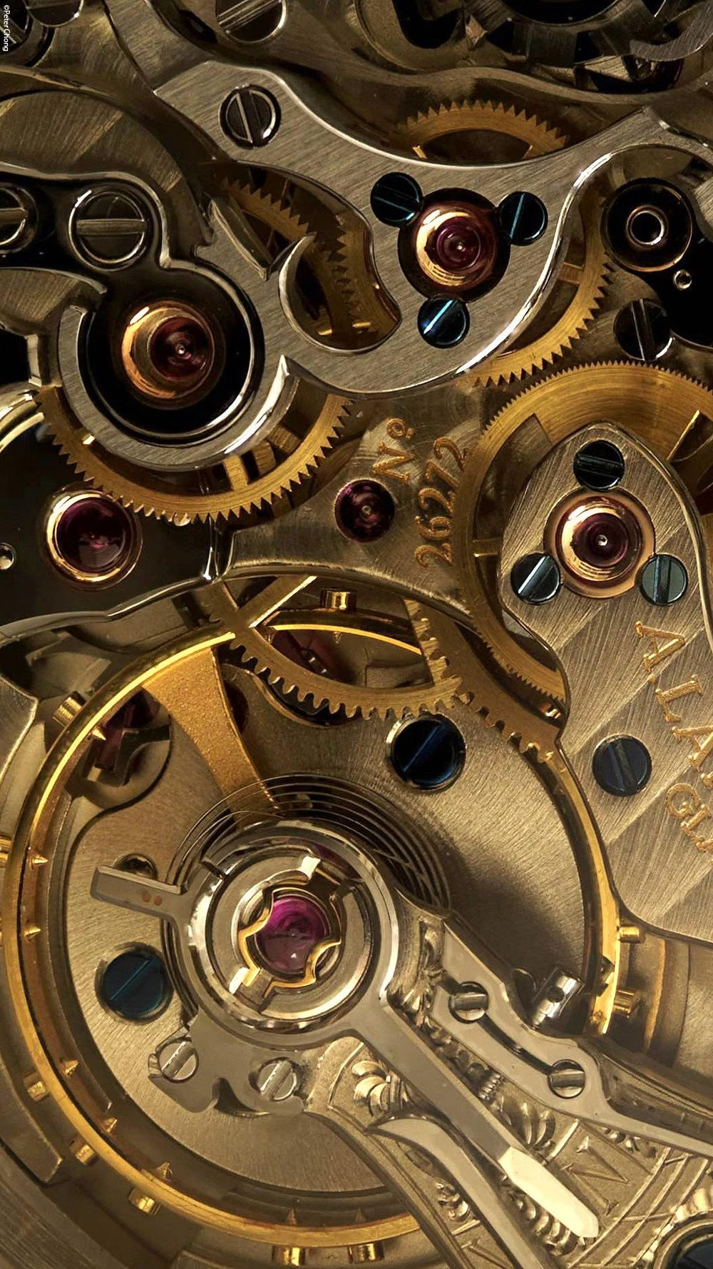

Steampunk UI design style
A hyper-skeuomorphic Victorian machine aesthetic turns the interface into a worn, theatrical artifact built from brass, iron, leather, parchment, glass, and enamel.
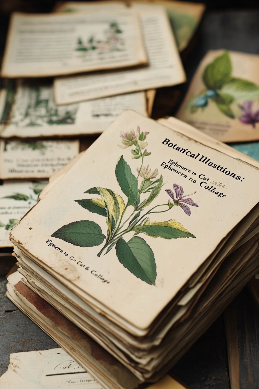
Dark Academia UI design style
Moody scholarly visuals use serif typography, parchment, dark wood, muted earth tones, and archival details.
Cottagecore UI design style
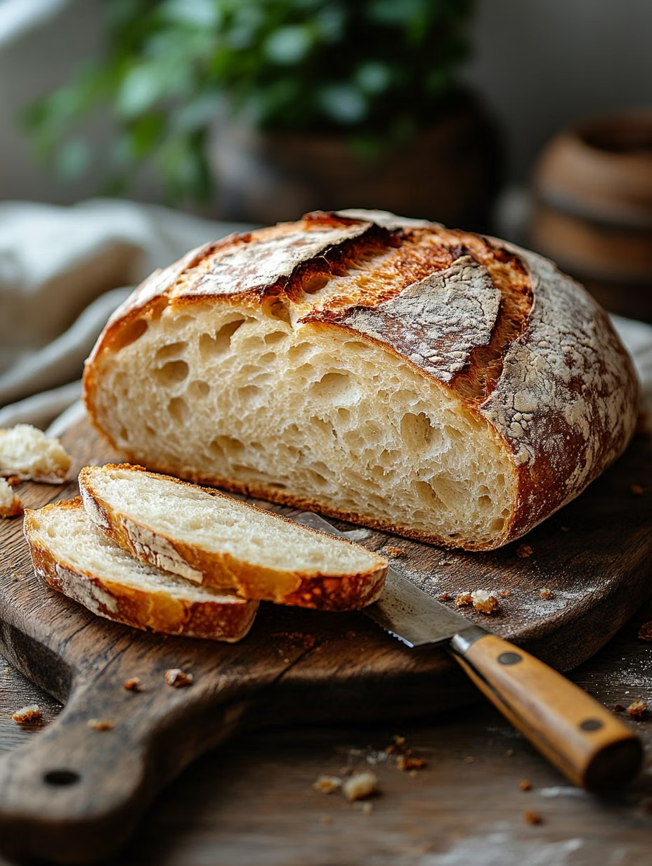
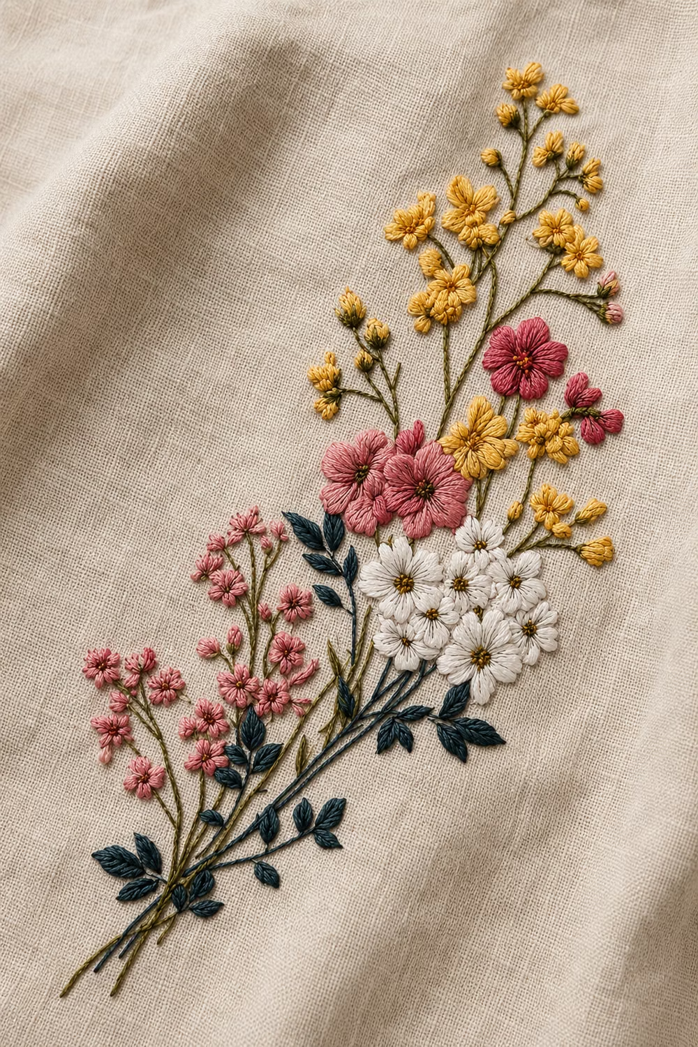
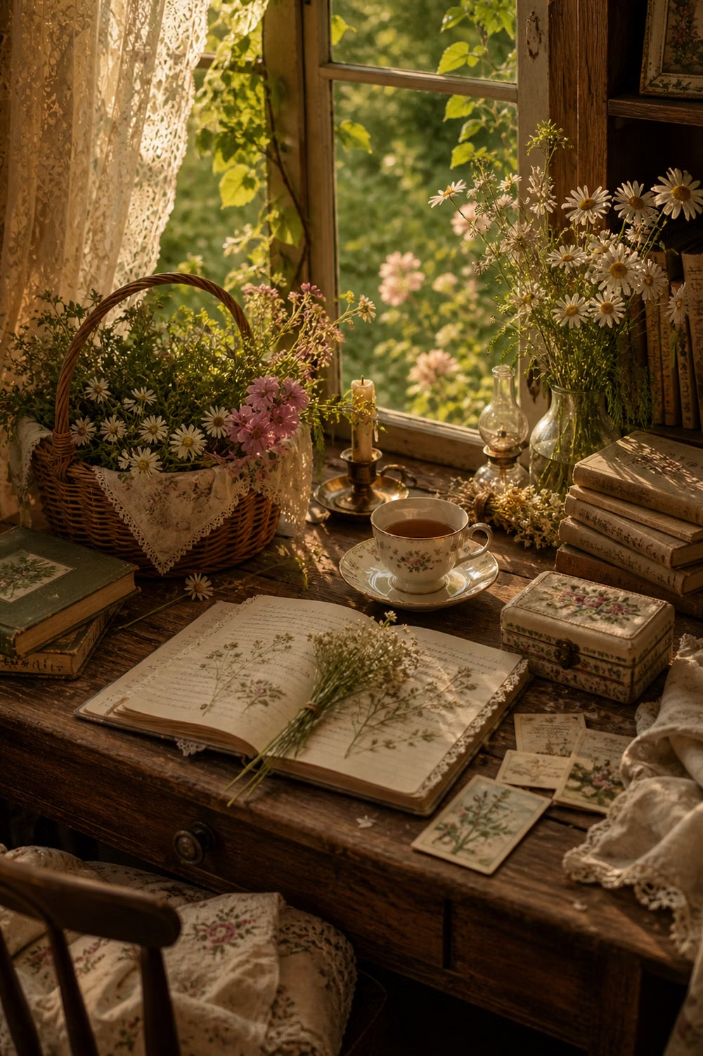
Pastoral imagery, florals, handmade textures, gentle serif type, warm domestic details, and romantic rural nostalgia.