Real-Wood Skeuomorphism UI design style
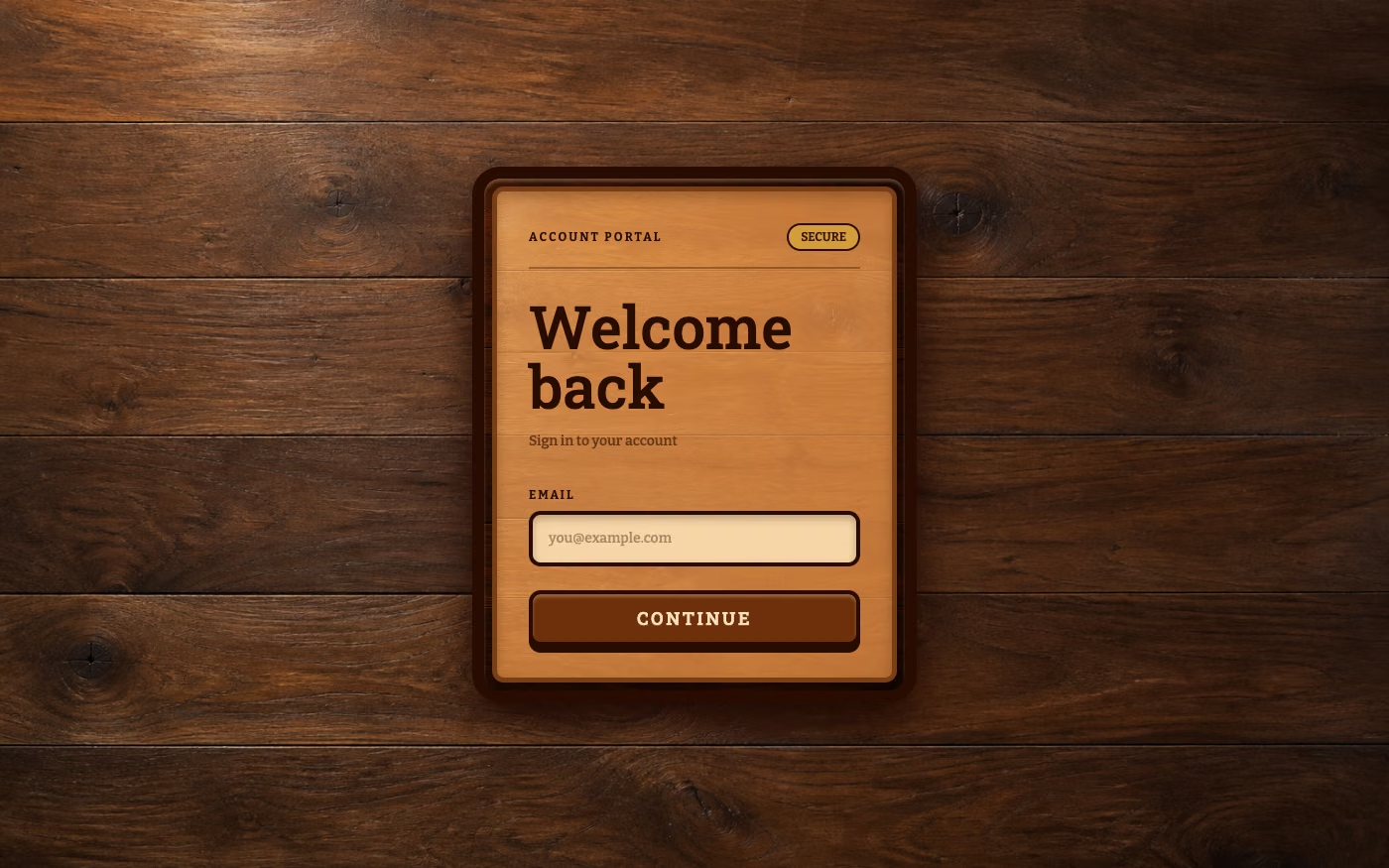
A tactile skeuomorphic style that constructs interfaces from highly realistic wood surfaces, making digital controls resemble carved, assembled, polished, or weathered wooden objects.
Design overview
- Signature elements
- photorealistic wood grain, visible knots and pores, wooden planks, carved controls, routed grooves, beveled edges, inset tracks, raised panels, realistic joinery, varnished surfaces, engraved labels, material shadows. In daisyUI themes, set `--noise: 1;` and `--depth: 1;`.
- Best suited to
- Craft-focused brands, music interfaces, fantasy and survival games, hospitality websites, artisan products, simulations, and nostalgic applications.
- Layout principles
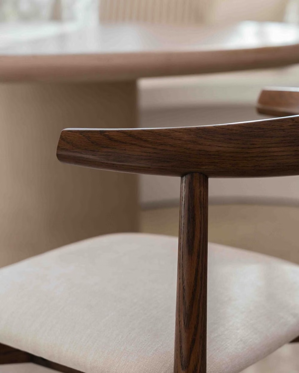
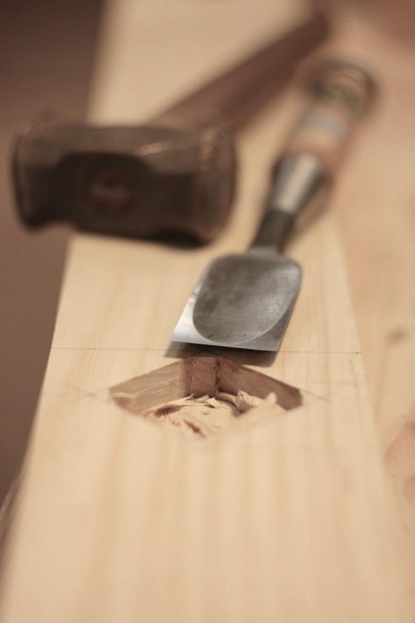
- Treat the interface as a physically constructed wooden object, using planks, frames, carved recesses, layered boards, and believable joinery to organize sections. Align grain direction with component geometry and maintain consistent lighting, depth, and material scale.
History and origins
A fact-checked account of where this visual language came from, with links to the references used.
- Period
- 2000s–early 2010s as a prominent UI treatment
- Origin
- Consumer software borrowing from furniture, audio equipment, and instrument panels
Real-Wood Skeuomorphism is a descriptive subset of skeuomorphic interface design rather than a separate movement. Wood-grain shelves, control panels, and desktops became especially visible in richly textured consumer apps of the 2000s and early 2010s, translating familiar furniture and audio-object cues into navigation before flat design displaced much of the simulated material.
Moodboard and visual references
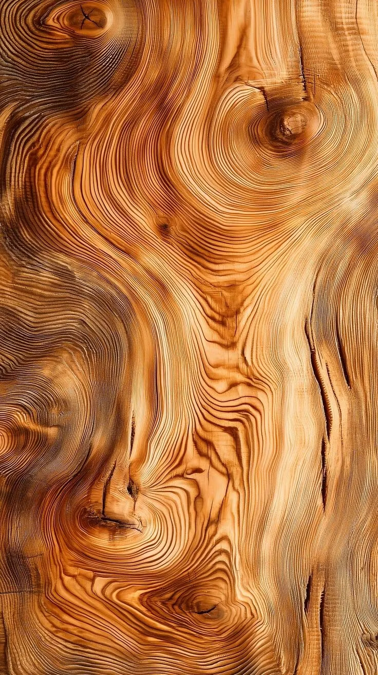
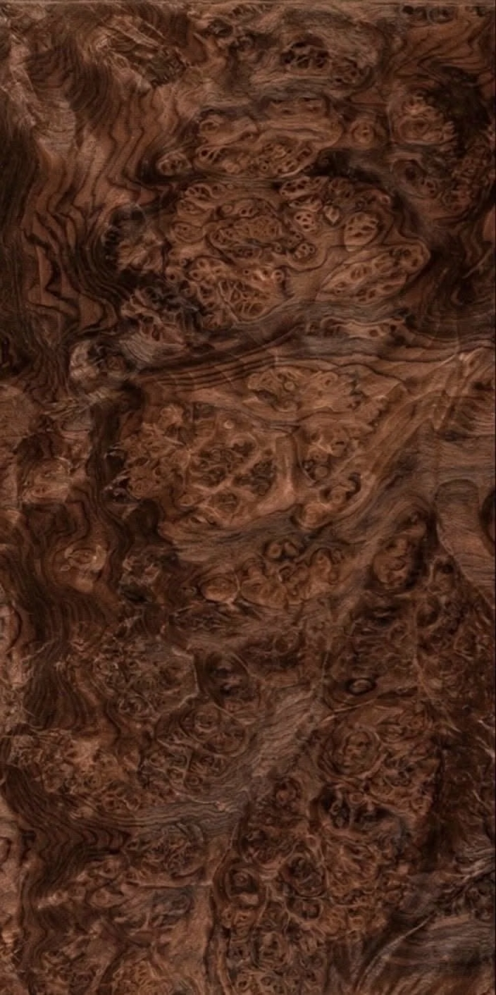
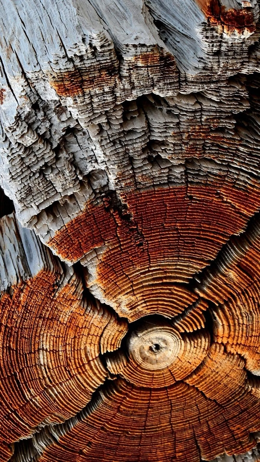
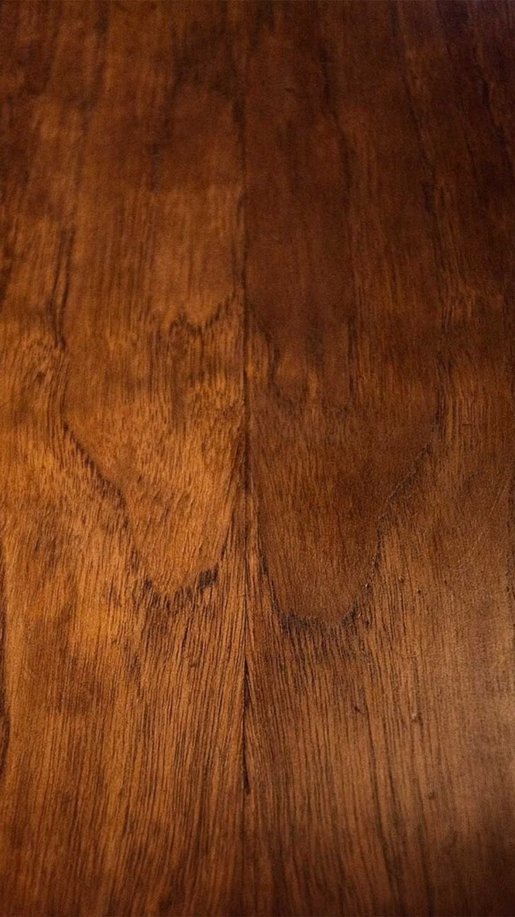
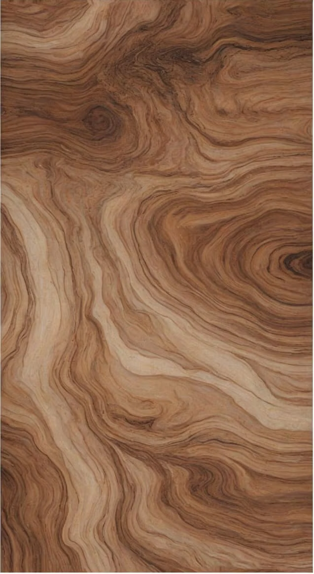
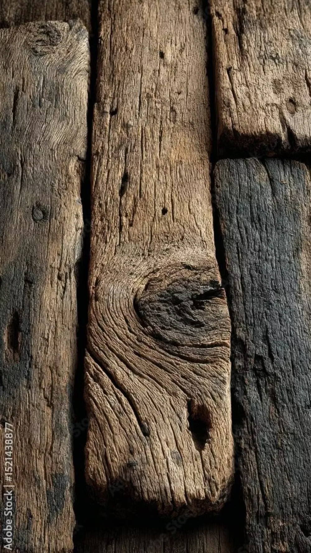
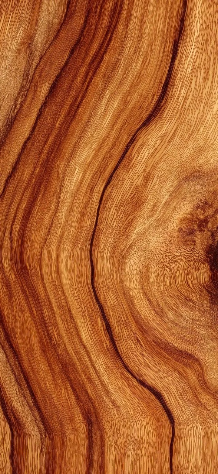
A visual study of the forms, inspirations, materials, colors, type, and cultural references associated with this UI design style.
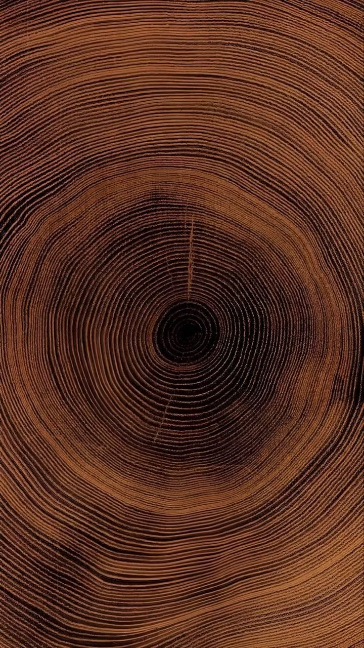
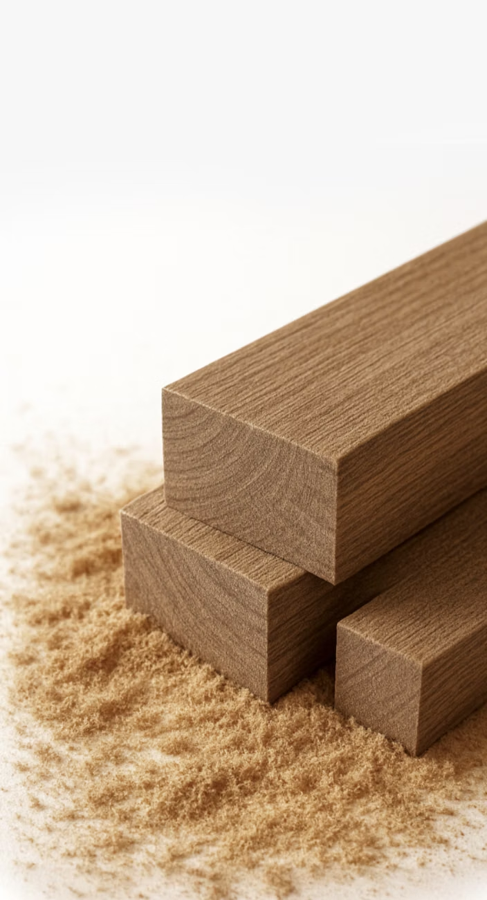
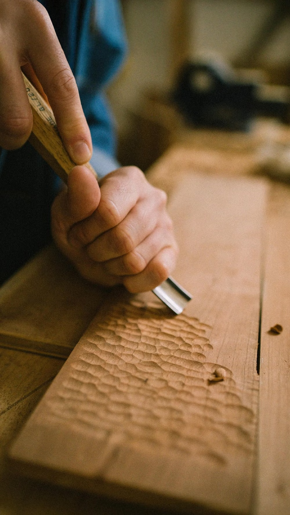
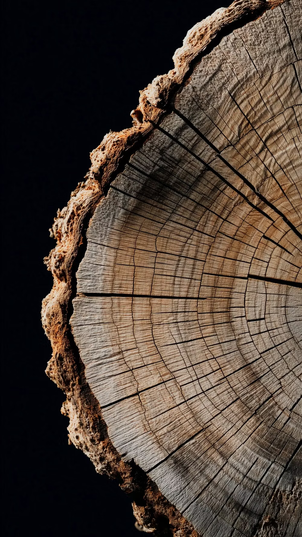
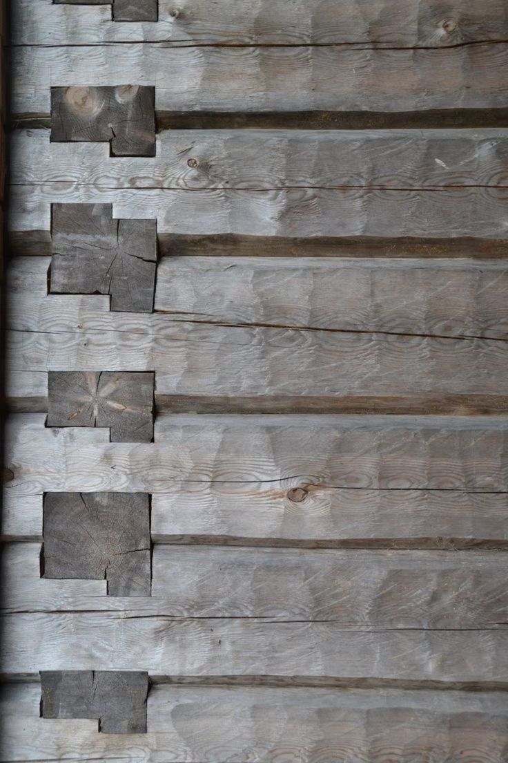
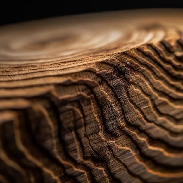
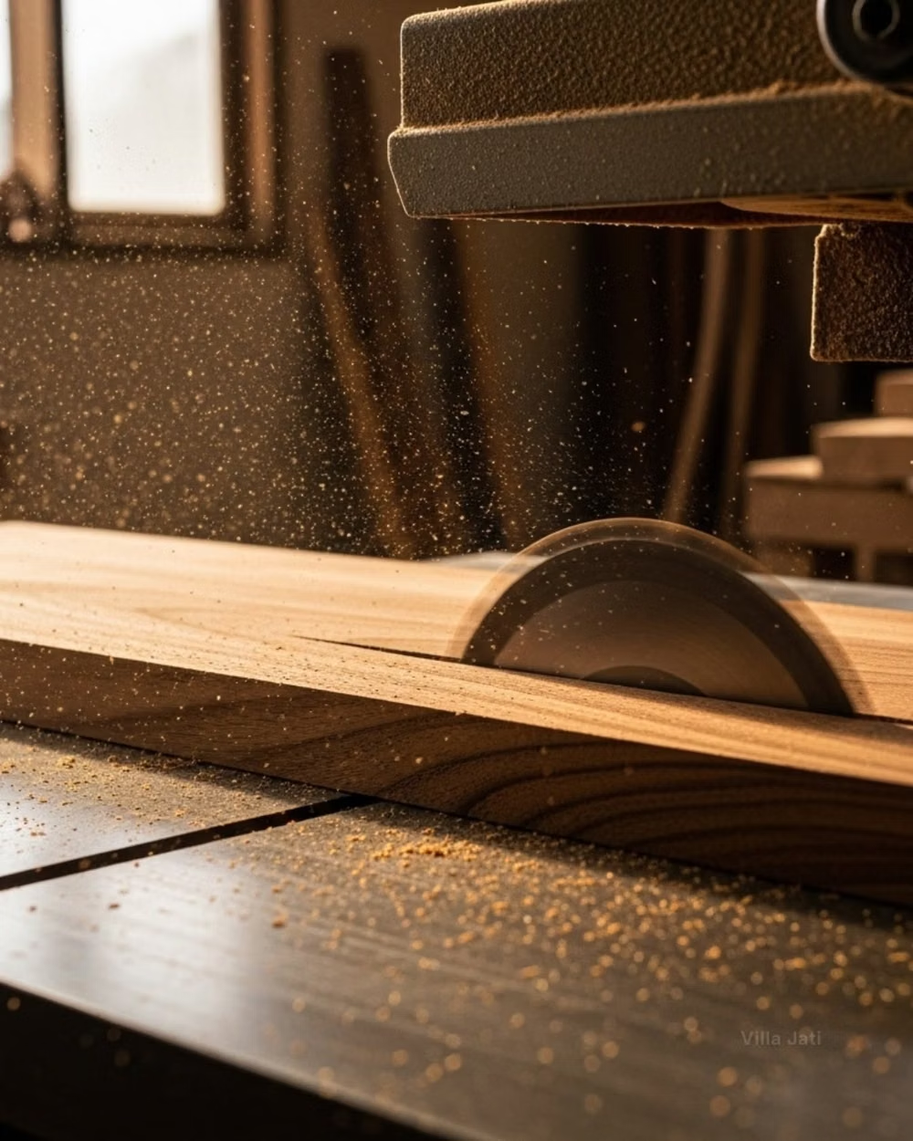
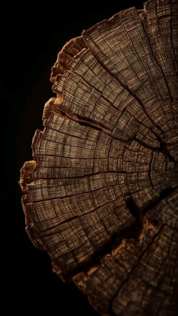
Design principles and implementation
Use these principles to write a focused AI UI design prompt instead of asking for a vague visual treatment.
Color direction
Build the palette from natural timber finishes and variations between raw, stained, aged, polished, and scorched wood. Use contrasting wood species or finish intensity to establish hierarchy, with secondary materials used sparingly. In a daisyUI theme, use a rich stained timber tone for `primary`, muted brass or leather for `secondary`, and derive `base-100`, `base-200`, and `base-300` from pale raw wood, mid-tone grain, and deeper finished wood.
Imagery direction
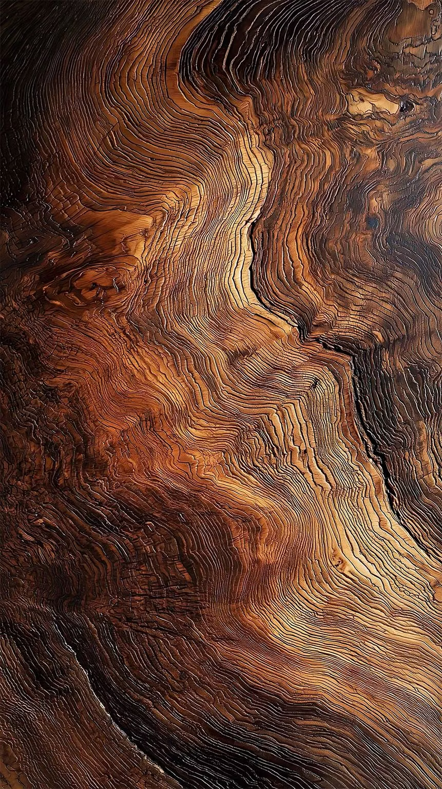
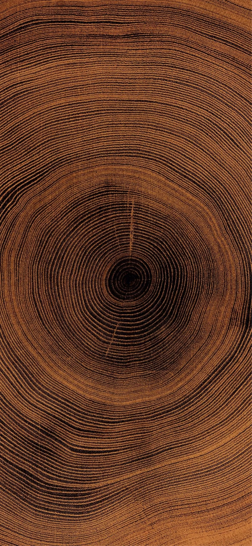
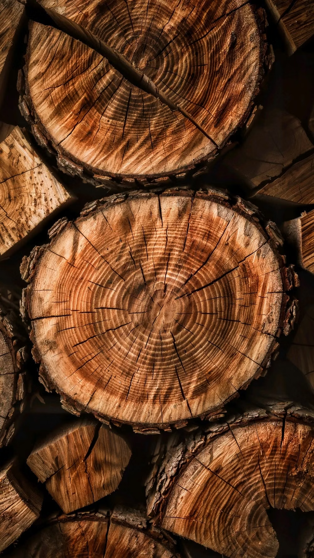
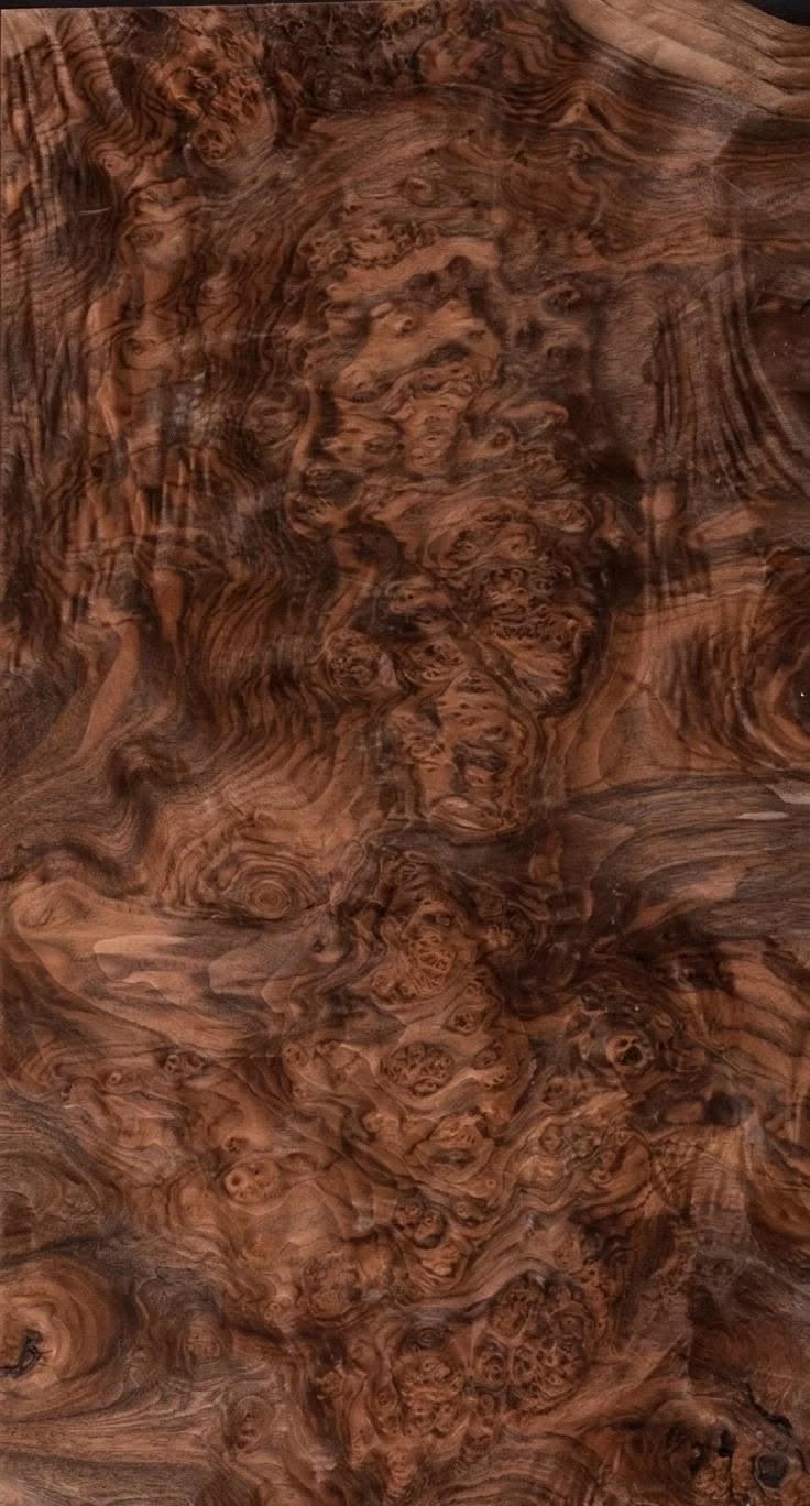
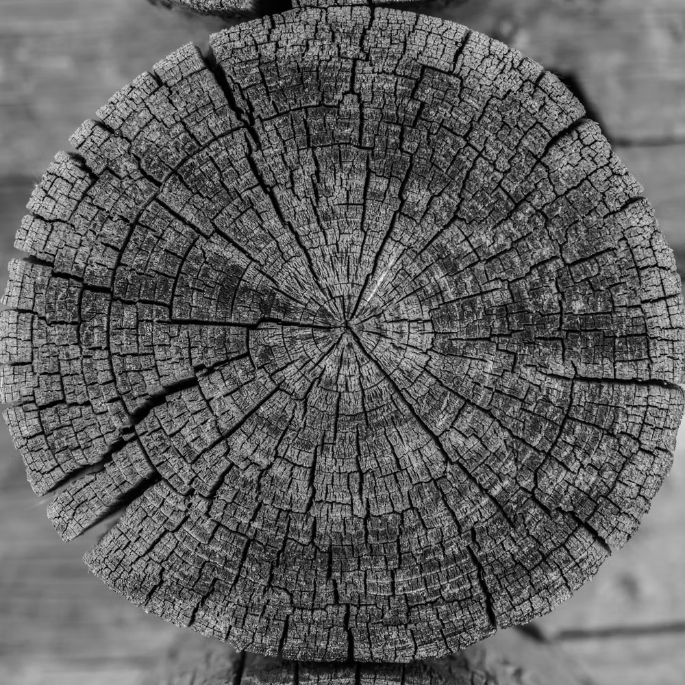
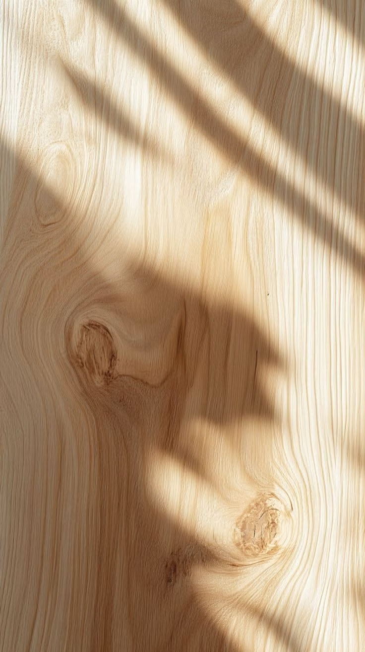
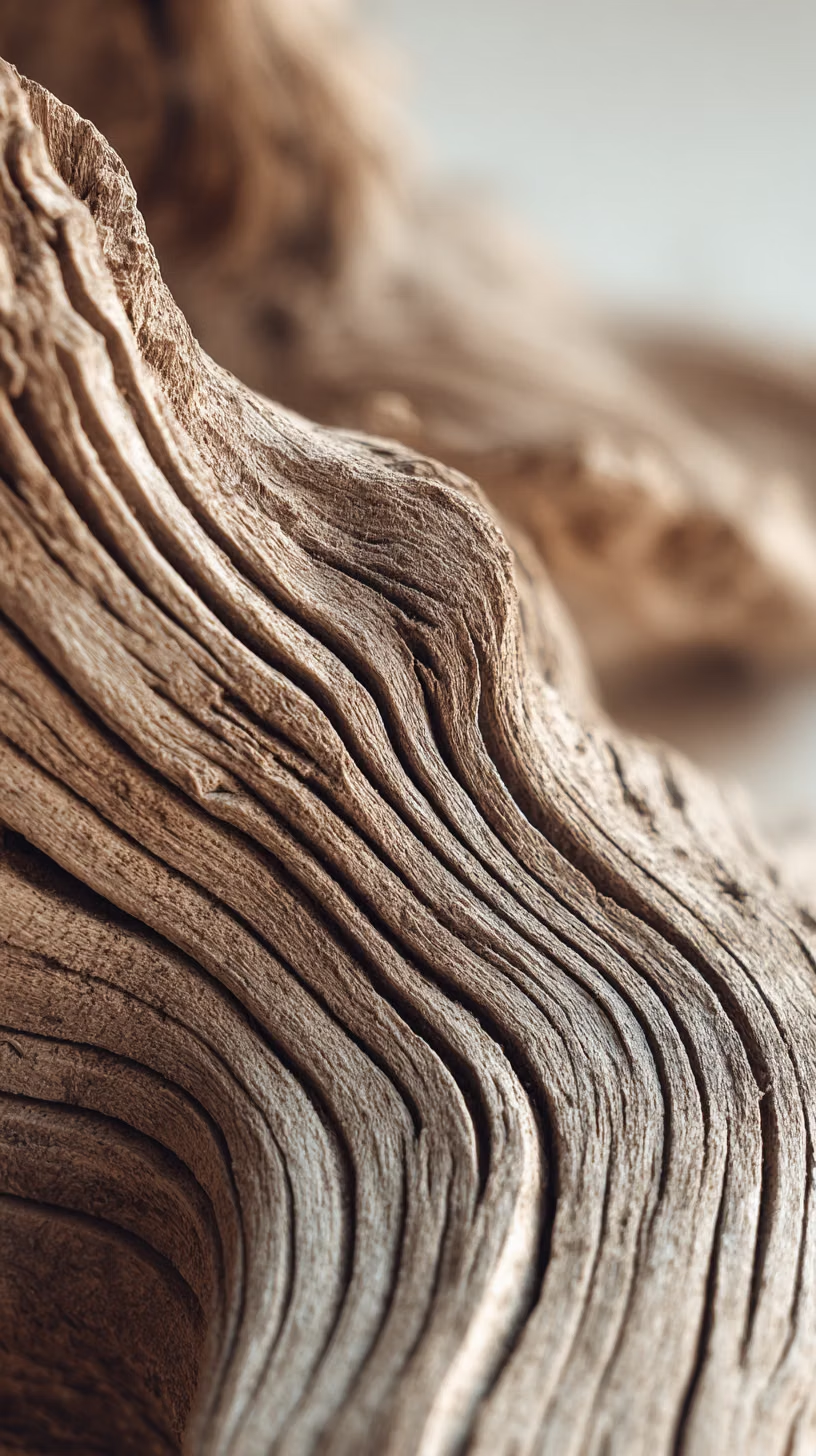
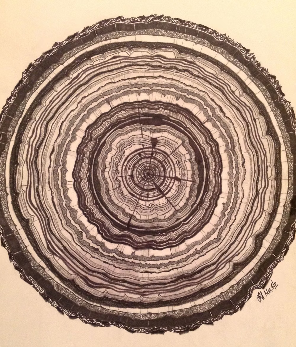
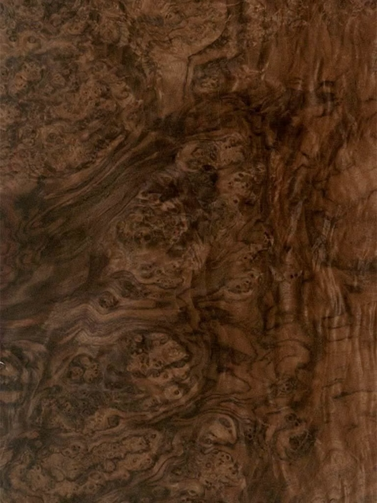
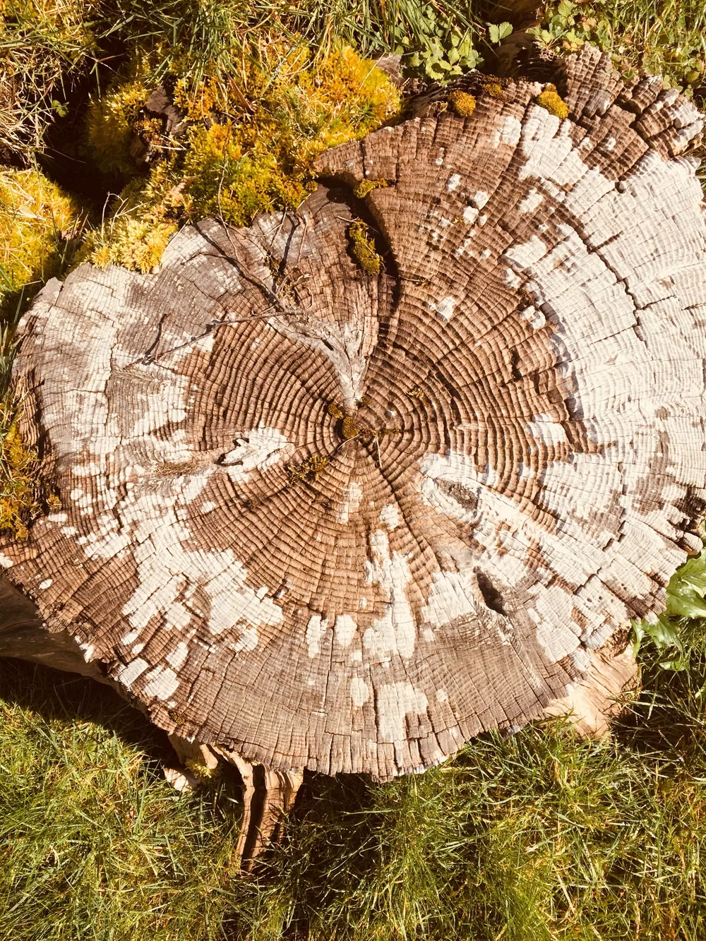
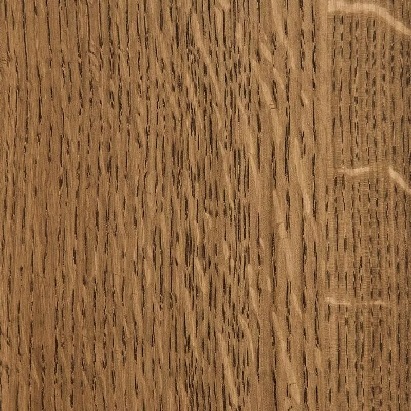
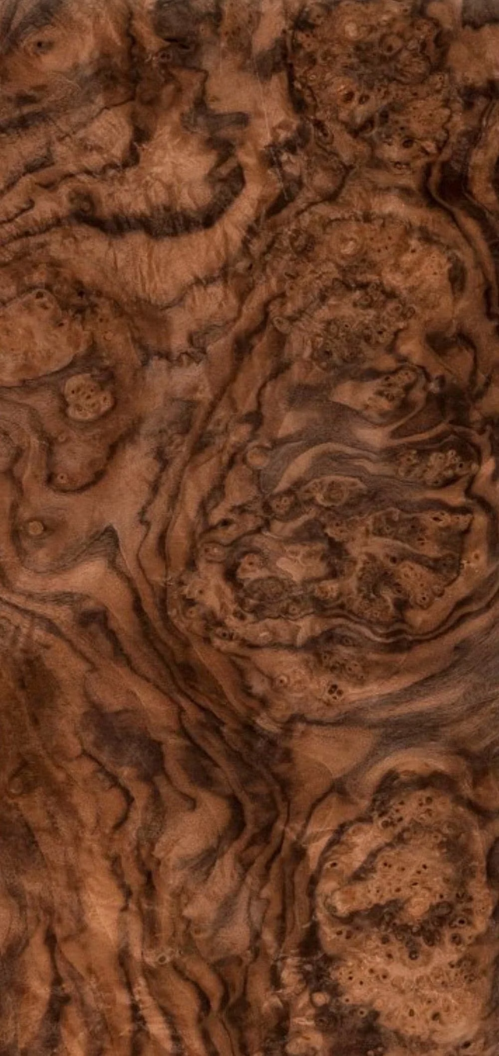
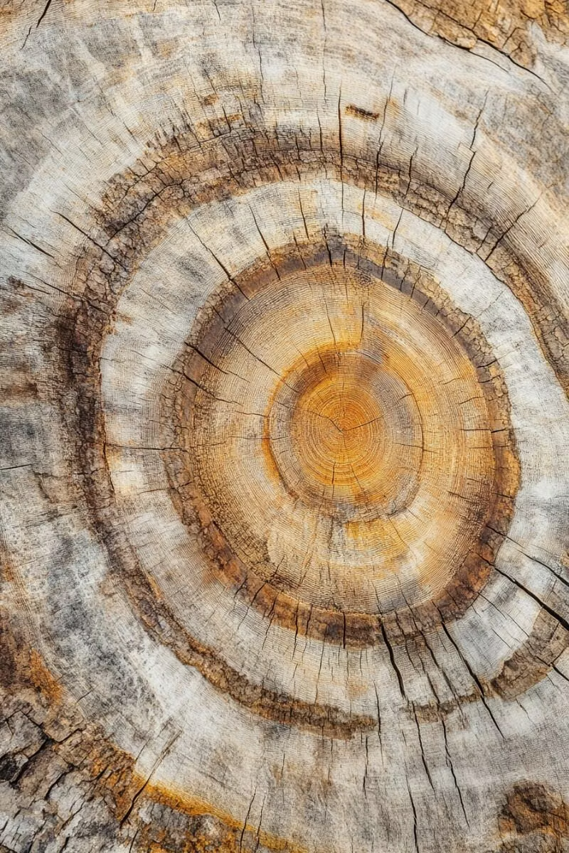
Prioritize high-resolution, realistic wood textures with visible grain, fibers, pores, knots, scratches, cracks, saw marks, seams, and finish variation. Wood should feel materially authentic rather than represented by flat brown fills or generic repeating patterns.
Content density
Moderate to dense, since substantial textures, dimensional controls, decorative framing, and material details require enough spacing to remain readable.
Motion direction
Use physical, weighty motion such as buttons depressing into wood, sliders moving through carved tracks, panels opening on hinges, and controls responding with restrained spring or friction. Avoid weightless transitions.
Shape language
Thick wooden slabs, carved capsules, rounded blocks, framed panels, recessed channels, raised discs, joined planks, softened corners, and irregular handcrafted edges. In daisyUI themes, set the `--radius-*` variables between `0.75rem` and `1.5rem`.
Typography rules
Use sturdy serif or humanist lettering that feels engraved, branded, printed, or inset into wood. Keep labels compact and highly legible, avoid ultra-thin type, and apply dimensional text effects only when they remain consistent with the simulated material.
Suggested Typfaces
Bitter
Fresh daisies glow in warm sunlight
Fresh daisies glow in warm sunlight
1 2 3 4 5 6 7 8 9 0
Roboto Slab
Fresh daisies glow in warm sunlight
Fresh daisies glow in warm sunlight
1 2 3 4 5 6 7 8 9 0
Arvo
Fresh daisies glow in warm sunlight
Fresh daisies glow in warm sunlight
1 2 3 4 5 6 7 8 9 0
Lora
Fresh daisies glow in warm sunlight
Fresh daisies glow in warm sunlight
1 2 3 4 5 6 7 8 9 0
Bree Serif
Fresh daisies glow in warm sunlight
Fresh daisies glow in warm sunlight
1 2 3 4 5 6 7 8 9 0
Build a Real-Wood Skeuomorphism interface with daisyUI
The live example translates this direction into daisyUI components and semantic theme tokens.
To generate a full page in the same visual language, give the style name and the design rules above to Blueprint MCP.
Related UI design styles
Compare nearby visual languages that share typography, shapes, use cases, or signature elements.
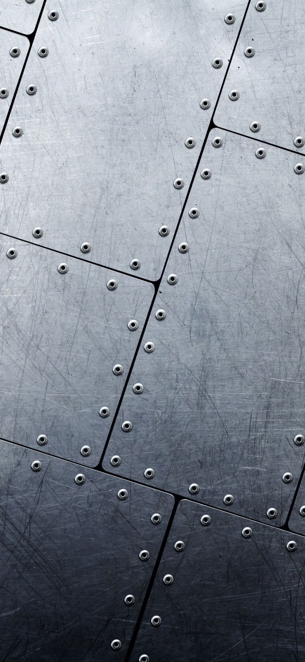
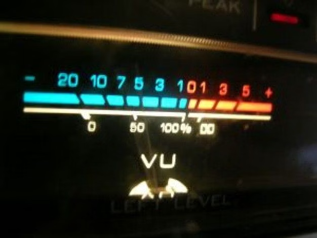
Skeuomorphism UI design style
Photorealistic or softly modeled interfaces use material depth, mechanical controls, and analog-equipment cues, often combining industrial nostalgia with clean retro-futurist geometry.
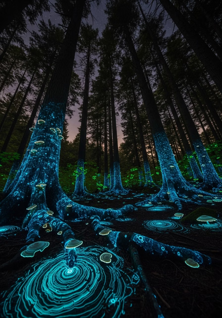

Luminous Eco-Skeuomorphism UI design style
A glossy, tactile interface style that combines early-2010s skeuomorphism with futuristic ecological-tech aesthetics. Controls resemble illuminated physical hardware, with intense inner glows, radiant edges, and soft light bloom making interactive elements appear electrically powered.
Cottagecore UI design style
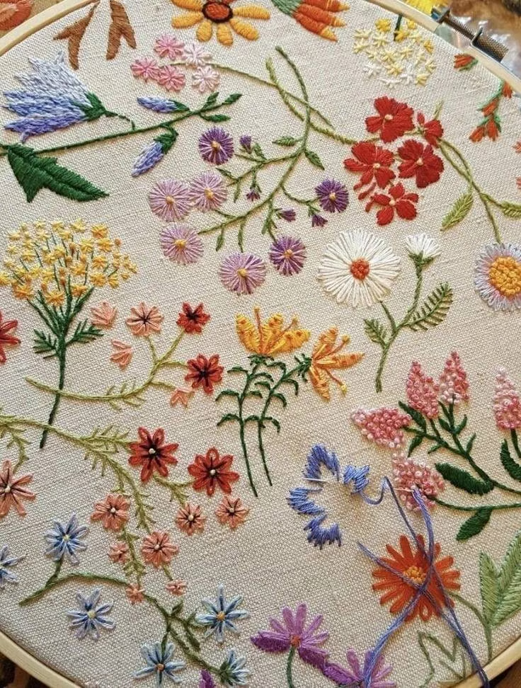
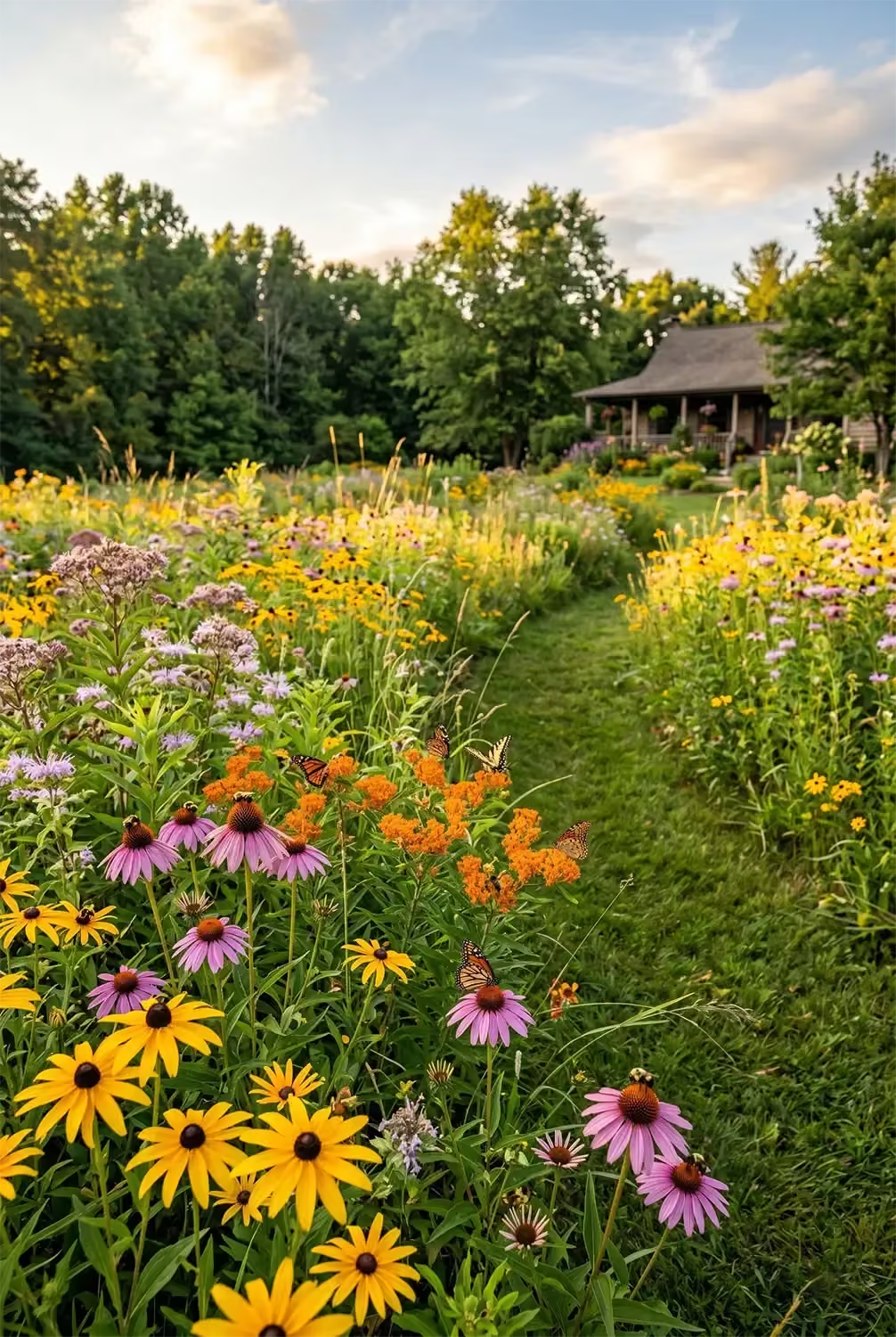
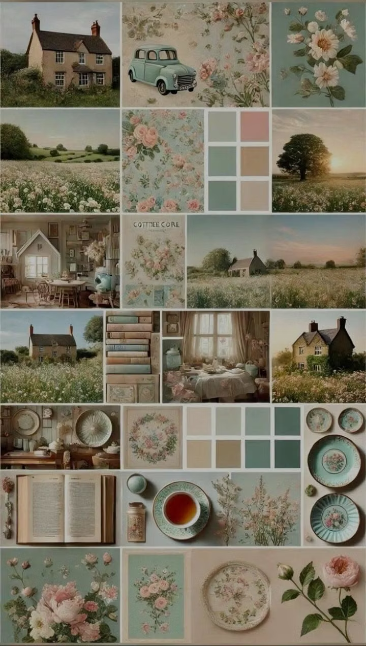
Pastoral imagery, florals, handmade textures, gentle serif type, warm domestic details, and romantic rural nostalgia.