Type-First Design UI design style
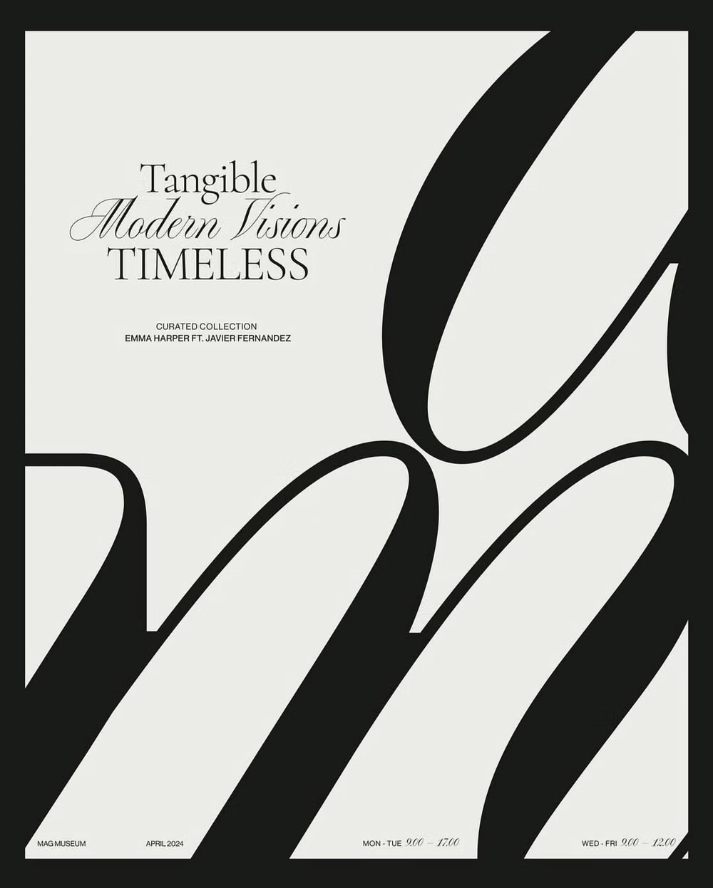
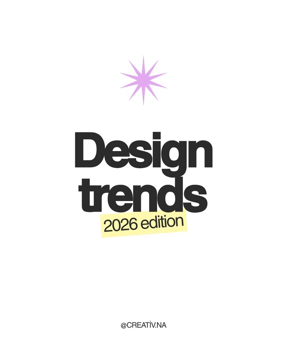
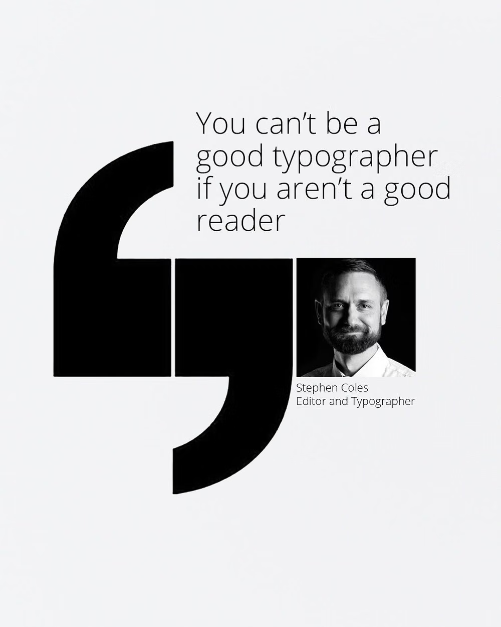
Oversized or expressive typography acts as the primary visual element, with imagery and controls playing supporting roles.
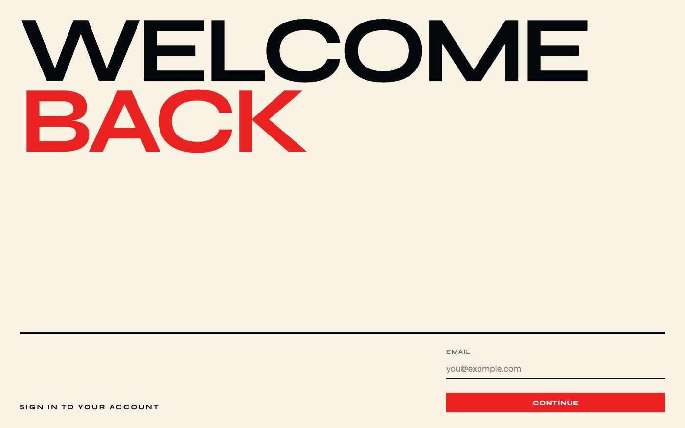
Design overview
- Signature elements
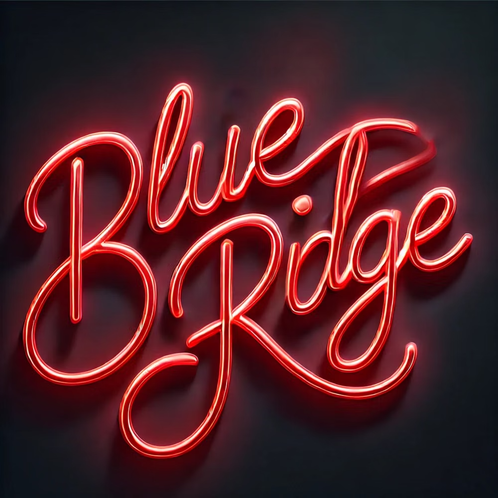
- oversized headlines, expressive letterforms, extreme scale contrast, tight cropping, minimal imagery, typographic composition
- Best suited to
- Agencies, portfolios, launches, events, editorial brands, and campaign websites.
- Layout principles
- Let oversized words establish the grid, crop letterforms at viewport edges, and position navigation, media, and actions in the negative spaces created by the type.
History and origins
A fact-checked account of where this visual language came from, with links to the references used.
- Period
- Modernist precedents in the early 20th century; recurring in digital design
- Origin
- European modernist print design and later screen publishing
Type-First Design is a current practice label, not a formally founded movement. Its history runs through modernist designers who made typography carry structure and voice—especially Bauhaus and Swiss practitioners—and through the arrival of web fonts and responsive type systems that let digital products use type as the primary visual material rather than a layer placed over decoration.
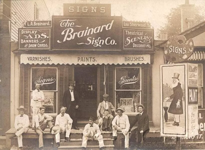
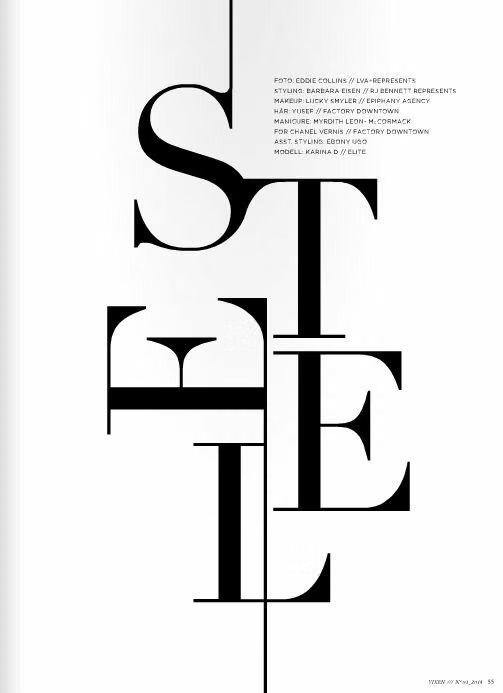
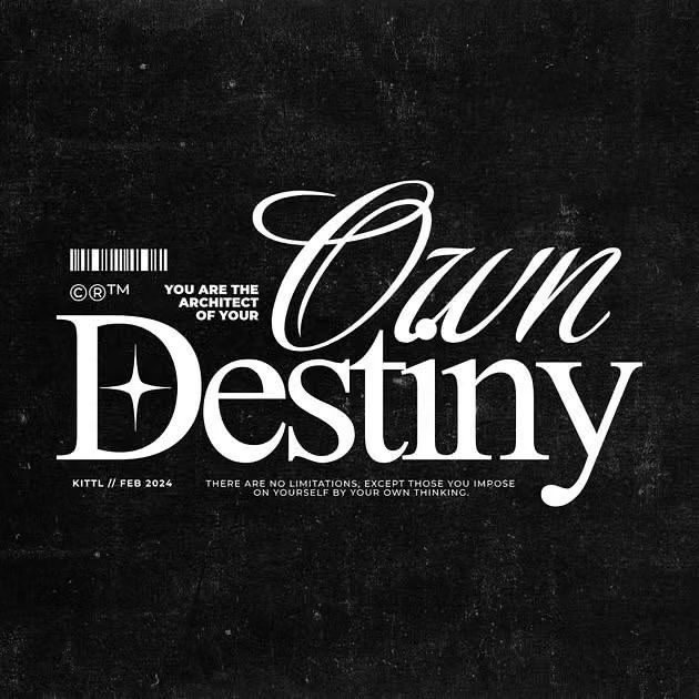
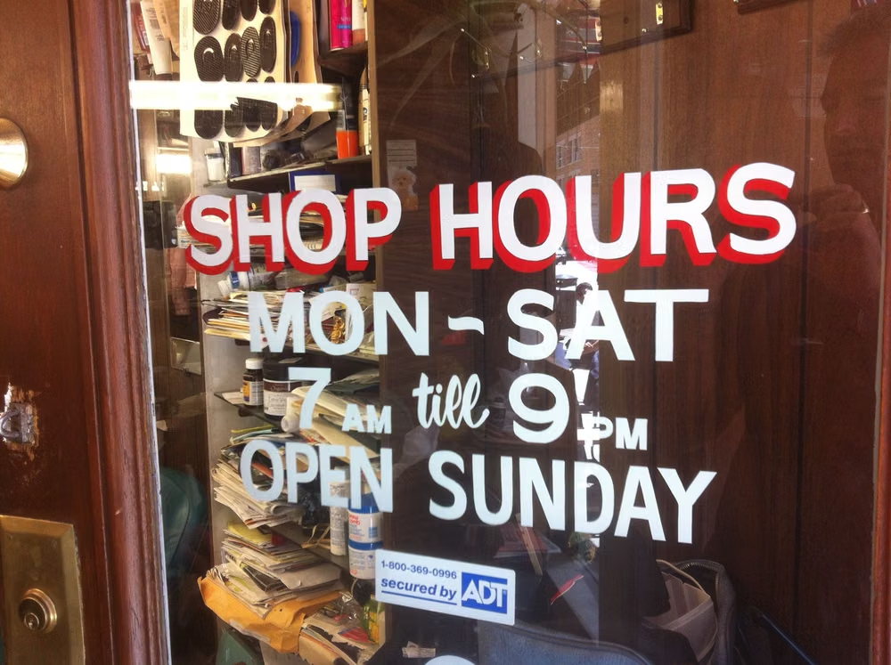
Moodboard and visual references
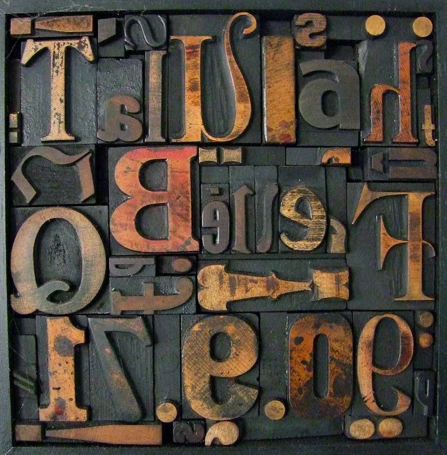
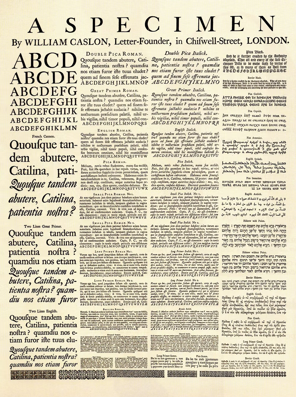
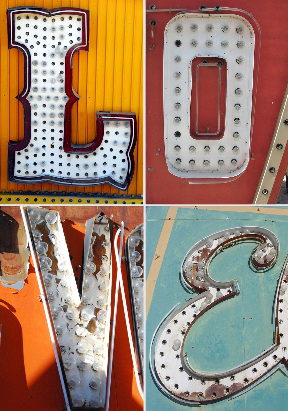
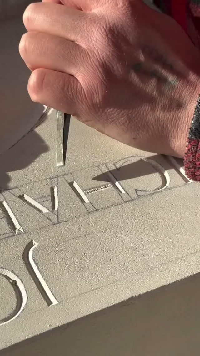
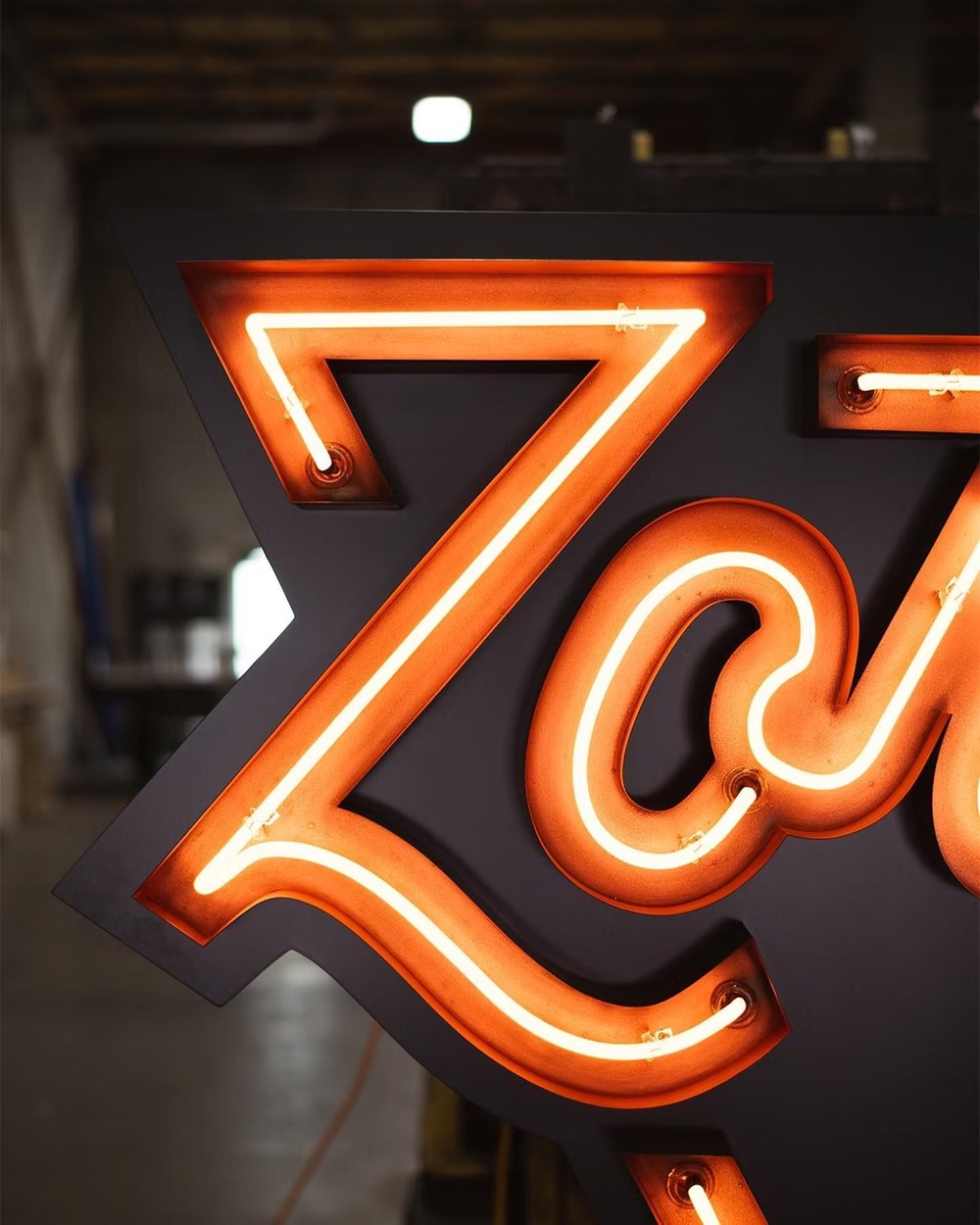
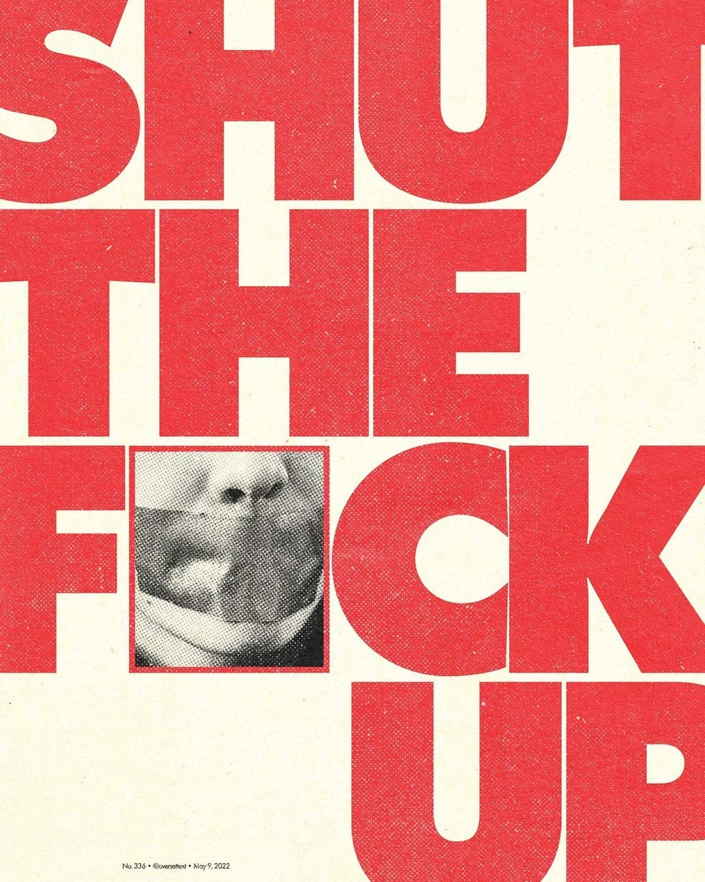
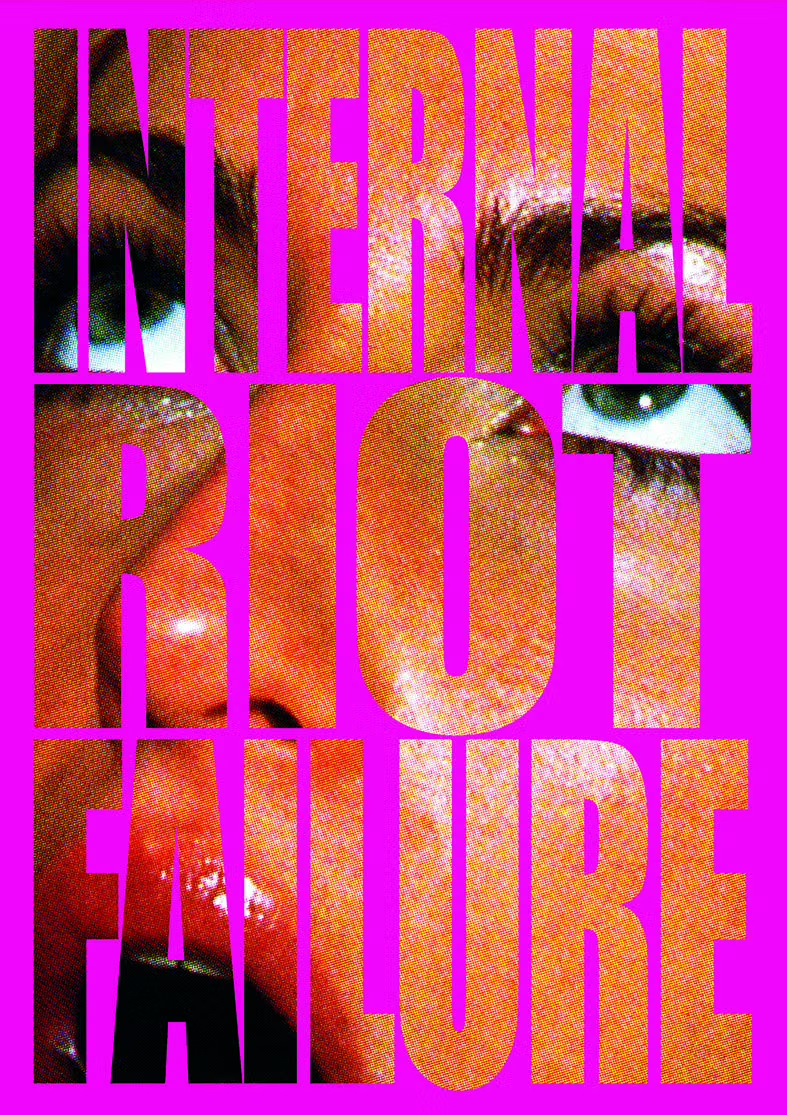
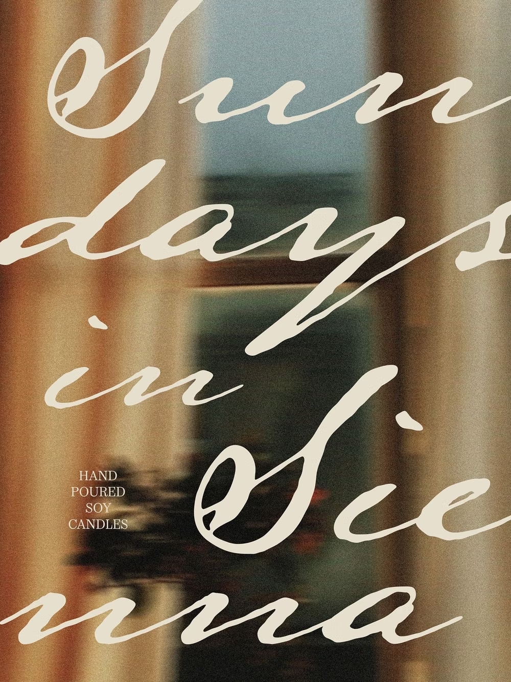
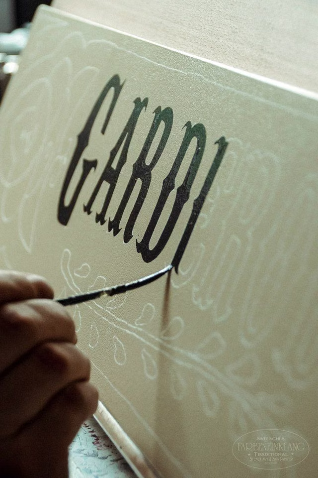
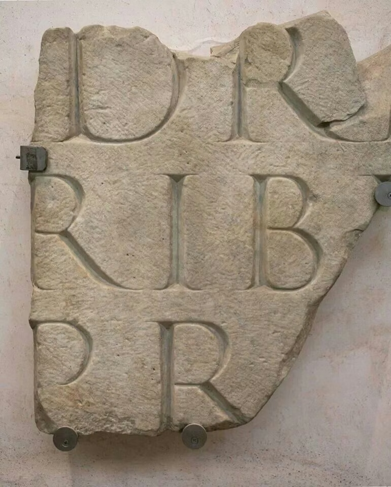
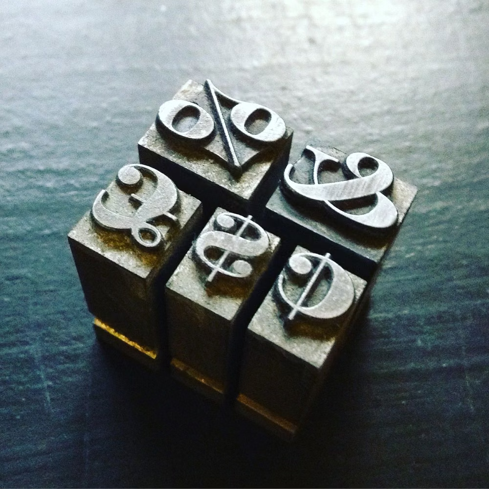
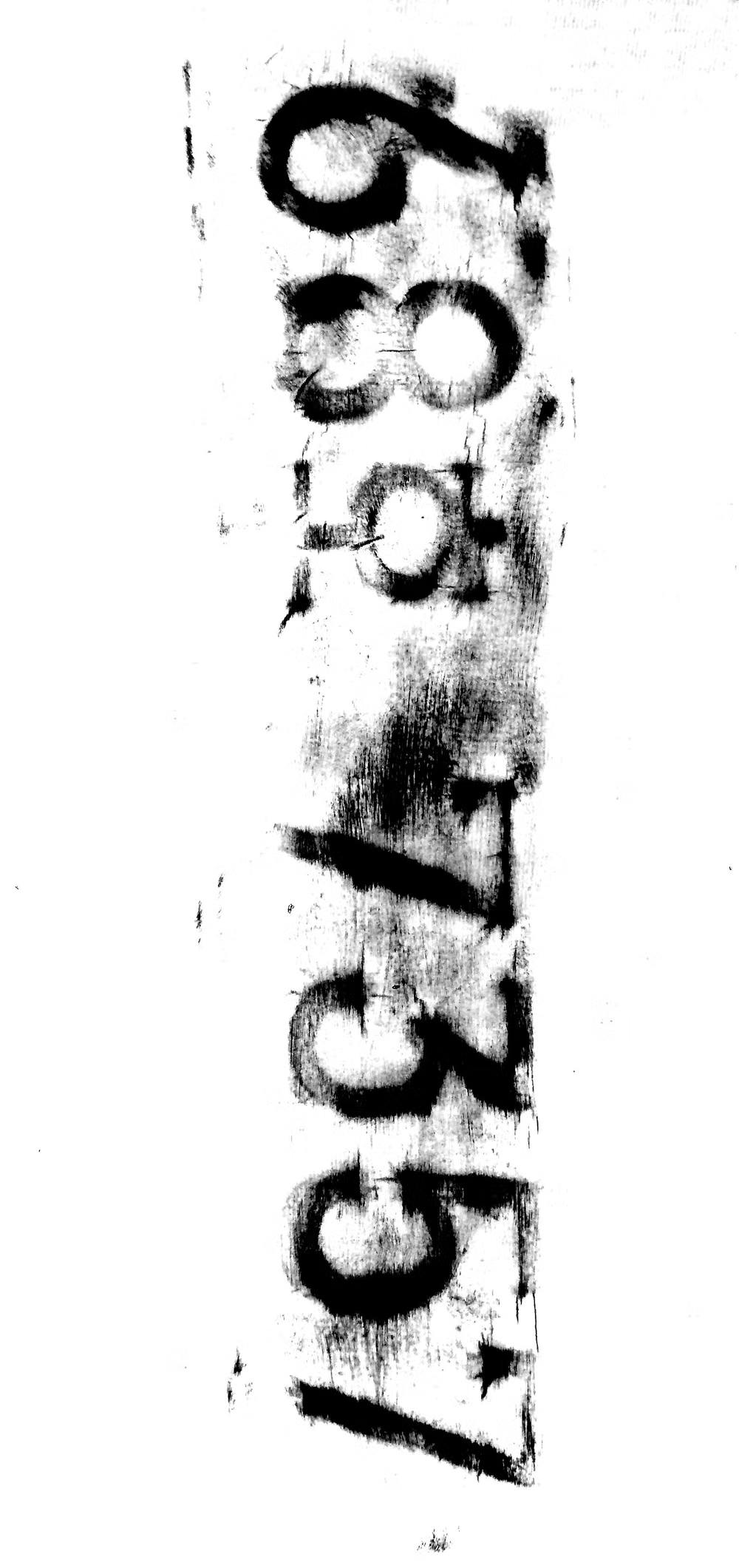
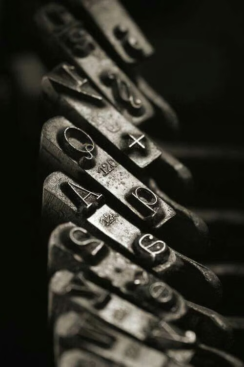
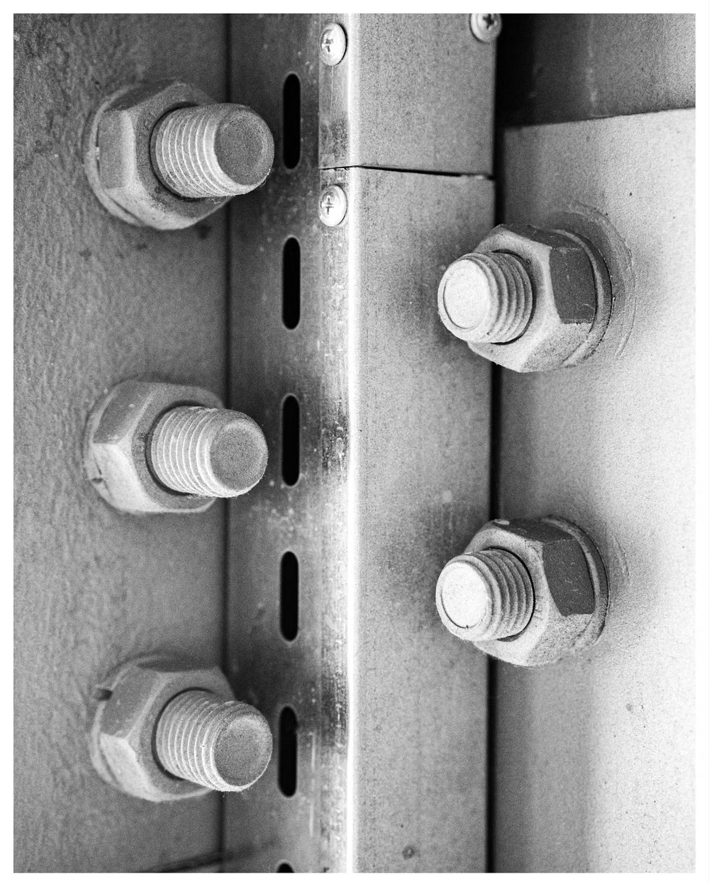
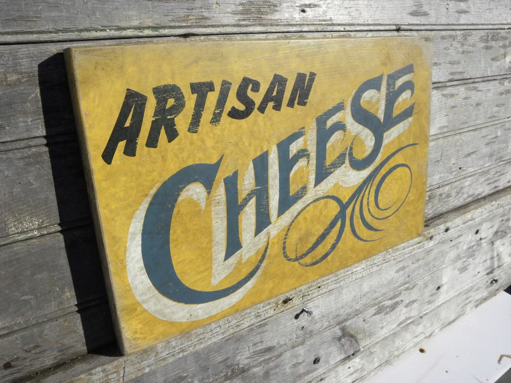
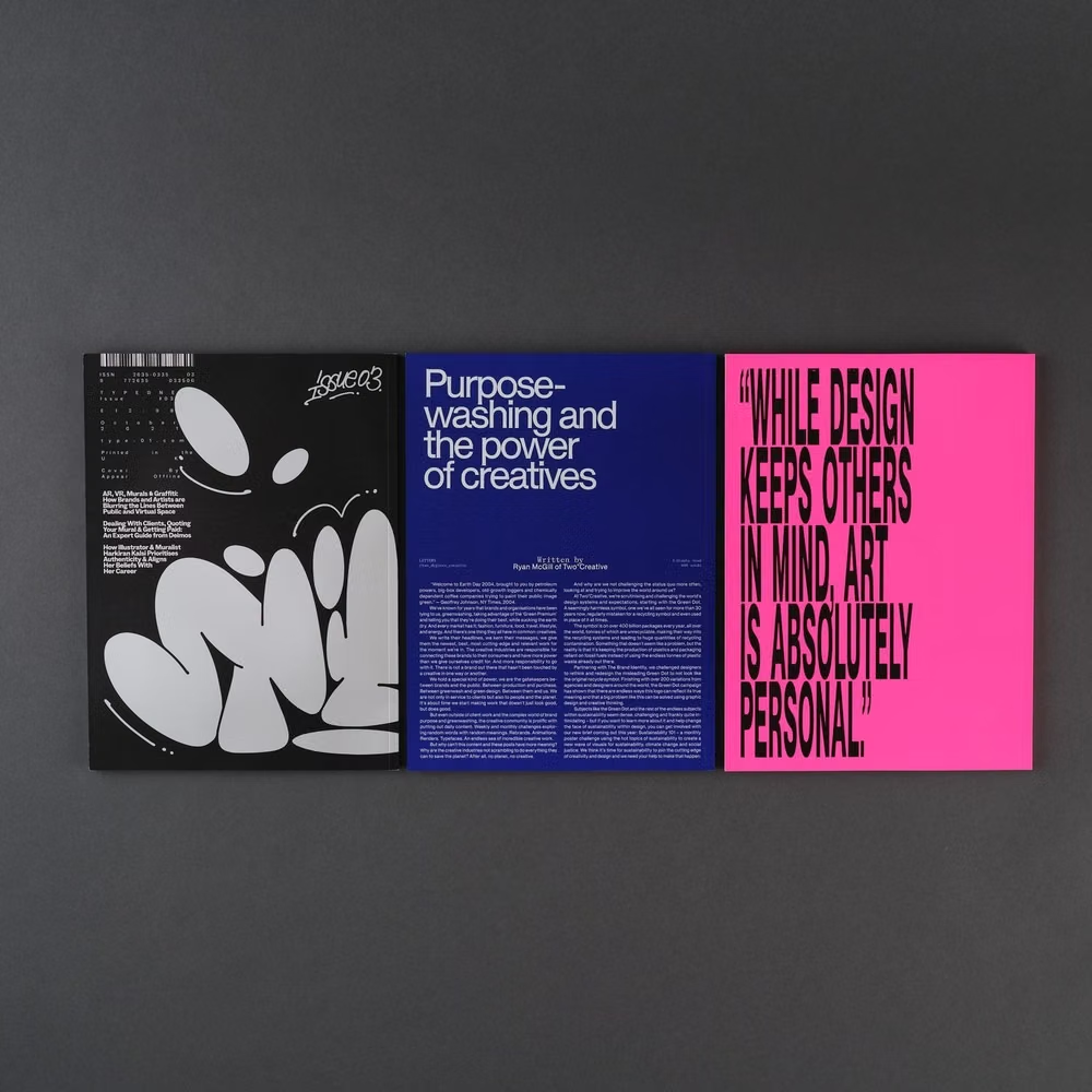
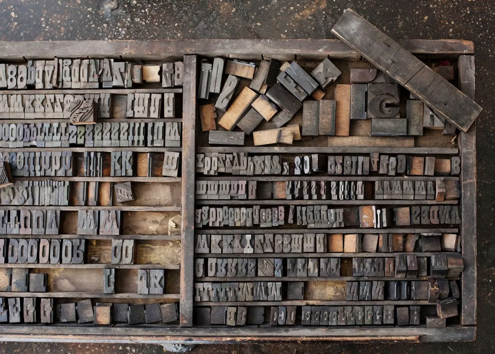
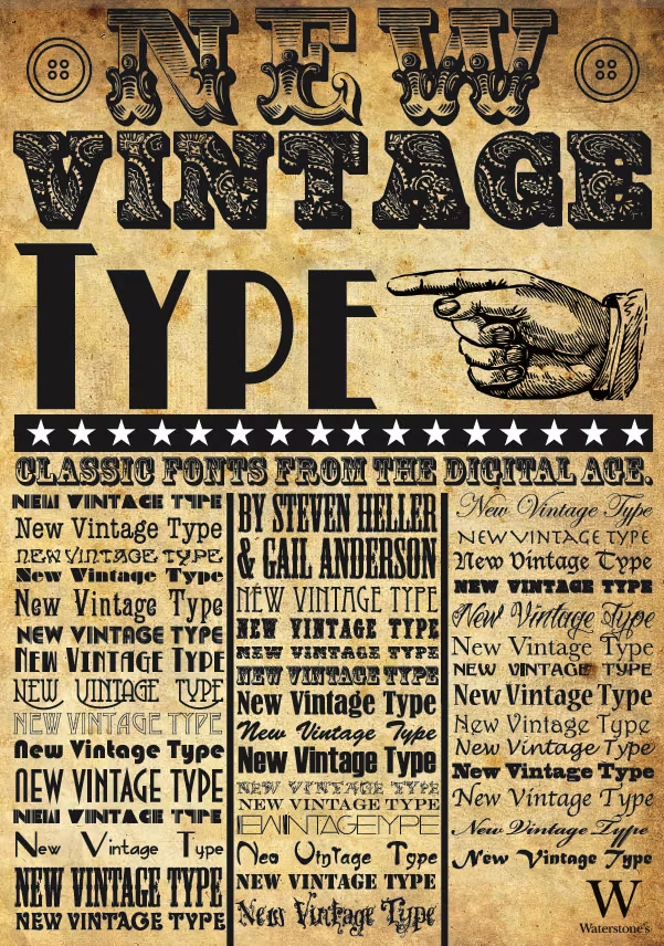
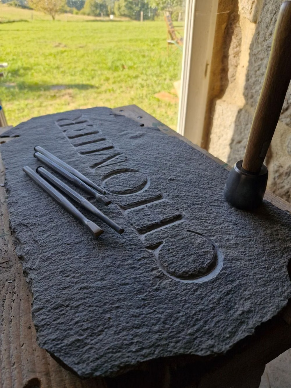
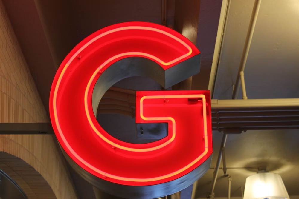
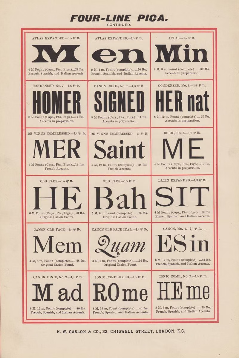
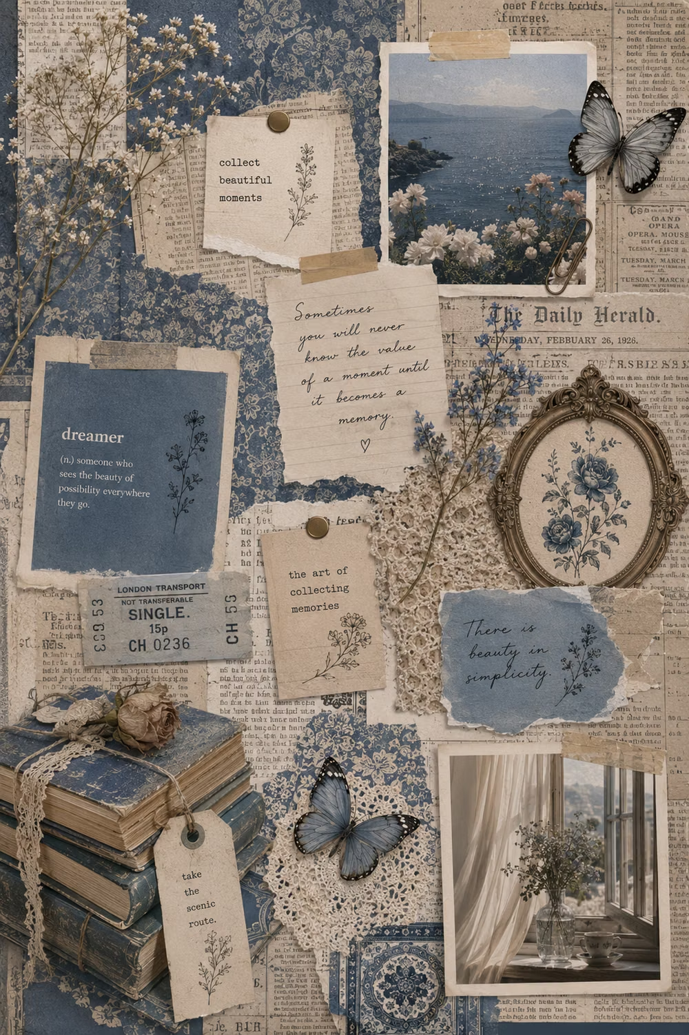
A visual study of the forms, inspirations, materials, colors, type, and cultural references associated with this UI design style.

Design principles and implementation
Use these principles to write a focused AI UI design prompt instead of asking for a vague visual treatment.
Color direction
Use high-contrast fields and treat text color as the main compositional signal, limiting secondary hues so letterform mass stays dominant. In a daisyUI theme, use the headline's dominant signal color for `primary`, one controlled counter-color for `secondary`, and keep `base-100`, `base-200`, and `base-300` in a stark white-to-gray or black-to-charcoal progression.
Imagery direction
Keep imagery minimal or embed it as a crop, mask, texture, or counterpoint within the typographic composition rather than giving it equal billing.
Content density
Open with sparse monumental statements, then collect supporting facts into compact editorial blocks that do not dilute the typographic idea.
Motion direction
Animate variable axes, line breaks, tracking, masks, and scale in ways that preserve word recognition and settle before longer reading begins.
Shape language
Use letterforms, baselines, underlines, and text boxes as the primary shapes; keep buttons and containers visually subordinate. In daisyUI themes, set the `--radius-*` variables to `0` or `0.25rem`.
Typography rules
Choose one unmistakable display family and one quiet reading face, test every dramatic crop responsively, and never sacrifice complete labels or body legibility.
Suggested Typfaces
Syne
Fresh daisies glow in warm sunlight
Fresh daisies glow in warm sunlight
1 2 3 4 5 6 7 8 9 0
Unbounded
Fresh daisies glow in warm sunlight
Fresh daisies glow in warm sunlight
1 2 3 4 5 6 7 8 9 0
Archivo Black
Fresh daisies glow in warm sunlight
Fresh daisies glow in warm sunlight
1 2 3 4 5 6 7 8 9 0
Bricolage Grotesque
Fresh daisies glow in warm sunlight
Fresh daisies glow in warm sunlight
1 2 3 4 5 6 7 8 9 0
Anton
Fresh daisies glow in warm sunlight
Fresh daisies glow in warm sunlight
1 2 3 4 5 6 7 8 9 0
Build a Type-First Design interface with daisyUI
The live example translates this direction into daisyUI components and semantic theme tokens.
To generate a full page in the same visual language, give the style name and the design rules above to Blueprint MCP.
Related UI design styles
Compare nearby visual languages that share typography, shapes, use cases, or signature elements.

Brutalism UI design style
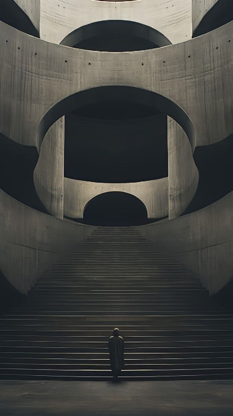
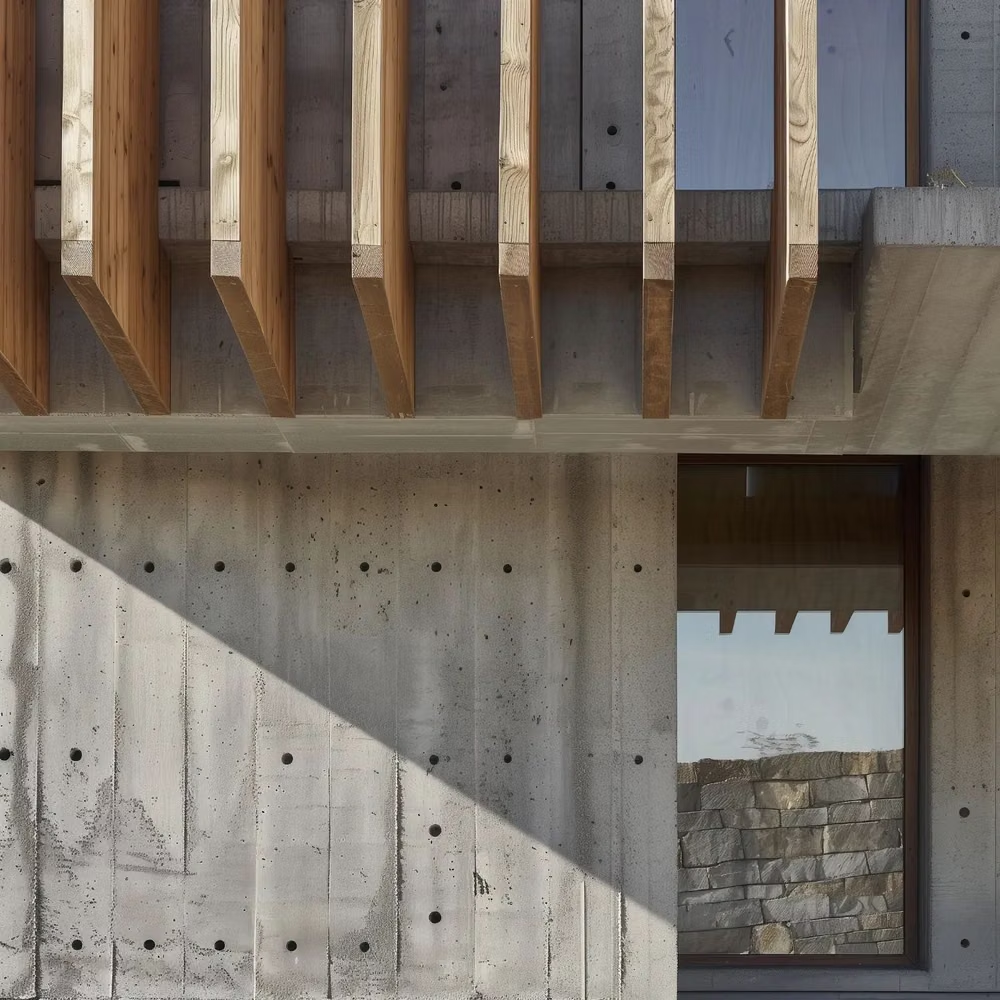
Raw typography, exposed structure, sharp edges, stark contrast, default-like controls, and intentionally unpolished layouts.
Collage UI design style
Cutout photography, overlapping fragments, mixed scales, torn edges, and layered media create expressive compositions.

Monochrome UI design style
A single hue or neutral family creates hierarchy through tone, scale, texture, and contrast rather than varied color.