Brutalism UI design style
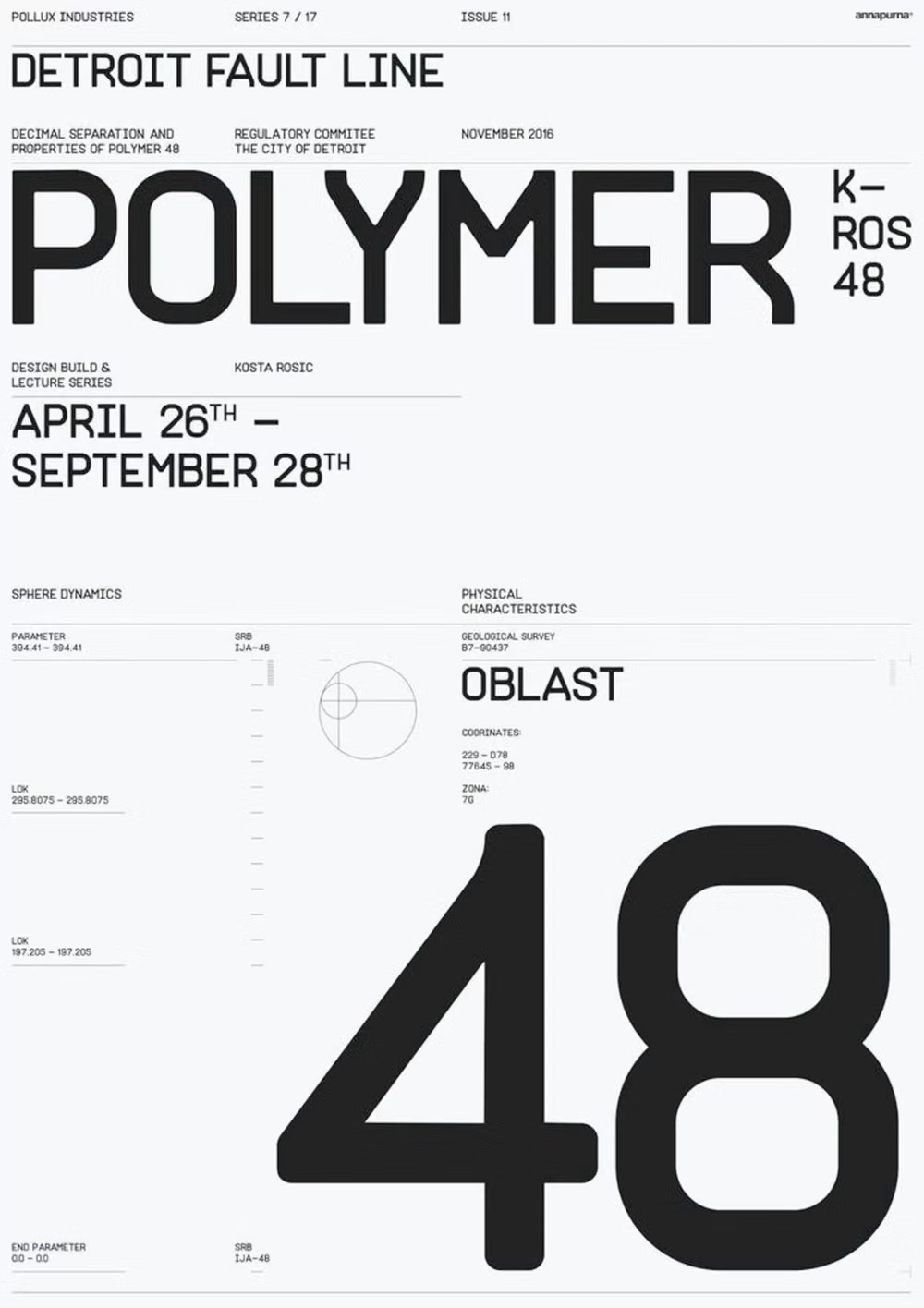
Raw typography, exposed structure, sharp edges, stark contrast, default-like controls, and intentionally unpolished layouts.
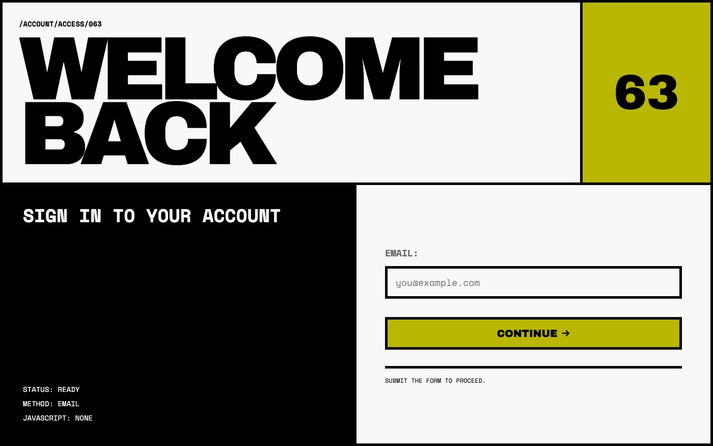
Design overview
- Signature elements
- raw HTML-like structure, default-style controls, stark contrast, exposed grid, oversized typography, minimal polish
- Best suited to
- Editorial sites, artist portfolios, cultural projects, and countercultural brands.
- Layout principles
- Expose the document flow, grid, and navigation directly, using oversized content blocks, abrupt scale changes, and unapologetic full-width sections.
History and origins
A fact-checked account of where this visual language came from, with links to the references used.
- Period
- 1950s–1970s in architecture; digital reinterpretation from the 2010s
- Origin
- Postwar Britain and Europe, with international development
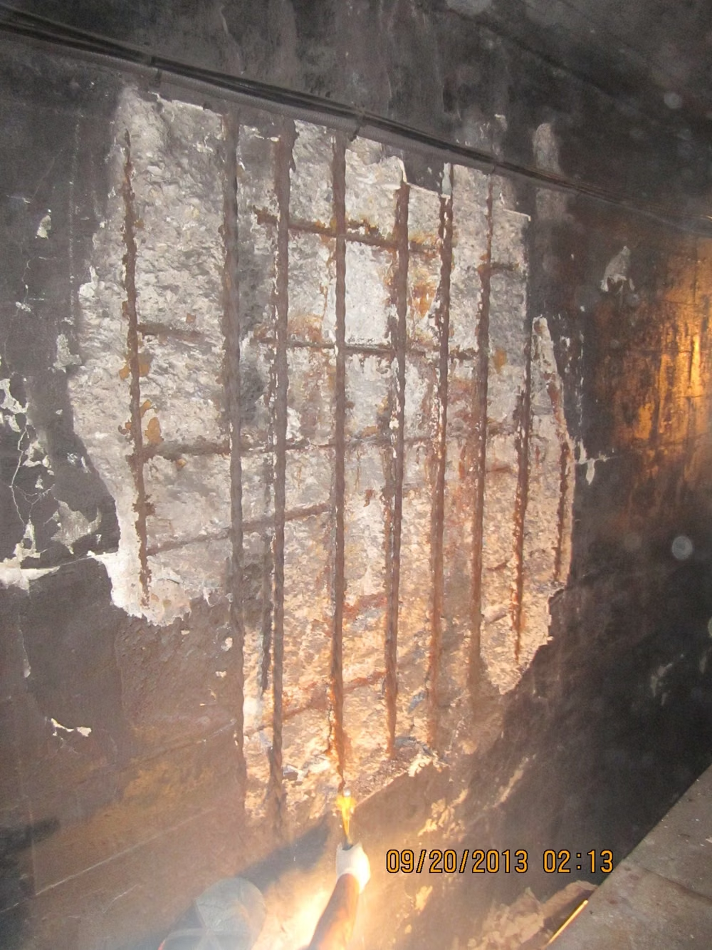
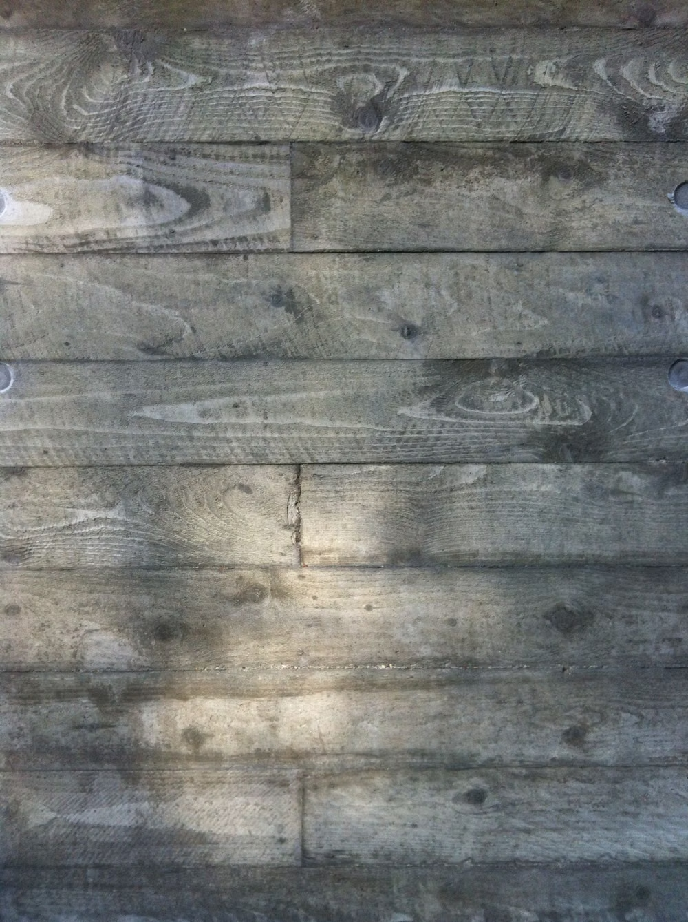
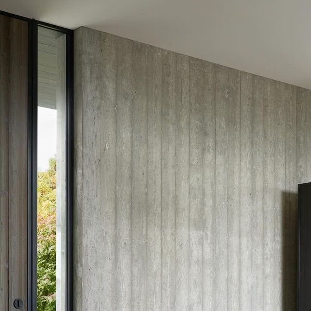
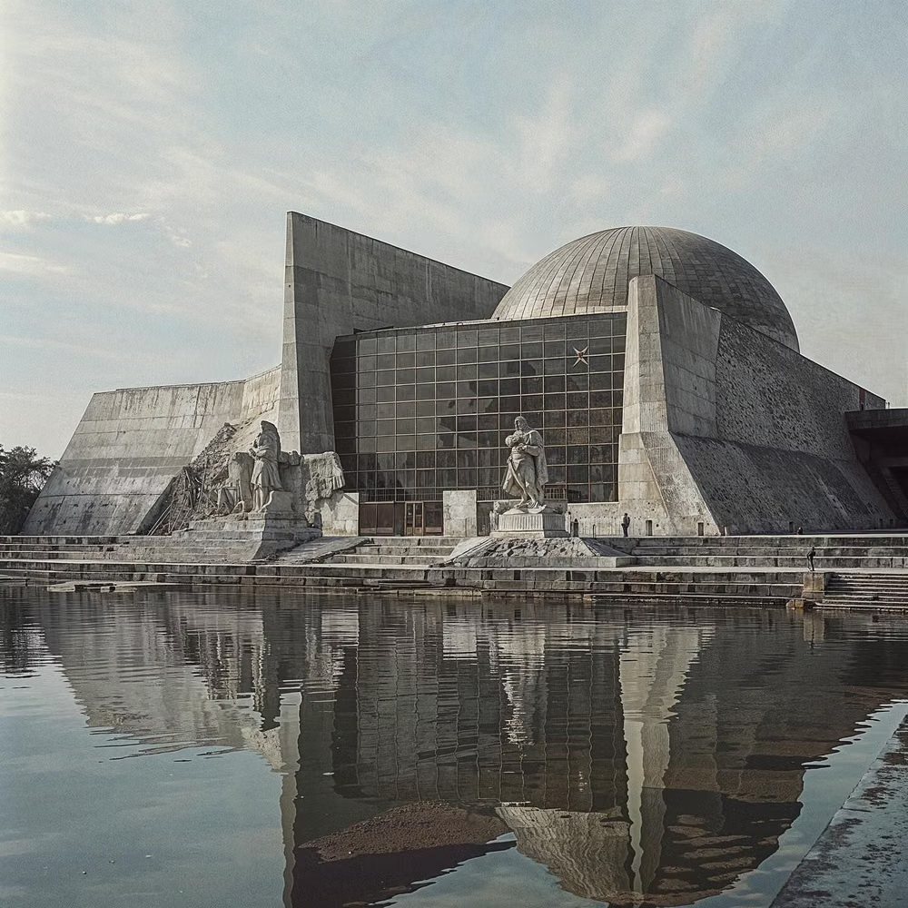
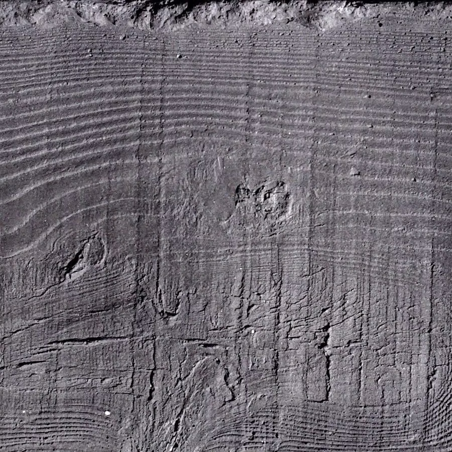
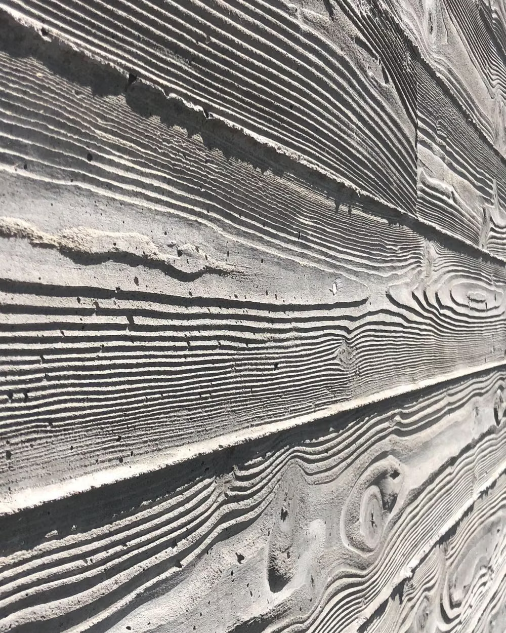
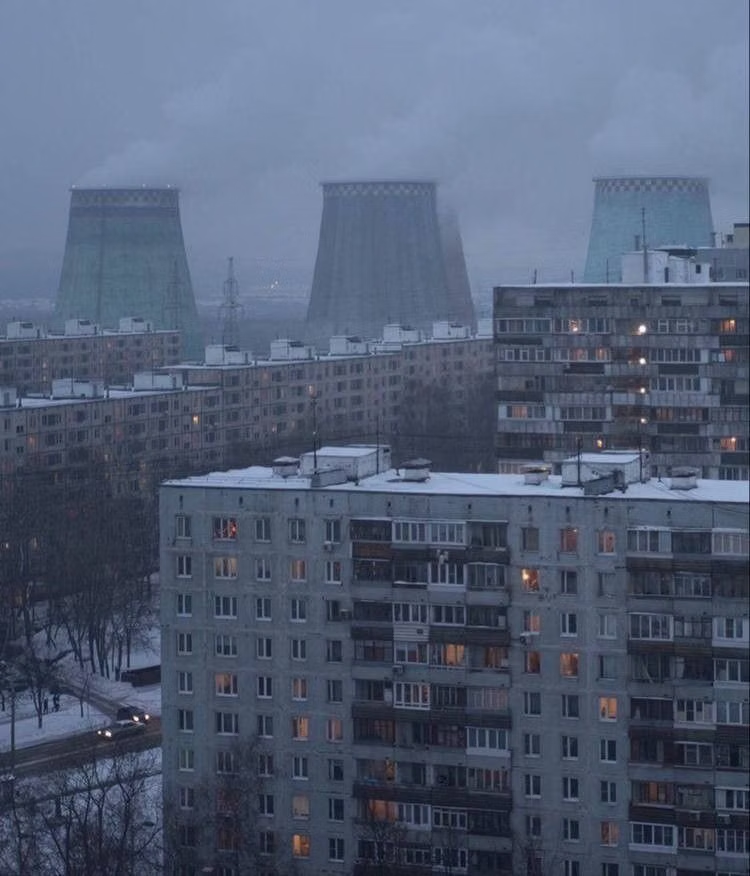
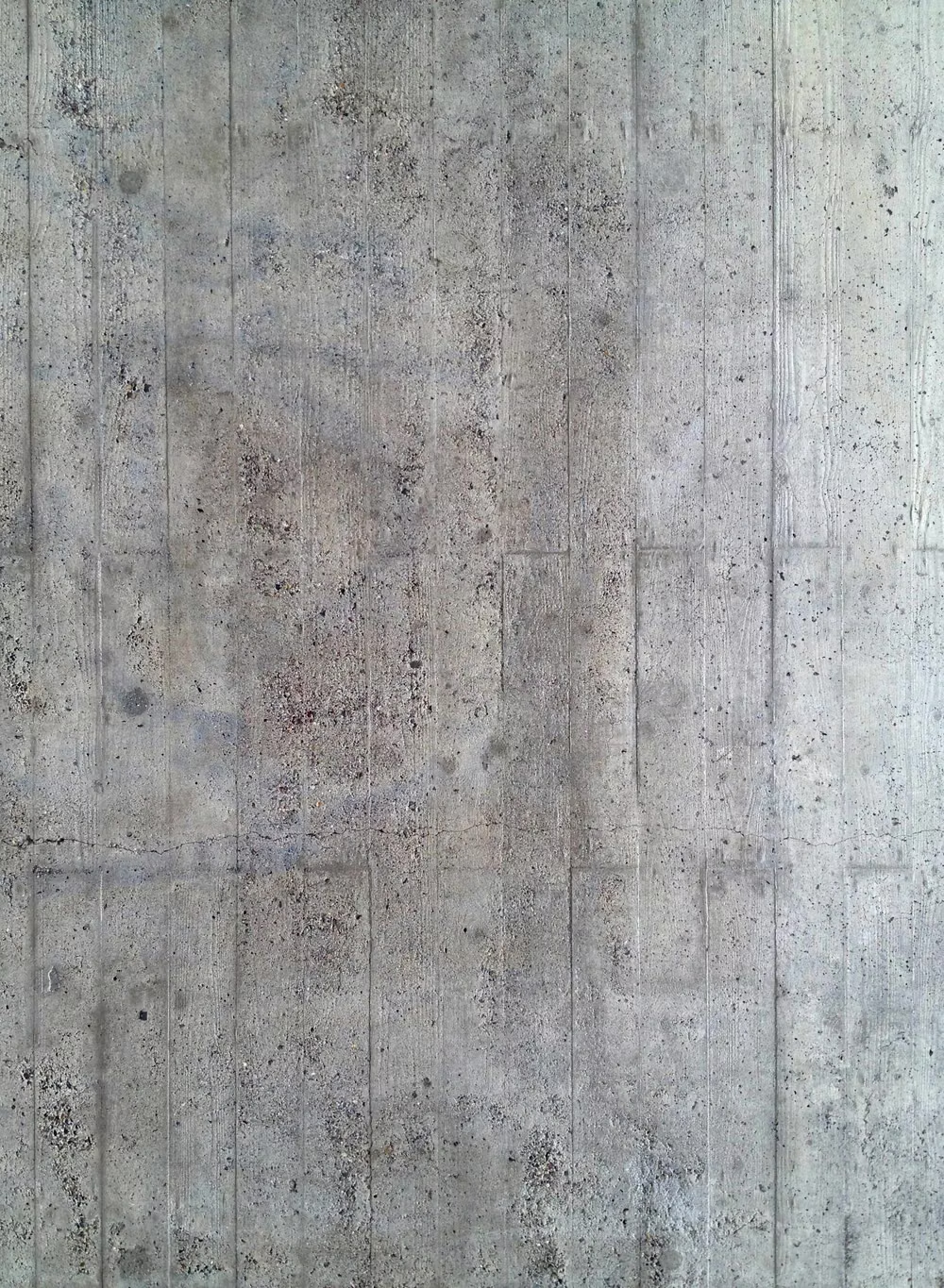
Architectural Brutalism developed after World War II around exposed construction, social programs, mass, and materials such as béton brut. Alison Smithson used “New Brutalism” in 1953, while Le Corbusier’s raw concrete was an important precedent; web designers later borrowed the name for sites that expose structure or refuse polished convention, but that digital usage is an analogy rather than a direct architectural method.
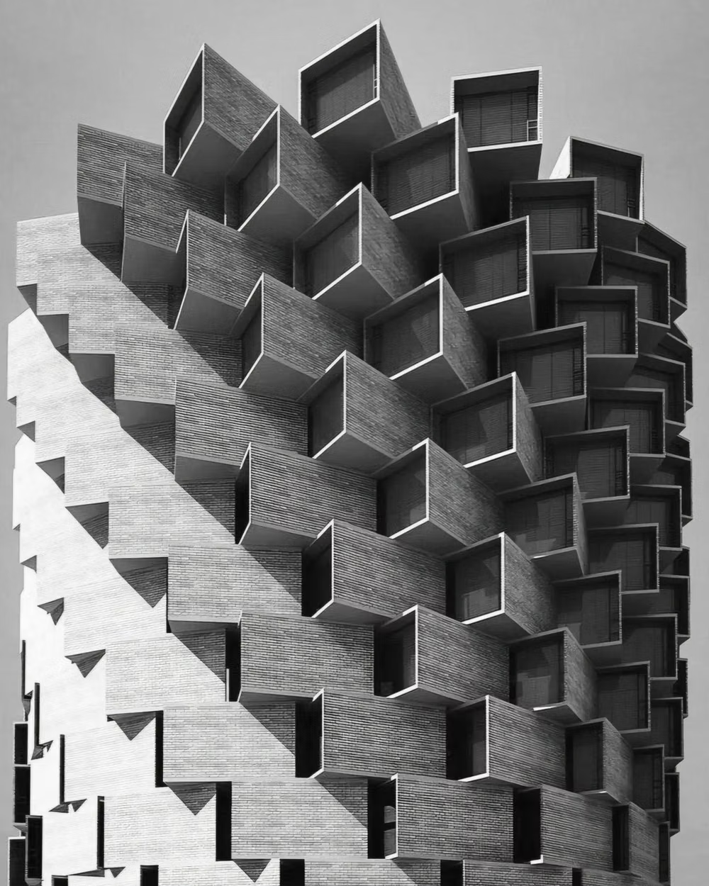
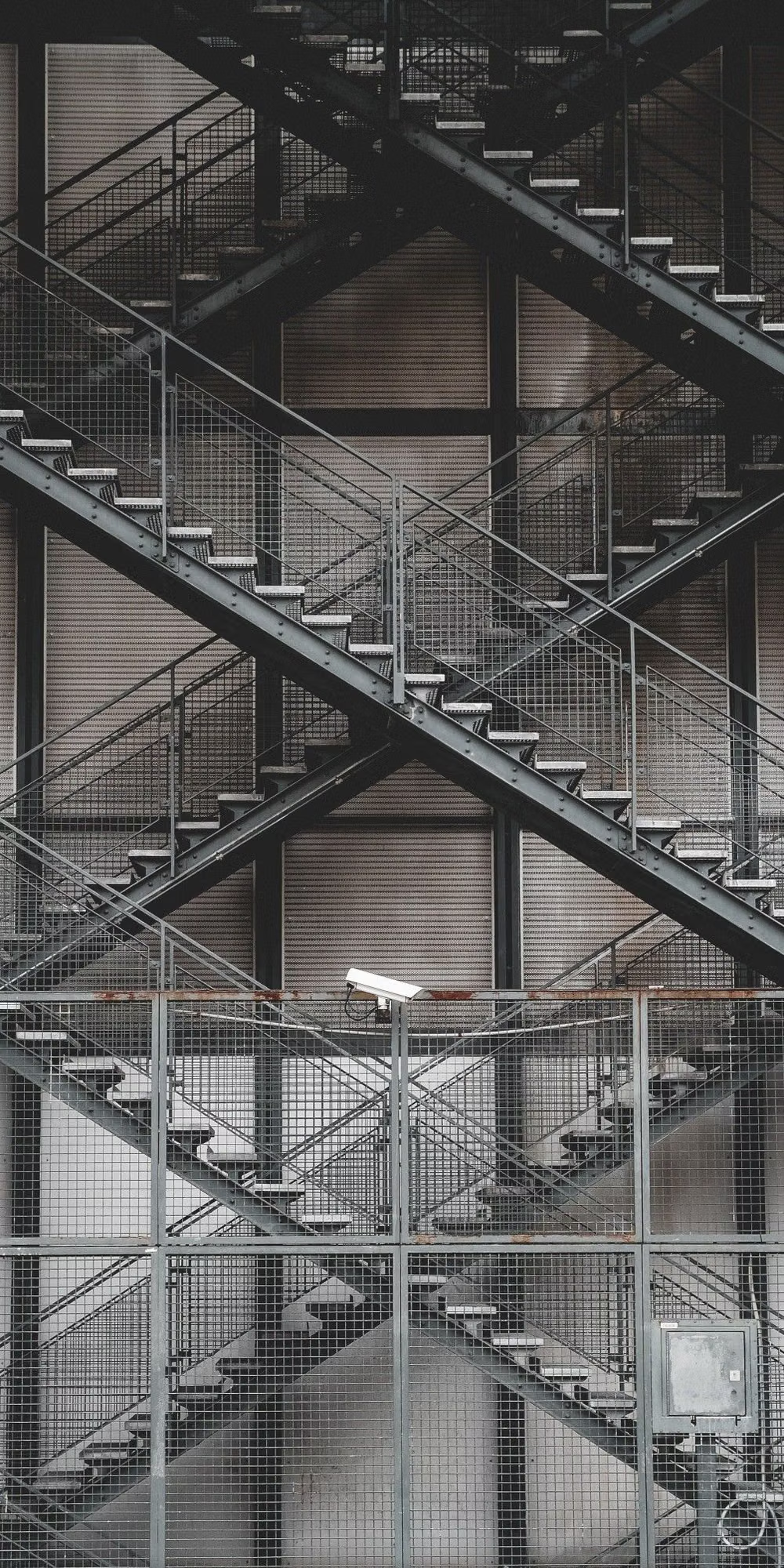
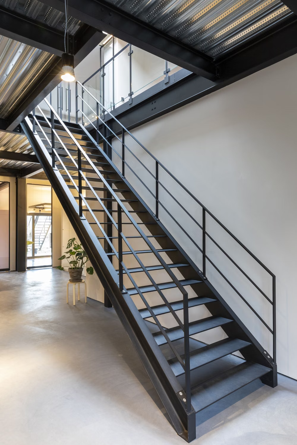
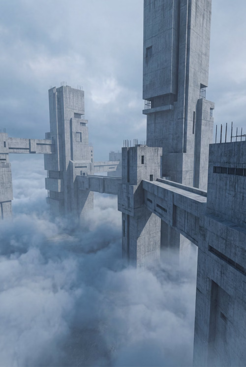
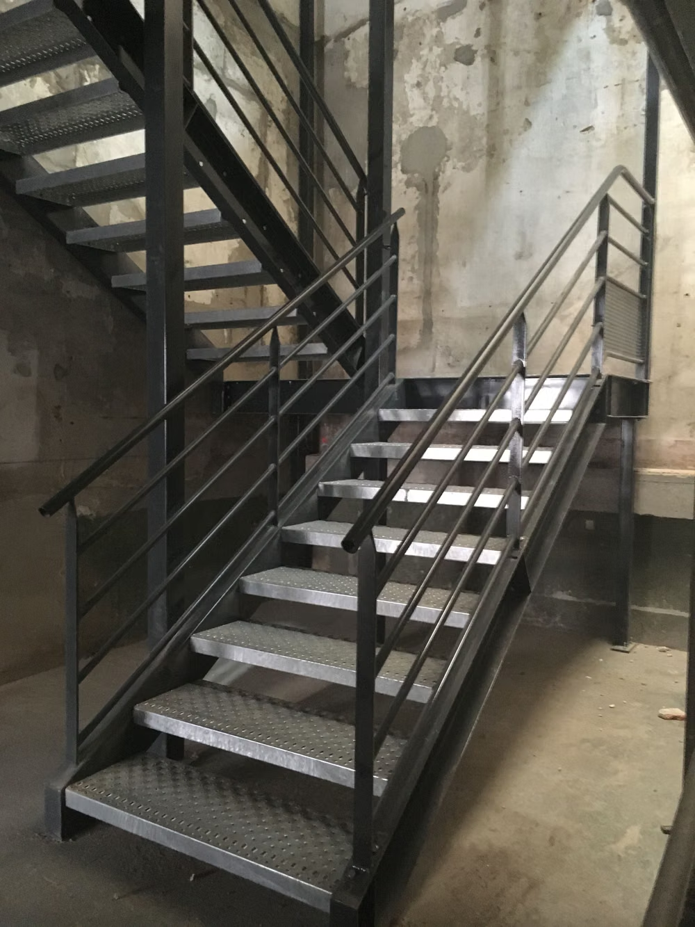
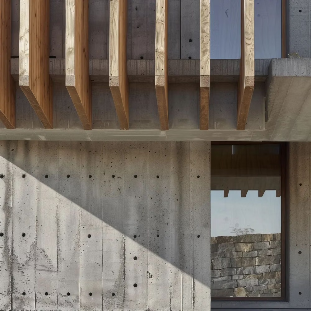
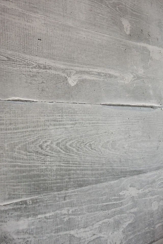
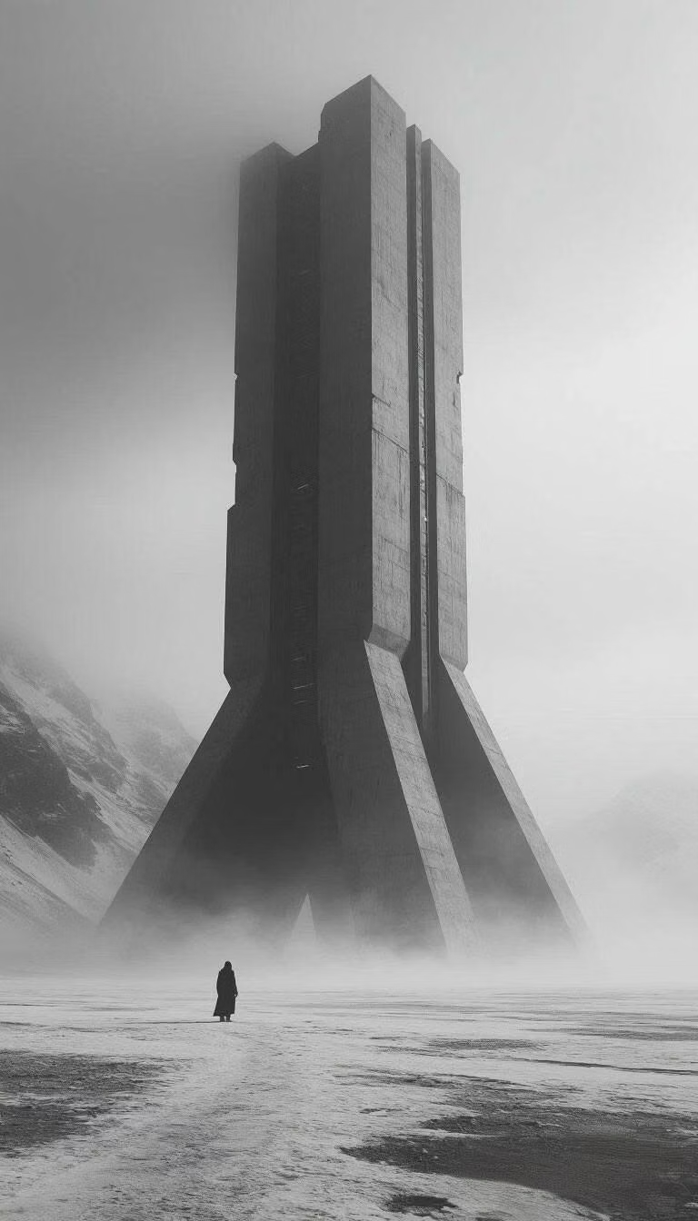
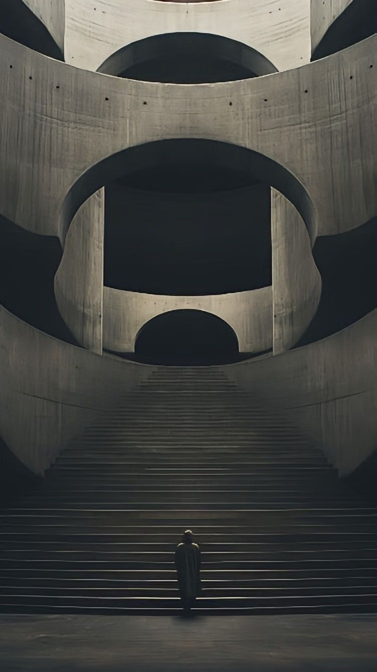
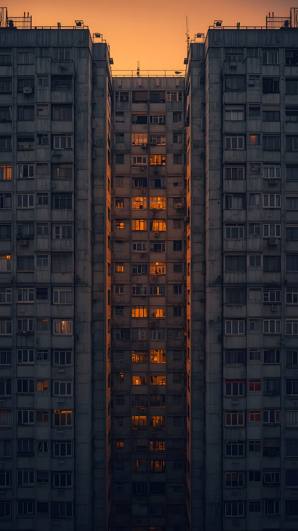
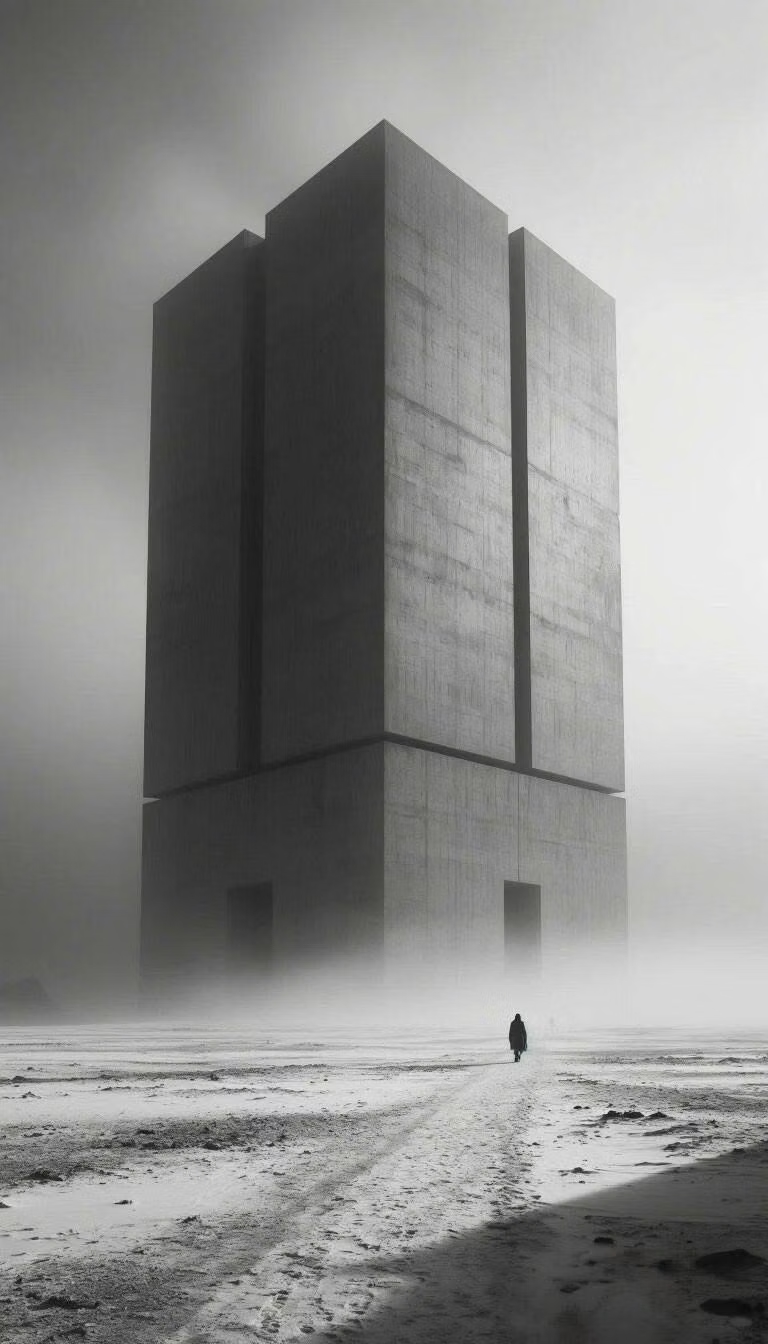
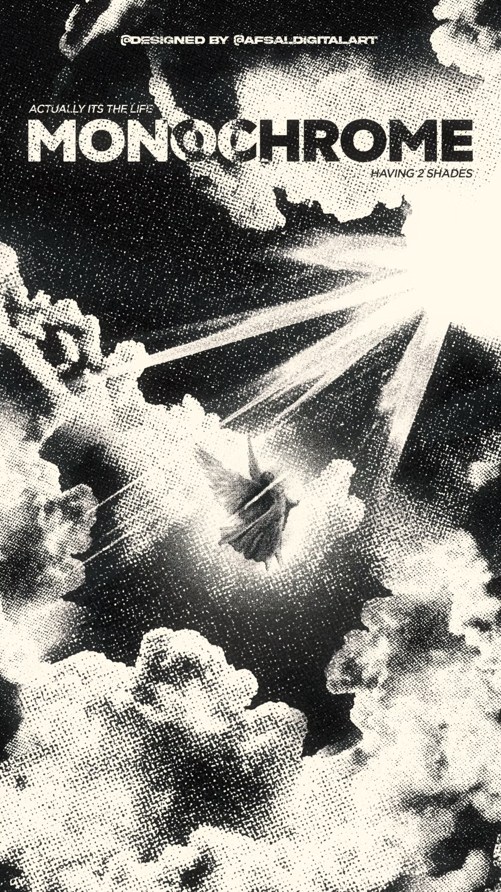
Moodboard and visual references
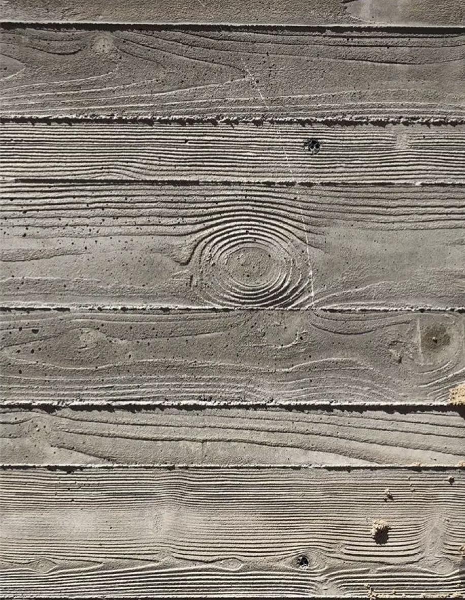
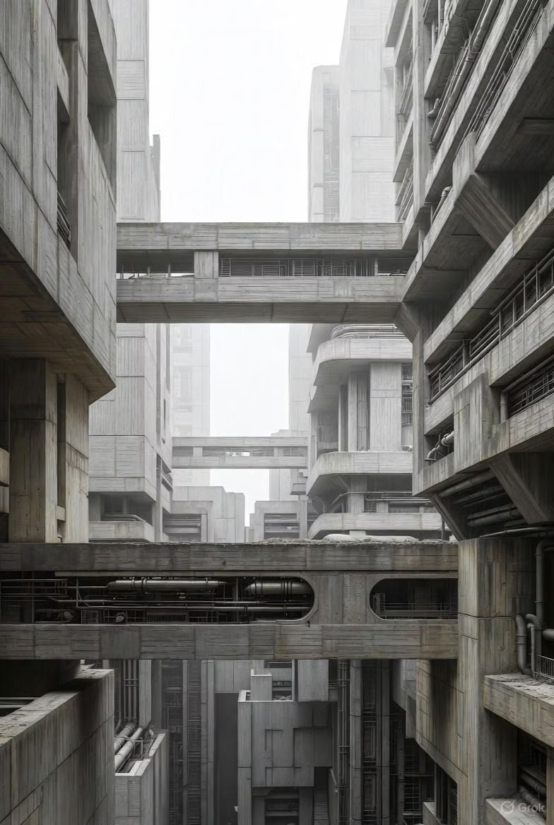
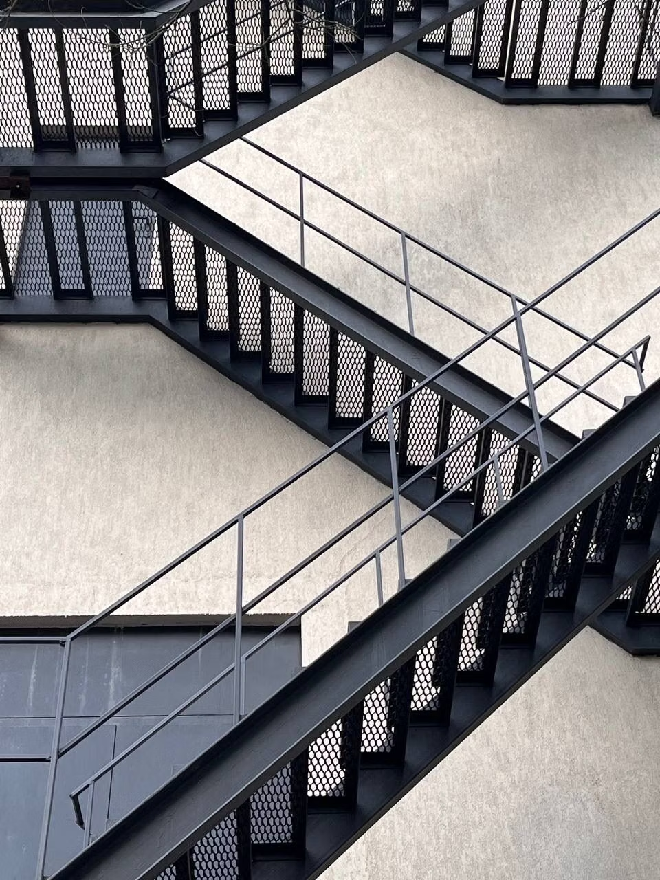
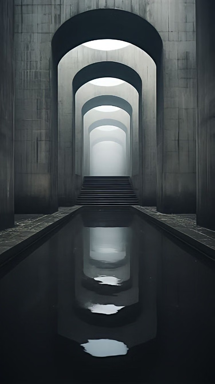
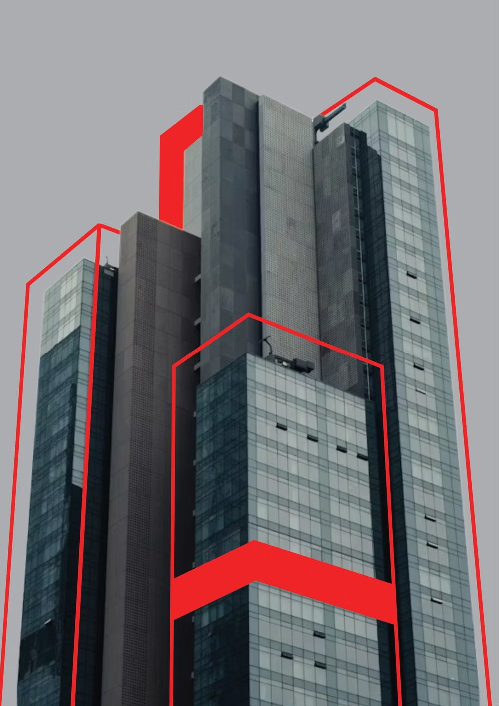
A visual study of the forms, inspirations, materials, colors, type, and cultural references associated with this UI design style.



Design principles and implementation
Use these principles to write a focused AI UI design prompt instead of asking for a vague visual treatment.
Color direction
Use black and white with one harsh utility accent, preserving default-like link and focus colors when they strengthen the raw interface logic. In a daisyUI theme, use harsh utility blue or red for `primary`, black for `secondary`, and set `base-100`, `base-200`, and `base-300` to white, light gray, and a visibly darker structural gray.
Imagery direction
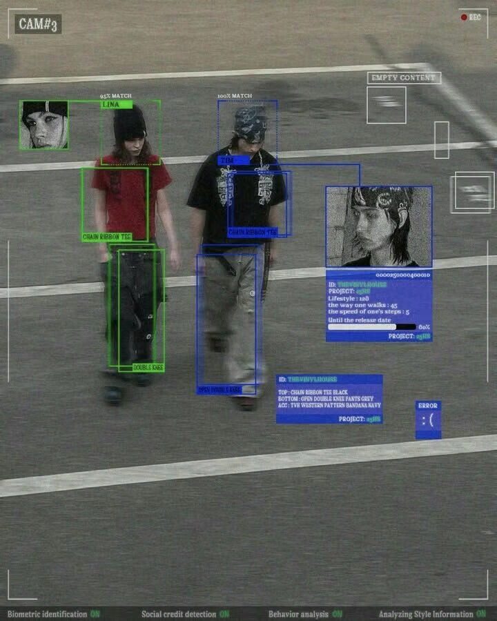
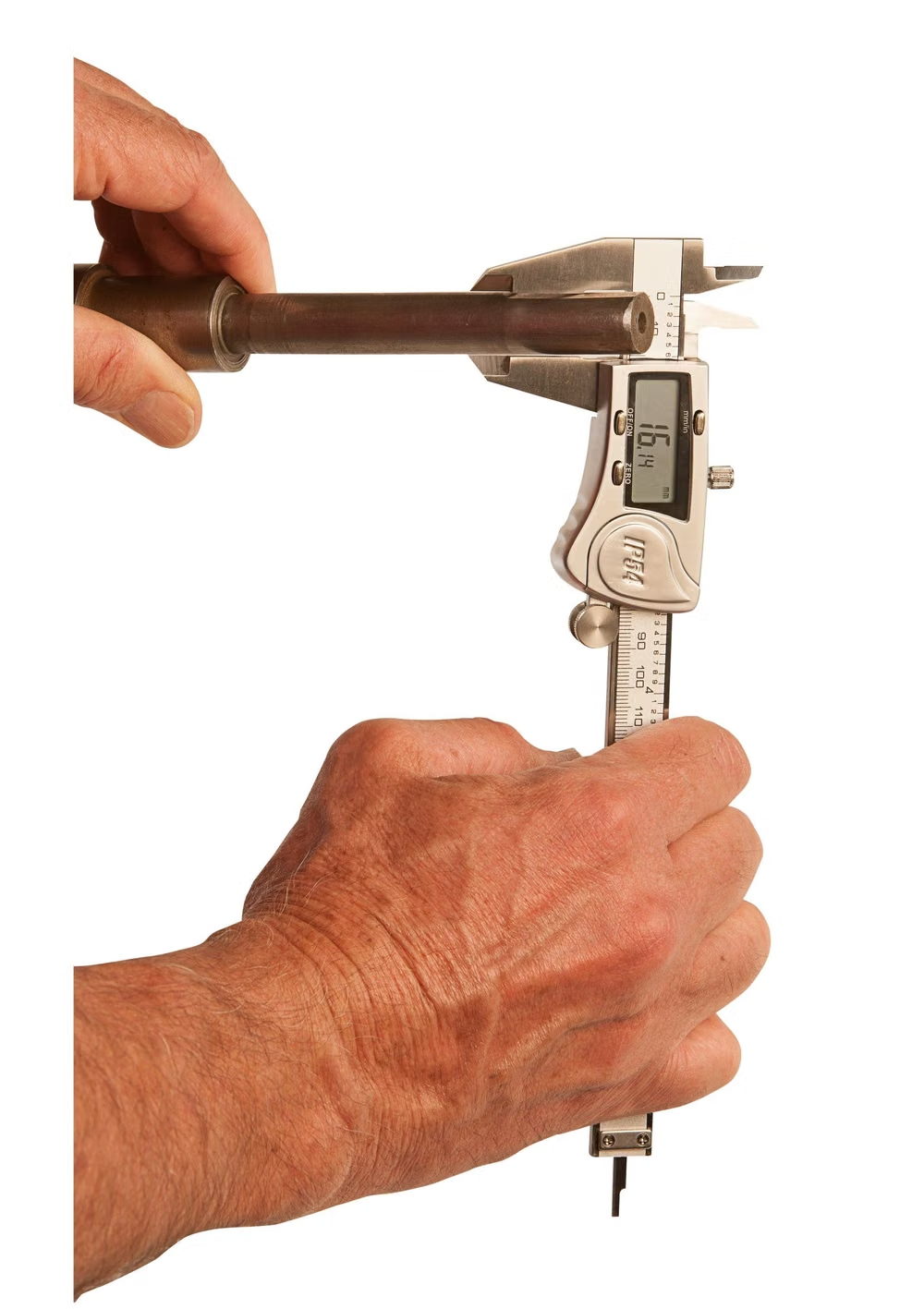
Use unpolished photographs, scans, screenshots, and direct media embeds with honest aspect ratios, visible captions, and minimal retouching.
Content density
Choose either stark sparseness or dense document-like lists, but make the information structure explicit rather than softening it into cards.
Motion direction
Prefer immediate state changes, hard cuts, native scrolling, and occasional raw marquees; avoid smooth decorative transitions that imply polish.
Shape language
Use sharp rectangles, thick rules, native controls, exposed borders, and full-bleed media with no ornamental radius system. In daisyUI themes, set the `--radius-*` variables to `0` or `0.25rem`.
Typography rules
Use system sans, grotesque, serif, or monospace faces at blunt scale contrasts, preserving underlined links and obvious semantic heading levels.
Suggested Typfaces
Archivo Black
Fresh daisies glow in warm sunlight
Fresh daisies glow in warm sunlight
1 2 3 4 5 6 7 8 9 0
Space Mono
Fresh daisies glow in warm sunlight
Fresh daisies glow in warm sunlight
1 2 3 4 5 6 7 8 9 0
IBM Plex Mono
Fresh daisies glow in warm sunlight
Fresh daisies glow in warm sunlight
1 2 3 4 5 6 7 8 9 0
Work Sans
Fresh daisies glow in warm sunlight
Fresh daisies glow in warm sunlight
1 2 3 4 5 6 7 8 9 0
Courier Prime
Fresh daisies glow in warm sunlight
Fresh daisies glow in warm sunlight
1 2 3 4 5 6 7 8 9 0
Build a Brutalism interface with daisyUI
The live example translates this direction into daisyUI components and semantic theme tokens.
To generate a full page in the same visual language, give the style name and the design rules above to Blueprint MCP.
Related UI design styles
Compare nearby visual languages that share typography, shapes, use cases, or signature elements.

Neubrutalism UI design style
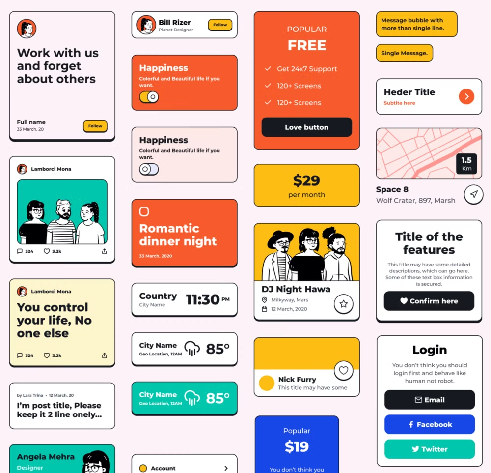
Also called Neo Brutalism or Neo Memphis, this late-2010s and 2020s digital style wraps conventional UX in loud geometric blocks, dark outlines, hard offset shadows, flat color, and exaggerated type.
Cyberminimalism UI design style
Late-2010s hyper-minimal tech design reduces interfaces to black or white fields, large grotesque type, strict grids, sparse geometry, and an occasional controlled gradient or premium render.
Monochrome UI design style
A single hue or neutral family creates hierarchy through tone, scale, texture, and contrast rather than varied color.