Monochrome UI design style
A single hue or neutral family creates hierarchy through tone, scale, texture, and contrast rather than varied color.
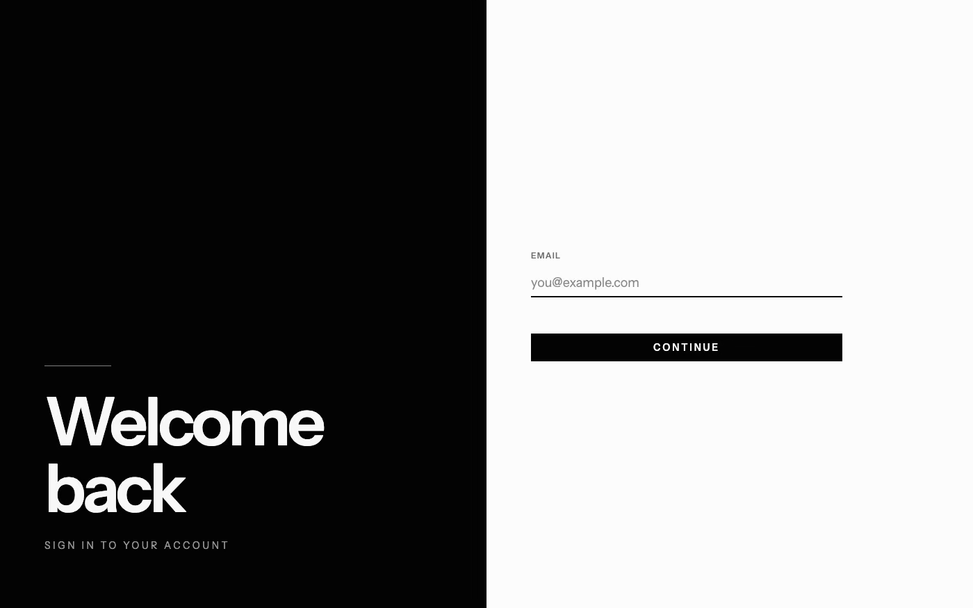
Design overview
- Signature elements
- single-hue palette, tonal hierarchy, strong contrast, texture variation, restrained imagery, shape-led composition. In daisyUI themes, set `--noise: 1;`.
- Best suited to
- Editorial products, luxury brands, portfolios, focus tools, and art-directed experiences.
- Layout principles
- Create hierarchy through scale, spacing, cropping, and tonal blocks, using strong silhouette changes where other systems would rely on multiple colors.
History and origins
A fact-checked account of where this visual language came from, with links to the references used.
- Period
- Recurring throughout screen-interface history
- Origin
- Early single-color displays and modernist graphic systems
Monochrome UI is a design constraint rather than a discrete movement. Early computer terminals were physically limited to one phosphor color, while later interfaces chose black-and-white or single-hue systems for hierarchy and focus; contemporary versions often combine that technical memory with the disciplined typography and grids of International Typographic Style.
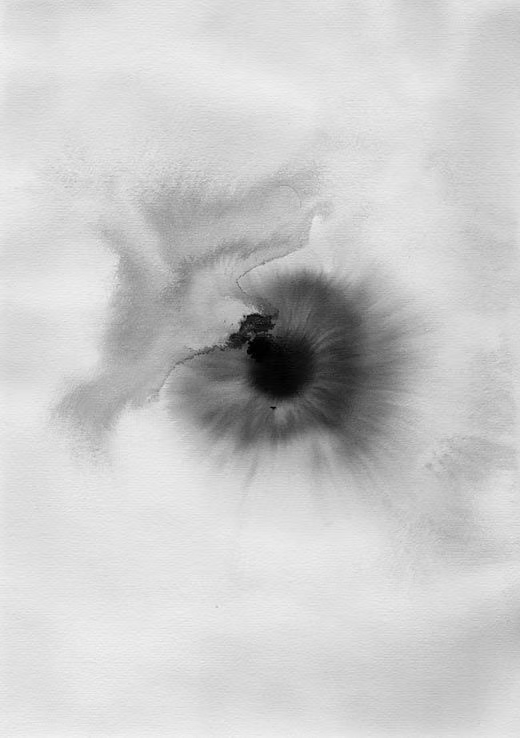
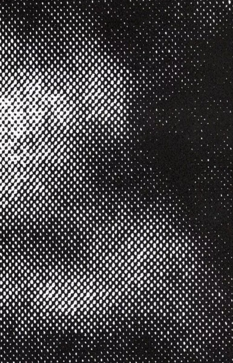
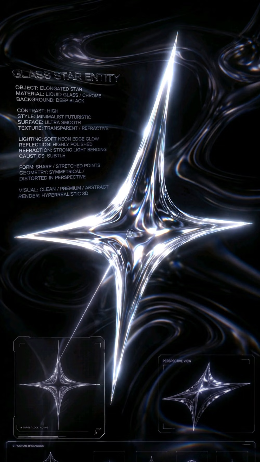
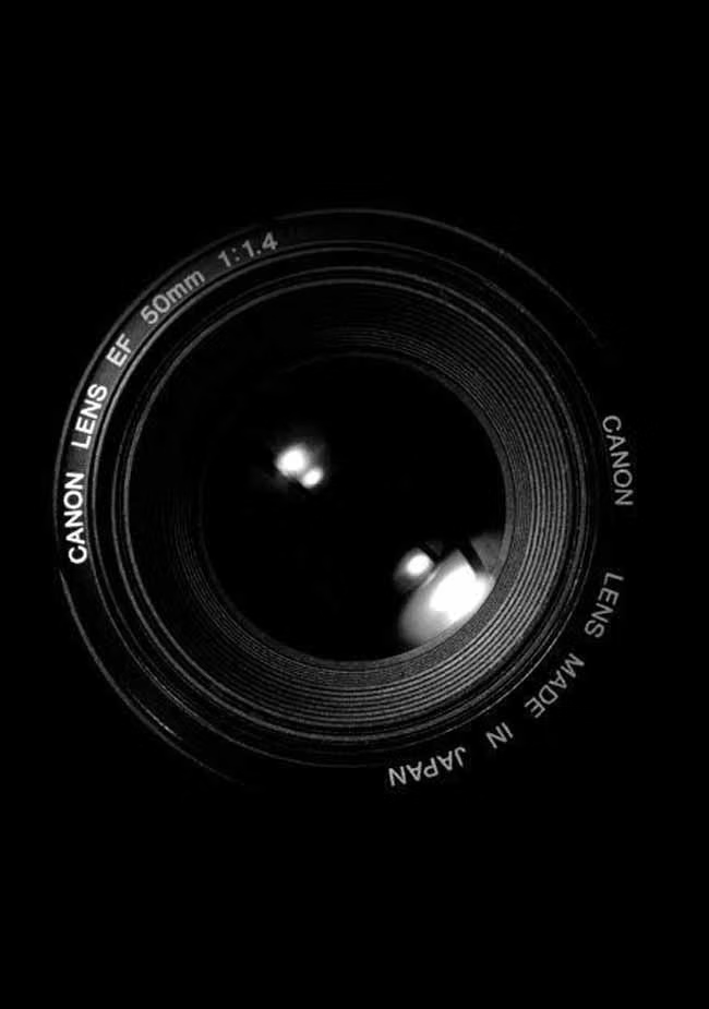
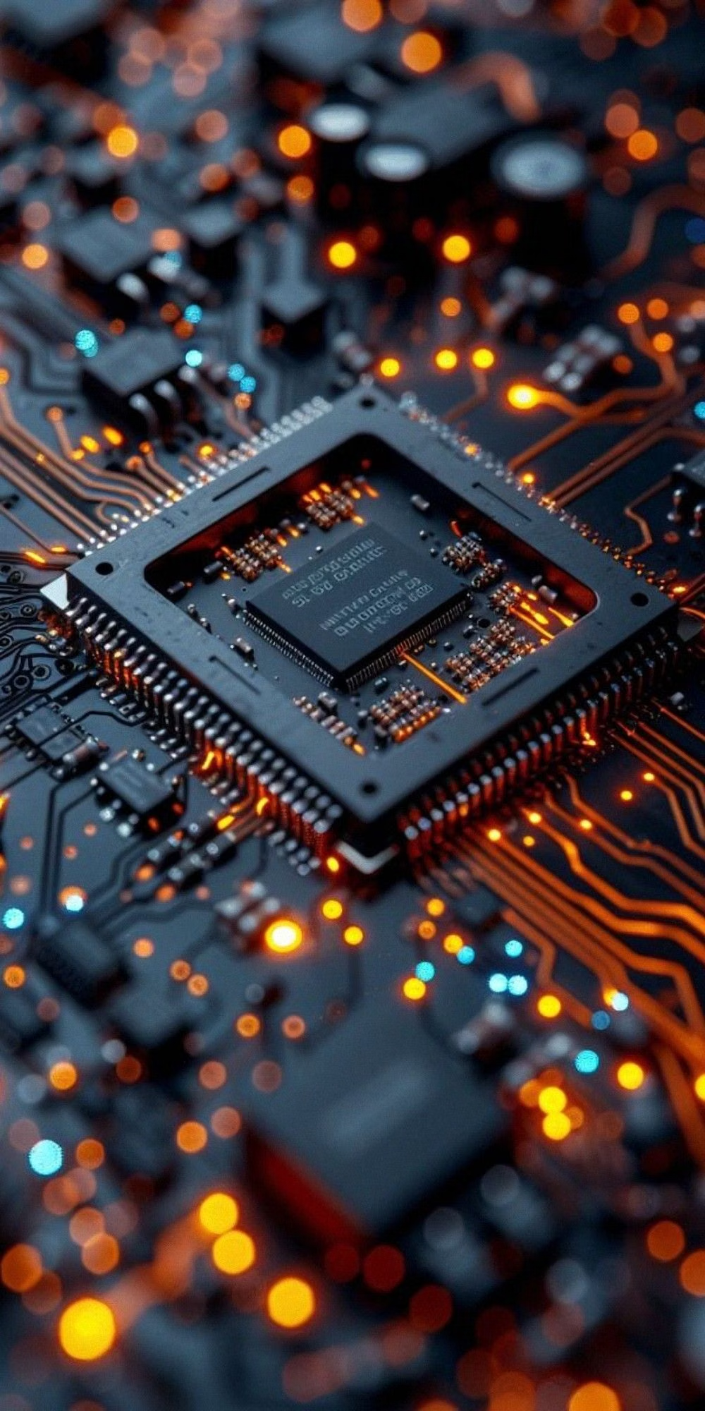
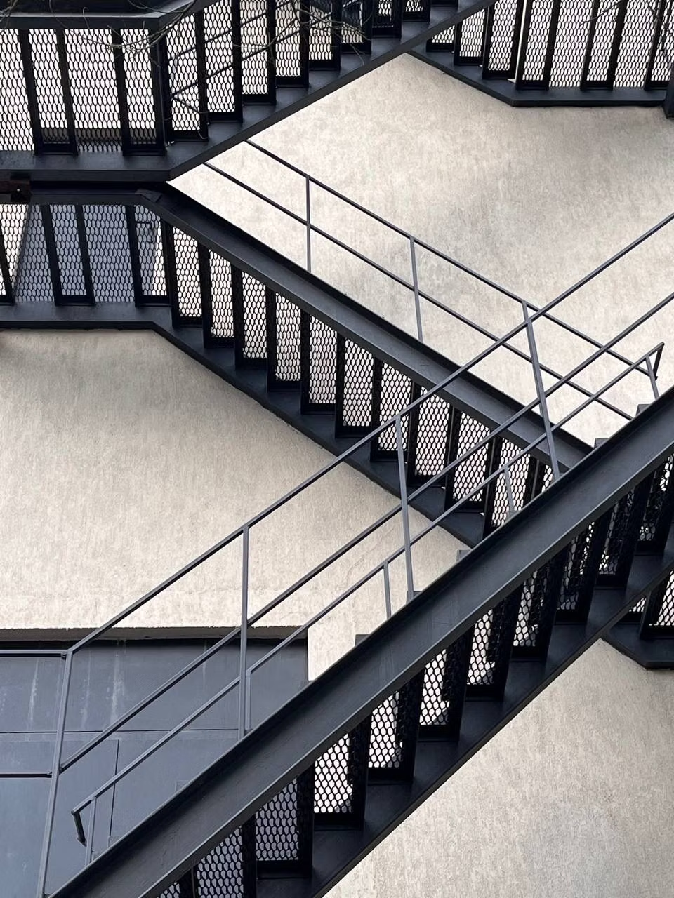
Moodboard and visual references
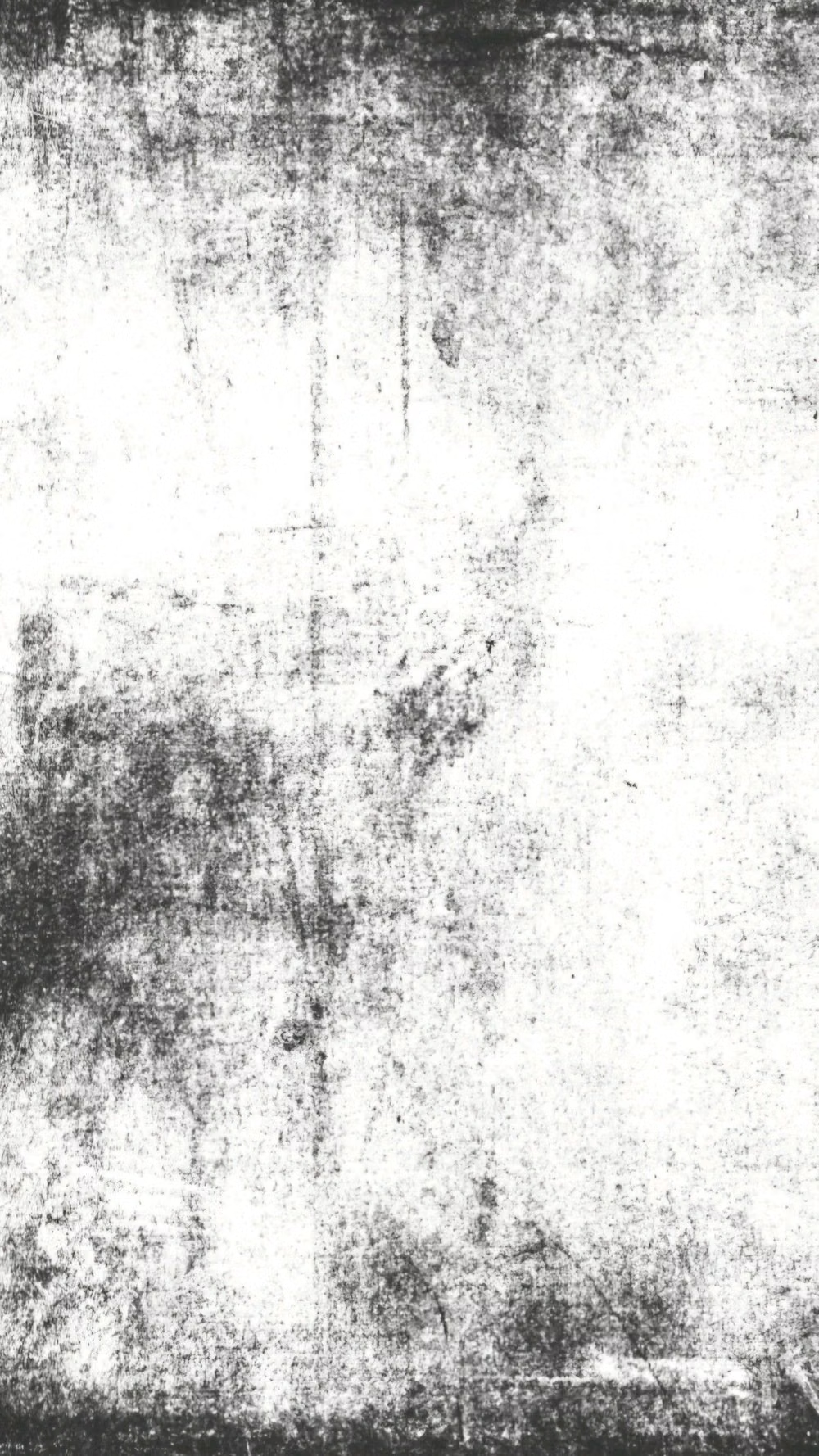
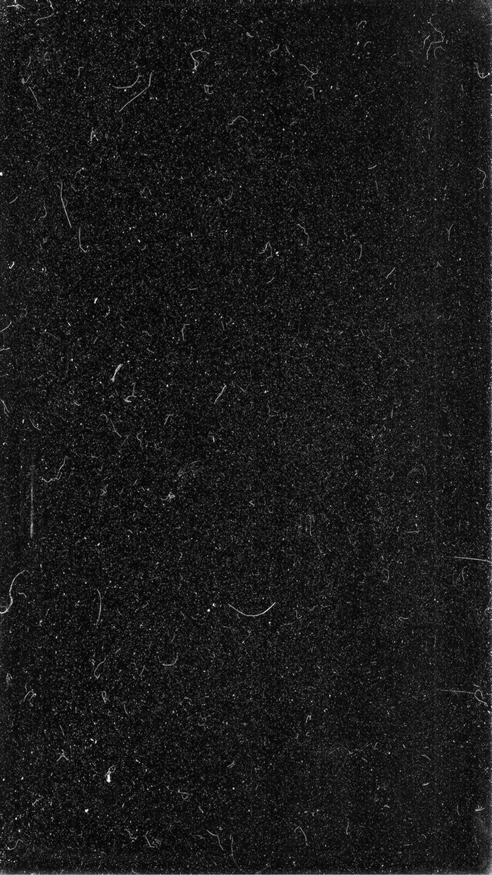
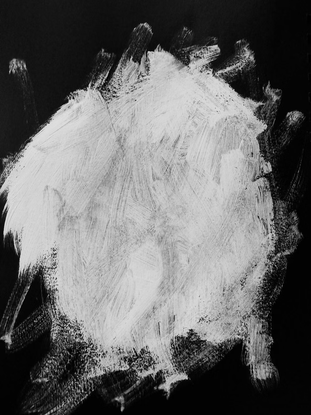
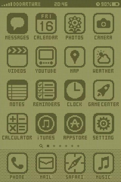
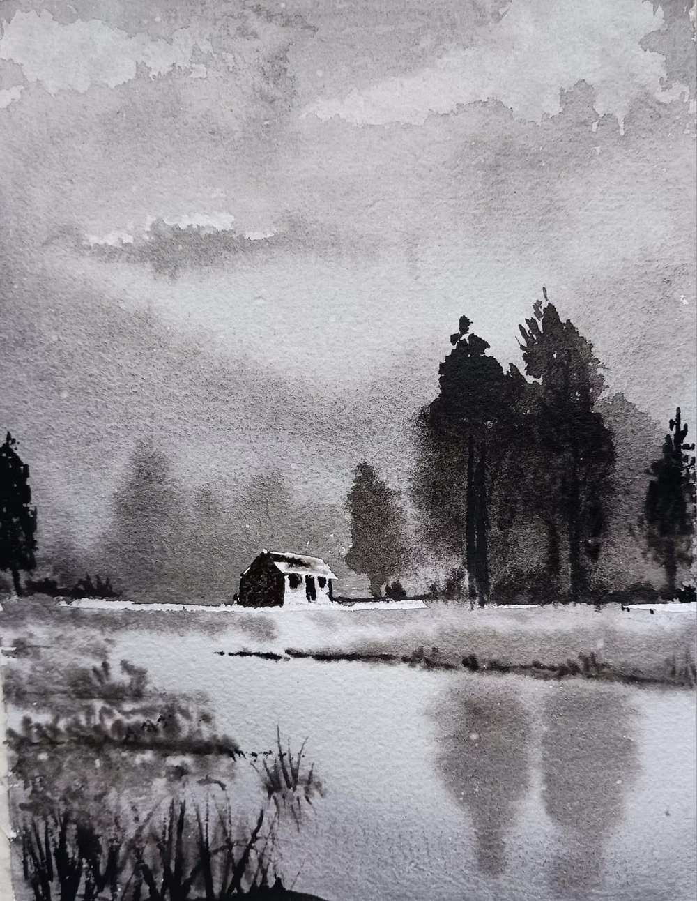
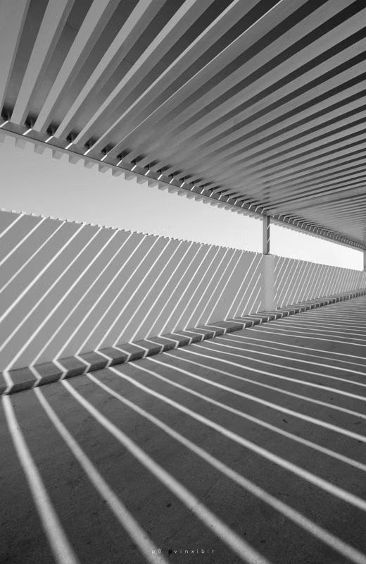
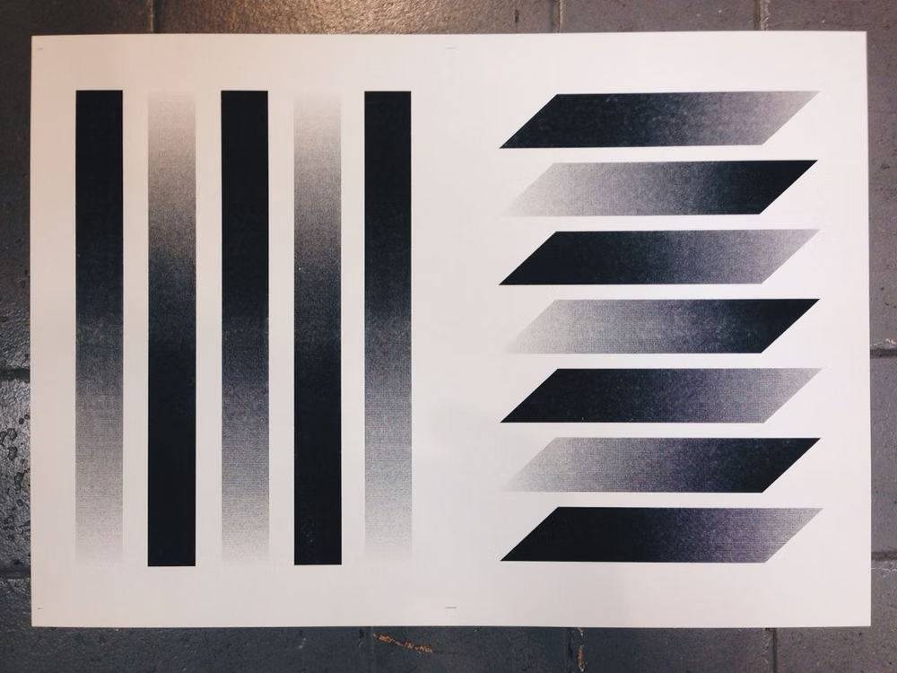
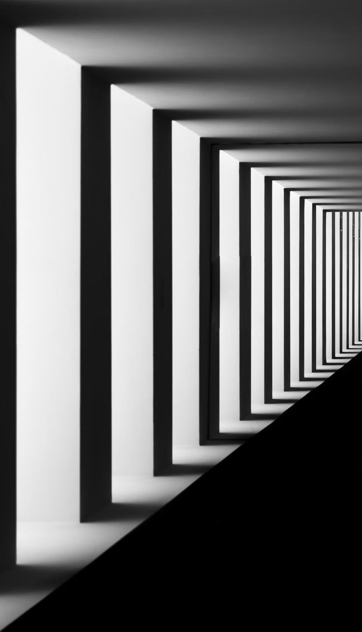
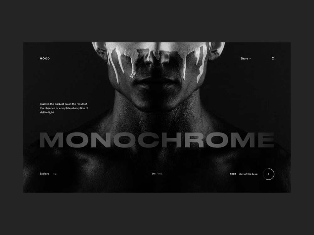
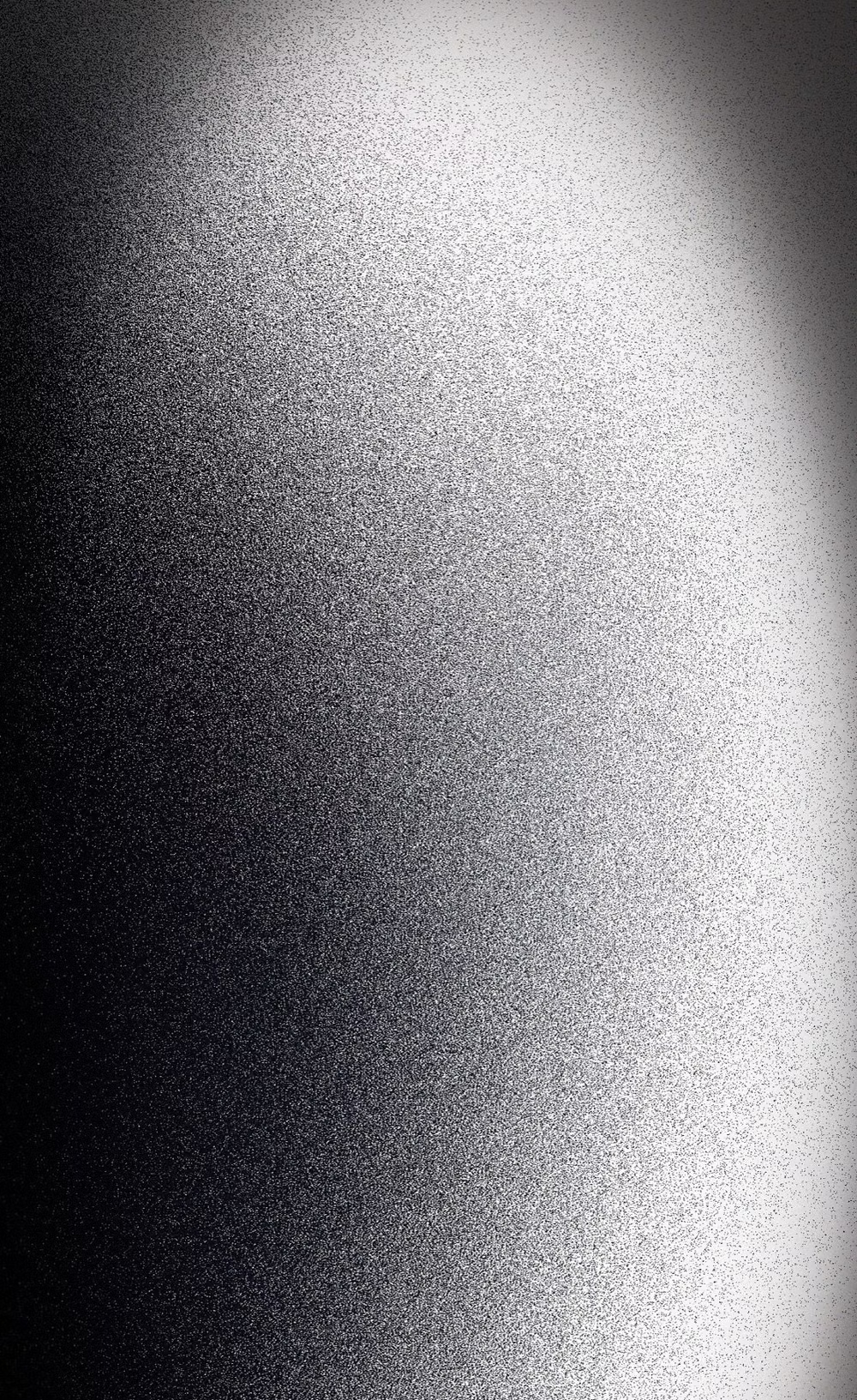
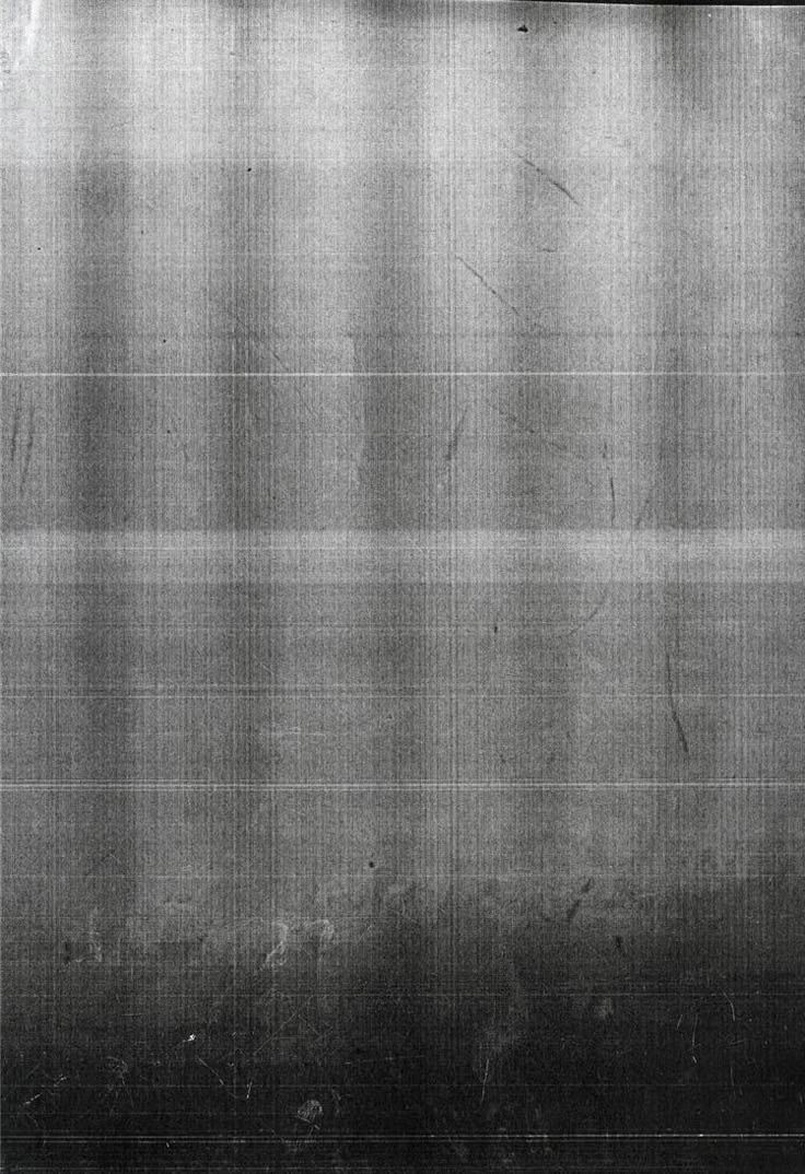
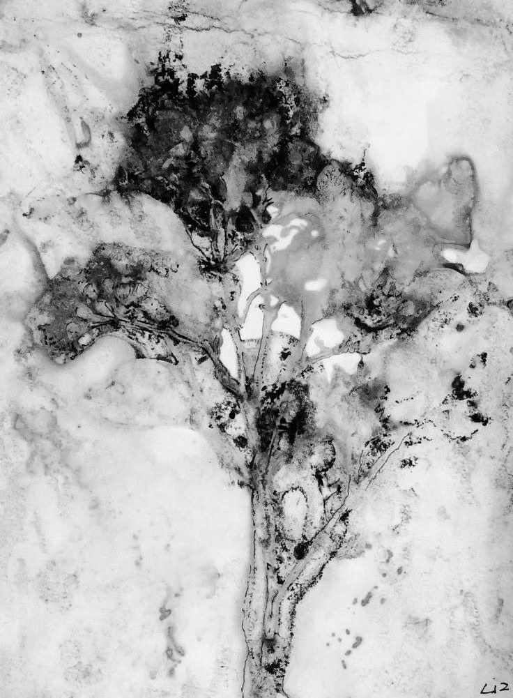
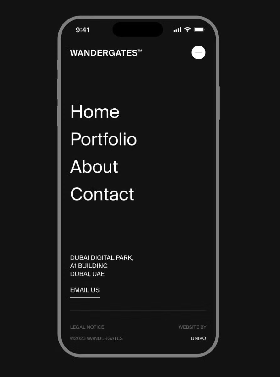
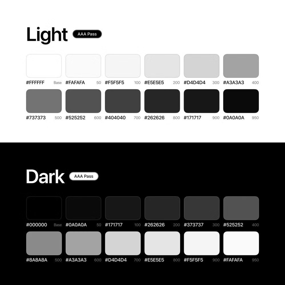
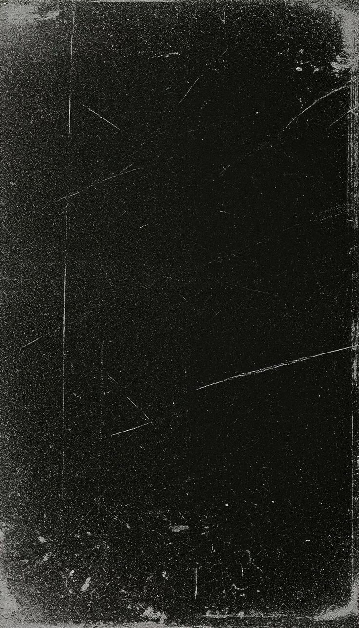
A visual study of the forms, inspirations, materials, colors, type, and cultural references associated with this UI design style.

Design principles and implementation
Use these principles to write a focused AI UI design prompt instead of asking for a vague visual treatment.
Color direction
Select one hue or neutral family, define enough tonal steps for surfaces and states, and preserve a clear contrast threshold between adjacent roles. In a daisyUI theme, use the clearest chromatic step for `primary`, a quieter neighboring step for `secondary`, and assign three reliably separated values from the same family to `base-100`, `base-200`, and `base-300`.
Imagery direction
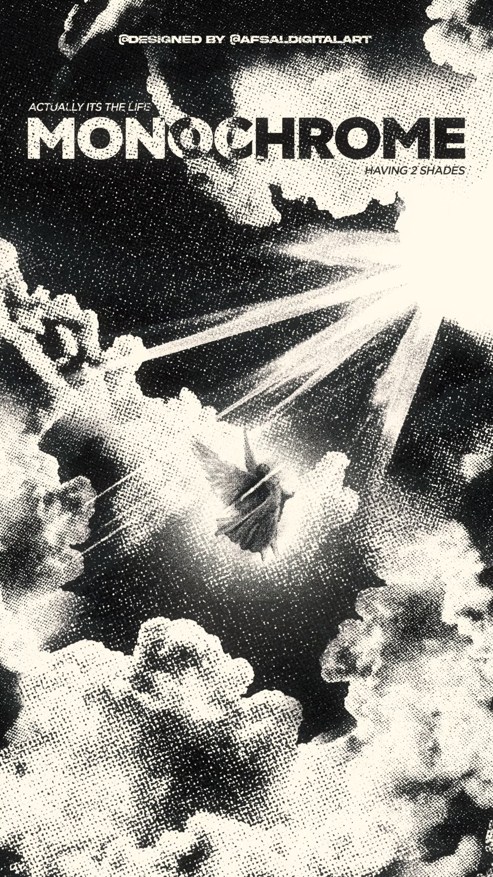
Use black-and-white, duotone, or single-ink imagery with deliberate grain and contrast so photographs belong to the same tonal system.
Content density
Choose density by task, but separate information through rhythm and tone rather than introducing extra accent colors for convenience.
Motion direction
Favor opacity reveals, tonal inversions, masks, and crop transitions that preserve the one-color discipline.
Shape language
Let bold silhouettes, cutouts, rules, and field boundaries carry structure; avoid ornamental shapes that need extra color to make sense. In daisyUI themes, set the `--radius-*` variables to `0` or `0.25rem`.
Typography rules
Use either one flexible family or a sharply contrasted editorial pair, relying on size, width, and weight for hierarchy instead of colored text.
Suggested Typfaces
Instrument Sans
Fresh daisies glow in warm sunlight
Fresh daisies glow in warm sunlight
1 2 3 4 5 6 7 8 9 0
Archivo
Fresh daisies glow in warm sunlight
Fresh daisies glow in warm sunlight
1 2 3 4 5 6 7 8 9 0
IBM Plex Sans
Fresh daisies glow in warm sunlight
Fresh daisies glow in warm sunlight
1 2 3 4 5 6 7 8 9 0
Inter
Fresh daisies glow in warm sunlight
Fresh daisies glow in warm sunlight
1 2 3 4 5 6 7 8 9 0
Space Grotesk
Fresh daisies glow in warm sunlight
Fresh daisies glow in warm sunlight
1 2 3 4 5 6 7 8 9 0
Build a Monochrome UI interface with daisyUI
The live example translates this direction into daisyUI components and semantic theme tokens.
To generate a full page in the same visual language, give the style name and the design rules above to Blueprint MCP.
Related UI design styles
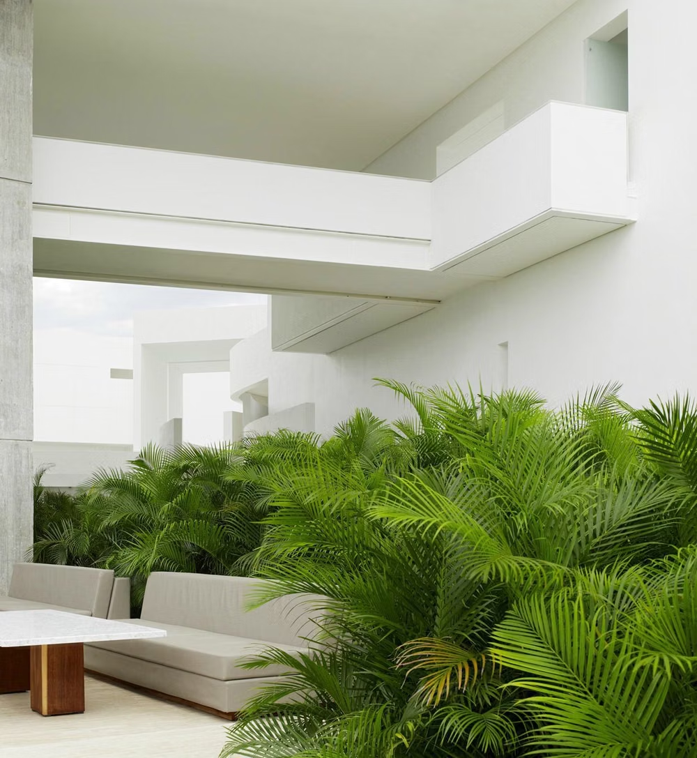
Compare nearby visual languages that share typography, shapes, use cases, or signature elements.

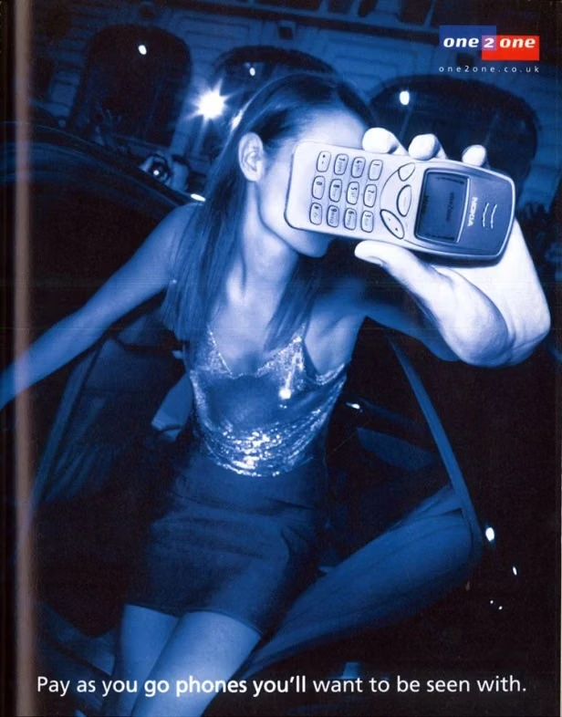
Gen-X Soft Club UI design style
Late-1990s and early-2000s urban futurism softens Y2K gloss through muted color, minimalist typography, blurred photography, and a sterile-meets-organic mood.
Cyberminimalism UI design style
Late-2010s hyper-minimal tech design reduces interfaces to black or white fields, large grotesque type, strict grids, sparse geometry, and an occasional controlled gradient or premium render.

Brutalism UI design style
Raw typography, exposed structure, sharp edges, stark contrast, default-like controls, and intentionally unpolished layouts.