Gen-X Soft Club UI design style
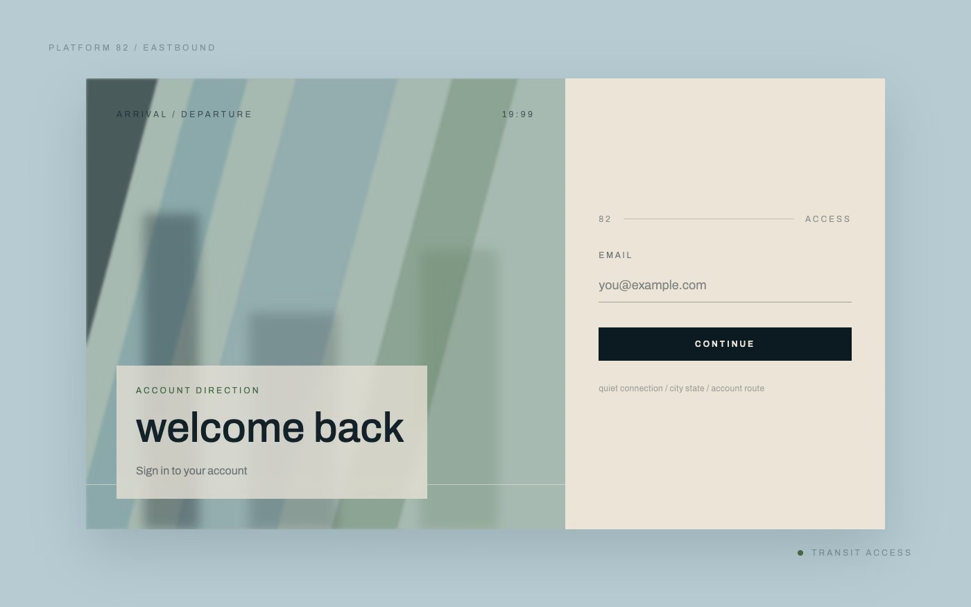
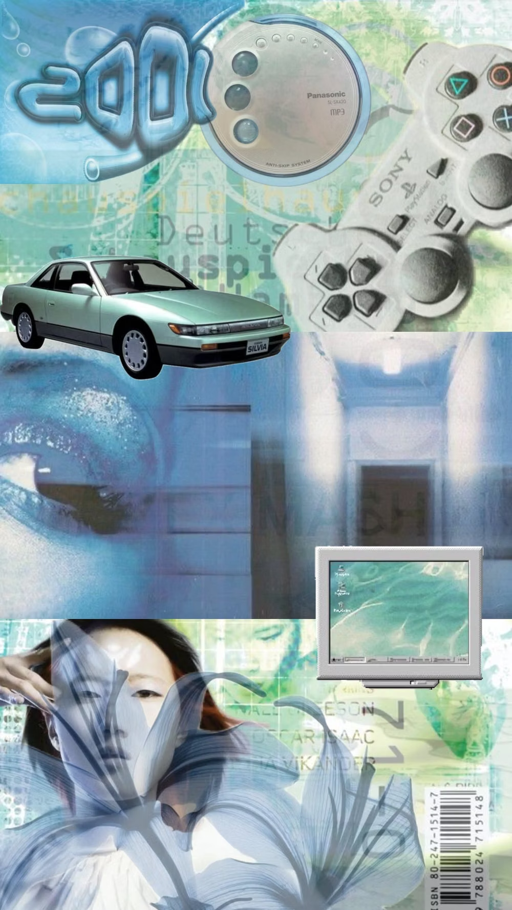
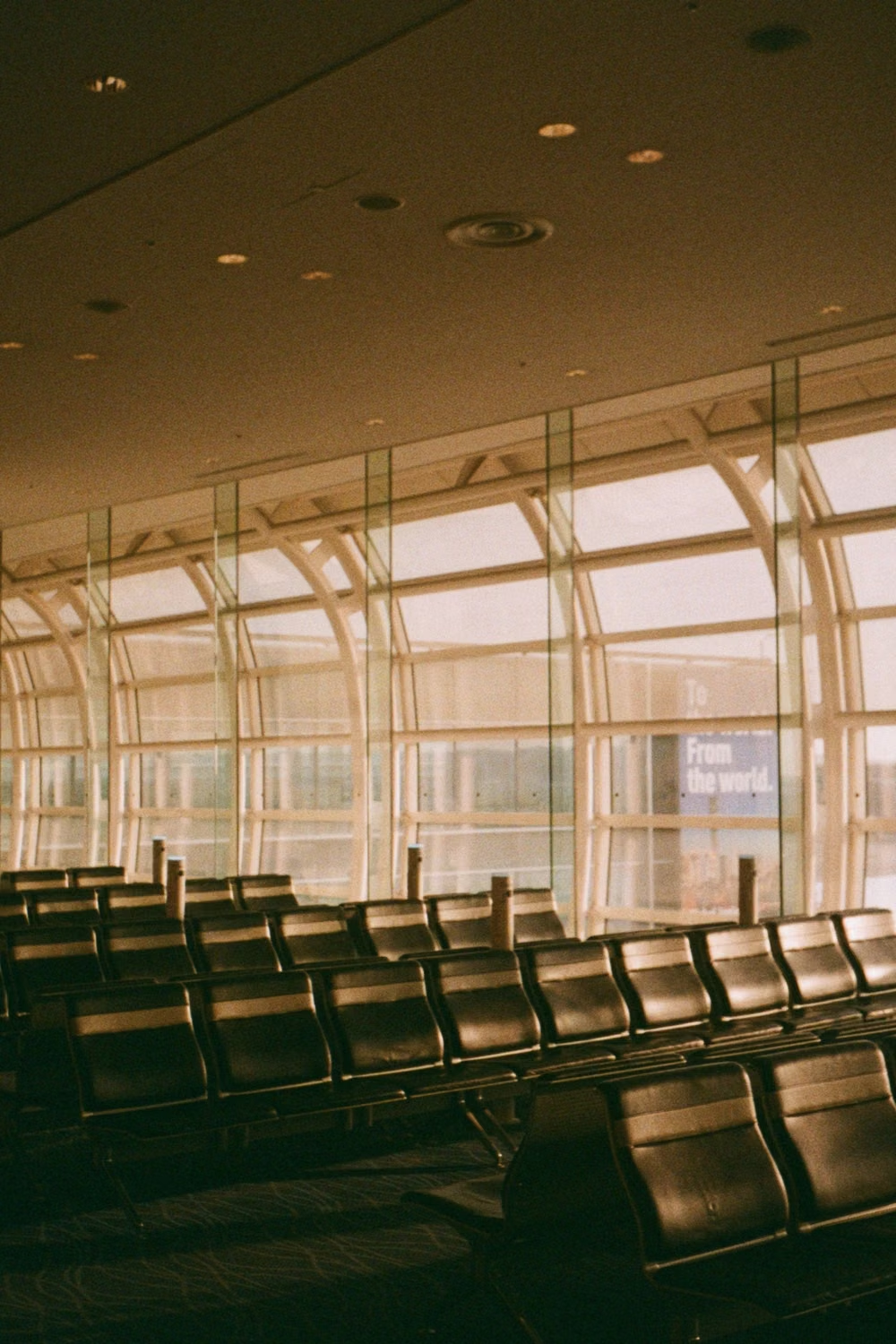
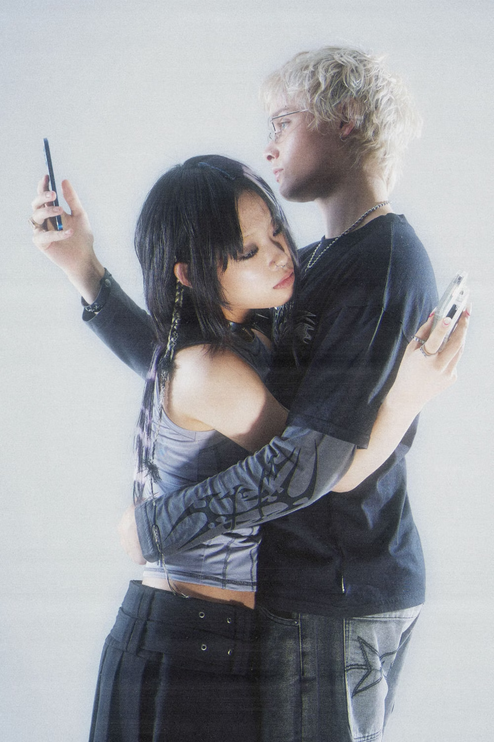
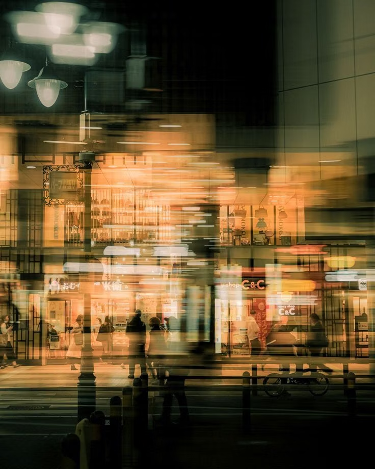
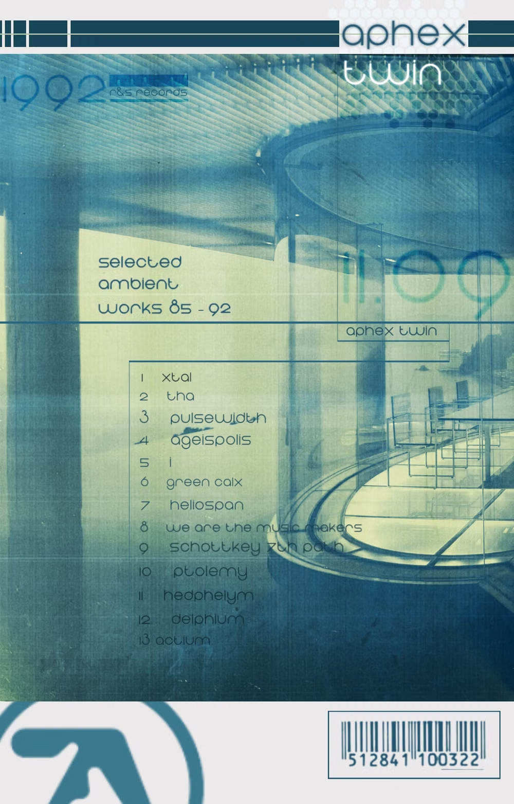
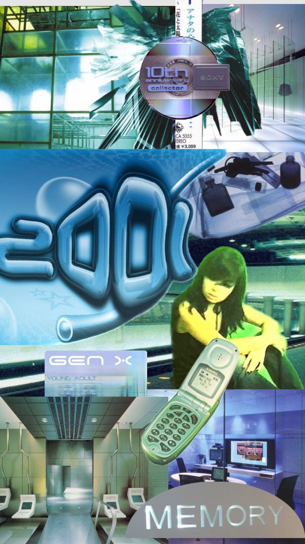
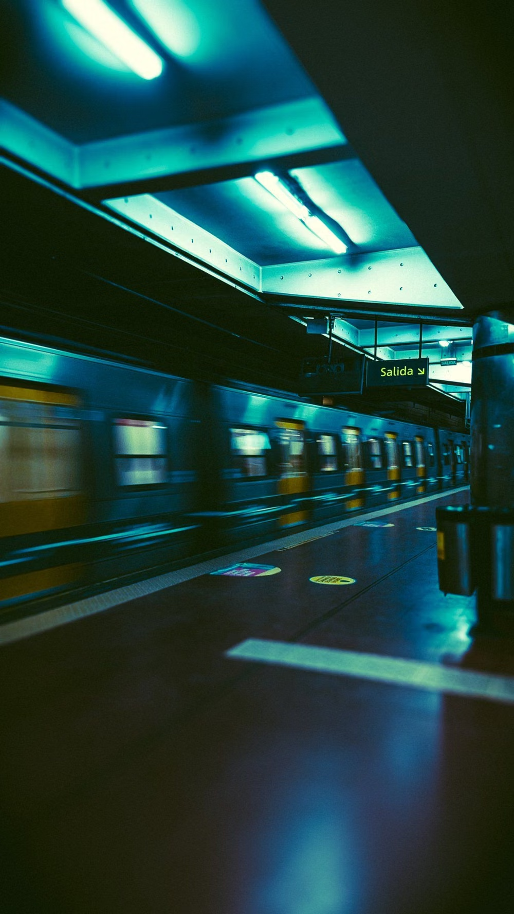
Late-1990s and early-2000s urban futurism softens Y2K gloss through muted color, minimalist typography, blurred photography, and a sterile-meets-organic mood.
Design overview
- Signature elements
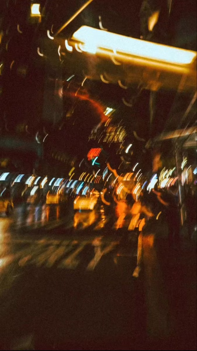
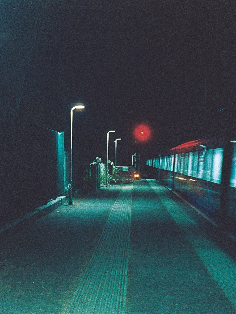
- cool muted palettes, blurred urban photography, transit-sign typography, Lomo color casts, restrained vector overlays, sterile-organic contrast. In daisyUI themes, set `--noise: 1;`.
- Best suited to
- Music, fashion, nightlife, culture, travel, editorial portfolios, and atmospheric lifestyle products.
- Layout principles
- Compose like a restrained late-1990s album sleeve or transit campaign, using one large softened city or human image, broad negative space, crisp typographic anchors, and a few small vector or wayfinding details.
History and origins
A fact-checked account of where this visual language came from, with links to the references used.
- Period
- Early 1990s–mid-2000s
- Origin
- Lifestyle technology, wellness branding, music, and editorial imagery
Gen-X Soft Club is a retrospective consumer-aesthetic classification rather than a name used consistently during its source period. CARI places it from the early 1990s to mid-2000s and credits Sloane Angel Hilton with the label, describing a polished, translucent, nature-tinged calm that developed as technology and wellness were sold as softer parts of everyday life.
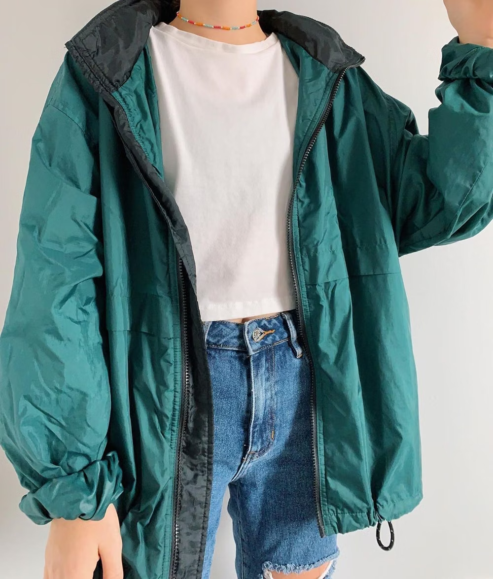
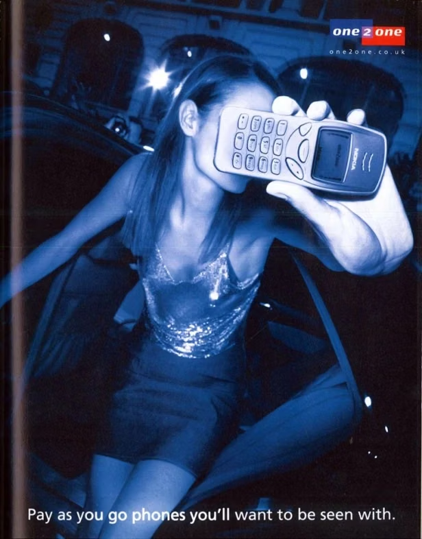
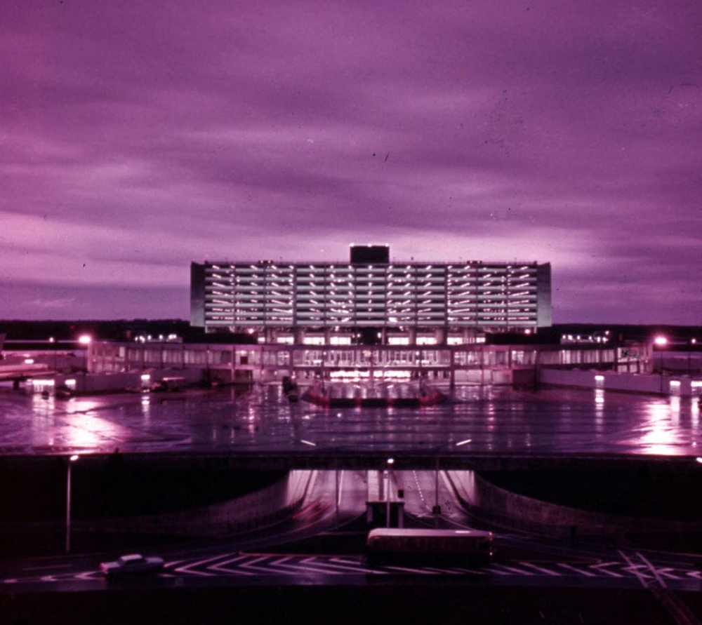
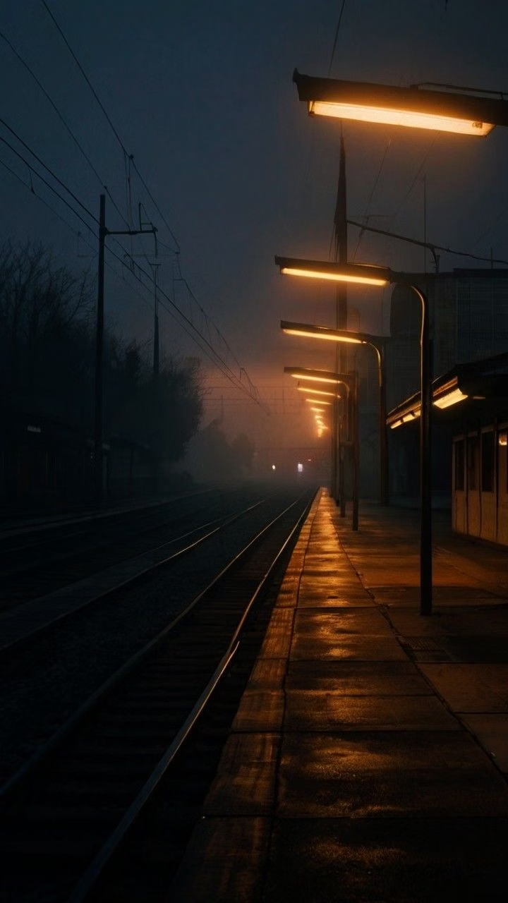
Moodboard and visual references
A visual study of the forms, inspirations, materials, colors, type, and cultural references associated with this UI design style.

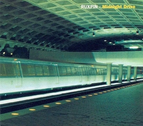
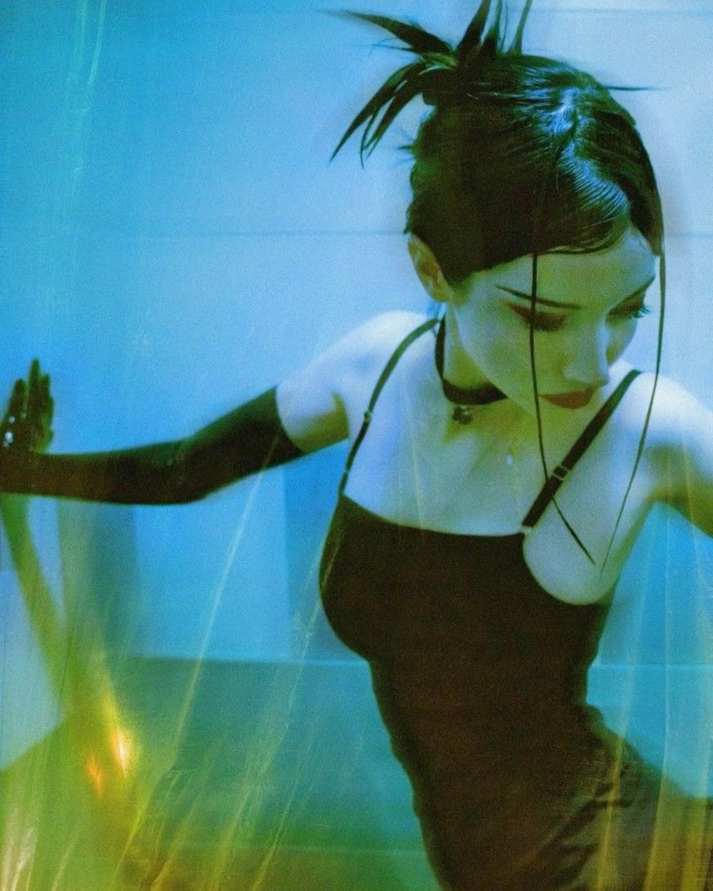
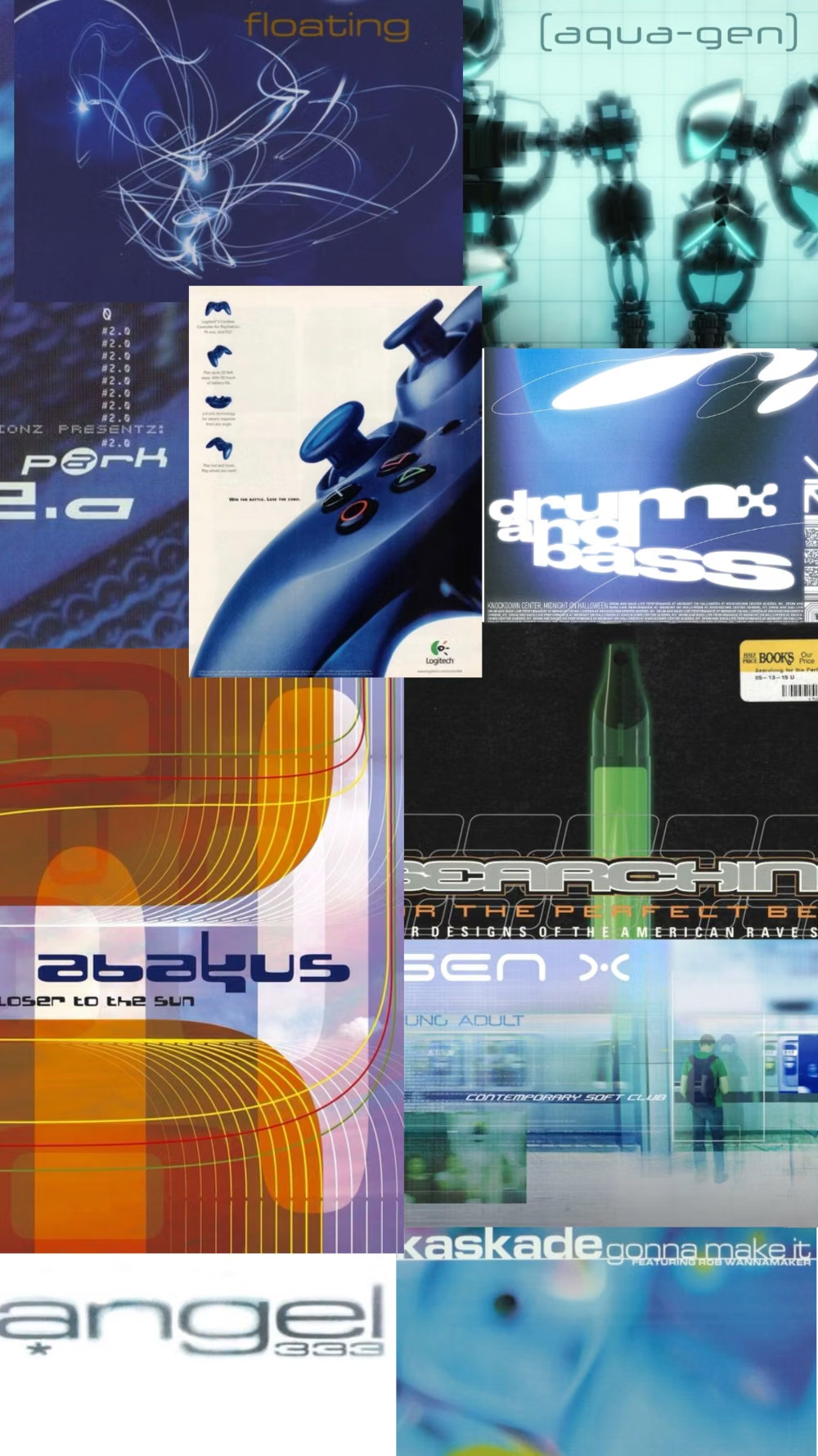
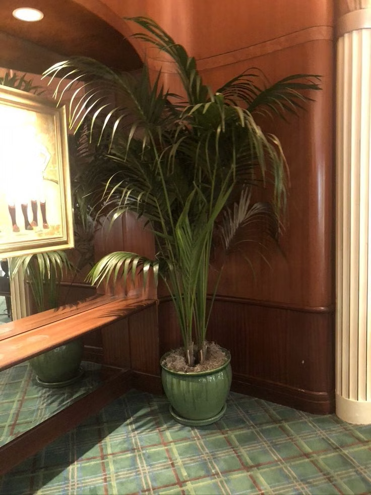

Design principles and implementation
Use these principles to write a focused AI UI design prompt instead of asking for a vague visual treatment.
Color direction
Use desaturated blue, seafoam or olive green, beige, tan, concrete gray, and black, binding photography and surfaces with cool color washes instead of candy-colored Y2K chrome. In a daisyUI theme, use desaturated blue or seafoam for `primary`, olive for `secondary`, and assign beige, cool light gray, and concrete gray to `base-100`, `base-200`, and `base-300`.
Imagery direction
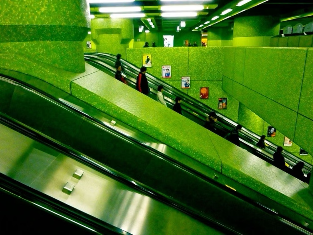
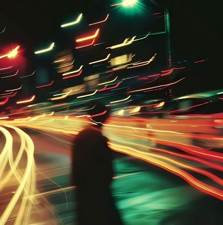
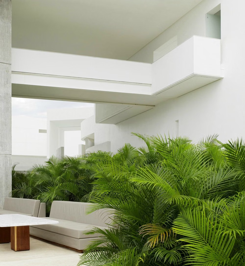
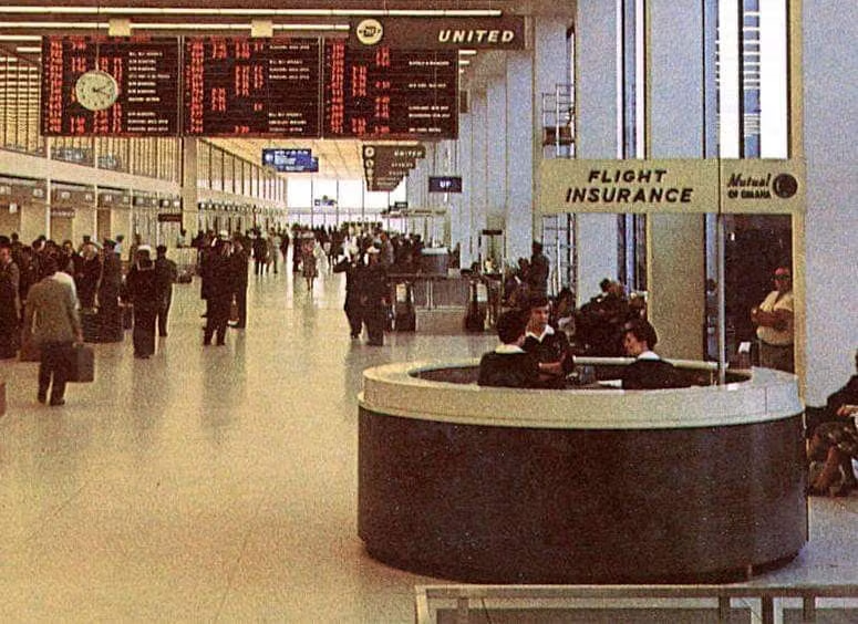
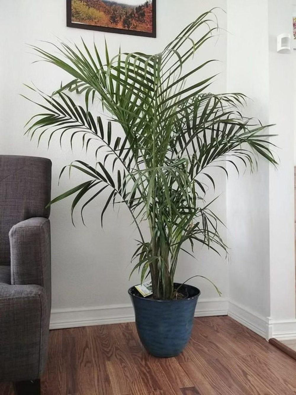
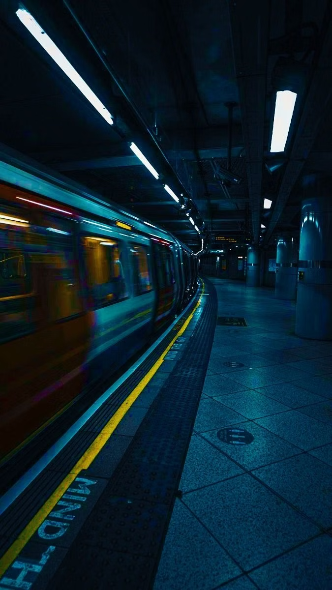
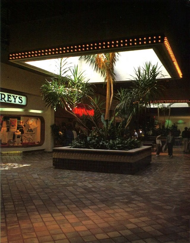
Choose airports, train platforms, city skylines, concrete interiors, plants, and natural-looking portraits; apply blur, bloom, bokeh, vignettes, Lomo-like cross-processing, or bleach-bypass effects without erasing the subject.
Content density
Keep density low to medium, letting one atmospheric image and a short message dominate while secondary navigation reads like quiet transit or album metadata.
Motion direction
Use slow crossfades, soft-focus shifts, restrained light leaks, passing-window motion, and short vector traces that evoke travel and club visuals without glossy spectacle.
Shape language
Favor clean rectangular crops, thin route lines, small circles, understated technical marks, and softened photo edges, balancing sterile geometry with natural textures. In daisyUI themes, set the `--radius-*` variables between `0.25rem` and `1rem`.
Typography rules
Use a neutral Helvetica-like neo-grotesque, align it like urban wayfinding, and pair compact labels with spare lowercase or sentence-case headlines; keep tracking measured and effects minimal.
Suggested Typfaces
Archivo
Fresh daisies glow in warm sunlight
Fresh daisies glow in warm sunlight
1 2 3 4 5 6 7 8 9 0
Inter
Fresh daisies glow in warm sunlight
Fresh daisies glow in warm sunlight
1 2 3 4 5 6 7 8 9 0
IBM Plex Sans
Fresh daisies glow in warm sunlight
Fresh daisies glow in warm sunlight
1 2 3 4 5 6 7 8 9 0
Space Grotesk
Fresh daisies glow in warm sunlight
Fresh daisies glow in warm sunlight
1 2 3 4 5 6 7 8 9 0
Roboto Condensed
Fresh daisies glow in warm sunlight
Fresh daisies glow in warm sunlight
1 2 3 4 5 6 7 8 9 0
Build a Gen-X Soft Club interface with daisyUI
The live example translates this direction into daisyUI components and semantic theme tokens.
To generate a full page in the same visual language, give the style name and the design rules above to Blueprint MCP.
Related UI design styles
Compare nearby visual languages that share typography, shapes, use cases, or signature elements.
2K1 UI design style
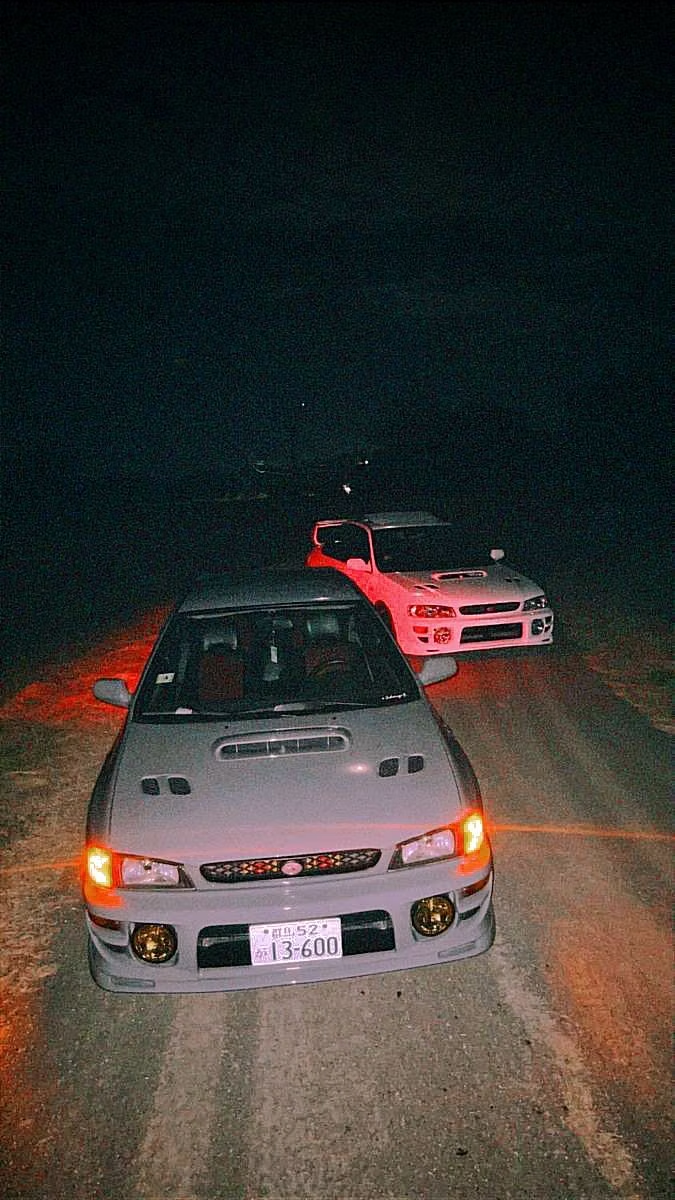
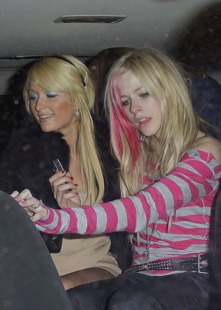
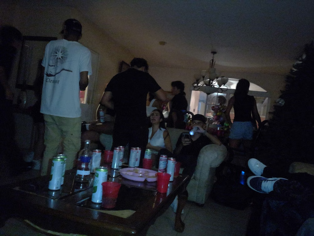
This 2001–2004 transitional pop-cultural look mixes late-Y2K clarity with dirtier hip-hop, sports, nu-metal, teen-comedy, and early-McBling attitude.


Millennial Beige UI design style
A calm tonal aesthetic layers cream, tan, sand, taupe, and greige with tactile natural details, soft contrast, and intentional empty space.
Monochrome UI design style
A single hue or neutral family creates hierarchy through tone, scale, texture, and contrast rather than varied color.