Cyberminimalism UI design style
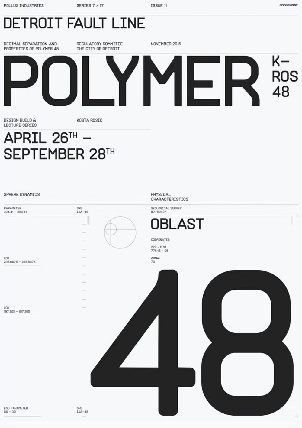
Late-2010s hyper-minimal tech design reduces interfaces to black or white fields, large grotesque type, strict grids, sparse geometry, and an occasional controlled gradient or premium render.
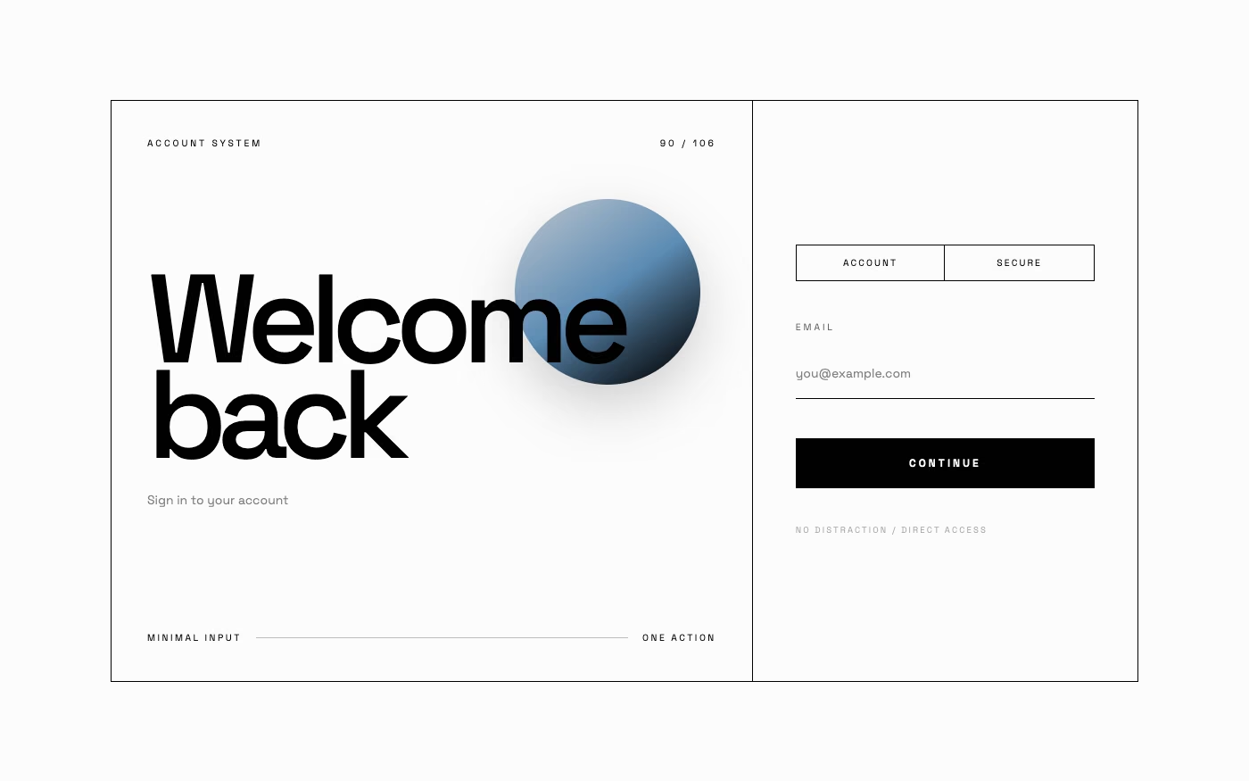
Design overview
- Signature elements
- black-and-white fields, oversized grotesque typography, strict bento grids, simple circles and squares, isolated product renders, restrained gradients
- Best suited to
- Technology brands, premium SaaS, product launches, portfolios, finance, architecture, and concise editorial experiences.
- Layout principles
- Use a sparse strict grid or disciplined bento system with one enormous word, isolated object, or decisive metric as the focal point and substantial uninterrupted field around it.
History and origins
A fact-checked account of where this visual language came from, with links to the references used.
- Period
- Retrospective label for late-1990s–2000s sources; current revival
- Origin
- Technology fashion, science-fiction imagery, product graphics, and online taxonomy
Cyberminimalism has no well-documented founding manifesto or stable historical definition. In visual-aesthetic use it classifies the restrained side of turn-of-the-millennium cyber design—monochrome space, small technical marks, and a few high-tech forms—while the same word also has an unrelated meaning in digital-wellbeing writing; this page uses the visual classification and does not claim a single origin.
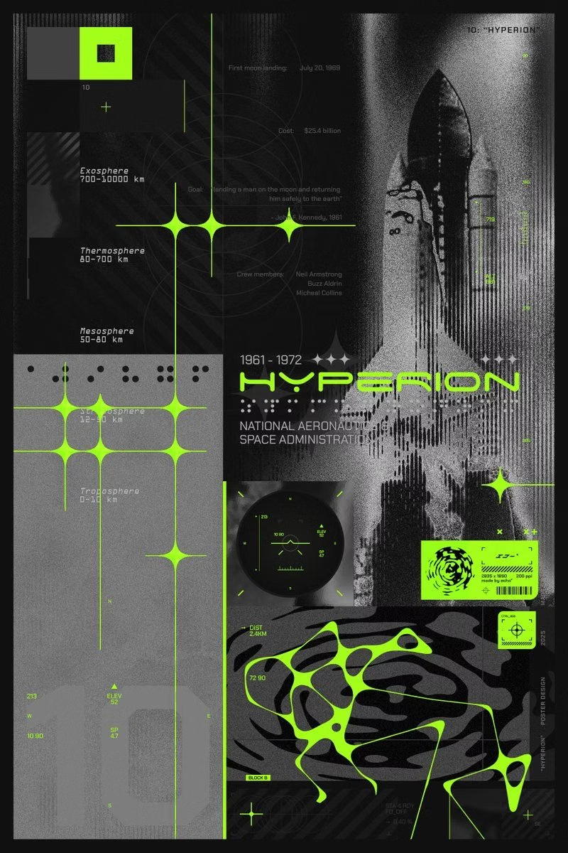
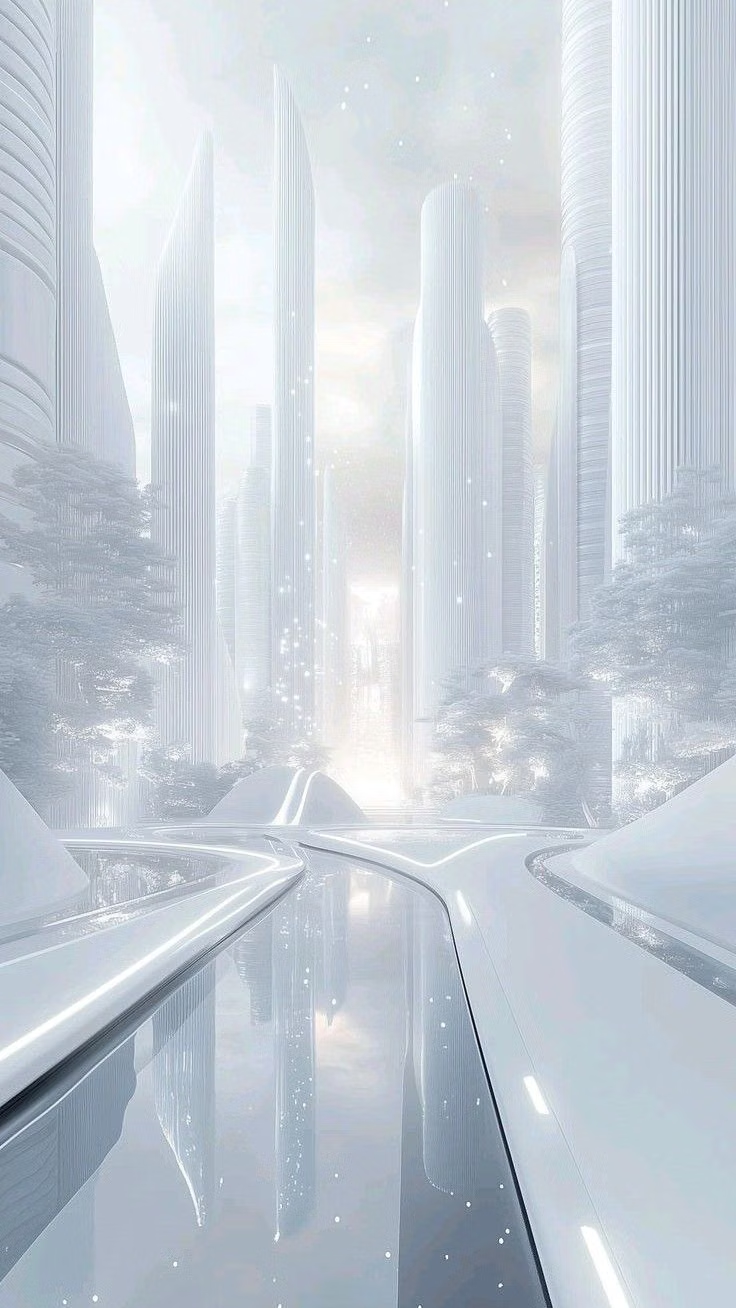
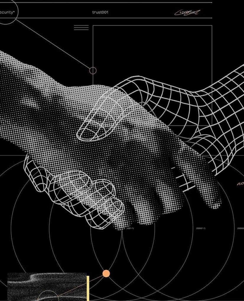
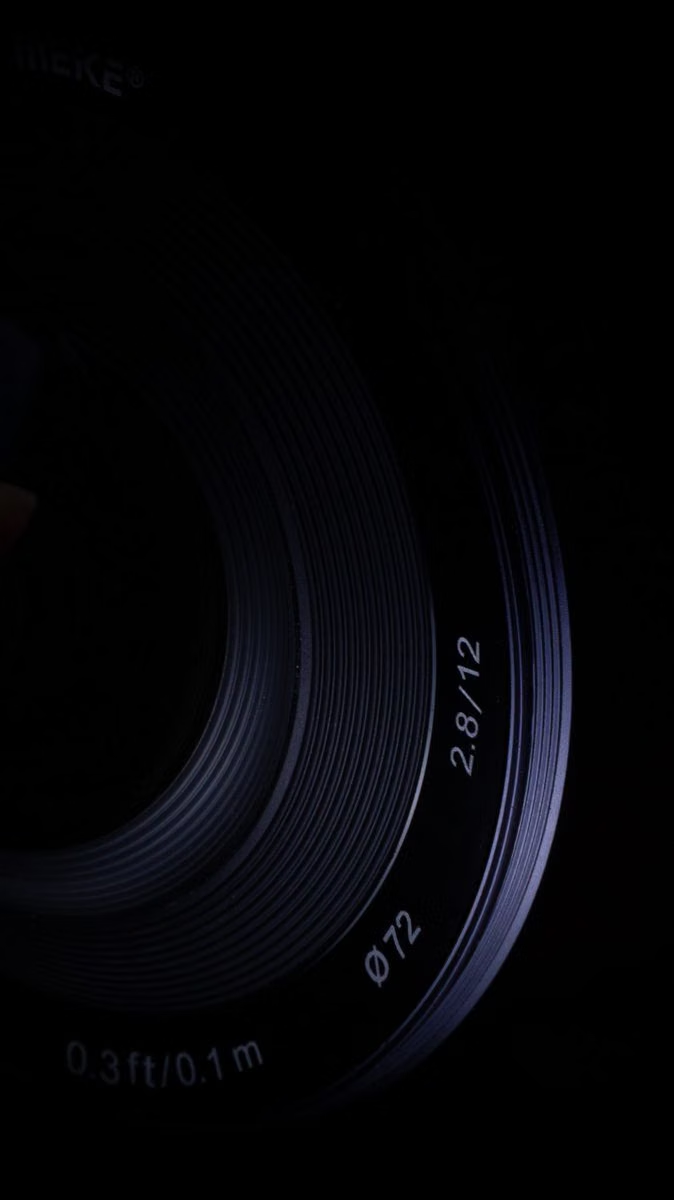
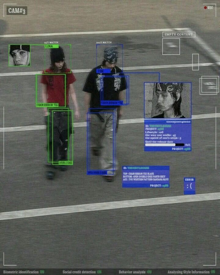
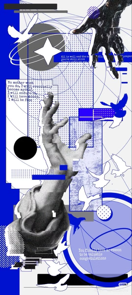
Moodboard and visual references
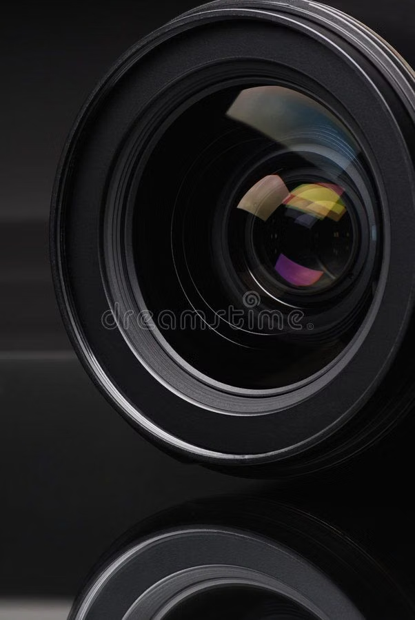
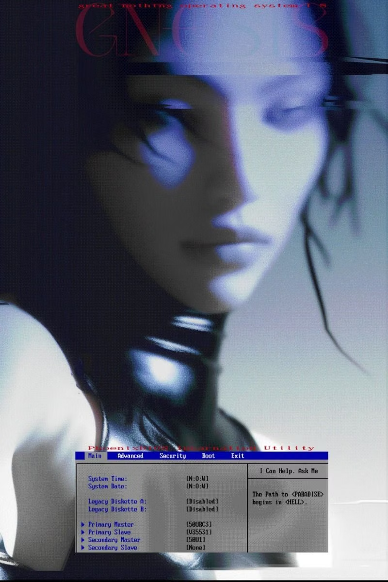
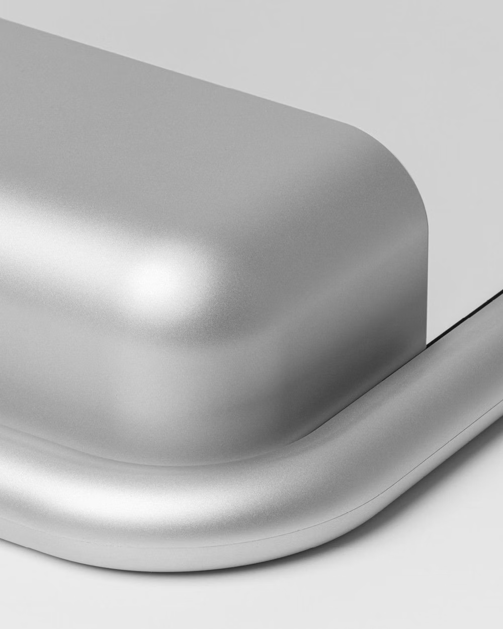
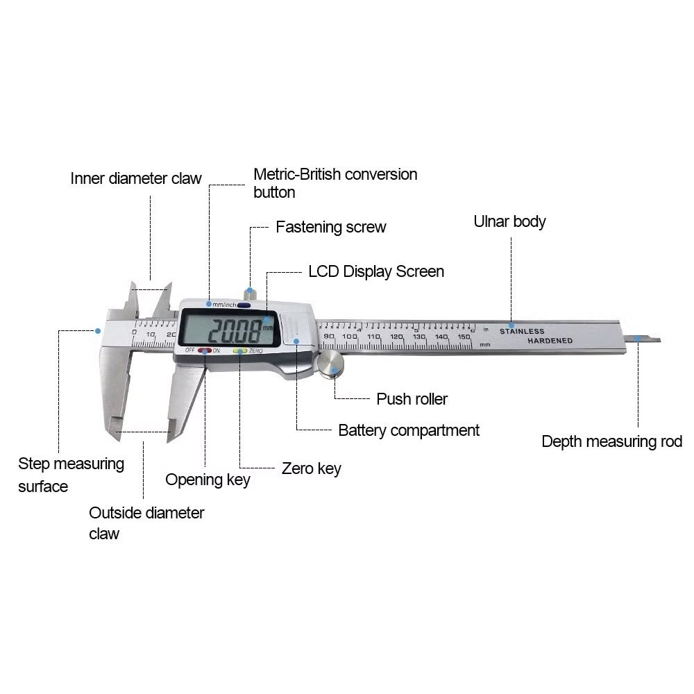
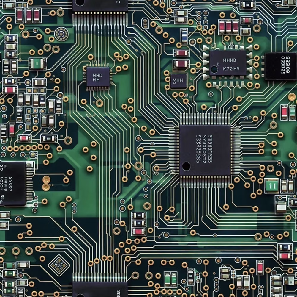
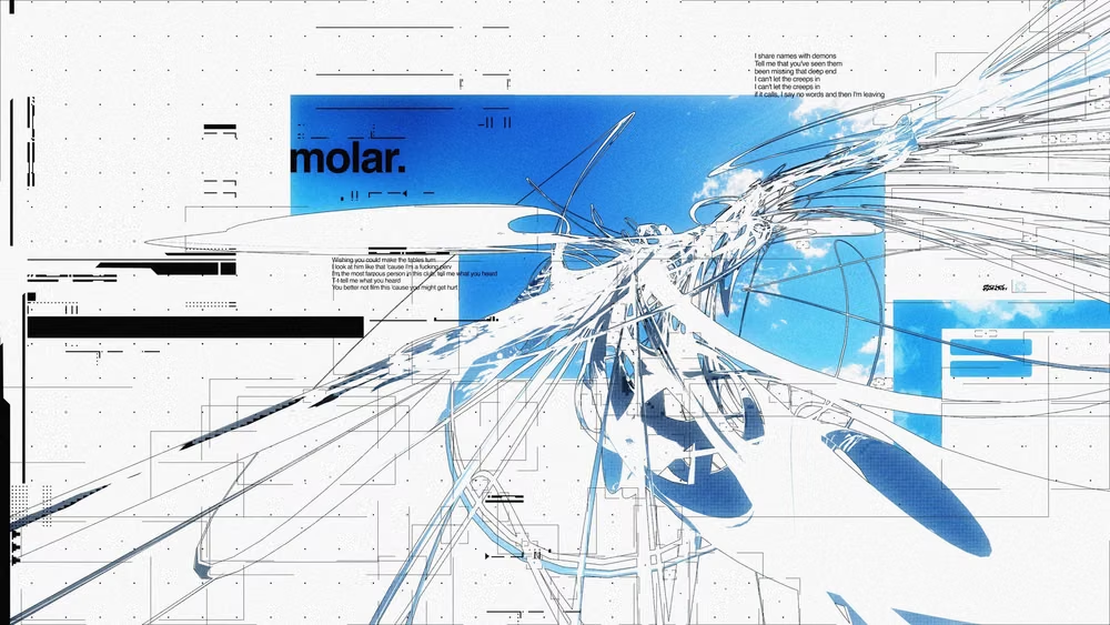
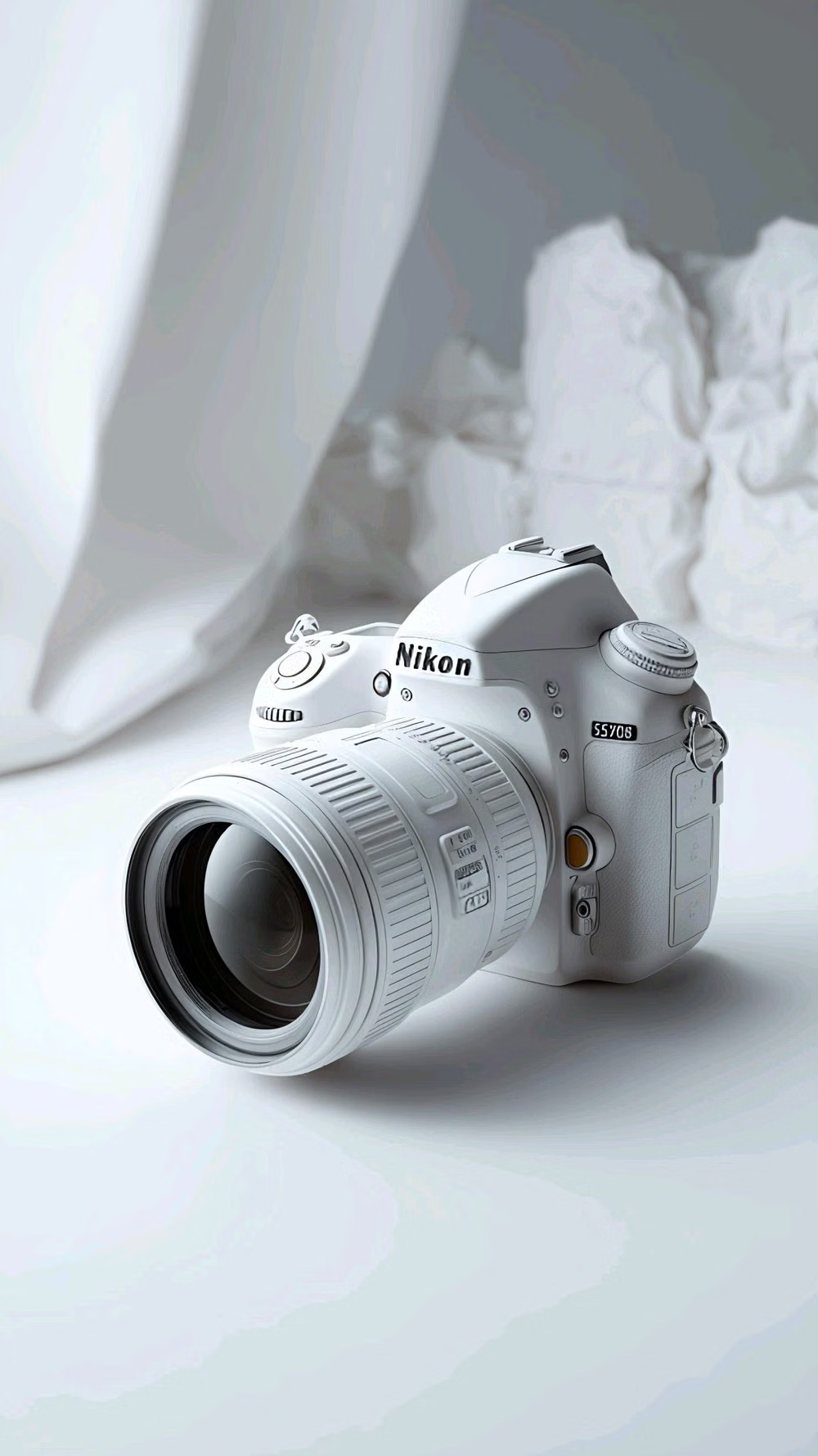
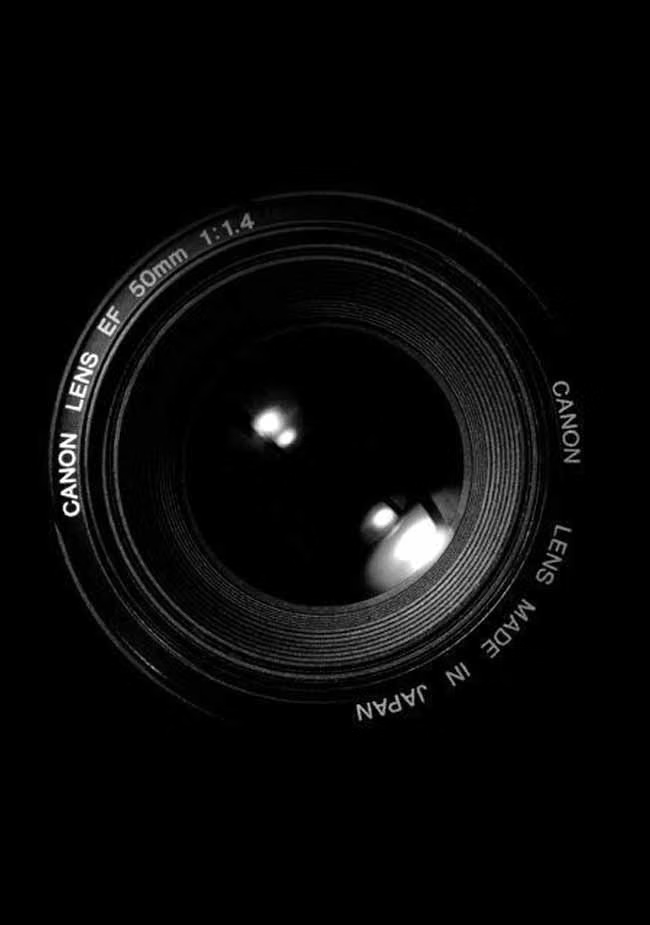
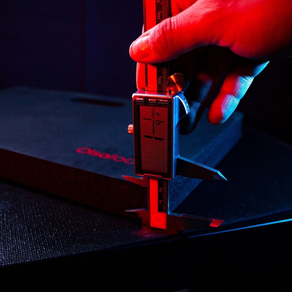
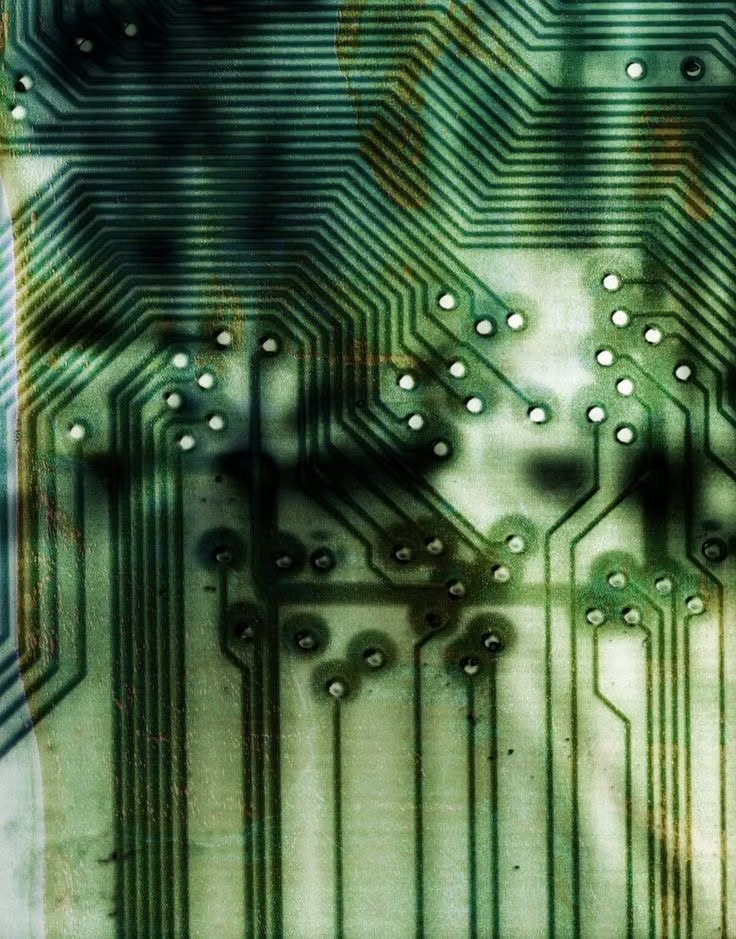
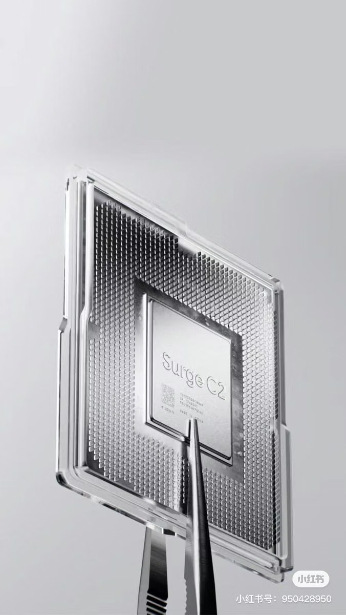
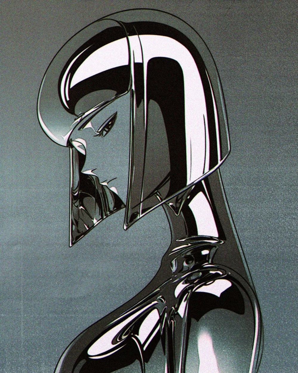
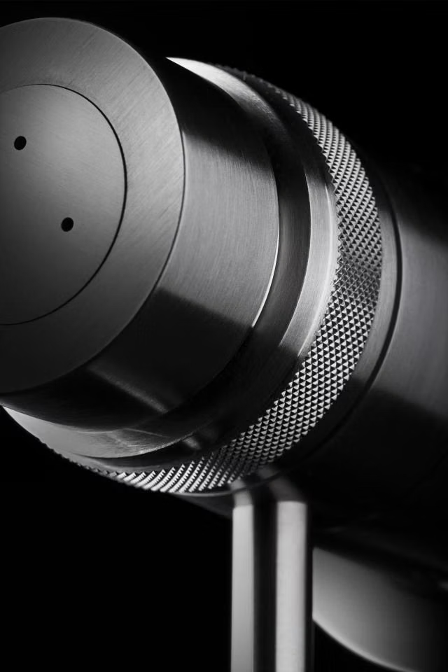
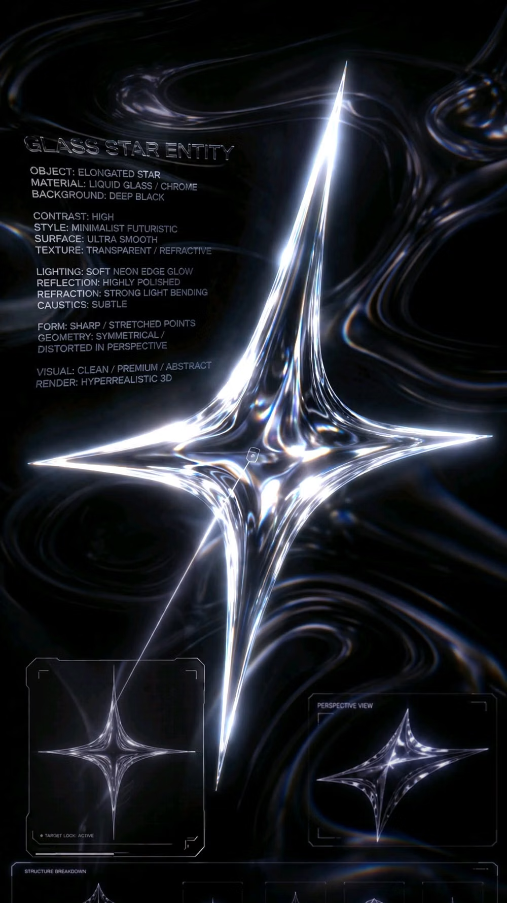
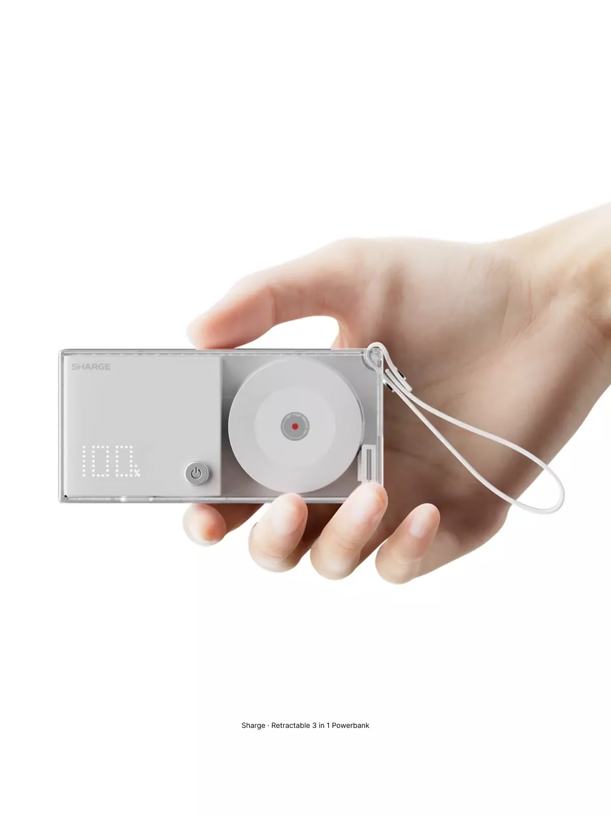
A visual study of the forms, inspirations, materials, colors, type, and cultural references associated with this UI design style.





Design principles and implementation
Use these principles to write a focused AI UI design prompt instead of asking for a vague visual treatment.
Color direction
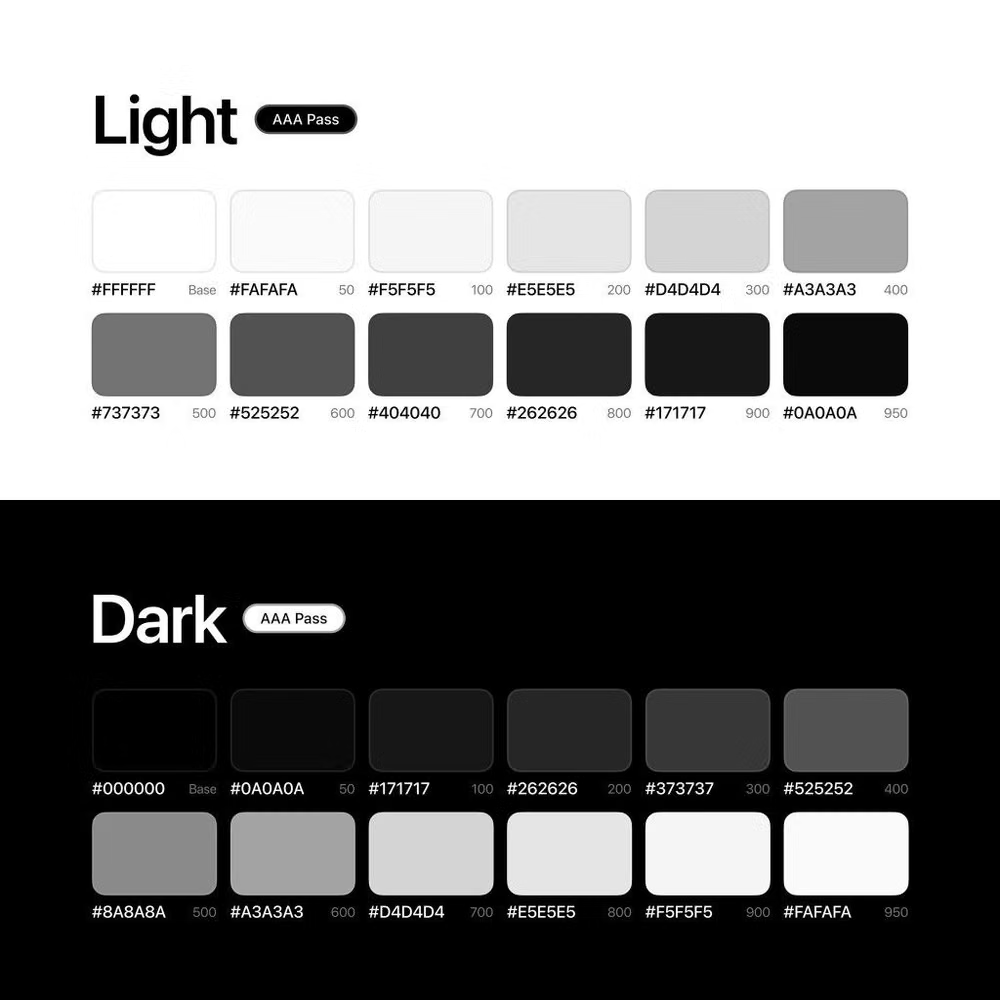
Work predominantly in black, white, and cool gray, introducing at most one spectral, grainy, or monochromatic gradient and one functional accent. In a daisyUI theme, use the lone functional icy-blue or spectral accent for `primary`, cool gray for `secondary`, and step `base-100`, `base-200`, and `base-300` through charcoal, near-black, and black for a dark scheme.
Imagery direction
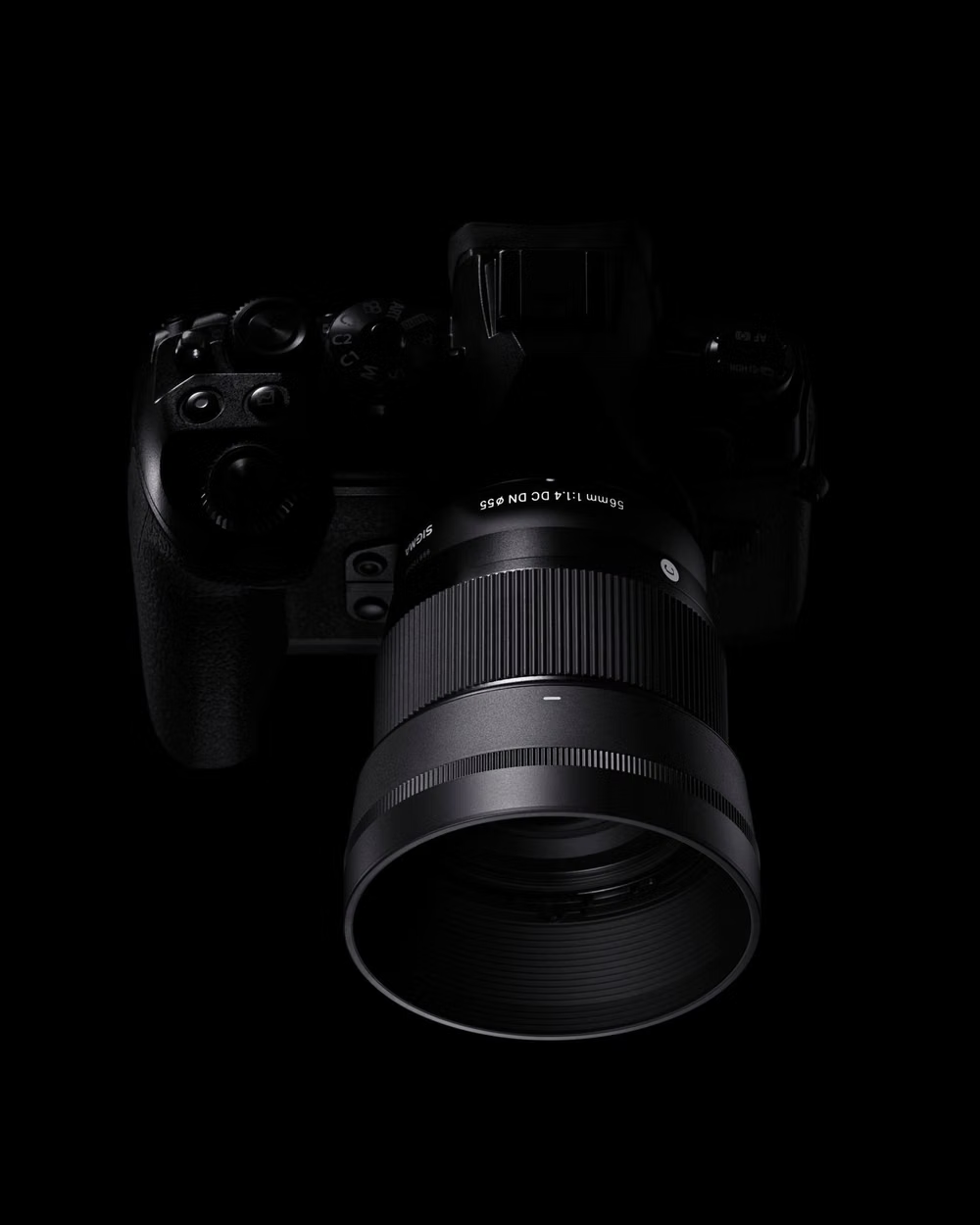
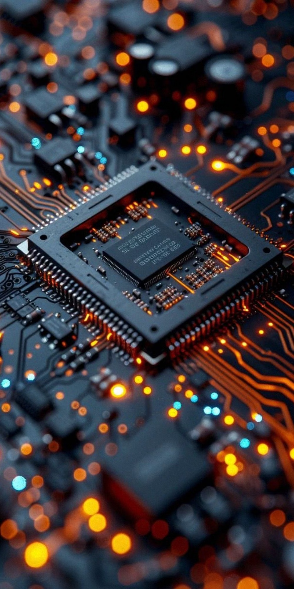
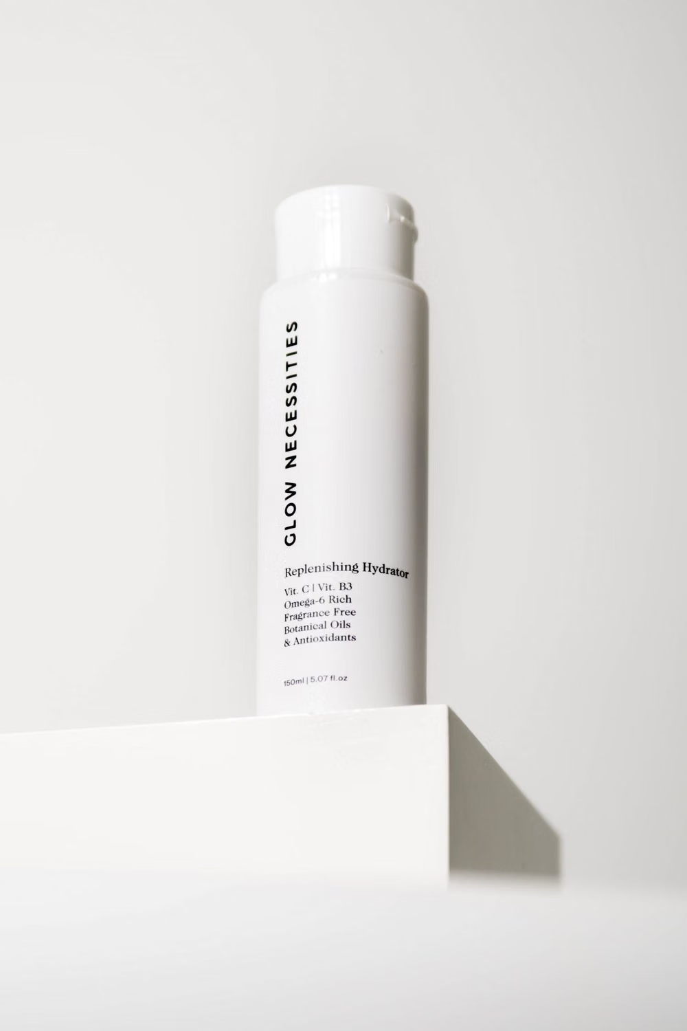
Use isolated devices, precise object renders, macro industrial details, clean diagrams, abstract smooth geometry, and tightly art-directed product crops on empty grounds.
Content density
Keep hero regions extremely low density and bento regions moderate, writing concise labels and progressively revealing any detailed product or data content.
Motion direction
Use slow exact wipes, modular grid resizing, controlled gradient travel, smooth object rotation, and restrained type reveals with no ornamental looping clutter.
Shape language
Favor perfect squares, circles, razor-thin rules, flush rectangles, and a few carefully targeted glass or softly modeled surfaces rather than a full card vocabulary. In daisyUI themes, set the `--radius-*` variables to `0` or `0.25rem`.
Typography rules
Use one contemporary grotesque across extreme display scales and very small labels, controlling tracking and line breaks precisely and avoiding decorative type mixing.
Suggested Typfaces
Space Grotesk
Fresh daisies glow in warm sunlight
Fresh daisies glow in warm sunlight
1 2 3 4 5 6 7 8 9 0
Inter
Fresh daisies glow in warm sunlight
Fresh daisies glow in warm sunlight
1 2 3 4 5 6 7 8 9 0
Sora
Fresh daisies glow in warm sunlight
Fresh daisies glow in warm sunlight
1 2 3 4 5 6 7 8 9 0
Instrument Sans
Fresh daisies glow in warm sunlight
Fresh daisies glow in warm sunlight
1 2 3 4 5 6 7 8 9 0
IBM Plex Sans
Fresh daisies glow in warm sunlight
Fresh daisies glow in warm sunlight
1 2 3 4 5 6 7 8 9 0
Build a Cyberminimalism interface with daisyUI
The live example translates this direction into daisyUI components and semantic theme tokens.
To generate a full page in the same visual language, give the style name and the design rules above to Blueprint MCP.
Related UI design styles
Compare nearby visual languages that share typography, shapes, use cases, or signature elements.
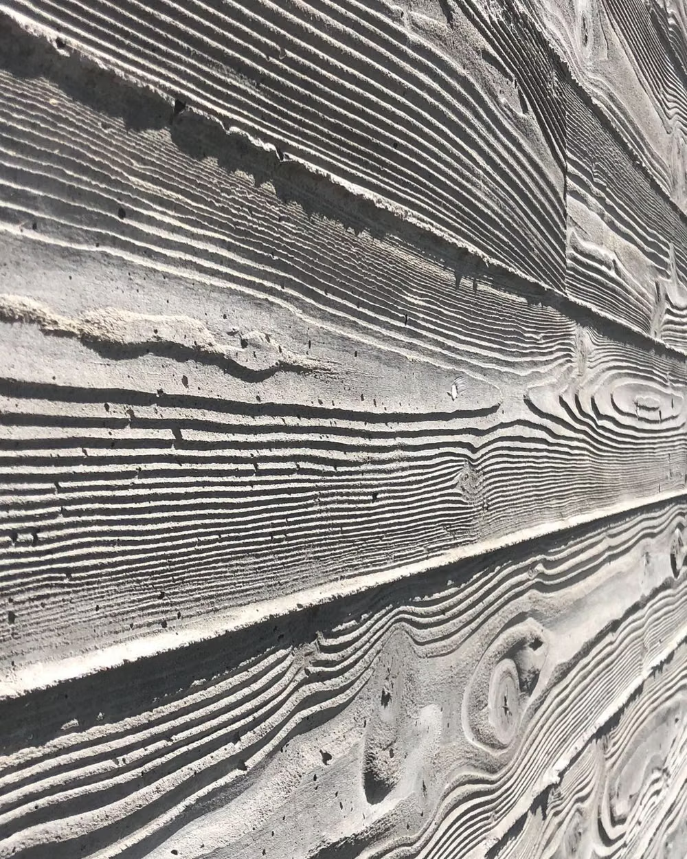
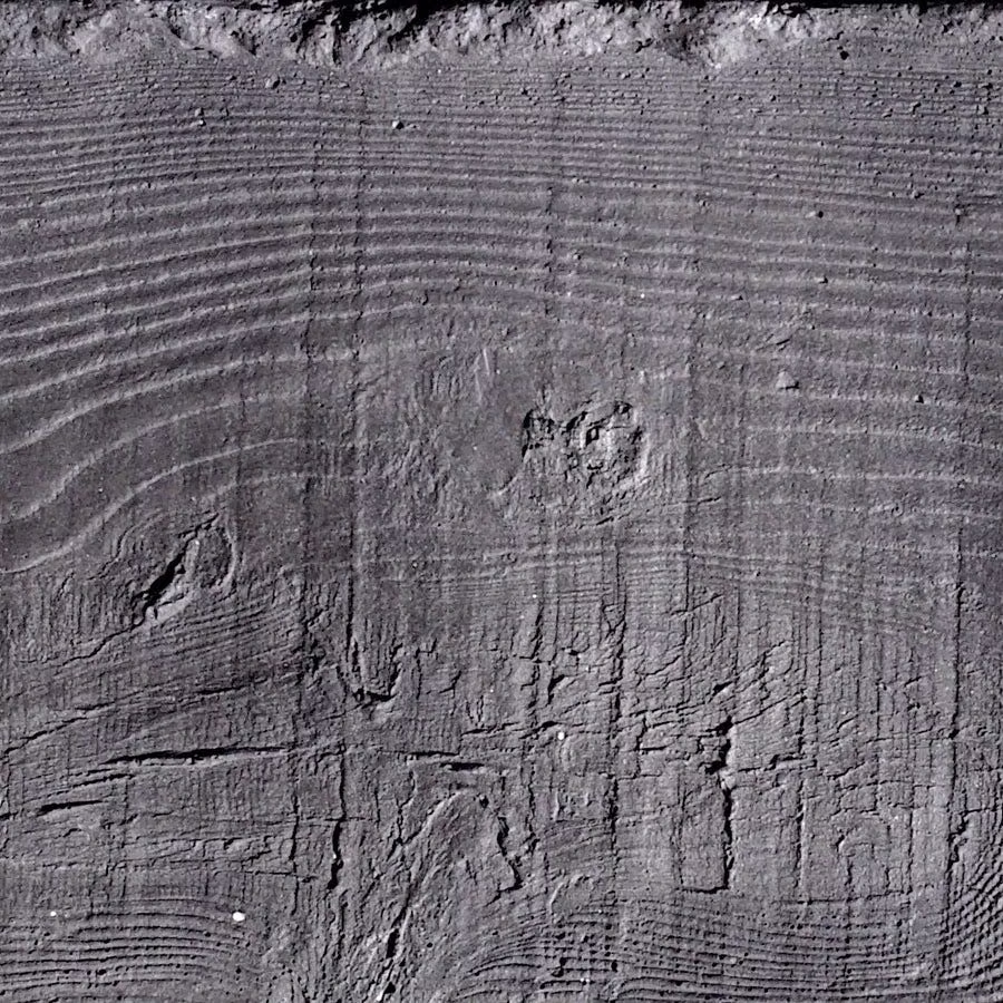

Brutalism UI design style
Raw typography, exposed structure, sharp edges, stark contrast, default-like controls, and intentionally unpolished layouts.

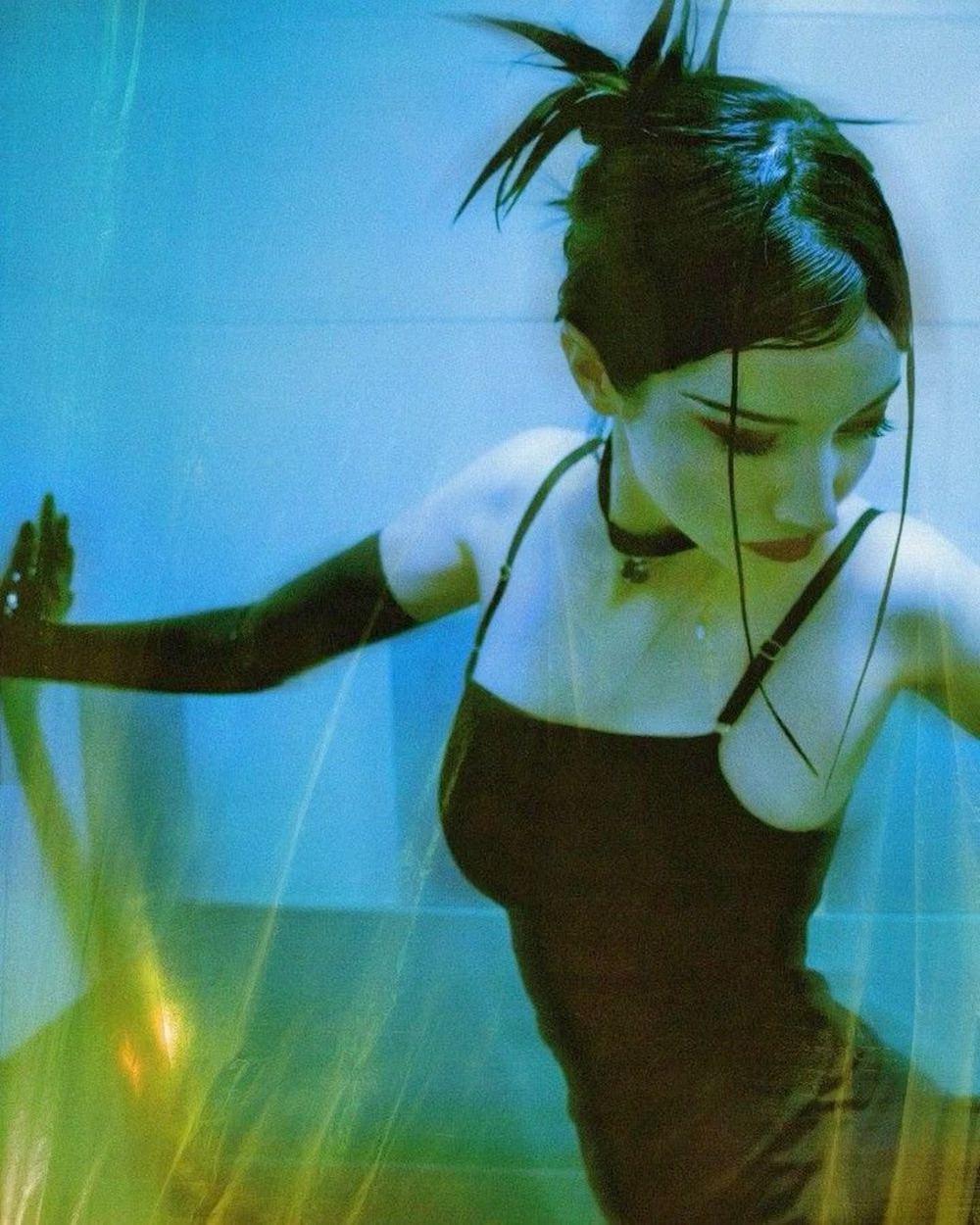
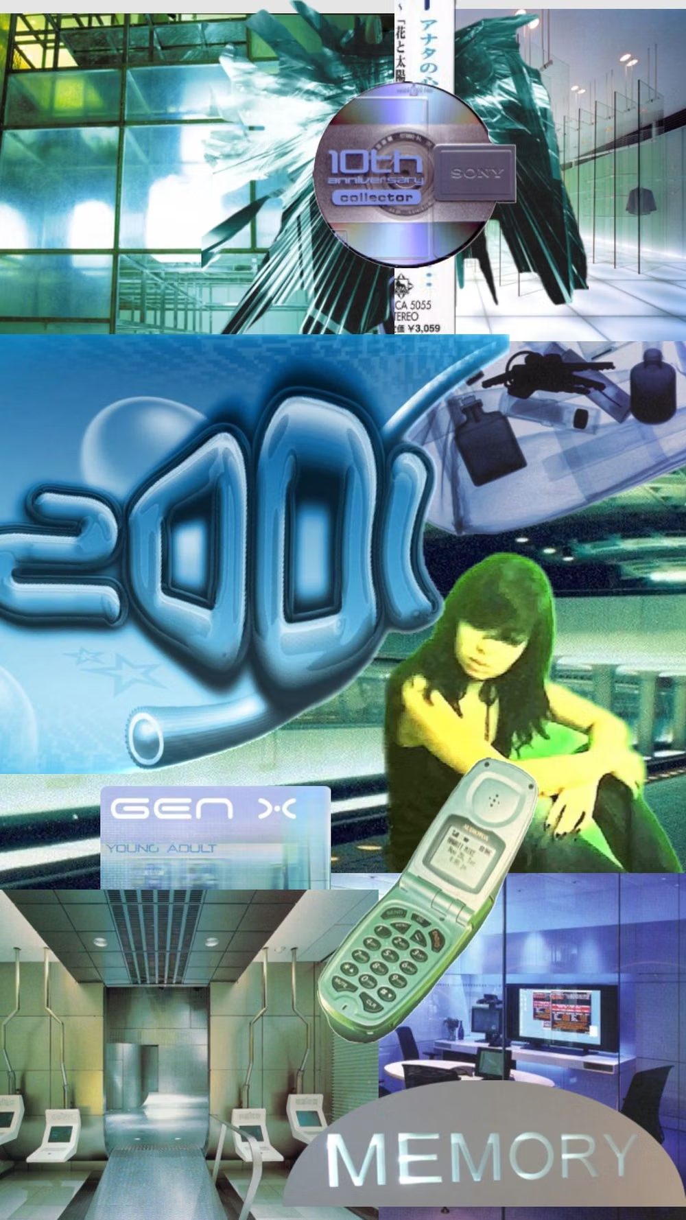
Gen-X Soft Club UI design style
Late-1990s and early-2000s urban futurism softens Y2K gloss through muted color, minimalist typography, blurred photography, and a sterile-meets-organic mood.
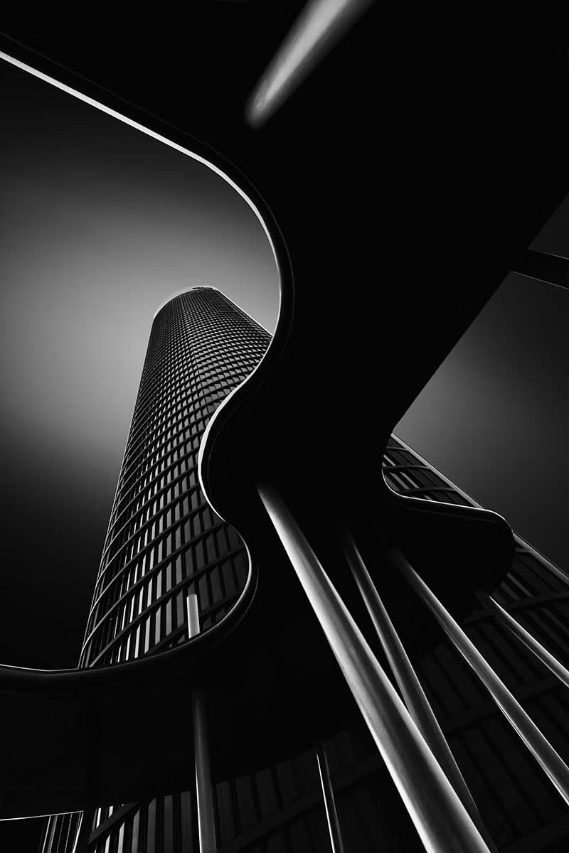
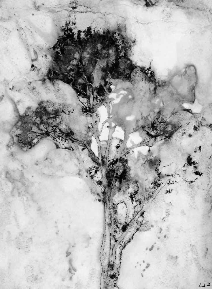
Monochrome UI design style
A single hue or neutral family creates hierarchy through tone, scale, texture, and contrast rather than varied color.