Data-Dense Utilitarian UI design style
Compact spacing, visible structure, tables, restrained colors, functional typography, and minimal ornamental styling.
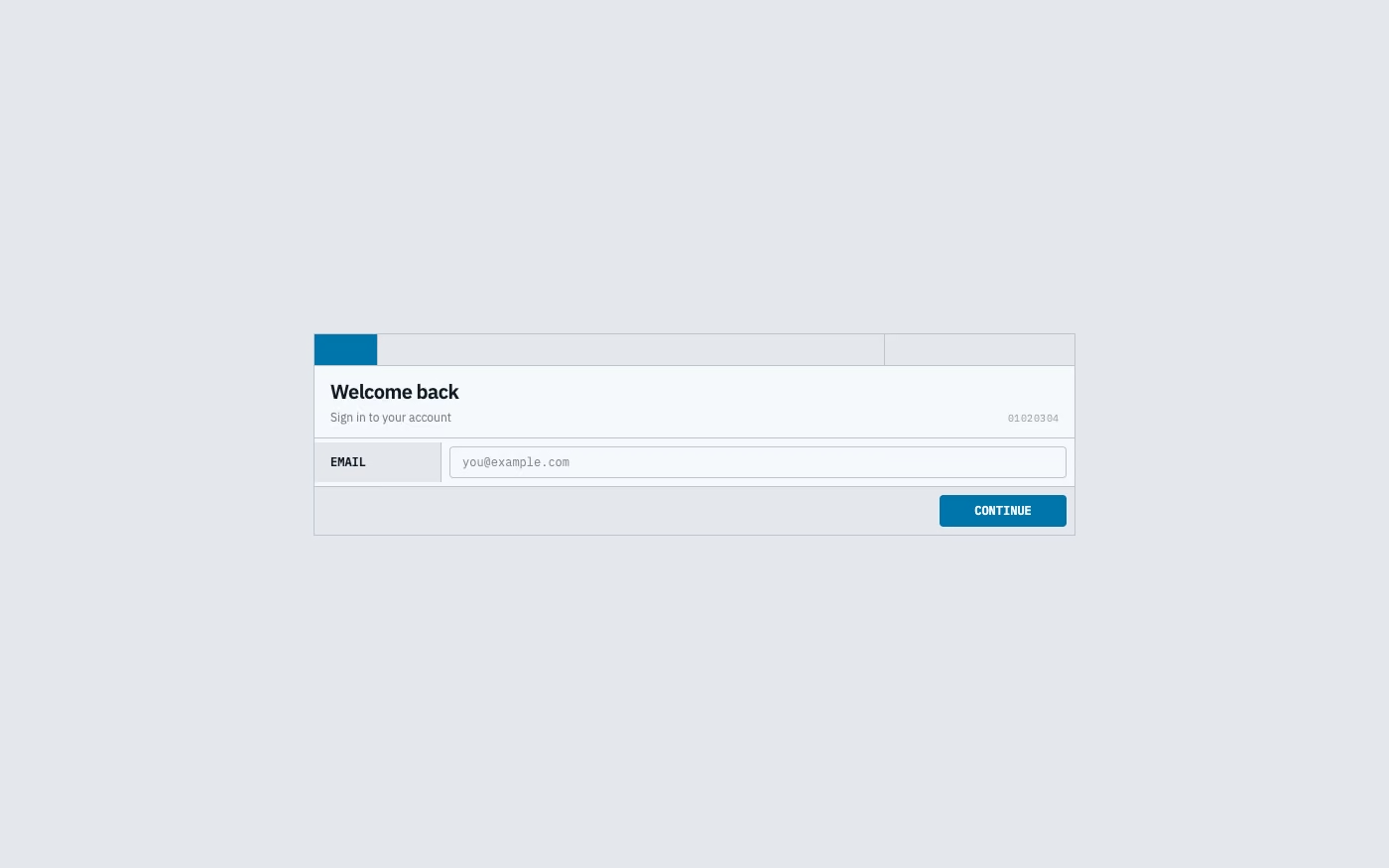
Design overview
- Signature elements
- compact spacing, dense tables, aligned numerals, visible gridlines, restrained palette, utilitarian controls
- Best suited to
- Developer tools, operations software, analytics, trading, logistics, and internal enterprise systems.
- Layout principles
- Use resizable panes, sticky headers, aligned columns, persistent filters, and predictable tool regions that keep high-value data visible during comparison.
History and origins
A fact-checked account of where this visual language came from, with links to the references used.
- Period
- 1970s–present
- Origin
- Scientific, financial, industrial, and enterprise software
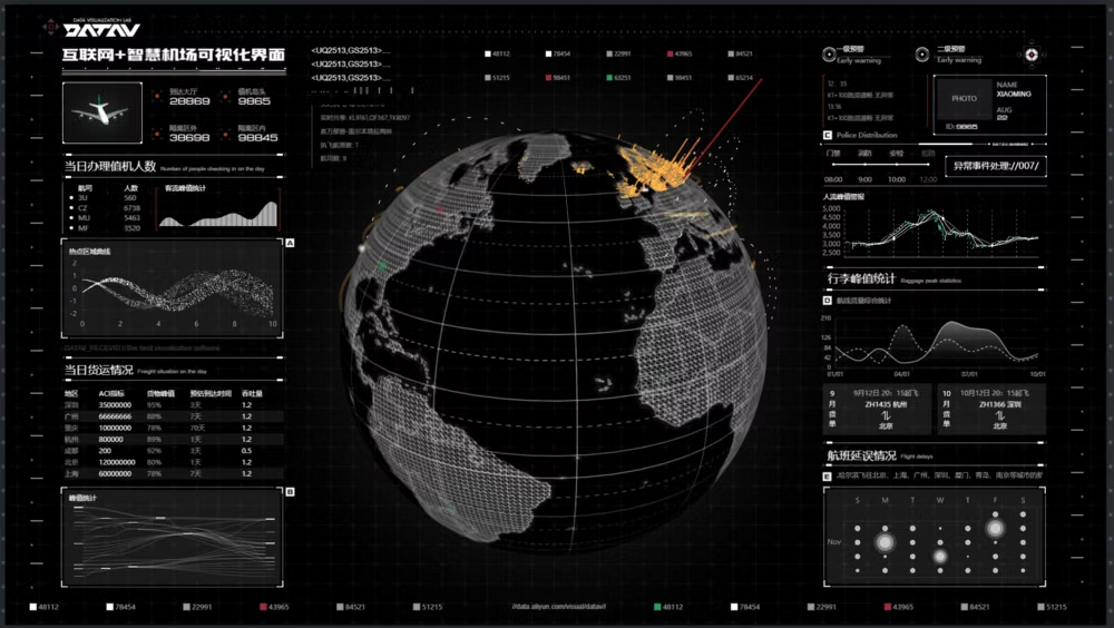
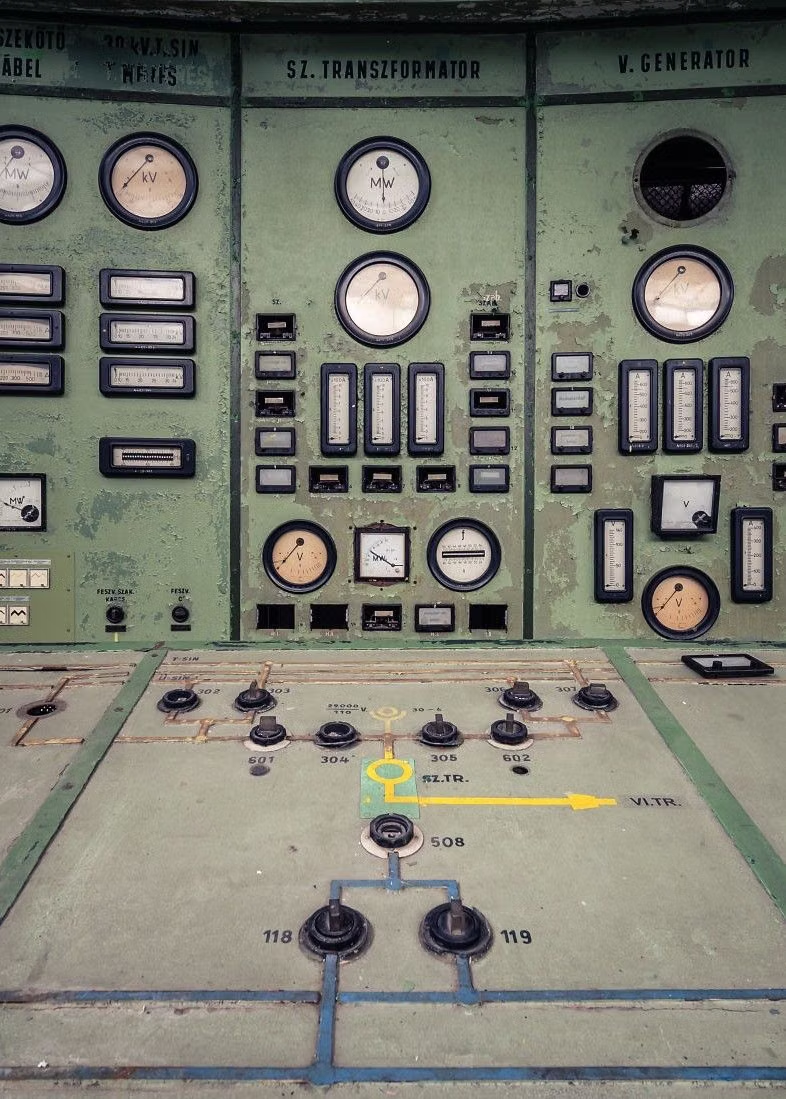
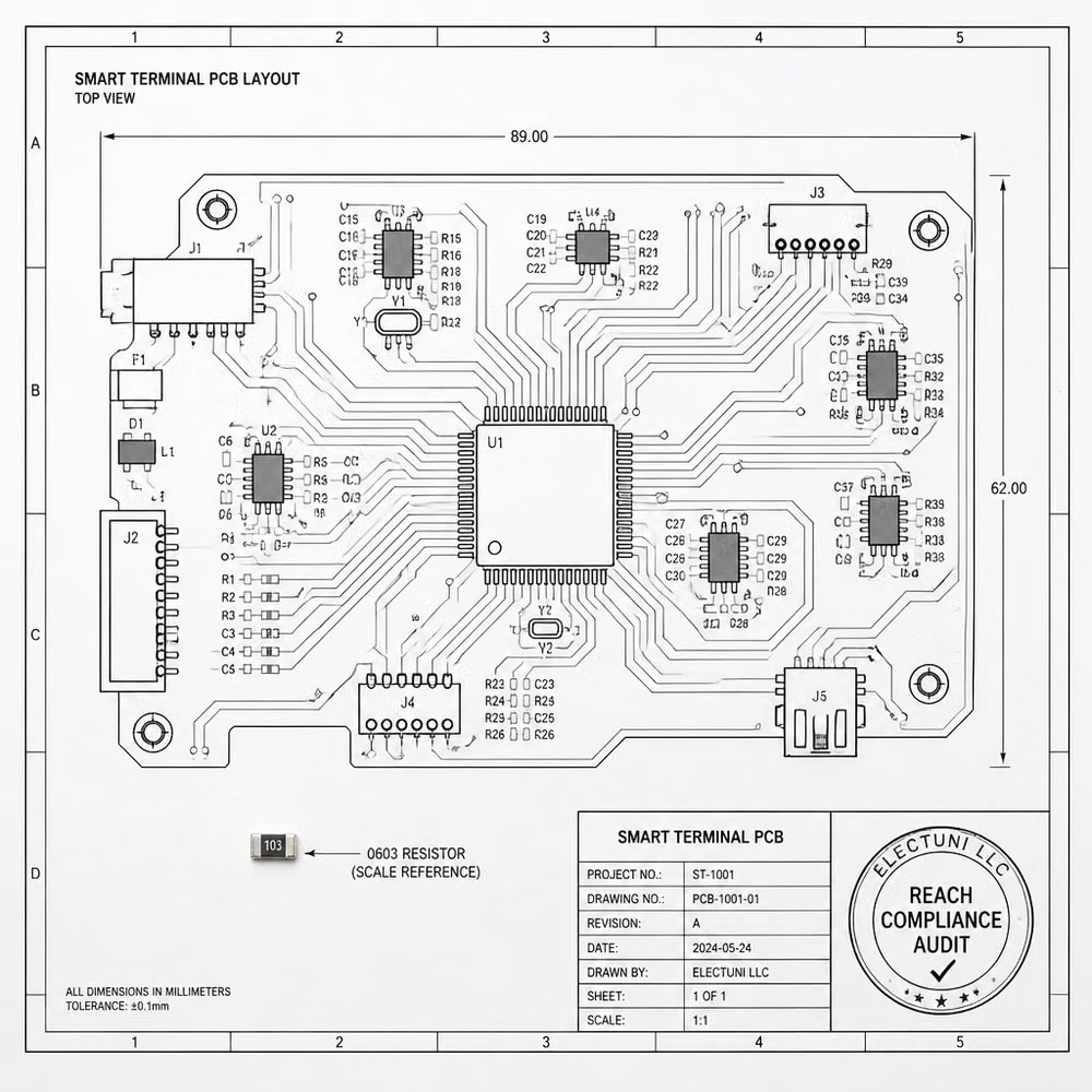
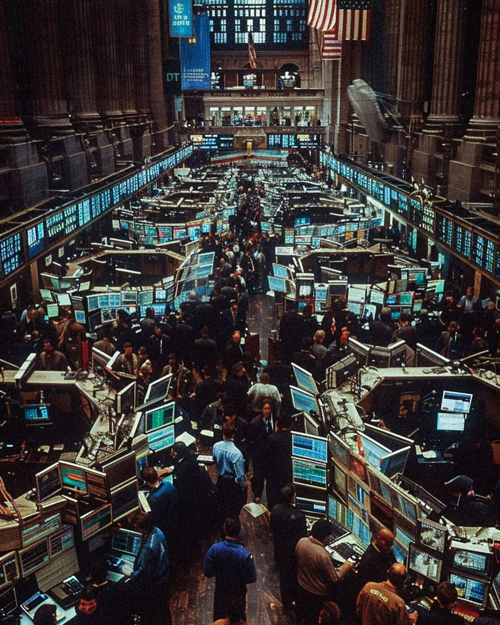
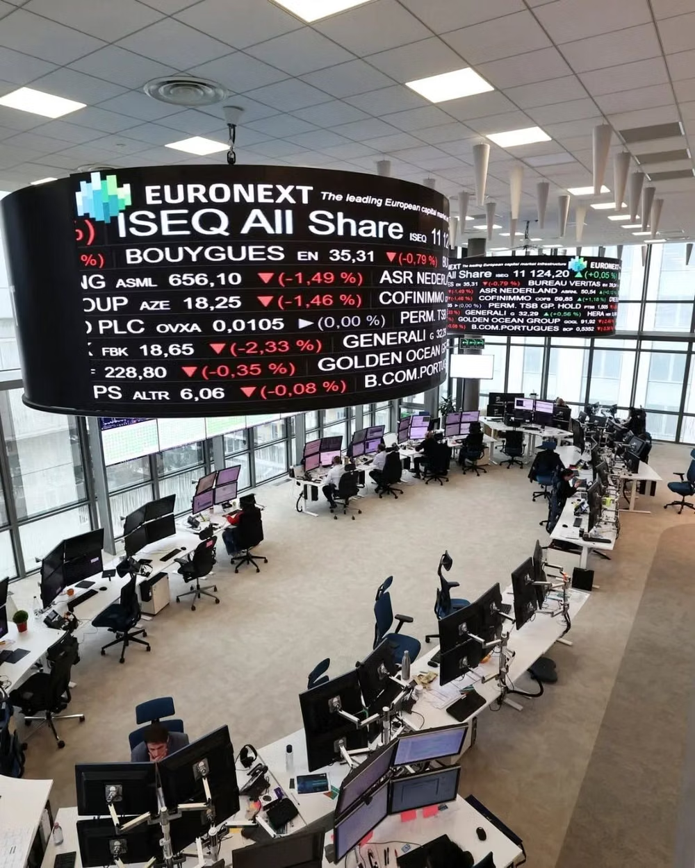
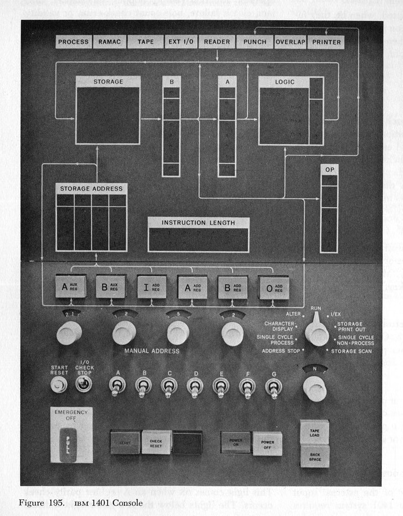
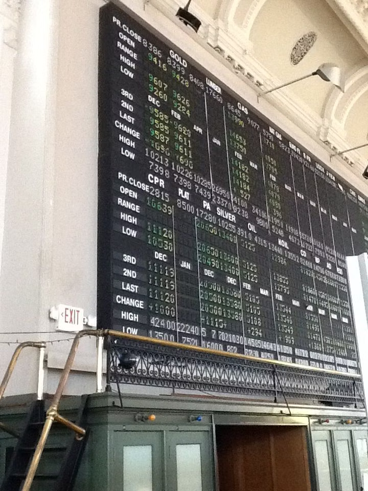
Data-Dense Utilitarian UI is a practical lineage rather than a named aesthetic movement. It grew wherever operators needed many variables at once—industrial control rooms, financial terminals, scientific displays, spreadsheets, and enterprise software—and contemporary design reframes that density with clearer typography, alignment, and interaction states rather than treating minimal element count as the goal.
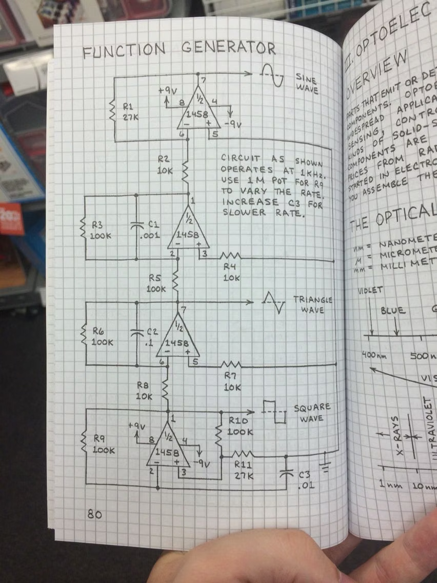
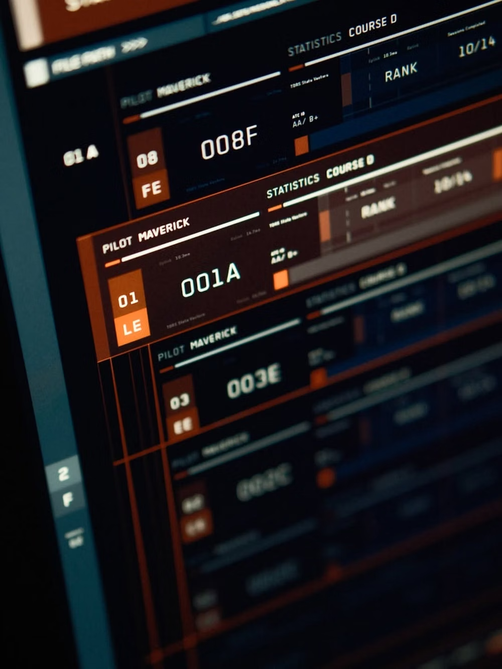
Moodboard and visual references
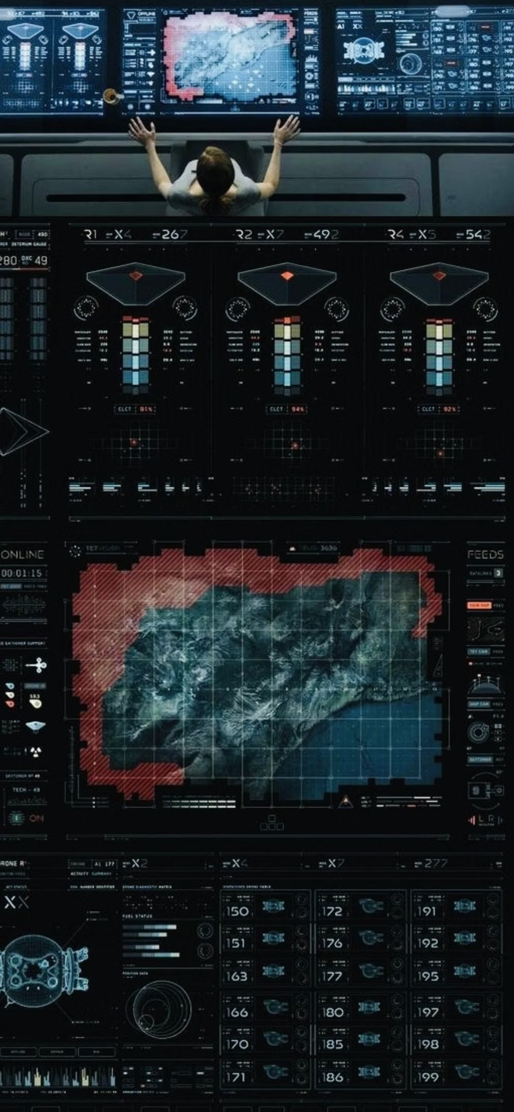
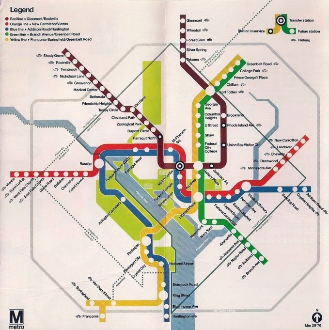
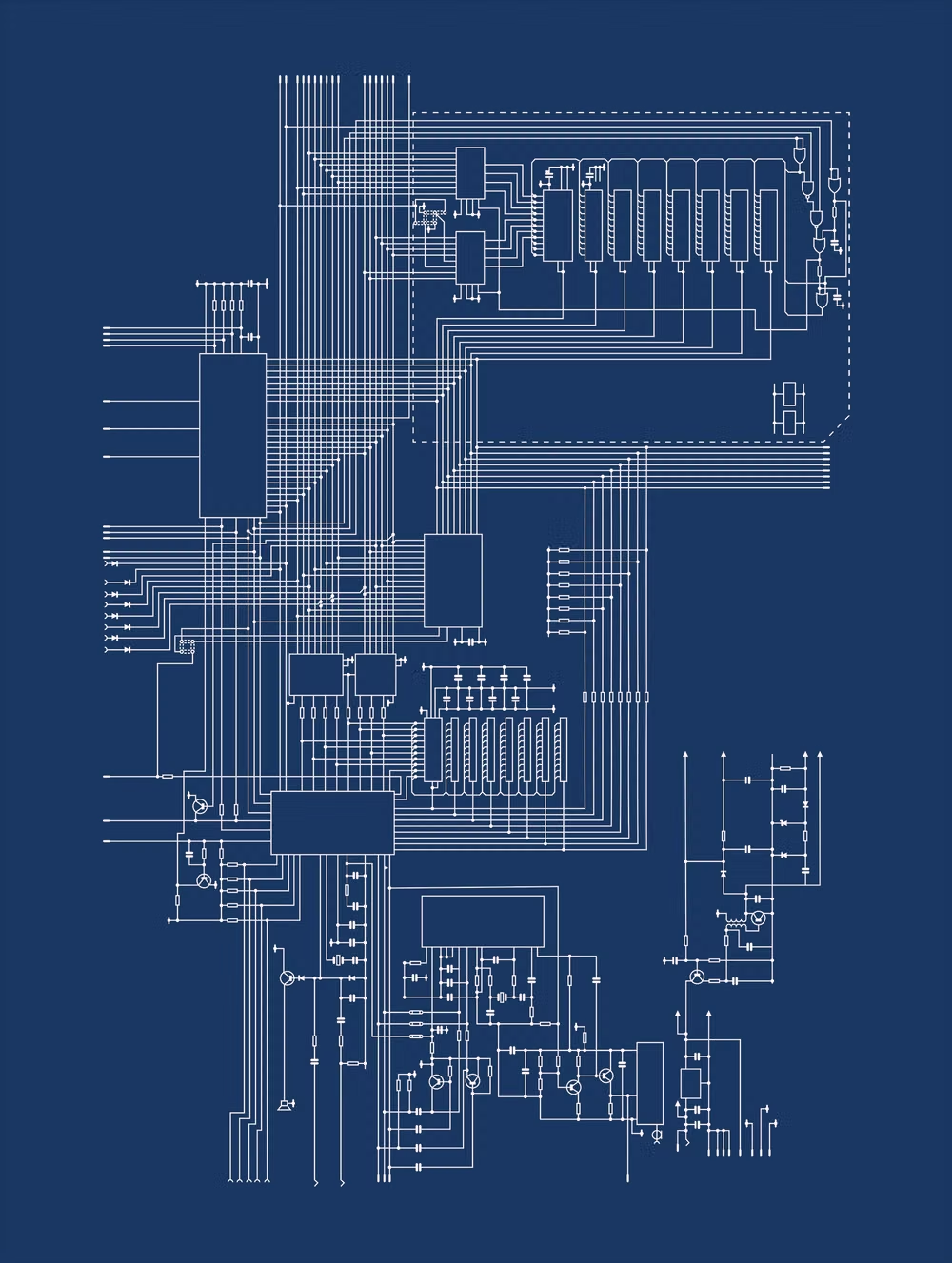
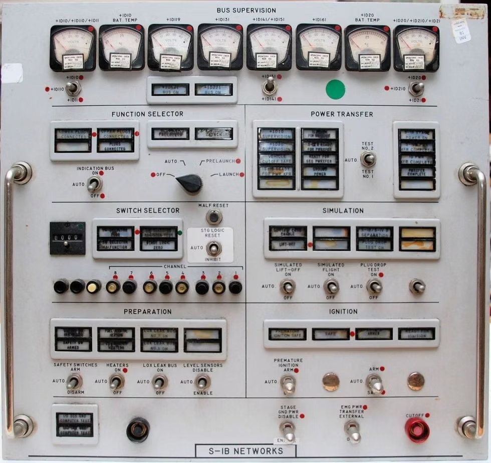
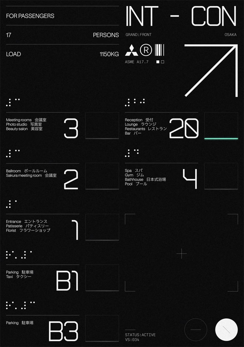
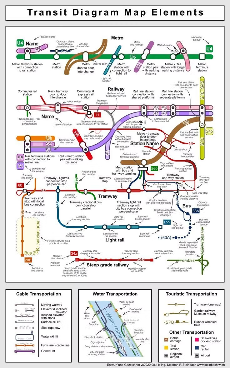
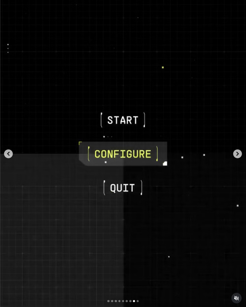
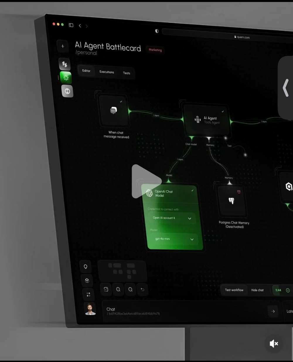
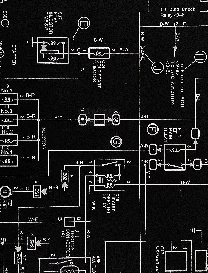
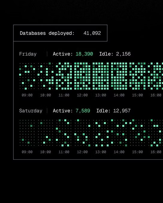
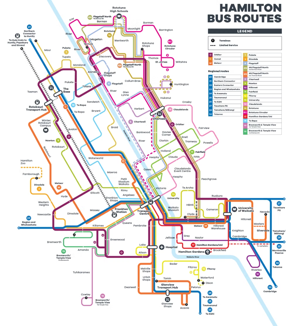
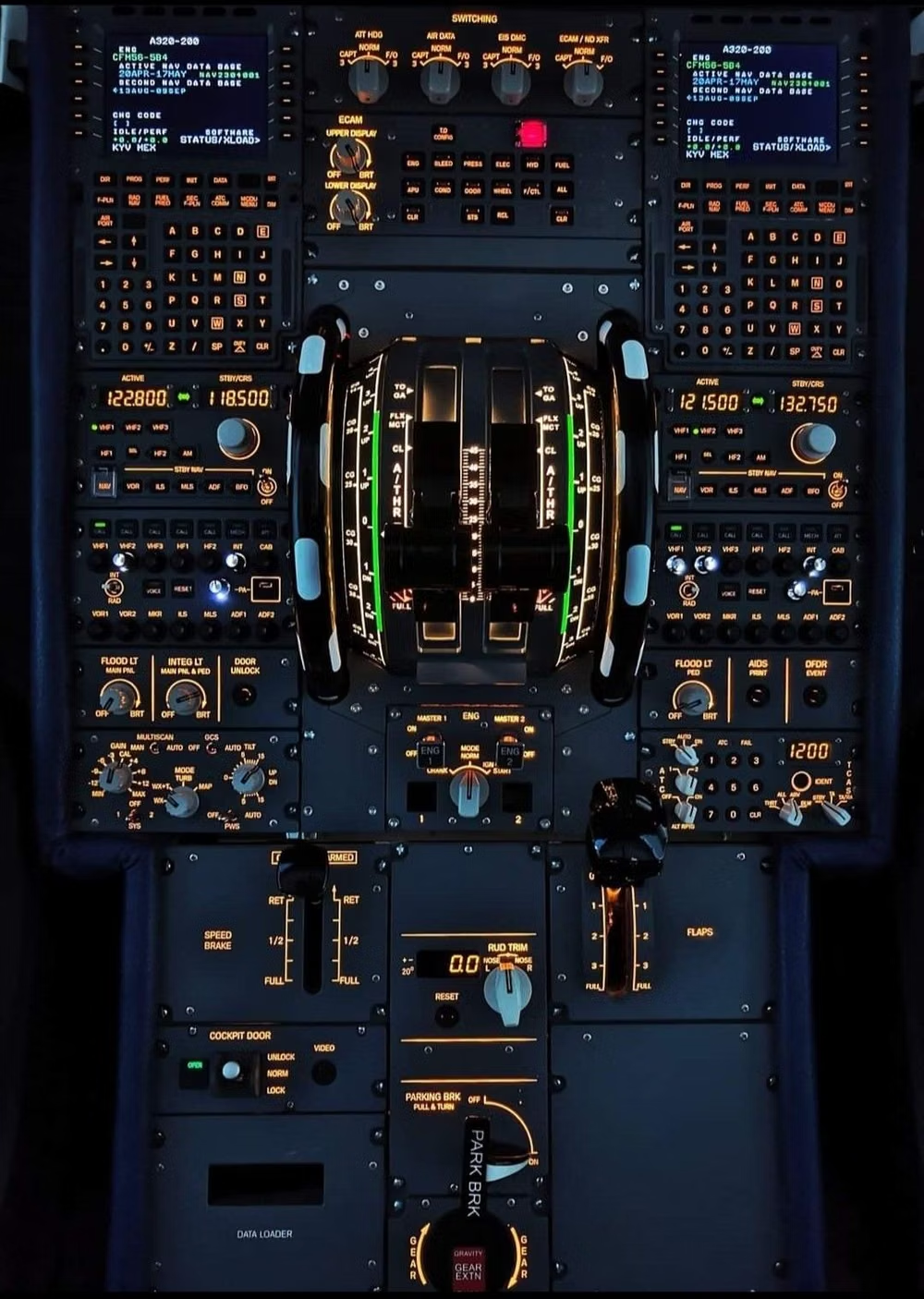
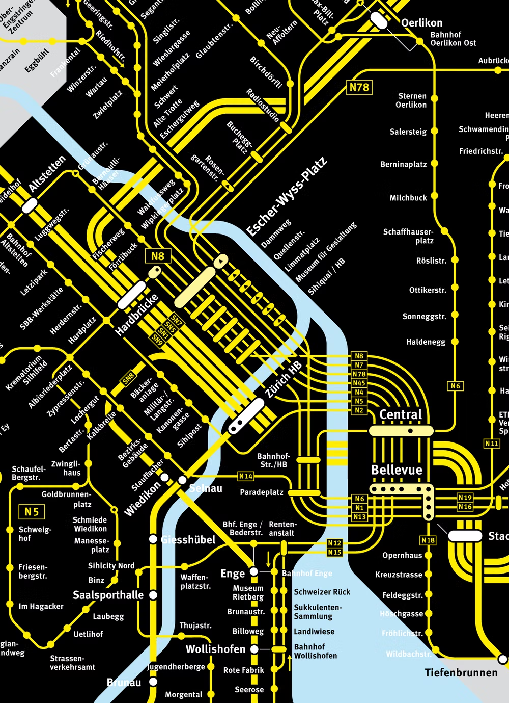
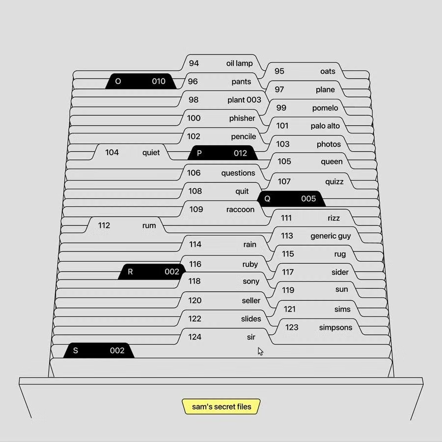
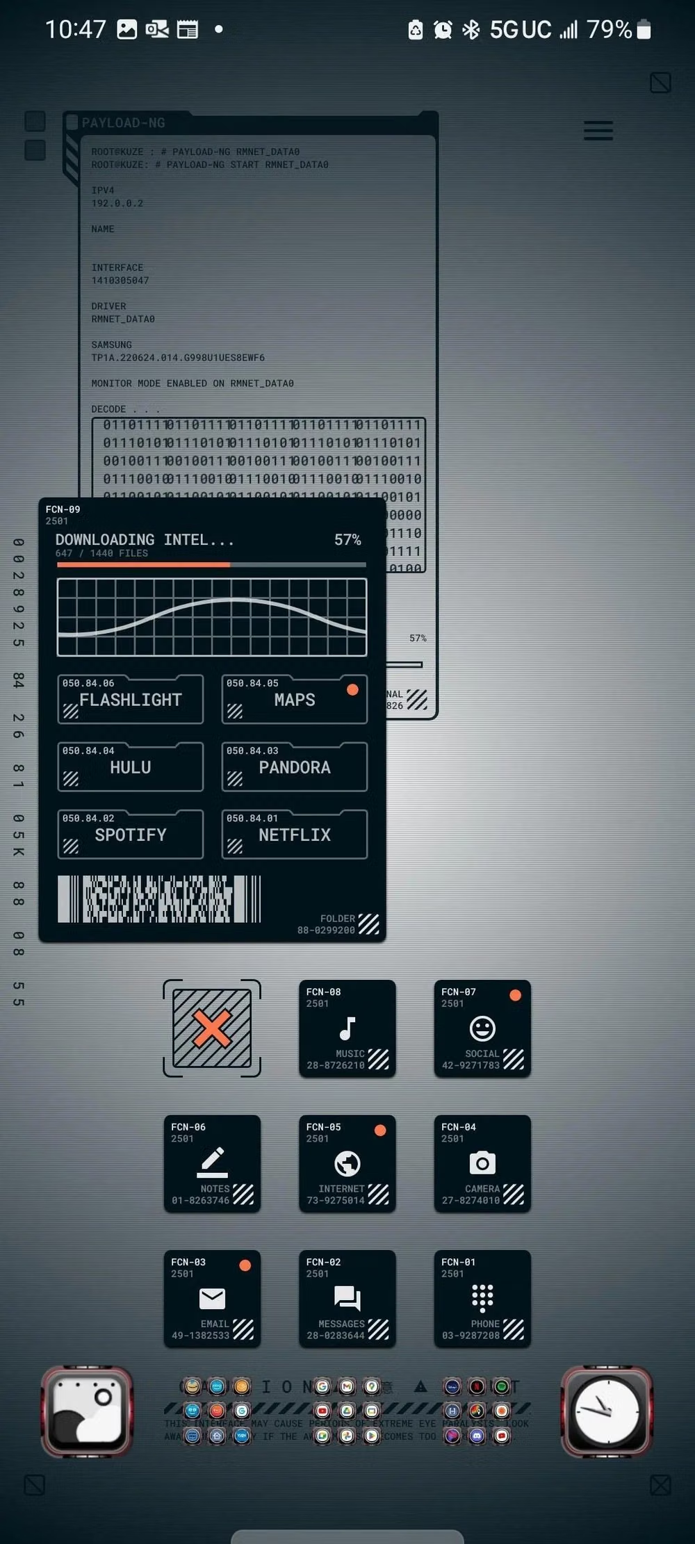
A visual study of the forms, inspirations, materials, colors, type, and cultural references associated with this UI design style.





Design principles and implementation
Use these principles to write a focused AI UI design prompt instead of asking for a vague visual treatment.
Color direction
Choose cool neutrals for structure, reserve saturated hues for state and threshold exceptions, and never encode a metric through color alone. In a daisyUI theme, use a subdued analytical blue for `primary`, slate or muted teal for `secondary`, and build `base-100`, `base-200`, and `base-300` from closely spaced cool white, blue-gray, and gray surfaces.
Imagery direction
Use sparklines, dense charts, topology diagrams, maps, and tiny status glyphs; exclude decorative photography from working views.
Content density
Keep density intentionally high with four- and eight-pixel spacing, compact row heights, and user-controlled expansion for verbose records. Use the `*-sm` size variants for daisyUI components to preserve this compact working density.
Motion direction
Make sorting, filtering, and panel changes nearly immediate, preserve scroll position, and avoid motion that delays repeated expert actions.
Shape language
Favor compact rectangles, two- to four-pixel radii, visible gridlines, and precise splitters with minimal surface elevation. In daisyUI themes, set the `--radius-*` variables to `0` or `0.25rem`.
Typography rules
Use a condensed sans-serif for labels and a mono or tabular-numeral face for values, aligning decimals and maintaining clear row rhythm.
Suggested Typfaces
IBM Plex Sans
Fresh daisies glow in warm sunlight
Fresh daisies glow in warm sunlight
1 2 3 4 5 6 7 8 9 0
IBM Plex Mono
Fresh daisies glow in warm sunlight
Fresh daisies glow in warm sunlight
1 2 3 4 5 6 7 8 9 0
Roboto Condensed
Fresh daisies glow in warm sunlight
Fresh daisies glow in warm sunlight
1 2 3 4 5 6 7 8 9 0
Source Sans 3
Fresh daisies glow in warm sunlight
Fresh daisies glow in warm sunlight
1 2 3 4 5 6 7 8 9 0
JetBrains Mono
Fresh daisies glow in warm sunlight
Fresh daisies glow in warm sunlight
1 2 3 4 5 6 7 8 9 0
Build a Data-Dense Utilitarian UI interface with daisyUI
The live example translates this direction into daisyUI components and semantic theme tokens.
To generate a full page in the same visual language, give the style name and the design rules above to Blueprint MCP.
Related UI design styles
Compare nearby visual languages that share typography, shapes, use cases, or signature elements.
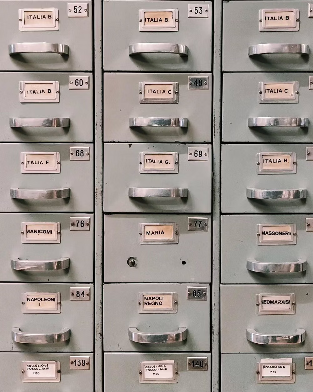
Clean UI design style
An engineered interface language pairs tightly controlled spacing, measured grids, layered neutral surfaces, and precise micro-details so dense information feels calm, airy, and aligned.
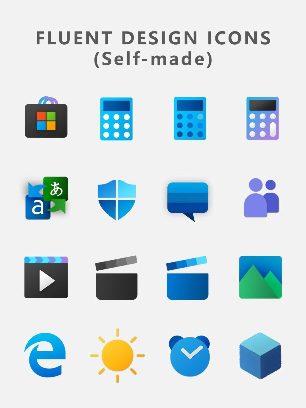

Fluent Design UI design style
Layered surfaces, adaptable components, soft depth, light, motion, and restrained translucent materials.


Minimalism UI design style
Deliberate reduction leaves only the content, controls, imagery, and structure needed for one focused experience.