Clean UI design style
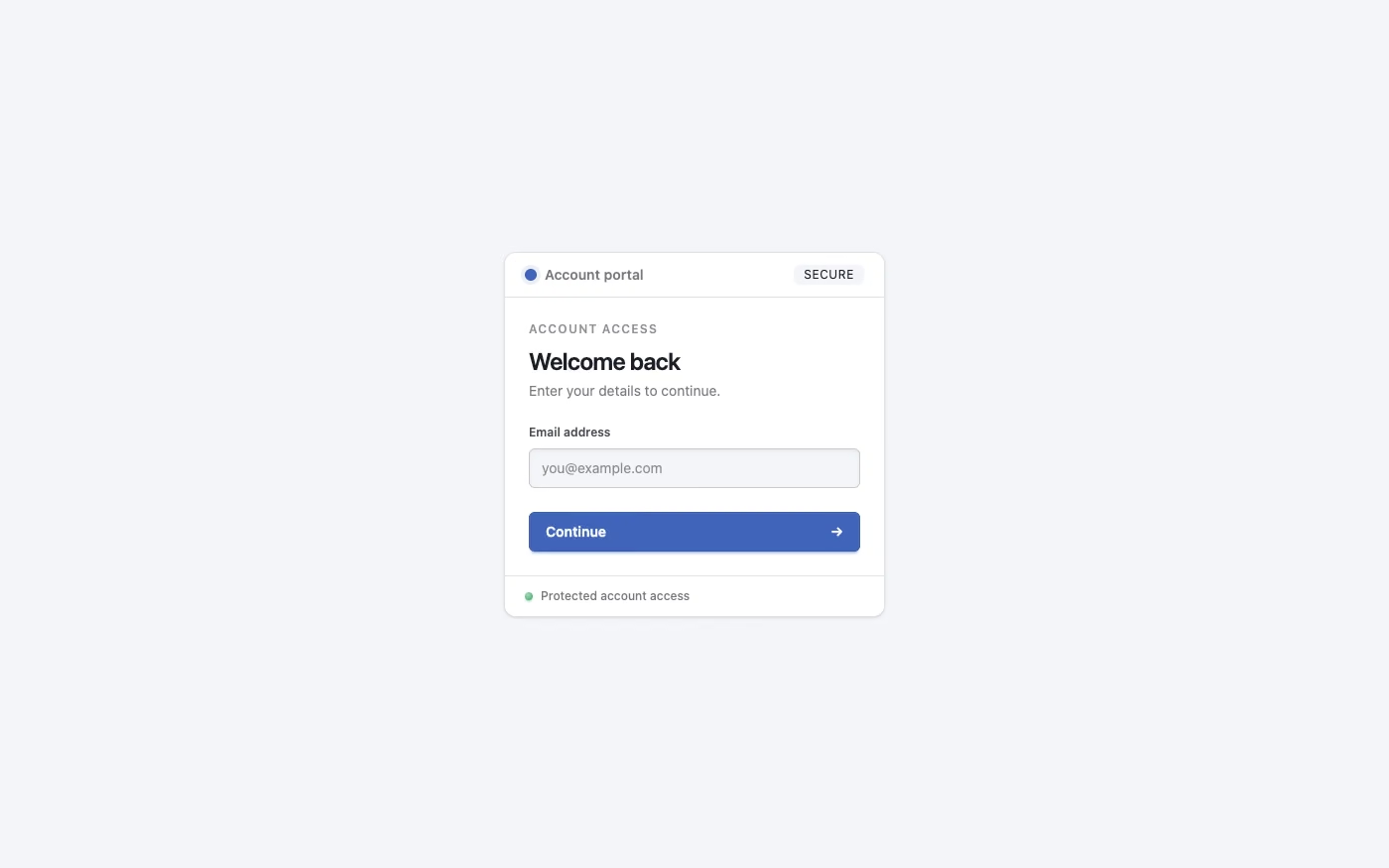
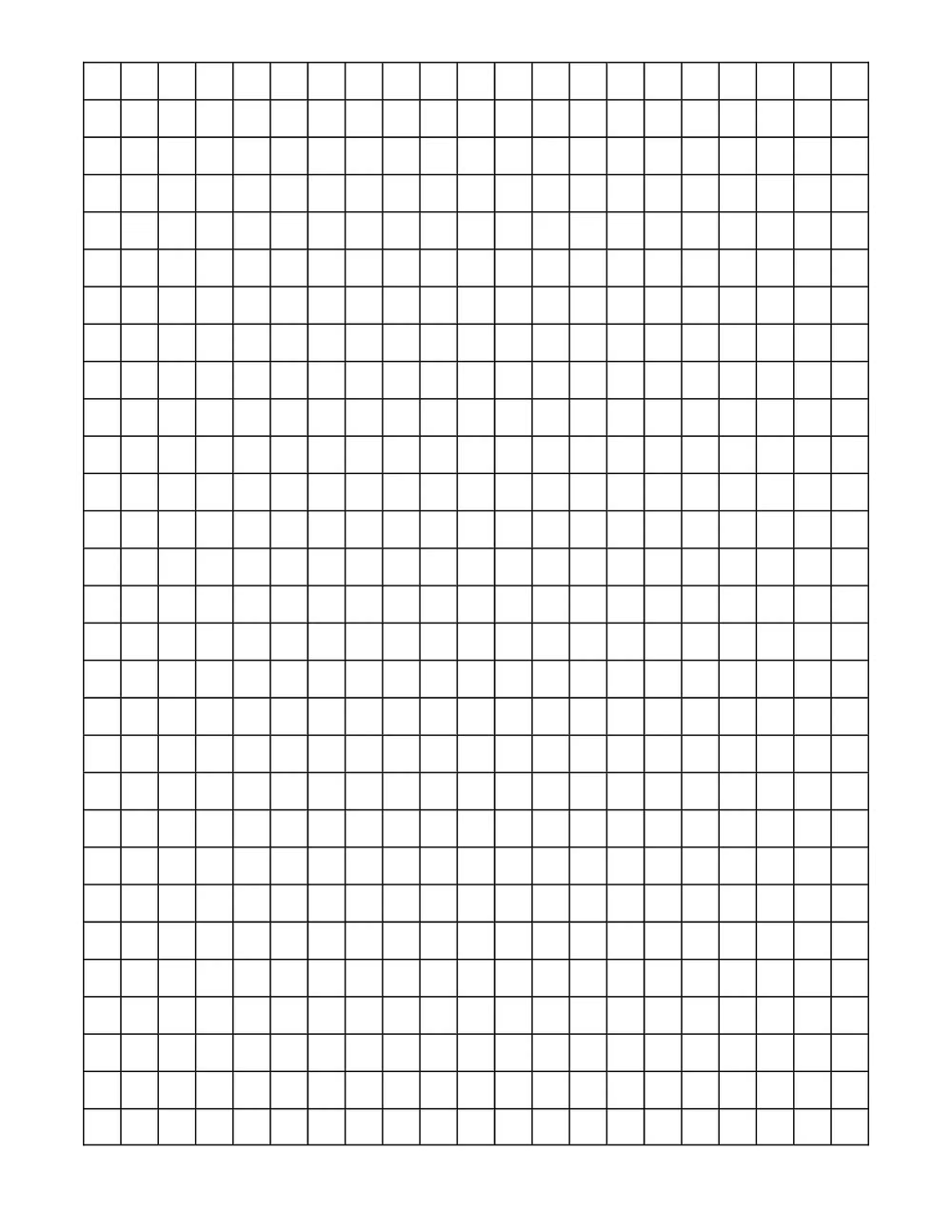
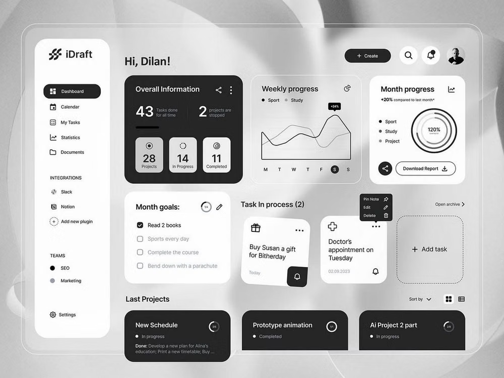
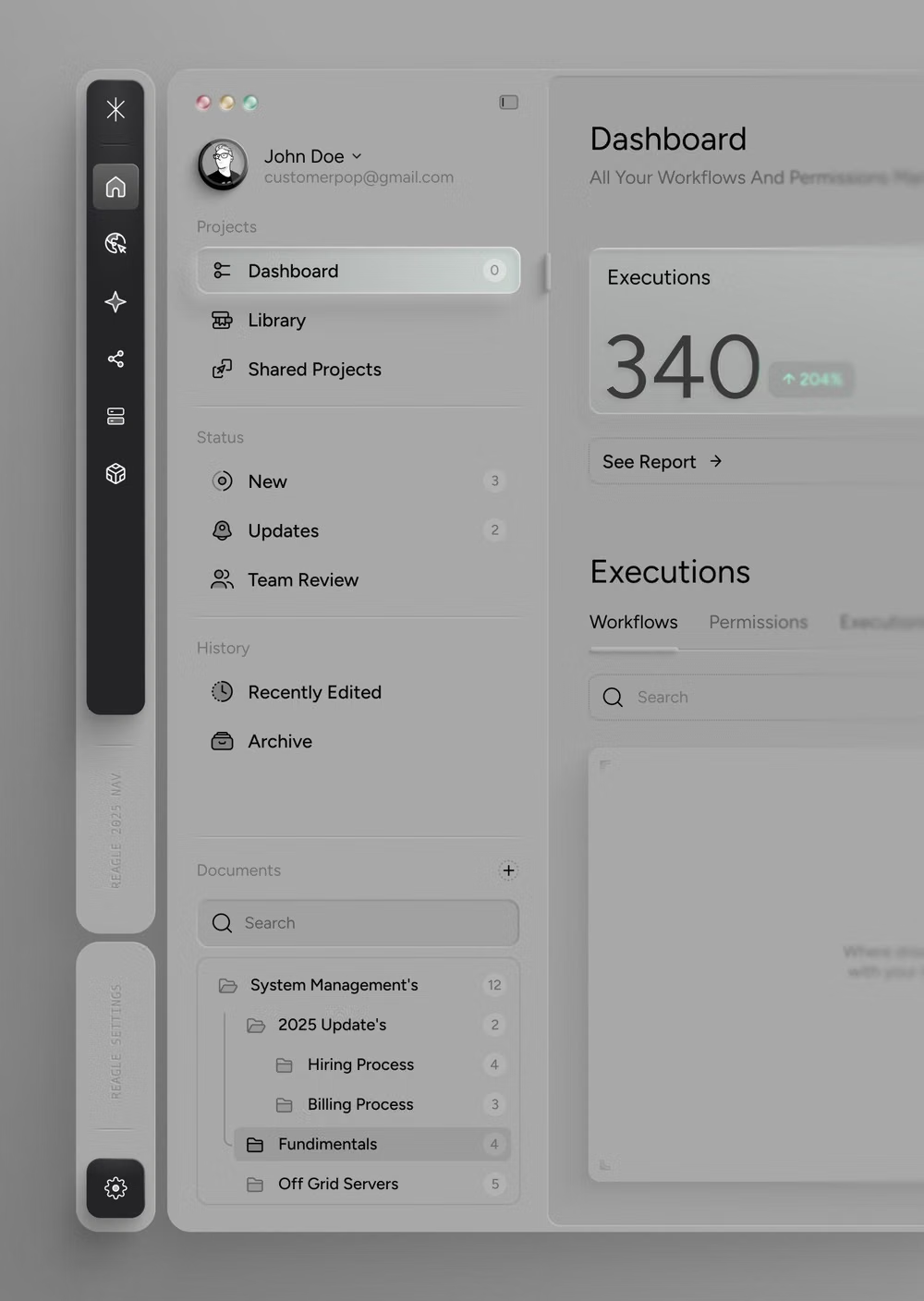
An engineered interface language pairs tightly controlled spacing, measured grids, layered neutral surfaces, and precise micro-details so dense information feels calm, airy, and aligned.
Design overview
- Signature elements
- tight spacing, measured grids, layered surfaces, hairline borders, subtle shadows, inset controls, restrained radii, precise micro-details. In daisyUI themes, set `--depth: 1;`.
- Best suited to
- Dashboards, admin panels, enterprise software, developer tools, settings, data products, and component-heavy web apps.
- Layout principles
- Build on a strict 12-column grid with predictable navigation, aligned page headers, repeatable sections, and controlled gaps, insets, and baselines; use cards only when they clarify grouping.
History and origins
A fact-checked account of where this visual language came from, with links to the references used.
- Period
- 2010s–present
- Origin
- Digital product teams and platform design systems
Clean UI is a current descriptive category rather than a named historical school. Its ordered grids and neutral surfaces inherit modernist information design, while its repeatable components grew with large platform systems such as Material Design, introduced publicly by Google in 2014, and the product-design systems that followed.
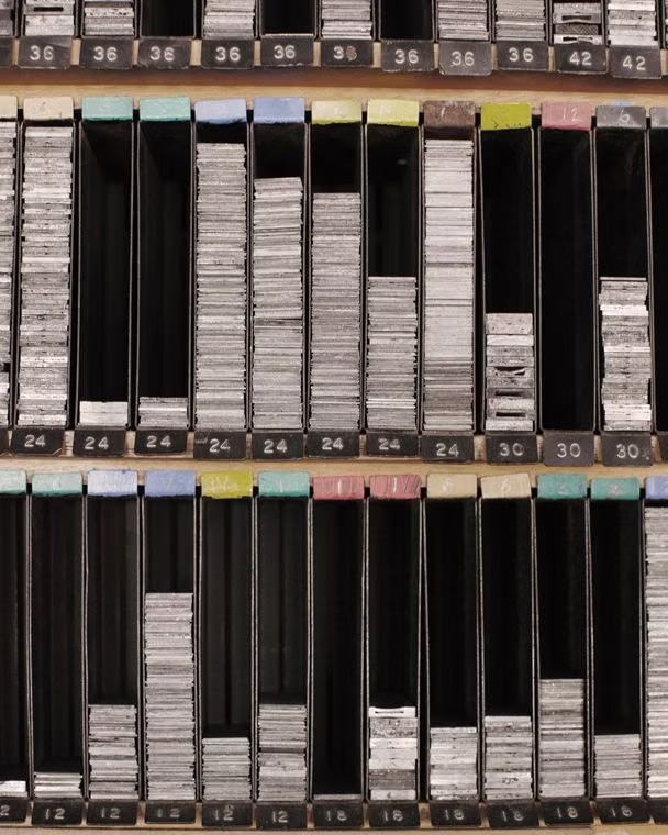
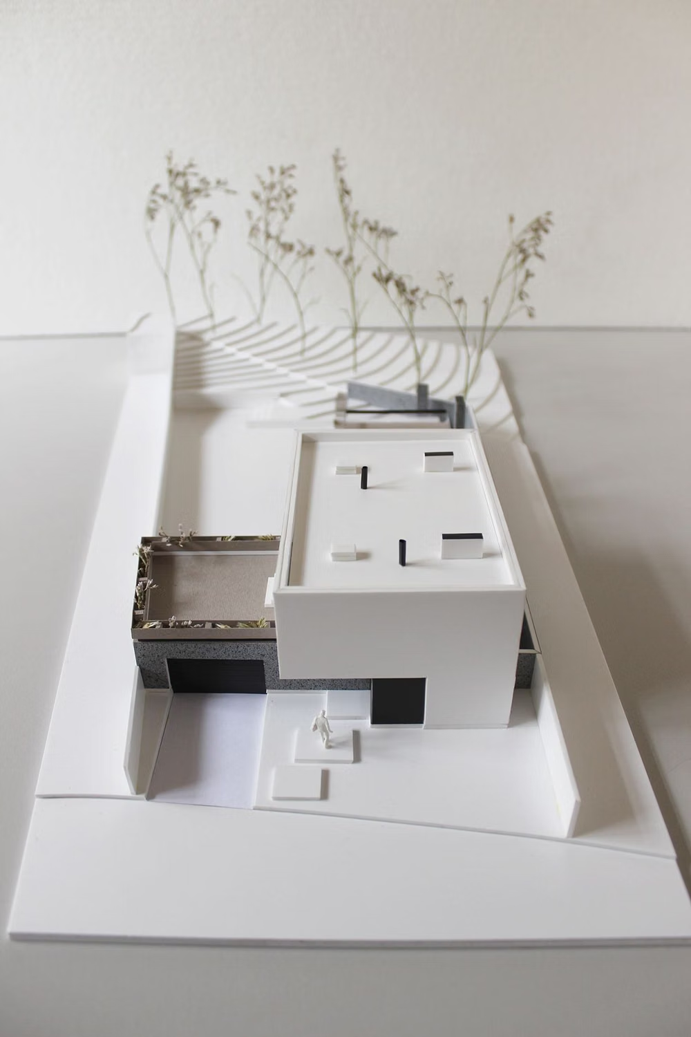
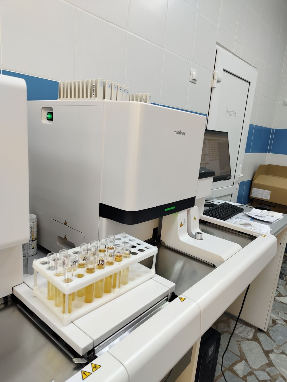
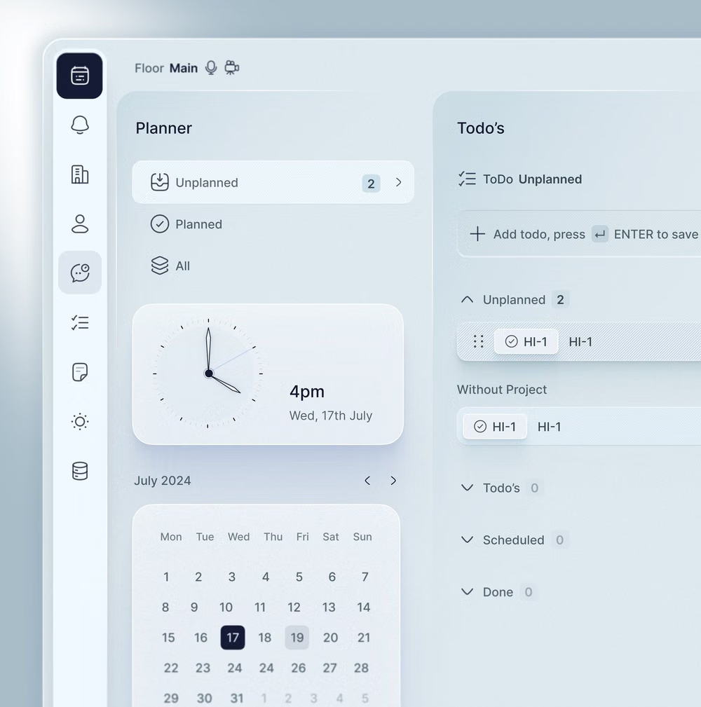
Moodboard and visual references
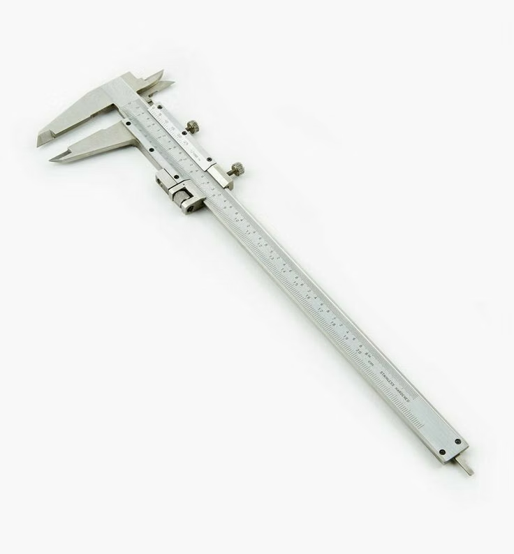
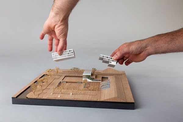
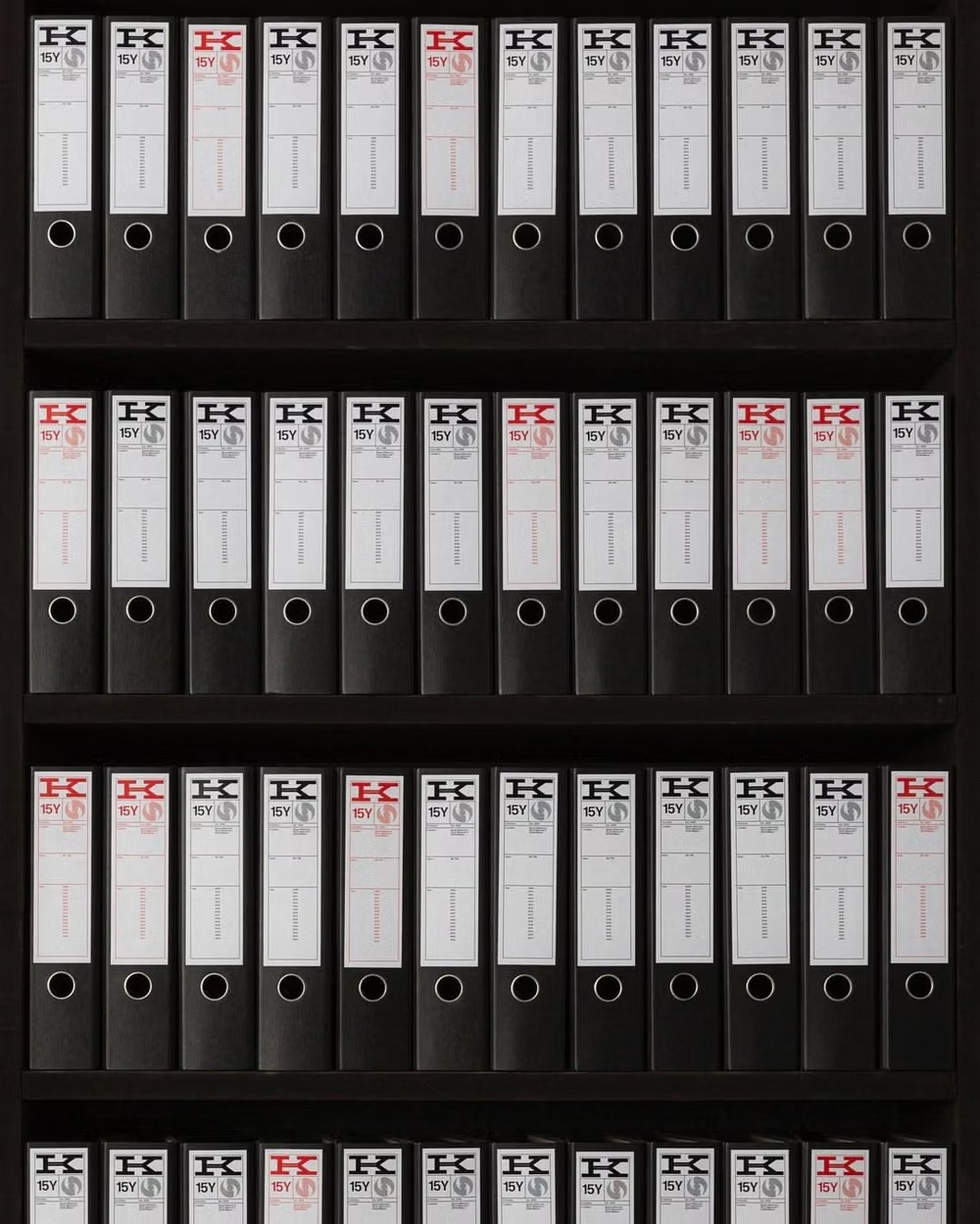
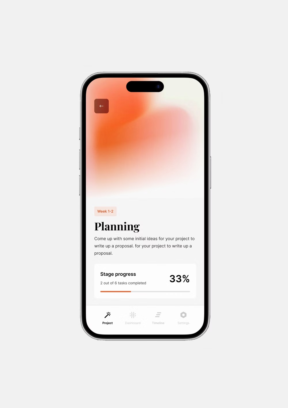
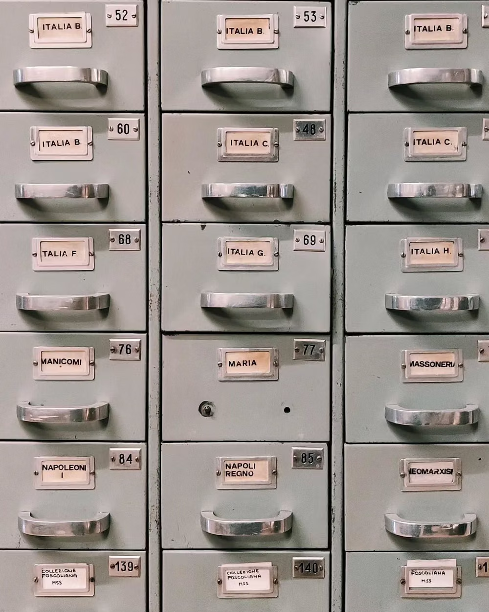
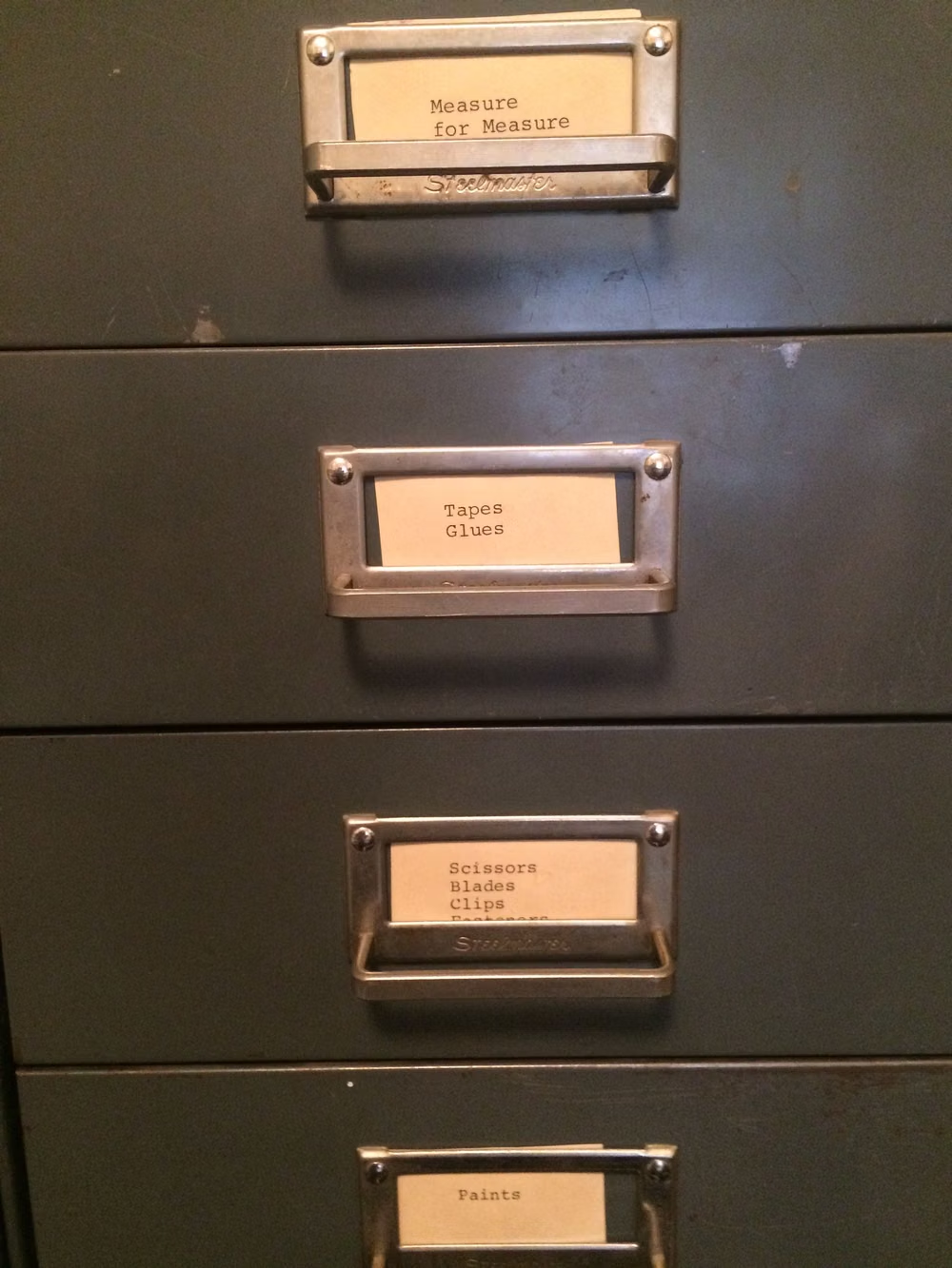
A visual study of the forms, inspirations, materials, colors, type, and cultural references associated with this UI design style.




Design principles and implementation
Use these principles to write a focused AI UI design prompt instead of asking for a vague visual treatment.
Color direction
Use white, off-white, and cool or warm gray as closely stepped surface layers; pair dark neutral text with one subdued accent, reserving saturated color for semantic states. In a daisyUI theme, use a subdued brand blue for `primary`, muted slate or teal for `secondary`, and assign white, off-white, and light gray to `base-100`, `base-200`, and `base-300`.
Imagery direction
Keep imagery subordinate to the information grid; prefer small avatars, product thumbnails, precise diagrams, and restrained data visualization over decorative illustration or cinematic photography.
Content density
Present medium to high information density through compact controls, tables, filters, and forms, balancing tight local grouping with enough space between sections to maintain an airy rhythm. Use the `*-sm` size variants for daisyUI components to preserve this compact working density.
Motion direction
Use measured fades, short slides, focus rings, and small state transitions for menus, dialogs, sorting, and validation; avoid ambient or theatrical motion.
Shape language
Use restrained rounded geometry, plain rectangles, compact pills, and inset controls; build soft depth with hairline borders, shallow shadows, and layered surfaces. In daisyUI themes, set the `--radius-*` variables between `0.25rem` and `1rem`.
Typography rules
Use a quiet neutral sans-serif with a strong hierarchy, compact scale, medium-weight labels, muted supporting text, and tabular numerals; rely on size, weight, and alignment instead of expressive styling.
Suggested Typfaces
Inter
Fresh daisies glow in warm sunlight
Fresh daisies glow in warm sunlight
1 2 3 4 5 6 7 8 9 0
Geist
Fresh daisies glow in warm sunlight
Fresh daisies glow in warm sunlight
1 2 3 4 5 6 7 8 9 0
Instrument Sans
Fresh daisies glow in warm sunlight
Fresh daisies glow in warm sunlight
1 2 3 4 5 6 7 8 9 0
DM Sans
Fresh daisies glow in warm sunlight
Fresh daisies glow in warm sunlight
1 2 3 4 5 6 7 8 9 0
IBM Plex Sans
Fresh daisies glow in warm sunlight
Fresh daisies glow in warm sunlight
1 2 3 4 5 6 7 8 9 0
Build a Clean UI interface with daisyUI
The live example translates this direction into daisyUI components and semantic theme tokens.
To generate a full page in the same visual language, give the style name and the design rules above to Blueprint MCP.
Related UI design styles
Compare nearby visual languages that share typography, shapes, use cases, or signature elements.

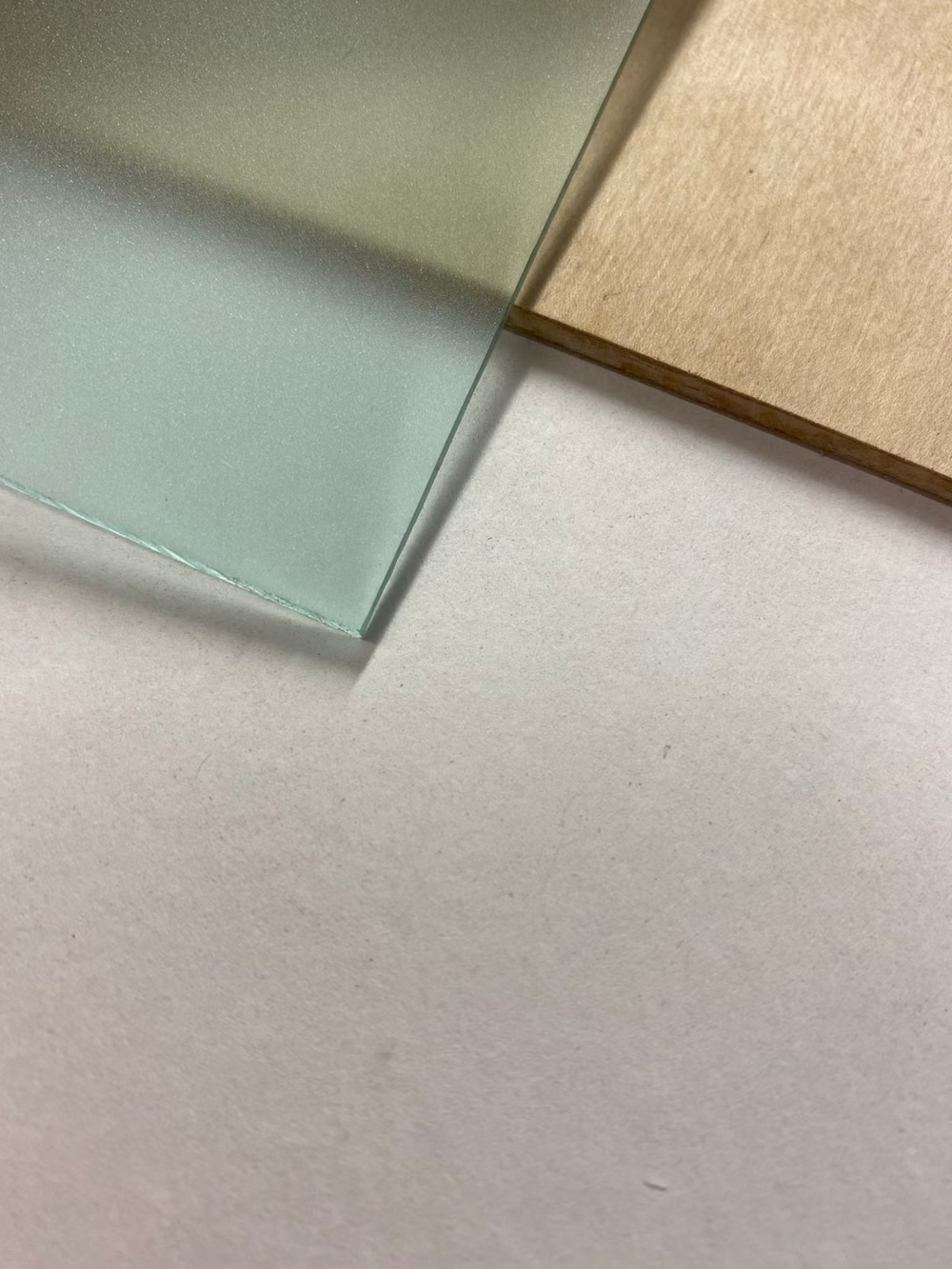
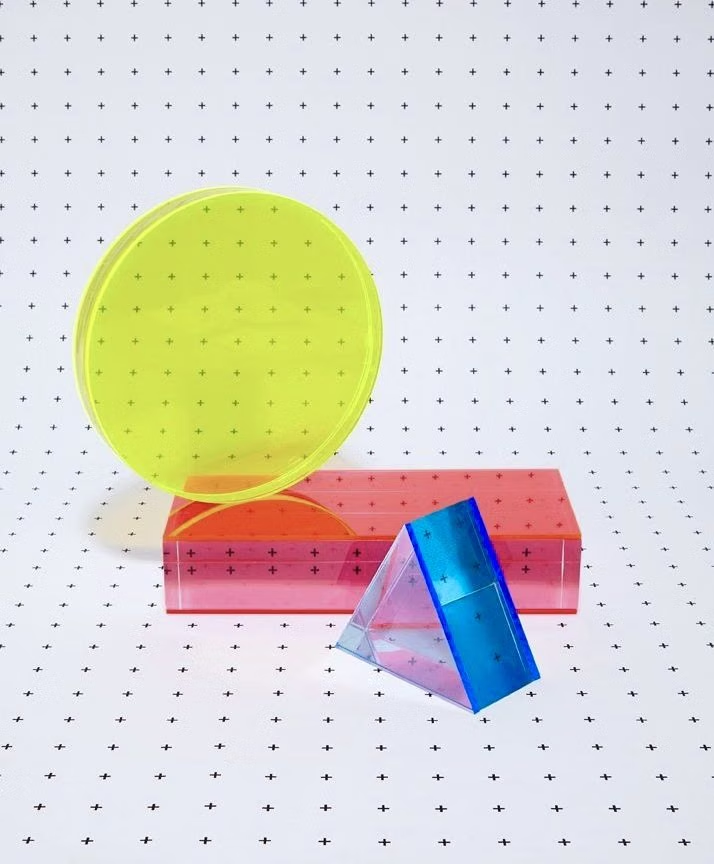
Fluent Design UI design style
Layered surfaces, adaptable components, soft depth, light, motion, and restrained translucent materials.

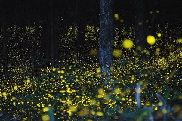

Luminous Eco-Skeuomorphism UI design style
A glossy, tactile interface style that combines early-2010s skeuomorphism with futuristic ecological-tech aesthetics. Controls resemble illuminated physical hardware, with intense inner glows, radiant edges, and soft light bloom making interactive elements appear electrically powered.
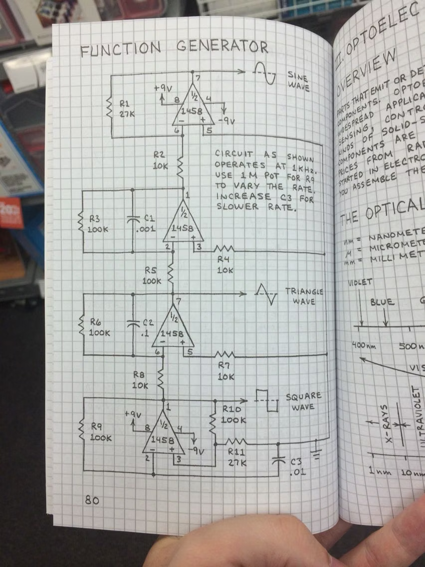
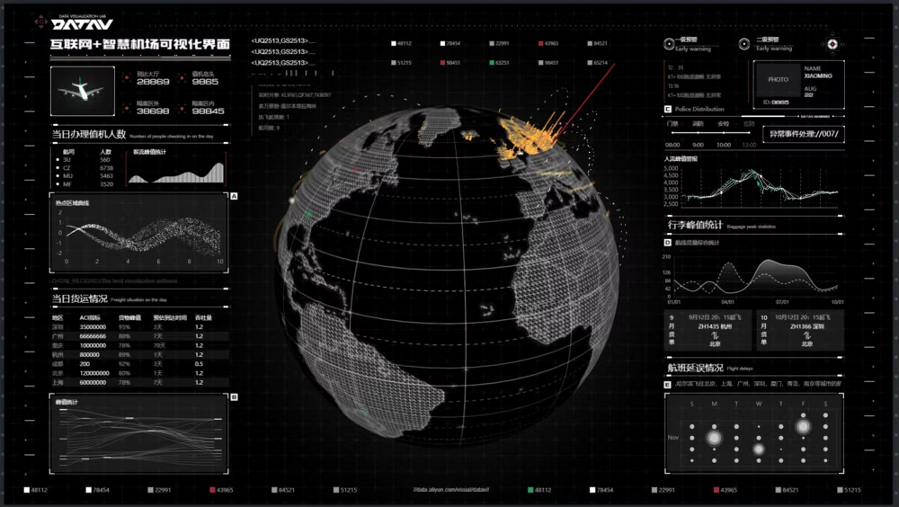

Data-Dense Utilitarian UI design style
Compact spacing, visible structure, tables, restrained colors, functional typography, and minimal ornamental styling.