Fluent Design UI design style
Layered surfaces, adaptable components, soft depth, light, motion, and restrained translucent materials.
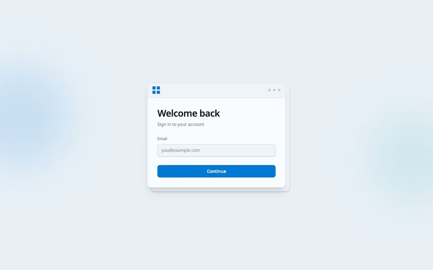
Design overview
- Signature elements
- acrylic translucency, soft elevation, light highlights, layered panels, adaptive components, subtle motion. In daisyUI themes, set `--depth: 1;`.
- Best suited to
- Microsoft-platform apps, enterprise software, productivity suites, and cross-device products.
- Layout principles
- Arrange navigation, command bars, content panes, and dialogs as a legible depth stack that adapts from spacious desktop windows to compact device frames.
History and origins
A fact-checked account of where this visual language came from, with links to the references used.
- Period
- 2017–present
- Origin
- Microsoft, Redmond
Microsoft announced Fluent Design System at Build 2017 as the next cross-device design language for Windows. It organized interface expression around light, depth, motion, material, and scale, building on Metro’s clarity while restoring layered and atmospheric effects suited to touch, pen, mixed reality, and traditional screens.
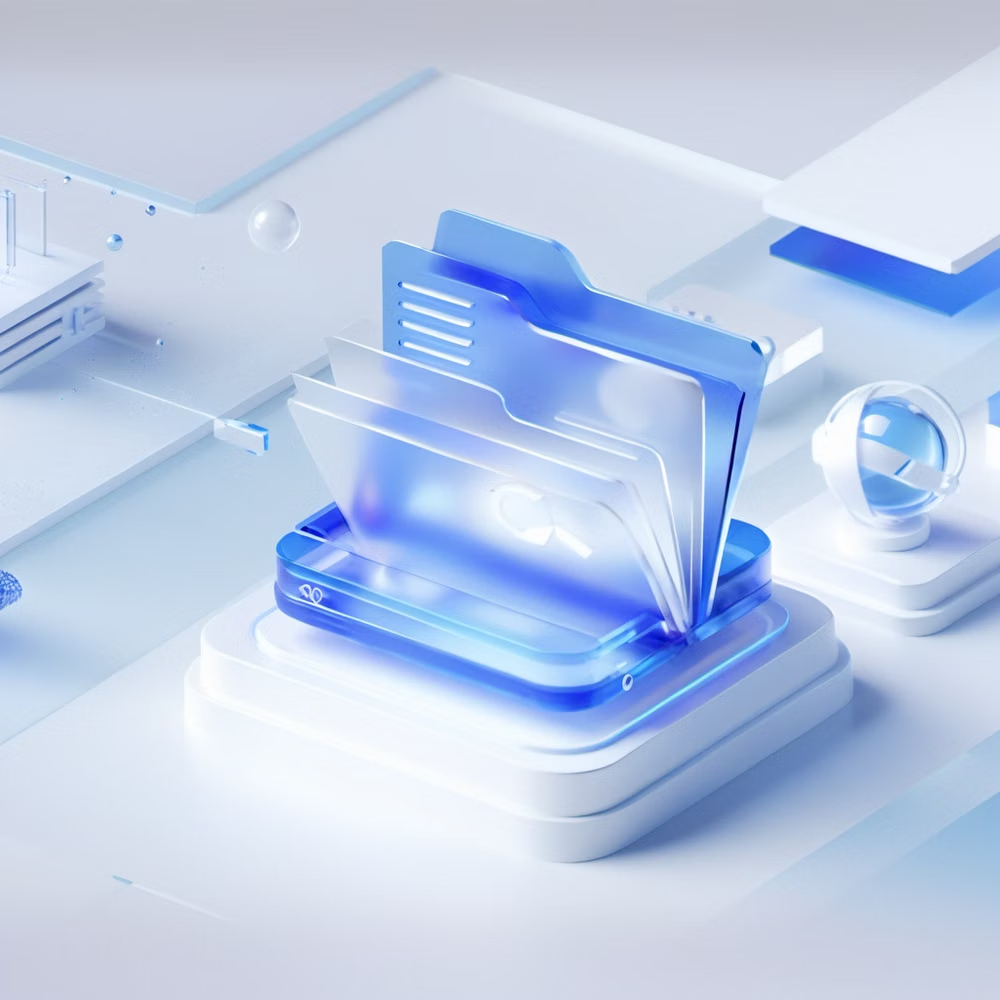
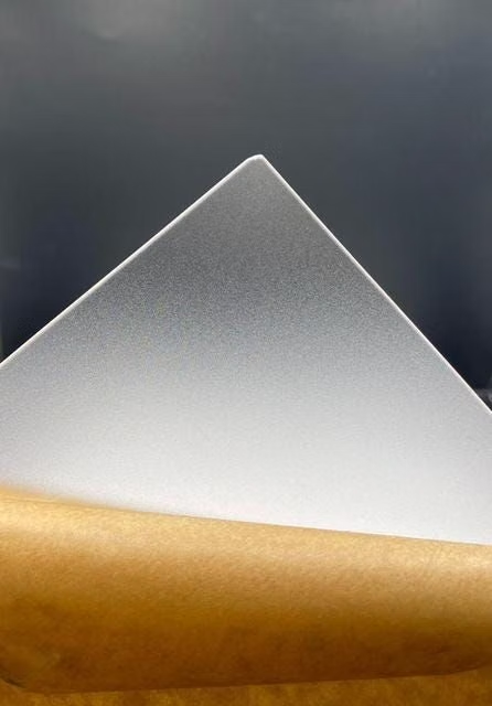
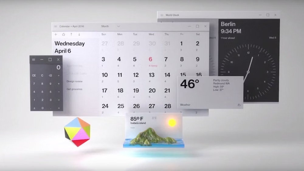
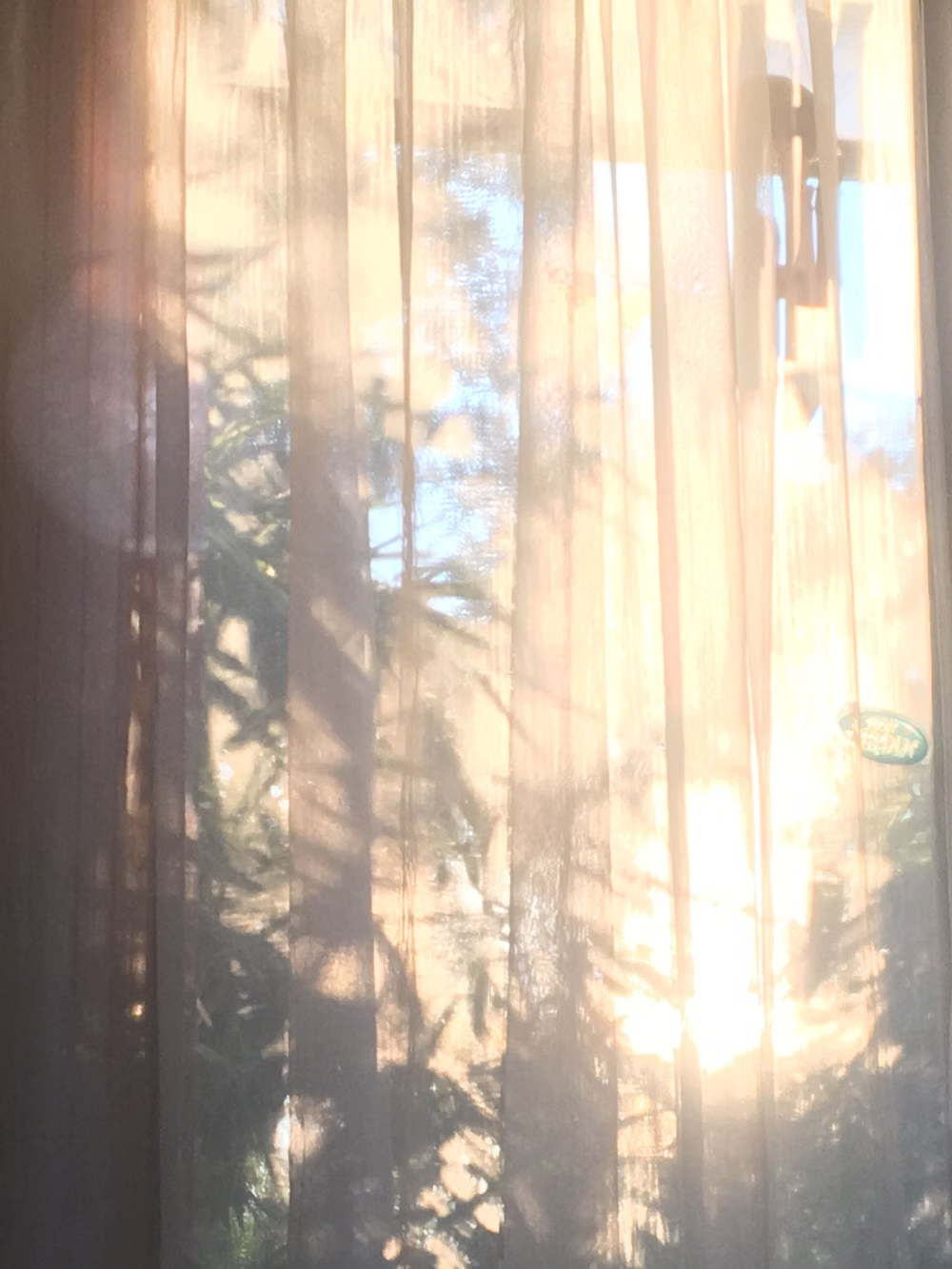
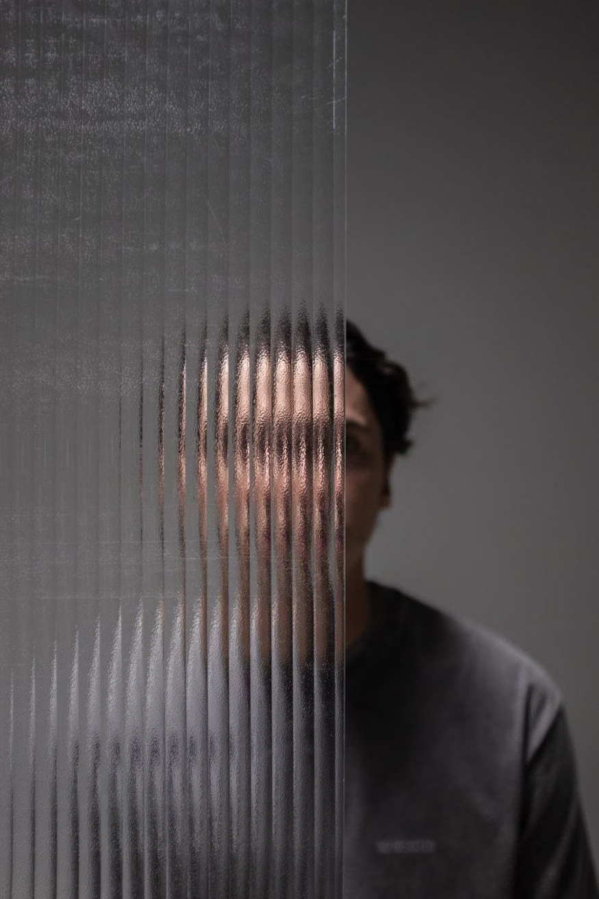
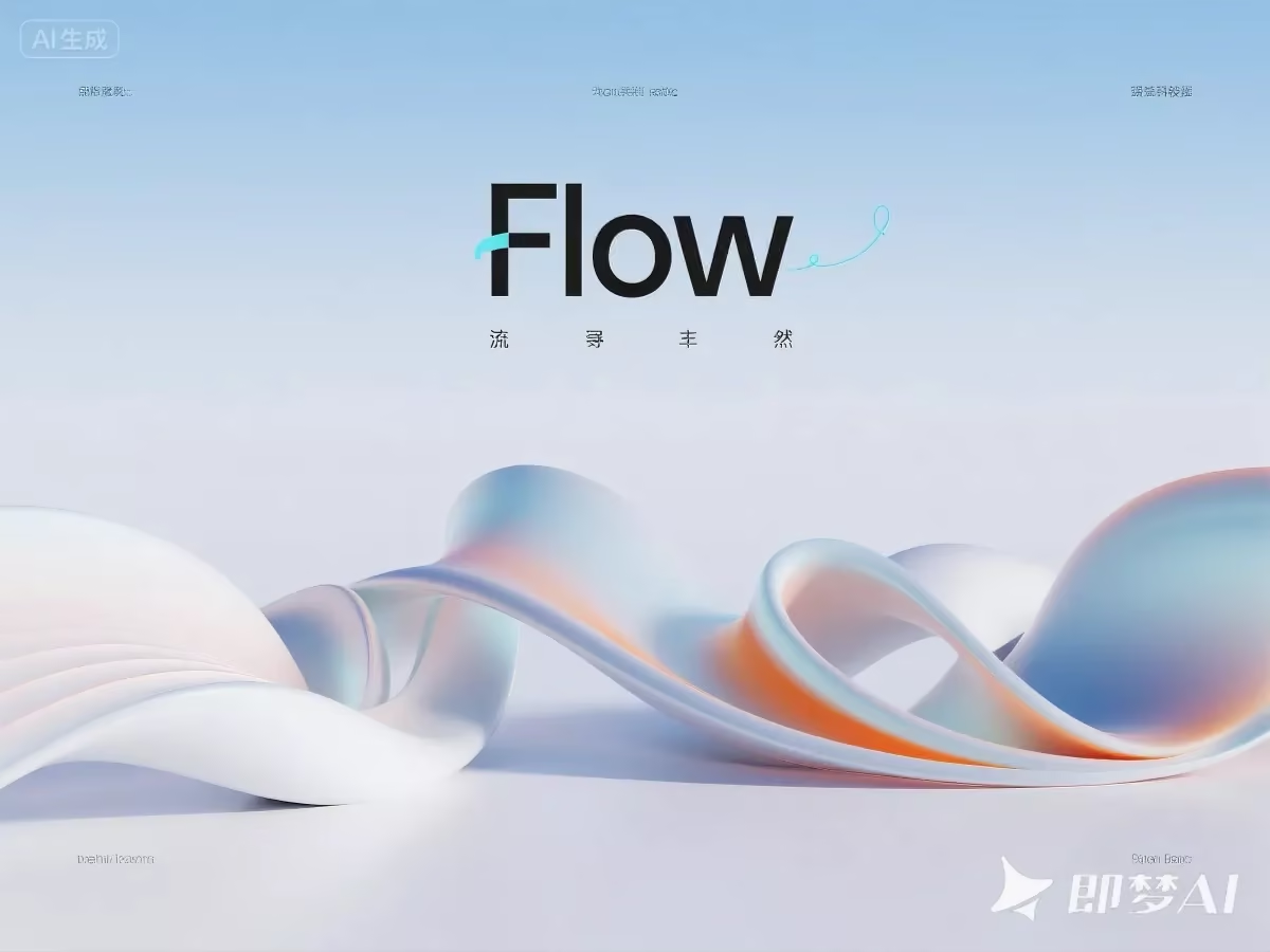
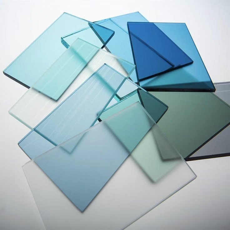
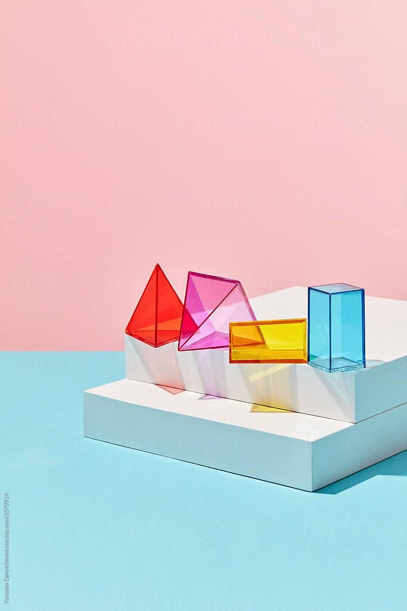
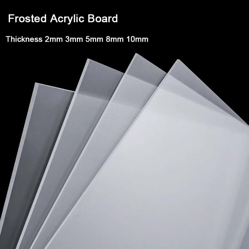
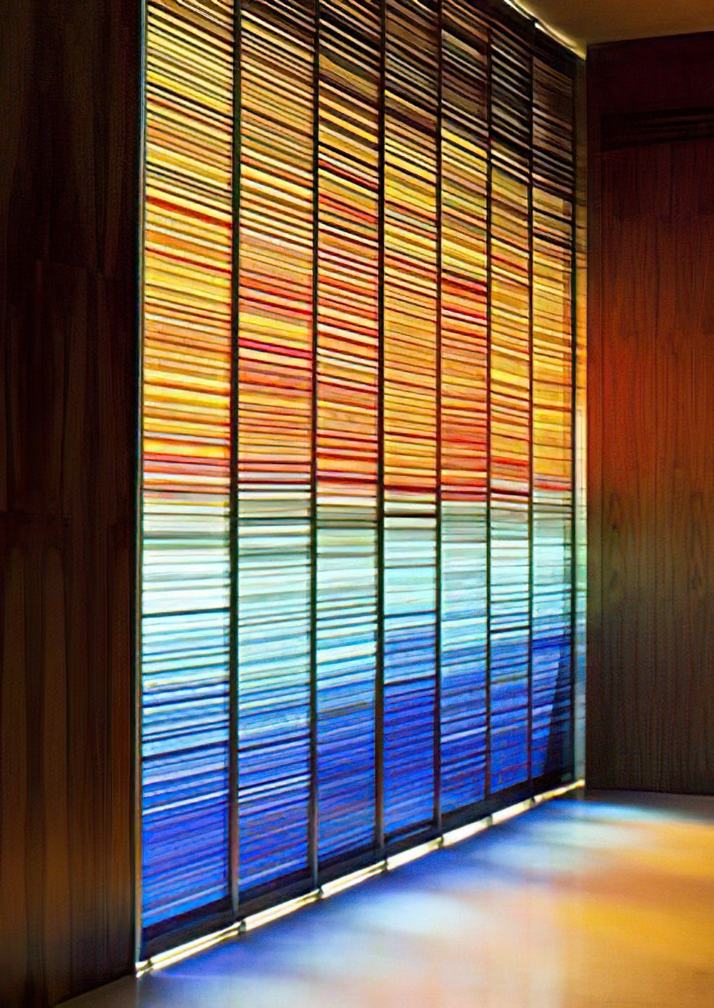
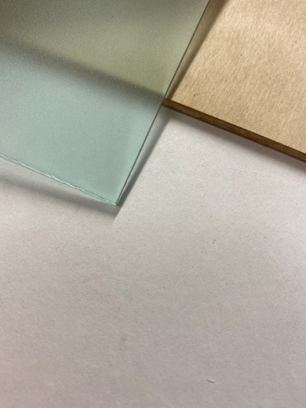
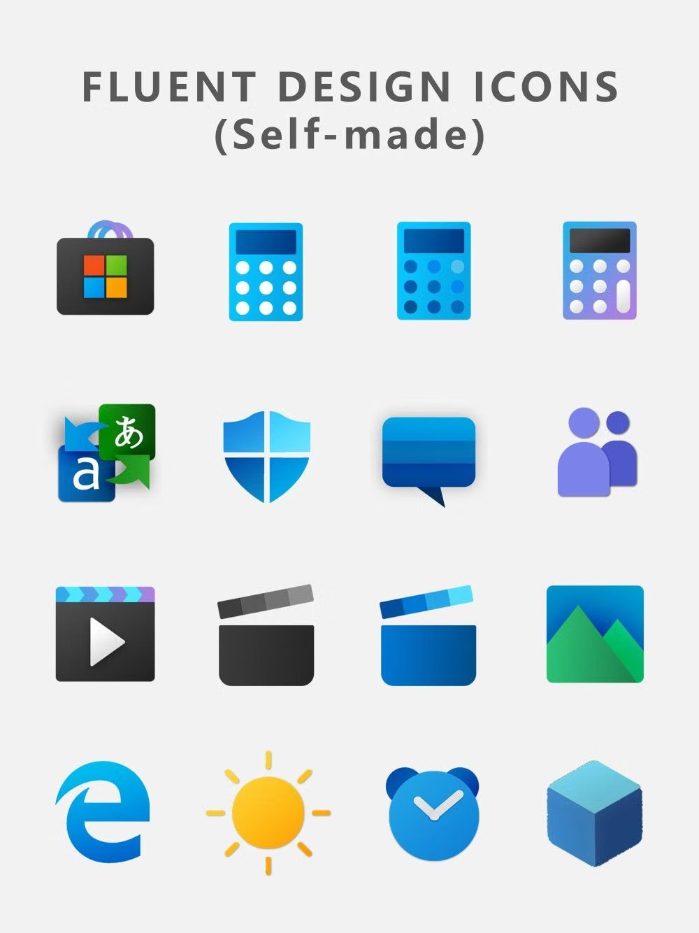
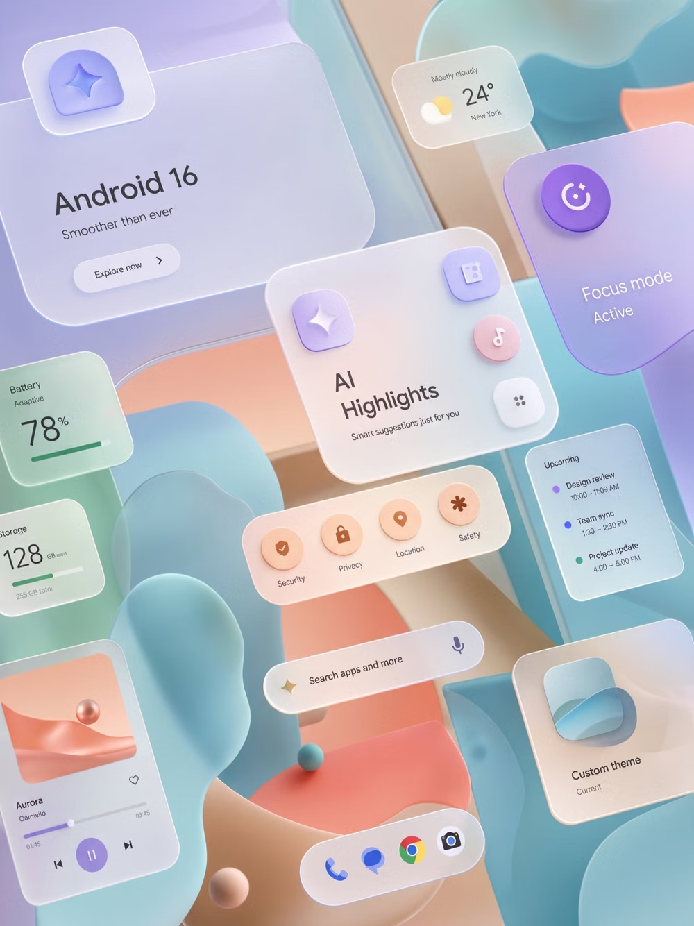
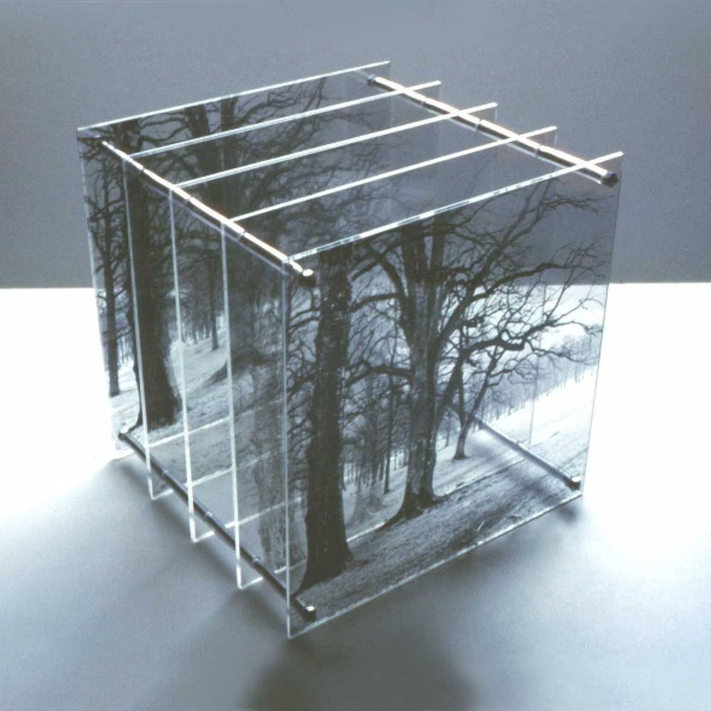
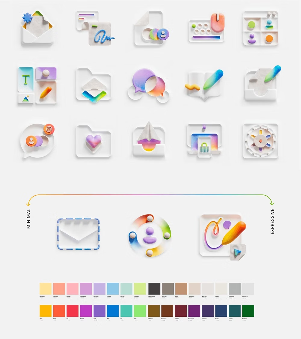
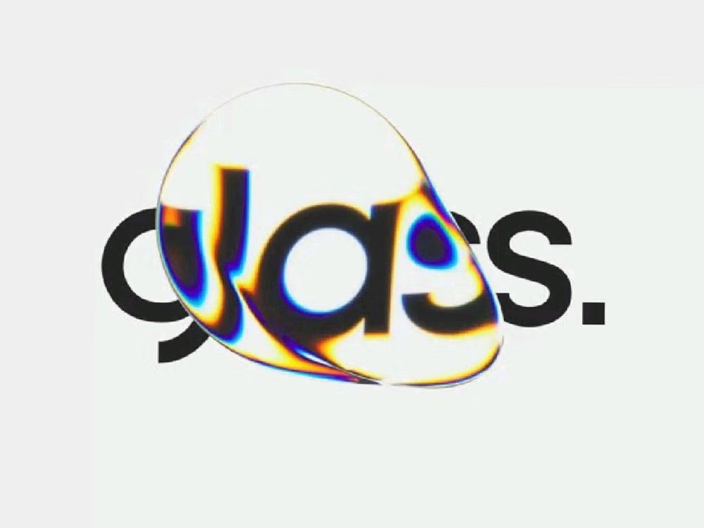
Moodboard and visual references
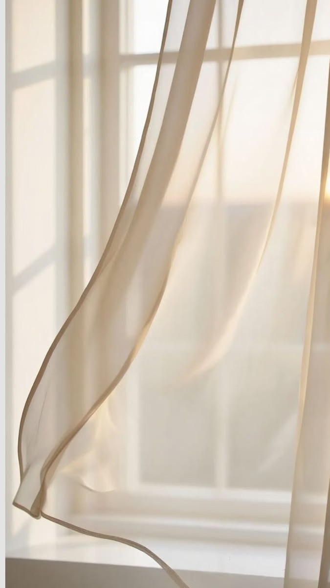
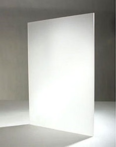
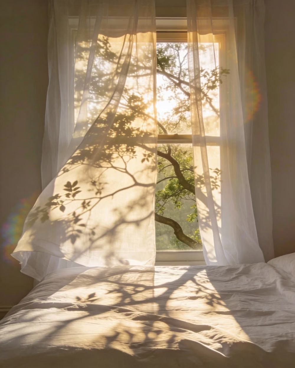
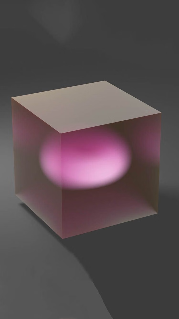
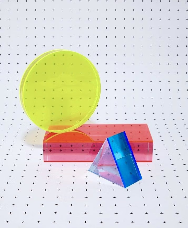
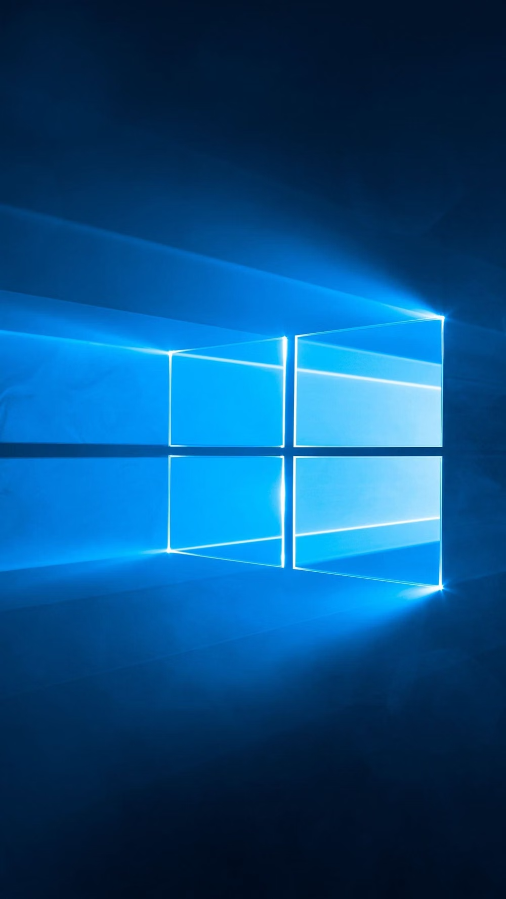
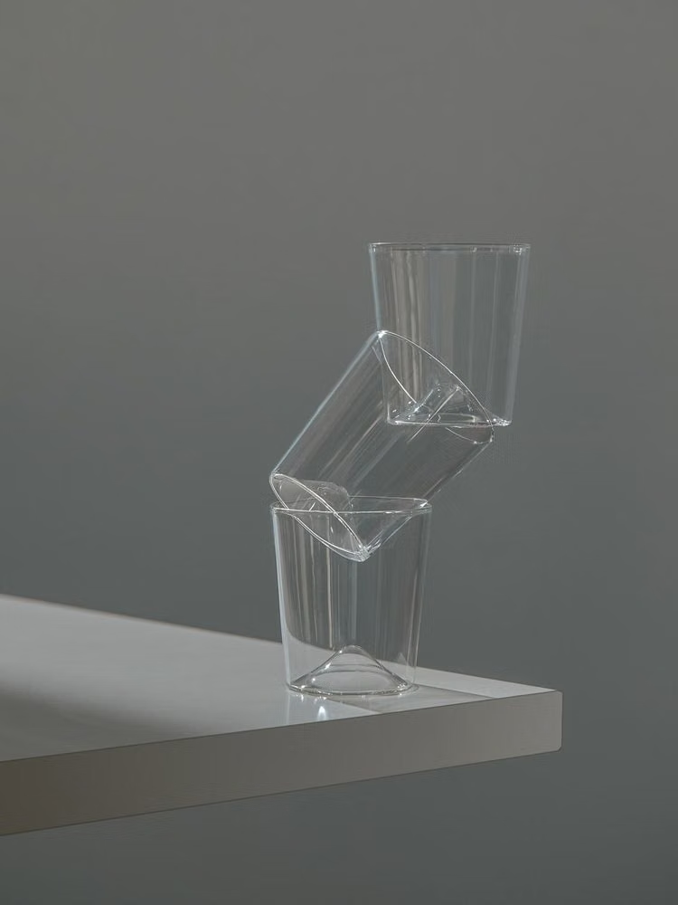
A visual study of the forms, inspirations, materials, colors, type, and cultural references associated with this UI design style.

Design principles and implementation
Use these principles to write a focused AI UI design prompt instead of asking for a vague visual treatment.
Color direction
Use neutral layered surfaces with one system accent, reserving acrylic tint and reveal lighting for transient navigation or selection rather than every panel. In a daisyUI theme, use system blue for `primary`, muted teal or violet for `secondary`, and build `base-100`, `base-200`, and `base-300` from closely stepped cool white and gray surfaces.
Imagery direction
Favor crisp productivity icons, restrained editorial photography, and diagrams that sit cleanly inside adaptive content panes.
Content density
Support medium to high working density with clear pane boundaries, compact commands, and breathing room around the current task. Use the `*-sm` size variants for daisyUI components to preserve this compact working density.
Motion direction
Connect related views with subtle depth, parallax, reveal highlights, and coordinated object movement that preserves spatial continuity.
Shape language
Use moderate radii, thin outlines, soft elevation, and lightly luminous edges; controls should feel precise rather than pillowy. In daisyUI themes, set the `--radius-*` variables between `0.25rem` and `1rem`.
Typography rules
Choose a Segoe-like humanist sans-serif, maintain compact but readable labels, and use weight changes sparingly across dense command surfaces.
Suggested Typfaces
Noto Sans
Fresh daisies glow in warm sunlight
Fresh daisies glow in warm sunlight
1 2 3 4 5 6 7 8 9 0
Inter
Fresh daisies glow in warm sunlight
Fresh daisies glow in warm sunlight
1 2 3 4 5 6 7 8 9 0
Source Sans 3
Fresh daisies glow in warm sunlight
Fresh daisies glow in warm sunlight
1 2 3 4 5 6 7 8 9 0
Manrope
Fresh daisies glow in warm sunlight
Fresh daisies glow in warm sunlight
1 2 3 4 5 6 7 8 9 0
Build a Fluent Design interface with daisyUI
The live example translates this direction into daisyUI components and semantic theme tokens.
To generate a full page in the same visual language, give the style name and the design rules above to Blueprint MCP.
Related UI design styles
Compare nearby visual languages that share typography, shapes, use cases, or signature elements.
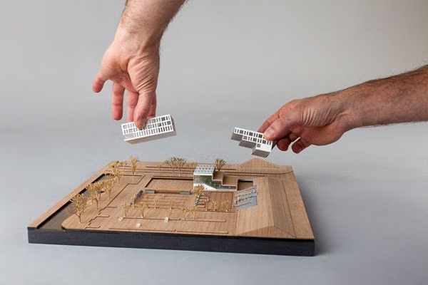
Clean UI design style
An engineered interface language pairs tightly controlled spacing, measured grids, layered neutral surfaces, and precise micro-details so dense information feels calm, airy, and aligned.
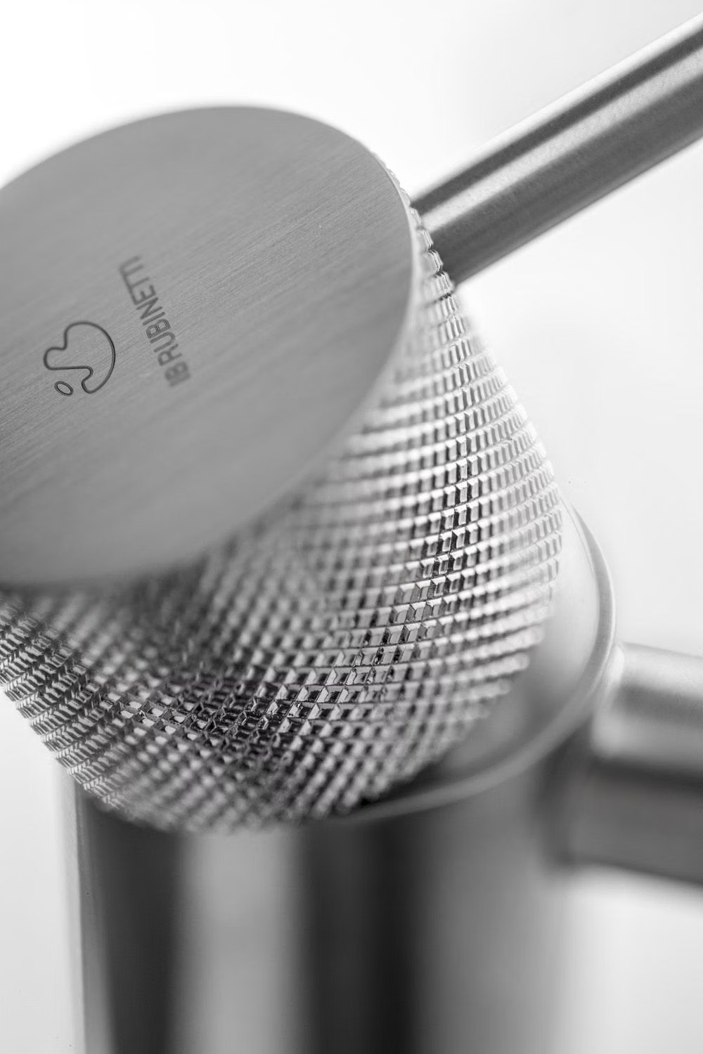

Skeuomorphism UI design style
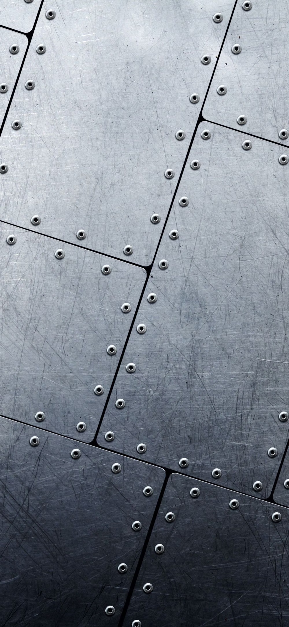
Photorealistic or softly modeled interfaces use material depth, mechanical controls, and analog-equipment cues, often combining industrial nostalgia with clean retro-futurist geometry.
Luminous Eco-Skeuomorphism UI design style
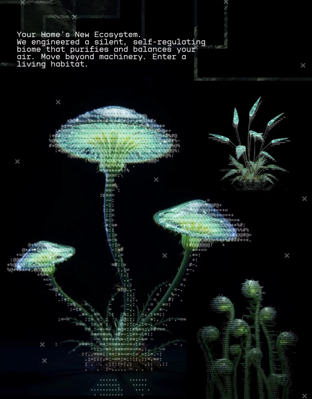
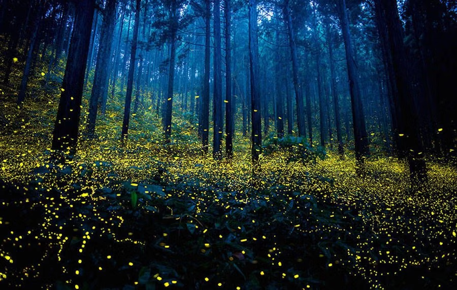
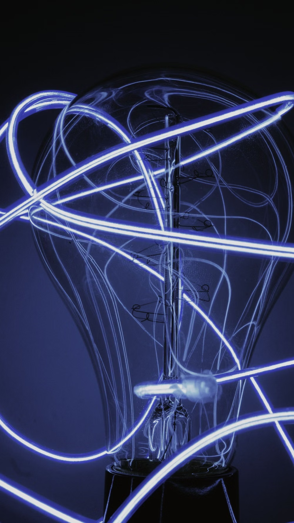
A glossy, tactile interface style that combines early-2010s skeuomorphism with futuristic ecological-tech aesthetics. Controls resemble illuminated physical hardware, with intense inner glows, radiant edges, and soft light bloom making interactive elements appear electrically powered.