Metro / Modern UI design style
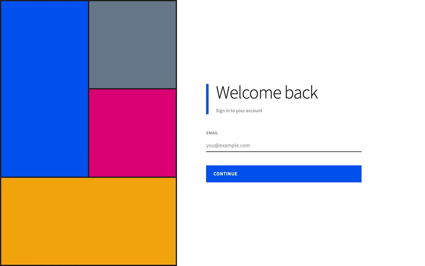
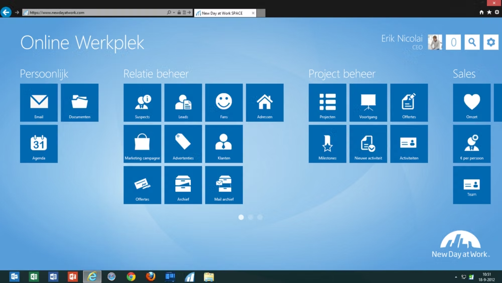
Typography-led layouts with flat tiles, edge-to-edge content, strong alignment, minimal chrome, and directional motion.
Design overview
- Signature elements
- typography-led hierarchy, flat tiles, edge-to-edge imagery, strict alignment, minimal chrome, lateral motion
- Best suited to
- Media hubs, dashboards, kiosks, Windows-inspired products, and information-first interfaces.
- Layout principles
- Compose asymmetric tile fields on a strict baseline grid, let key content reach the viewport edge, and use panoramic horizontal groupings instead of card stacks.
History and origins
A fact-checked account of where this visual language came from, with links to the references used.
- Period
- Mid-2000s roots; formalized around 2010
- Origin
- Microsoft, Redmond
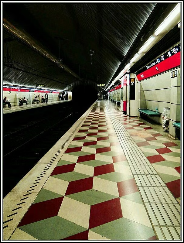
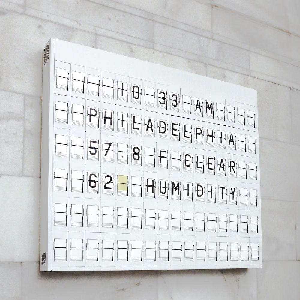
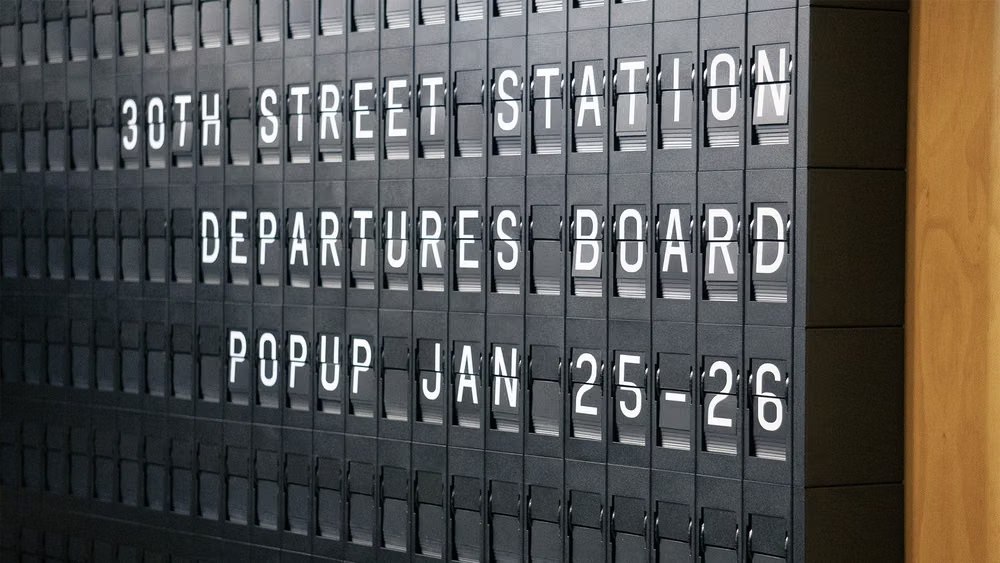
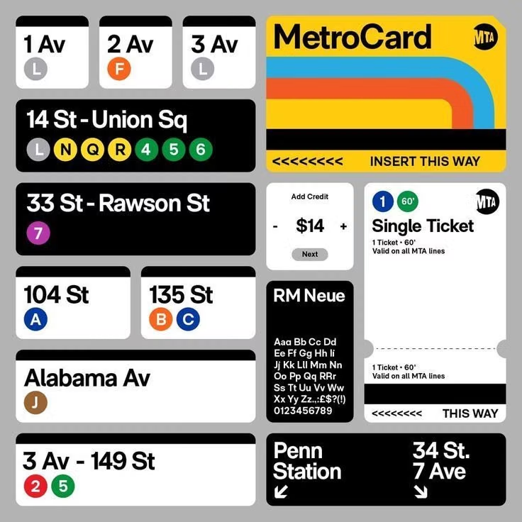
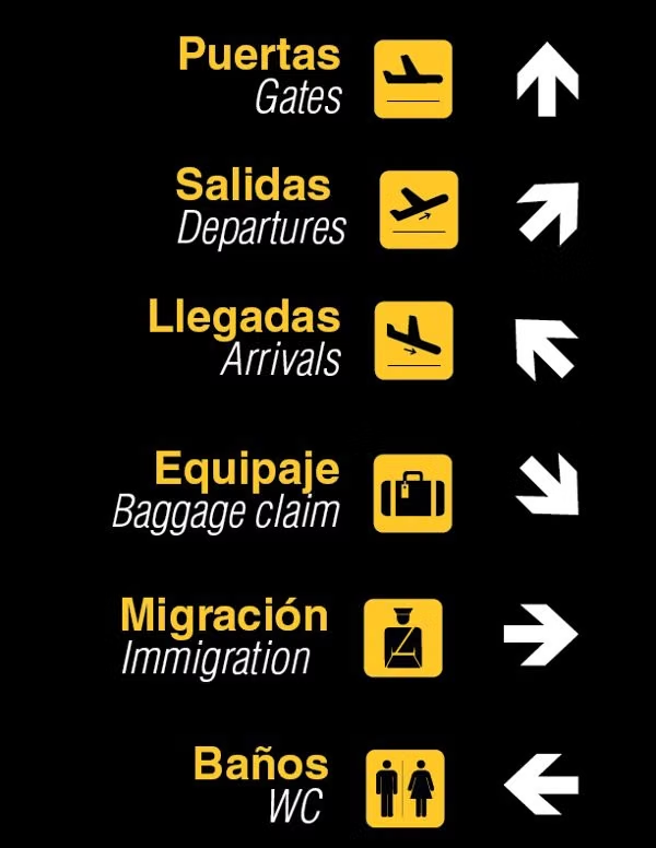
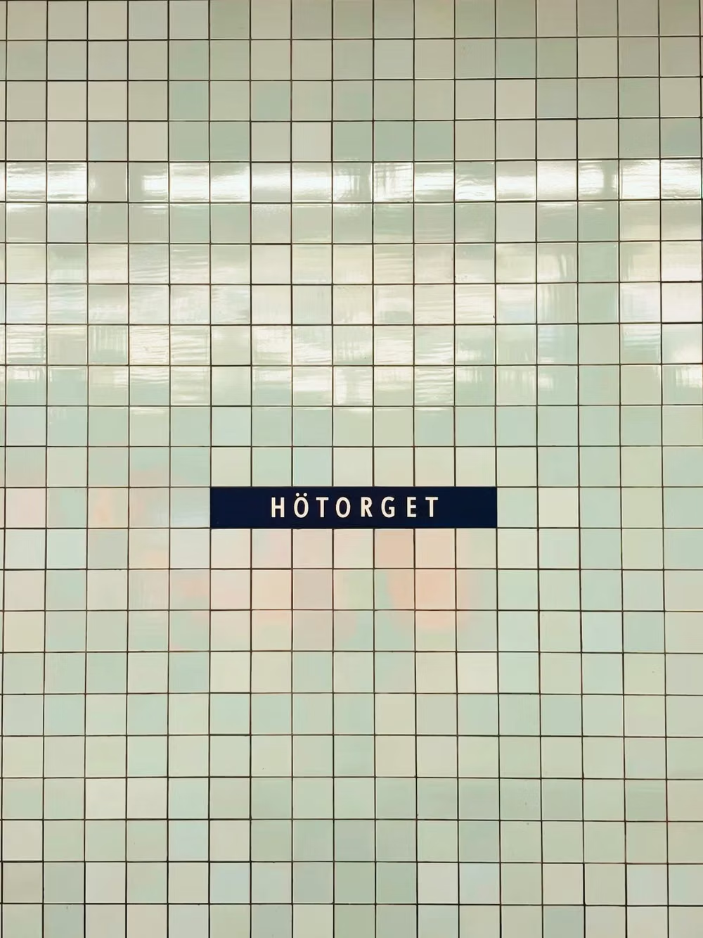
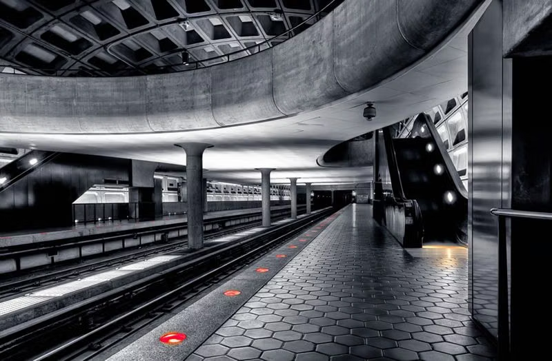
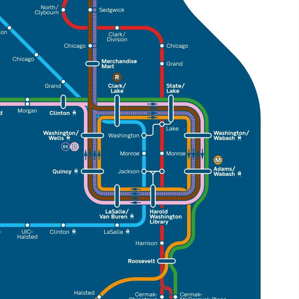
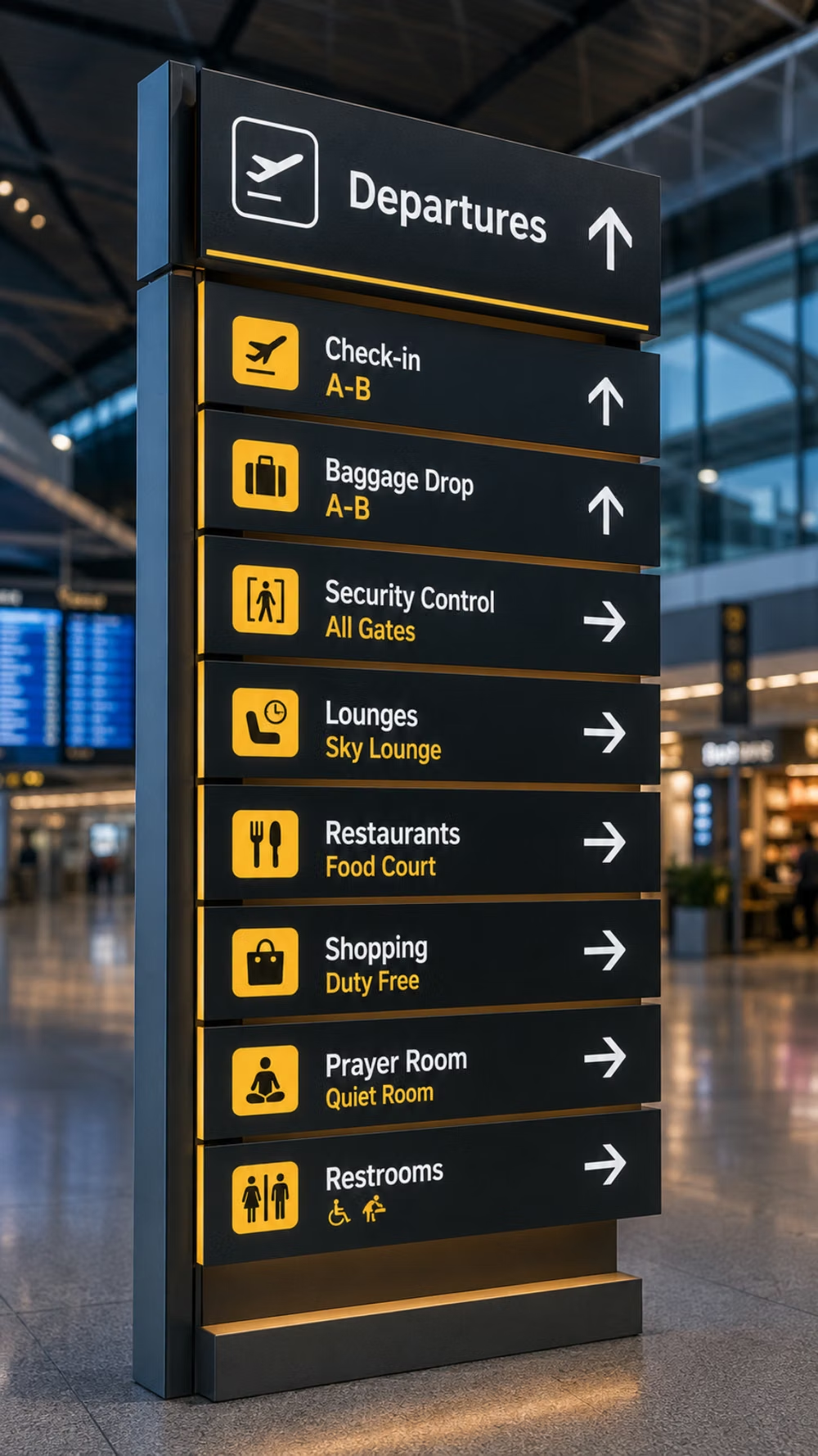
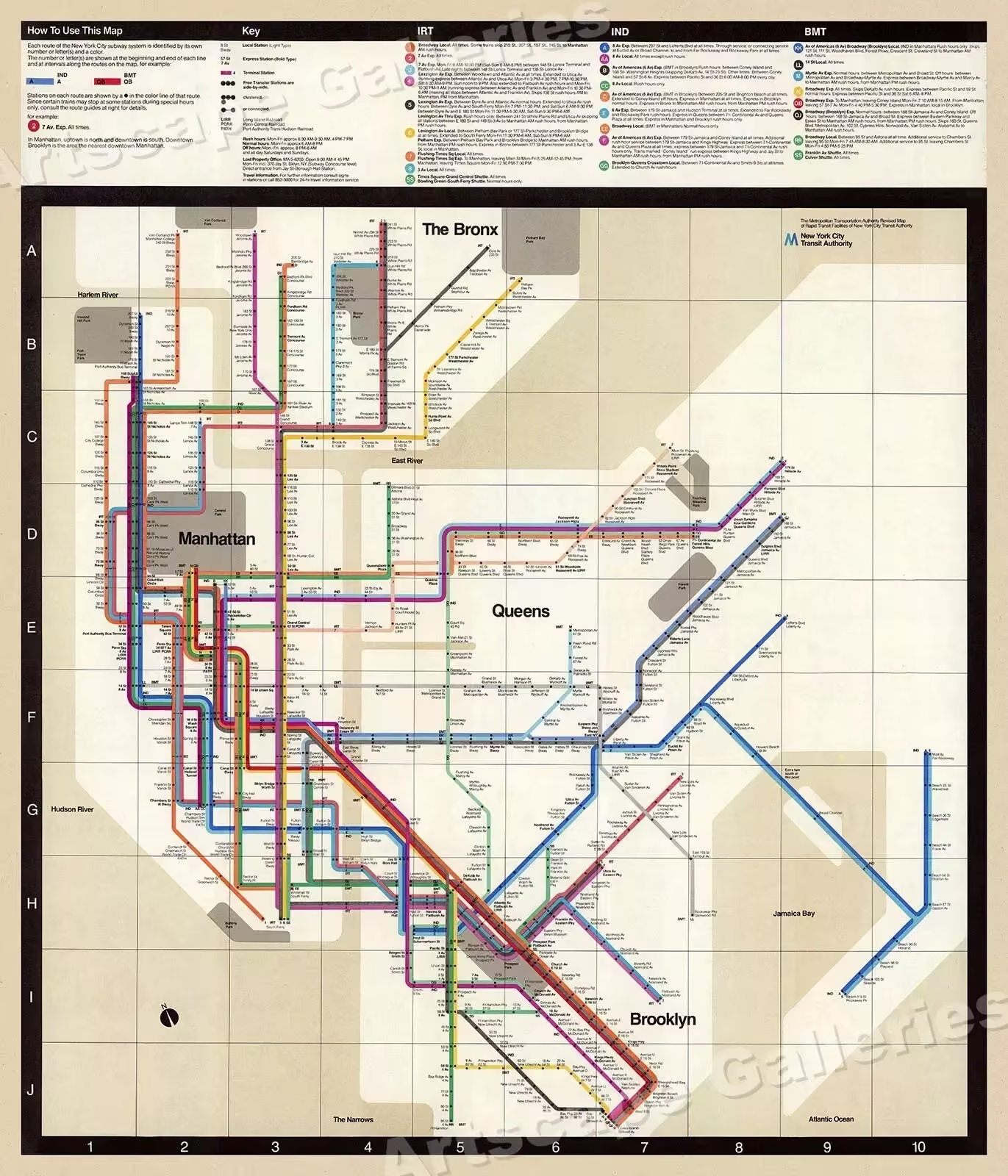
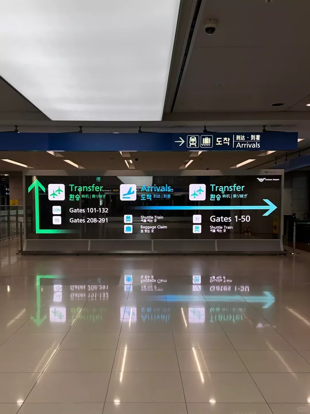
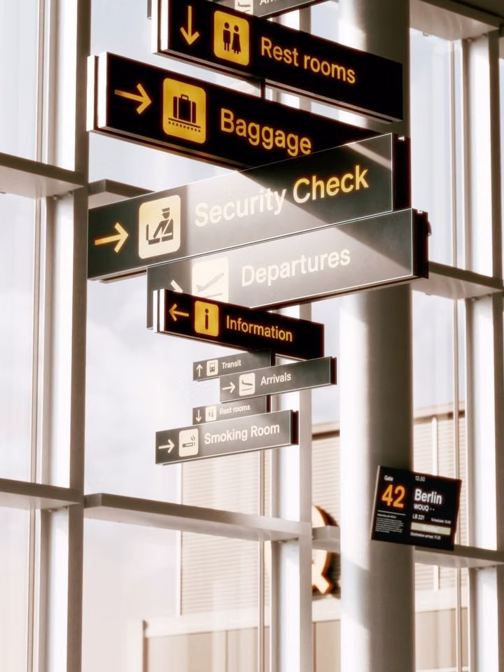
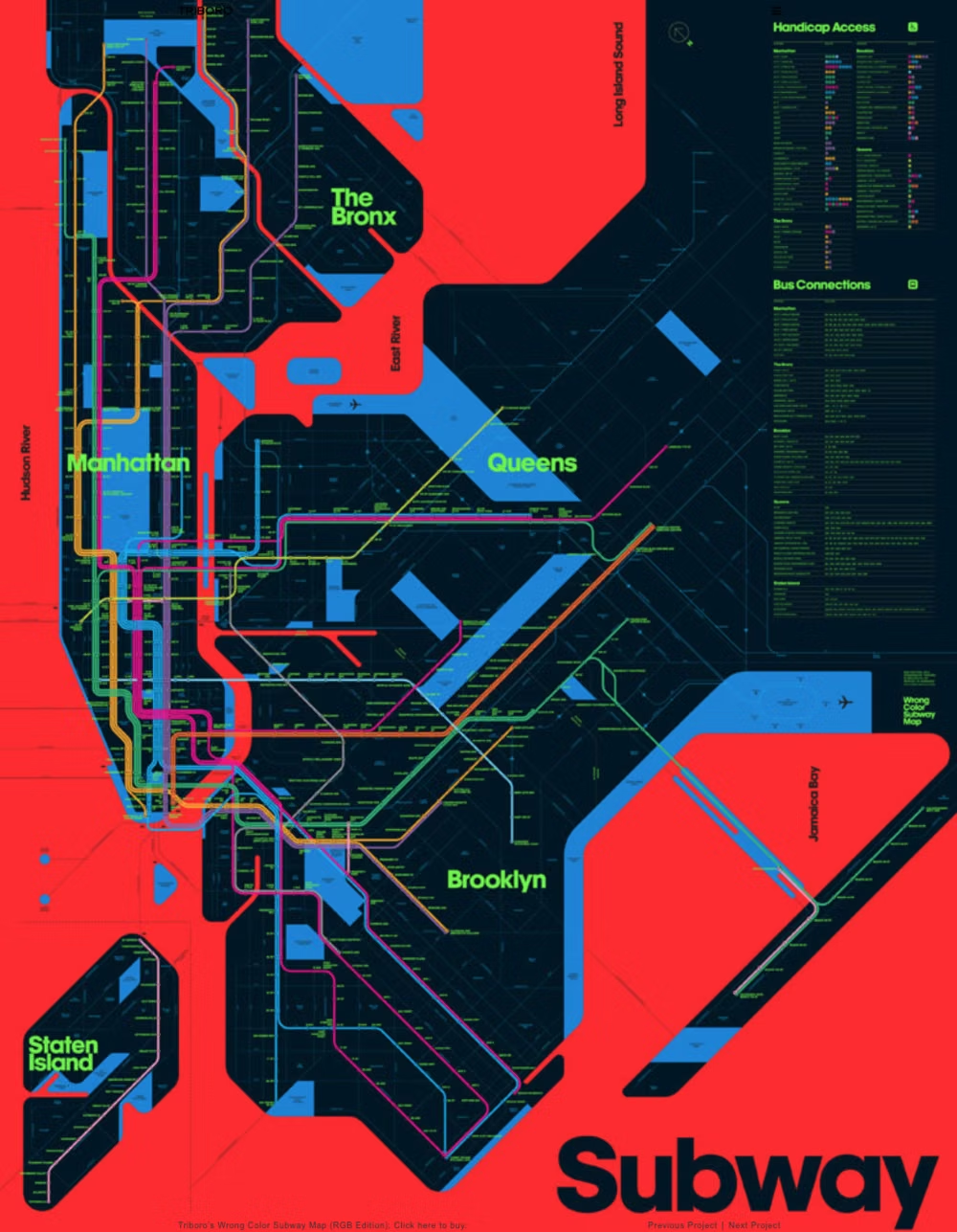
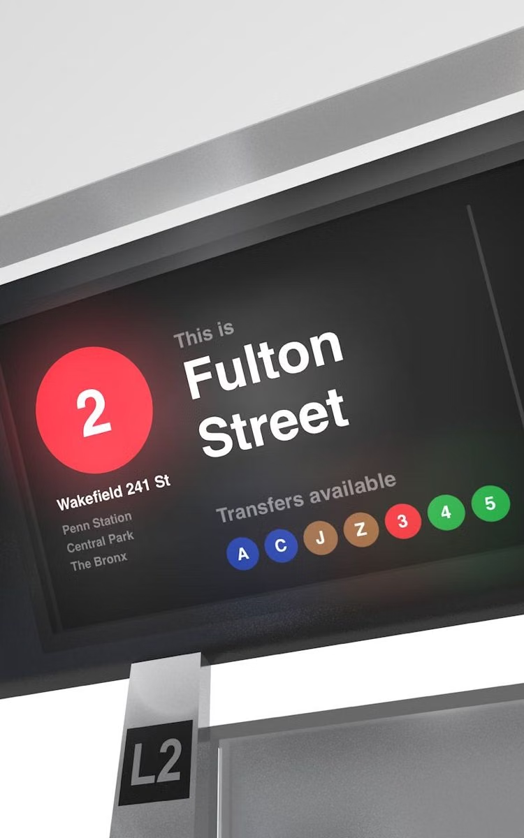
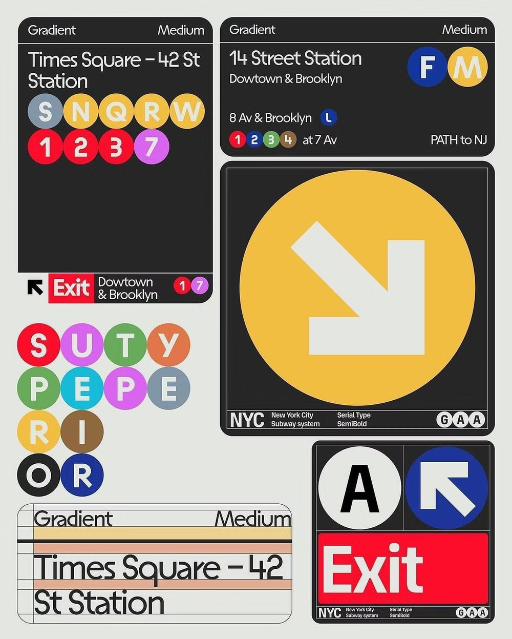
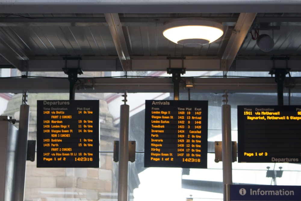
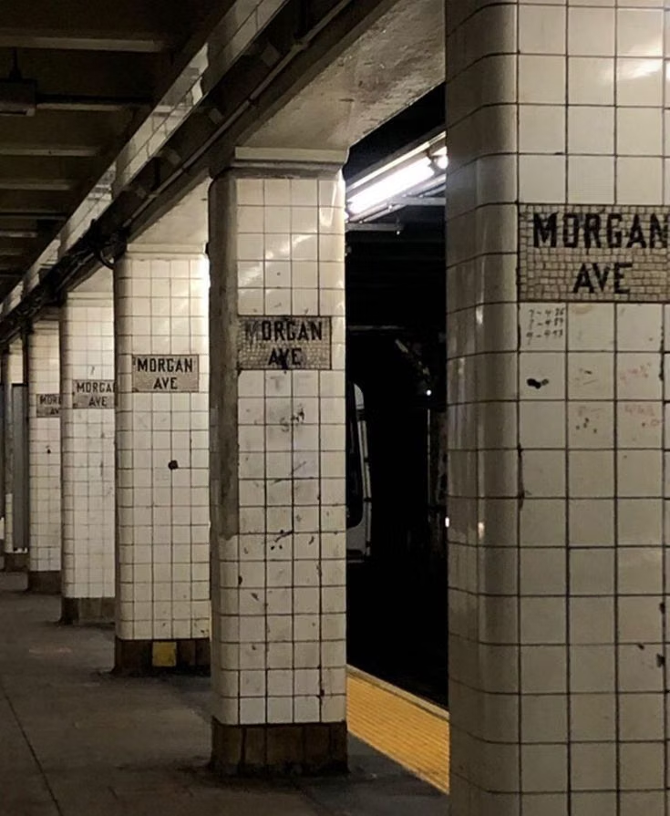
Microsoft developed Metro from earlier work in products such as Windows Media Center and Zune, then made it the defining language of Windows Phone 7 around 2010. The team explicitly drew on the clarity of transport signage: strong typography, motion, flat planes, and content placed ahead of decorative chrome.
Moodboard and visual references
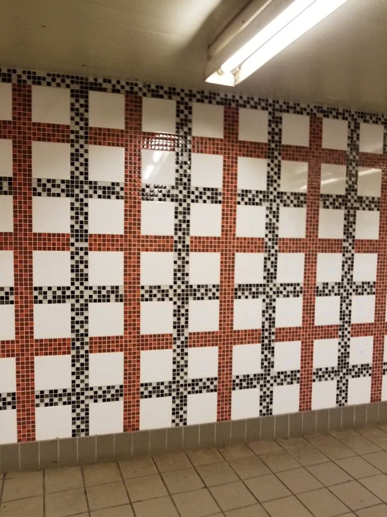
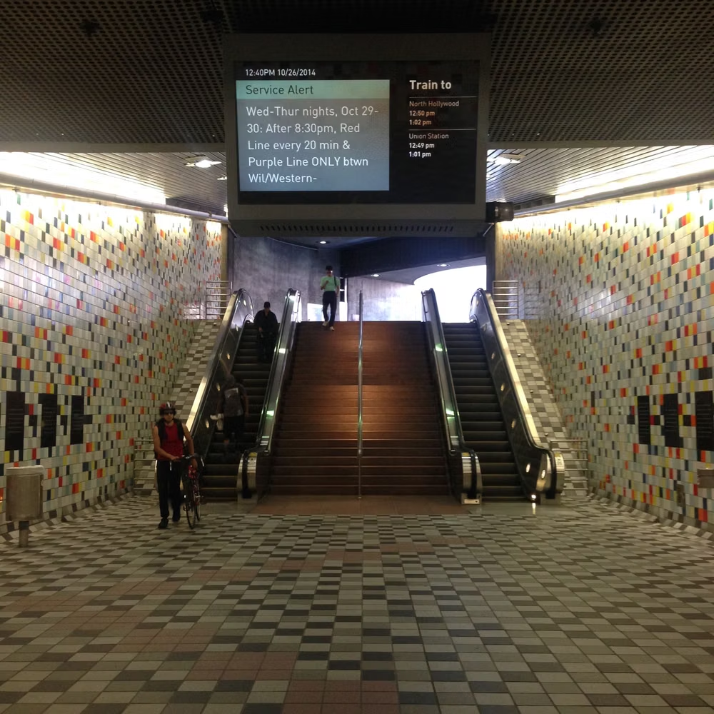
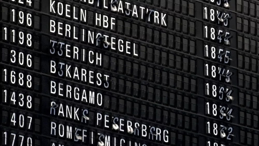
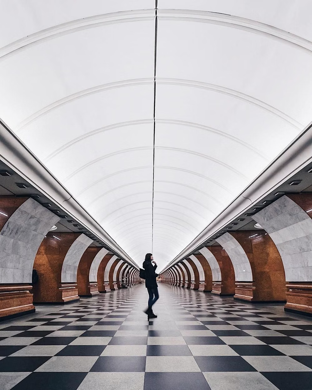
A visual study of the forms, inspirations, materials, colors, type, and cultural references associated with this UI design style.
Design principles and implementation
Use these principles to write a focused AI UI design prompt instead of asking for a vague visual treatment.
Color direction
Set large flat accent fields against black, white, or charcoal; use a small set of bold system colors with no atmospheric blending. In a daisyUI theme, use cobalt or cyan for `primary`, a second bold system hue such as magenta or green for `secondary`, and set `base-100`, `base-200`, and `base-300` to crisp white, light gray, and charcoal in a light scheme or tightly stepped charcoals in a dark one.
Imagery direction
Crop photography edge to edge inside tiles, favor direct subject framing, and let captions or large type sit beside images rather than on decorative frames.
Content density
Present many destinations at once but keep each tile internally spare, using scale and alignment to make the information map immediately scannable.
Motion direction
Use lateral pivots, panoramic scrolling, and staggered tile entrances that reinforce the horizontal information architecture.
Shape language
Keep tiles square or rectangular with sharp corners, flush edges, and minimal borders; let proportion replace ornament. In daisyUI themes, set the `--radius-*` variables to `0` or `0.25rem`.
Typography rules
Use a light, open sans-serif at dramatic sizes for navigation and headlines, align text flush left, and treat type as the primary interface graphic.
Suggested Typfaces
Source Sans 3
Fresh daisies glow in warm sunlight
Fresh daisies glow in warm sunlight
1 2 3 4 5 6 7 8 9 0
Open Sans
Fresh daisies glow in warm sunlight
Fresh daisies glow in warm sunlight
1 2 3 4 5 6 7 8 9 0
Archivo
Fresh daisies glow in warm sunlight
Fresh daisies glow in warm sunlight
1 2 3 4 5 6 7 8 9 0
Roboto Condensed
Fresh daisies glow in warm sunlight
Fresh daisies glow in warm sunlight
1 2 3 4 5 6 7 8 9 0
Barlow
Fresh daisies glow in warm sunlight
Fresh daisies glow in warm sunlight
1 2 3 4 5 6 7 8 9 0
Build a Metro / Modern UI interface with daisyUI
The live example translates this direction into daisyUI components and semantic theme tokens.
To generate a full page in the same visual language, give the style name and the design rules above to Blueprint MCP.
Related UI design styles
Compare nearby visual languages that share typography, shapes, use cases, or signature elements.
Swiss Style UI design style
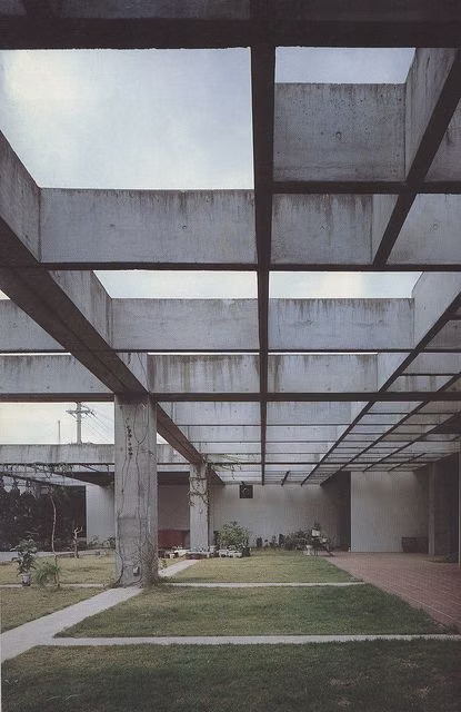
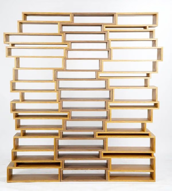
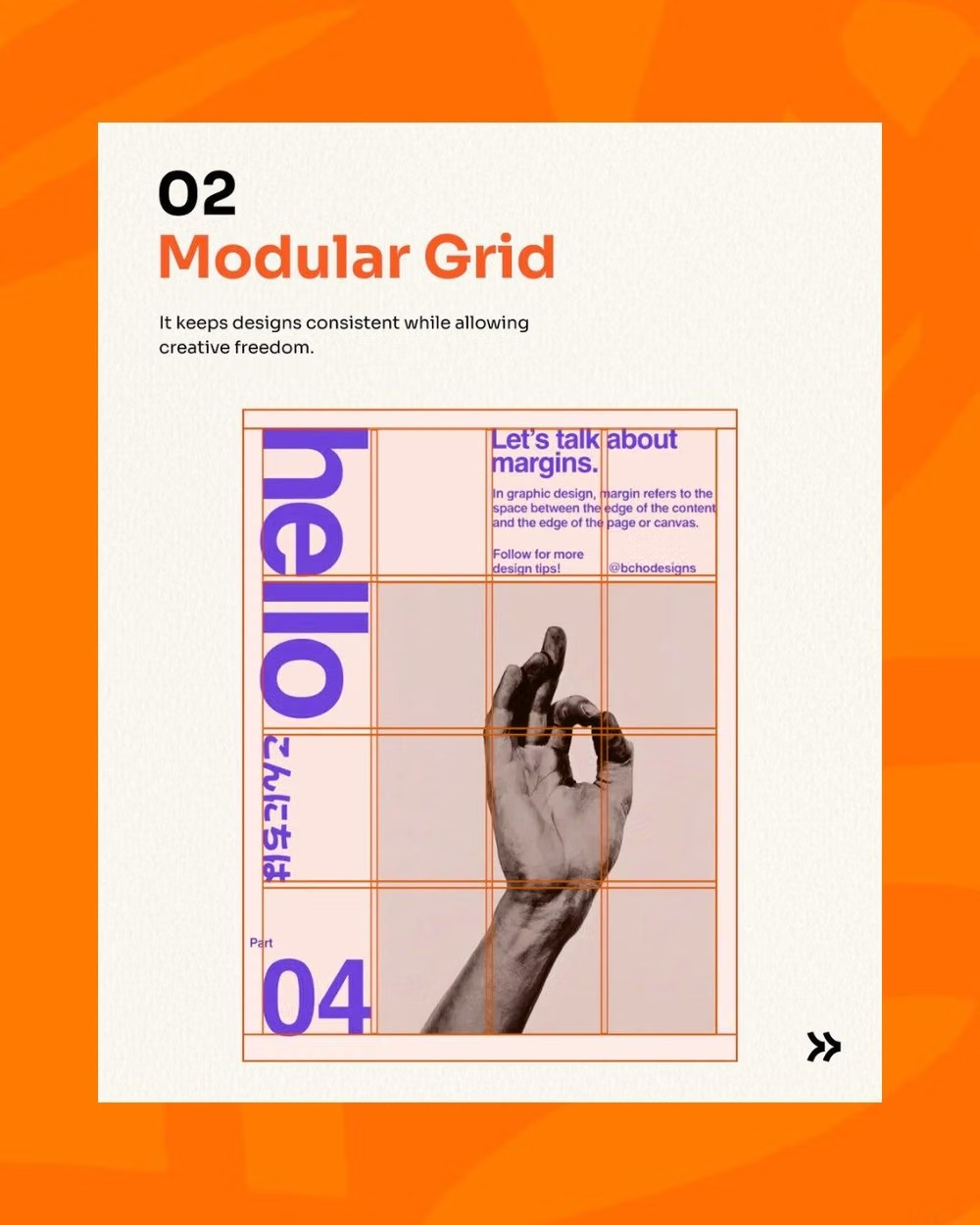
Strict grids, generous whitespace, sans-serif typography, asymmetry, and objective information hierarchy.
Gen-X Soft Club UI design style
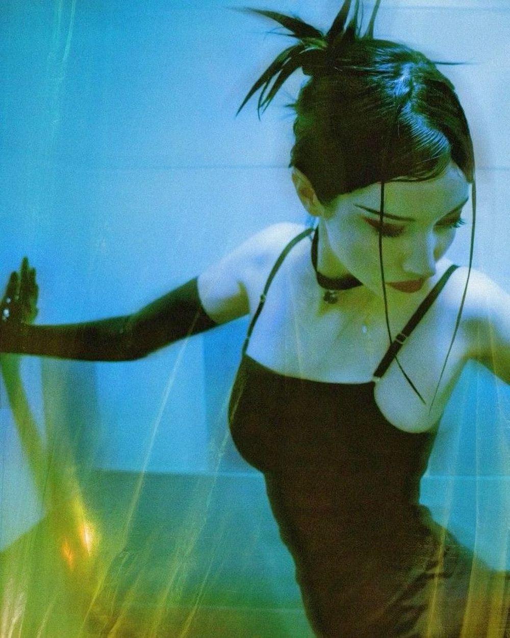
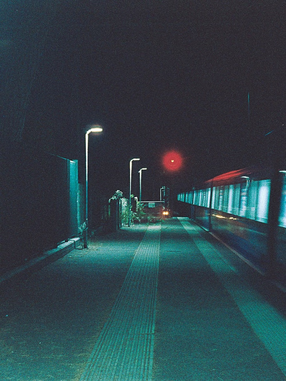
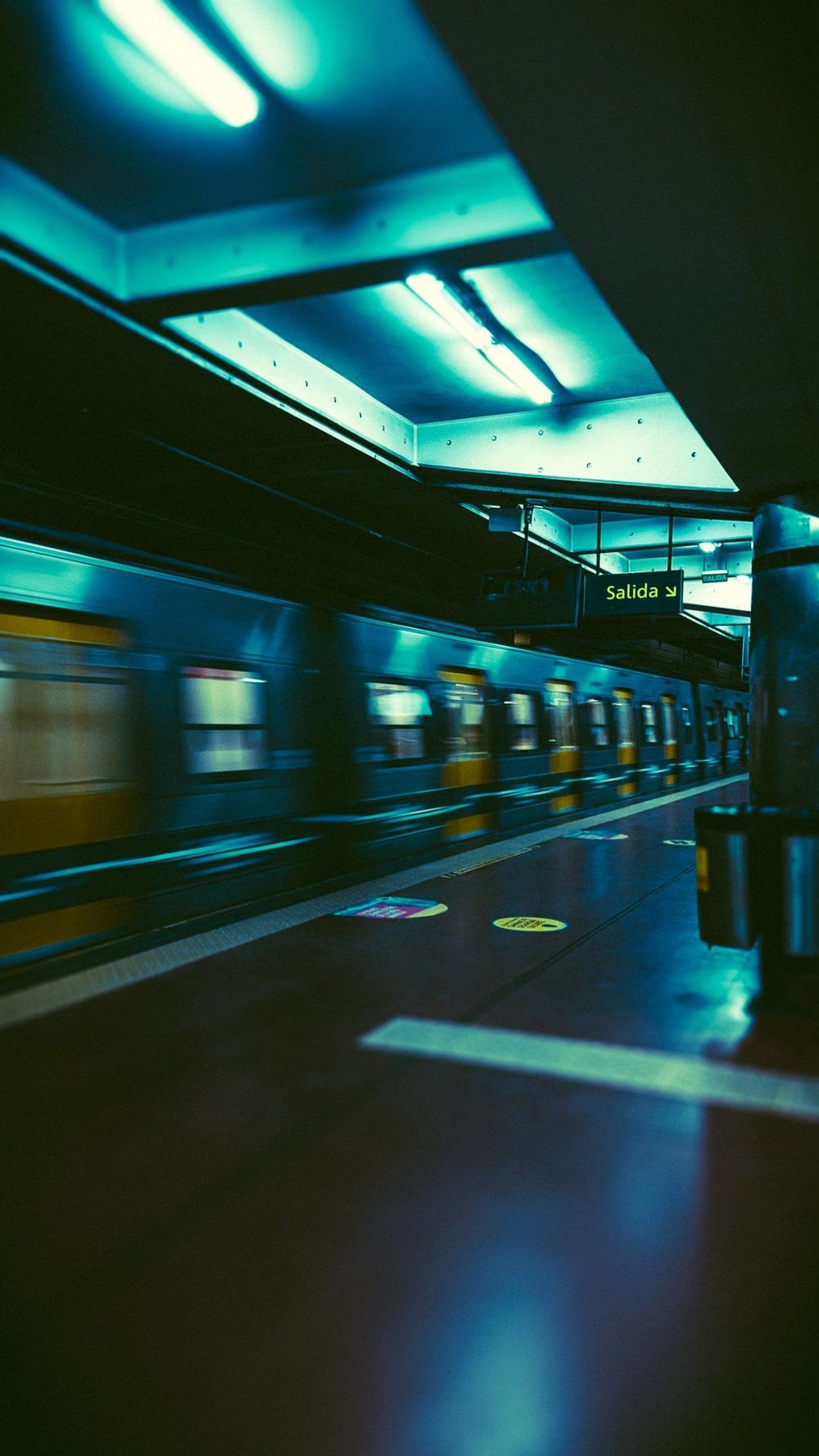
Late-1990s and early-2000s urban futurism softens Y2K gloss through muted color, minimalist typography, blurred photography, and a sterile-meets-organic mood.
2K1 UI design style
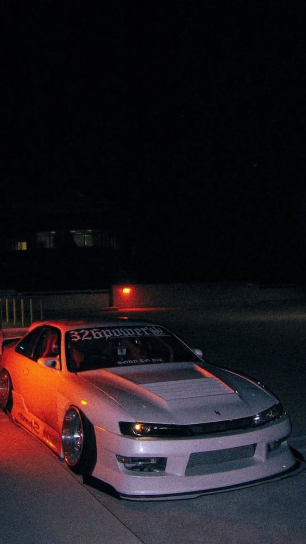
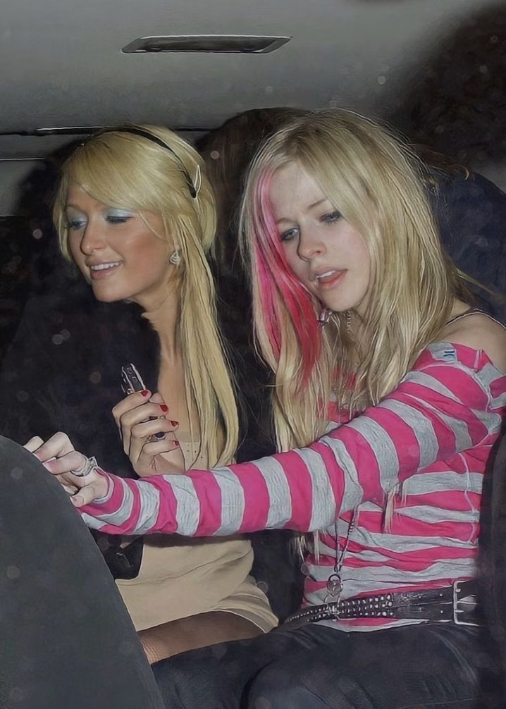
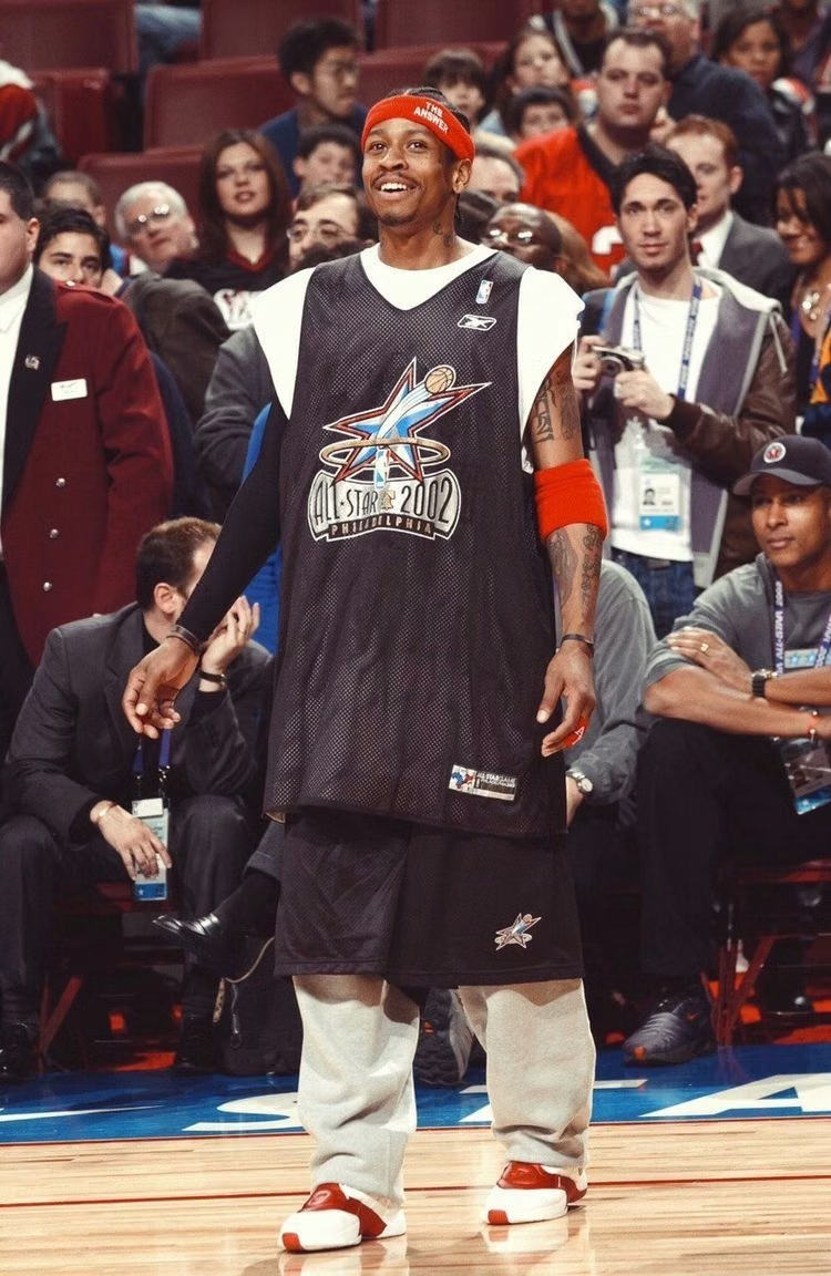
This 2001–2004 transitional pop-cultural look mixes late-Y2K clarity with dirtier hip-hop, sports, nu-metal, teen-comedy, and early-McBling attitude.