Claymorphism UI design style
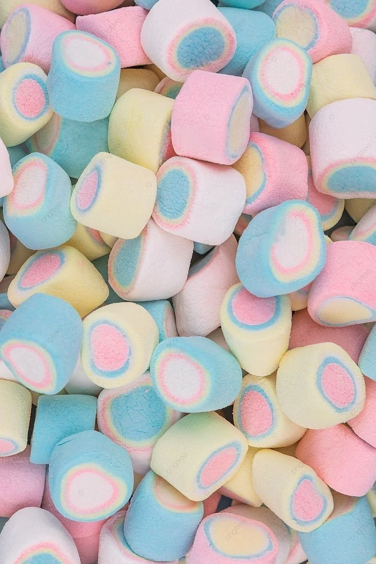
Inflated, clay-like components with pastel colors, large radii, soft shading, and playful dimensional shadows.

Design overview
- Signature elements
- inflated components, soft three-dimensional shading, pastel palette, oversized radii, chunky icons, toy-like depth. In daisyUI themes, set `--depth: 1;`.
- Best suited to
- Education, onboarding, creative tools, and playful consumer products.
- Layout principles
- Build simple centered scenes from a few chunky modules, leave room around each object, and use floating clusters rather than tight dashboard grids.
History and origins
A fact-checked account of where this visual language came from, with links to the references used.
- Period
- Around 2021–early 2020s
- Origin
- Online UI and 3D illustration communities
Claymorphism is a contemporary interface label, not a historic art movement. It appeared around 2021 as designers combined rounded 3D illustration, toy-like volume, and soft skeuomorphic lighting after a decade dominated by flat UI; the term is commonly attributed to designer Michał Malewicz, though its distributed visual development makes a single artistic origin difficult to prove.
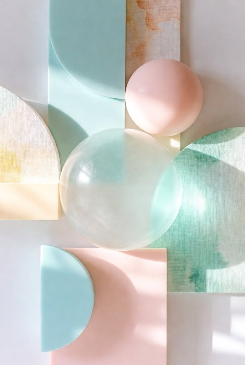
Moodboard and visual references
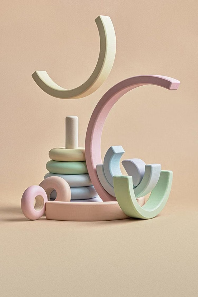
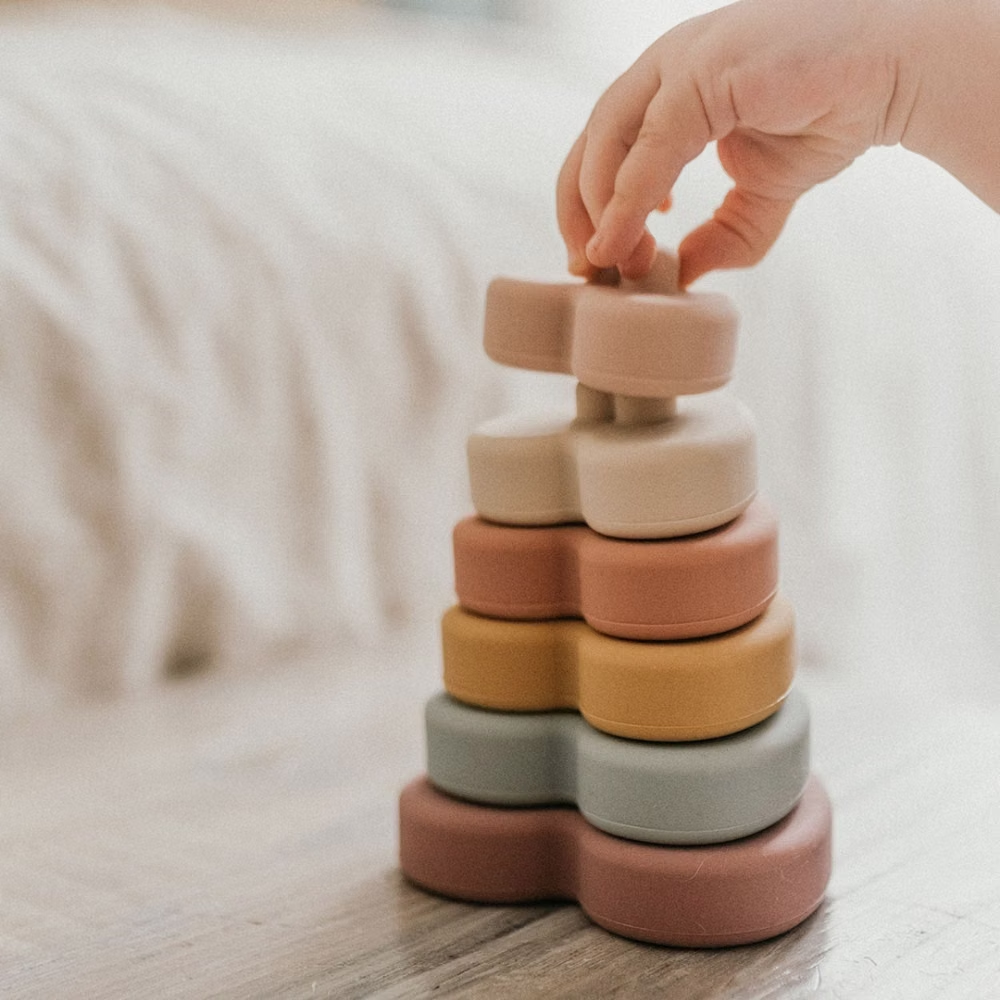
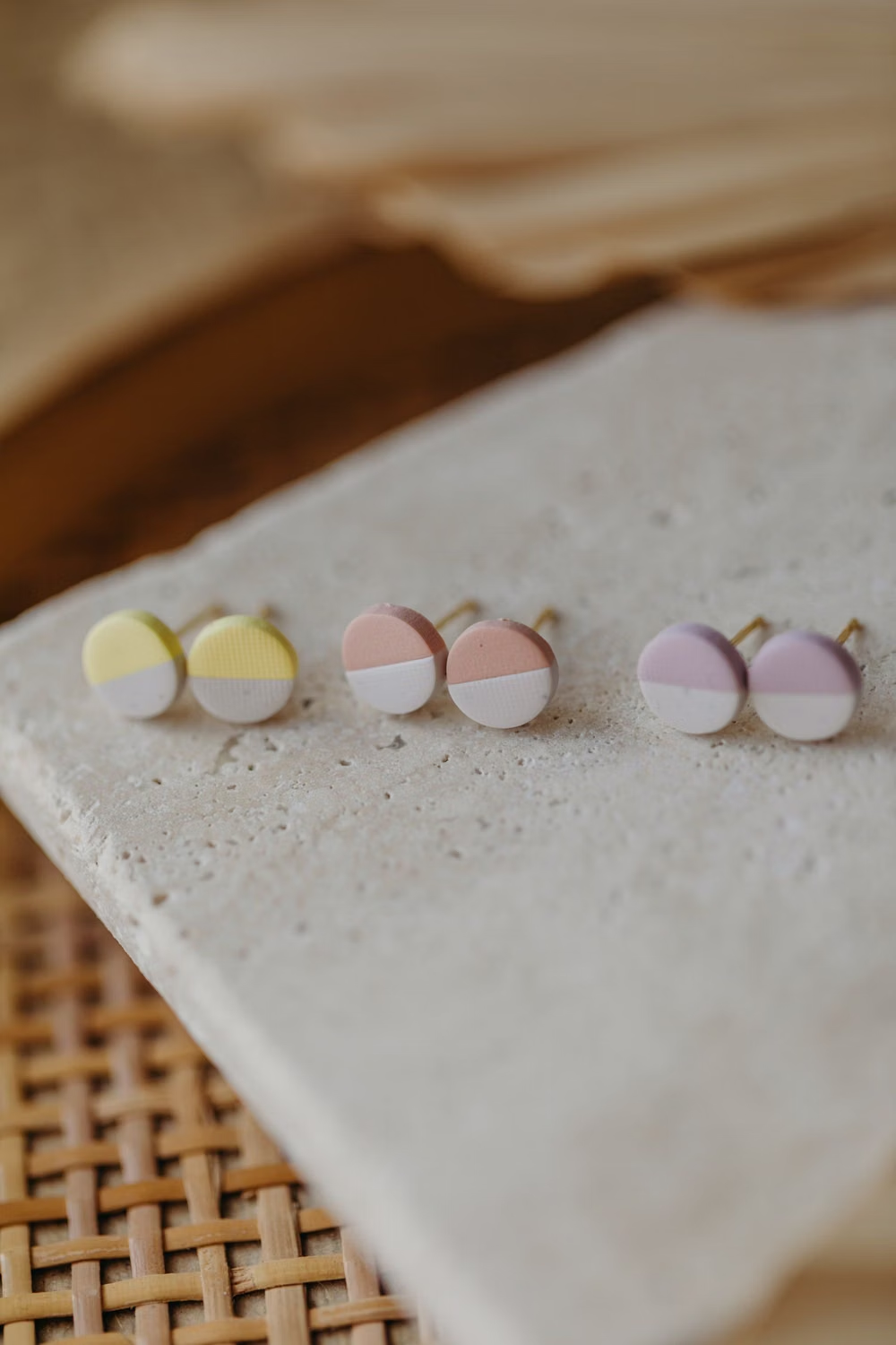
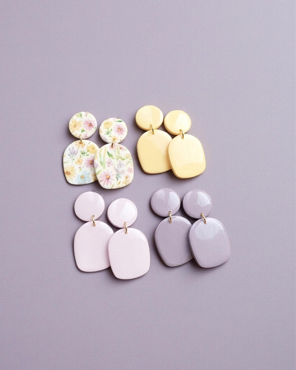
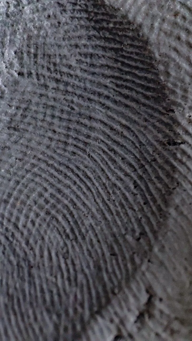
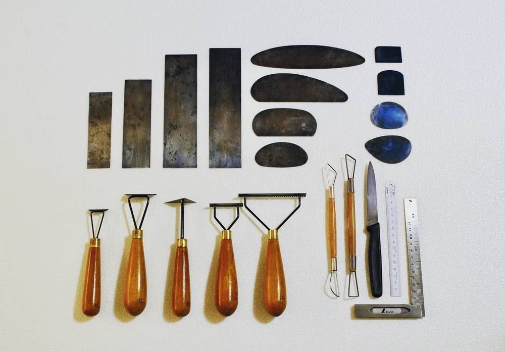
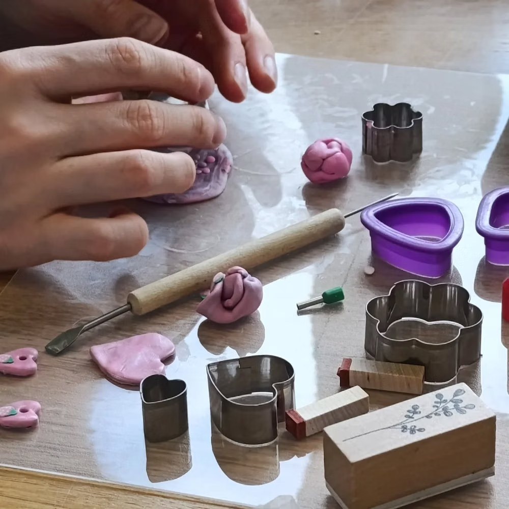
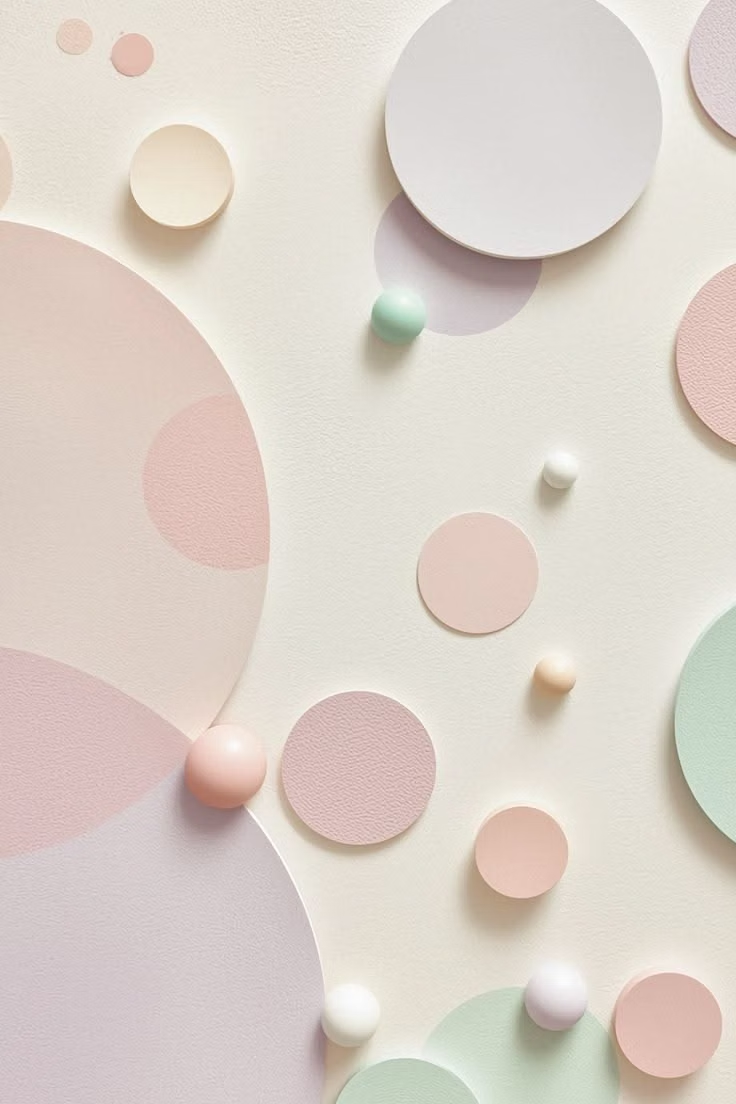
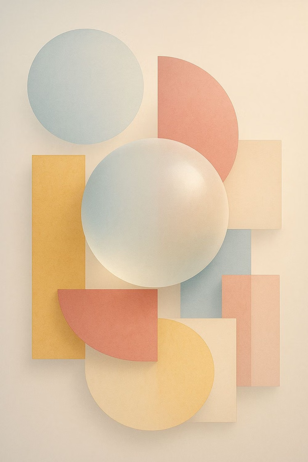
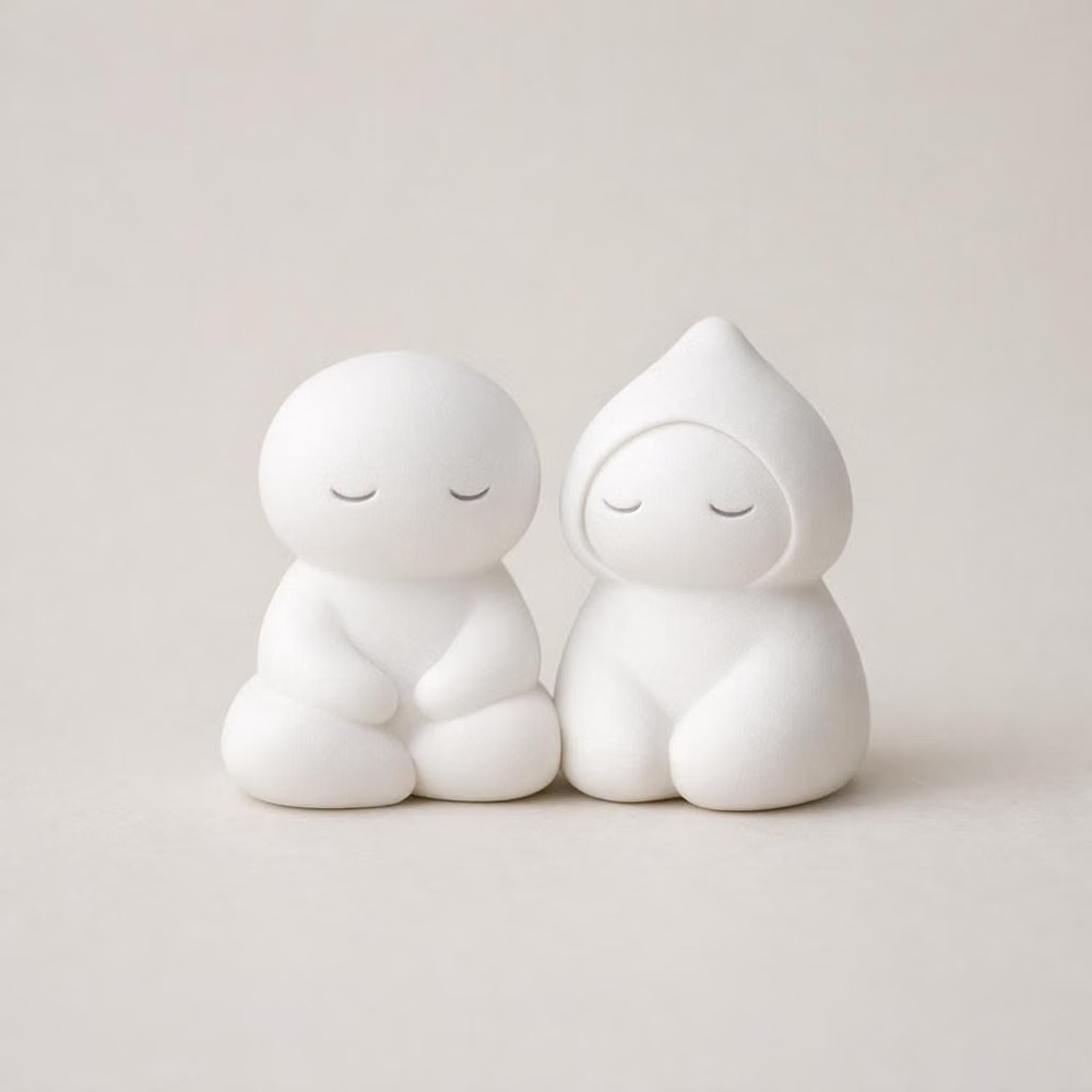
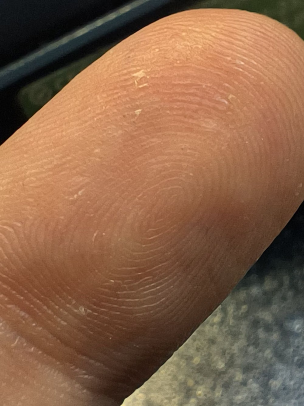
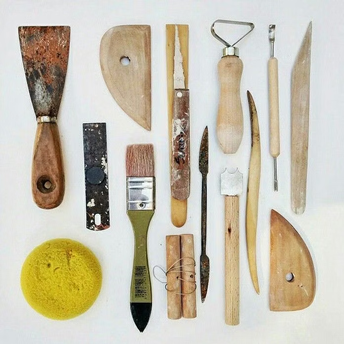
A visual study of the forms, inspirations, materials, colors, type, and cultural references associated with this UI design style.

Design principles and implementation
Use these principles to write a focused AI UI design prompt instead of asking for a vague visual treatment.
Color direction
Combine two or three soft pastel families with warm shaded sides and dark readable text; reserve the brightest clay color for the active object. In a daisyUI theme, use the brightest peach, lilac, or sky clay hue for `primary`, a complementary soft pastel for `secondary`, and set `base-100`, `base-200`, and `base-300` to creamy, gently tinted, progressively shaded surfaces.
Imagery direction
Use modeled clay characters, soft three-dimensional icons, and toy-like objects with matte surfaces and consistent studio lighting.
Content density
Keep density low to medium, using one friendly task or lesson per cluster and short supporting copy. Use the `*-lg` size variants for daisyUI components to reinforce the chunky, informal scale.
Motion direction
Use buoyant lifts, soft squash and stretch, and gentle bounce on success while keeping repeated motion slow and sparse.
Shape language
Favor inflated blobs, thick capsules, rounded cubes, and oversized radii with soft side shading instead of sharp borders. In daisyUI themes, set the `--radius-*` variables between `1rem` and `2rem`.
Typography rules
Pair rounded, heavy display lettering with a simpler friendly sans-serif; keep headings short so their playful mass does not crowd controls.
Suggested Typfaces
Fredoka
Fresh daisies glow in warm sunlight
Fresh daisies glow in warm sunlight
1 2 3 4 5 6 7 8 9 0
Baloo 2
Fresh daisies glow in warm sunlight
Fresh daisies glow in warm sunlight
1 2 3 4 5 6 7 8 9 0
Nunito
Fresh daisies glow in warm sunlight
Fresh daisies glow in warm sunlight
1 2 3 4 5 6 7 8 9 0
M PLUS Rounded 1c
Fresh daisies glow in warm sunlight
Fresh daisies glow in warm sunlight
1 2 3 4 5 6 7 8 9 0
Sniglet
Fresh daisies glow in warm sunlight
Fresh daisies glow in warm sunlight
1 2 3 4 5 6 7 8 9 0
Build a Claymorphism interface with daisyUI
The live example translates this direction into daisyUI components and semantic theme tokens.
To generate a full page in the same visual language, give the style name and the design rules above to Blueprint MCP.
Related UI design styles
Compare nearby visual languages that share typography, shapes, use cases, or signature elements.
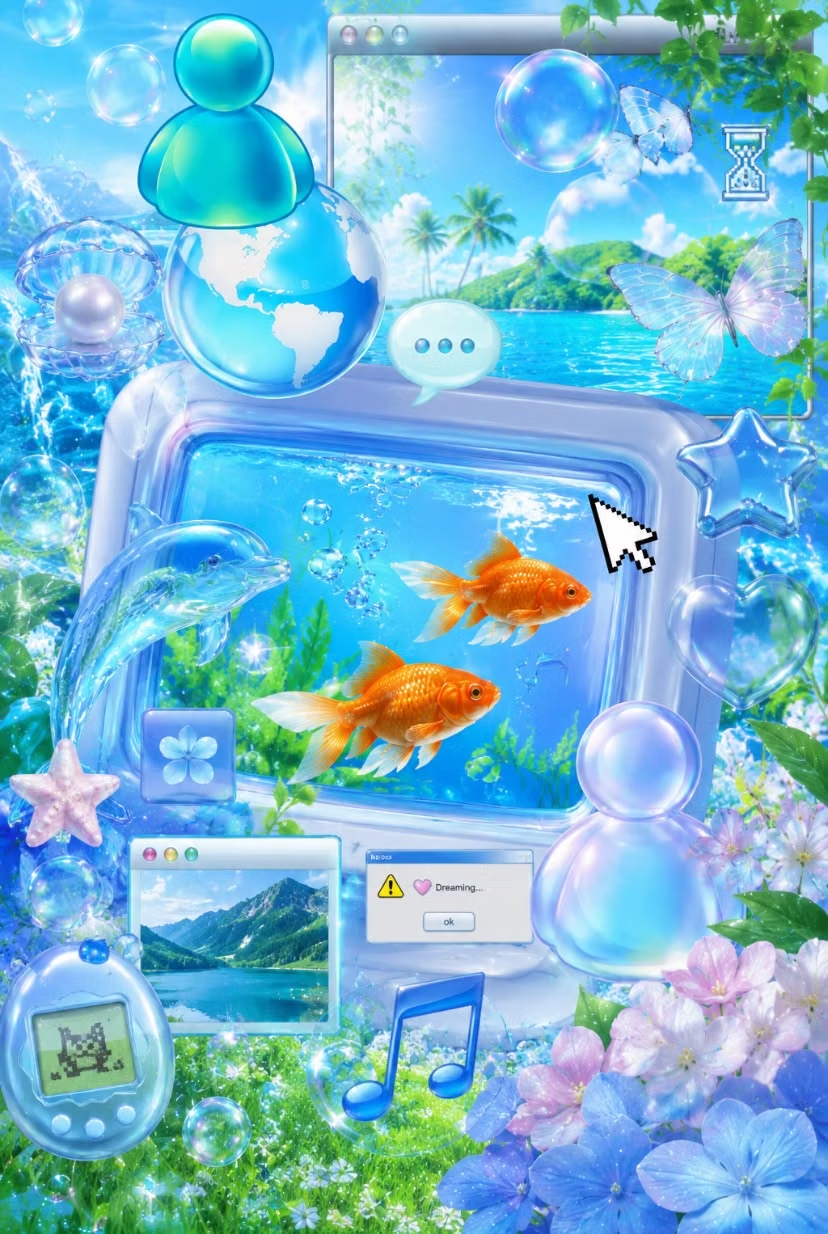
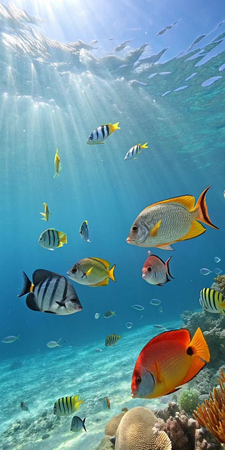

Frutiger Aero UI design style
Glossy blue-and-green visuals combine skeuomorphic interfaces, glassy controls, water, bubbles, open skies, nature, and optimistic technology.
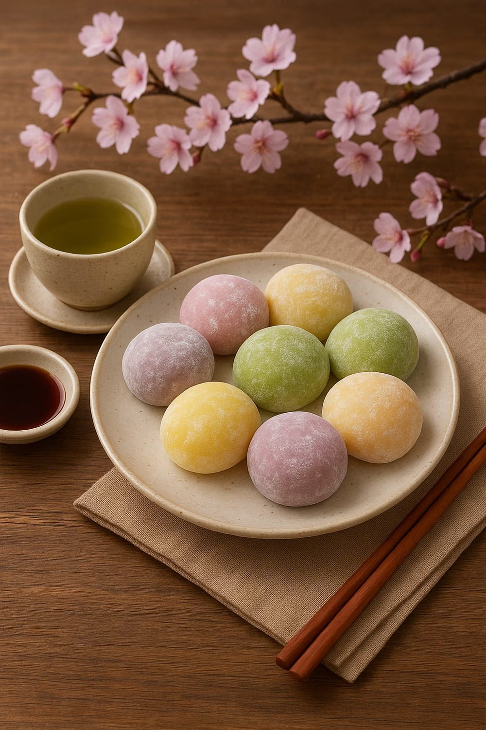
Kawaii UI design style
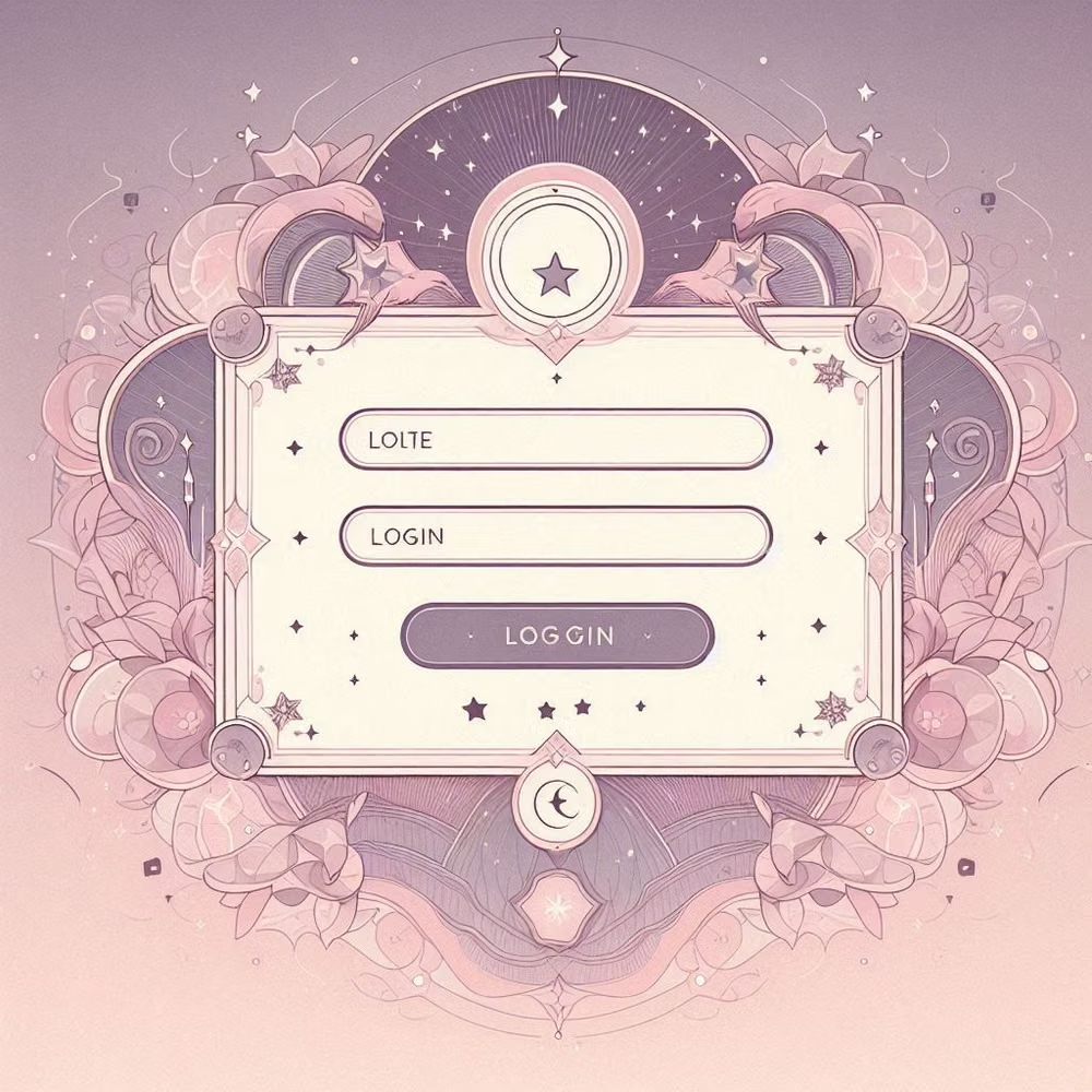
Cute characters, rounded shapes, soft colors, expressive icons, and cheerful decorative details.
Organic / Blob Design UI design style
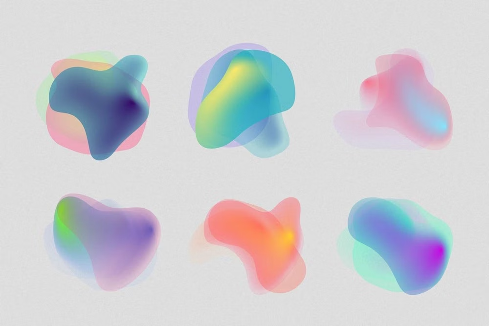
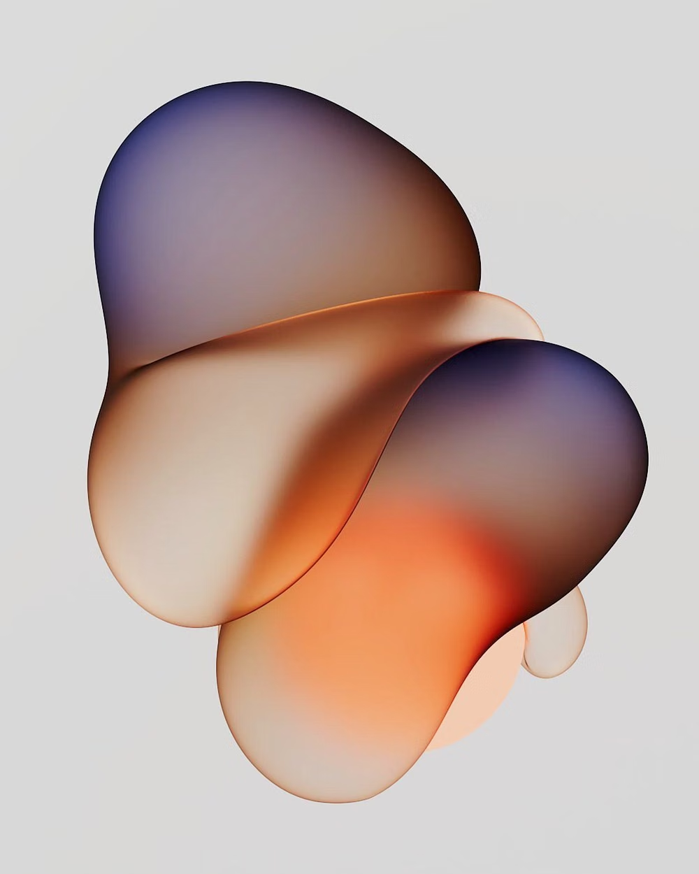
Fluid silhouettes, asymmetric curves, soft blobs, rounded containers, and freeform compositions replace rigid geometry.