Frutiger Aero UI design style
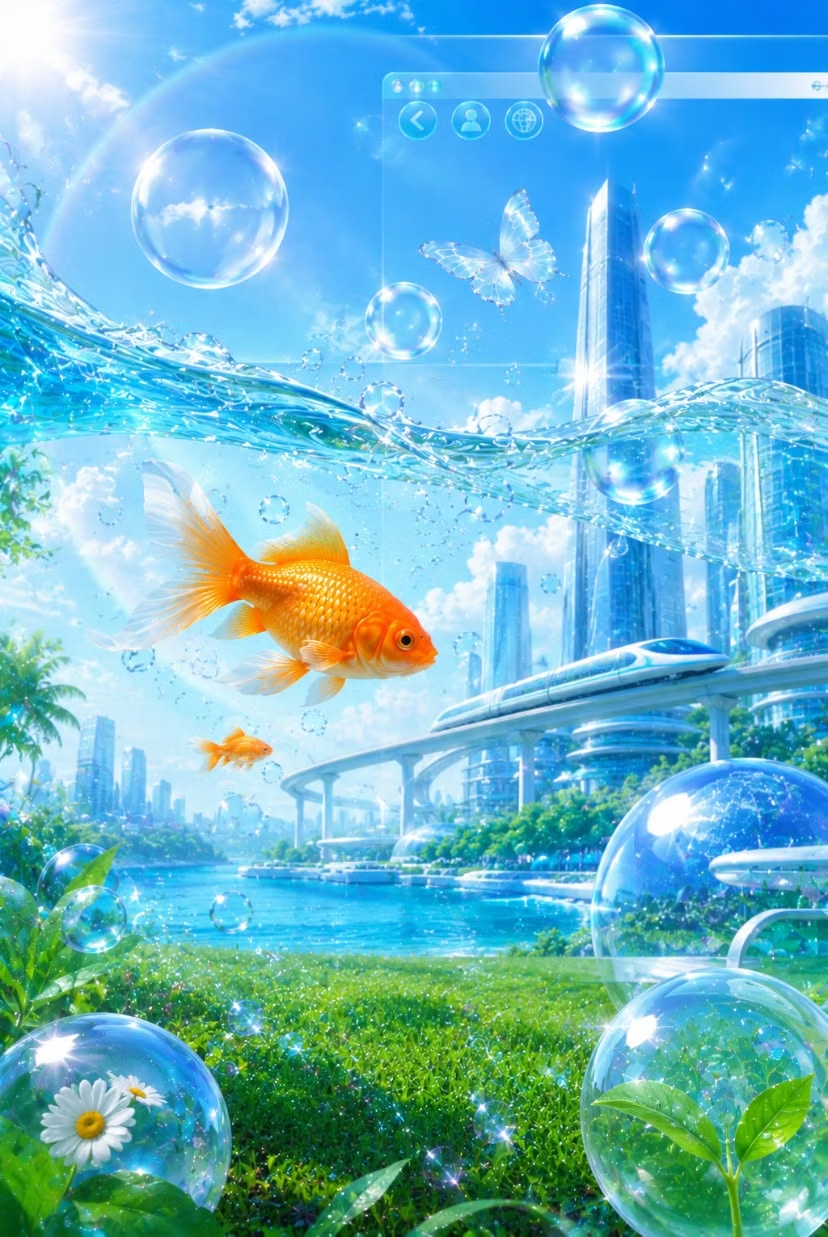
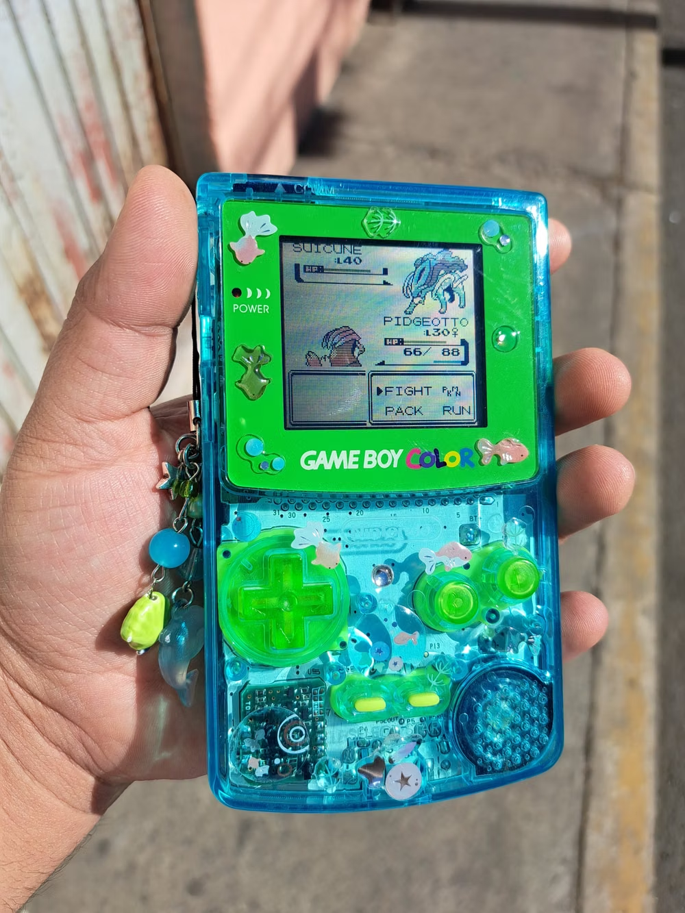
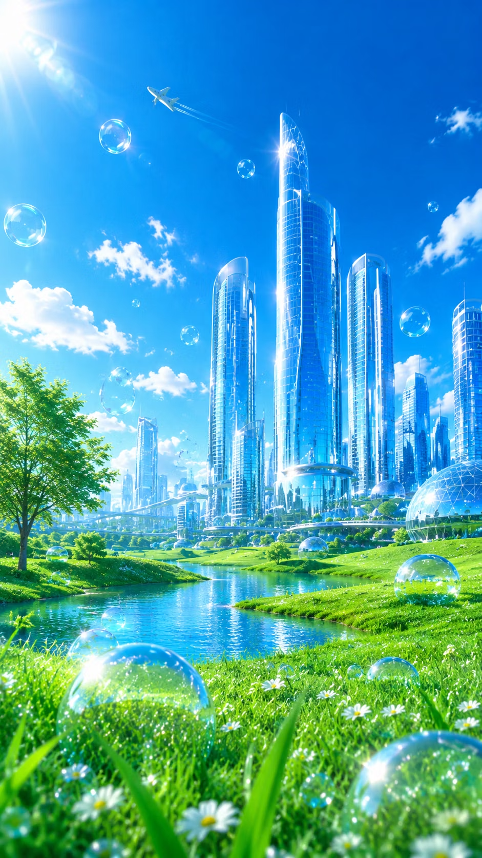
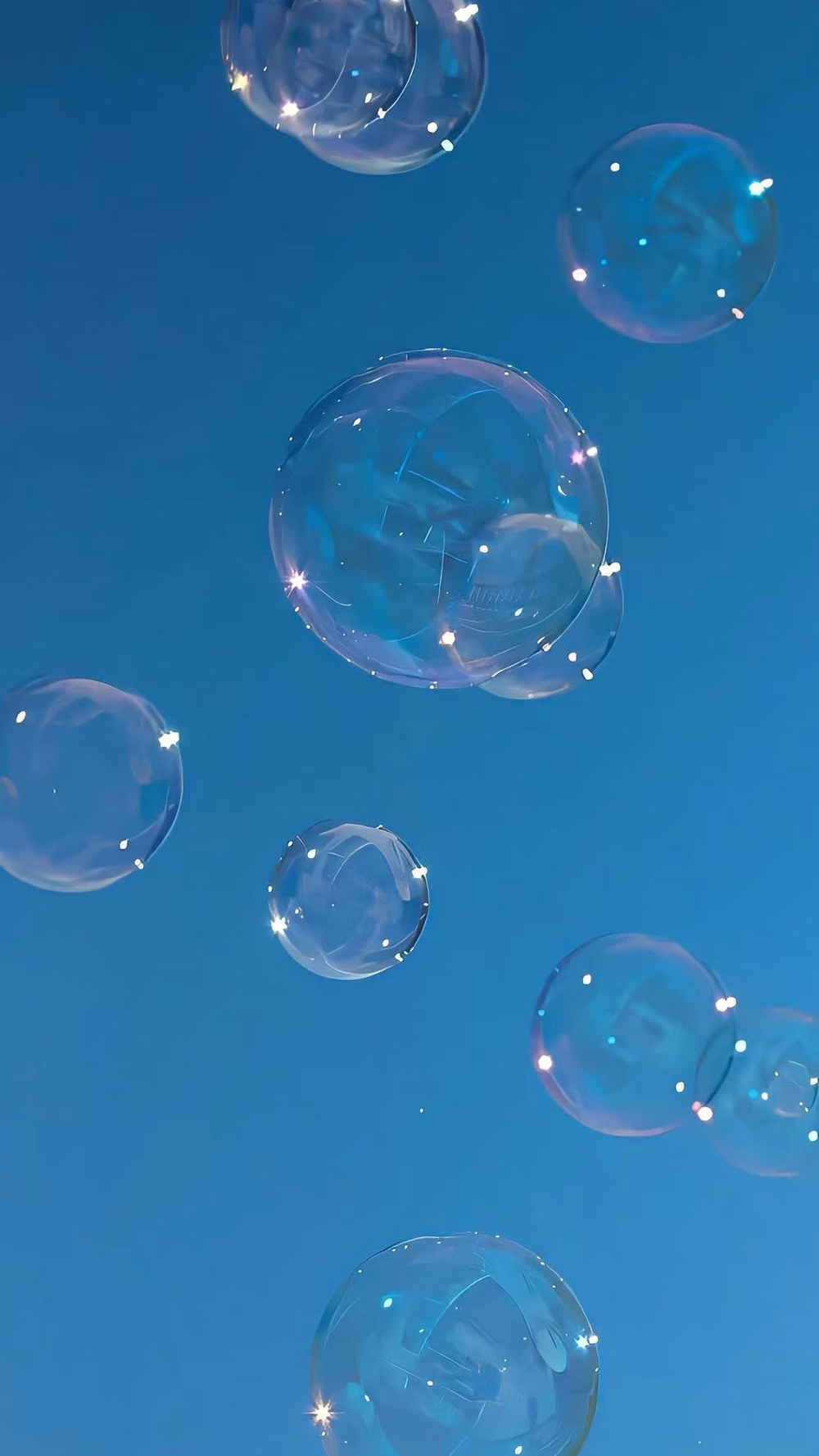
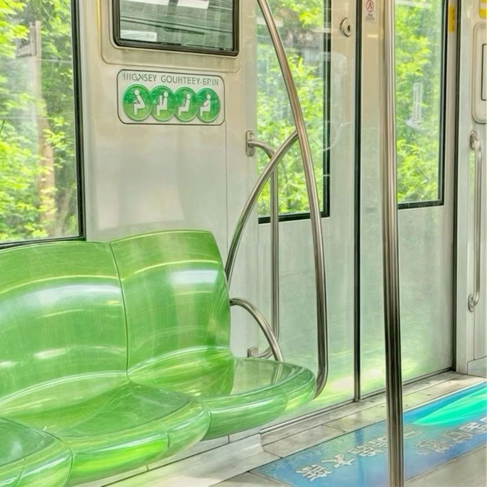
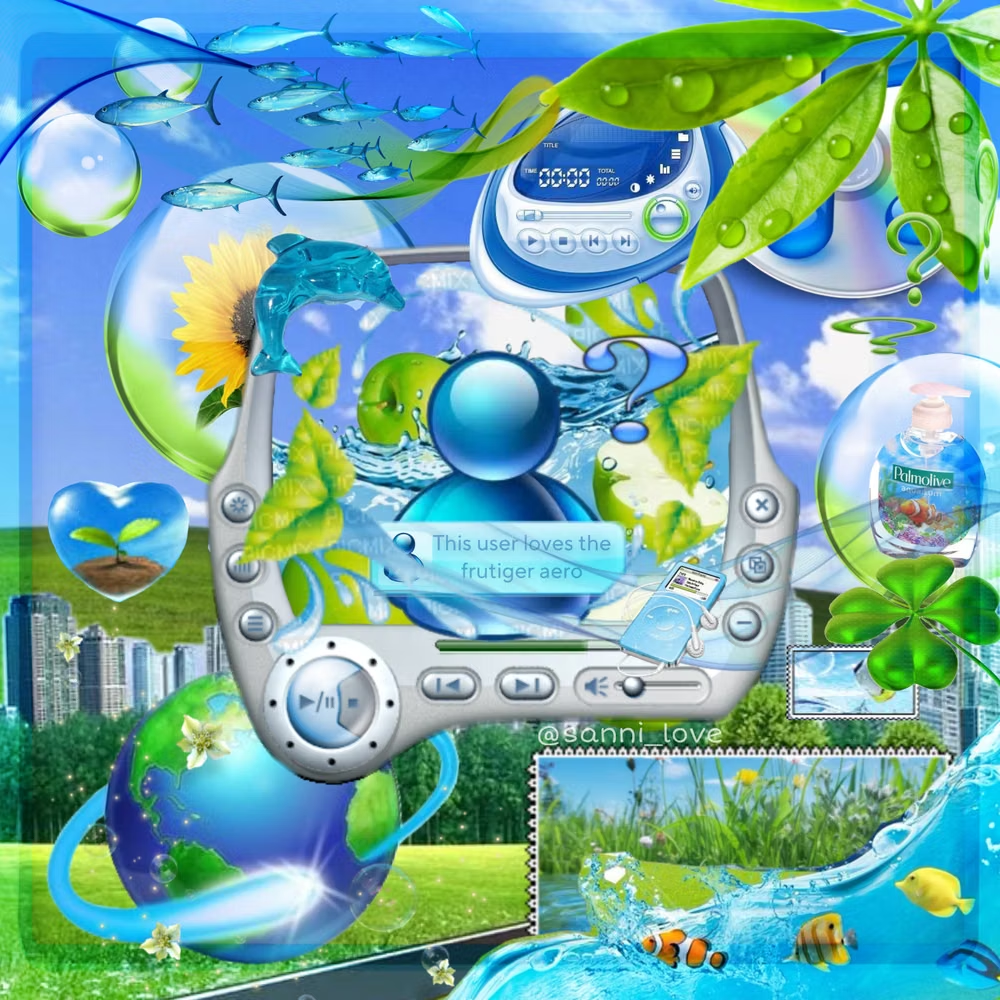
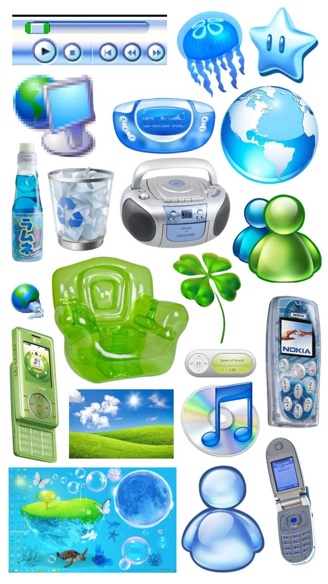
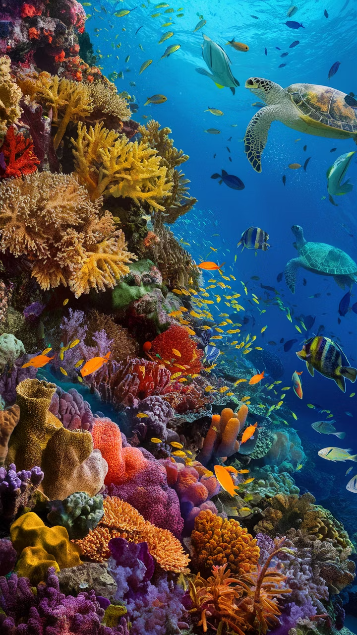
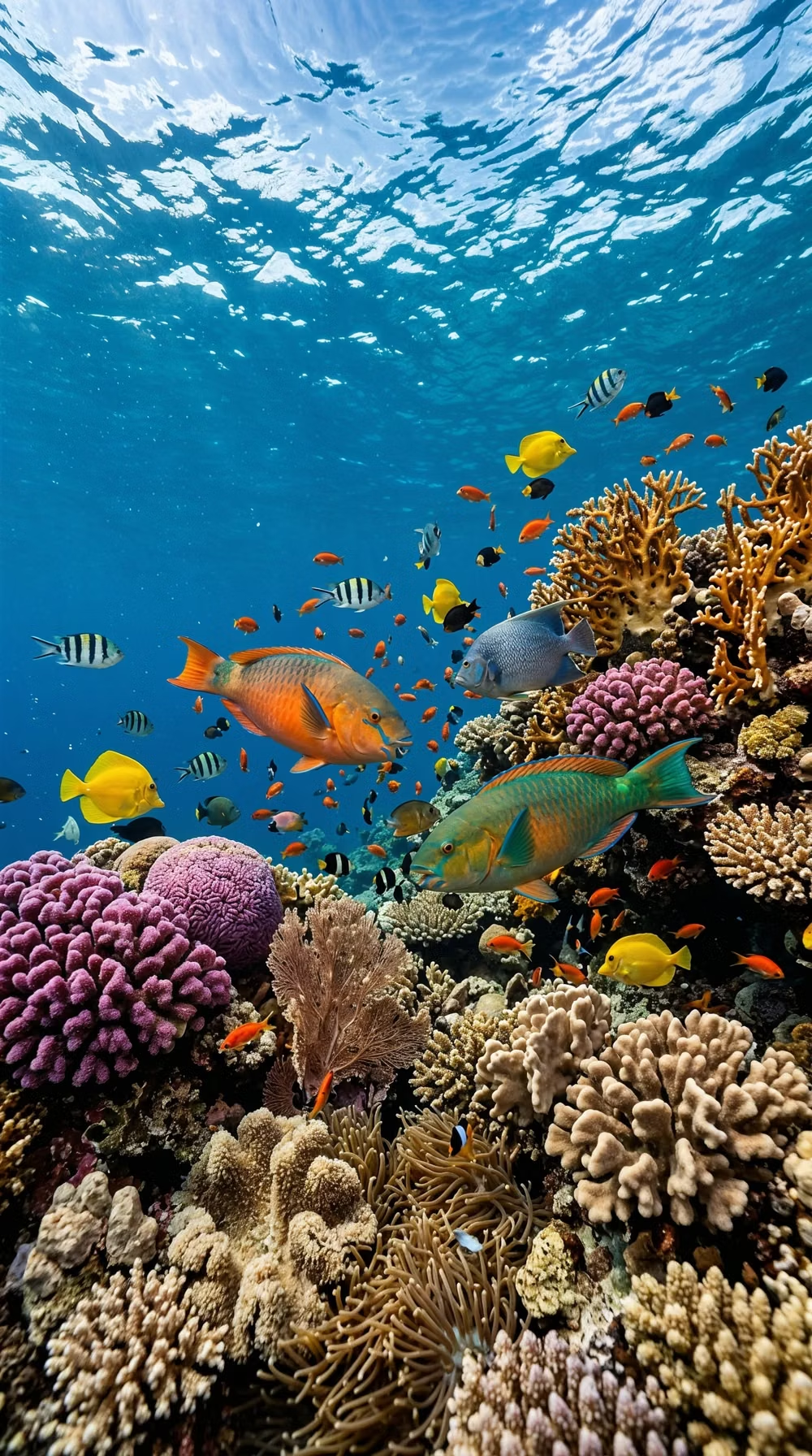
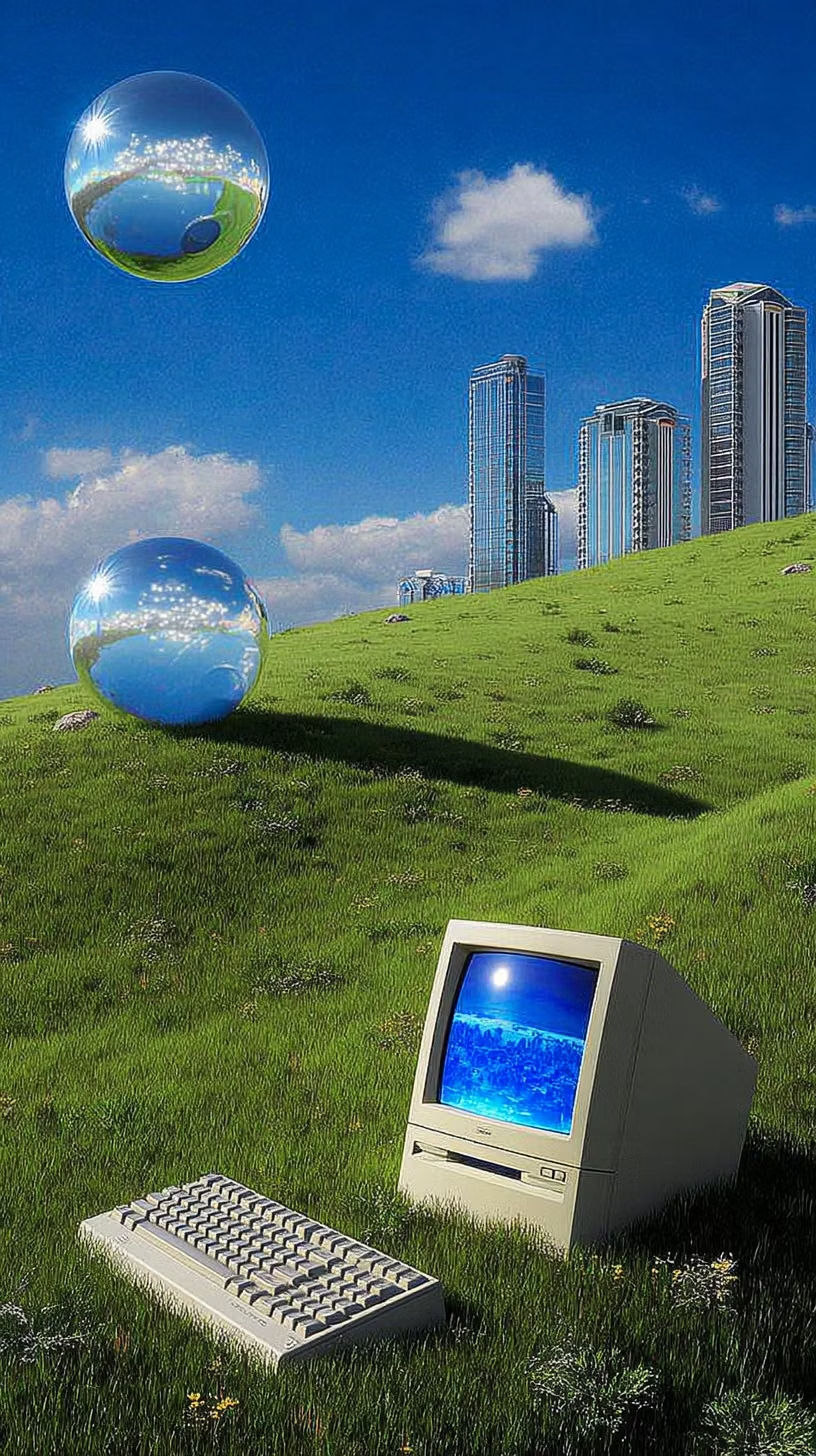
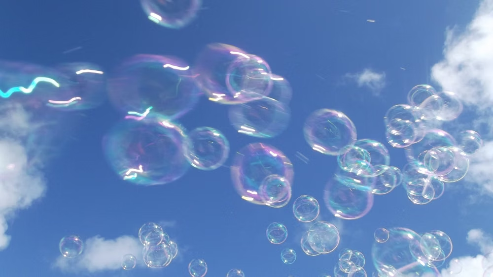
Glossy blue-and-green visuals combine skeuomorphic interfaces, glassy controls, water, bubbles, open skies, nature, and optimistic technology.
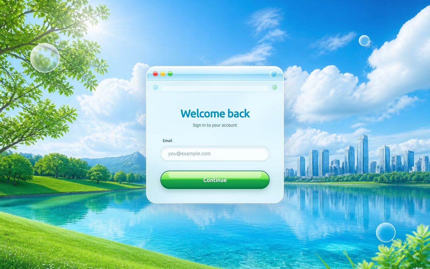
Design overview
- Signature elements
- blue-green palette, glossy controls, bubbles and water, open skies, lush grass, optimistic technology. In daisyUI themes, set `--depth: 1;`.
- Best suited to
- Nostalgic campaigns, eco-tech products, playful utilities, and youth experiences.
- Layout principles
- Combine glossy utility panels with open landscape depth, using clear toolbars, friendly modules, and broad sky or water scenes behind the interface.
History and origins
A fact-checked account of where this visual language came from, with links to the references used.
- Period
- Approximately 2005–2013; name coined retrospectively in 2017
- Origin
- Global operating systems, stock imagery, advertising, and consumer technology
Frutiger Aero describes the glossy skies, grass, water, bubbles, and friendly technology imagery common from the mid-2000s into the early 2010s. CARI records the name as coined by Froyo Tam and Sofi Xian in 2017, combining Adrian Frutiger’s humanist type legacy with Windows Aero; it is therefore a retrospective category, not the period’s own unified design system.
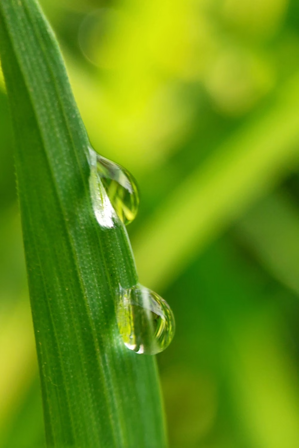
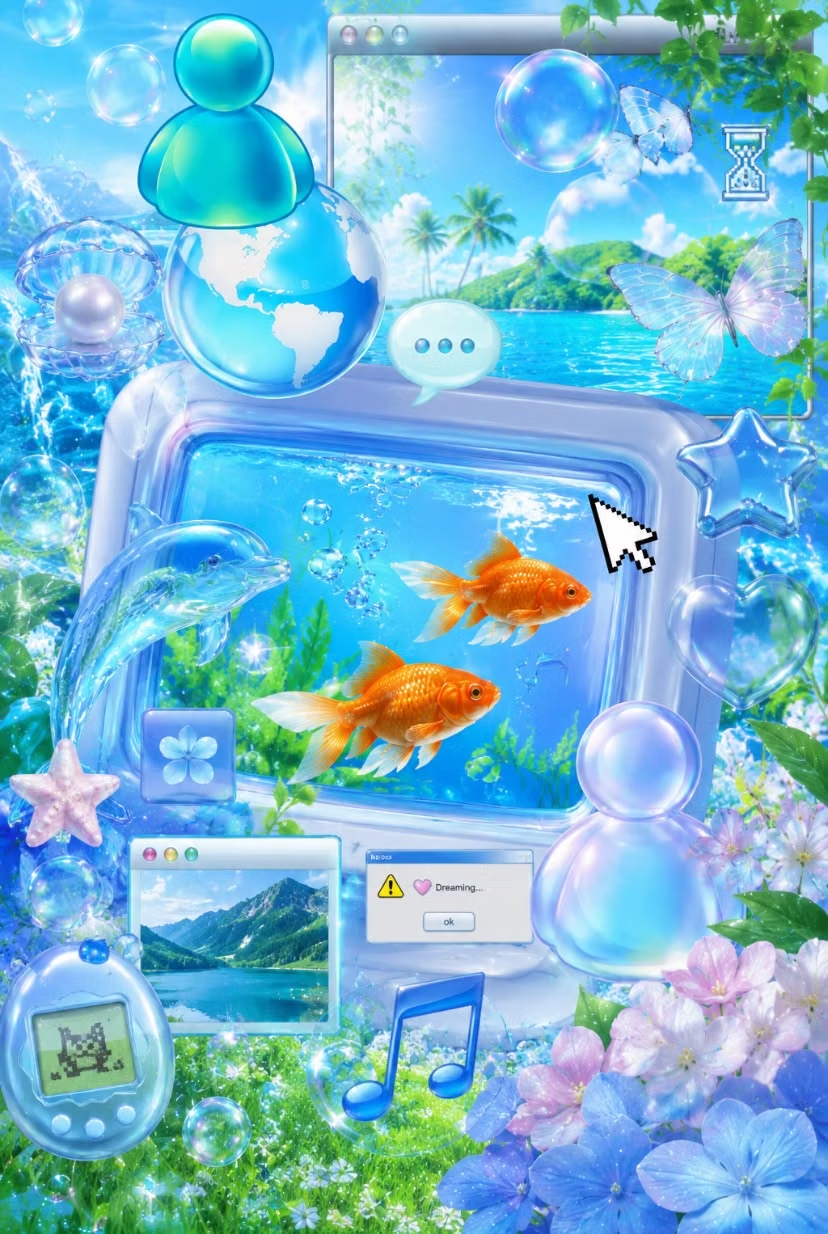
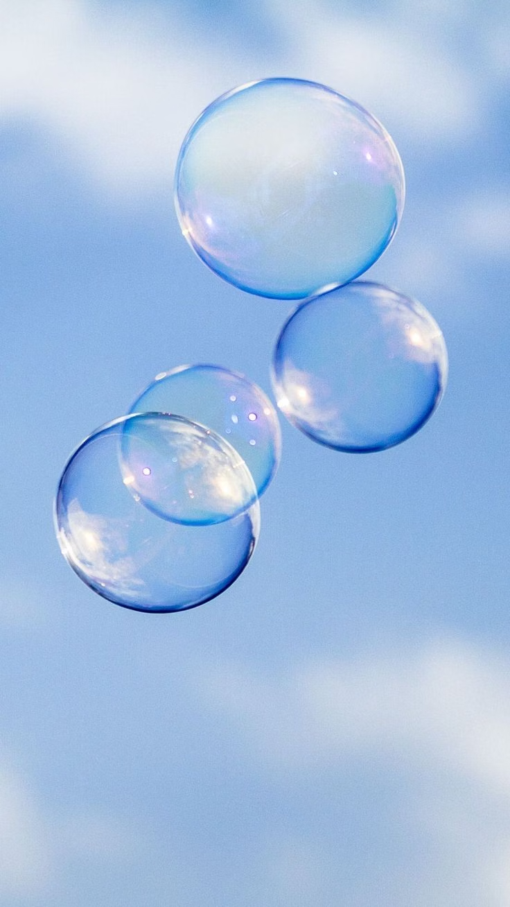
Moodboard and visual references
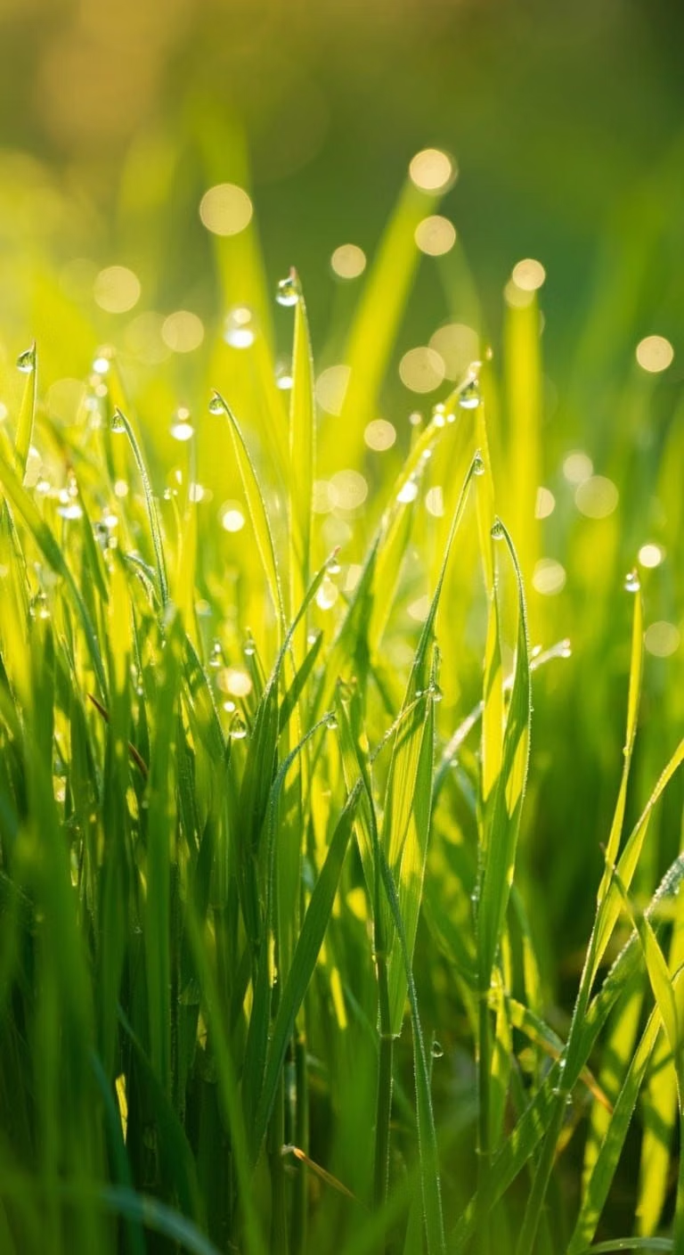
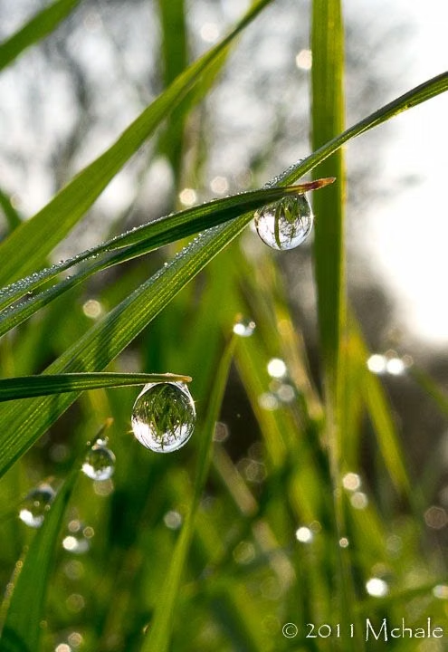
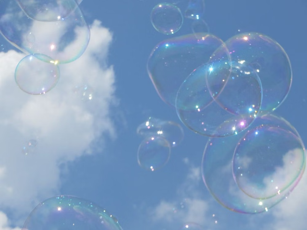
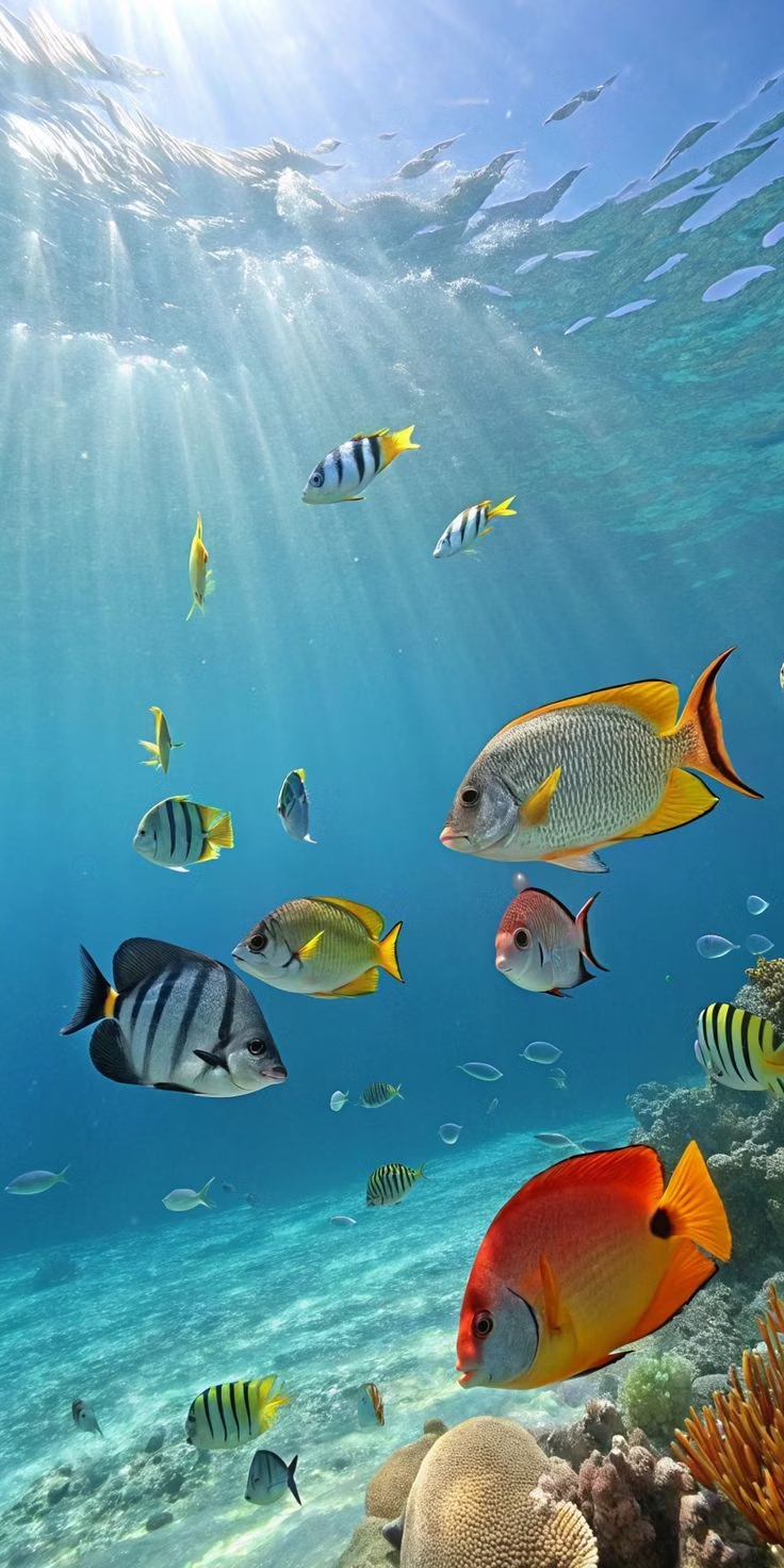
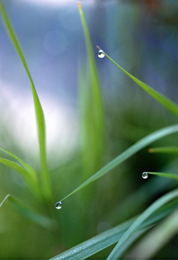
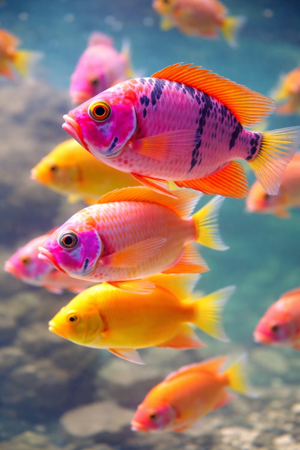
A visual study of the forms, inspirations, materials, colors, type, and cultural references associated with this UI design style.




Design principles and implementation
Use these principles to write a focused AI UI design prompt instead of asking for a vague visual treatment.
Color direction
Use vivid sky blue, grass green, aqua, white, and sunny yellow with glassy gradients, soft shadows, and optimistic high-key lighting. In a daisyUI theme, use vivid sky blue for `primary`, grass green or aqua for `secondary`, and set `base-100`, `base-200`, and `base-300` to bright white, pale aqua, and light sky gray.
Imagery direction
Show open skies, lush grass, water, bubbles, leaves, globes, friendly technology, and clean three-dimensional icons with photographic clarity.
Content density
Keep density medium, balancing compact desktop-like controls with generous scenic areas and cheerful explanatory illustrations.
Motion direction
Float bubbles, ripple water, sweep glossy highlights, grow leaves, and use buoyant window transitions that feel optimistic rather than futuristic.
Shape language
Favor gel buttons, glass orbs, leaf tabs, water droplets, soft bevels, and rounded panels that resemble friendly operating-system chrome. In daisyUI themes, set the `--radius-*` variables between `1rem` and `2rem`.
Typography rules
Use a clear humanist sans-serif with compact interface labels, subtle softness, and strong dark-on-light contrast across glossy backgrounds.
Suggested Typfaces
Ubuntu
Fresh daisies glow in warm sunlight
Fresh daisies glow in warm sunlight
1 2 3 4 5 6 7 8 9 0
Nunito Sans
Fresh daisies glow in warm sunlight
Fresh daisies glow in warm sunlight
1 2 3 4 5 6 7 8 9 0
Varela Round
Fresh daisies glow in warm sunlight
Fresh daisies glow in warm sunlight
1 2 3 4 5 6 7 8 9 0
Quicksand
Fresh daisies glow in warm sunlight
Fresh daisies glow in warm sunlight
1 2 3 4 5 6 7 8 9 0
M PLUS Rounded 1c
Fresh daisies glow in warm sunlight
Fresh daisies glow in warm sunlight
1 2 3 4 5 6 7 8 9 0
Build a Frutiger Aero interface with daisyUI
The live example translates this direction into daisyUI components and semantic theme tokens.
To generate a full page in the same visual language, give the style name and the design rules above to Blueprint MCP.
Related UI design styles
Compare nearby visual languages that share typography, shapes, use cases, or signature elements.
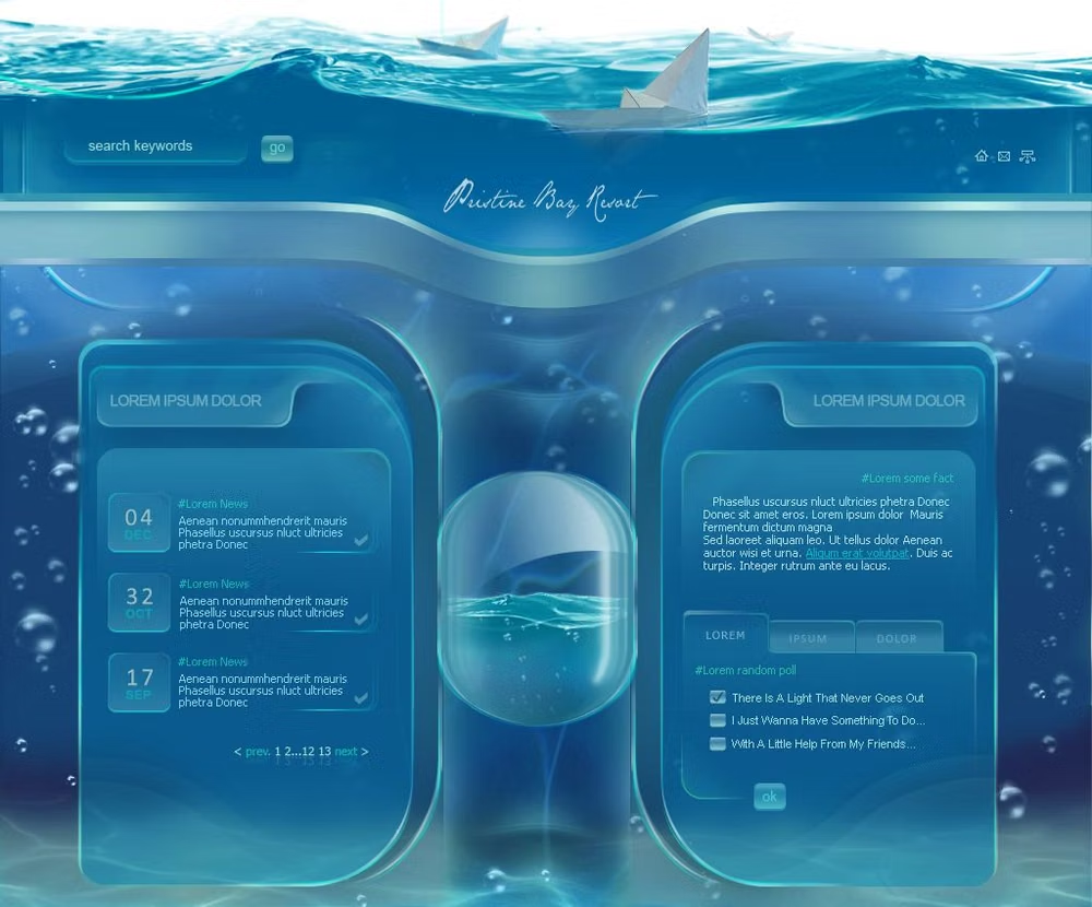
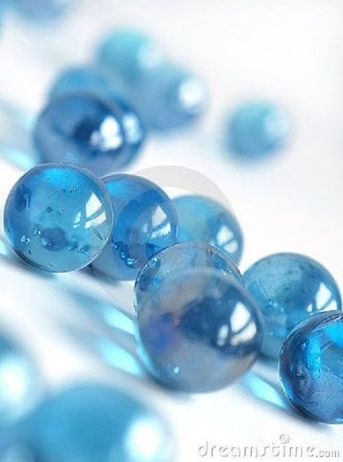
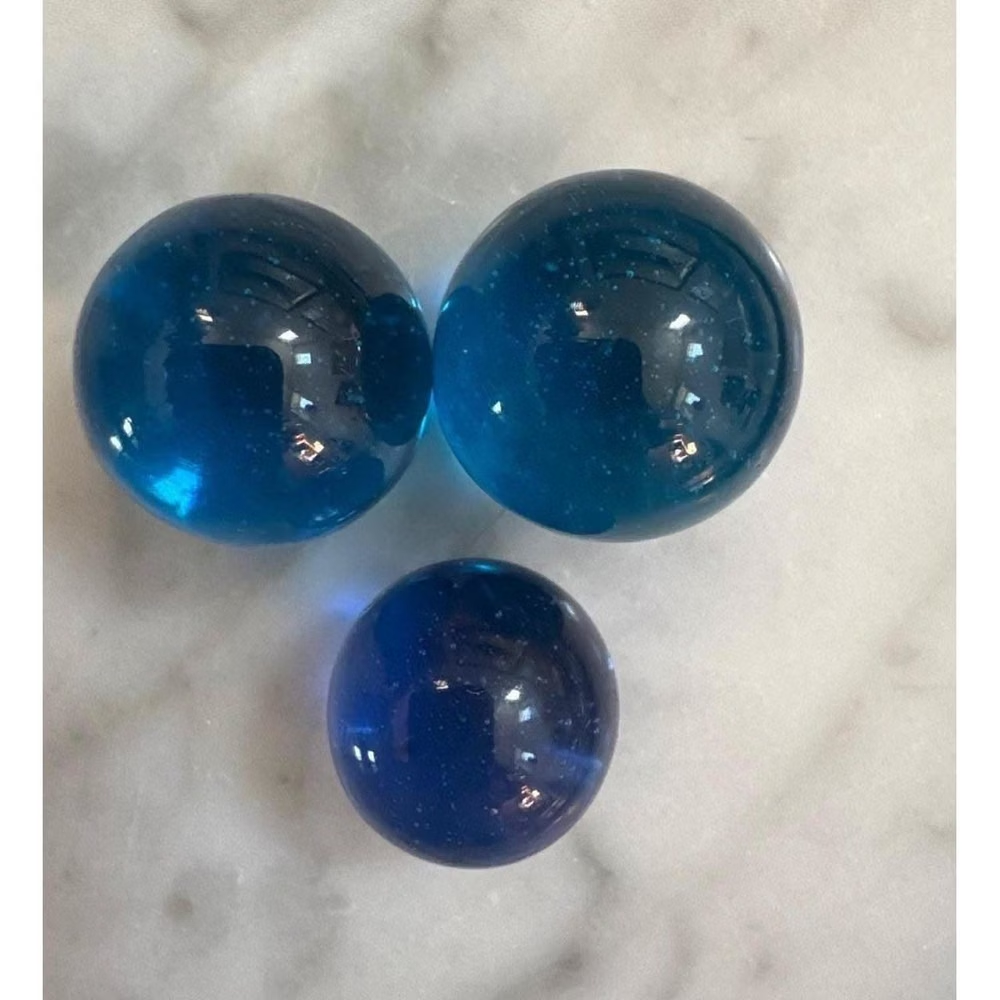
Aqua UI design style
Glossy gel-like controls, candy colors, translucent highlights, pinstripes, and vivid dimensional icons.
Claymorphism UI design style
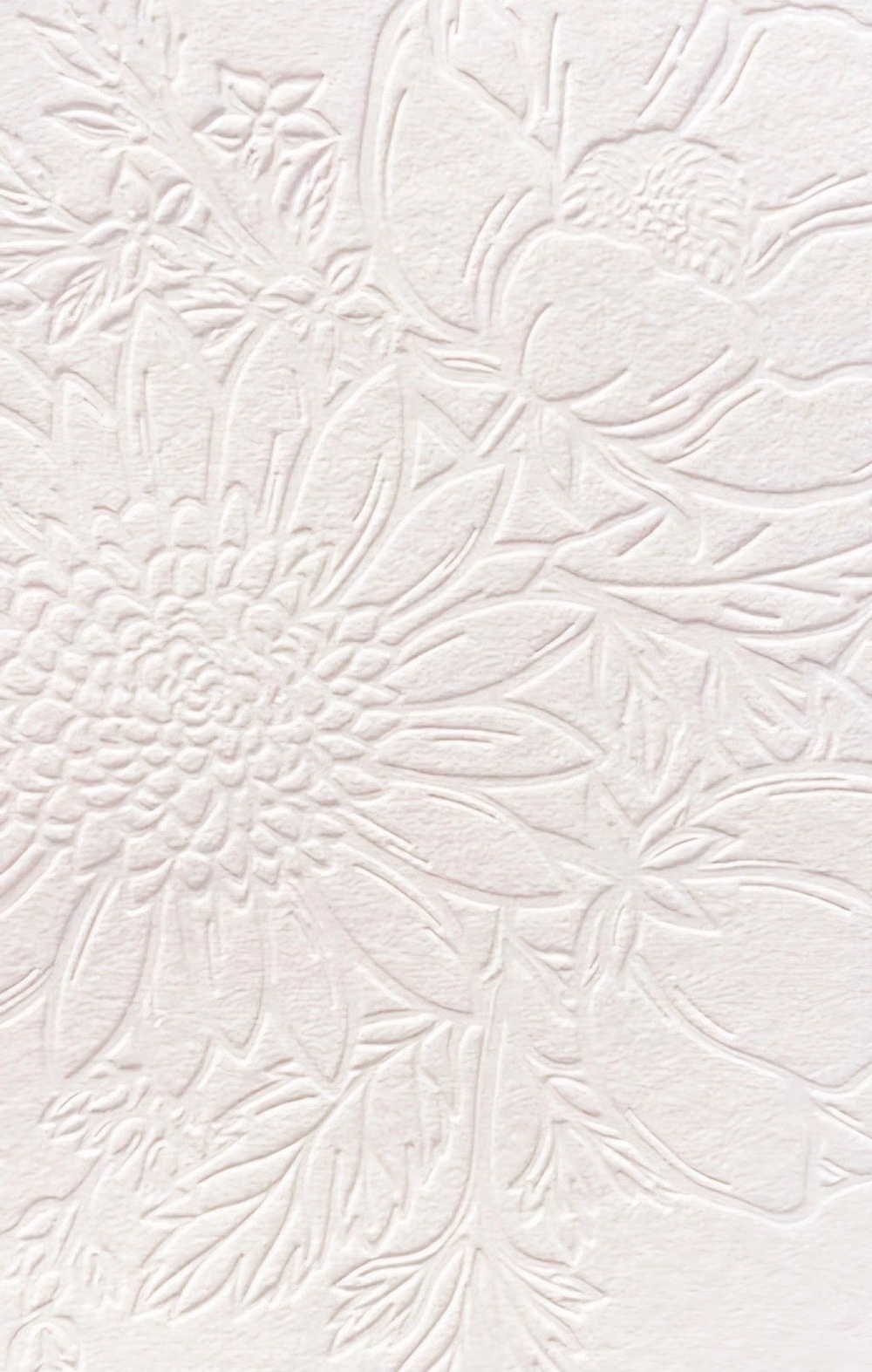
Inflated, clay-like components with pastel colors, large radii, soft shading, and playful dimensional shadows.
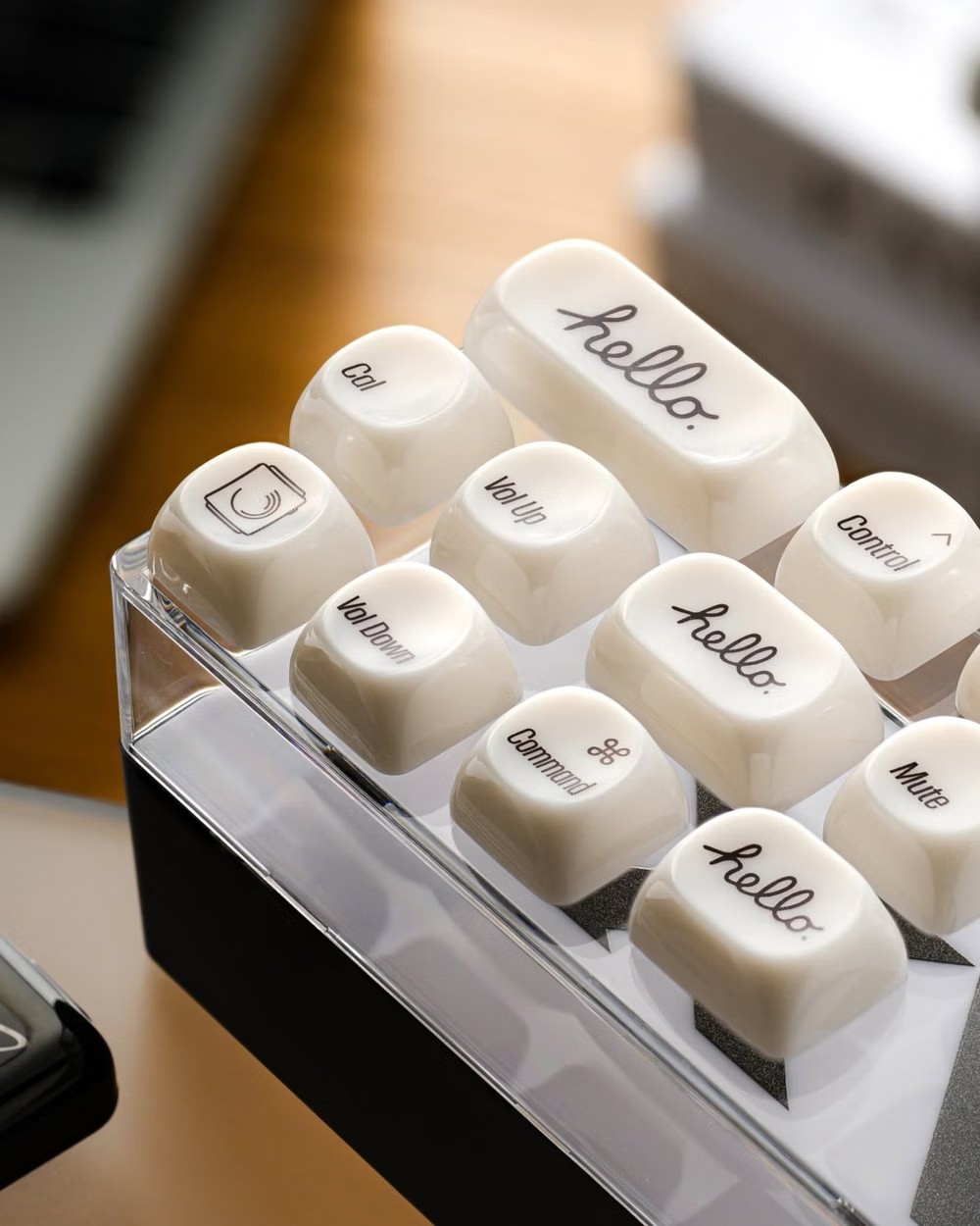

Neumorphism UI design style
Low-contrast monochromatic surfaces with controls that appear softly raised from or pressed into the background.