Aqua UI design style
Glossy gel-like controls, candy colors, translucent highlights, pinstripes, and vivid dimensional icons.
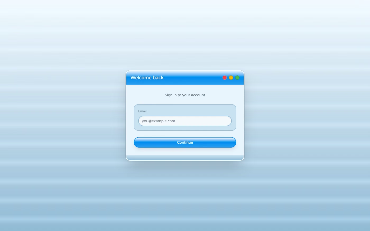
Design overview
- Signature elements
- gel buttons, candy colors, glossy highlights, pinstripe surfaces, translucent chrome, dimensional icons. In daisyUI themes, set `--depth: 1;`.
- Best suited to
- Retro desktop experiences, music players, nostalgic utilities, and early-2000s-inspired products.
- Layout principles
- Frame content as polished desktop windows with visible title bars, toolbars, side wells, and bottom status regions arranged for direct manipulation.
History and origins
A fact-checked account of where this visual language came from, with links to the references used.
- Period
- Introduced in 2000
- Origin
- Apple, California
Apple unveiled the Aqua interface with Mac OS X on January 5, 2000. Its translucent menus, luminous color, soft shadows, pinstriped surfaces, and gel-like controls were designed to make a new Unix-based operating system feel approachable, and they became a defining reference for glossy early-2000s software.
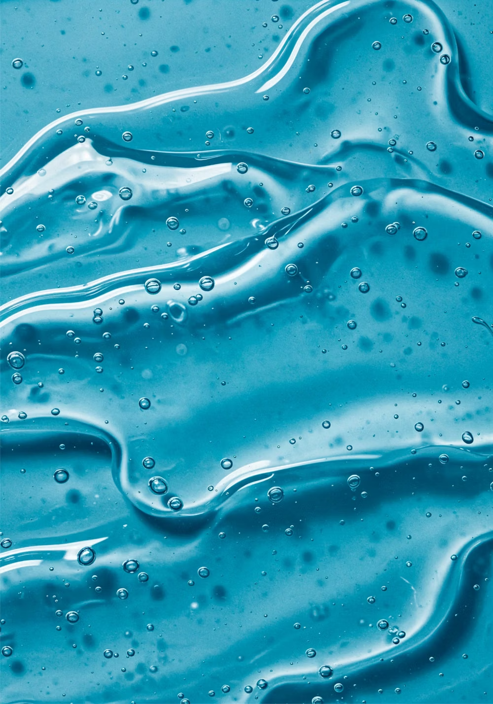
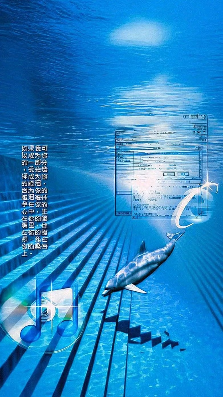
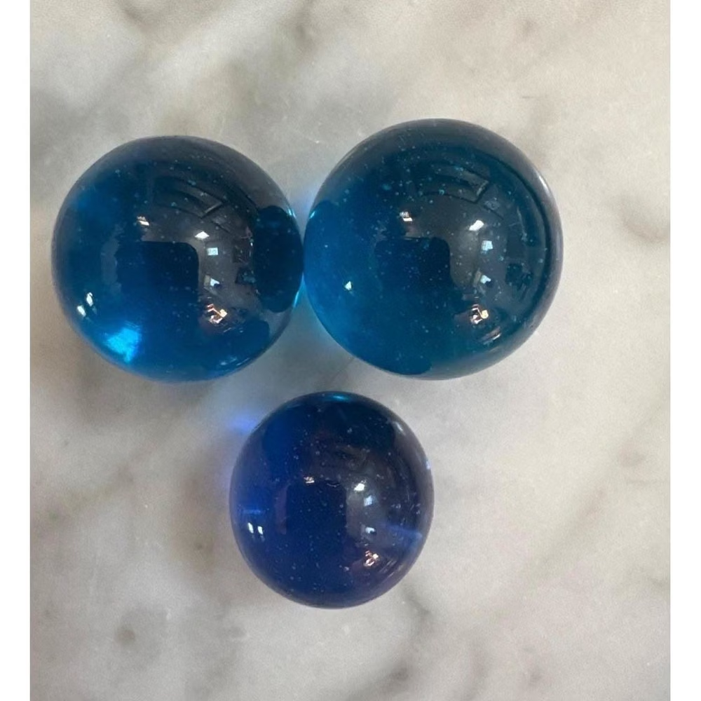
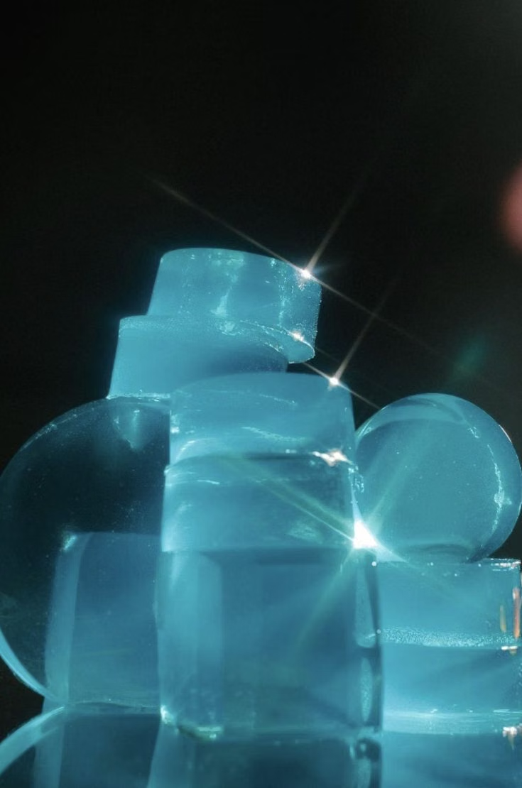
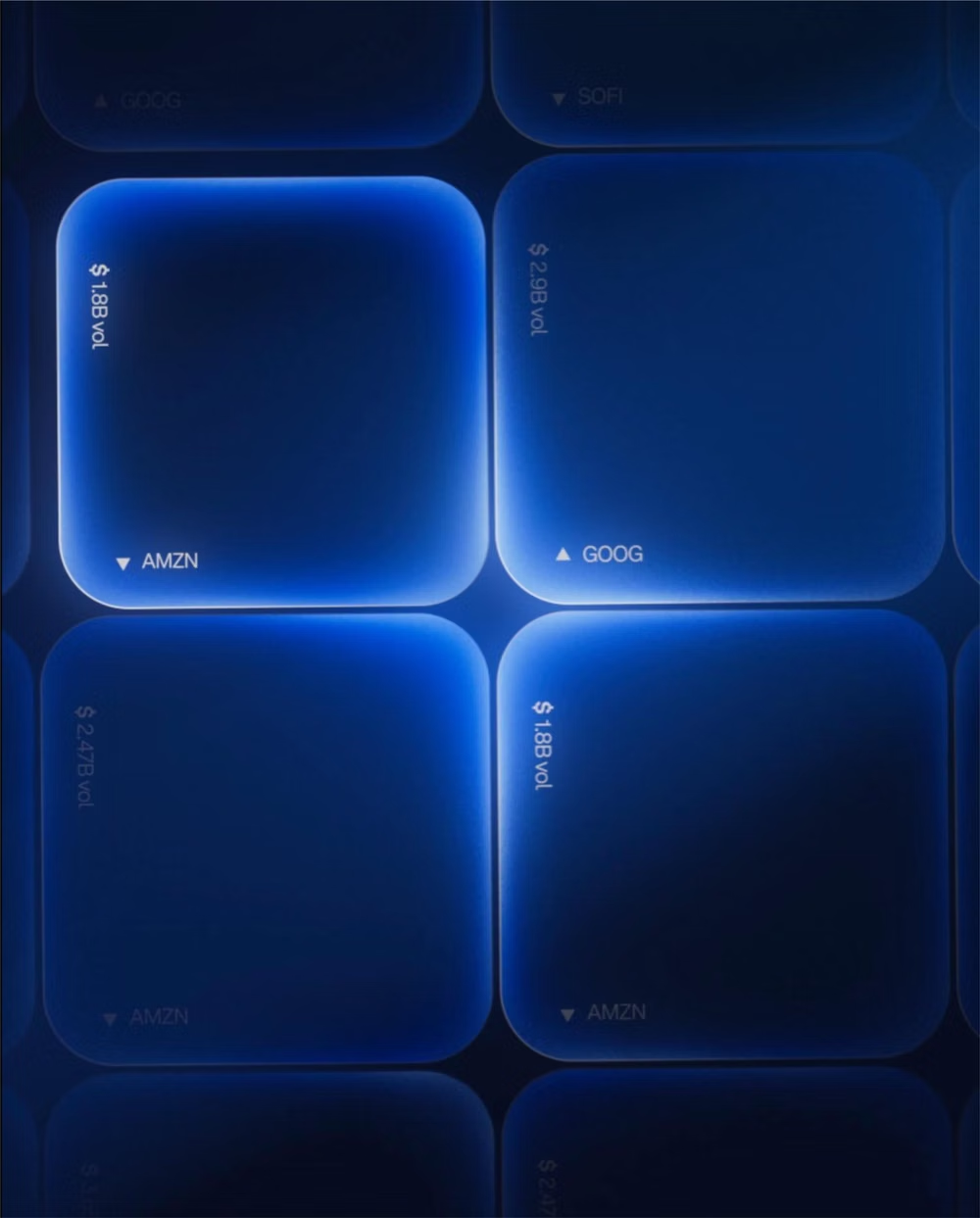
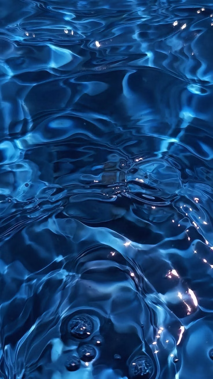
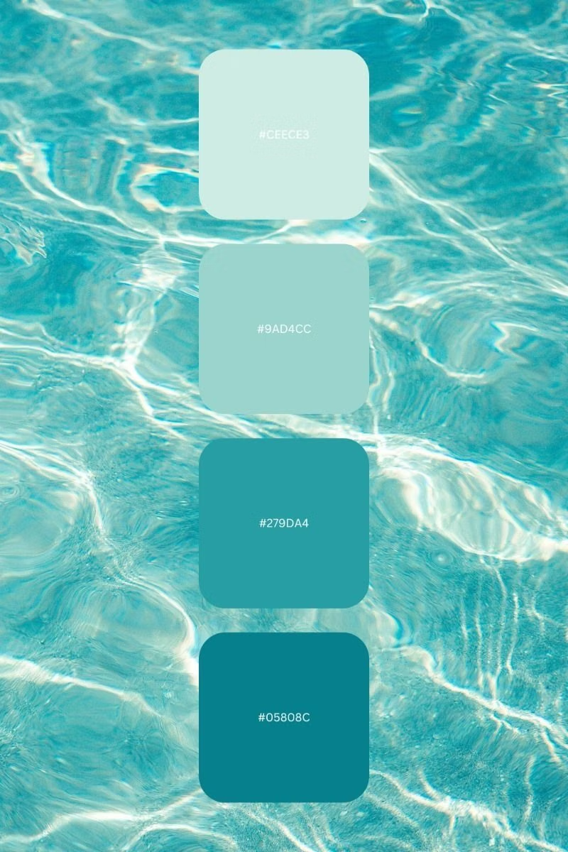
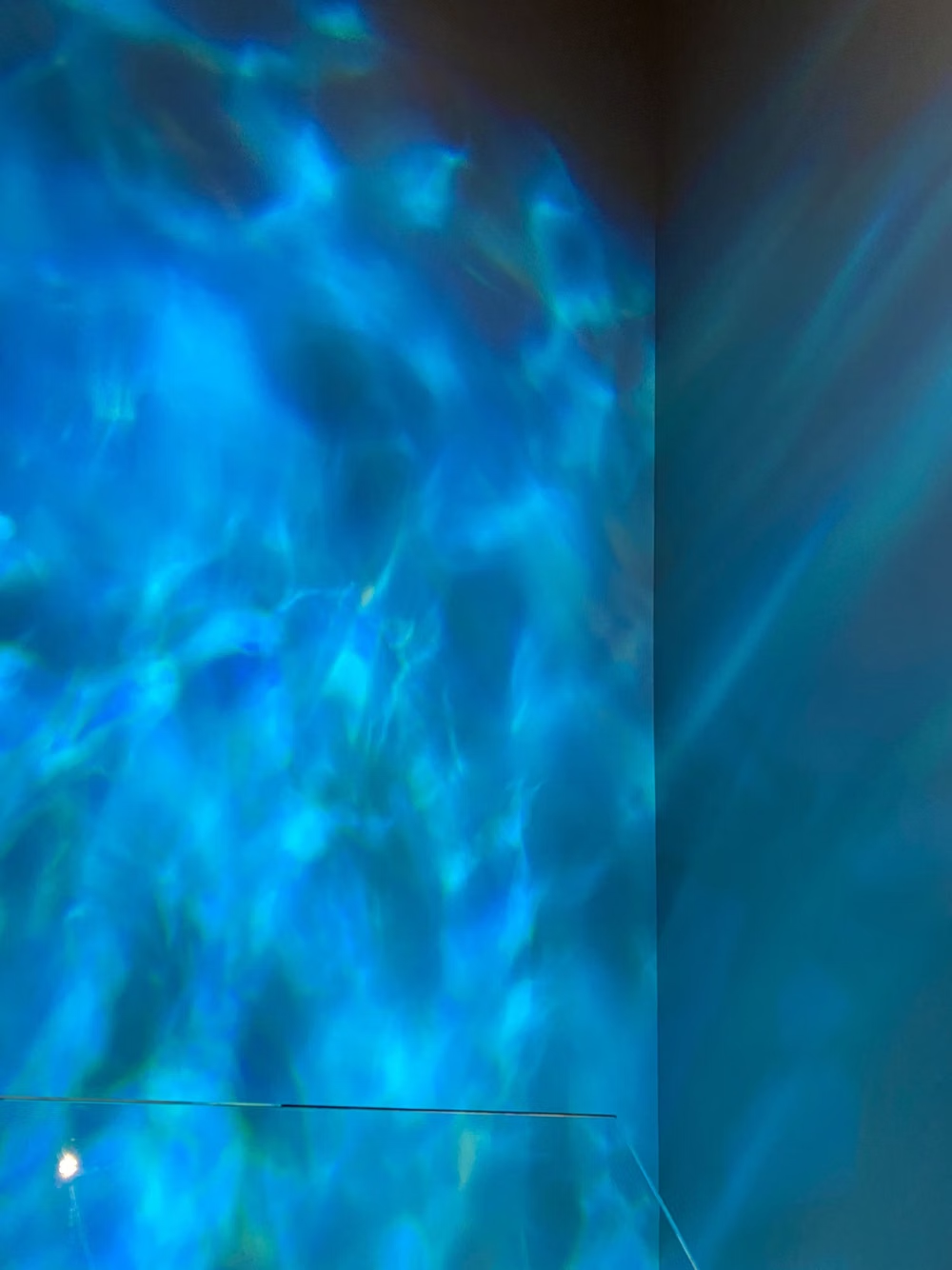
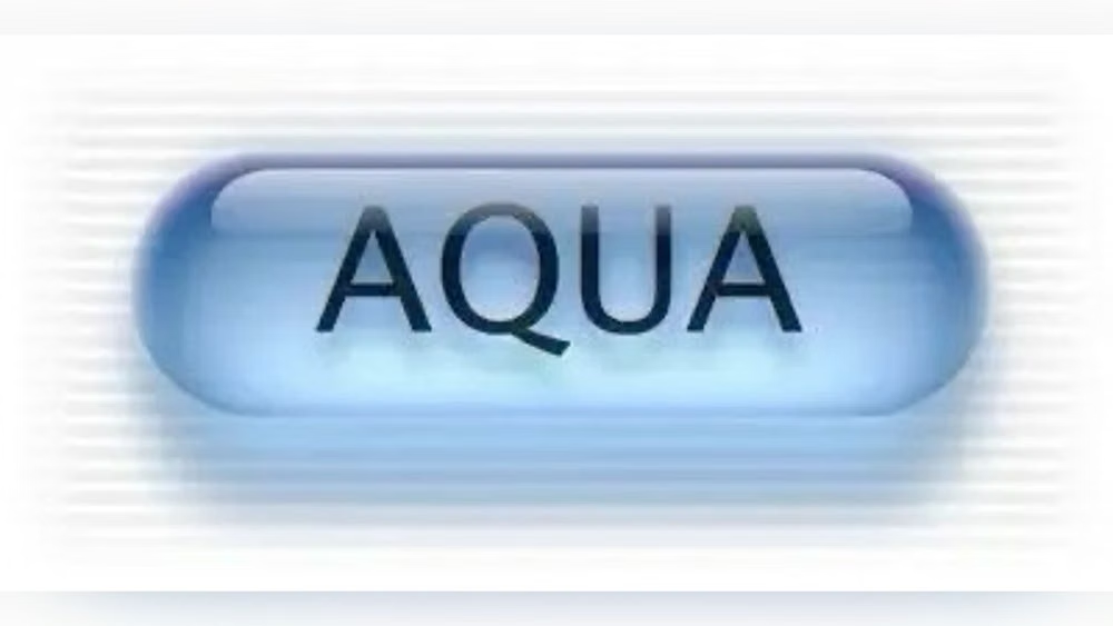
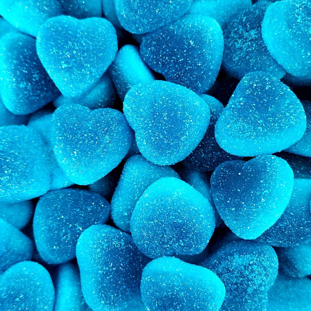
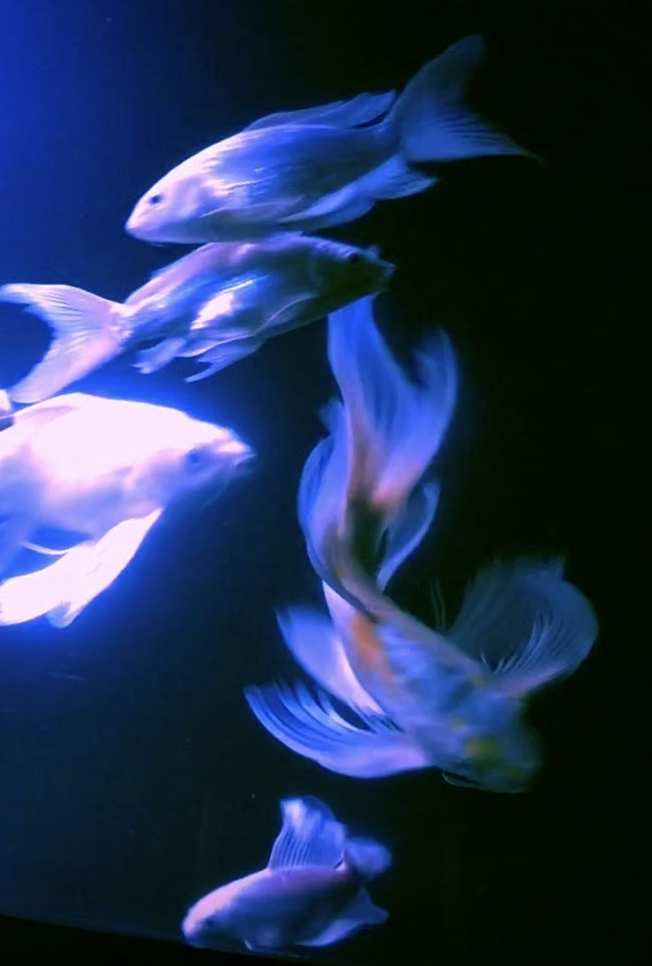
Moodboard and visual references
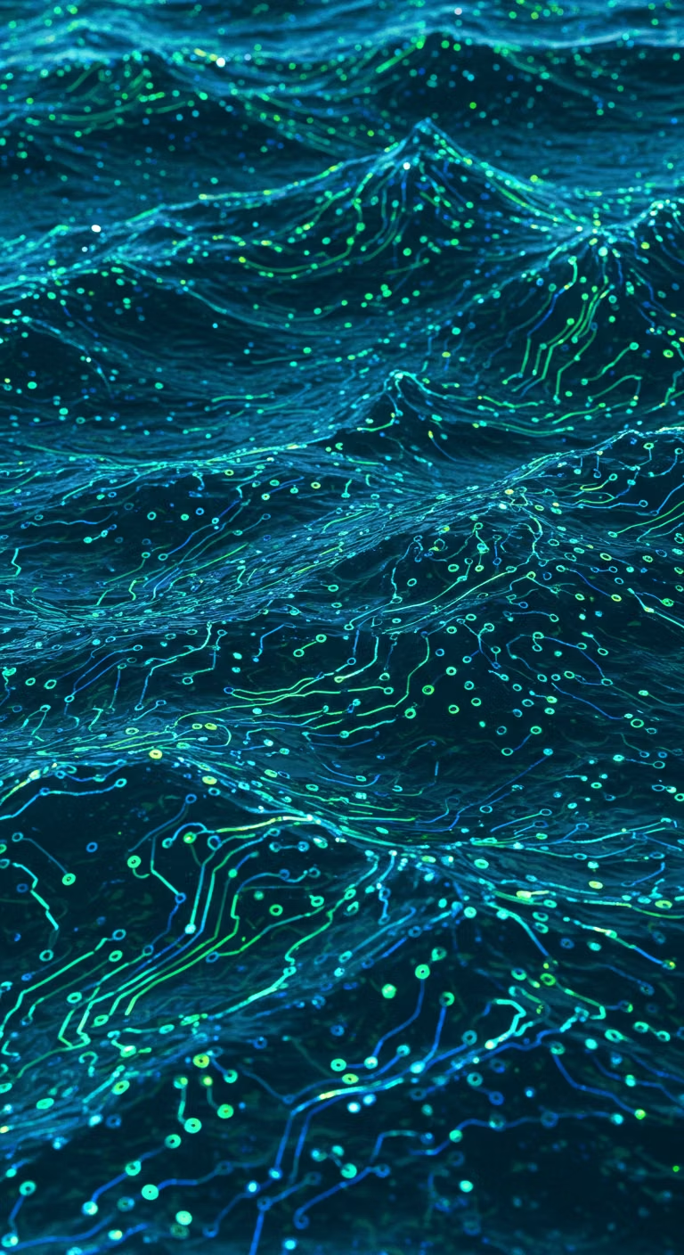
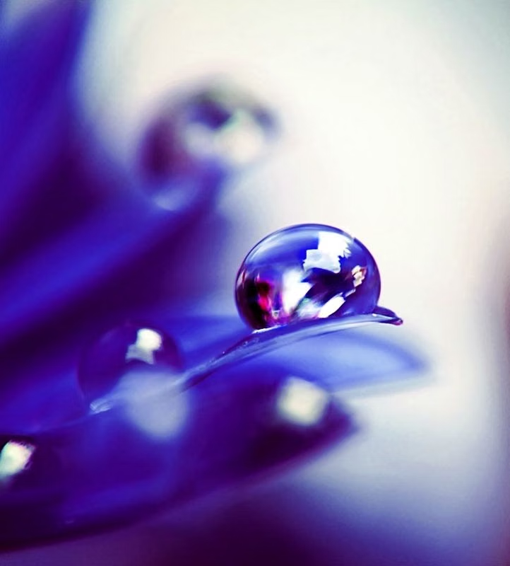
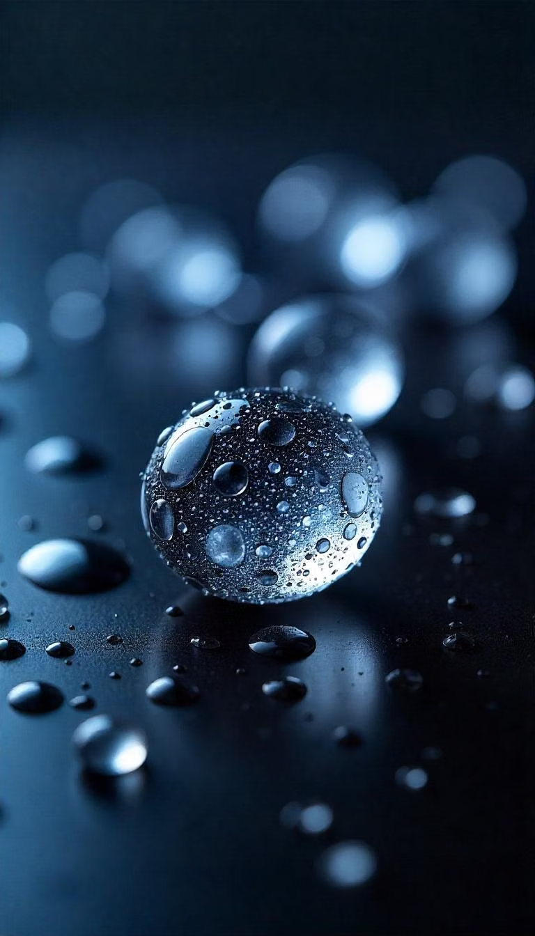
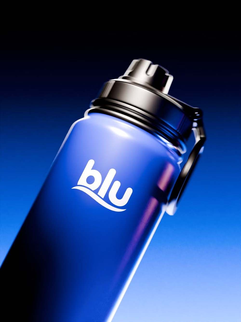
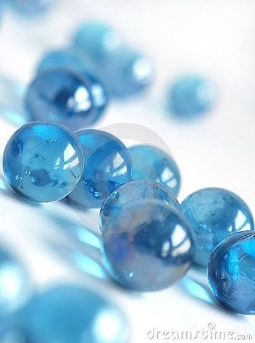
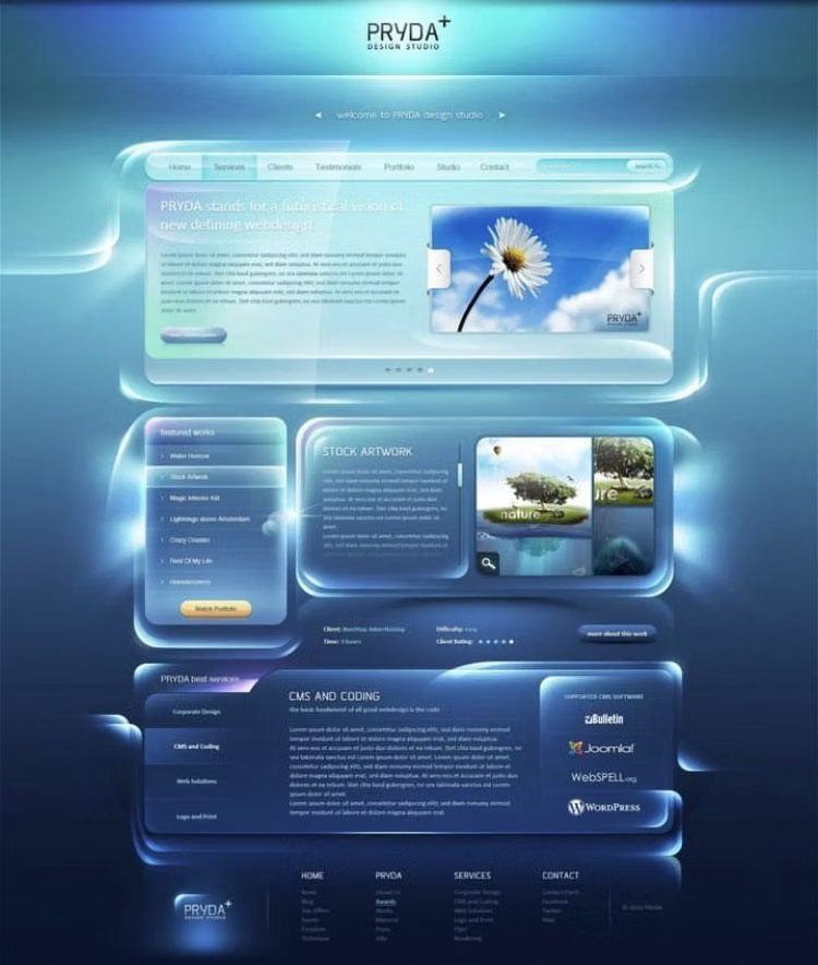
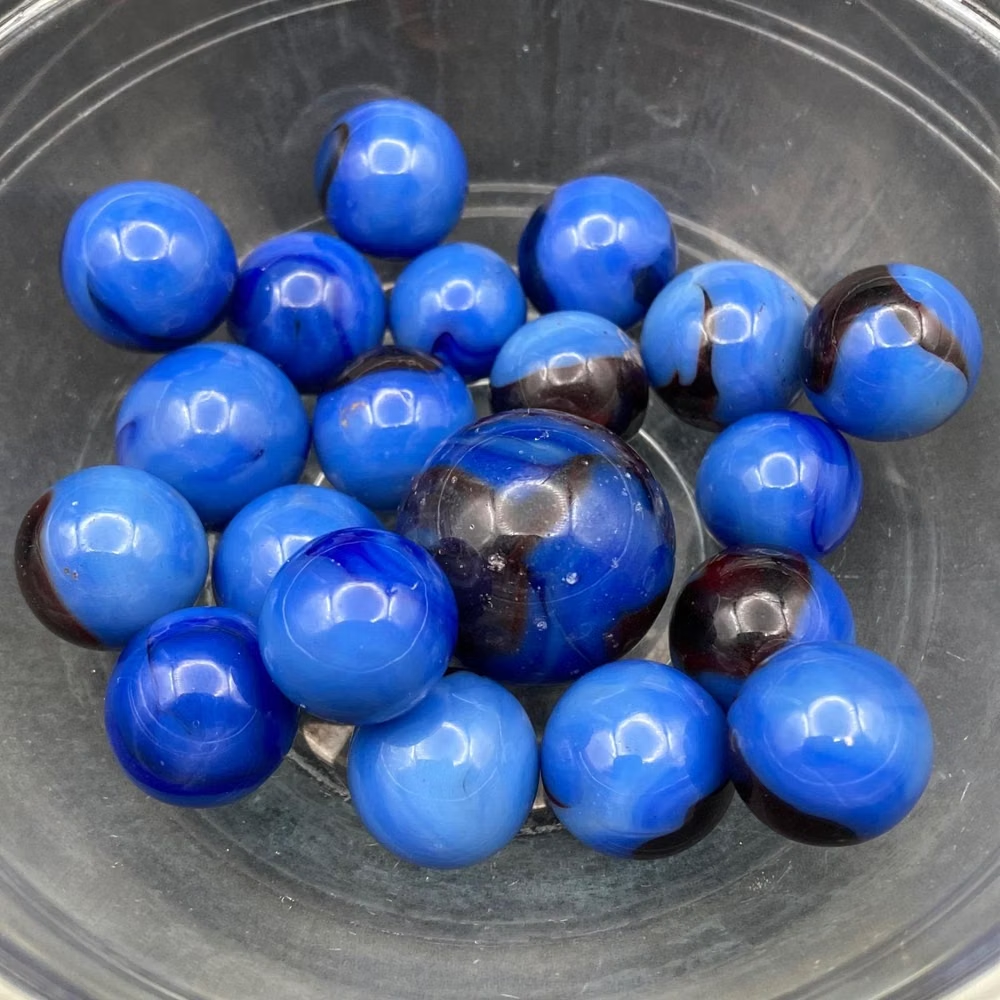
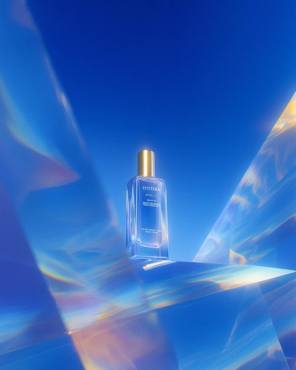
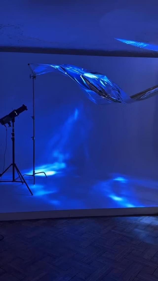
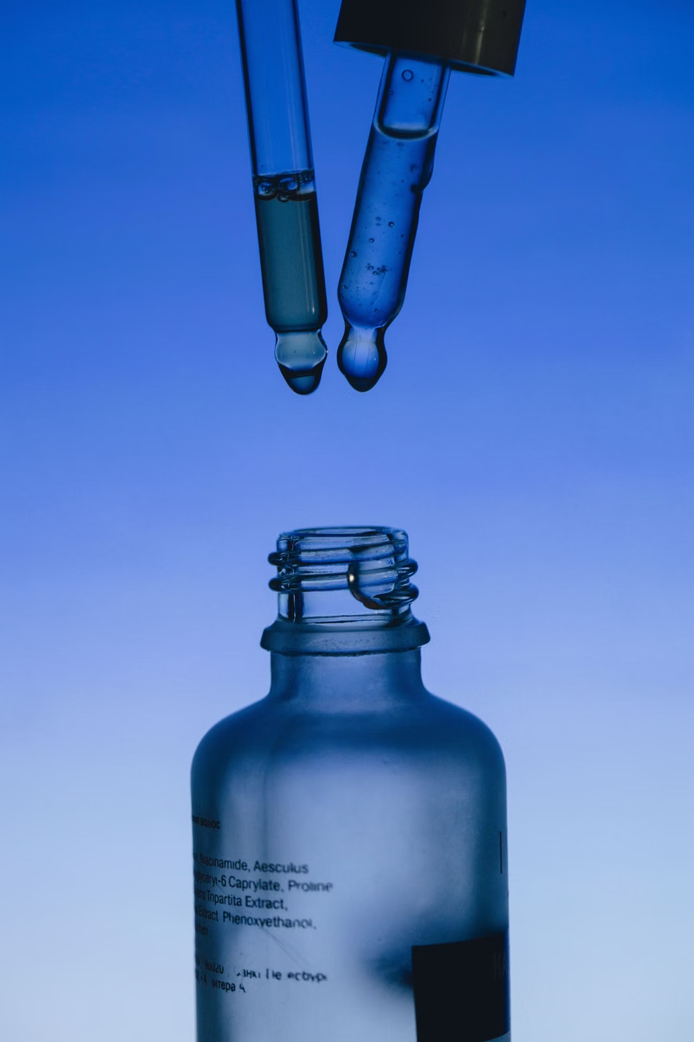
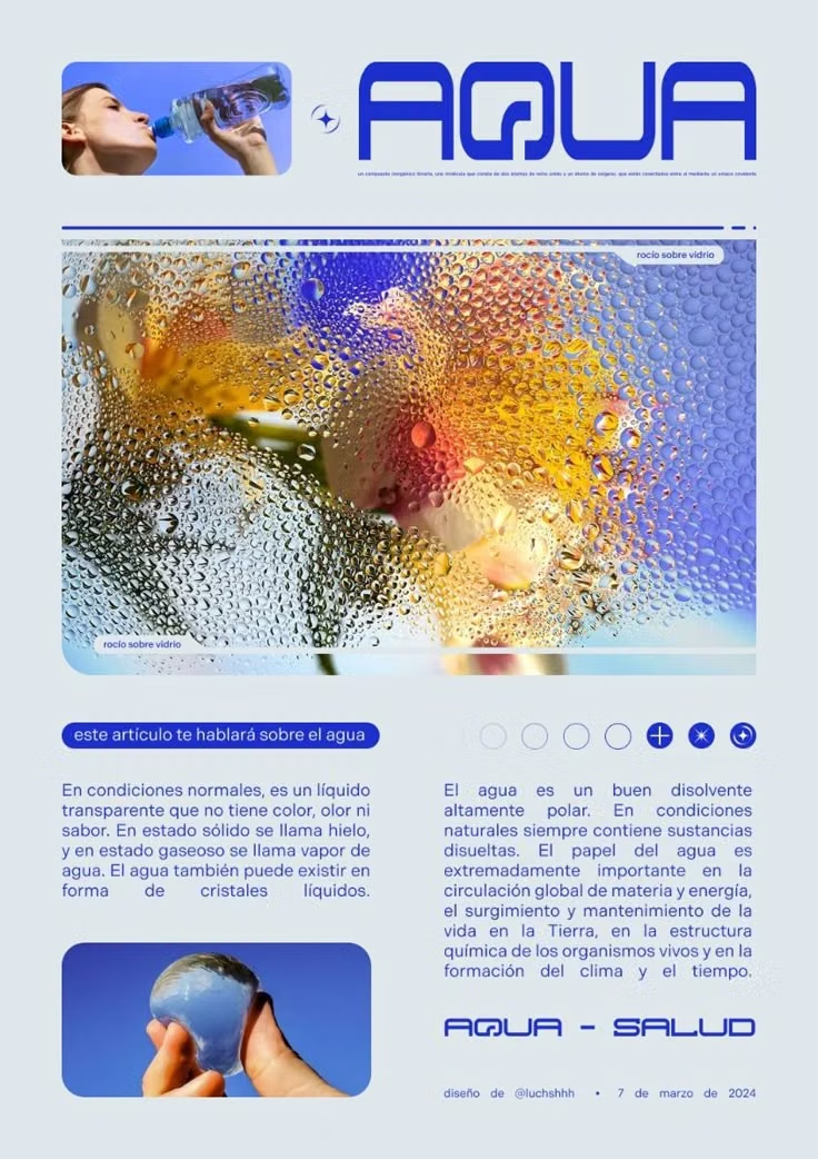
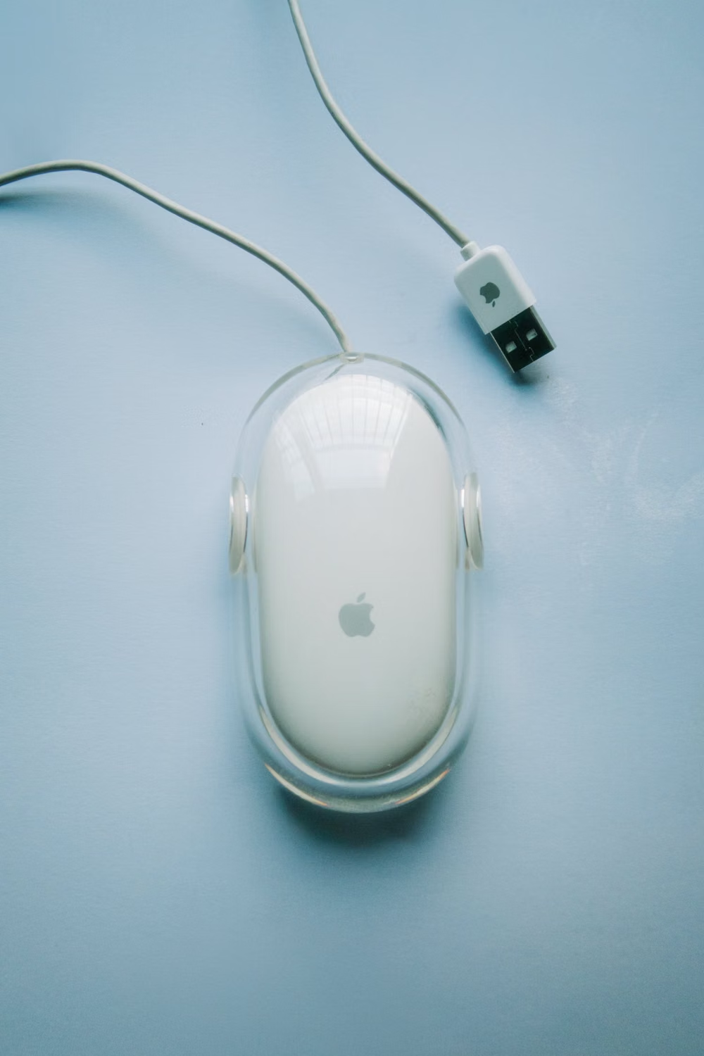
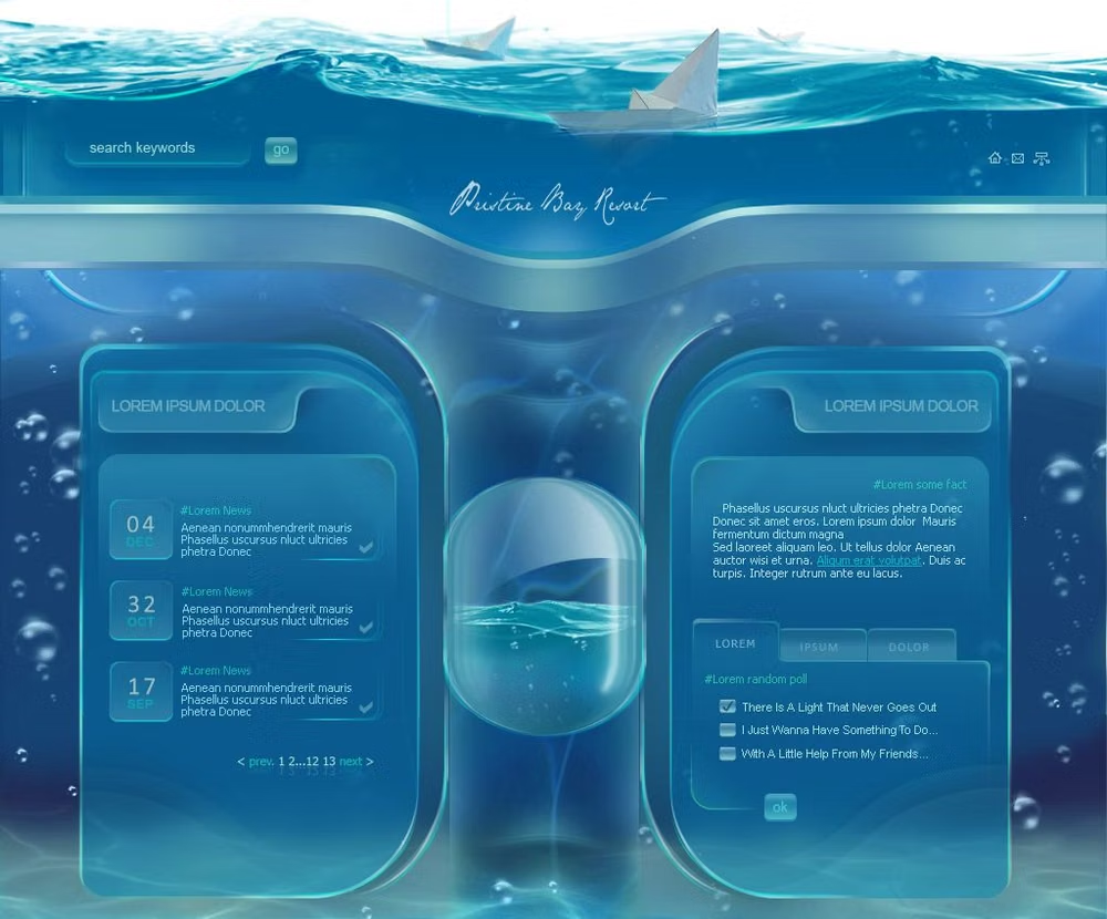
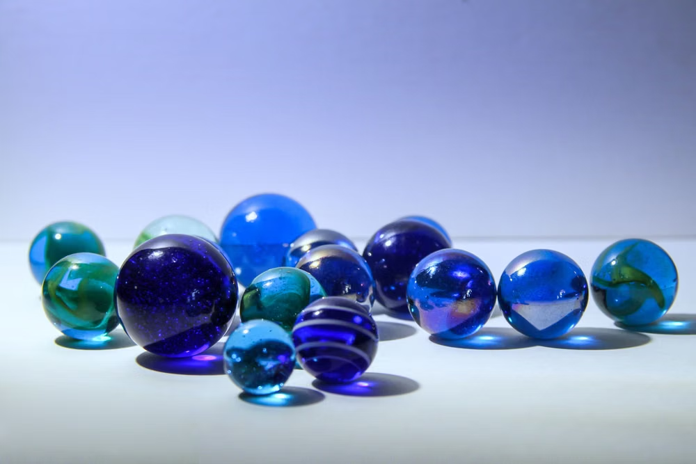
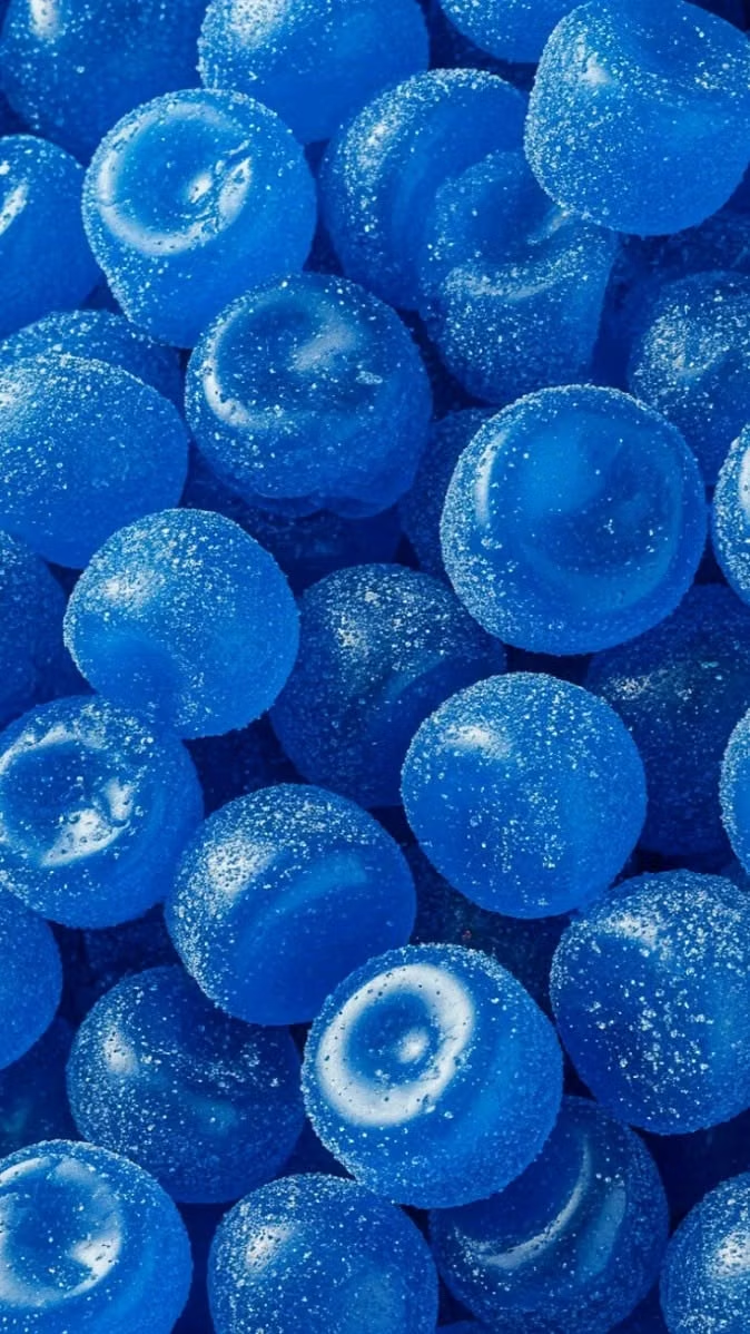
A visual study of the forms, inspirations, materials, colors, type, and cultural references associated with this UI design style.


Design principles and implementation
Use these principles to write a focused AI UI design prompt instead of asking for a vague visual treatment.
Color direction
Use candy blue, graphite, and pearl surfaces with strong vertical gradients, white specular bands, and saturated traffic-light accents. In a daisyUI theme, use candy blue for `primary`, aqua or graphite for `secondary`, and assign pearl white, pale silver, and cool gray to `base-100`, `base-200`, and `base-300`.
Imagery direction
Choose glossy dimensional icons, watery textures, polished hardware, and bright desktop-style illustrations rendered from a consistent three-quarter angle.
Content density
Use medium desktop density with compact toolbars and lists, balanced by broad glossy controls and clear window regions.
Motion direction
Apply gel-button compression, liquid progress sheen, drawer slides, and elastic window transitions inspired by early desktop interfaces.
Shape language
Use capsules, glassy wells, beveled window chrome, circular status lights, and convex controls with conspicuous highlights. In daisyUI themes, set the `--radius-*` variables between `0.75rem` and `1.5rem`.
Typography rules
Use a friendly screen-optimized sans-serif for compact labels, darker title-bar text, and crisp anti-aliased numerals against glossy surfaces.
Suggested Typfaces
Varela Round
Fresh daisies glow in warm sunlight
Fresh daisies glow in warm sunlight
1 2 3 4 5 6 7 8 9 0
Ubuntu
Fresh daisies glow in warm sunlight
Fresh daisies glow in warm sunlight
1 2 3 4 5 6 7 8 9 0
Nunito Sans
Fresh daisies glow in warm sunlight
Fresh daisies glow in warm sunlight
1 2 3 4 5 6 7 8 9 0
Exo 2
Fresh daisies glow in warm sunlight
Fresh daisies glow in warm sunlight
1 2 3 4 5 6 7 8 9 0
Quicksand
Fresh daisies glow in warm sunlight
Fresh daisies glow in warm sunlight
1 2 3 4 5 6 7 8 9 0
Build a Aqua UI interface with daisyUI
The live example translates this direction into daisyUI components and semantic theme tokens.
To generate a full page in the same visual language, give the style name and the design rules above to Blueprint MCP.
Related UI design styles
Compare nearby visual languages that share typography, shapes, use cases, or signature elements.
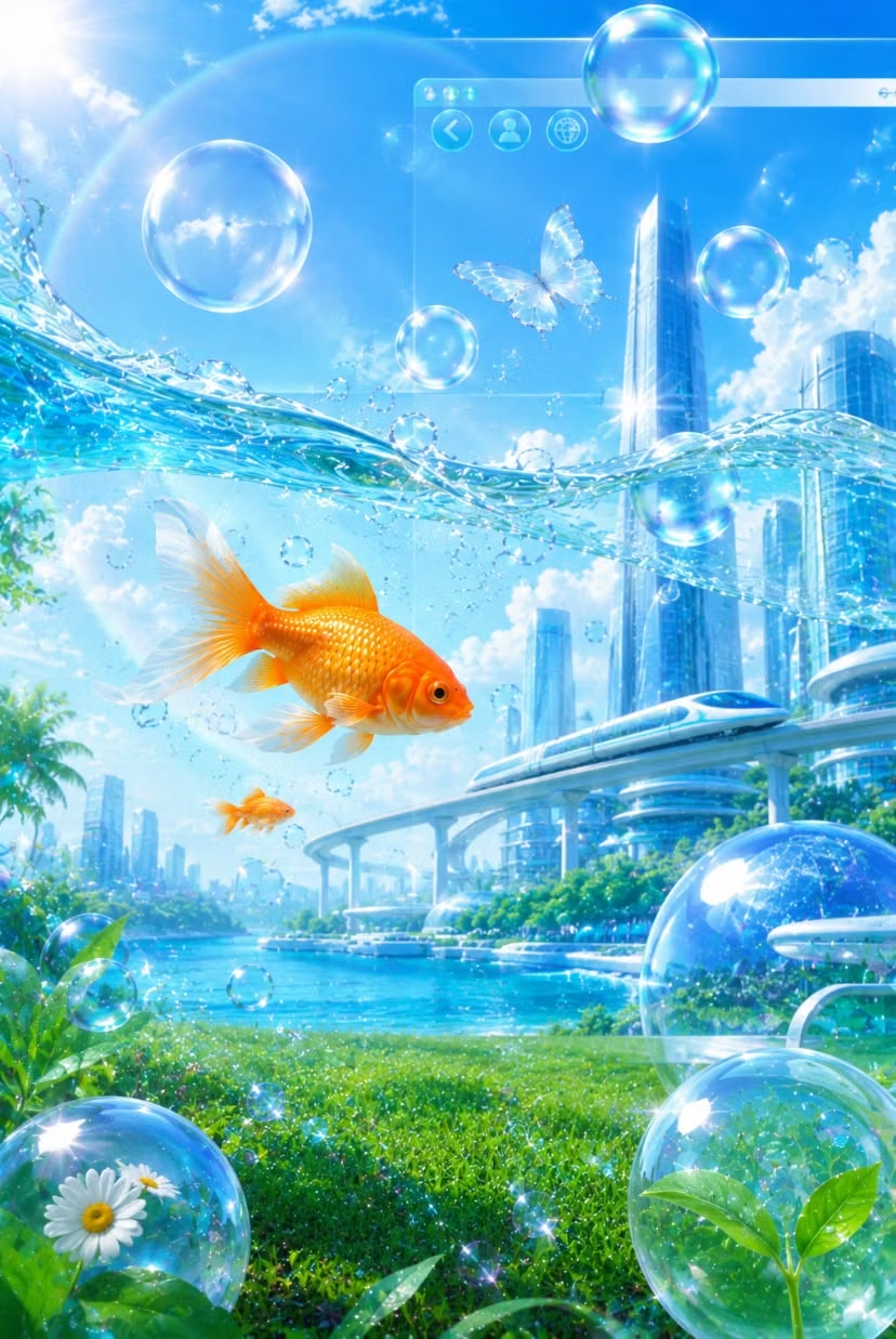
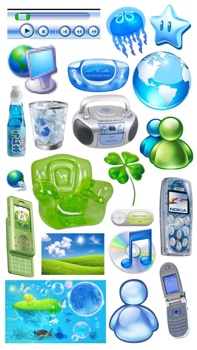

Frutiger Aero UI design style
Glossy blue-and-green visuals combine skeuomorphic interfaces, glassy controls, water, bubbles, open skies, nature, and optimistic technology.

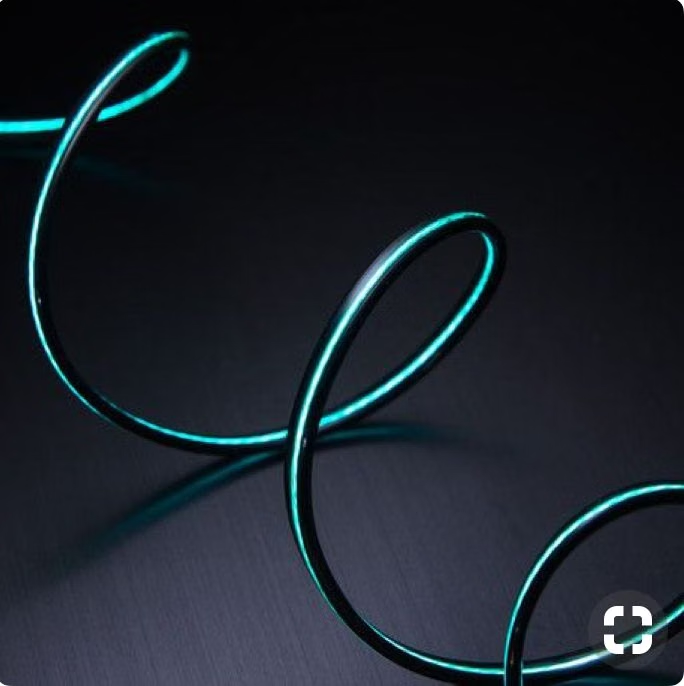
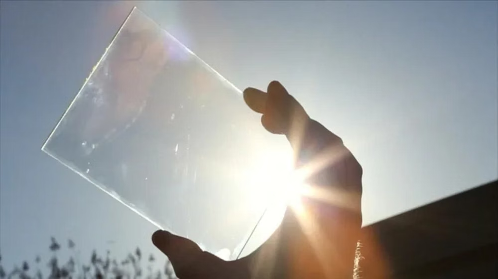
Luminous Eco-Skeuomorphism UI design style
A glossy, tactile interface style that combines early-2010s skeuomorphism with futuristic ecological-tech aesthetics. Controls resemble illuminated physical hardware, with intense inner glows, radiant edges, and soft light bloom making interactive elements appear electrically powered.
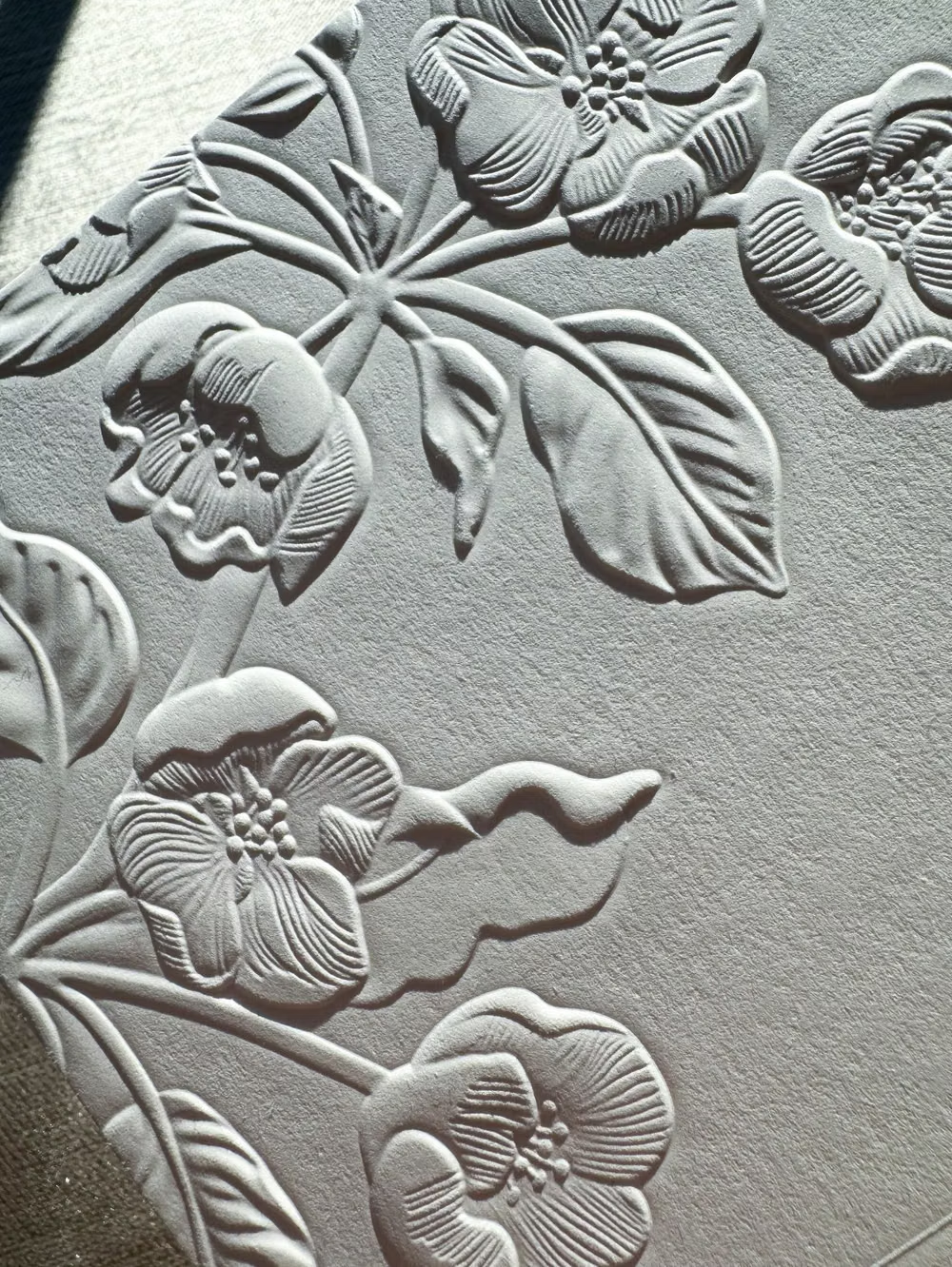
Neumorphism UI design style
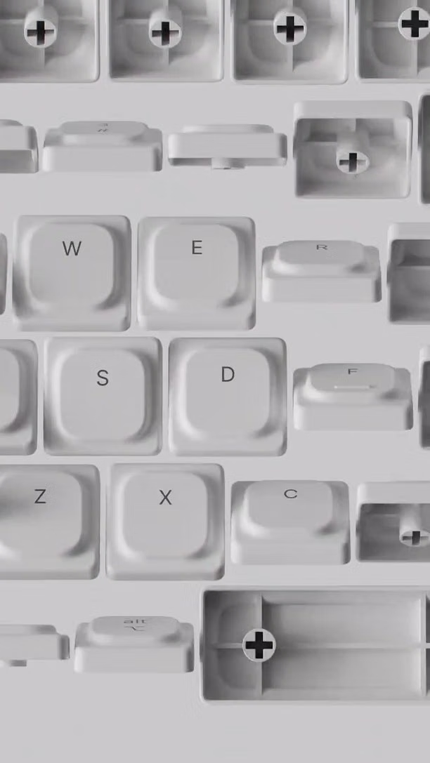
Low-contrast monochromatic surfaces with controls that appear softly raised from or pressed into the background.