Mesh Gradient / Aurora UI design style
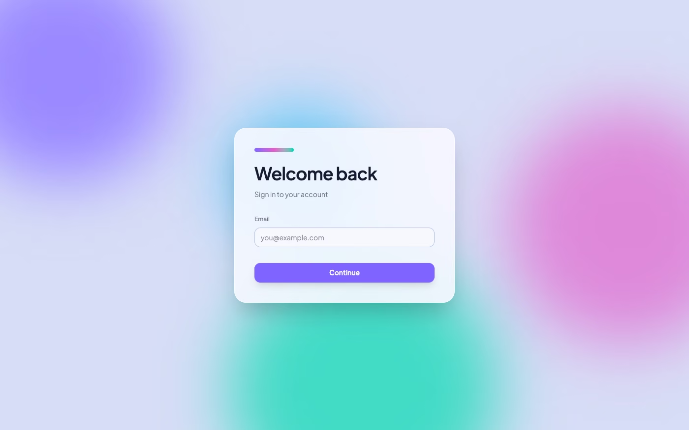
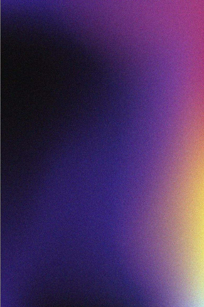
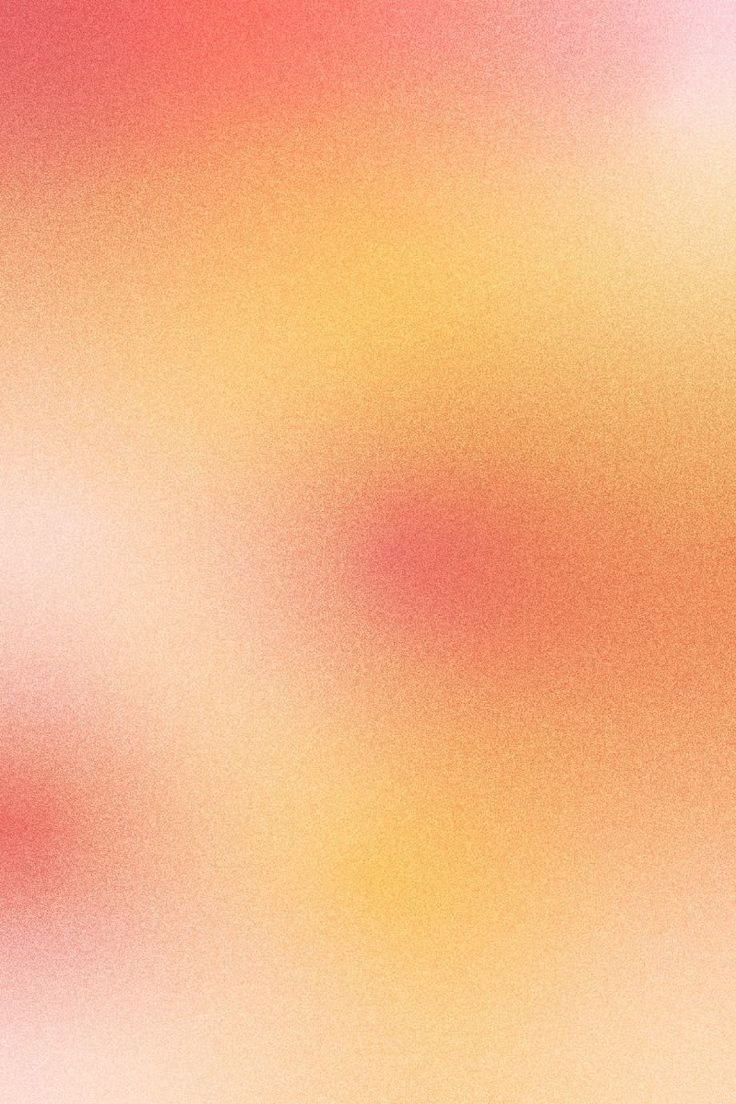
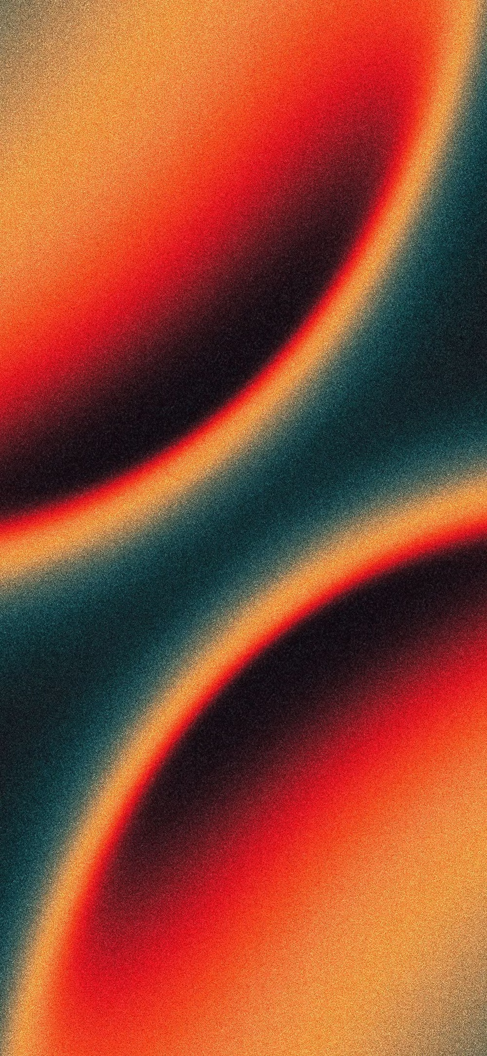
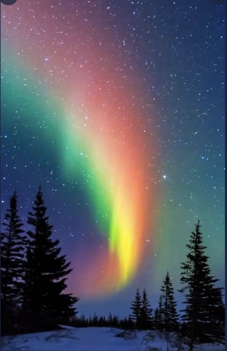
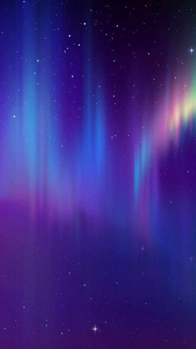
Atmospheric multi-point gradients blending luminous colors into soft clouds, glows, and color fields.
Design overview
- Signature elements
- multi-point gradients, luminous color clouds, soft glow, blurred transitions, atmospheric depth, vibrant accents. In daisyUI themes, set `--depth: 1;`.
- Best suited to
- AI products, SaaS landing pages, premium branding, onboarding, and hero backgrounds.
- Layout principles
- Anchor content in calm solid or lightly translucent zones while one large aurora field establishes the hero, section transition, or product focus.
History and origins
A fact-checked account of where this visual language came from, with links to the references used.
- Period
- Late 2010s–present
- Origin
- Contemporary digital branding and interface design
Mesh Gradient and Aurora UI are descriptive contemporary labels rather than a documented movement with a single origin. They extend a much older graphic technique—continuous color transition—using modern vector and browser tools to overlap multiple gradient fields; their prominence rose alongside the saturated gradient rebrand cycle of the late 2010s.
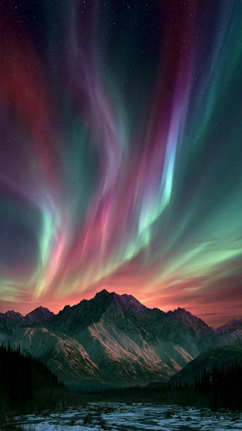
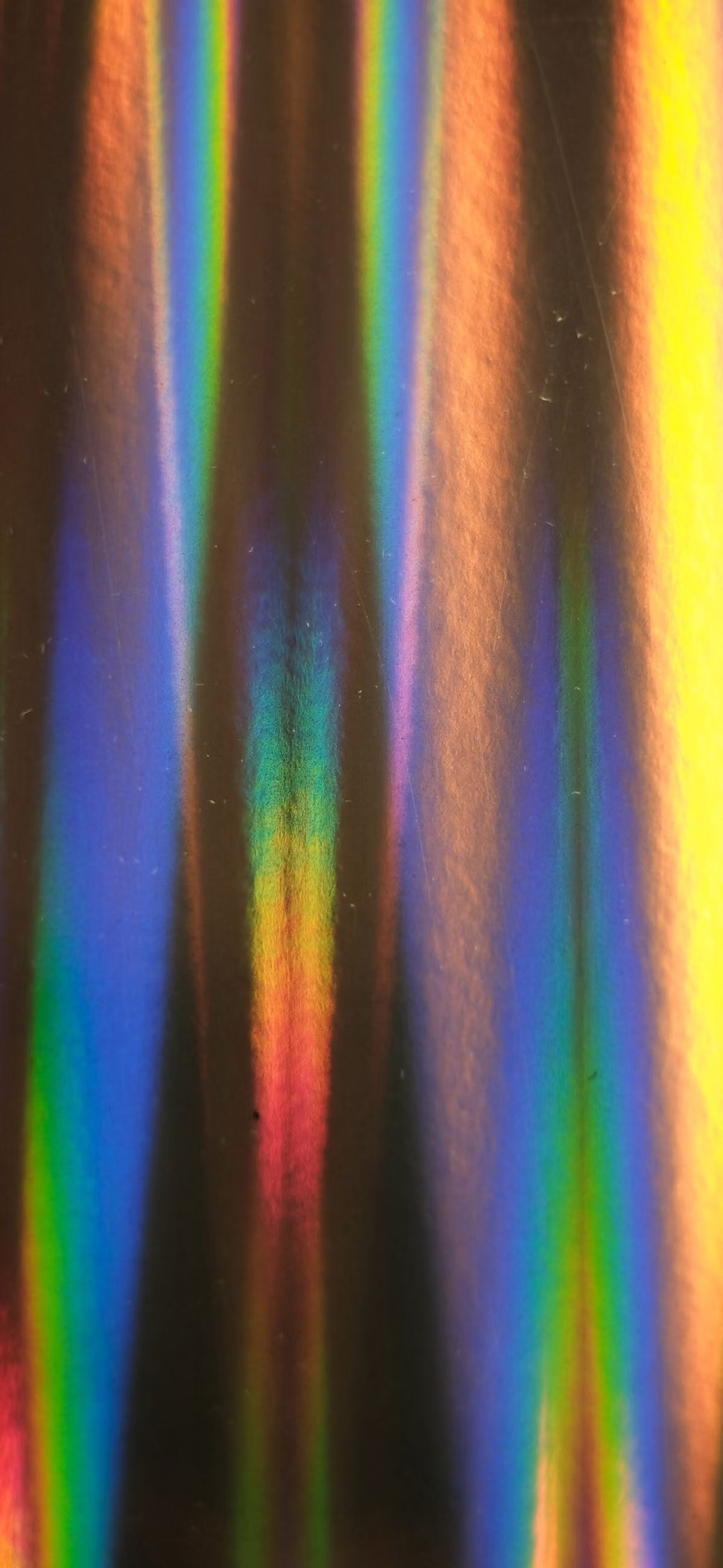
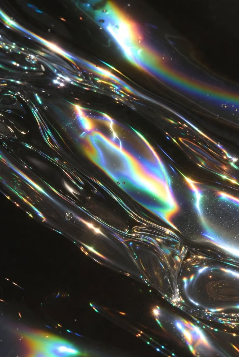
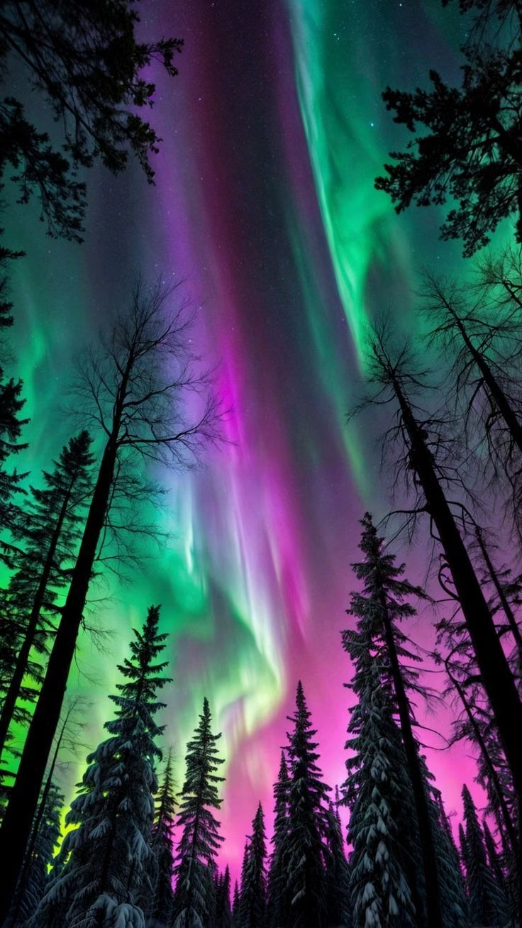
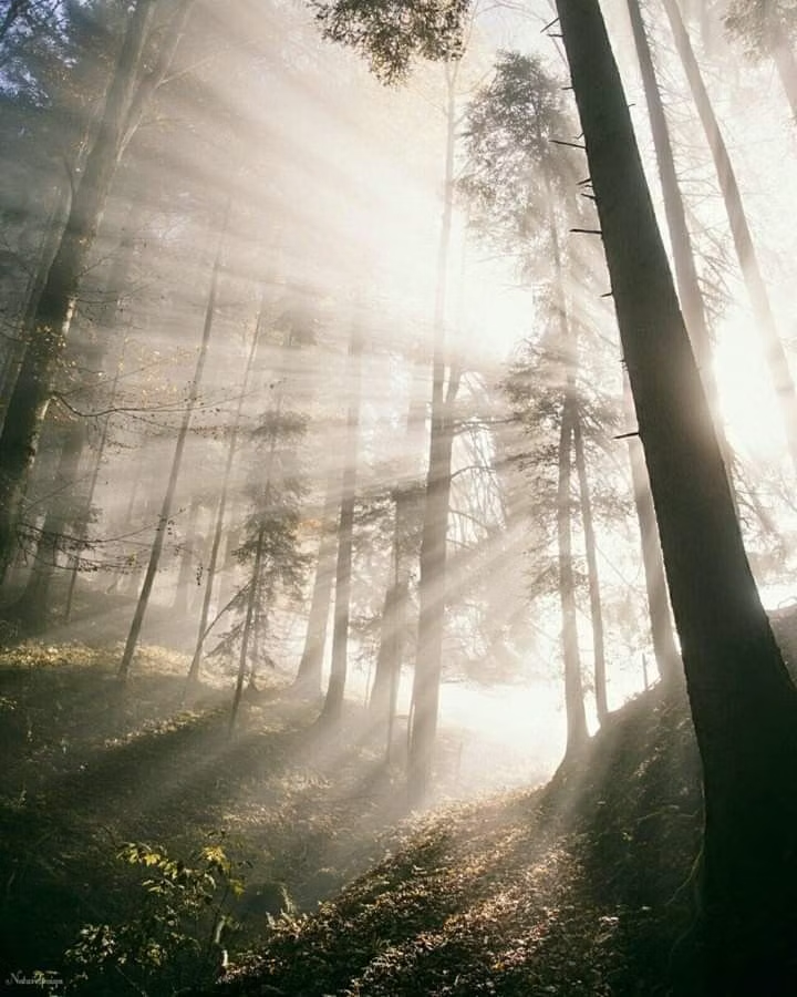
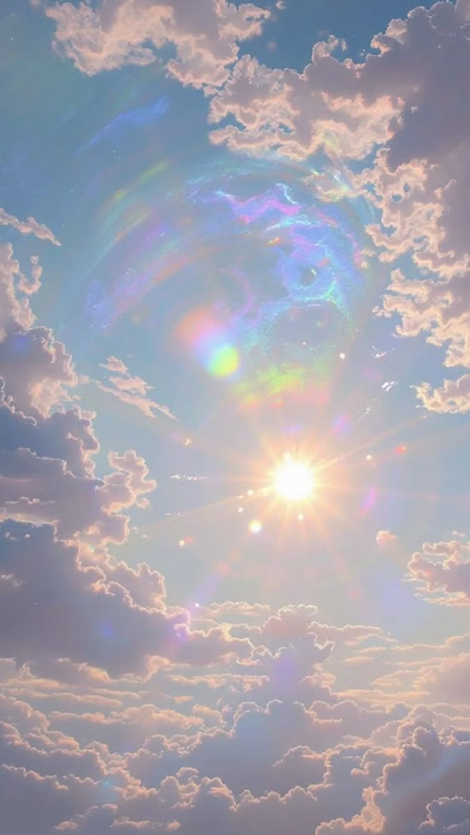
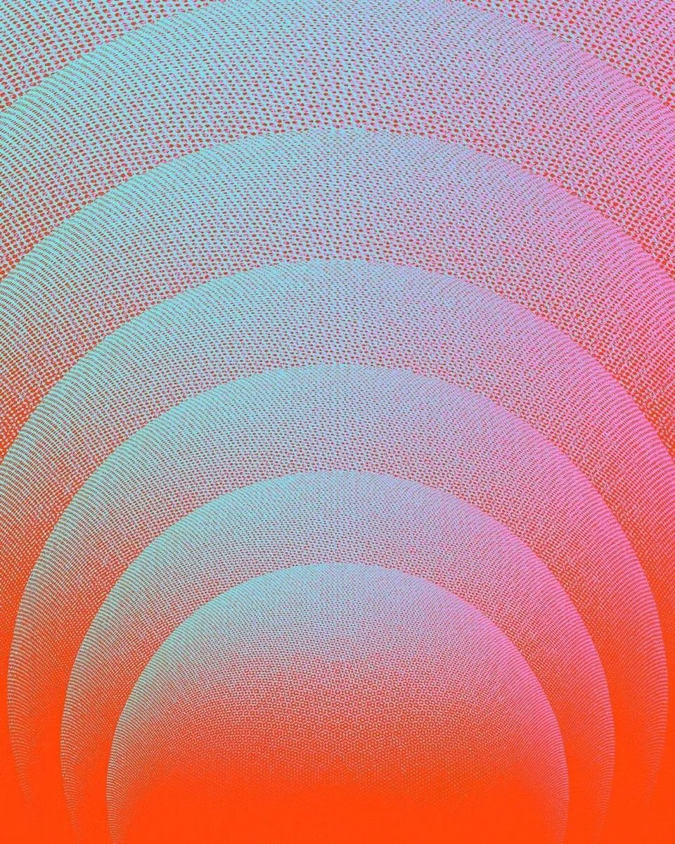
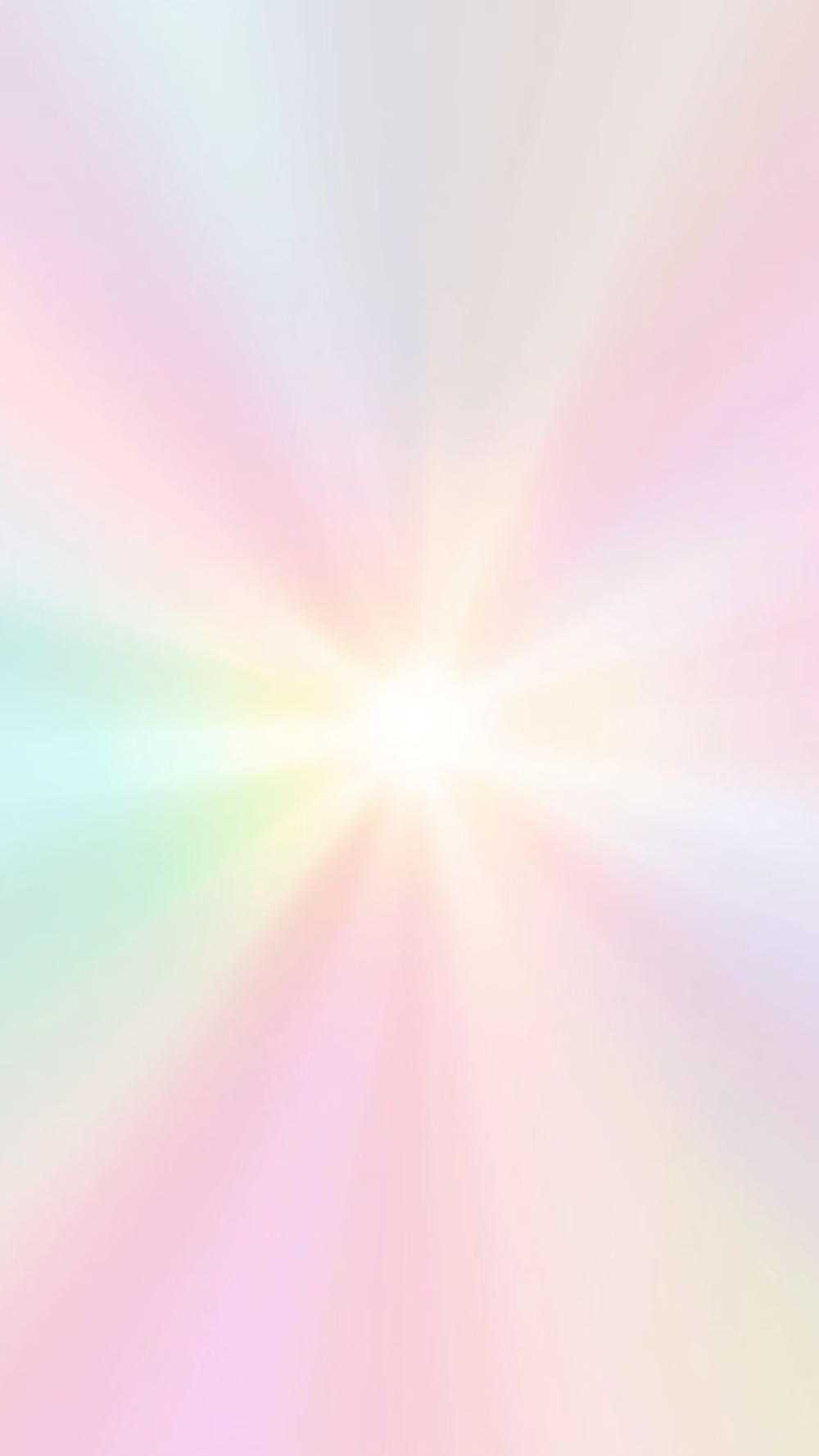
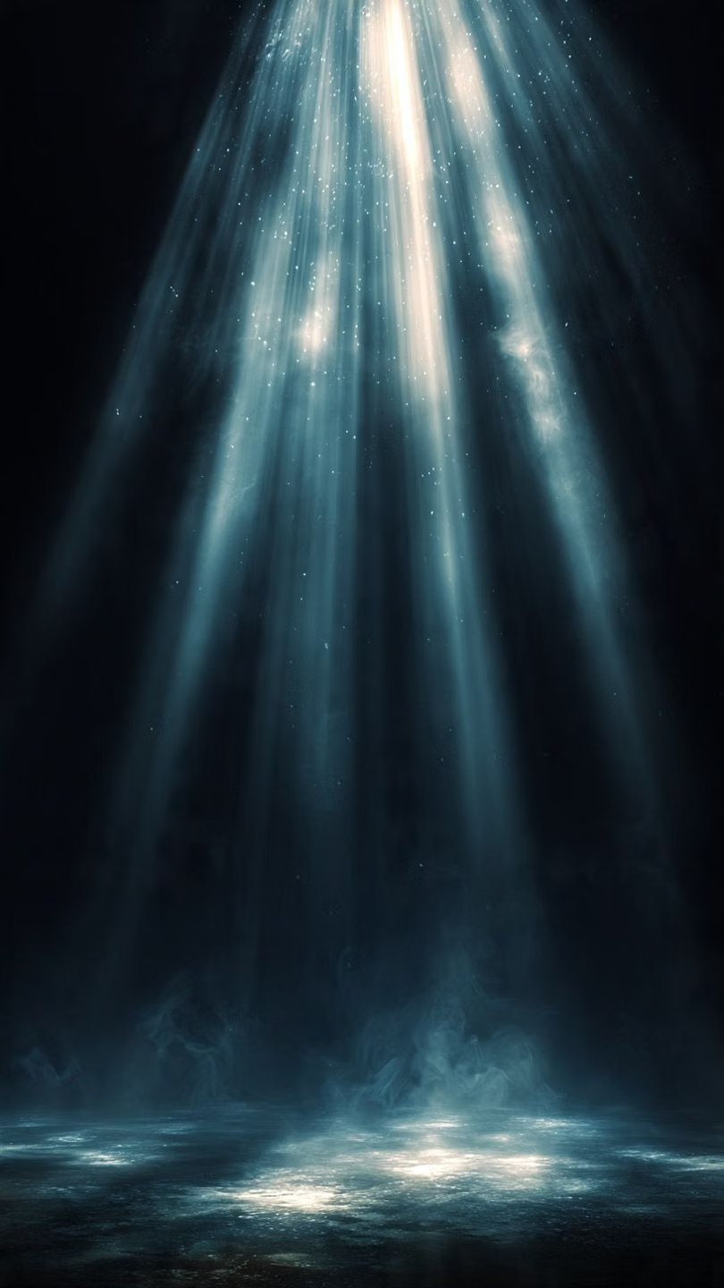
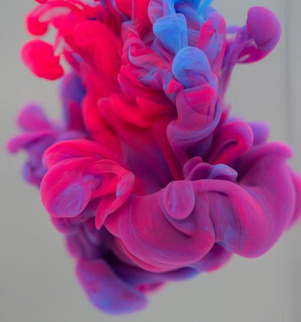
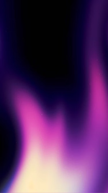
Moodboard and visual references
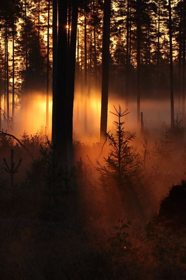
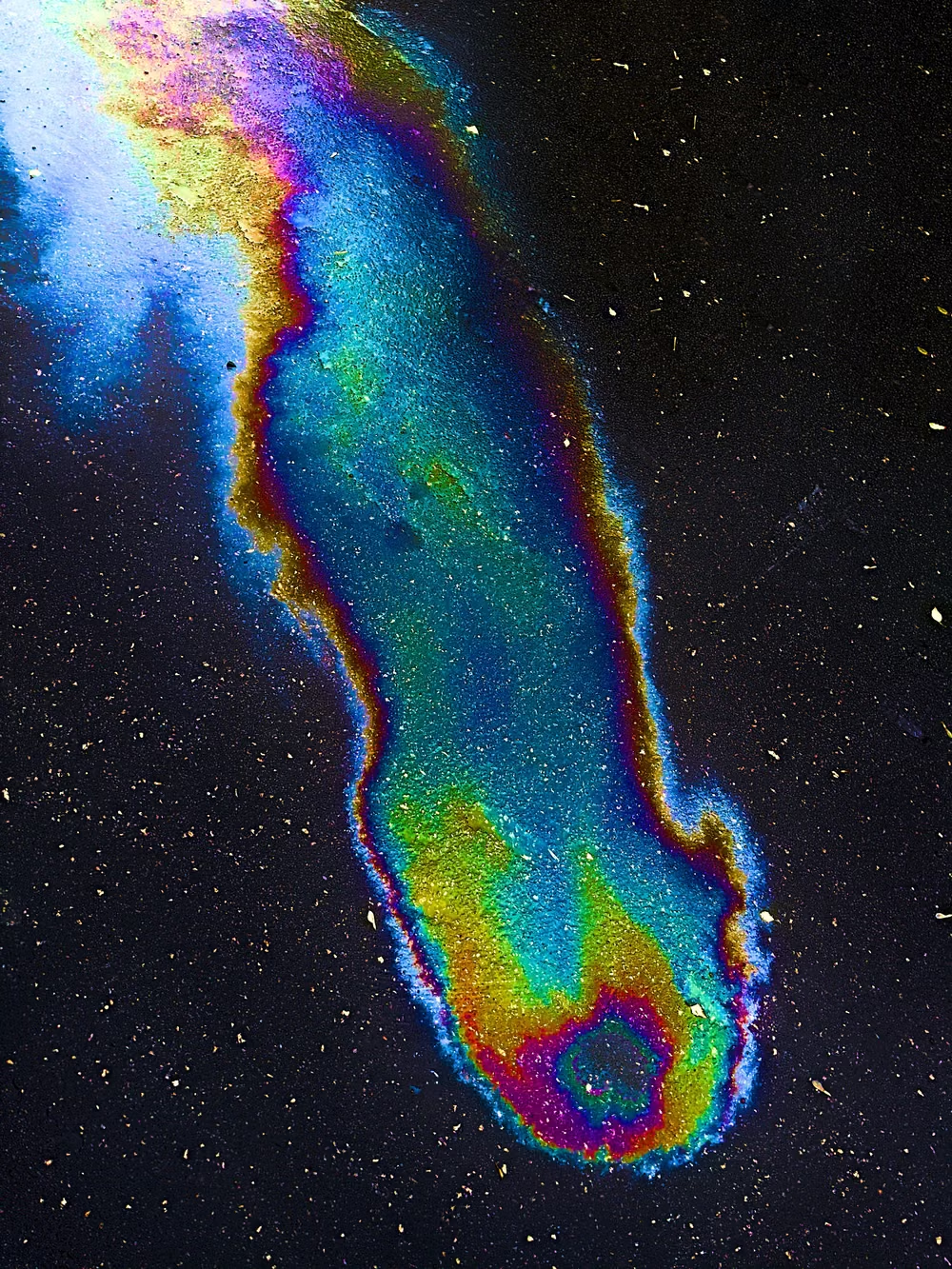
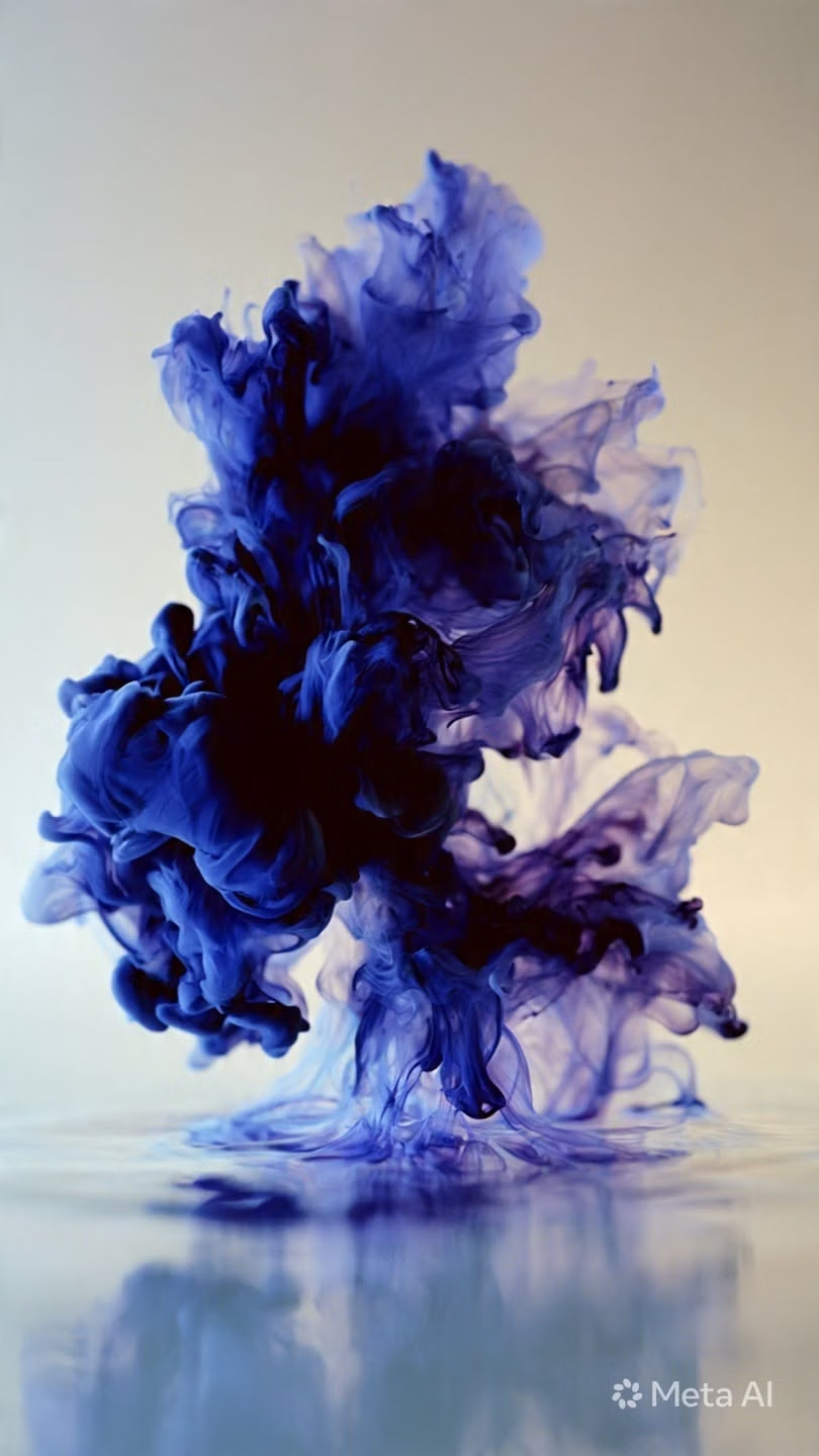
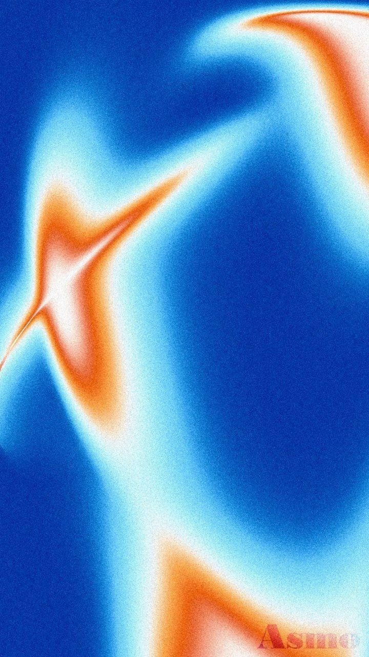
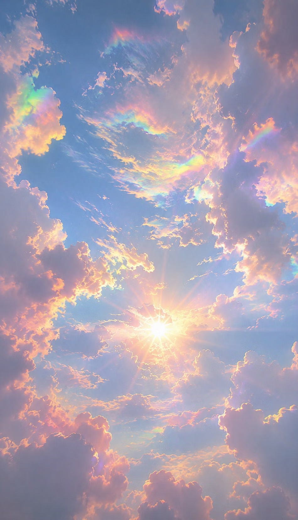
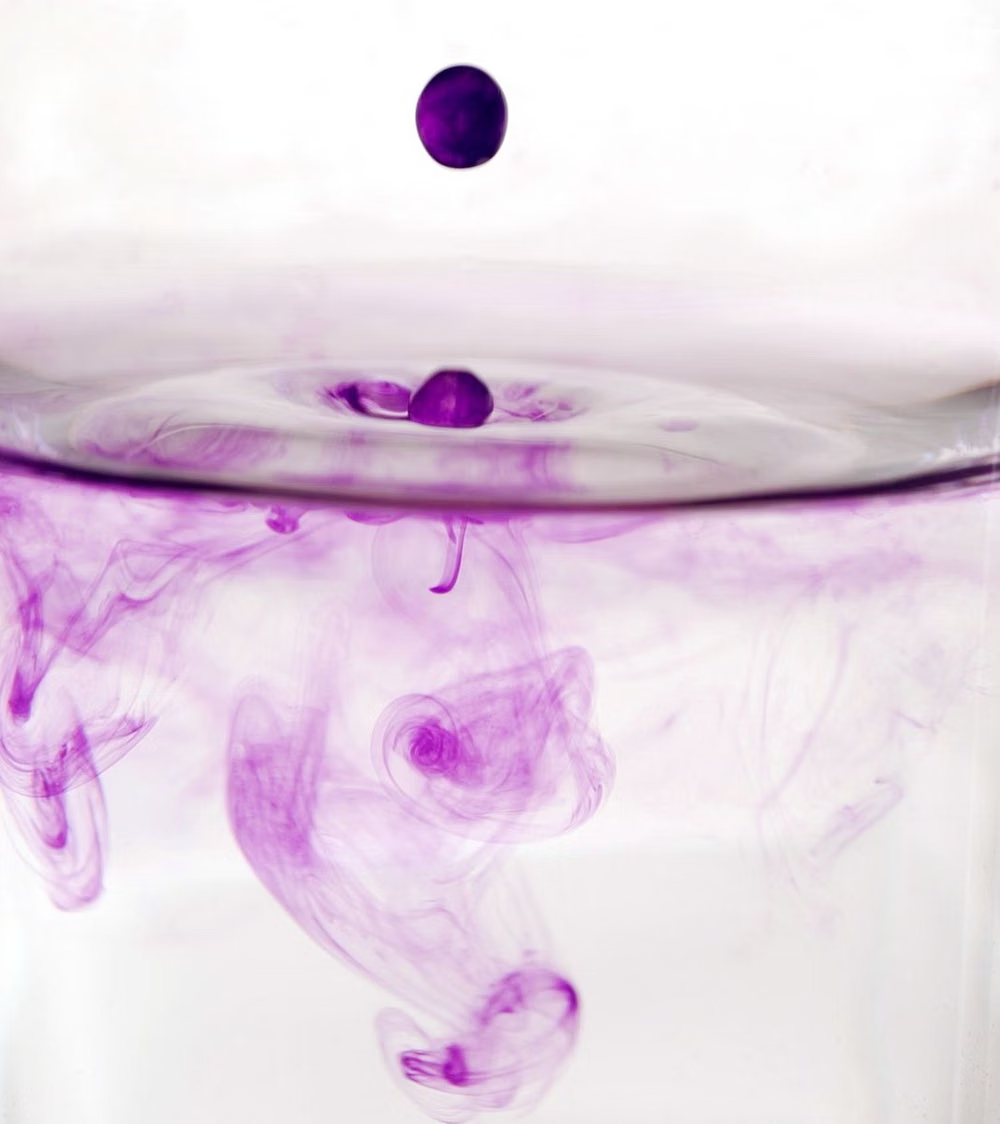
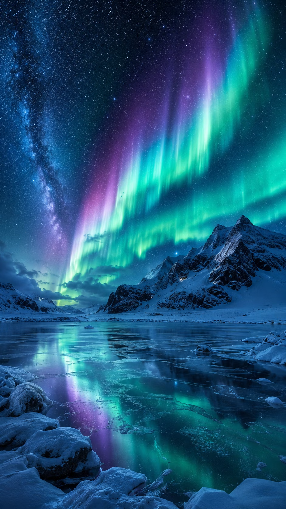
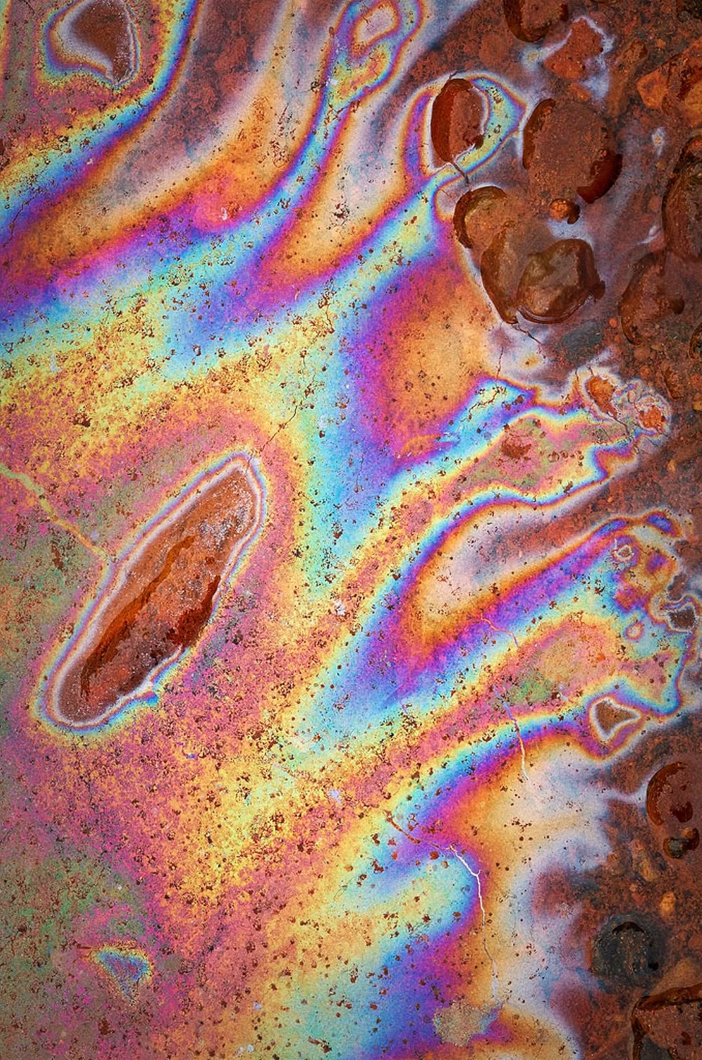
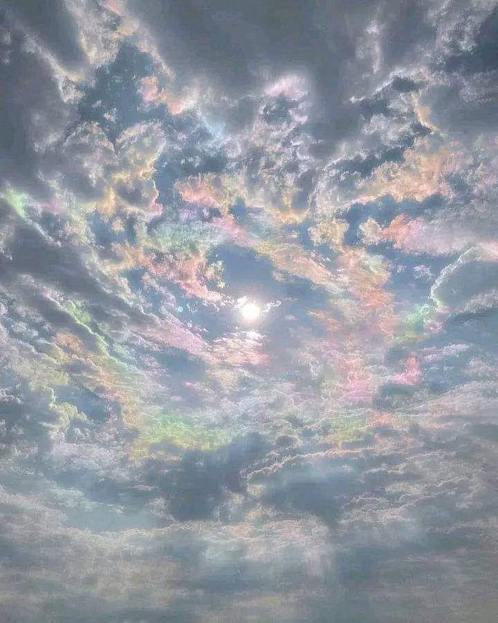
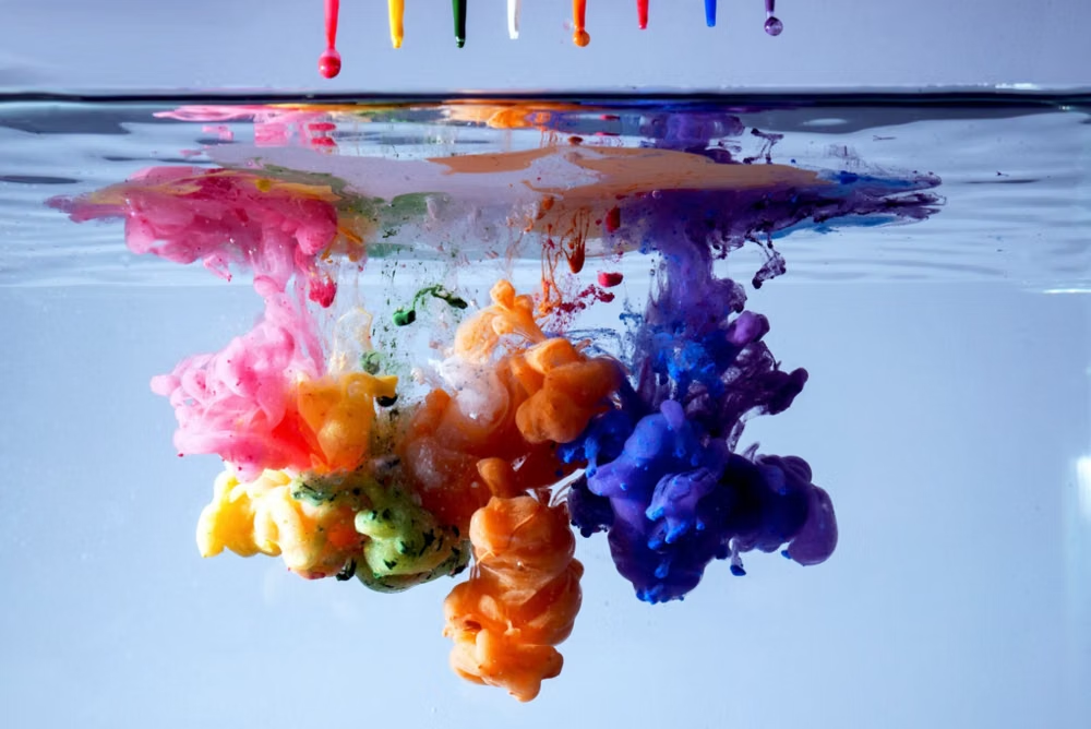
A visual study of the forms, inspirations, materials, colors, type, and cultural references associated with this UI design style.
Design principles and implementation
Use these principles to write a focused AI UI design prompt instead of asking for a vague visual treatment.
Color direction
Blend three to five neighboring luminous hues through soft multi-point fields, preserving quiet dark or pale zones behind important text. In a daisyUI theme, use the gradient's dominant luminous hue for `primary`, its nearest contrasting neighbor for `secondary`, and sample quiet near-white or deep-charcoal tones for the solid `base-100`, `base-200`, and `base-300` surfaces.
Imagery direction
Treat the gradient as primary atmosphere, then layer silhouettes, crisp product captures, or simple cutouts rather than competing full-color photography.
Content density
Keep gradient-heavy regions sparse and cinematic; move detailed features, forms, and data into visually settled sections.
Motion direction
Drift color clouds slowly through position and blur changes, stopping movement near reading tasks and honoring reduced-motion preferences.
Shape language
Echo the color fields with broad rounded frames, diffuse halos, and occasional soft blobs while keeping functional controls geometrically clear. In daisyUI themes, set the `--radius-*` variables between `0.75rem` and `1.5rem`.
Typography rules
Use a contemporary sans-serif with large, compact headlines and plain body text; never fill paragraphs or small labels with the gradient.
Suggested Typfaces
Sora
Fresh daisies glow in warm sunlight
Fresh daisies glow in warm sunlight
1 2 3 4 5 6 7 8 9 0
Outfit
Fresh daisies glow in warm sunlight
Fresh daisies glow in warm sunlight
1 2 3 4 5 6 7 8 9 0
Plus Jakarta Sans
Fresh daisies glow in warm sunlight
Fresh daisies glow in warm sunlight
1 2 3 4 5 6 7 8 9 0
Urbanist
Fresh daisies glow in warm sunlight
Fresh daisies glow in warm sunlight
1 2 3 4 5 6 7 8 9 0
Manrope
Fresh daisies glow in warm sunlight
Fresh daisies glow in warm sunlight
1 2 3 4 5 6 7 8 9 0
Build a Mesh Gradient / Aurora UI interface with daisyUI
The live example translates this direction into daisyUI components and semantic theme tokens.
To generate a full page in the same visual language, give the style name and the design rules above to Blueprint MCP.
Related UI design styles
Compare nearby visual languages that share typography, shapes, use cases, or signature elements.
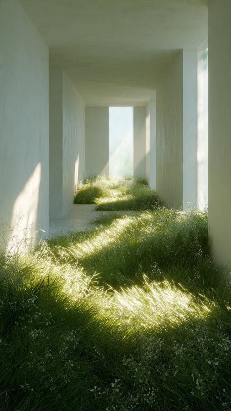
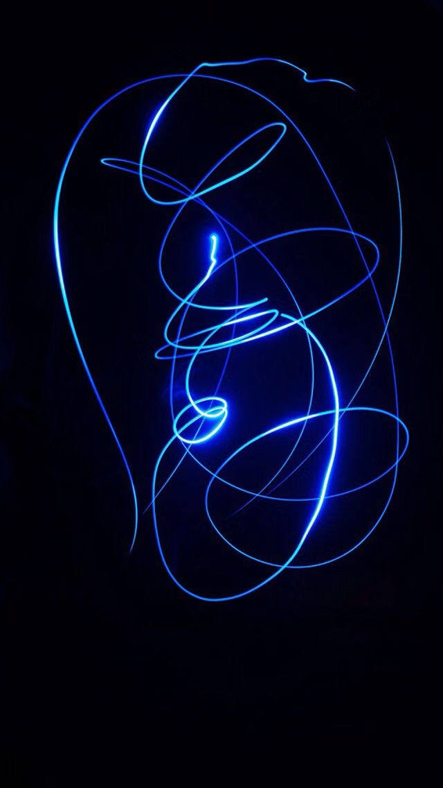
Luminous Eco-Skeuomorphism UI design style
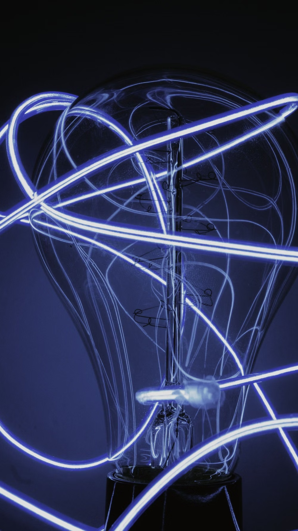
A glossy, tactile interface style that combines early-2010s skeuomorphism with futuristic ecological-tech aesthetics. Controls resemble illuminated physical hardware, with intense inner glows, radiant edges, and soft light bloom making interactive elements appear electrically powered.
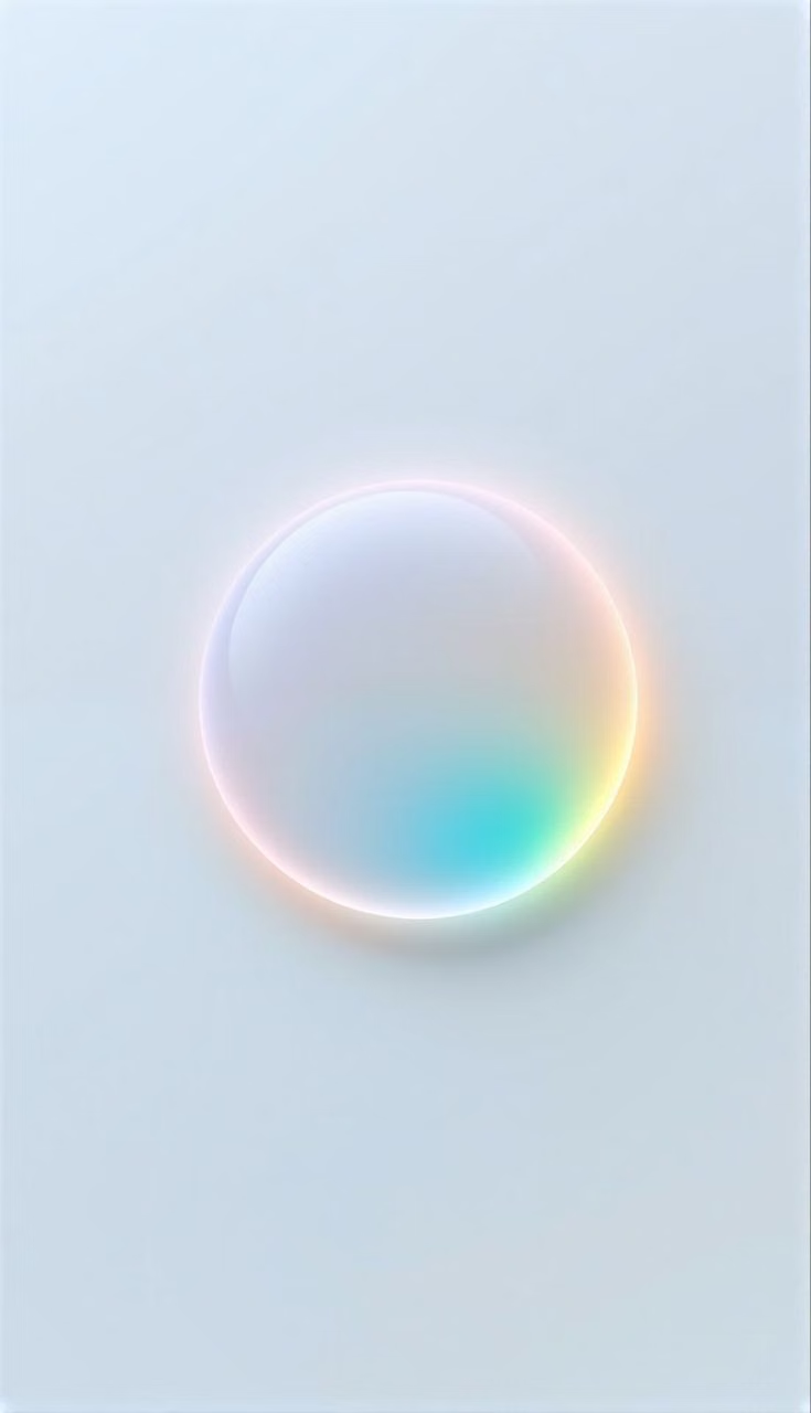
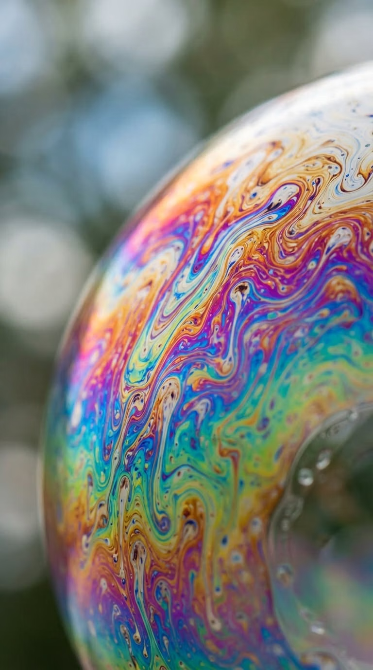
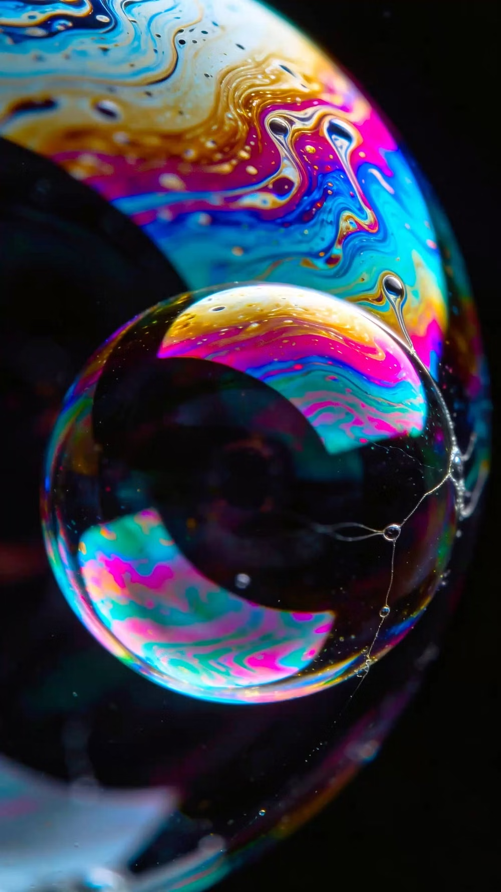
Holographic / Iridescent UI design style
Spectral color shifts, pearlescent gradients, reflective surfaces, diffraction, and futuristic light effects.
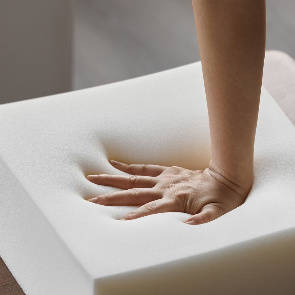
Neumorphism UI design style
Low-contrast monochromatic surfaces with controls that appear softly raised from or pressed into the background.