Organic / Blob Design UI design style
Fluid silhouettes, asymmetric curves, soft blobs, rounded containers, and freeform compositions replace rigid geometry.
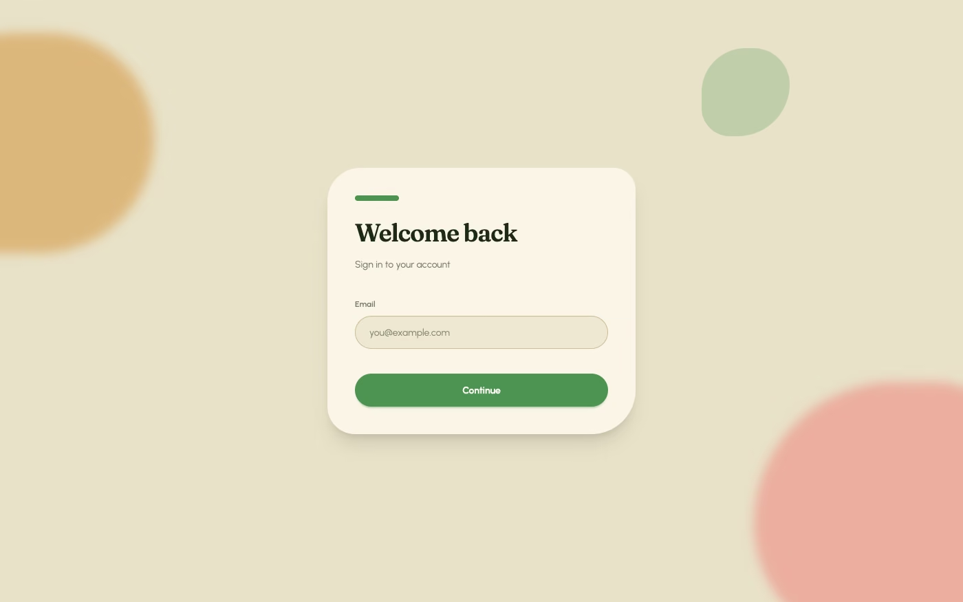
Design overview
- Signature elements
- blob shapes, asymmetric curves, fluid containers, soft edges, freeform layout, playful motion
- Best suited to
- Wellness, creative tools, lifestyle brands, onboarding, and approachable technology products.
- Layout principles
- Arrange sections along a loose flowing path with asymmetrical overlaps, while maintaining one dependable reading spine for text and controls.
History and origins
A fact-checked account of where this visual language came from, with links to the references used.
- Period
- Early 20th-century biomorphic art; digital revival in the late 2010s
- Origin
- Modern art and contemporary vector-based product design
Organic or Blob Design is a contemporary UI label with older biomorphic roots. Early-20th-century artists used abstract forms that suggested plants, bodies, and cells without depicting them literally; vector tools and flexible web layouts made similar irregular silhouettes easy to deploy at scale, producing the conspicuous late-2010s wave of soft brand blobs.
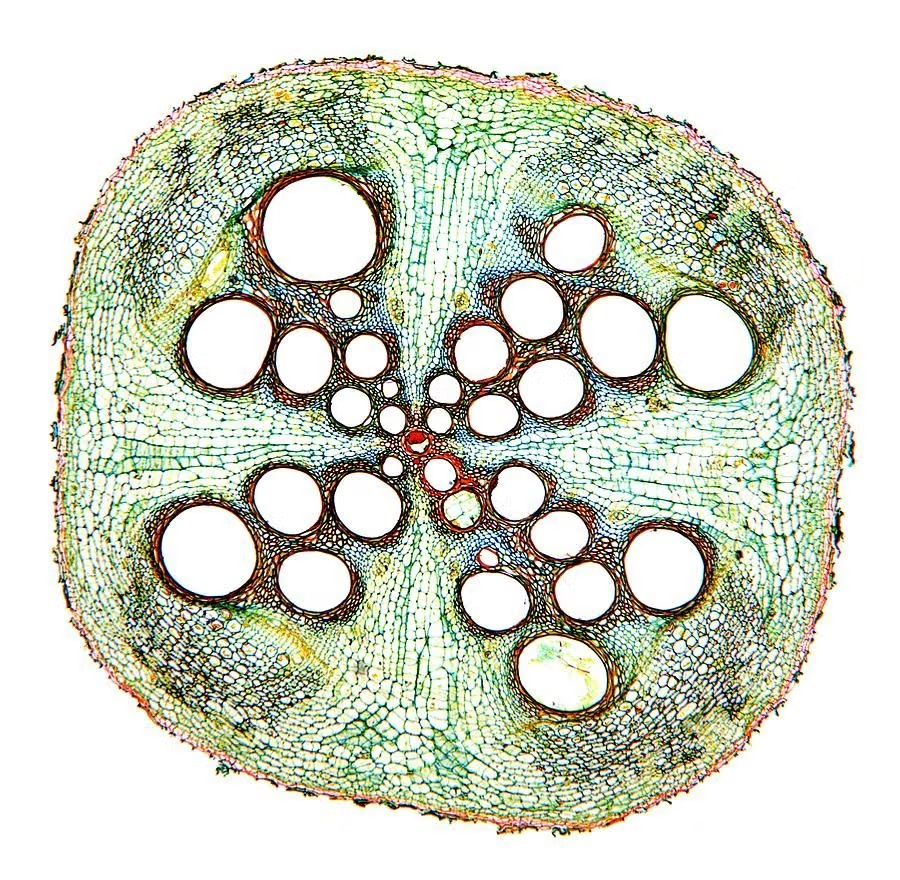
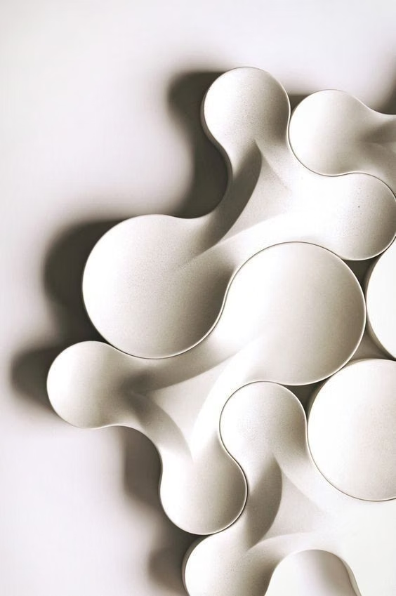
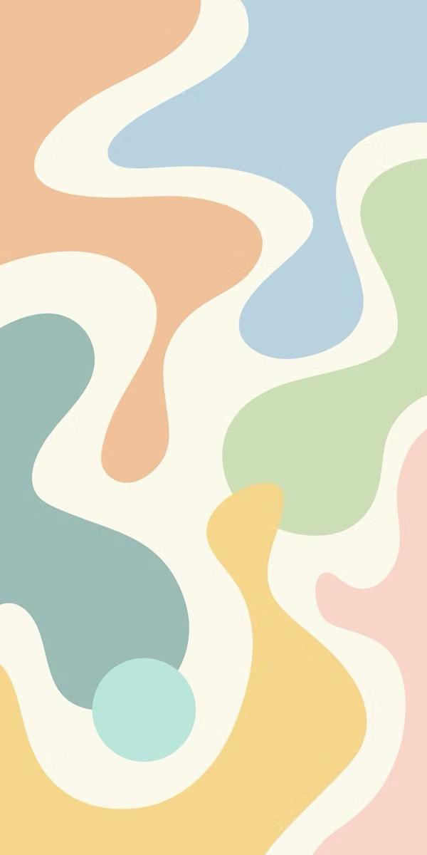
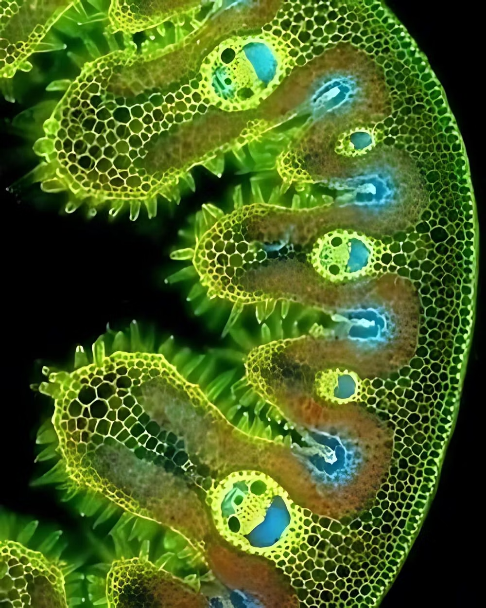
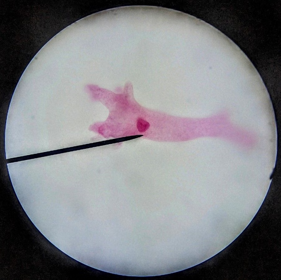
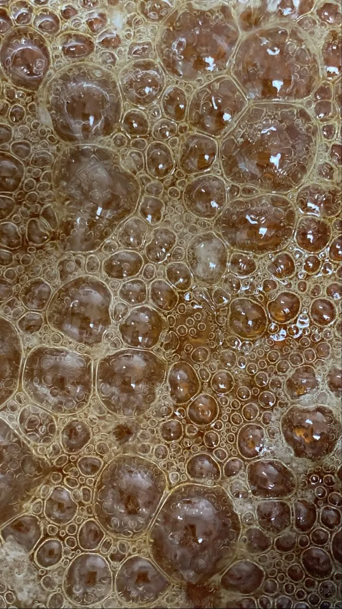
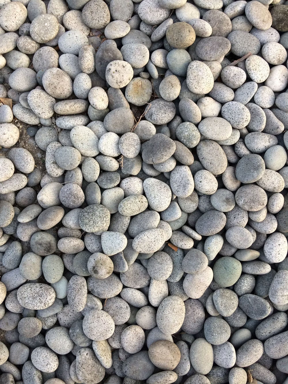
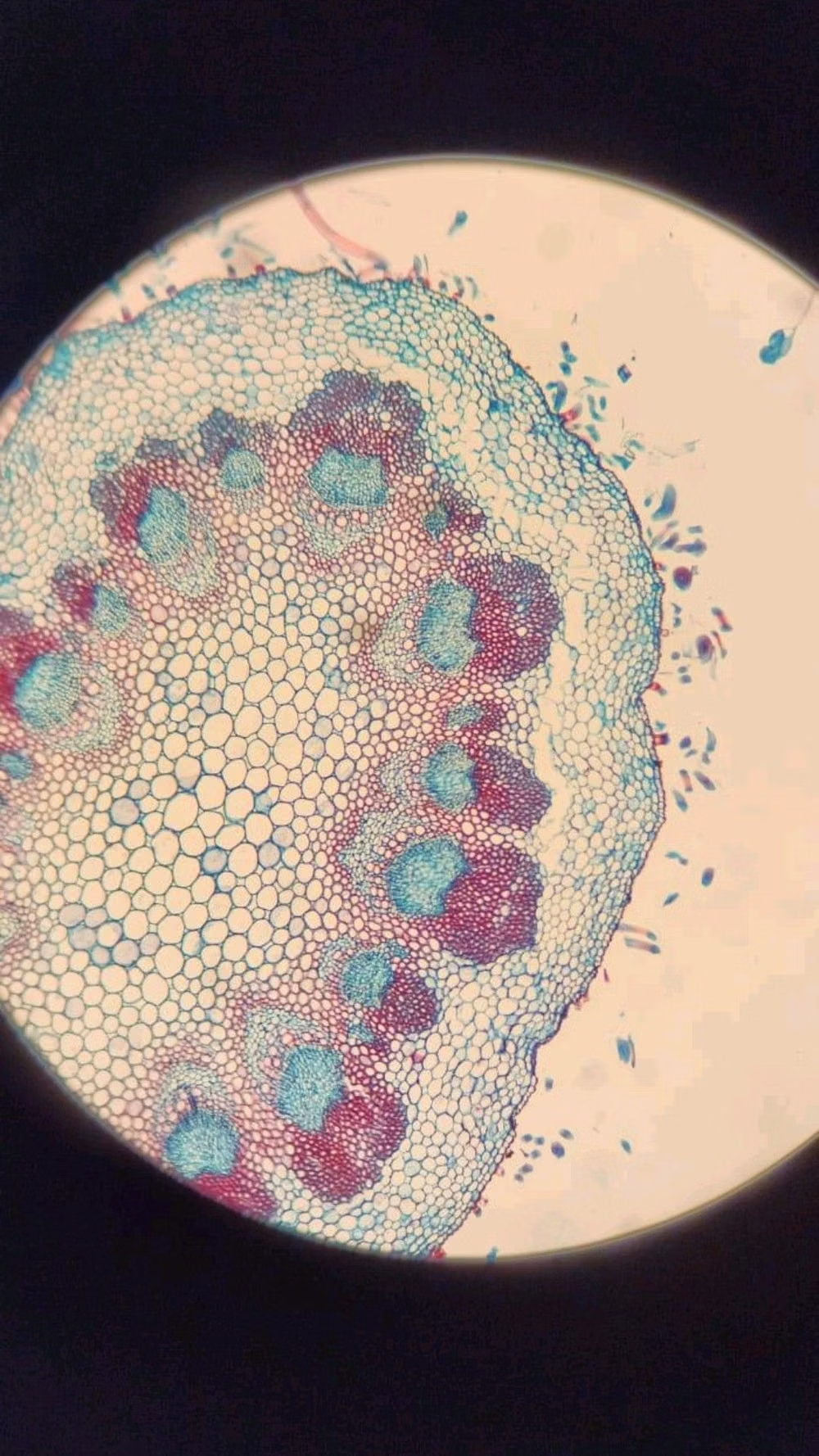
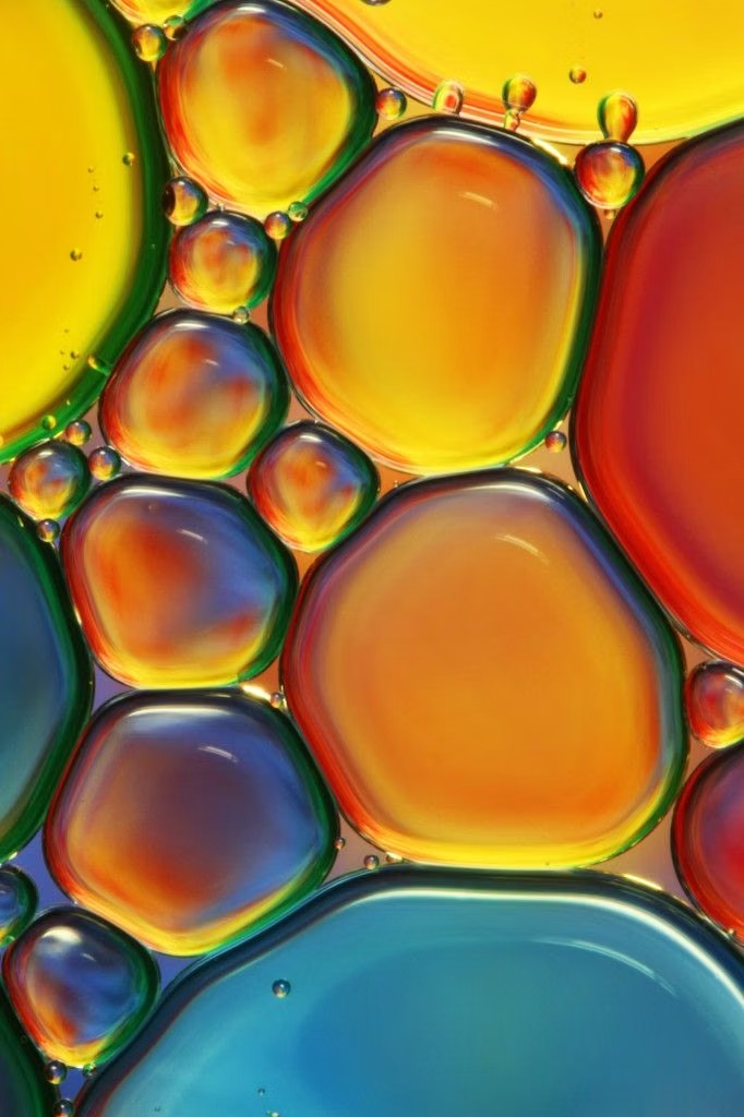
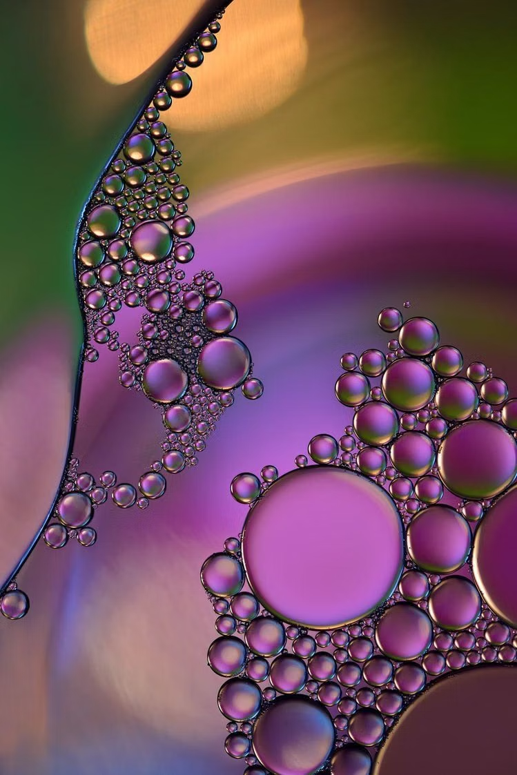
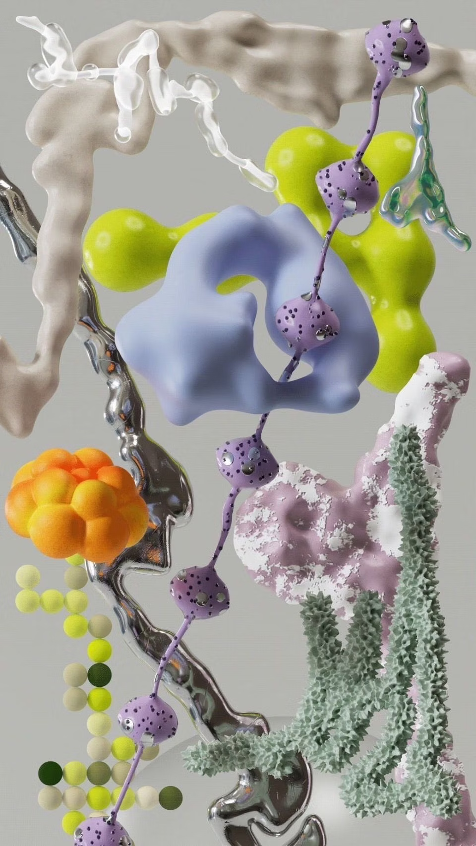
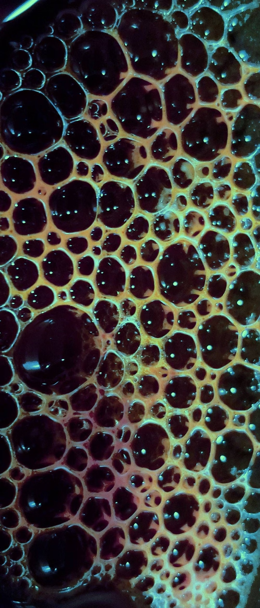
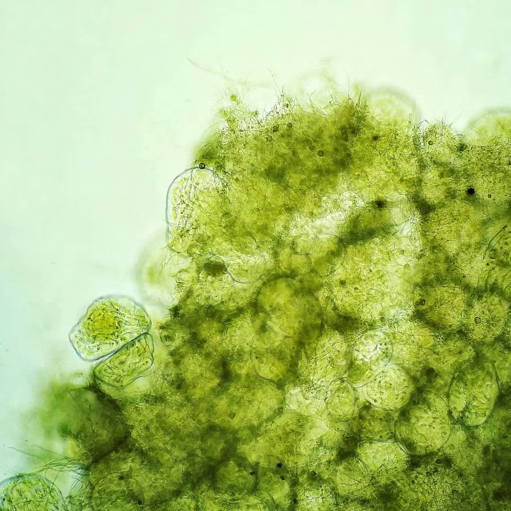
Moodboard and visual references
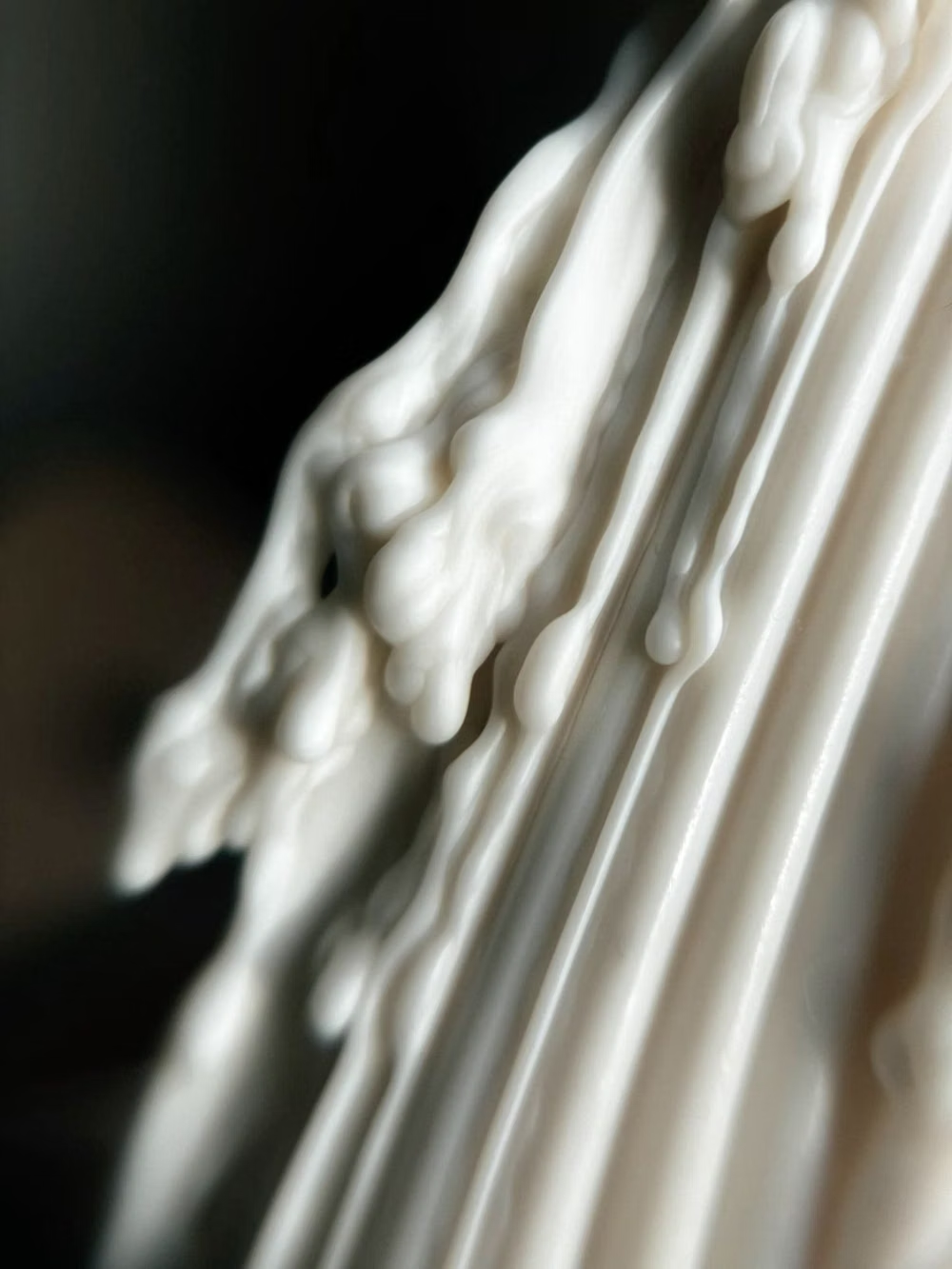
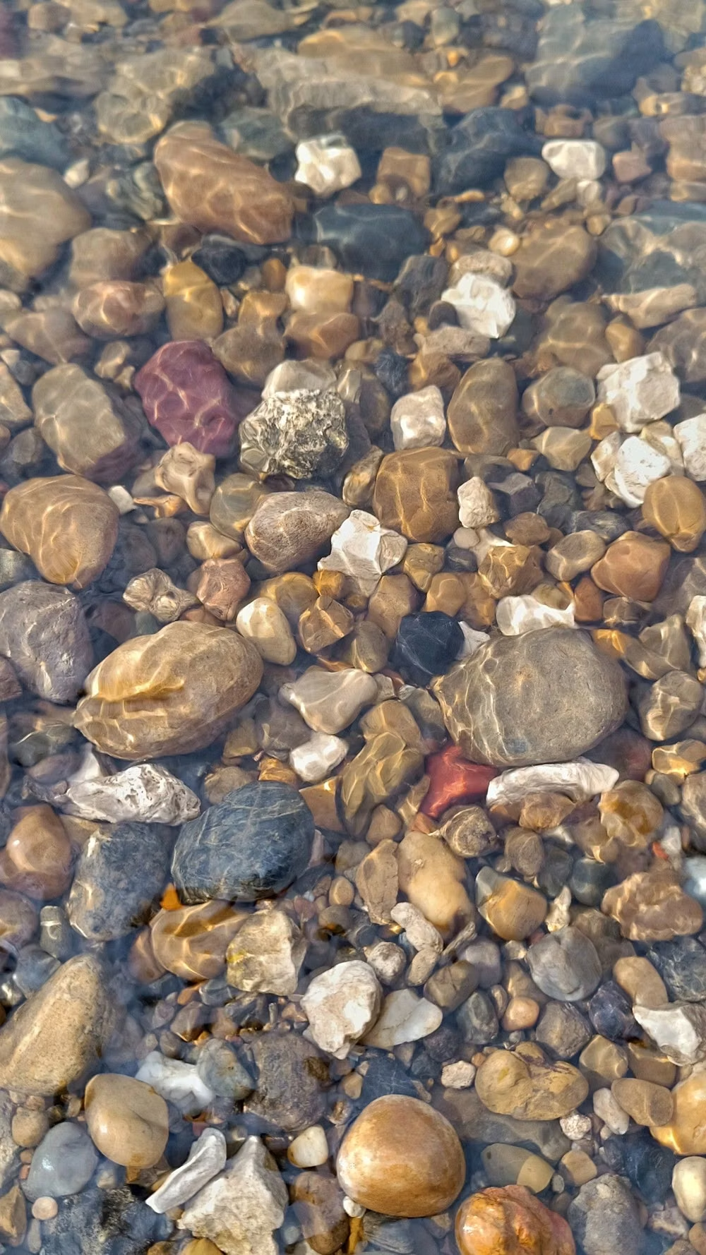
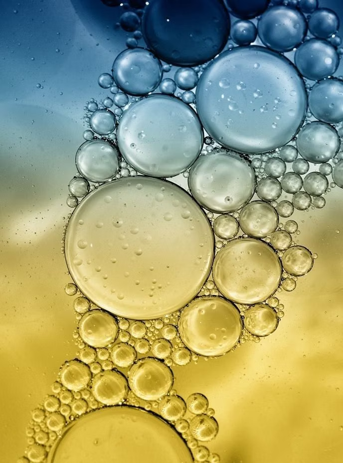
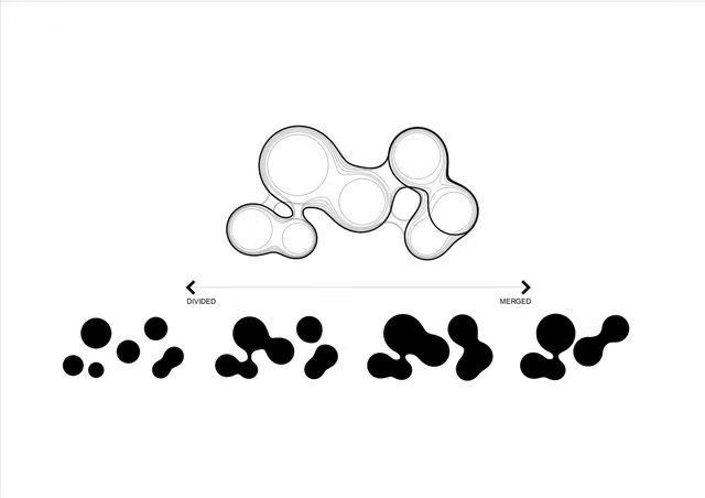
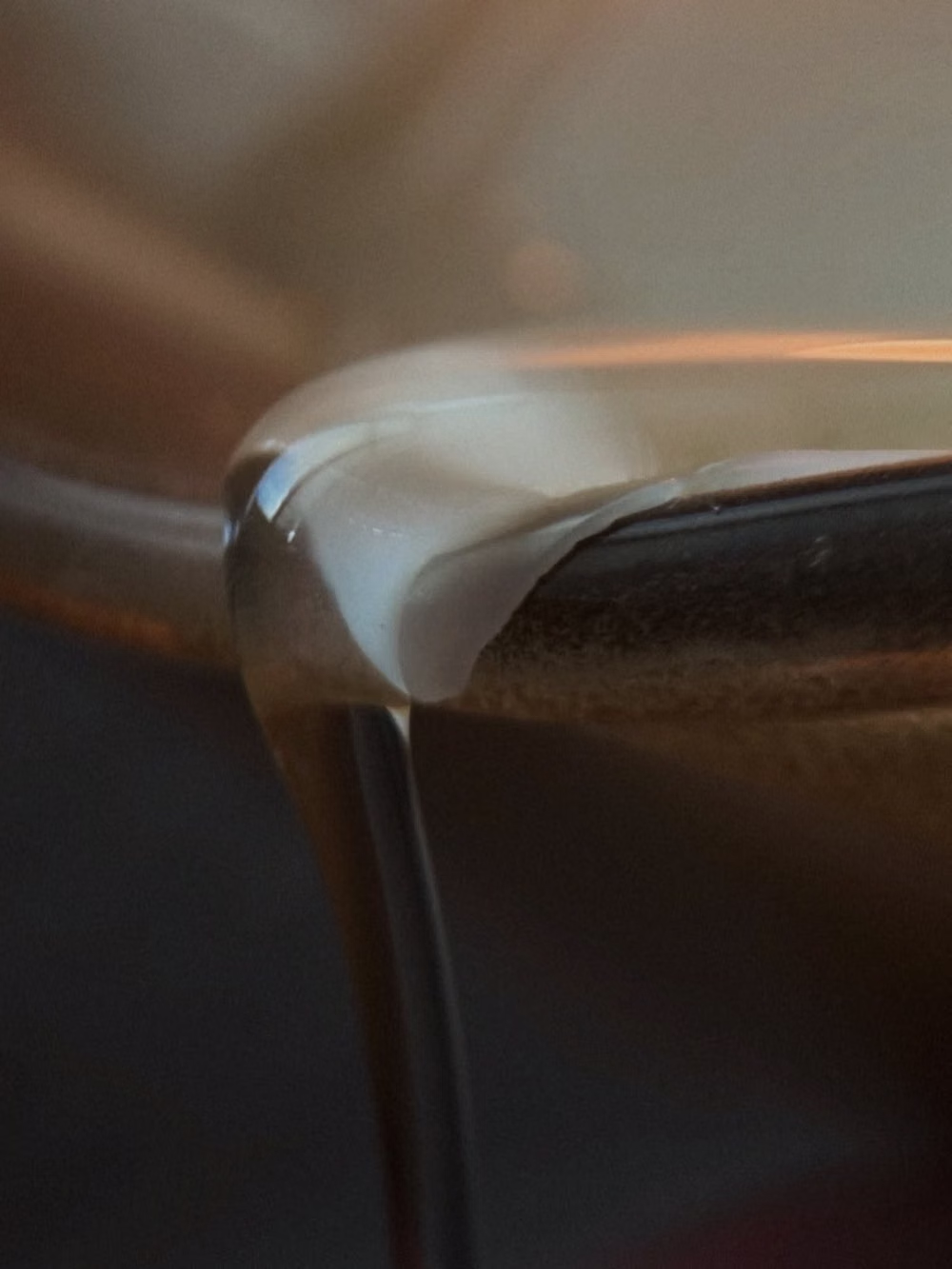
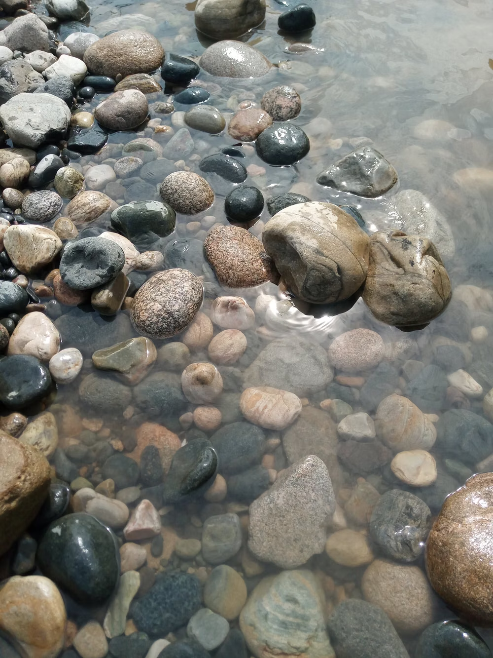
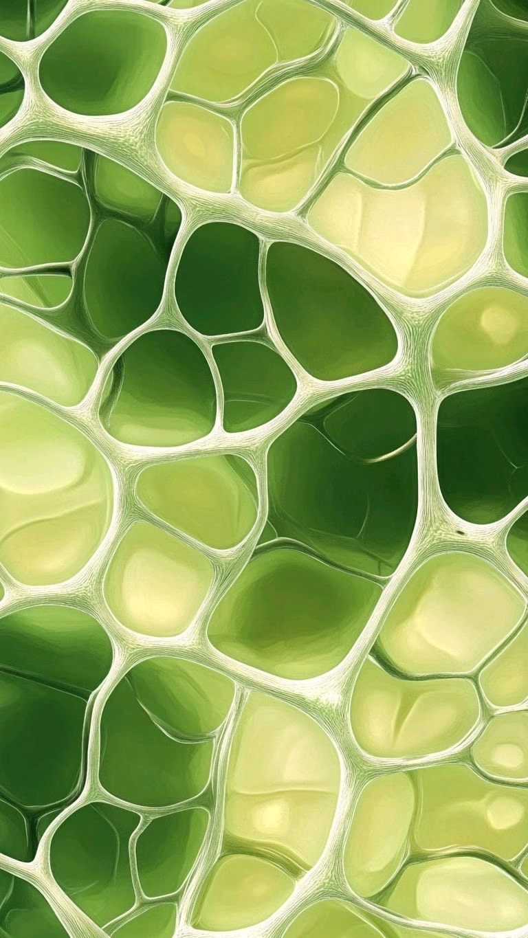
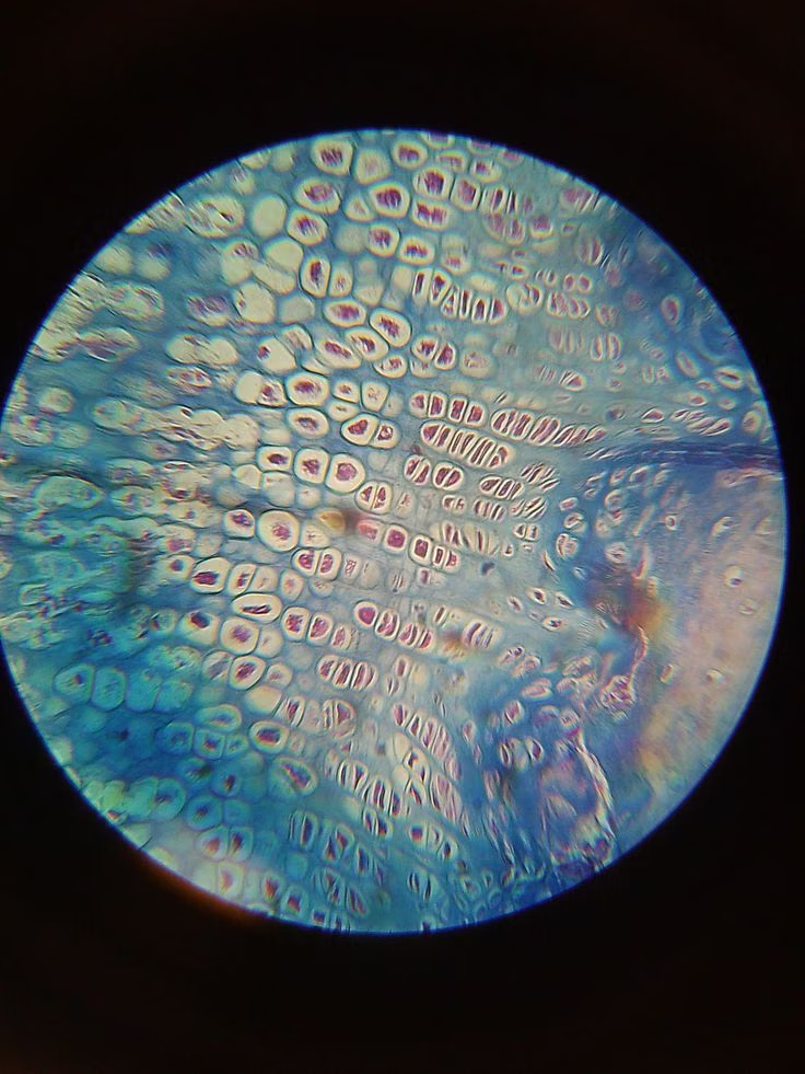
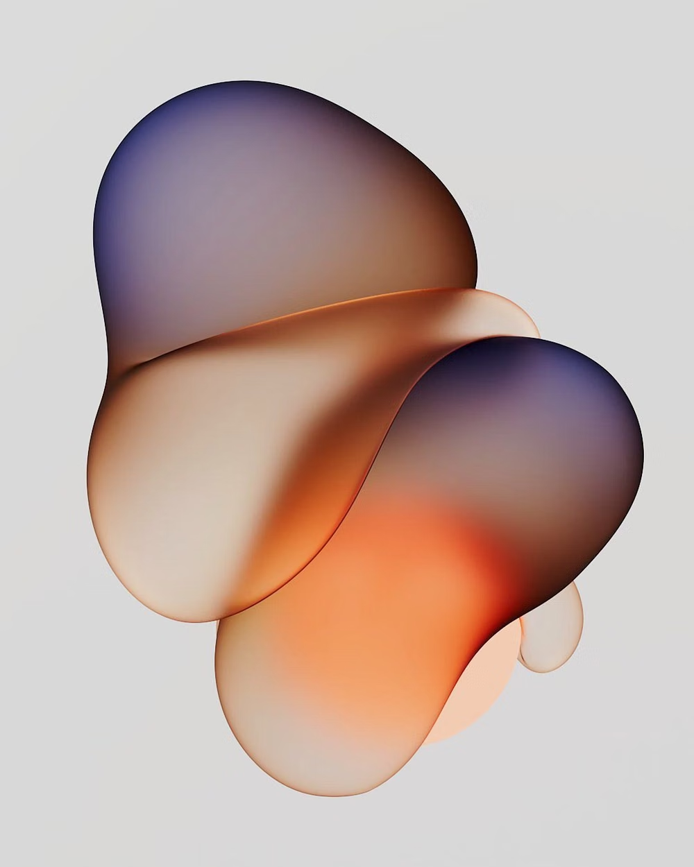
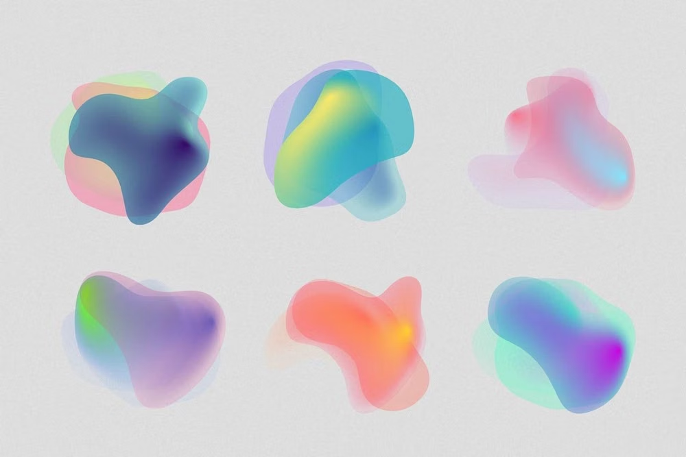
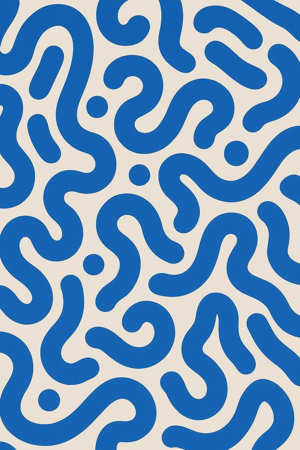
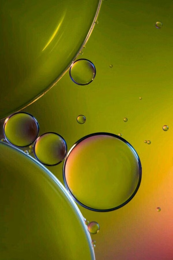
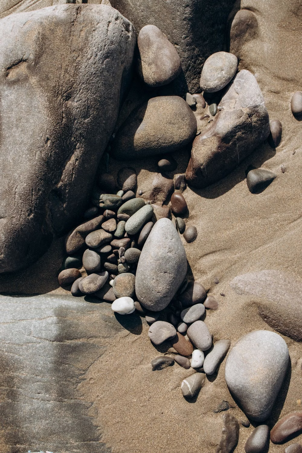
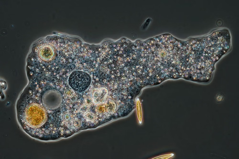
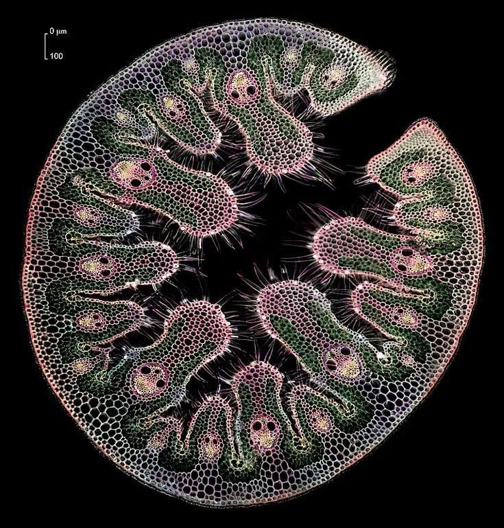
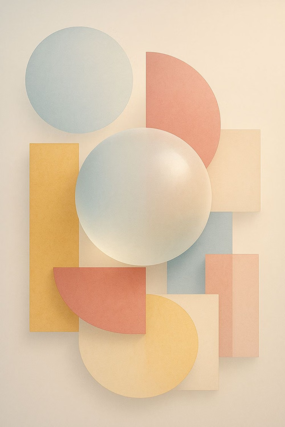
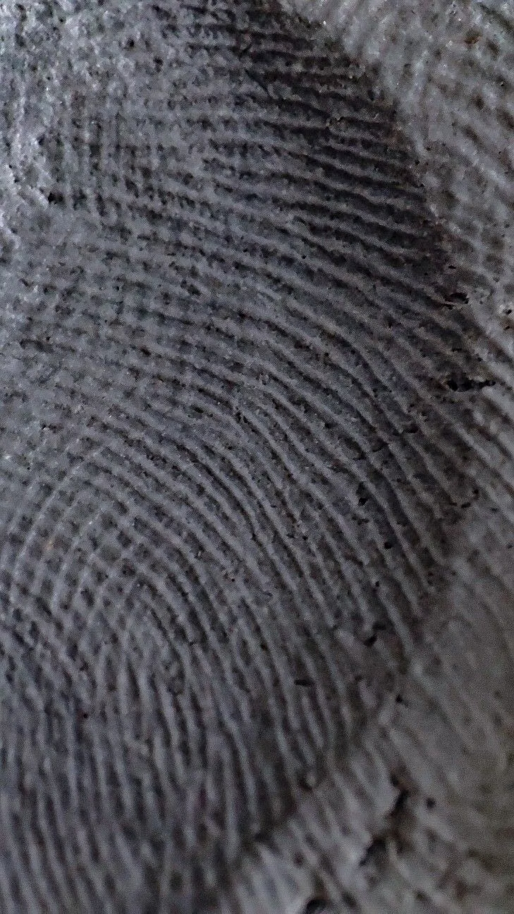
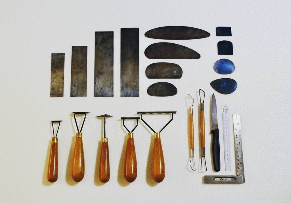
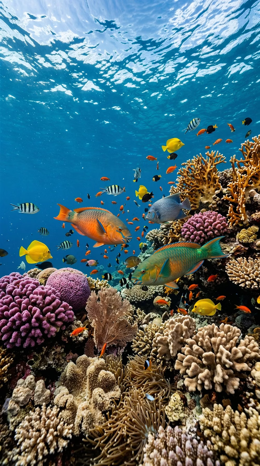
A visual study of the forms, inspirations, materials, colors, type, and cultural references associated with this UI design style.
Design principles and implementation
Use these principles to write a focused AI UI design prompt instead of asking for a vague visual treatment.
Color direction
Use botanical, fruit, or mineral tones in soft pairings, with occasional blended transitions that follow the edges of organic forms. In a daisyUI theme, use the strongest botanical or fruit hue for `primary`, a soft neighboring mineral tone for `secondary`, and step `base-100`, `base-200`, and `base-300` through cream, pale mineral, and gently tinted earth surfaces.
Imagery direction
Combine cutout people, plants, hand-modeled objects, and abstract fluid fields whose contours interact with nearby content.
Content density
Keep density low to medium, giving curved containers enough internal space and avoiding long text inside narrow blob extremities. Use the `*-lg` size variants for daisyUI components to reinforce the chunky, informal scale.
Motion direction
Morph silhouettes slowly, float small accents, and let sections ease into one another with soft organic timing rather than rigid slides.
Shape language
Use asymmetric blobs, pebble cards, soft waves, and irregular circular crops while keeping interactive targets predictably sized. In daisyUI themes, set the `--radius-*` variables between `1rem` and `2rem`.
Typography rules
Choose a warm humanist sans-serif or soft display serif, follow generous leading, and keep type on calm regions instead of wrapping it around every curve.
Suggested Typfaces
Fraunces
Fresh daisies glow in warm sunlight
Fresh daisies glow in warm sunlight
1 2 3 4 5 6 7 8 9 0
Gabarito
Fresh daisies glow in warm sunlight
Fresh daisies glow in warm sunlight
1 2 3 4 5 6 7 8 9 0
Varela Round
Fresh daisies glow in warm sunlight
Fresh daisies glow in warm sunlight
1 2 3 4 5 6 7 8 9 0
Quicksand
Fresh daisies glow in warm sunlight
Fresh daisies glow in warm sunlight
1 2 3 4 5 6 7 8 9 0
Urbanist
Fresh daisies glow in warm sunlight
Fresh daisies glow in warm sunlight
1 2 3 4 5 6 7 8 9 0
Build a Organic / Blob Design interface with daisyUI
The live example translates this direction into daisyUI components and semantic theme tokens.
To generate a full page in the same visual language, give the style name and the design rules above to Blueprint MCP.
Related UI design styles
Compare nearby visual languages that share typography, shapes, use cases, or signature elements.
Biophilic Design UI design style
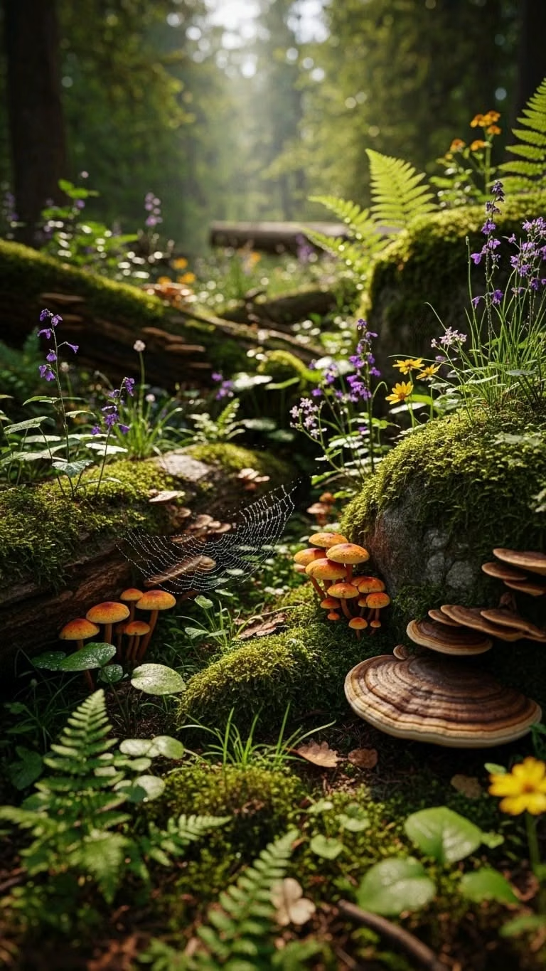
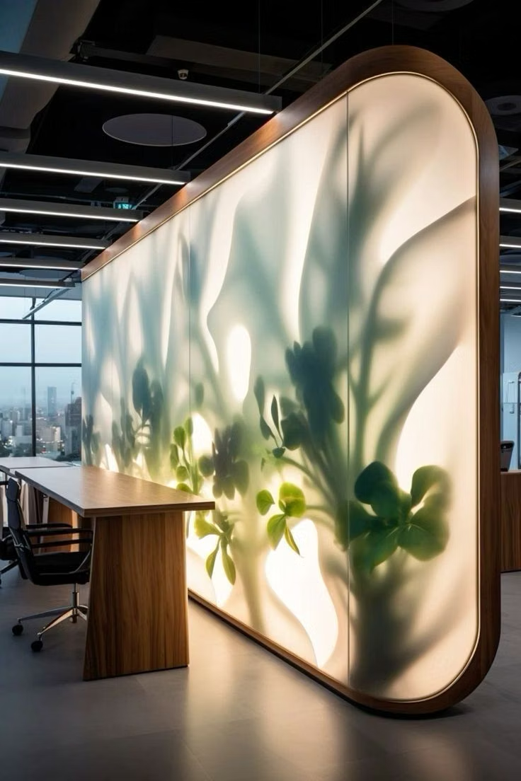
Nature-centered interfaces use organic shapes, botanical imagery, earthy colors, natural textures, and gentle motion.
Claymorphism UI design style
Inflated, clay-like components with pastel colors, large radii, soft shading, and playful dimensional shadows.
Frutiger Aero UI design style
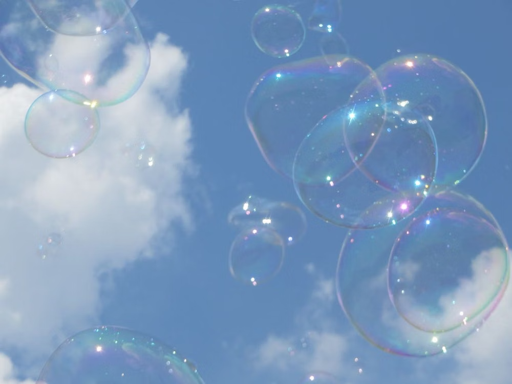
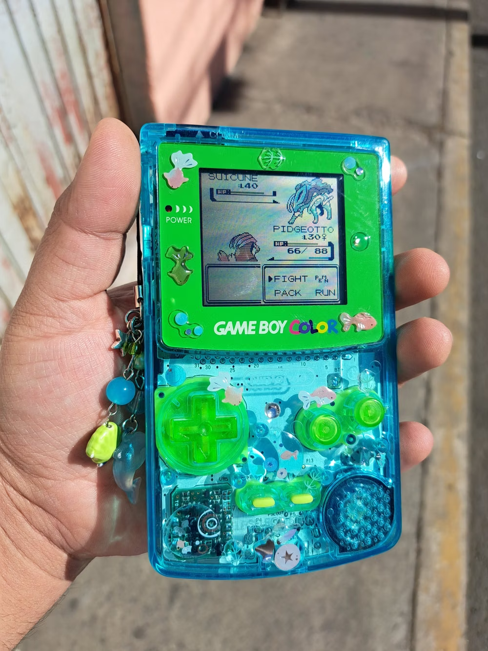
Glossy blue-and-green visuals combine skeuomorphic interfaces, glassy controls, water, bubbles, open skies, nature, and optimistic technology.