Scandinavian Modern UI design style
Functional simplicity, light palettes, warm natural materials, clean lines, and friendly human-centered restraint.
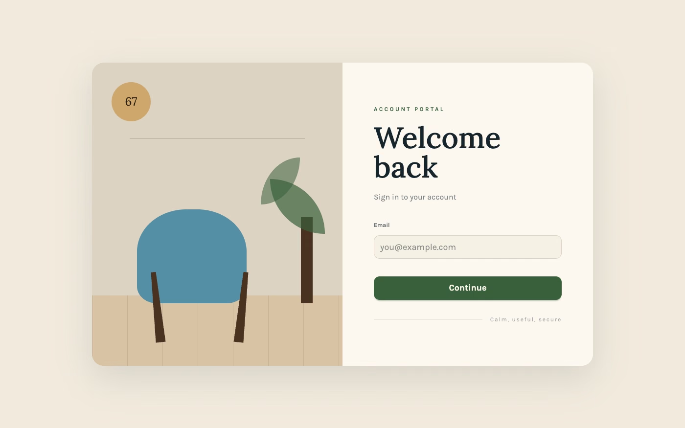
Design overview
- Signature elements
- light neutrals, clean lines, warm wood tones, functional spacing, humanist type, subtle color accents
- Best suited to
- Furniture, lifestyle, wellness, architecture, commerce, and productivity products.
- Layout principles
- Use airy functional modules, calm asymmetry, and generous margins, balancing clean product grids with warm lifestyle or interior scenes.
History and origins
A fact-checked account of where this visual language came from, with links to the references used.
- Period
- 1920s roots; international prominence in the 1940s–1960s
- Origin
- Denmark, Sweden, Finland, Norway, and Iceland
Scandinavian Modern developed through Nordic architecture, furniture, glass, textile, and product design, with roots in the 1920s and strong international visibility after World War II. It joined functional production with human scale, craft knowledge, light, and natural materials; “Danish Modern” became a particularly influential export within the broader regional story.
Moodboard and visual references
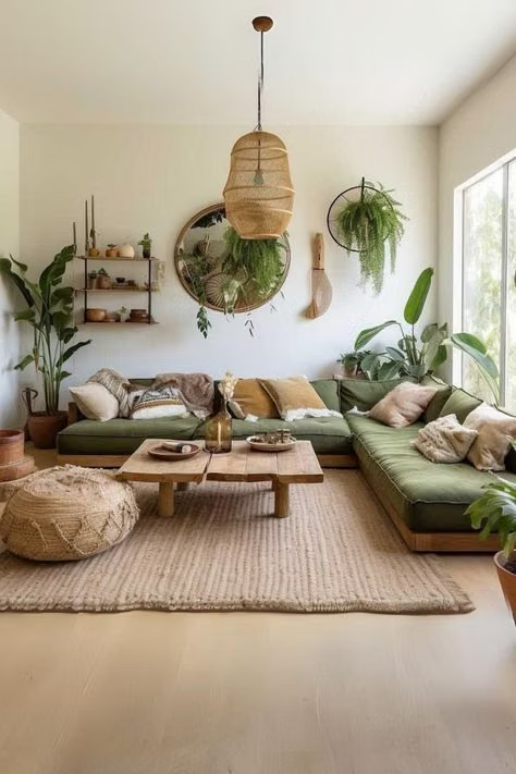
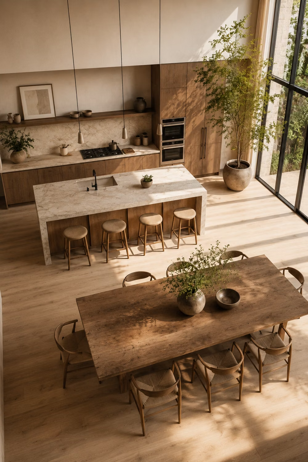
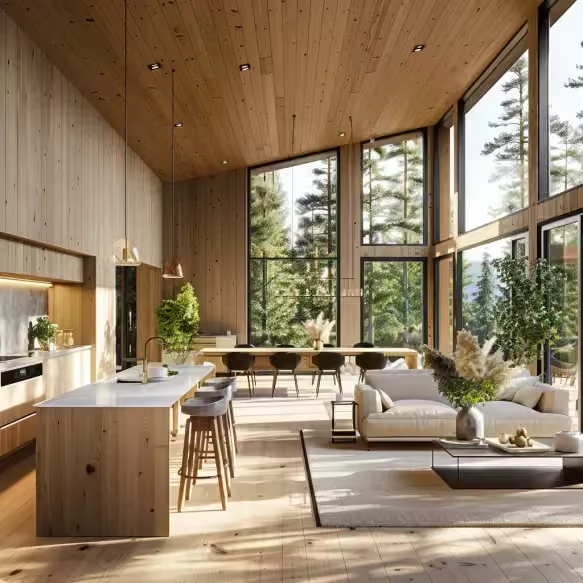
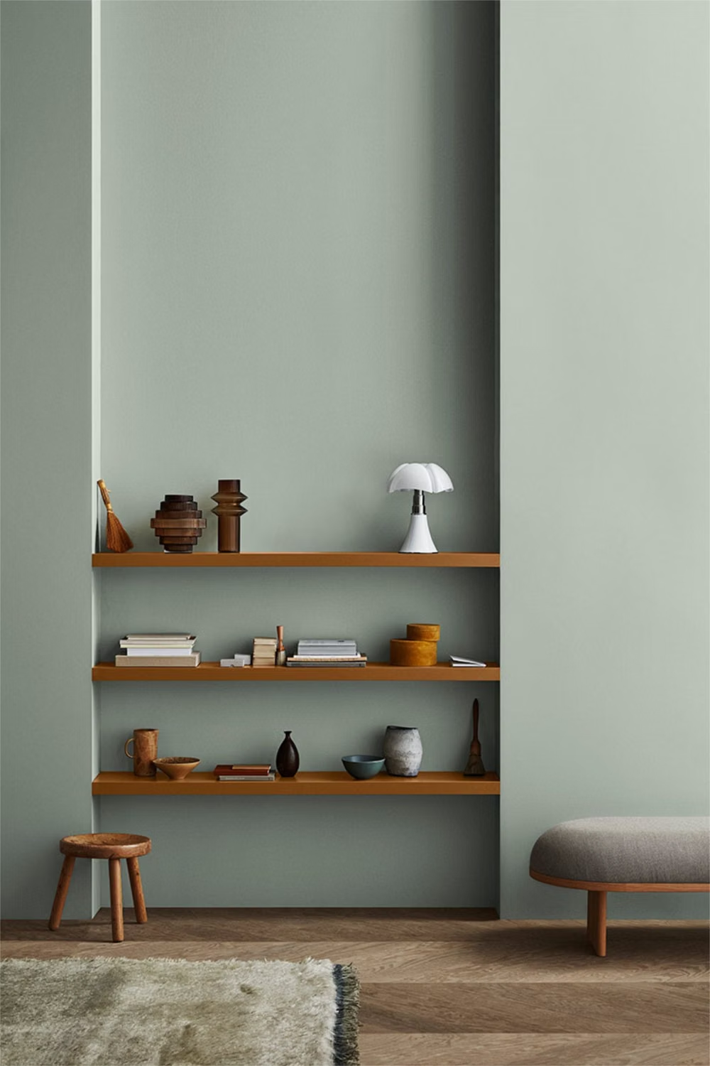
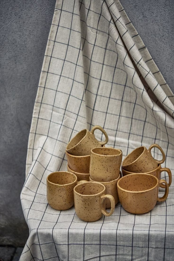
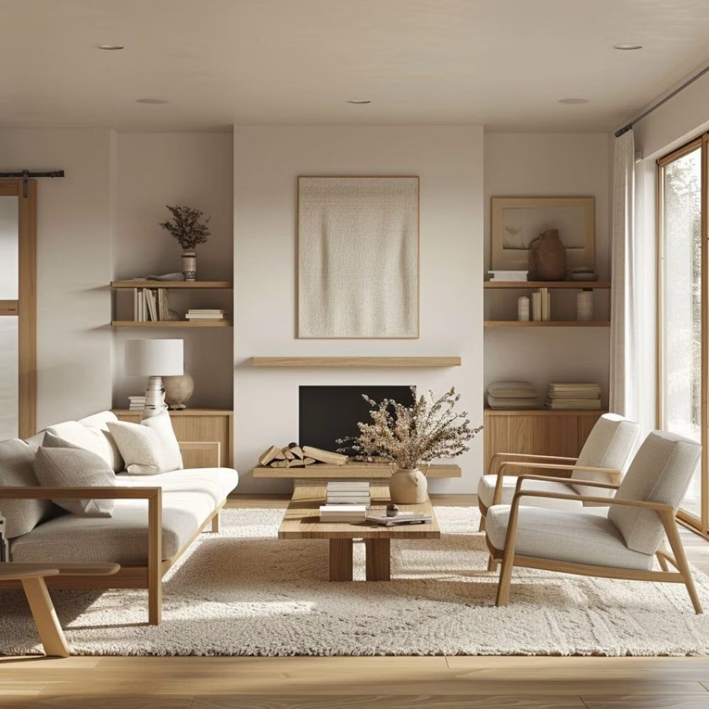
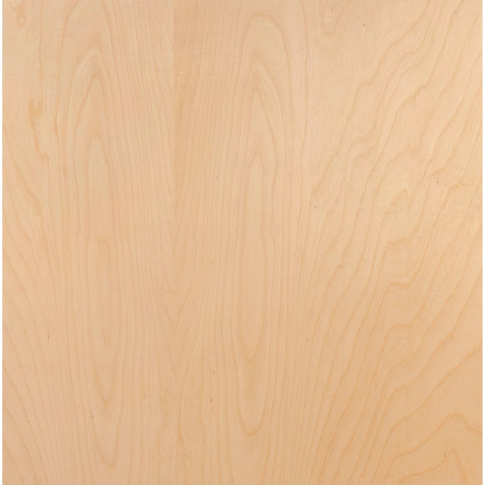
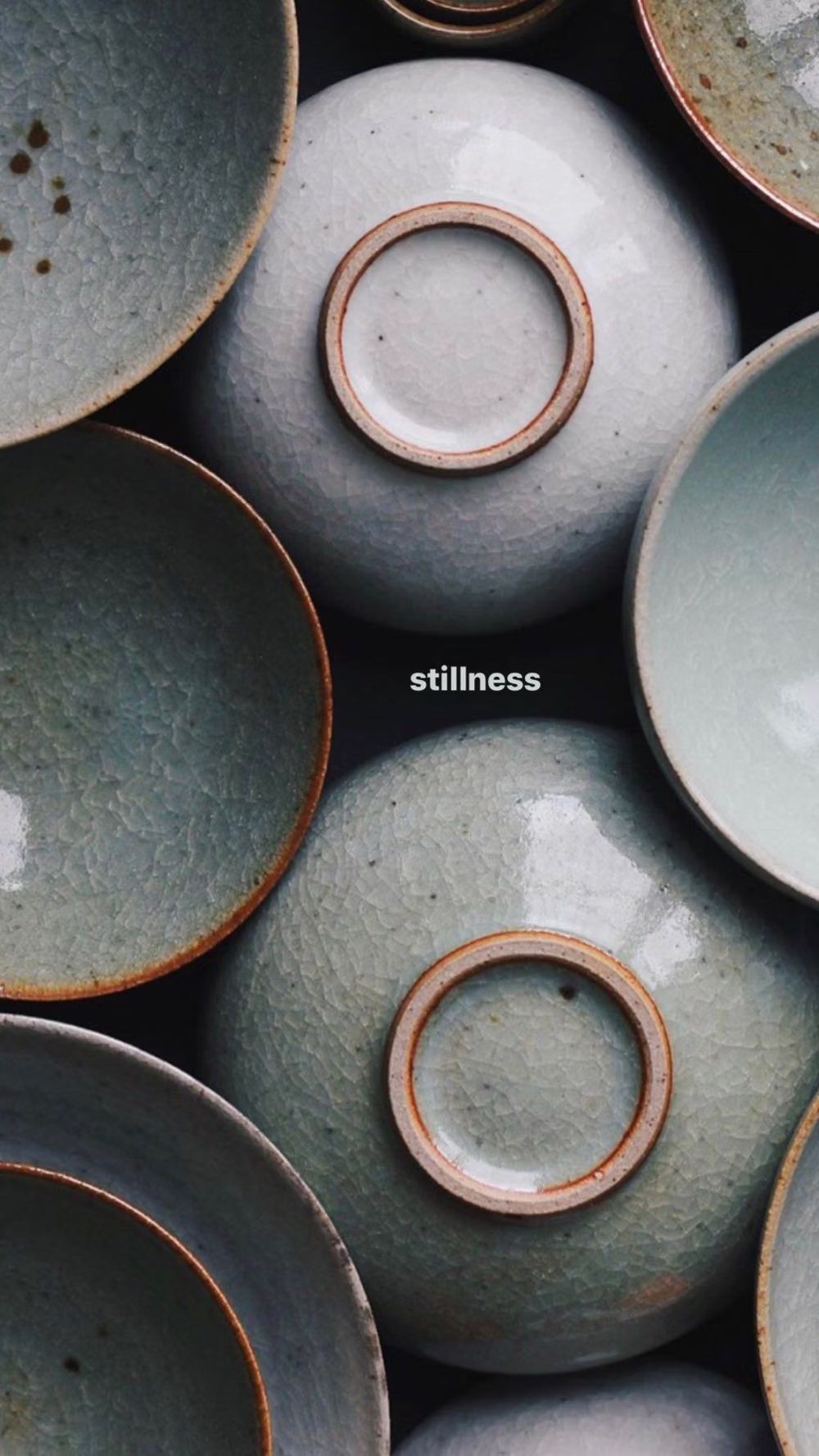
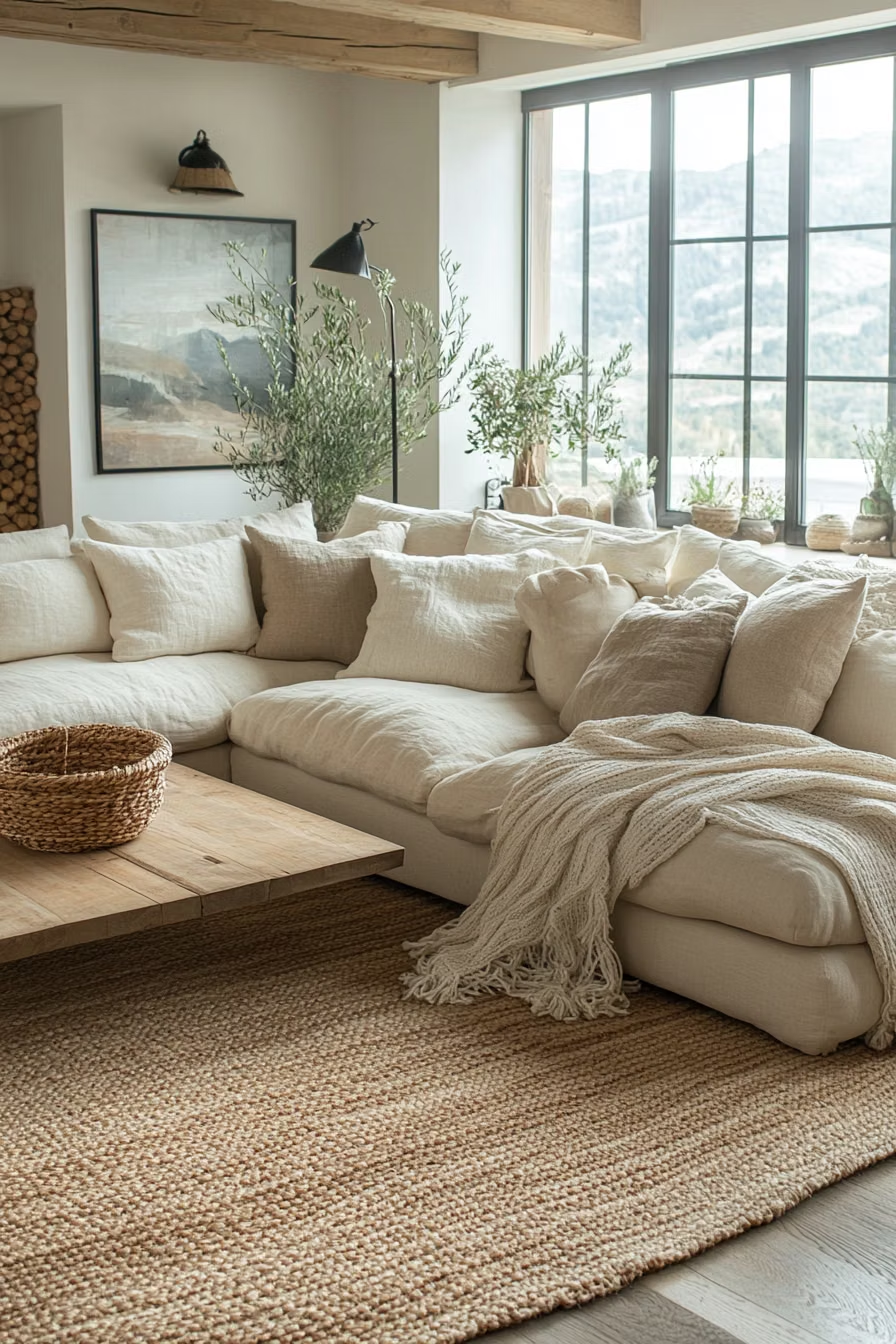
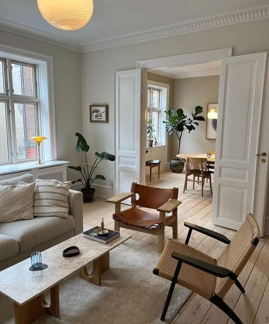
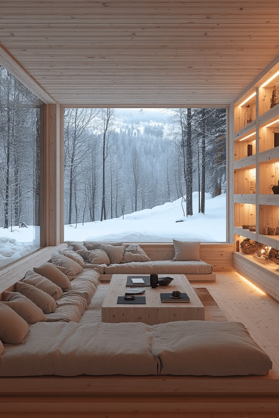
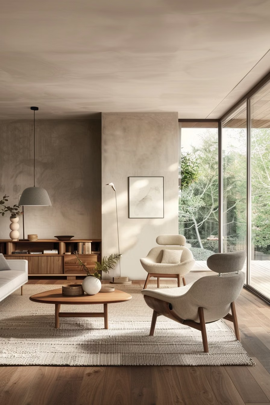
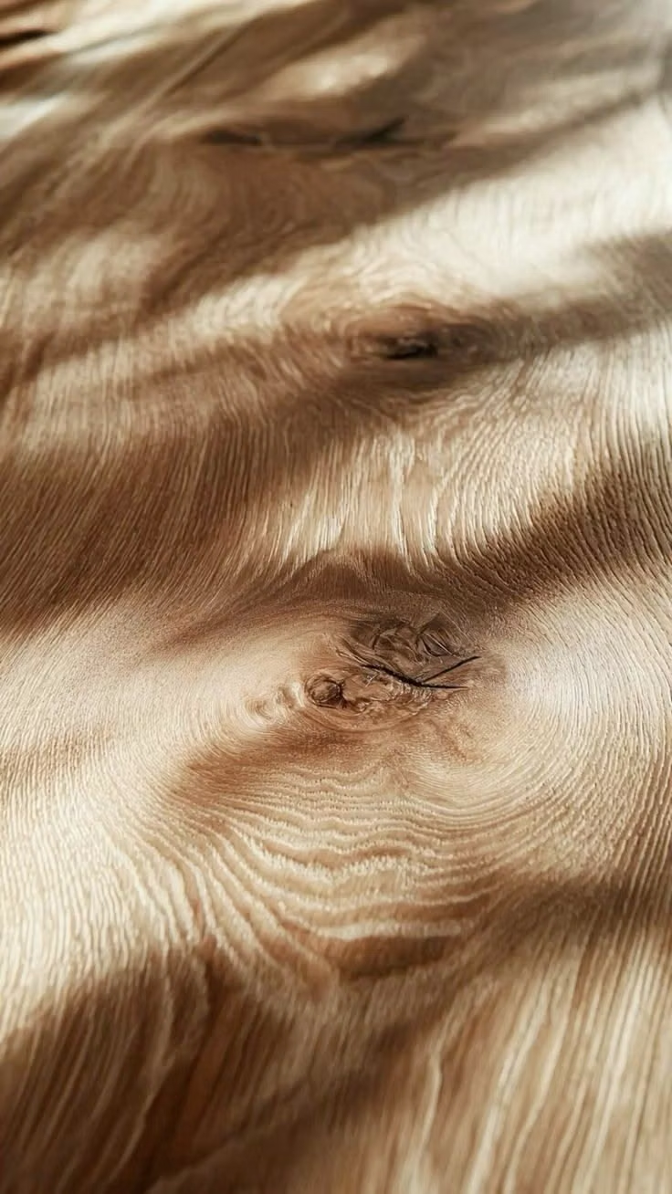
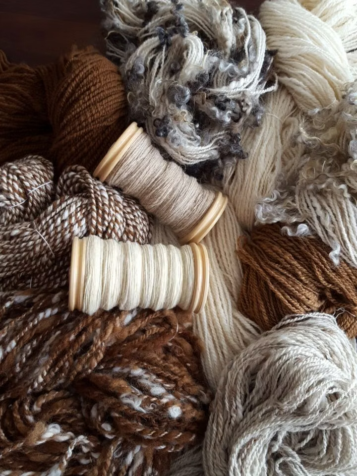
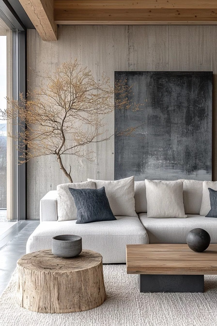
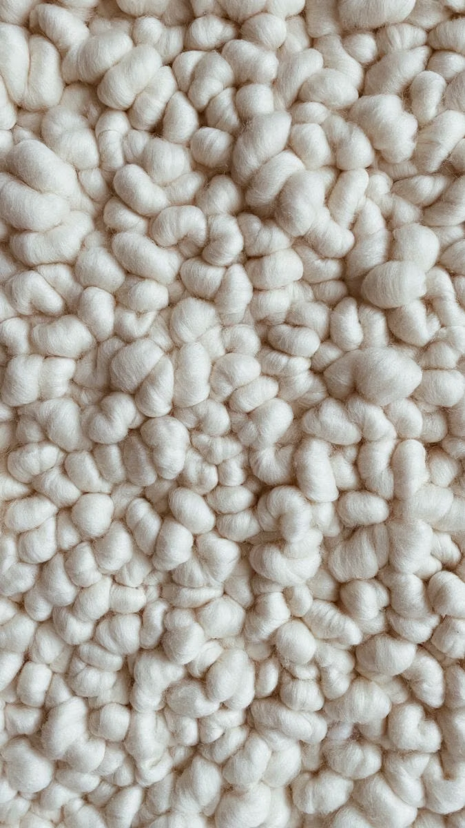
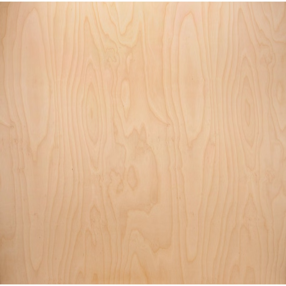
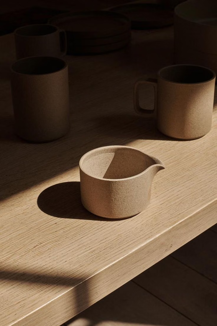
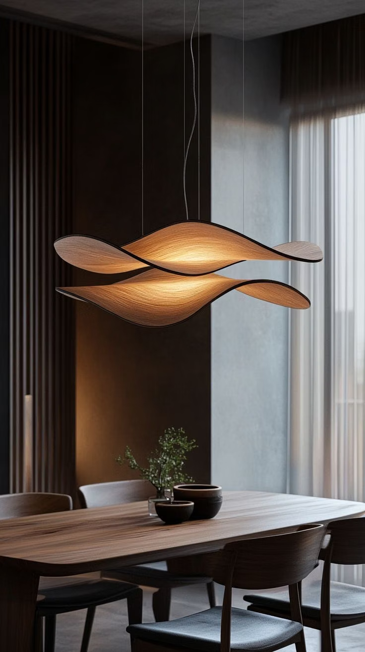
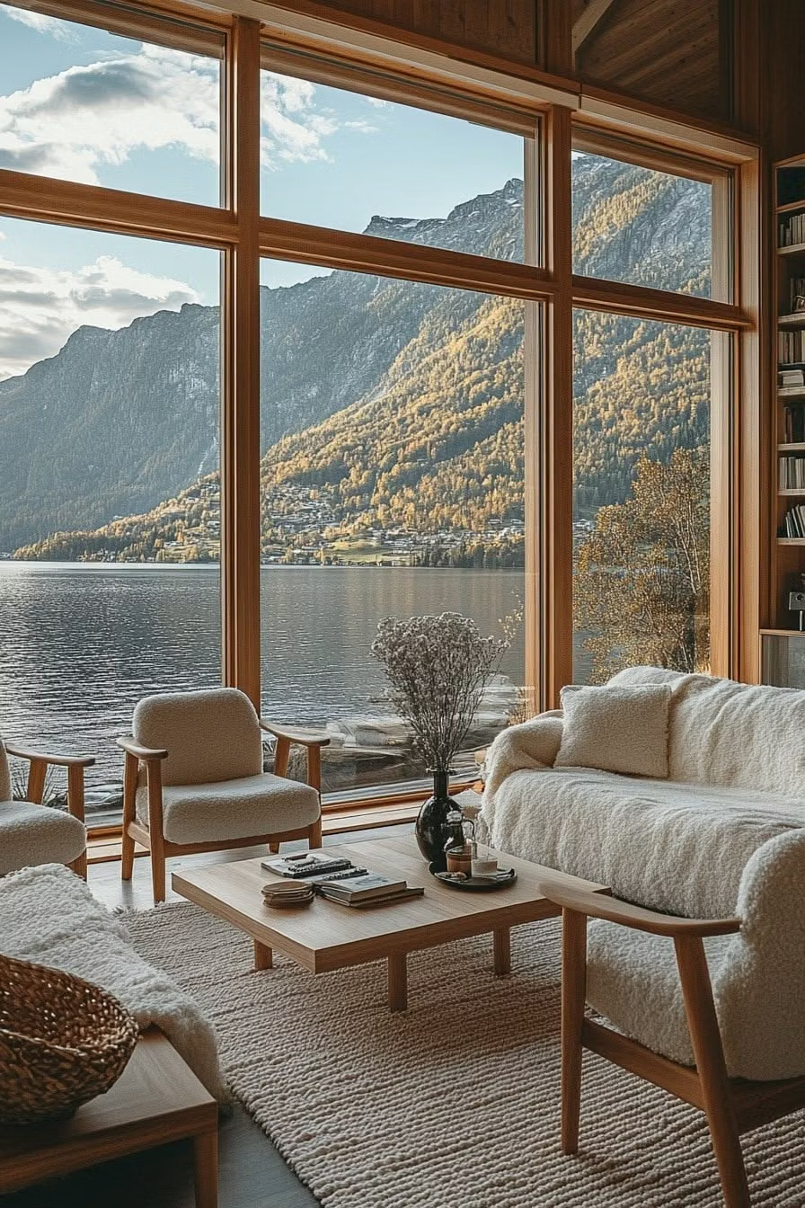
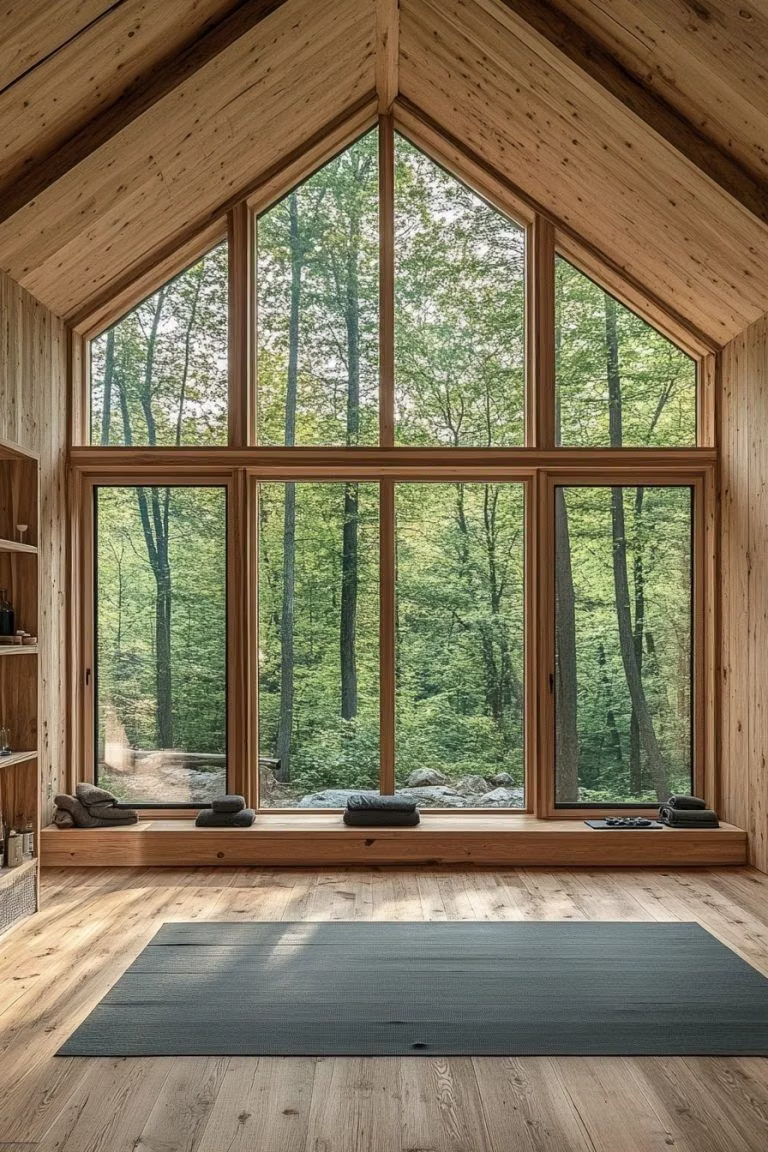
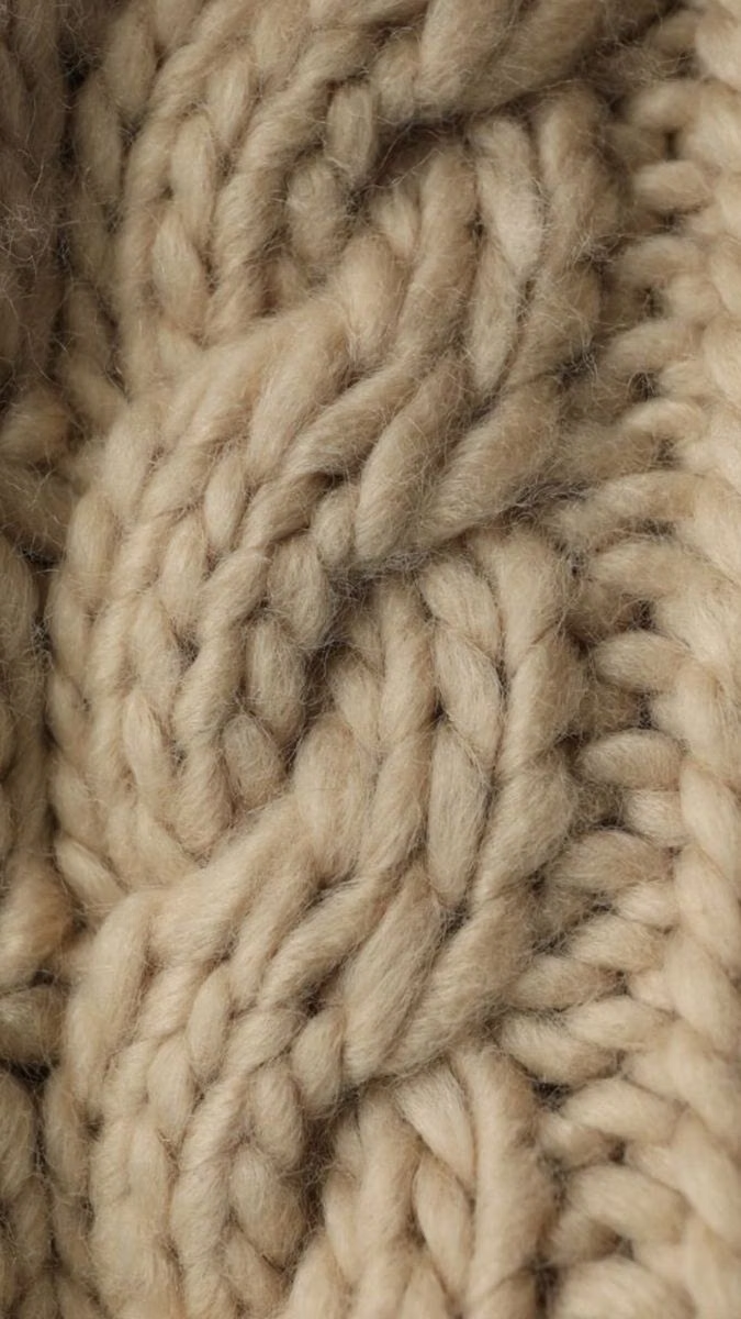
A visual study of the forms, inspirations, materials, colors, type, and cultural references associated with this UI design style.


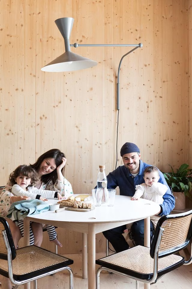
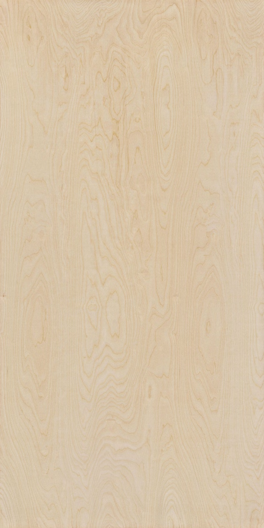
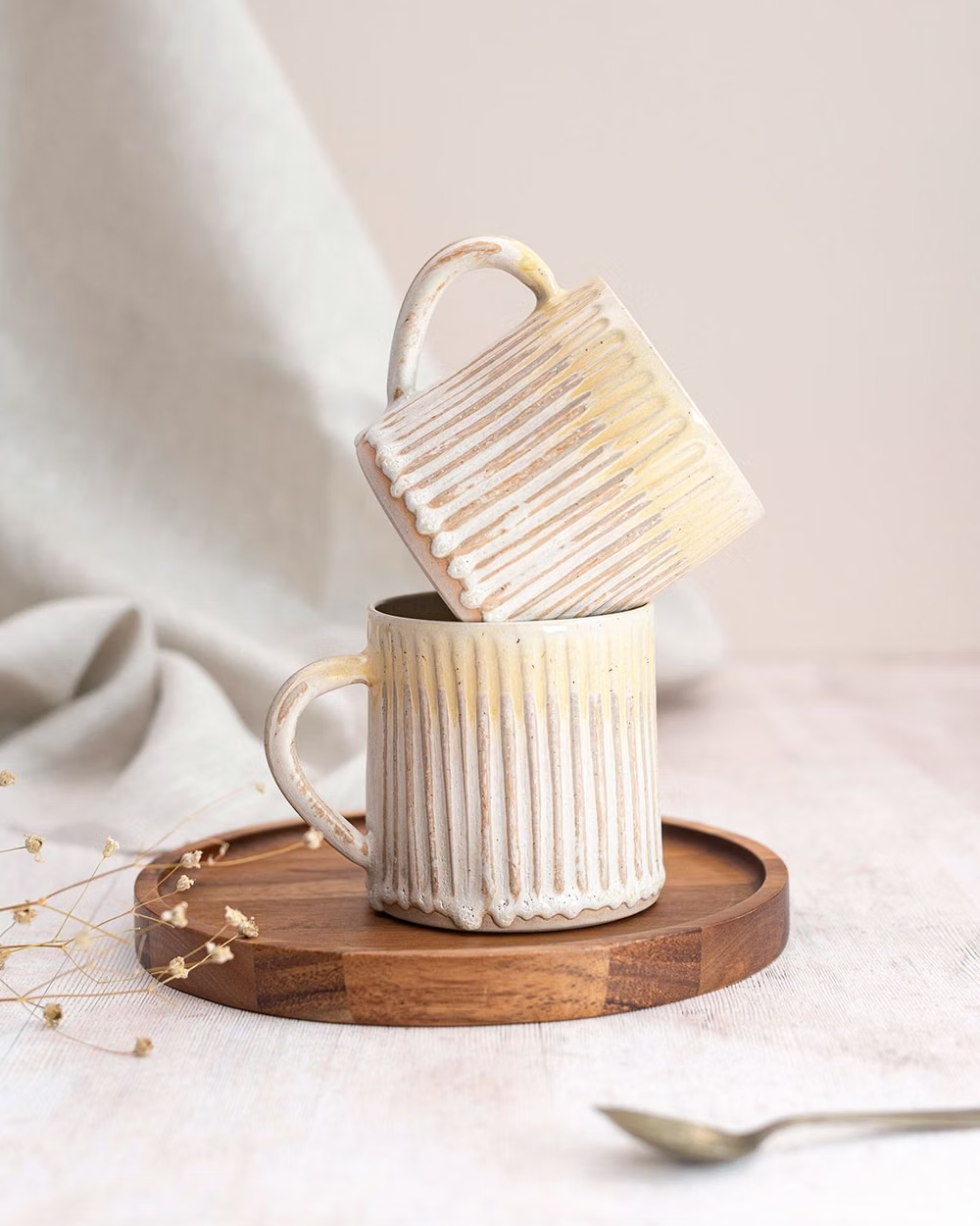
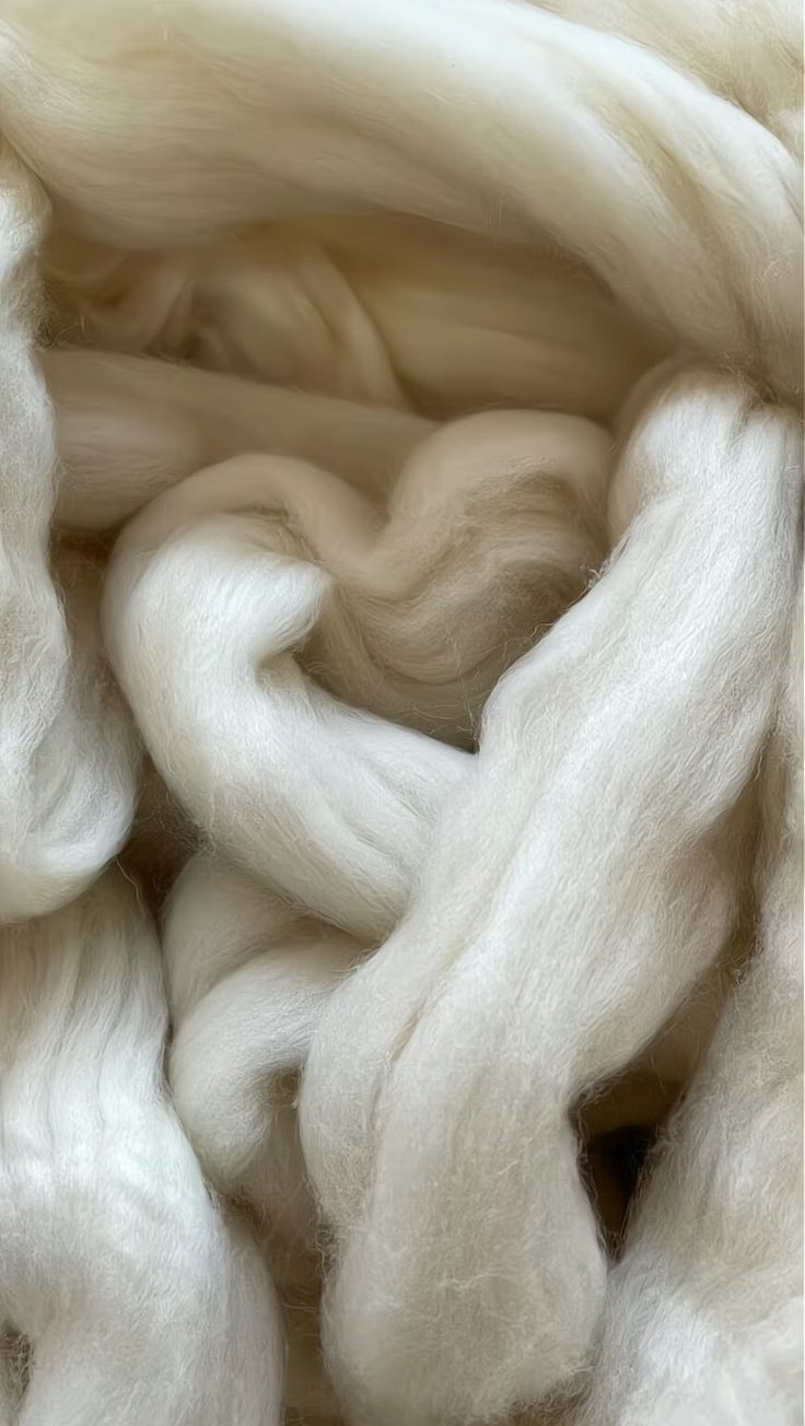


Design principles and implementation
Use these principles to write a focused AI UI design prompt instead of asking for a vague visual treatment.
Color direction
Choose white, soft gray, oatmeal, pale wood, muted blue, and forest or clay accents, keeping the overall light level high and natural. In a daisyUI theme, use muted blue or forest green for `primary`, clay for `secondary`, and assign white, oatmeal, and pale wood-gray to `base-100`, `base-200`, and `base-300`.
Imagery direction
Use daylight interiors, honest material details, useful objects, landscapes, and relaxed human moments with minimal staging.
Content density
Keep density low to medium, favoring practical clarity, concise descriptions, and enough open space to convey ease and order.
Motion direction
Use subtle fades, short slides, and quiet hover feedback with natural timing, avoiding decorative loops or dramatic depth effects.
Shape language
Favor clean lines, simple rectangles, modest soft corners, fine dividers, and occasional warm material blocks. In daisyUI themes, set the `--radius-*` variables between `0.25rem` and `1rem`.
Typography rules
Choose a friendly humanist sans-serif with an optional restrained serif accent, using comfortable sizes, open counters, and uncomplicated hierarchy.
Suggested Typfaces
Karla
Fresh daisies glow in warm sunlight
Fresh daisies glow in warm sunlight
1 2 3 4 5 6 7 8 9 0
Figtree
Fresh daisies glow in warm sunlight
Fresh daisies glow in warm sunlight
1 2 3 4 5 6 7 8 9 0
Manrope
Fresh daisies glow in warm sunlight
Fresh daisies glow in warm sunlight
1 2 3 4 5 6 7 8 9 0
Source Sans 3
Fresh daisies glow in warm sunlight
Fresh daisies glow in warm sunlight
1 2 3 4 5 6 7 8 9 0
Lora
Fresh daisies glow in warm sunlight
Fresh daisies glow in warm sunlight
1 2 3 4 5 6 7 8 9 0
Build a Scandinavian Modern interface with daisyUI
The live example translates this direction into daisyUI components and semantic theme tokens.
To generate a full page in the same visual language, give the style name and the design rules above to Blueprint MCP.
Related UI design styles
Compare nearby visual languages that share typography, shapes, use cases, or signature elements.
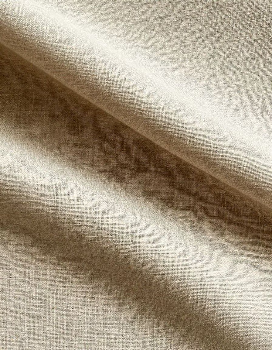
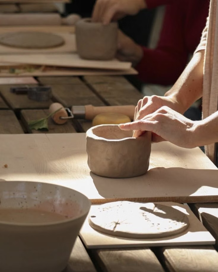
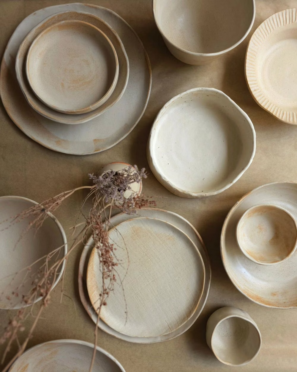
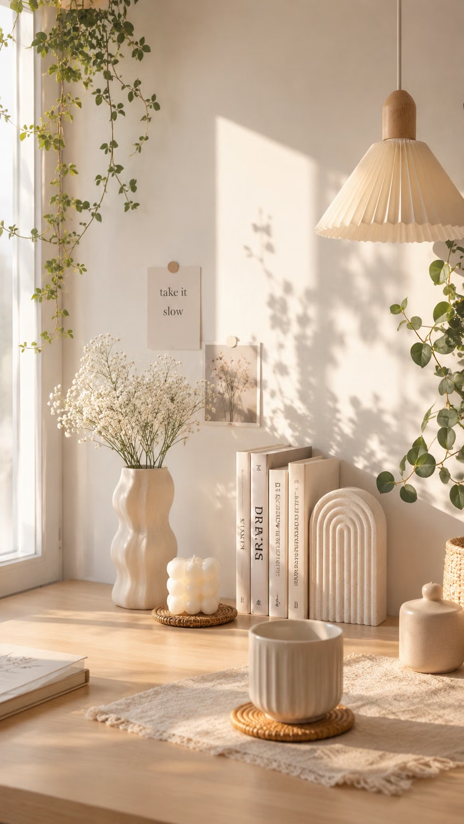
Millennial Beige UI design style
A calm tonal aesthetic layers cream, tan, sand, taupe, and greige with tactile natural details, soft contrast, and intentional empty space.
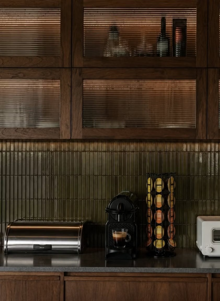
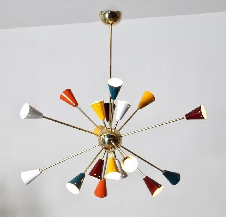
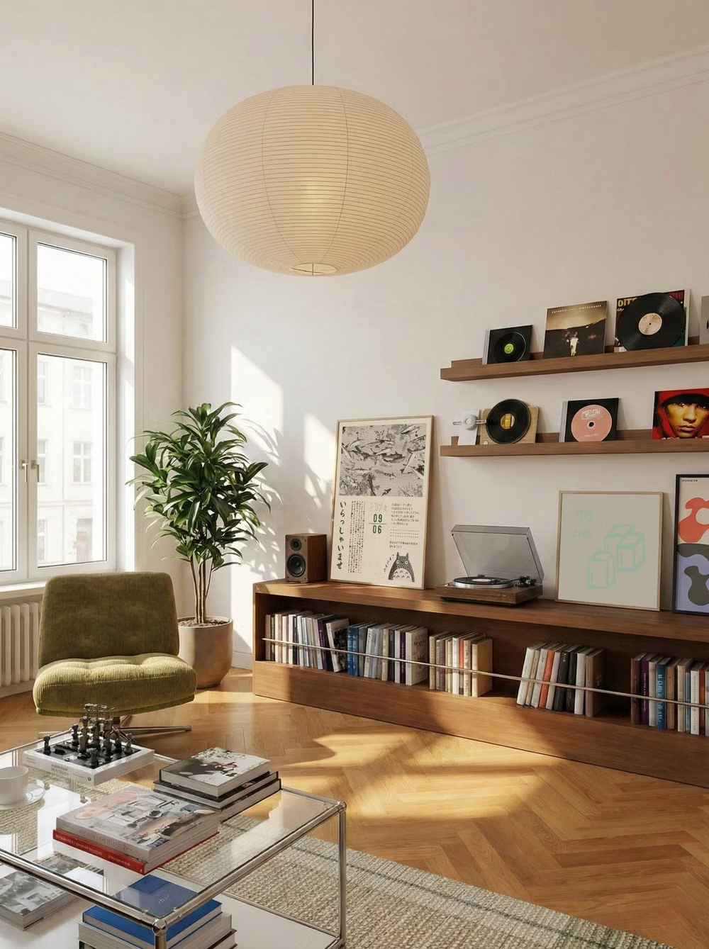
Mid-Century Modern UI design style
Clean geometry, warm muted colors, humanist illustration, functional layouts, and optimistic postwar simplicity.
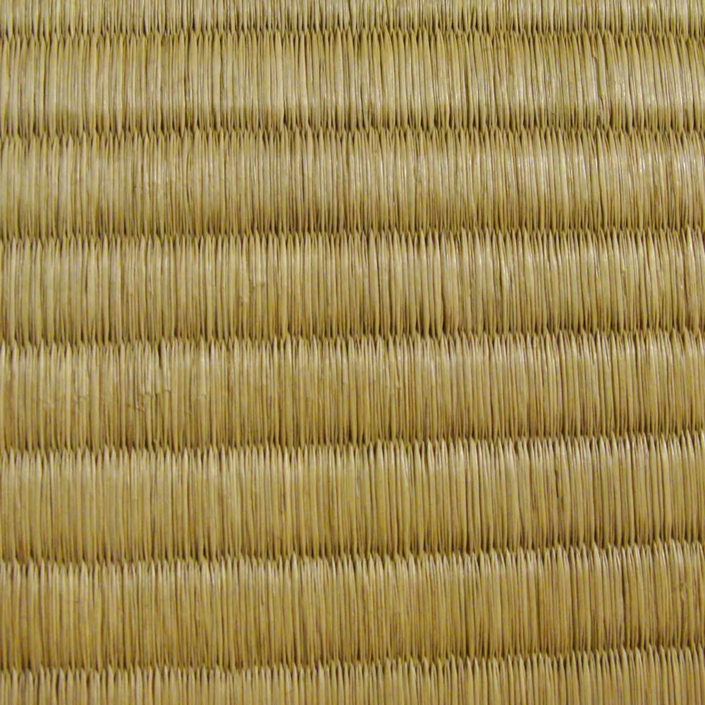
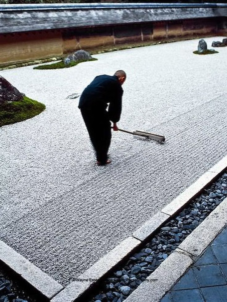
Japanese Minimalism UI design style
Disciplined reduction, calm neutral color, precise spacing, natural materials, and meaningful emptiness create quiet clarity.