Japanese Minimalism UI design style
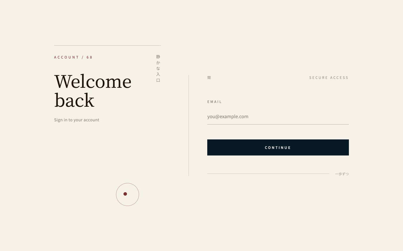
Disciplined reduction, calm neutral color, precise spacing, natural materials, and meaningful emptiness create quiet clarity.
Design overview
- Signature elements
- meaningful whitespace, precise spacing, neutral palette, fine rules, natural materials, restrained typography
- Best suited to
- Wellness, hospitality, architecture, productivity, premium commerce, and contemplative products.
- Layout principles
- Use ma, the purposeful interval between elements, with asymmetrical balance, precise modular spacing, and a quiet sequence of thresholds between content regions.
History and origins
A fact-checked account of where this visual language came from, with links to the references used.
- Period
- Long cultural precedents; global design label especially visible from the late 20th century
- Origin
- Japan
Japanese Minimalism is an external umbrella, not one historical Japanese movement. Contemporary accounts connect its visual restraint to distinct concepts including ma, emptiness, asymmetry, material honesty, Zen practice, Shinto relationships with nature, and modern Japanese design; collapsing all of those histories into a generic “Zen look” erases important differences.
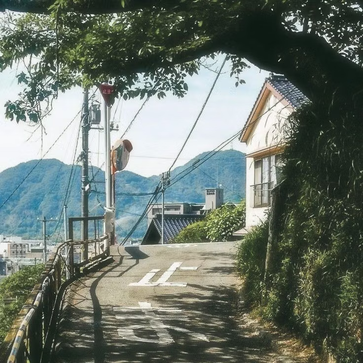
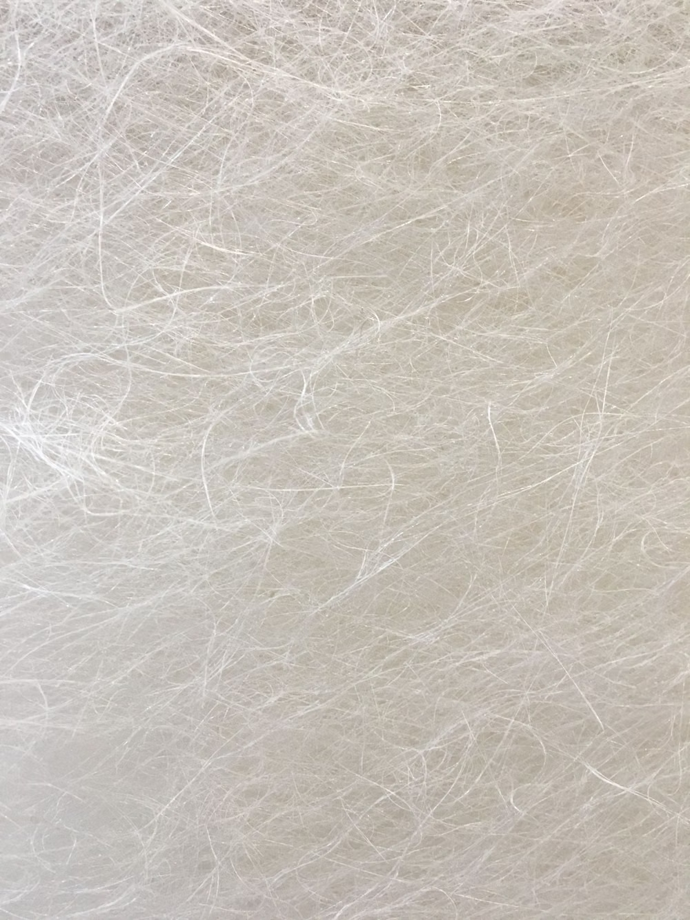
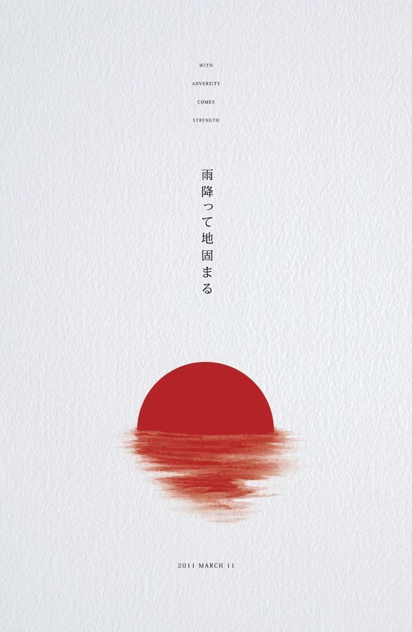
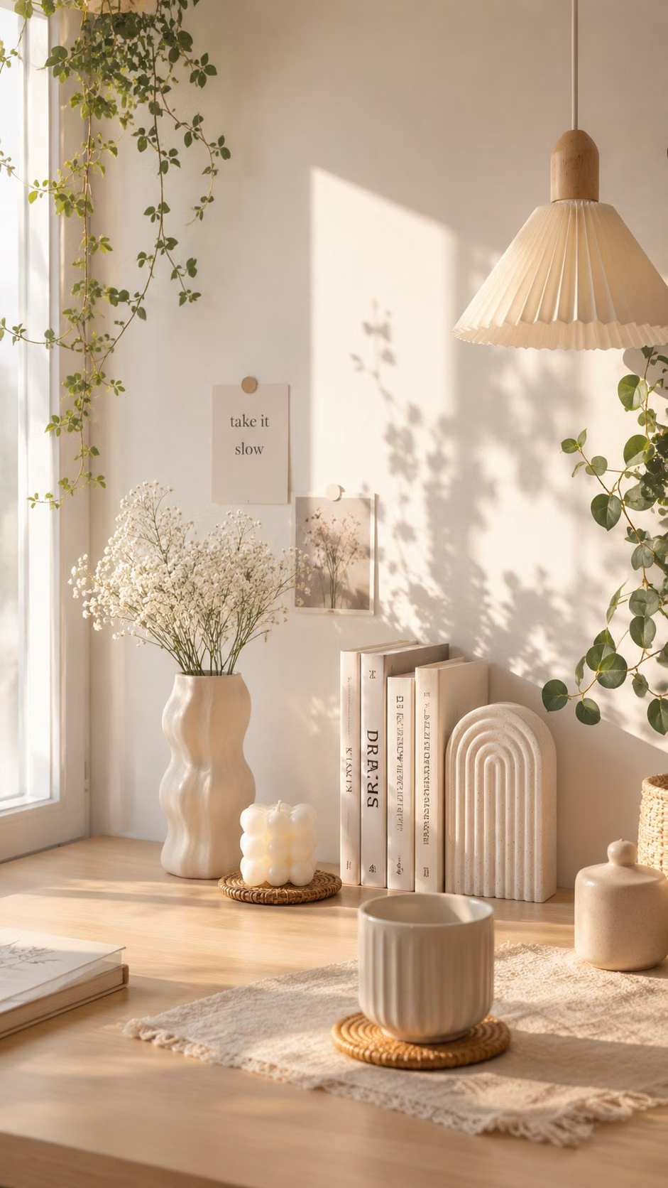
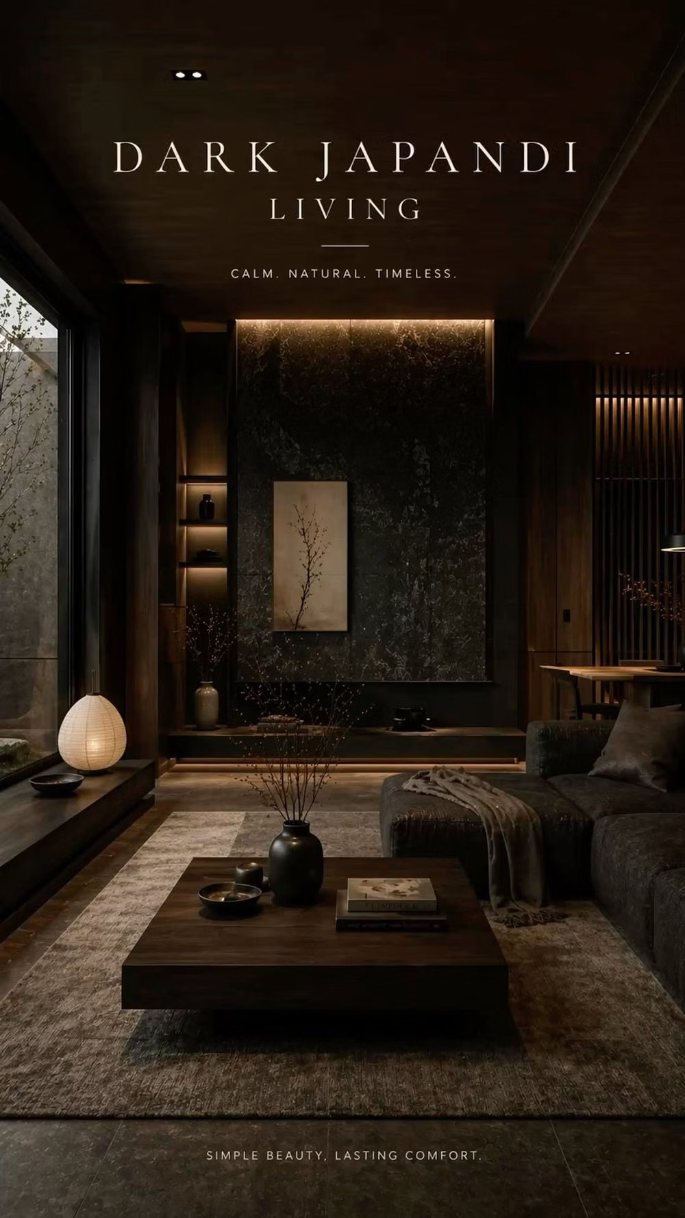
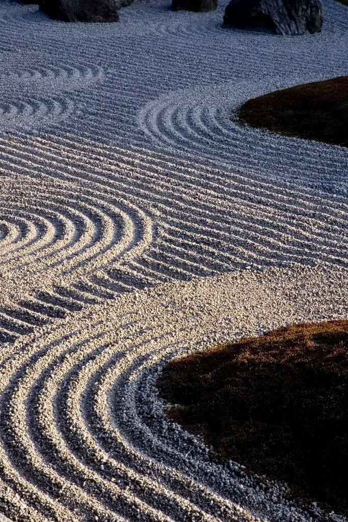
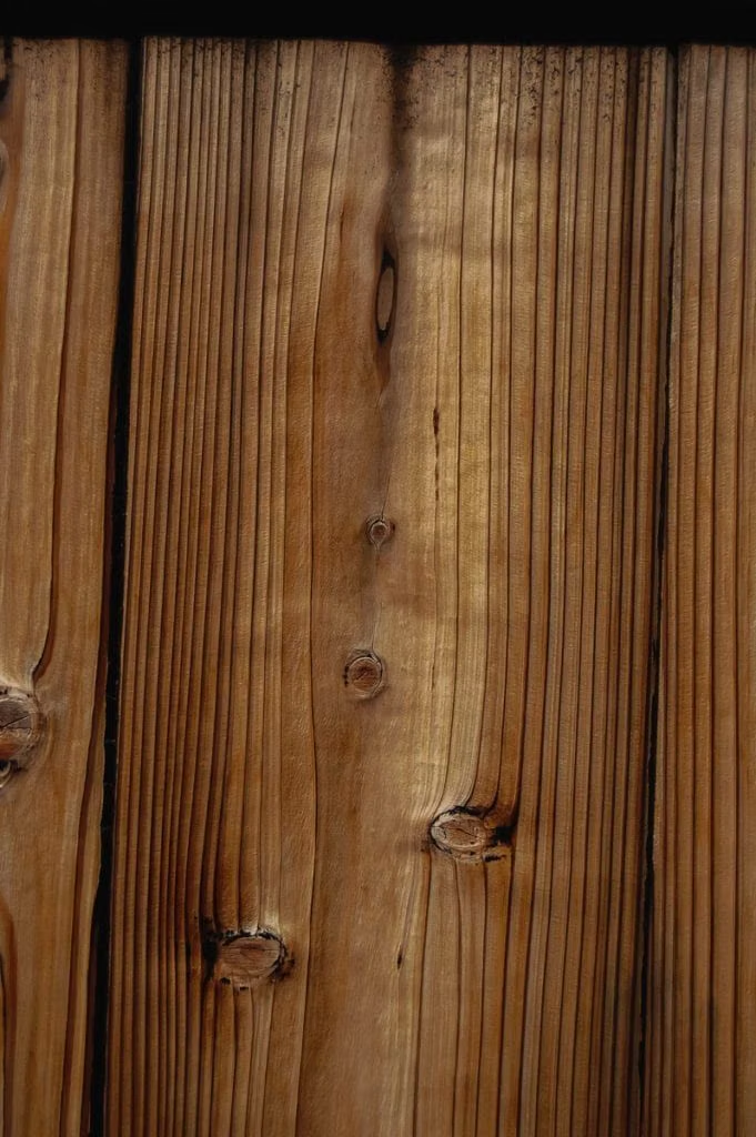
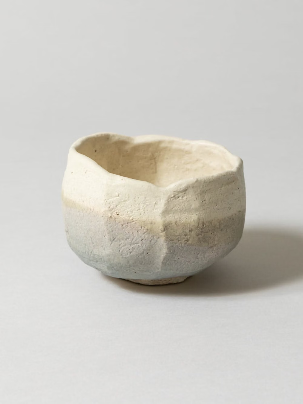
Moodboard and visual references
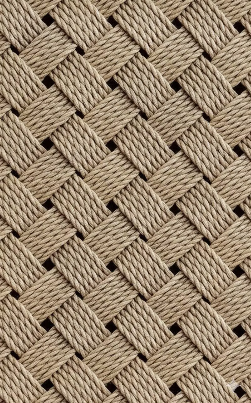
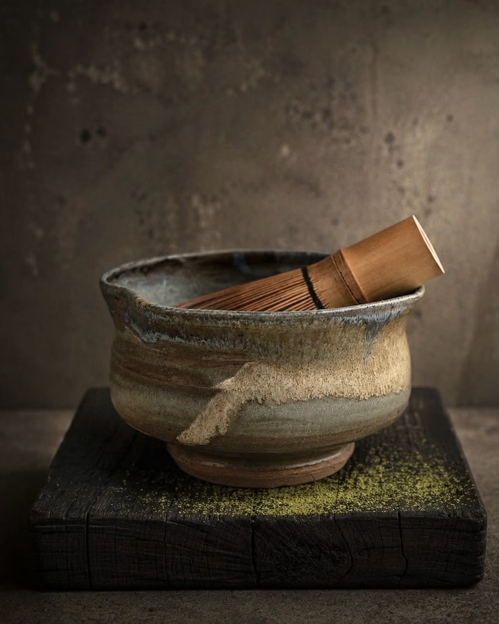
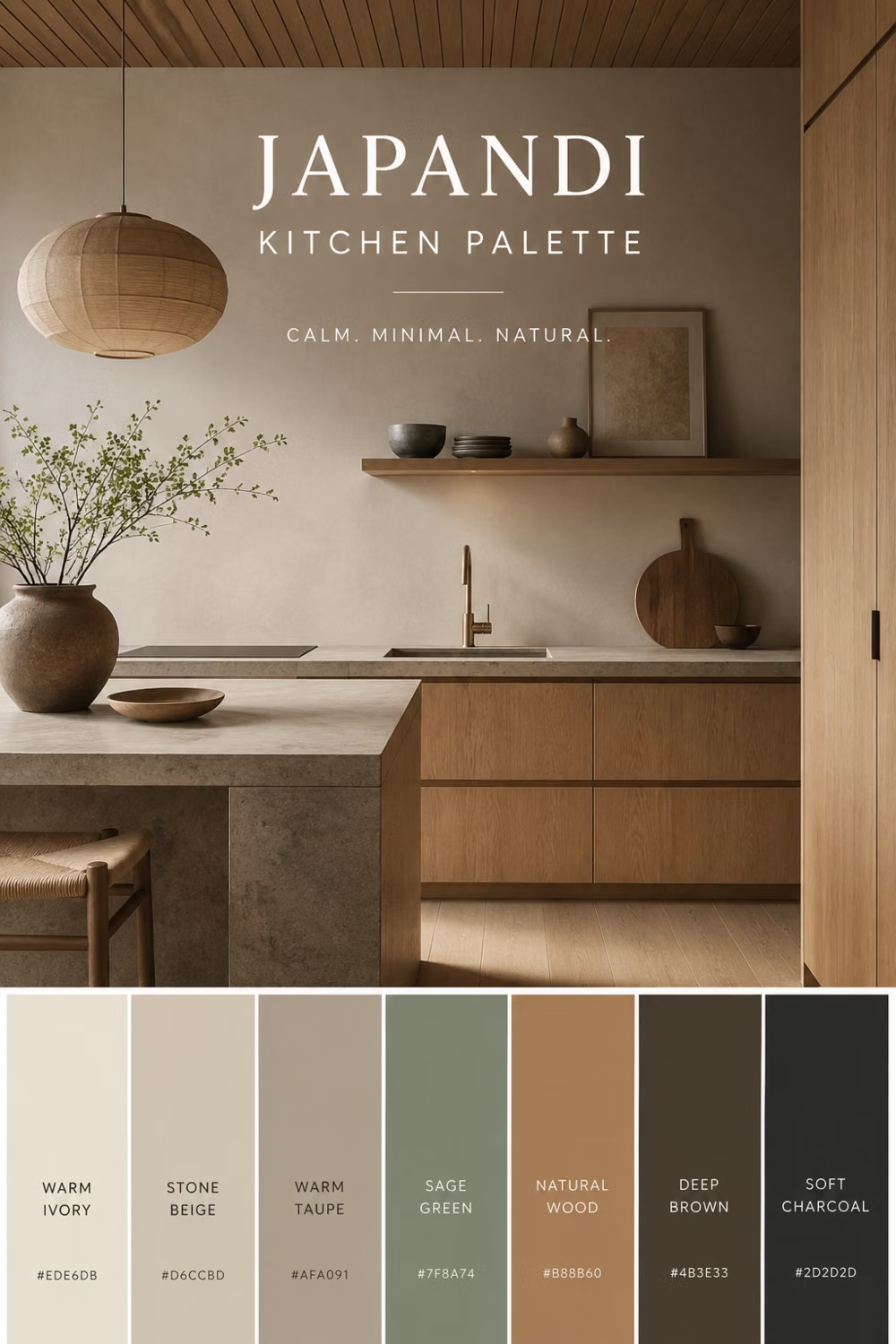
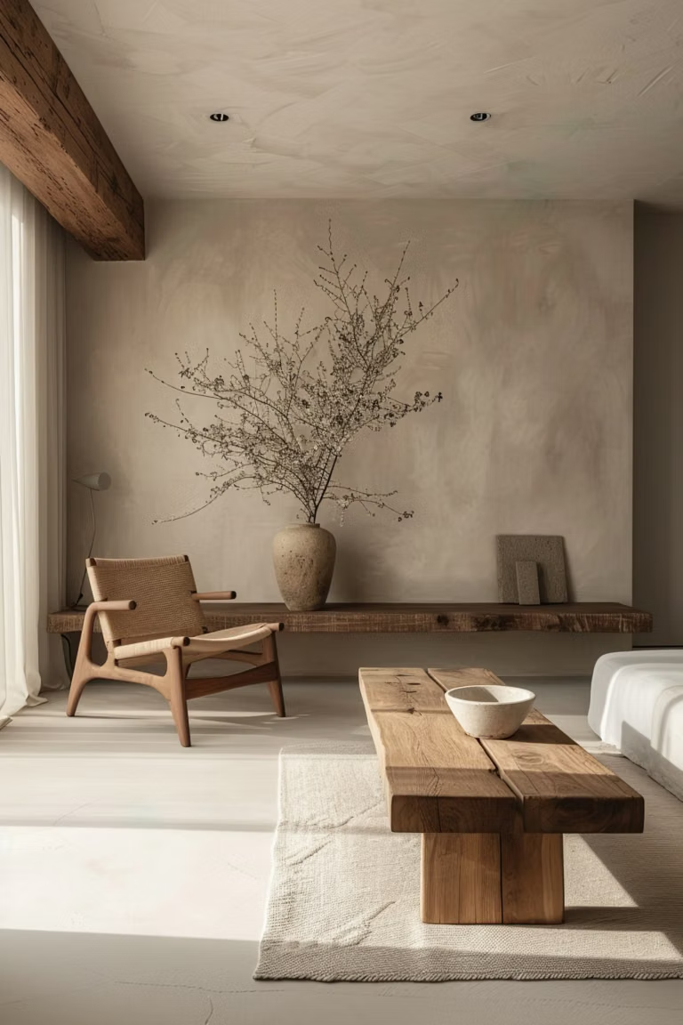
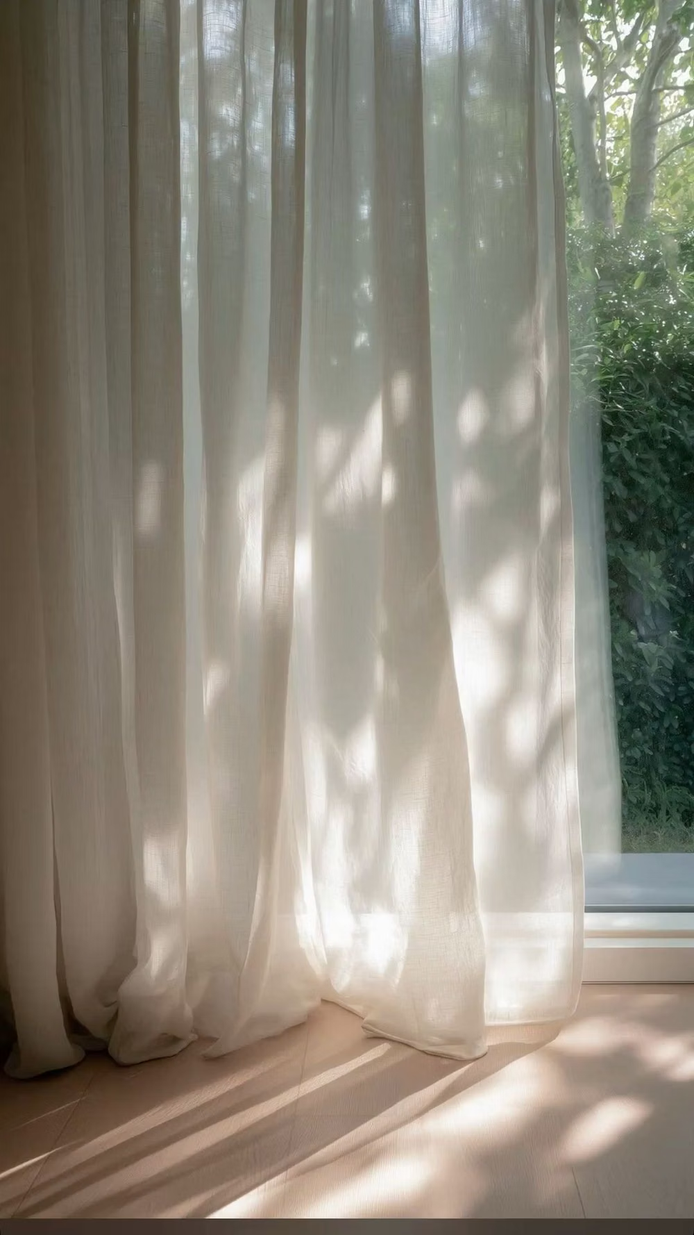
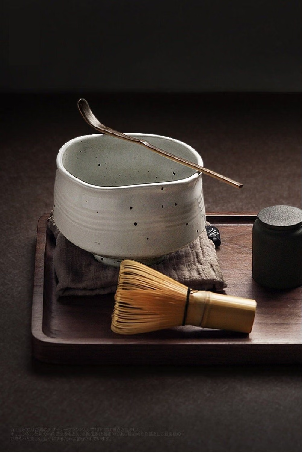
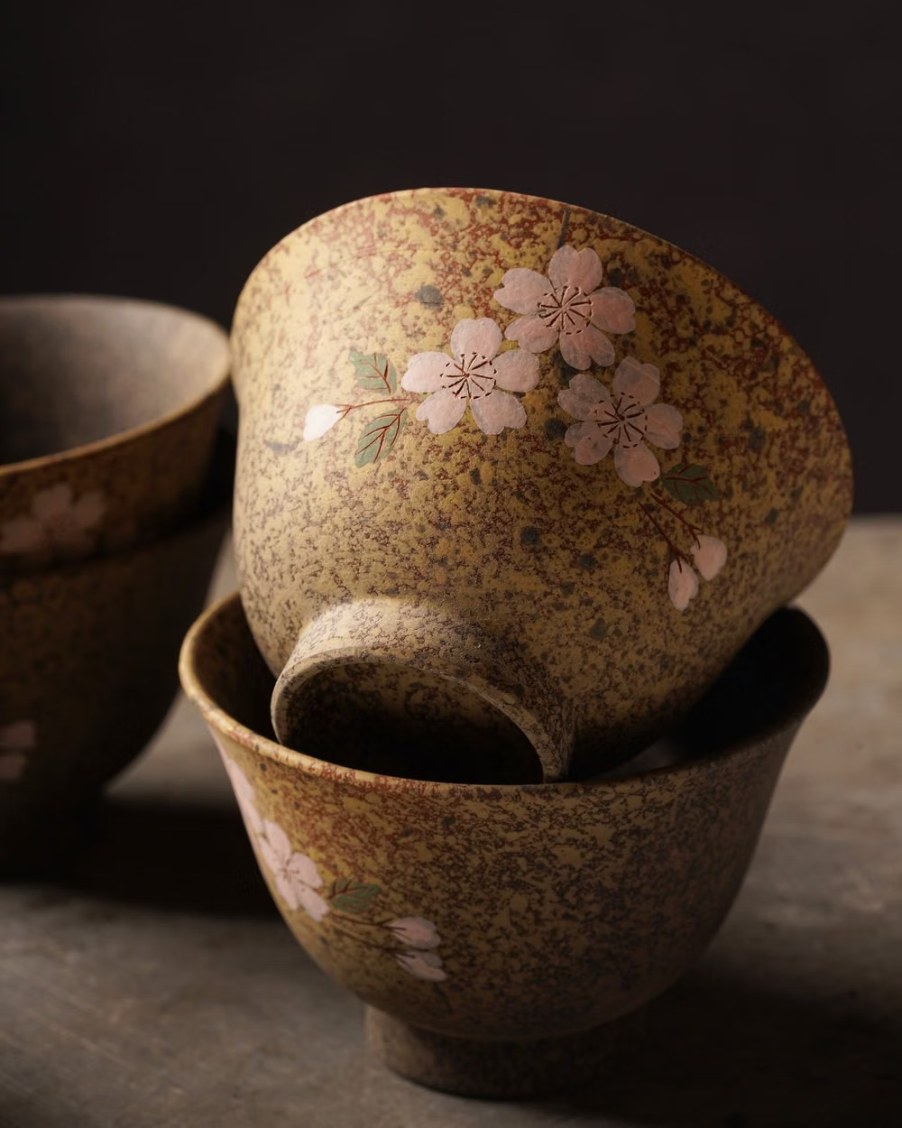
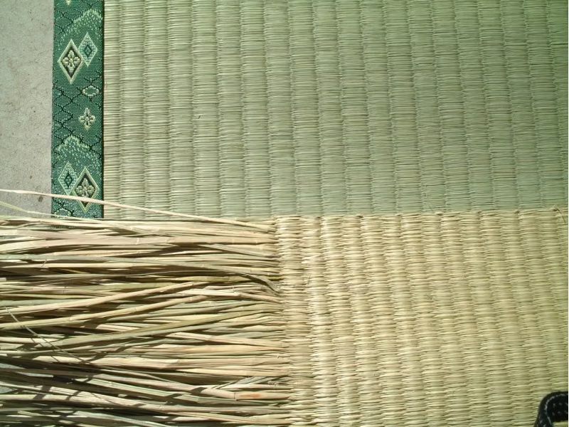
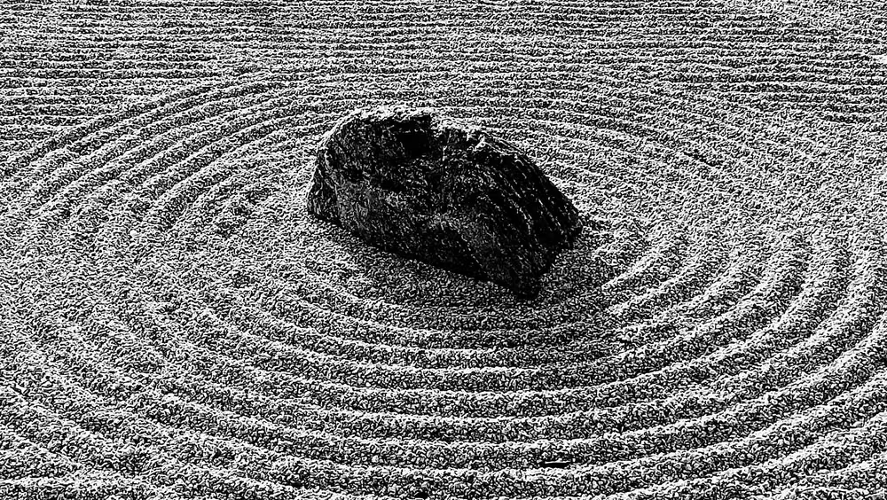
A visual study of the forms, inspirations, materials, colors, type, and cultural references associated with this UI design style.
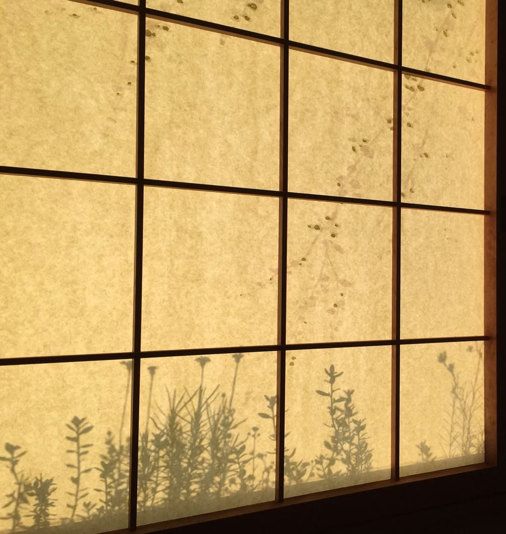
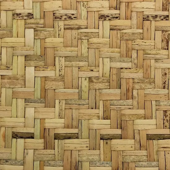
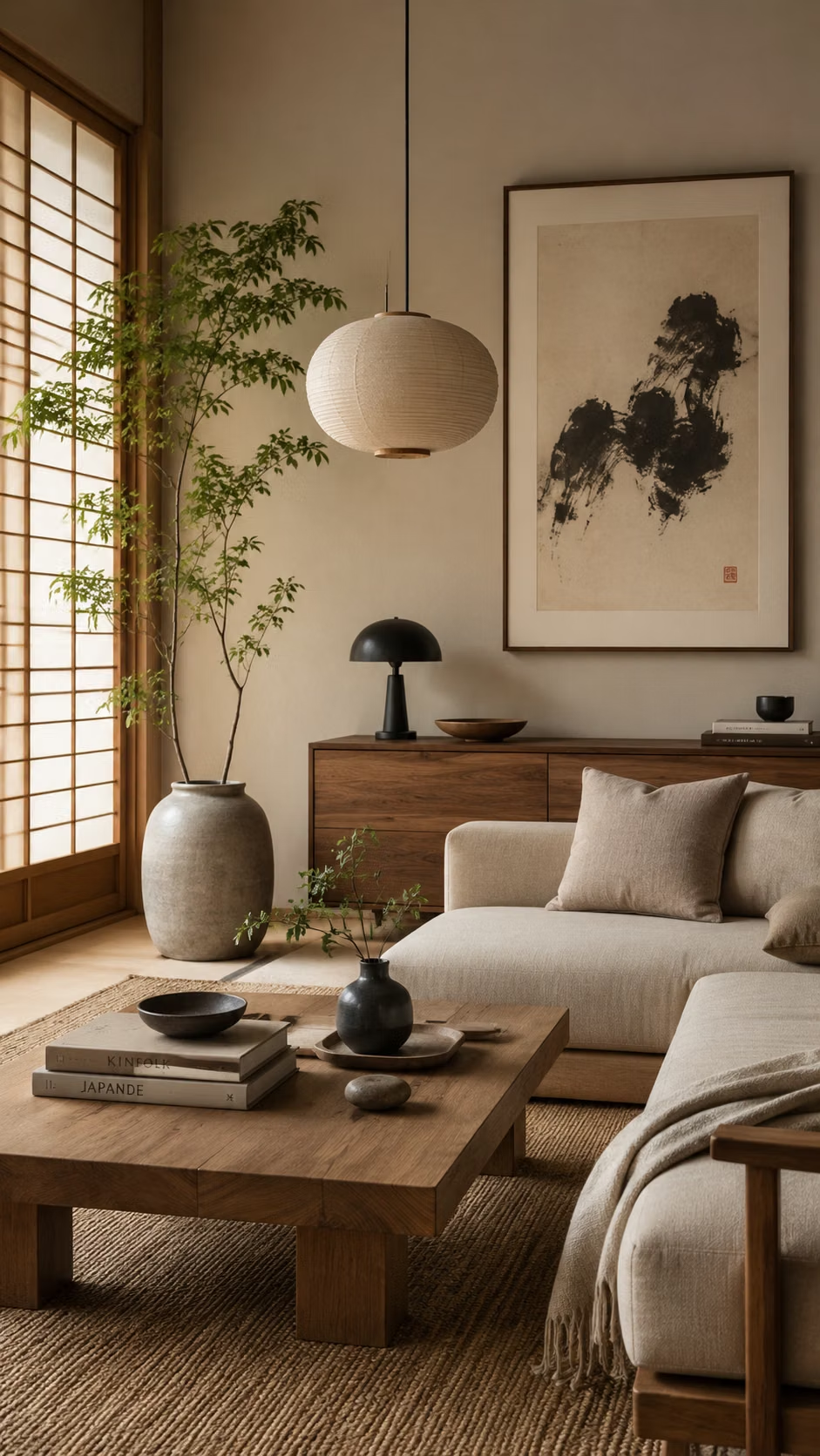
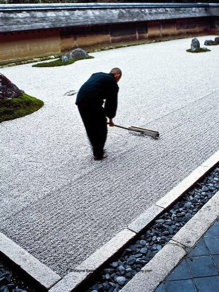



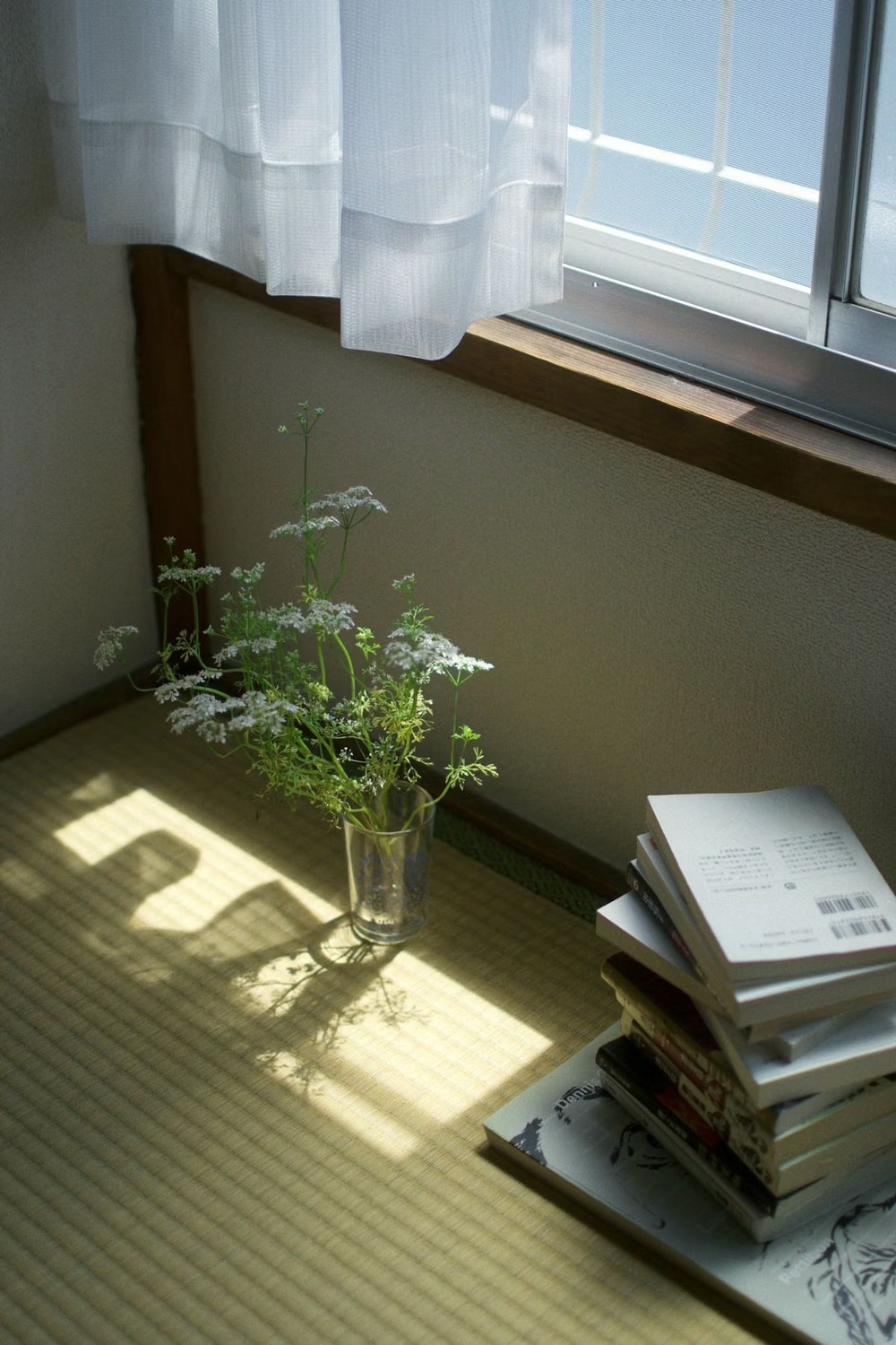
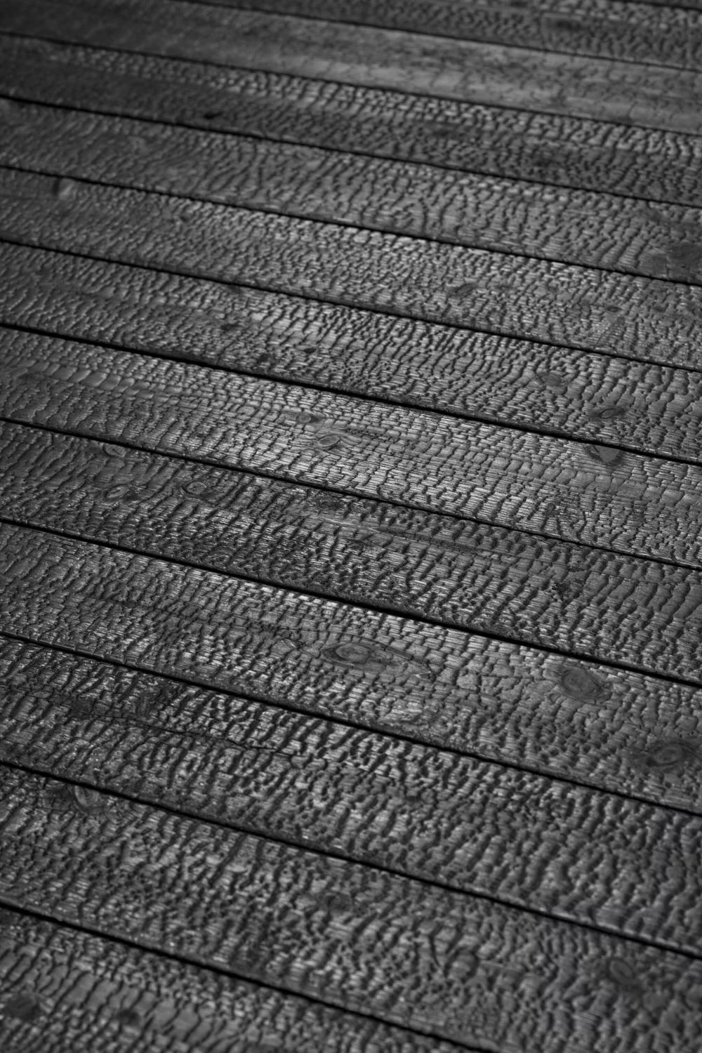
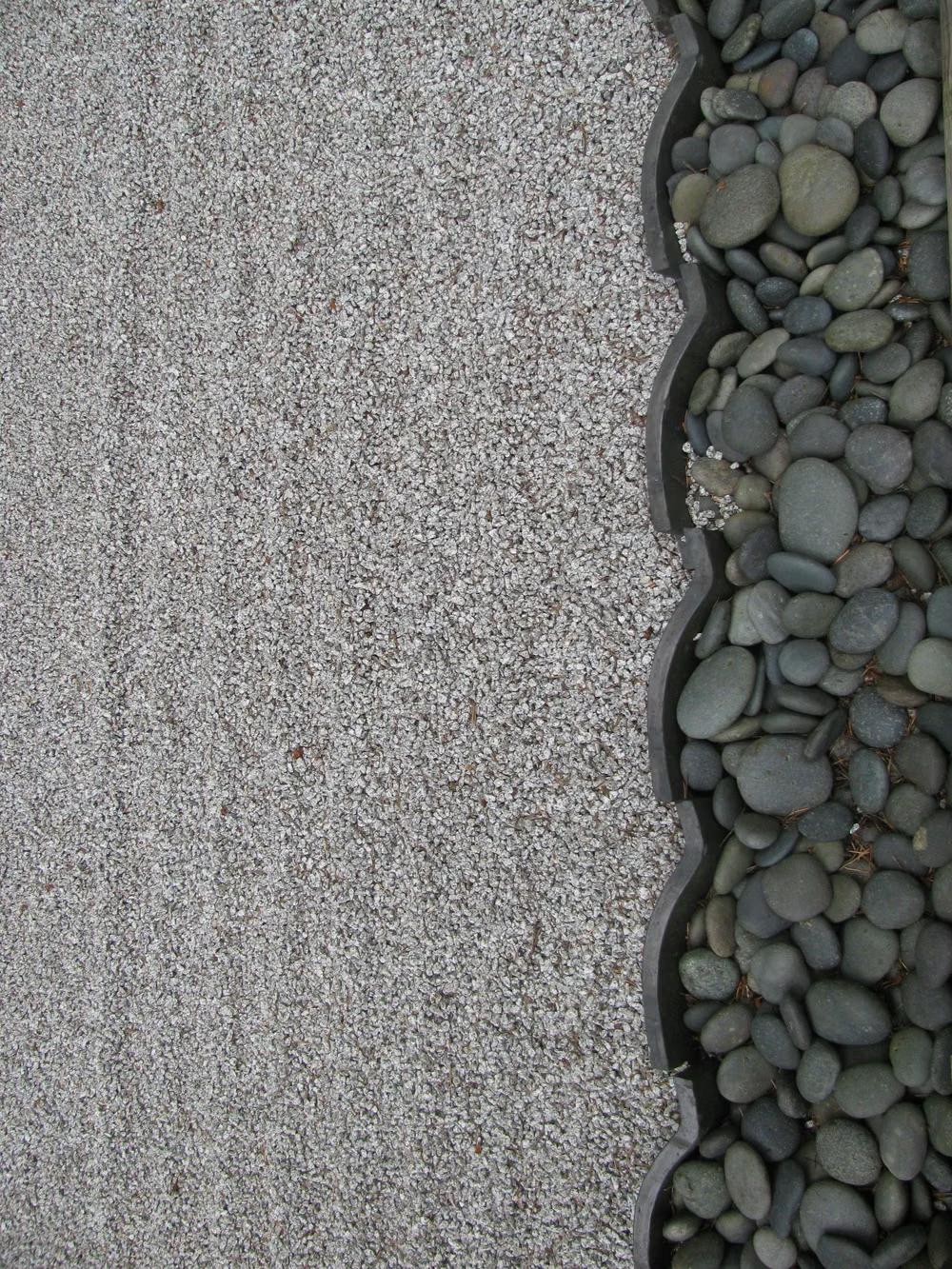
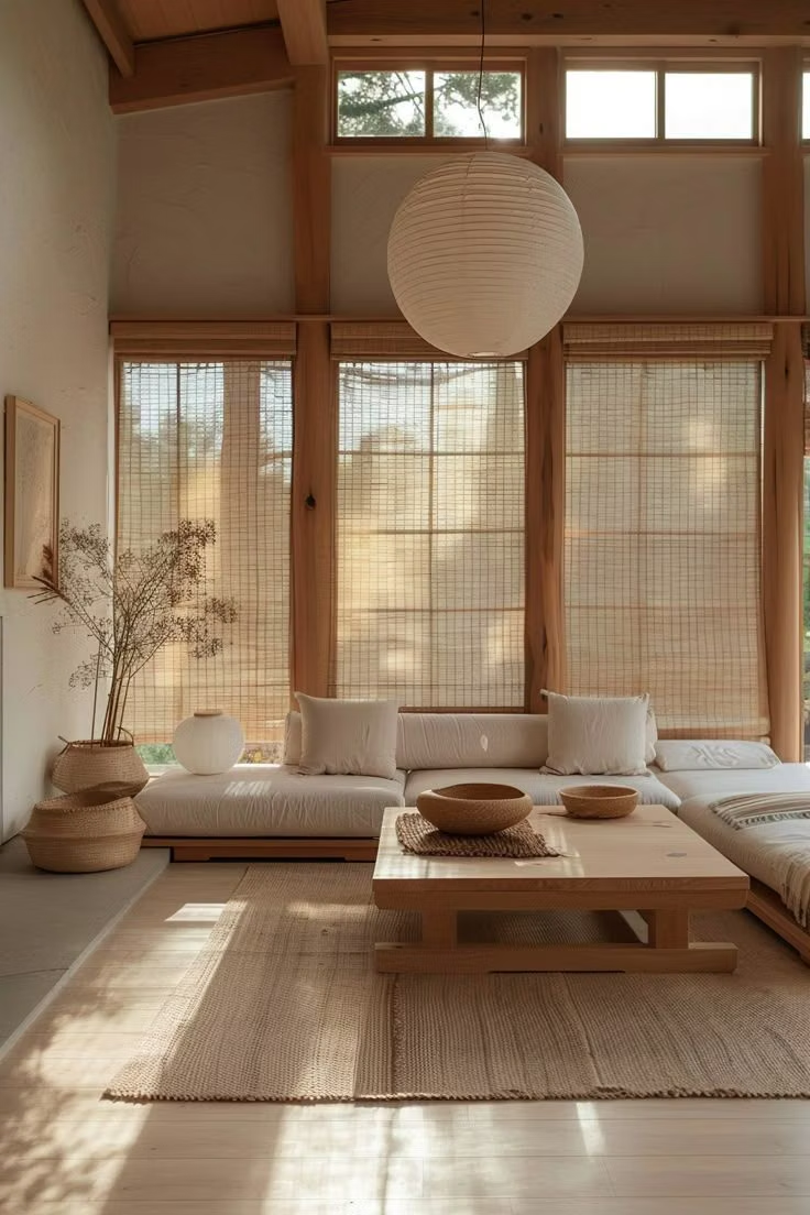
Design principles and implementation
Use these principles to write a focused AI UI design prompt instead of asking for a vague visual treatment.
Color direction
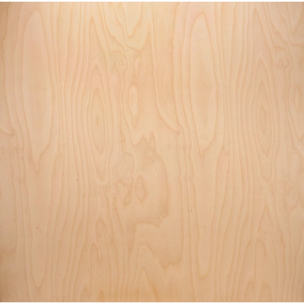
Work with rice paper, ink, charcoal, indigo, cedar, stone, and muted earth tones, allowing natural material color to replace decorative accents. In a daisyUI theme, use indigo or ink for `primary`, muted cedar or moss for `secondary`, and set `base-100`, `base-200`, and `base-300` to rice paper, warm linen, and pale stone.
Imagery direction
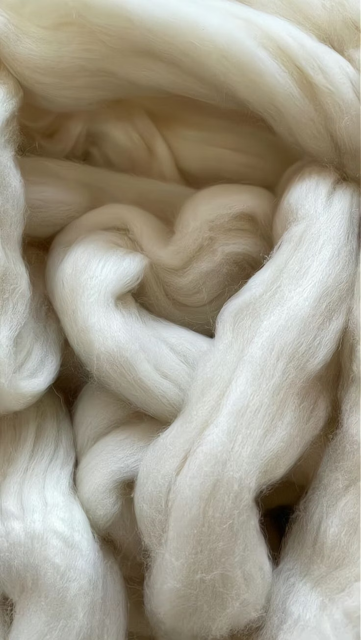
Choose restrained architecture, gardens, craft, food, fabric, and material close-ups with quiet light, careful cropping, and few subjects.
Content density
Keep density low, presenting one object, thought, or action at a time and treating emptiness as an active compositional element.
Motion direction
Use slow screen-like slides, gentle reveals, and precise fades with clear pauses; motion should feel deliberate and finite.
Shape language
Use thin rules, exact rectangles, circles, screens, and occasional brush or paper edges, avoiding an excess of soft Western-style cards. In daisyUI themes, set the `--radius-*` variables to `0` or `0.25rem`.
Typography rules
Use restrained Gothic or Mincho families with careful Japanese spacing, balanced Latin companions, and optional vertical type only where reading order stays clear.
Suggested Typfaces
Noto Sans JP
Fresh daisies glow in warm sunlight
Fresh daisies glow in warm sunlight
1 2 3 4 5 6 7 8 9 0
Noto Serif JP
Fresh daisies glow in warm sunlight
Fresh daisies glow in warm sunlight
1 2 3 4 5 6 7 8 9 0
Zen Kaku Gothic New
Fresh daisies glow in warm sunlight
Fresh daisies glow in warm sunlight
1 2 3 4 5 6 7 8 9 0
Zen Old Mincho
Fresh daisies glow in warm sunlight
Fresh daisies glow in warm sunlight
1 2 3 4 5 6 7 8 9 0
Shippori Mincho
Fresh daisies glow in warm sunlight
Fresh daisies glow in warm sunlight
1 2 3 4 5 6 7 8 9 0
Build a Japanese Minimalism interface with daisyUI
The live example translates this direction into daisyUI components and semantic theme tokens.
To generate a full page in the same visual language, give the style name and the design rules above to Blueprint MCP.
Related UI design styles
Compare nearby visual languages that share typography, shapes, use cases, or signature elements.
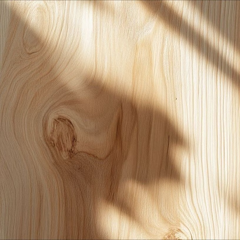
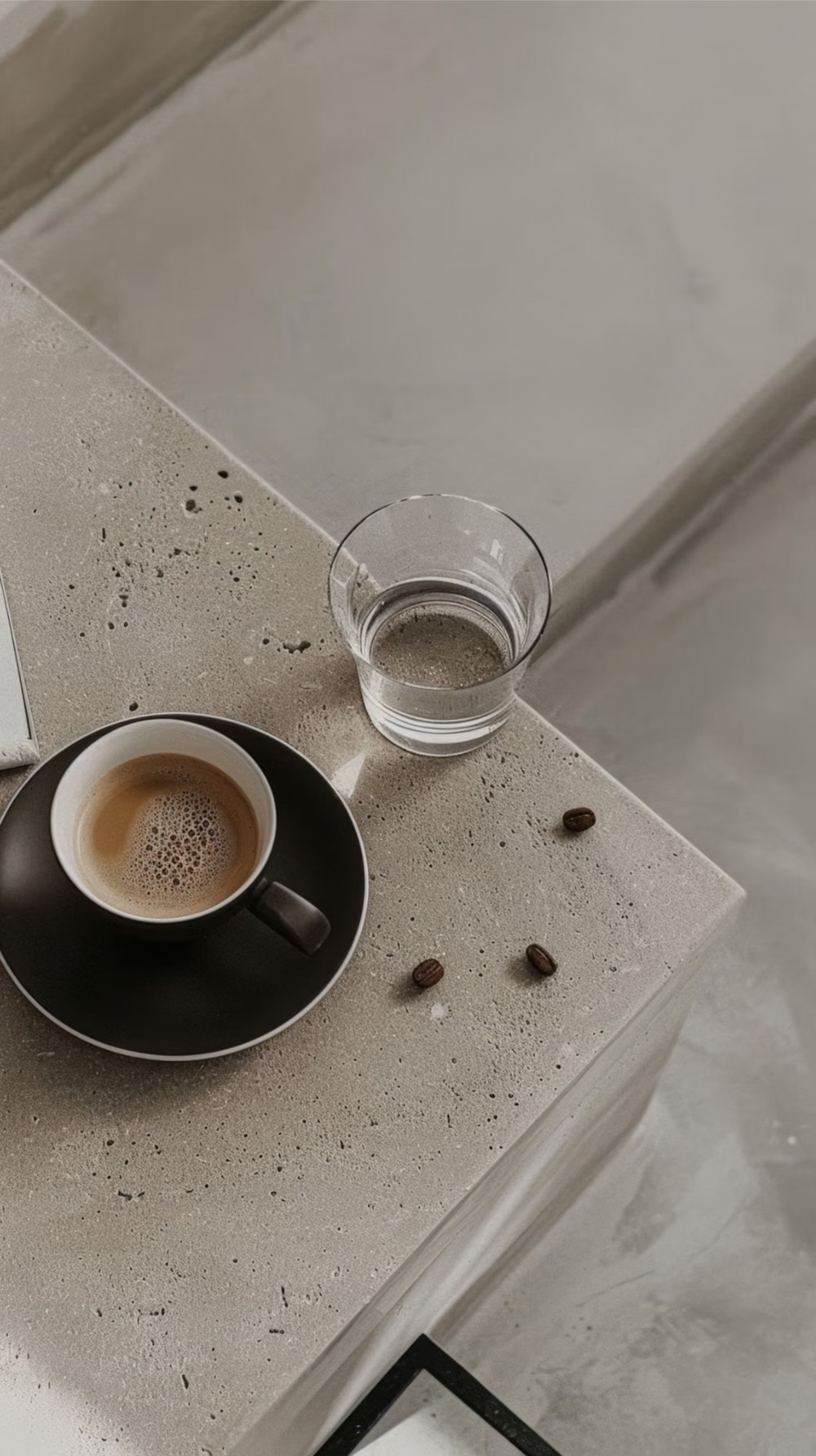

Millennial Beige UI design style
A calm tonal aesthetic layers cream, tan, sand, taupe, and greige with tactile natural details, soft contrast, and intentional empty space.
Scandinavian Modern UI design style
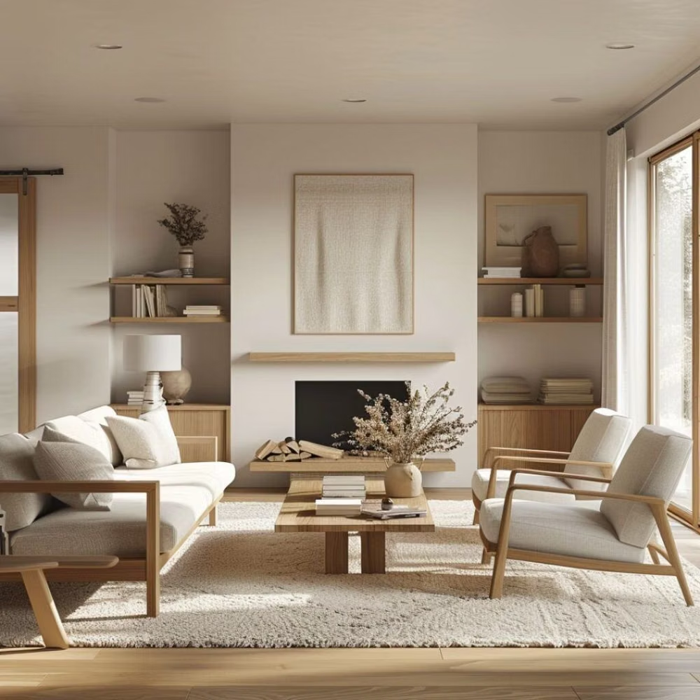
Functional simplicity, light palettes, warm natural materials, clean lines, and friendly human-centered restraint.
Cyberminimalism UI design style
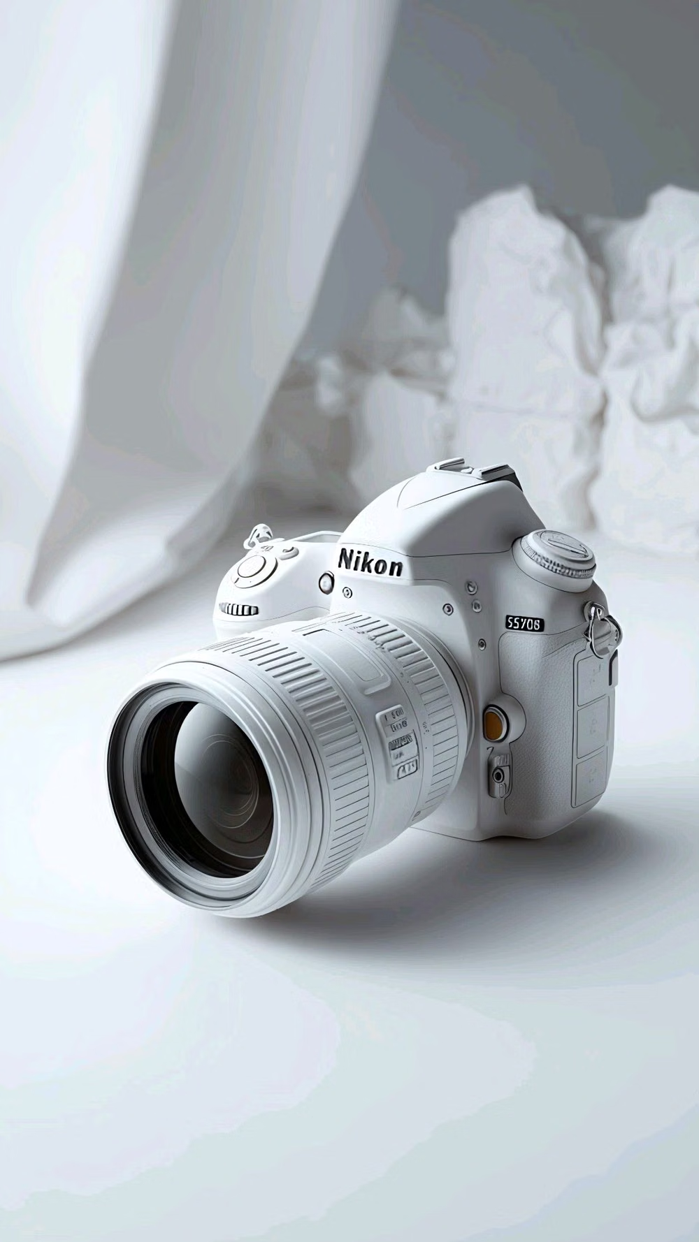
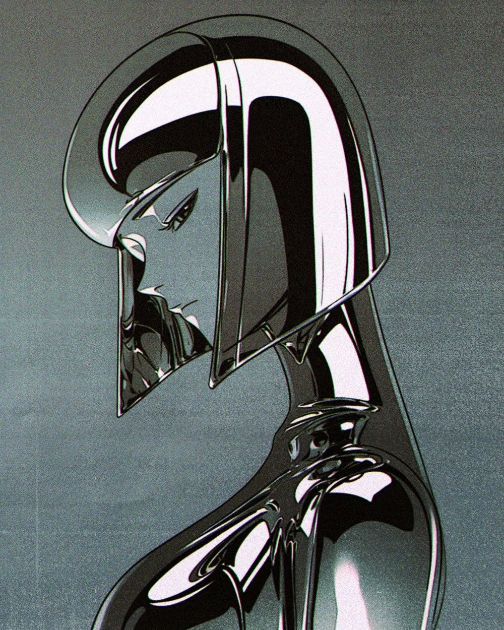
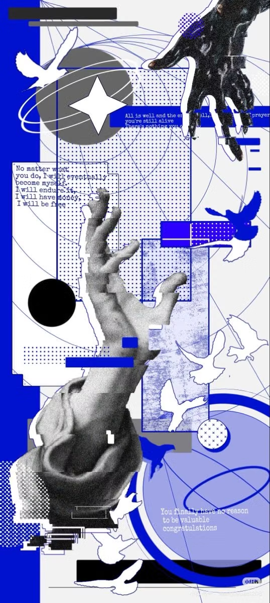
Late-2010s hyper-minimal tech design reduces interfaces to black or white fields, large grotesque type, strict grids, sparse geometry, and an occasional controlled gradient or premium render.