Wabi-Sabi UI design style
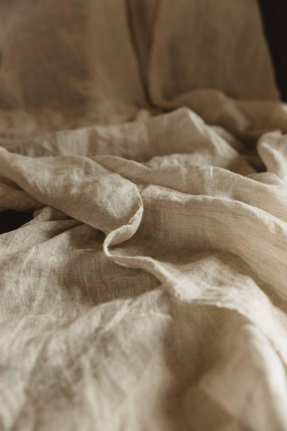
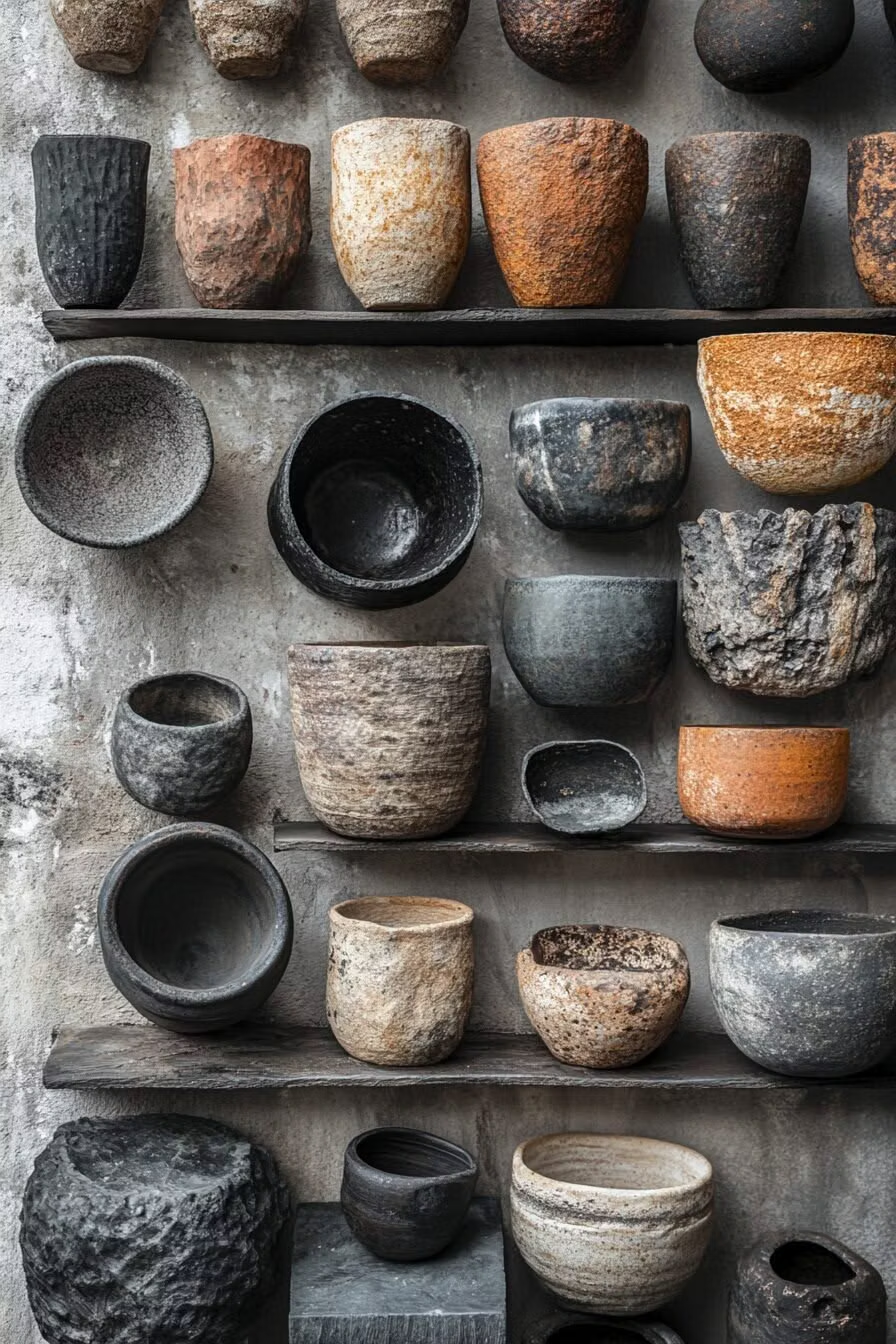
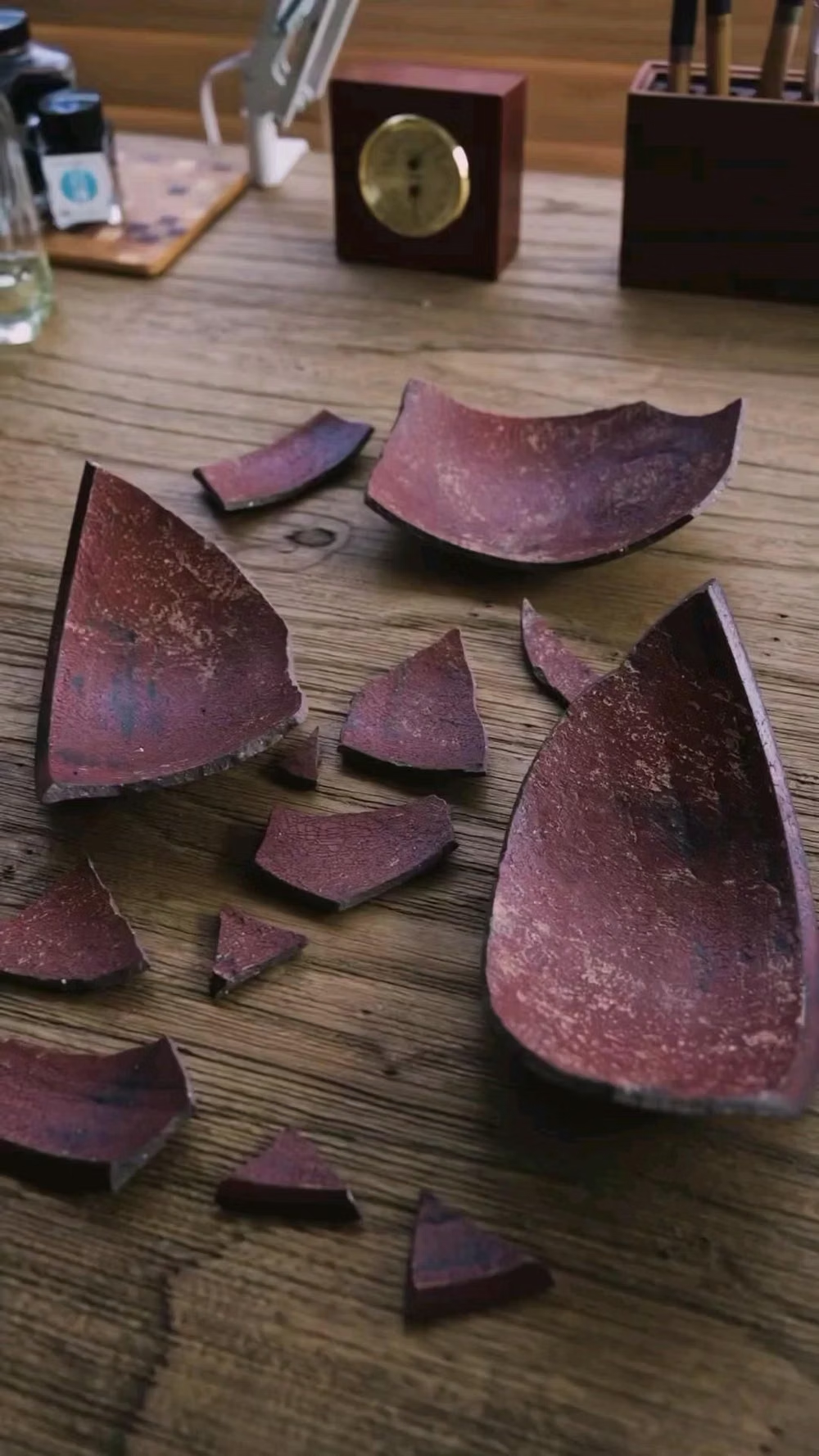
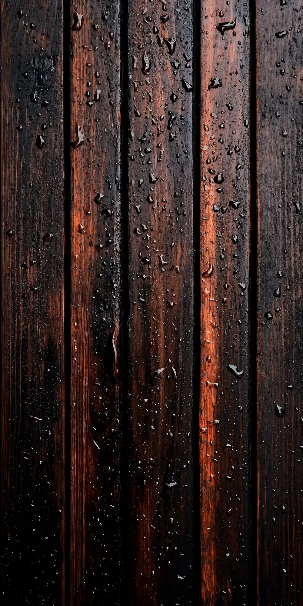
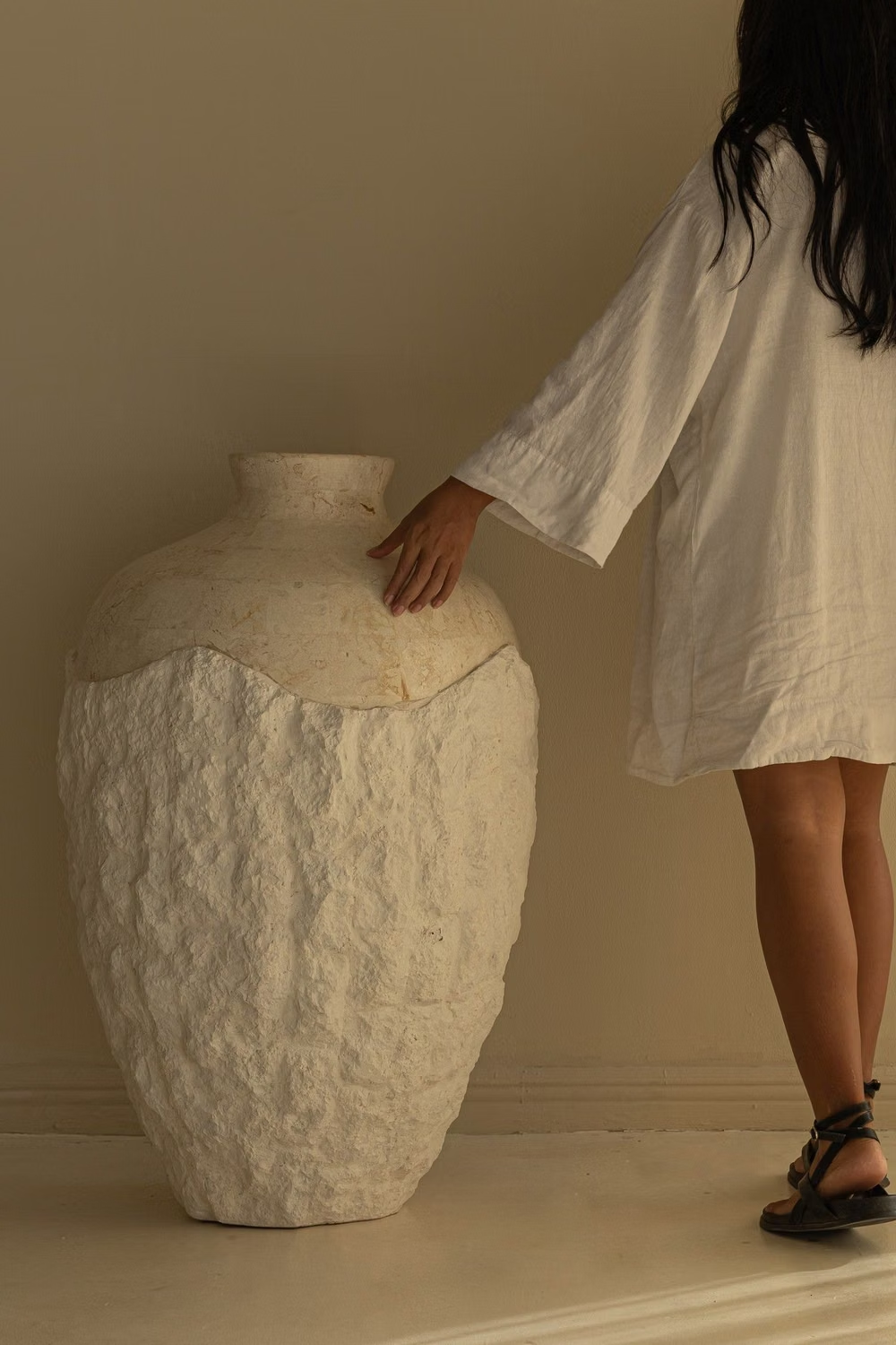
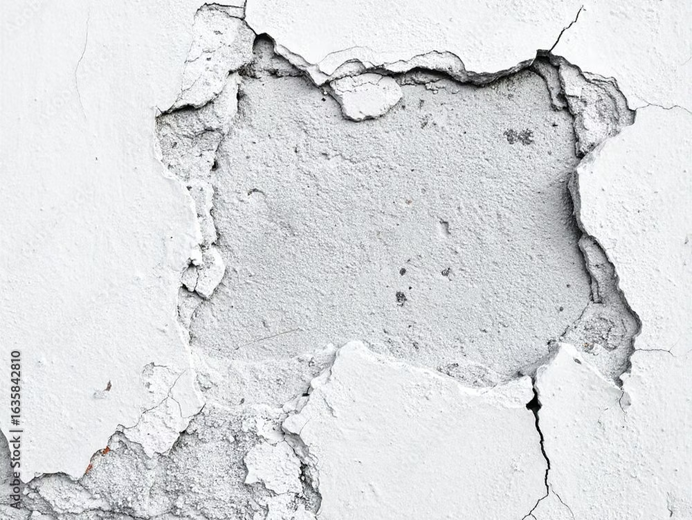
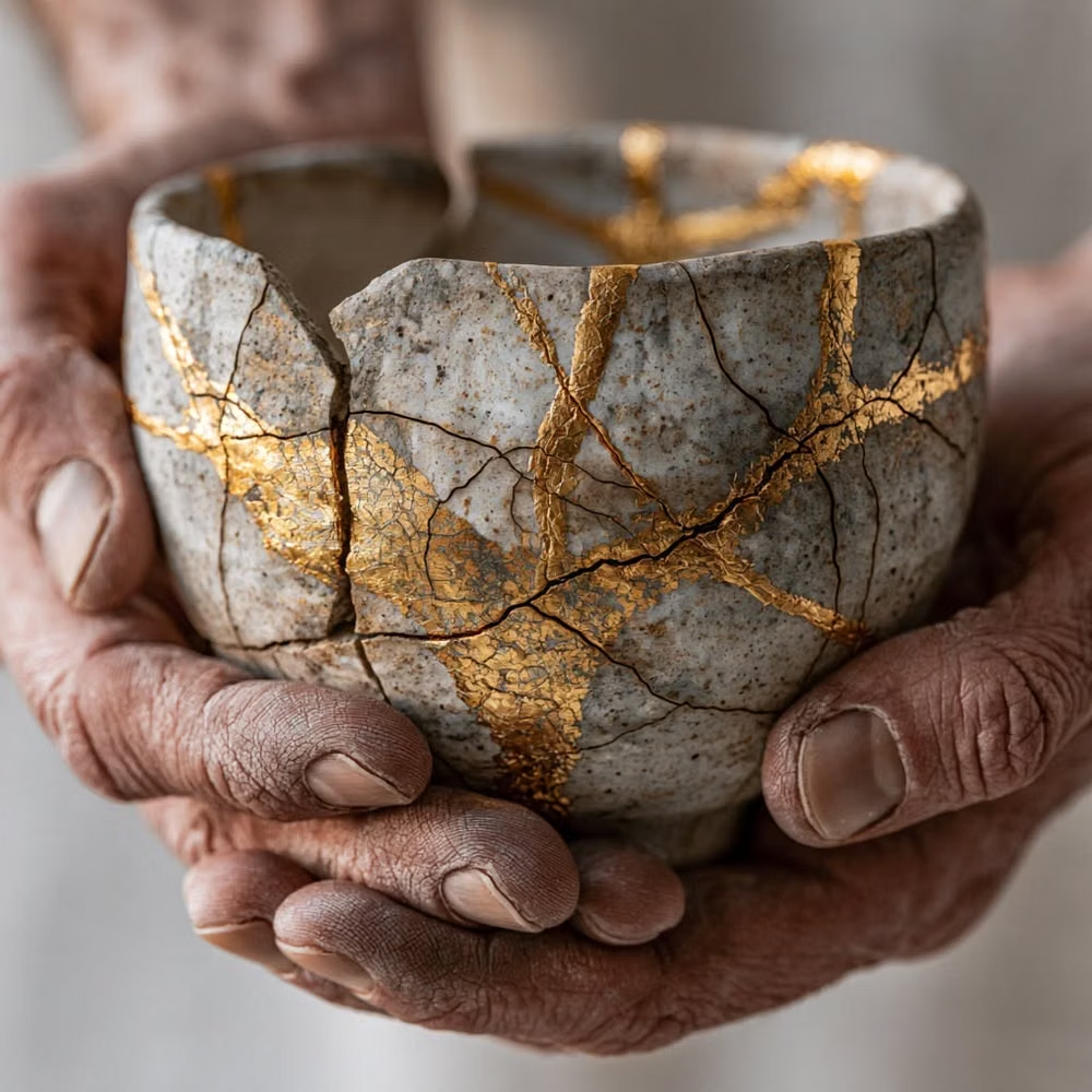
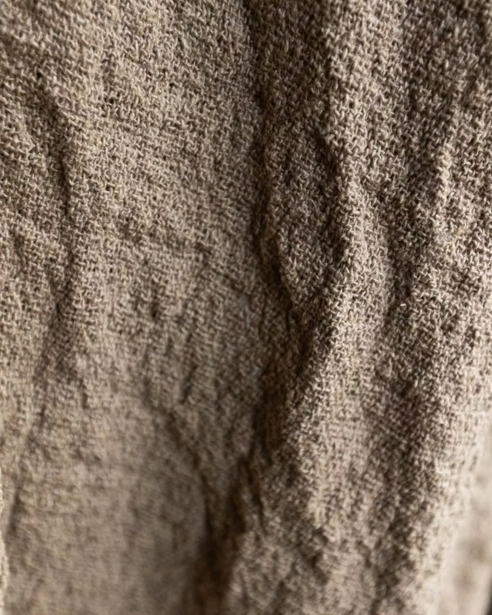
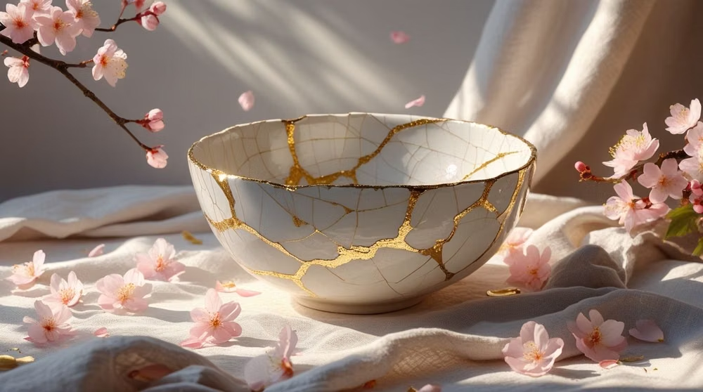
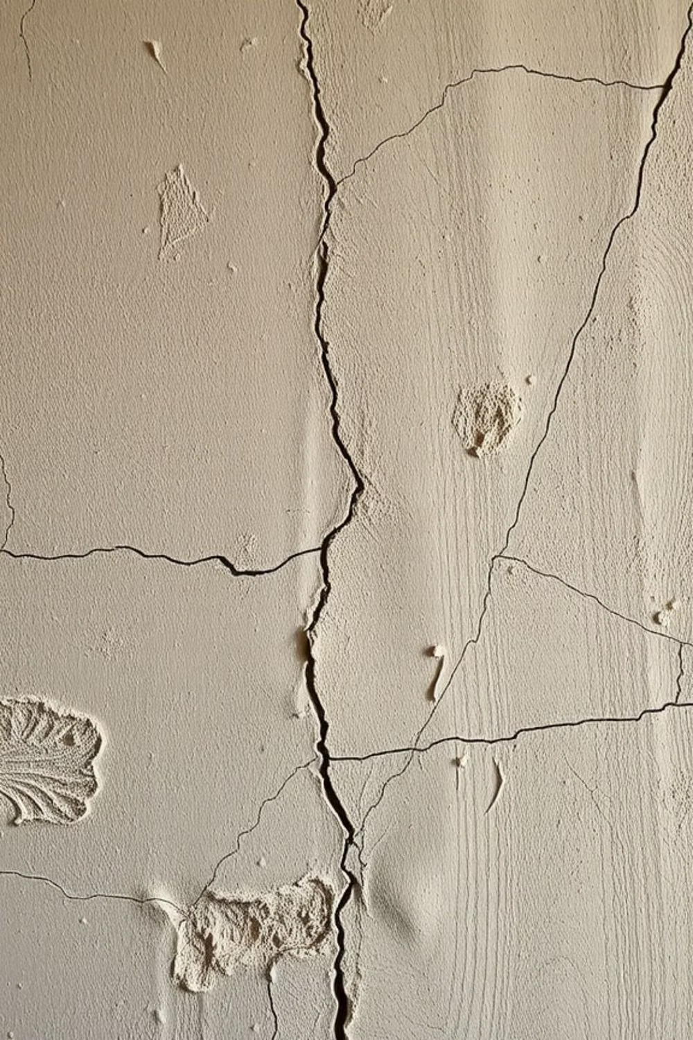
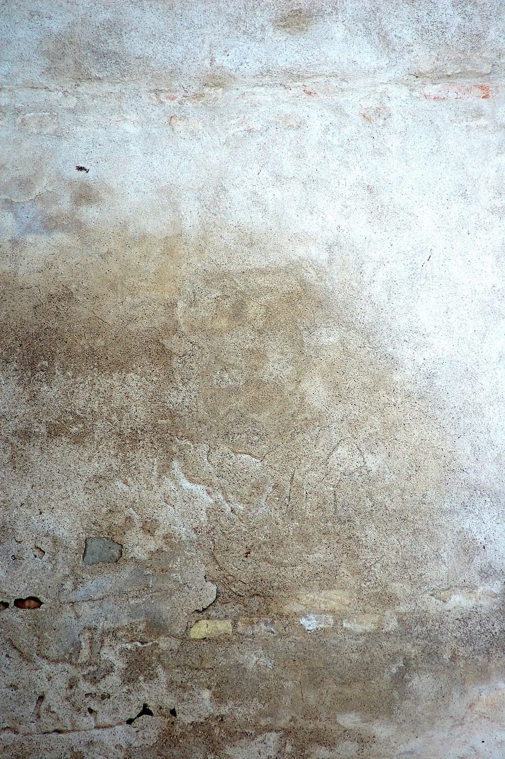
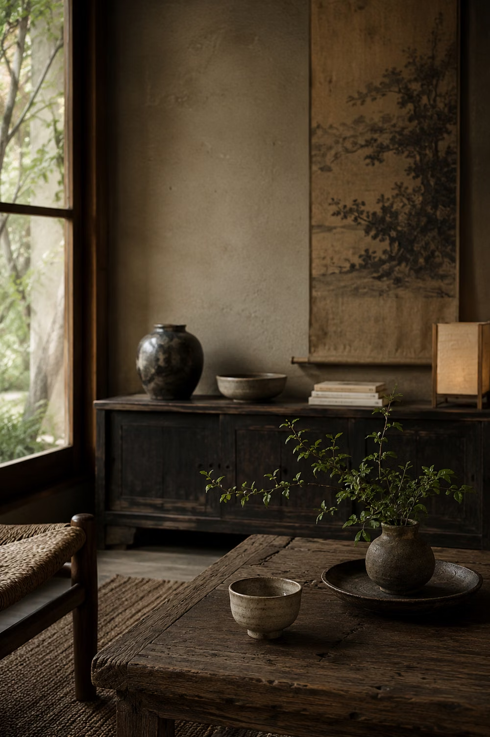
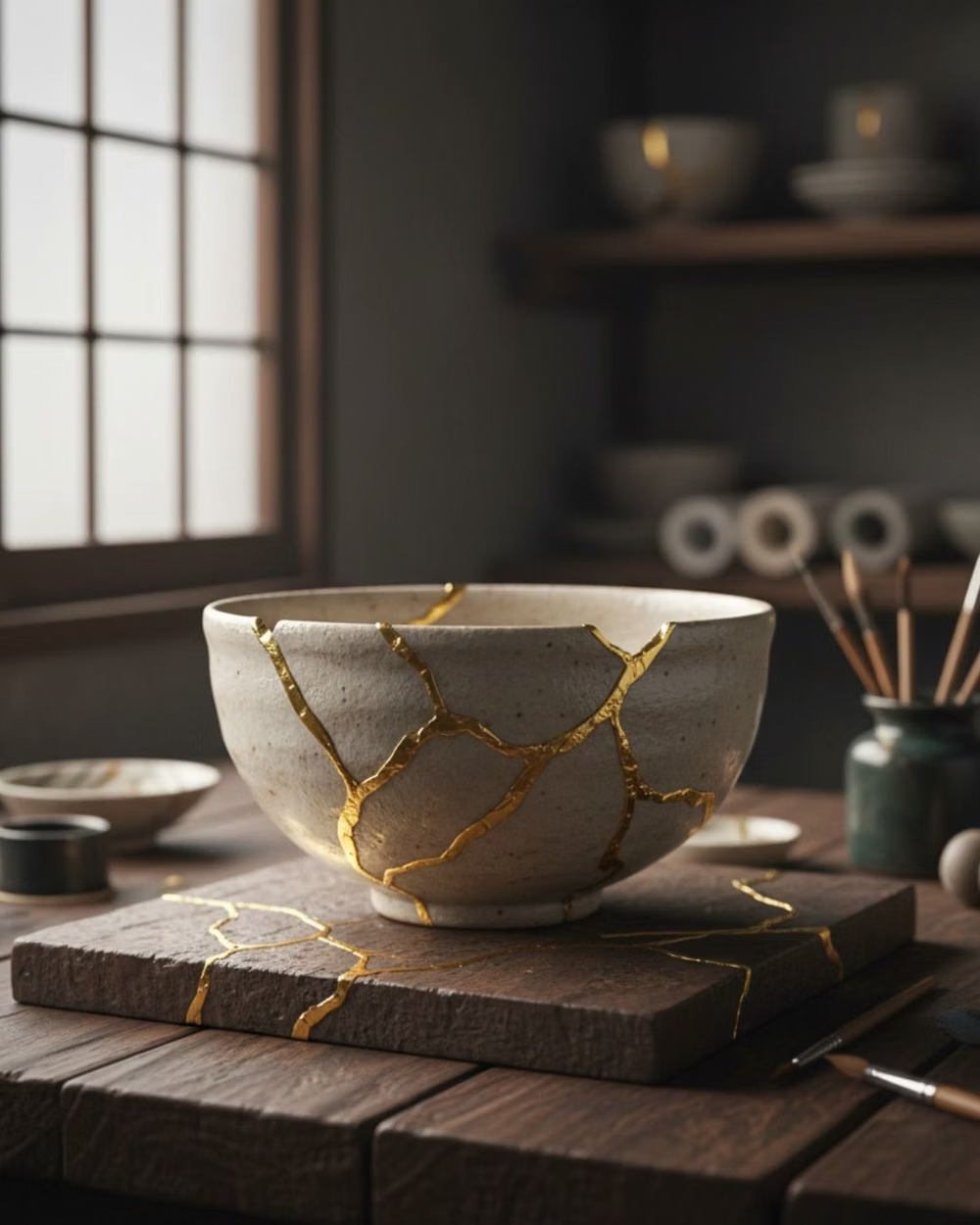
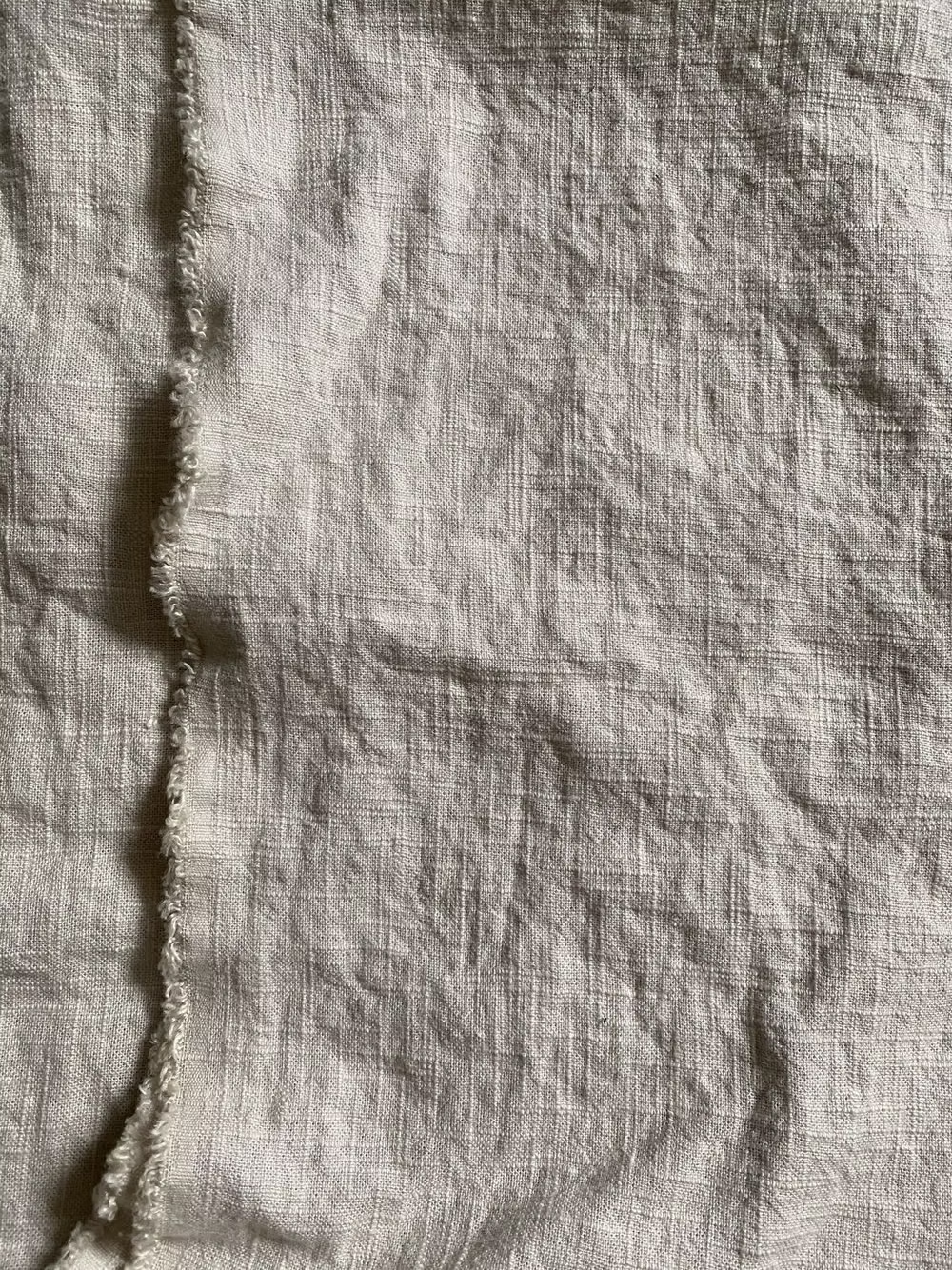
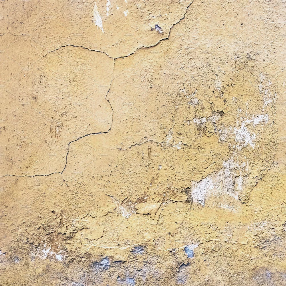
Asymmetry, weathered texture, muted earth tones, imperfection, and visible material age create understated warmth.
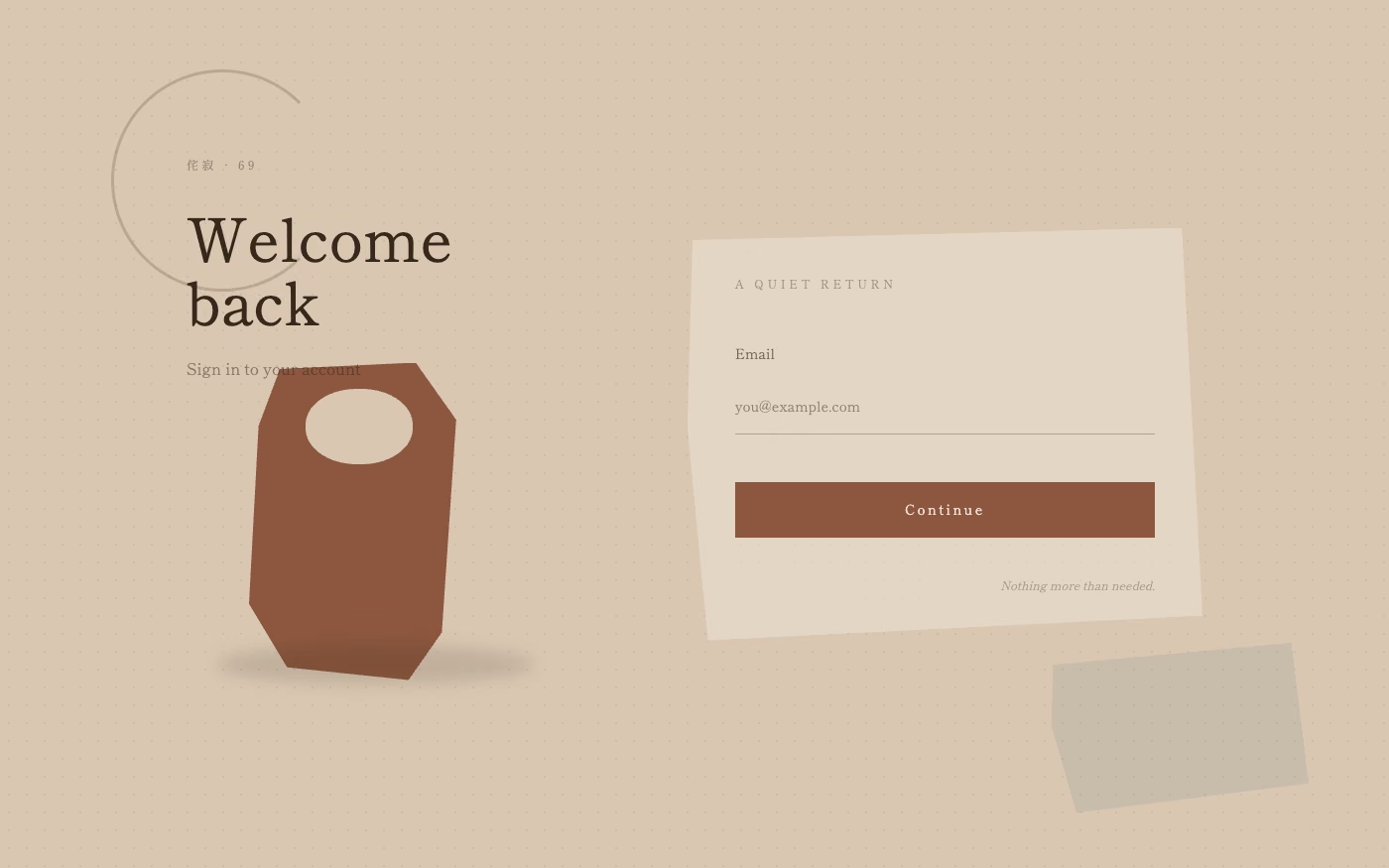
Design overview
- Signature elements
- asymmetry, weathered texture, muted earth tones, irregular edges, visible imperfection, quiet composition. In daisyUI themes, set `--noise: 1;`.
- Best suited to
- Craft, hospitality, wellness, food, slow-living brands, and artisan commerce.
- Layout principles
- Build quiet asymmetrical arrangements with irregular margins, visible pauses, and small material details that reward close attention rather than perfect alignment.
History and origins
A fact-checked account of where this visual language came from, with links to the references used.
- Period
- Medieval precedents; deeply associated with tea culture from the 15th–16th centuries
- Origin
- Japan
Wabi and sabi accumulated meanings over centuries and became closely connected with Zen-influenced tea practice, where weathered materials, restraint, asymmetry, and impermanence could be valued. Tea masters including Sen no Rikyū shaped the 16th-century tradition, but modern commercial “wabi-sabi” often simplifies a complex aesthetic and ethical history into a palette of beige ceramics.
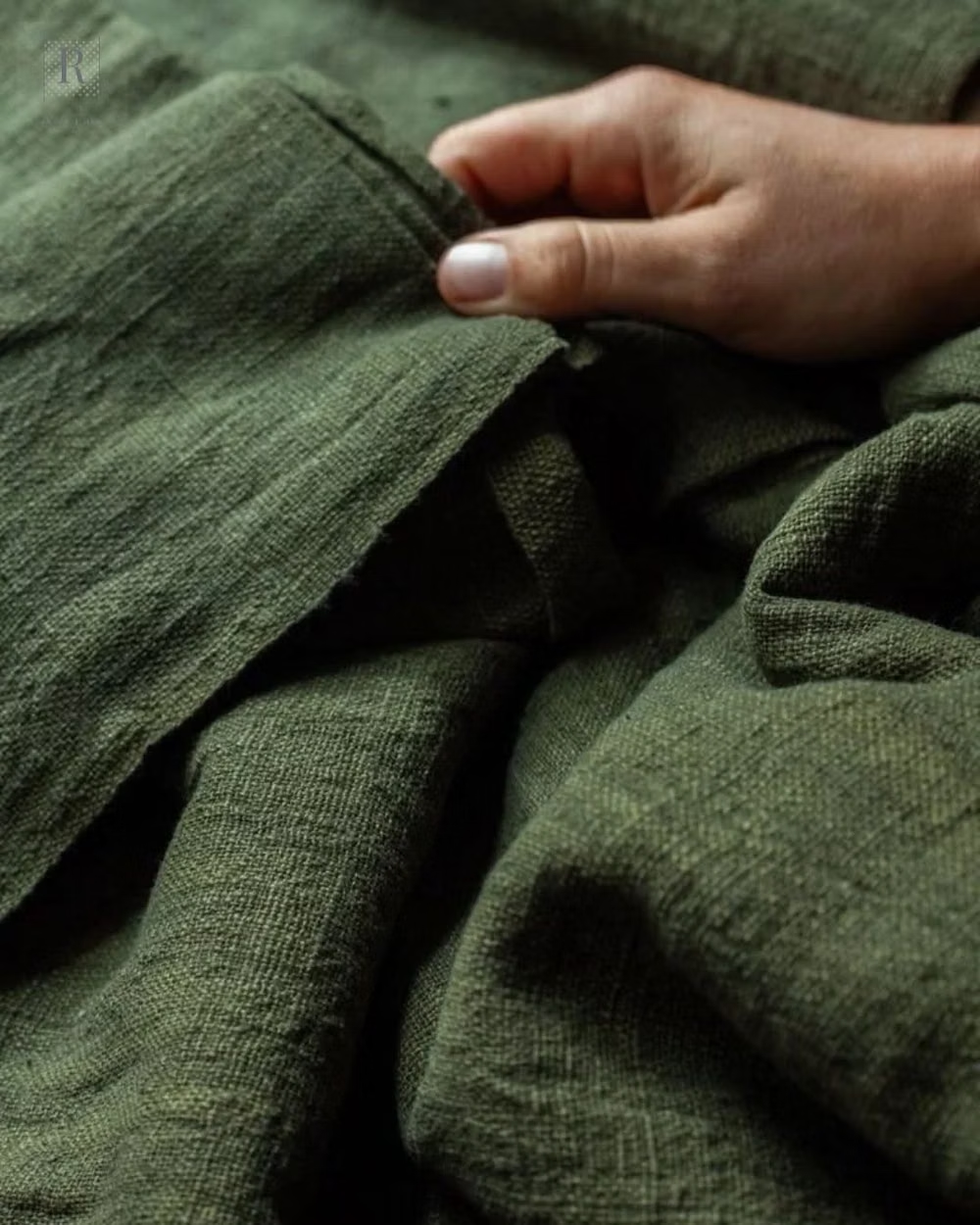
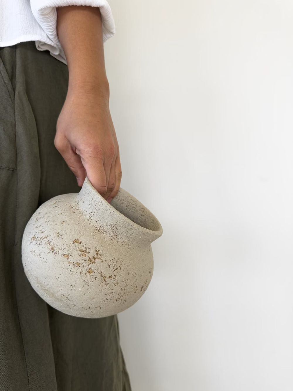
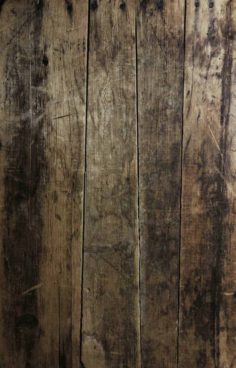
Moodboard and visual references
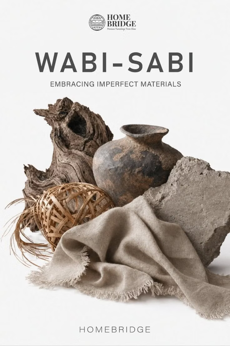
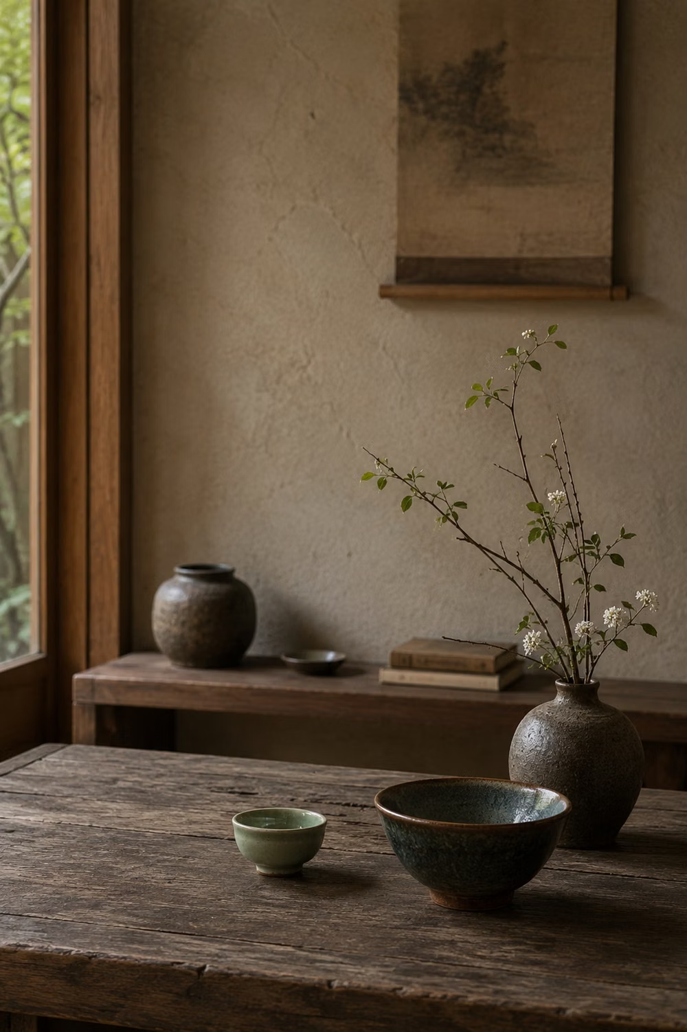
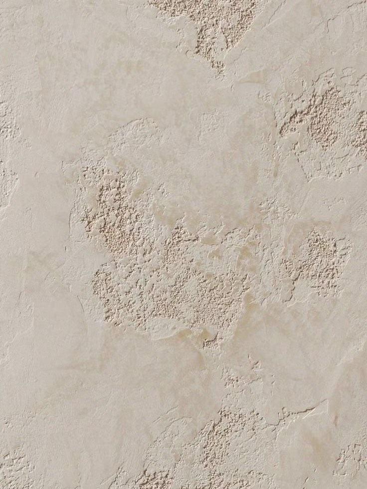
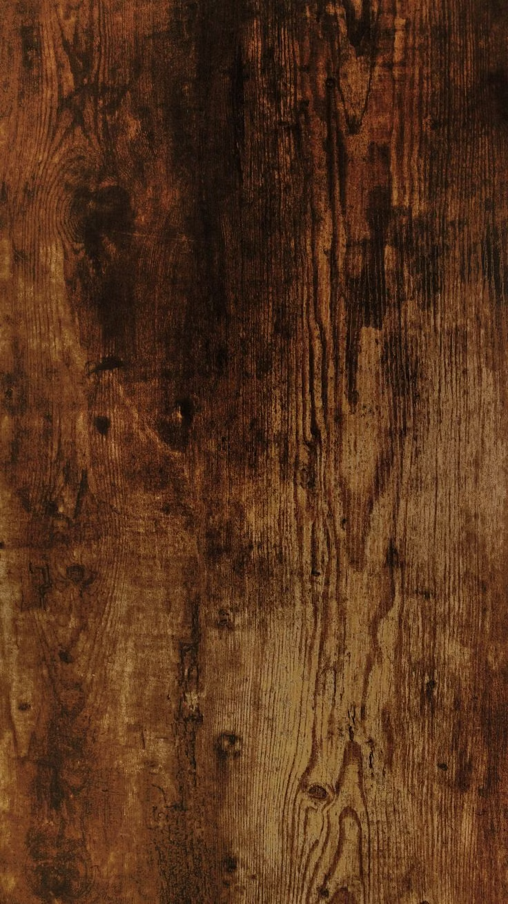
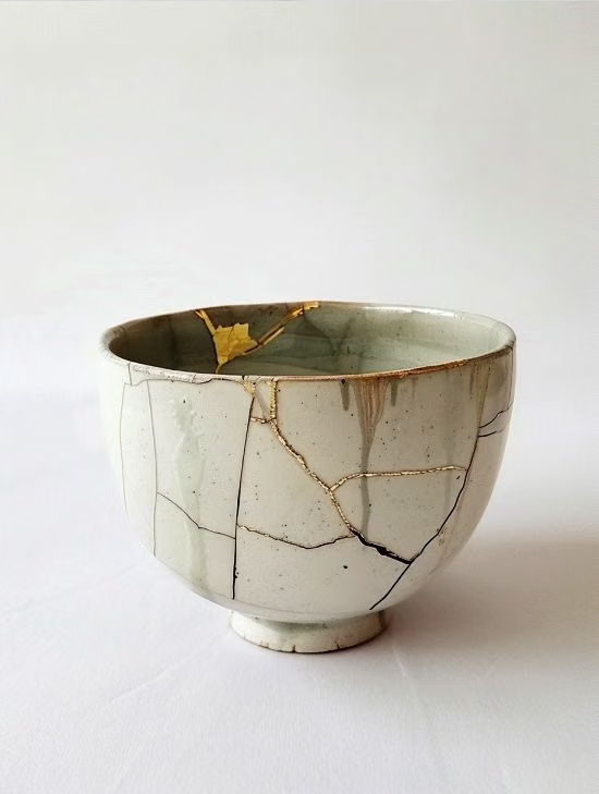
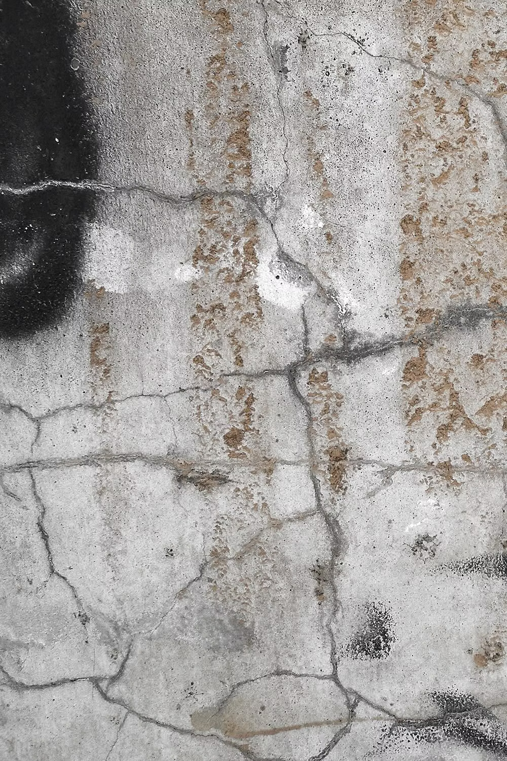
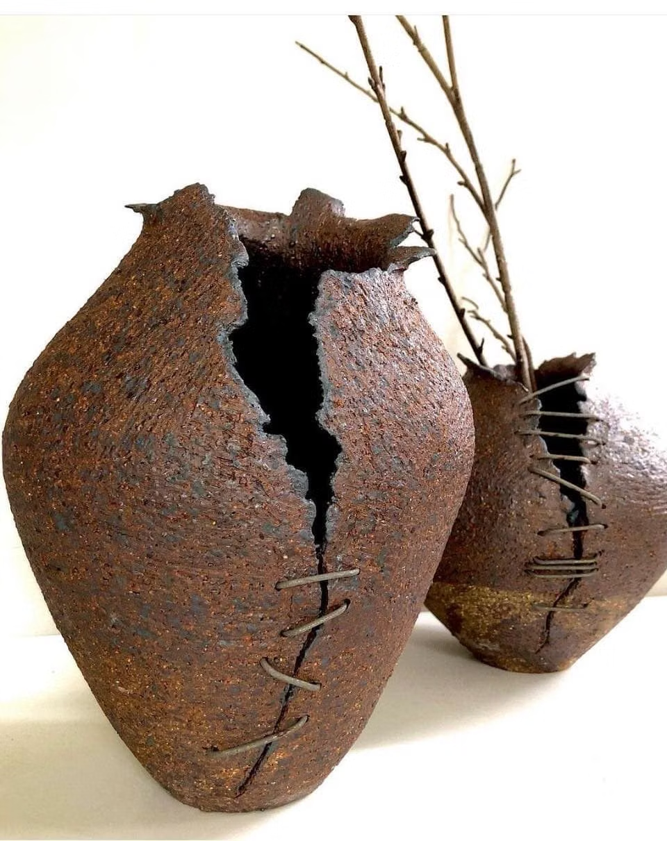
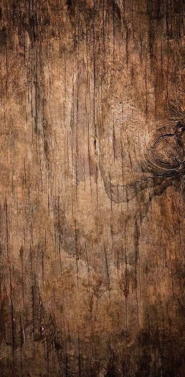
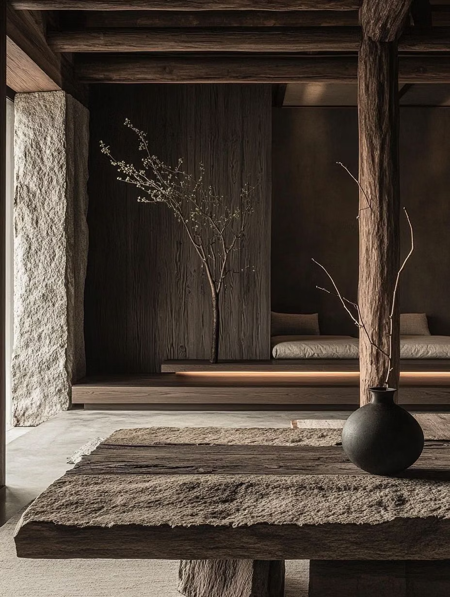
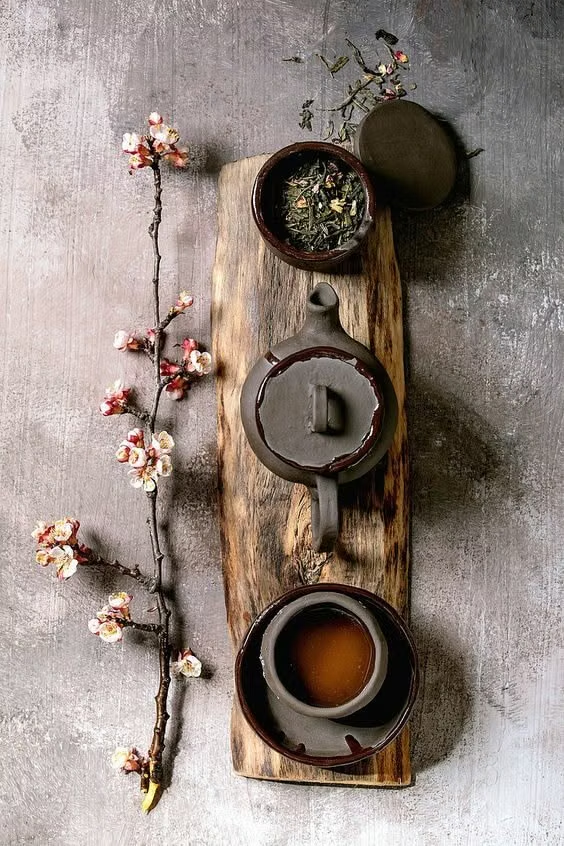
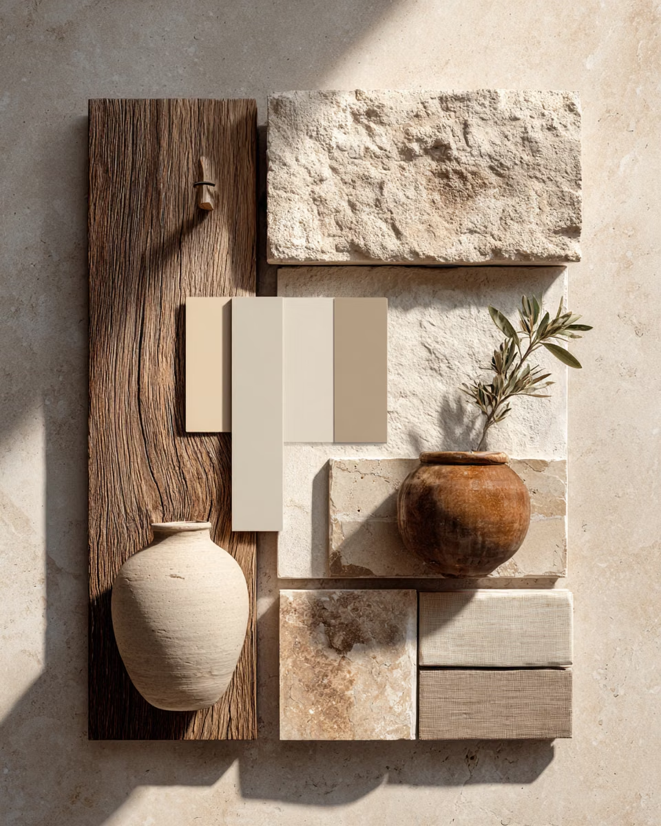
A visual study of the forms, inspirations, materials, colors, type, and cultural references associated with this UI design style.

Design principles and implementation
Use these principles to write a focused AI UI design prompt instead of asking for a vague visual treatment.
Color direction
Choose weathered clay, ash, moss, tea, linen, charcoal, and oxidized metal tones with subtle unevenness and no polished high-saturation accent. In a daisyUI theme, use weathered clay or moss for `primary`, oxidized metal or tea for `secondary`, and assign linen, tea-stained beige, and soft ash to `base-100`, `base-200`, and `base-300`.
Imagery direction
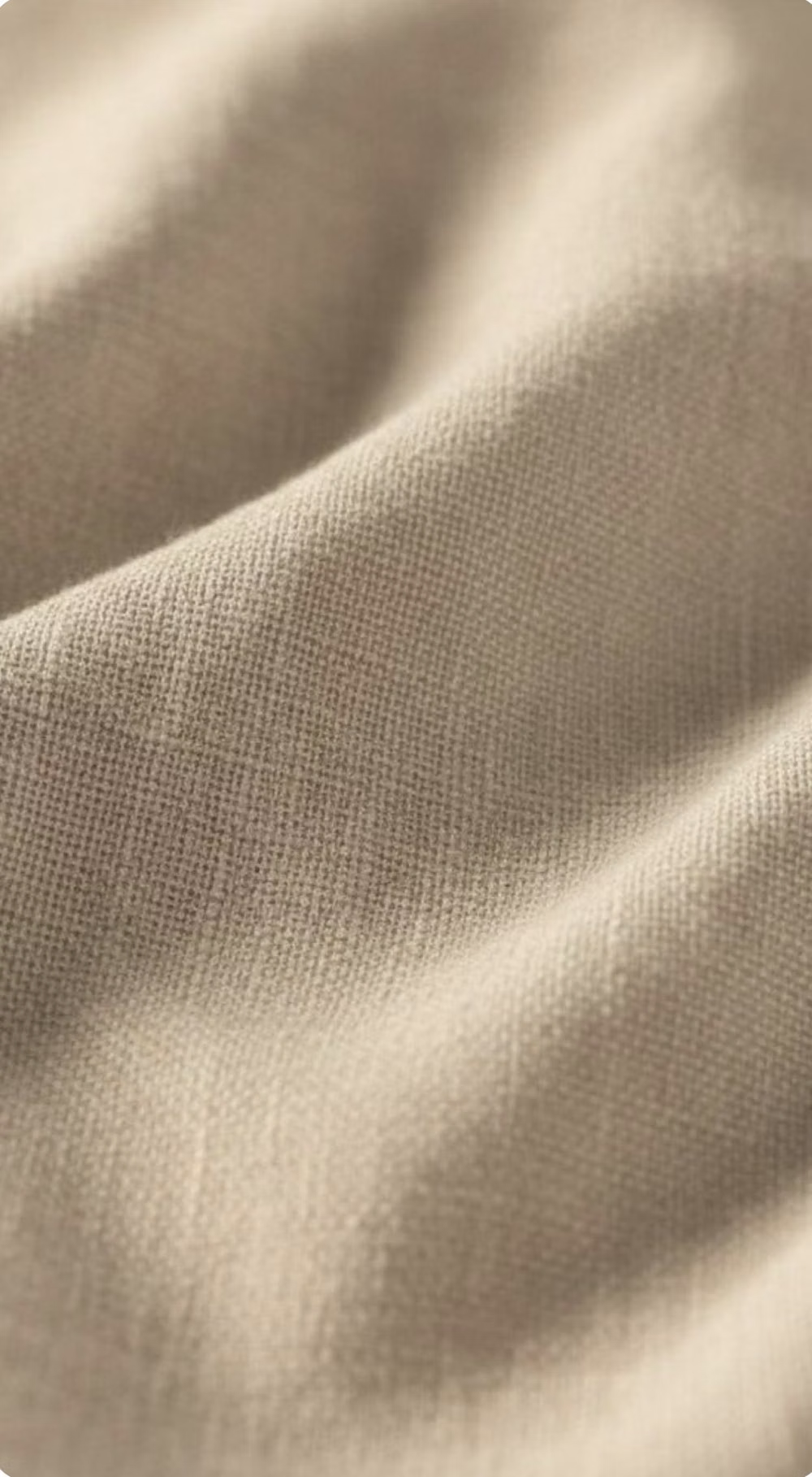
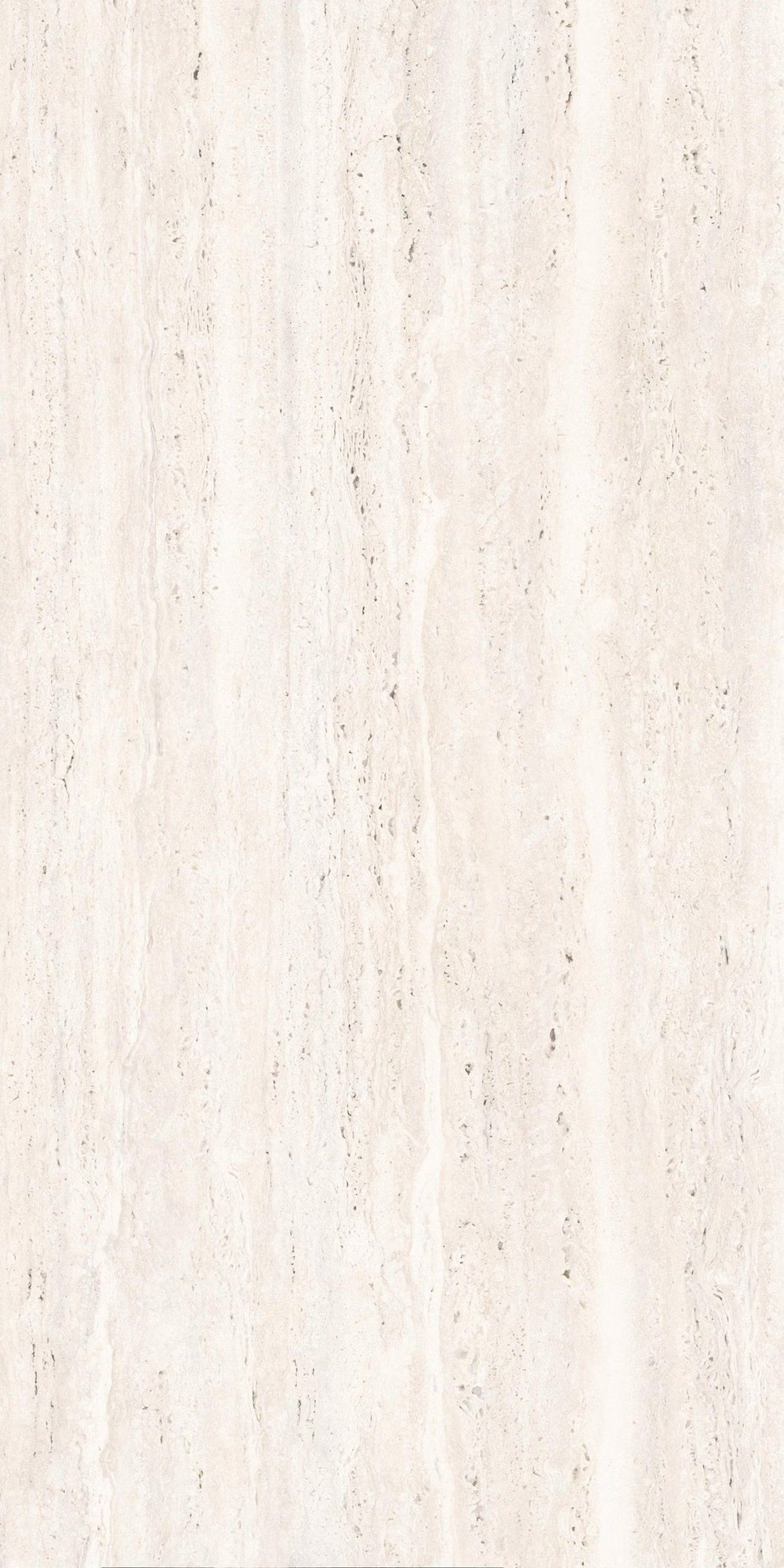
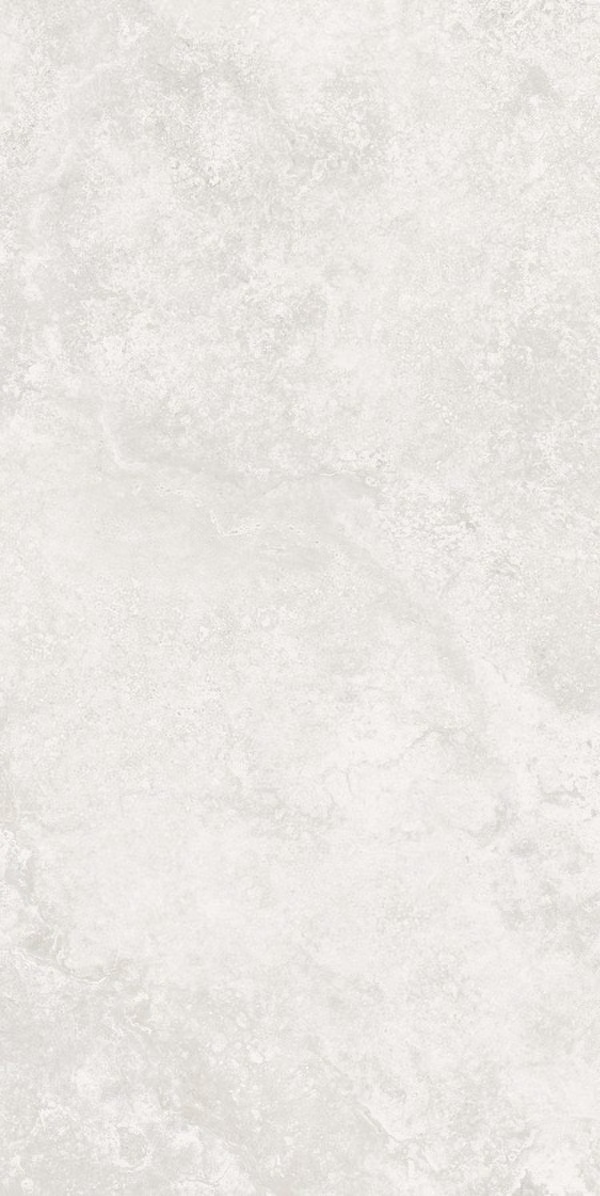
Use macro photography of handmade objects, aged wood, ceramics, fabric, food, and weathered surfaces that reveal imperfection and use.
Content density
Keep density low, allowing one crafted object or short passage to occupy a generous field without explanatory clutter.
Motion direction
Use slow imperfect crossfades, hand-paced reveals, and subtle material changes that do not loop with machine-like precision.
Shape language
Favor irregular edges, incomplete circles, uneven vessels, torn fibers, and asymmetrical frames whose imperfections remain controlled. In daisyUI themes, set the `--radius-*` variables to `0` or `0.25rem`.
Typography rules
Use a quiet serif, Mincho, or humanist face with relaxed leading and modest scale, avoiding glossy display lettering or mechanically tight spacing.
Suggested Typfaces
Shippori Mincho
Fresh daisies glow in warm sunlight
Fresh daisies glow in warm sunlight
1 2 3 4 5 6 7 8 9 0
Zen Old Mincho
Fresh daisies glow in warm sunlight
Fresh daisies glow in warm sunlight
1 2 3 4 5 6 7 8 9 0
Sawarabi Mincho
Fresh daisies glow in warm sunlight
Fresh daisies glow in warm sunlight
1 2 3 4 5 6 7 8 9 0
Yuji Syuku
Fresh daisies glow in warm sunlight
Fresh daisies glow in warm sunlight
1 2 3 4 5 6 7 8 9 0
Noto Serif JP
Fresh daisies glow in warm sunlight
Fresh daisies glow in warm sunlight
1 2 3 4 5 6 7 8 9 0
Build a Wabi-Sabi interface with daisyUI
The live example translates this direction into daisyUI components and semantic theme tokens.
To generate a full page in the same visual language, give the style name and the design rules above to Blueprint MCP.
Related UI design styles
Compare nearby visual languages that share typography, shapes, use cases, or signature elements.
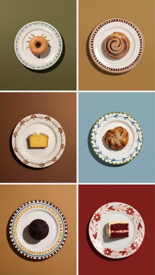
Global Village Coffeehouse UI design style
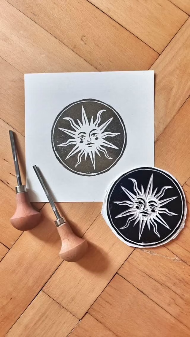
Earth tones, rough borders, woodcut-like symbols, suns, moons, spirals, natural motifs, and sincere hand-drawn globalism.
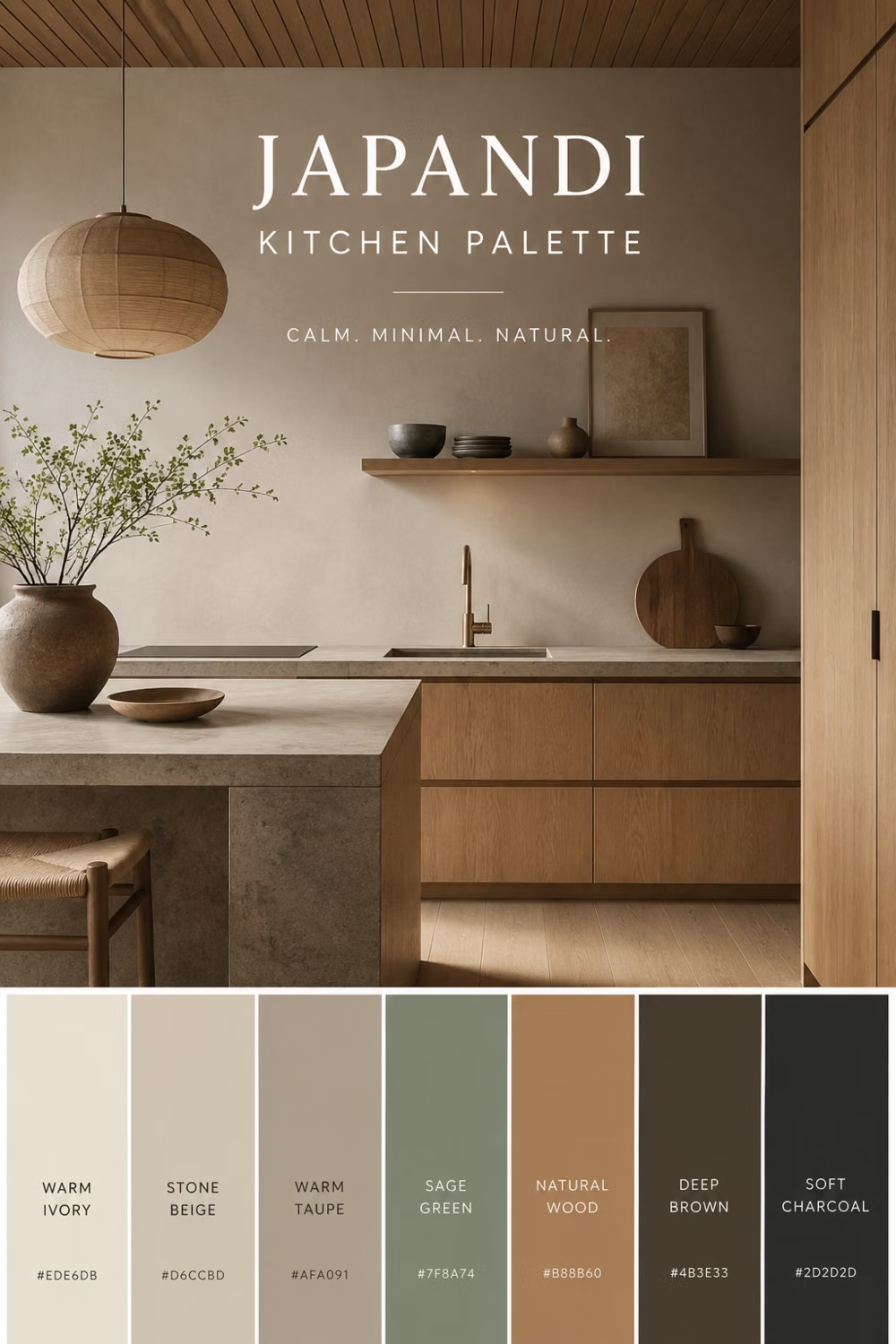
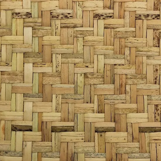
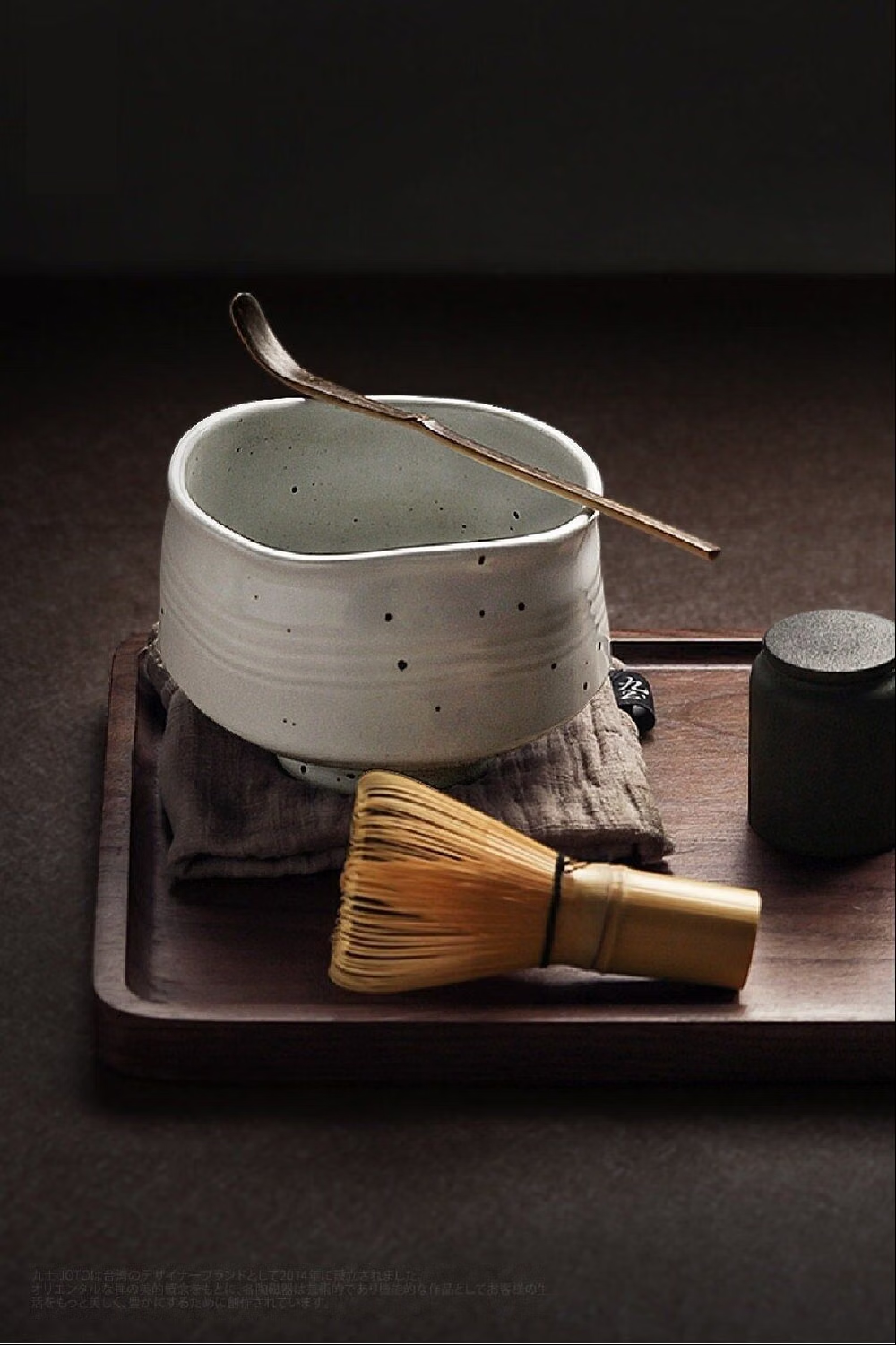
Japanese Minimalism UI design style
Disciplined reduction, calm neutral color, precise spacing, natural materials, and meaningful emptiness create quiet clarity.
Millennial Beige UI design style
A calm tonal aesthetic layers cream, tan, sand, taupe, and greige with tactile natural details, soft contrast, and intentional empty space.