Global Village Coffeehouse UI design style
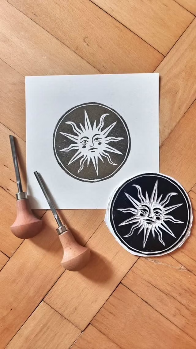
Earth tones, rough borders, woodcut-like symbols, suns, moons, spirals, natural motifs, and sincere hand-drawn globalism.
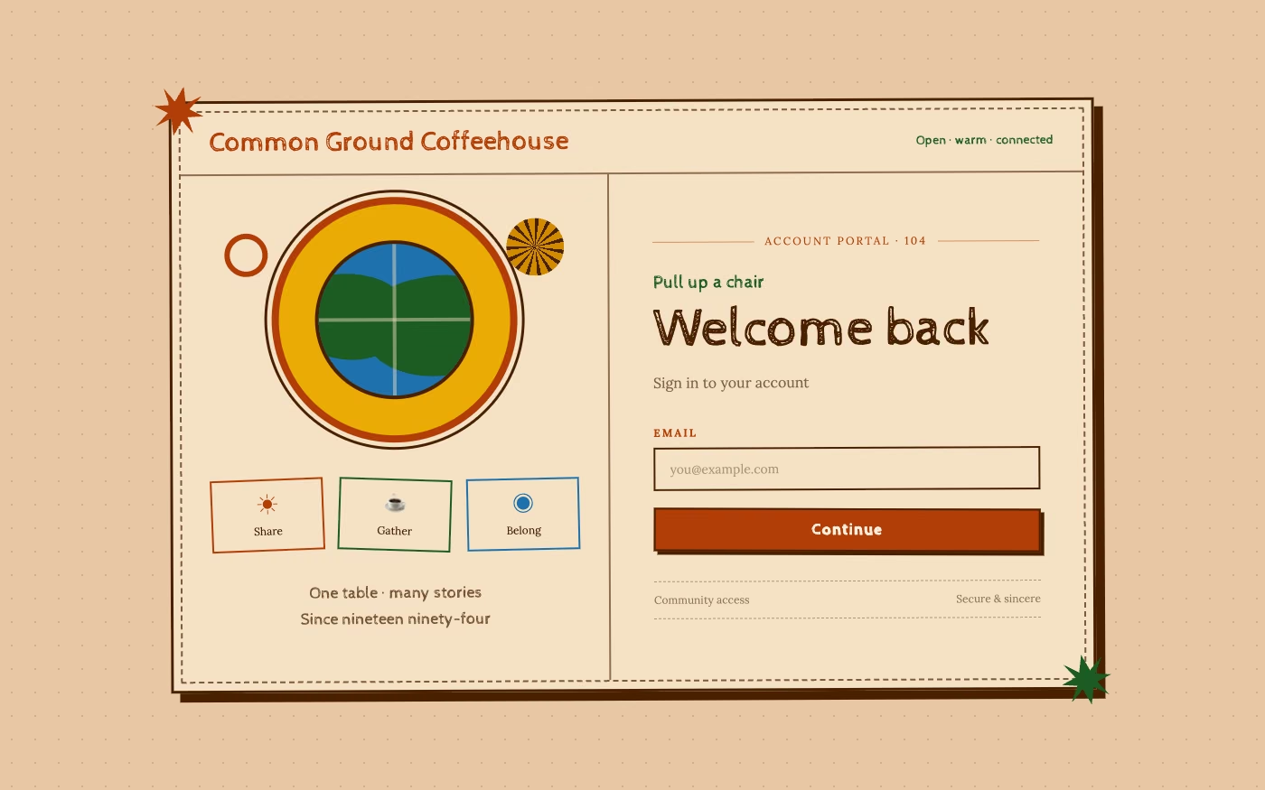
Design overview
- Signature elements
- earth tones, woodcut symbols, rough borders, hand-drawn suns, natural motifs, sincere globalism. In daisyUI themes, set `--noise: 1;`.
- Best suited to
- Coffee, food, wellness, community, travel, craft, and 1990s-inspired lifestyle brands.
- Layout principles
- Arrange content like a handcrafted cafe menu or community board, centering a sun, globe, or shared symbol among warm grouped offerings and stories.
History and origins
A fact-checked account of where this visual language came from, with links to the references used.
- Period
- Late 1980s–mid-1990s
- Origin
- Coffeehouse, environmental, world-music, retail, and early-internet branding
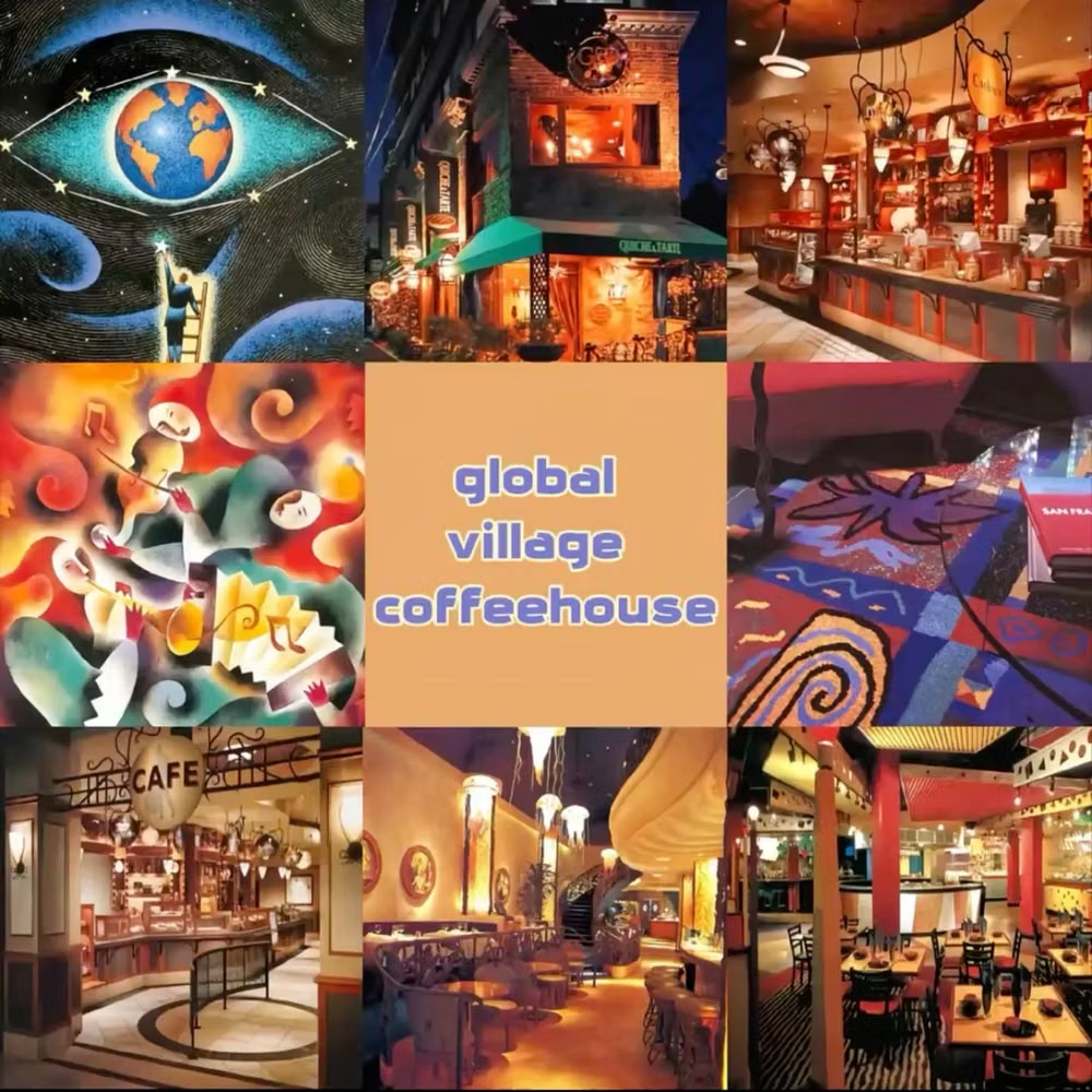
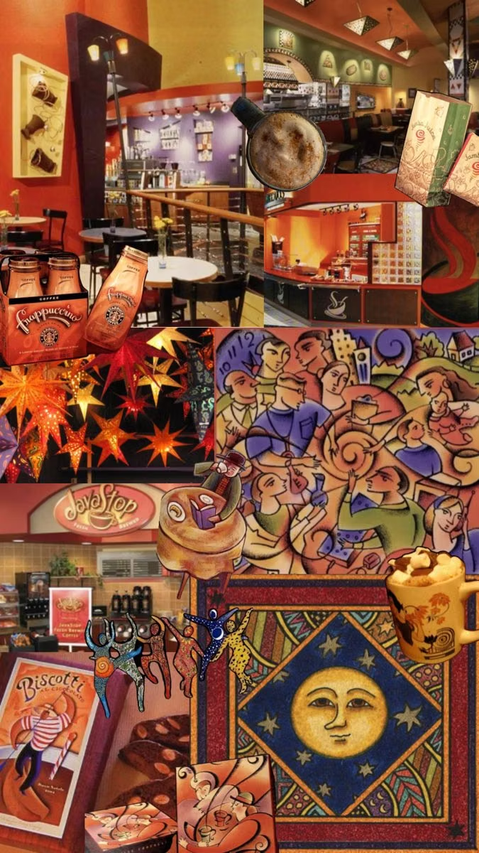
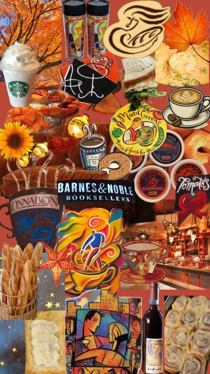
Global Village Coffeehouse is a retrospective name for warm commercial graphics that combined hand drawing, earth tones, woodcut-like marks, suns, moons, globes, spirals, and an idealized multicultural “global village.” CARI places its peak in the mid-1990s and documents the label as a 2017 research-community coinage; its source imagery also deserves scrutiny for flattening distinct cultures into marketable motifs.
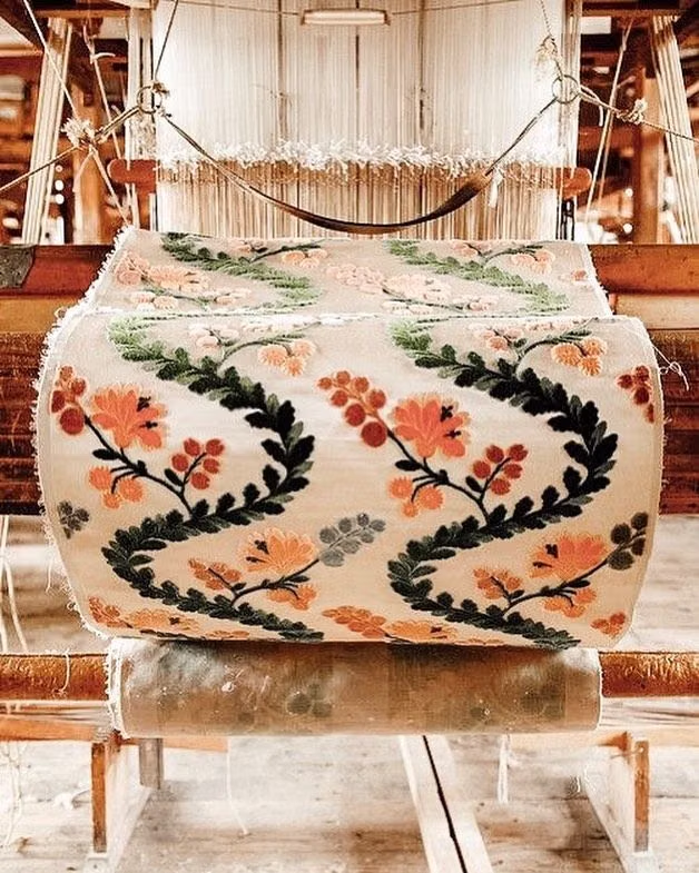
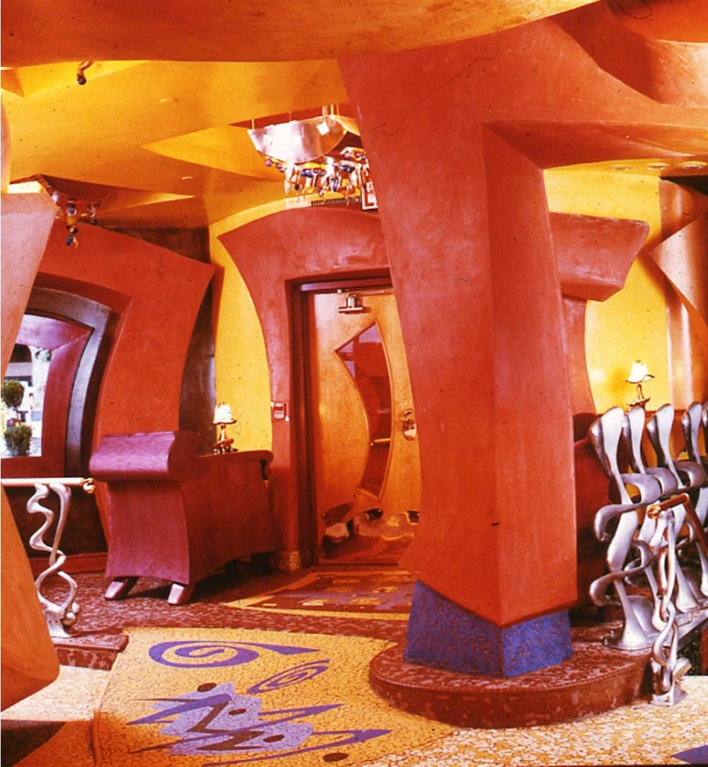
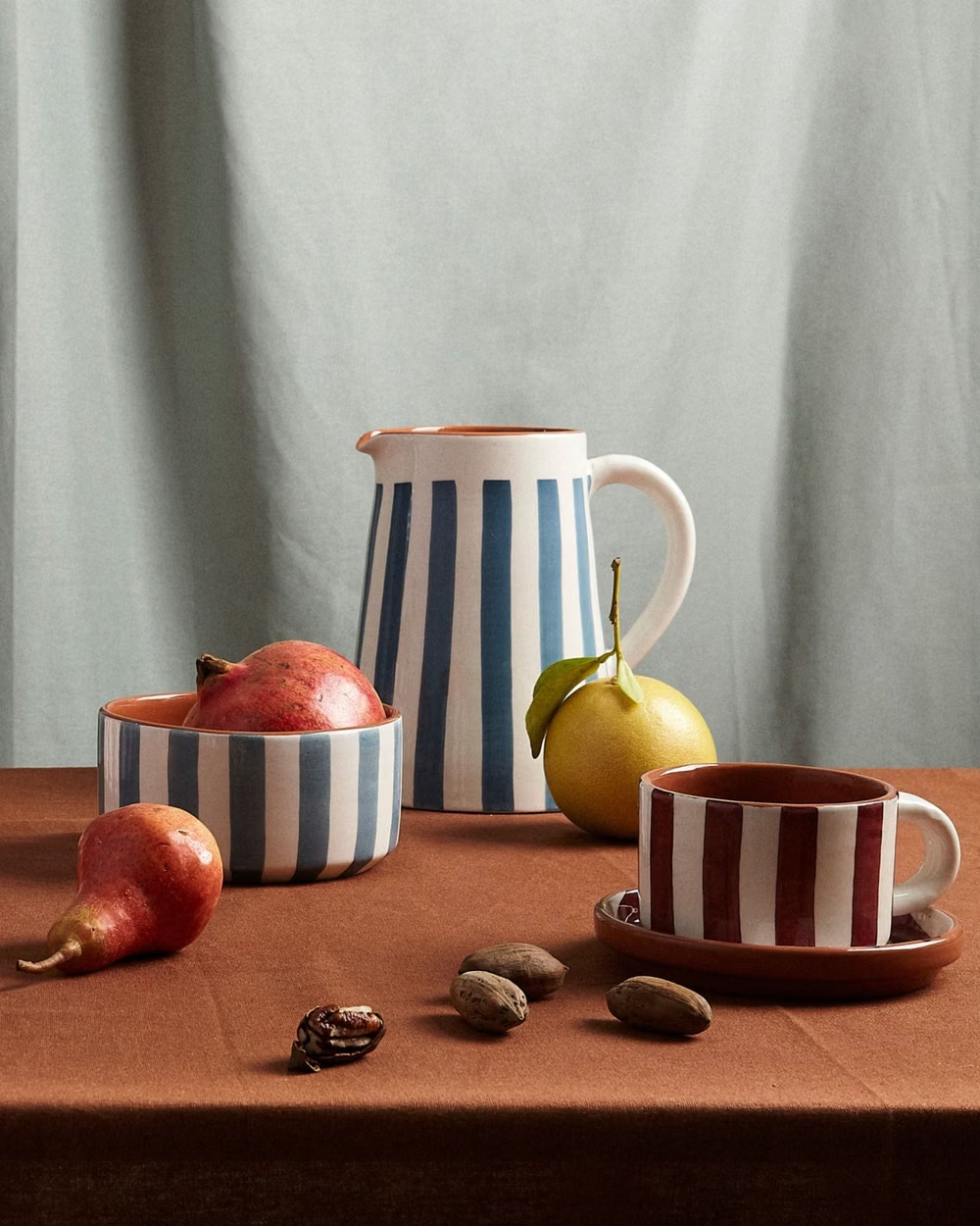
Moodboard and visual references
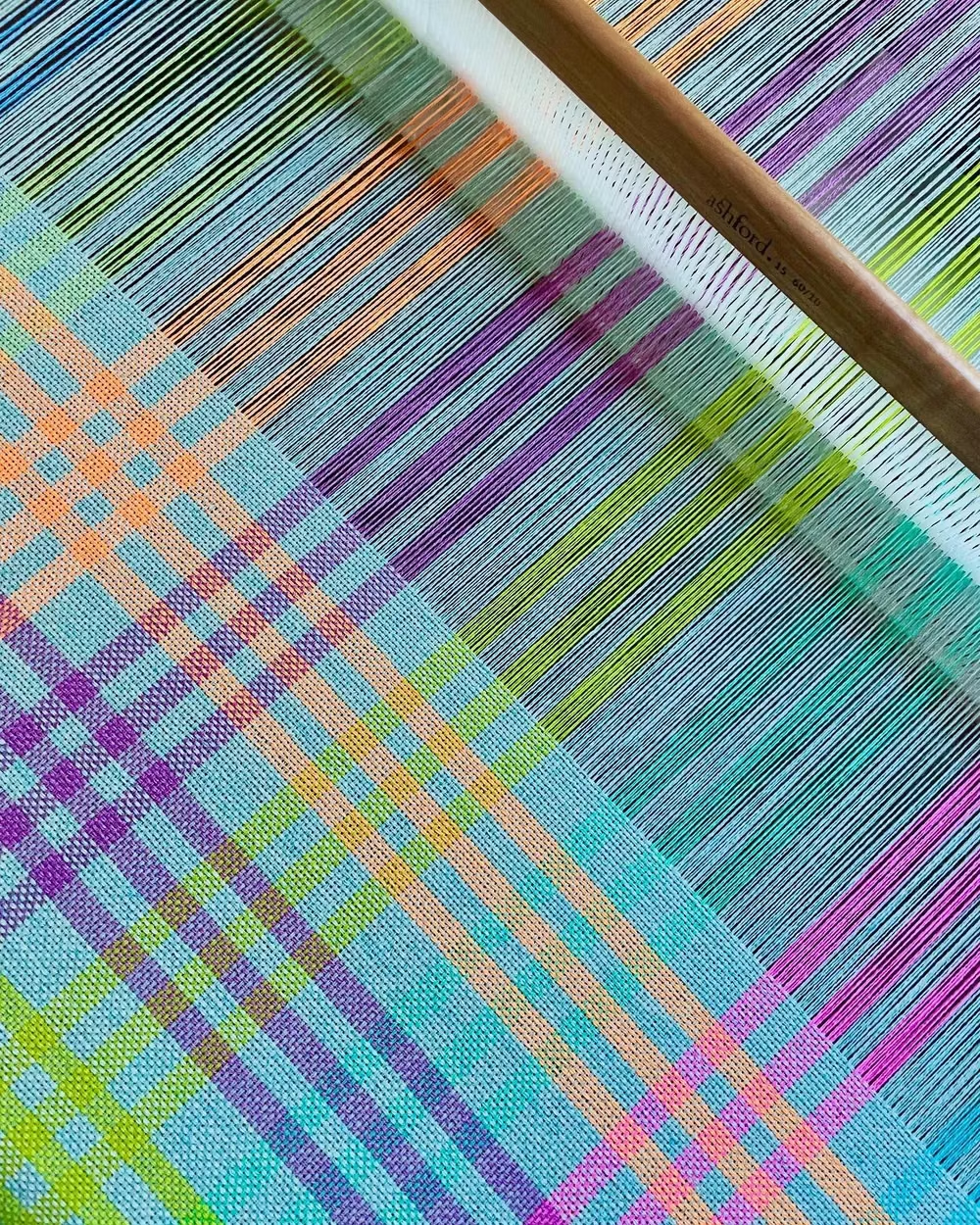
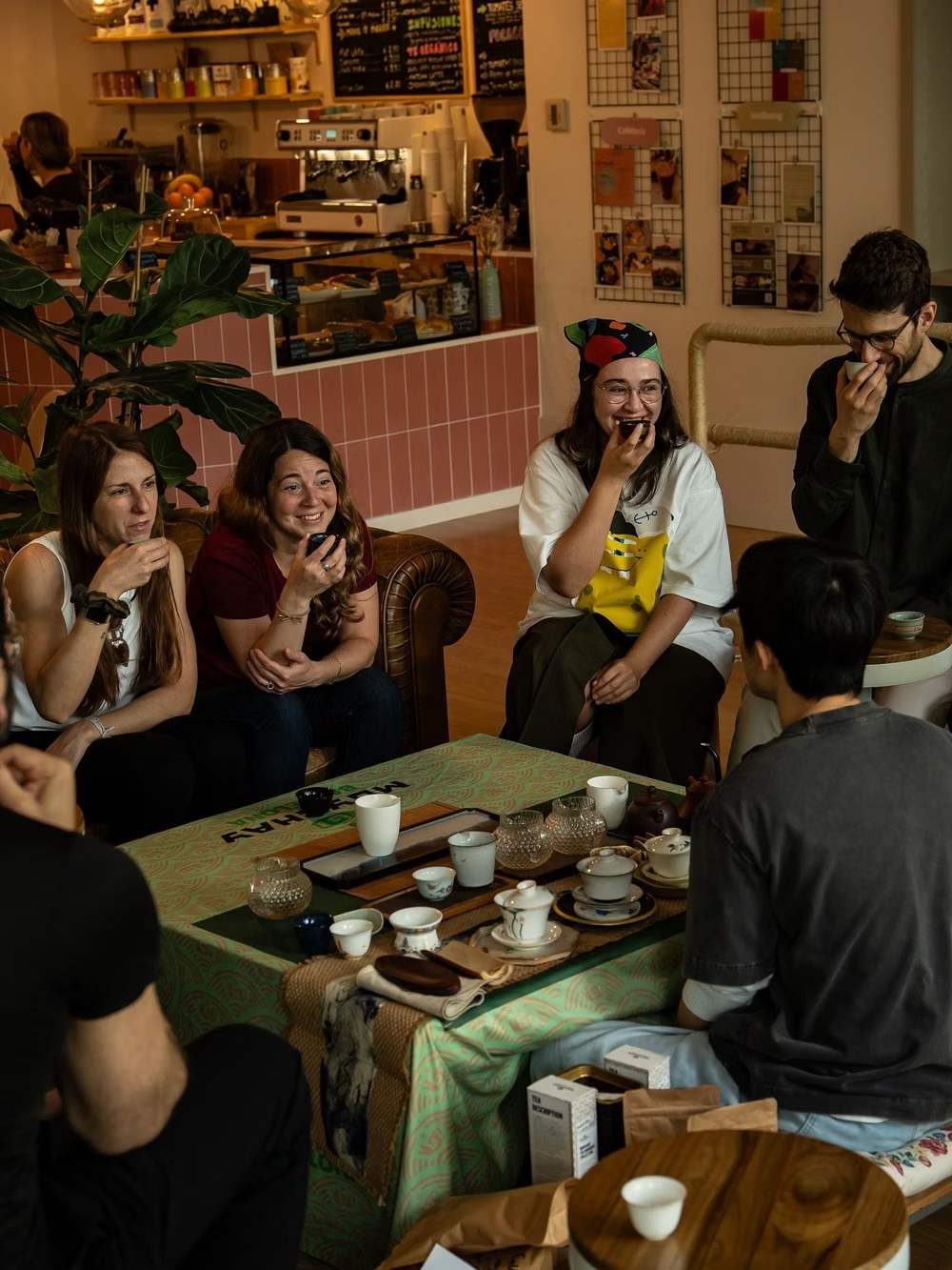
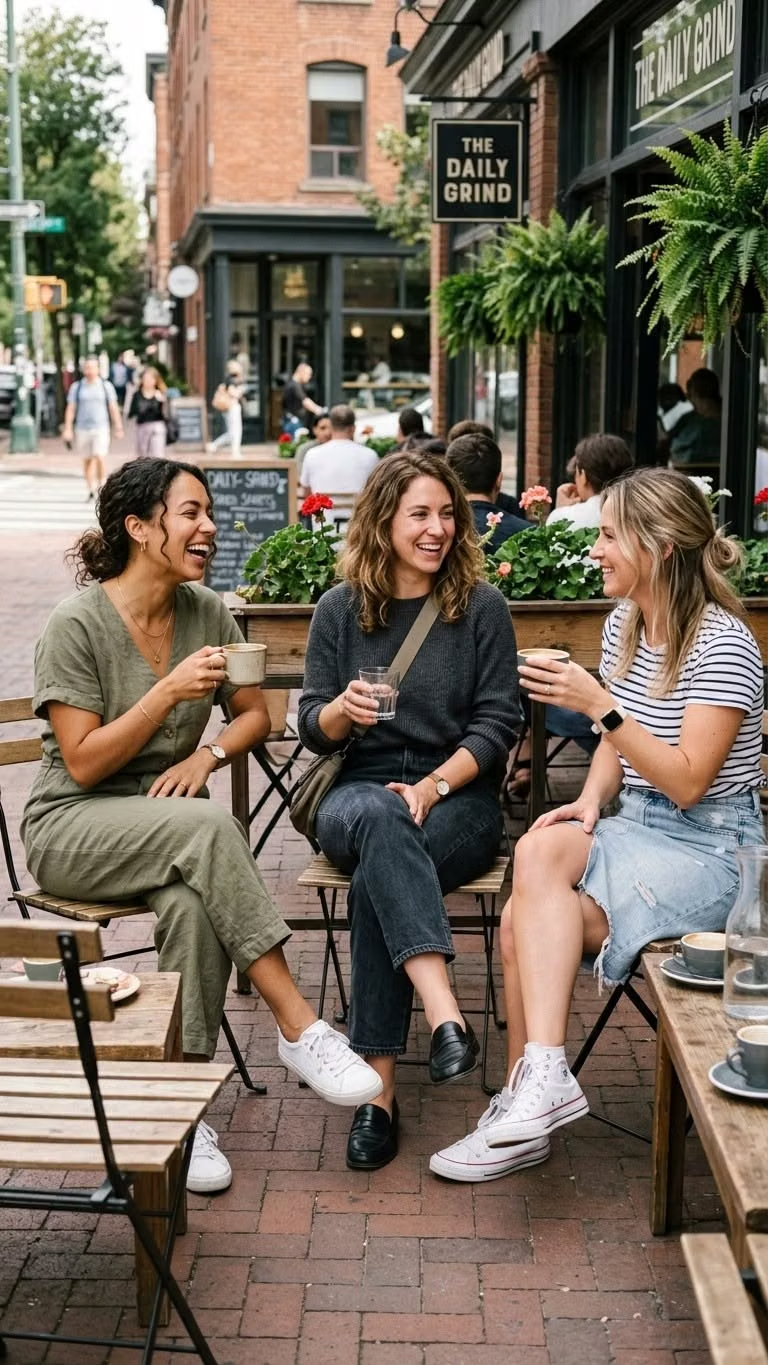
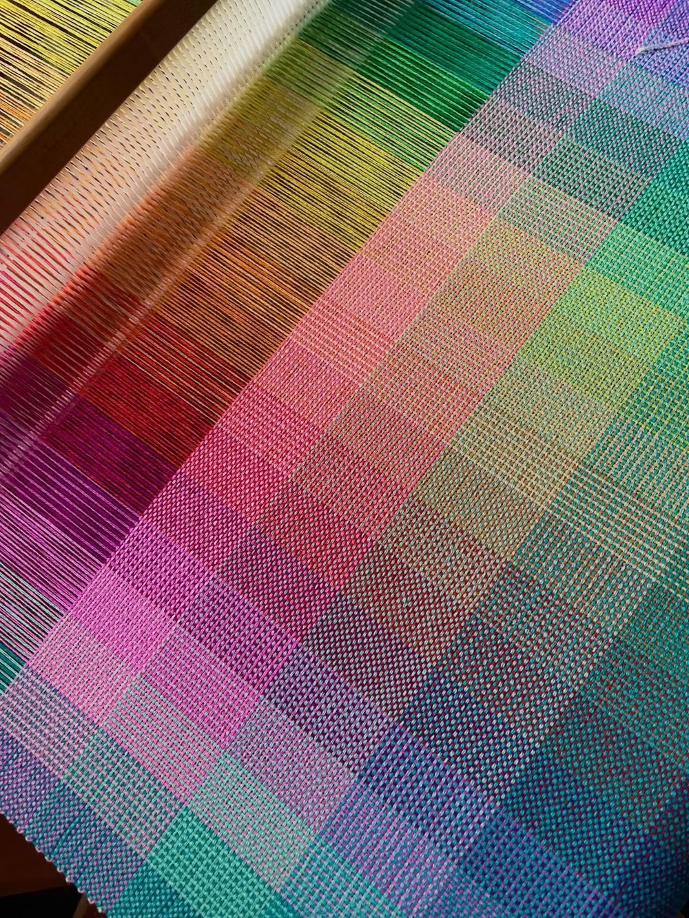
A visual study of the forms, inspirations, materials, colors, type, and cultural references associated with this UI design style.

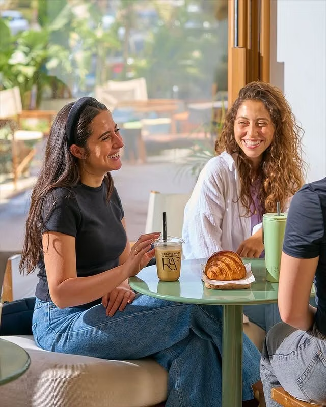
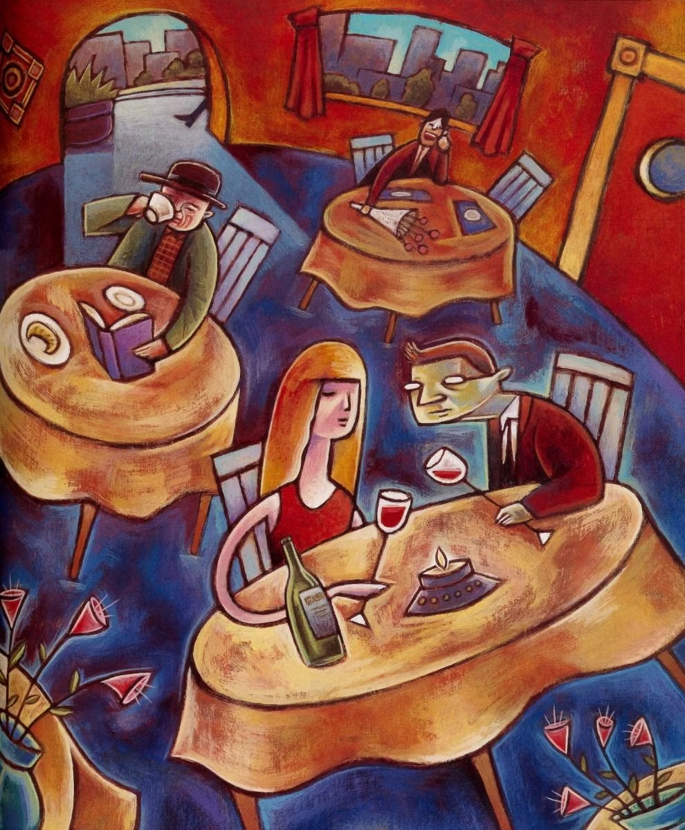
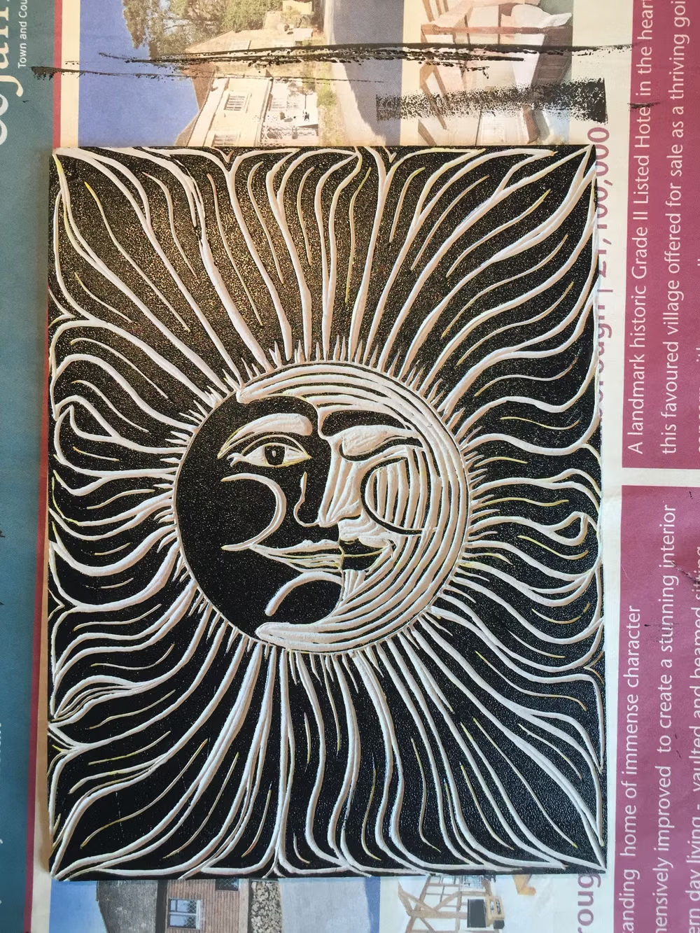
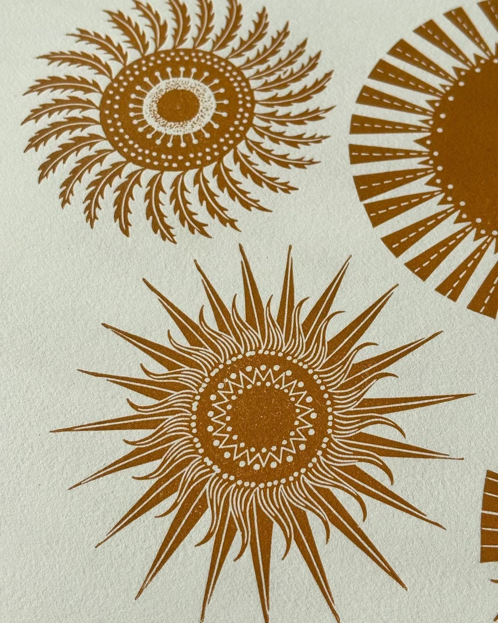

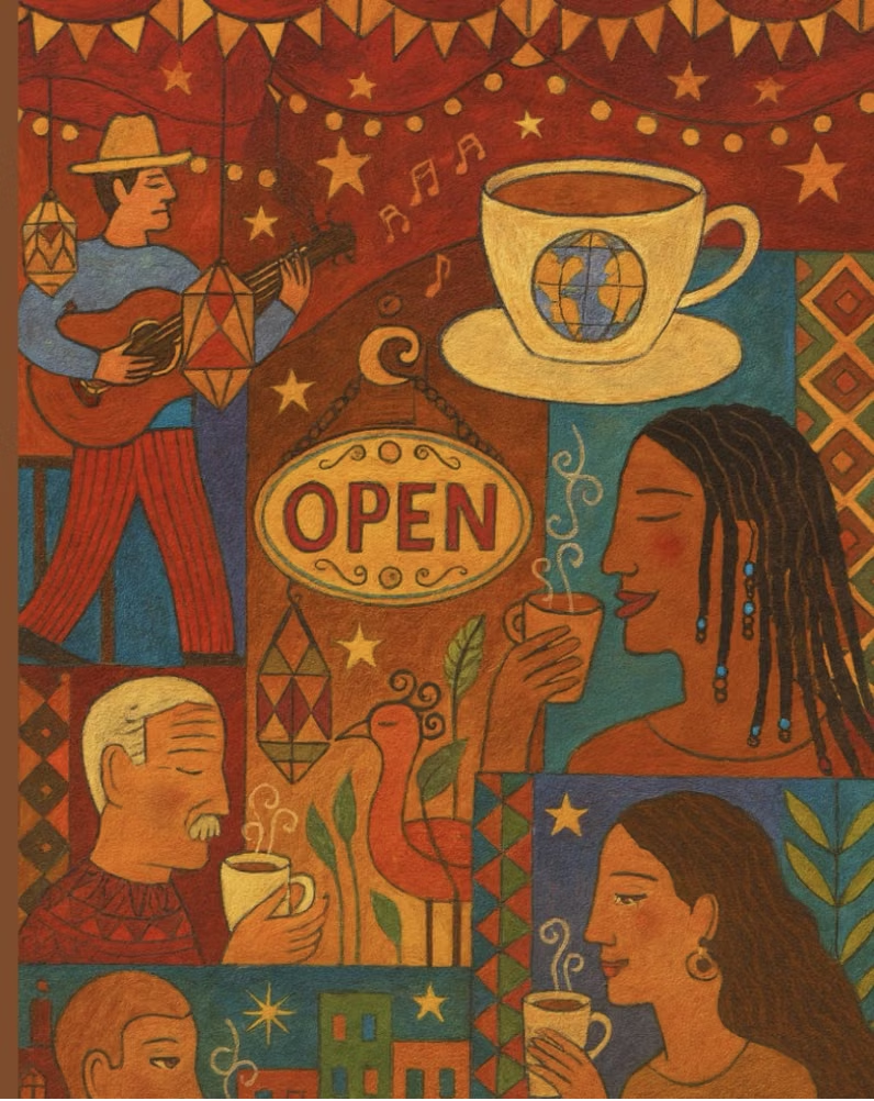
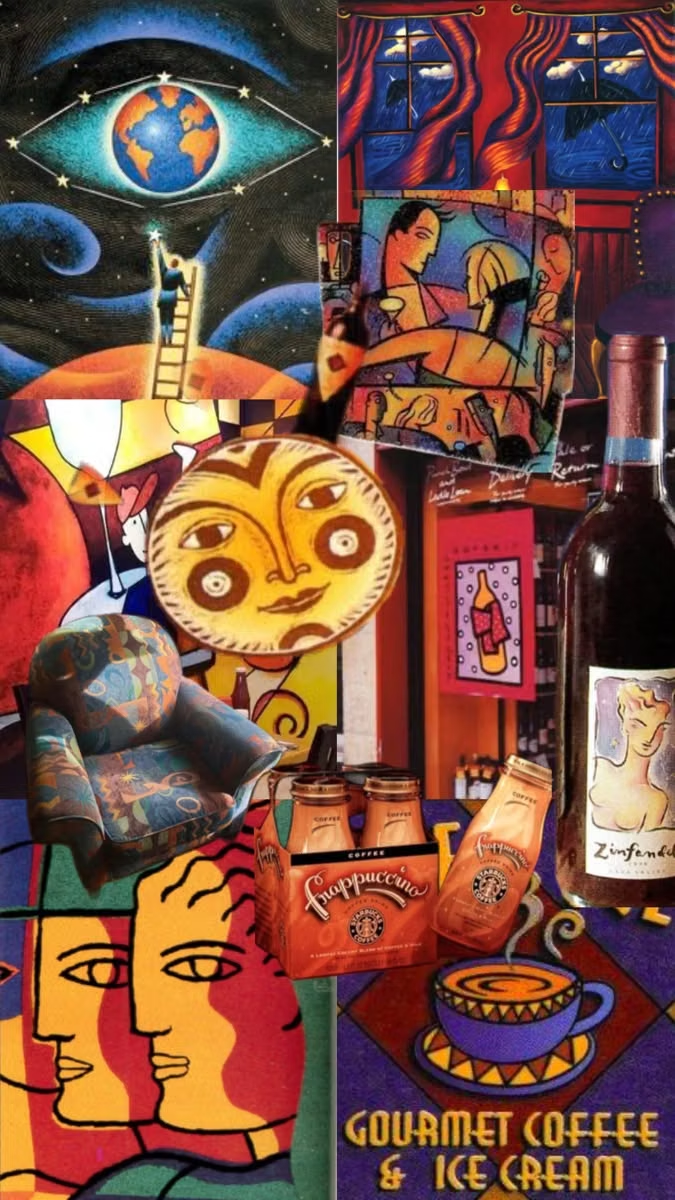
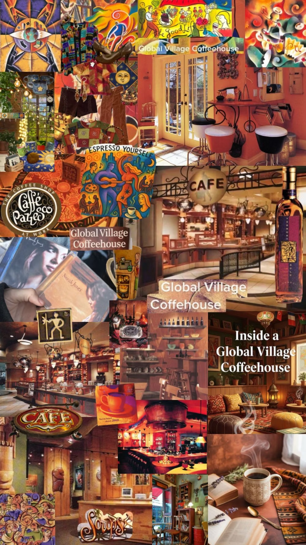

![handwoven colorful textile loom photograph - Why choose #Kalaashraye? Because every saree is: 🤲 Handmade on loom with organic cotton. 🌿 Dyed naturally with vegetable colors. 💚 Eco-friendly and sustainable. 🧵 A treasure of India’s rich heritage. 📣 Support handmade, support tradition. ✨ Experience the charm of handmade luxury. Visit www.kalaashraye.com [kalaashraye, wovenwithlove, rootedinindia, madeinindia🇮🇳, ecofriendlyfashion, supportlocal]](../../moodboards/global-village-coffeehouse/14-inspiration-handwoven-textile.avif)
Design principles and implementation
Use these principles to write a focused AI UI design prompt instead of asking for a vague visual treatment.
Color direction
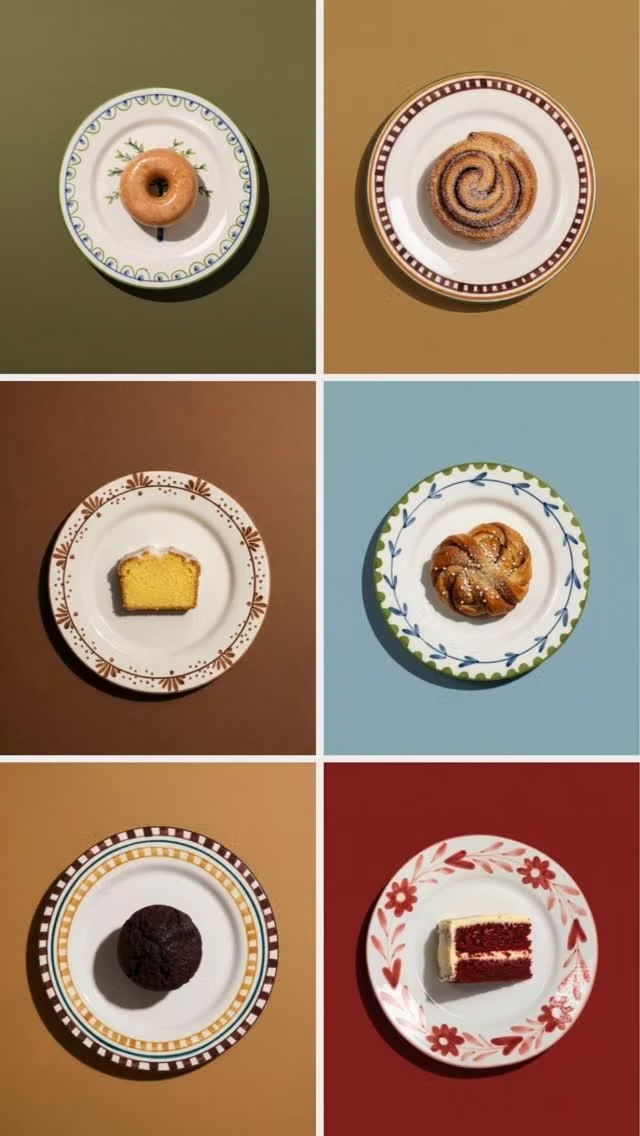
Use terracotta, ochre, forest, indigo, coffee brown, faded turquoise, and unbleached paper with matte imperfect coverage. In a daisyUI theme, use terracotta or forest for `primary`, faded turquoise or ochre for `secondary`, and set `base-100`, `base-200`, and `base-300` to unbleached paper, warm tan, and light coffee beige.
Imagery direction
Choose woodcut-like suns, moons, hands, spirals, plants, maps, food, craft, and sincere multicultural community scenes with contextual care.
Content density
Use medium to high detail in labeled groups, balancing pattern and storytelling with straightforward menus, schedules, or service information.
Motion direction
Draw rough borders and symbols on, rotate suns slowly, and reveal handcrafted motifs with tactile unhurried transitions.
Shape language
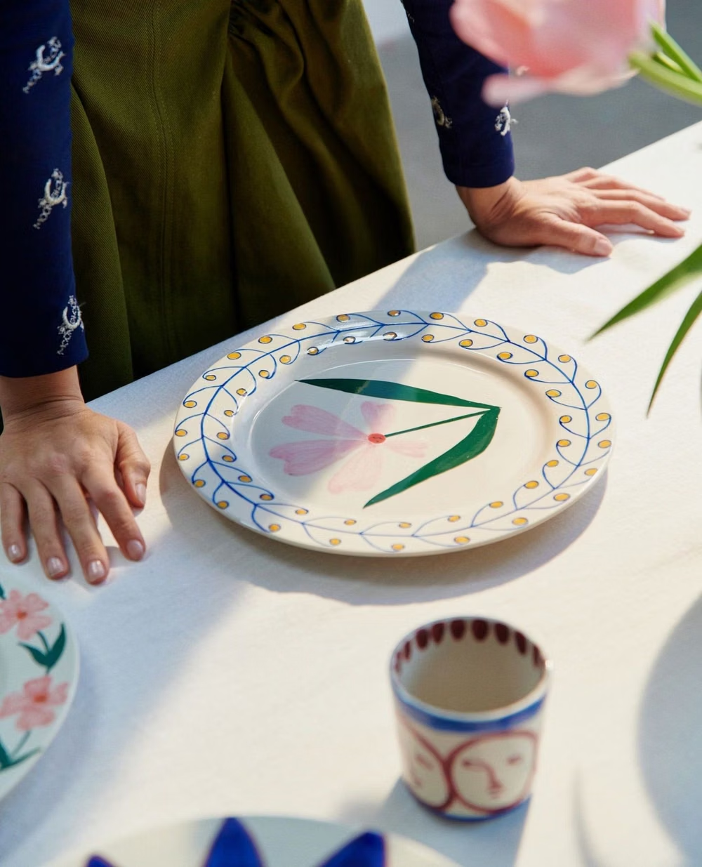
Favor rough borders, spirals, rays, hand-cut circles, folk symbols, vines, and irregular framed panels with visible craft. In daisyUI themes, set the `--radius-*` variables between `0.25rem` and `1rem`.
Typography rules
Use a warm humanist serif or sans-serif with hand-lettered accents, avoiding faux-ethnic display fonts and maintaining clear practical labels.
Suggested Typfaces
Cabin Sketch
Fresh daisies glow in warm sunlight
Fresh daisies glow in warm sunlight
1 2 3 4 5 6 7 8 9 0
Lora
Fresh daisies glow in warm sunlight
Fresh daisies glow in warm sunlight
1 2 3 4 5 6 7 8 9 0
Kalam
Fresh daisies glow in warm sunlight
Fresh daisies glow in warm sunlight
1 2 3 4 5 6 7 8 9 0
Alegreya Sans
Fresh daisies glow in warm sunlight
Fresh daisies glow in warm sunlight
1 2 3 4 5 6 7 8 9 0
Josefin Slab
Fresh daisies glow in warm sunlight
Fresh daisies glow in warm sunlight
1 2 3 4 5 6 7 8 9 0
Build a Global Village Coffeehouse interface with daisyUI
The live example translates this direction into daisyUI components and semantic theme tokens.
To generate a full page in the same visual language, give the style name and the design rules above to Blueprint MCP.
Related UI design styles
Compare nearby visual languages that share typography, shapes, use cases, or signature elements.
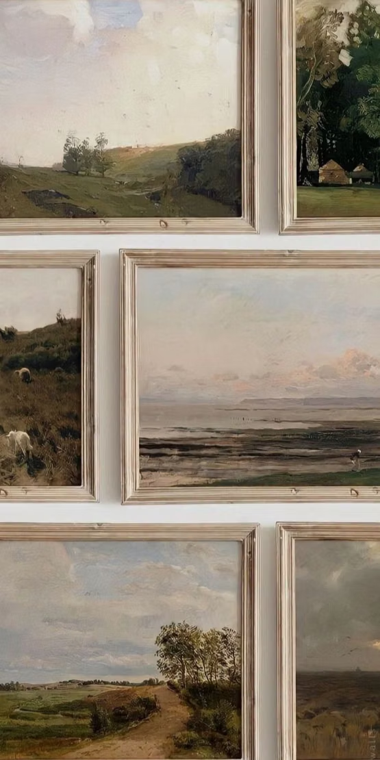
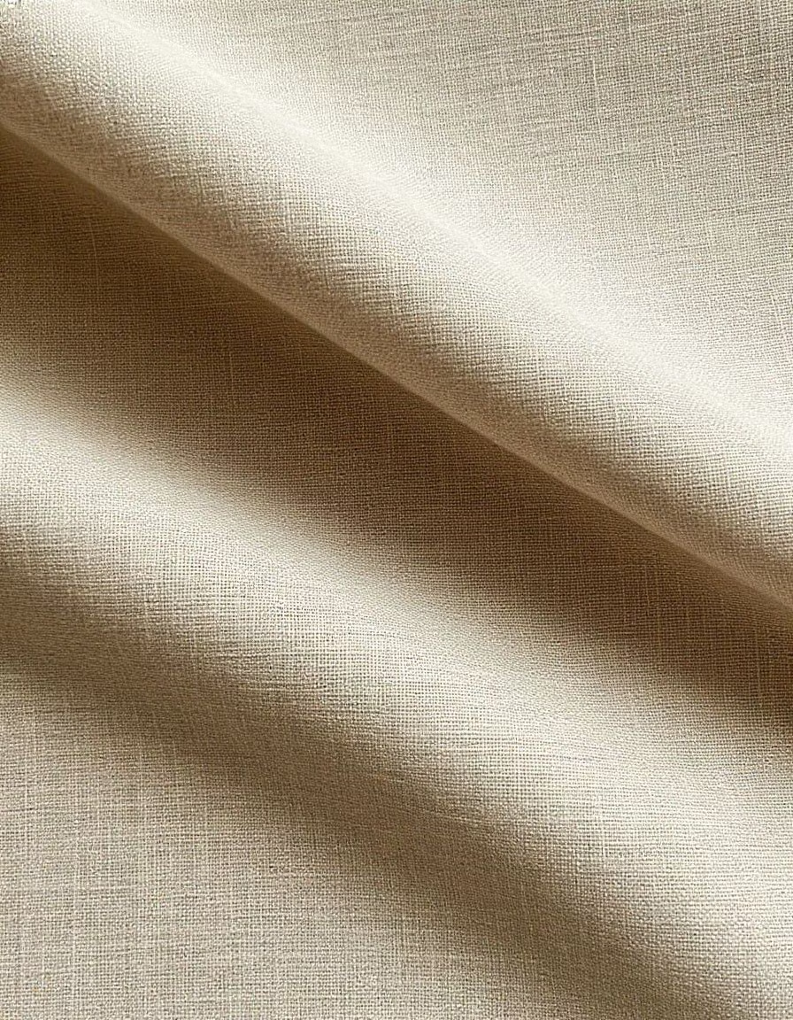
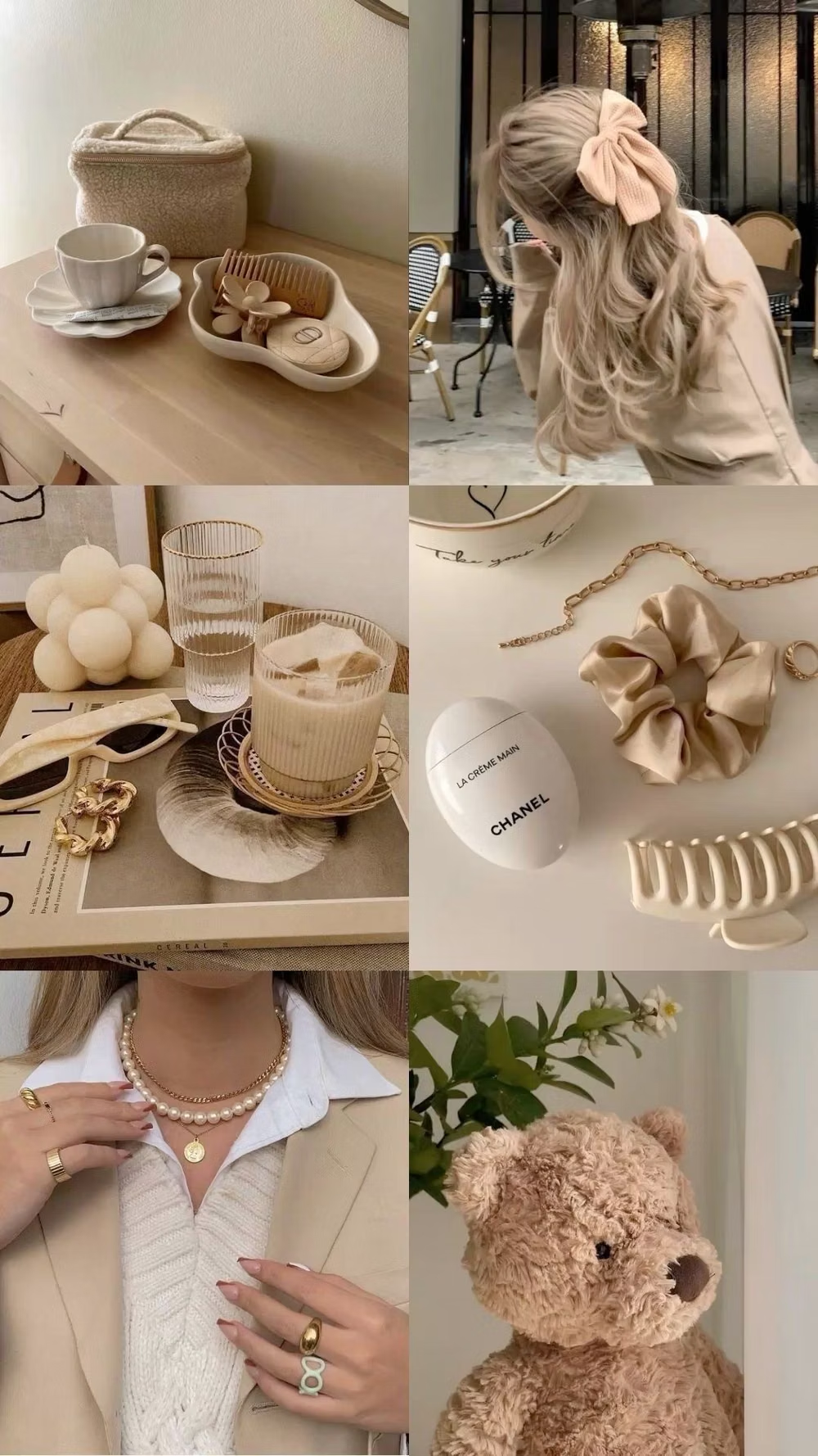
Millennial Beige UI design style
A calm tonal aesthetic layers cream, tan, sand, taupe, and greige with tactile natural details, soft contrast, and intentional empty space.
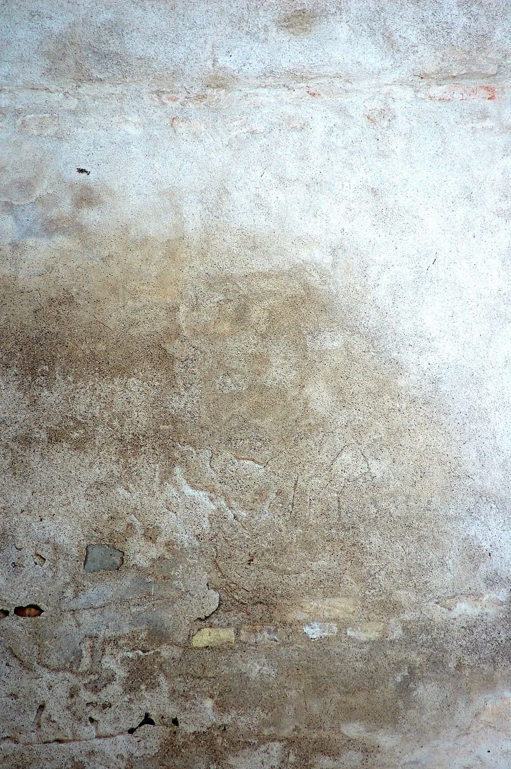
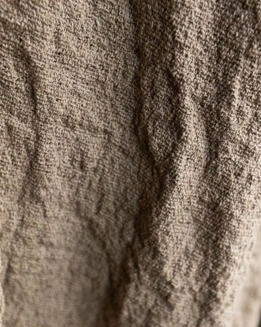
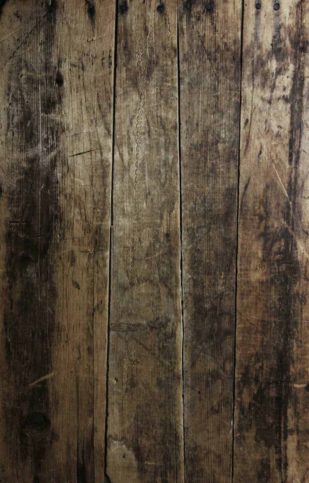
Wabi-Sabi UI design style
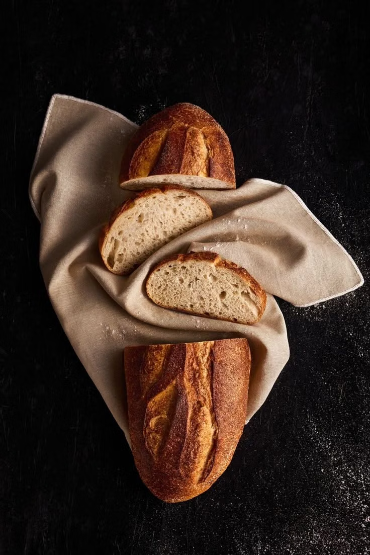
Asymmetry, weathered texture, muted earth tones, imperfection, and visible material age create understated warmth.
Cottagecore UI design style
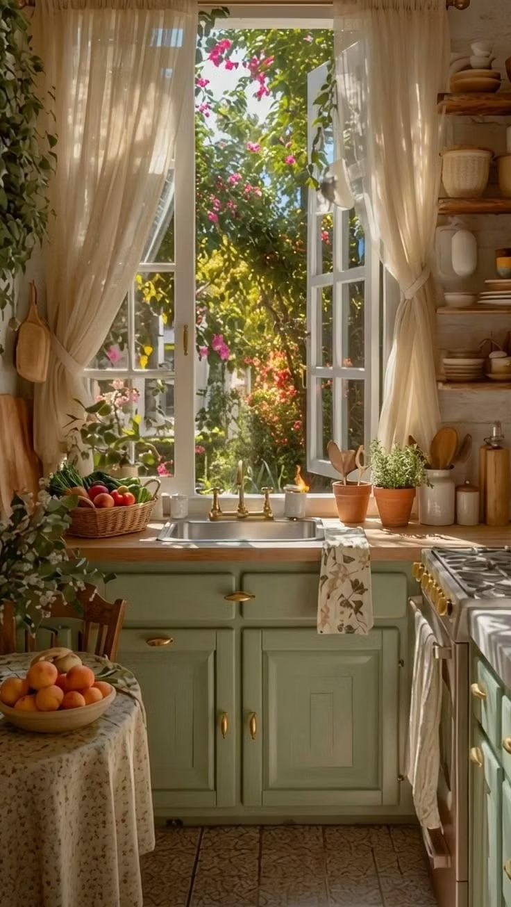
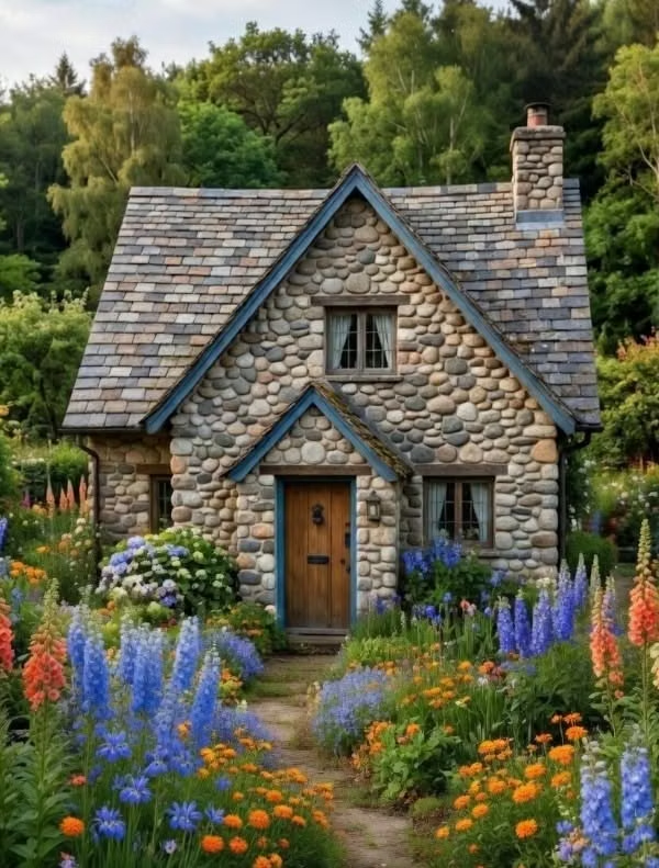
Pastoral imagery, florals, handmade textures, gentle serif type, warm domestic details, and romantic rural nostalgia.