Indie Sleaze UI design style
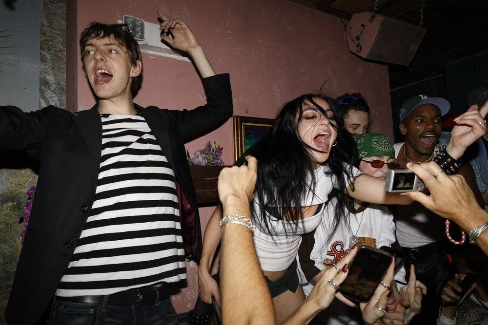
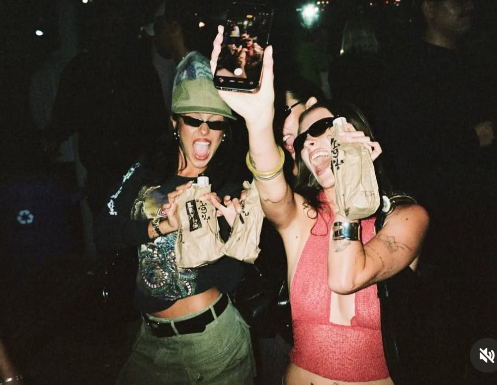
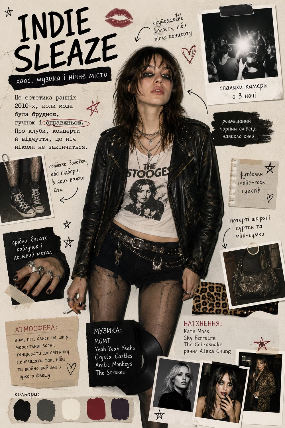
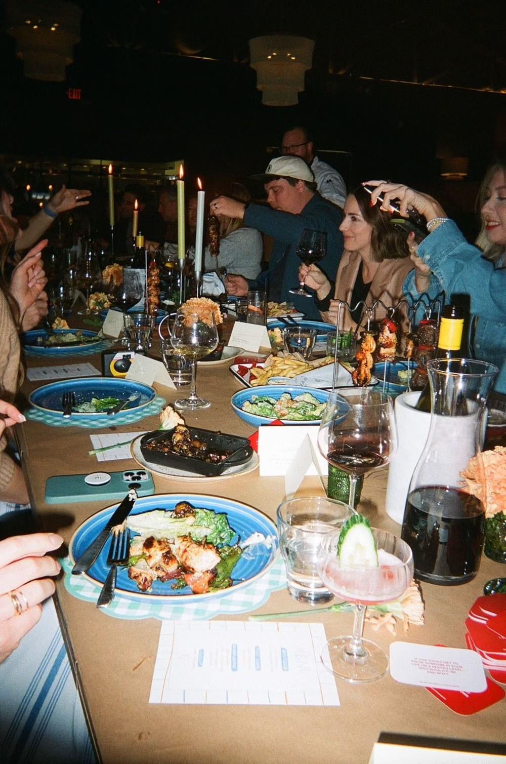
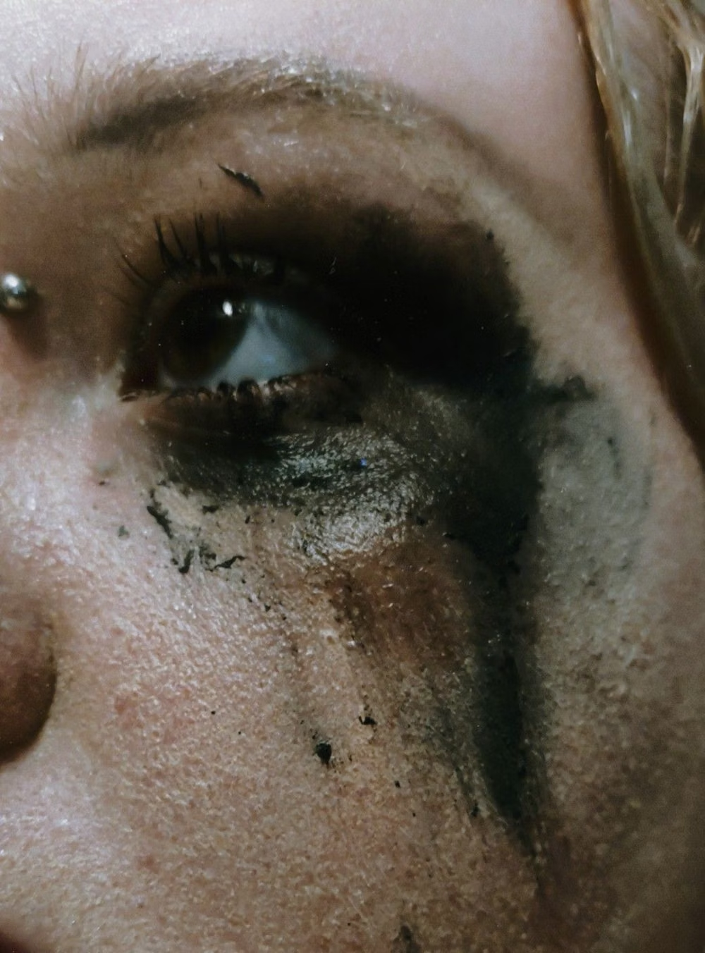
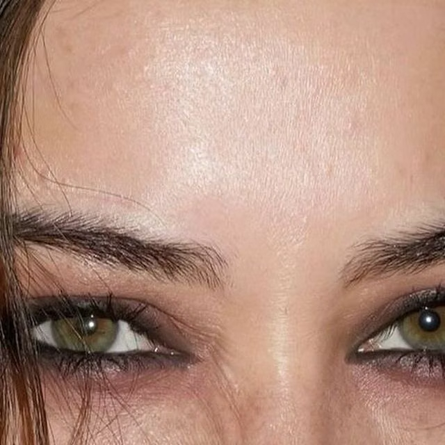
Flash photography, messy nightlife imagery, condensed type, black backgrounds, low-fi textures, and deliberately unpolished cool.
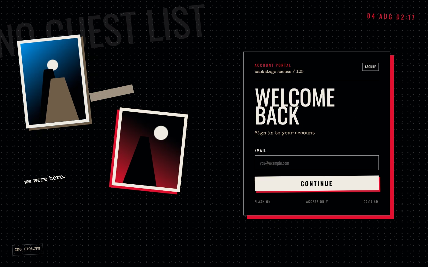
Design overview
- Signature elements
- direct-flash photography, black backgrounds, condensed type, messy cropping, low-fi grain, nightlife ephemera. In daisyUI themes, set `--noise: 1;`.
- Best suited to
- Music, fashion, nightlife, events, youth media, and subcultural campaigns.
- Layout principles
- Assemble a messy nightlife photo feed or event flyer from crooked crops and abrupt columns, keeping dates, names, and navigation on one reliable track.
History and origins
A fact-checked account of where this visual language came from, with links to the references used.
- Period
- Early 2000s–early 2010s; label coined retrospectively in 2018
- Origin
- Nightlife, fashion blogs, flash photography, music scenes, and social platforms
Indie Sleaze is a retrospective label for a period of deliberately messy nightlife imagery, direct flash, skinny type, low-resolution blogs, club flyers, and indie-electro fashion. CARI dates the source period from the early 2000s to early 2010s and records Dalia Barillaro coining the name in October 2018, well after the scene itself.
Moodboard and visual references
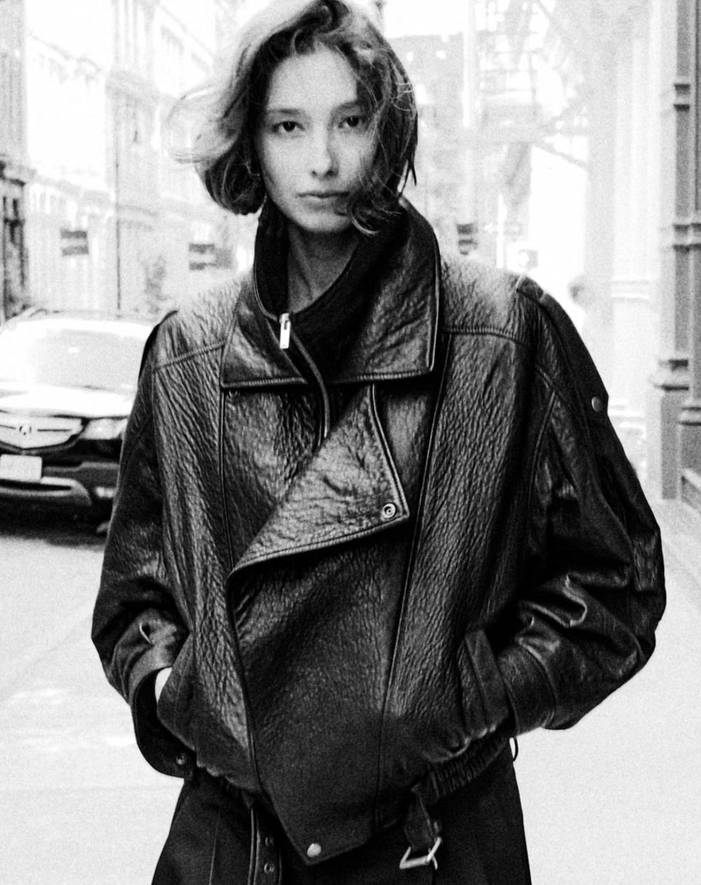
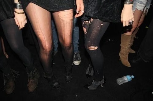
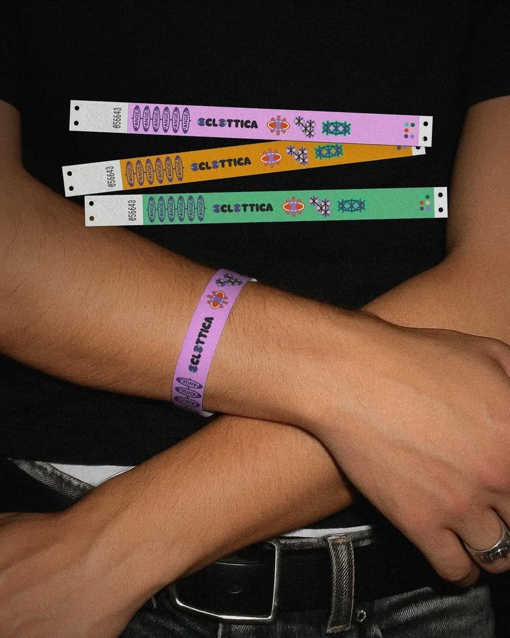
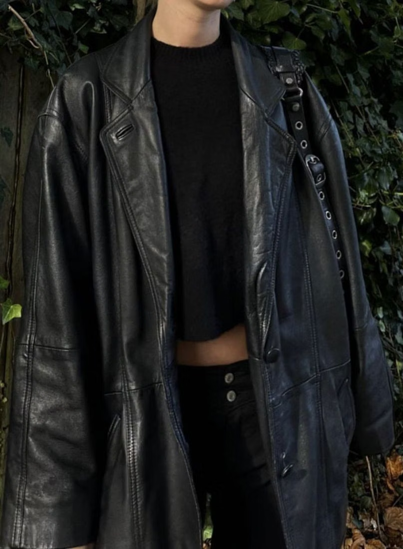
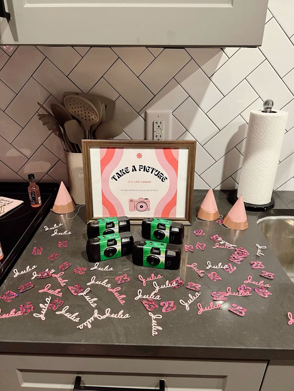
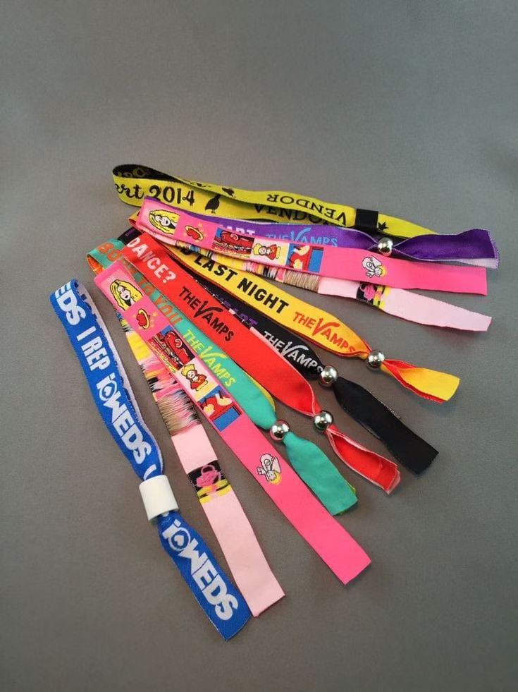
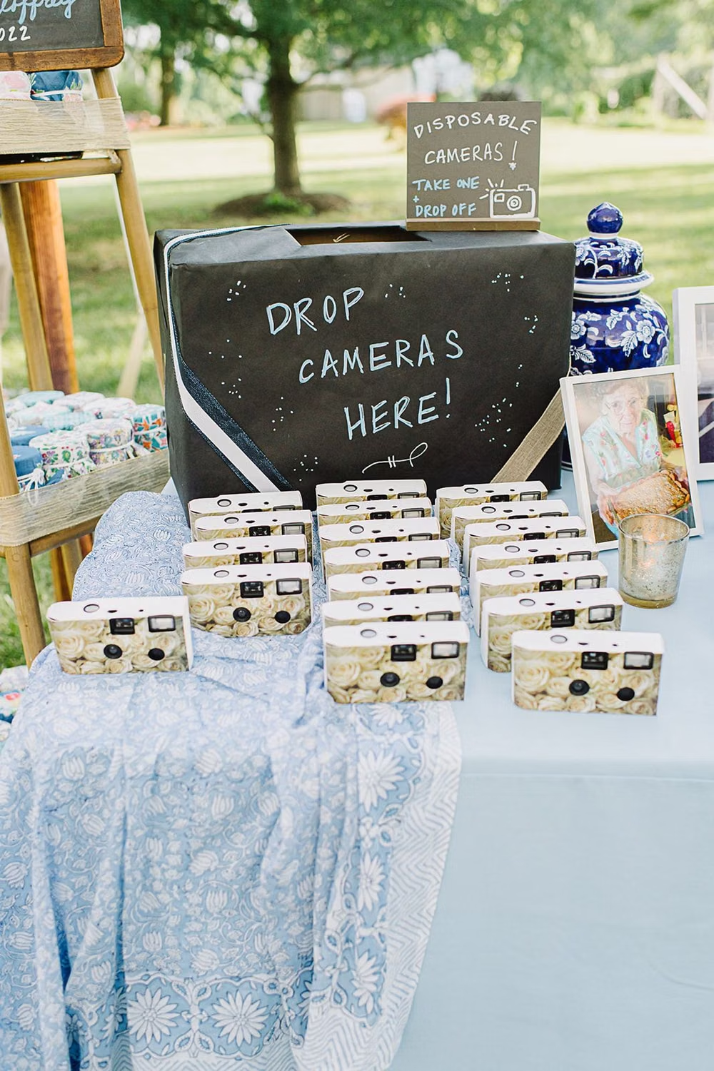
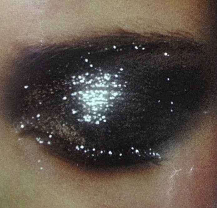
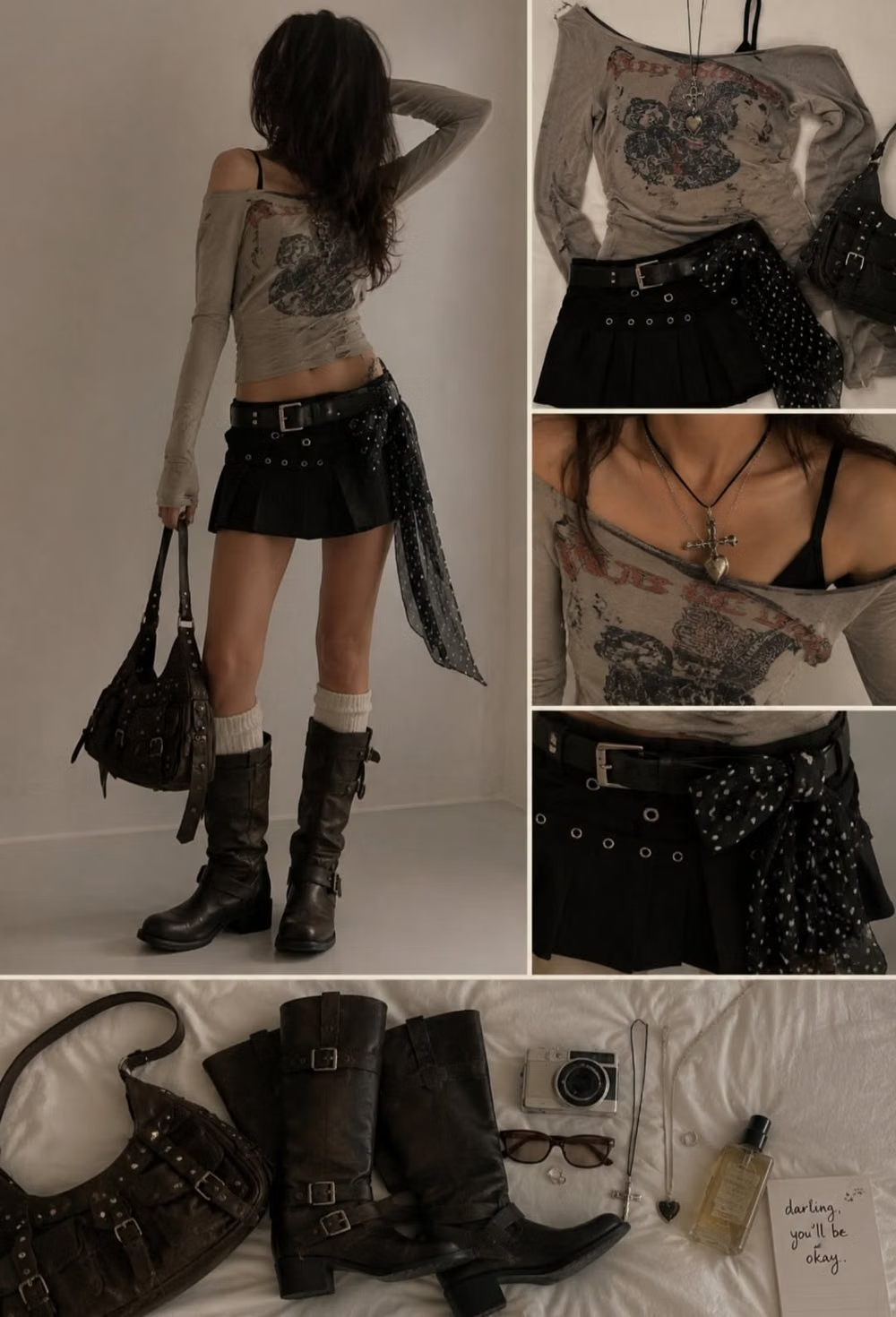
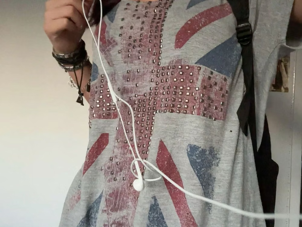
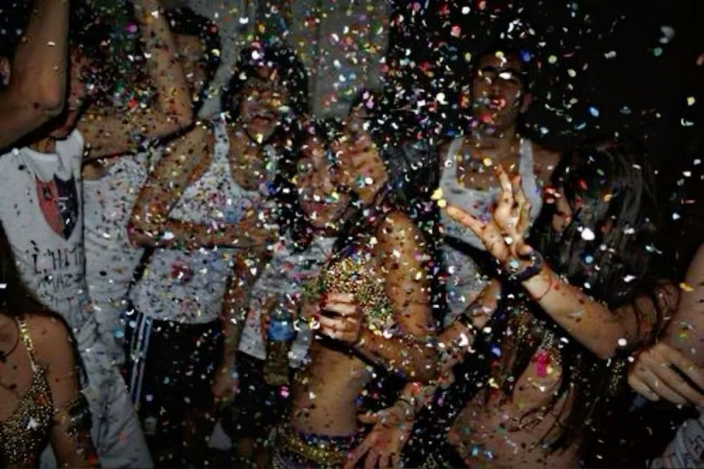
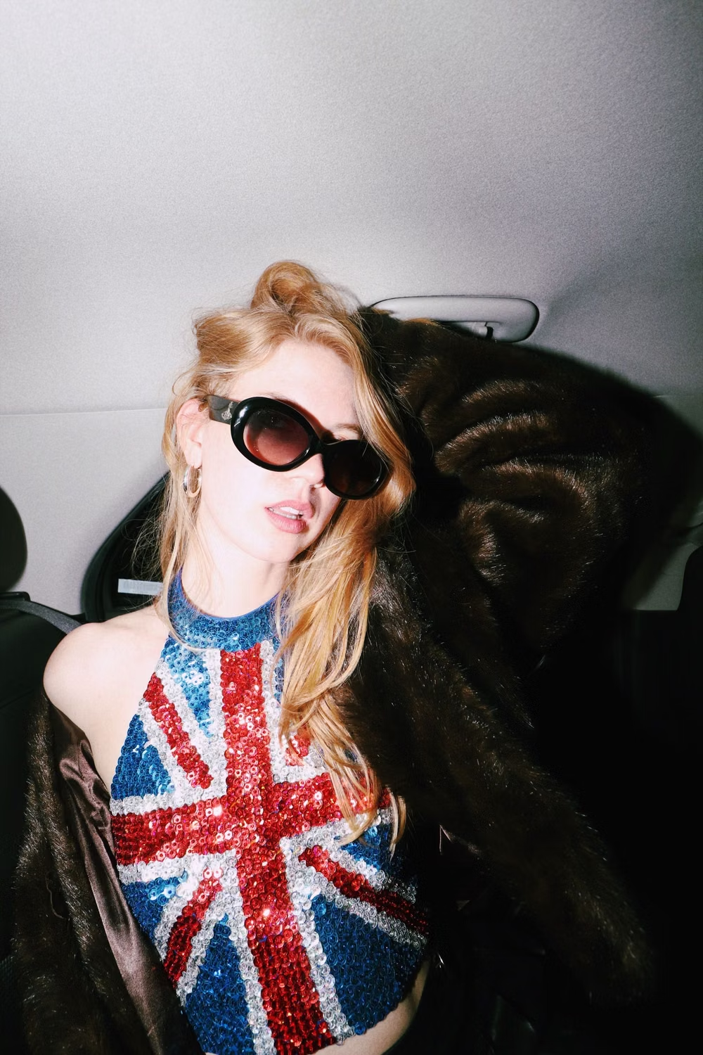
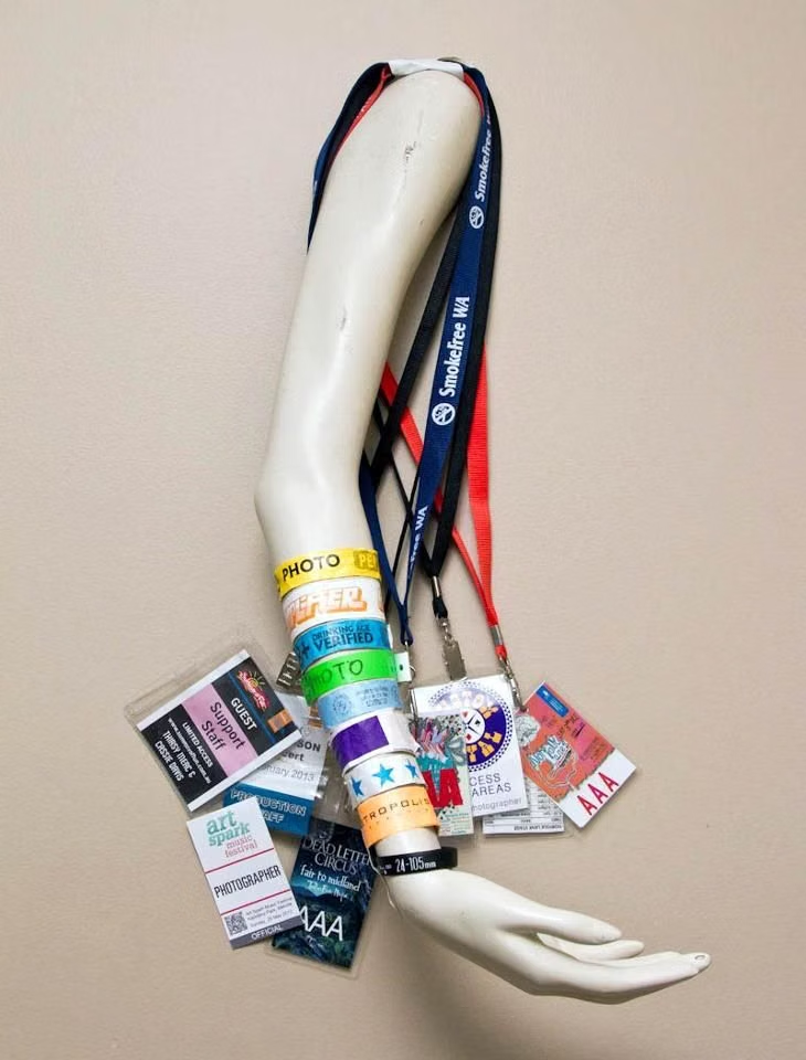
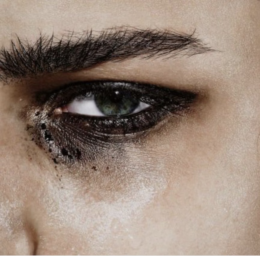
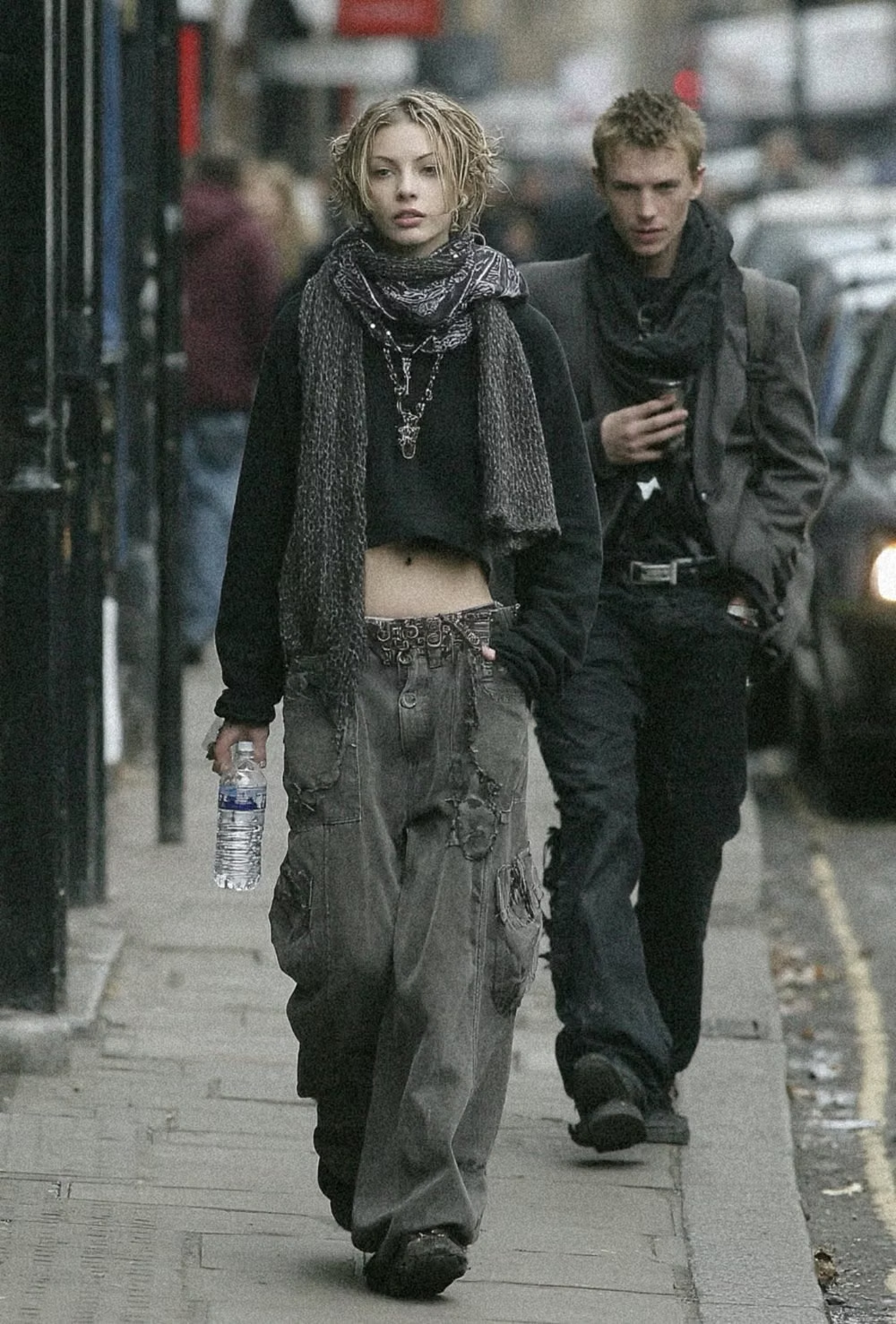
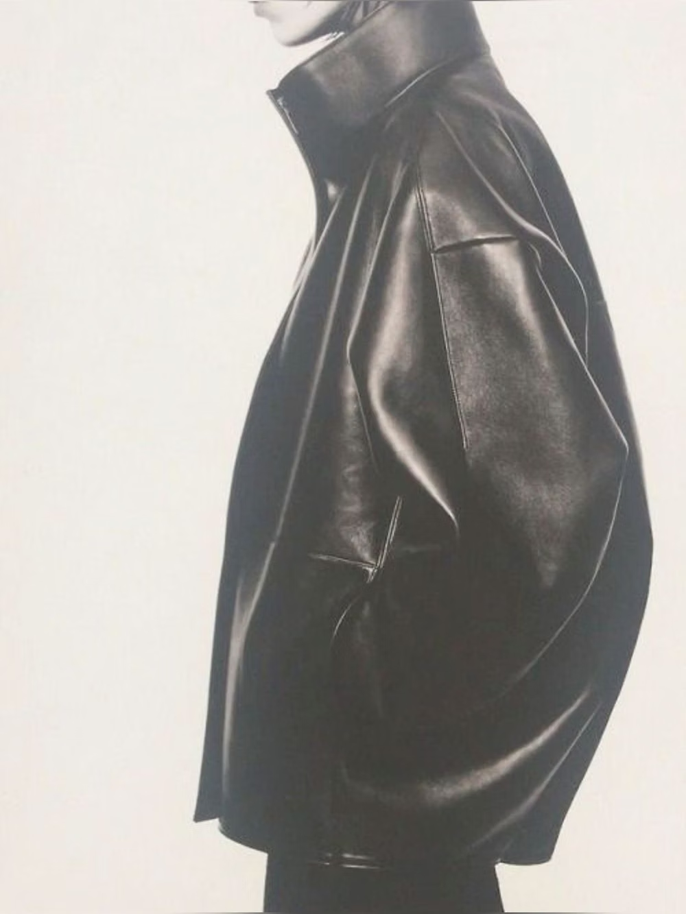
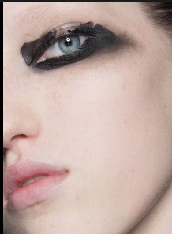
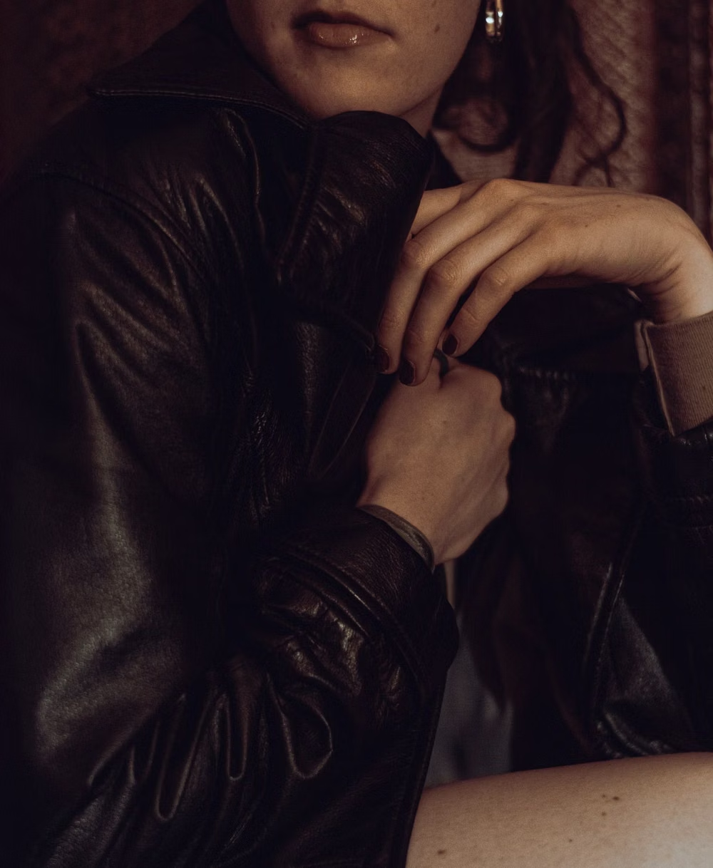
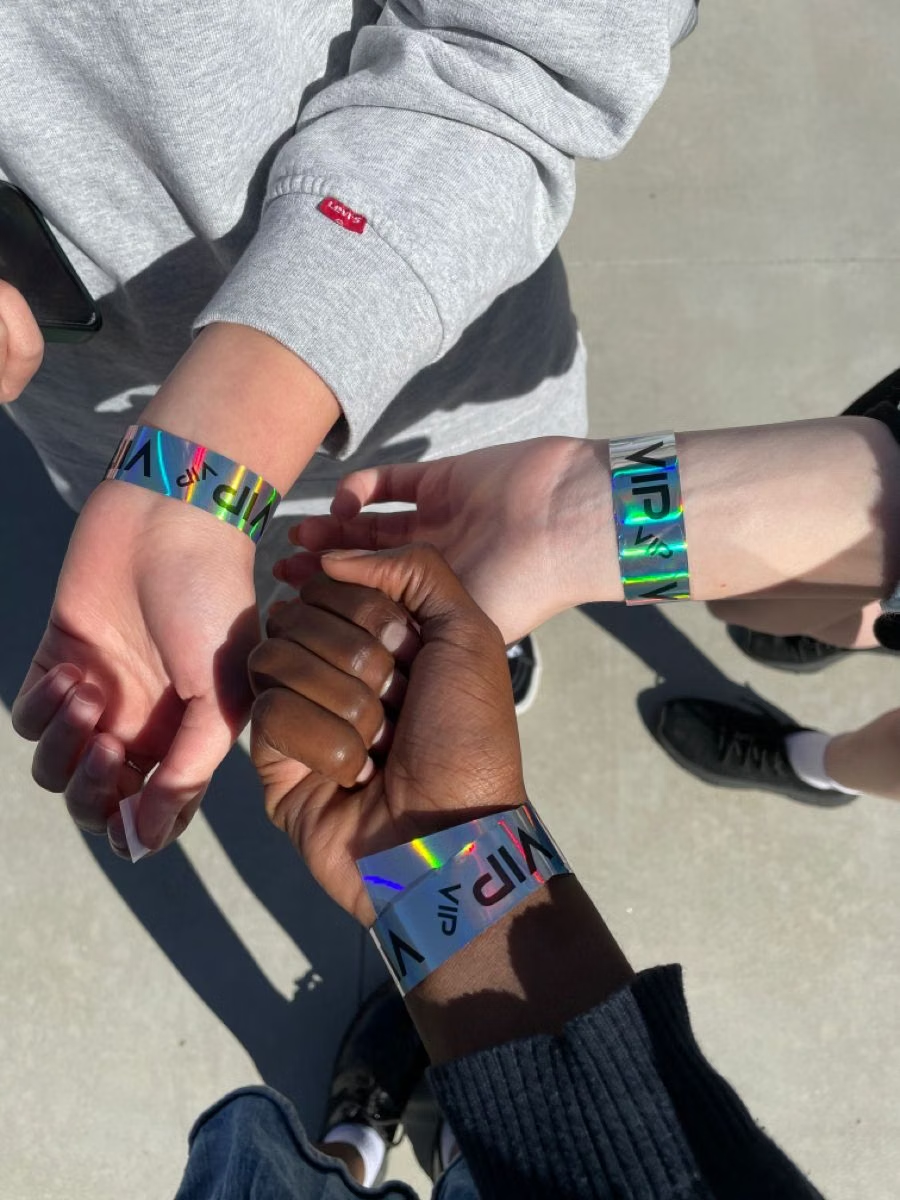
A visual study of the forms, inspirations, materials, colors, type, and cultural references associated with this UI design style.
Design principles and implementation
Use these principles to write a focused AI UI design prompt instead of asking for a vague visual treatment.
Color direction
Use black, dirty white, flash blue, nicotine beige, and occasional lipstick red or electric accent with harsh photographic contrast. In a daisyUI theme, use flash blue for `primary`, lipstick red for `secondary`, and assign dark charcoal, near-black, and black to `base-100`, `base-200`, and `base-300`.
Imagery direction
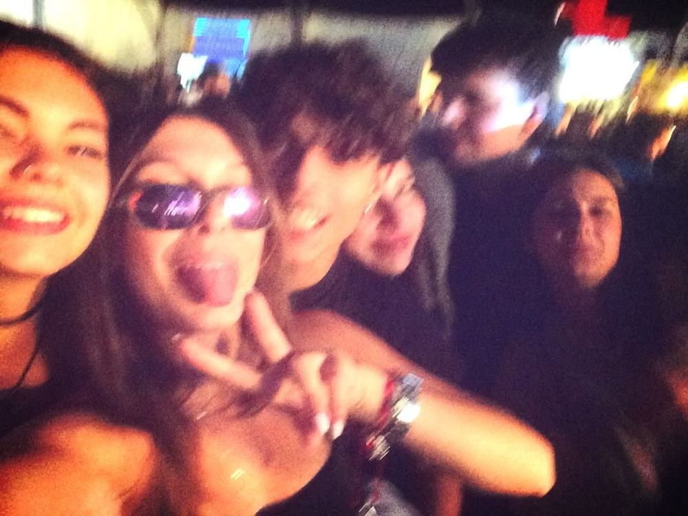
Choose direct-flash parties, candid bands, bathroom mirrors, street style, venue ephemera, blurred movement, and low-fi camera artifacts.
Content density
Use high image density and compact captions, preserving blunt whitespace or solid black around lineups, credits, and calls to action.
Motion direction
Use flash cuts, jittered photo swaps, abrupt scroll reveals, timestamp flicker, and short handheld-feeling transitions.
Shape language
Use crooked photo rectangles, contact sheets, tape, scribbles, timestamp blocks, thin rules, and minimally styled form elements. In daisyUI themes, set the `--radius-*` variables to `0` or `0.25rem`.
Typography rules
Use condensed sans-serif for lineups and navigation, mixing in plain serif or handwriting accents while keeping the overall treatment deliberately unpolished.
Suggested Typfaces
Oswald
Fresh daisies glow in warm sunlight
Fresh daisies glow in warm sunlight
1 2 3 4 5 6 7 8 9 0
Bebas Neue
Fresh daisies glow in warm sunlight
Fresh daisies glow in warm sunlight
1 2 3 4 5 6 7 8 9 0
Archivo Narrow
Fresh daisies glow in warm sunlight
Fresh daisies glow in warm sunlight
1 2 3 4 5 6 7 8 9 0
Special Elite
Fresh daisies glow in warm sunlight
Fresh daisies glow in warm sunlight
1 2 3 4 5 6 7 8 9 0
Anton
Fresh daisies glow in warm sunlight
Fresh daisies glow in warm sunlight
1 2 3 4 5 6 7 8 9 0
Build a Indie Sleaze interface with daisyUI
The live example translates this direction into daisyUI components and semantic theme tokens.
To generate a full page in the same visual language, give the style name and the design rules above to Blueprint MCP.
Related UI design styles
Compare nearby visual languages that share typography, shapes, use cases, or signature elements.
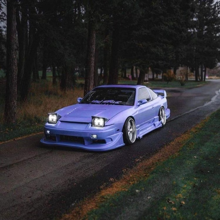
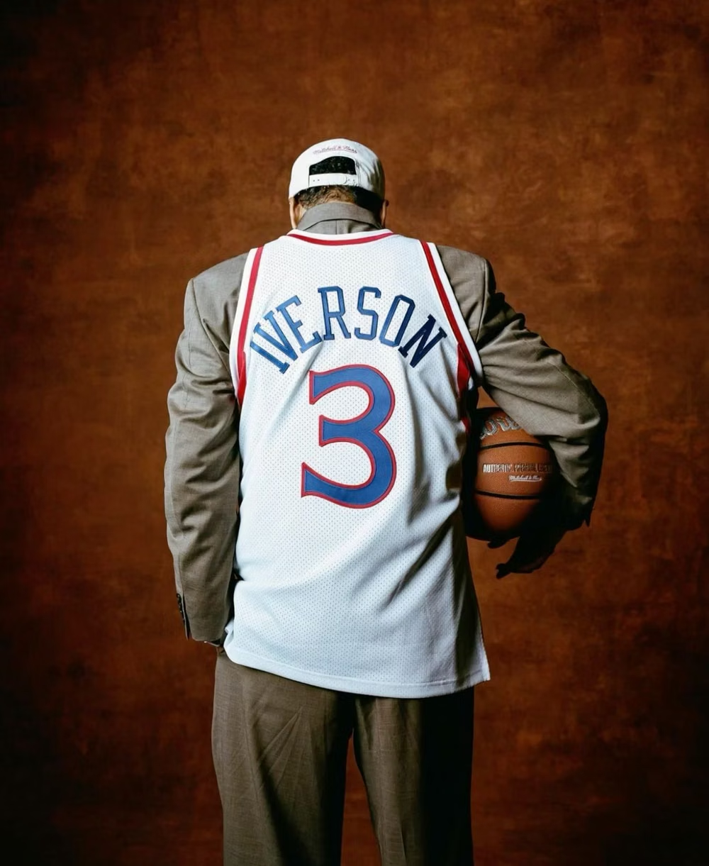
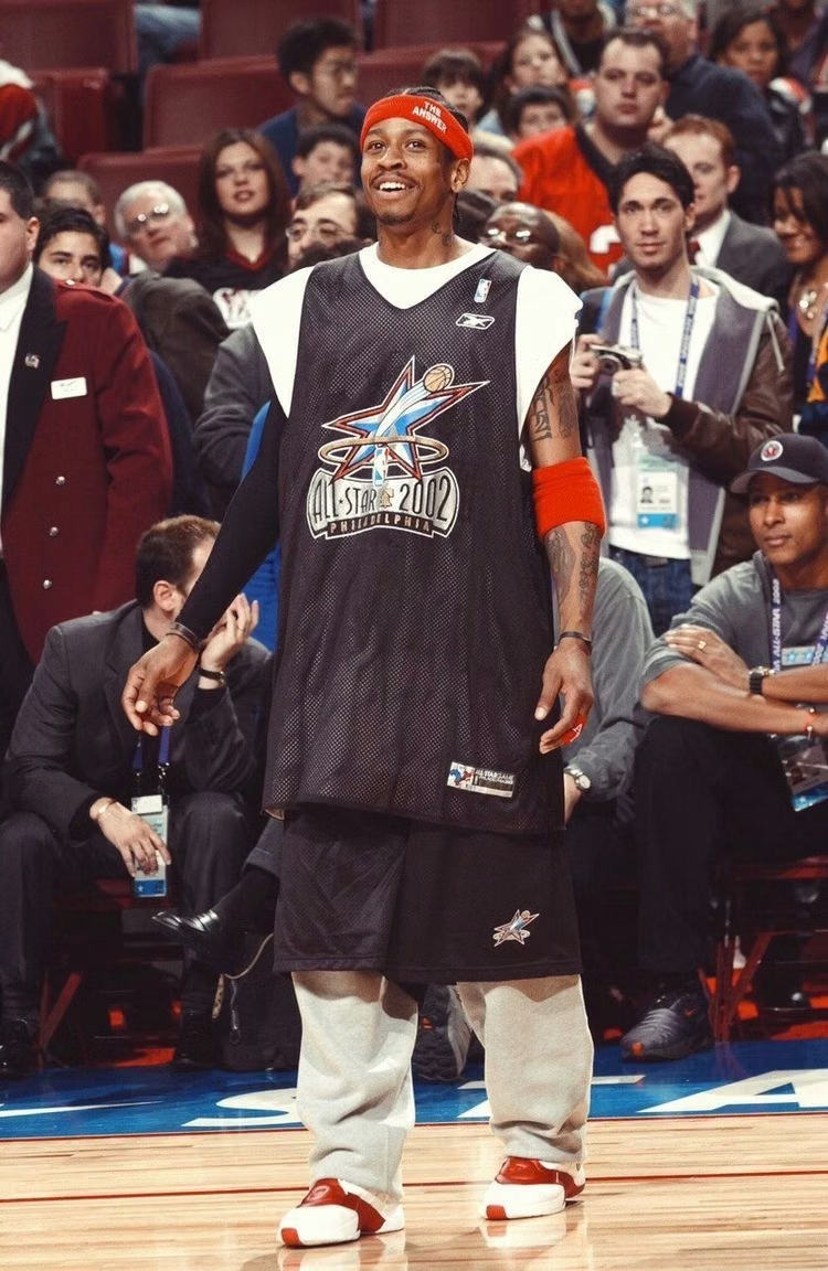
2K1 UI design style
This 2001–2004 transitional pop-cultural look mixes late-Y2K clarity with dirtier hip-hop, sports, nu-metal, teen-comedy, and early-McBling attitude.
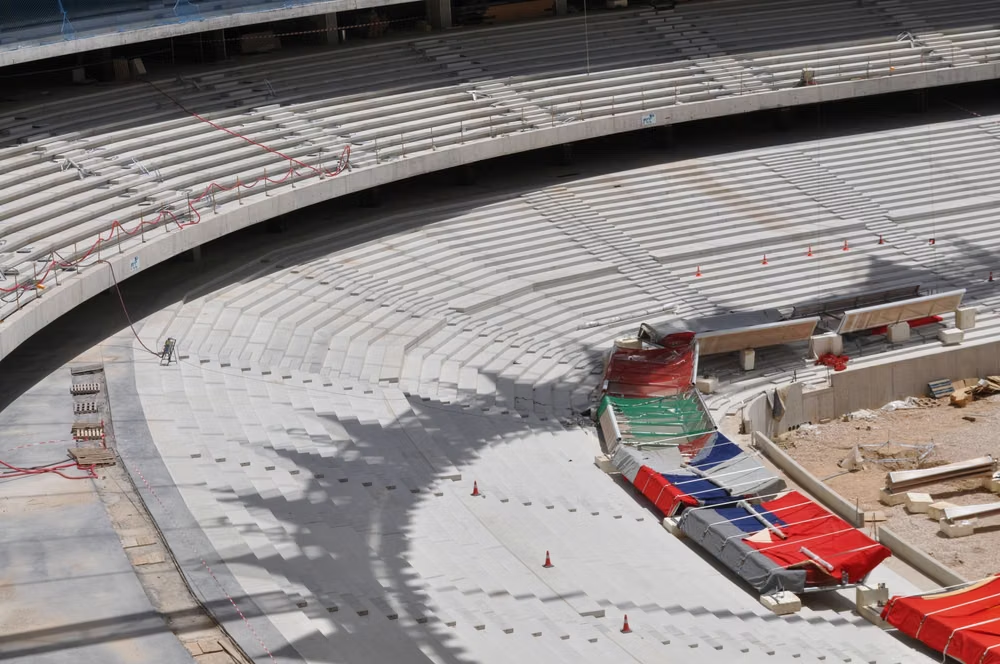
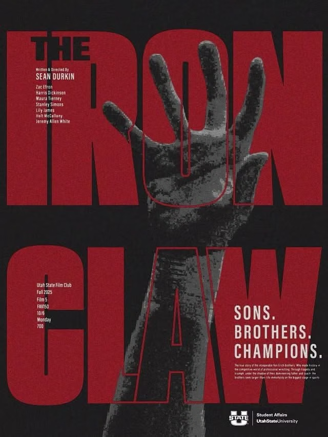
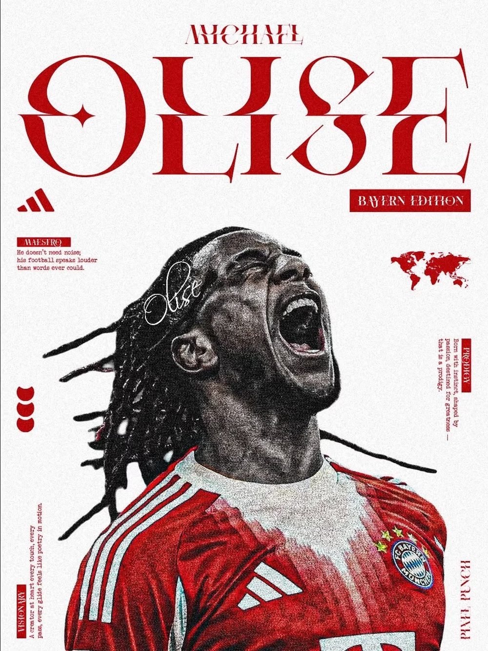
Sports Brutalism UI design style
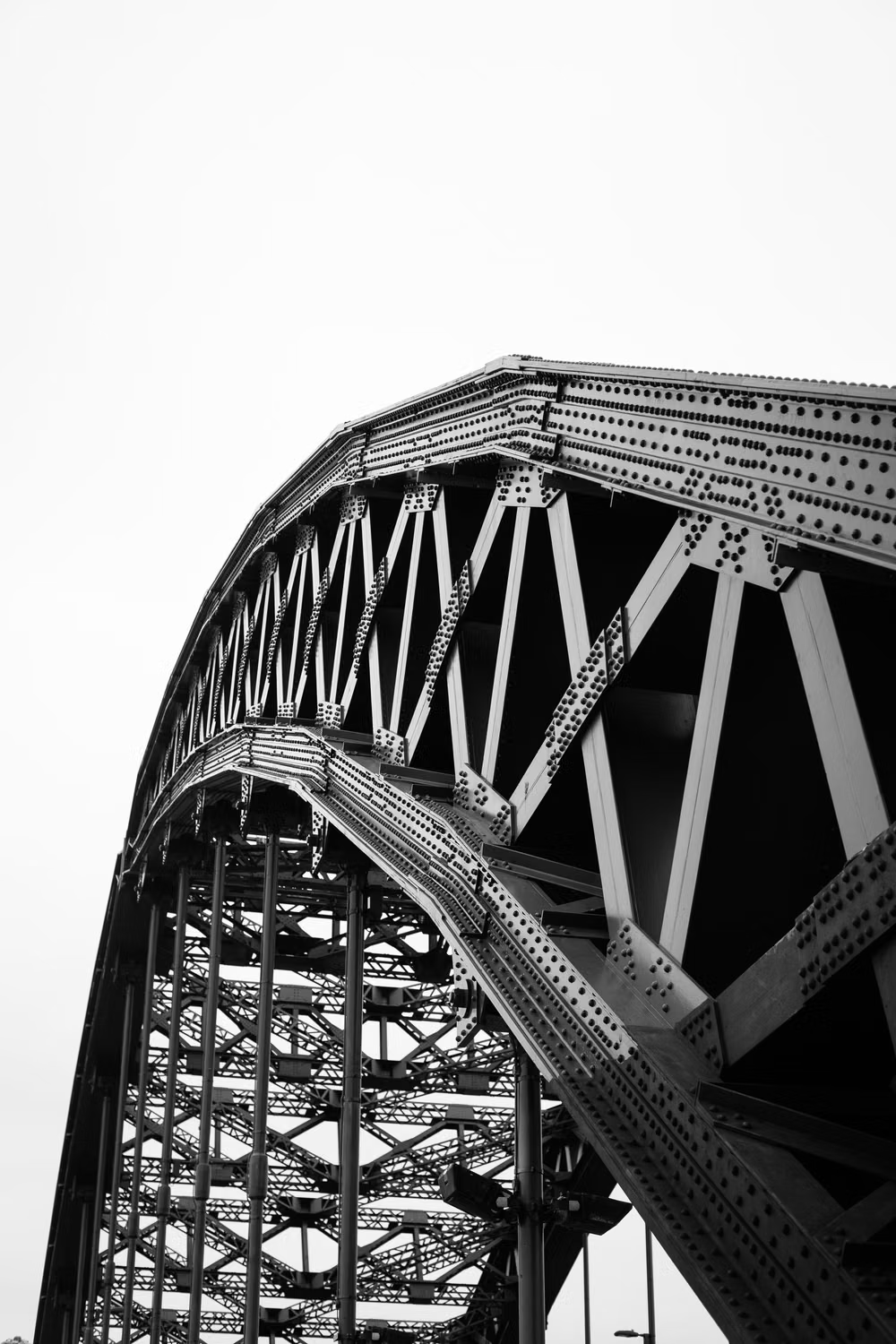
Condensed type, hard grids, scoreboards, halftones, high-contrast photography, oversized numbers, and aggressive overlays.

Constructivism UI design style
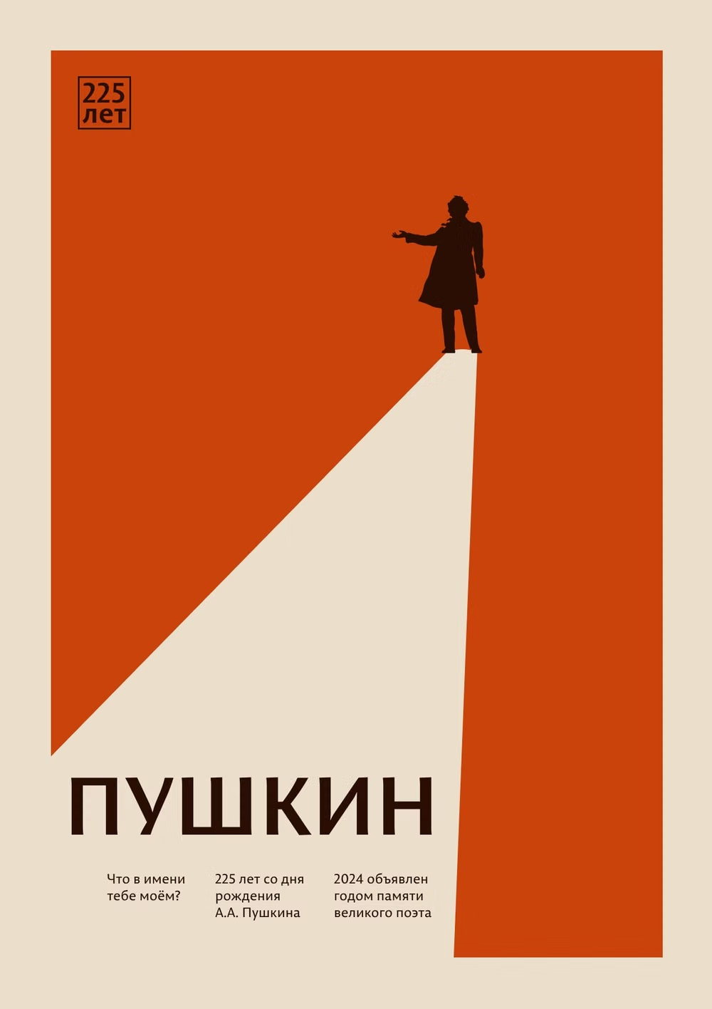
Dynamic diagonals, photomontage, bold sans-serif type, limited red-black palettes, and propagandistic visual force.