Gothic / Neo-Gothic UI design style
Pointed forms, blackletter or dramatic serif type, dark contrast, tracery, religious ornament, and medieval atmosphere.
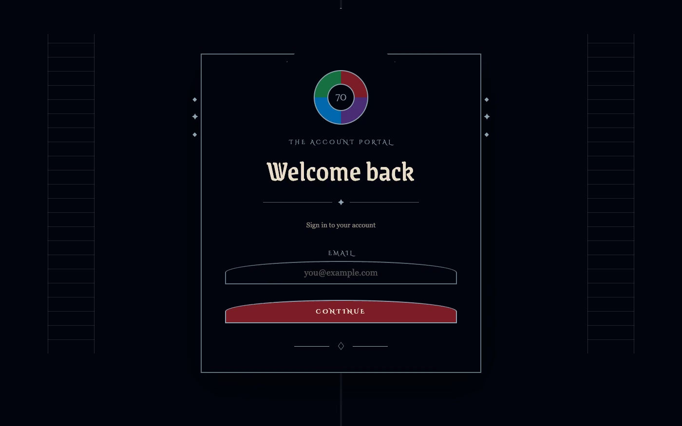
Design overview
- Signature elements
- blackletter type, pointed arches, tracery, dark palette, ornamental borders, medieval symbols
- Best suited to
- Fashion, music, games, entertainment, literature, and dark luxury branding.
- Layout principles
- Use tall axial compositions, pointed framing, and cathedral-like vertical rhythm, placing content within portals, niches, and ornamental border systems.
History and origins
A fact-checked account of where this visual language came from, with links to the references used.
- Period
- Medieval Gothic from the 12th–16th centuries; Gothic Revival from the late 18th–19th centuries
- Origin
- Medieval Europe; revival especially influential in Britain
Gothic architecture developed in medieval Europe through pointed arches, rib vaults, tracery, vertical structure, and stained glass. The Gothic Revival began in late-18th-century Britain and expanded through the 19th century, reinterpreting medieval form for churches, institutions, interiors, print, and nationalist narratives; current UI often combines both periods with later gothic subculture.
Moodboard and visual references
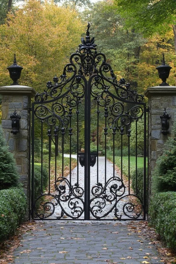
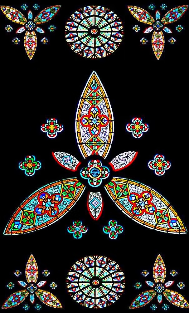
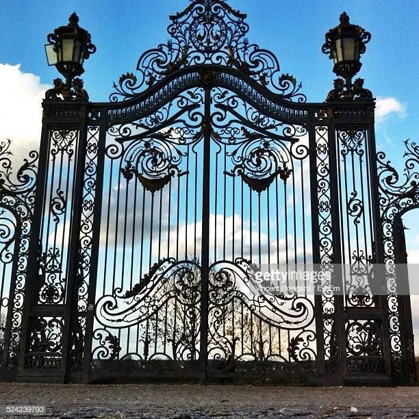
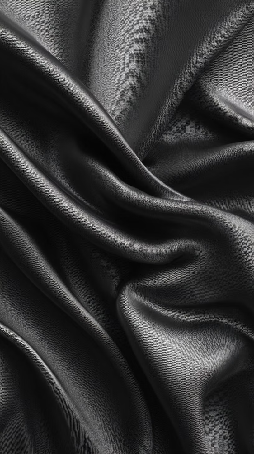
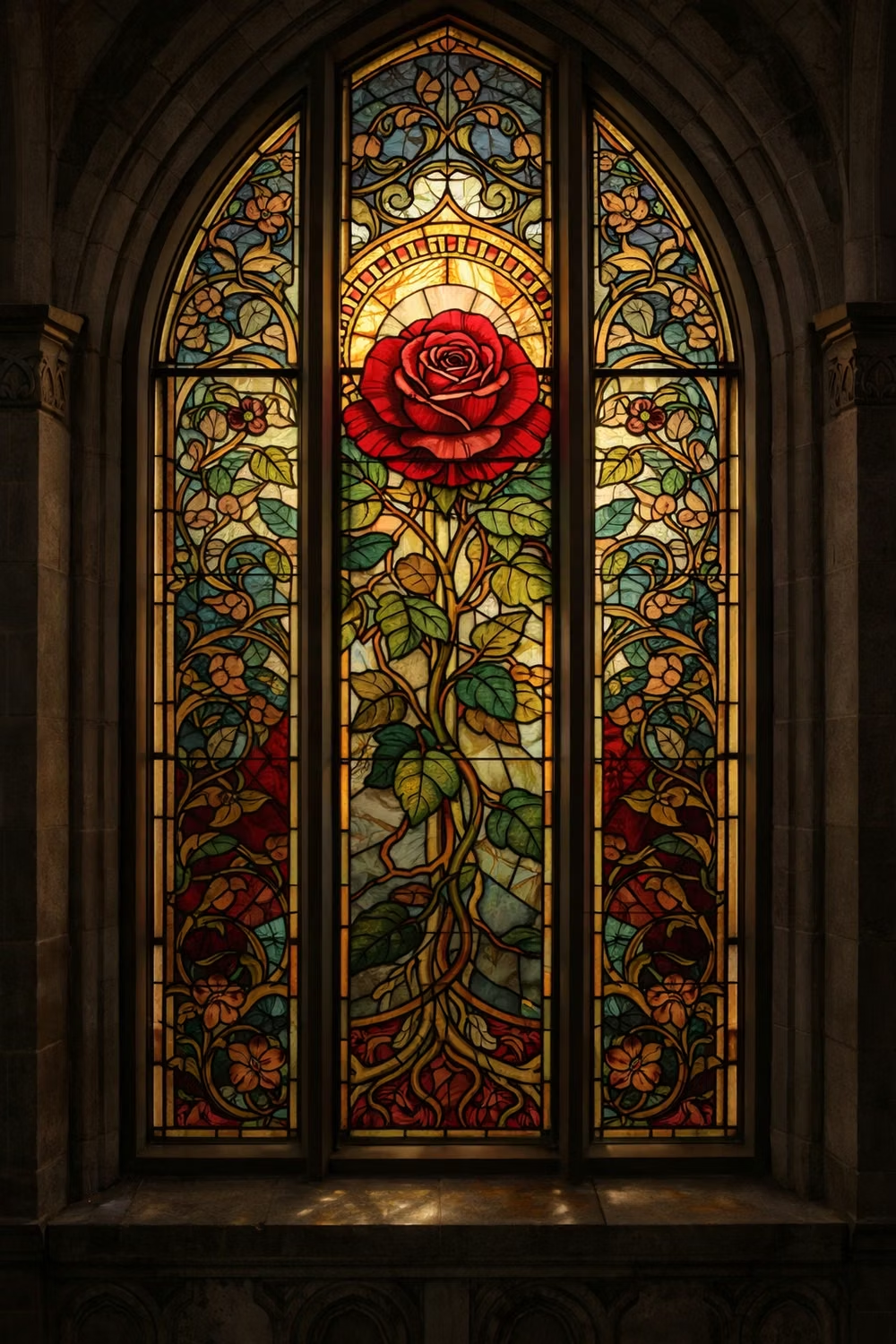
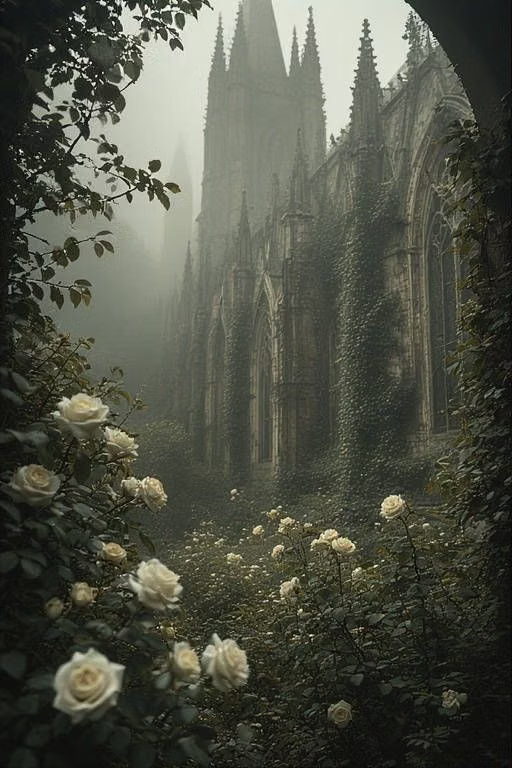
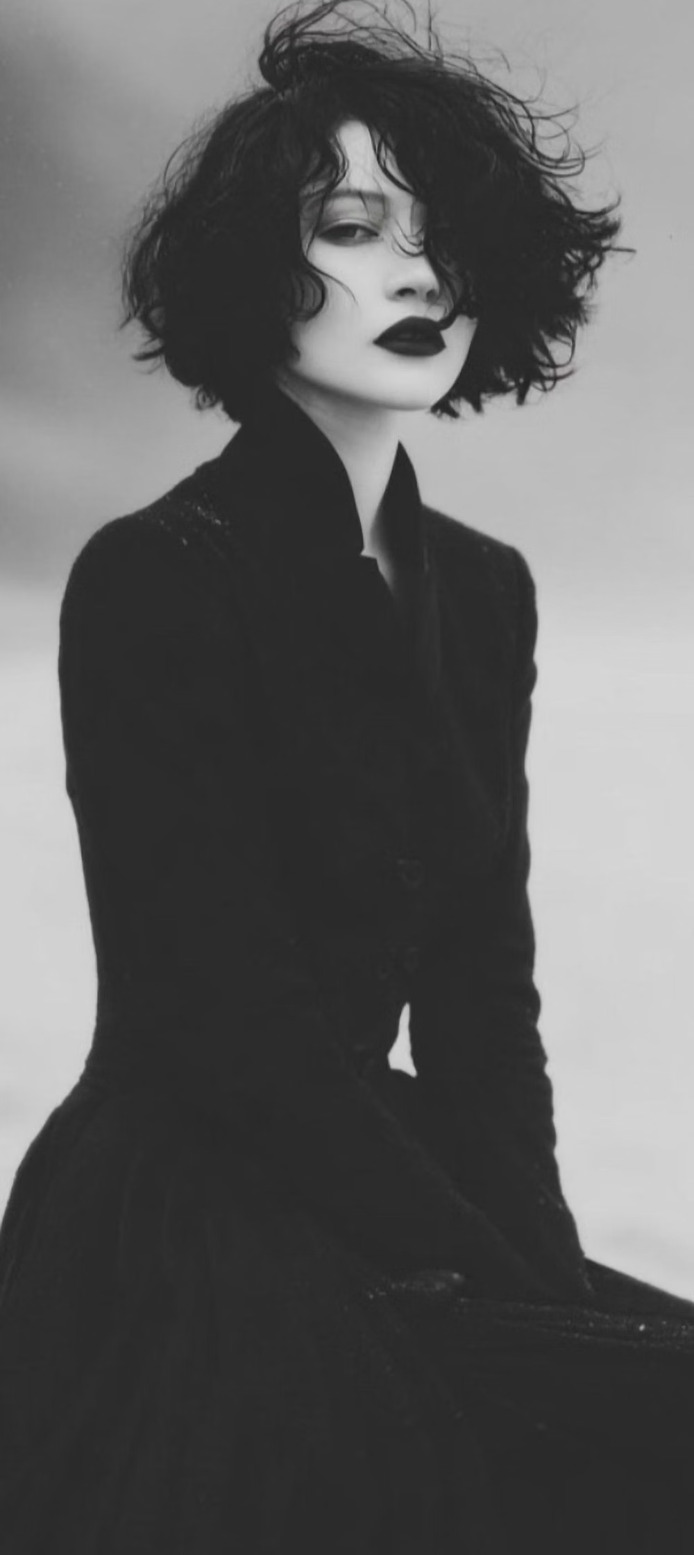
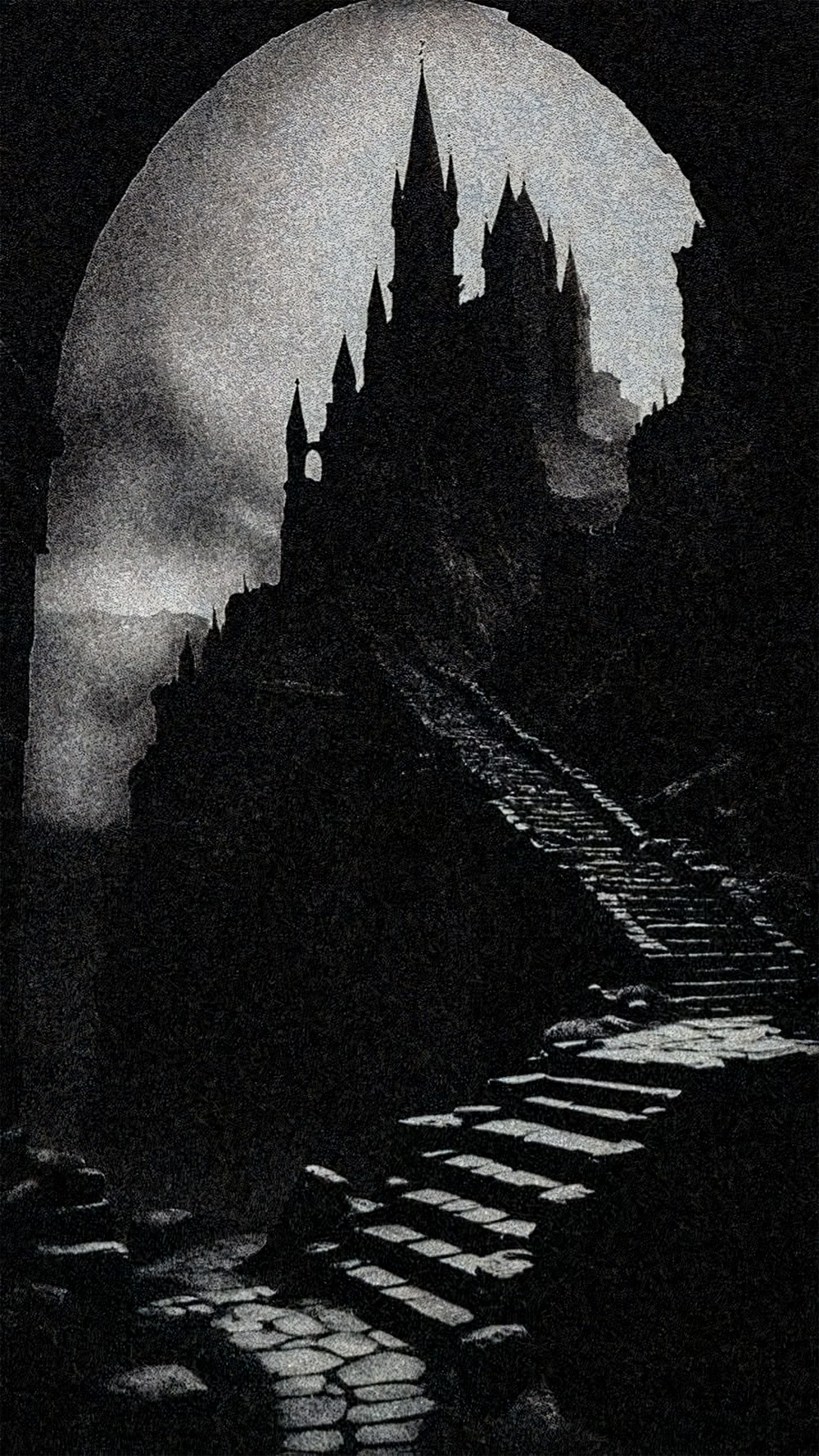
A visual study of the forms, inspirations, materials, colors, type, and cultural references associated with this UI design style.
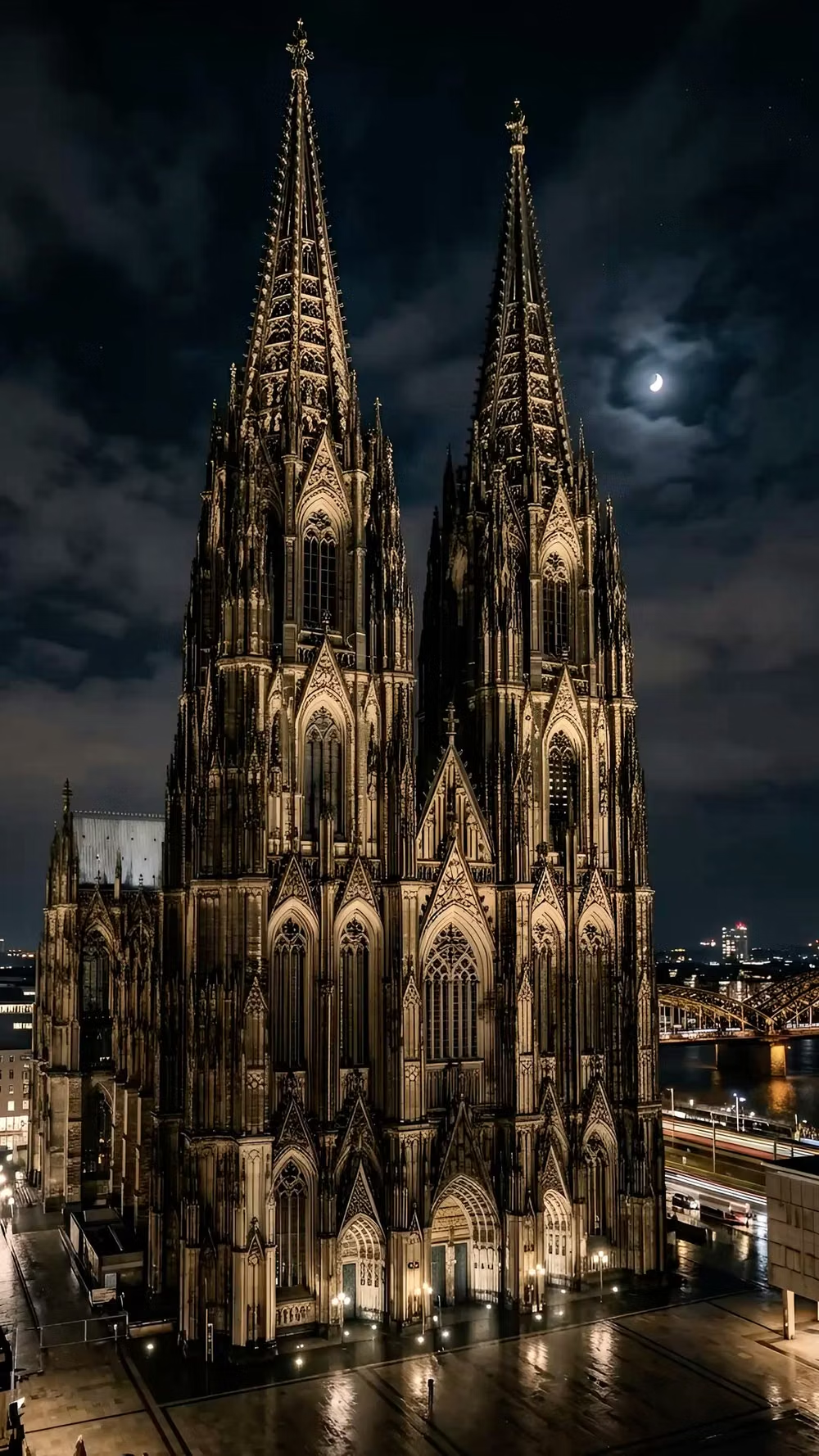
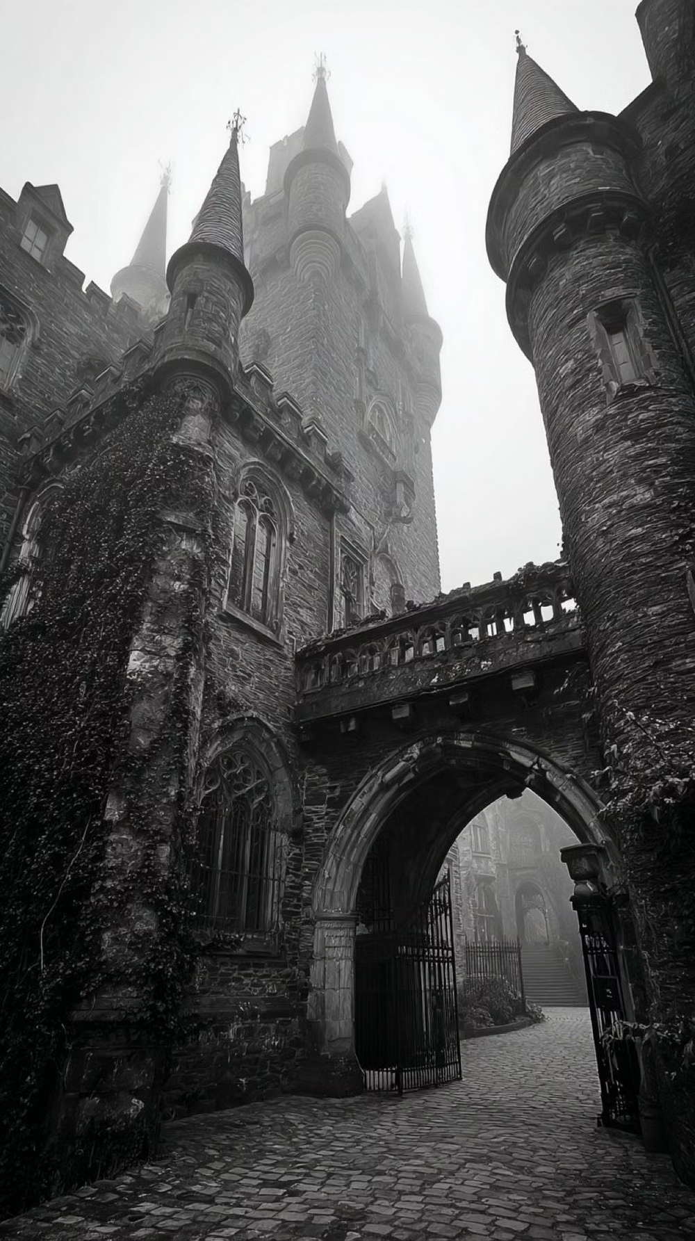
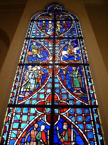
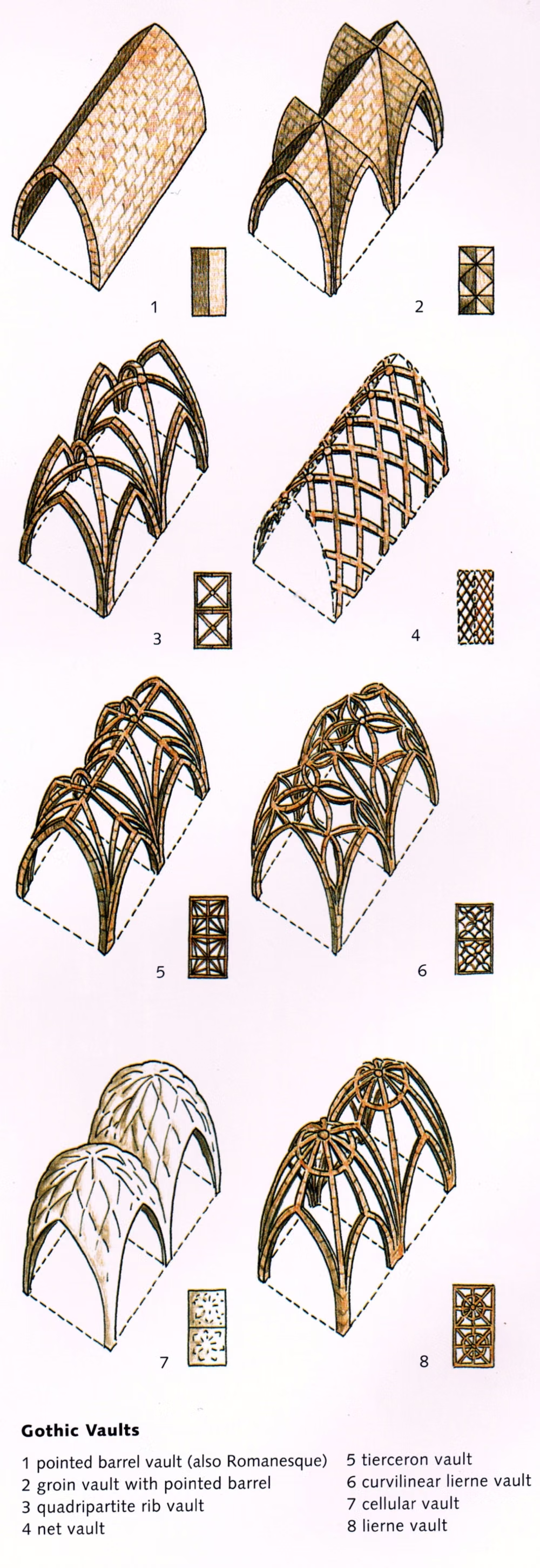
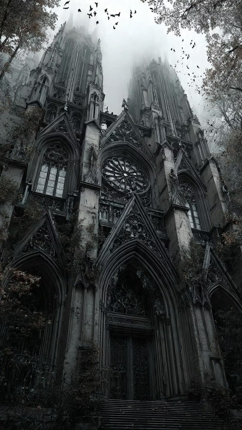
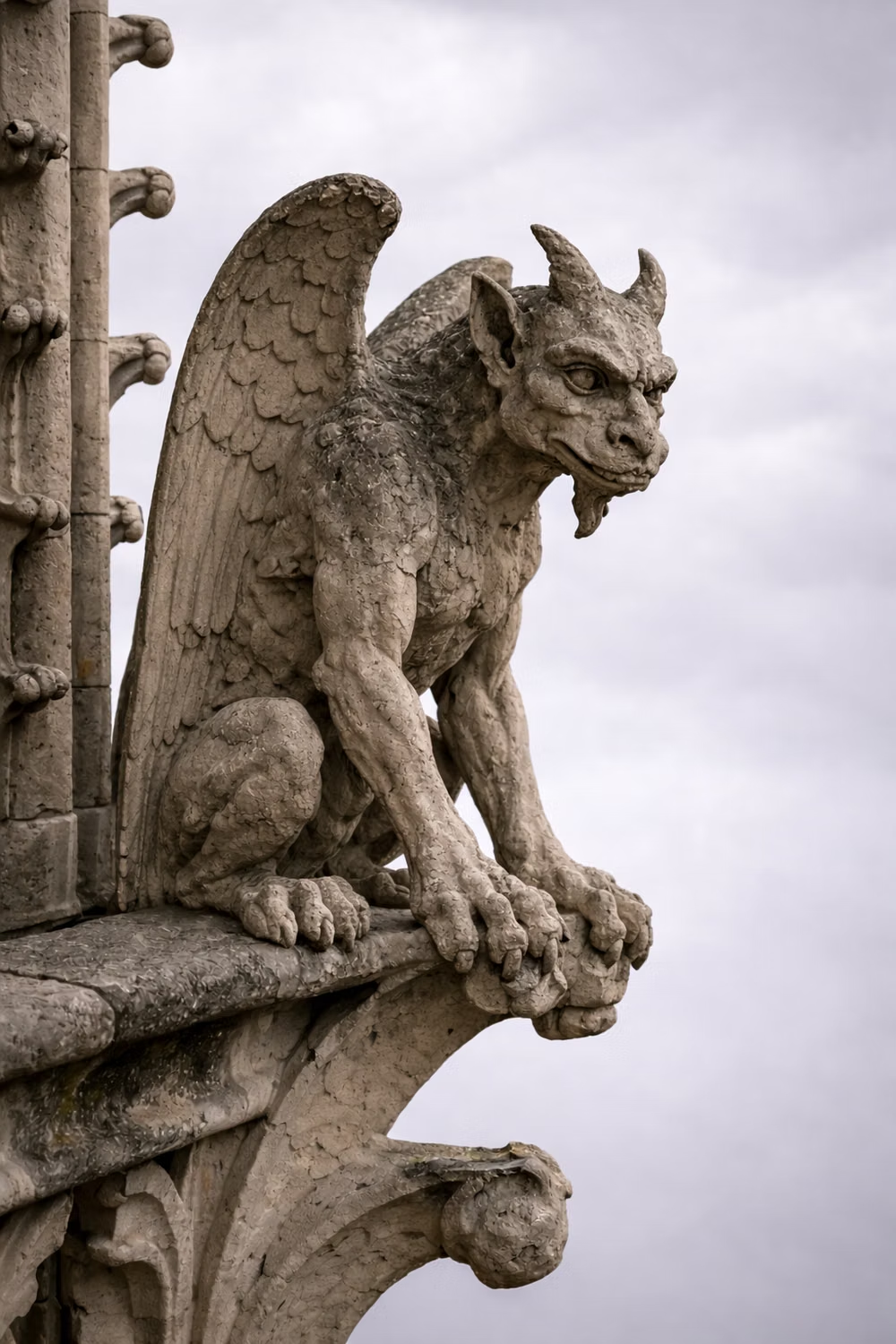
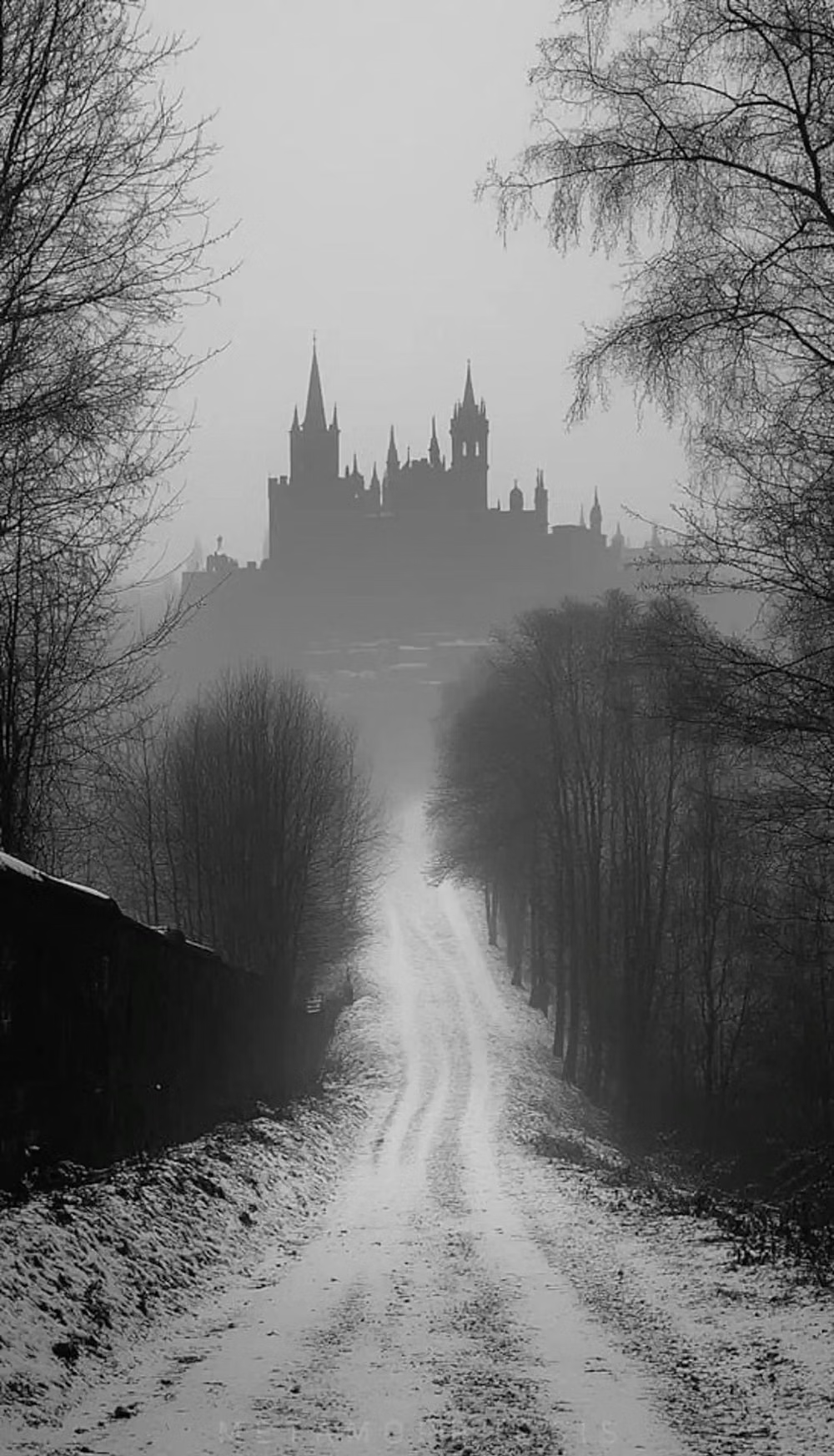
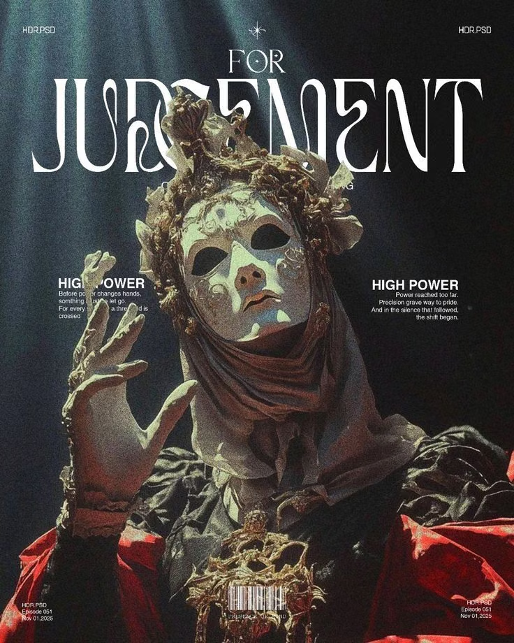
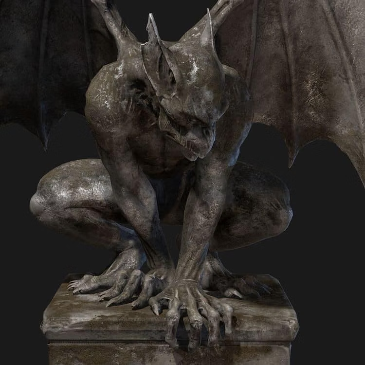
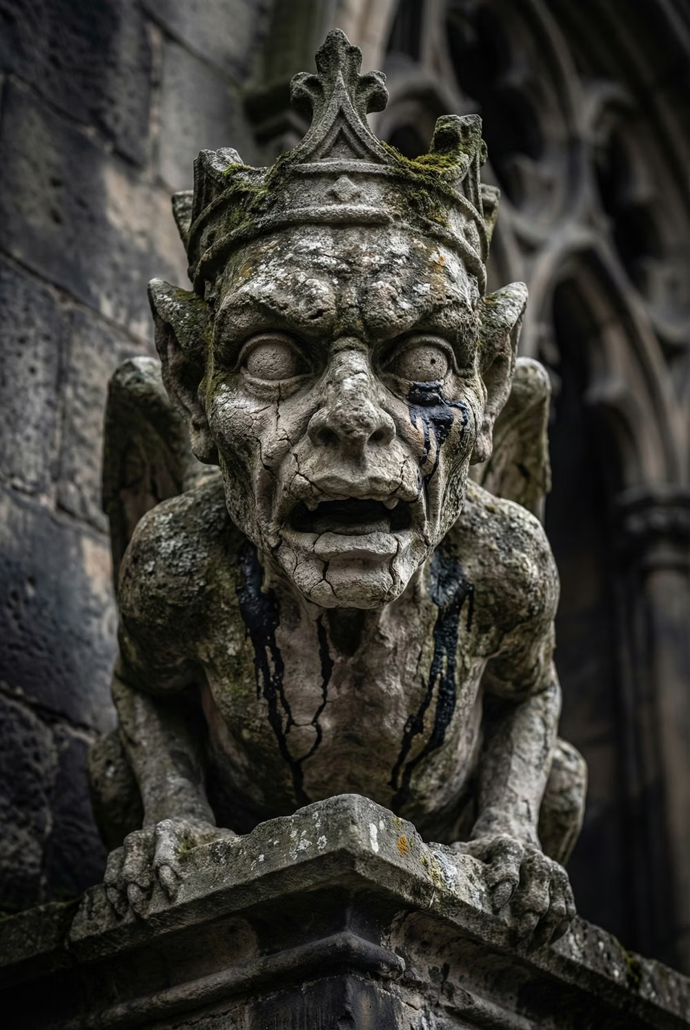
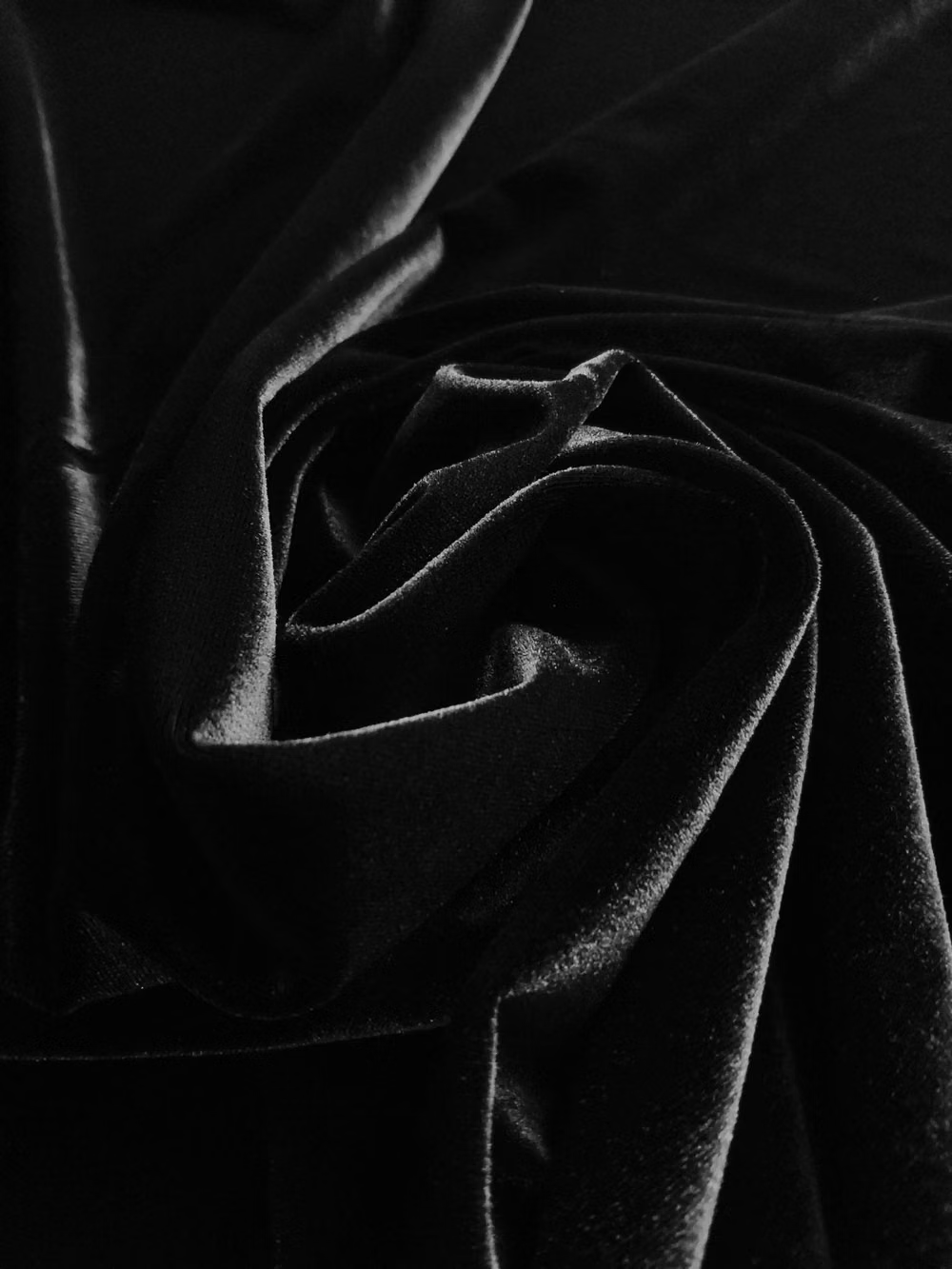
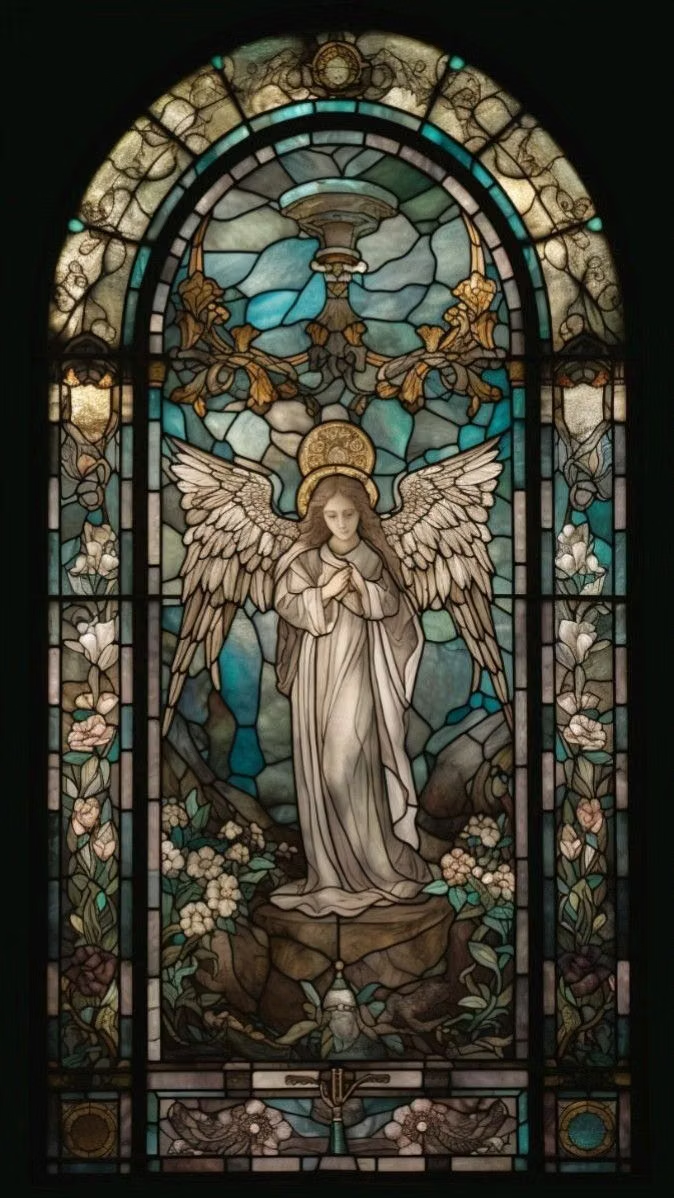
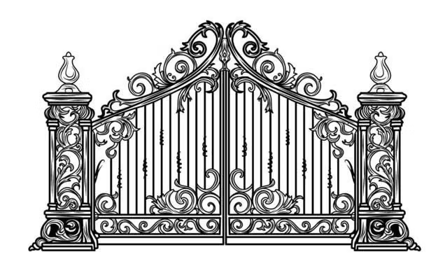
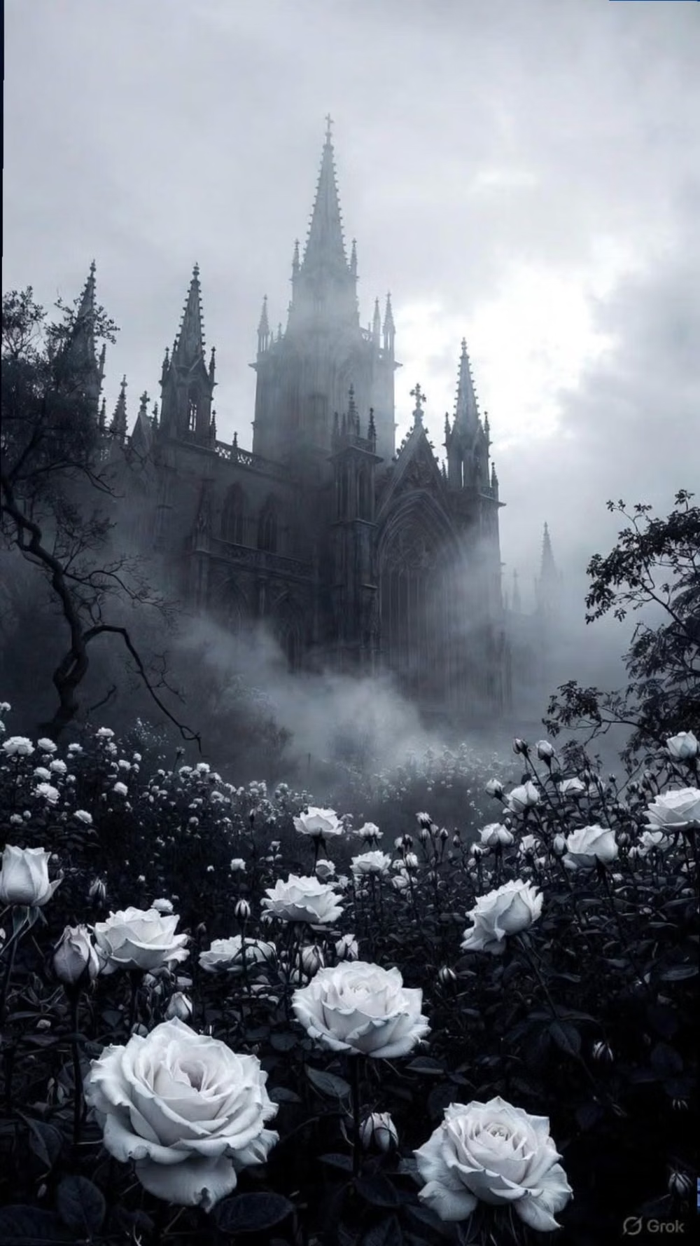
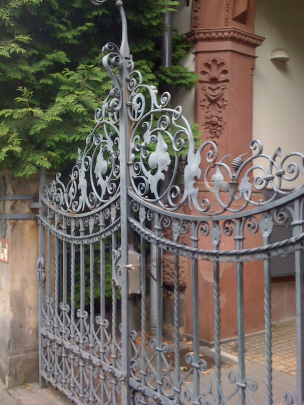
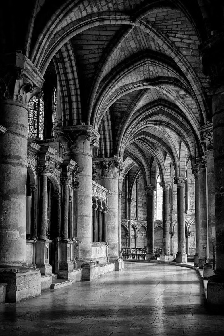
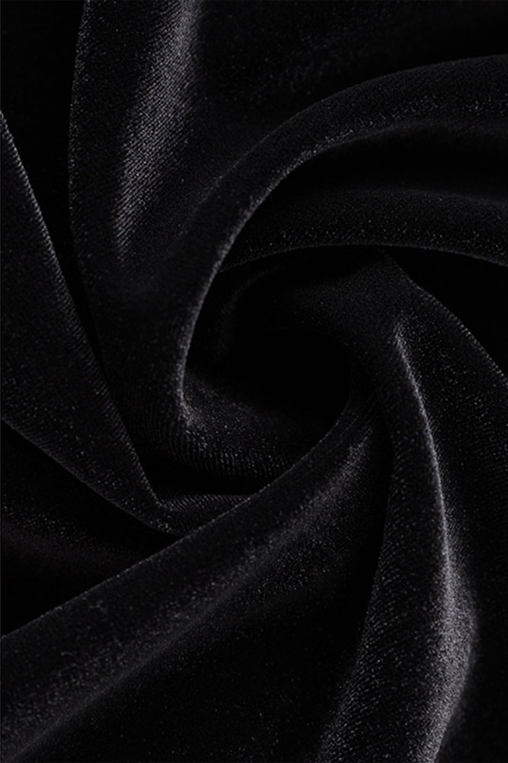
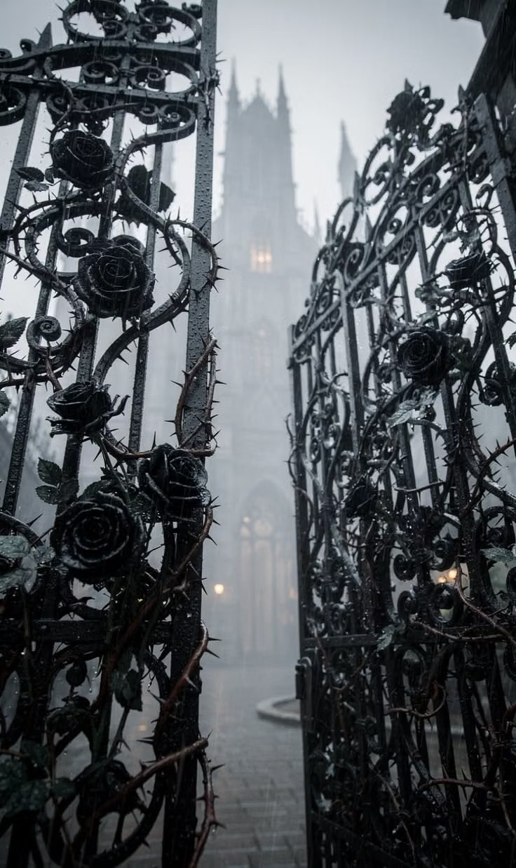
![Gothic cathedral rib vault photograph - [Salisbury Cathedral, Aerial View.1220-1238.Photograph. Salisbury, England.] Pointed arches, lancet windows and stained glass windows were a key feature of the Gothic England churches. The narrow piers of the cathedral were made of cut stone and this enabled the structure itself to be very light so the walls were very thin but capable of holding the whole structure up. The cathedral consisted of rib vaults they were also a type of decorative element. (Smarthistory) (Akexander, K.D., 243-244)](../../moodboards/gothic-neo-gothic/18-inspiration-cathedral-rib-vault.avif)
Design principles and implementation
Use these principles to write a focused AI UI design prompt instead of asking for a vague visual treatment.
Color direction
Combine black, midnight blue, oxblood, parchment, and cold metallic accents with small jewel tones that resemble stained glass. In a daisyUI theme, use oxblood or a deep stained-glass jewel tone for `primary`, cold silver or midnight blue for `secondary`, and step `base-100`, `base-200`, and `base-300` through dark charcoal, midnight, and black.
Imagery direction
Use Gothic architecture, dramatic portraiture, tracery, sculpture, reliquaries, medieval symbols, and dark material studies with directional light.
Content density
Maintain medium density, concentrating ornament around entrances and headings while keeping reading areas dark, calm, and spacious.
Motion direction
Use candle-like light shifts, slow vertical reveals, opening portals, tracery draws, and restrained atmospheric haze.
Shape language
Favor pointed arches, quatrefoils, shields, spires, lancet frames, tracery, and narrow vertical panels with sharp ornamental detail. In daisyUI themes, set the `--radius-*` variables to `0` or `0.25rem`.
Typography rules
Use blackletter or dramatic display serif only for short titles, paired with a highly readable old-style serif or sans-serif for navigation and body copy.
Suggested Typfaces
UnifrakturCook
Fresh daisies glow in warm sunlight
Fresh daisies glow in warm sunlight
1 2 3 4 5 6 7 8 9 0
UnifrakturMaguntia
Fresh daisies glow in warm sunlight
Fresh daisies glow in warm sunlight
1 2 3 4 5 6 7 8 9 0
Grenze Gotisch
Fresh daisies glow in warm sunlight
Fresh daisies glow in warm sunlight
1 2 3 4 5 6 7 8 9 0
Pirata One
Fresh daisies glow in warm sunlight
Fresh daisies glow in warm sunlight
1 2 3 4 5 6 7 8 9 0
Cinzel Decorative
Fresh daisies glow in warm sunlight
Fresh daisies glow in warm sunlight
1 2 3 4 5 6 7 8 9 0
Build a Gothic / Neo-Gothic interface with daisyUI
The live example translates this direction into daisyUI components and semantic theme tokens.
To generate a full page in the same visual language, give the style name and the design rules above to Blueprint MCP.
Related UI design styles
Compare nearby visual languages that share typography, shapes, use cases, or signature elements.
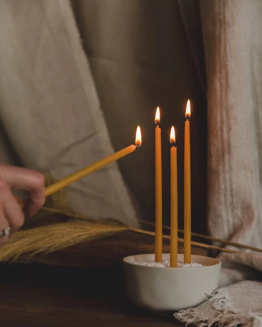
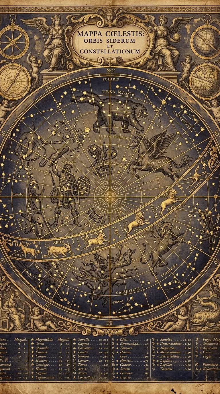
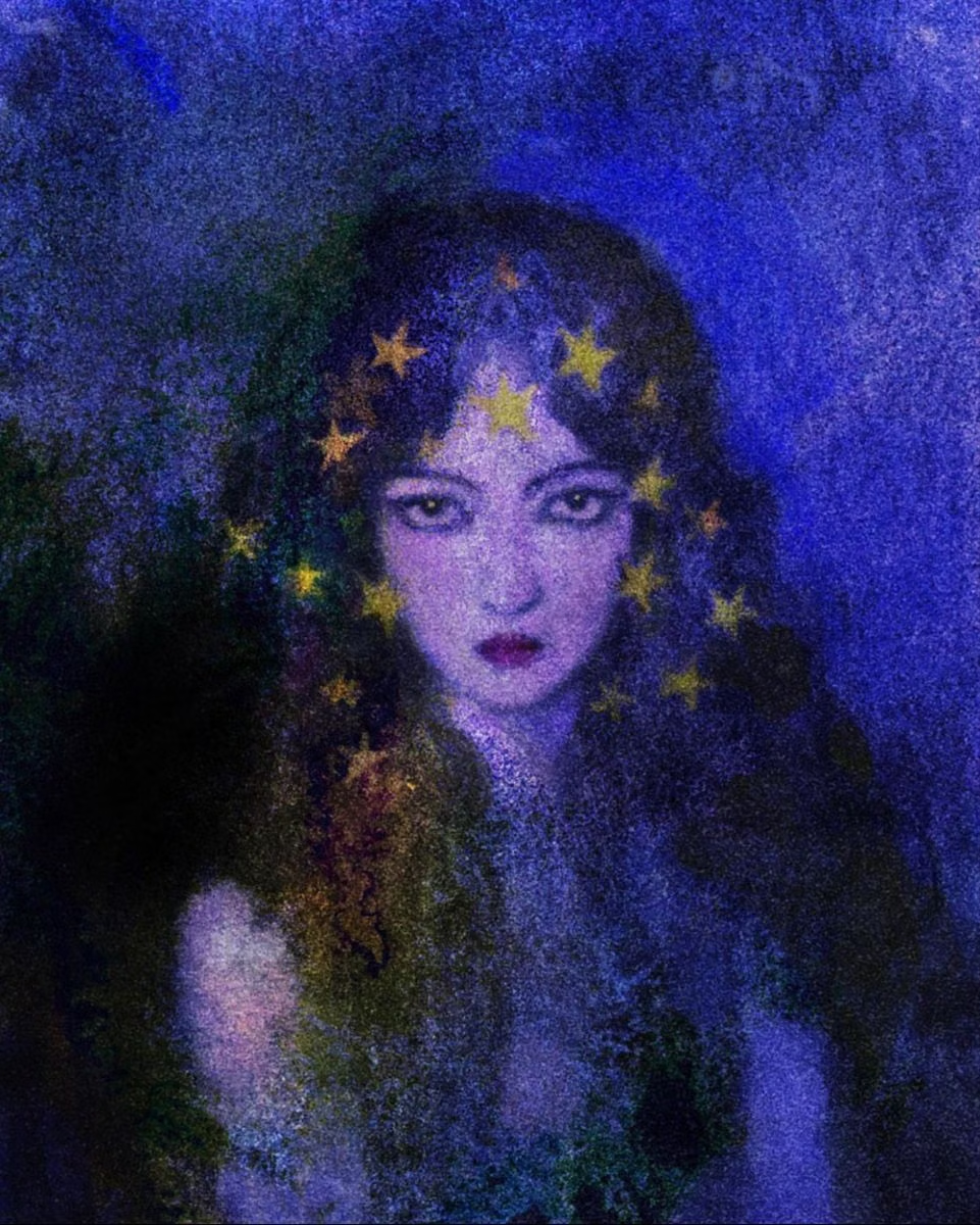
Whimsigothic UI design style
Celestial symbols, jewel tones, ornate curves, mystical illustration, and playful gothic motifs create theatrical enchantment.
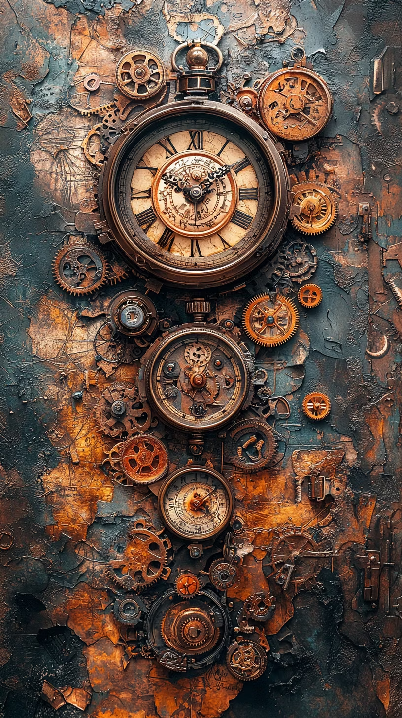
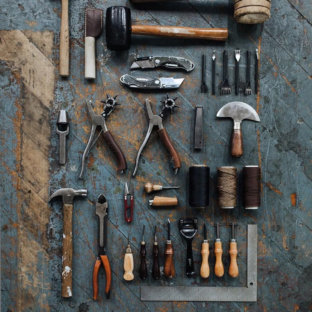
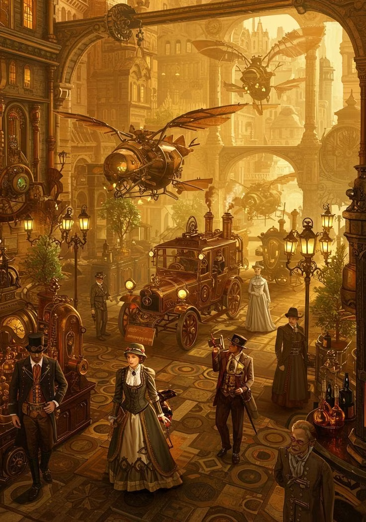
Steampunk UI design style
A hyper-skeuomorphic Victorian machine aesthetic turns the interface into a worn, theatrical artifact built from brass, iron, leather, parchment, glass, and enamel.
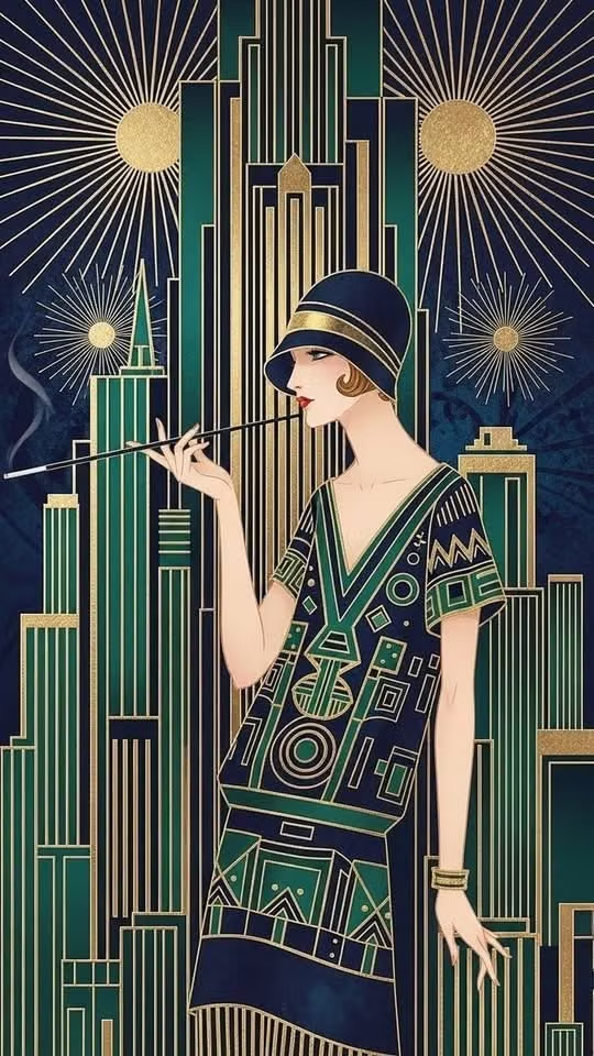
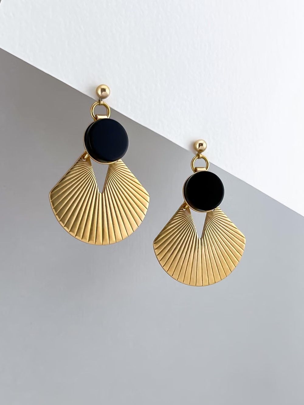
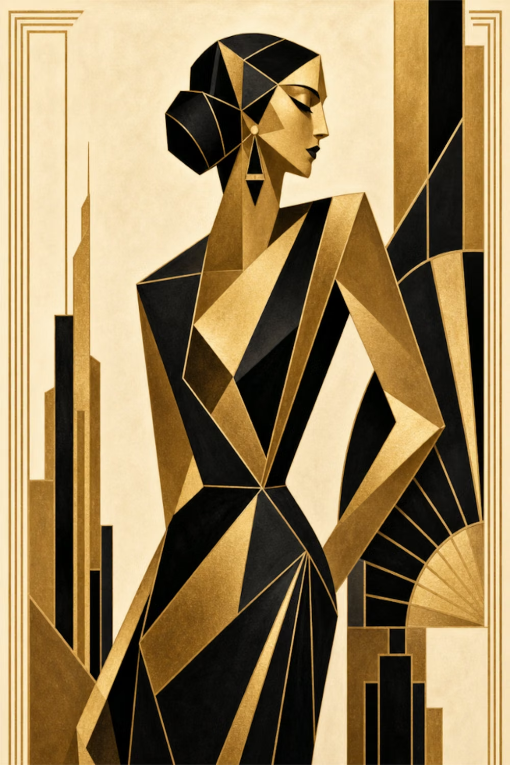
Art Deco UI design style
Symmetrical geometry, stepped forms, luxurious metallic accents, dramatic contrast, and ornamental typography.