Art Deco UI design style
Symmetrical geometry, stepped forms, luxurious metallic accents, dramatic contrast, and ornamental typography.
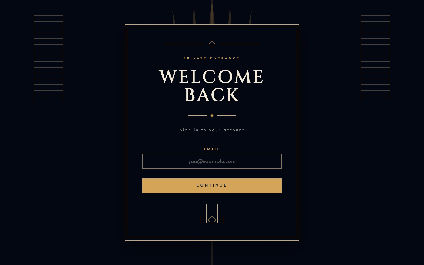
Design overview
- Signature elements
- stepped geometry, fan motifs, metallic accents, symmetrical composition, high contrast, geometric display type
- Best suited to
- Hospitality, luxury products, entertainment, events, and premium branding.
- Layout principles
- Build symmetrical axial compositions with stepped tiers, centered entrances, and mirrored decorative structures that lead toward a glamorous focal point.
History and origins
A fact-checked account of where this visual language came from, with links to the references used.
- Period
- 1920s–1930s
- Origin
- Paris, then international
Art Deco developed from prewar French luxury design and received its defining international showcase at the 1925 Exposition internationale des arts décoratifs et industriels modernes in Paris. It combined craft and expensive materials with stepped geometry, streamlined machinery, and imagery drawn from many cultures, then spread through architecture, transport, fashion, cinema, and graphic design.
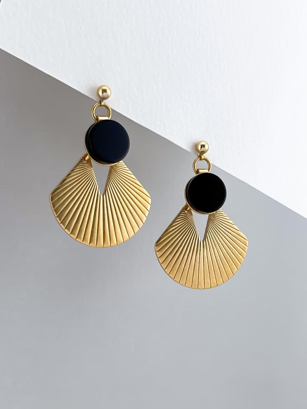
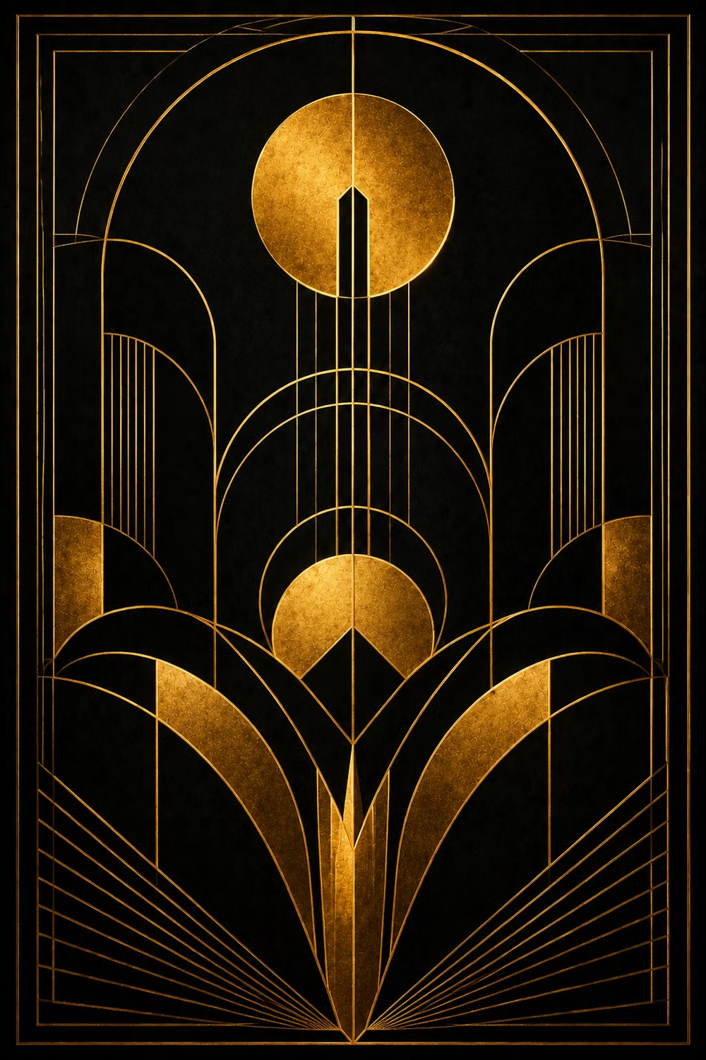
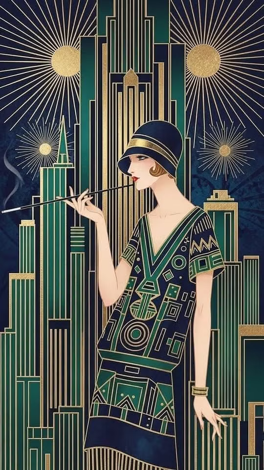
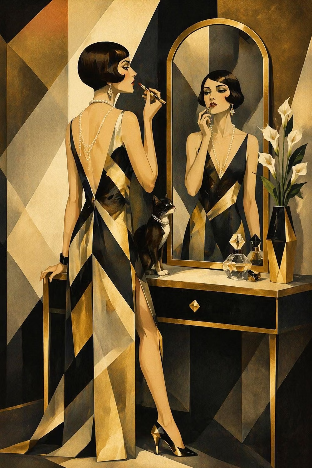
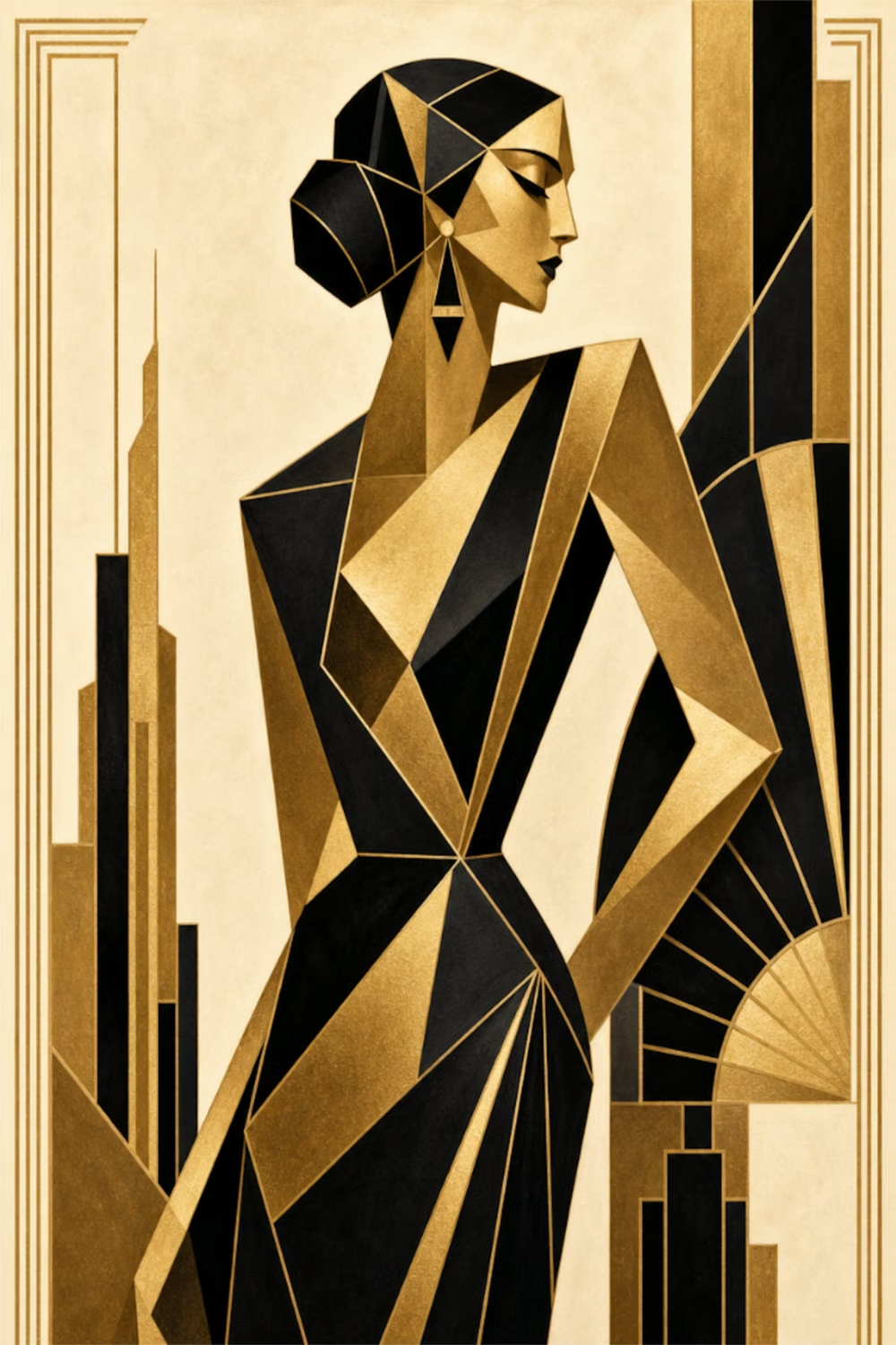
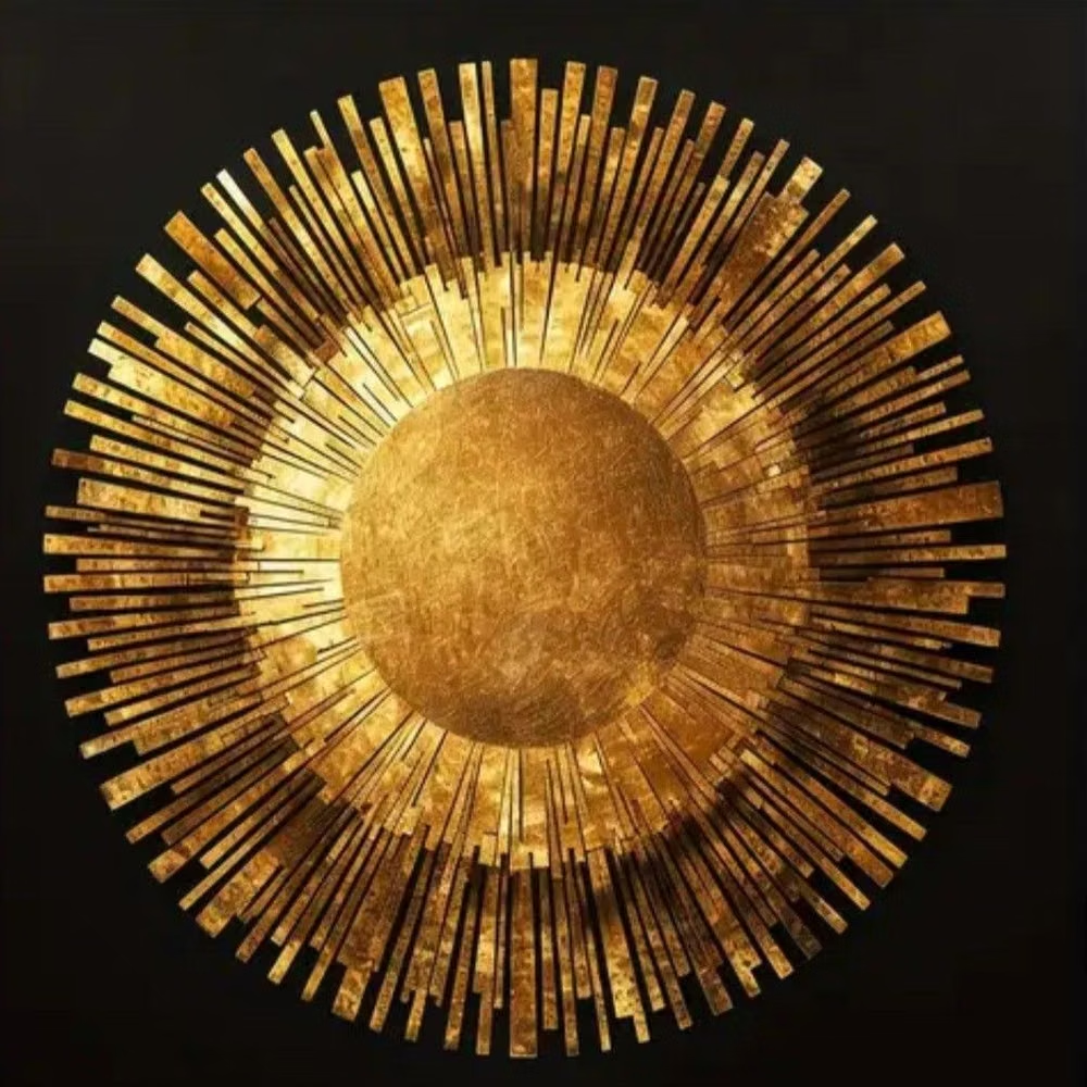
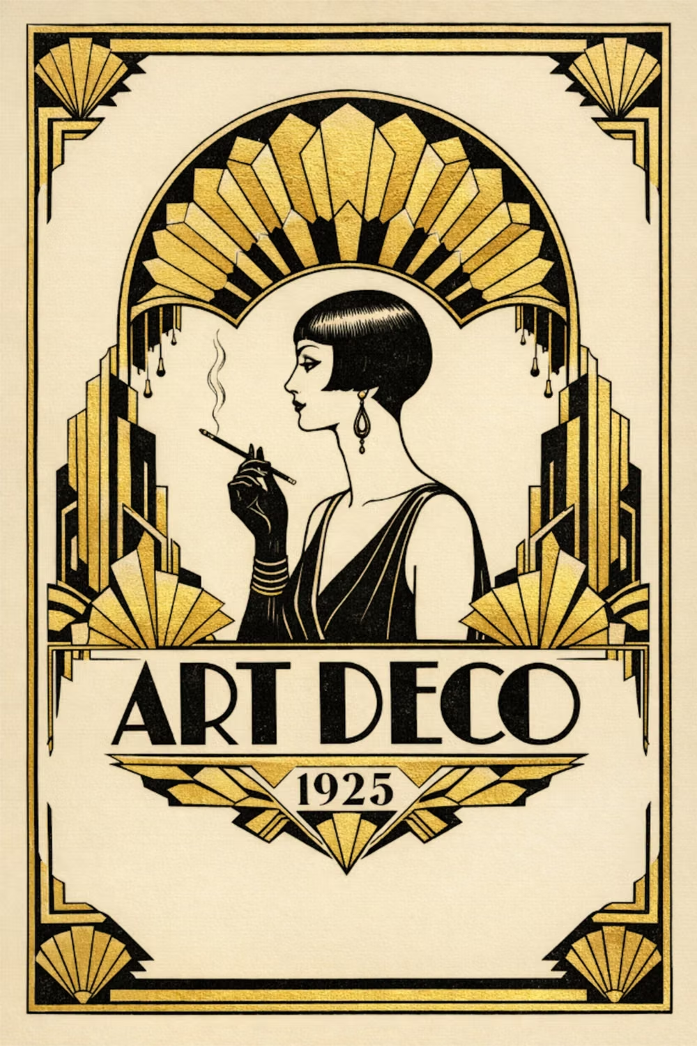
Moodboard and visual references
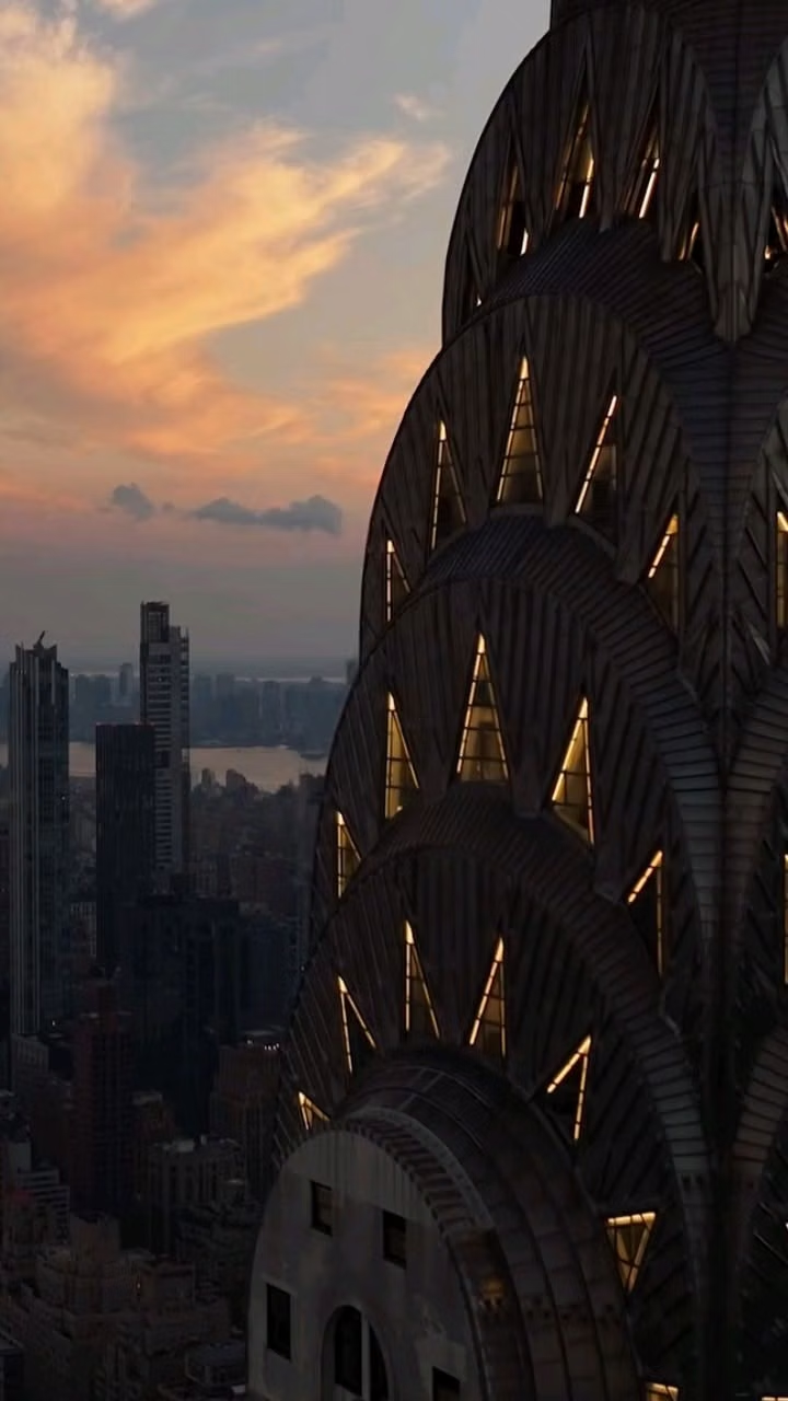
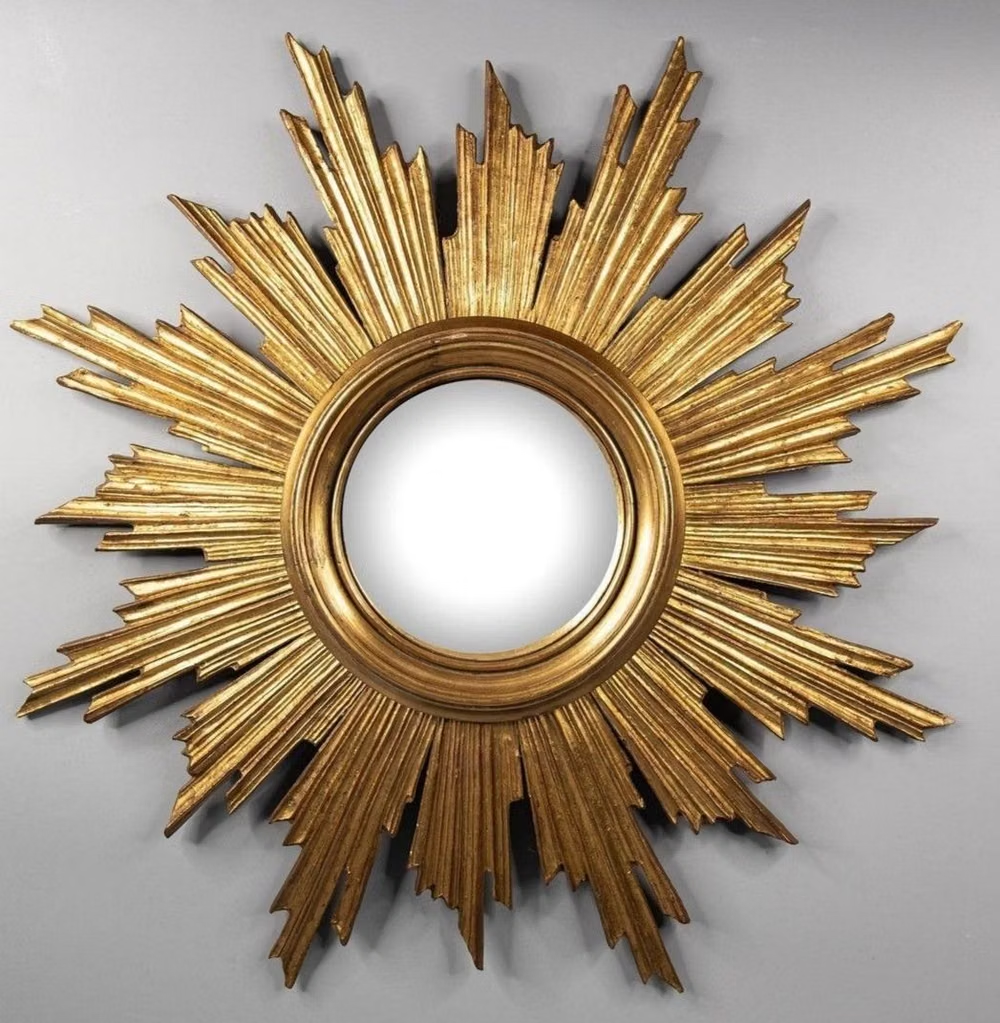
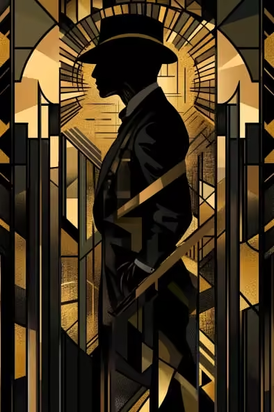
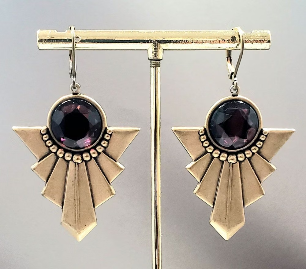
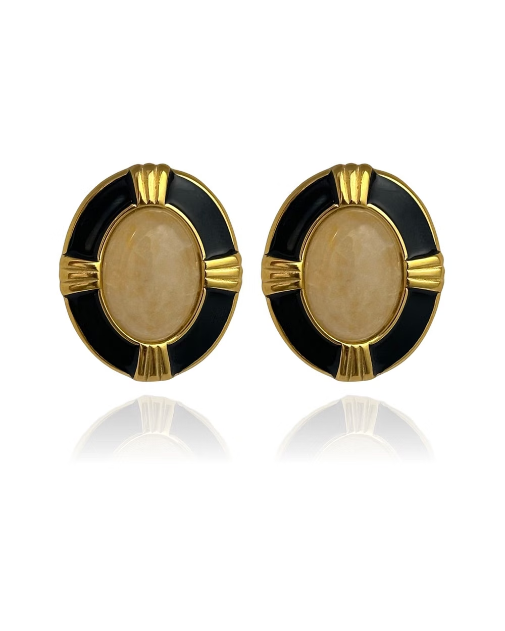
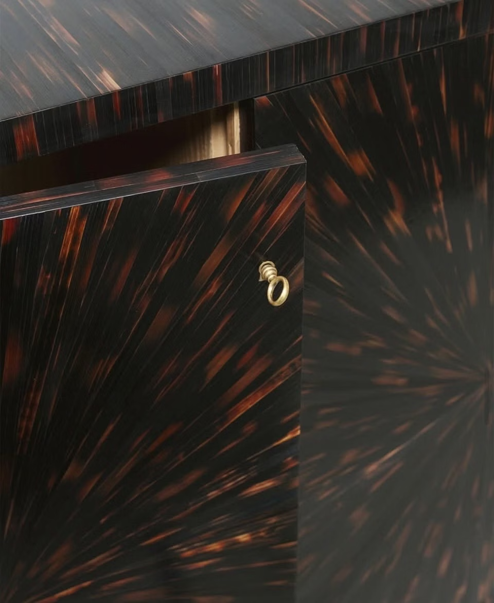
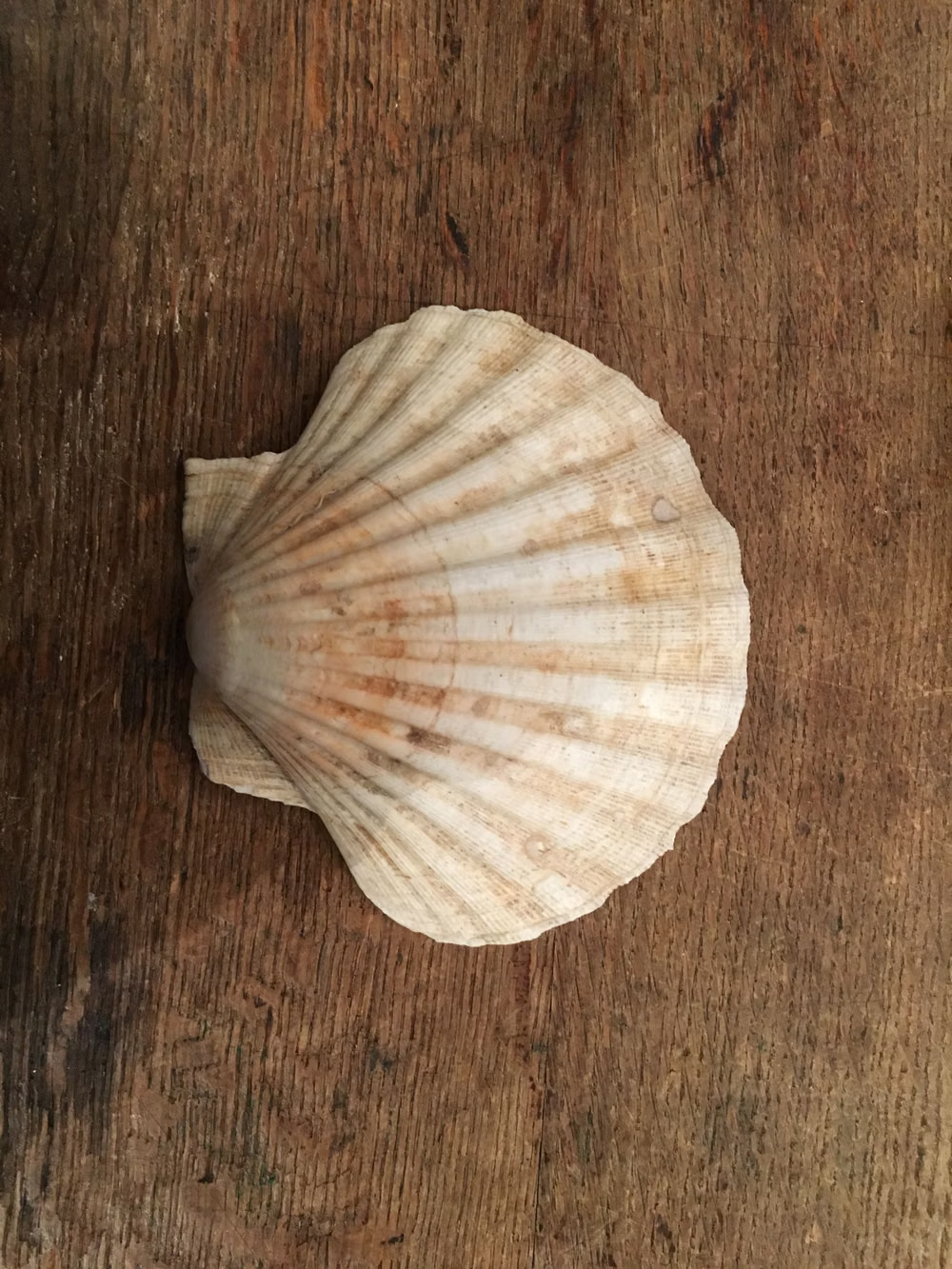
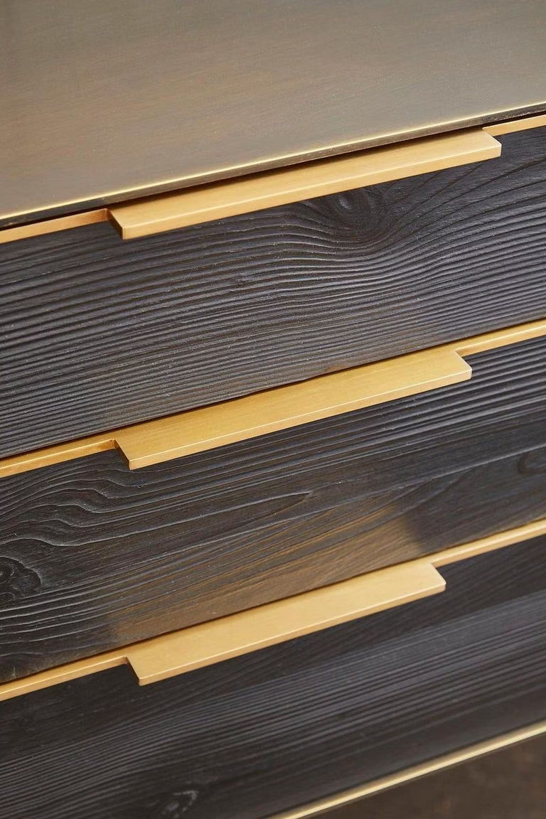
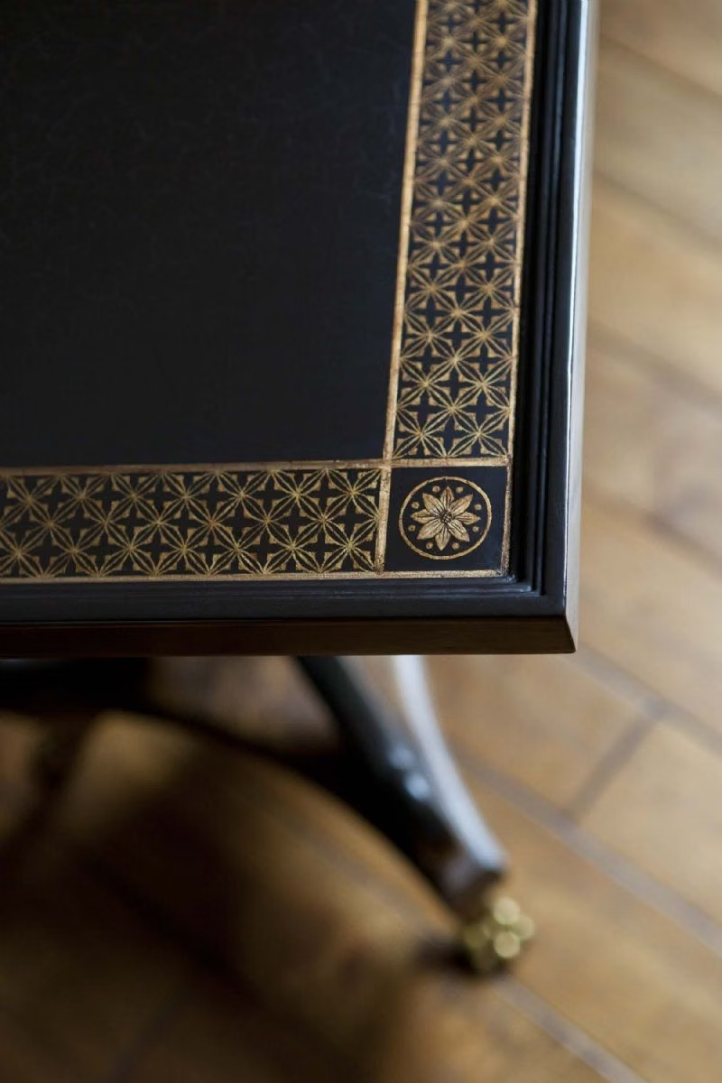
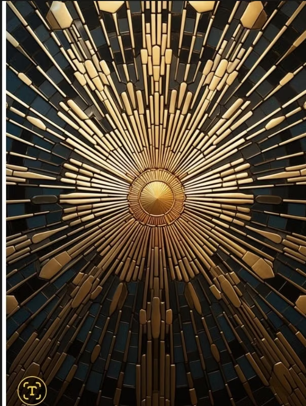
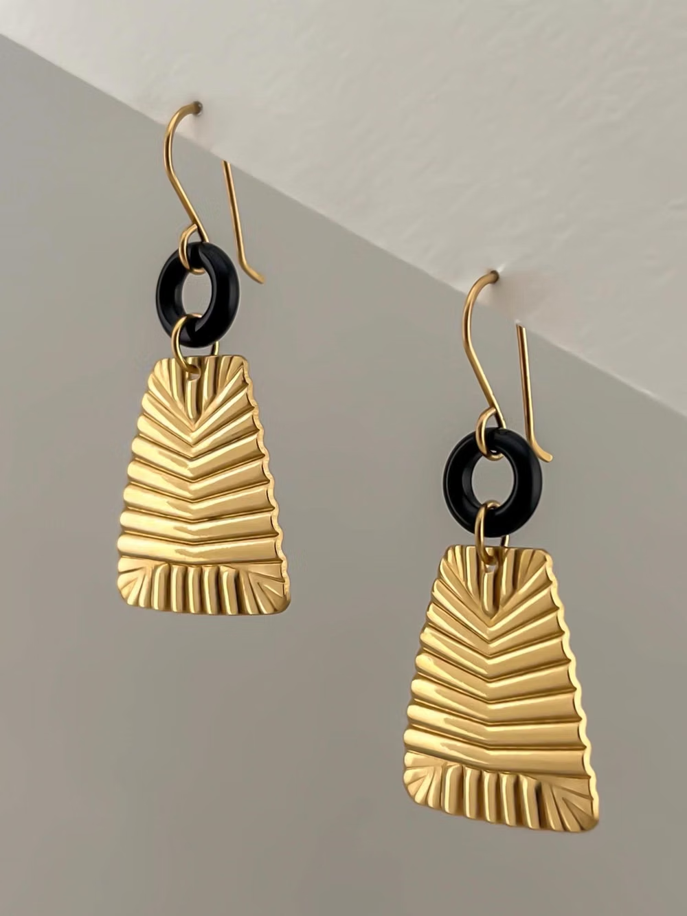
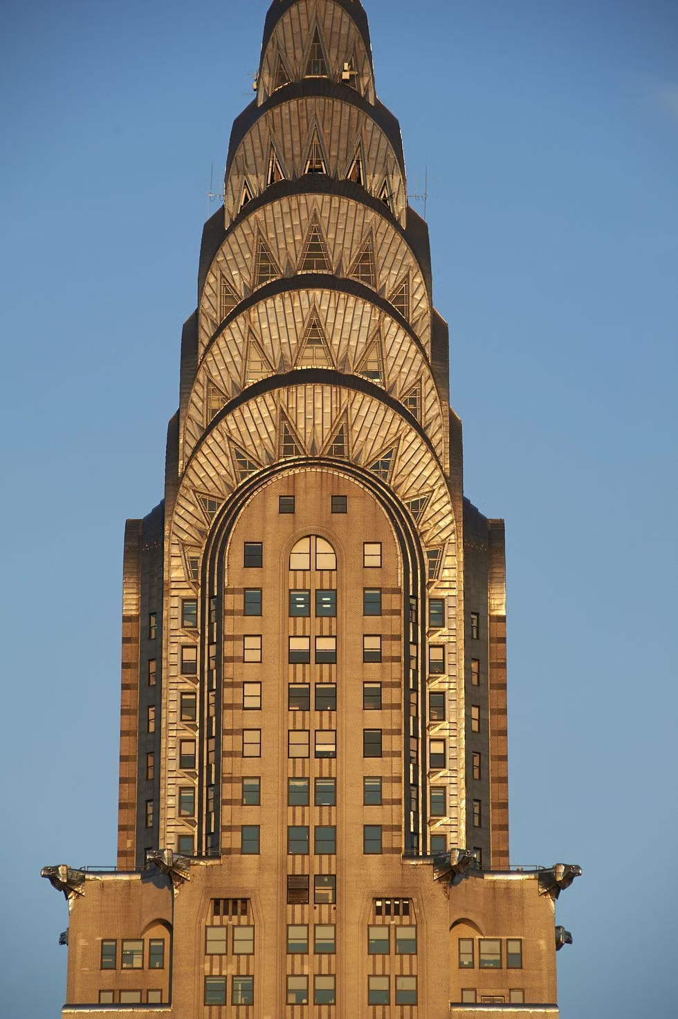
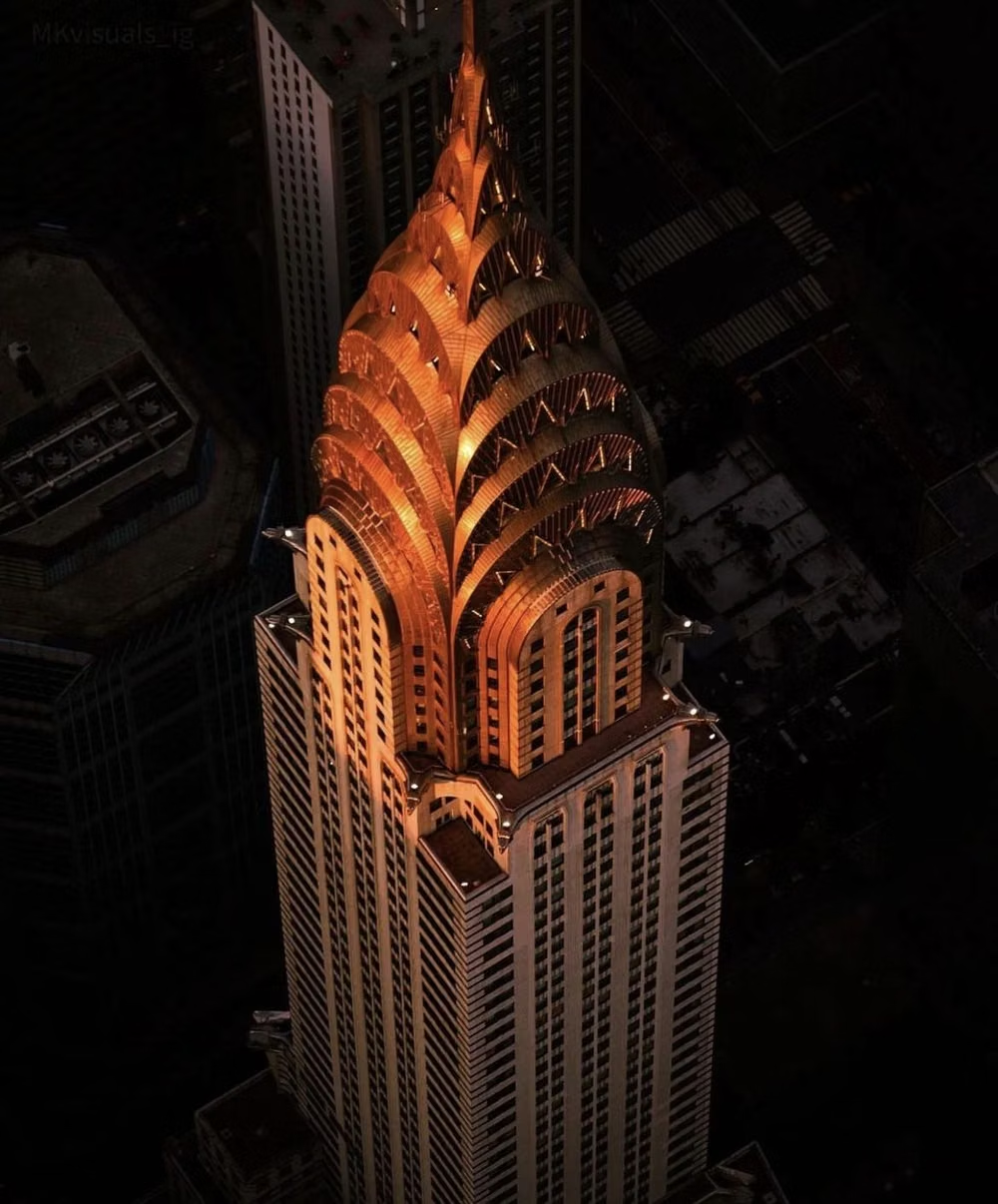
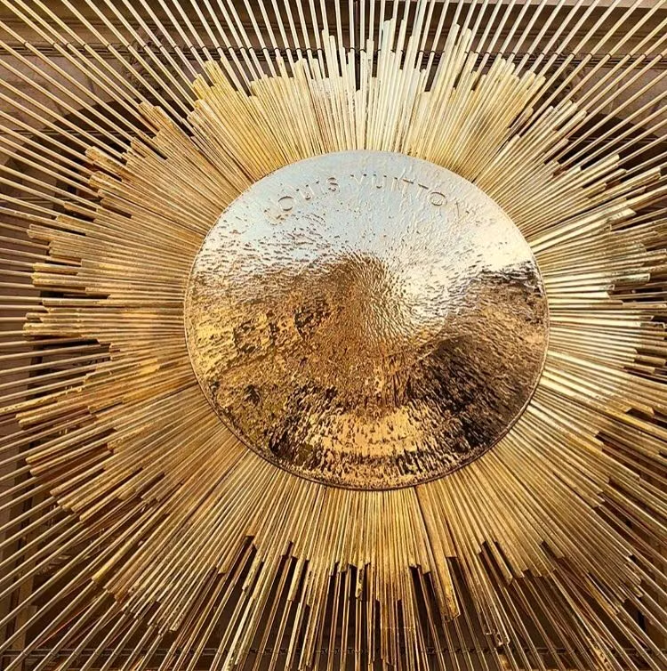
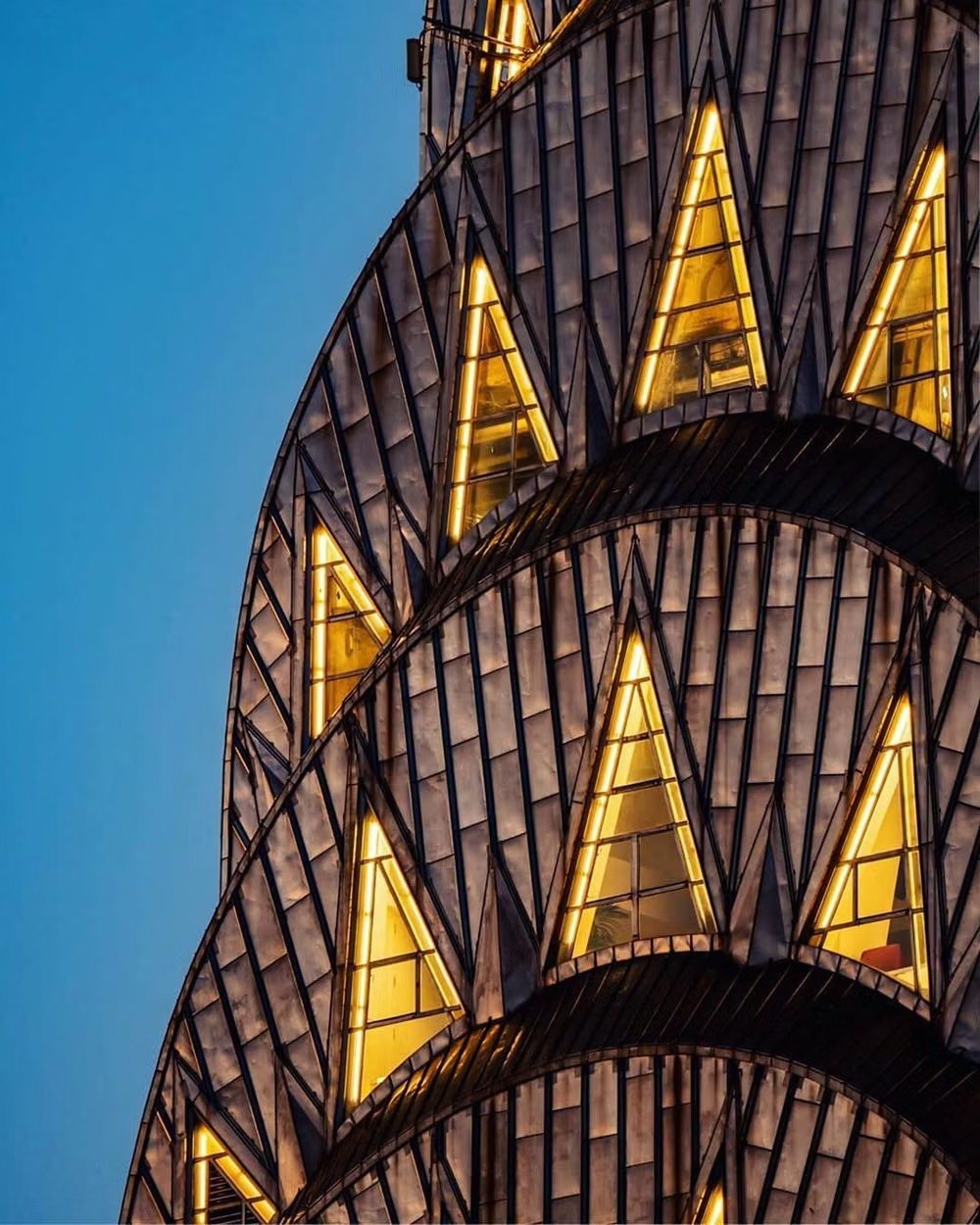
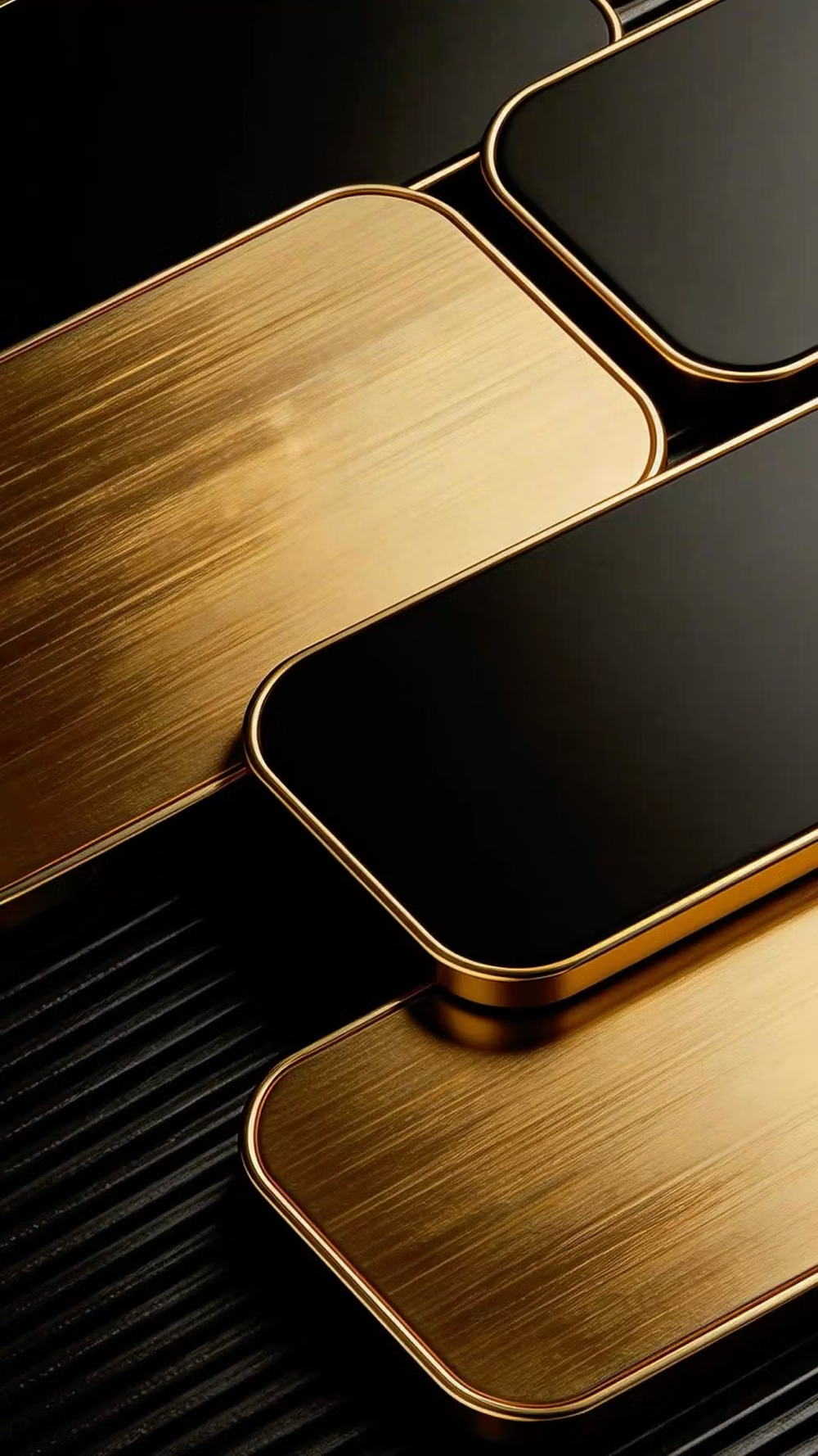
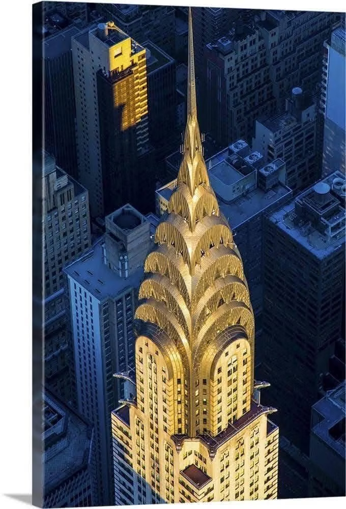
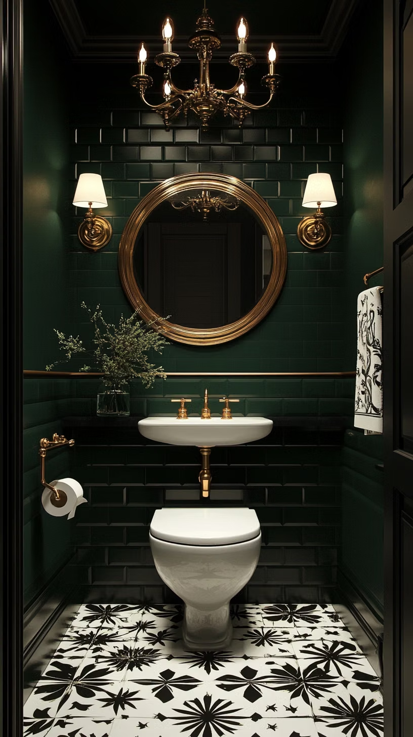
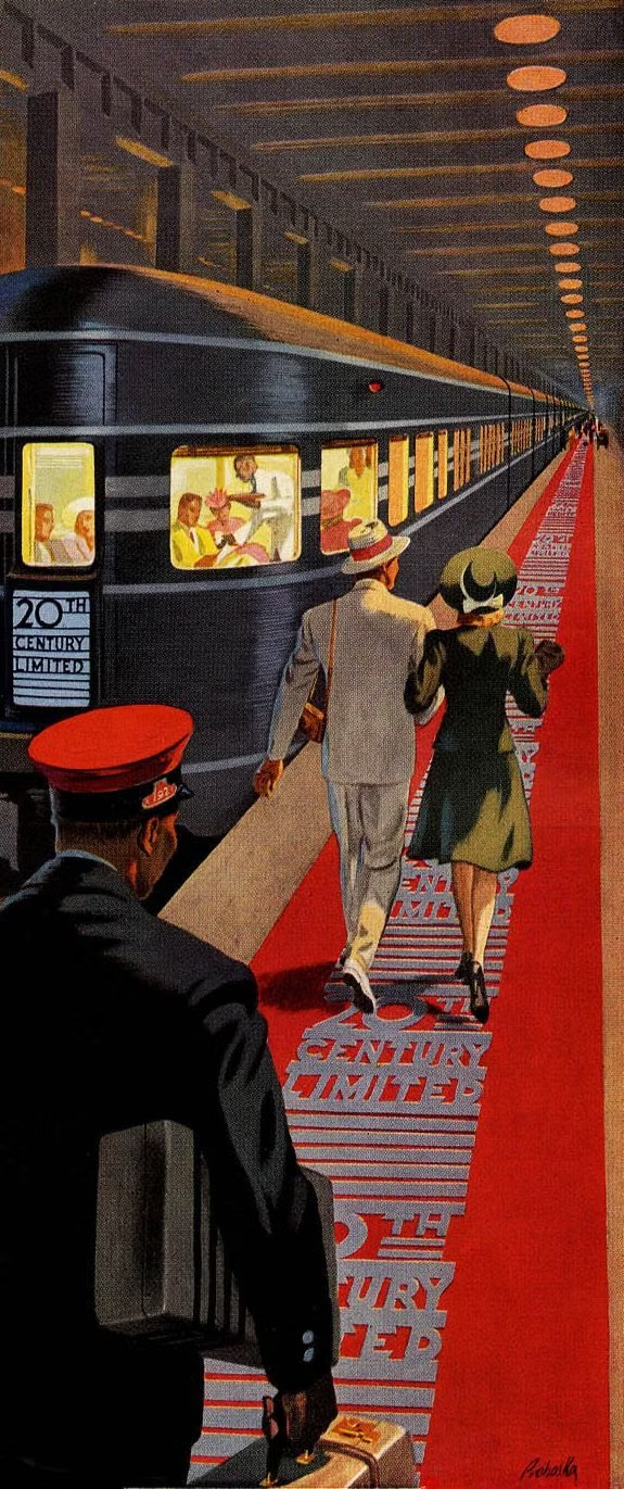
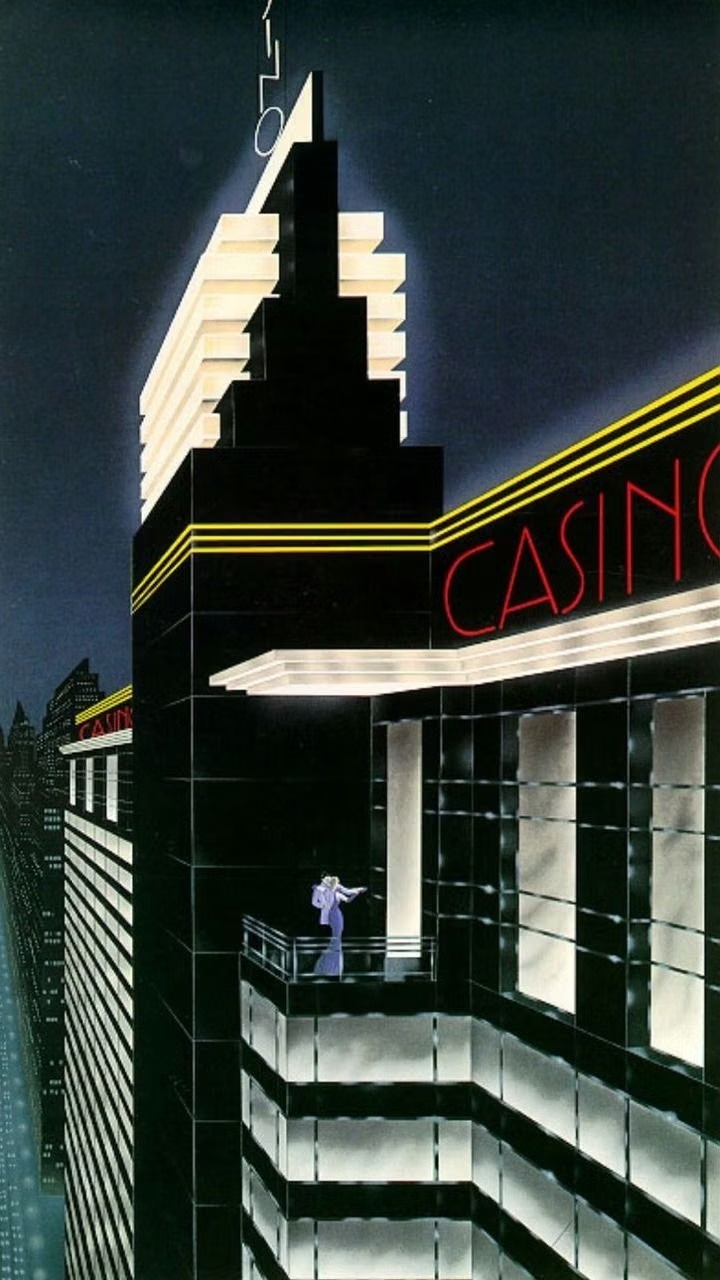
A visual study of the forms, inspirations, materials, colors, type, and cultural references associated with this UI design style.


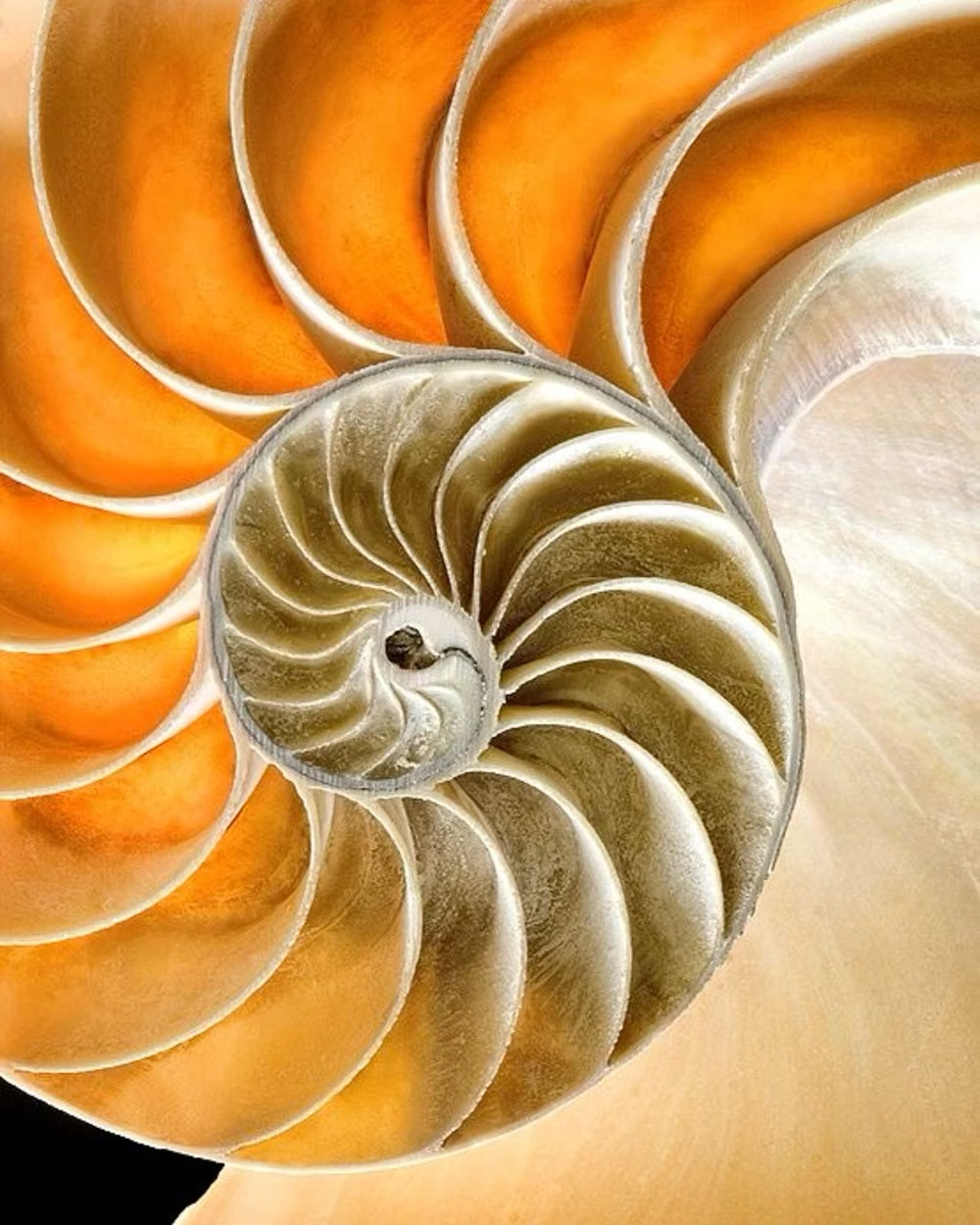
Design principles and implementation
Use these principles to write a focused AI UI design prompt instead of asking for a vague visual treatment.
Color direction
Combine black or deep jewel tones with ivory and controlled gold, silver, or brass accents, maintaining crisp high-contrast separation. In a daisyUI theme, use controlled gold or brass for `primary`, emerald, sapphire, or oxblood for `secondary`, and step `base-100`, `base-200`, and `base-300` through deep charcoal, ink black, and jewel-tinted black.
Imagery direction
Use dramatic architecture, polished products, theatrical portraiture, fan motifs, and geometric city or stage imagery with hard directional light.
Content density
Keep density low to medium, allowing metallic linework and monumental headings to frame a concise premium message.
Motion direction
Reveal fan patterns radially, move through stepped masks, and add brief metallic glints or curtain-like openings with measured theatrical timing.
Shape language
Use sunbursts, fans, chevrons, stepped pyramids, fluted lines, octagons, and symmetrical frames with sharp geometric precision. In daisyUI themes, set the `--radius-*` variables to `0` or `0.25rem`.
Typography rules
Use geometric display capitals with generous tracking for short headings, paired with a restrained serif or sans-serif for details and controls.
Suggested Typfaces
Limelight
Fresh daisies glow in warm sunlight
Fresh daisies glow in warm sunlight
1 2 3 4 5 6 7 8 9 0
Poiret One
Fresh daisies glow in warm sunlight
Fresh daisies glow in warm sunlight
1 2 3 4 5 6 7 8 9 0
Cinzel
Fresh daisies glow in warm sunlight
Fresh daisies glow in warm sunlight
1 2 3 4 5 6 7 8 9 0
Josefin Sans
Fresh daisies glow in warm sunlight
Fresh daisies glow in warm sunlight
1 2 3 4 5 6 7 8 9 0
Italiana
Fresh daisies glow in warm sunlight
Fresh daisies glow in warm sunlight
1 2 3 4 5 6 7 8 9 0
Build a Art Deco interface with daisyUI
The live example translates this direction into daisyUI components and semantic theme tokens.
To generate a full page in the same visual language, give the style name and the design rules above to Blueprint MCP.
Related UI design styles
Compare nearby visual languages that share typography, shapes, use cases, or signature elements.
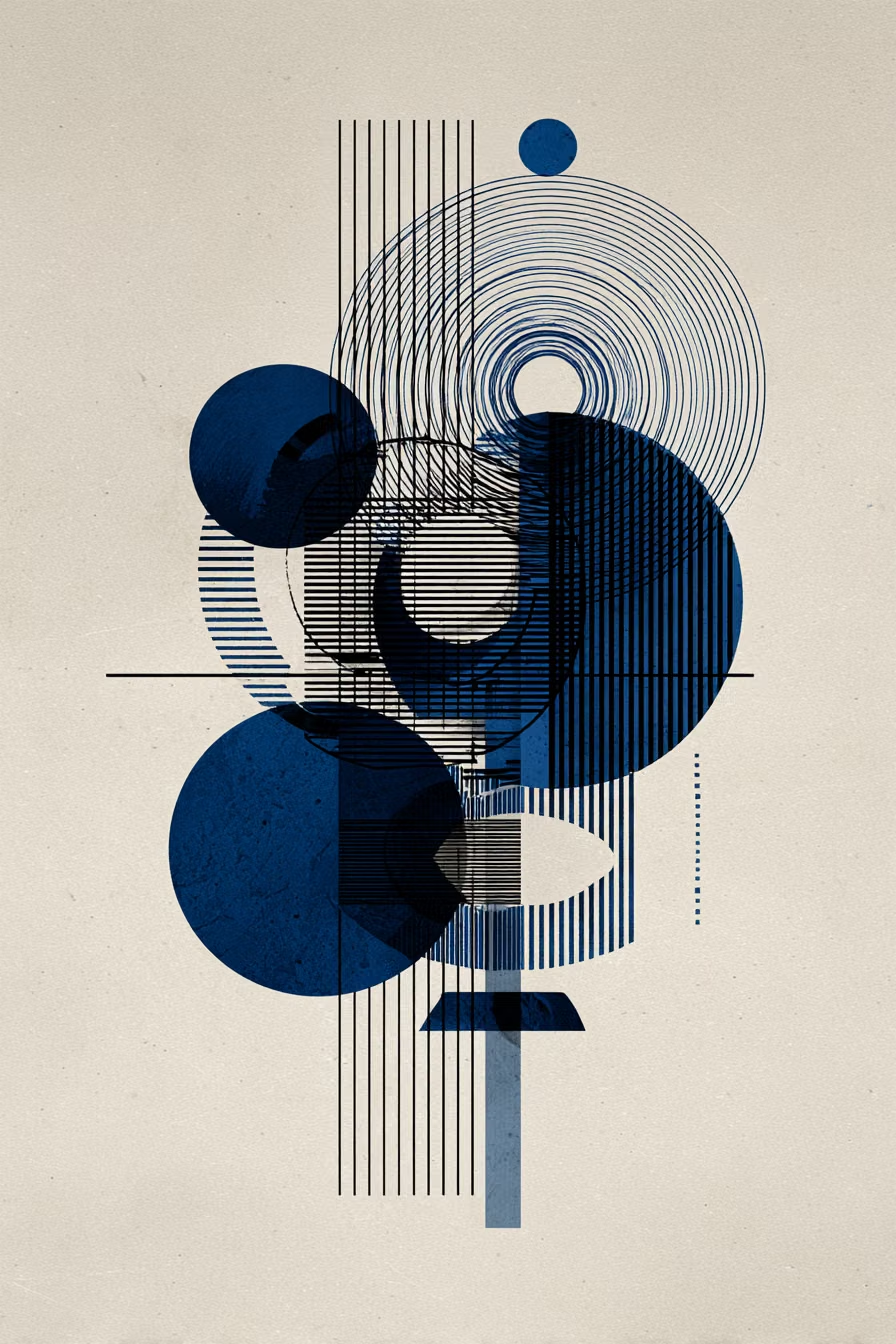
Geometric Abstract UI design style
Circles, lines, polygons, modular forms, and bold spatial relationships create a nonrepresentational visual system.
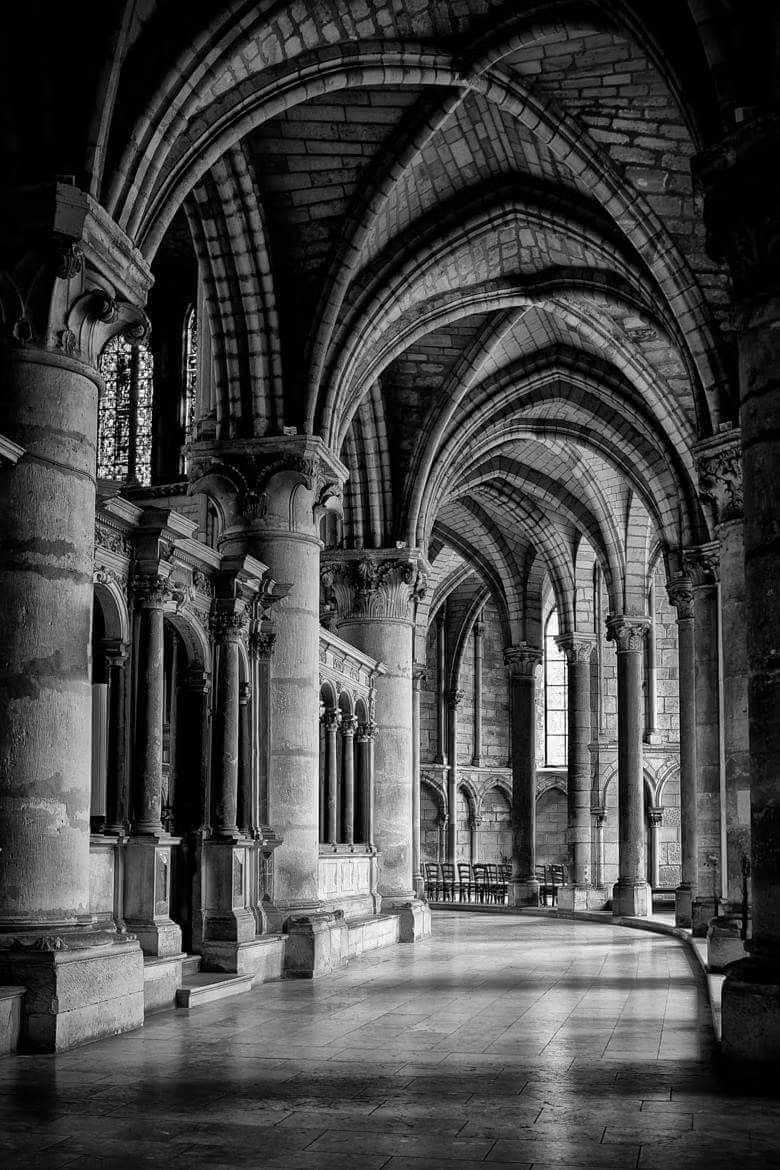
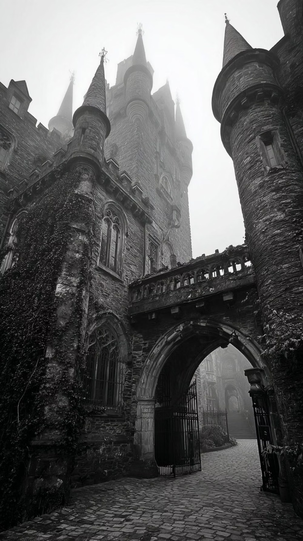
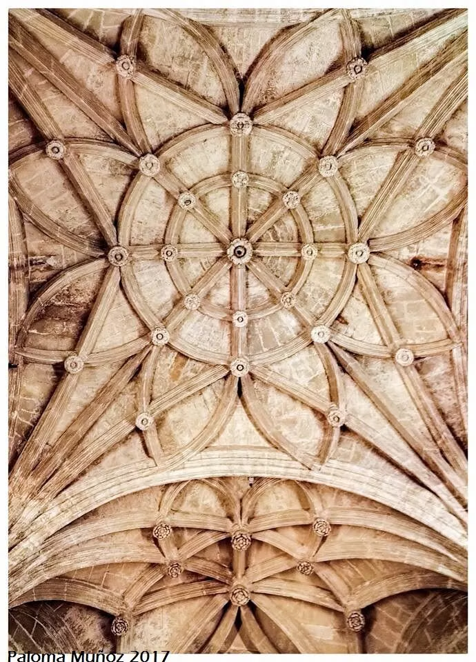
Gothic / Neo-Gothic UI design style
Pointed forms, blackletter or dramatic serif type, dark contrast, tracery, religious ornament, and medieval atmosphere.
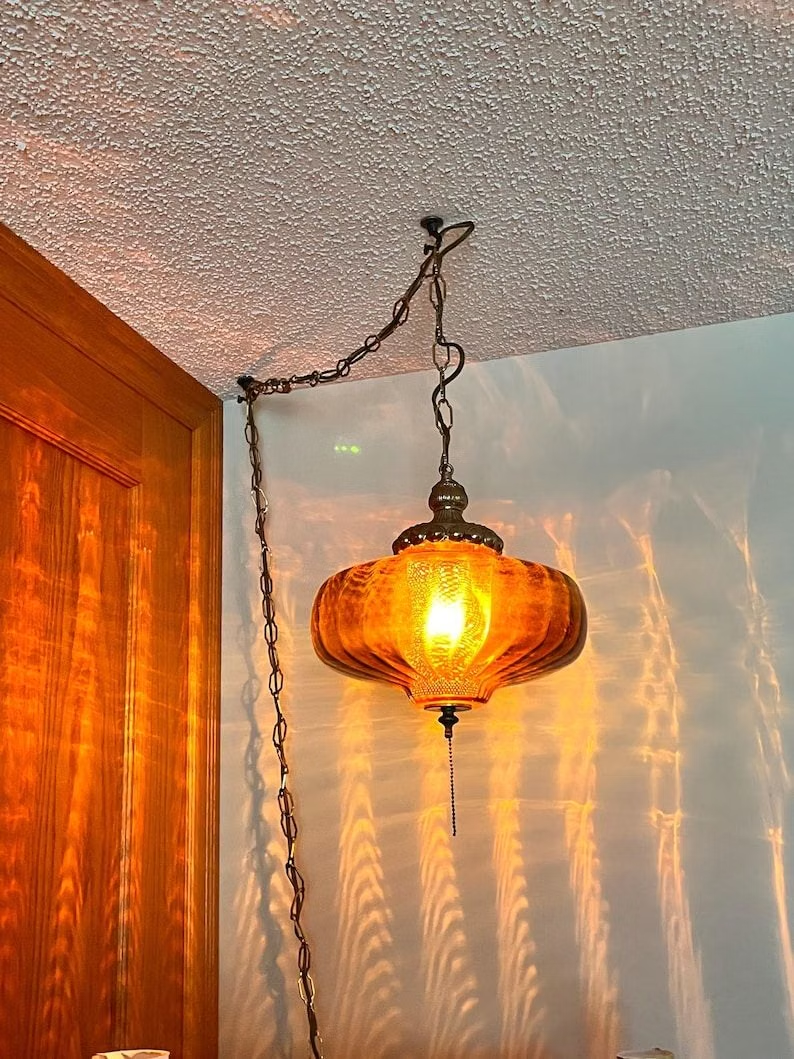
![molded plywood lounge chair detail photograph - [Nathan Martell] : Layup Chair - Chair, Lounge](../../moodboards/mid-century-modern/11-inspiration-molded-plywood-chair.avif)
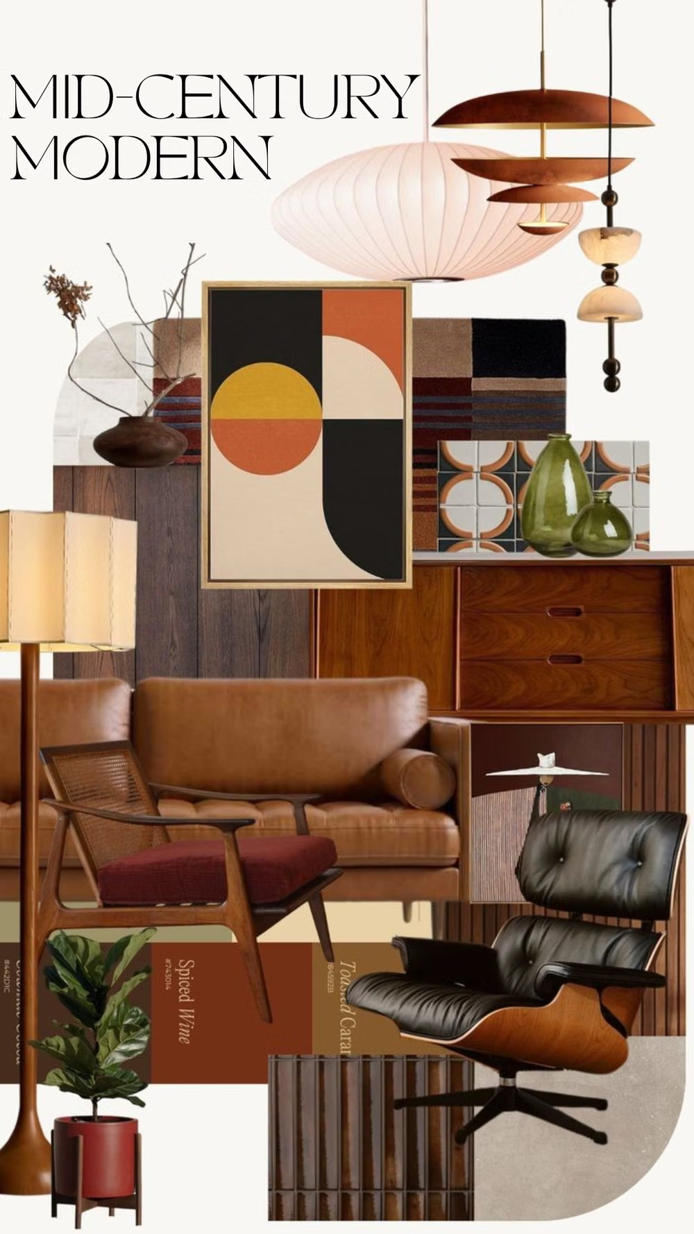
Mid-Century Modern UI design style
Clean geometry, warm muted colors, humanist illustration, functional layouts, and optimistic postwar simplicity.