Streamline Moderne UI design style
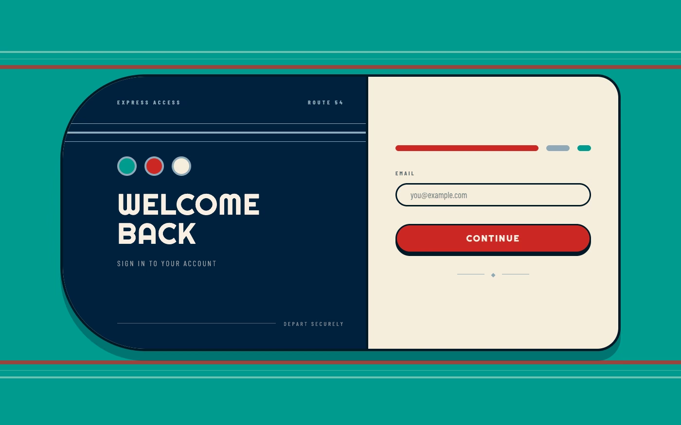
Aerodynamic curves, horizontal bands, chrome, rounded corners, and machine-age speed simplify Art Deco ornament.
Design overview
- Signature elements
- aerodynamic curves, horizontal speed lines, rounded corners, chrome accents, ocean-liner forms, machine-age simplicity
- Best suited to
- Travel, automotive, hospitality, appliances, retro technology, and transport-inspired brands.
- Layout principles
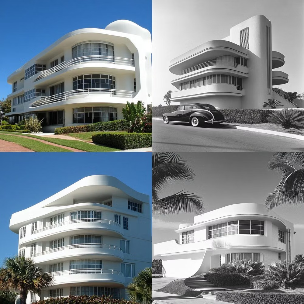
- Emphasize long horizontal bands, rounded leading edges, and streamlined section flow that makes the interface feel like a vessel moving forward.
History and origins
A fact-checked account of where this visual language came from, with links to the references used.
- Period
- 1930s–early 1940s
- Origin
- Industrial design and architecture in the United States and Europe
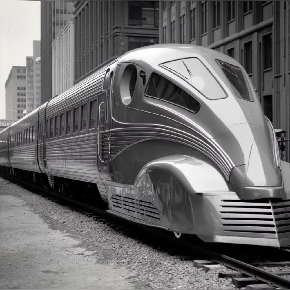
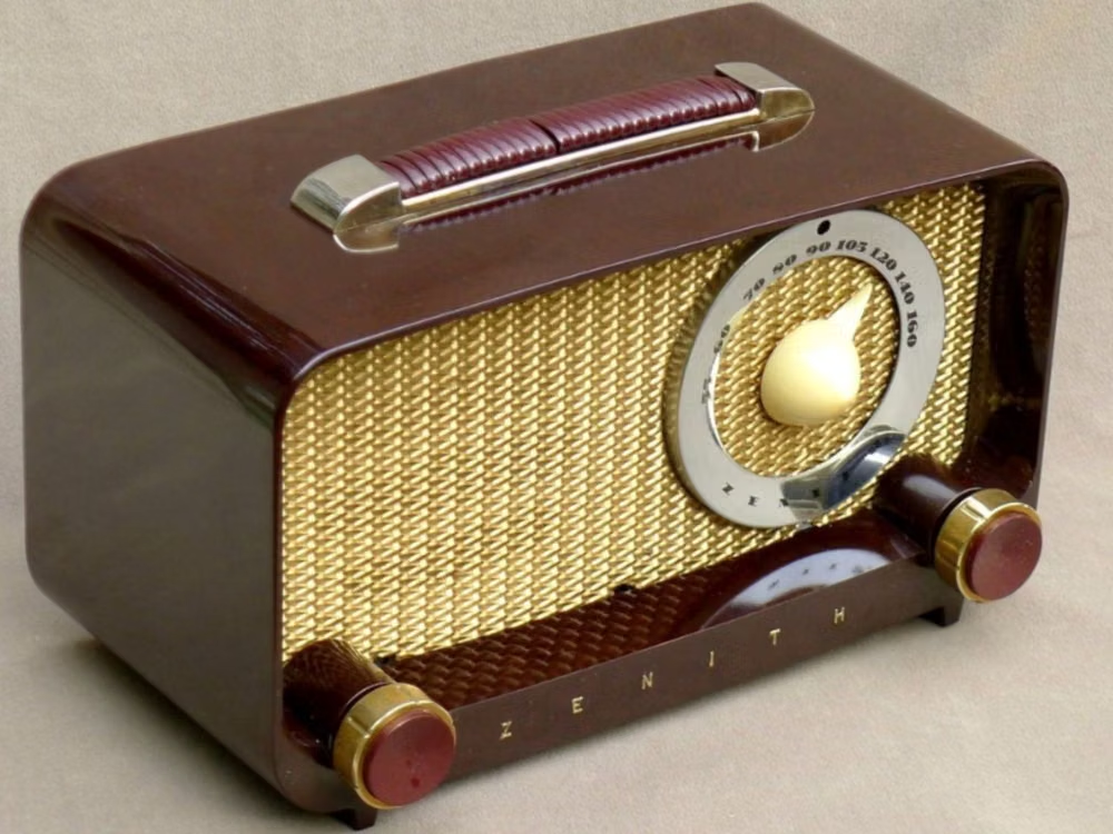
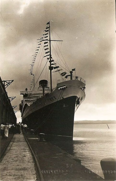
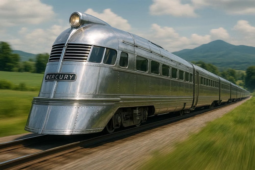
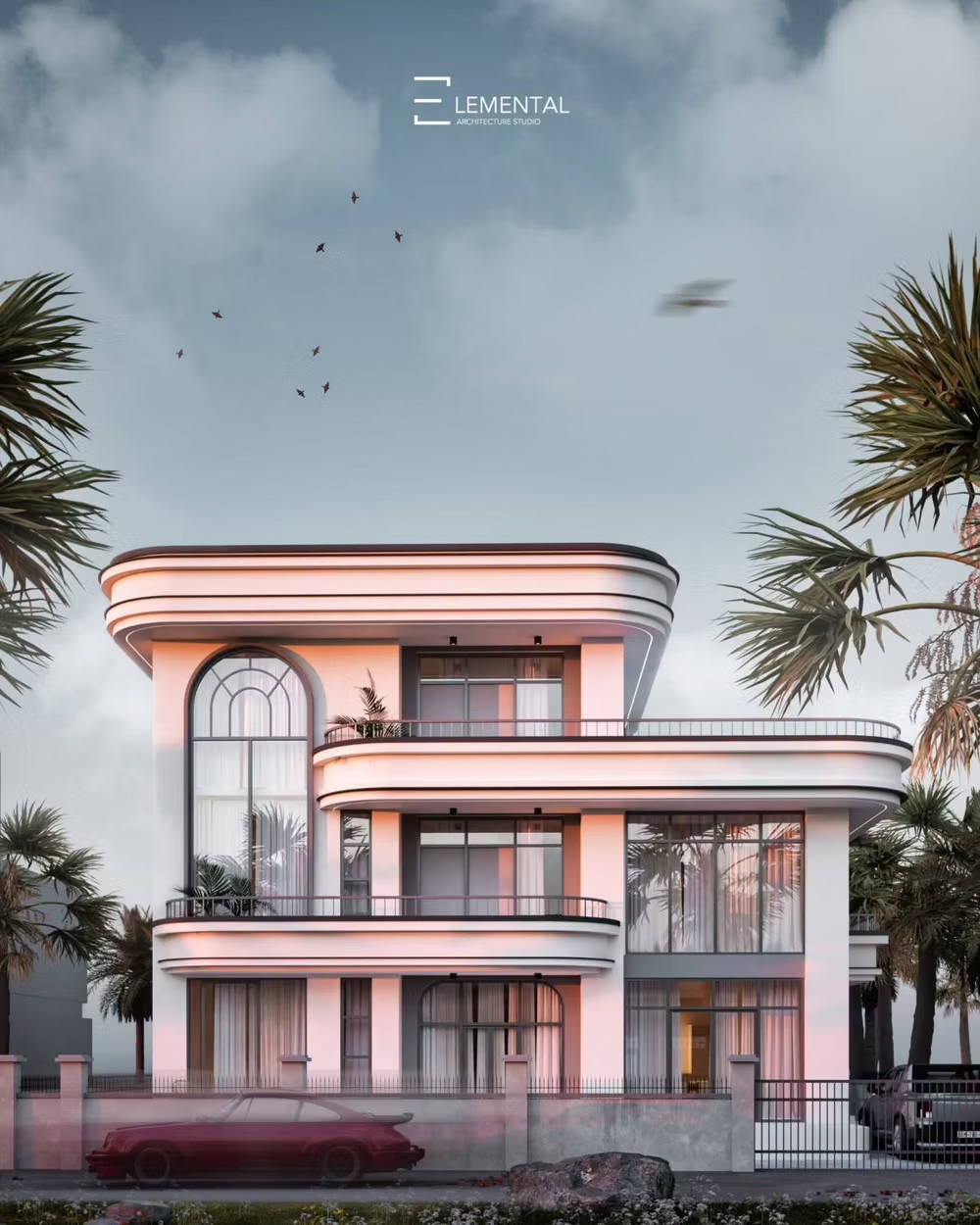
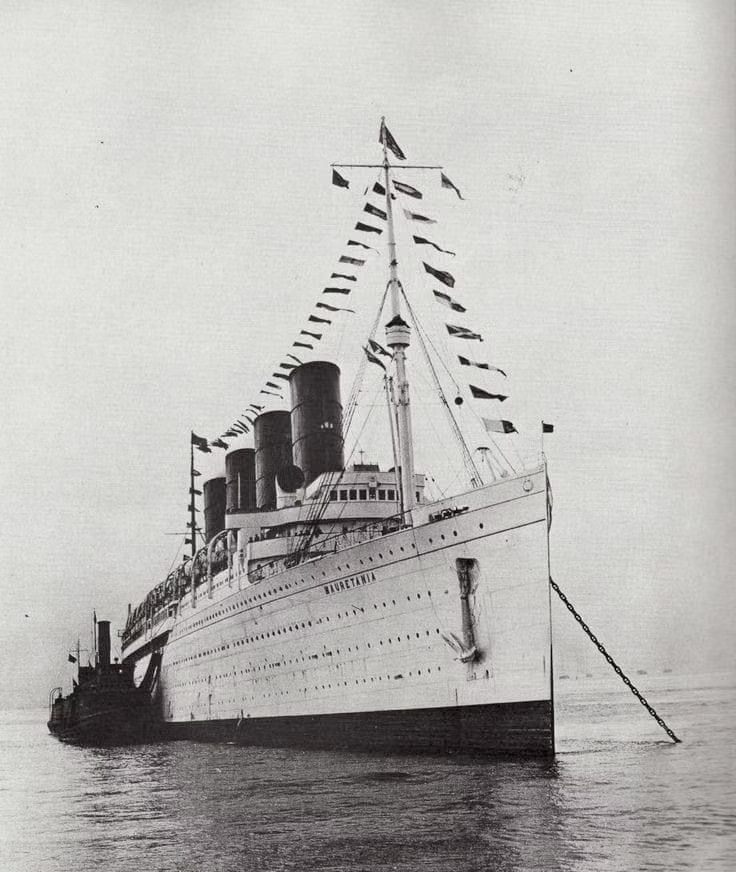
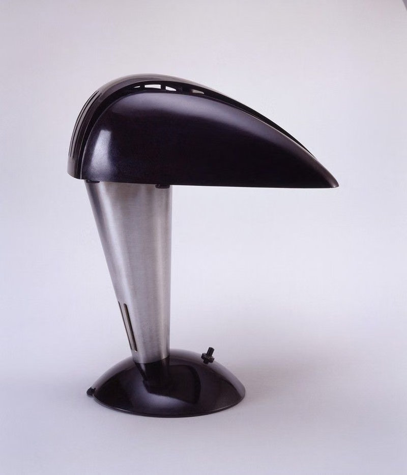
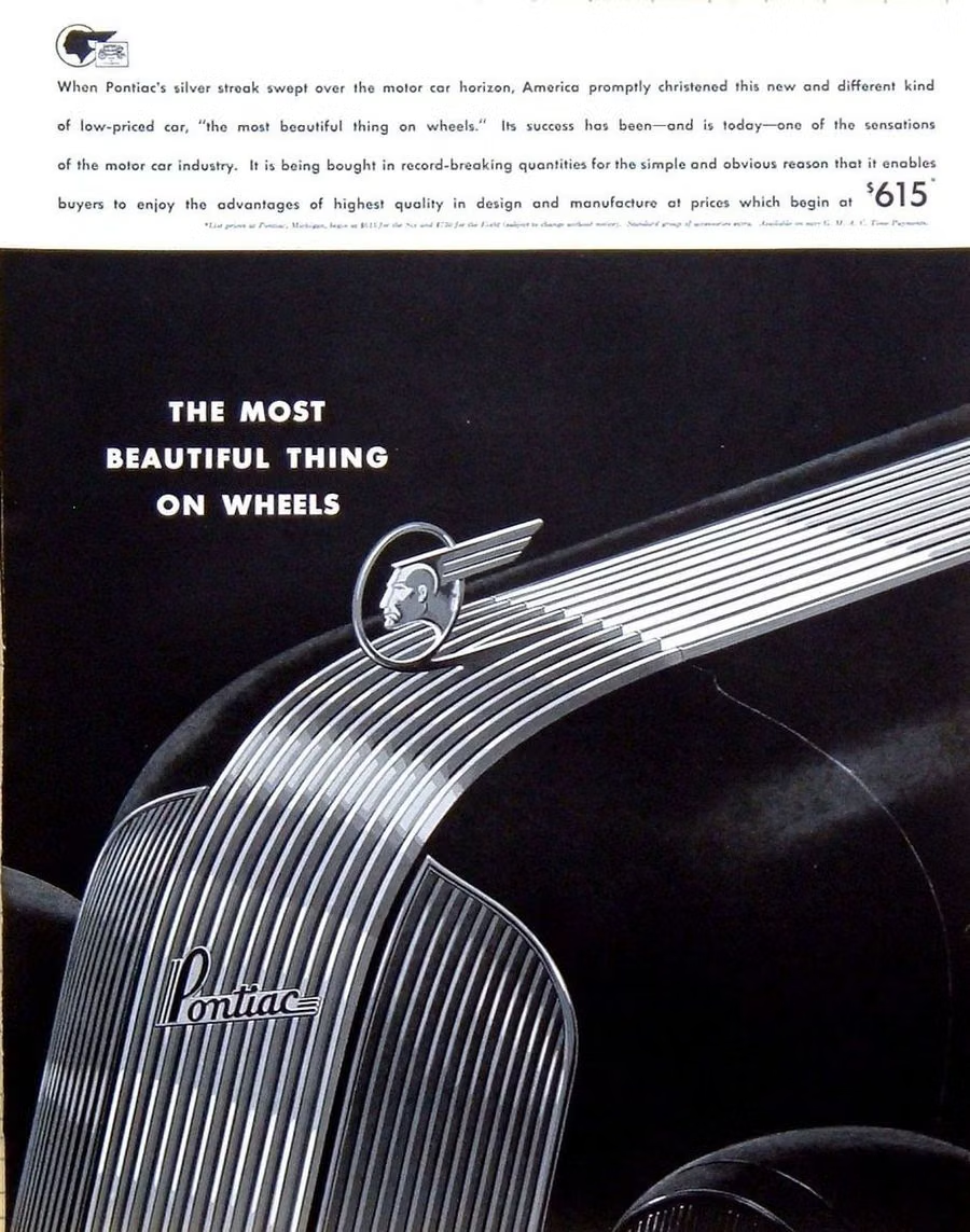
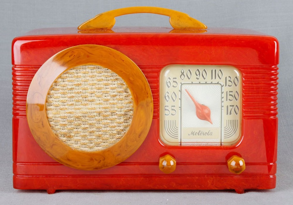
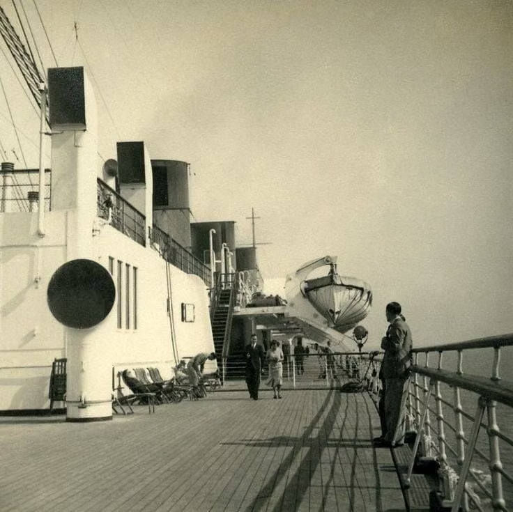
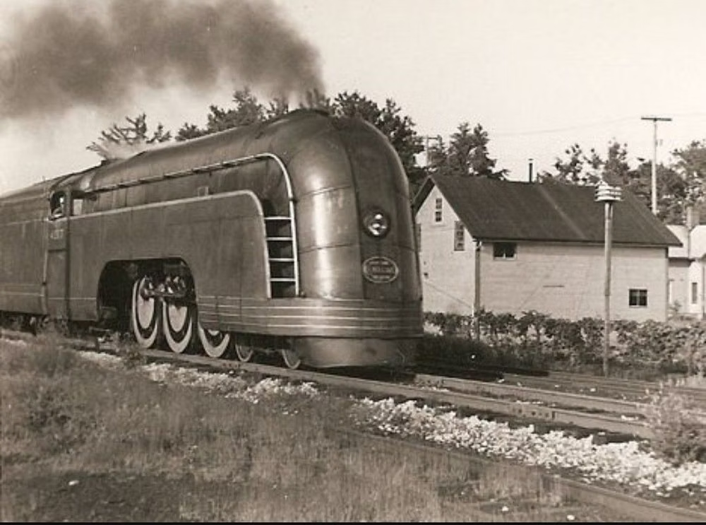
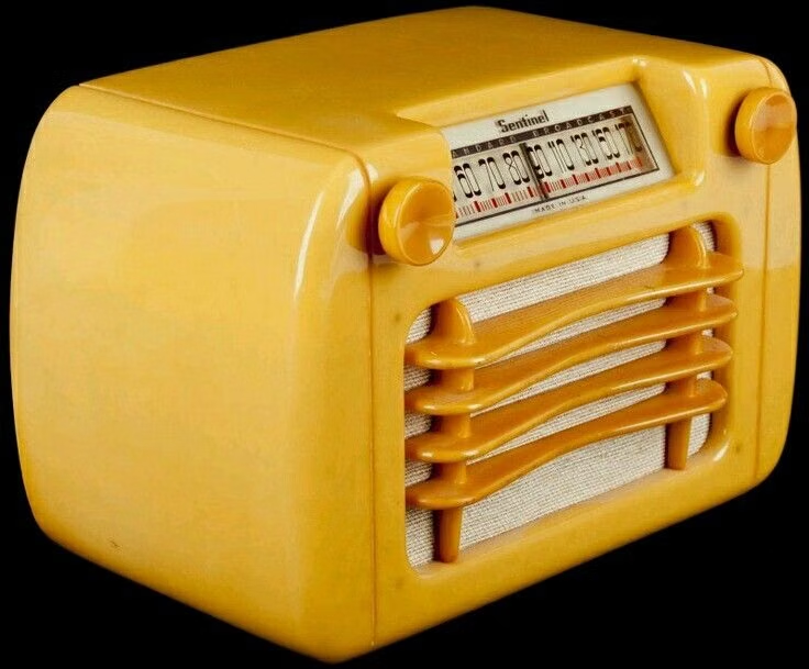
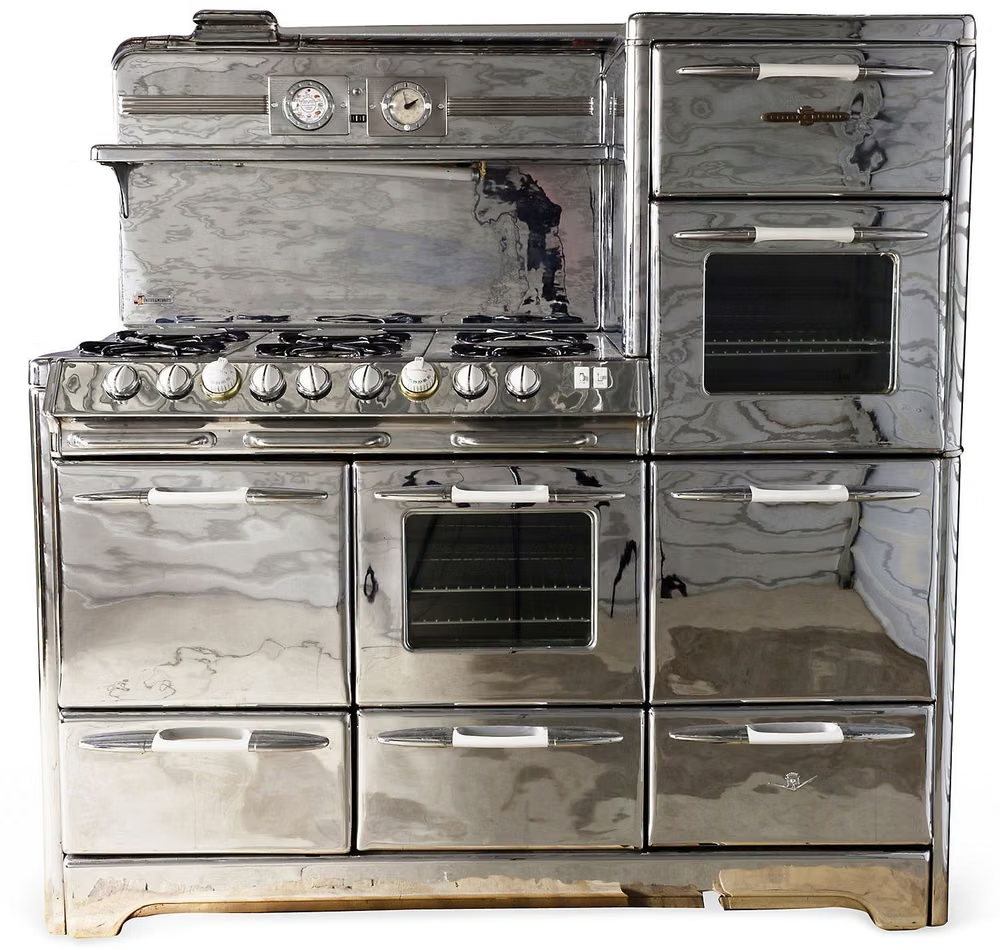
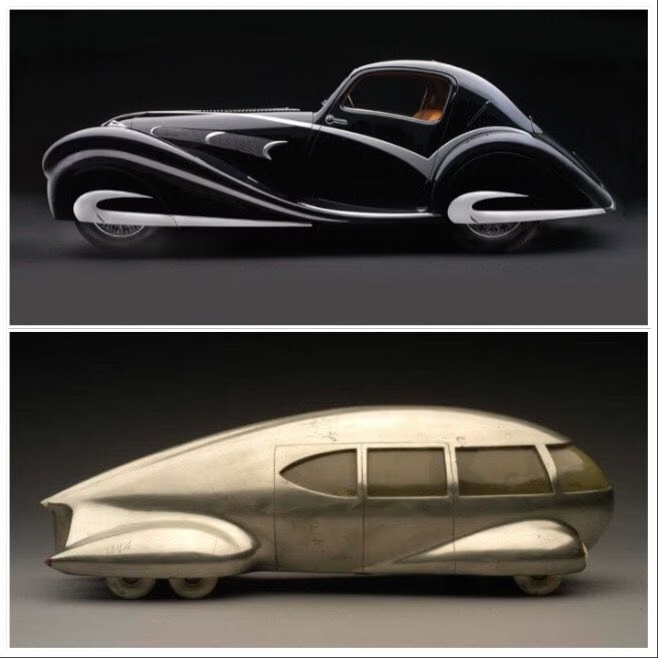
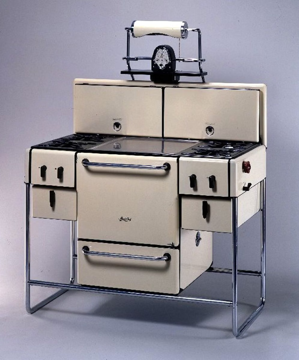
Streamline Moderne was the machine-age, aerodynamic branch of late Art Deco. Designers translated research and imagery from aircraft, ships, trains, and wind tunnels into rounded corners, horizontal bands, smooth shells, and chrome details—even for stationary products—and the style reached a mass audience at fairs such as the 1939–1940 New York World’s Fair.
Moodboard and visual references
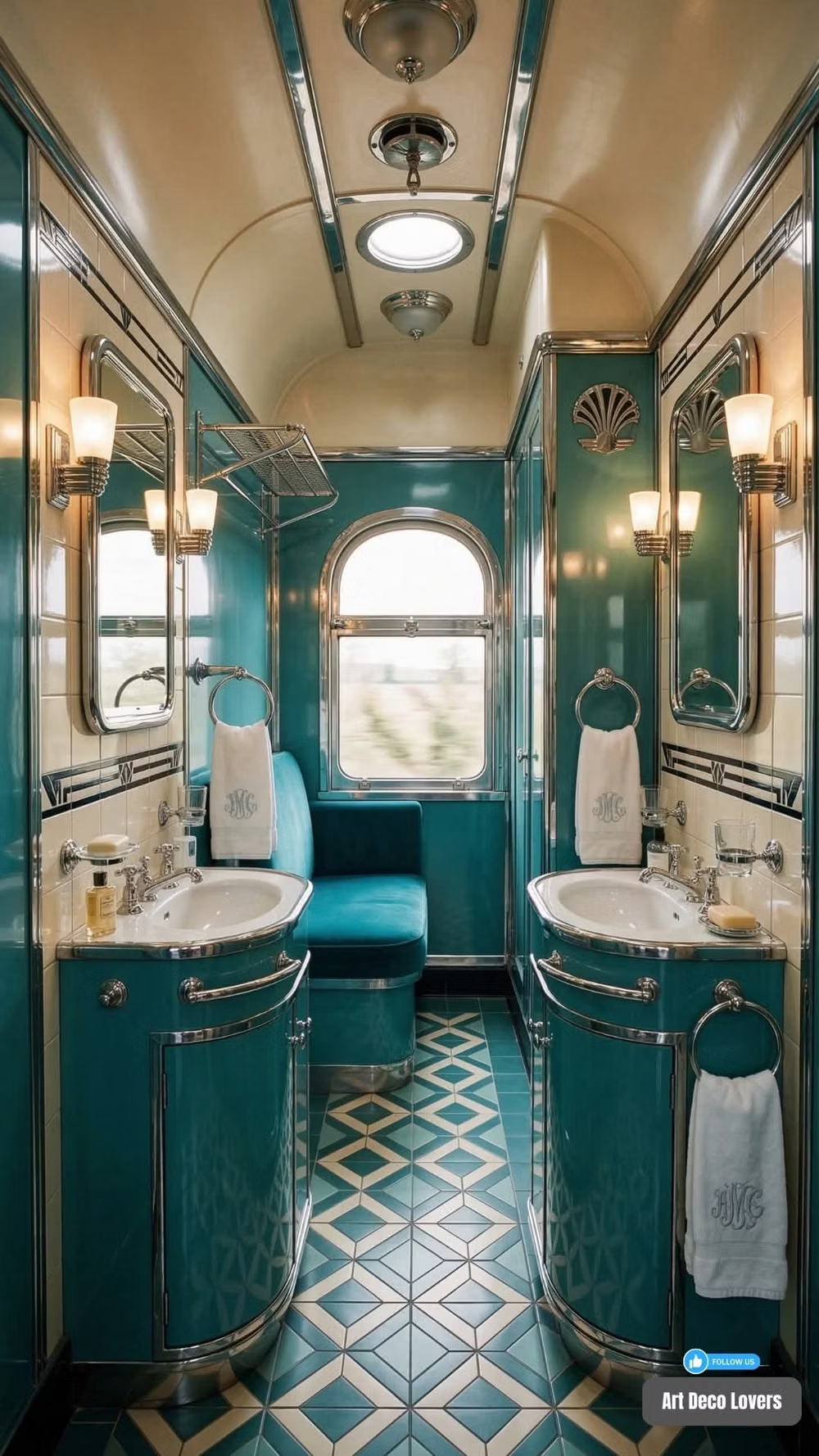
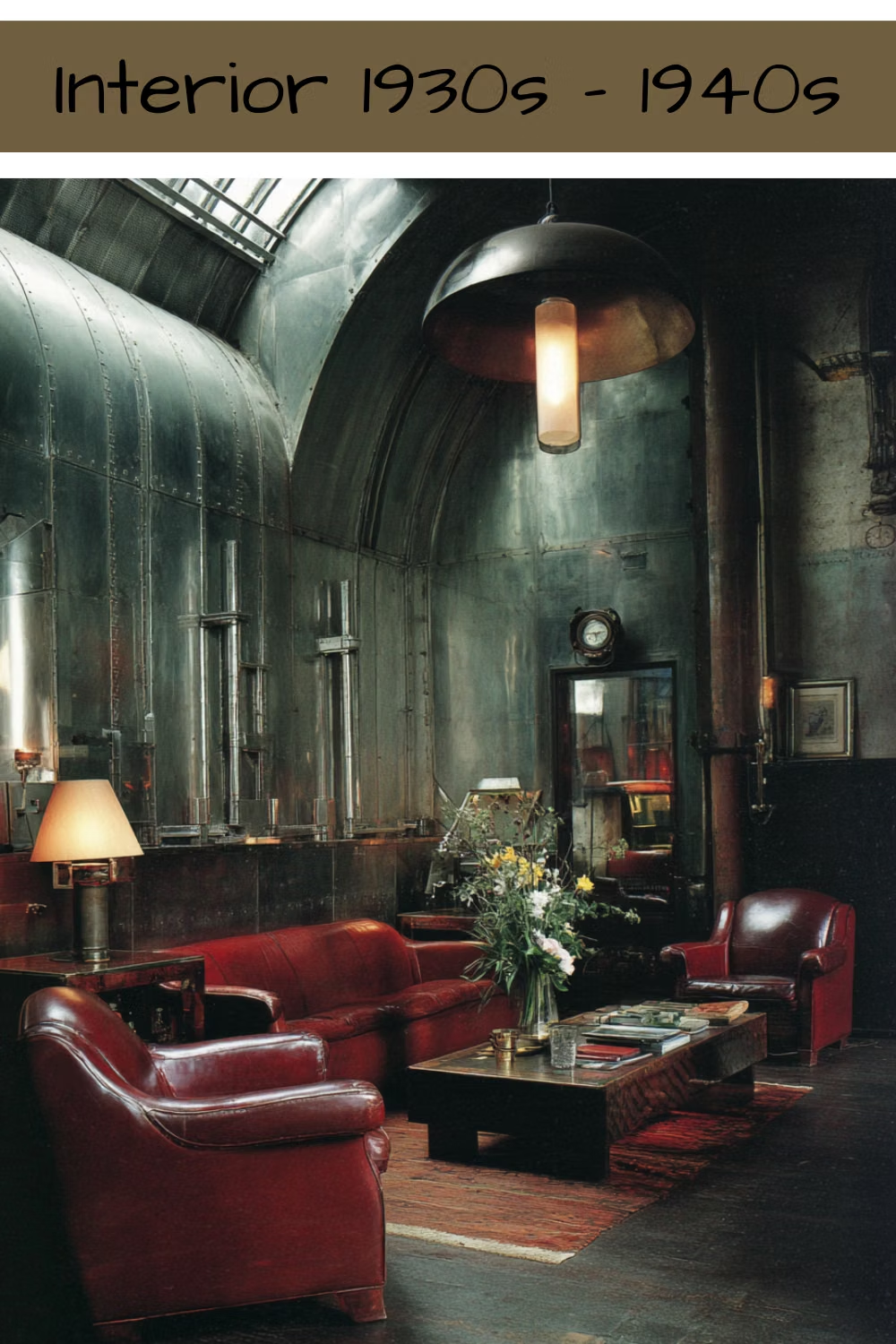
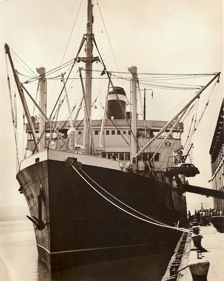
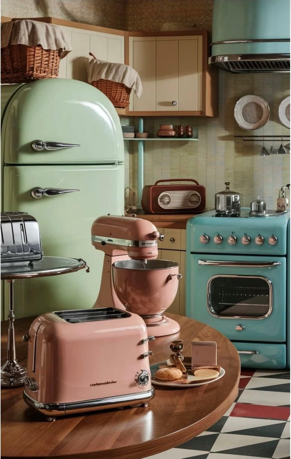
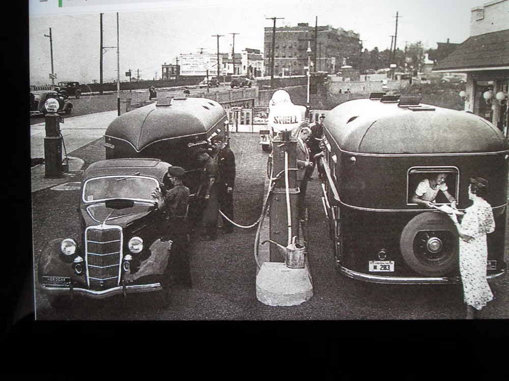
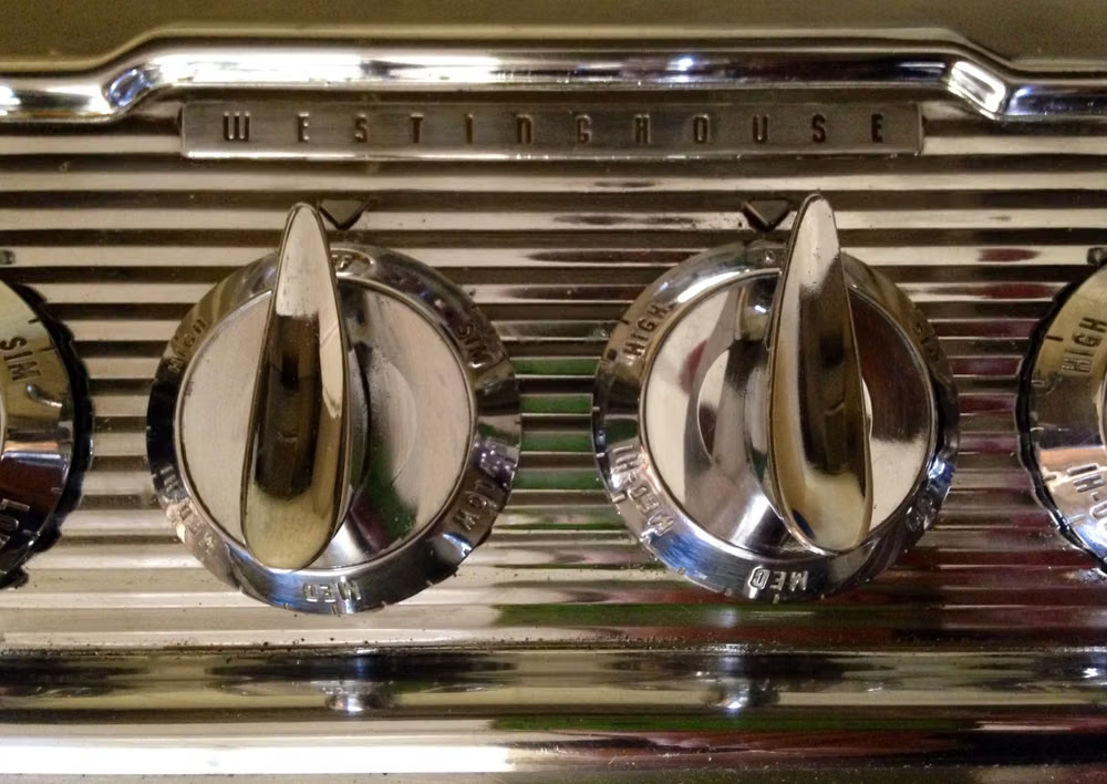
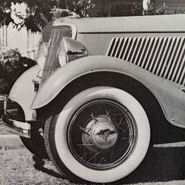
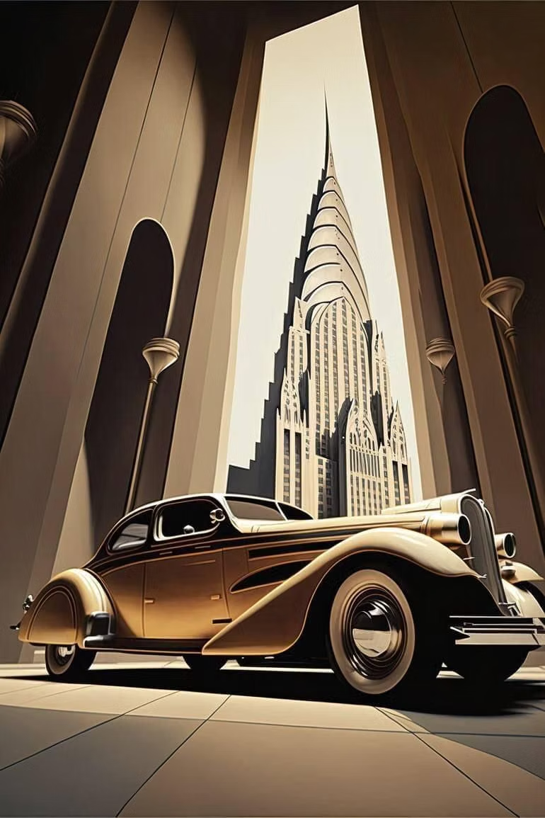
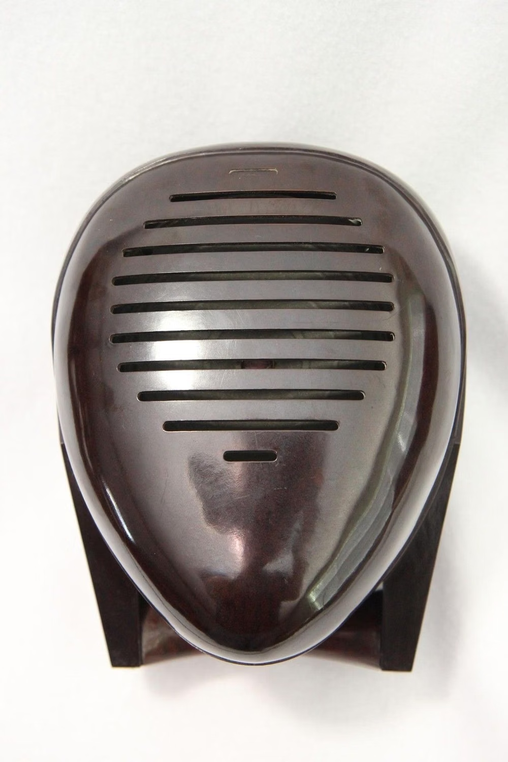
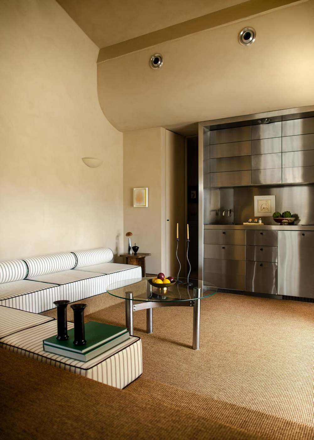
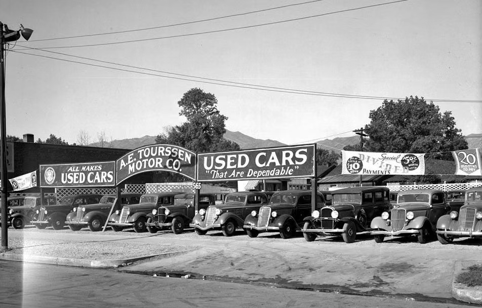
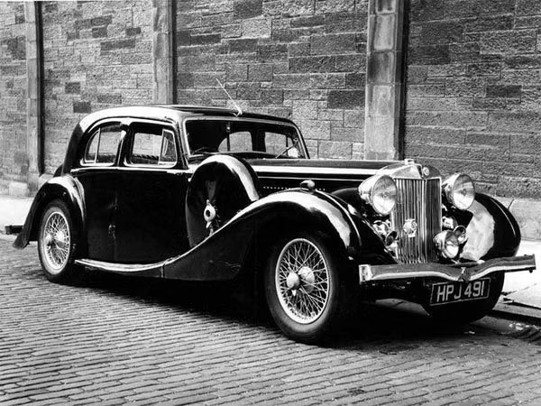
A visual study of the forms, inspirations, materials, colors, type, and cultural references associated with this UI design style.
Design principles and implementation
Use these principles to write a focused AI UI design prompt instead of asking for a vague visual treatment.
Color direction
Use cream, navy, sea green, signal red, and polished chrome, with restrained gradients that suggest enamel, speed, and machinery. In a daisyUI theme, use navy or sea green for `primary`, signal red for `secondary`, and assign cream, pale silver, and cool light gray to `base-100`, `base-200`, and `base-300`.
Imagery direction
Choose ocean liners, trains, automobiles, terminals, appliances, and aerodynamic industrial details photographed or illustrated from low sweeping angles.
Content density
Use medium density arranged in long horizontal groups, keeping vertical clutter low and prioritizing routes, features, or destinations.
Motion direction
Glide panels laterally, trail restrained speed lines, and sweep highlights along curved surfaces with smooth constant acceleration.
Shape language
Favor aerodynamic capsules, horizontal ribs, portholes, rounded corners, teardrops, and chrome bands stripped of ornate Deco detail. In daisyUI themes, set the `--radius-*` variables between `0.75rem` and `1.5rem`.
Typography rules
Use a streamlined geometric or condensed sans-serif with broad horizontal spacing, keeping labels compact and aligned to the motion bands.
Suggested Typfaces
Righteous
Fresh daisies glow in warm sunlight
Fresh daisies glow in warm sunlight
1 2 3 4 5 6 7 8 9 0
Audiowide
Fresh daisies glow in warm sunlight
Fresh daisies glow in warm sunlight
1 2 3 4 5 6 7 8 9 0
Josefin Sans
Fresh daisies glow in warm sunlight
Fresh daisies glow in warm sunlight
1 2 3 4 5 6 7 8 9 0
Barlow Condensed
Fresh daisies glow in warm sunlight
Fresh daisies glow in warm sunlight
1 2 3 4 5 6 7 8 9 0
Poiret One
Fresh daisies glow in warm sunlight
Fresh daisies glow in warm sunlight
1 2 3 4 5 6 7 8 9 0
Build a Streamline Moderne interface with daisyUI
The live example translates this direction into daisyUI components and semantic theme tokens.
To generate a full page in the same visual language, give the style name and the design rules above to Blueprint MCP.
Related UI design styles
Compare nearby visual languages that share typography, shapes, use cases, or signature elements.
Jet Age Optimism UI design style
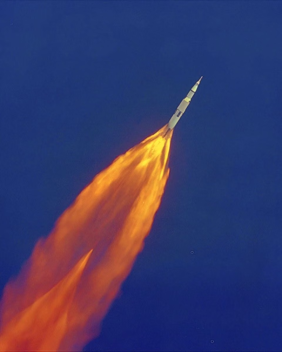
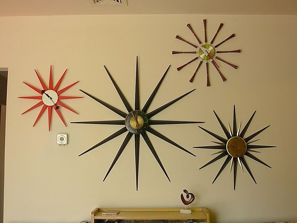
Postwar futurism combines boomerangs, starbursts, atoms, parabolas, sweeping curves, neon, chrome, and exuberant technological optimism.

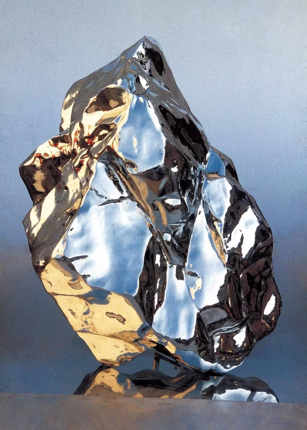
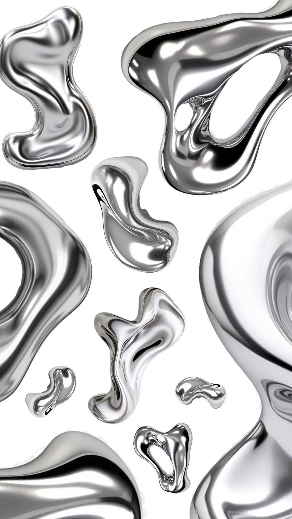
Chrome / Liquid Metal UI design style
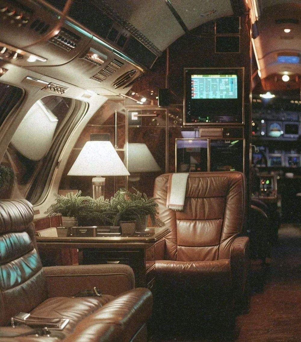
Mirror-like metallic surfaces, molten forms, sharp reflections, and high-contrast specular lighting.
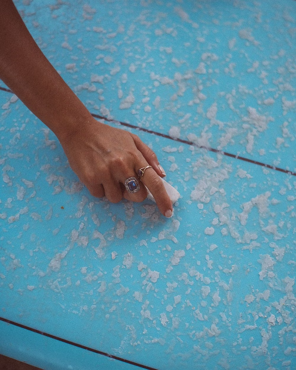
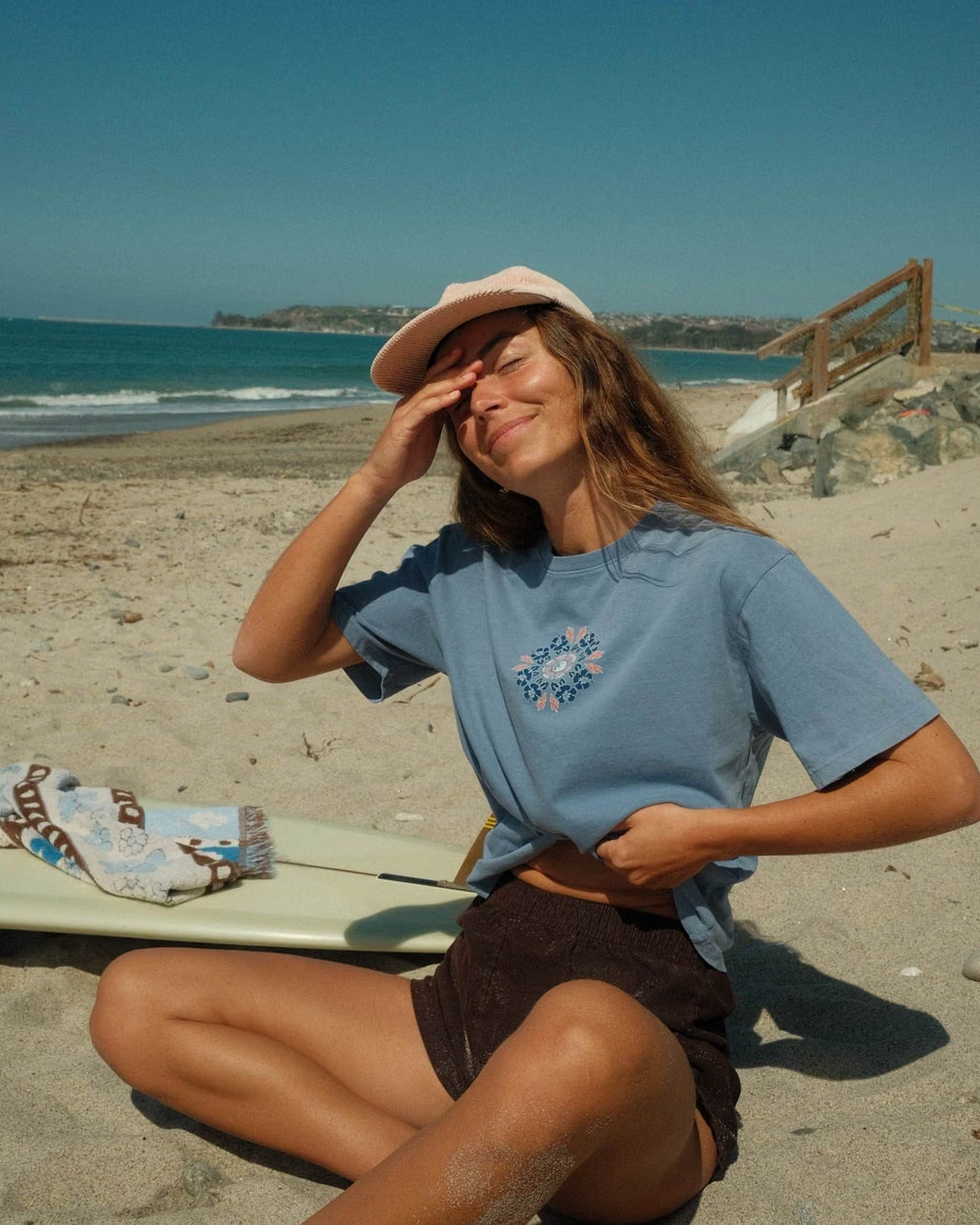
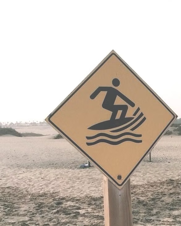
Surf Crush UI design style
The 1999–2008 surf-media craze combines sunlit ocean photography, boards, Hawaiian prints, puka shells, hibiscus flowers, beach hair, and youthful coastal freedom.