Surf Crush UI design style
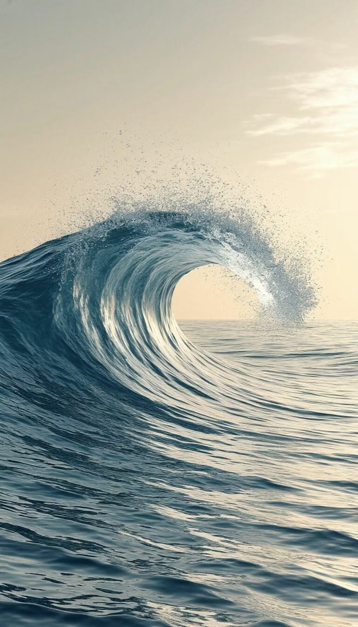
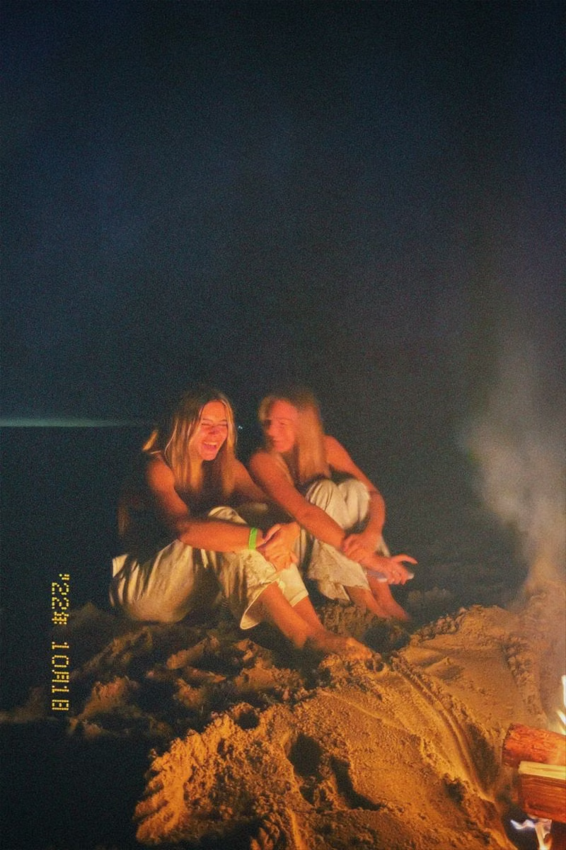
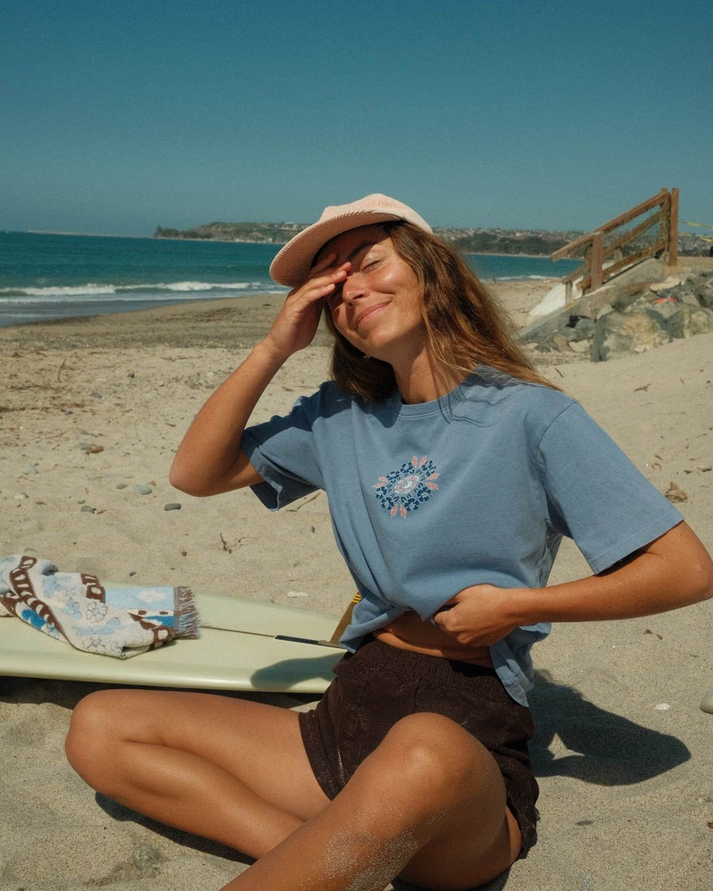
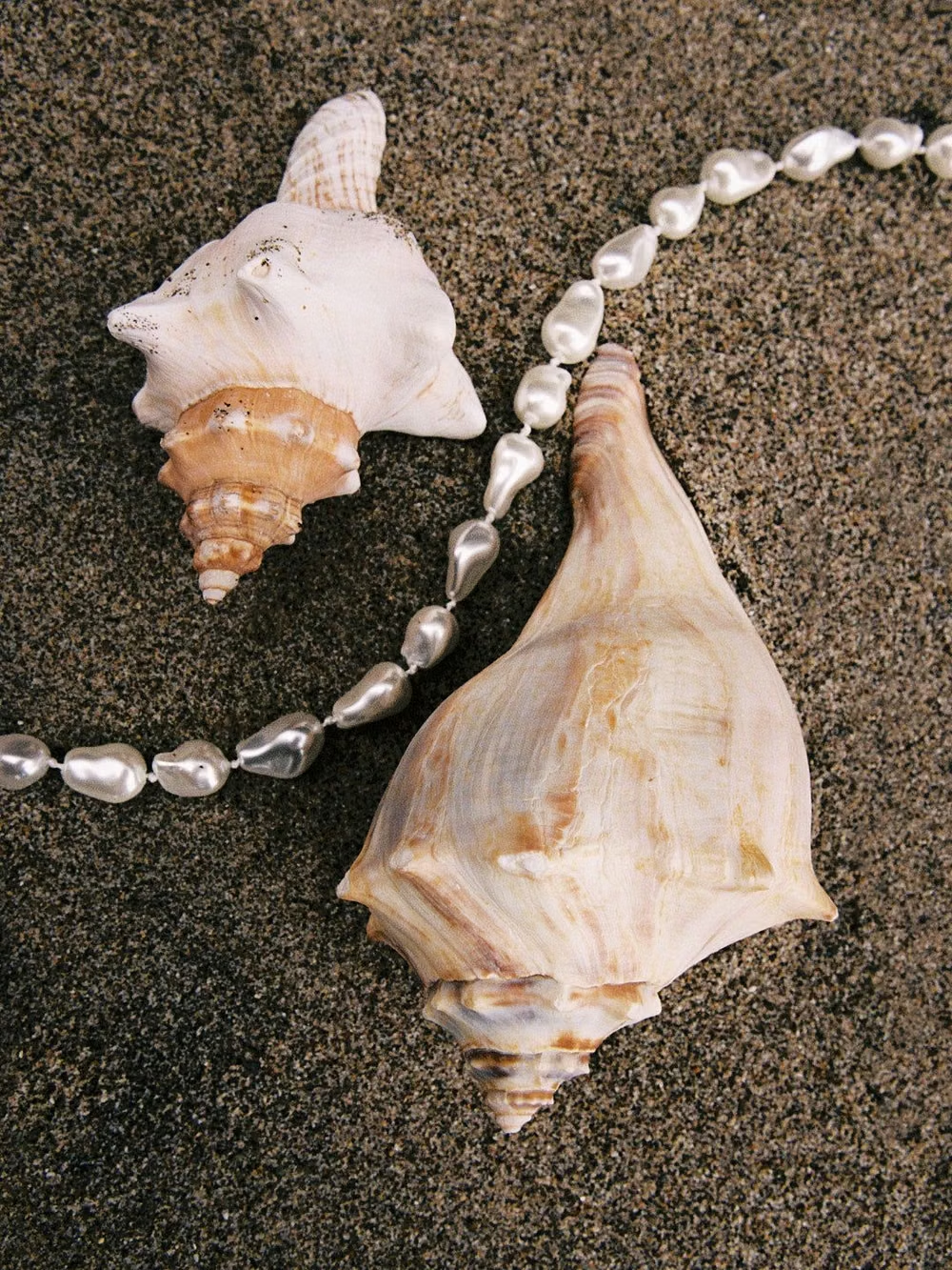
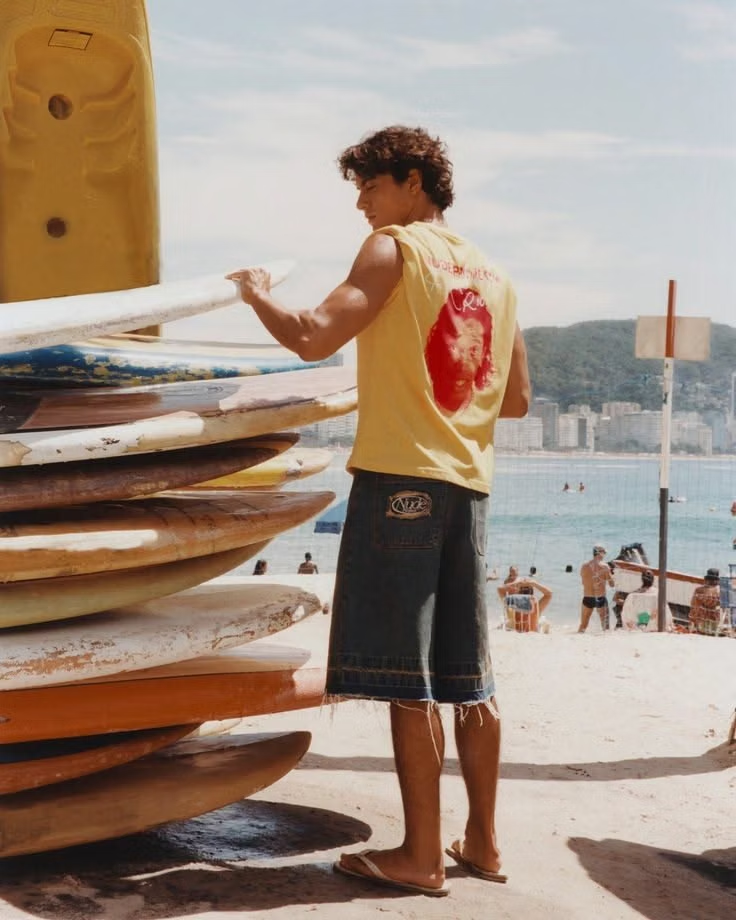
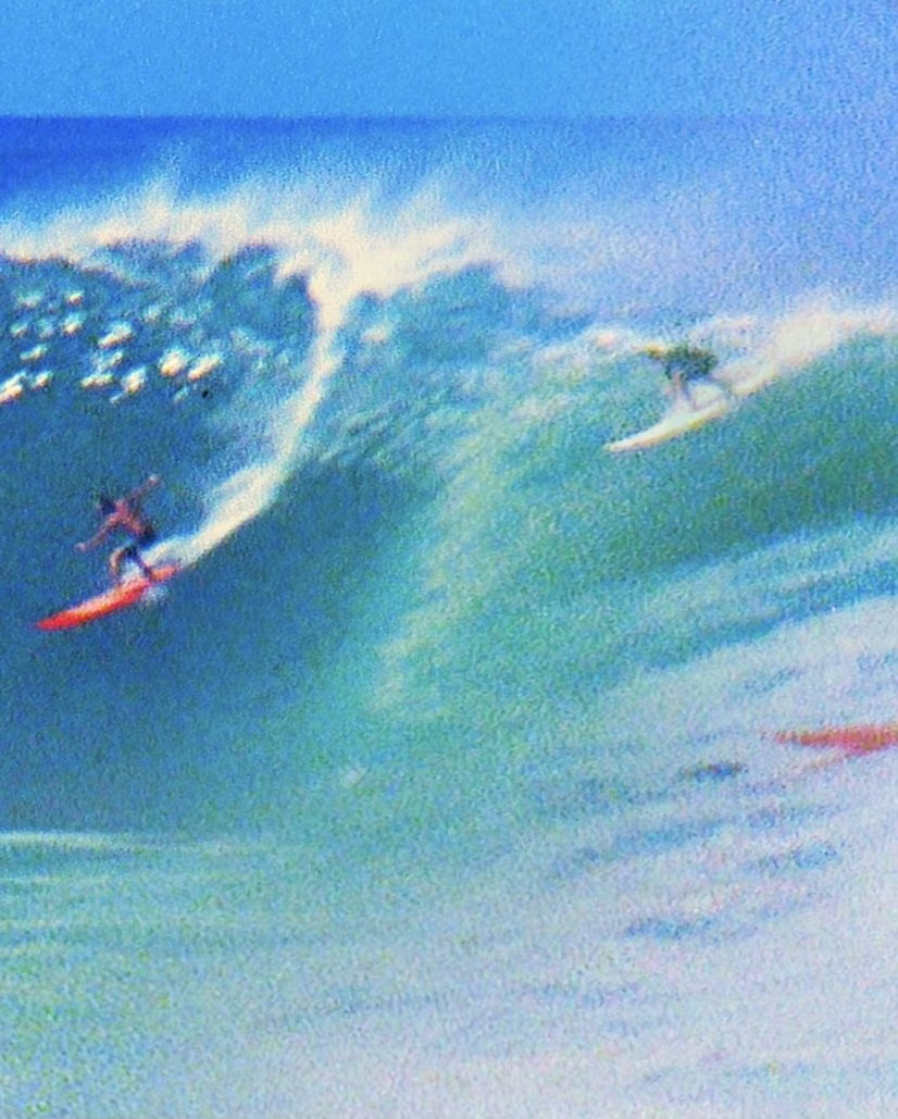
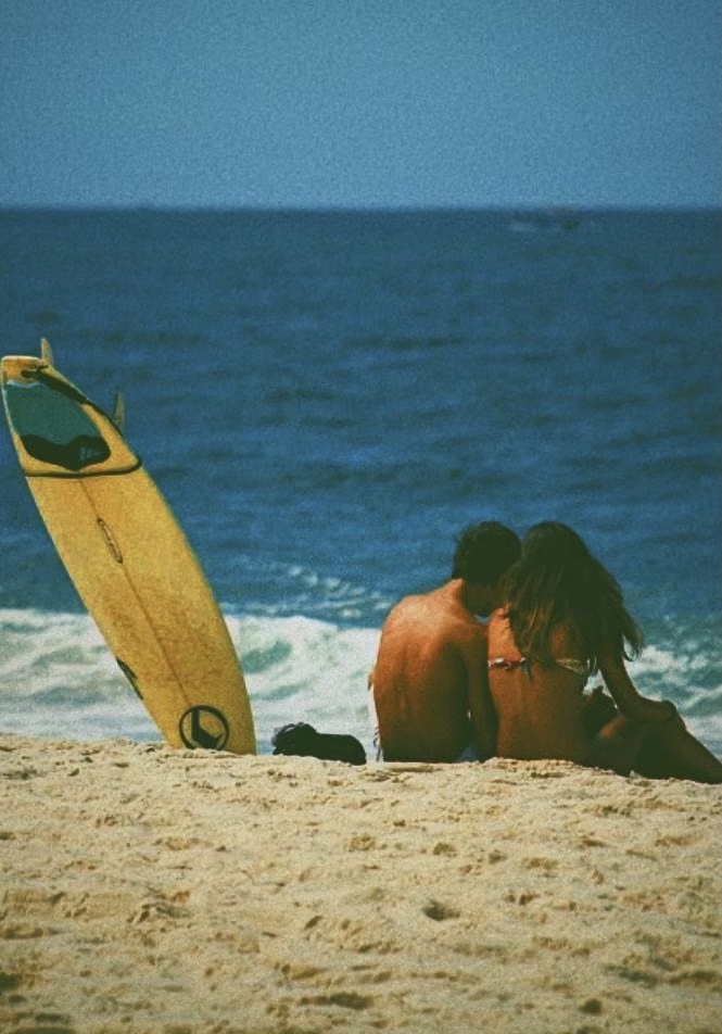
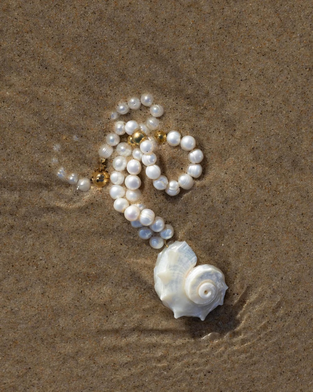
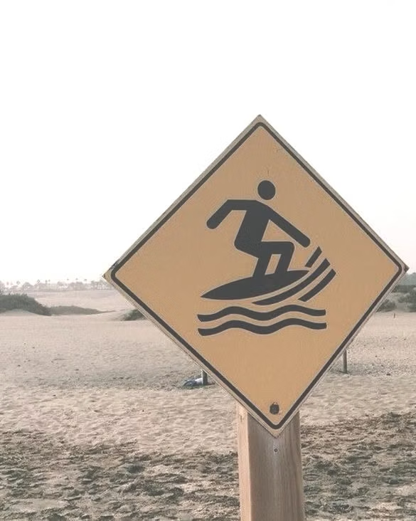
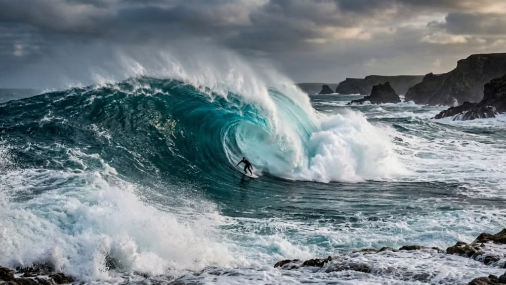
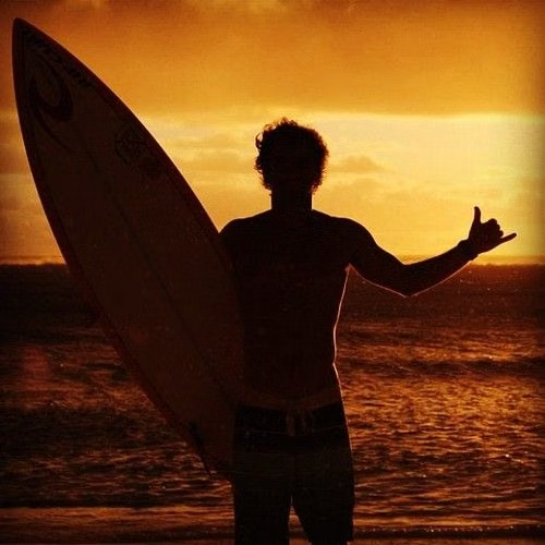
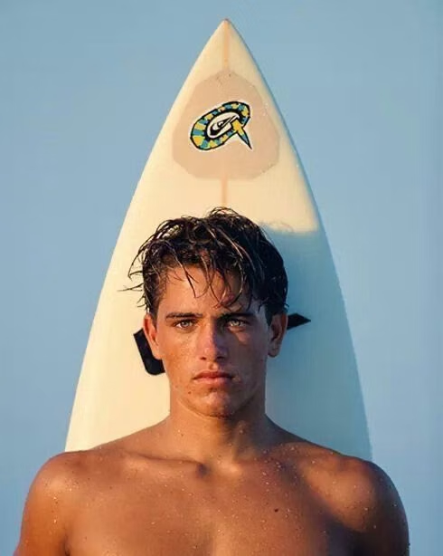
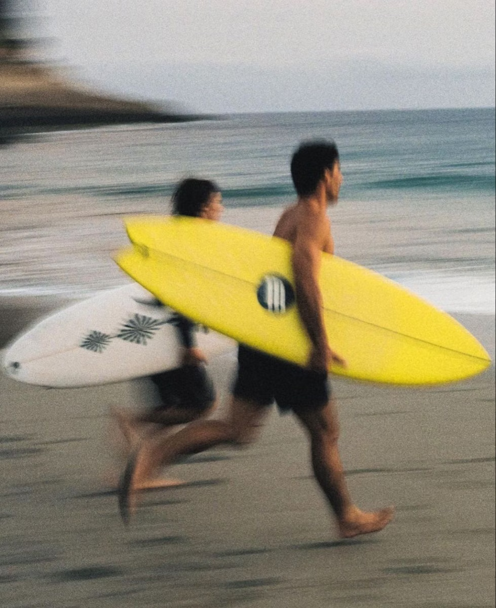
The 1999–2008 surf-media craze combines sunlit ocean photography, boards, Hawaiian prints, puka shells, hibiscus flowers, beach hair, and youthful coastal freedom.
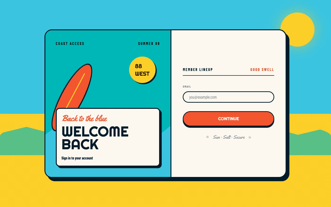
Design overview
- Signature elements
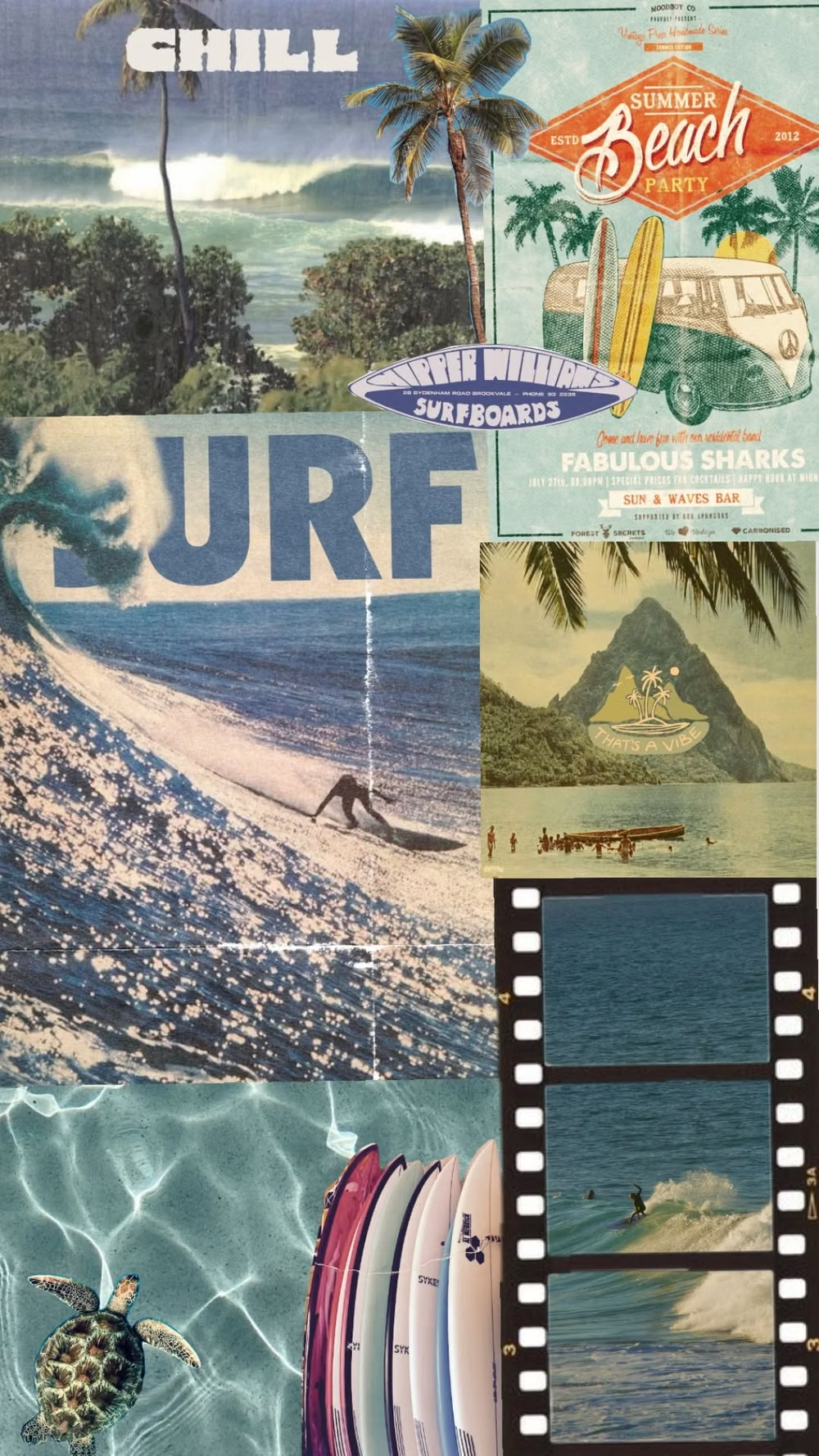
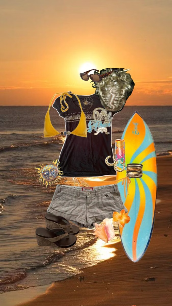
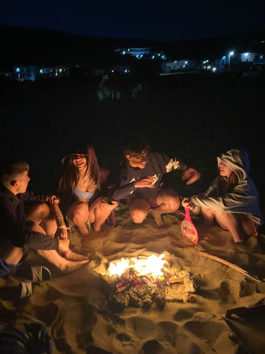
- surfboards and curling waves, Hawaiian and hibiscus prints, puka shells, sun-bleached photography, surfwear logos, beach bonfire ephemera. In daisyUI themes, set `--noise: 1;`.
- Best suited to
- Travel, swim and surf brands, sports, summer events, youth entertainment, hospitality, and coastal lifestyle products.
- Layout principles
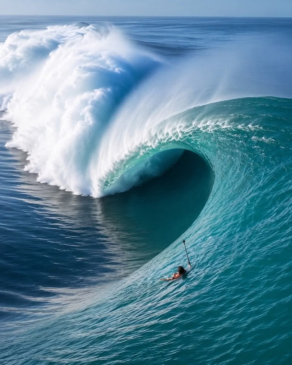
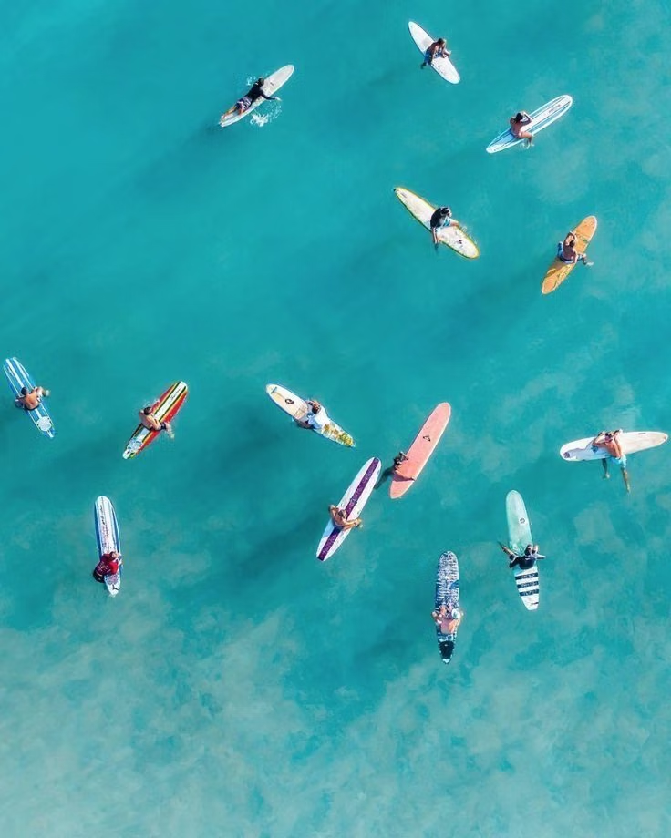
- Build a magazine-like coastal spread from panoramic wave or group photography, diagonal board shapes, layered snapshots, and sticker-style badges, placing logistics on clear sunlit bands.
History and origins
A fact-checked account of where this visual language came from, with links to the references used.
- Period
- Approximately 1999–2008 as source material; named retrospectively in 2018
- Origin
- Early-2000s surf fashion, youth television, film, and beach lifestyle marketing
Surf Crush is a retrospective label for the hibiscus prints, turquoise water, puka shells, board shorts, and sunlit beach branding common around the turn of the millennium. Community histories place its source period around 1999–2008 and attribute the name to Steves Peeps in 2018, so it should be read as a later archive category rather than an original industry term.
Moodboard and visual references
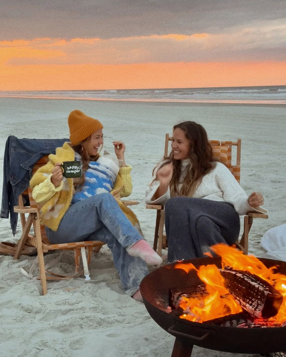
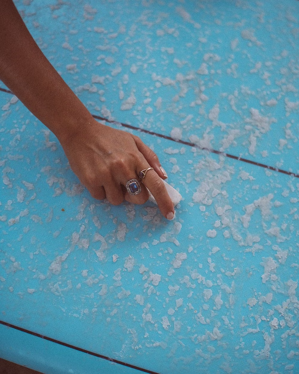
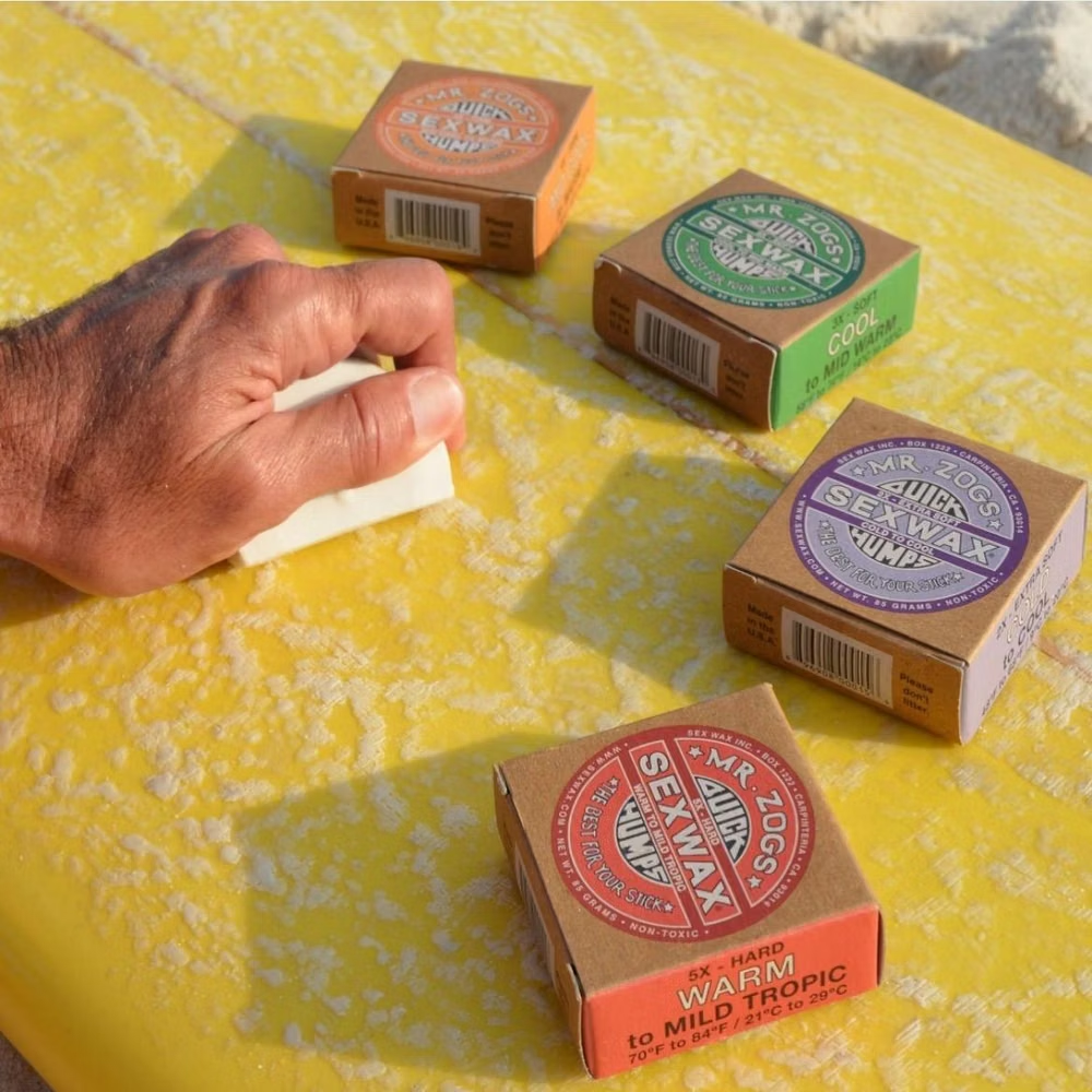
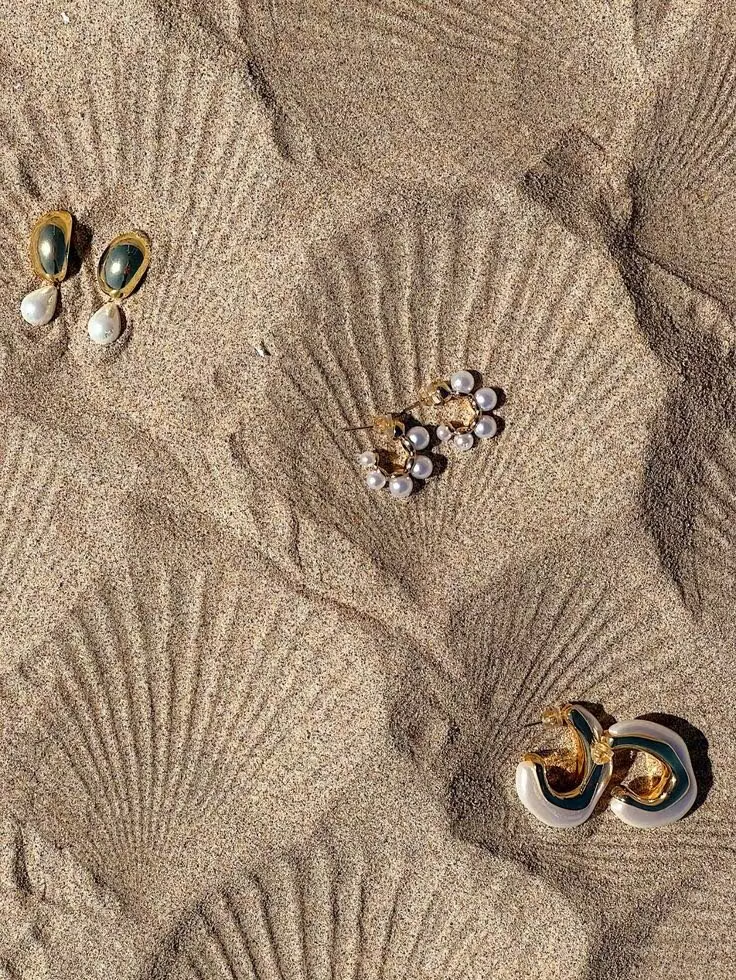
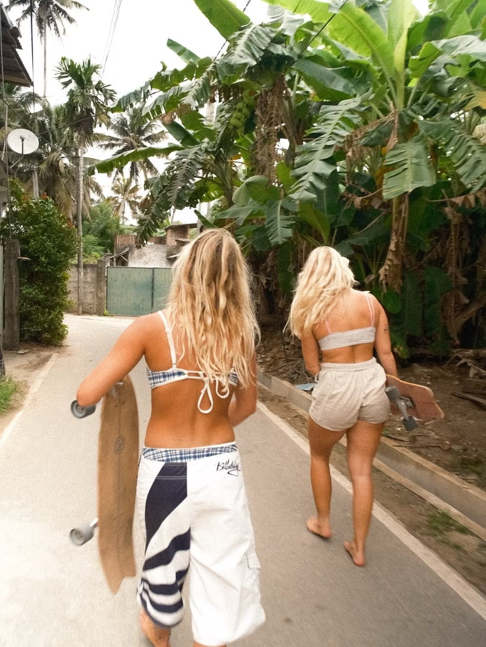
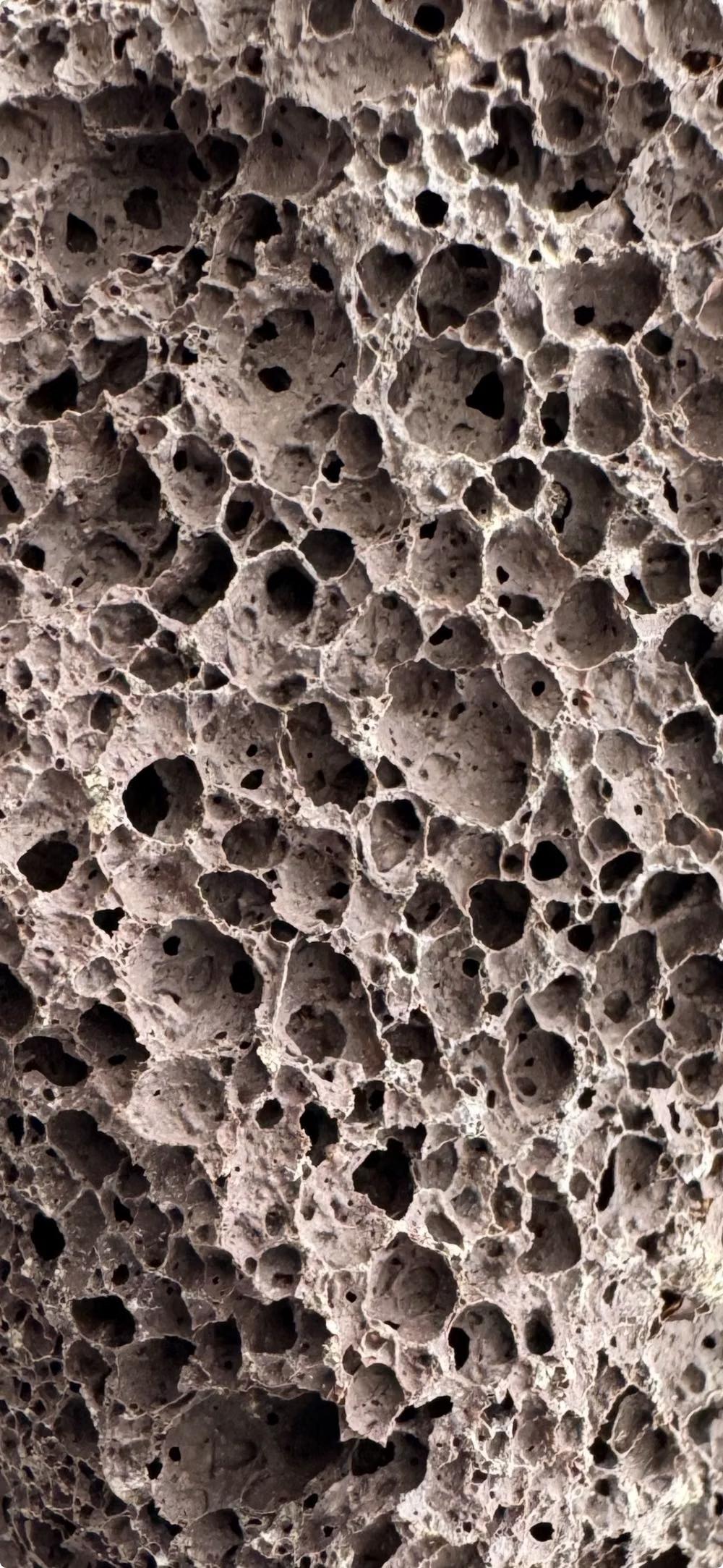
A visual study of the forms, inspirations, materials, colors, type, and cultural references associated with this UI design style.
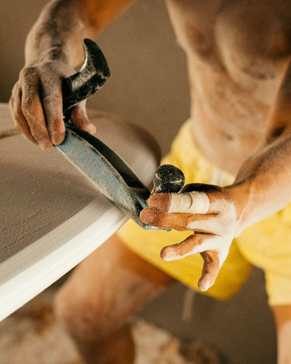
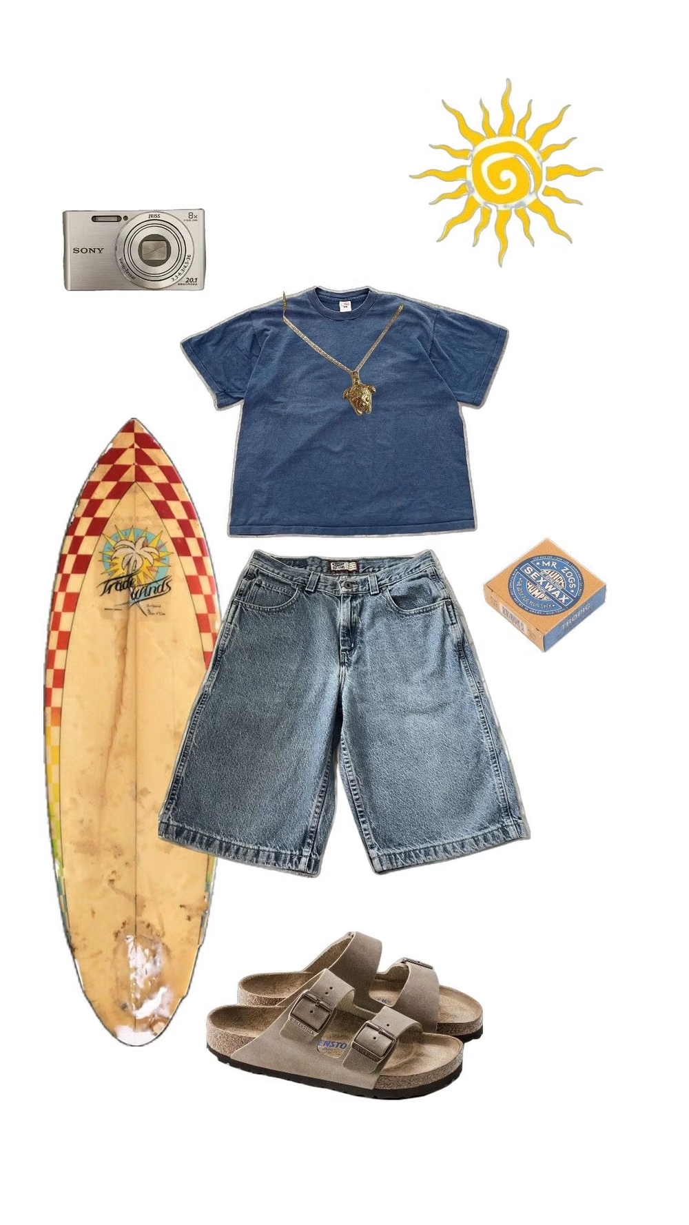
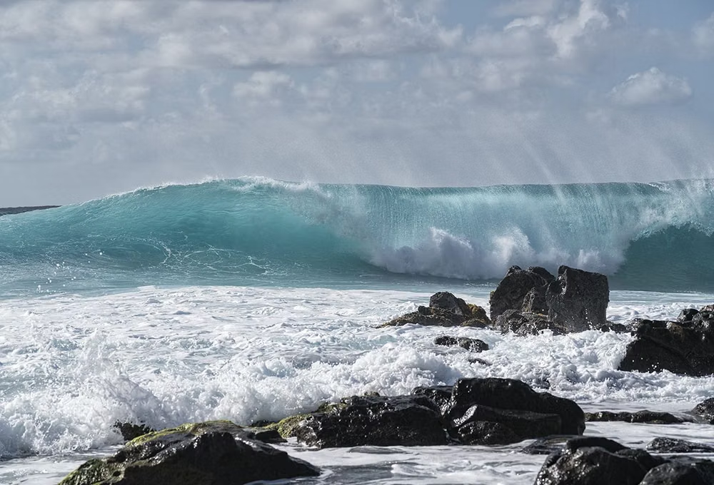
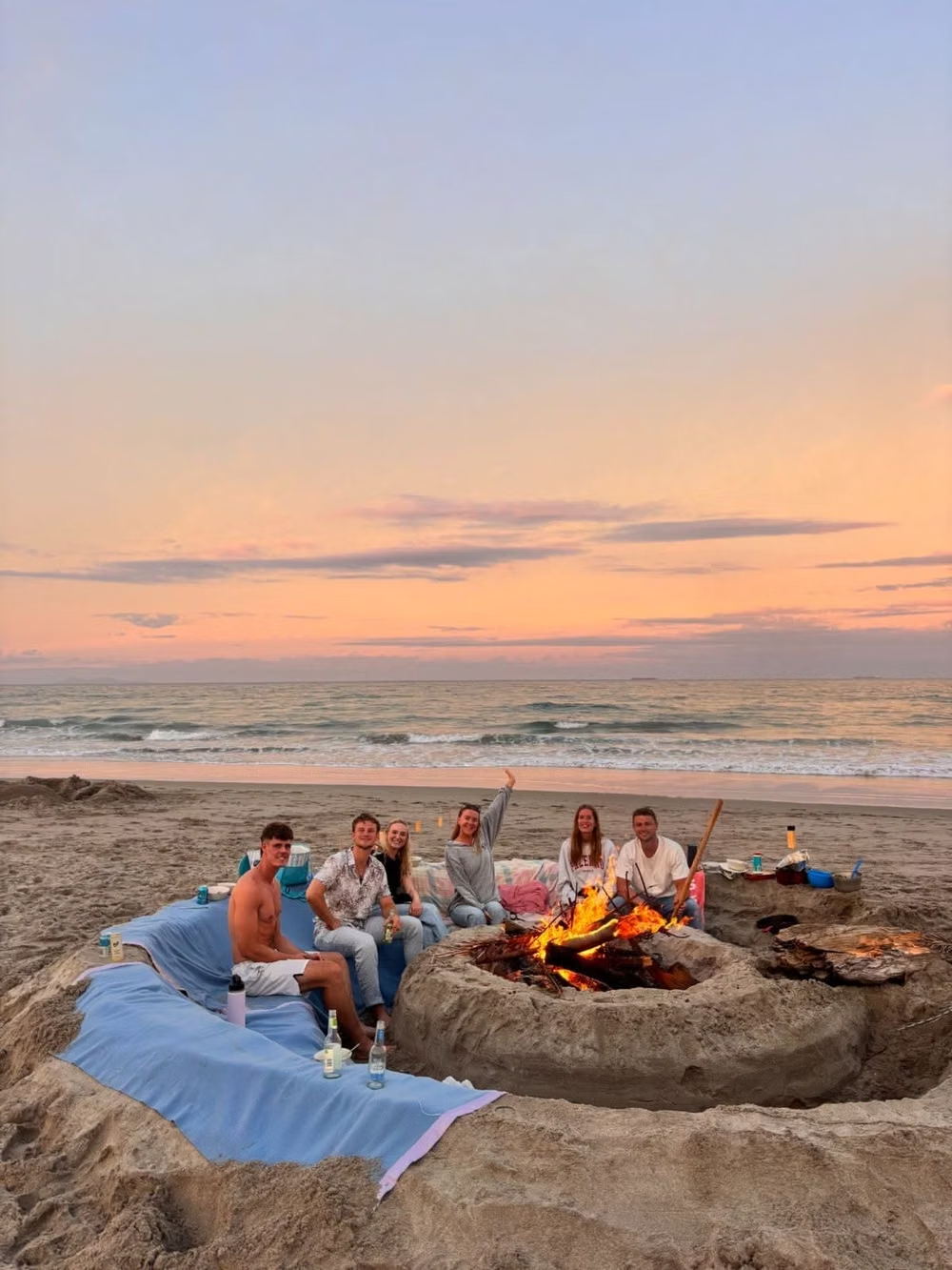
Design principles and implementation
Use these principles to write a focused AI UI design prompt instead of asking for a vague visual treatment.
Color direction
Use ocean blue, aqua, sun yellow, hibiscus orange or pink, sand, tan, and white under bright natural daylight, avoiding both muted nautical restraint and sugary coquette pastels. In a daisyUI theme, use ocean blue or aqua for `primary`, hibiscus orange or sun yellow for `secondary`, and set `base-100`, `base-200`, and `base-300` to white, sunlit sand, and pale tan.
Imagery direction
Show active surfing, swimming, volleyball, friend groups, boards, shells, beach hair, bonfires, palm-lined shores, and period surfwear with an honest outdoor snapshot quality.
Content density
Keep visual density lively and copy moderate, giving schedules, locations, conditions, products, and booking actions uncluttered contrast over the beach imagery.
Motion direction
Sweep sections like breaking waves, slide boards and snapshots into place, flutter fabric patterns, and use brief sun glints or water ripples without turning the scene into a tropical screensaver.
Shape language
Use long surfboard ovals, curling wave arcs, hibiscus silhouettes, shells, sunbursts, torn photo edges, and repeating boardshort patterns. In daisyUI themes, set the `--radius-*` variables between `0.75rem` and `1.5rem`.
Typography rules
Combine chunky surfwear sans-serif or hand-painted display lettering with a relaxed readable body face, using scripts only as short sun-faded accents.
Suggested Typfaces
Permanent Marker
Fresh daisies glow in warm sunlight
Fresh daisies glow in warm sunlight
1 2 3 4 5 6 7 8 9 0
Barlow Condensed
Fresh daisies glow in warm sunlight
Fresh daisies glow in warm sunlight
1 2 3 4 5 6 7 8 9 0
Righteous
Fresh daisies glow in warm sunlight
Fresh daisies glow in warm sunlight
1 2 3 4 5 6 7 8 9 0
Nunito Sans
Fresh daisies glow in warm sunlight
Fresh daisies glow in warm sunlight
1 2 3 4 5 6 7 8 9 0
Yellowtail
Fresh daisies glow in warm sunlight
Fresh daisies glow in warm sunlight
1 2 3 4 5 6 7 8 9 0
Build a Surf Crush interface with daisyUI
The live example translates this direction into daisyUI components and semantic theme tokens.
To generate a full page in the same visual language, give the style name and the design rules above to Blueprint MCP.
Related UI design styles
Compare nearby visual languages that share typography, shapes, use cases, or signature elements.
Biophilic Design UI design style
Nature-centered interfaces use organic shapes, botanical imagery, earthy colors, natural textures, and gentle motion.
2K1 UI design style
This 2001–2004 transitional pop-cultural look mixes late-Y2K clarity with dirtier hip-hop, sports, nu-metal, teen-comedy, and early-McBling attitude.
Gen-X Soft Club UI design style
Late-1990s and early-2000s urban futurism softens Y2K gloss through muted color, minimalist typography, blurred photography, and a sterile-meets-organic mood.