UrBling UI design style
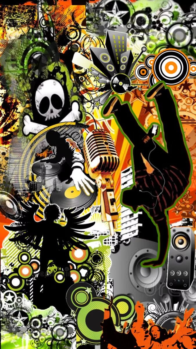
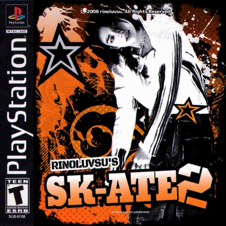
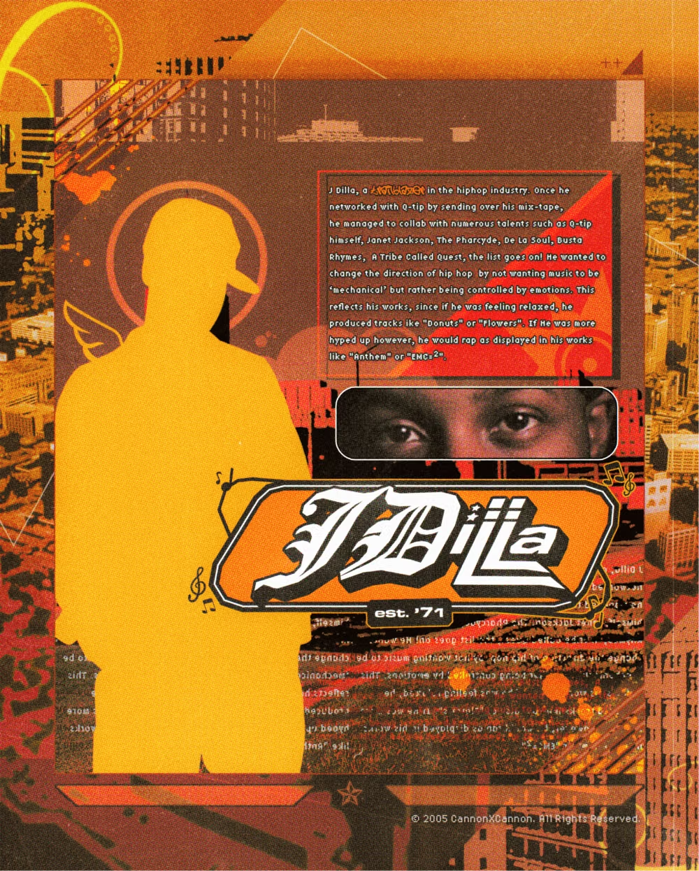
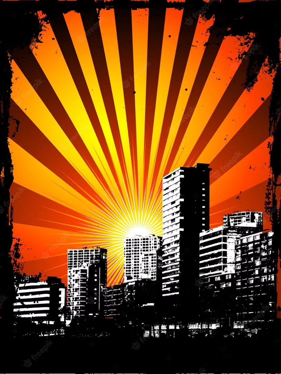
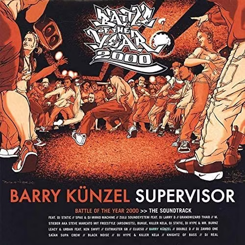
Also called Urban Grunge, this late-1990s and mid-2000s commercial style fuses hip-hop and street imagery with grunge, graffiti, Kustom Kulture motifs, and maximal urban branding while downplaying McBling luxury.
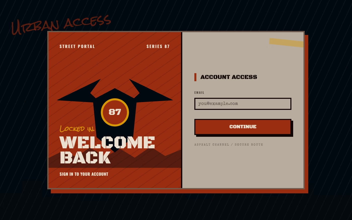
Design overview
- Signature elements
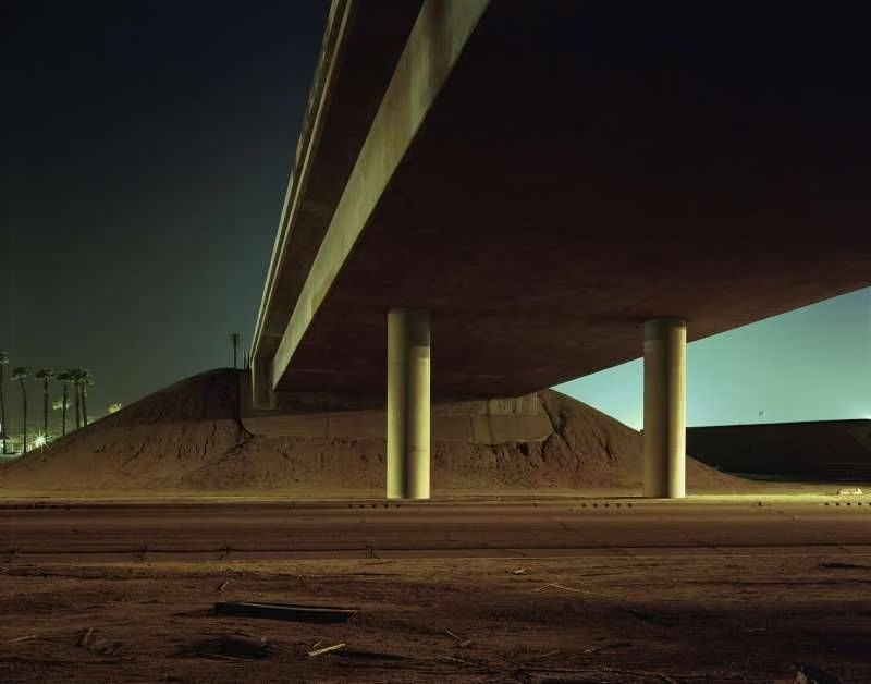
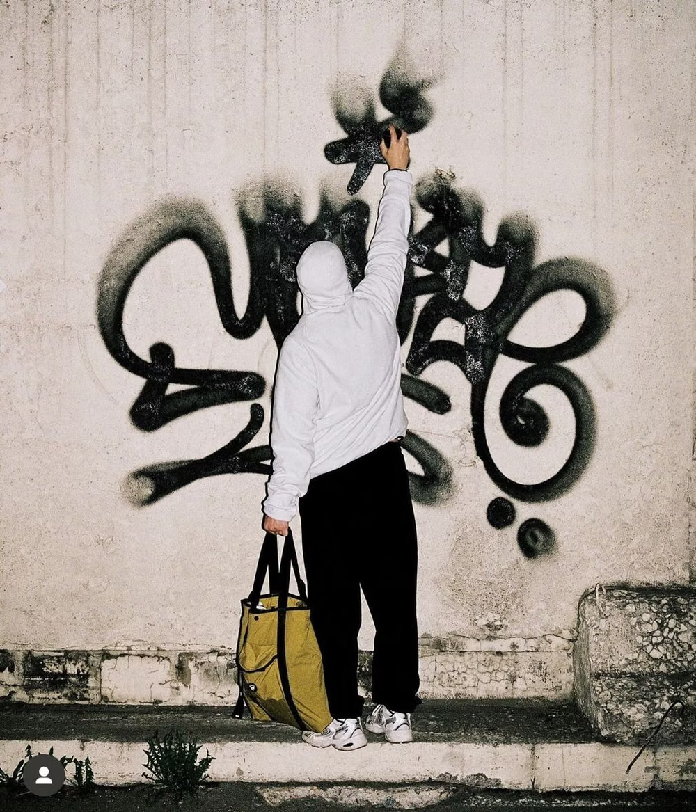
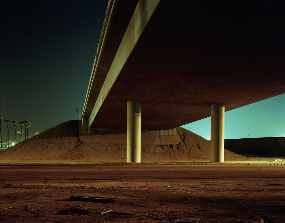
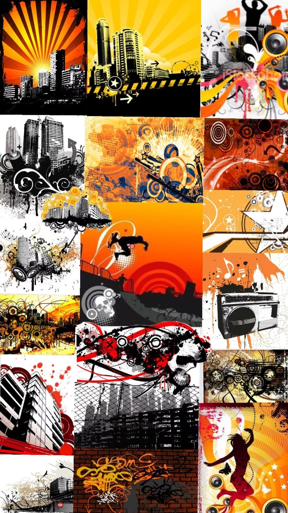
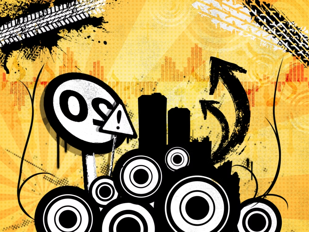
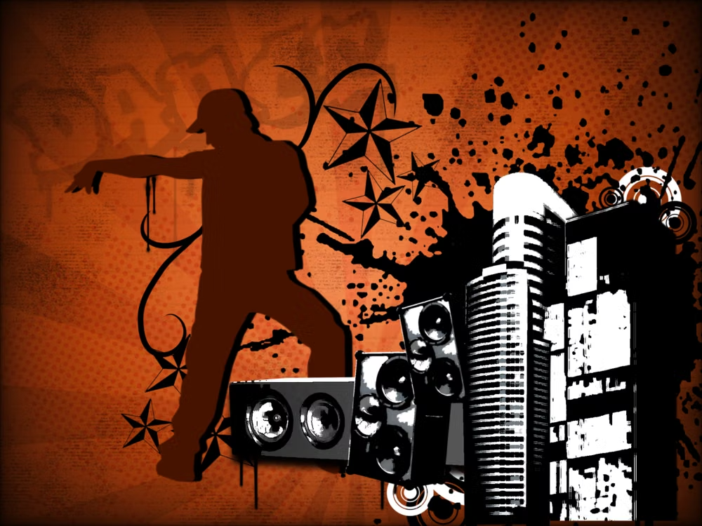
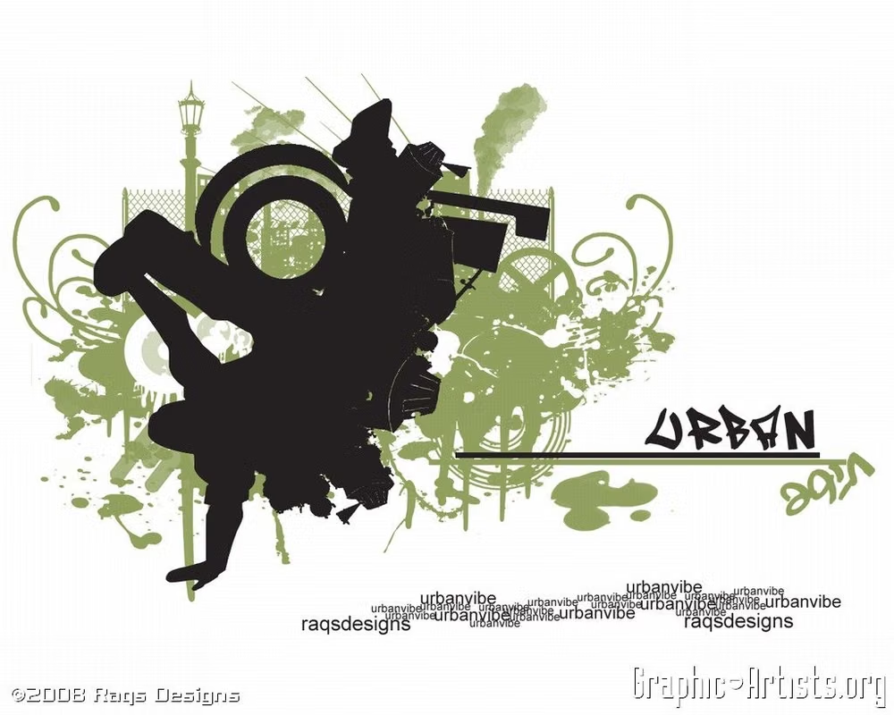
- silhouetted city infrastructure, graffiti and stencil lettering, paint splatters and drips, wings and crests, flames and tribal motifs, sepia-red urban palettes. In daisyUI themes, set `--noise: 1;`.
- Best suited to
- Music, streetwear, skate culture, sports, automotive products, events, gaming, and mid-2000s nostalgic campaigns.
- Layout principles
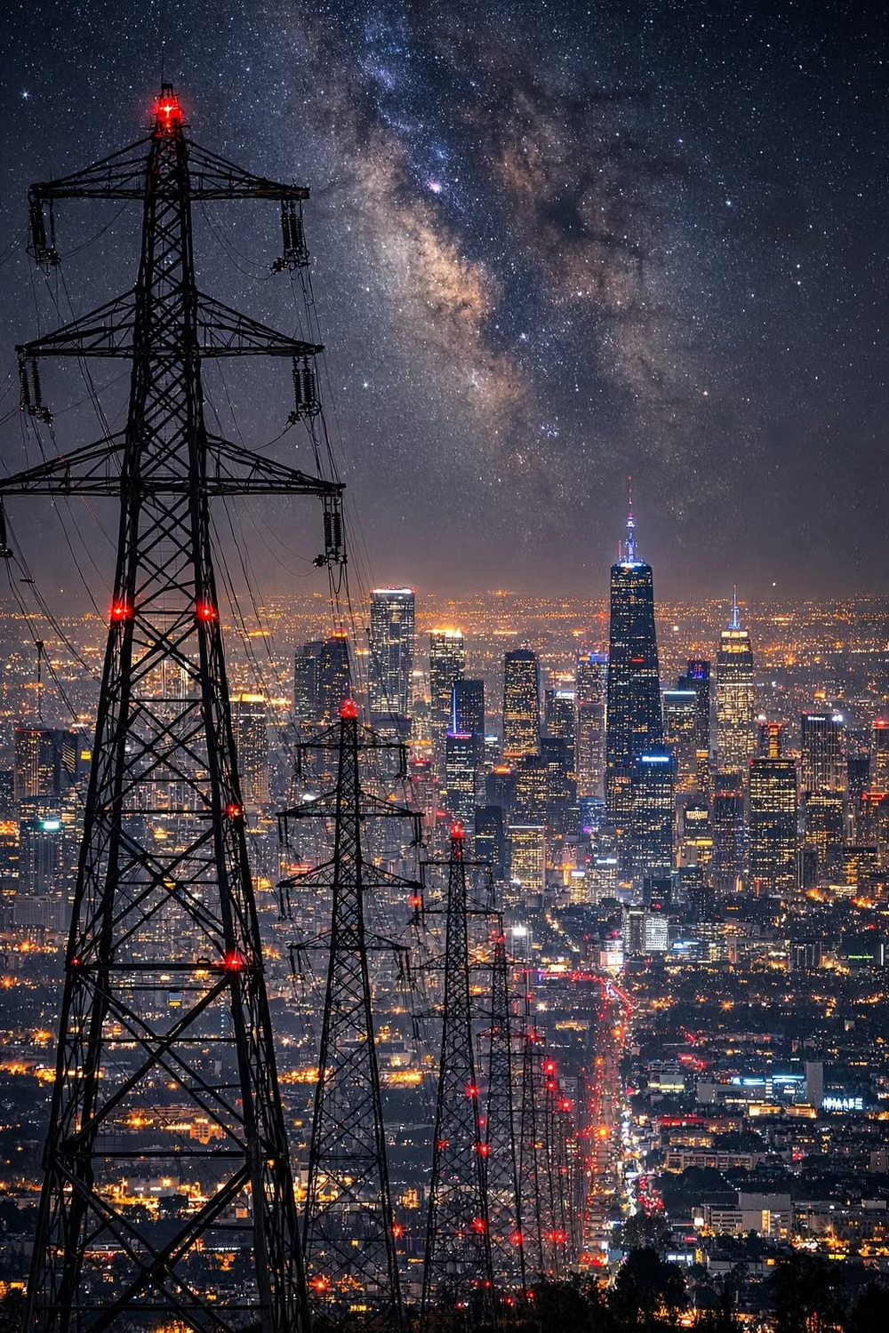
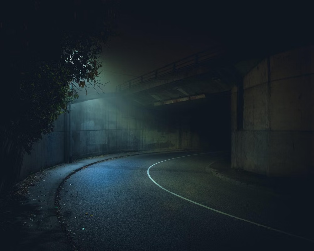
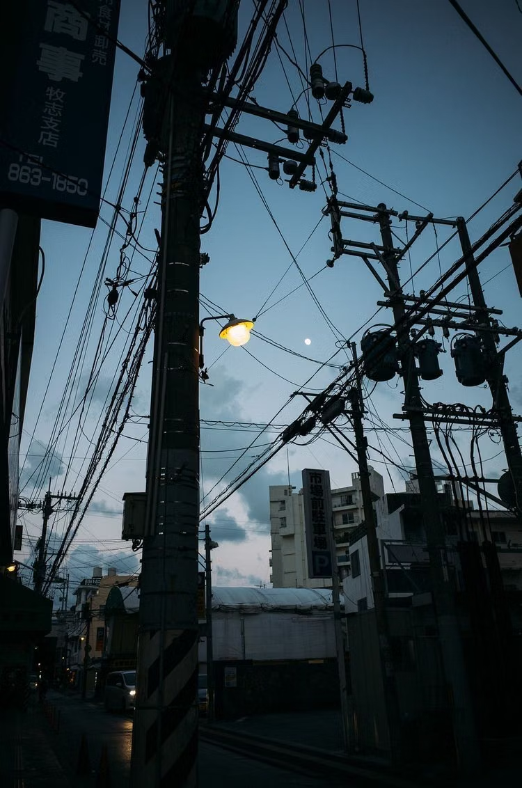
- Layer a silhouetted skyline, road, or power-line horizon behind a dense central crest, product, or performer, then pin practical navigation to one stable poster-like column.
History and origins
A fact-checked account of where this visual language came from, with links to the references used.
- Period
- Early–late 2000s
- Origin
- Commercial youth branding shaped by hip-hop, streetwear, graffiti, and club imagery
UrBling is a retrospective classification for glossy commercial “urban” graphics of the 2000s. CARI now catalogs the field as Urban Grunge and credits Froyo Tam with the research label; because much of the source imagery was corporate appropriation of Black and Latino cultural forms, its history is also a history of marketing, sanitization, and unequal attribution.
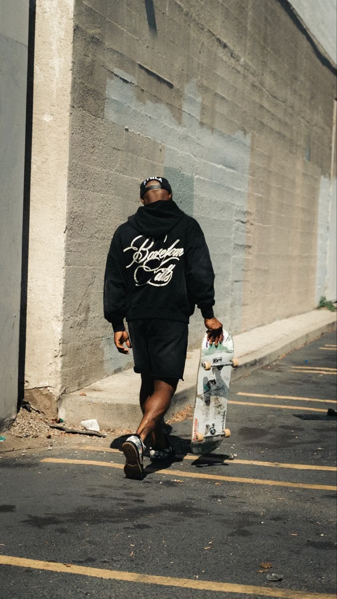
Moodboard and visual references
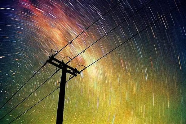
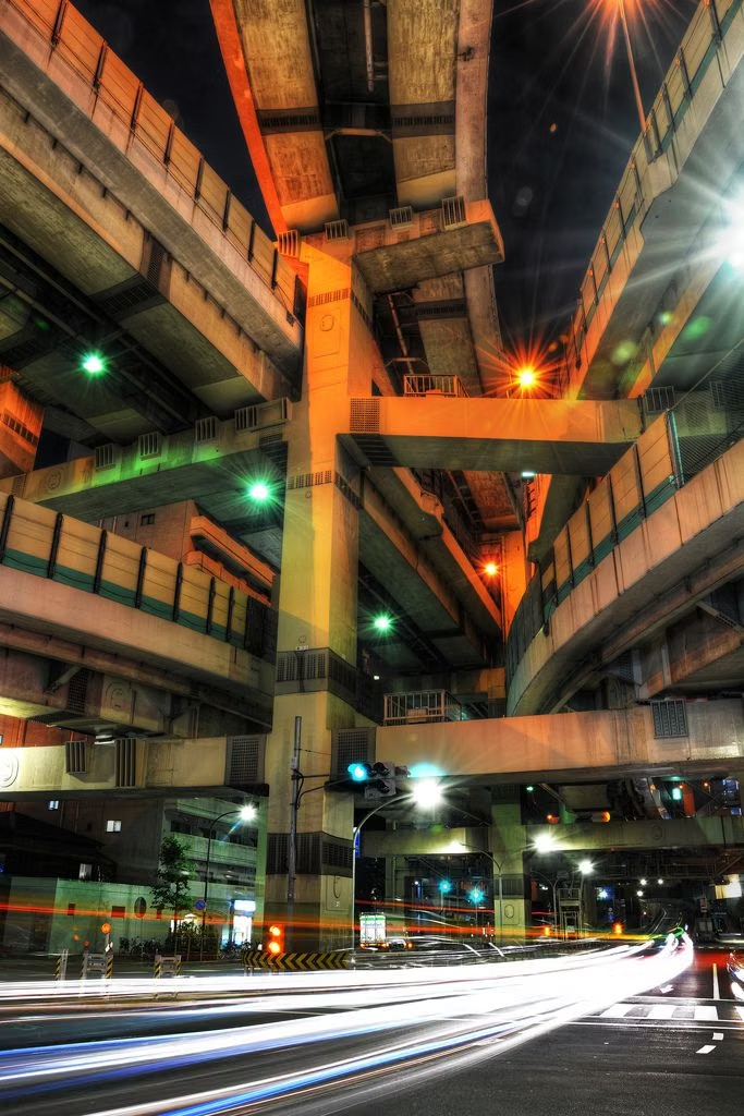
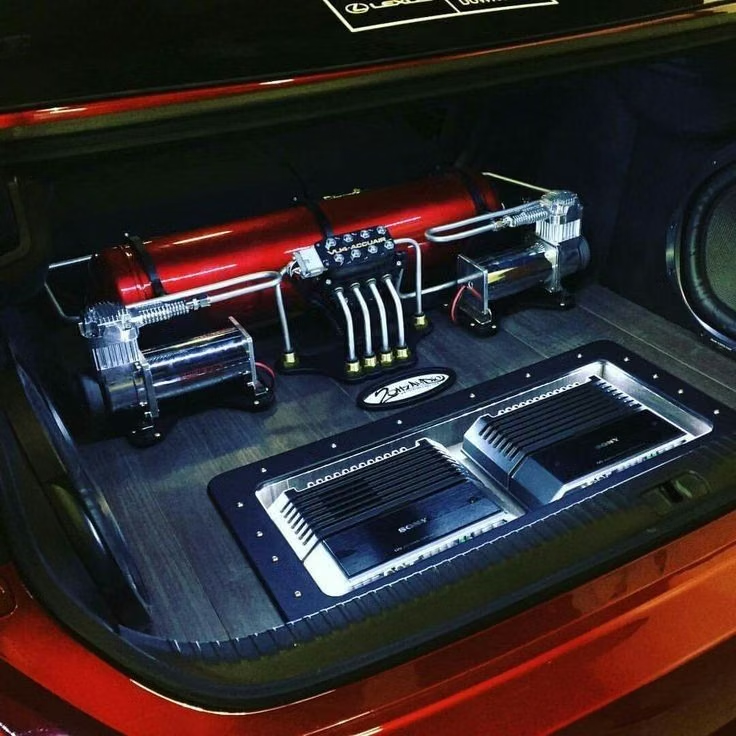
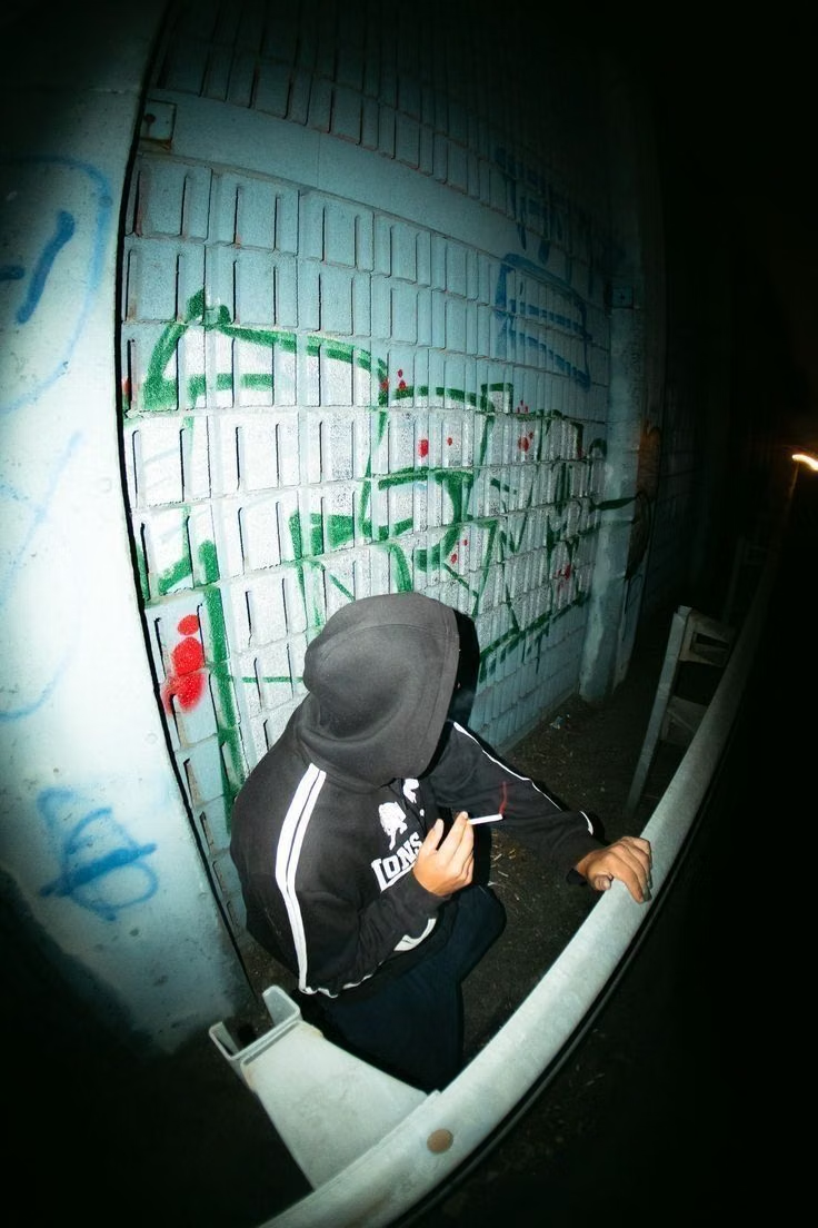
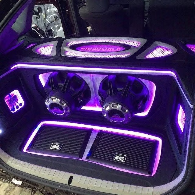
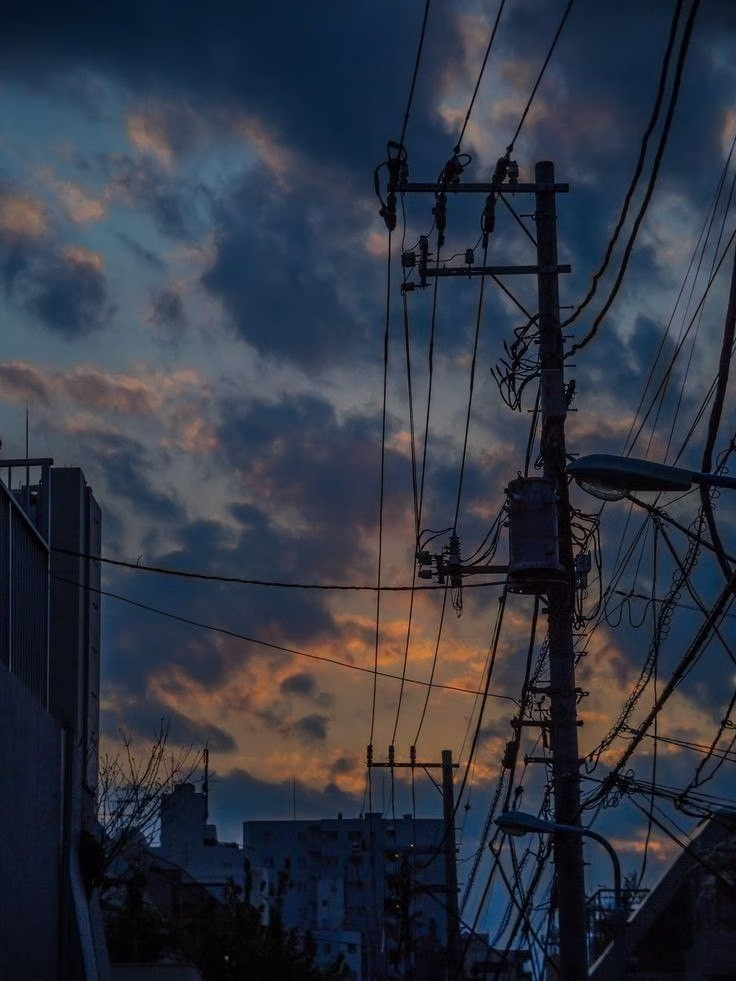
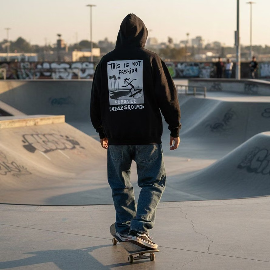
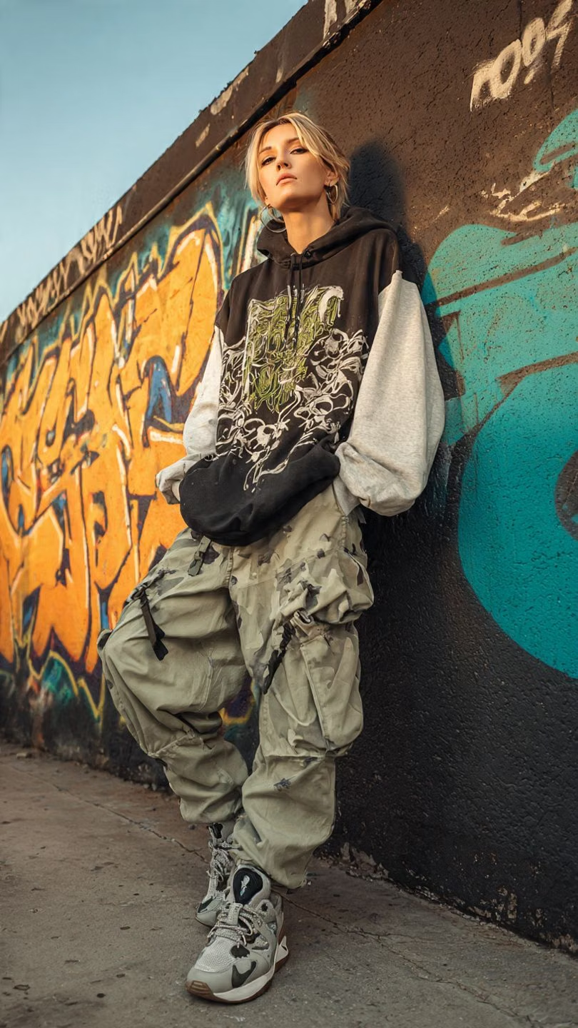
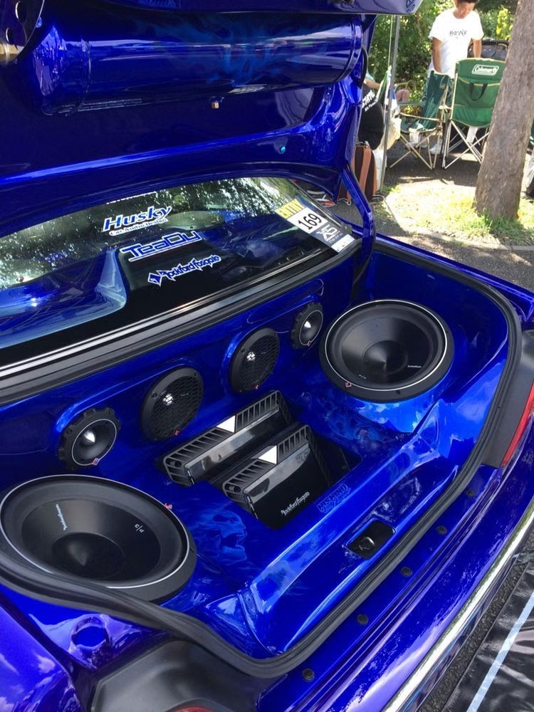
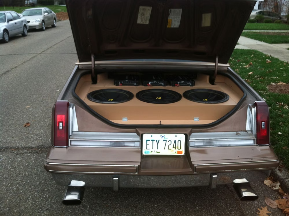
A visual study of the forms, inspirations, materials, colors, type, and cultural references associated with this UI design style.
Design principles and implementation
Use these principles to write a focused AI UI design prompt instead of asking for a vague visual treatment.
Color direction
Use asphalt black, concrete gray, sepia, rust, orange, yellow, and deep red with dirty white or silver highlights and visibly weathered transitions. In a daisyUI theme, use orange or deep red for `primary`, rust or warning yellow for `secondary`, and assign concrete gray, charcoal, and asphalt black to `base-100`, `base-200`, and `base-300`.
Imagery direction
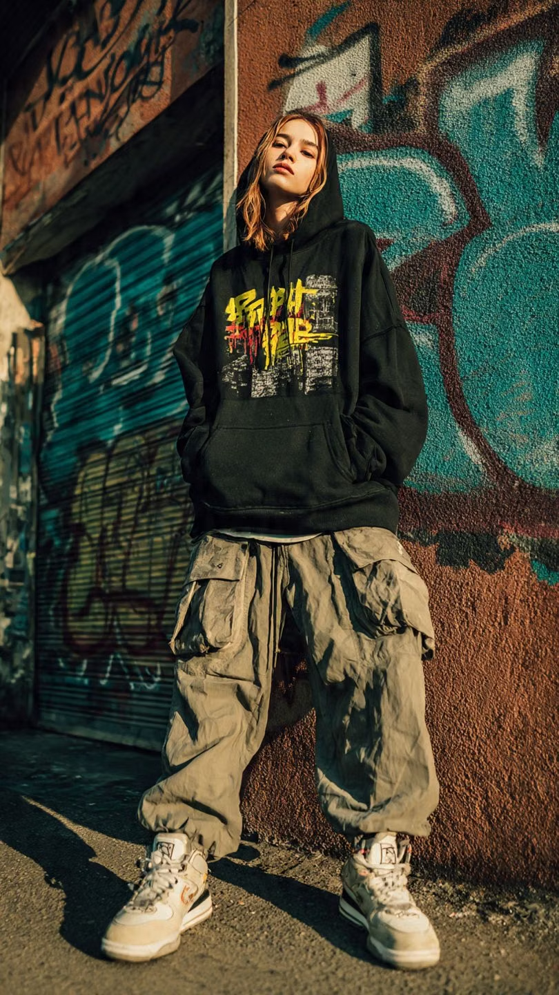
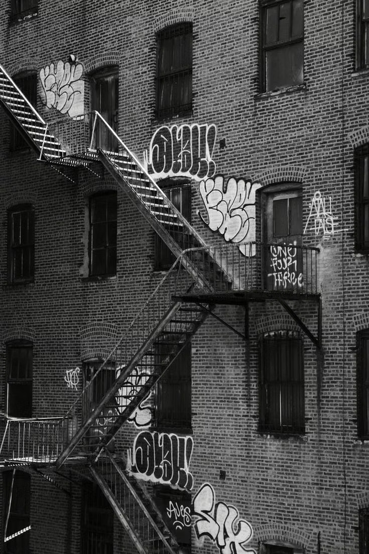
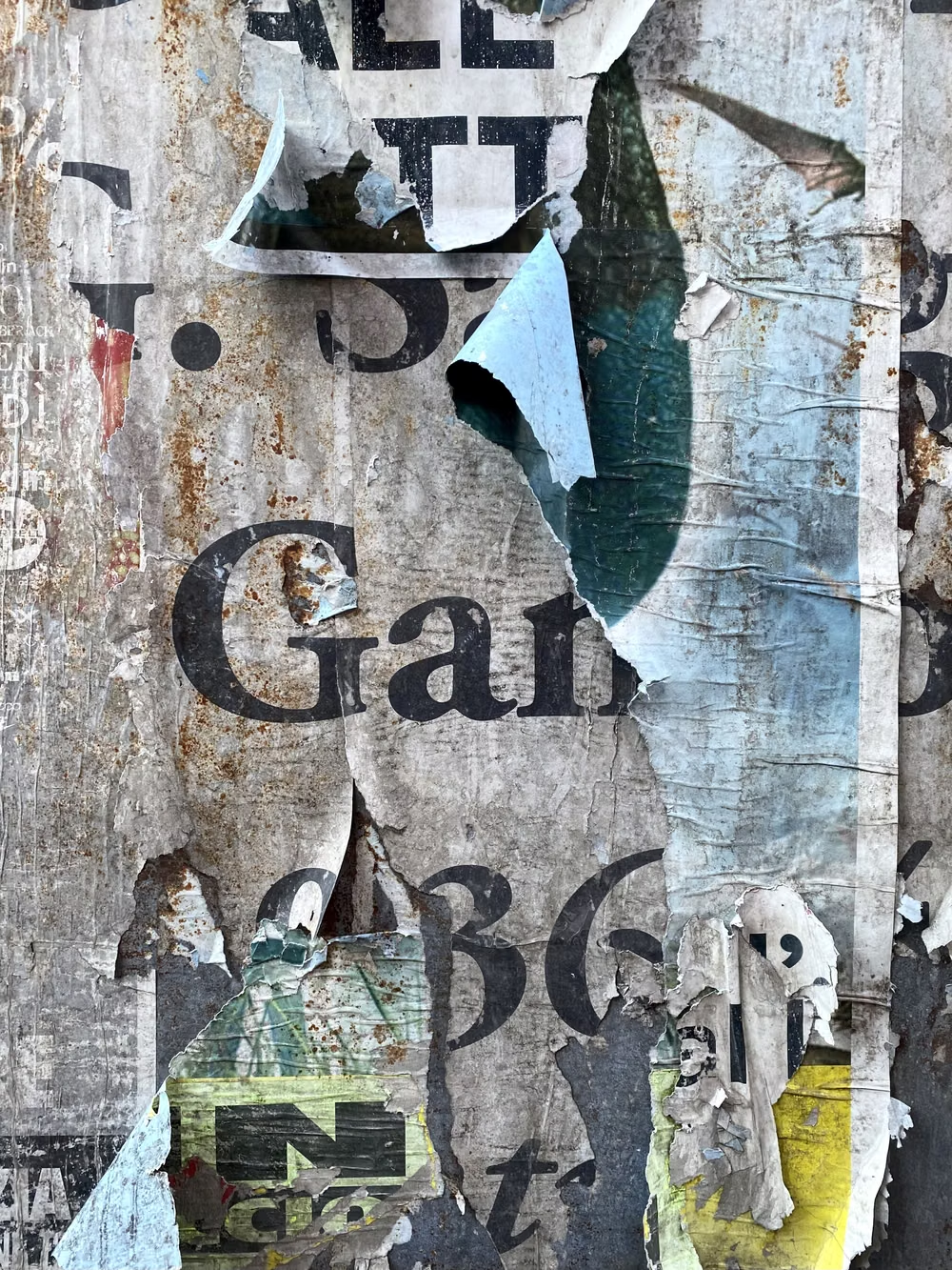
Choose streetlights, power lines, overpasses, buildings, graffiti walls, skate scenes, custom cars, speakers, hoodies, and urban night photography treated with splatter and grit.
Content density
Allow high graphic density and short promotional language, but keep schedules, prices, track lists, and actions on solid high-contrast fields.
Motion direction
Stamp stencils, spray or wipe paint, drip selected marks, shift layered skylines, and reveal crests with gritty mechanical timing rather than gemstone sparkle.
Shape language
Use heraldic shields, wings, flames, tribal curls, splatters, drips, torn edges, stencil blocks, and sharp custom-lettered emblems. In daisyUI themes, set the `--radius-*` variables to `0` or `0.25rem`.
Typography rules
Mix slab sans-serif, graffiti, stencil, and gothic display faces for names or slogans, grounding longer copy in a sturdy condensed sans-serif.
Suggested Typfaces
Black Ops One
Fresh daisies glow in warm sunlight
Fresh daisies glow in warm sunlight
1 2 3 4 5 6 7 8 9 0
Rock Salt
Fresh daisies glow in warm sunlight
Fresh daisies glow in warm sunlight
1 2 3 4 5 6 7 8 9 0
Special Elite
Fresh daisies glow in warm sunlight
Fresh daisies glow in warm sunlight
1 2 3 4 5 6 7 8 9 0
Roboto Slab
Fresh daisies glow in warm sunlight
Fresh daisies glow in warm sunlight
1 2 3 4 5 6 7 8 9 0
Oswald
Fresh daisies glow in warm sunlight
Fresh daisies glow in warm sunlight
1 2 3 4 5 6 7 8 9 0
Build a UrBling interface with daisyUI
The live example translates this direction into daisyUI components and semantic theme tokens.
To generate a full page in the same visual language, give the style name and the design rules above to Blueprint MCP.
Related UI design styles
Compare nearby visual languages that share typography, shapes, use cases, or signature elements.
Punk / Zine UI design style
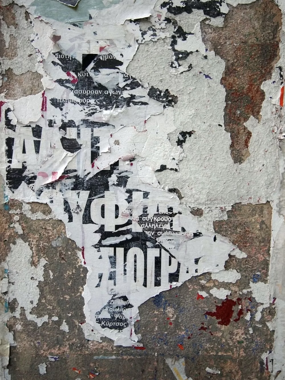
Photocopied textures, ransom-note typography, torn paper, handwriting, stamps, and confrontational DIY energy.
Dieselpunk UI design style
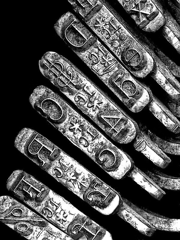
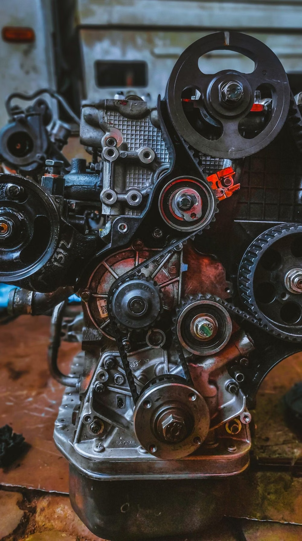
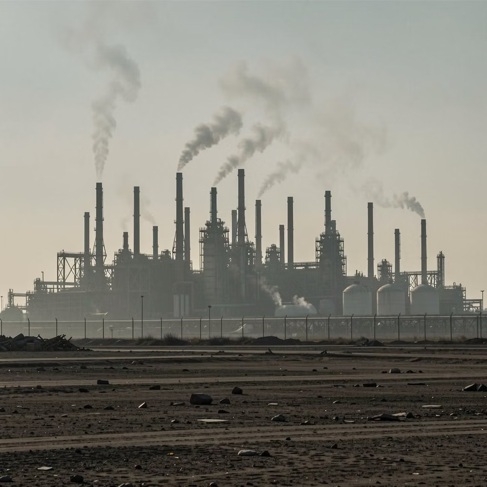
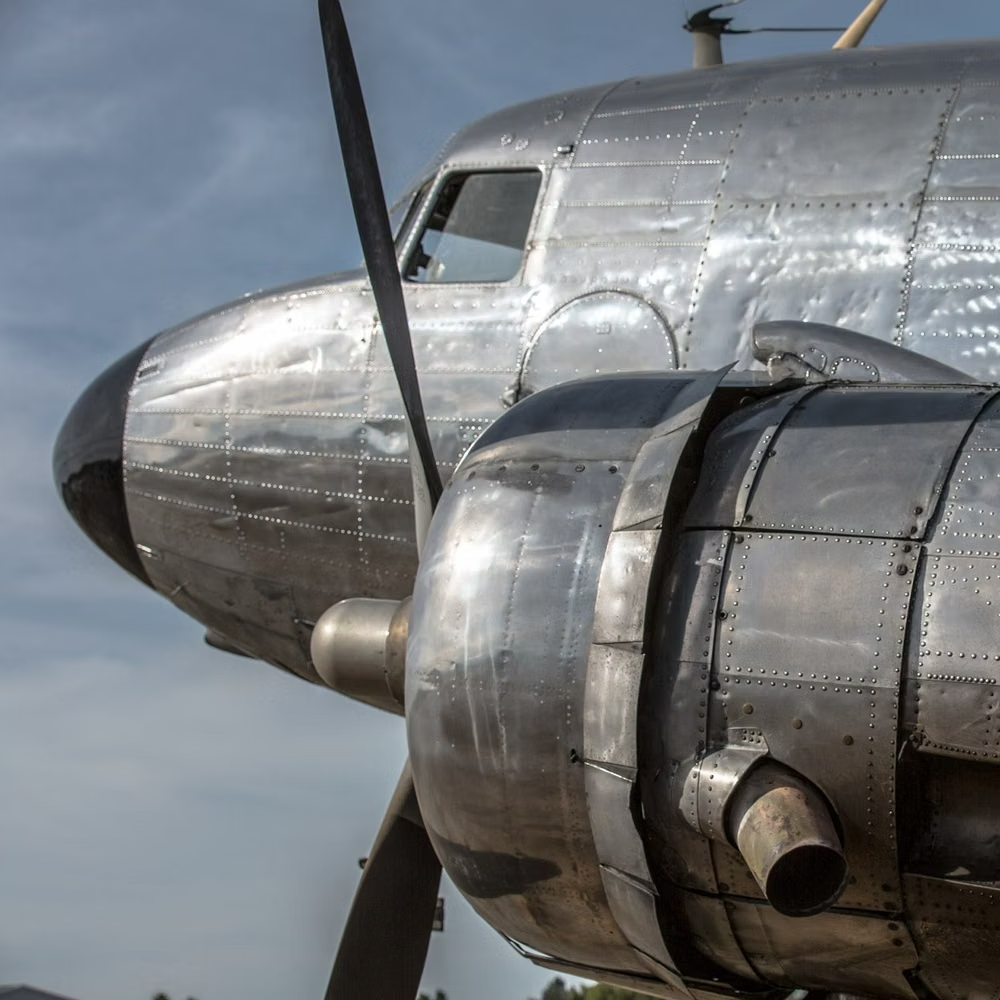
Interwar and mid-century industrial machinery, riveted metal, propaganda graphics, soot, military modernism, and heavy mechanical forms.
Grunge UI design style
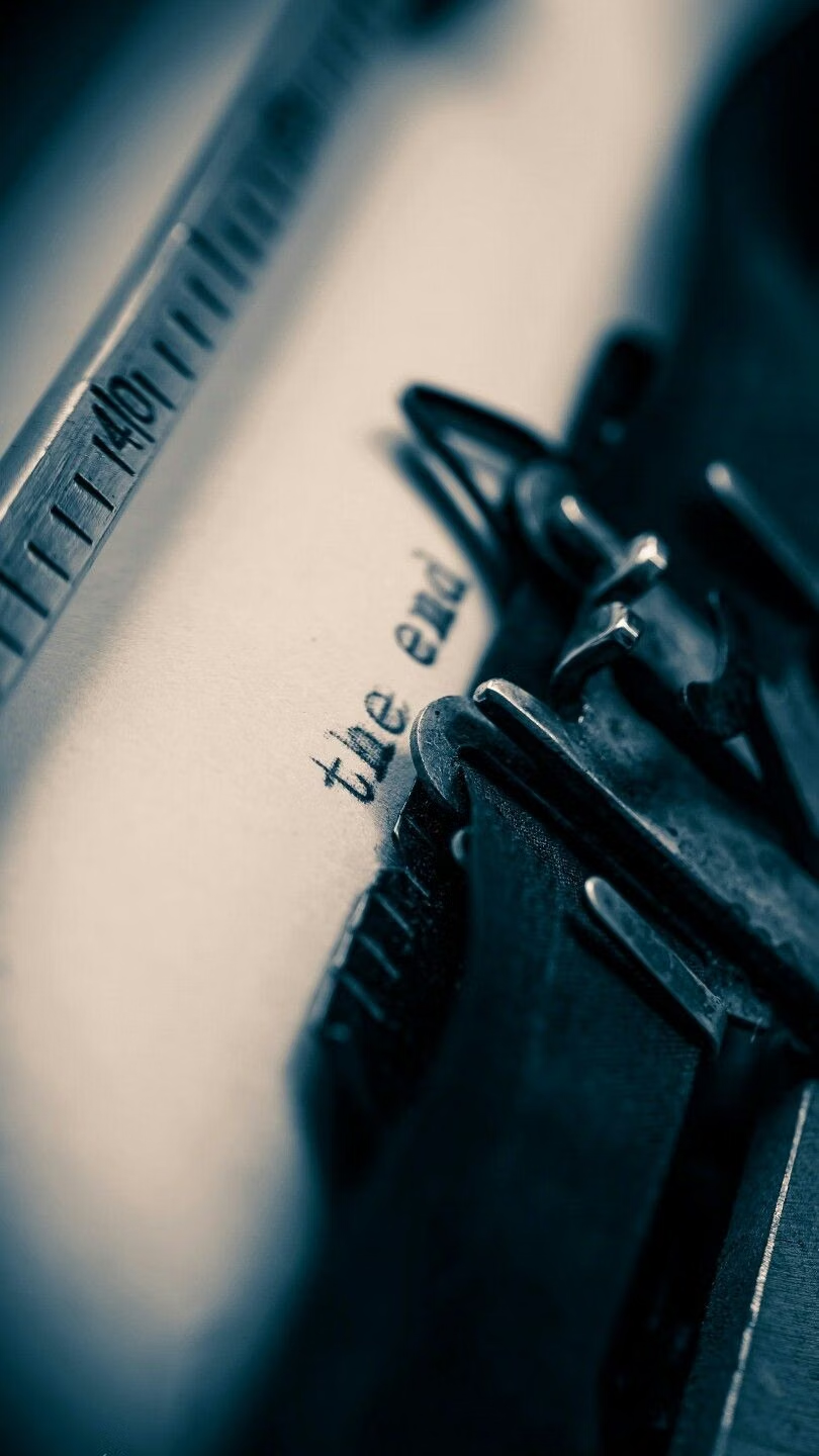
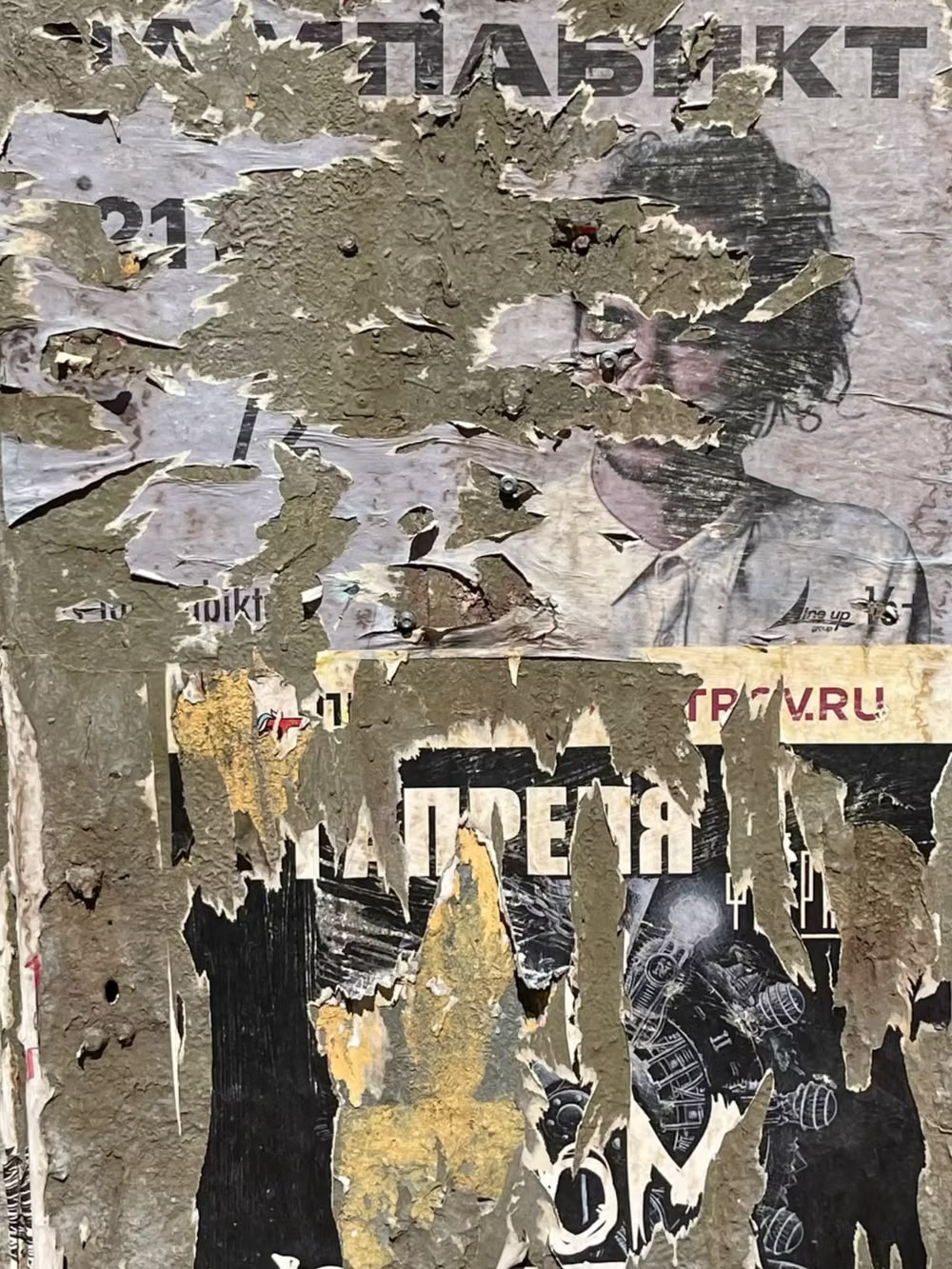
Distressed type, scratches, stains, rough textures, muted or dirty color, and irregular layering create worn intensity.