Mid-Century Modern UI design style
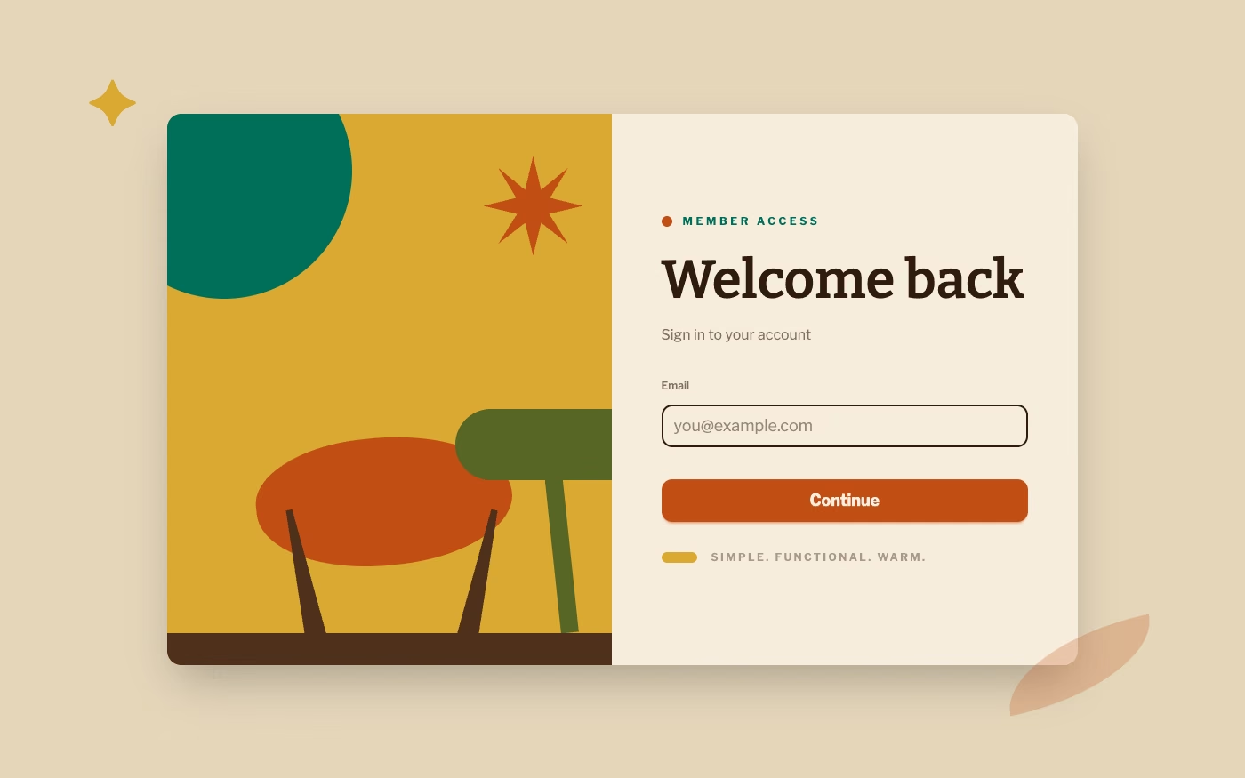
Clean geometry, warm muted colors, humanist illustration, functional layouts, and optimistic postwar simplicity.
Design overview
- Signature elements
- warm muted palette, simple geometry, humanist illustration, tapered forms, clean layouts, optimistic motifs
- Best suited to
- Architecture, furniture, lifestyle, editorial, hospitality, and design-led commerce.
- Layout principles
- Use functional modular blocks with relaxed asymmetry, mixing clean product grids with open illustrated or photographic living spaces.
History and origins
A fact-checked account of where this visual language came from, with links to the references used.
- Period
- Roughly the mid-1940s–late 1960s
- Origin
- Postwar Europe and the United States, with influential Nordic and Californian centers
Mid-Century Modern groups postwar architecture, furniture, products, and graphics that emphasized functional planning, new industrial materials, and clean organic geometry. The period was diverse rather than a single organization, and the label itself was popularized retrospectively by Cara Greenberg’s 1984 book Mid-Century Modern rather than being the universal name used by its original designers.
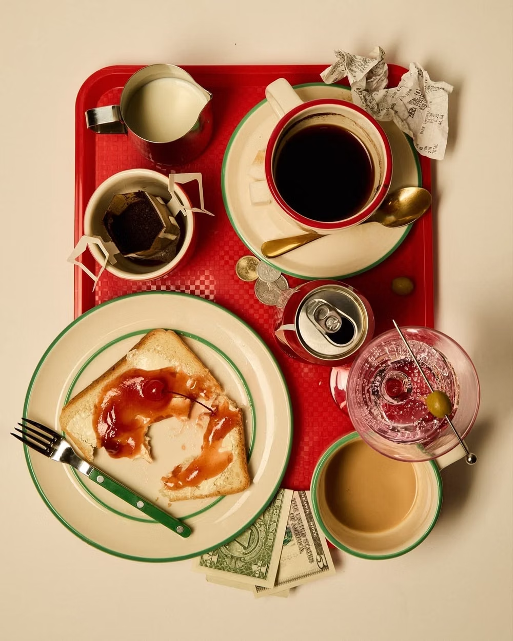
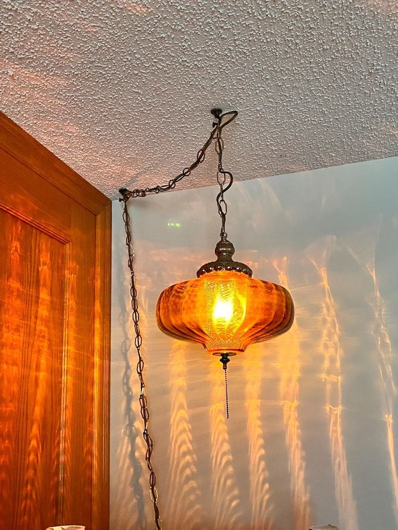
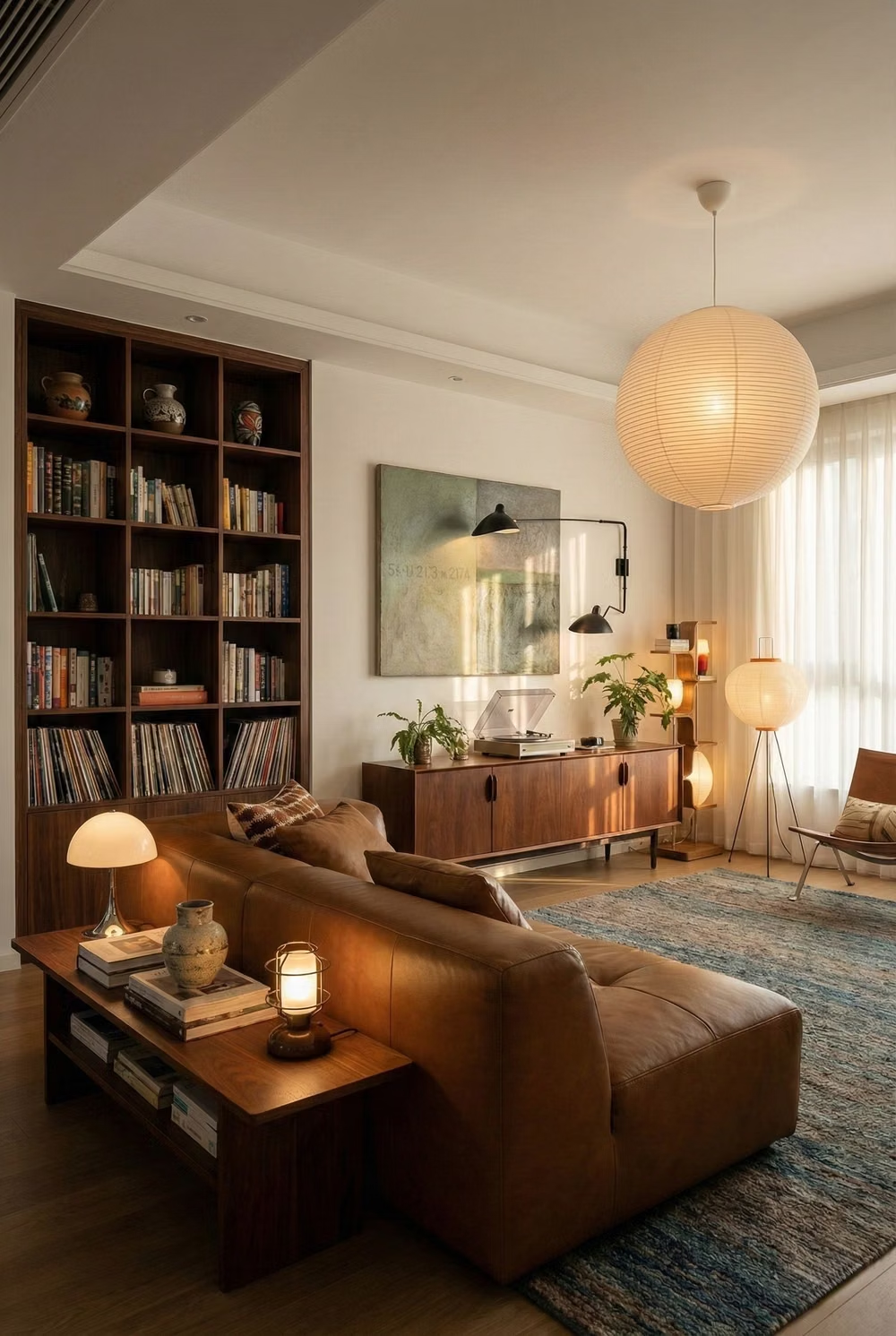
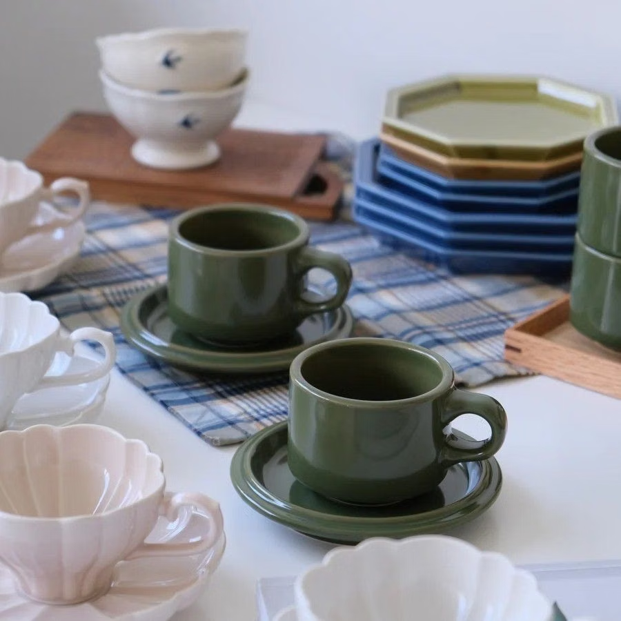
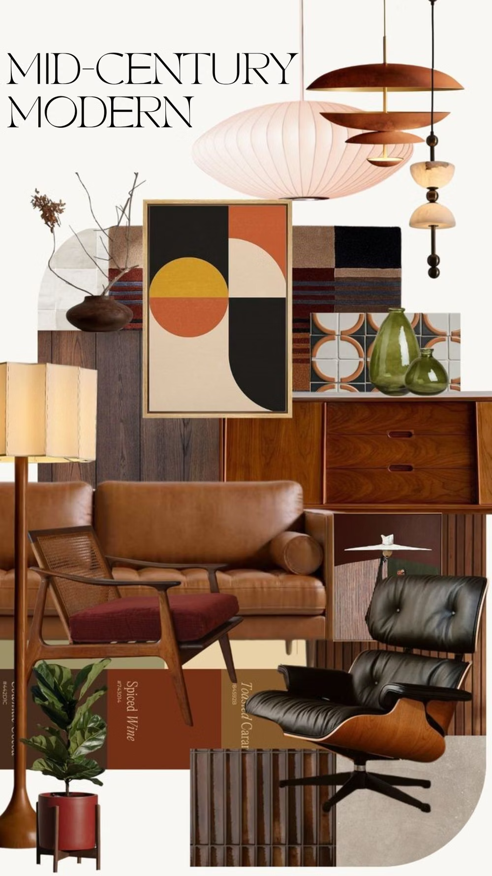
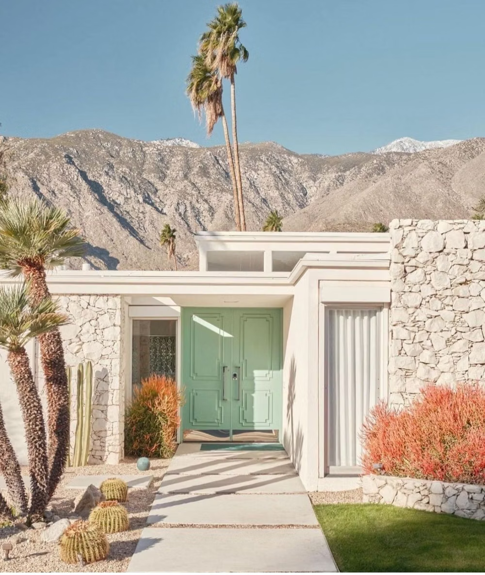
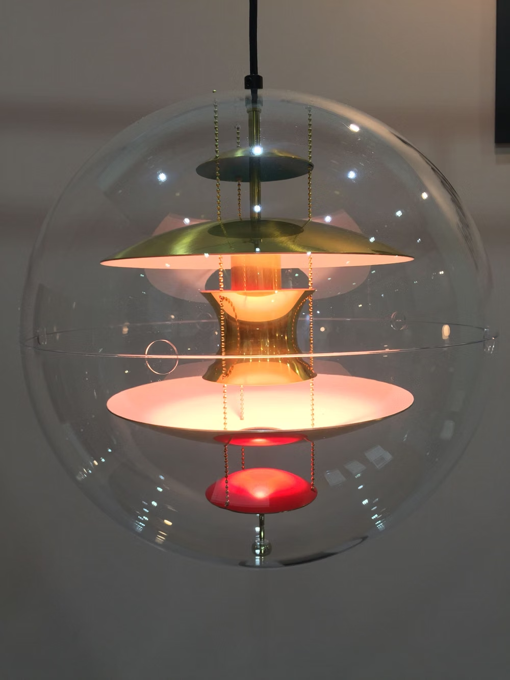
Moodboard and visual references
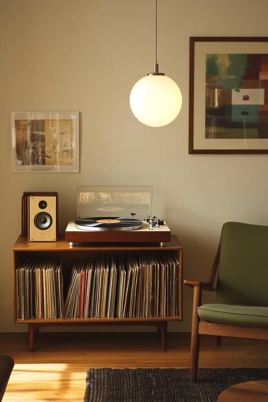
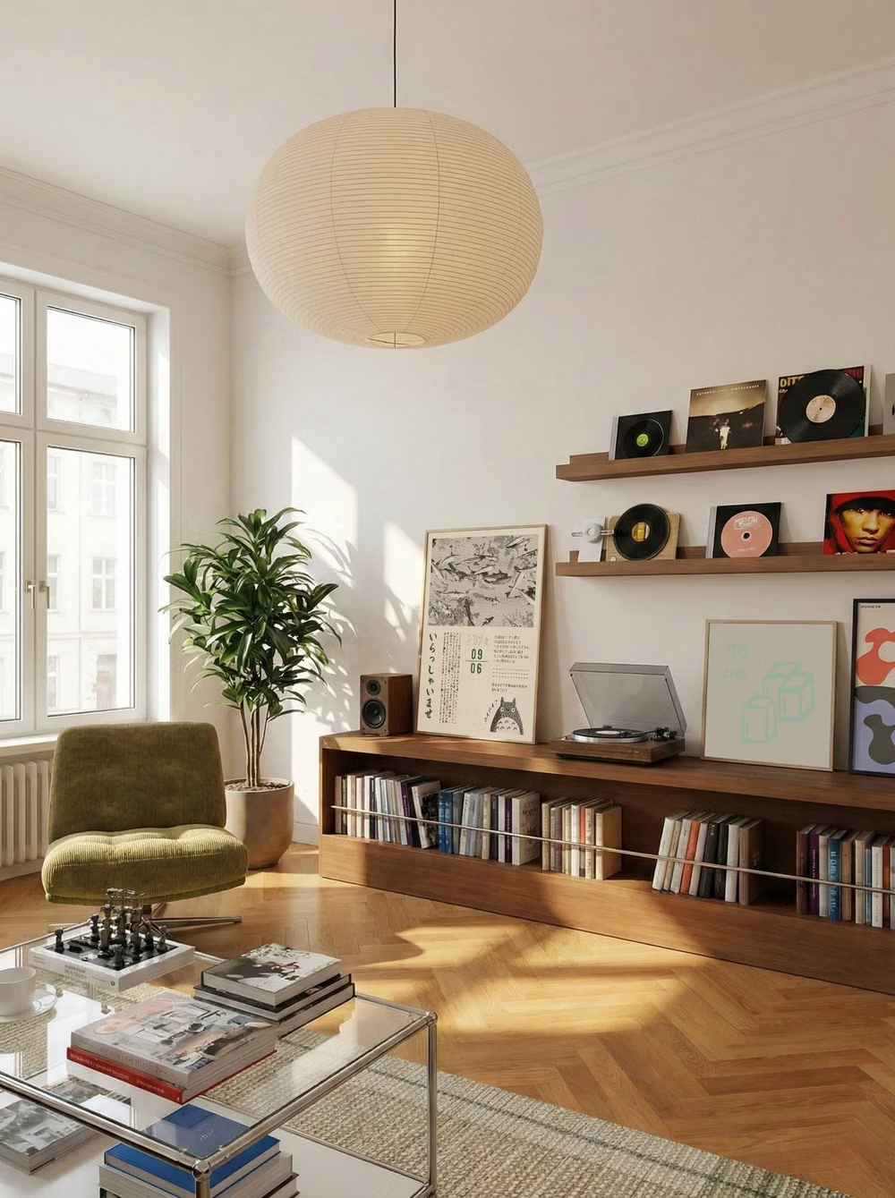
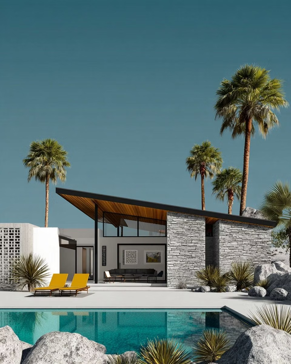
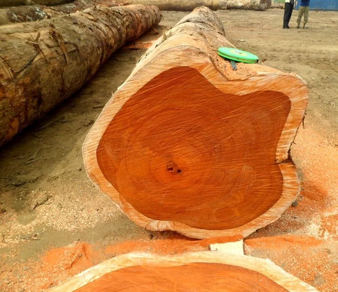
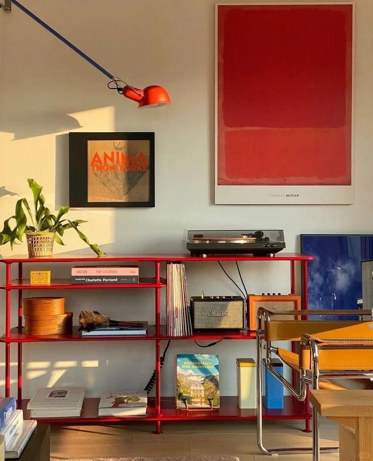
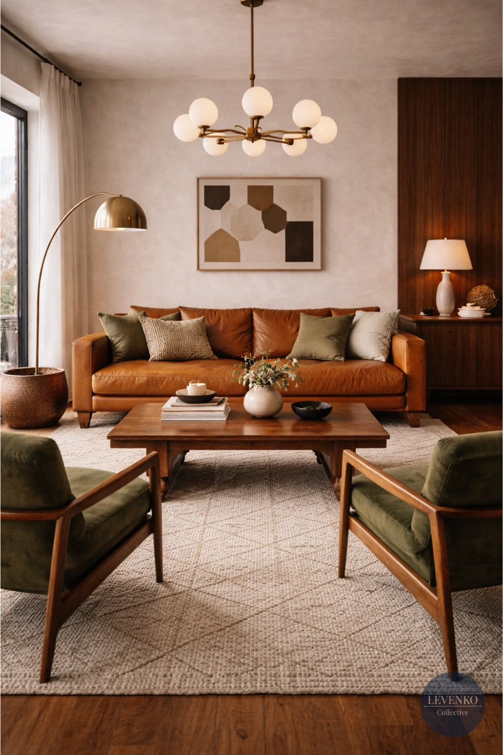
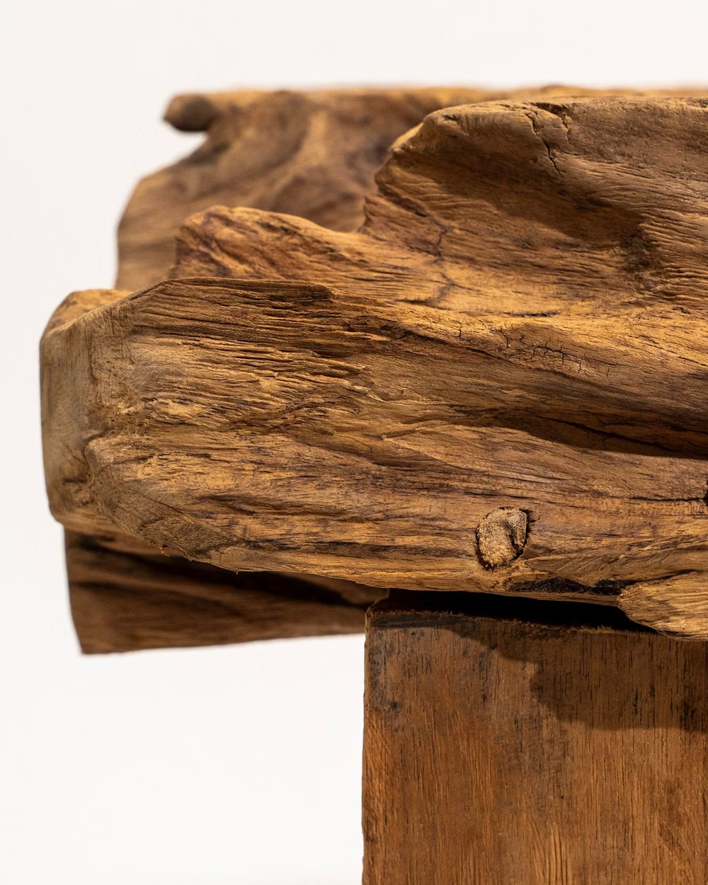
A visual study of the forms, inspirations, materials, colors, type, and cultural references associated with this UI design style.

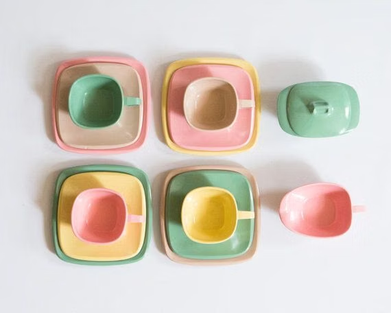
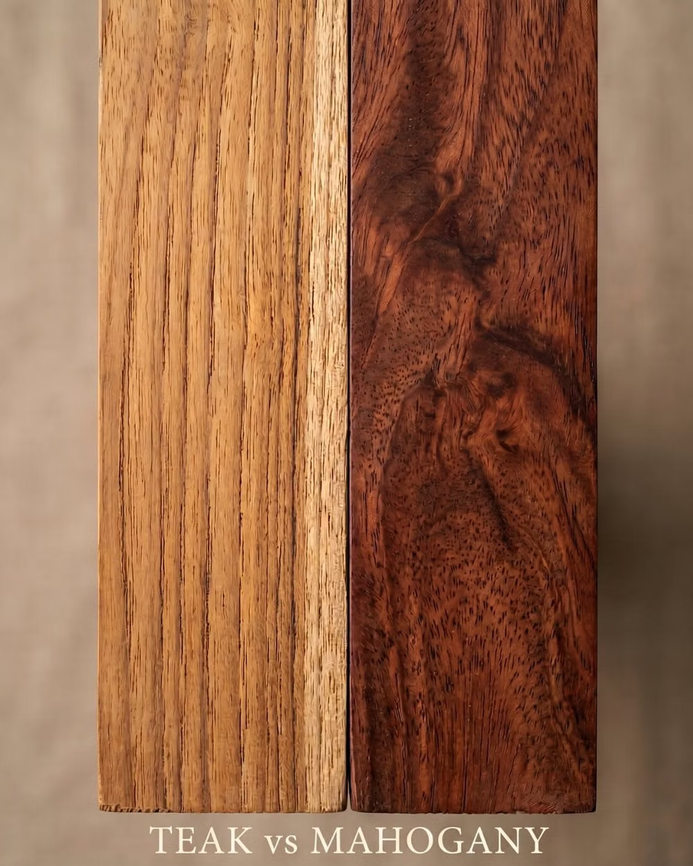
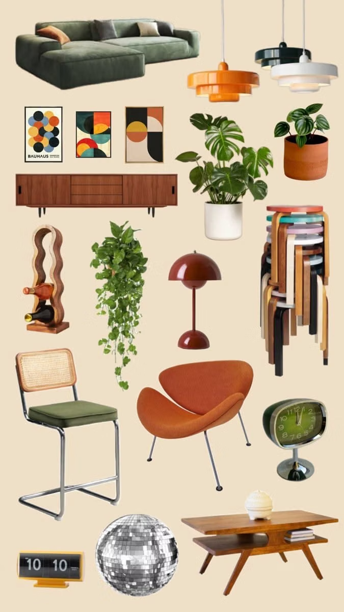
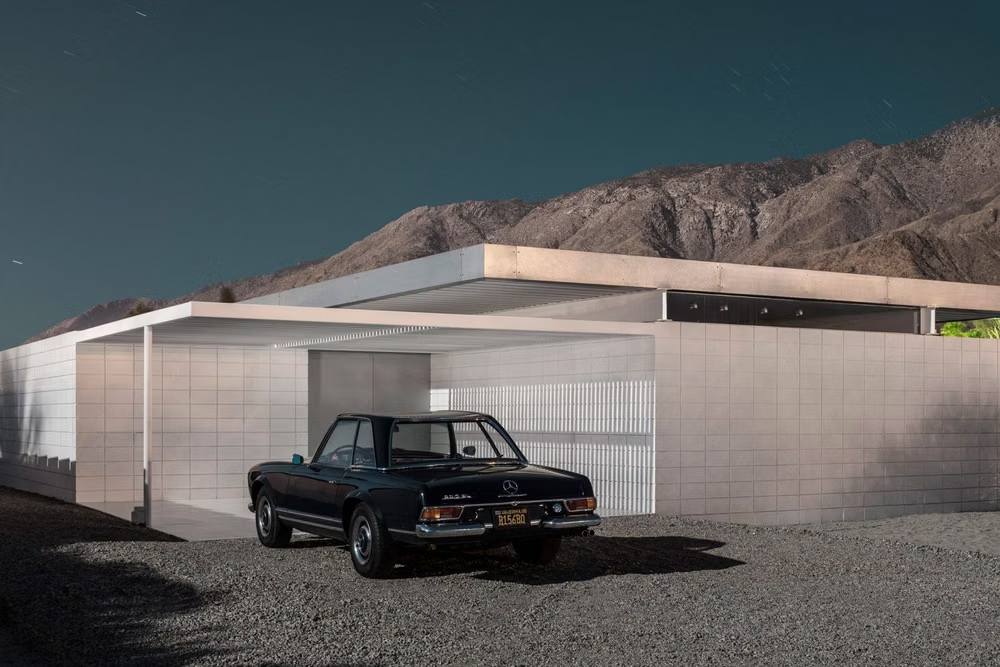
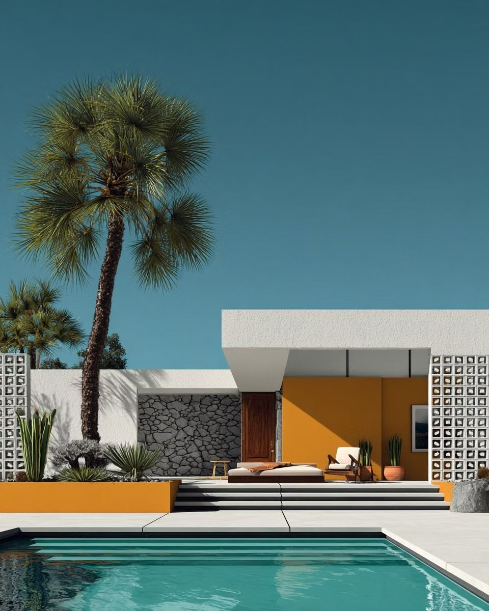
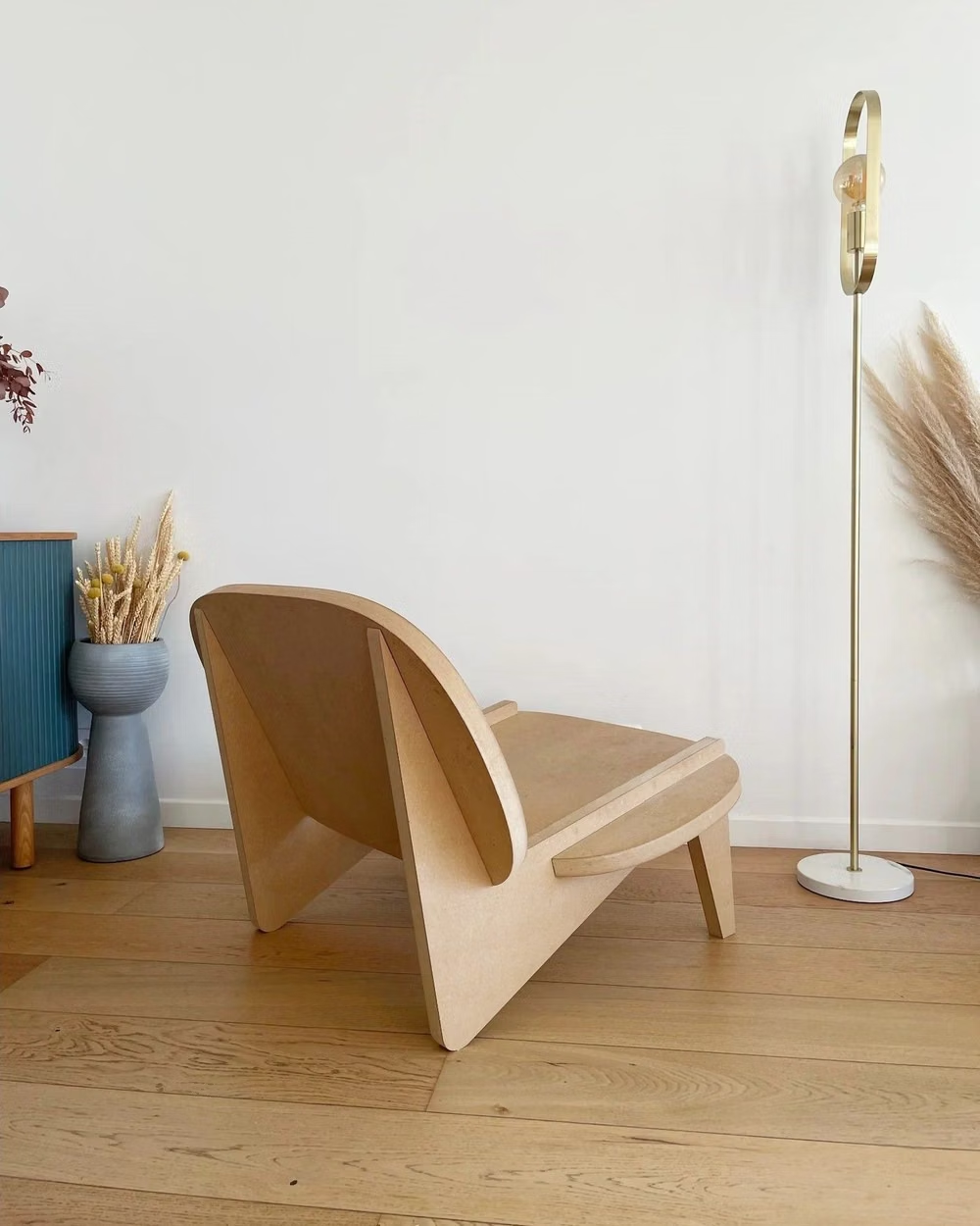
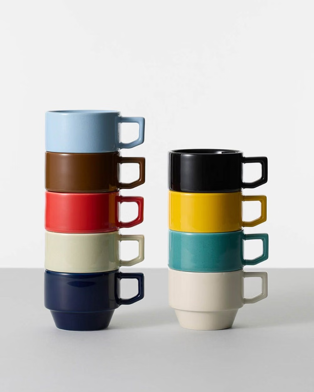
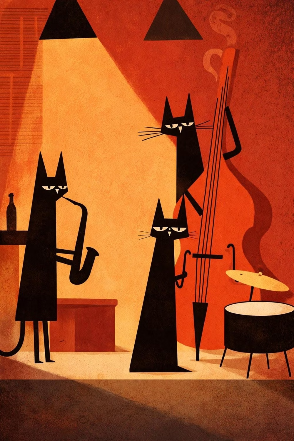
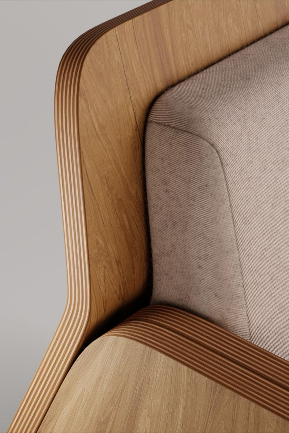
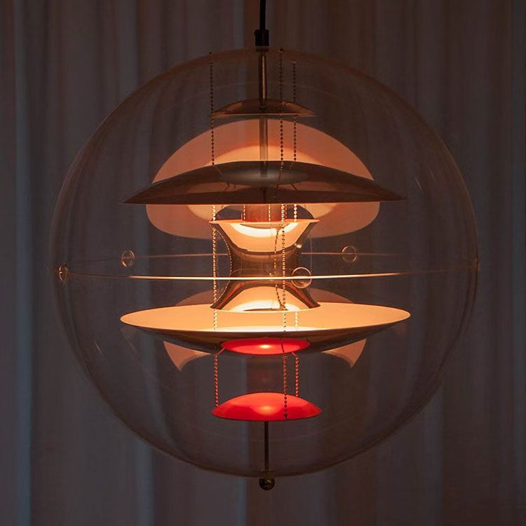
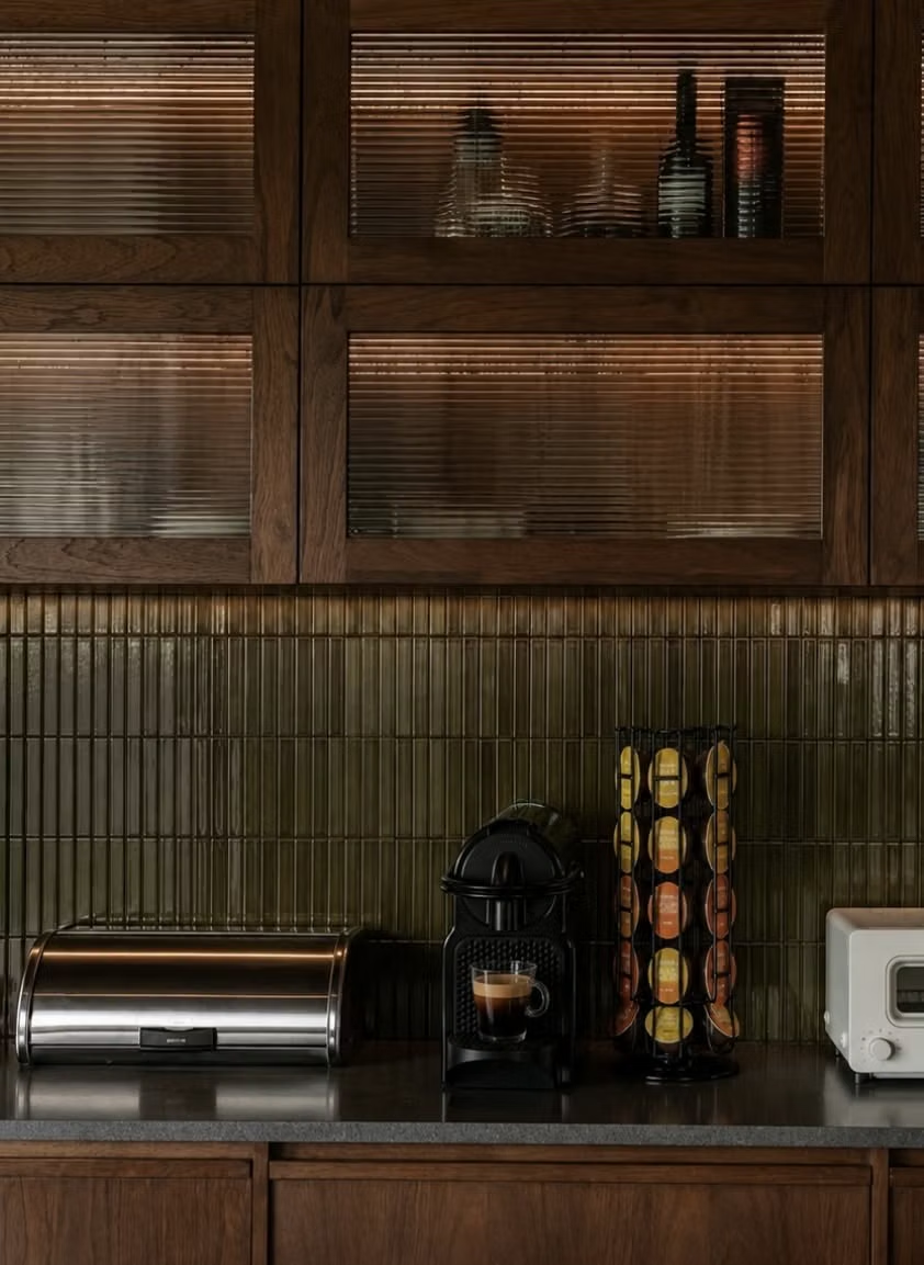
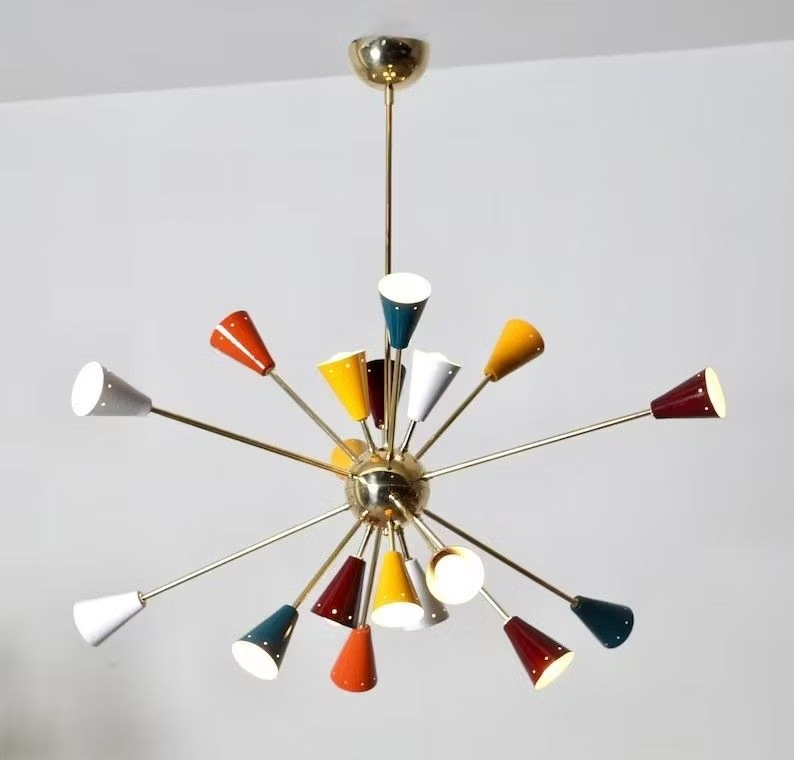
![molded plywood lounge chair detail photograph - [Nathan Martell] : Layup Chair - Chair, Lounge](../../moodboards/mid-century-modern/11-inspiration-molded-plywood-chair.avif)
Design principles and implementation
Use these principles to write a focused AI UI design prompt instead of asking for a vague visual treatment.
Color direction
Combine mustard, olive, burnt orange, teal, walnut, and warm cream in muted arrangements that feel optimistic without becoming childish. In a daisyUI theme, use burnt orange or teal for `primary`, mustard or olive for `secondary`, and set `base-100`, `base-200`, and `base-300` to warm cream, pale tan, and muted walnut-beige.
Imagery direction
Use furniture, architecture, domestic objects, and humanist illustrations with simple silhouettes, warm materials, and period-appropriate styling.
Content density
Keep density medium, presenting practical information clearly while allowing signature objects and color fields room to breathe.
Motion direction
Use simple sliding panels, gentle rotating motifs, and straightforward object reveals with the unfussy confidence of period motion graphics.
Shape language
Use tapered legs, boomerangs, rounded rectangles, lozenges, starbursts, and simple circles balanced against clean structural lines. In daisyUI themes, set the `--radius-*` variables between `0.25rem` and `1rem`.
Typography rules
Pair a friendly humanist sans-serif with a restrained slab or serif, using confident headings and comfortable body proportions.
Suggested Typfaces
Josefin Sans
Fresh daisies glow in warm sunlight
Fresh daisies glow in warm sunlight
1 2 3 4 5 6 7 8 9 0
Libre Franklin
Fresh daisies glow in warm sunlight
Fresh daisies glow in warm sunlight
1 2 3 4 5 6 7 8 9 0
Fira Sans
Fresh daisies glow in warm sunlight
Fresh daisies glow in warm sunlight
1 2 3 4 5 6 7 8 9 0
League Spartan
Fresh daisies glow in warm sunlight
Fresh daisies glow in warm sunlight
1 2 3 4 5 6 7 8 9 0
Bitter
Fresh daisies glow in warm sunlight
Fresh daisies glow in warm sunlight
1 2 3 4 5 6 7 8 9 0
Build a Mid-Century Modern interface with daisyUI
The live example translates this direction into daisyUI components and semantic theme tokens.
To generate a full page in the same visual language, give the style name and the design rules above to Blueprint MCP.
Related UI design styles
Compare nearby visual languages that share typography, shapes, use cases, or signature elements.
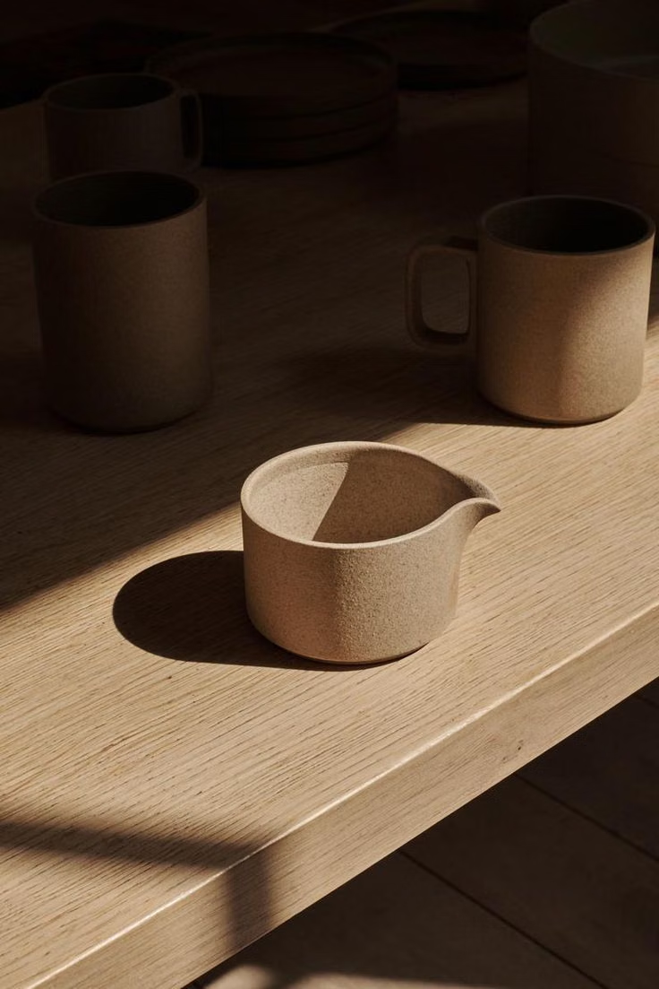

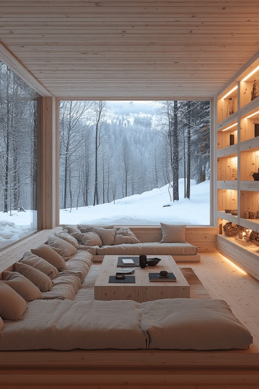
Scandinavian Modern UI design style
Functional simplicity, light palettes, warm natural materials, clean lines, and friendly human-centered restraint.
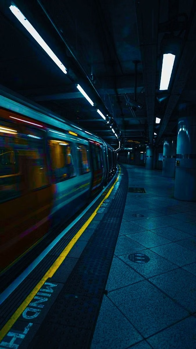
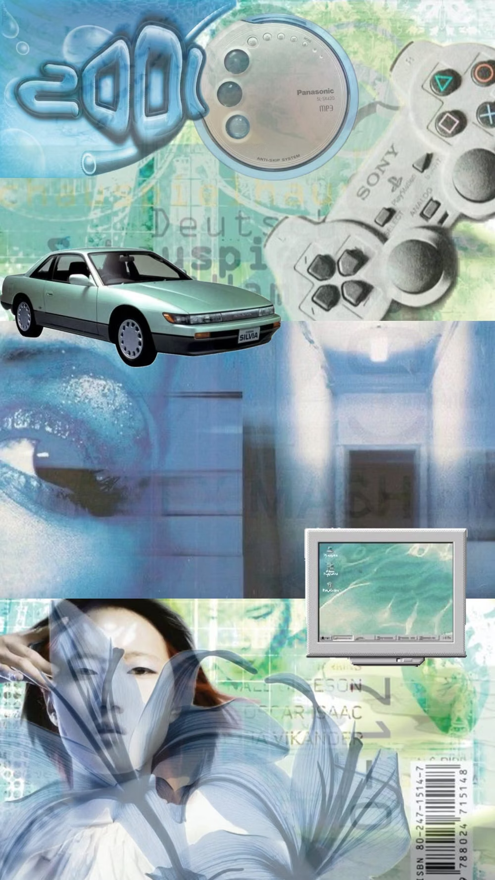
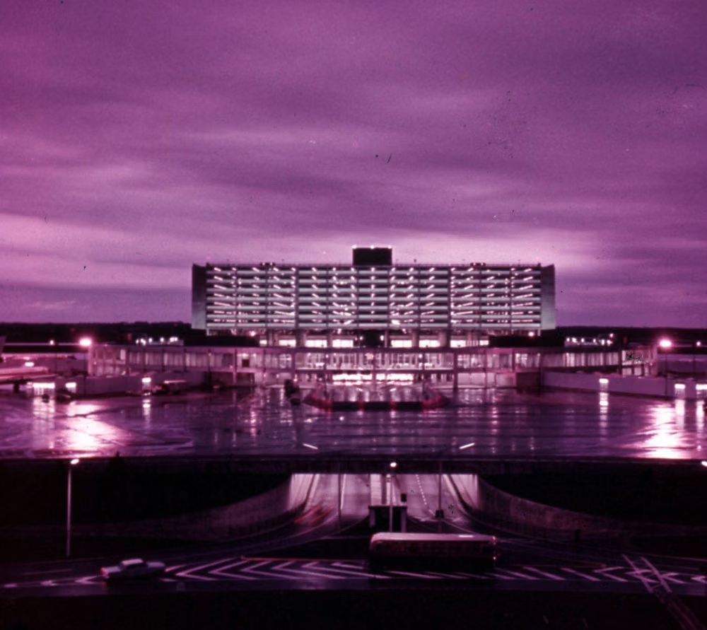
Gen-X Soft Club UI design style
Late-1990s and early-2000s urban futurism softens Y2K gloss through muted color, minimalist typography, blurred photography, and a sterile-meets-organic mood.
Millennial Beige UI design style
A calm tonal aesthetic layers cream, tan, sand, taupe, and greige with tactile natural details, soft contrast, and intentional empty space.