American Kitsch UI design style
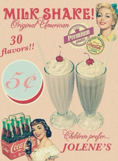
Commercial illustration from the 1920s through 1960s, especially the 1950s, uses vivid cartoonish realism, cheerful exaggeration, hand-lettered selling language, and nostalgic scenes of everyday American life.
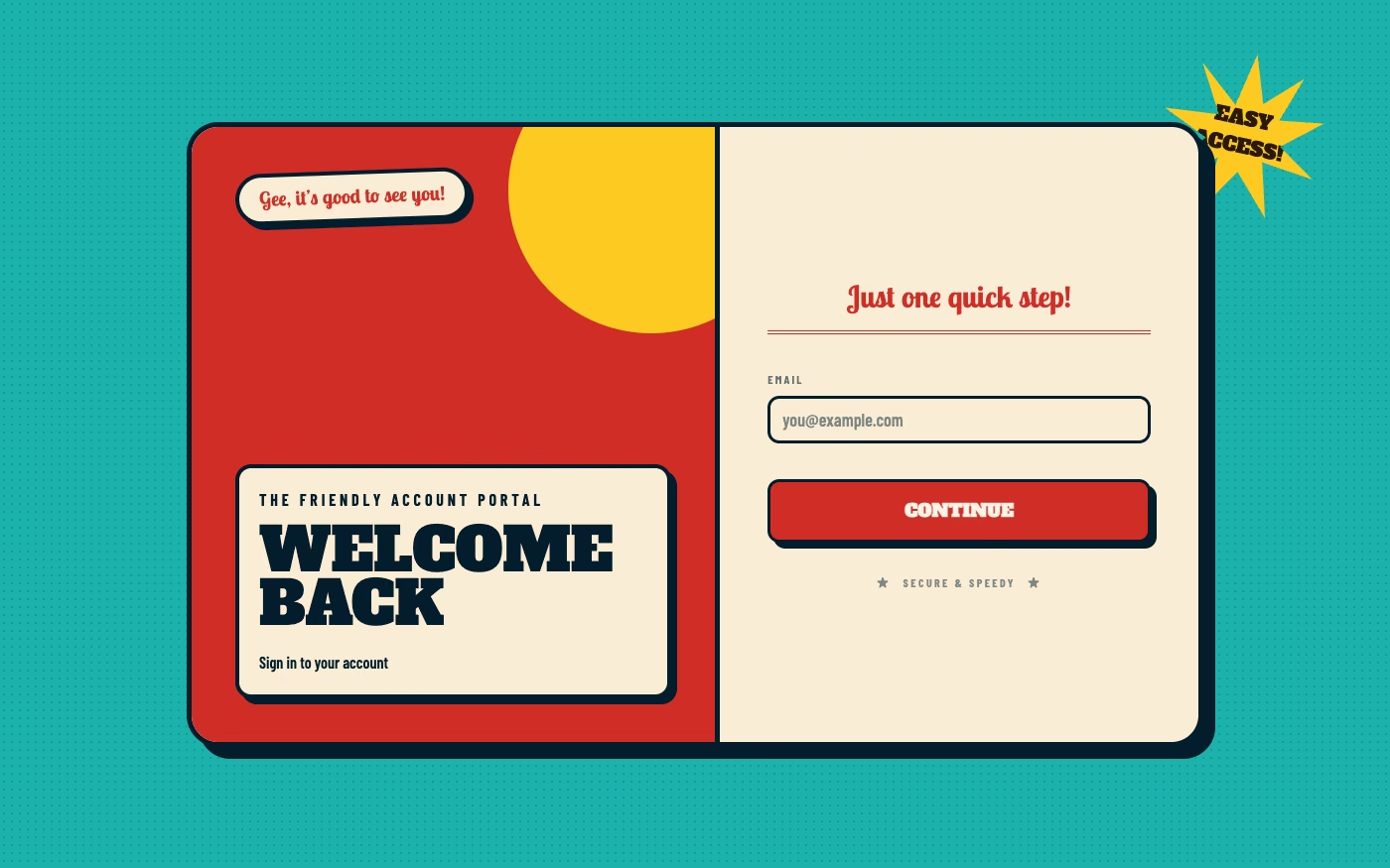
Design overview
- Signature elements
- painted advertising scenes, smiling exaggerated characters, hand-lettered headlines, product demonstrations, price starbursts, aged print texture. In daisyUI themes, set `--noise: 1;`.
- Best suited to
- Food, hospitality, entertainment, heritage brands, roadside culture, packaging, and humorous nostalgic campaigns.
- Layout principles
- Compose like a magazine advertisement, diner placemat, billboard, or package front with one large narrative illustration, a prominent product or promise, and compact benefit, price, or coupon callouts.
History and origins
A fact-checked account of where this visual language came from, with links to the references used.
- Period
- Late 1940s–1960s
- Origin
- Postwar consumer culture and roadside commerce in the United States
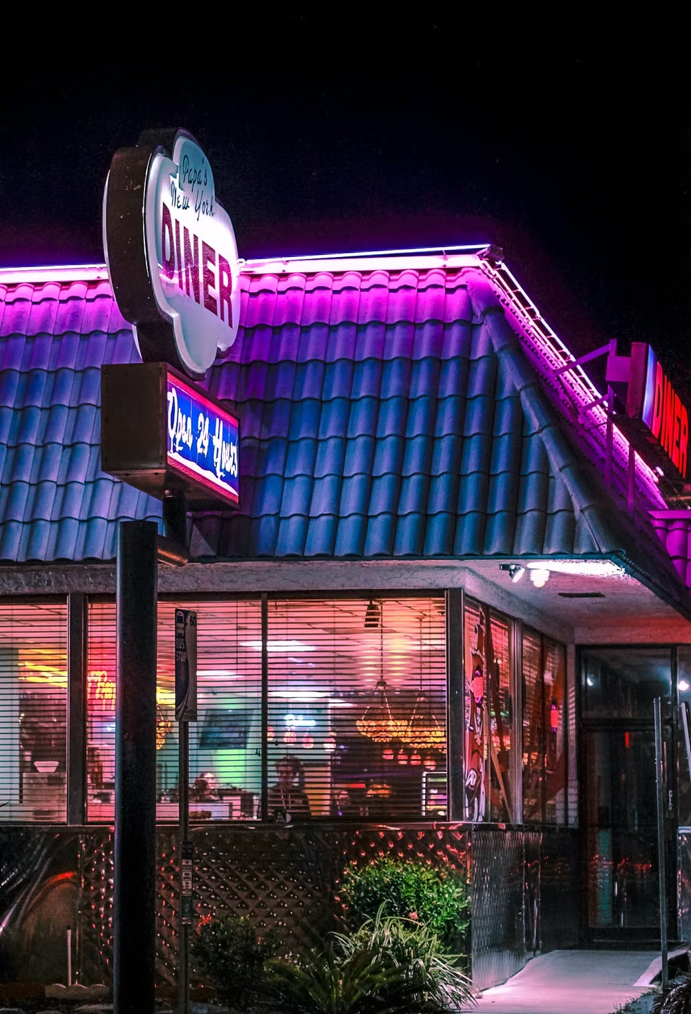
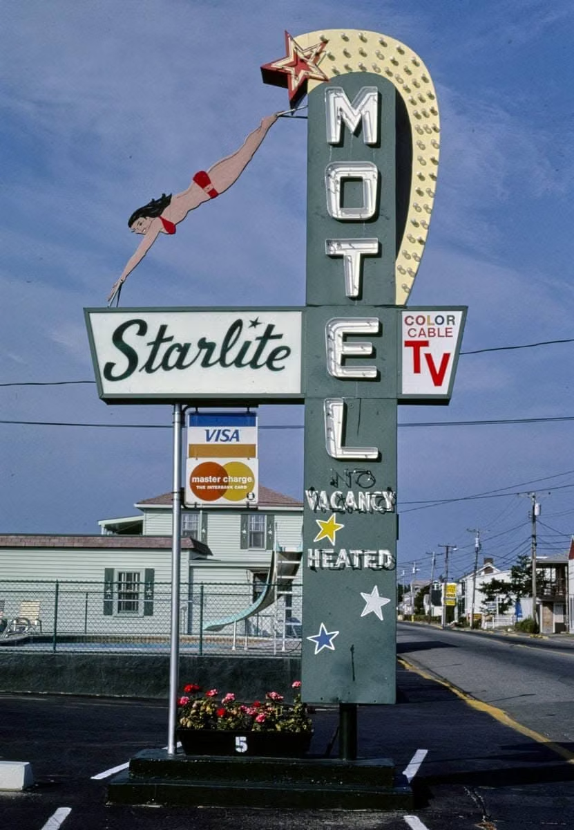
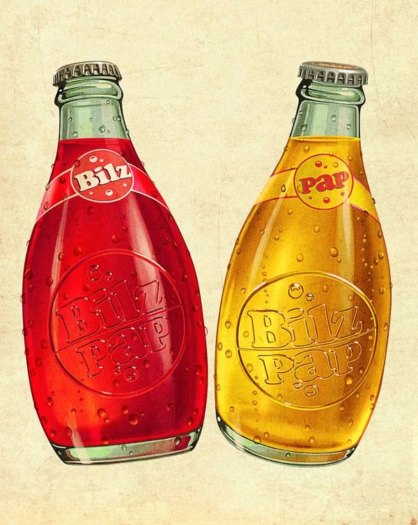
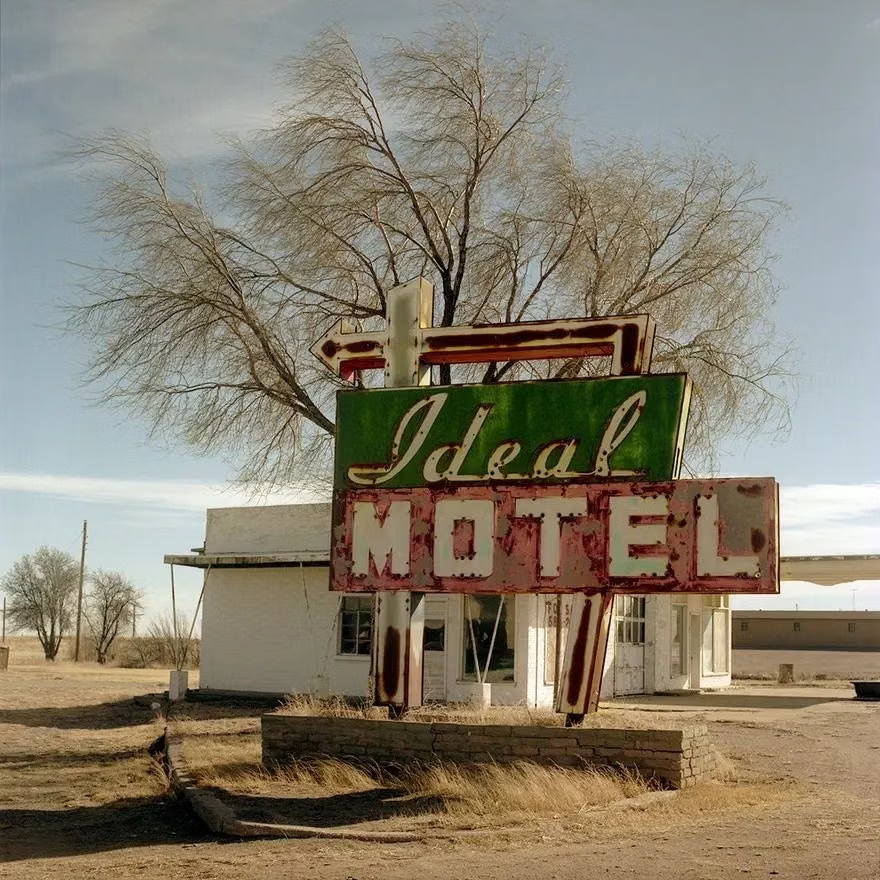
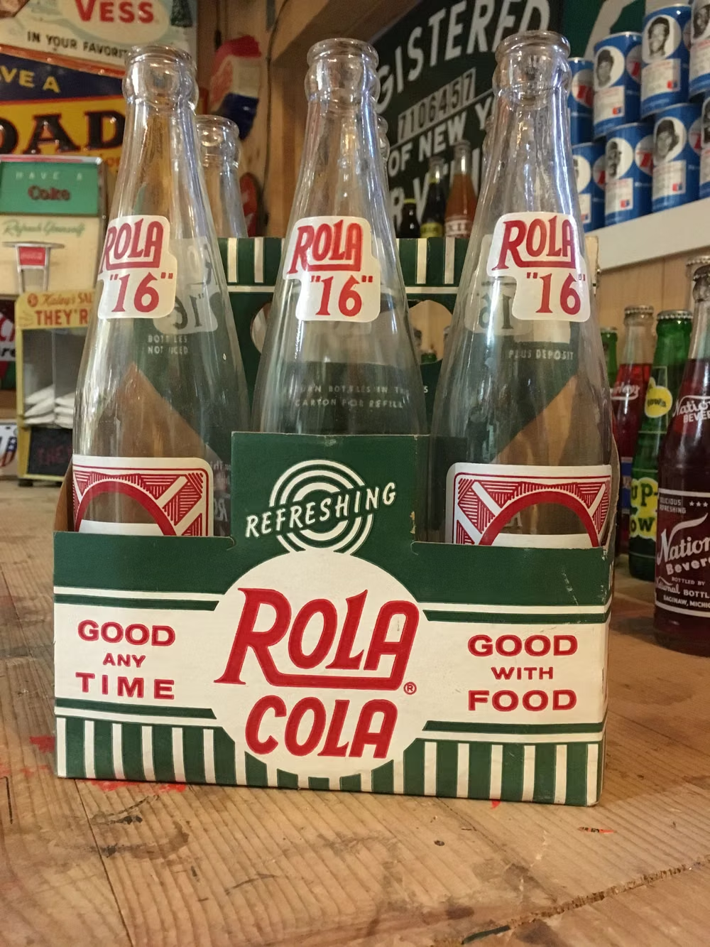
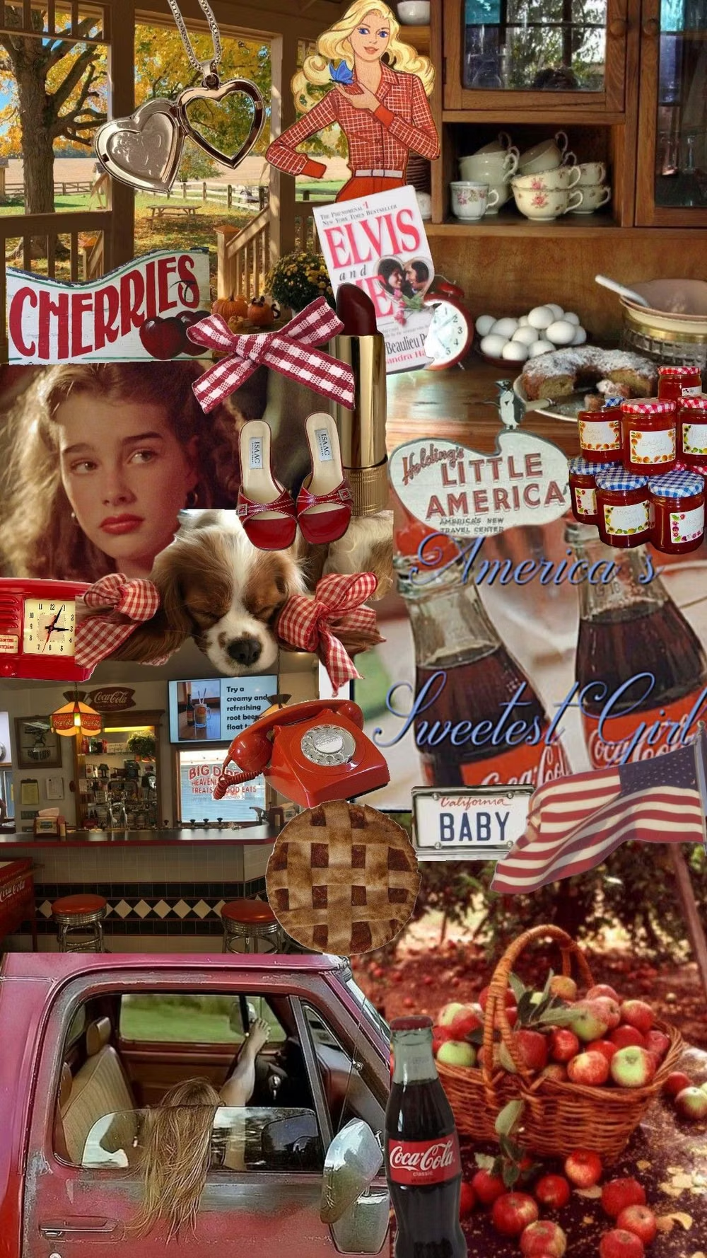
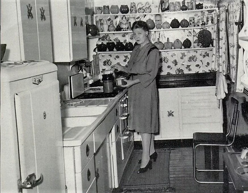
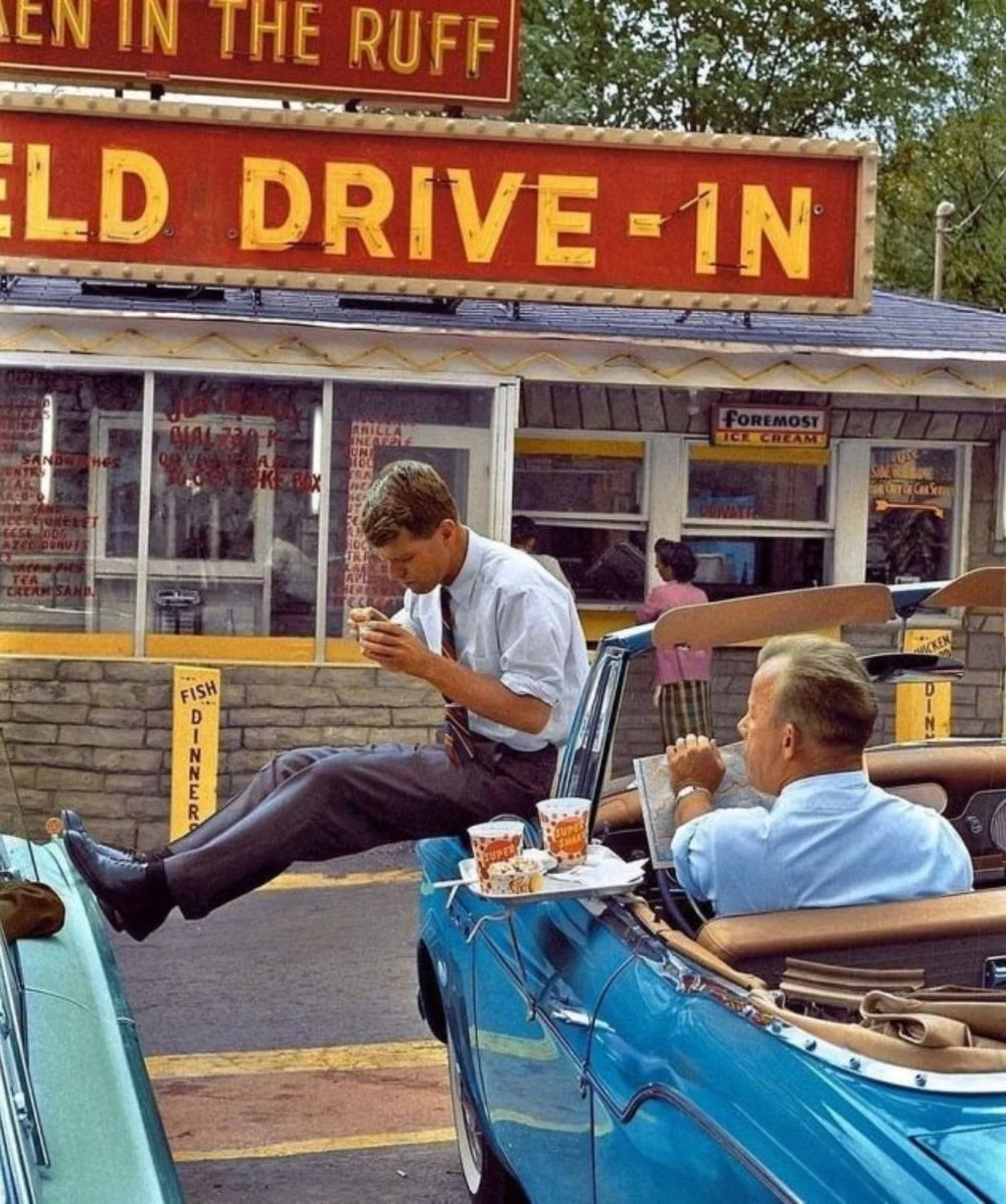
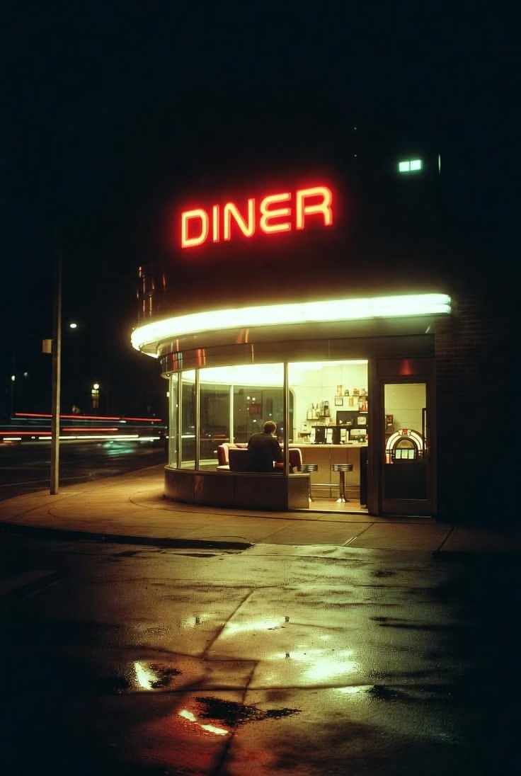
American Kitsch is a retrospective umbrella, not a movement that named itself. It draws together postwar advertising, novelty products, roadside signs, diner graphics, tropical fantasies, household ornament, and car styling produced during expanding mass consumption; later designers embraced the exaggeration and perceived bad taste as a deliberately joyful historical reference.
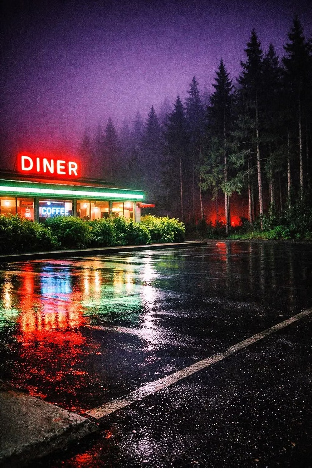
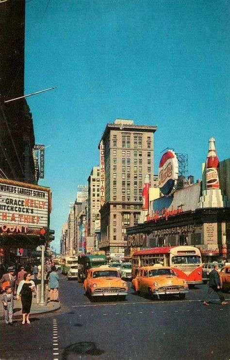
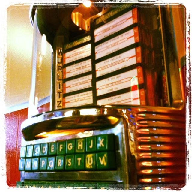
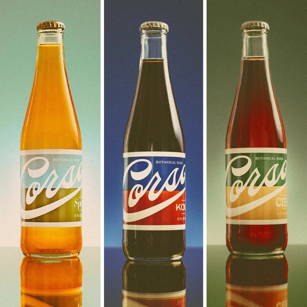
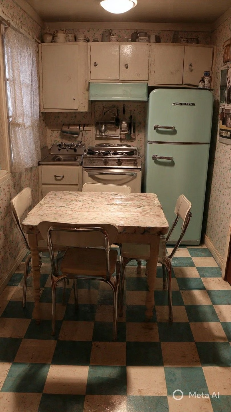
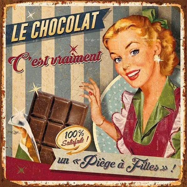
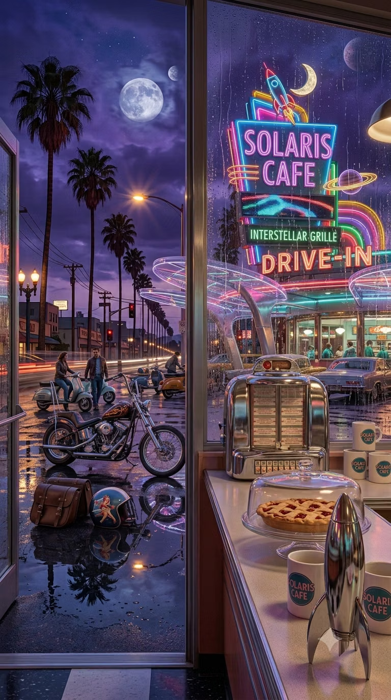
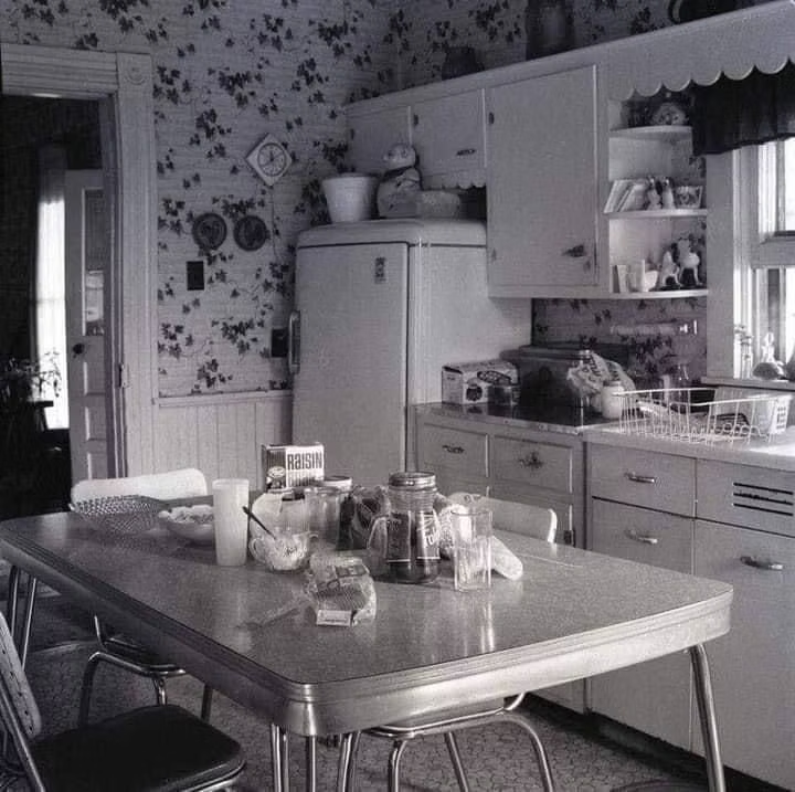
Moodboard and visual references
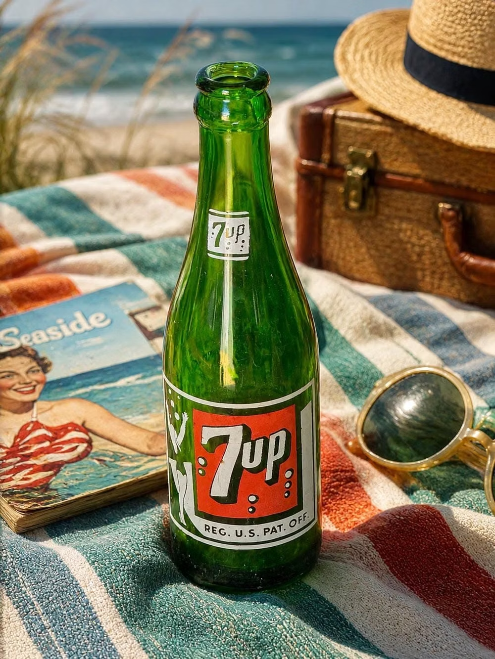
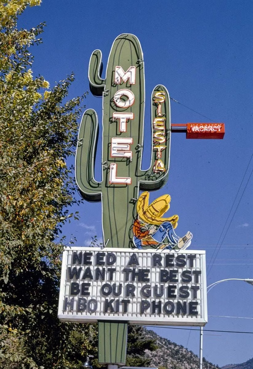
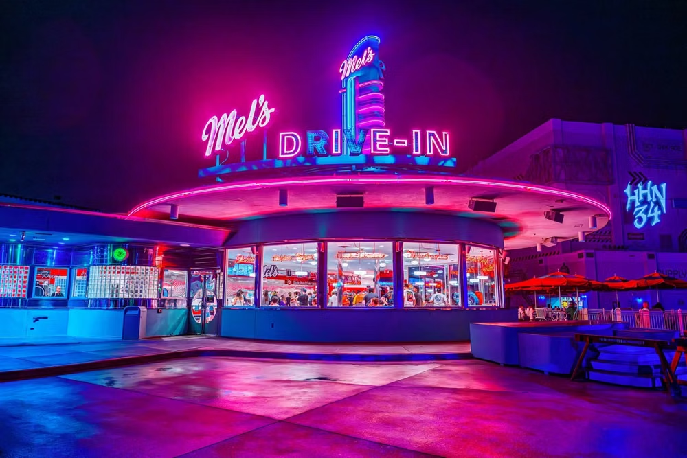
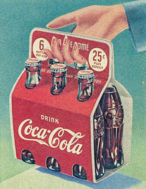
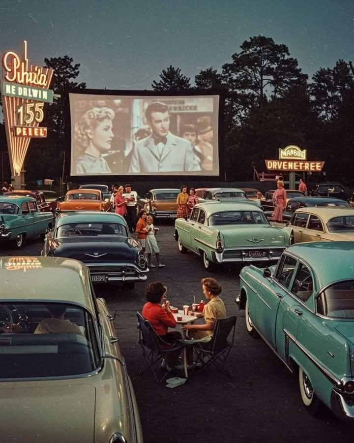
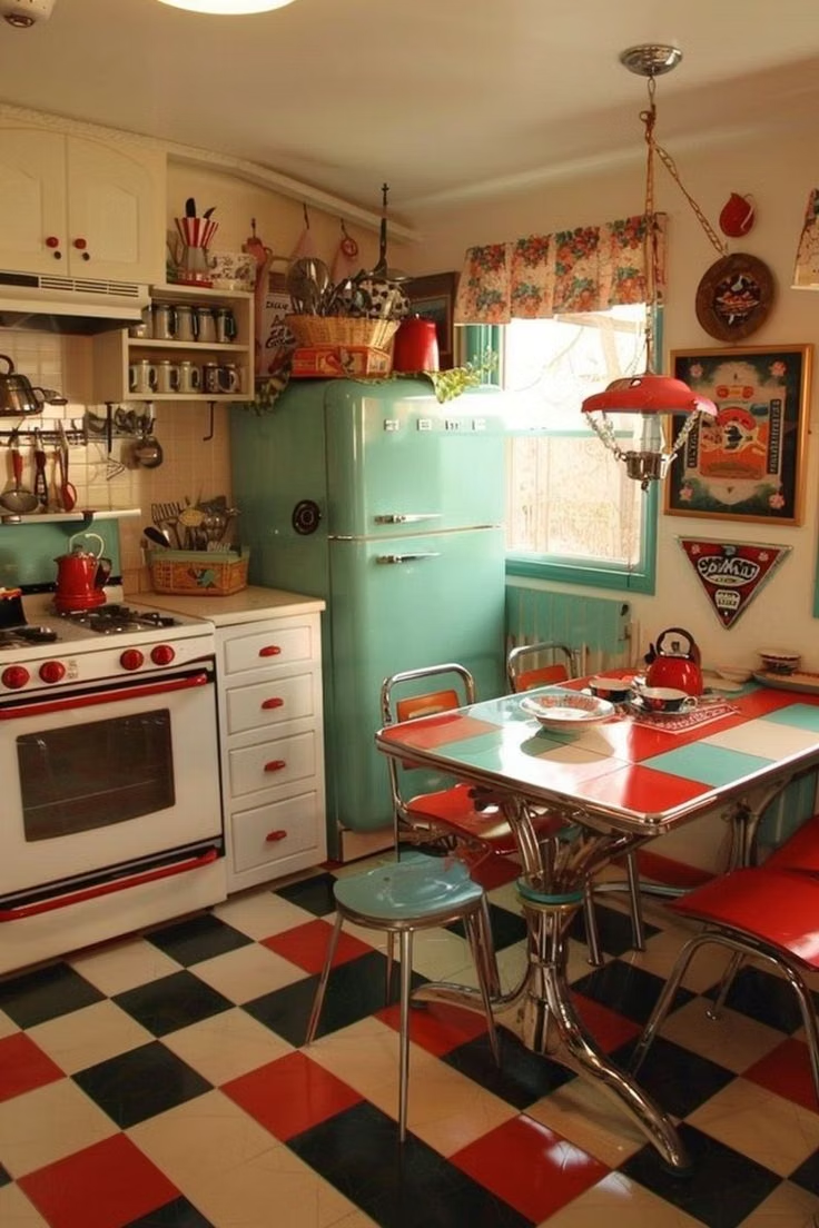
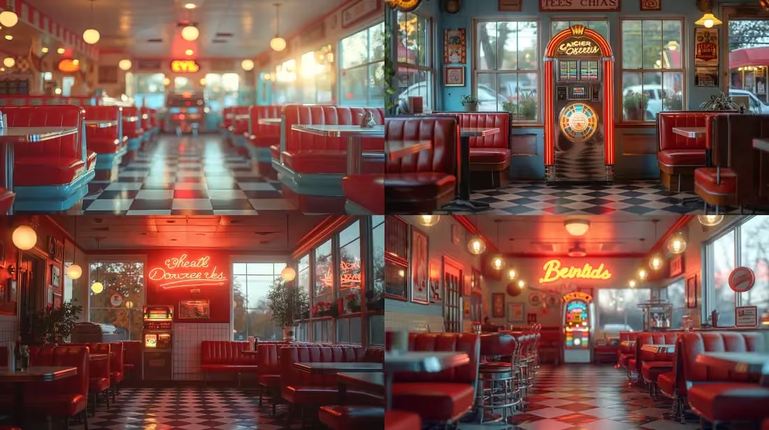
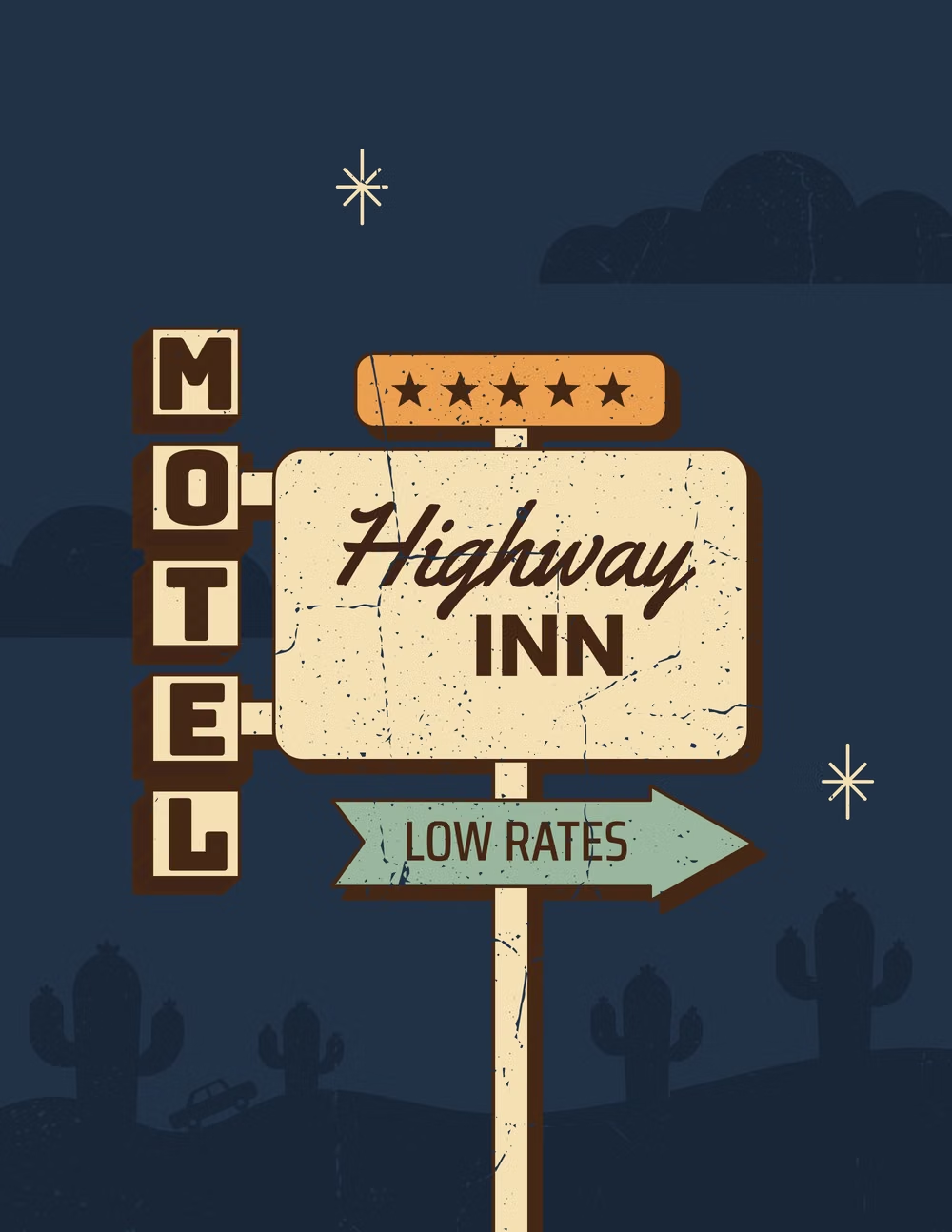
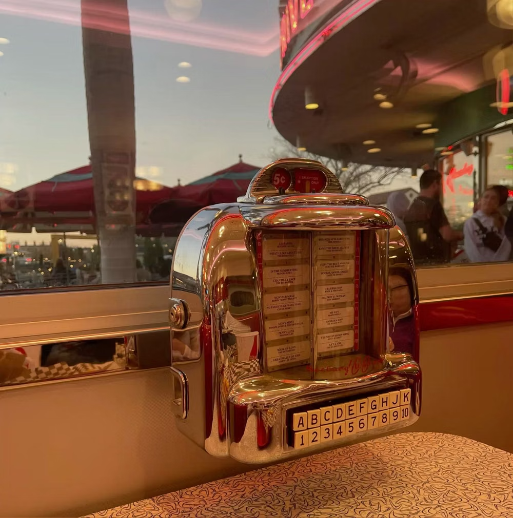
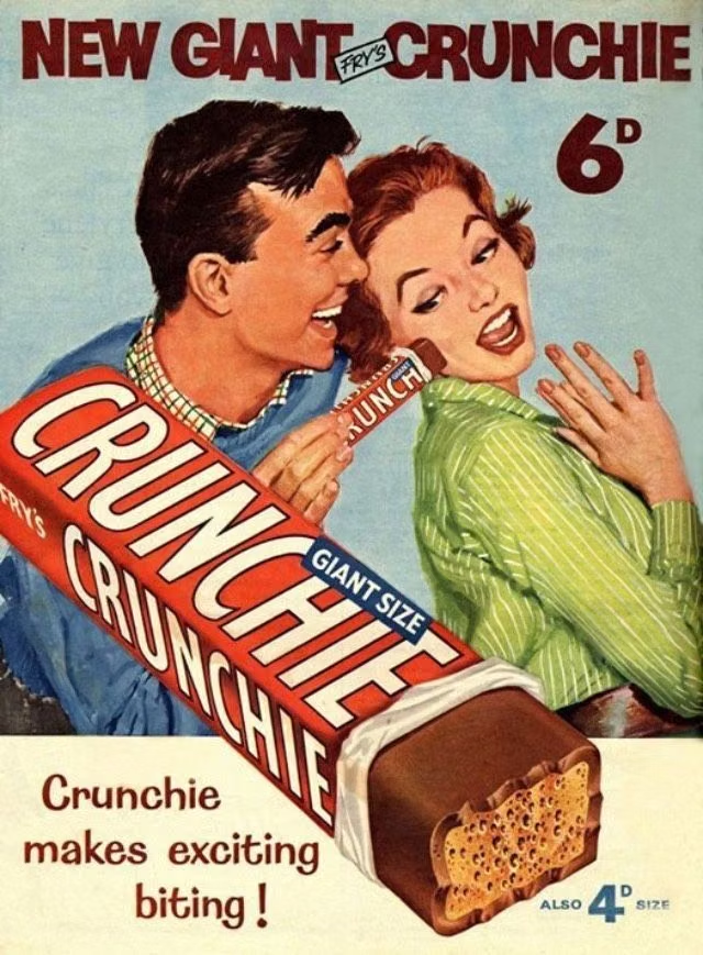
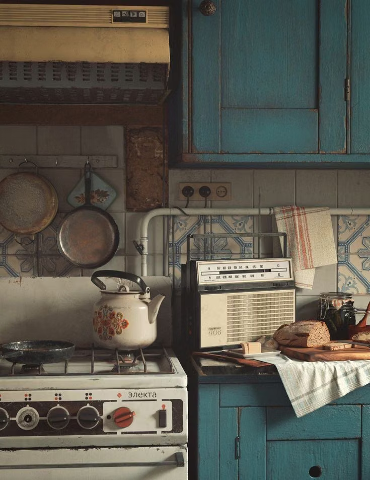
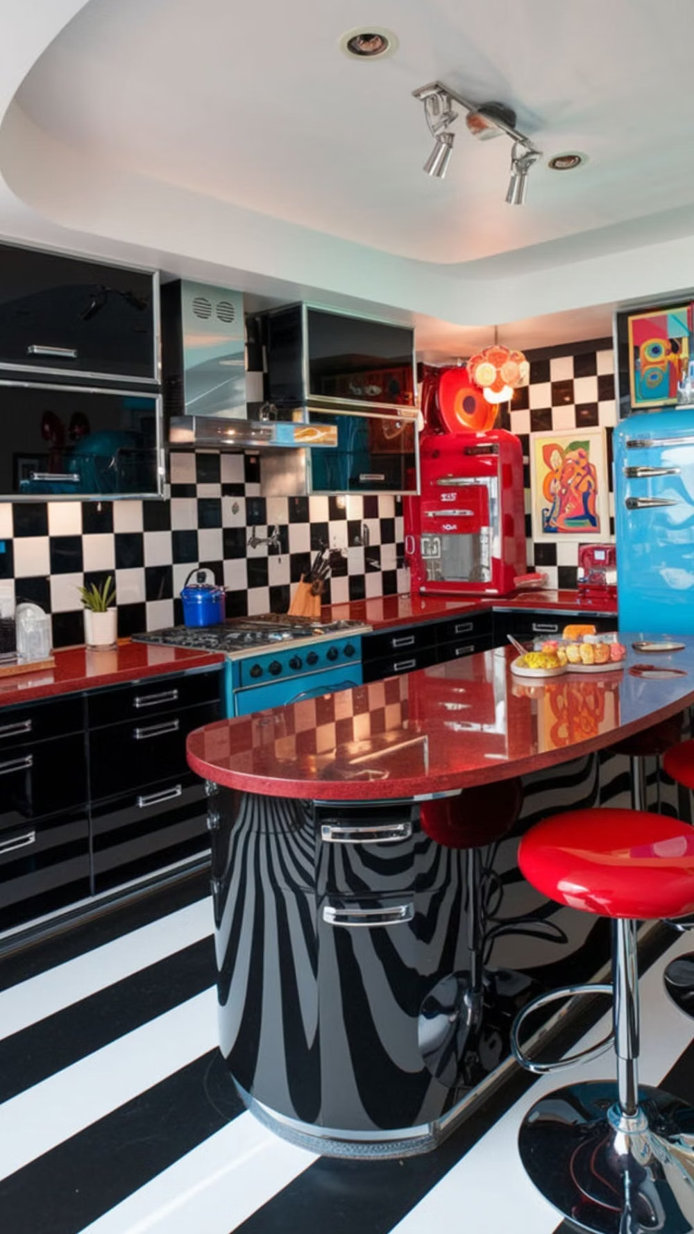
A visual study of the forms, inspirations, materials, colors, type, and cultural references associated with this UI design style.
Design principles and implementation
Use these principles to write a focused AI UI design prompt instead of asking for a vague visual treatment.
Color direction
Use warm cream, cherry red, turquoise, butter yellow, mint, navy, and flesh tones with vivid mid-century contrast, slightly faded ink, and no contemporary atmospheric gradients. In a daisyUI theme, use cherry red or turquoise for `primary`, butter yellow or mint for `secondary`, and assign warm cream, faded white, and pale tan to `base-100`, `base-200`, and `base-300`.
Imagery direction
Show expressive families, cooks, motorists, diners, domestic mishaps, food, appliances, road trips, and idealized suburban scenes in polished painterly realism with gentle humor.
Content density
Use medium to high promotional density, grouping short copy, badges, bursts, and labels around a dominant scene while protecting the main headline and action.
Motion direction
Reveal the scene like a sequential print ad, illuminate diner signs, pop price bursts, and stage simple product demonstrations with brisk theatrical timing.
Shape language
Use scalloped labels, price bursts, rounded product badges, ribbons, coupons, speech devices, diner signs, and printed frames with period-appropriate irregularity. In daisyUI themes, set the `--radius-*` variables between `0.75rem` and `1.5rem`.
Typography rules
Pair brush script or an exuberant slab with a practical condensed sans-serif, limiting novelty lettering to the headline, product name, price, or short sales phrase.
Suggested Typfaces
Alfa Slab One
Fresh daisies glow in warm sunlight
Fresh daisies glow in warm sunlight
1 2 3 4 5 6 7 8 9 0
Barlow Condensed
Fresh daisies glow in warm sunlight
Fresh daisies glow in warm sunlight
1 2 3 4 5 6 7 8 9 0
Libre Franklin
Fresh daisies glow in warm sunlight
Fresh daisies glow in warm sunlight
1 2 3 4 5 6 7 8 9 0
Lobster Two
Fresh daisies glow in warm sunlight
Fresh daisies glow in warm sunlight
1 2 3 4 5 6 7 8 9 0
Bitter
Fresh daisies glow in warm sunlight
Fresh daisies glow in warm sunlight
1 2 3 4 5 6 7 8 9 0
Build a American Kitsch interface with daisyUI
The live example translates this direction into daisyUI components and semantic theme tokens.
To generate a full page in the same visual language, give the style name and the design rules above to Blueprint MCP.
Related UI design styles
Compare nearby visual languages that share typography, shapes, use cases, or signature elements.
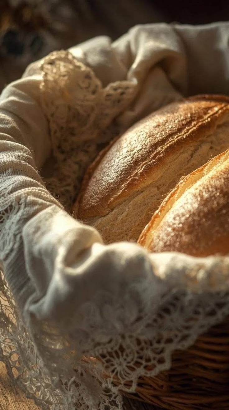
Cottagecore UI design style
Pastoral imagery, florals, handmade textures, gentle serif type, warm domestic details, and romantic rural nostalgia.
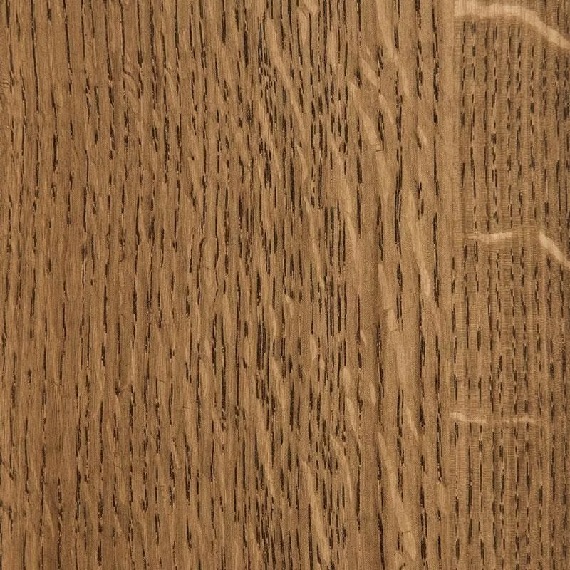
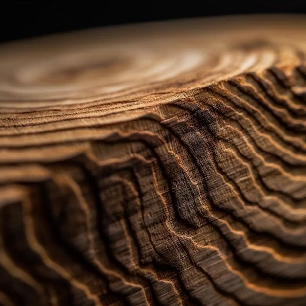
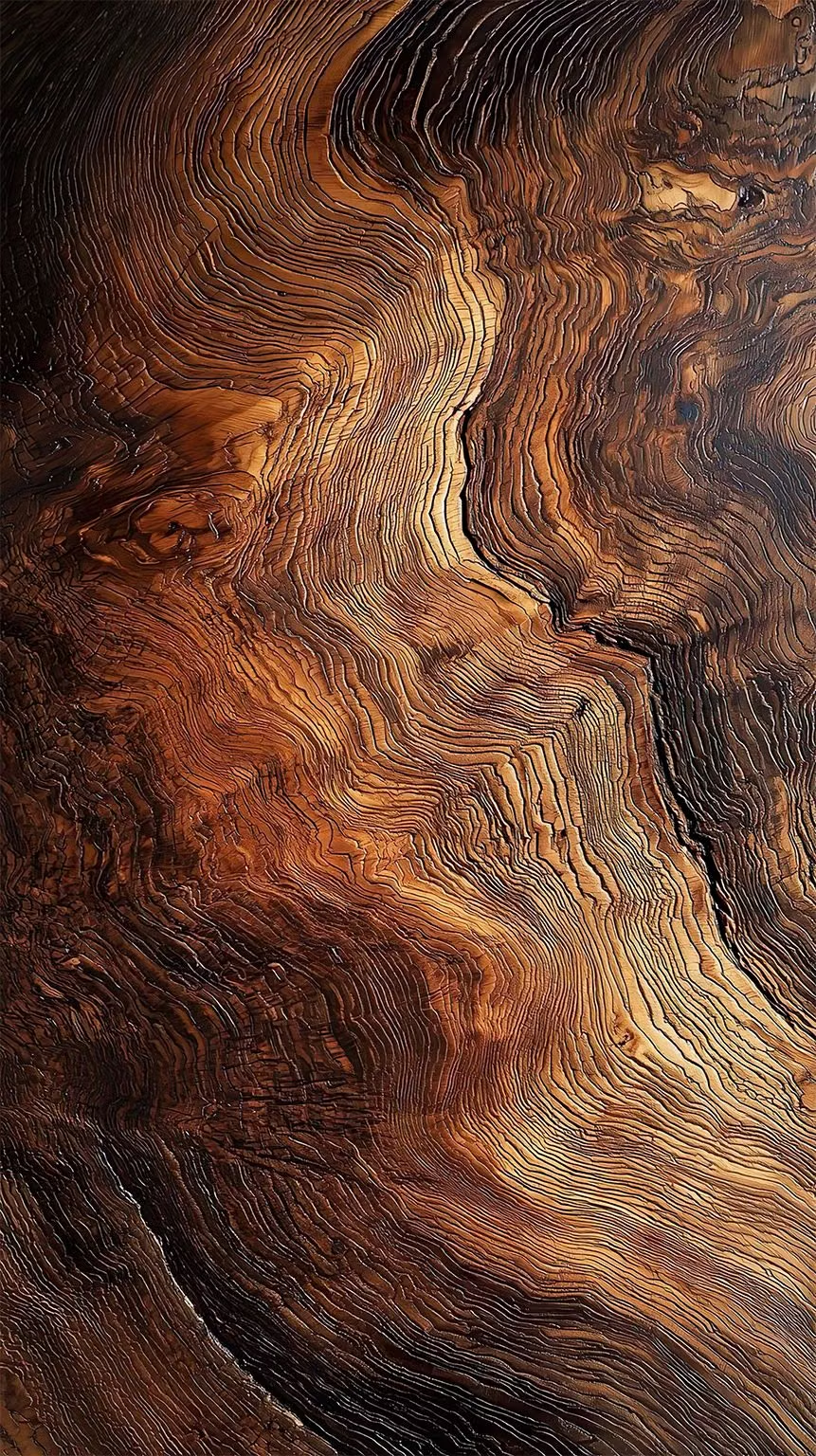
Real-Wood Skeuomorphism UI design style
A tactile skeuomorphic style that constructs interfaces from highly realistic wood surfaces, making digital controls resemble carved, assembled, polished, or weathered wooden objects.

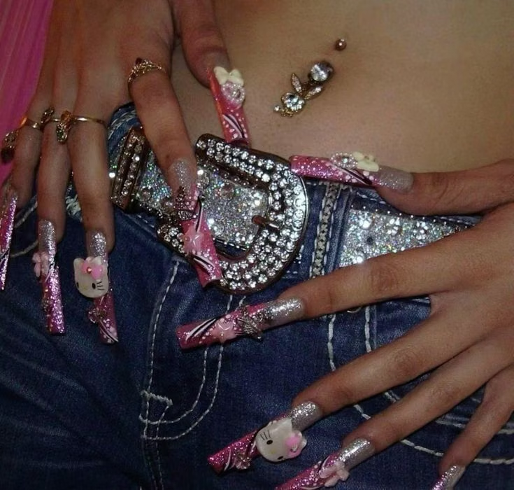
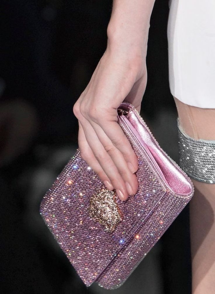
McBling UI design style
Bedazzled surfaces, hot pink, metallic accessories, ornate scripts, celebrity excess, and maximal early-2000s luxury signals.