Art Nouveau UI design style
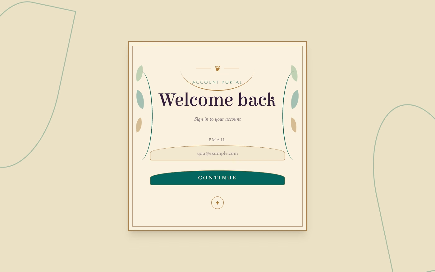
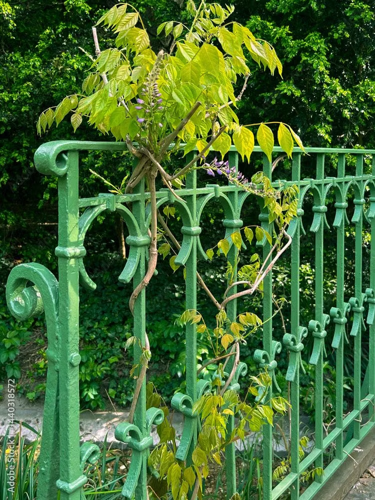
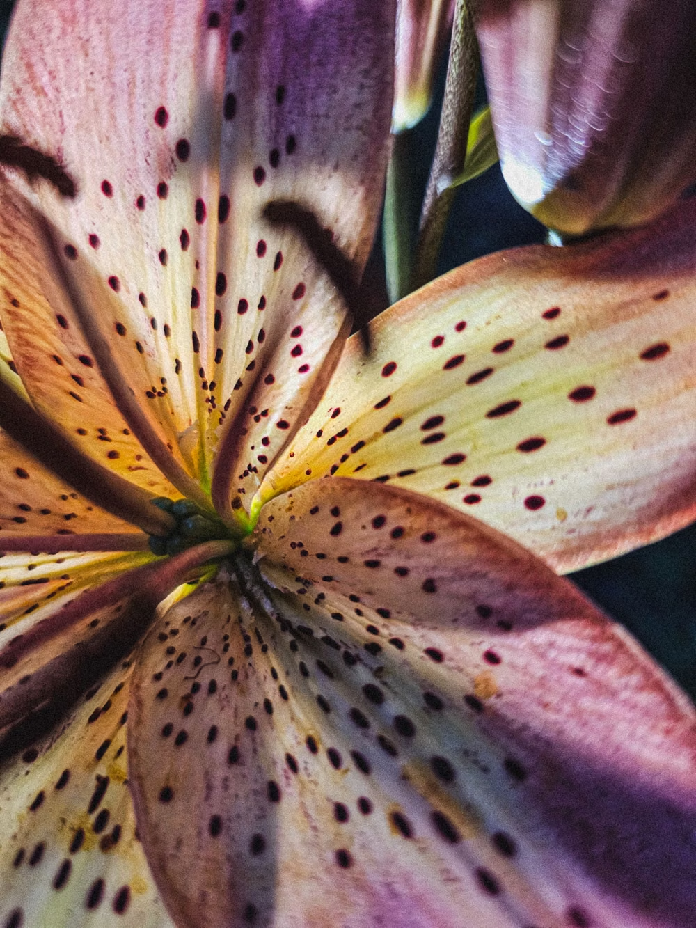
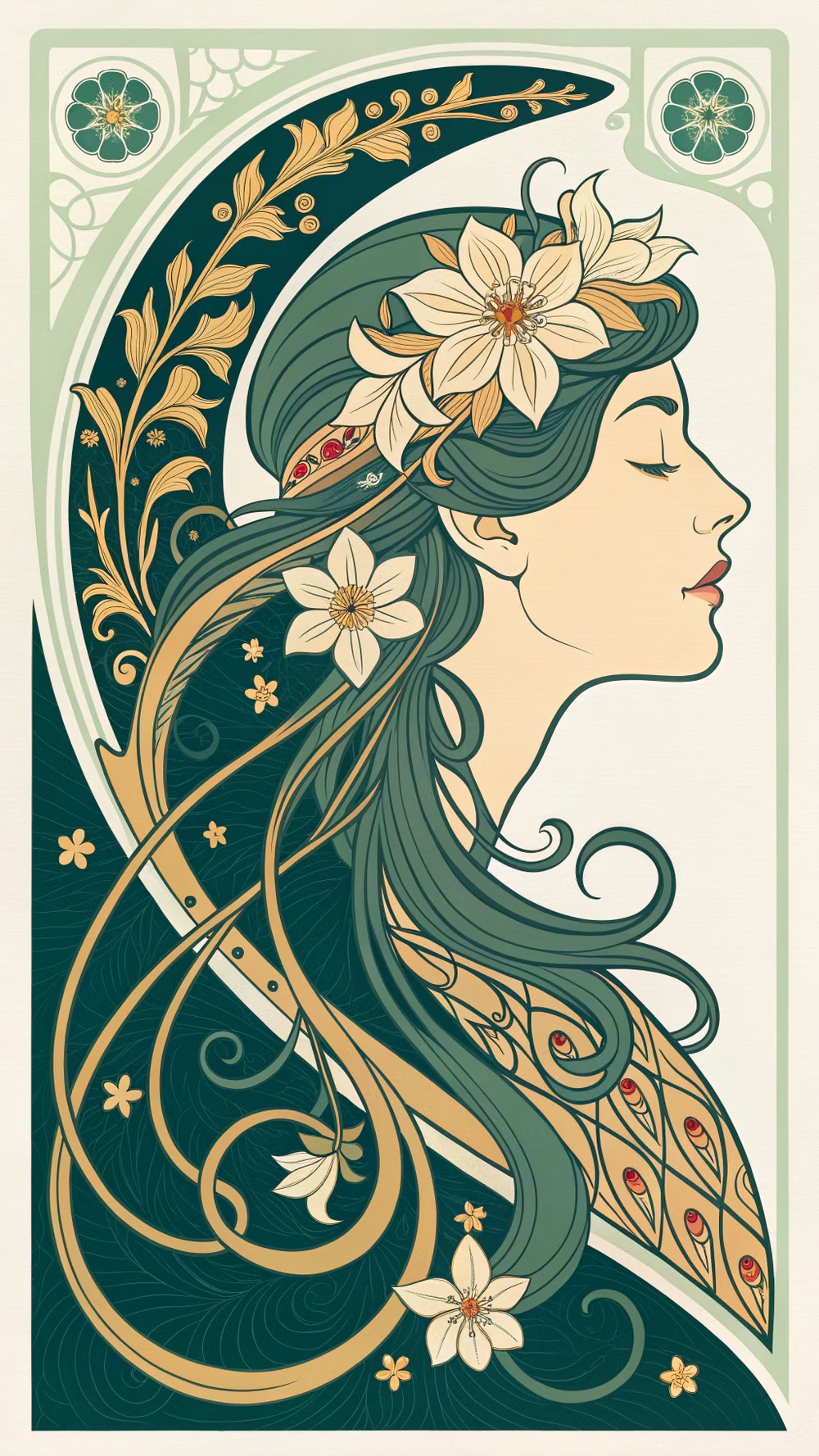
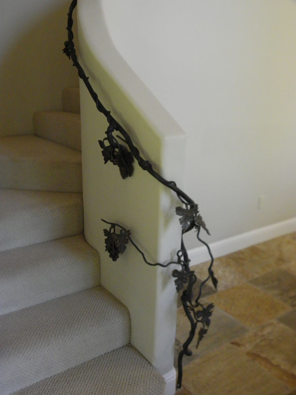
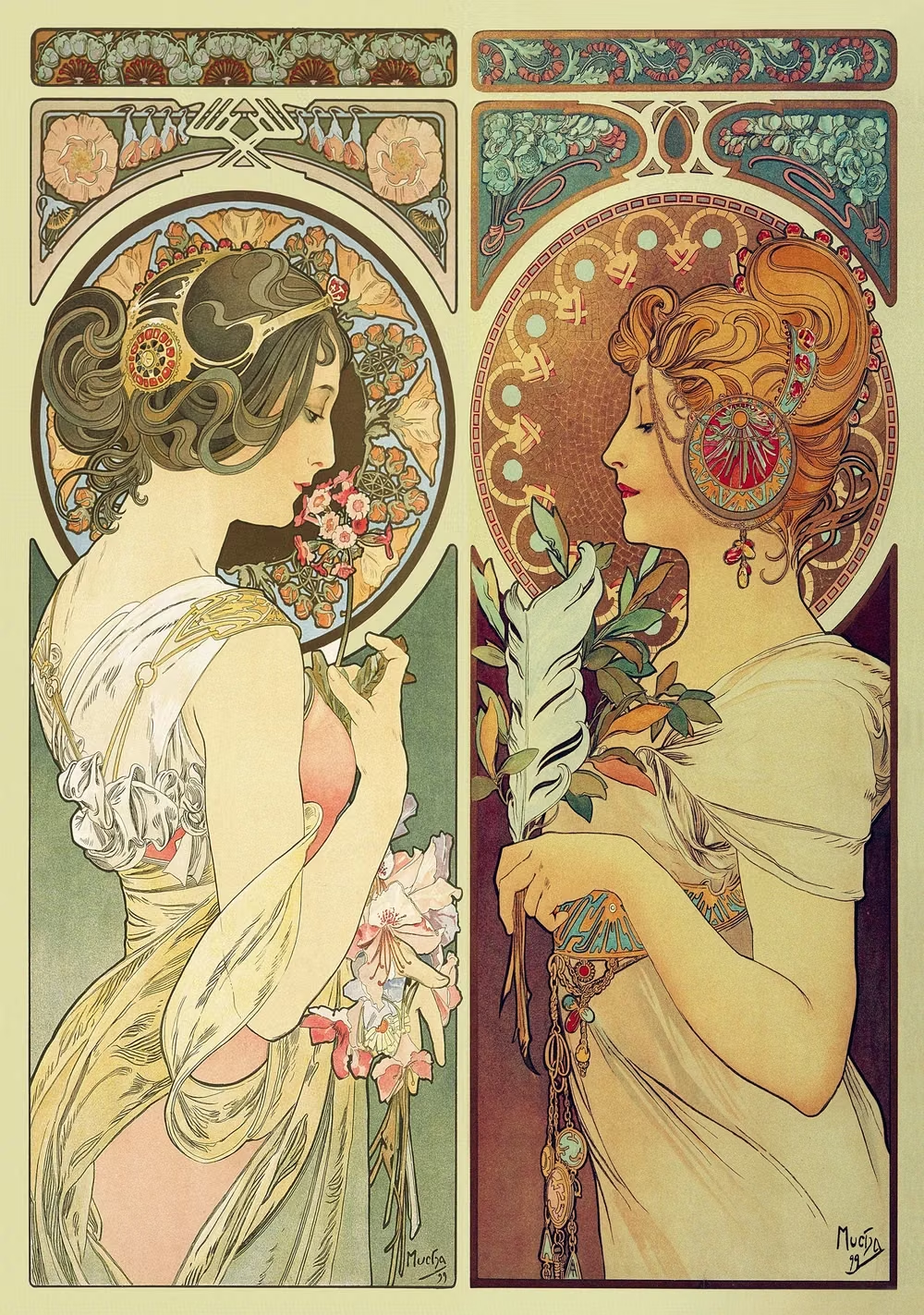
Flowing botanical lines, decorative frames, elegant lettering, natural motifs, and integrated ornament.
Design overview
- Signature elements
- flowing botanical lines, whiplash curves, ornamental frames, floral motifs, elegant lettering, integrated illustration
- Best suited to
- Beauty, hospitality, arts, weddings, premium packaging, and heritage-inspired commerce.
- Layout principles
- Frame content with flowing botanical borders, use tall graceful compositions, and let ornamental lines connect headings, imagery, and section transitions.
History and origins
A fact-checked account of where this visual language came from, with links to the references used.
- Period
- Early 1890s–World War I
- Origin
- An international movement with major centers in Belgium, France, Austria, Britain, Spain, and the United States
Art Nouveau emerged in the 1890s as an international attempt to create a modern, unified art spanning architecture, interiors, posters, type, and objects. Its regional forms differed, but flowing plant-like lines, asymmetric composition, and integrated ornament became common signals; World War I largely ended its first period of prominence.
Moodboard and visual references
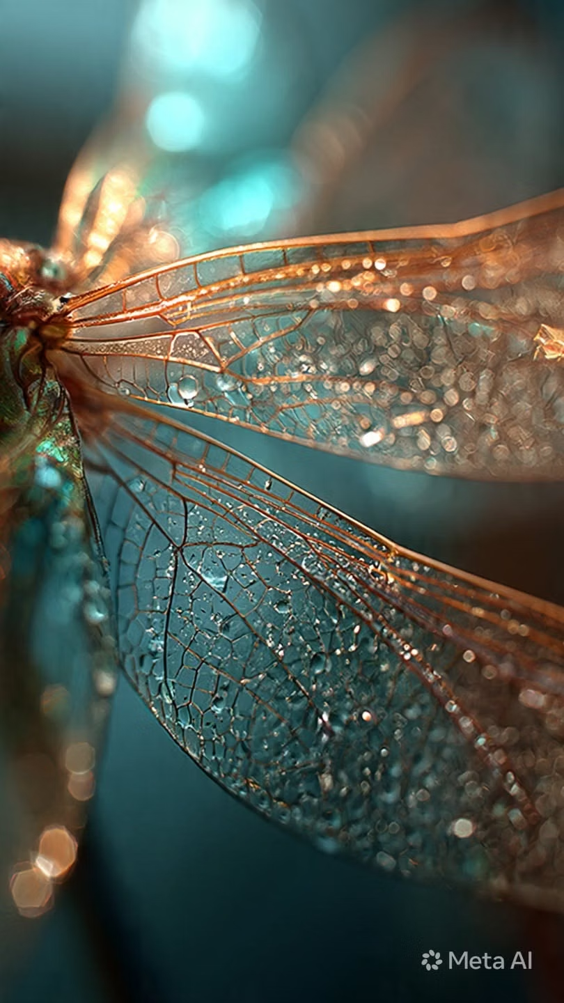
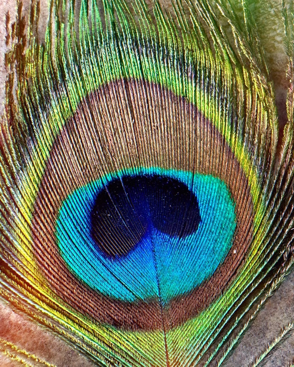
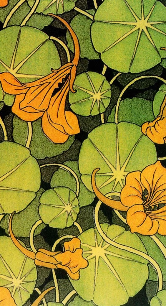
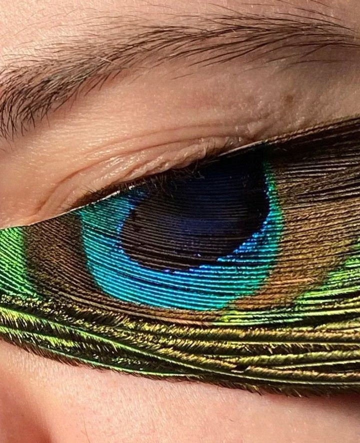
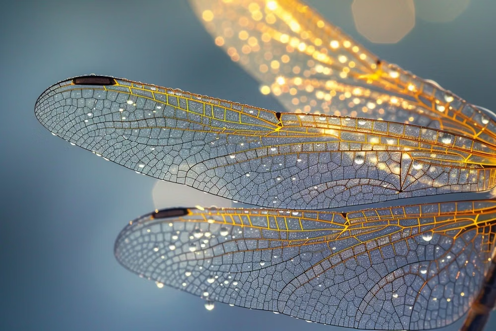
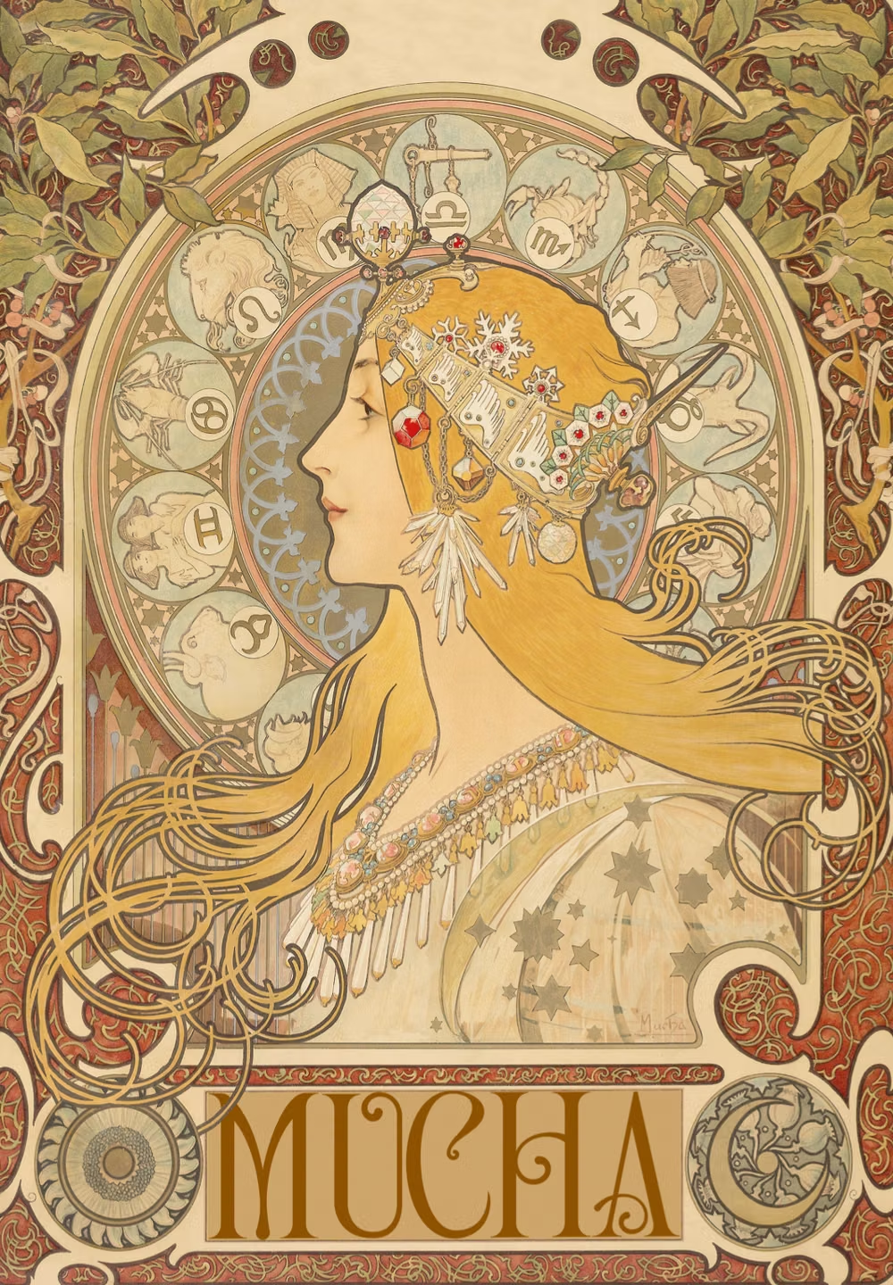
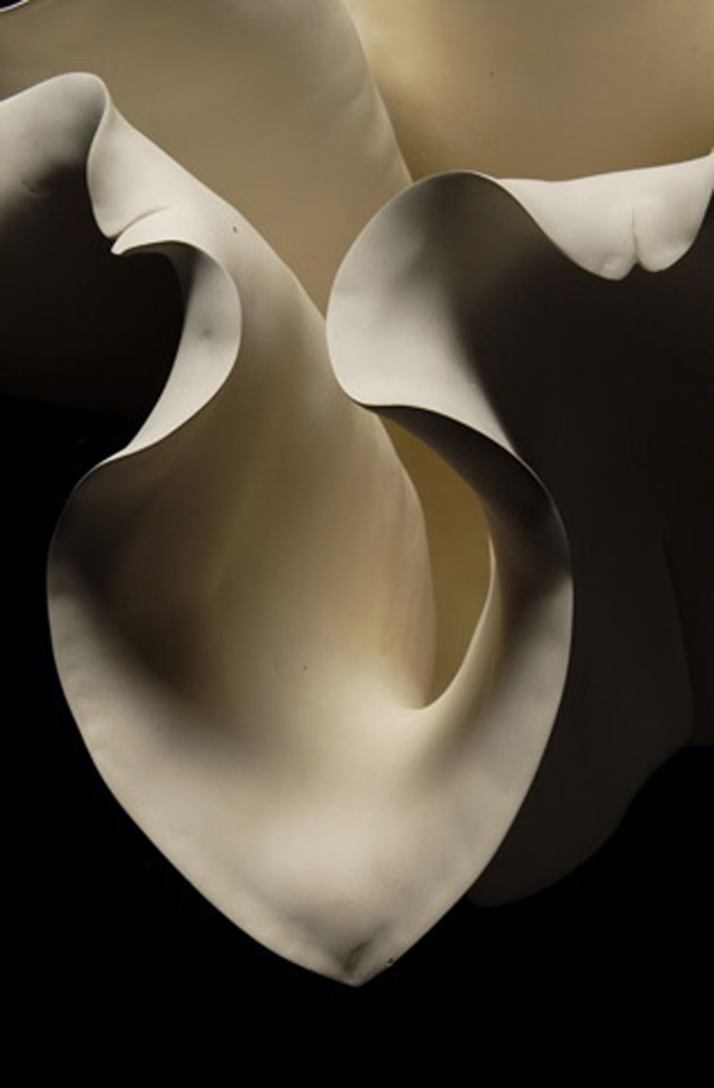
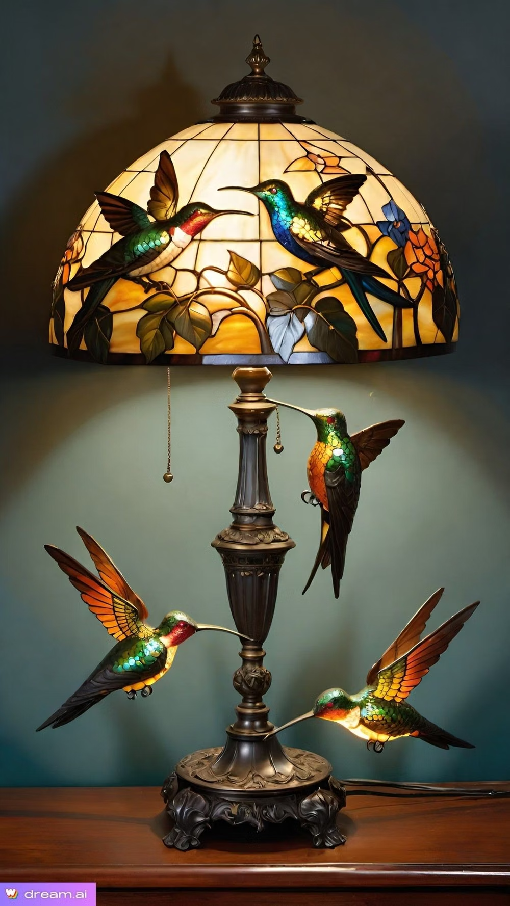
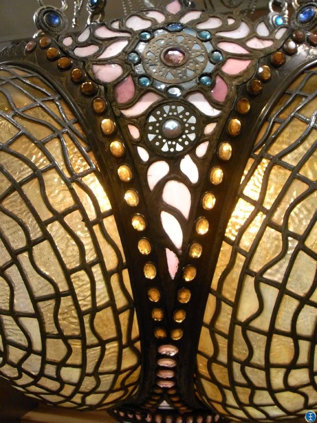
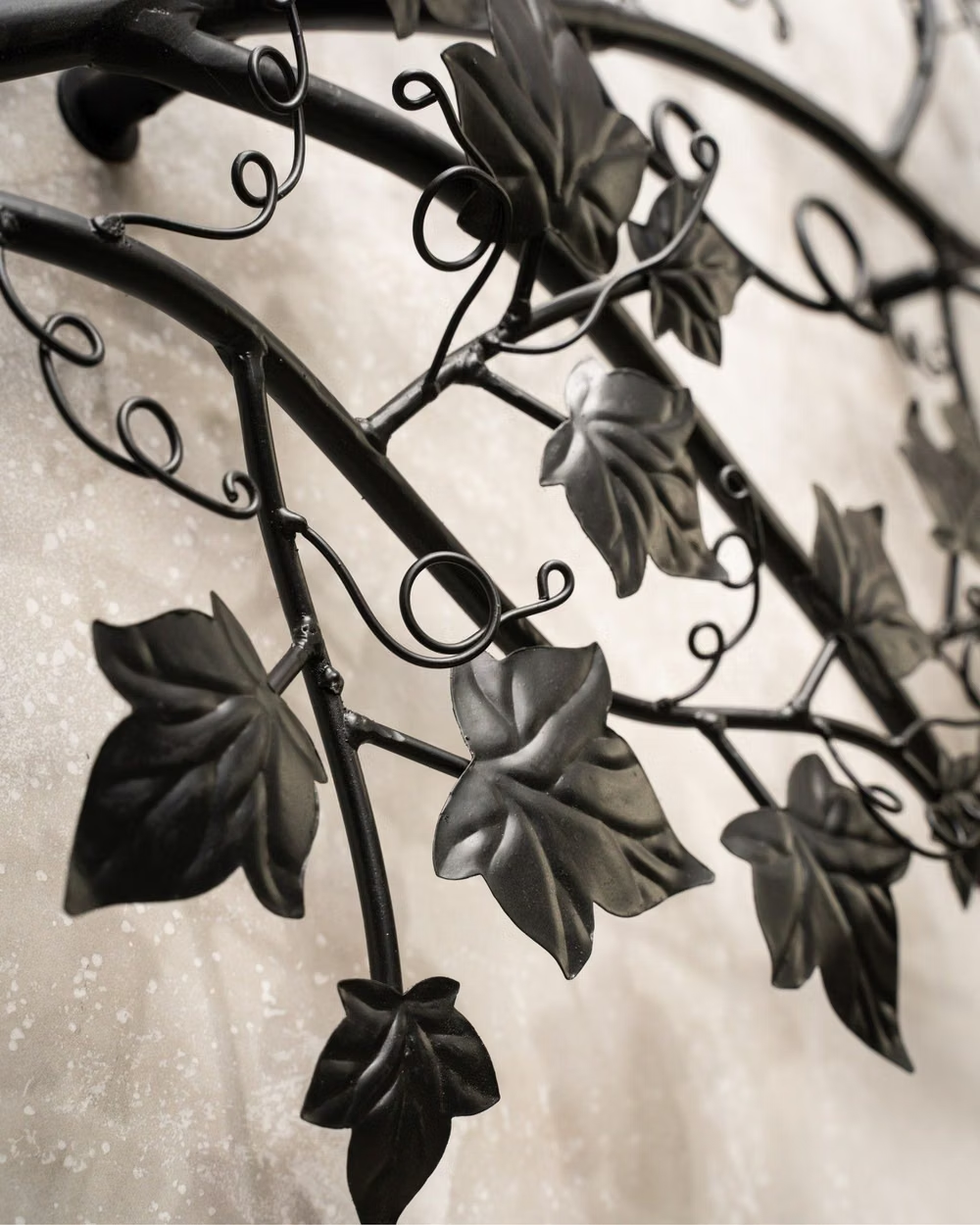
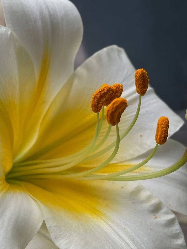
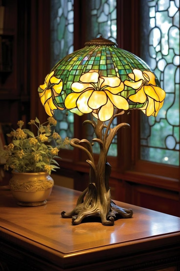
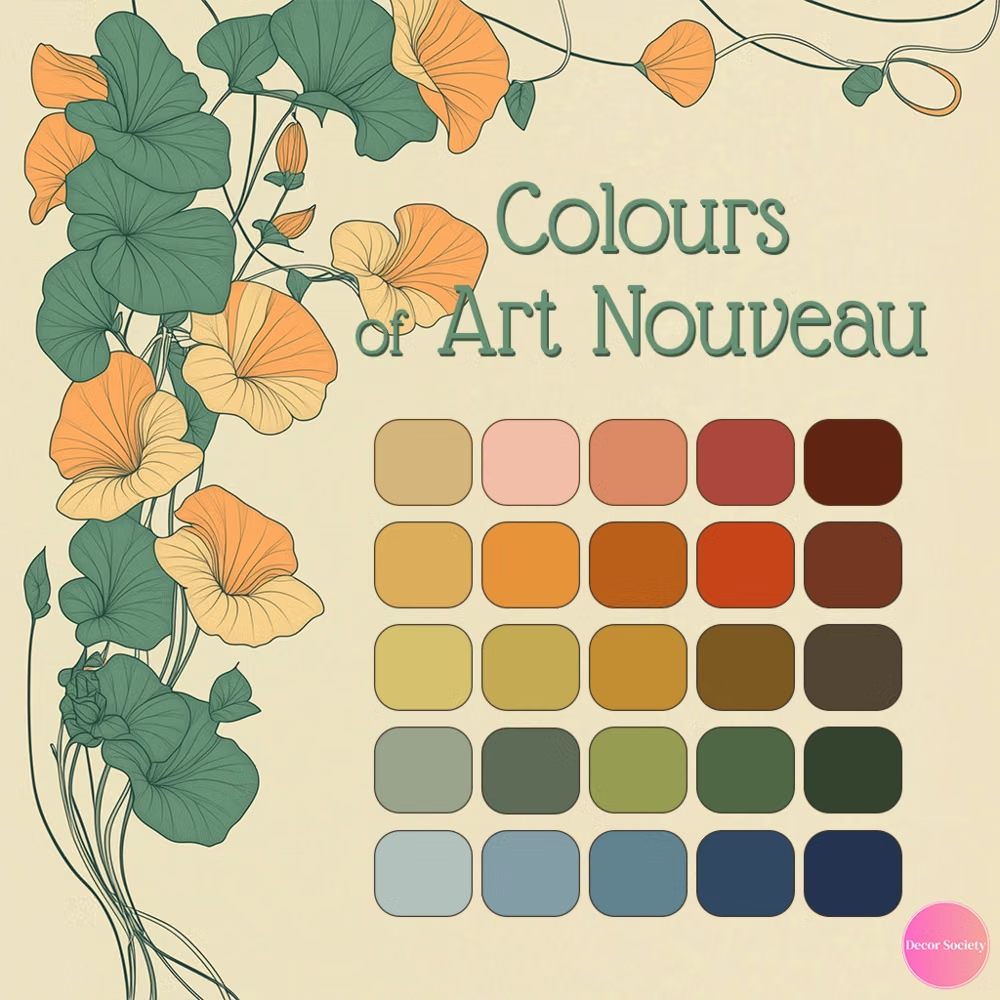
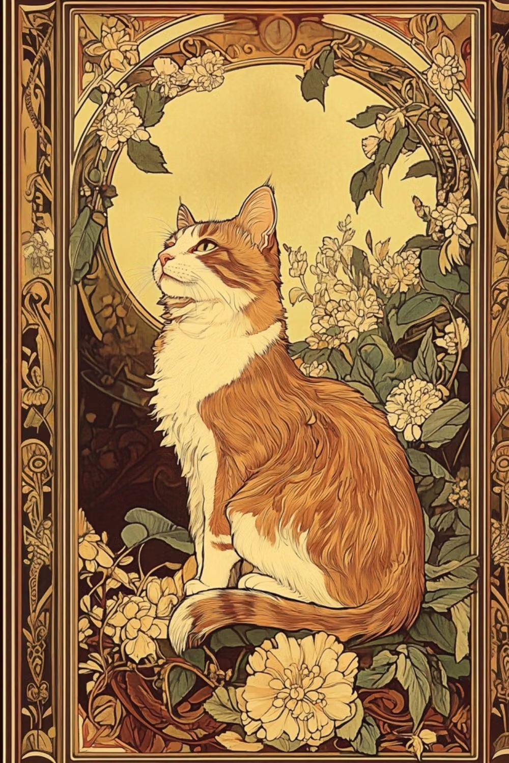
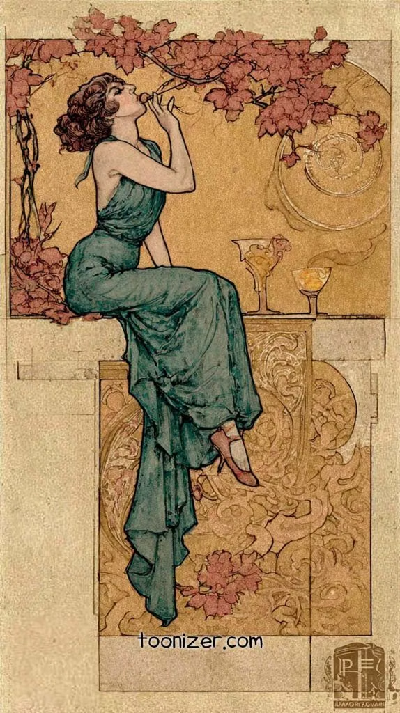
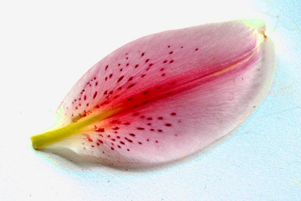
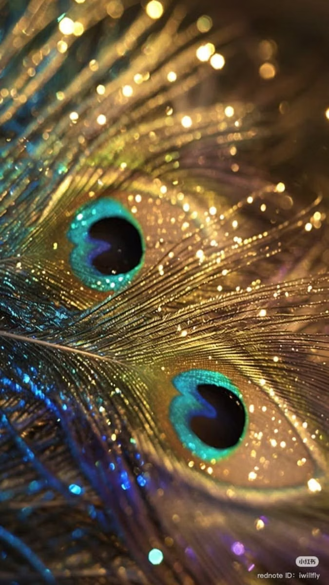
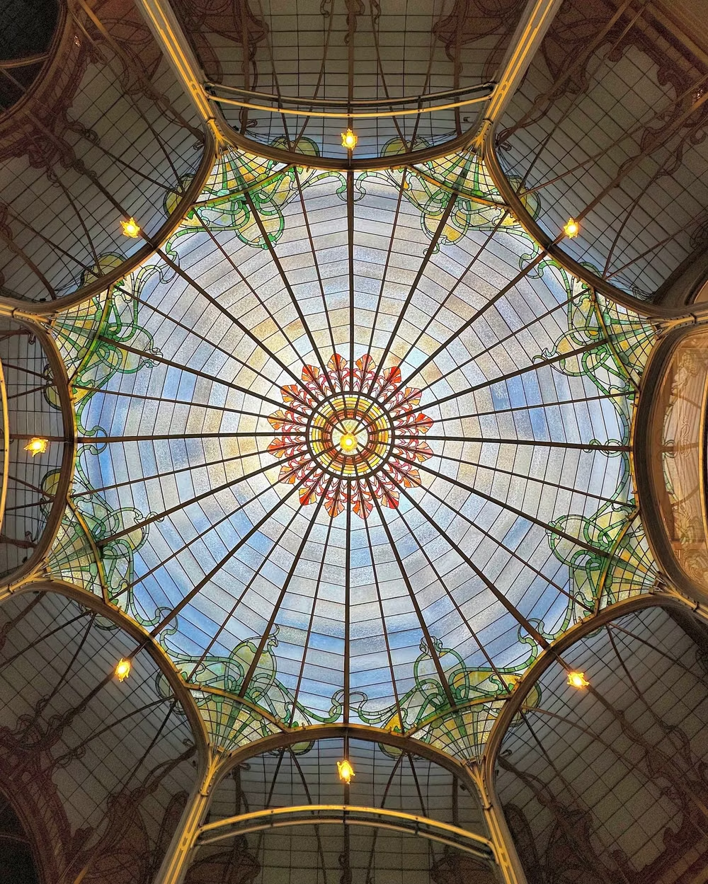
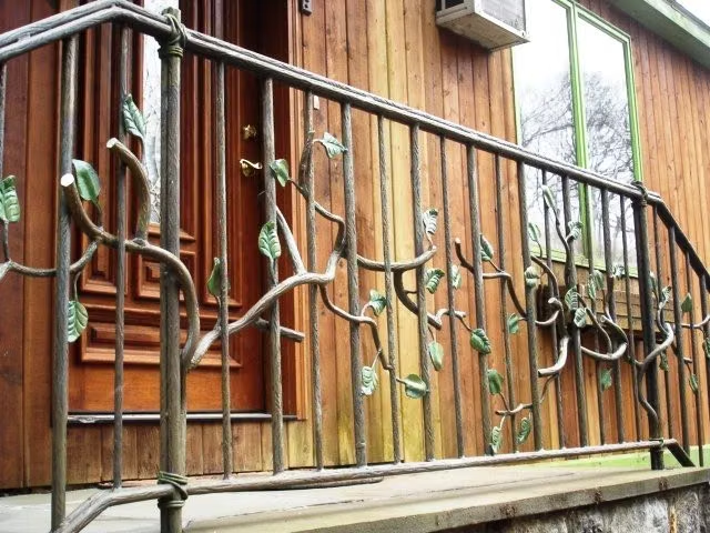
A visual study of the forms, inspirations, materials, colors, type, and cultural references associated with this UI design style.

Design principles and implementation
Use these principles to write a focused AI UI design prompt instead of asking for a vague visual treatment.
Color direction
Choose cream, sage, muted teal, plum, dusty rose, and antique gold in softened botanical harmonies rather than bright digital primaries. In a daisyUI theme, use muted teal or plum for `primary`, sage or dusty rose for `secondary`, and assign cream, pale parchment, and warm botanical gray to `base-100`, `base-200`, and `base-300`.
Imagery direction
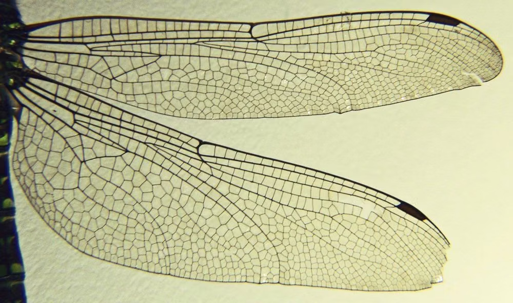
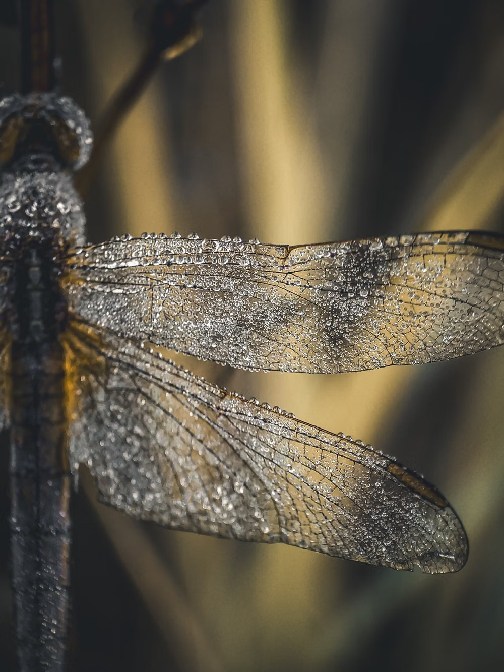
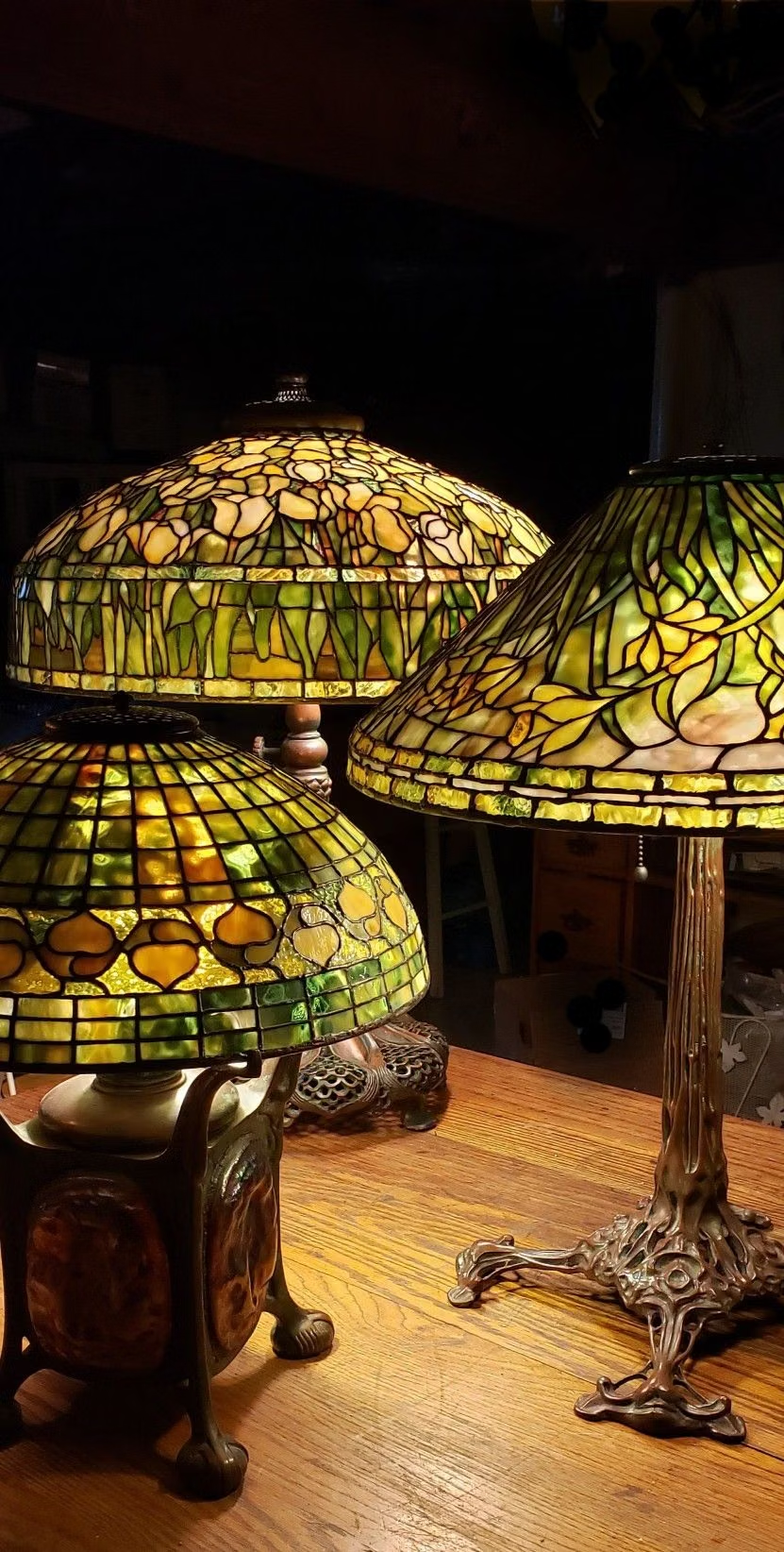
Use elegant portraiture, flowers, insects, vines, stained glass, and integrated line illustration with a consistent hand-drawn ornamental finish.
Content density
Keep density medium, concentrating detail in frames and corner ornament while leaving the center calm enough for reading and action.
Motion direction
Draw vines and whiplash curves along their paths, open floral frames, and dissolve imagery gently as if revealed through layered print.
Shape language
Use whiplash curves, tendrils, petals, elongated arches, oval frames, and intertwined organic borders with few straight mechanical edges. In daisyUI themes, set the `--radius-*` variables between `0.75rem` and `1.5rem`.
Typography rules
Reserve decorative period lettering for names and short headings, then use an elegant readable serif with generous leading for all substantive copy.
Suggested Typfaces
Poiret One
Fresh daisies glow in warm sunlight
Fresh daisies glow in warm sunlight
1 2 3 4 5 6 7 8 9 0
Elsie
Fresh daisies glow in warm sunlight
Fresh daisies glow in warm sunlight
1 2 3 4 5 6 7 8 9 0
Cormorant Infant
Fresh daisies glow in warm sunlight
Fresh daisies glow in warm sunlight
1 2 3 4 5 6 7 8 9 0
Marcellus
Fresh daisies glow in warm sunlight
Fresh daisies glow in warm sunlight
1 2 3 4 5 6 7 8 9 0
Berkshire Swash
Fresh daisies glow in warm sunlight
Fresh daisies glow in warm sunlight
1 2 3 4 5 6 7 8 9 0
Build a Art Nouveau interface with daisyUI
The live example translates this direction into daisyUI components and semantic theme tokens.
To generate a full page in the same visual language, give the style name and the design rules above to Blueprint MCP.
Related UI design styles
Compare nearby visual languages that share typography, shapes, use cases, or signature elements.
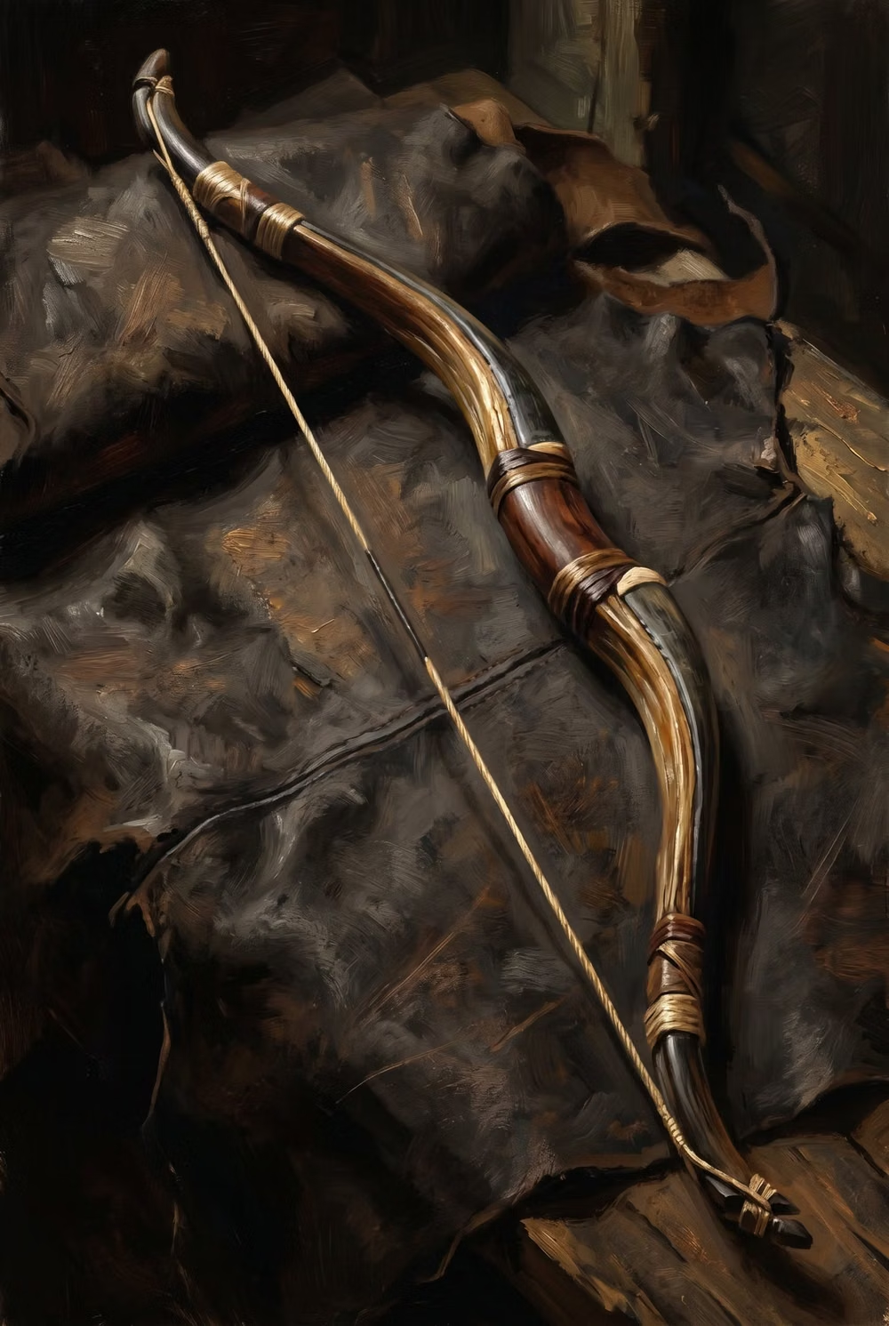
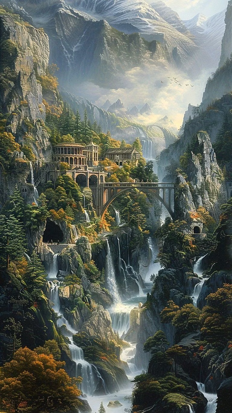
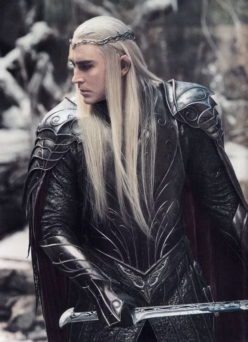
Elvish Aesthetic UI design style
Nature-bound high fantasy combines graceful verticality, flowing botanical ornament, luminous landscapes, refined handcraft, and an ancient otherworldly calm.
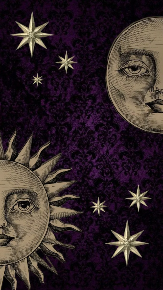
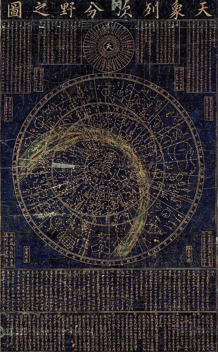
Whimsigothic UI design style
Celestial symbols, jewel tones, ornate curves, mystical illustration, and playful gothic motifs create theatrical enchantment.
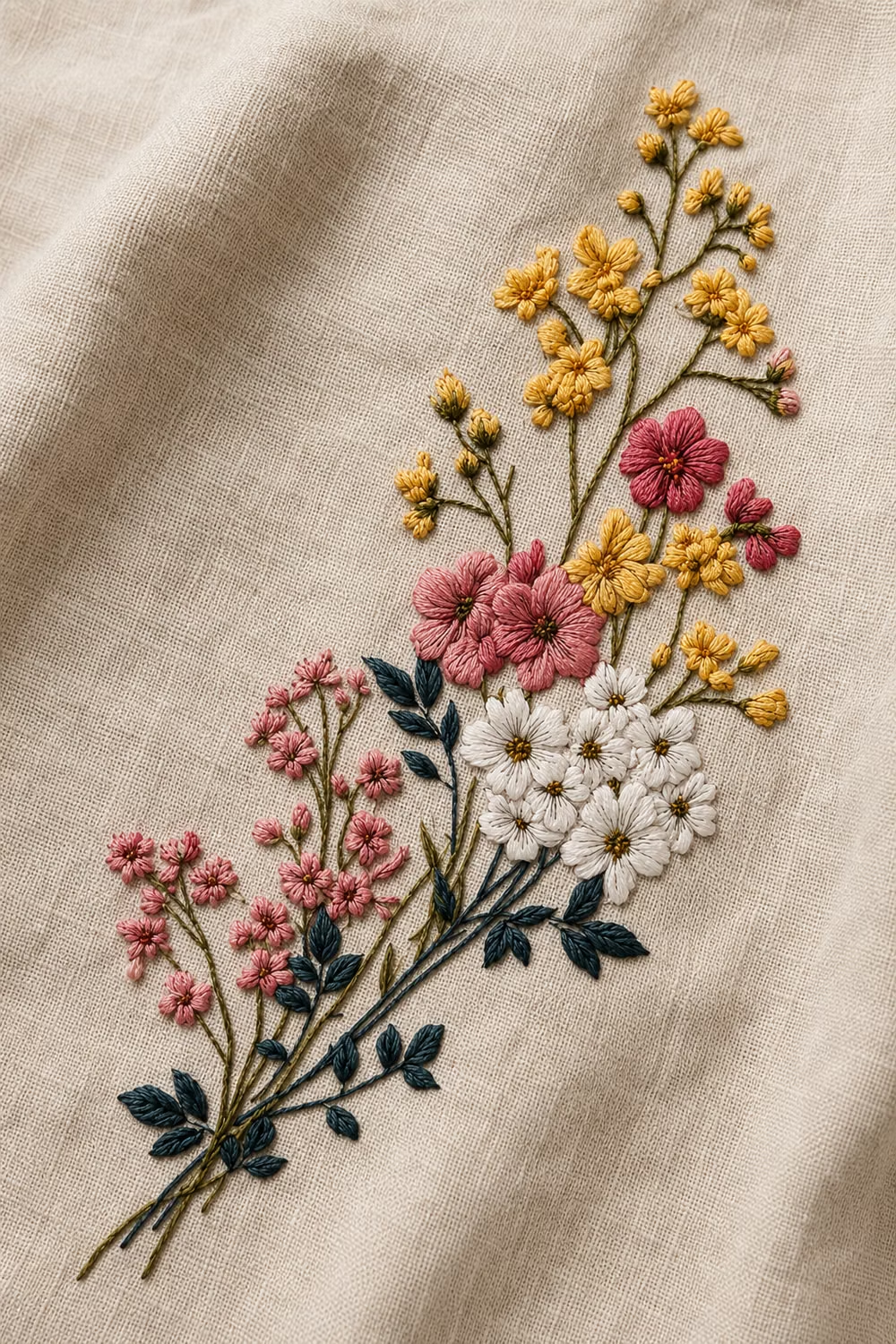
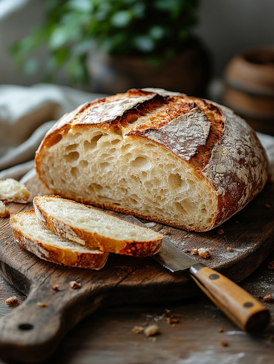
Cottagecore UI design style
Pastoral imagery, florals, handmade textures, gentle serif type, warm domestic details, and romantic rural nostalgia.