Whimsigothic UI design style
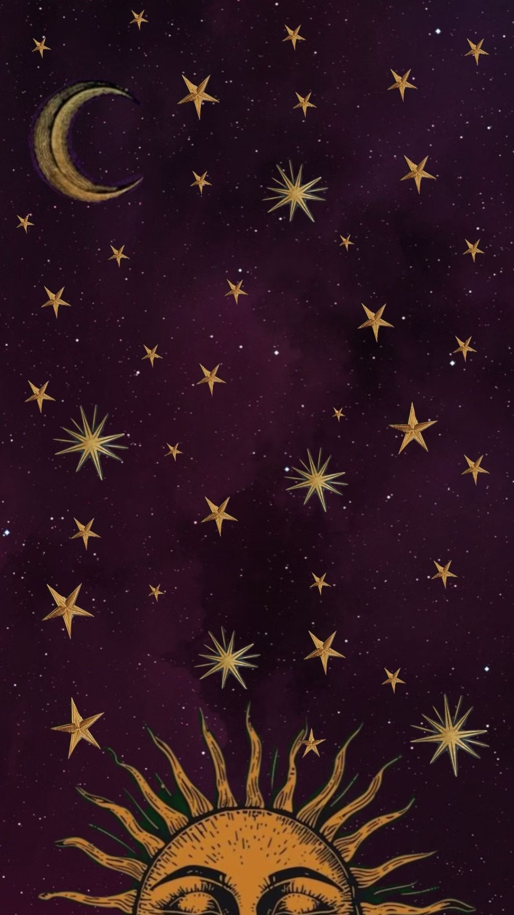
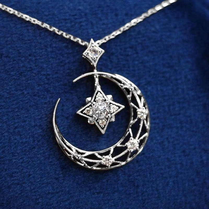
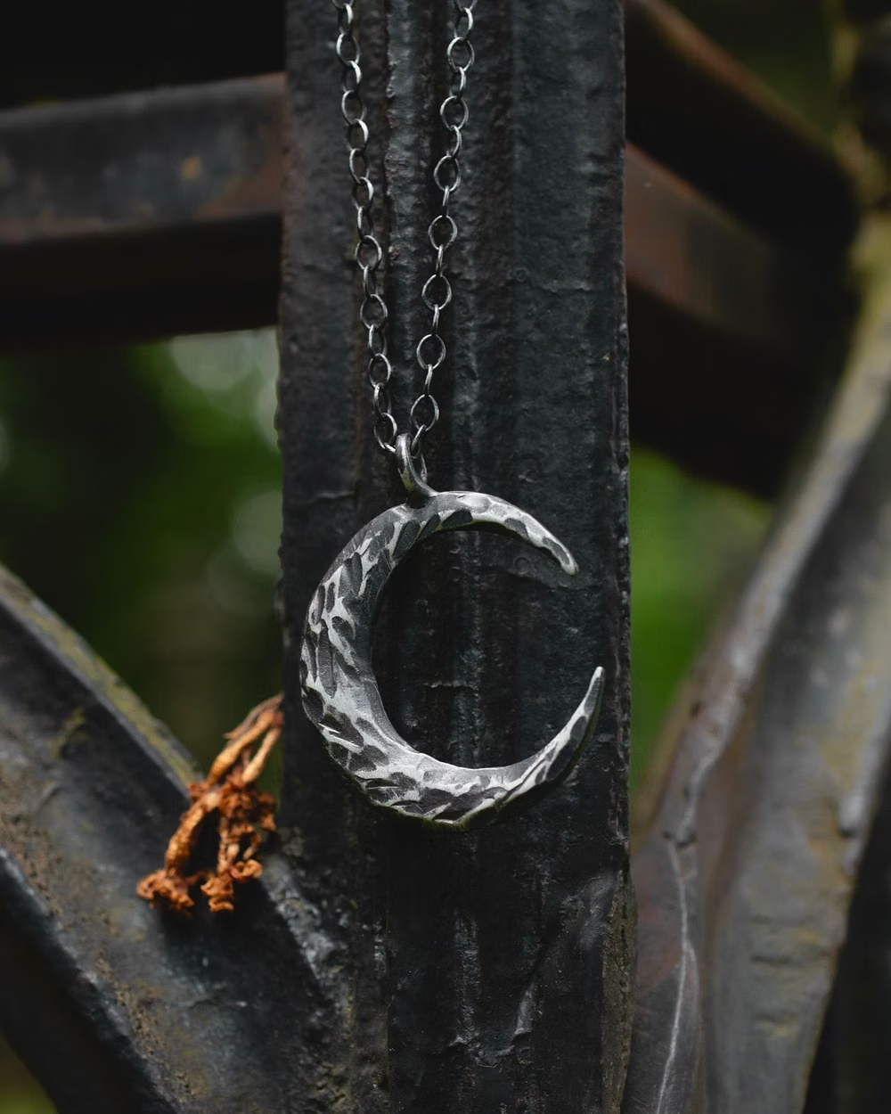
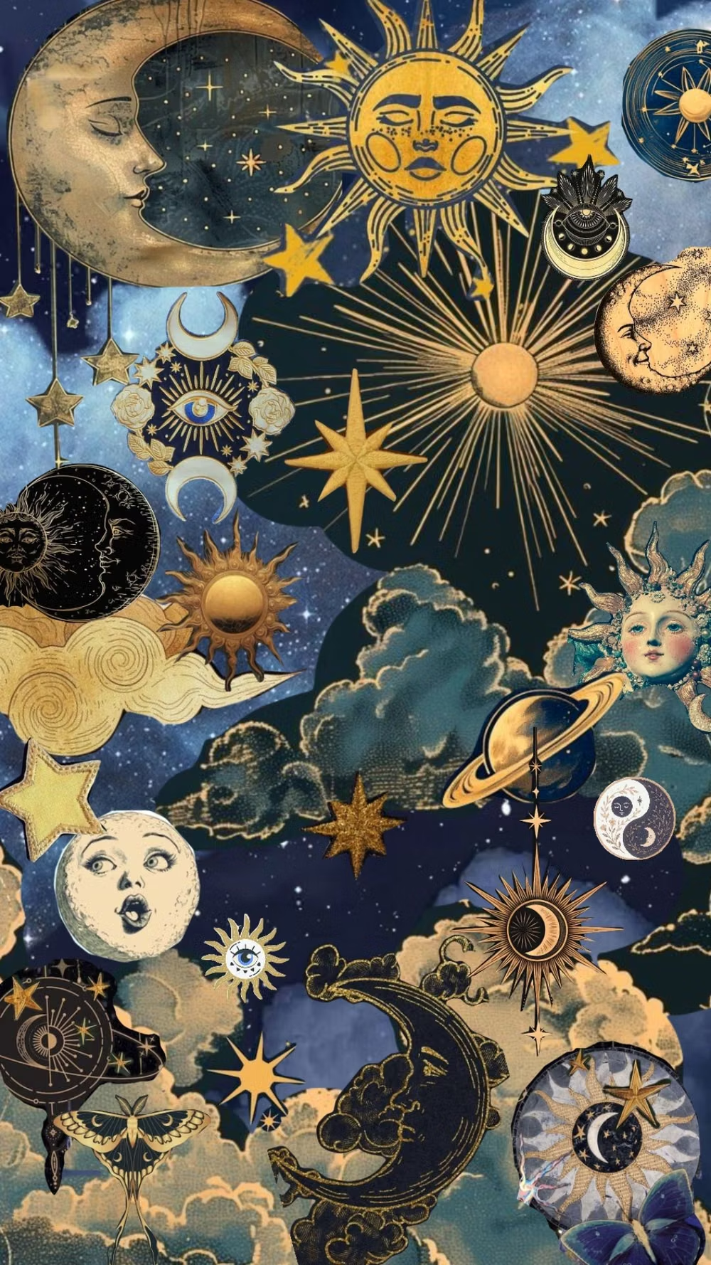
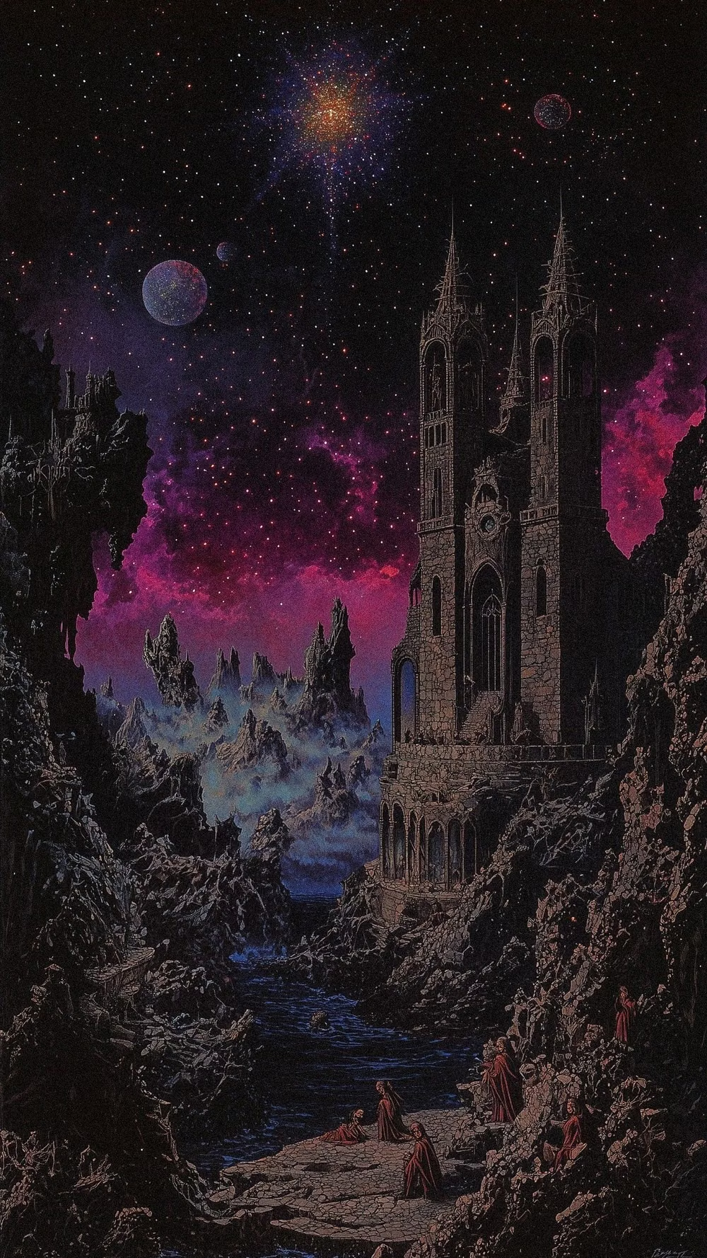
Celestial symbols, jewel tones, ornate curves, mystical illustration, and playful gothic motifs create theatrical enchantment.
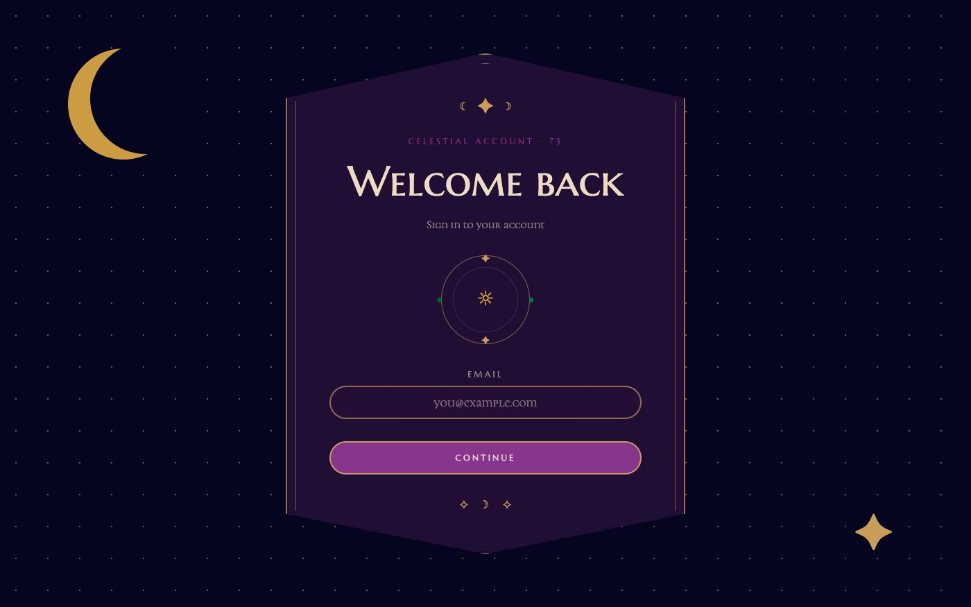
Design overview
- Signature elements
- moons and stars, jewel tones, mystical symbols, ornate curves, playful gothic type, celestial illustration
- Best suited to
- Beauty, music, astrology, fashion, entertainment, and imaginative lifestyle brands.
- Layout principles
- Compose theatrical celestial scenes around radial charts, framed stories, and layered nighttime panels, balancing mysticism with a clear central action.
History and origins
A fact-checked account of where this visual language came from, with links to the references used.
- Period
- 1990s source period; label coined in 2020
- Origin
- A retrospective internet classification of 1990s fashion, interiors, and media
Whimsigothic is a new name for an older cluster of celestial, bohemian, gothic, and Art Nouveau-inflected imagery visible in 1990s popular culture. Researcher Evan Collins coined the term in 2020; because the category was assembled retrospectively, the designers and audiences of the original period did not generally call their work Whimsigothic.
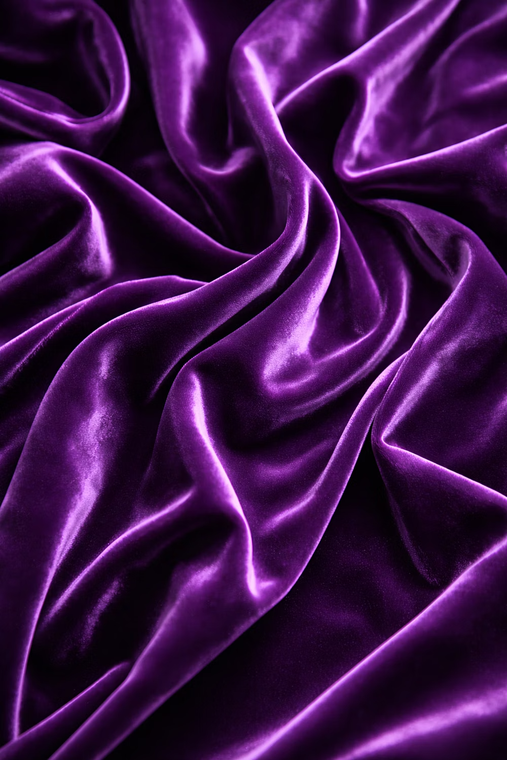
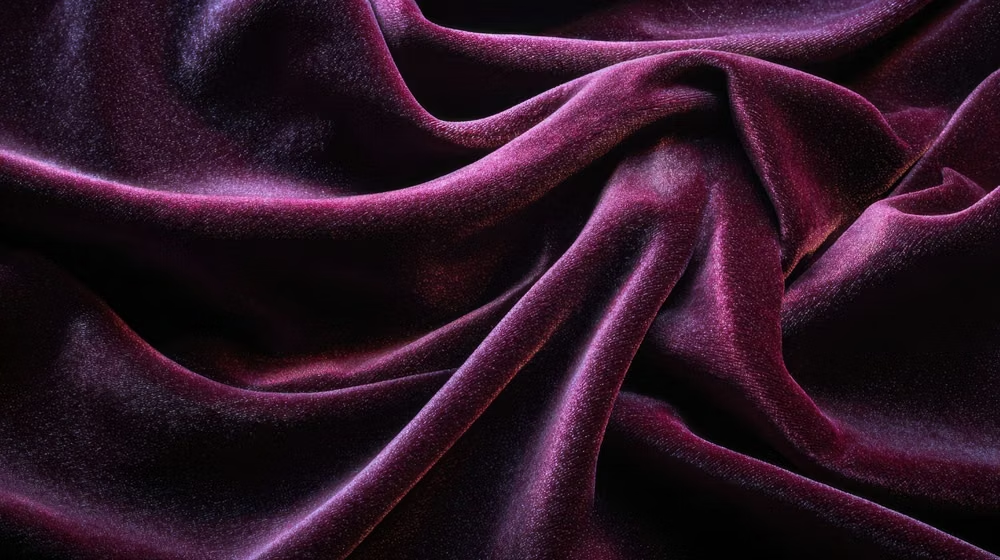
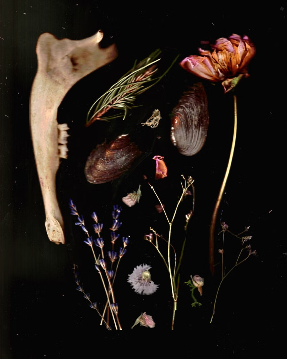
Moodboard and visual references
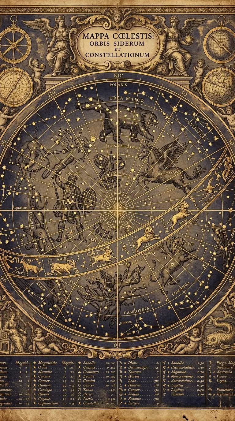
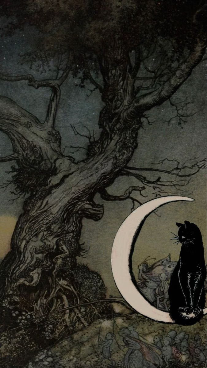
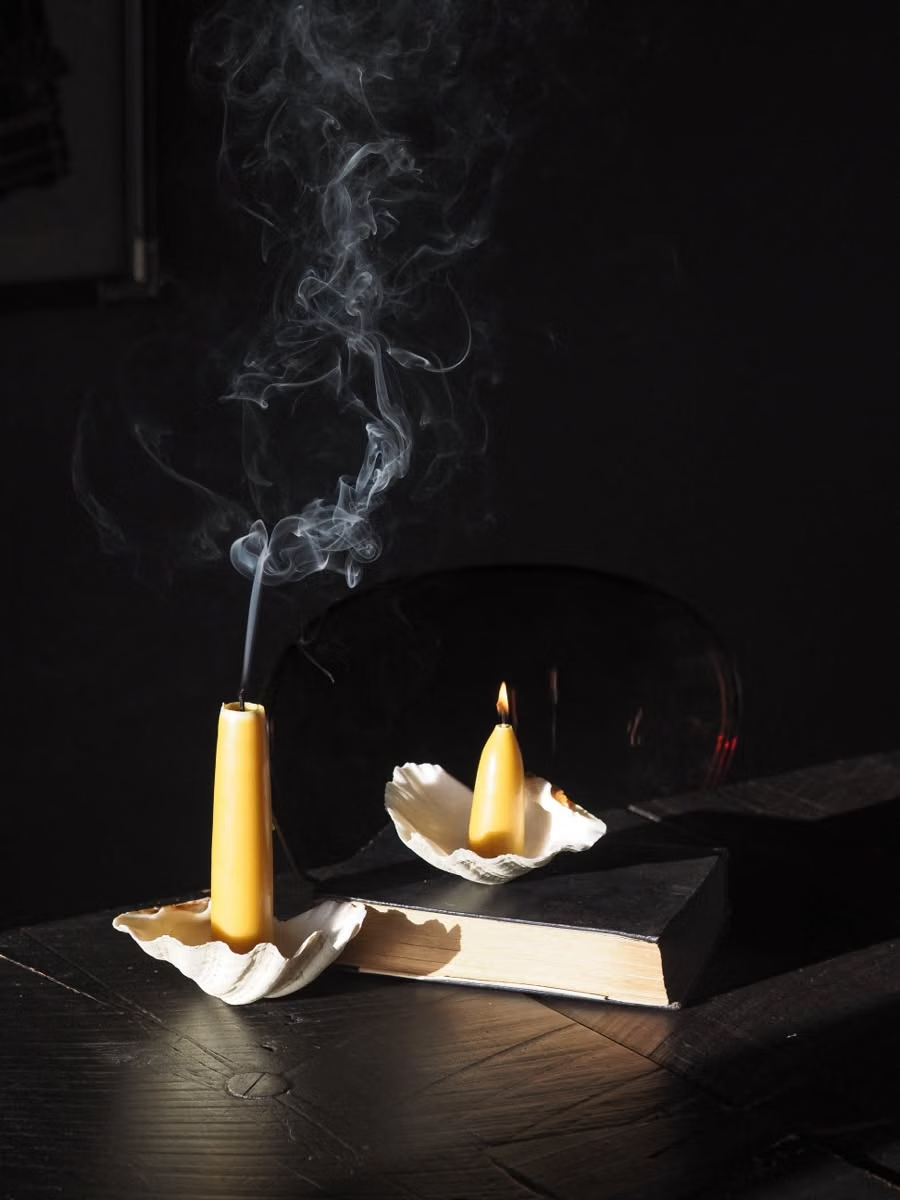
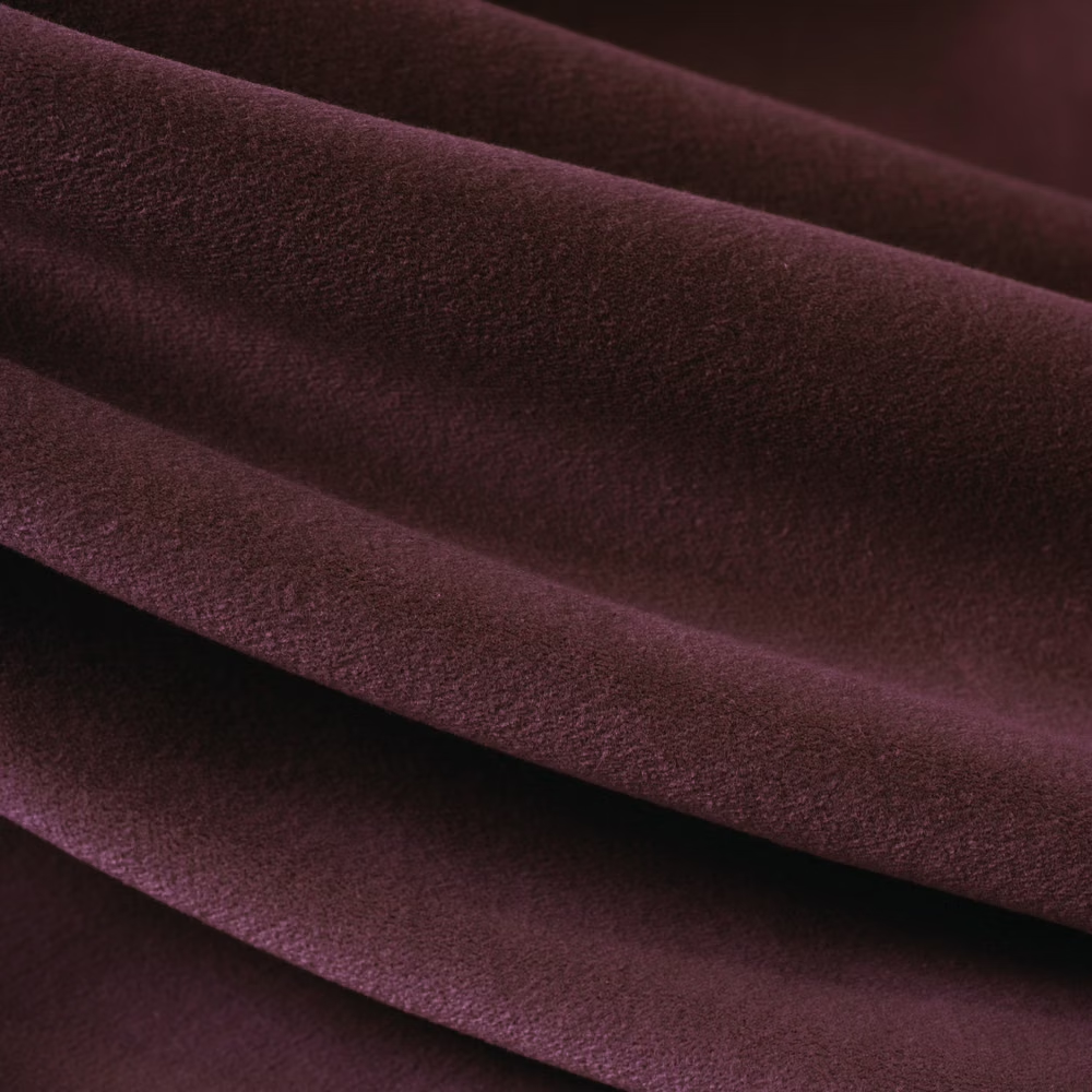
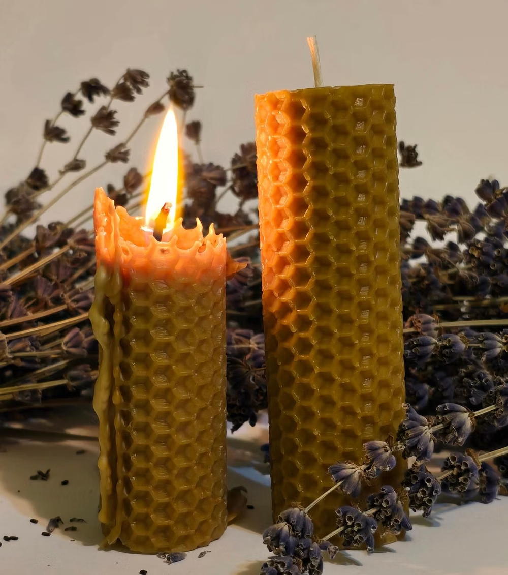
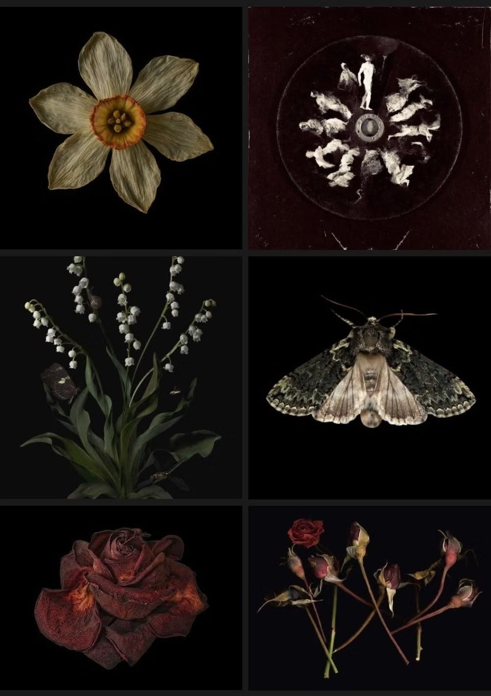
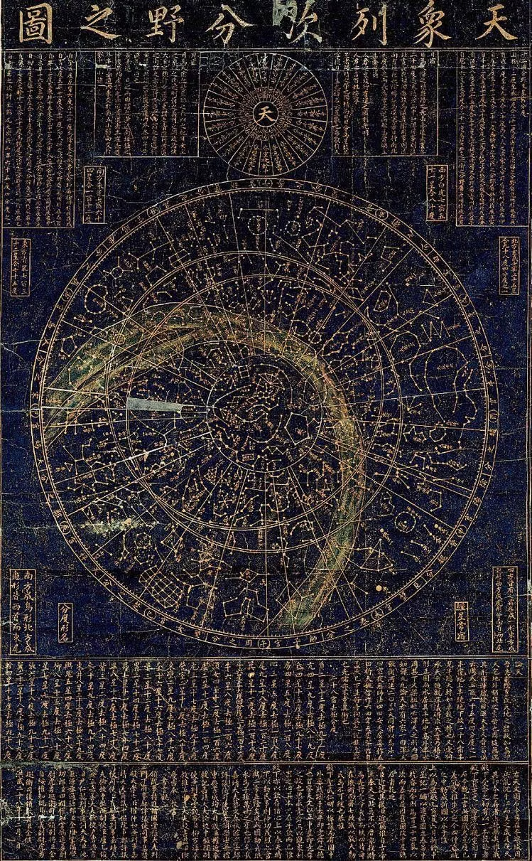
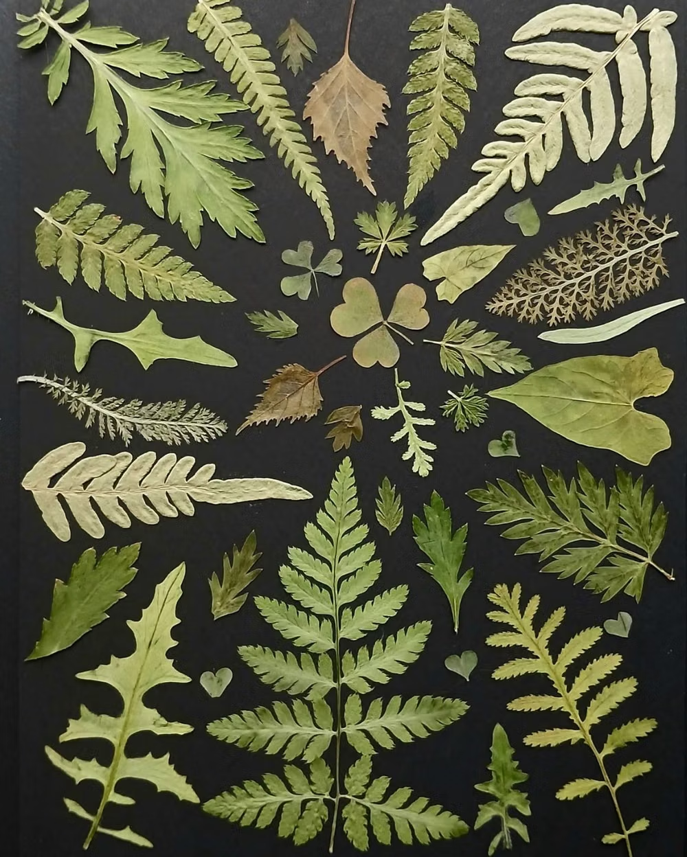
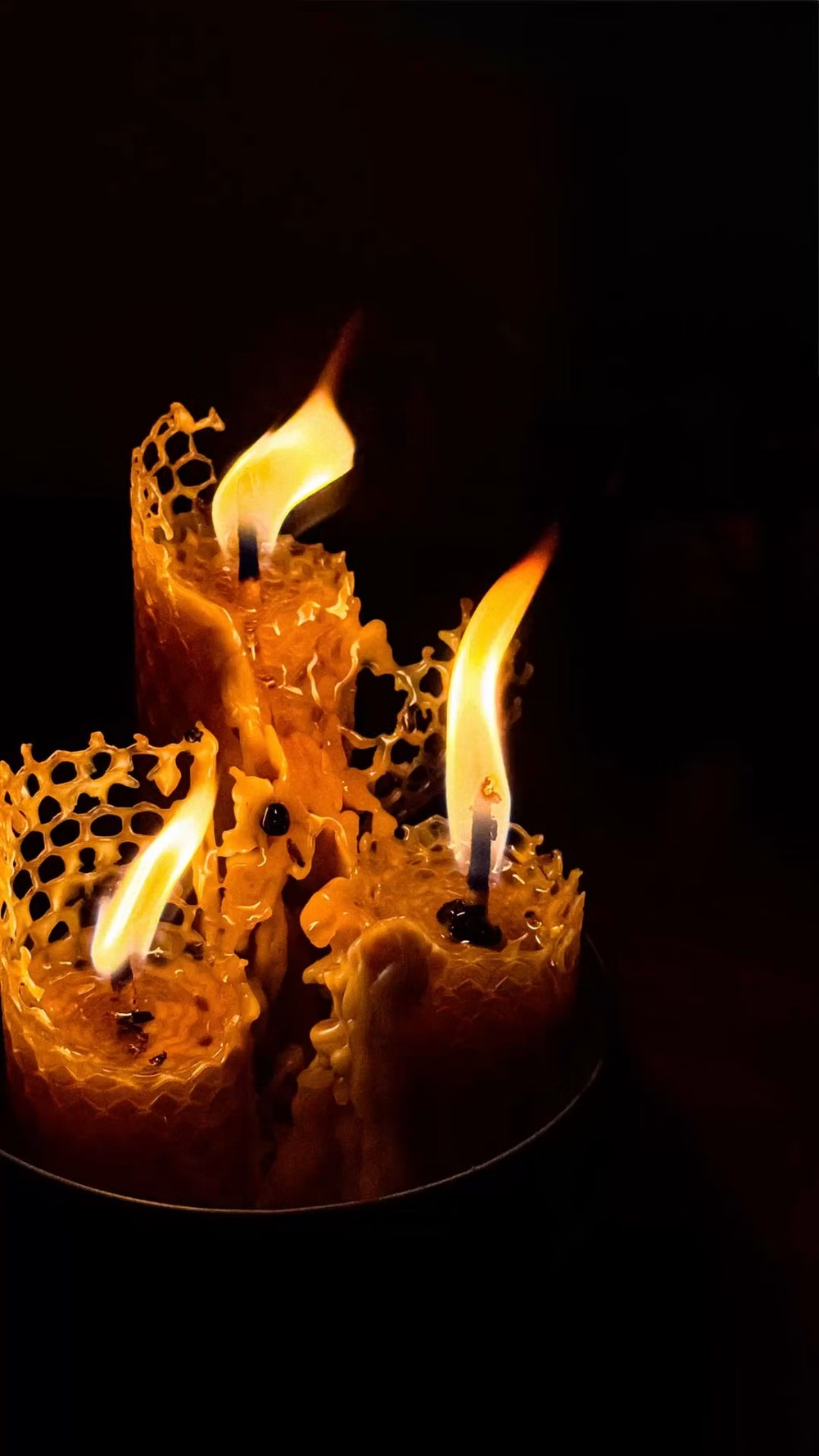
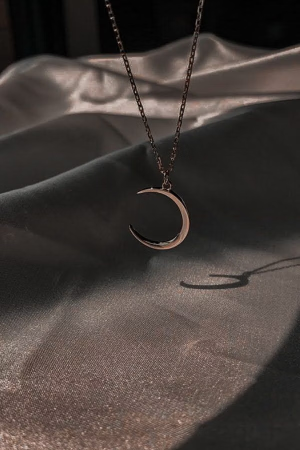
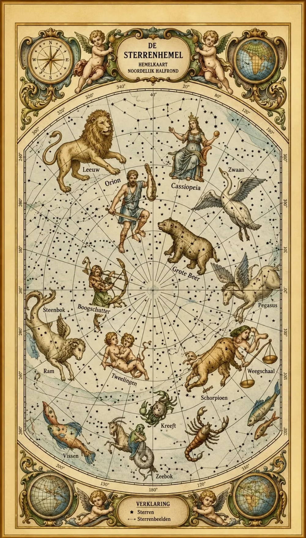
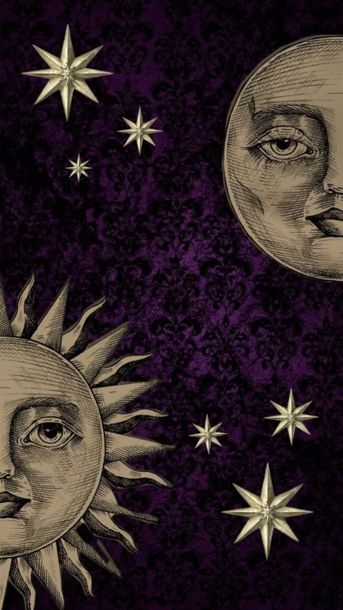
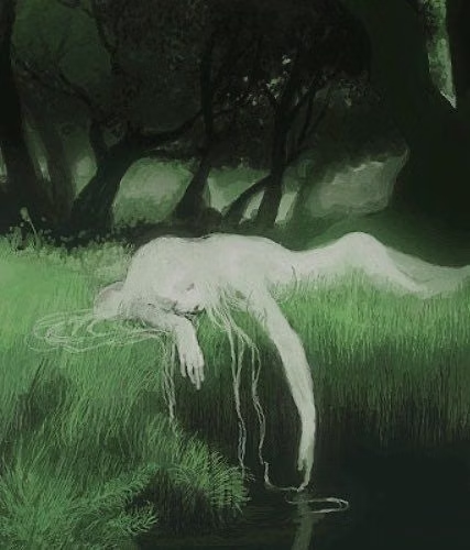
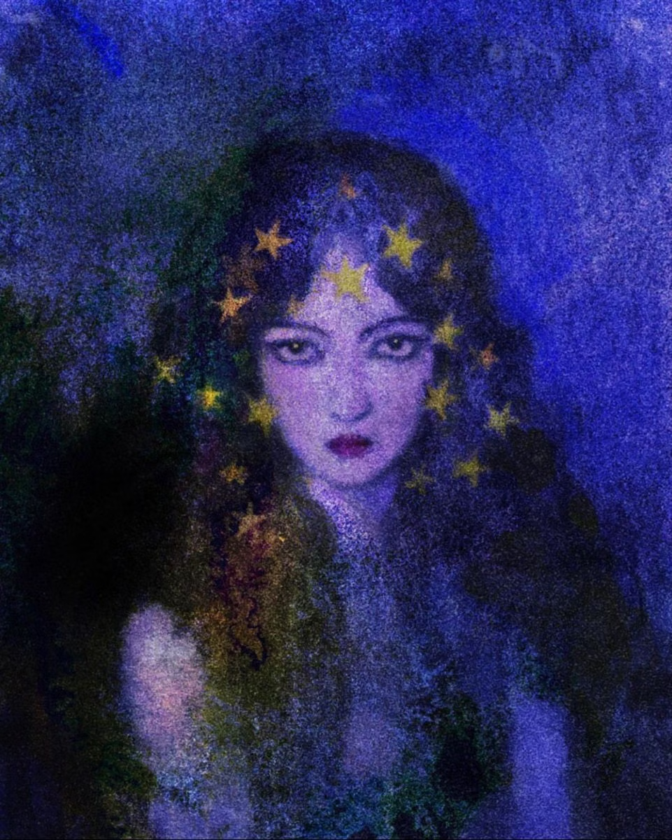
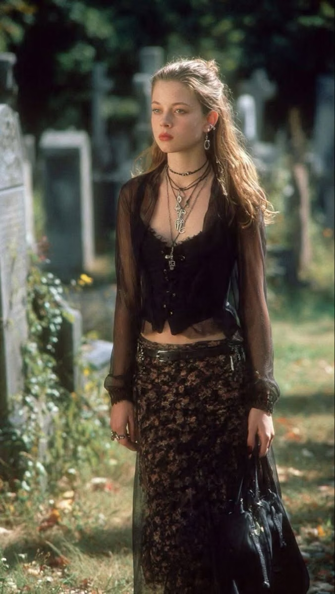
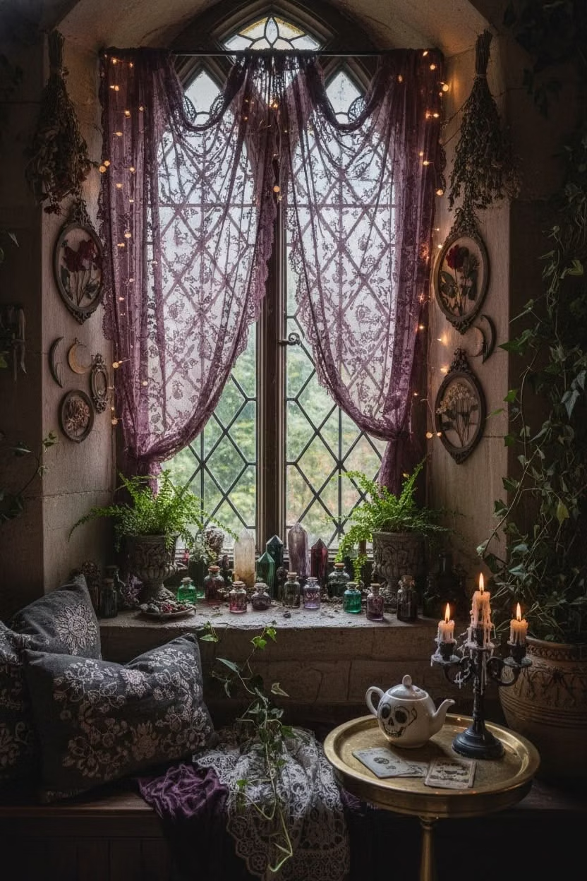
A visual study of the forms, inspirations, materials, colors, type, and cultural references associated with this UI design style.
Design principles and implementation
Use these principles to write a focused AI UI design prompt instead of asking for a vague visual treatment.
Color direction
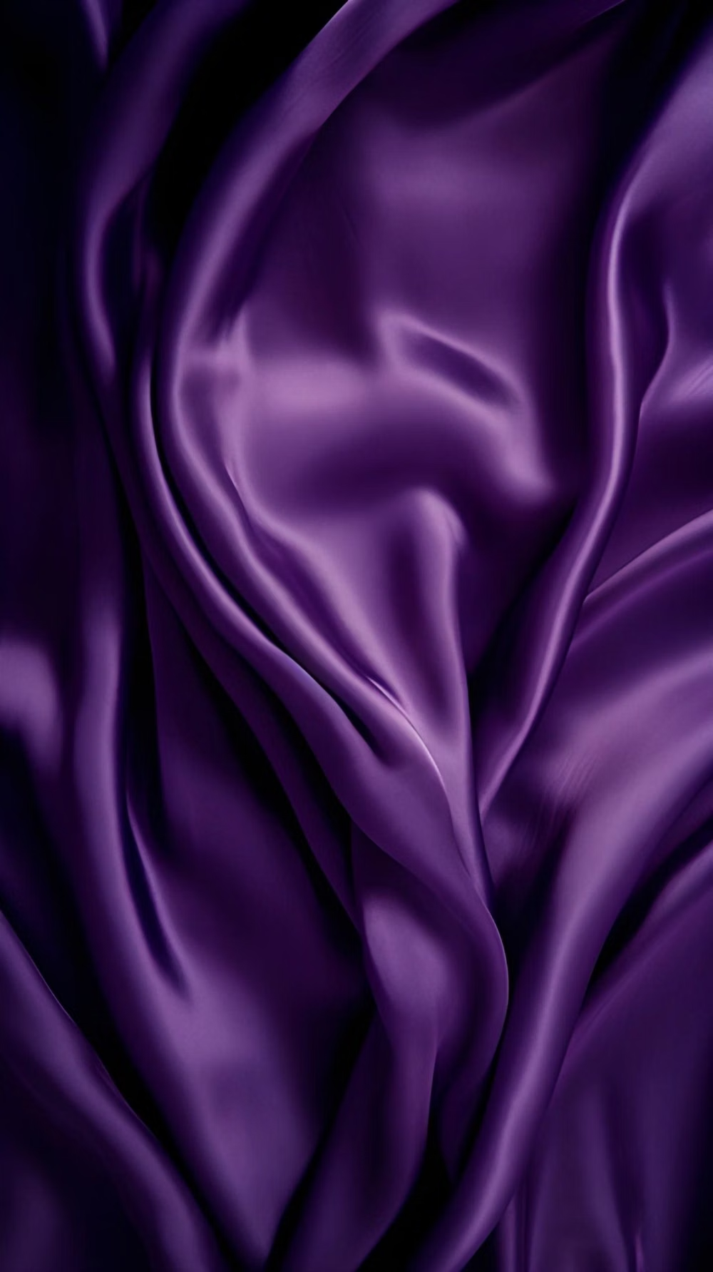
Use midnight blue, plum, emerald, ruby, moonlit cream, and antique gold in jewel-like combinations with deep shadow. In a daisyUI theme, use plum or emerald for `primary`, antique gold or ruby for `secondary`, and step `base-100`, `base-200`, and `base-300` through midnight blue, inky violet, and black.
Imagery direction
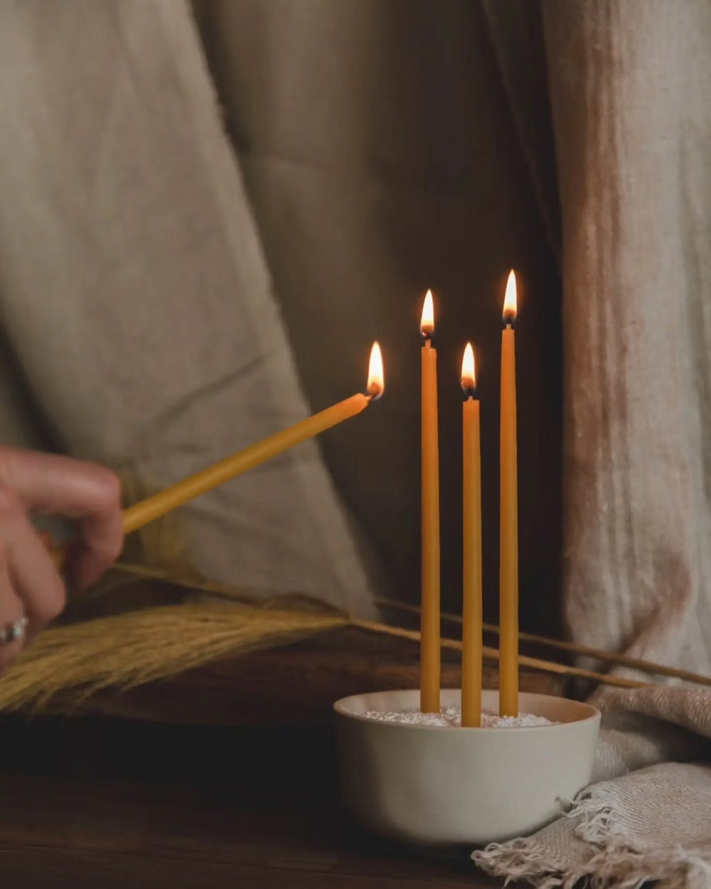
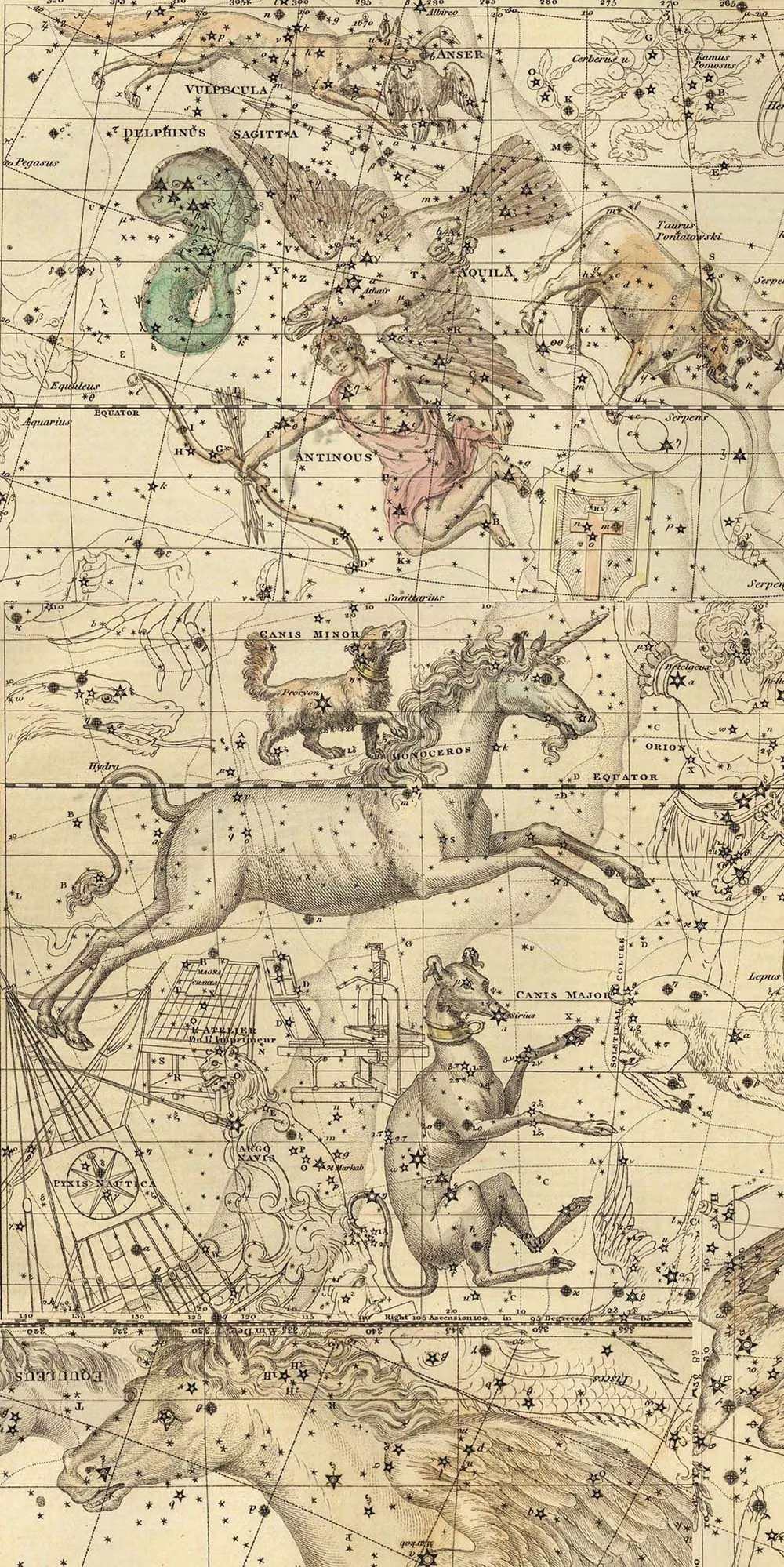
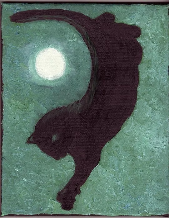
Choose moons, stars, tarot-like figures, velvet, candles, celestial maps, ornate botanicals, and playful mystical characters.
Content density
Maintain medium visual and content density, clustering symbolic details around headings while keeping readings, products, or controls legible.
Motion direction
Orbit small celestial symbols, twinkle selected stars, open card-like panels, and reveal constellations with slow theatrical timing.
Shape language
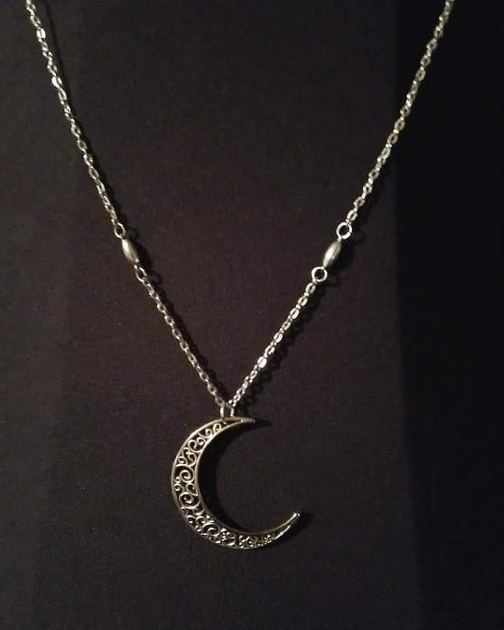
Use crescent moons, stars, arches, ornate curves, medallions, pointed frames, and curling botanical motifs with a playful gothic edge. In daisyUI themes, set the `--radius-*` variables between `0.75rem` and `1.5rem`.
Typography rules
Pair a whimsical Gothic or uncial display face with a refined serif body, limiting ornate capitals to short magical statements.
Suggested Typfaces
Cinzel Decorative
Fresh daisies glow in warm sunlight
Fresh daisies glow in warm sunlight
1 2 3 4 5 6 7 8 9 0
Grenze Gotisch
Fresh daisies glow in warm sunlight
Fresh daisies glow in warm sunlight
1 2 3 4 5 6 7 8 9 0
Cormorant Unicase
Fresh daisies glow in warm sunlight
Fresh daisies glow in warm sunlight
1 2 3 4 5 6 7 8 9 0
Marcellus SC
Fresh daisies glow in warm sunlight
Fresh daisies glow in warm sunlight
1 2 3 4 5 6 7 8 9 0
Uncial Antiqua
Fresh daisies glow in warm sunlight
Fresh daisies glow in warm sunlight
1 2 3 4 5 6 7 8 9 0
Build a Whimsigothic interface with daisyUI
The live example translates this direction into daisyUI components and semantic theme tokens.
To generate a full page in the same visual language, give the style name and the design rules above to Blueprint MCP.
Related UI design styles
Compare nearby visual languages that share typography, shapes, use cases, or signature elements.


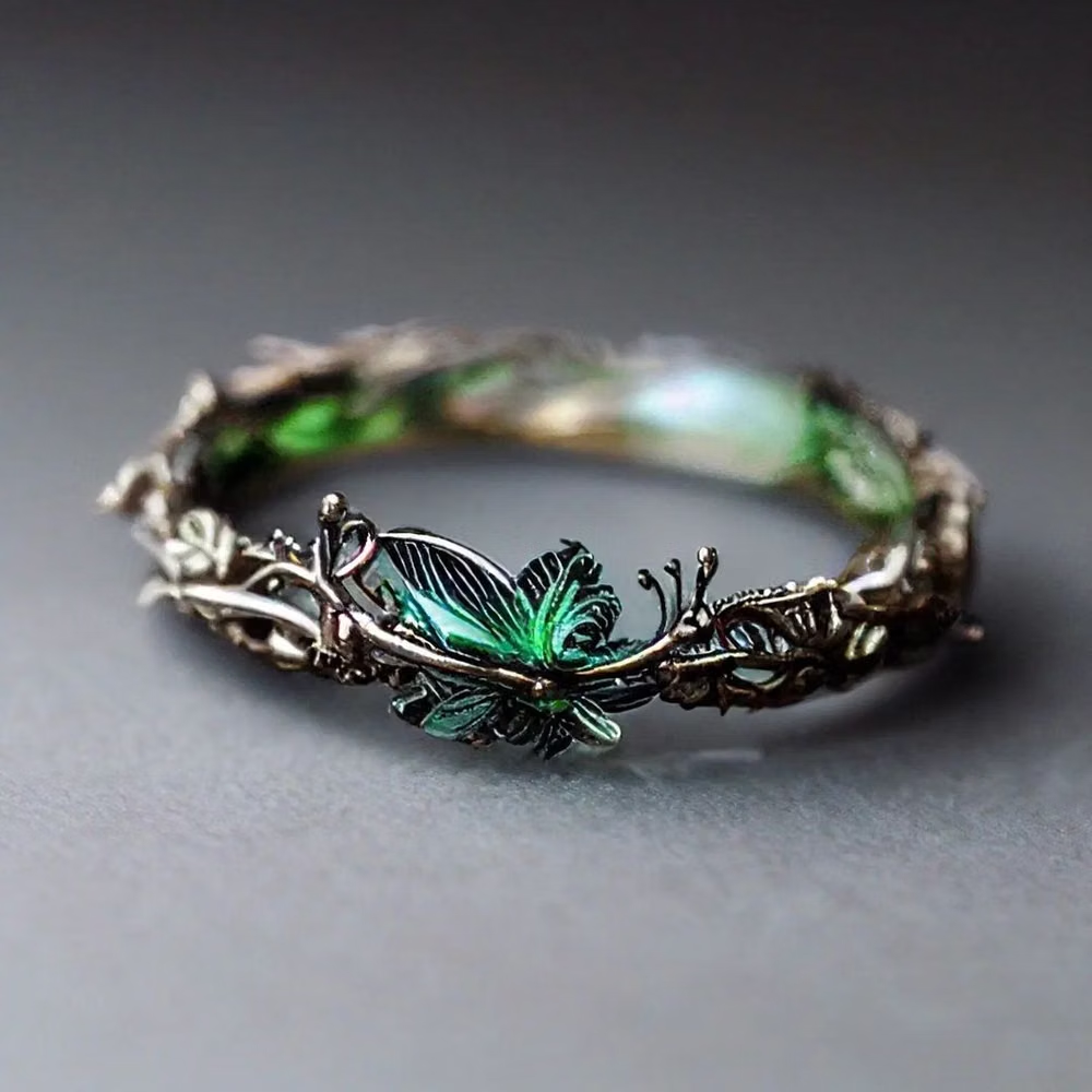
Elvish Aesthetic UI design style
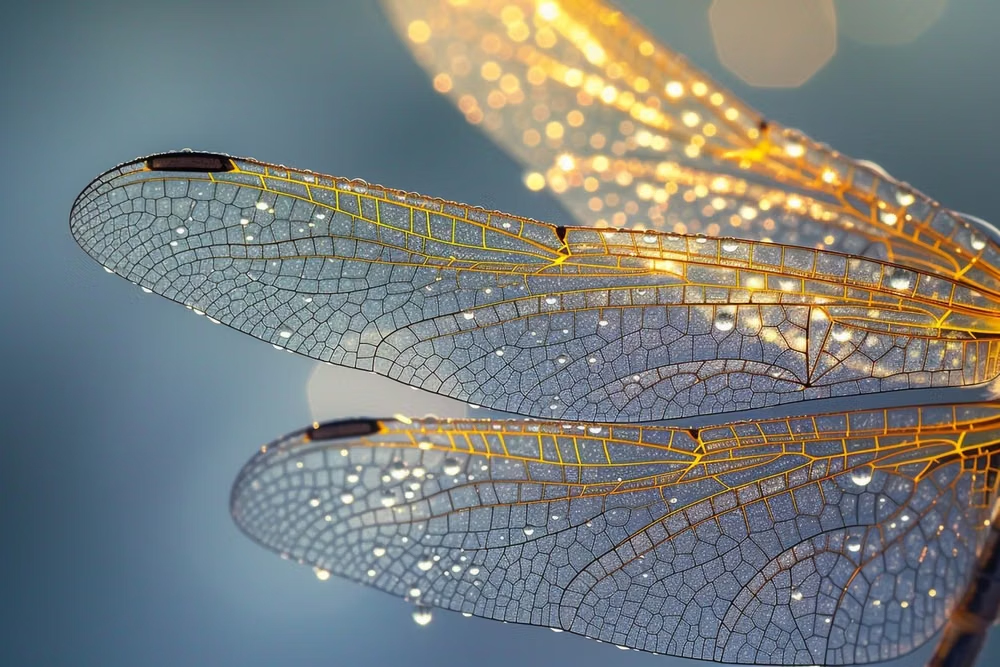
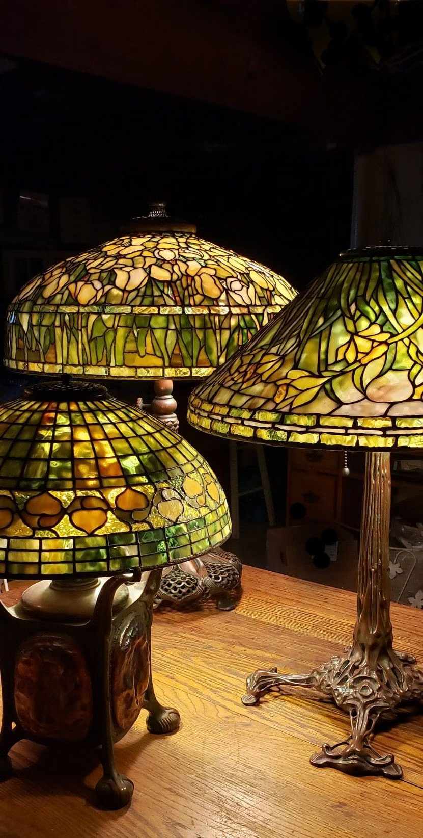
Nature-bound high fantasy combines graceful verticality, flowing botanical ornament, luminous landscapes, refined handcraft, and an ancient otherworldly calm.
Art Nouveau UI design style
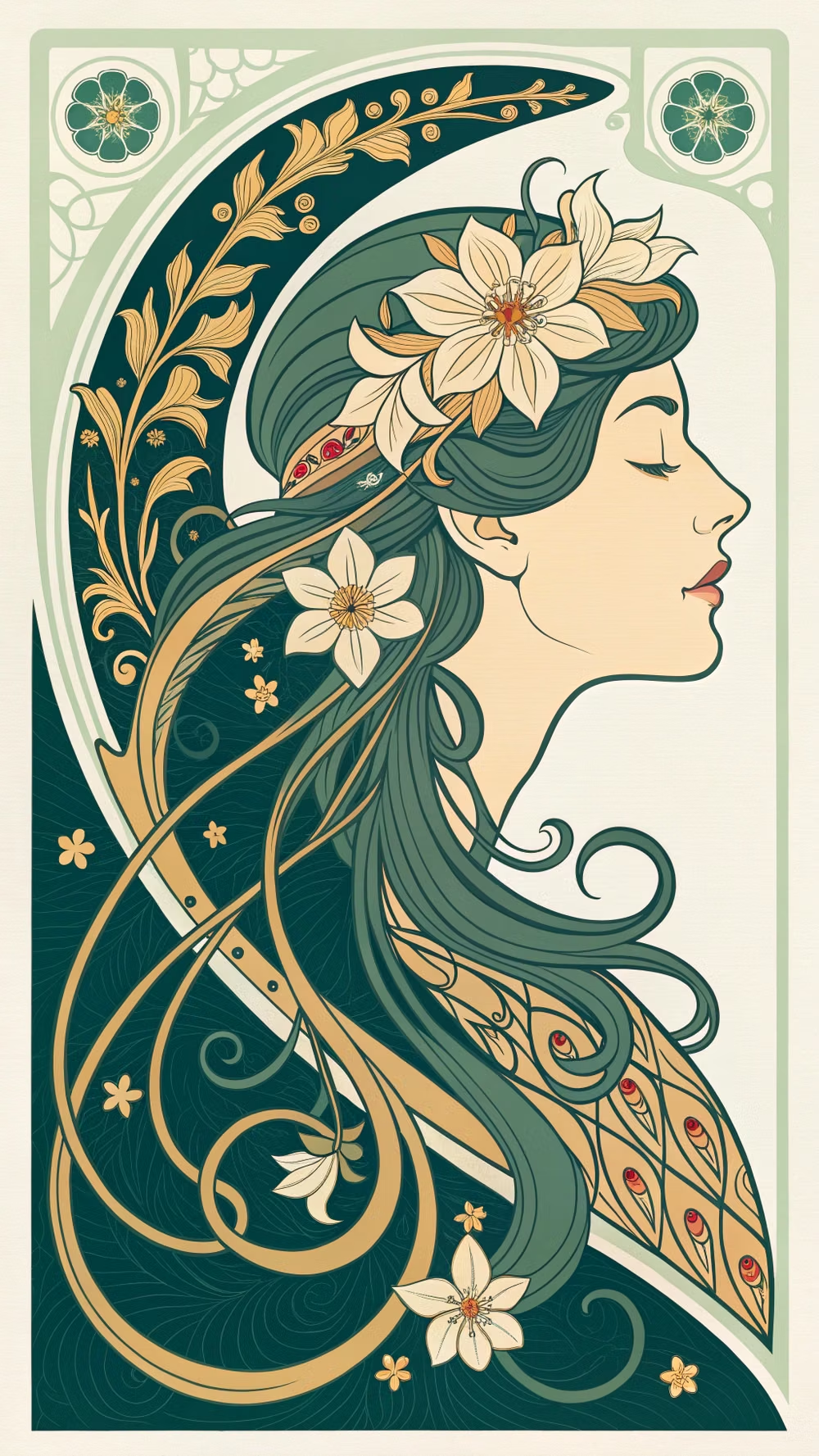
Flowing botanical lines, decorative frames, elegant lettering, natural motifs, and integrated ornament.
![Gothic cathedral rib vault photograph - [Salisbury Cathedral, Aerial View.1220-1238.Photograph. Salisbury, England.] Pointed arches, lancet windows and stained glass windows were a key feature of the Gothic England churches. The narrow piers of the cathedral were made of cut stone and this enabled the structure itself to be very light so the walls were very thin but capable of holding the whole structure up. The cathedral consisted of rib vaults they were also a type of decorative element. (Smarthistory) (Akexander, K.D., 243-244)](../../moodboards/gothic-neo-gothic/18-inspiration-cathedral-rib-vault.avif)
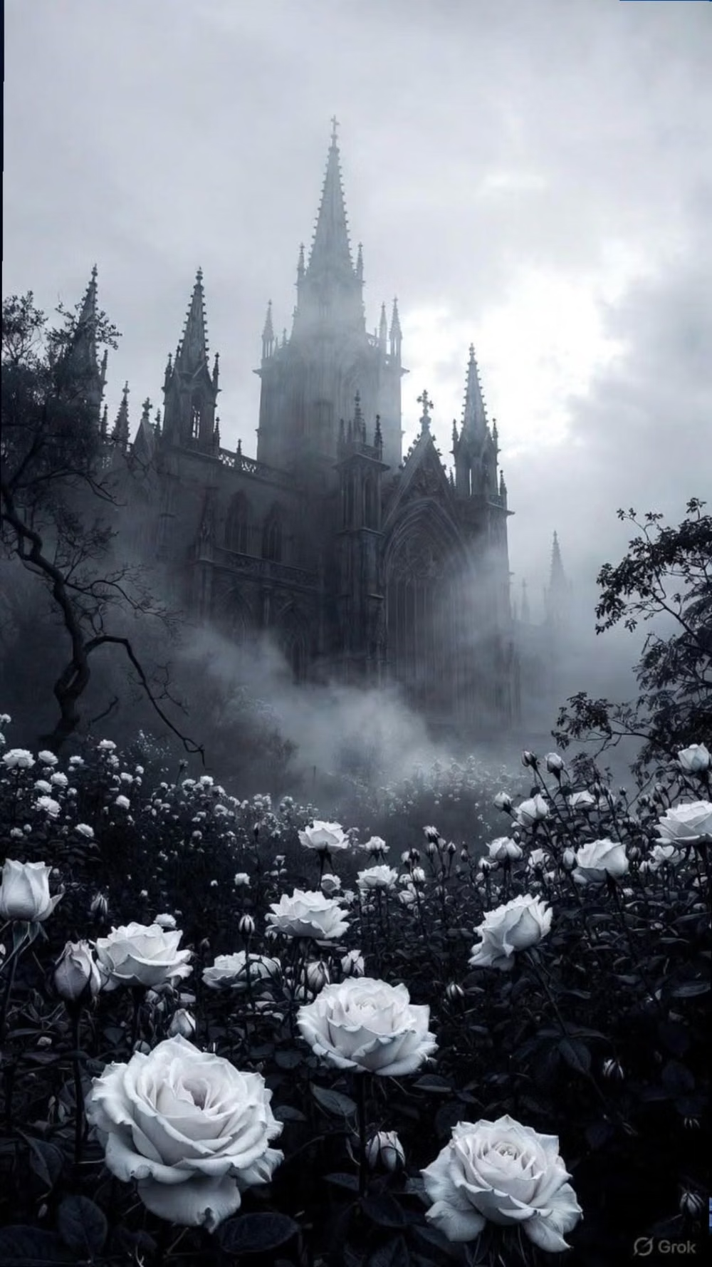
Gothic / Neo-Gothic UI design style
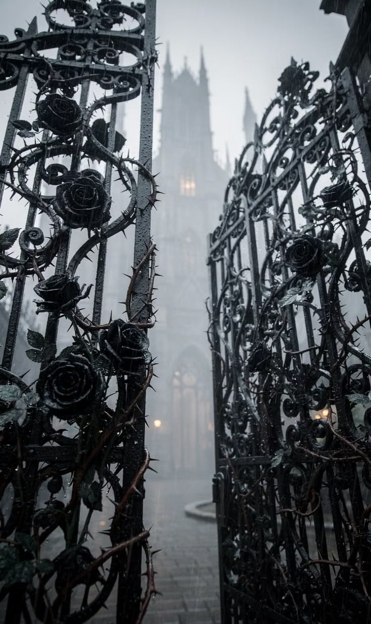
Pointed forms, blackletter or dramatic serif type, dark contrast, tracery, religious ornament, and medieval atmosphere.