Dopamine Design UI design style
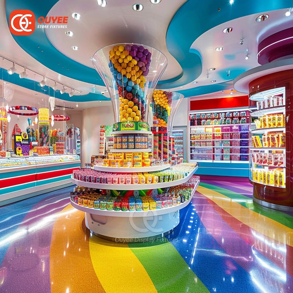
Joyful saturated colors, bold patterns, playful forms, and deliberately energetic combinations prioritize emotional uplift.
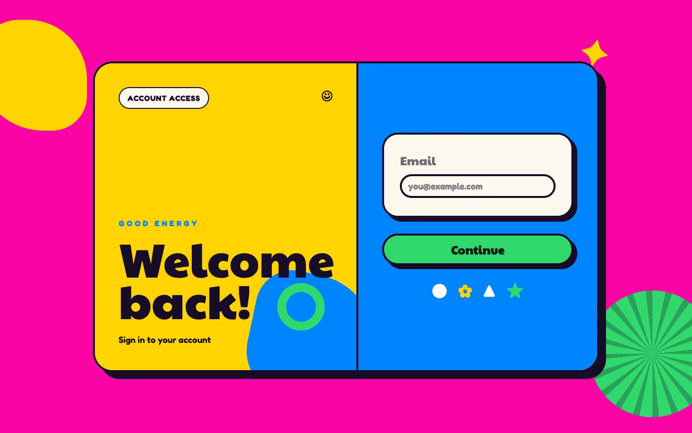
Design overview
- Signature elements
- saturated color clashes, bold patterns, playful shapes, cheerful icons, oversized type, energetic layering
- Best suited to
- Consumer apps, retail, wellness, food, events, and youth-oriented brands.
- Layout principles
- Build an energetic modular composition with oversized focal blocks and playful collisions, but hold navigation and primary actions to a stable recurring track.
History and origins
A fact-checked account of where this visual language came from, with links to the references used.
- Period
- Early 2020s
- Origin
- Social-media fashion and interior trends, later adapted to branding and UI
Dopamine Design is a recent popular label, not a scientific design theory or a historical movement. It grew from “dopamine dressing” and “dopamine decor” in the early 2020s, especially after pandemic restrictions, using saturated color and playful objects as shorthand for personal pleasure; the name should not be read as a proven neurological effect of any particular palette.
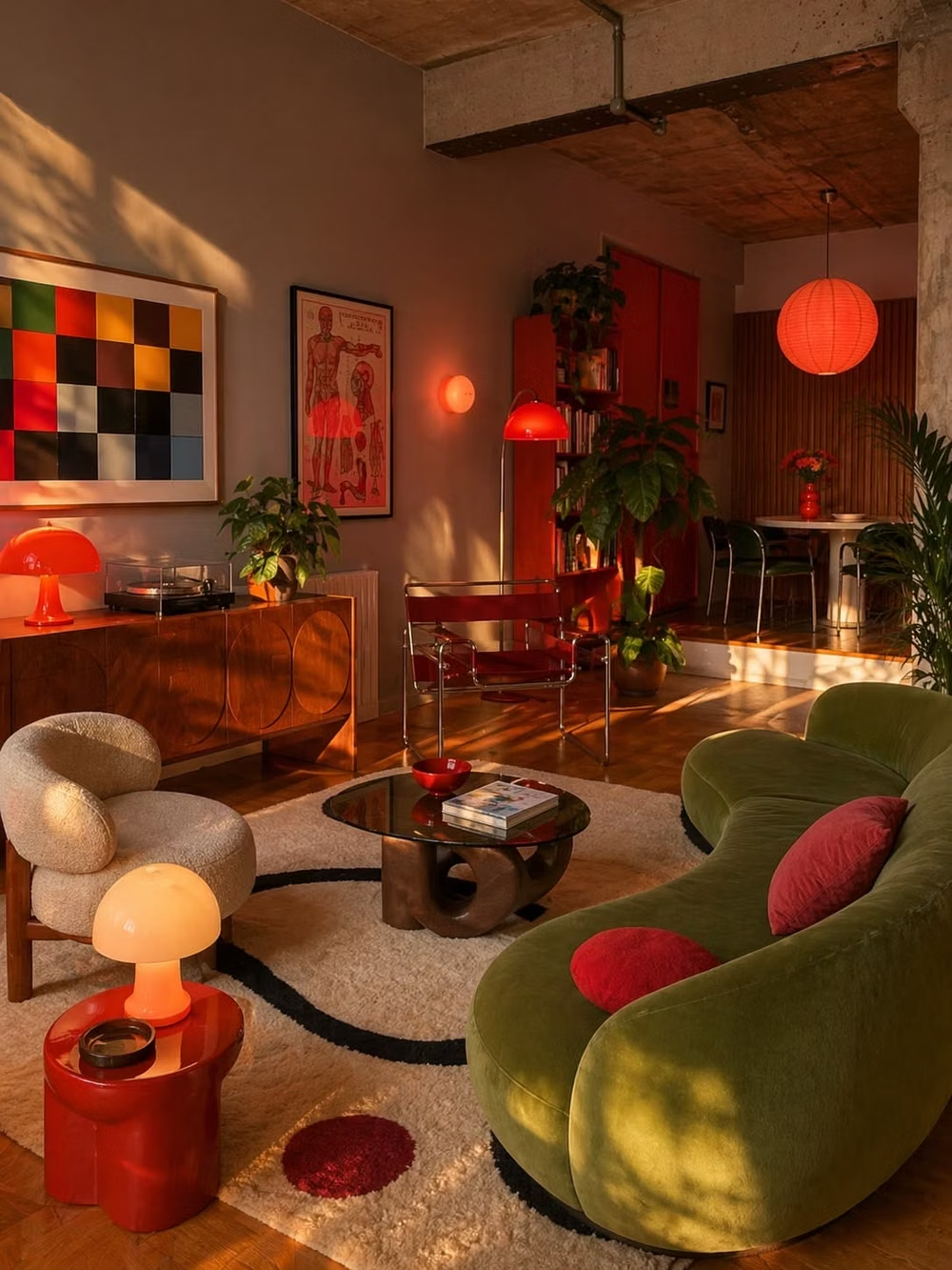
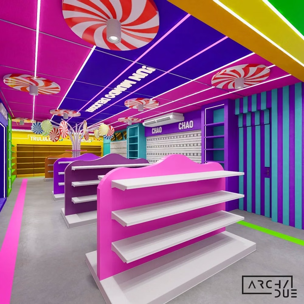
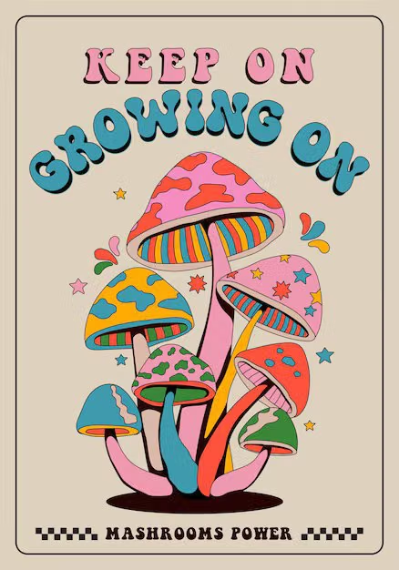
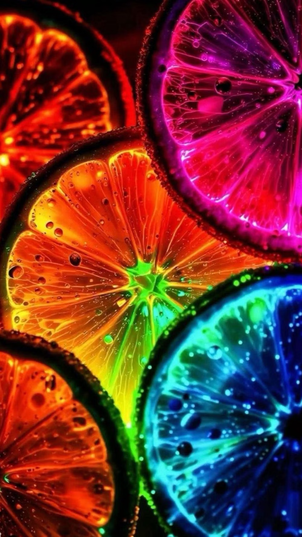
Moodboard and visual references
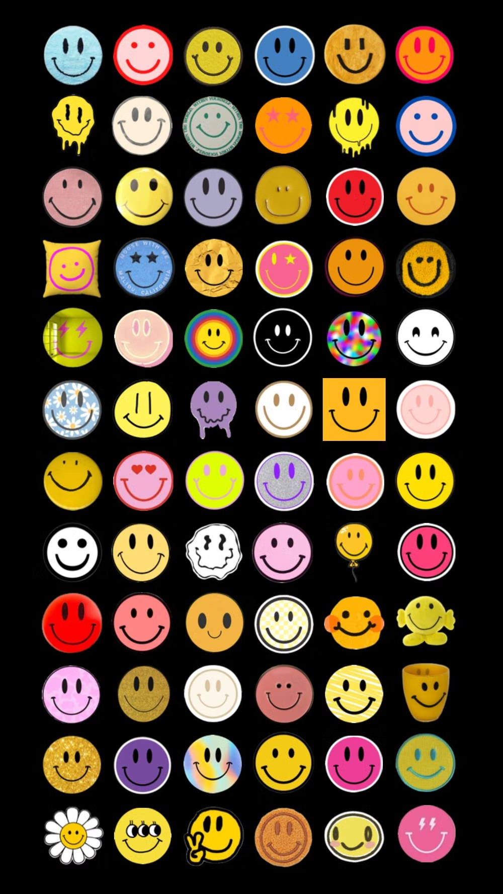
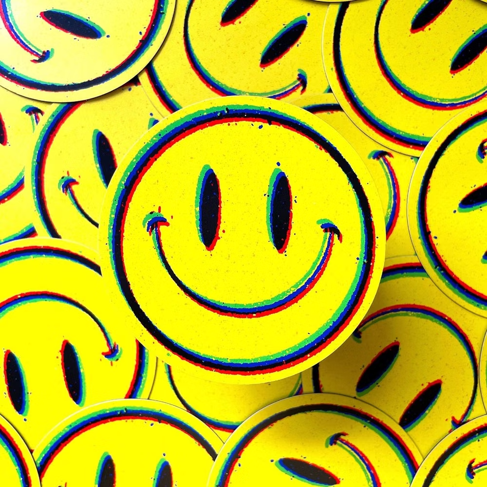
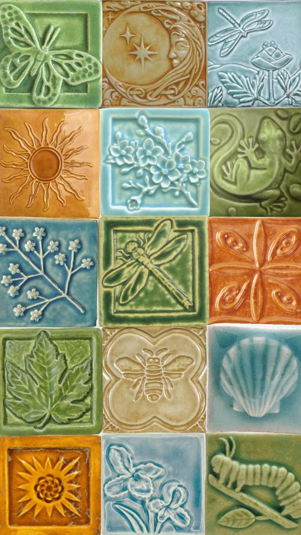
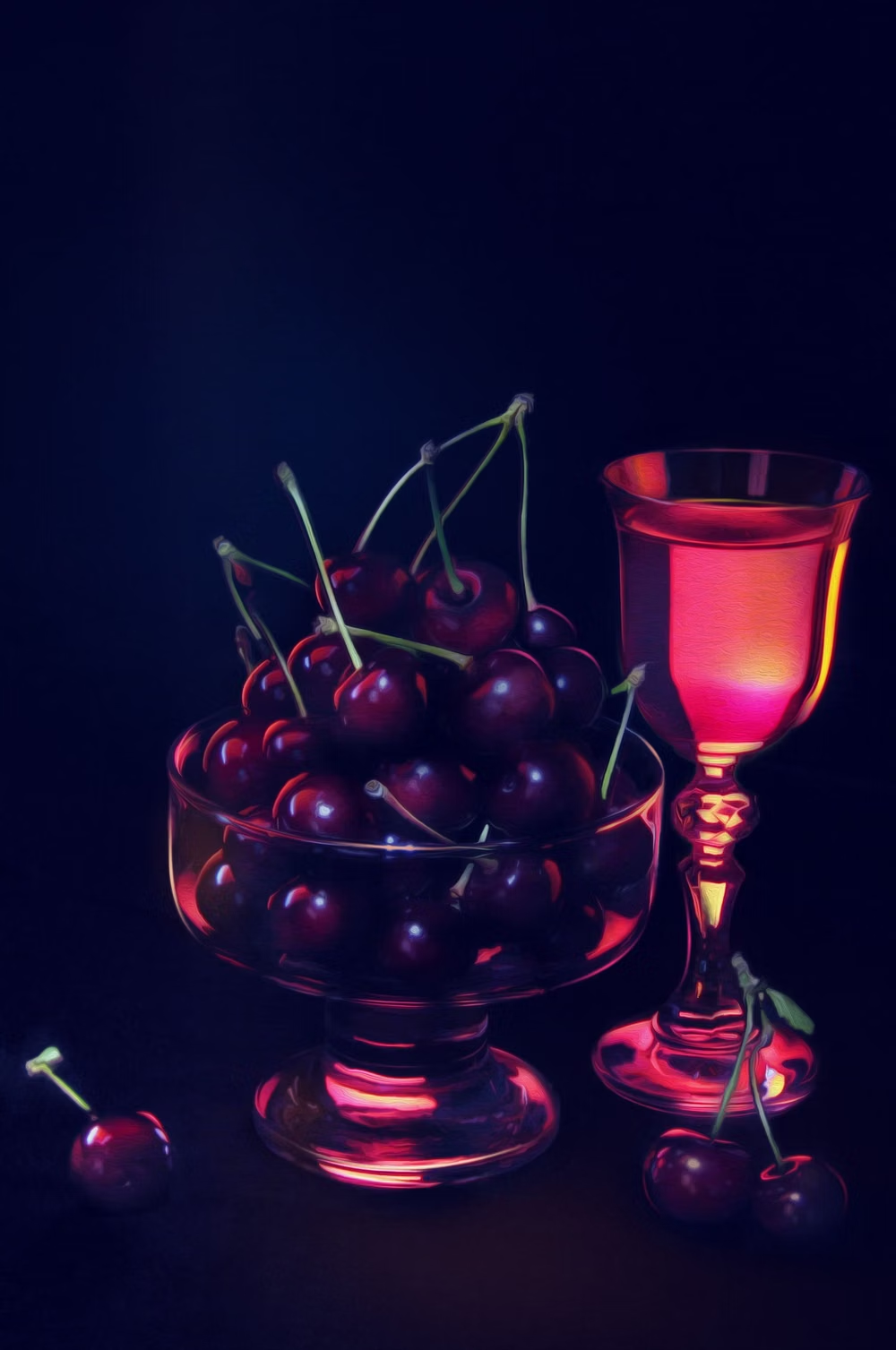
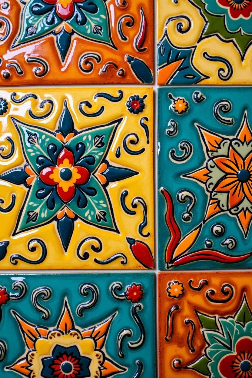
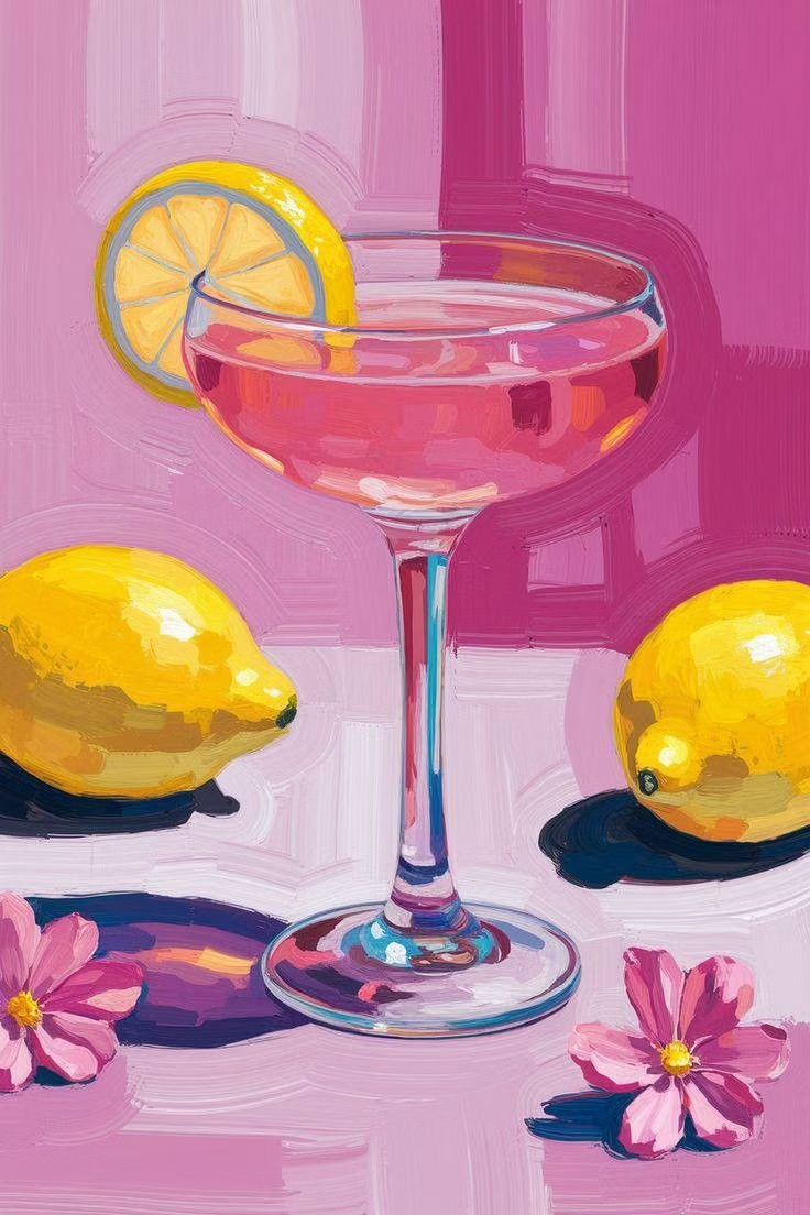
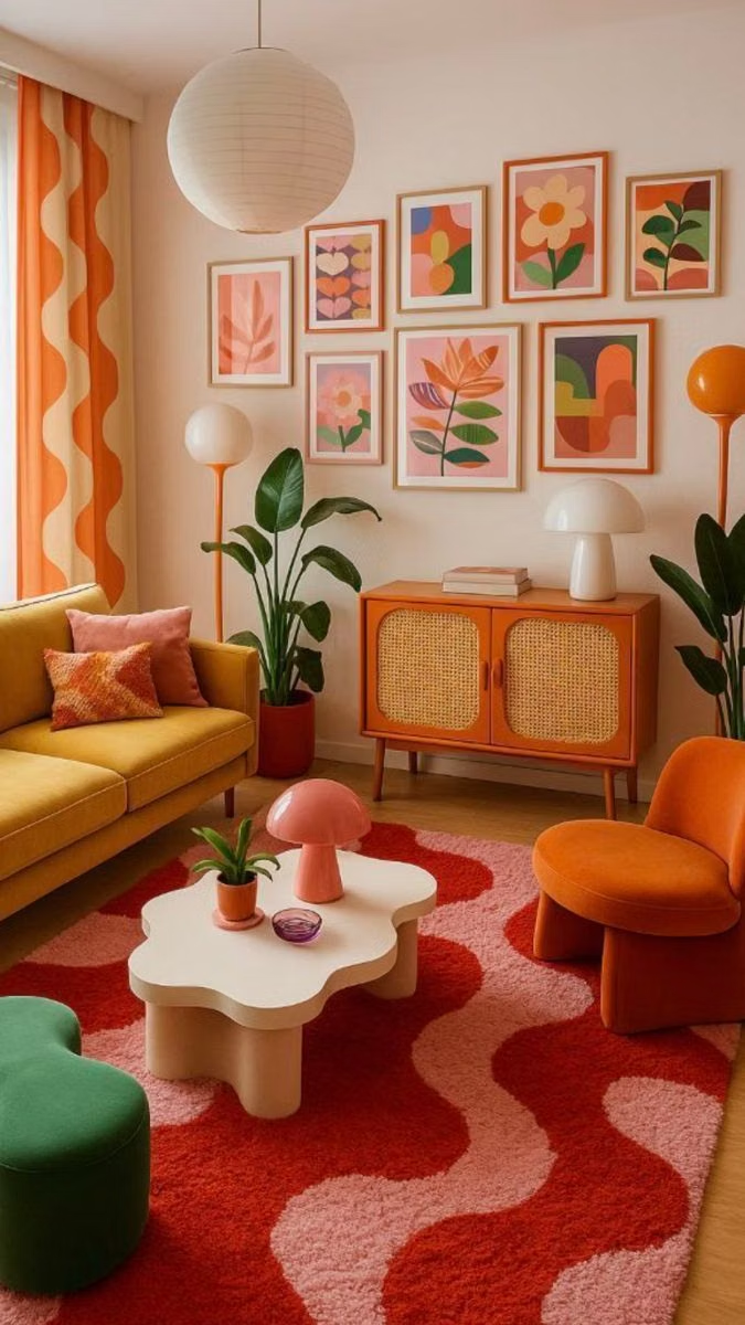
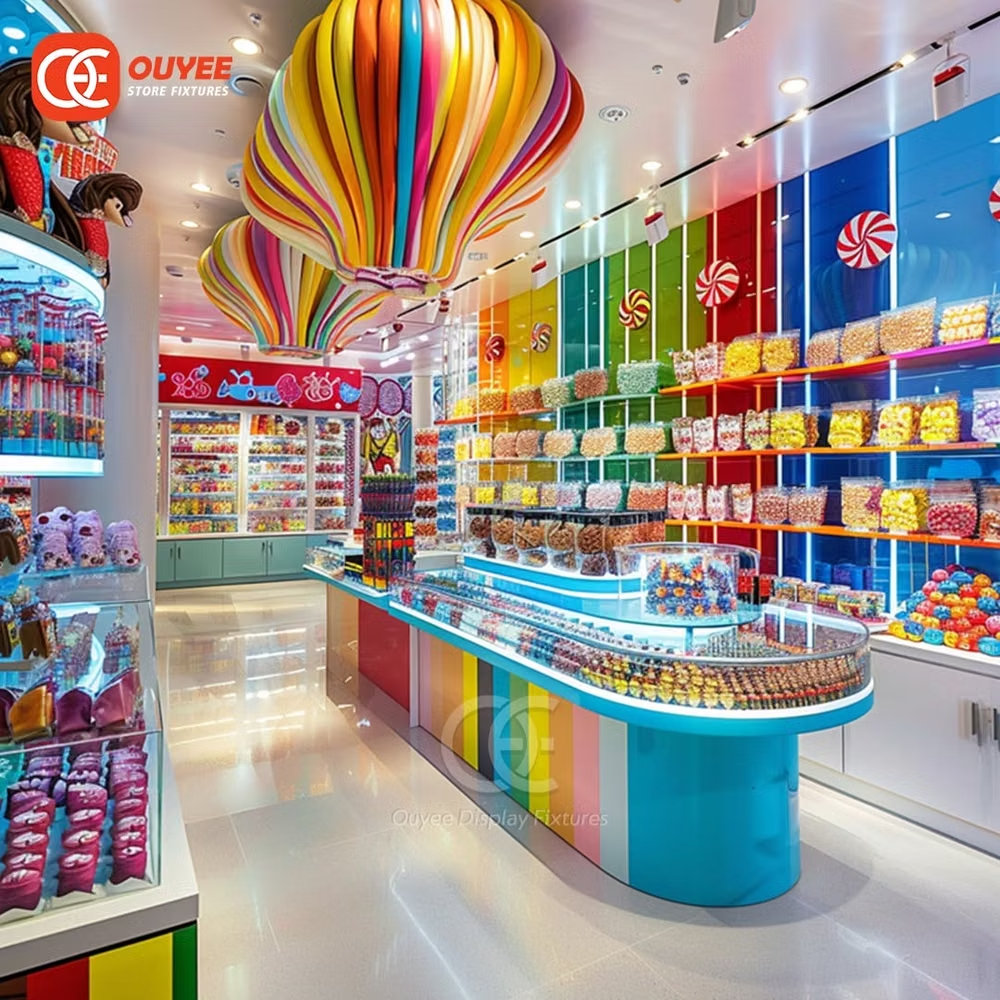
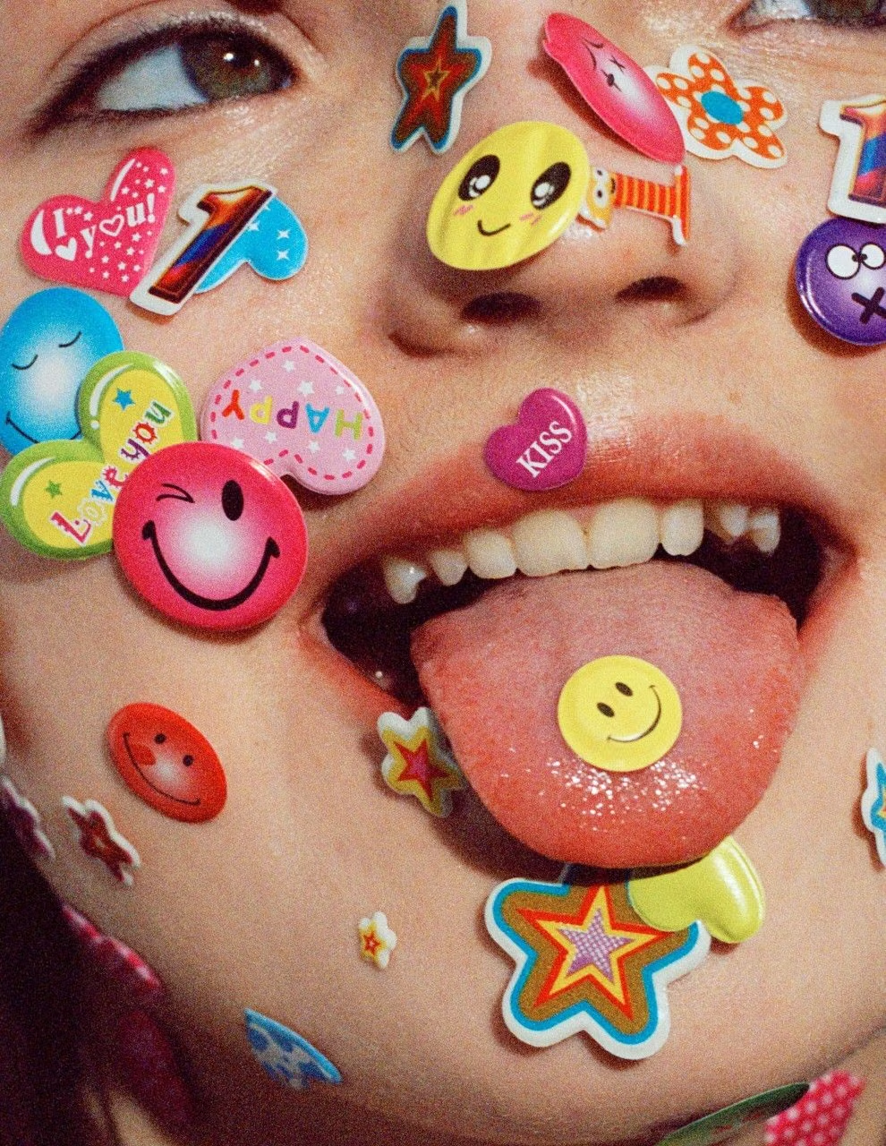
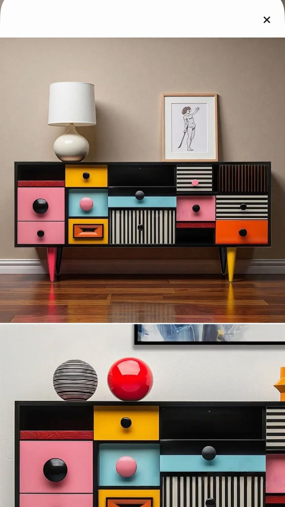
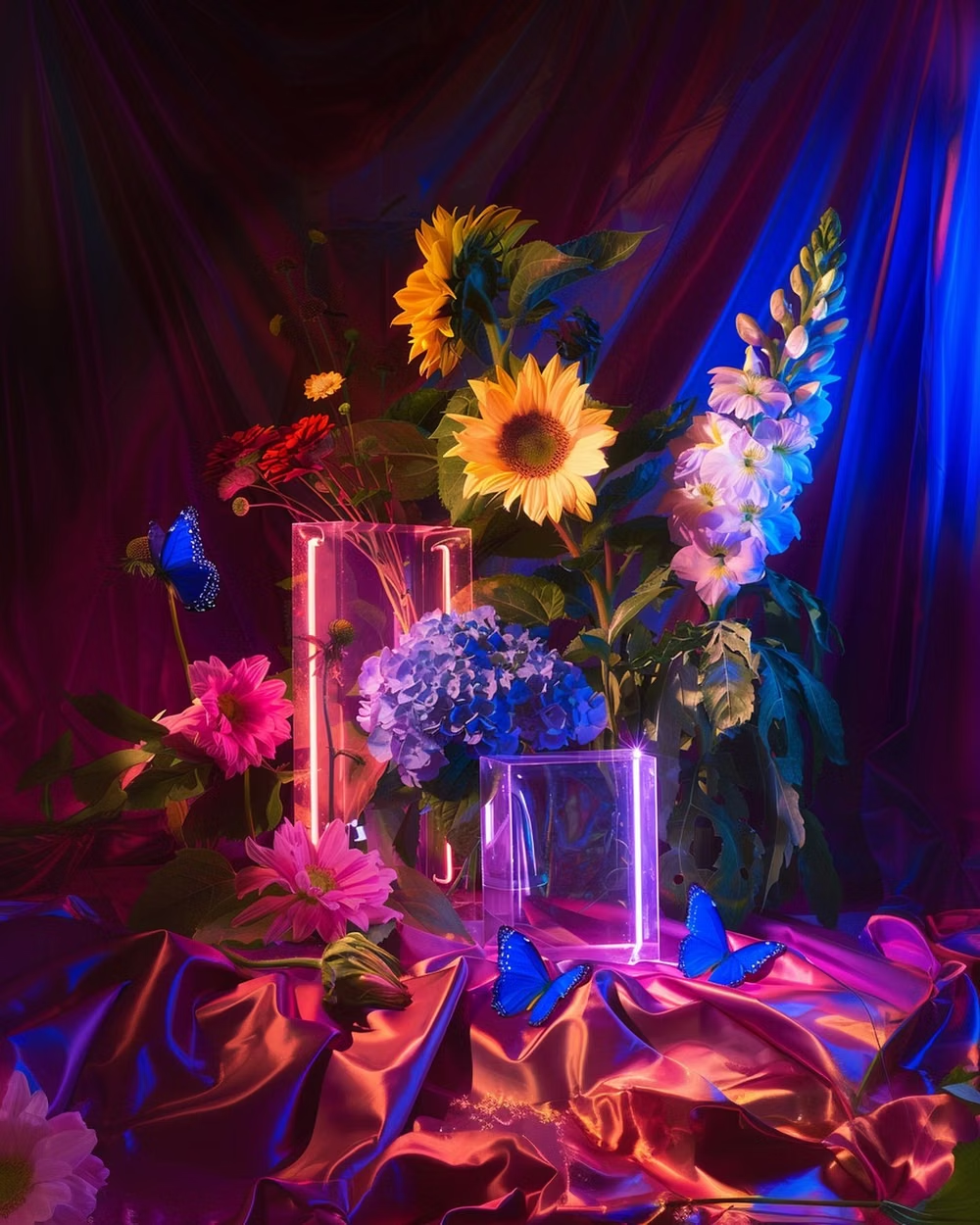
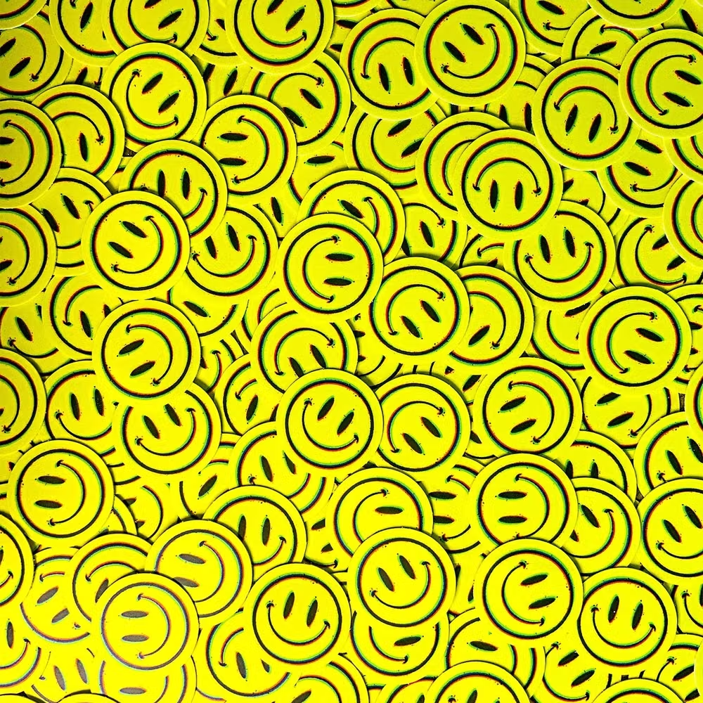
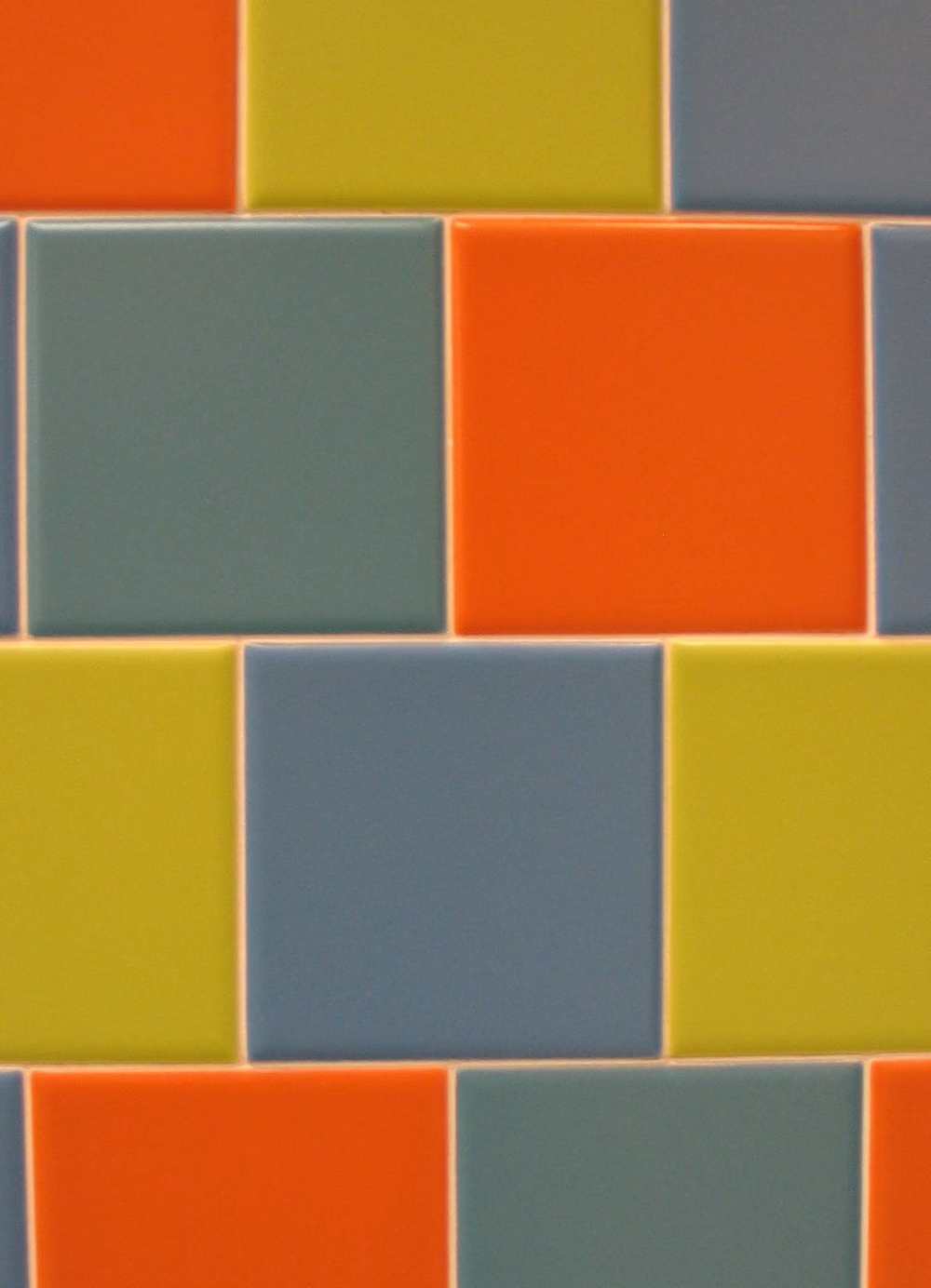
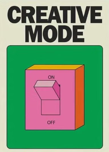
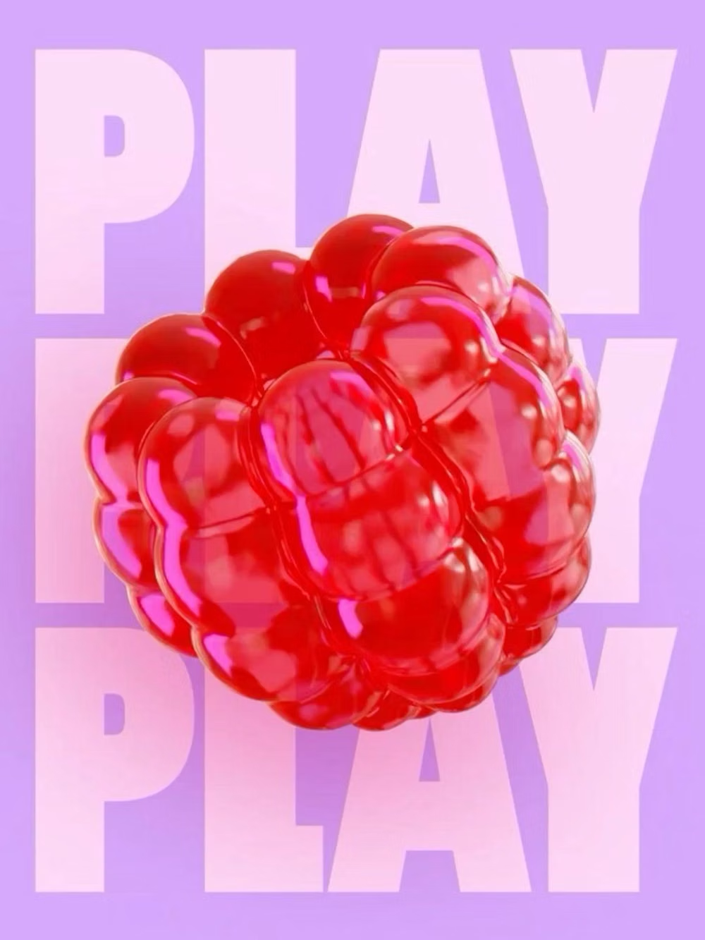
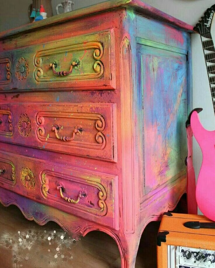
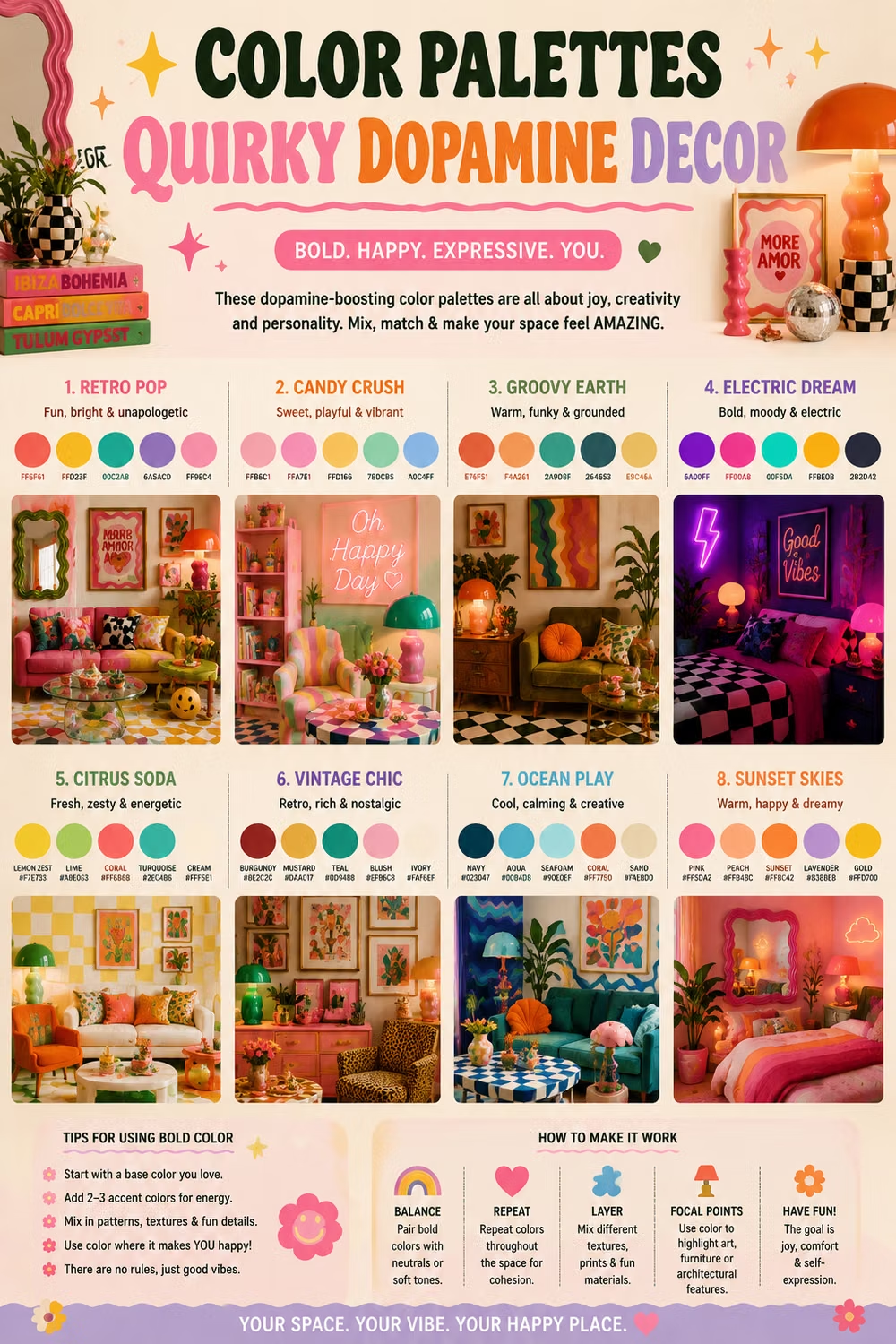
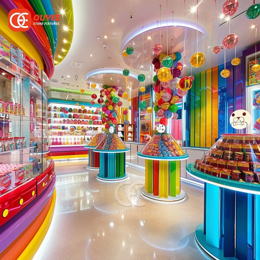
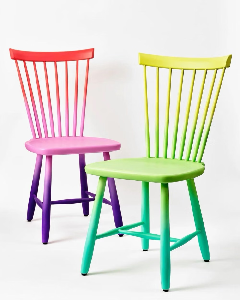
A visual study of the forms, inspirations, materials, colors, type, and cultural references associated with this UI design style.
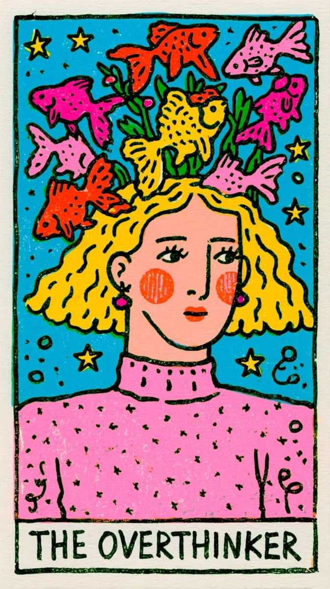
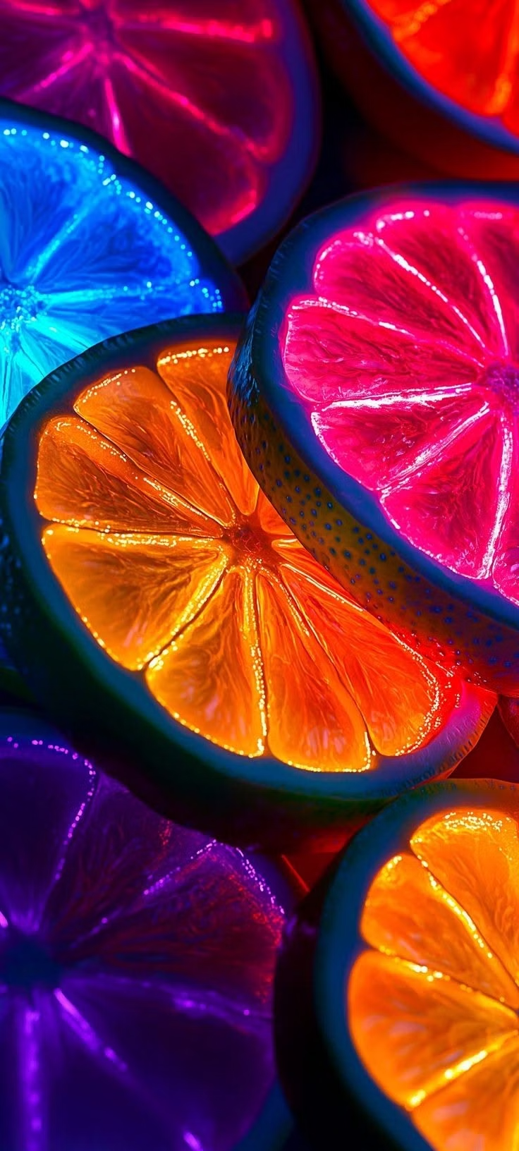
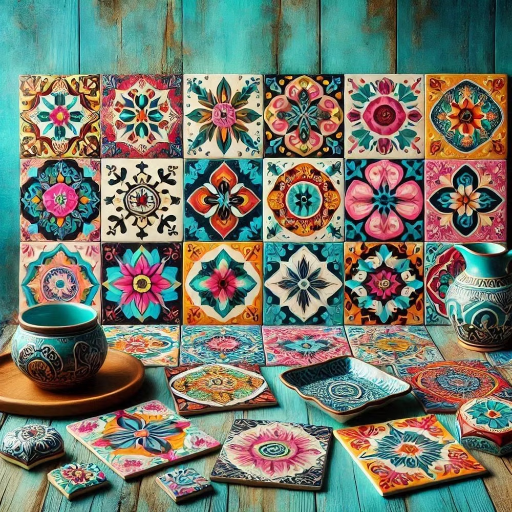
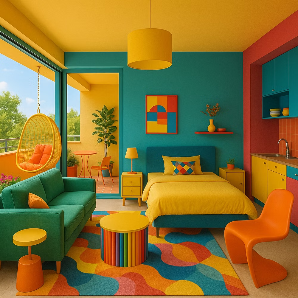
Design principles and implementation
Use these principles to write a focused AI UI design prompt instead of asking for a vague visual treatment.
Color direction
Combine saturated joyful hues in intentional warm-cool clashes, using broad color fields and dark anchors to prevent the palette from becoming muddy. In a daisyUI theme, use the dominant joyful warm hue for `primary`, its energetic cool counterpoint for `secondary`, and keep `base-100`, `base-200`, and `base-300` in pale, lightly tinted neutrals so the accents stay clean.
Imagery direction
Choose exuberant product crops, smiling faces, tactile patterns, stickers, and bold illustrations with immediate emotional warmth.
Content density
Use medium to high visual density but moderate copy, giving each colorful module one short message and one obvious action. Use the `*-lg` size variants for daisyUI components to reinforce the chunky, informal scale.
Motion direction
Use quick pops, spins, confetti-like success moments, and bouncy transitions at key rewards, pausing motion during reading and form entry.
Shape language
Mix oversized flowers, waves, stars, squiggles, chunky pills, and irregular frames with confident scale changes. In daisyUI themes, set the `--radius-*` variables between `1rem` and `2rem`.
Typography rules
Use a bold rounded or eccentric display face for compact statements, support it with a sturdy sans-serif, and keep color clashes away from small text.
Suggested Typfaces
Fredoka
Fresh daisies glow in warm sunlight
Fresh daisies glow in warm sunlight
1 2 3 4 5 6 7 8 9 0
Paytone One
Fresh daisies glow in warm sunlight
Fresh daisies glow in warm sunlight
1 2 3 4 5 6 7 8 9 0
Lilita One
Fresh daisies glow in warm sunlight
Fresh daisies glow in warm sunlight
1 2 3 4 5 6 7 8 9 0
Modak
Fresh daisies glow in warm sunlight
Fresh daisies glow in warm sunlight
1 2 3 4 5 6 7 8 9 0
Titan One
Fresh daisies glow in warm sunlight
Fresh daisies glow in warm sunlight
1 2 3 4 5 6 7 8 9 0
Build a Dopamine Design interface with daisyUI
The live example translates this direction into daisyUI components and semantic theme tokens.
To generate a full page in the same visual language, give the style name and the design rules above to Blueprint MCP.
Related UI design styles
Compare nearby visual languages that share typography, shapes, use cases, or signature elements.
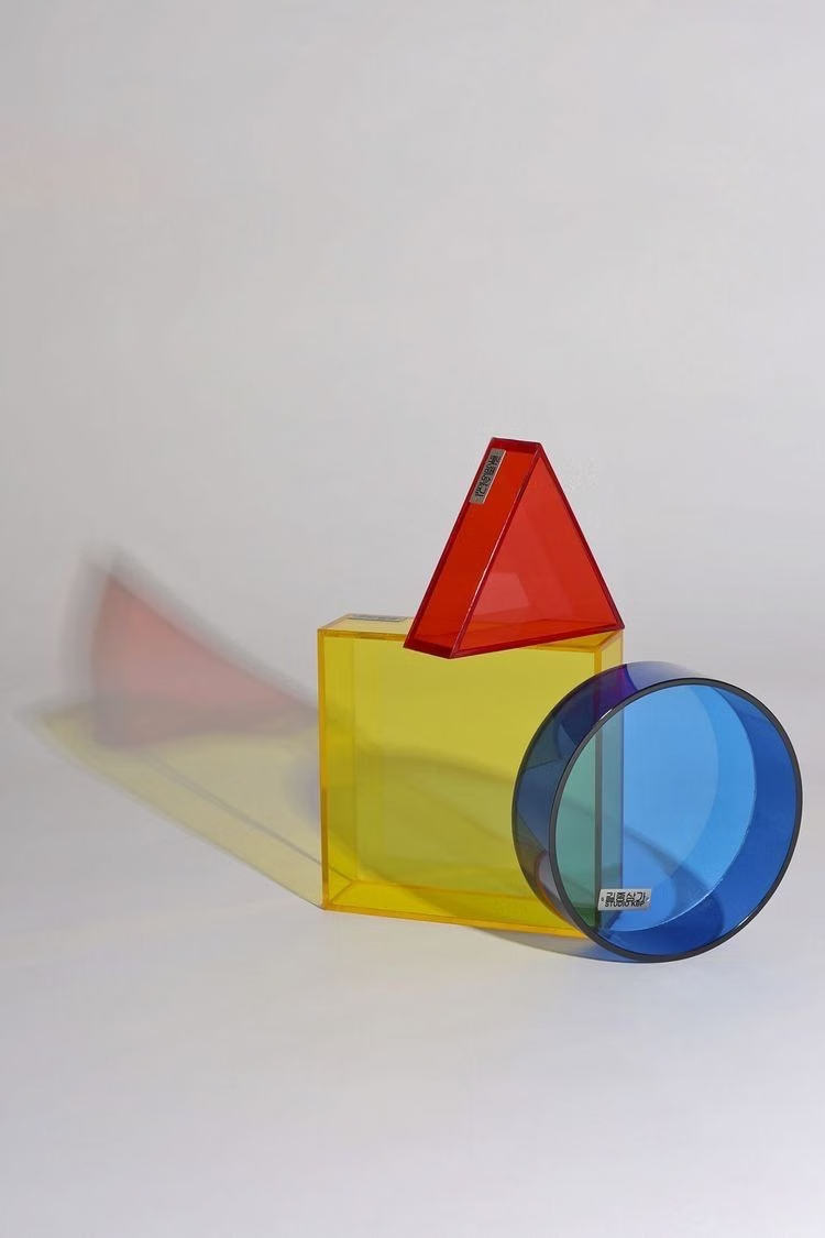
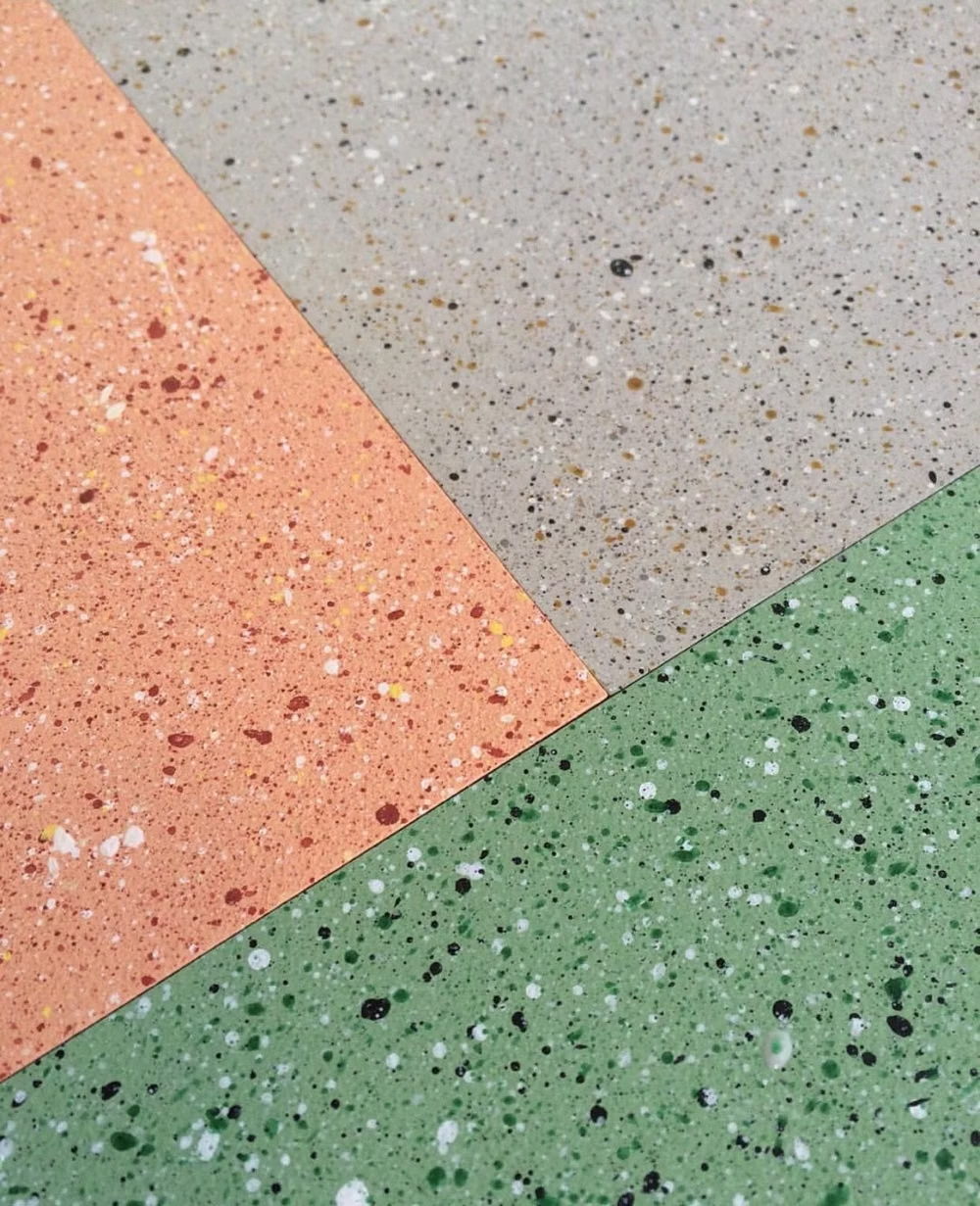
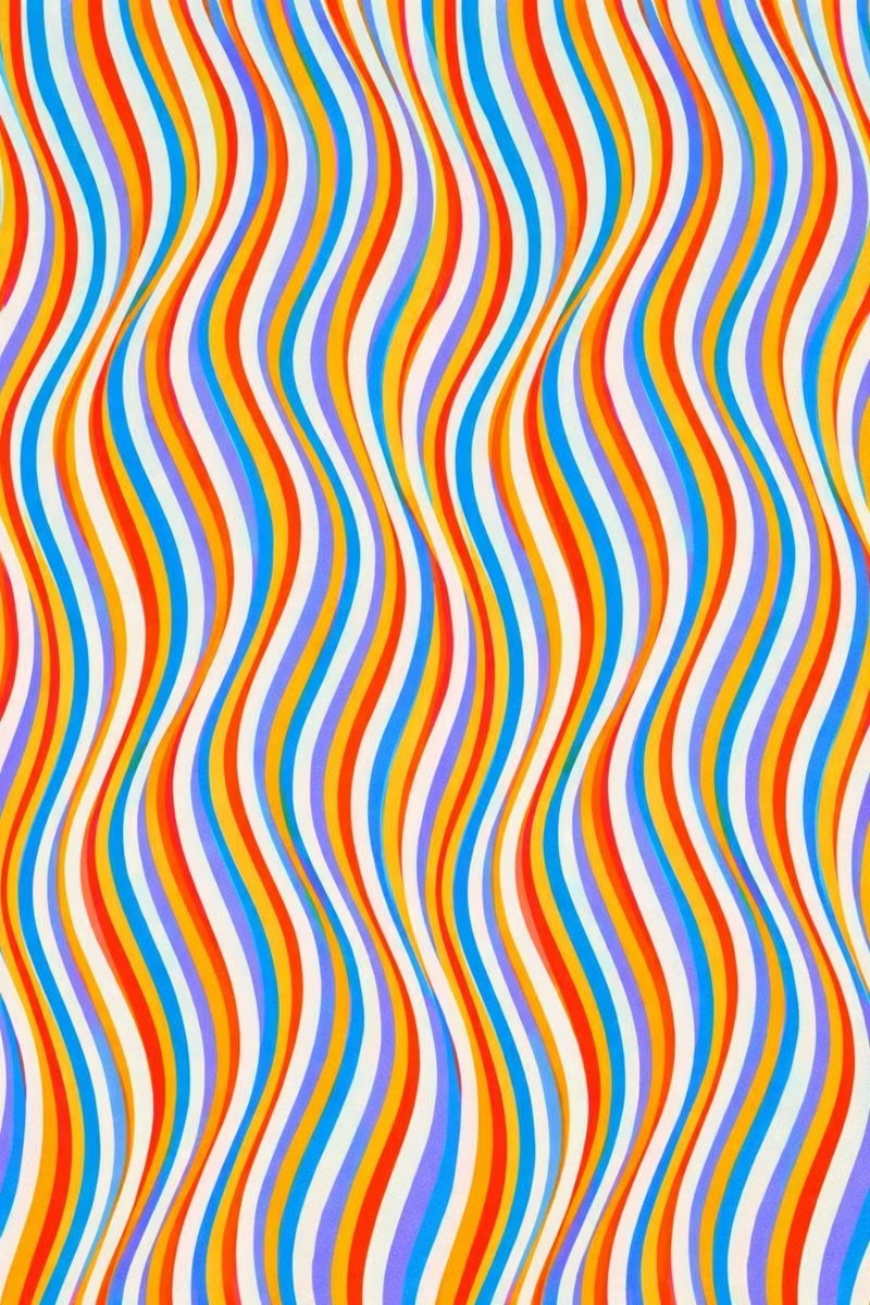
Memphis Design UI design style
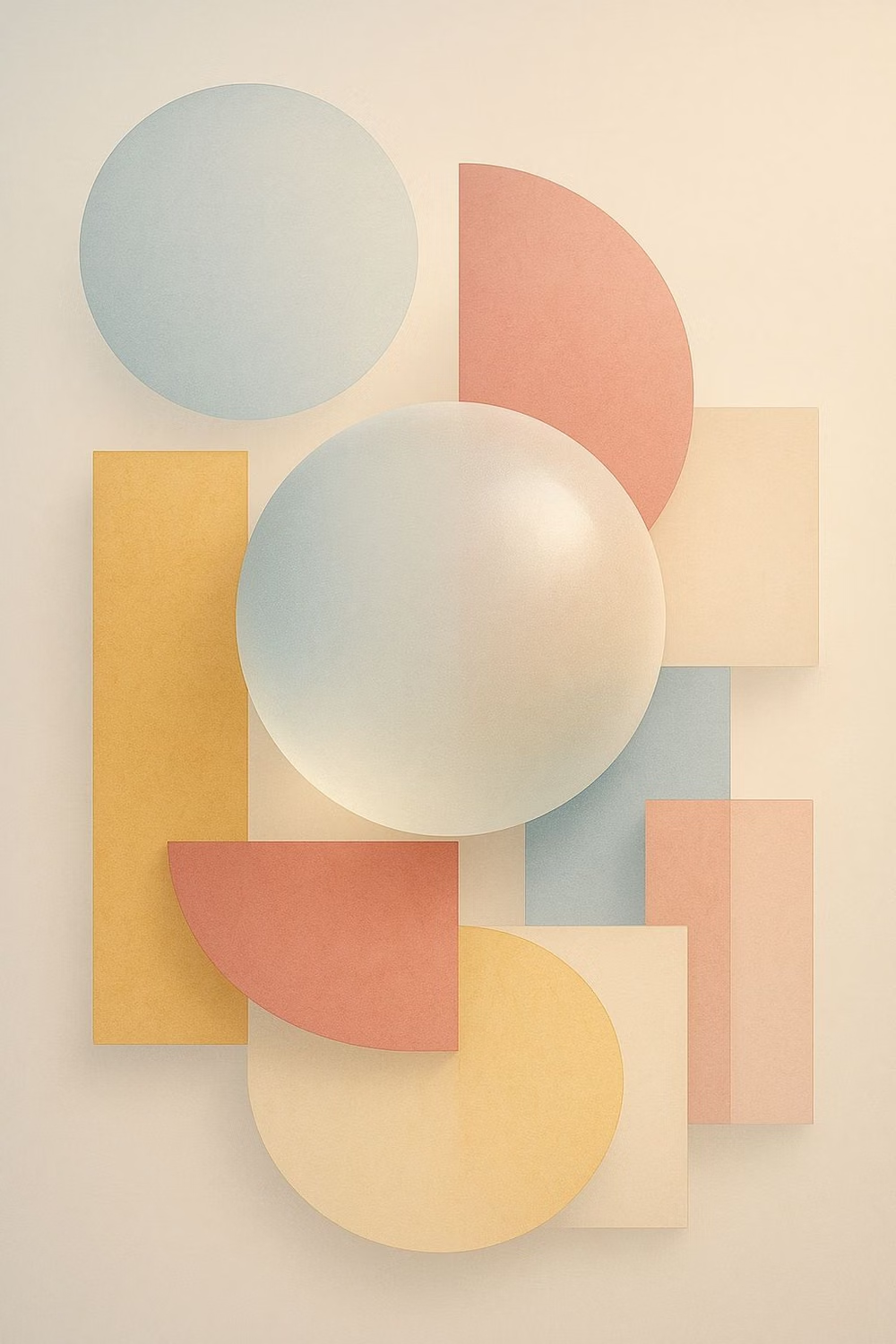
Bright geometric shapes, squiggles, dots, contrasting patterns, and playful visual imbalance evoke the 1980s Memphis Group.
Claymorphism UI design style
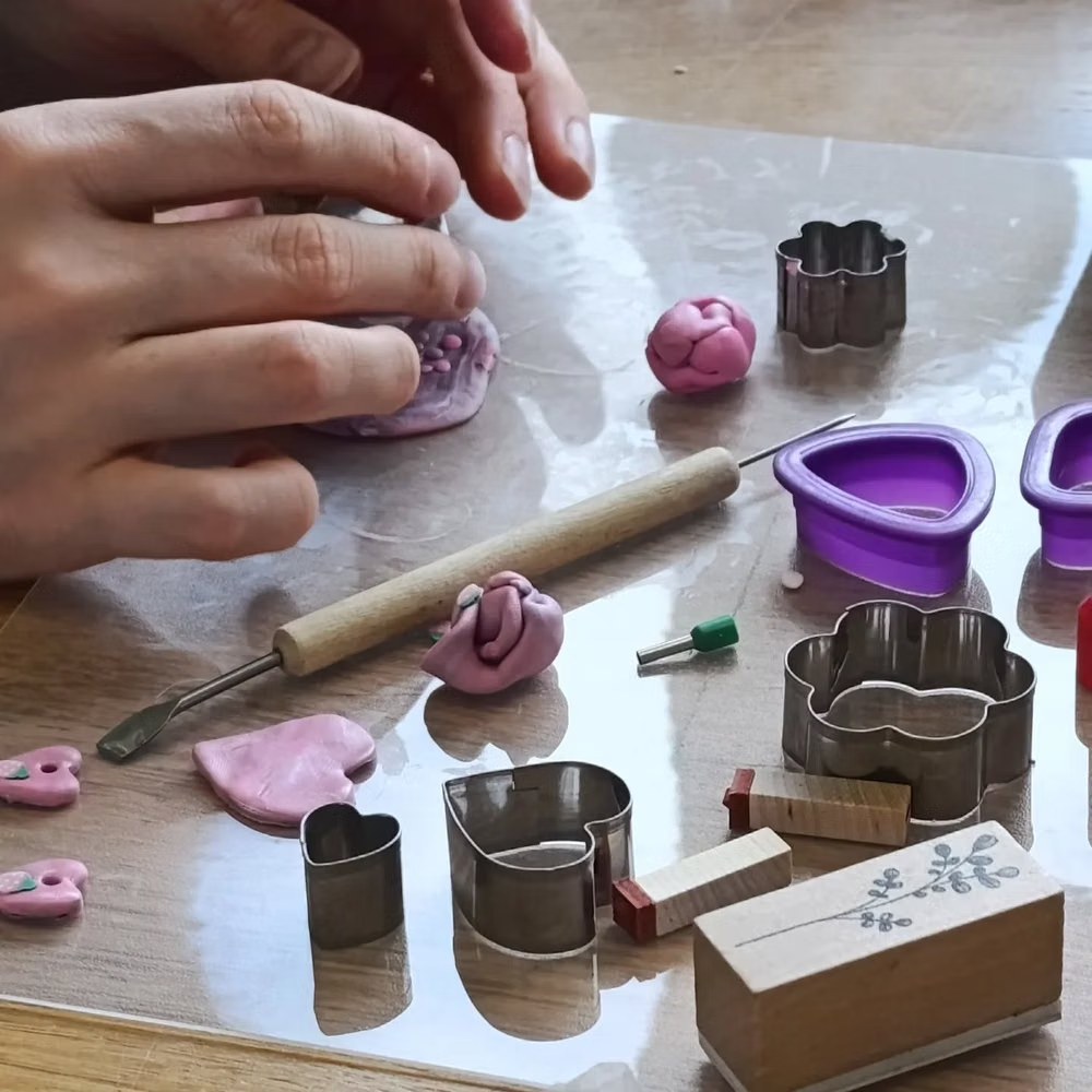
Inflated, clay-like components with pastel colors, large radii, soft shading, and playful dimensional shadows.
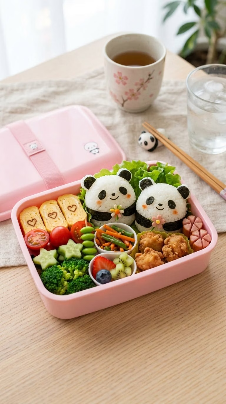
Kawaii UI design style
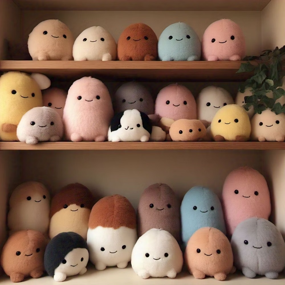
Cute characters, rounded shapes, soft colors, expressive icons, and cheerful decorative details.