PC-98 UI design style
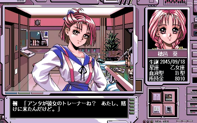
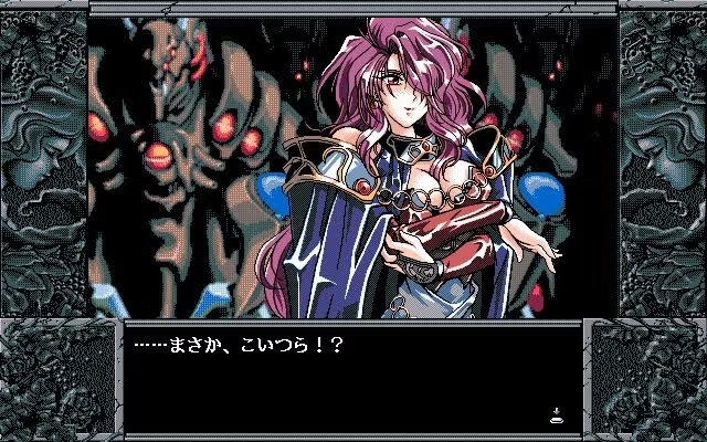
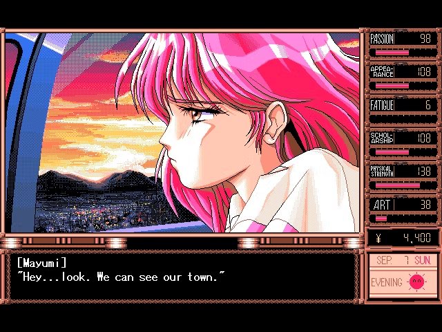
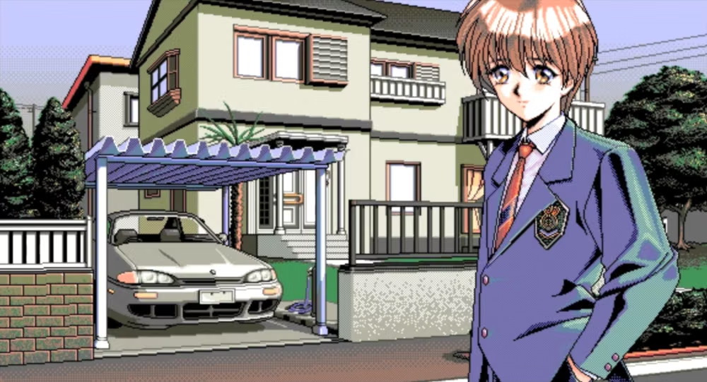
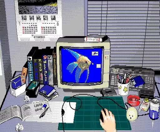
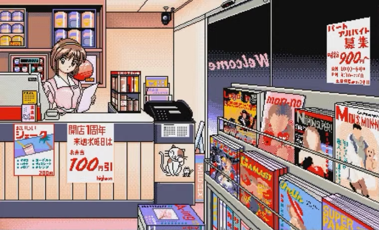
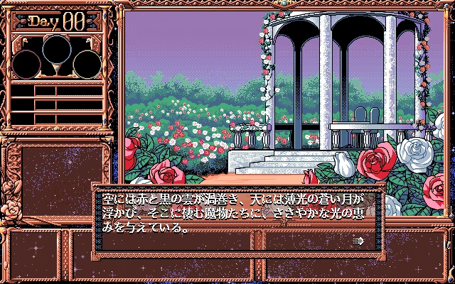
NEC PC-9800-era Japanese games pair relatively high-resolution 640×400 scenes with tightly limited color, meticulous dithering, detailed anime portraits, and compact visual-novel or adventure-game interfaces.
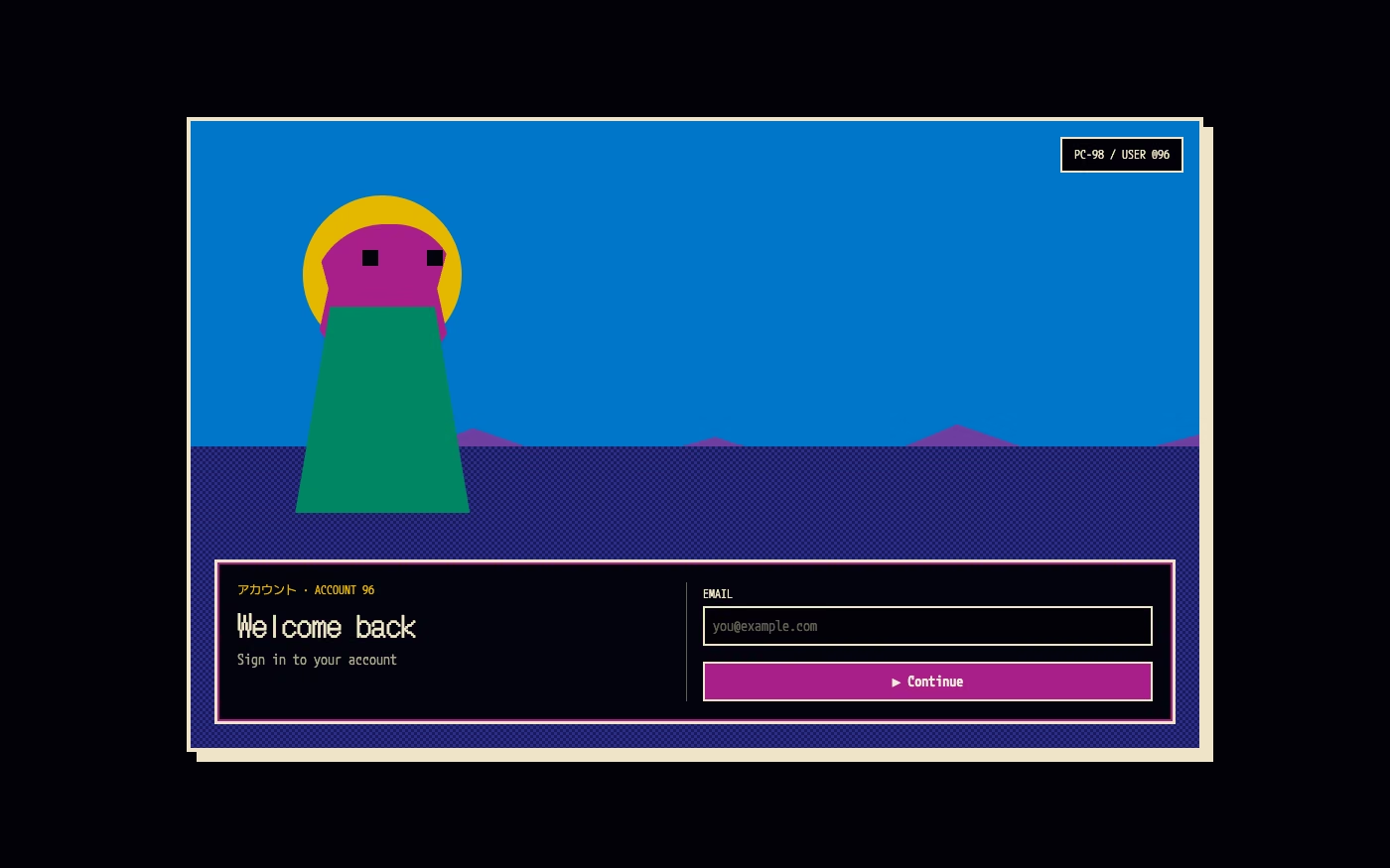
Design overview
- Signature elements
- 640×400 pixel scenes, sixteen-color palettes, patterned dithering, detailed anime portraits, scenic visual-novel backgrounds, rectangular dialogue and command windows. In daisyUI themes, set `--noise: 1;` and `--depth: 1;`.
- Best suited to
- Visual novels, games, music releases, retro technology projects, narrative portfolios, and Japanese-computing archives.
- Layout principles
- Frame the experience in an 8:5 landscape scene, placing a large character or location image behind a bottom dialogue box, side command list, portrait inset, or narrow status strip.
History and origins
A fact-checked account of where this visual language came from, with links to the references used.
- Period
- Hardware platform from 1982–2003; peak cultural influence in the 1980s–1990s
- Origin
- NEC personal computers in Japan
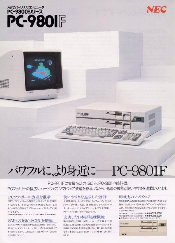
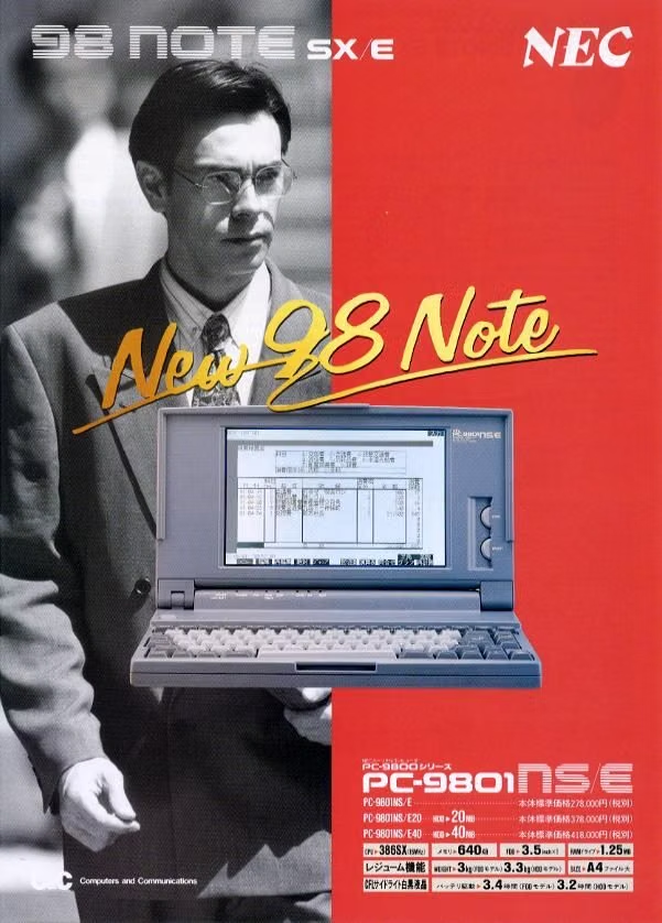
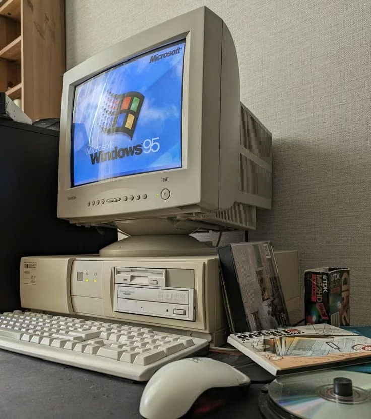
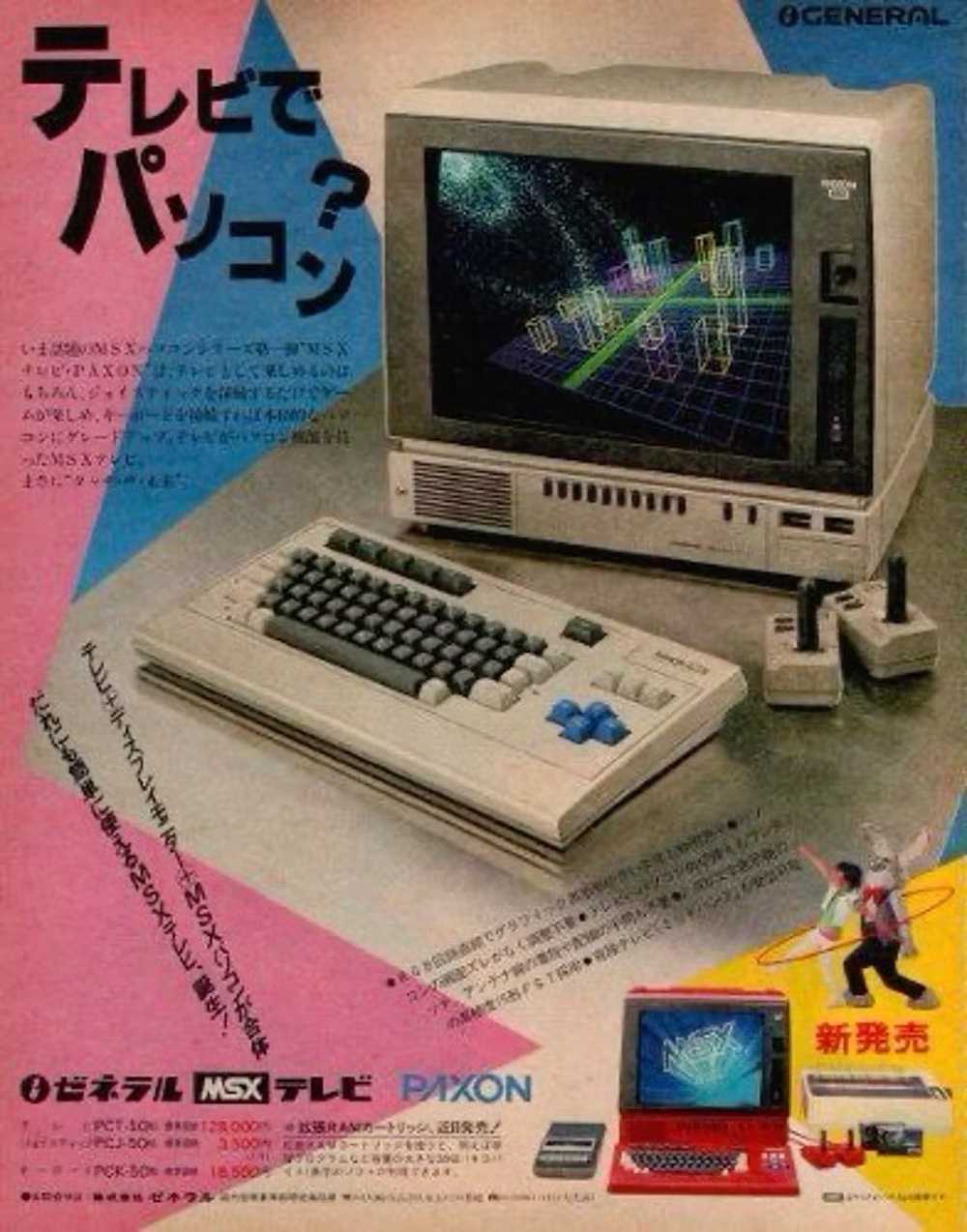
PC-98 refers to NEC’s PC-9800 family, launched with the PC-9801 in 1982 and dominant in Japan’s personal-computer market for much of the following decade. Its high-resolution Japanese text display and game ecosystem encouraged detailed dithered pixel art, dense menus, and distinctive typography; today’s “PC-98 aesthetic” is a retrospective focus on that platform’s visual output.
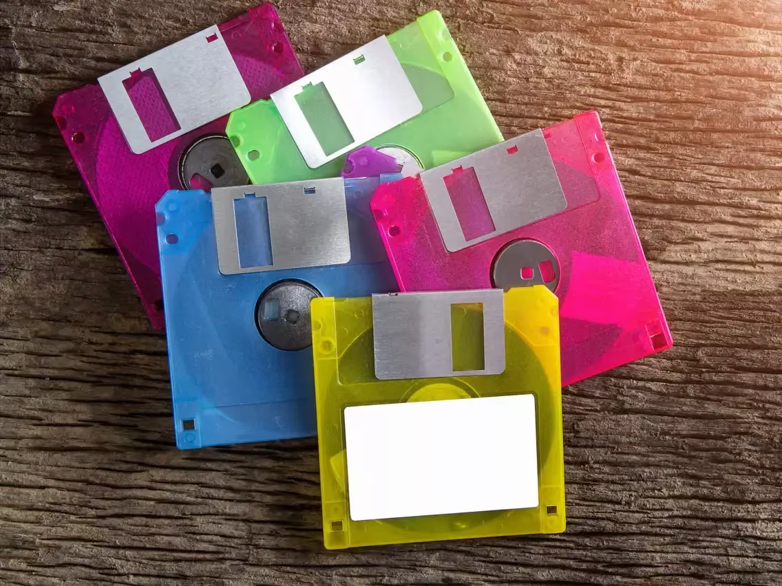
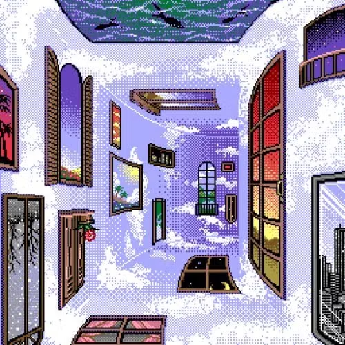
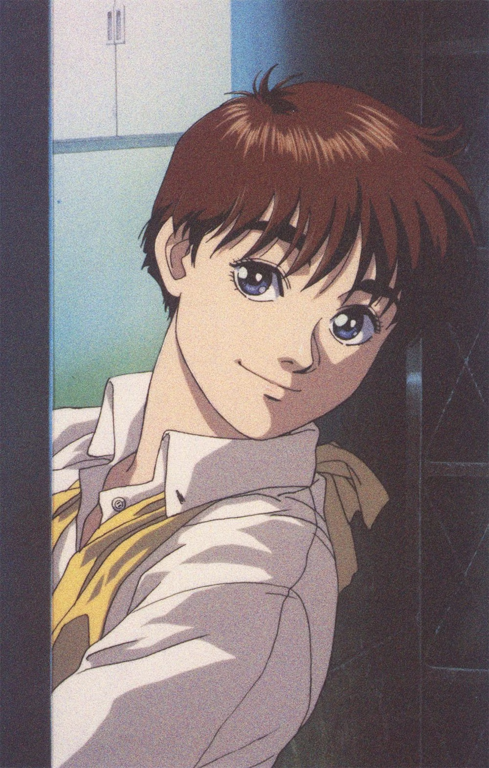
Moodboard and visual references
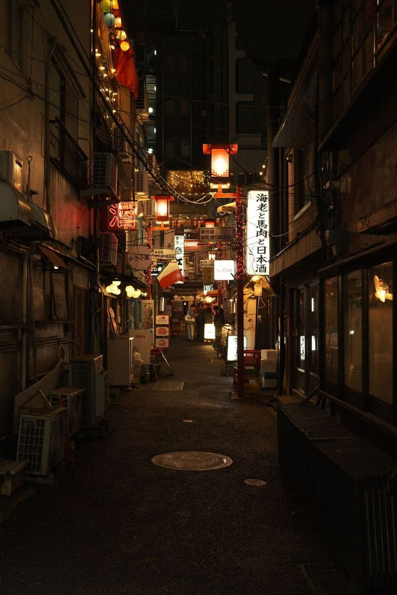
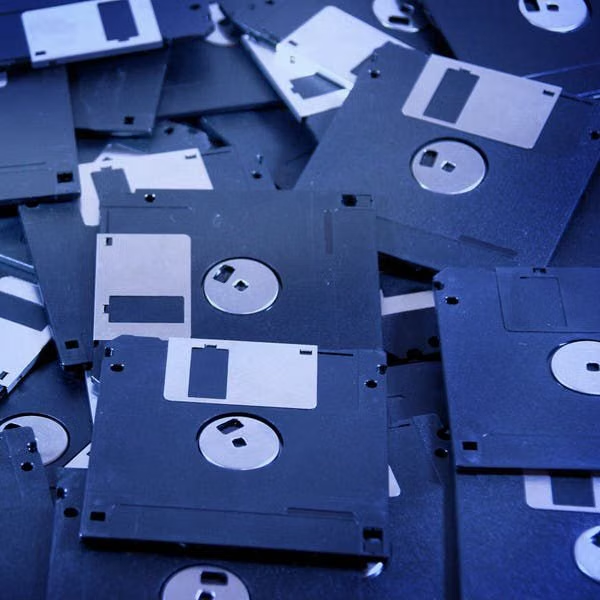
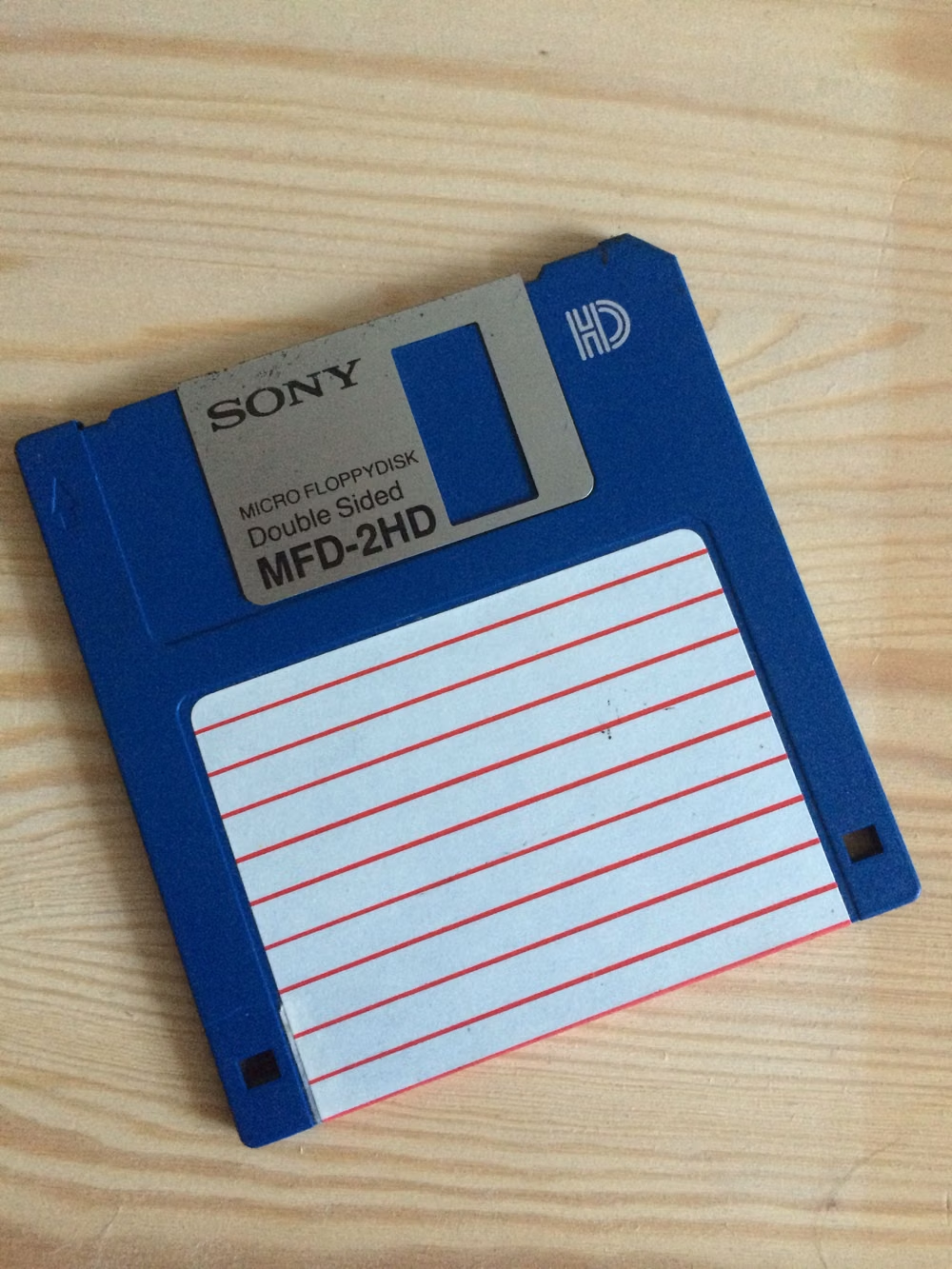
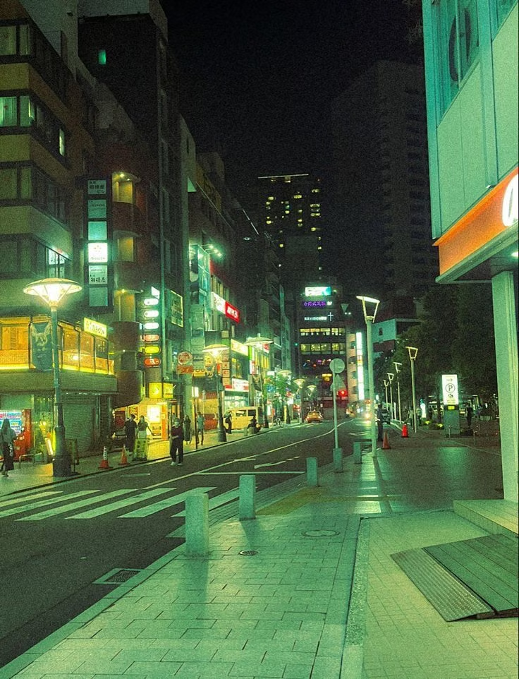
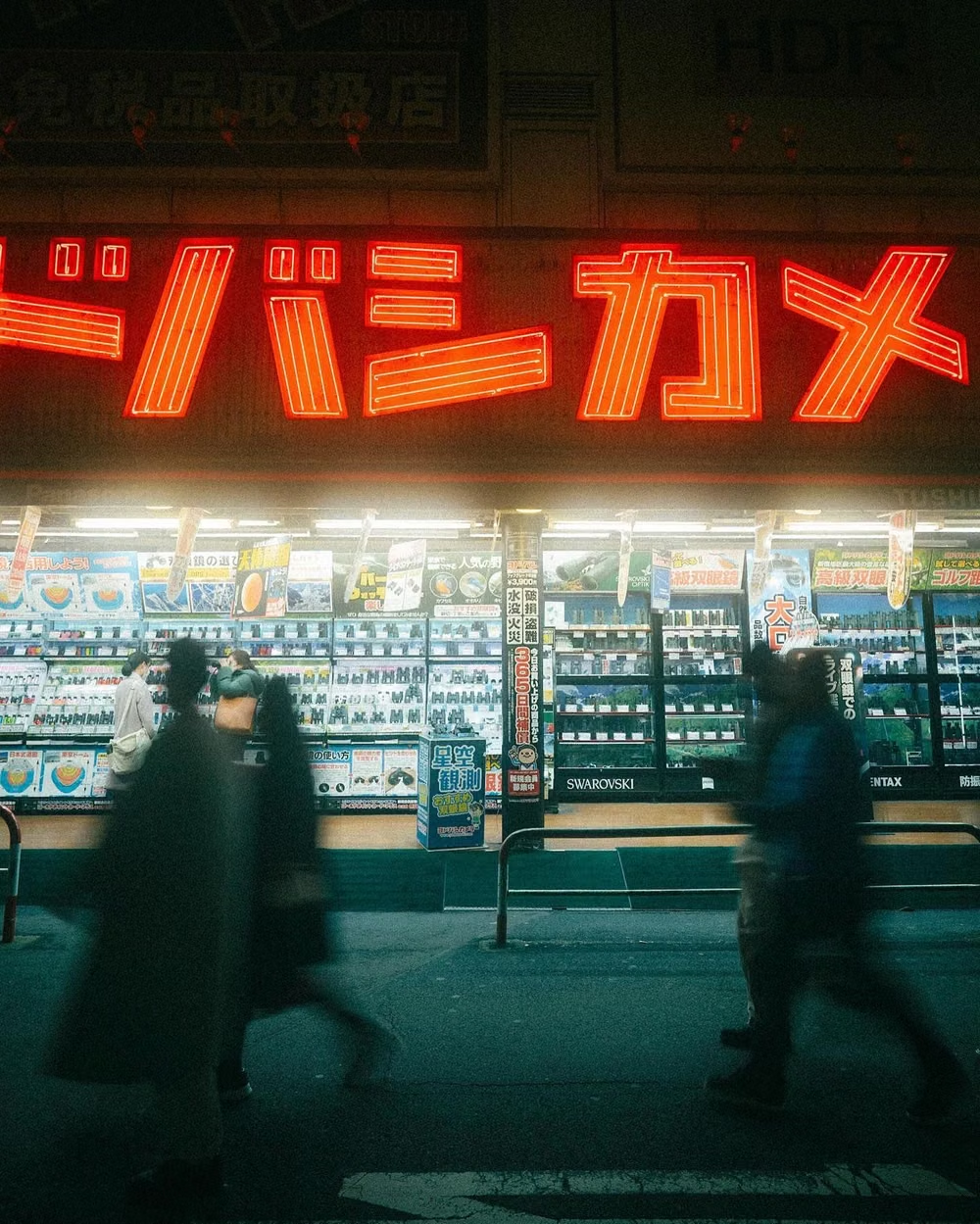
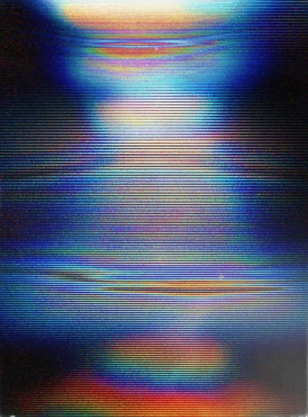
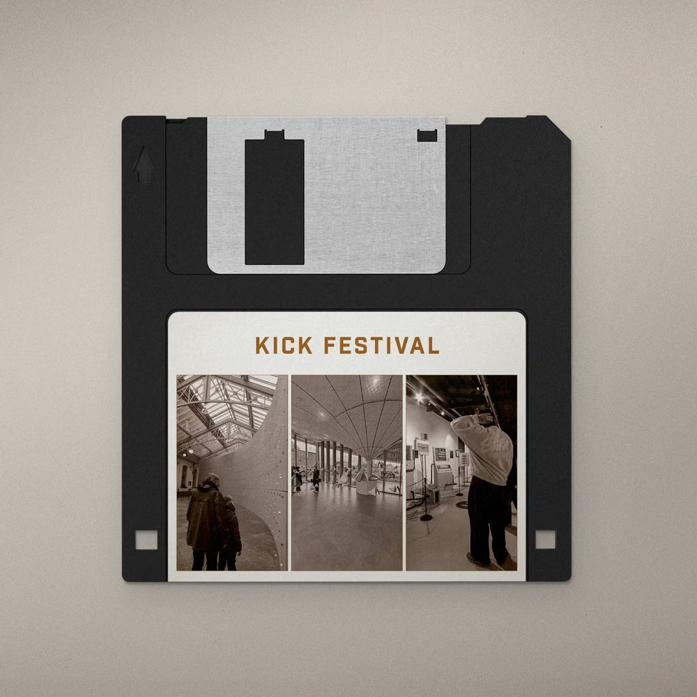
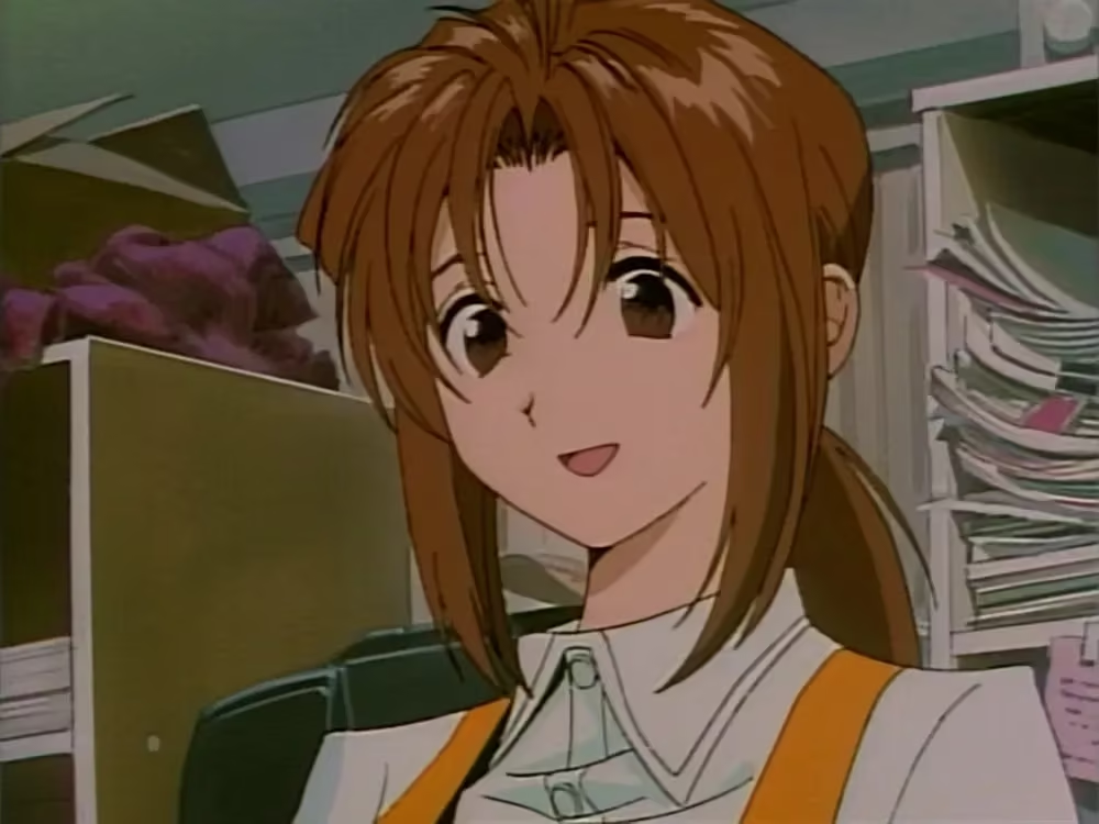
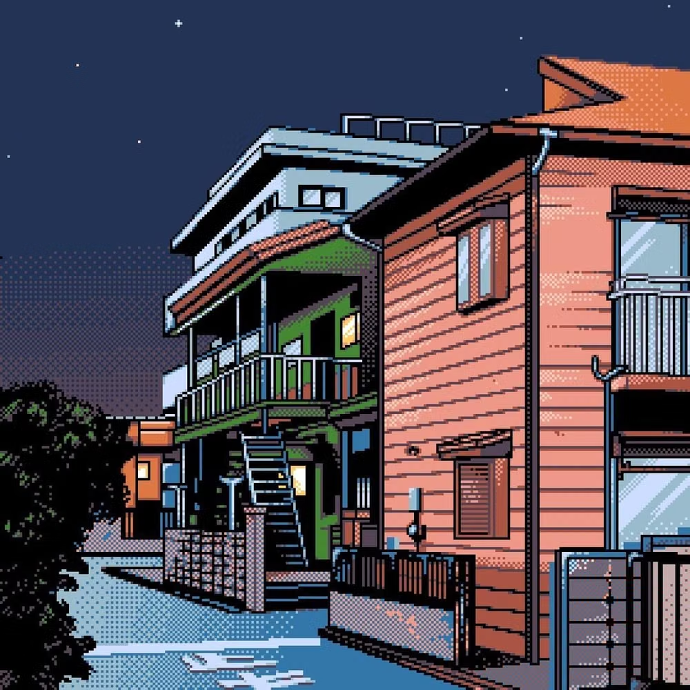
A visual study of the forms, inspirations, materials, colors, type, and cultural references associated with this UI design style.

Design principles and implementation
Use these principles to write a focused AI UI design prompt instead of asking for a vague visual treatment.
Color direction
Choose a scene-specific indexed palette of roughly sixteen simultaneous colors from a broader bank, building shade ramps through checker, line, and noise dithers rather than smooth gradients. In a daisyUI theme, use the clearest action or dialogue-highlight swatch for `primary`, a contrasting scene swatch for `secondary`, and map three exact indexed navy, gray, or cream panel values to `base-100`, `base-200`, and `base-300`.
Imagery direction
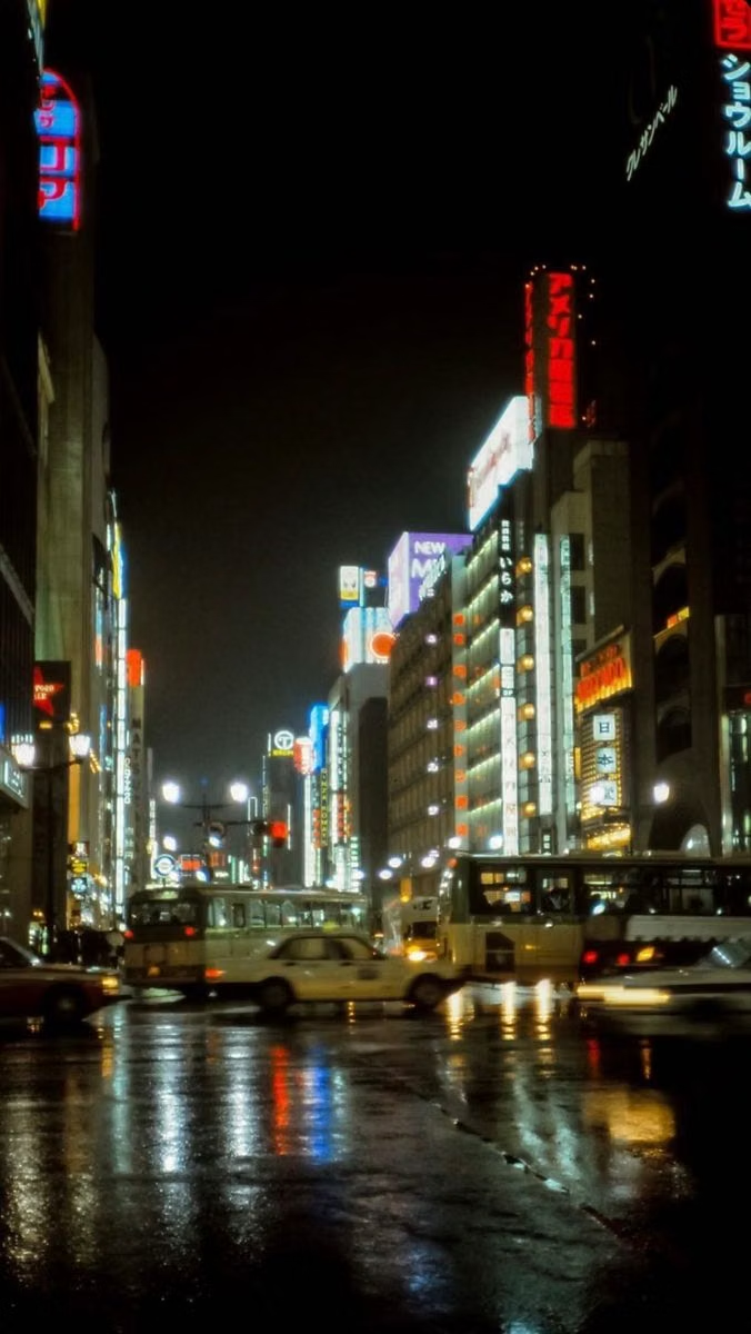
Draw late-1980s or 1990s anime characters, detailed interiors, city streets, landscapes, machinery, and dramatic close-ups with deliberate pixel clusters and hand-controlled patterned shading.
Content density
Allow high pictorial detail and compact interface chrome, but keep each dialogue page short, command lists narrow, and selection state unmistakable. Use the `*-sm` size variants for daisyUI components to preserve this compact working density.
Motion direction
Use sparse stepped character frames, blinking cursors, paced text crawl, palette cycling, hard scene wipes, and small status changes instead of modern smooth interpolation.
Shape language
Use sharp pixel frames, one-pixel rules, inset status bands, tiled corners, rectangular command windows, and dithered shadow fields with no anti-aliased vector curves. In daisyUI themes, set the `--radius-*` variables to `0` or `0.25rem`.
Typography rules
Use a crisp Japanese-capable bitmap or monospace face at integer scale, preserve enough pixels for complex glyphs, and align dialogue and commands to the native grid.
Suggested Typfaces
DotGothic16
Fresh daisies glow in warm sunlight
Fresh daisies glow in warm sunlight
1 2 3 4 5 6 7 8 9 0
IBM Plex Mono
Fresh daisies glow in warm sunlight
Fresh daisies glow in warm sunlight
1 2 3 4 5 6 7 8 9 0
M PLUS 1 Code
Fresh daisies glow in warm sunlight
Fresh daisies glow in warm sunlight
1 2 3 4 5 6 7 8 9 0
Pixelify Sans
Fresh daisies glow in warm sunlight
Fresh daisies glow in warm sunlight
1 2 3 4 5 6 7 8 9 0
Kosugi Maru
Fresh daisies glow in warm sunlight
Fresh daisies glow in warm sunlight
1 2 3 4 5 6 7 8 9 0
Build a PC-98 interface with daisyUI
The live example translates this direction into daisyUI components and semantic theme tokens.
To generate a full page in the same visual language, give the style name and the design rules above to Blueprint MCP.
Related UI design styles
Compare nearby visual languages that share typography, shapes, use cases, or signature elements.
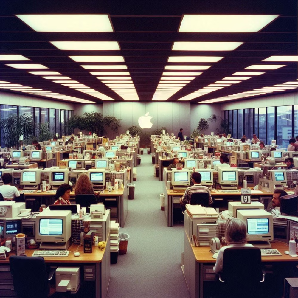
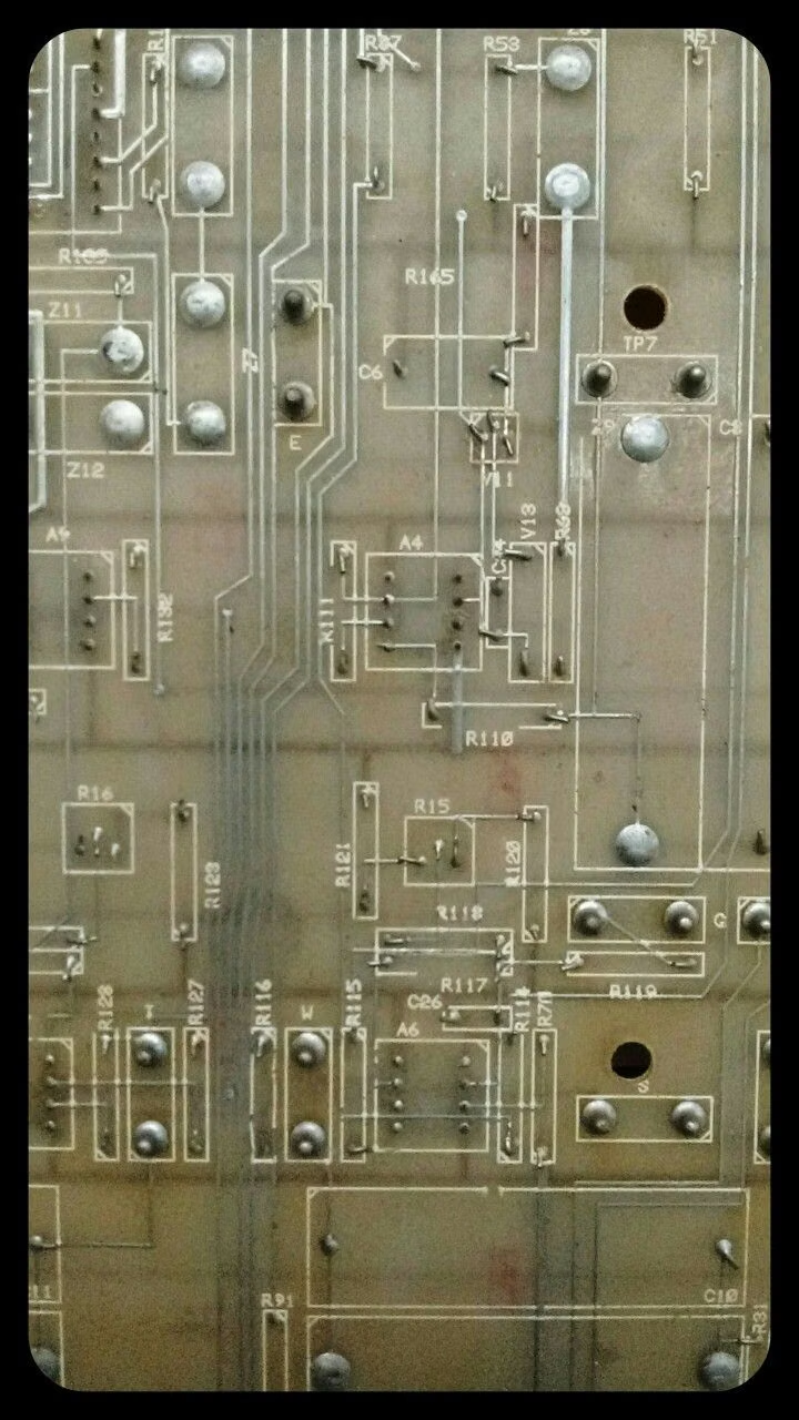
Retro Computing UI design style
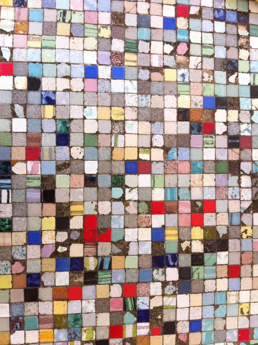
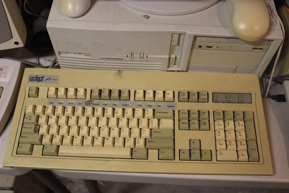
CRT glow, bitmap fonts, window chrome, limited palettes, scanlines, floppy-disk motifs, and vintage operating-system conventions.
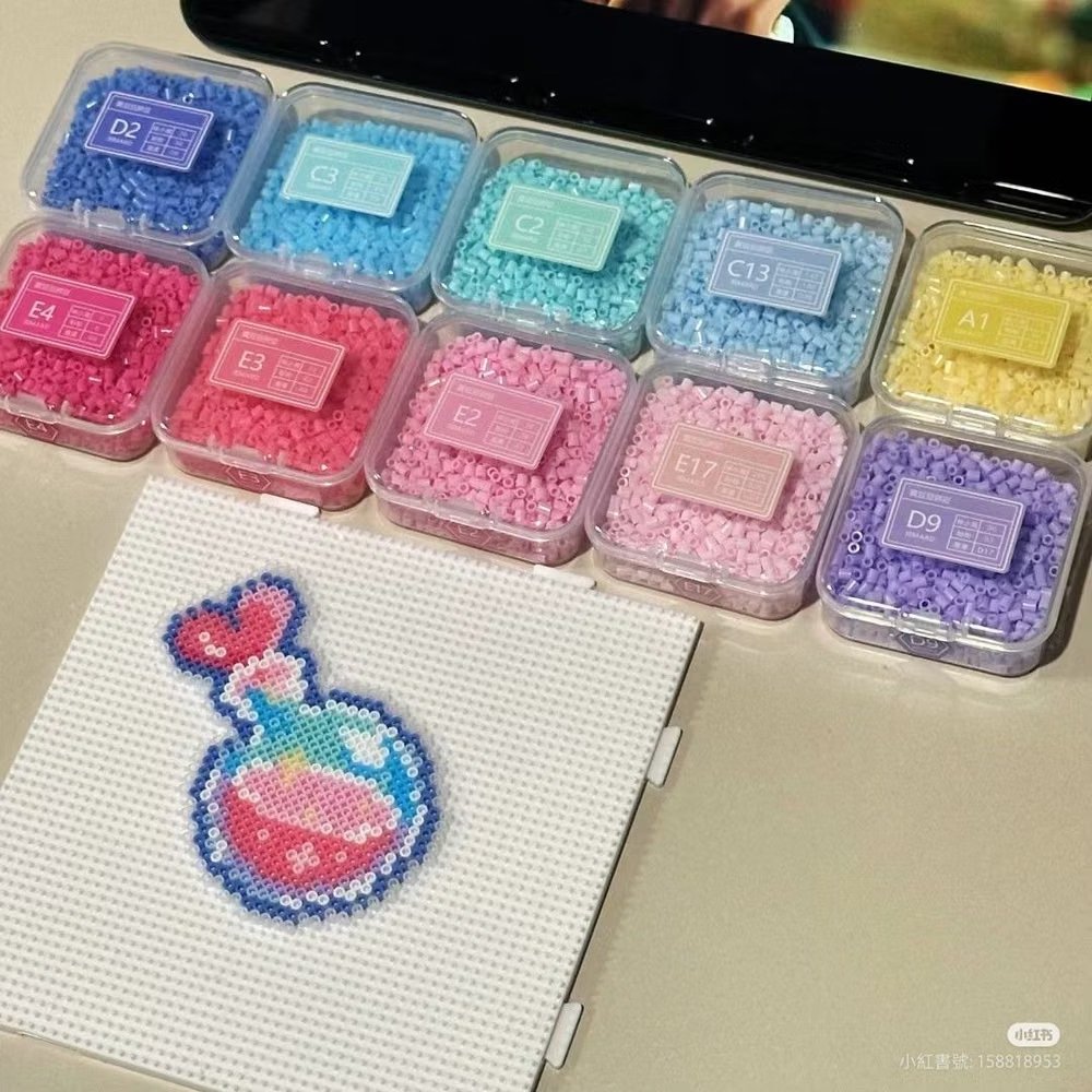
Pixel Art UI design style
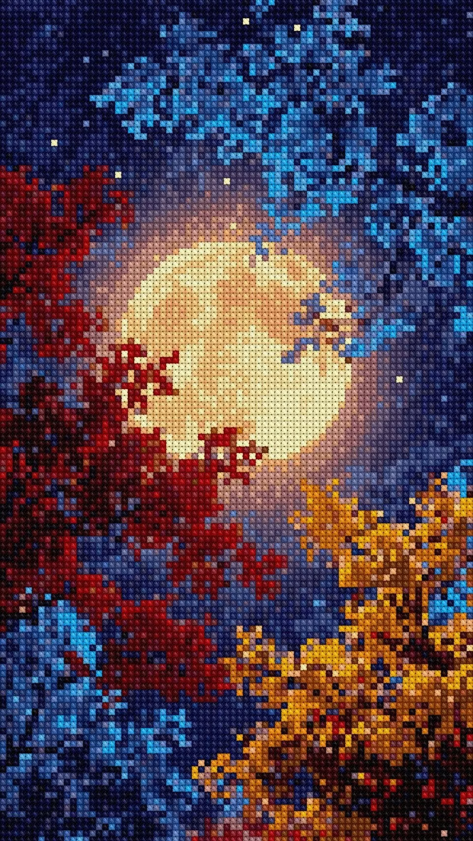
Low-resolution graphics, limited palettes, blocky typography, and game-inspired interface details.
Terminal / CLI UI design style
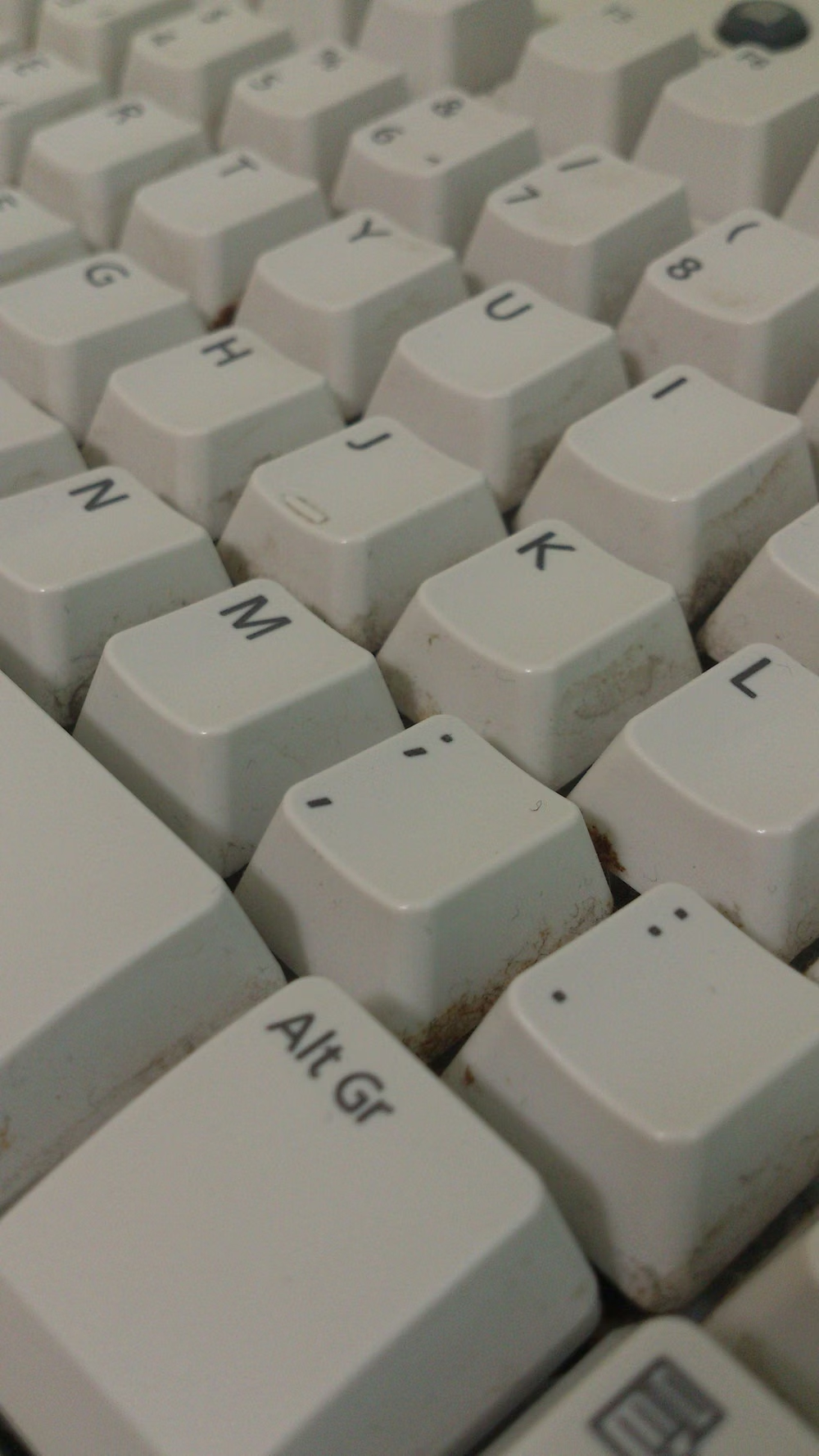
Monospaced type, command prompts, phosphor-like color, cursor states, logs, and text-first interaction.