Pixel Art UI design style
Low-resolution graphics, limited palettes, blocky typography, and game-inspired interface details.
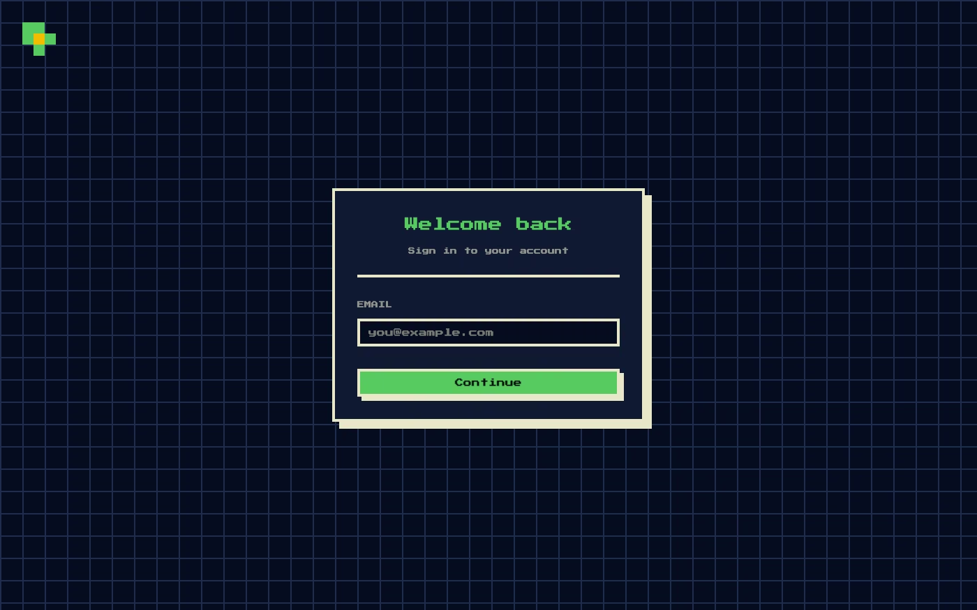
Design overview
- Signature elements
- pixel grid, limited palette, bitmap icons, blocky typography, hard-edged sprites, low-resolution animation
- Best suited to
- Games, developer portfolios, entertainment products, retro communities, and playful utilities.
- Layout principles
- Align every panel and sprite to an integer pixel or tile grid, organize controls like a game HUD, and scale modules only by whole-number factors.
History and origins
A fact-checked account of where this visual language came from, with links to the references used.
- Period
- 1970s roots; term documented in 1982
- Origin
- Computer research labs, arcade games, and early home computers
Artists were building images pixel by pixel by the early 1970s, including work made with Richard Shoup’s SuperPaint system. The term “pixel art” was published by Xerox PARC researchers Adele Goldberg and Robert Flegal in 1982; limited display resolution made the method central to games, while later designers preserved the visible grid as an intentional style.
Moodboard and visual references
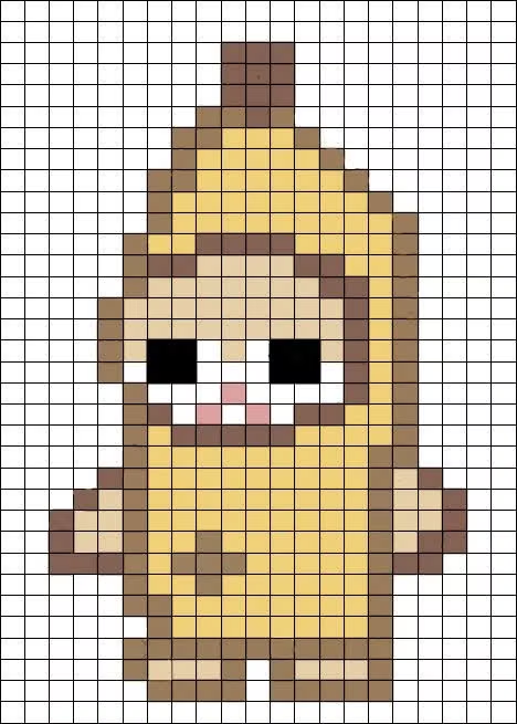
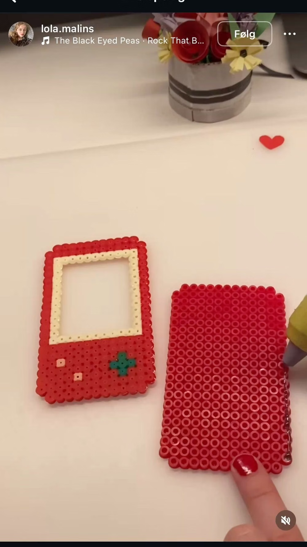
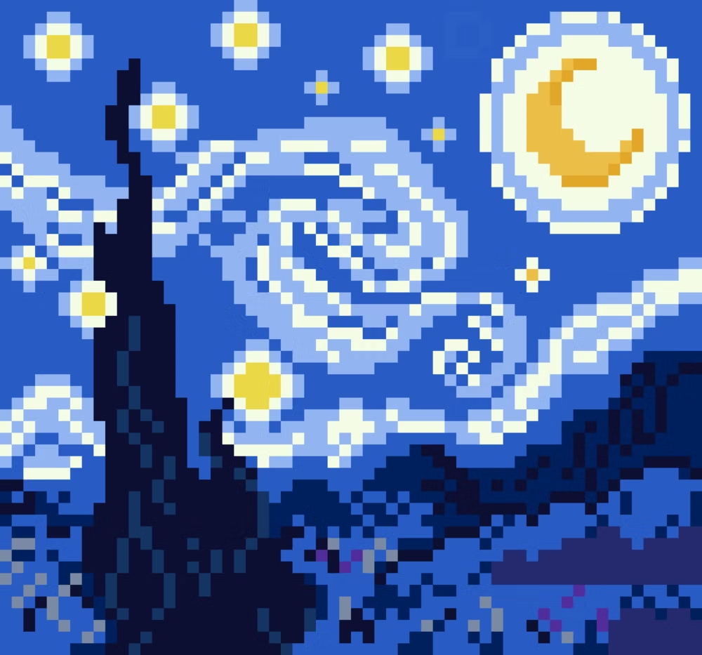
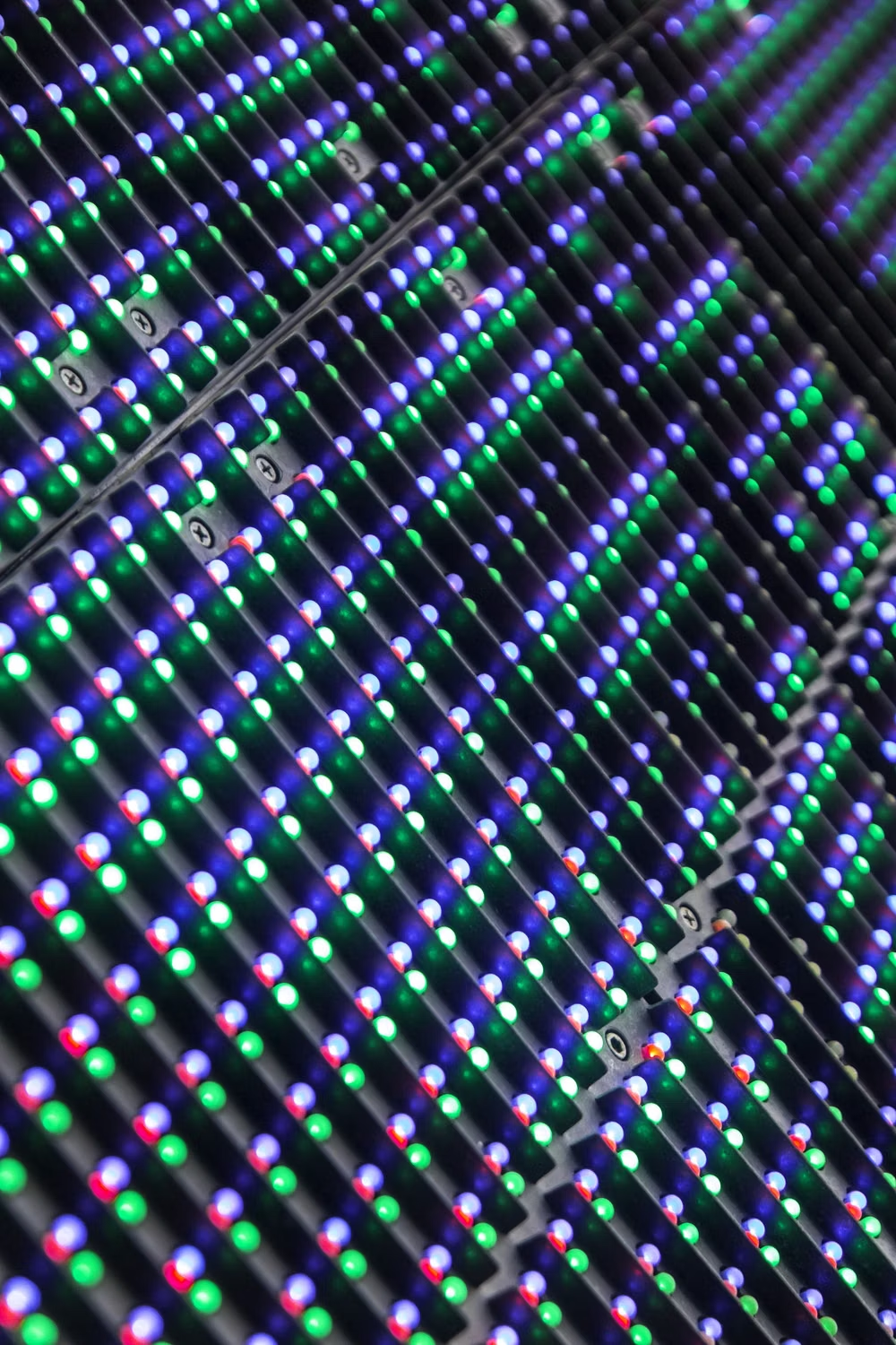
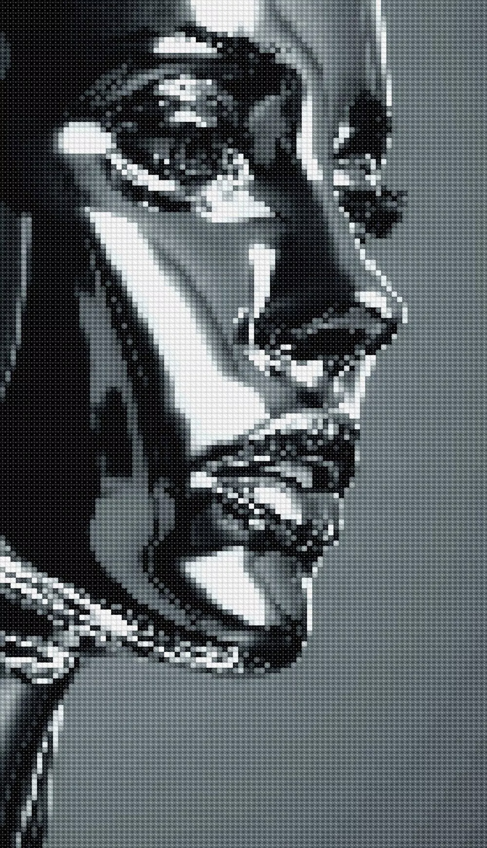
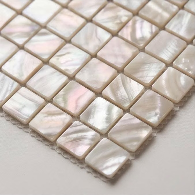
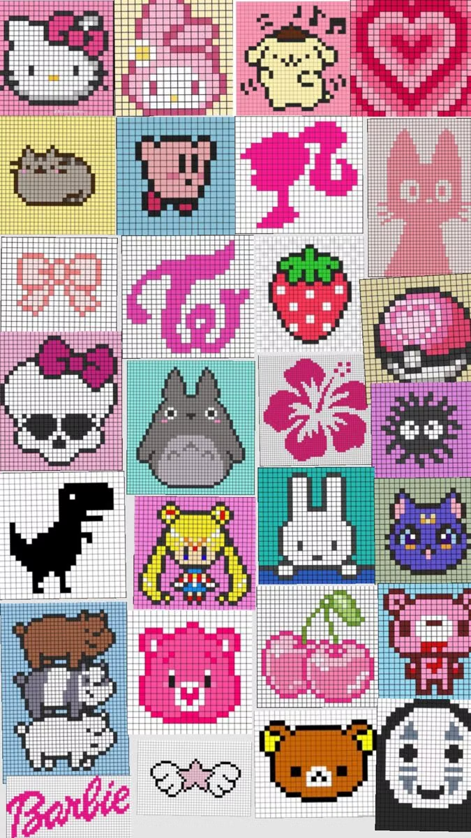
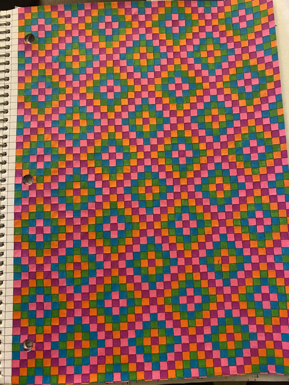
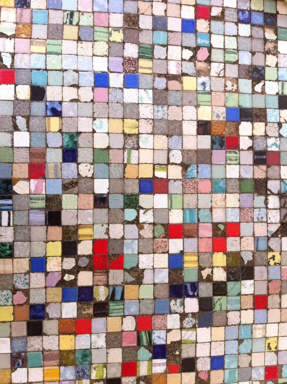
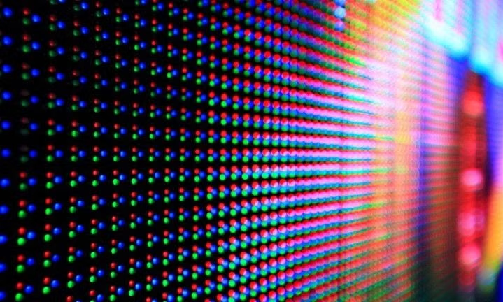
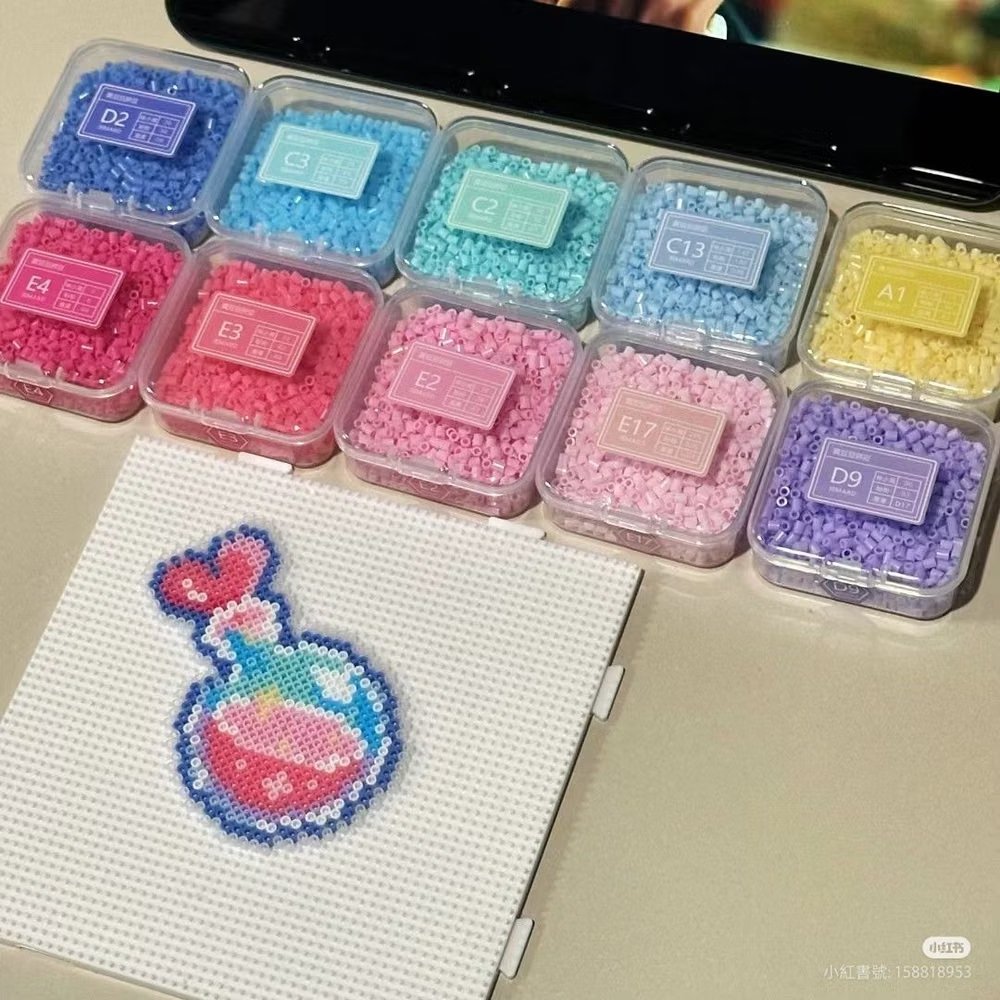
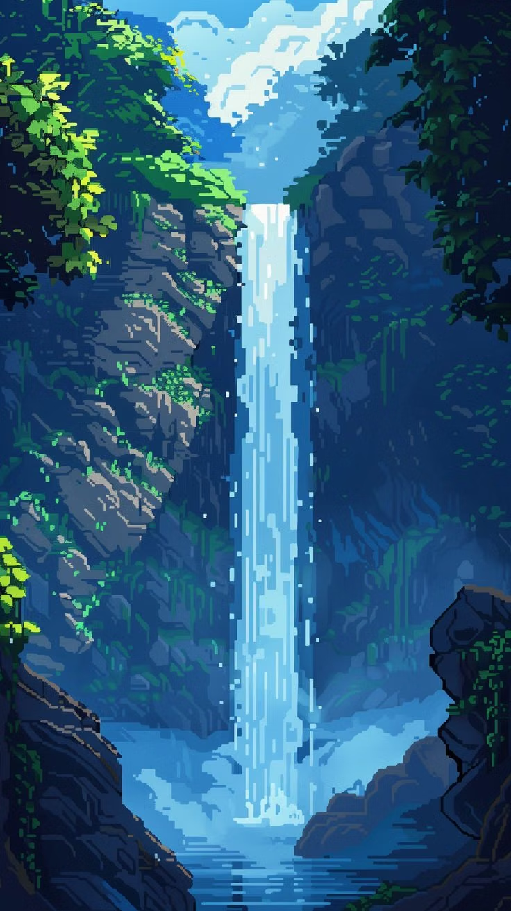
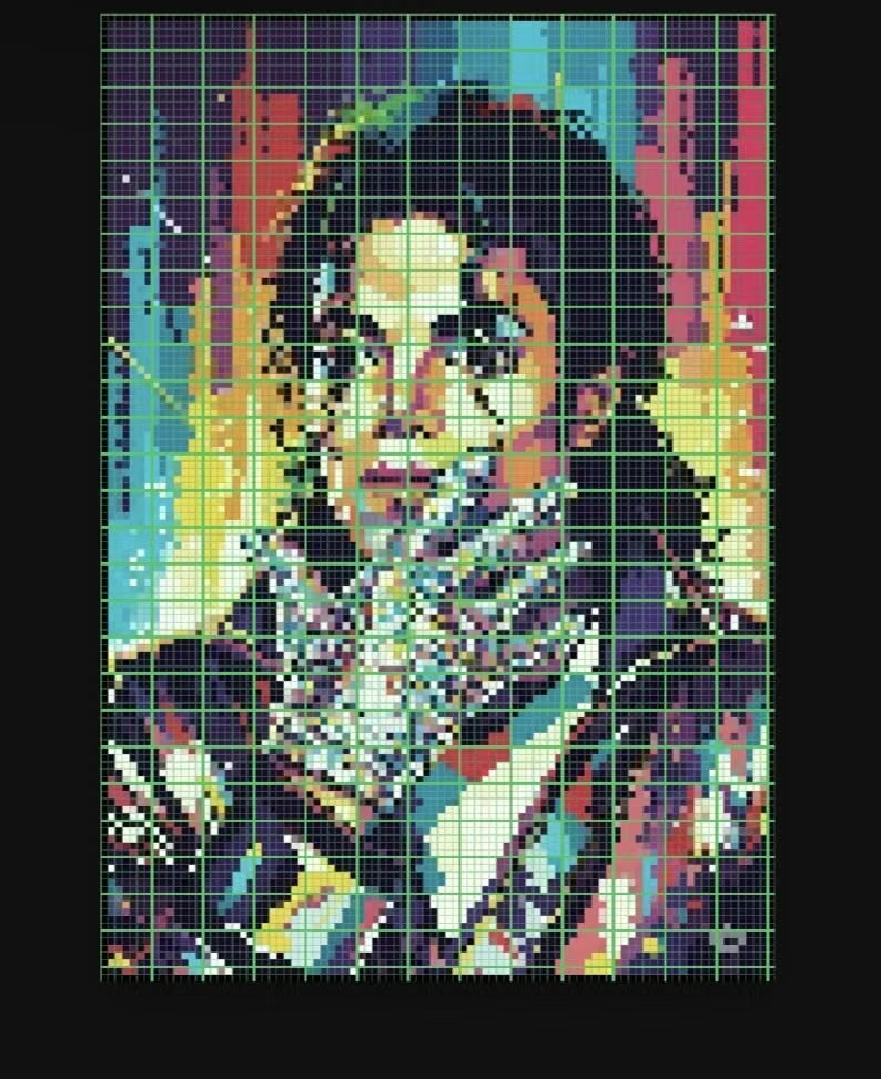
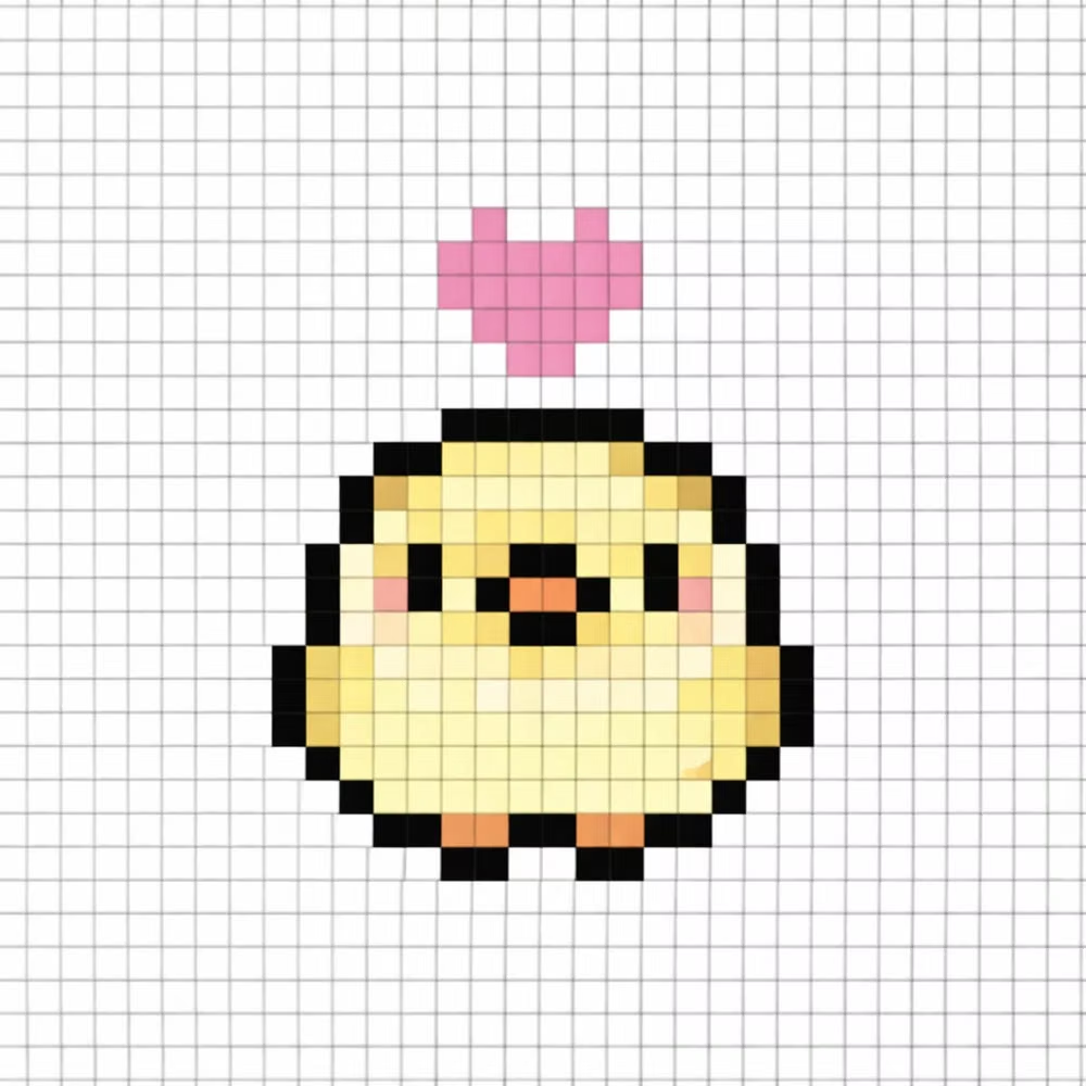
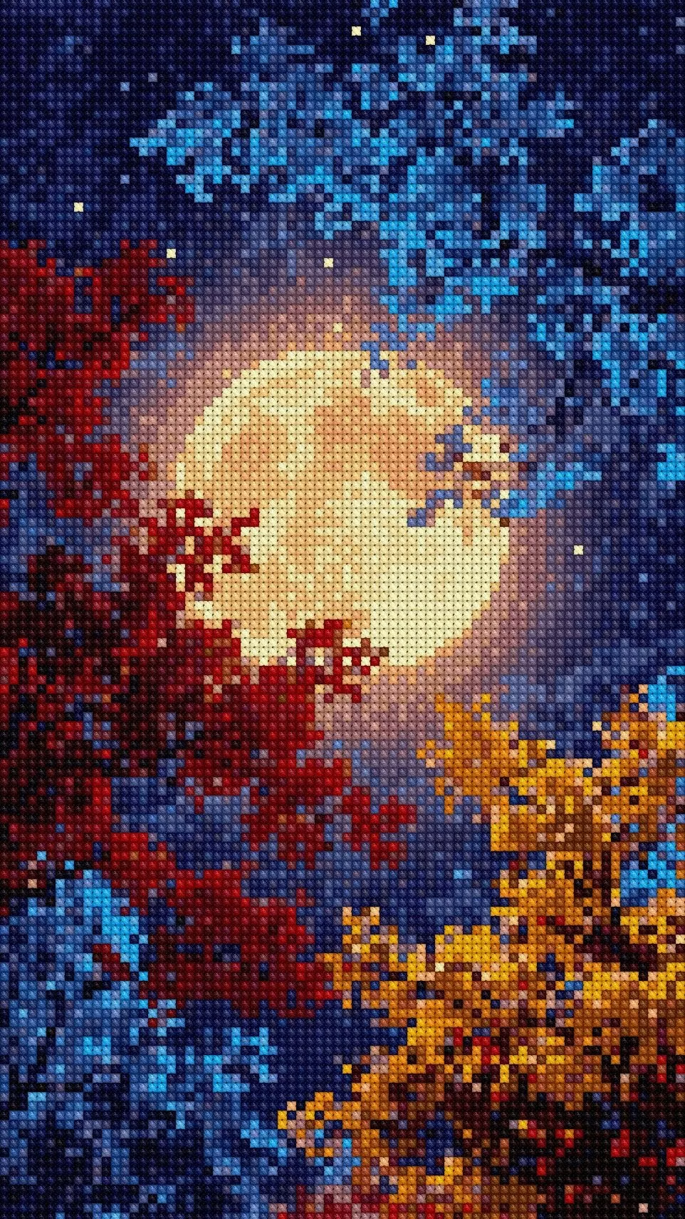
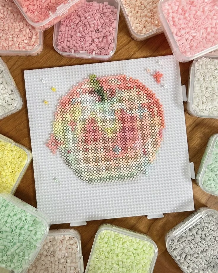
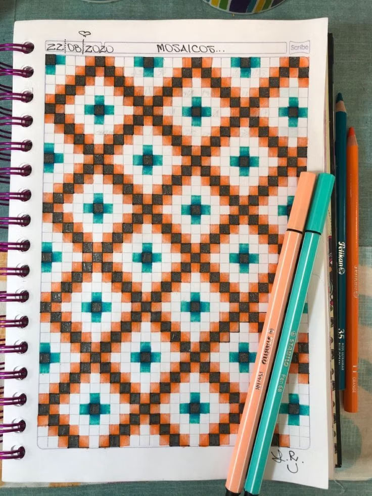
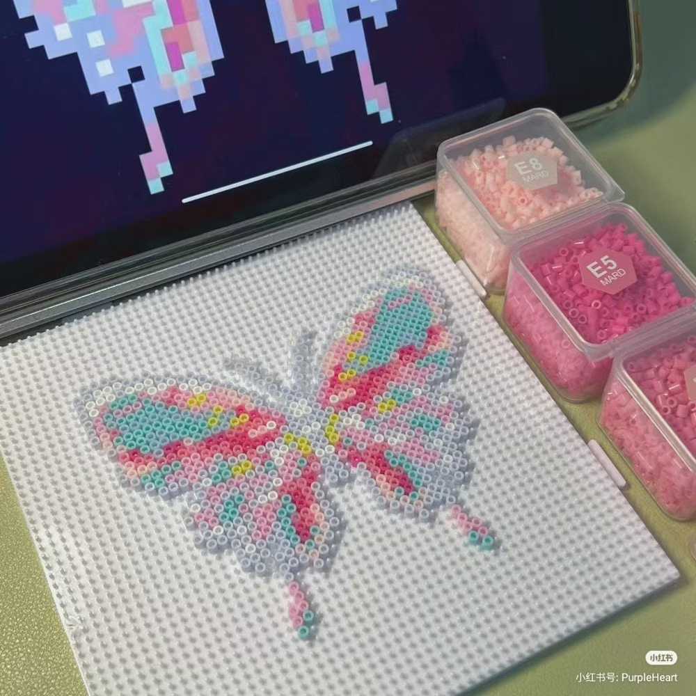
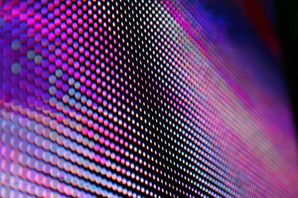
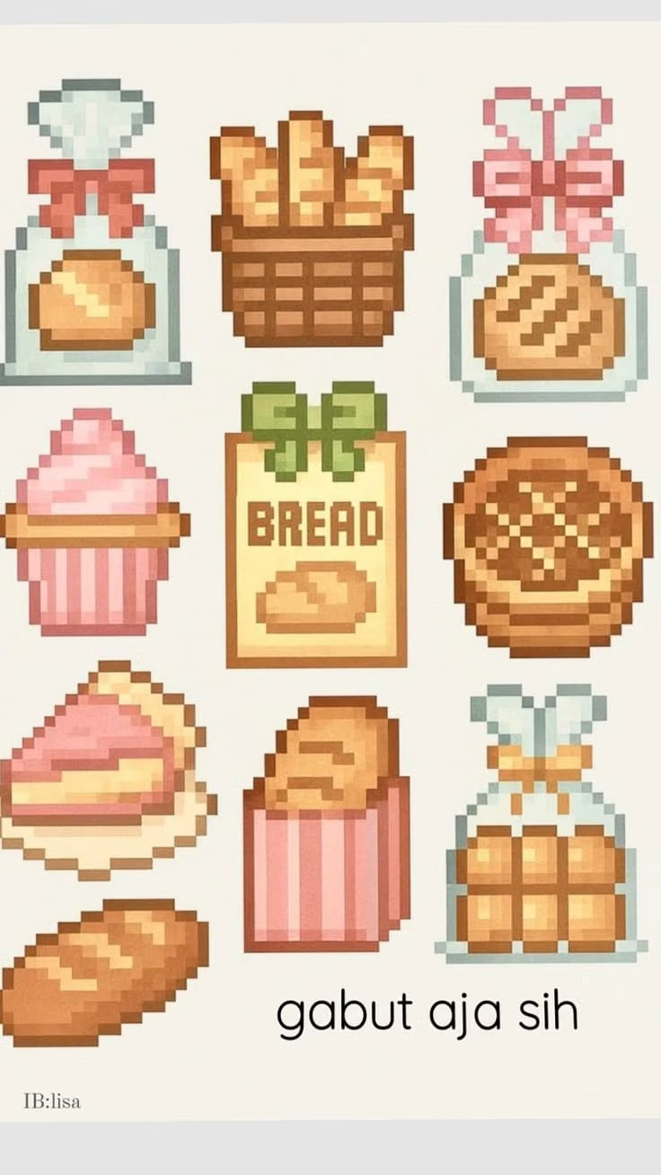
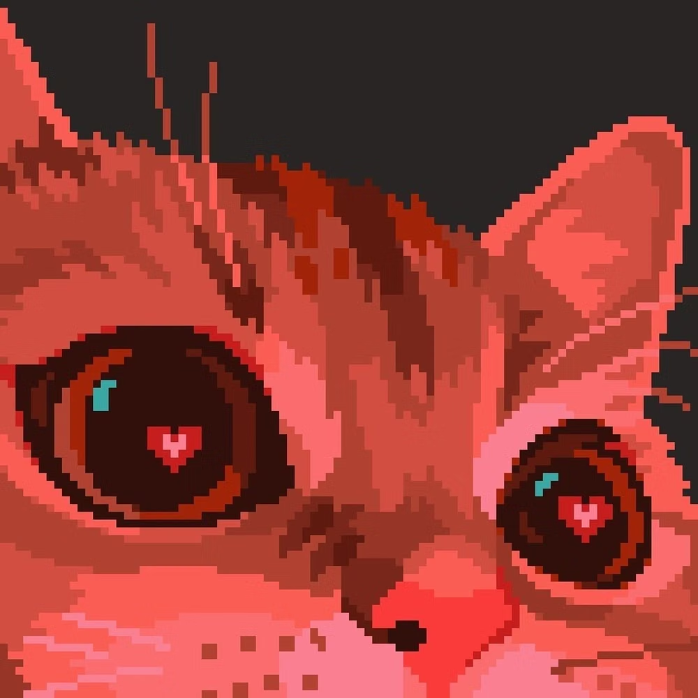
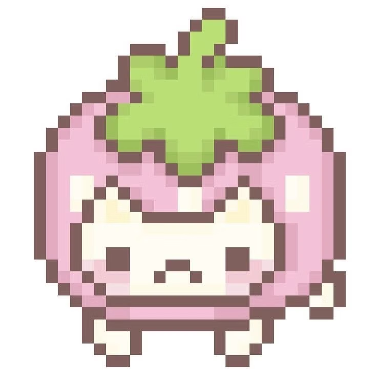
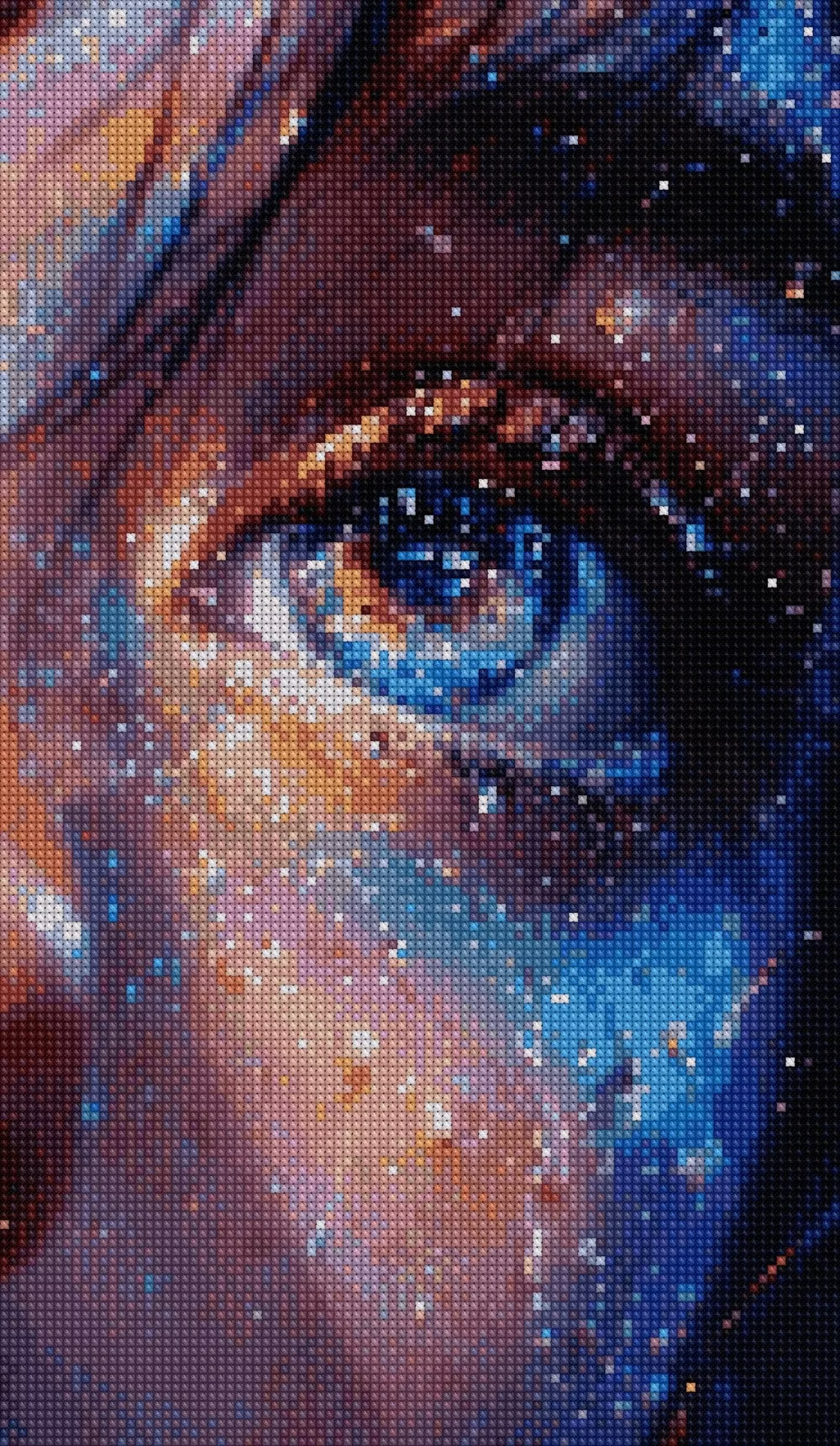
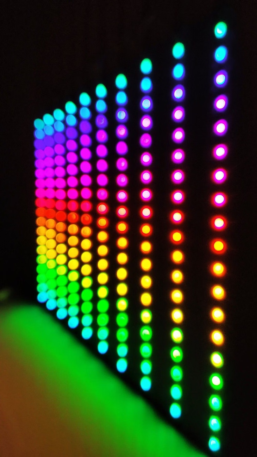
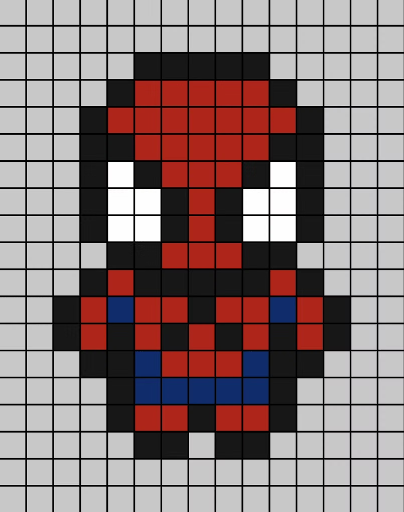
A visual study of the forms, inspirations, materials, colors, type, and cultural references associated with this UI design style.
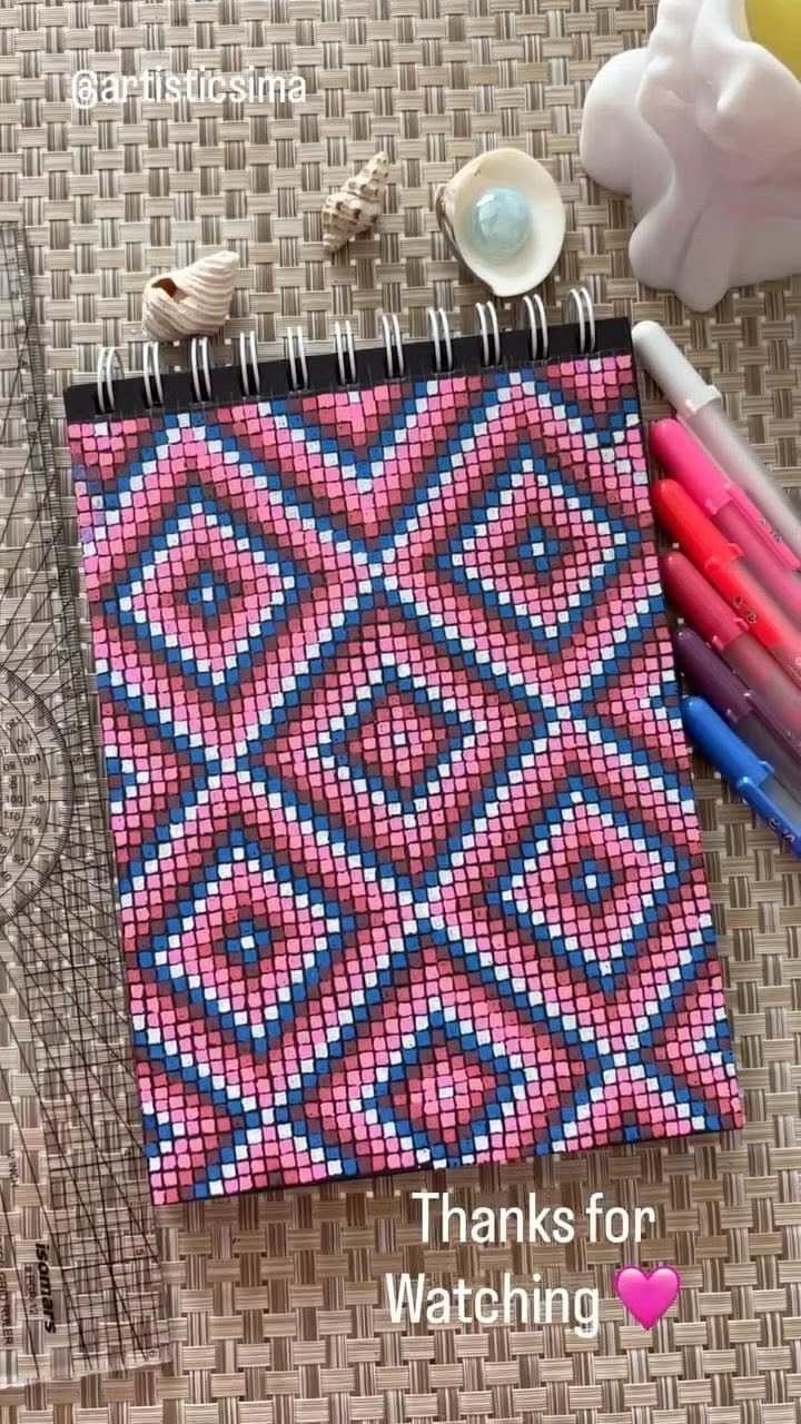
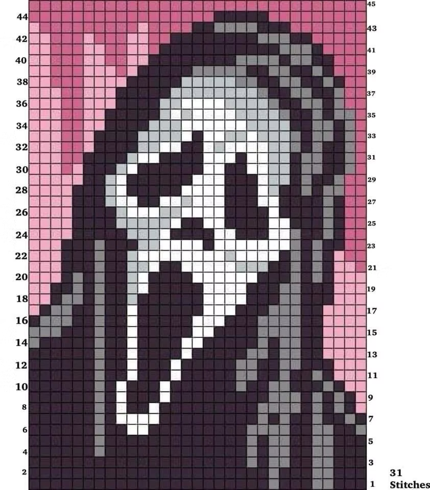
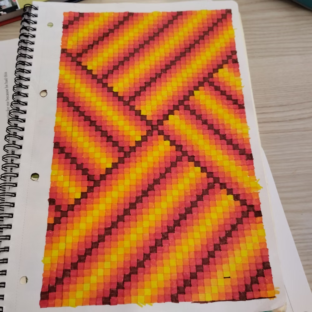
Design principles and implementation
Use these principles to write a focused AI UI design prompt instead of asking for a vague visual treatment.
Color direction
Define a compact indexed palette with explicit light, midtone, shadow, and status colors; disable smoothing and avoid accidental intermediate hues. In a daisyUI theme, use the clearest action or protagonist swatch for `primary`, a contrasting environment or status swatch for `secondary`, and map three exact indexed panel values to `base-100`, `base-200`, and `base-300`.
Imagery direction
Use sprites, tile maps, bitmap icons, dithered scenes, and low-resolution portraits drawn at a consistent native scale.
Content density
Maintain medium density through inventories, dialogue boxes, and HUD panels, but give each pixel icon enough cells to remain recognizable.
Motion direction
Animate with authored frame sequences, stepped movement, palette swaps, and sprite cycles instead of smooth vector interpolation.
Shape language
Use hard stair-stepped edges, tiled borders, pixel corners, and block-built silhouettes with no anti-aliased curves. In daisyUI themes, set the `--radius-*` variables to `0` or `0.25rem`.
Typography rules
Choose a bitmap face designed for the target resolution, render at integer sizes, and reserve all-caps arcade lettering for short labels.
Suggested Typfaces
Press Start 2P
Fresh daisies glow in warm sunlight
Fresh daisies glow in warm sunlight
1 2 3 4 5 6 7 8 9 0
Pixelify Sans
Fresh daisies glow in warm sunlight
Fresh daisies glow in warm sunlight
1 2 3 4 5 6 7 8 9 0
Silkscreen
Fresh daisies glow in warm sunlight
Fresh daisies glow in warm sunlight
1 2 3 4 5 6 7 8 9 0
Tiny5
Fresh daisies glow in warm sunlight
Fresh daisies glow in warm sunlight
1 2 3 4 5 6 7 8 9 0
Jersey 10
Fresh daisies glow in warm sunlight
Fresh daisies glow in warm sunlight
1 2 3 4 5 6 7 8 9 0
Build a Pixel Art interface with daisyUI
The live example translates this direction into daisyUI components and semantic theme tokens.
To generate a full page in the same visual language, give the style name and the design rules above to Blueprint MCP.
Related UI design styles
Compare nearby visual languages that share typography, shapes, use cases, or signature elements.
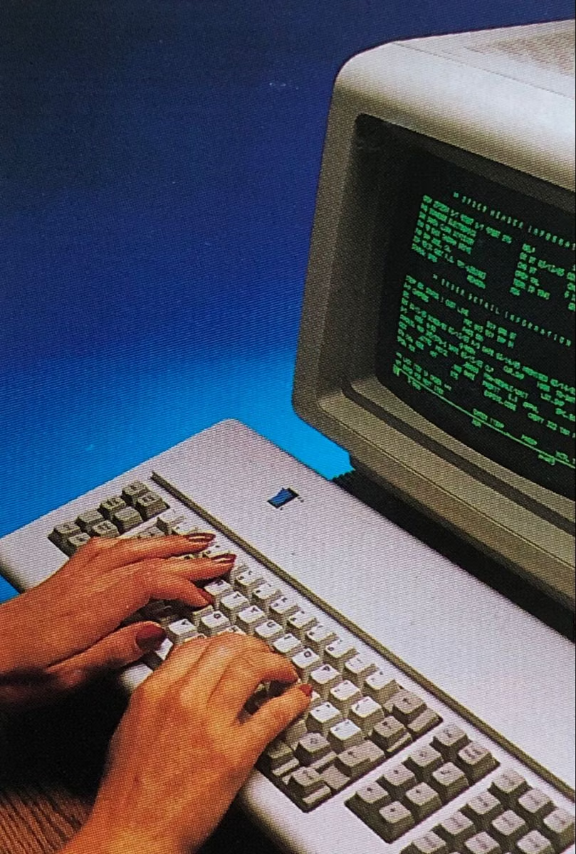
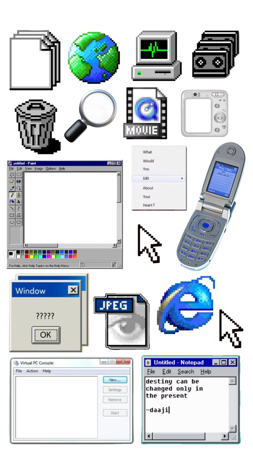
Retro Computing UI design style
CRT glow, bitmap fonts, window chrome, limited palettes, scanlines, floppy-disk motifs, and vintage operating-system conventions.
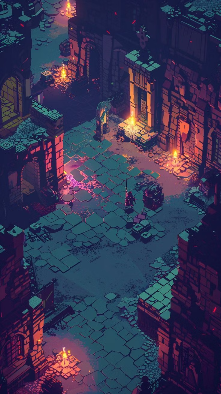
RPG Pixel Art UI design style
Classic 8-bit and 16-bit role-playing games combine top-down tile maps, expressive party sprites, framed dialogue, inventory menus, and readable battle effects.
PC-98 UI design style
NEC PC-9800-era Japanese games pair relatively high-resolution 640×400 scenes with tightly limited color, meticulous dithering, detailed anime portraits, and compact visual-novel or adventure-game interfaces.