Corporate Memphis UI design style
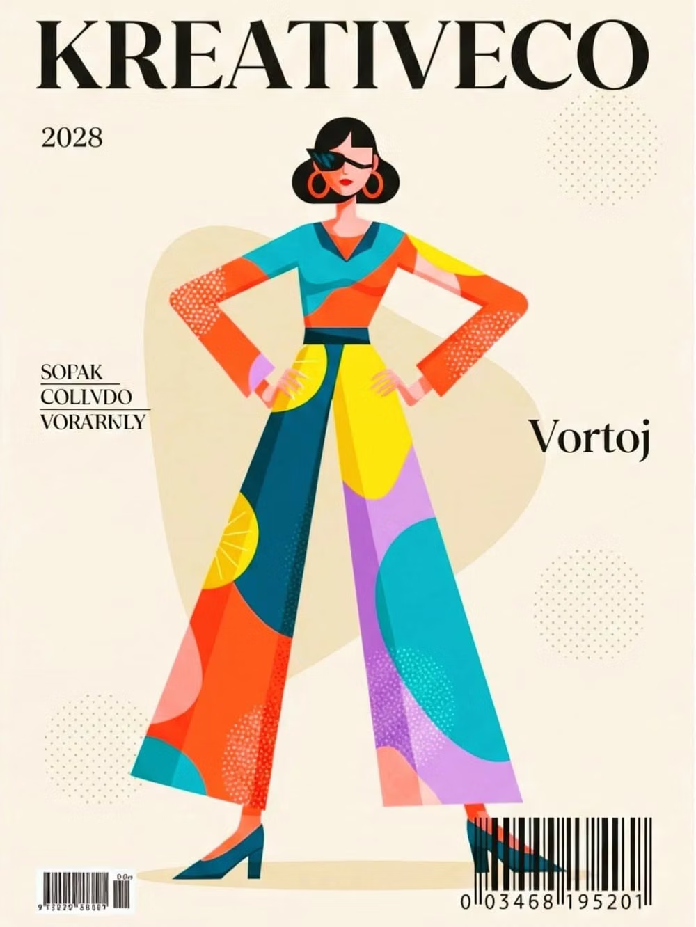
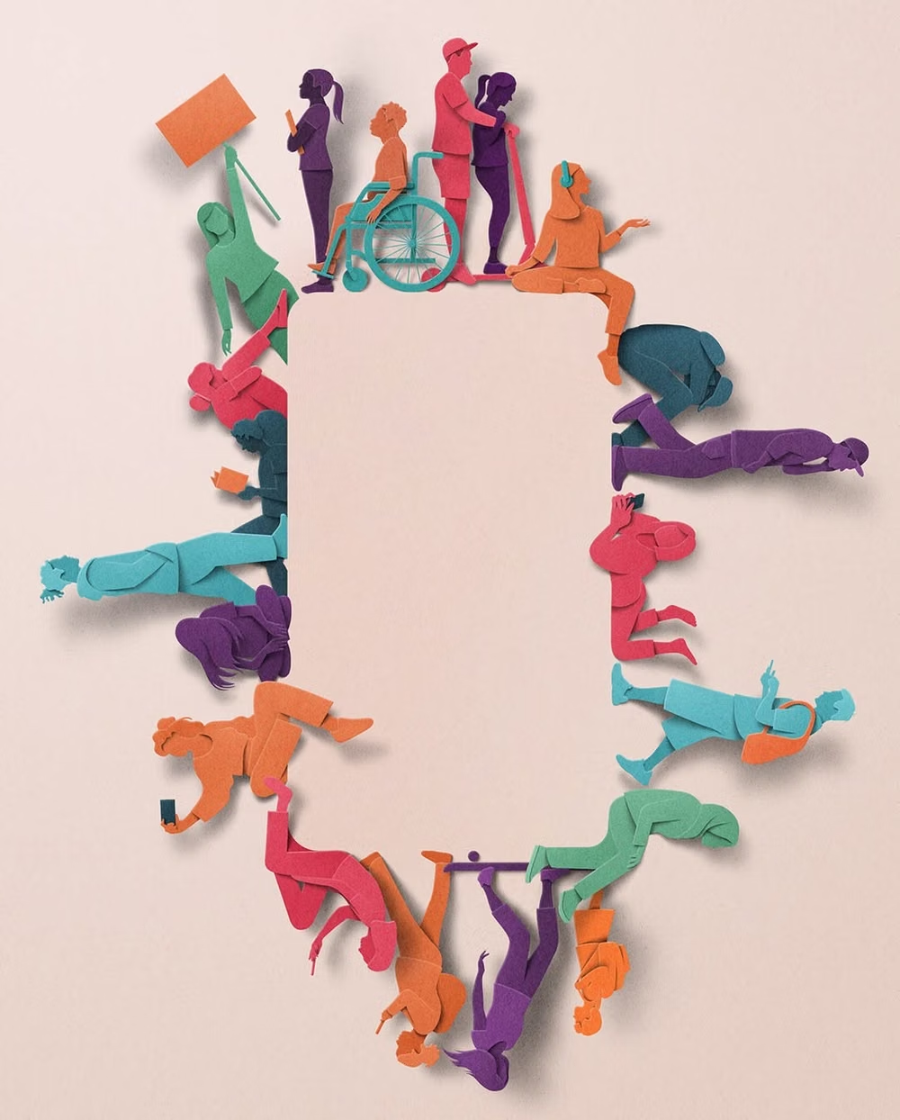
Flat vector scenes with bright solid colors, geometric environments, and simplified people with exaggerated proportions.
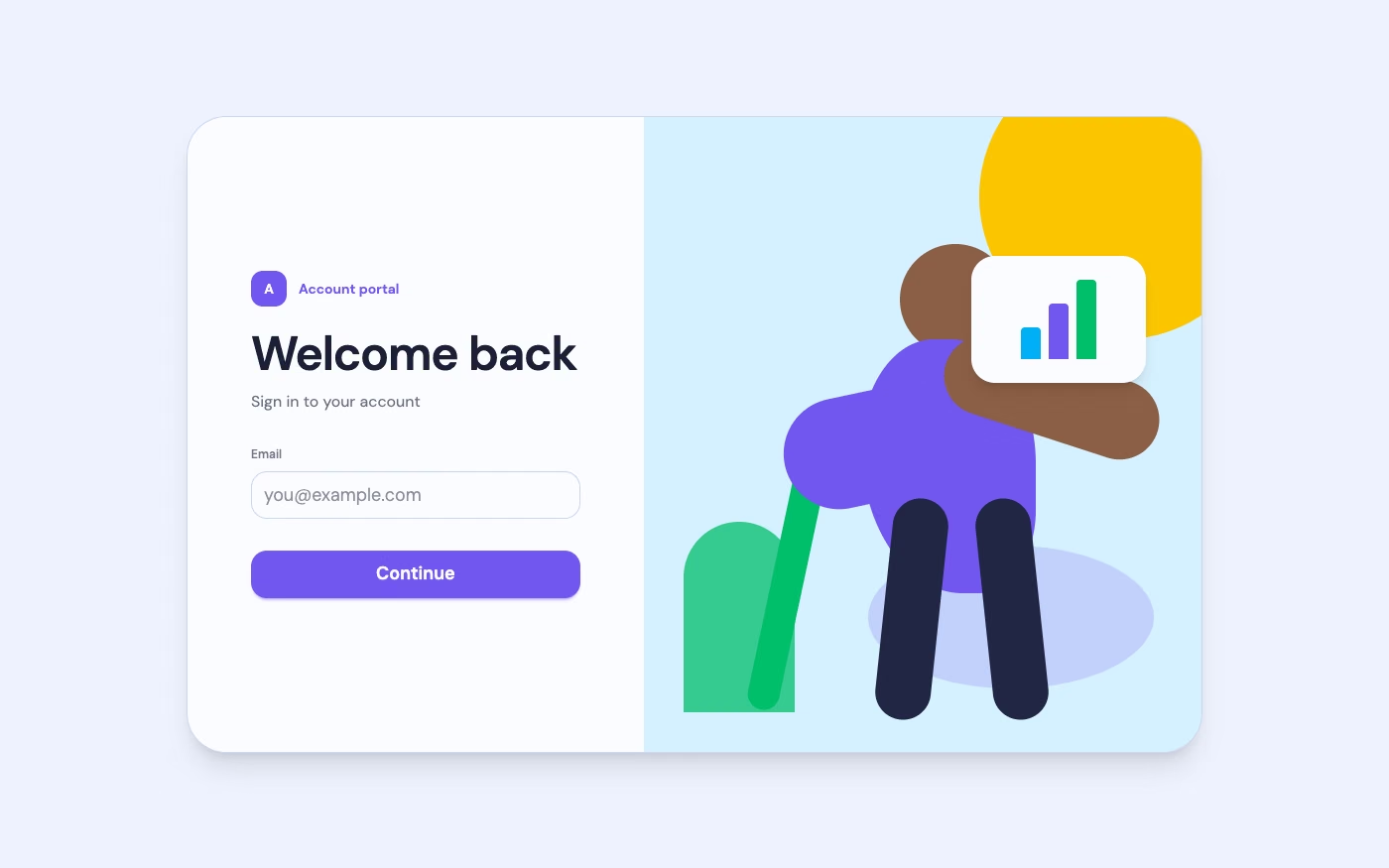
Design overview
- Signature elements
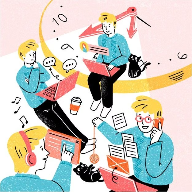
- flat vector people, exaggerated proportions, geometric environments, bright solid colors, simplified faces, friendly scenes
- Best suited to
- SaaS onboarding, explainers, fintech, HR products, service brands, and friendly corporate communication.
- Layout principles
- Pair concise product content with one large illustrative scene, then reuse smaller modular vignettes to explain steps, benefits, or empty states.
History and origins
A fact-checked account of where this visual language came from, with links to the references used.
- Period
- Late 2010s–early 2020s
- Origin
- Global technology branding; strongly associated with Facebook’s 2017 Alegria system
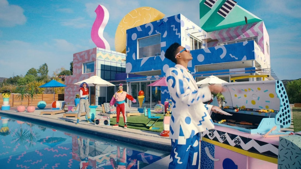
Corporate Memphis is a critical nickname for flat, friendly vector illustration used by large technology companies. A major reference point is Alegria, created by Buck with illustrator Xoana Herrera for Facebook in 2017; its abstract people, bright shapes, and scalable scenes spread widely, while the “Corporate Memphis” label connected that wave—loosely and sometimes sarcastically—to the color and geometry of 1980s Memphis design.
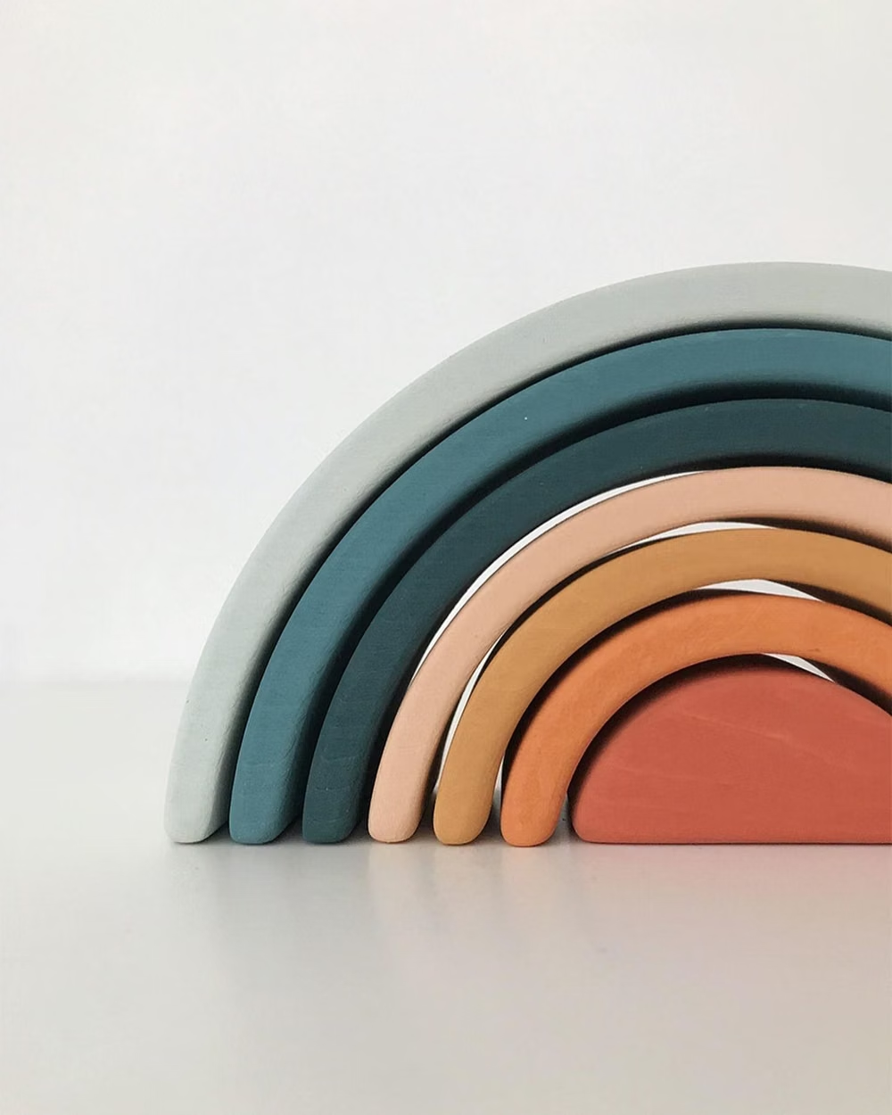
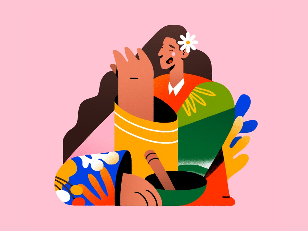
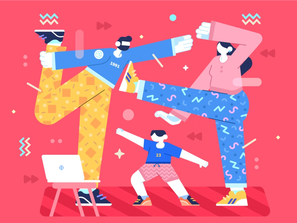
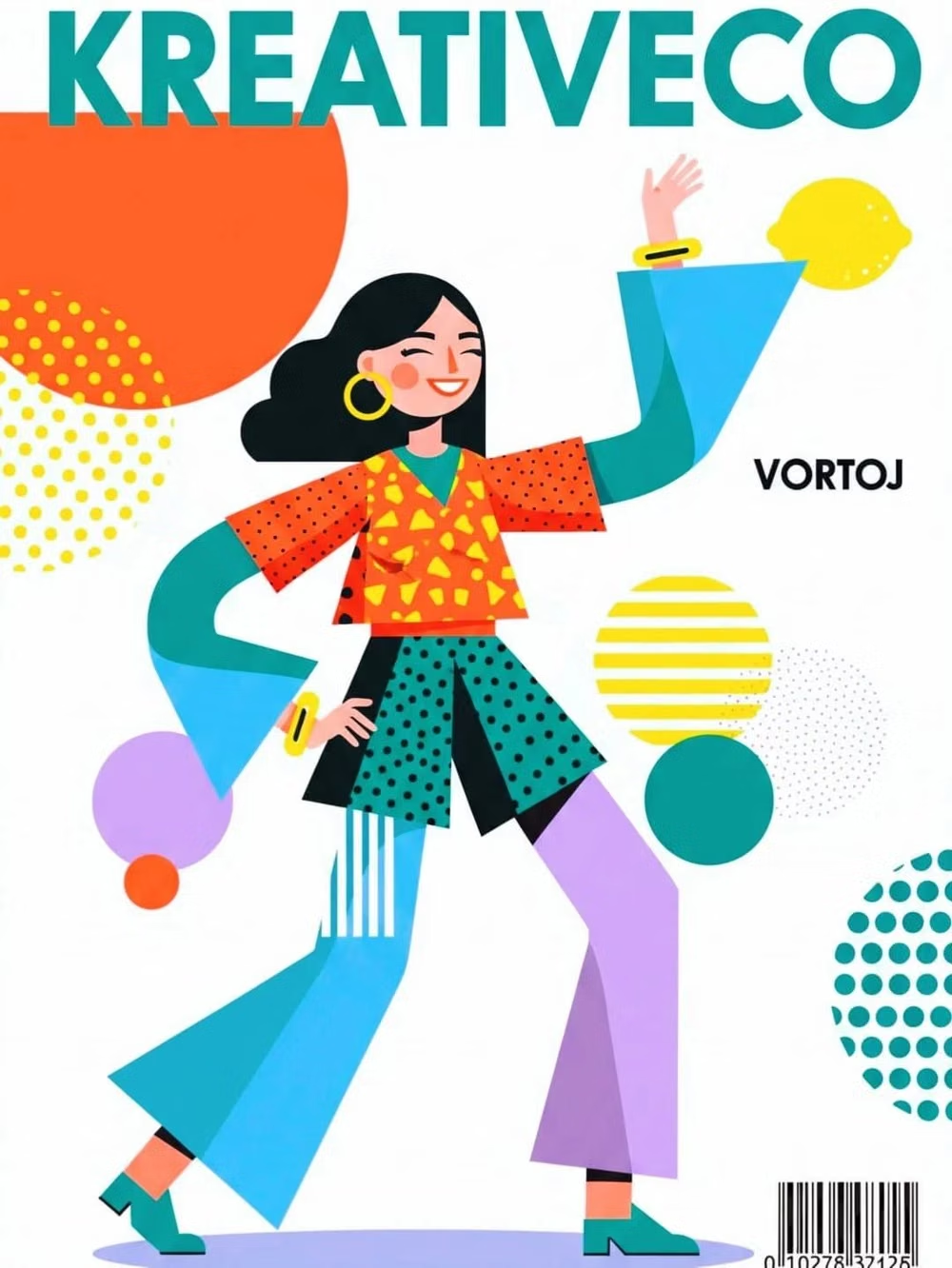
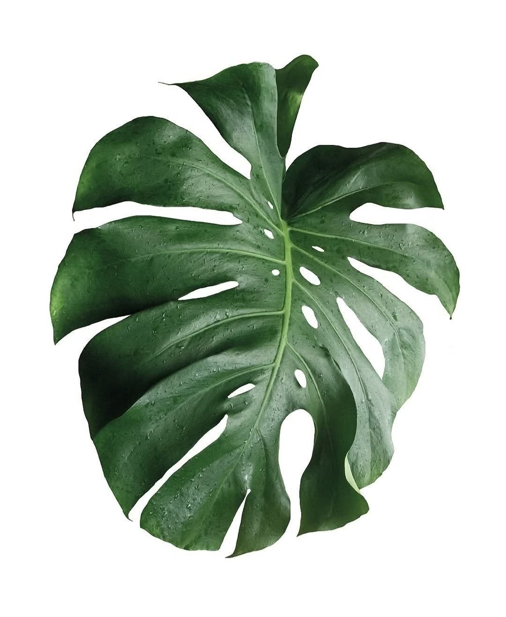
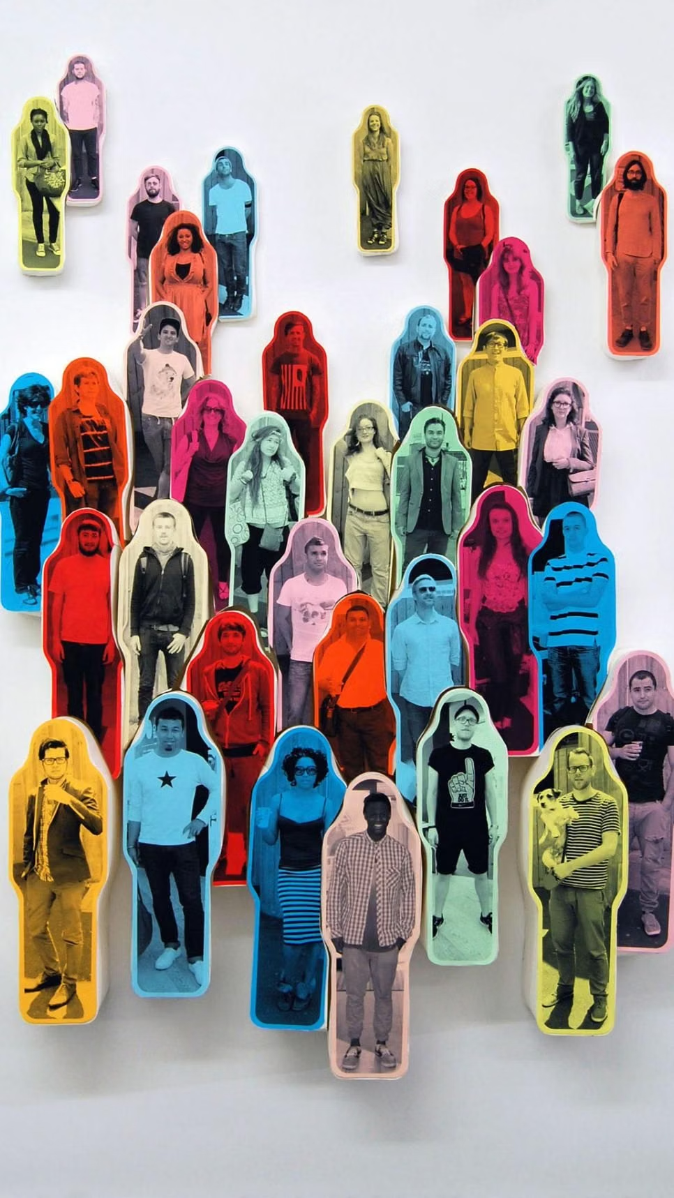
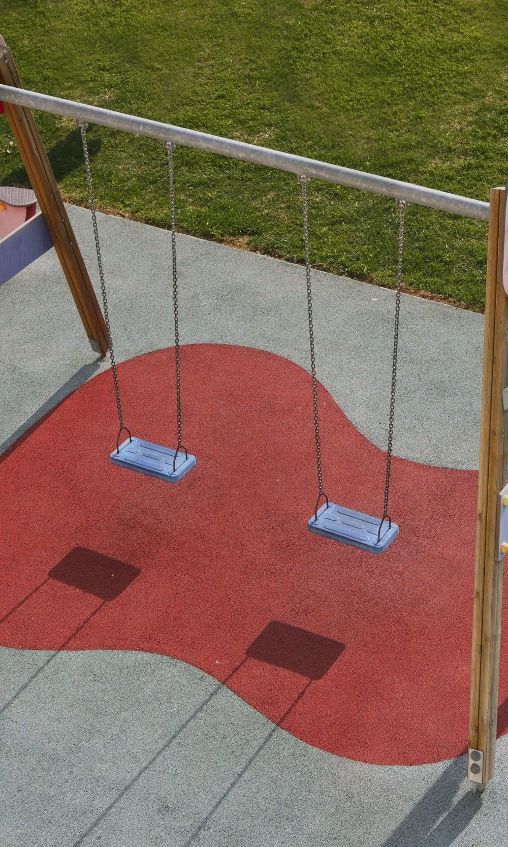
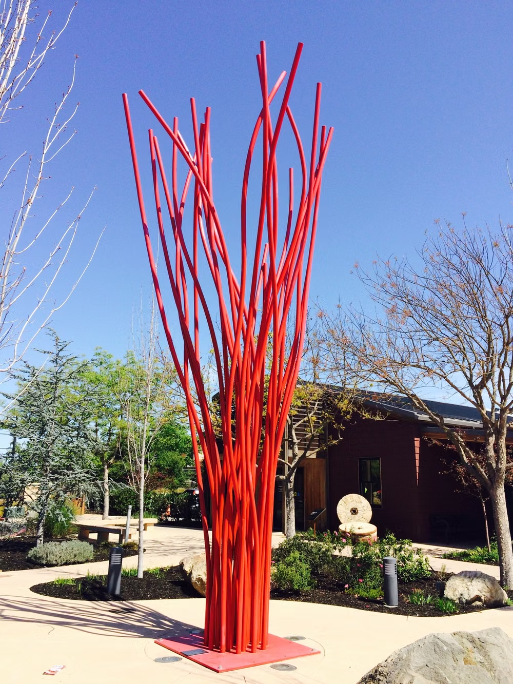
Moodboard and visual references
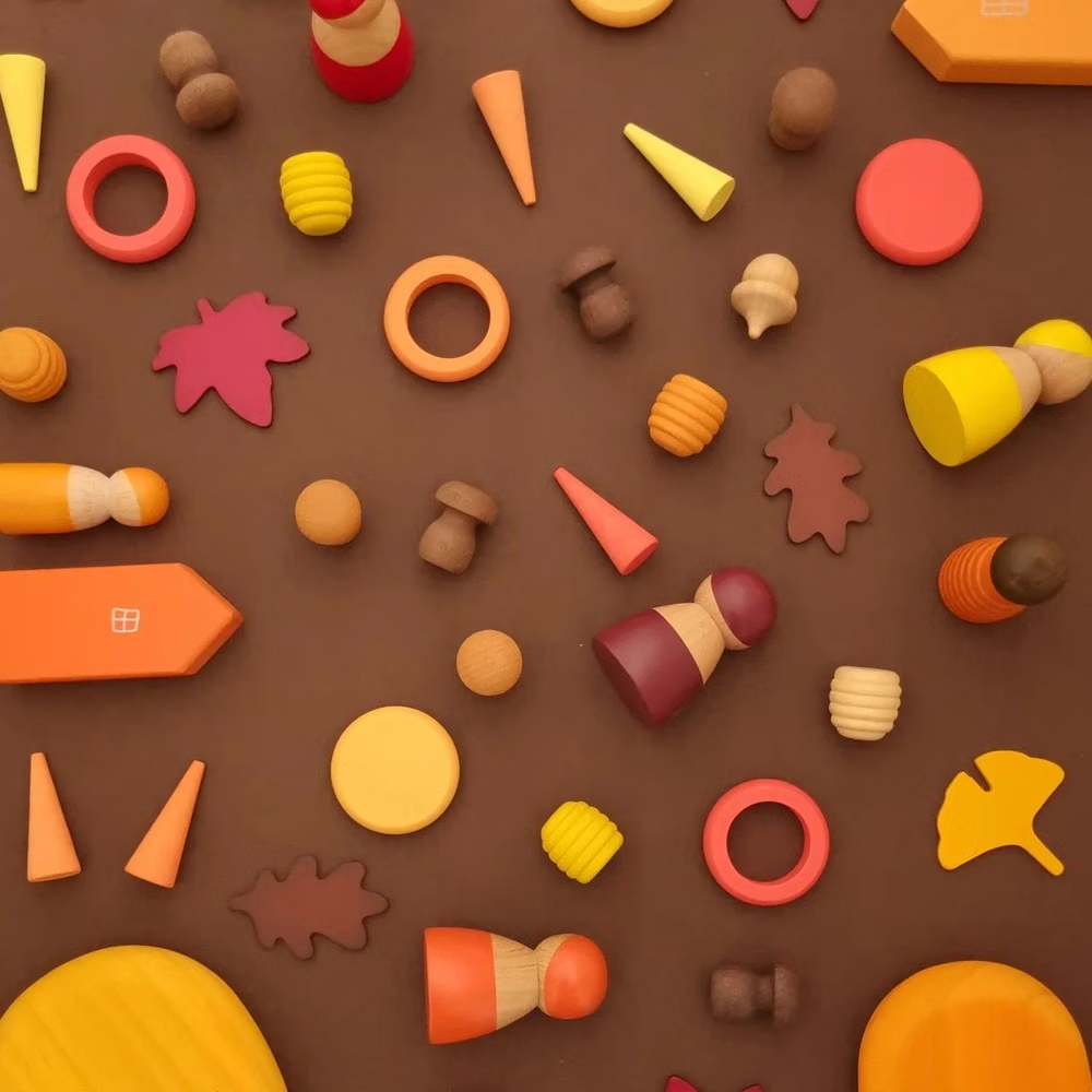
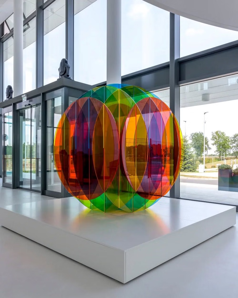
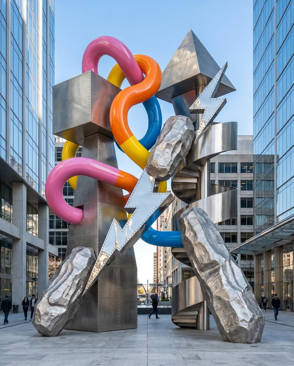
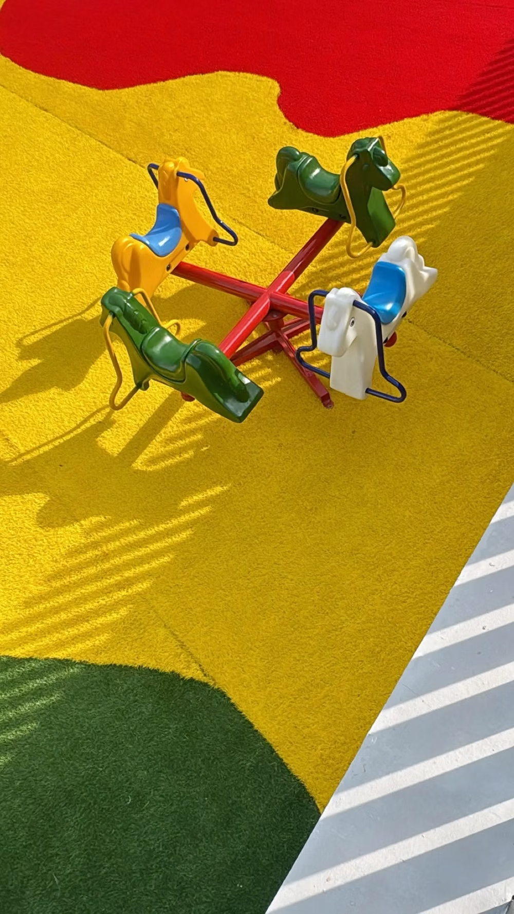
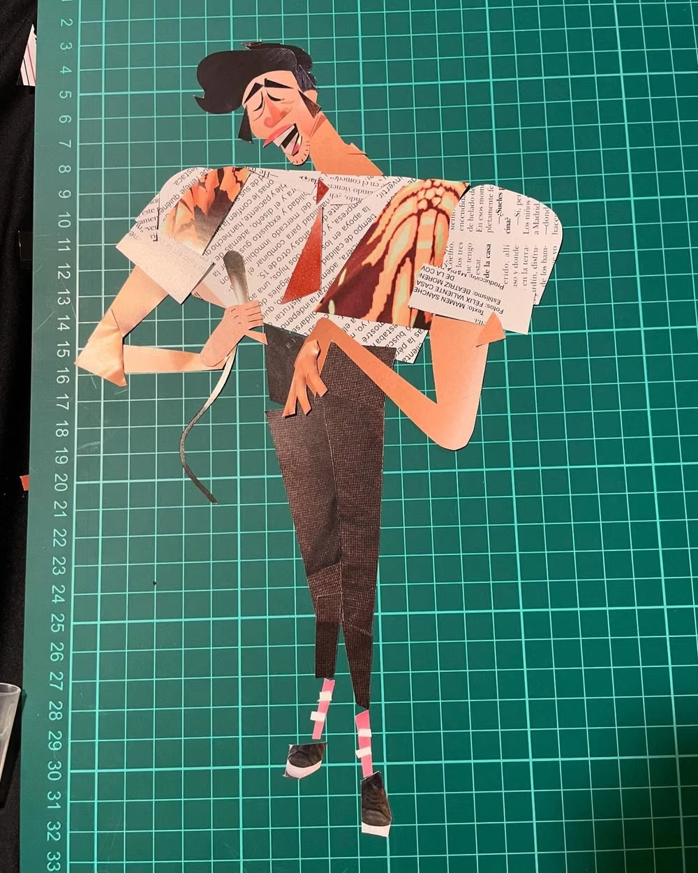
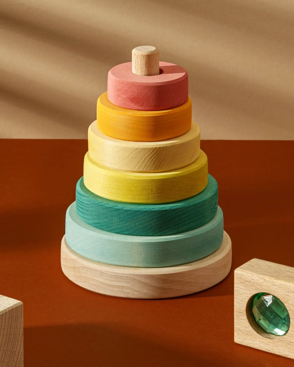
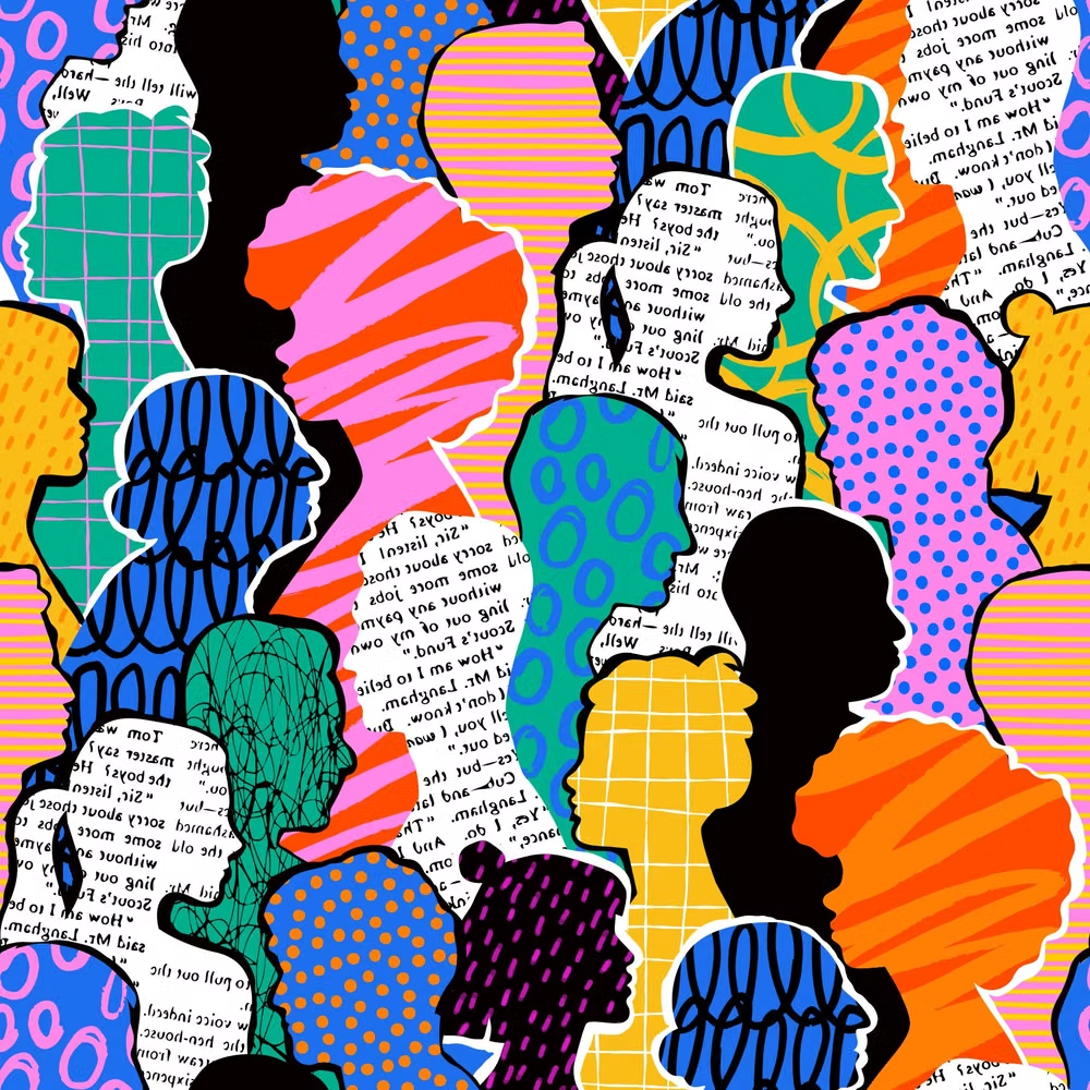
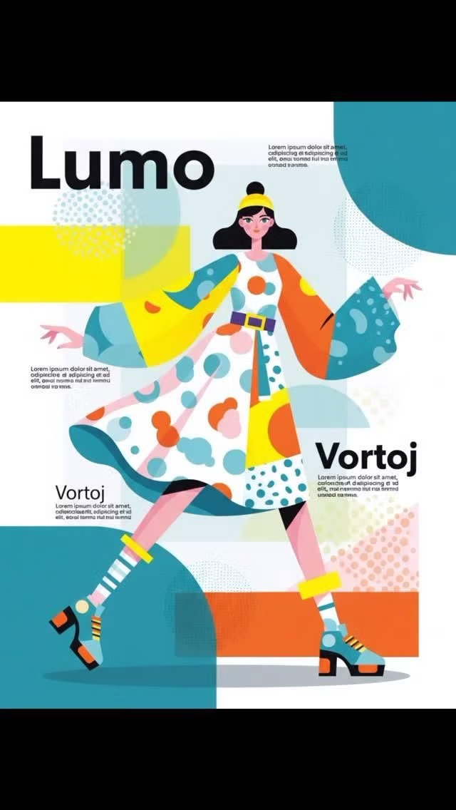
A visual study of the forms, inspirations, materials, colors, type, and cultural references associated with this UI design style.








Design principles and implementation
Use these principles to write a focused AI UI design prompt instead of asking for a vague visual treatment.
Color direction
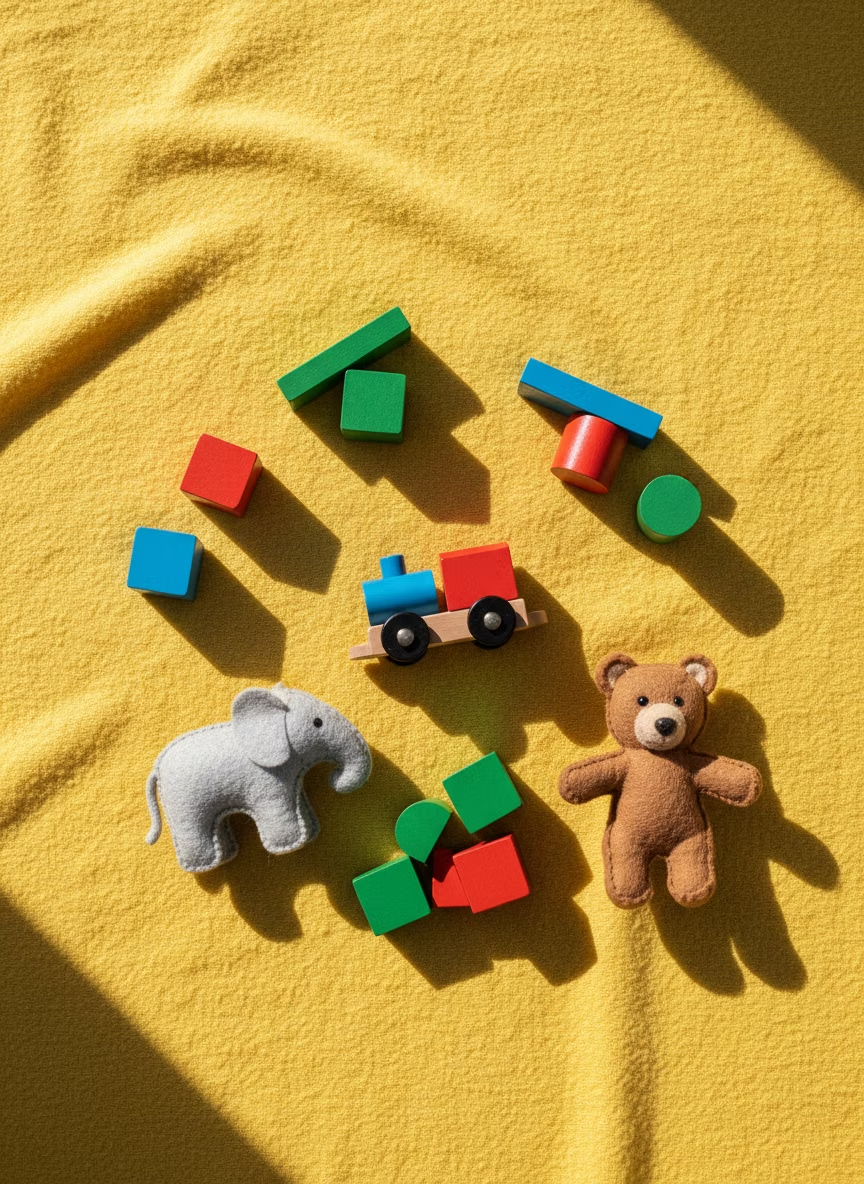
Use bright brand primaries and soft secondary fills against a pale neutral background, keeping skin and clothing colors inclusive and clearly separated. In a daisyUI theme, use the brightest brand hue for `primary`, a softer contrasting fill for `secondary`, and assign pale cream, lightly tinted neutral, and soft gray to `base-100`, `base-200`, and `base-300`.
Imagery direction
Create flat vector people with exaggerated limbs, simplified faces, geometric props, and workplace or service scenarios tied directly to the message.
Content density
Keep density medium to low, letting each scene explain one concept and avoiding decorative characters around already complex workflows.
Motion direction
Animate simple character gestures, floating props, and scene assembly with friendly easing while keeping the product interaction itself direct.
Shape language
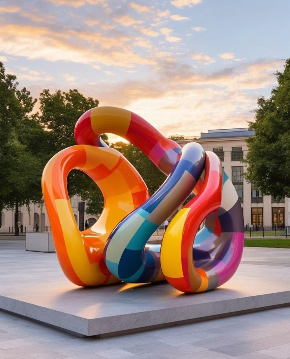
Use soft geometric environments, rounded rectangles, circles, and abstract plant or furniture forms with consistent flat outlines. In daisyUI themes, set the `--radius-*` variables between `0.75rem` and `1.5rem`.
Typography rules
Choose an approachable geometric sans-serif with open counters, use strong sentence-case headings, and keep the illustration more expressive than the type.
Suggested Typfaces
Poppins
Fresh daisies glow in warm sunlight
Fresh daisies glow in warm sunlight
1 2 3 4 5 6 7 8 9 0
DM Sans
Fresh daisies glow in warm sunlight
Fresh daisies glow in warm sunlight
1 2 3 4 5 6 7 8 9 0
Nunito Sans
Fresh daisies glow in warm sunlight
Fresh daisies glow in warm sunlight
1 2 3 4 5 6 7 8 9 0
Rubik
Fresh daisies glow in warm sunlight
Fresh daisies glow in warm sunlight
1 2 3 4 5 6 7 8 9 0
M PLUS Rounded 1c
Fresh daisies glow in warm sunlight
Fresh daisies glow in warm sunlight
1 2 3 4 5 6 7 8 9 0
Build a Corporate Memphis interface with daisyUI
The live example translates this direction into daisyUI components and semantic theme tokens.
To generate a full page in the same visual language, give the style name and the design rules above to Blueprint MCP.
Related UI design styles
Compare nearby visual languages that share typography, shapes, use cases, or signature elements.
![small rounded plush toys pastel photograph - Создайте гиперреалистичный 3D-рендер [эмодзи] в виде невероятно милой, мягкой плюшевой игрушки, напоминающей детскую плюшевую игрушку, которую так приятно обнимать. Игрушка должна быть круглой, пухлой формы с пушистой, гладкой шерсткой, излучающей тепло и невинность. Используйте мягкое, равномерное освещение, чтобы подчеркнуть её уютную текстуру, и разместите её на чистом белом фоне для создания чистого, современного образа. Используйте нежные и игривые цвета, а слегка приглушённую палитру — для создания нежной, мечтательной атмосферы. Стиль должен быть очень детализированным, но при этом мягким, с акцентом на максимальную миловидность и игрушечную эстетику.](../../moodboards/kawaii-ui/21-inspiration-rounded-plush-toys.avif)
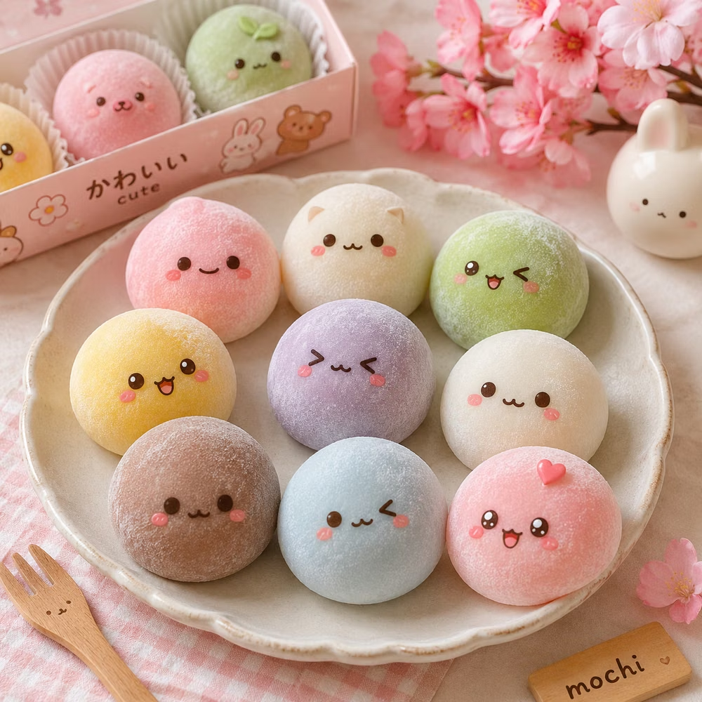
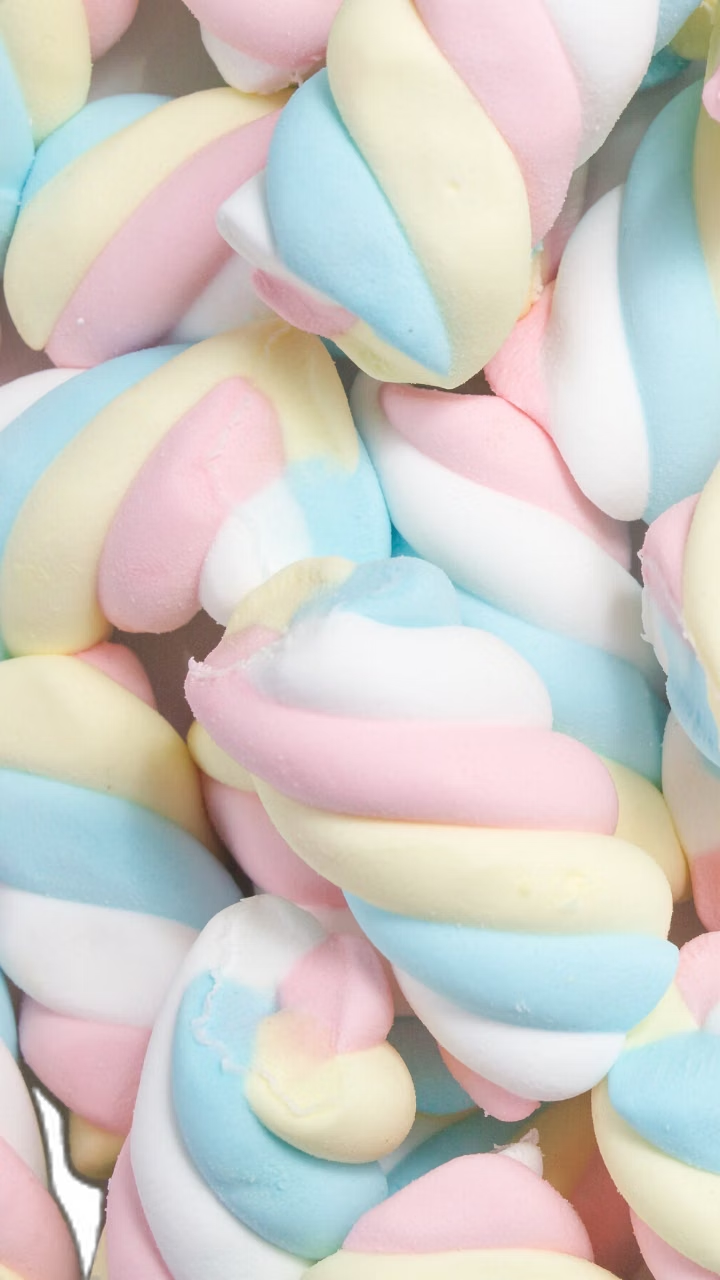
Kawaii UI design style
Cute characters, rounded shapes, soft colors, expressive icons, and cheerful decorative details.
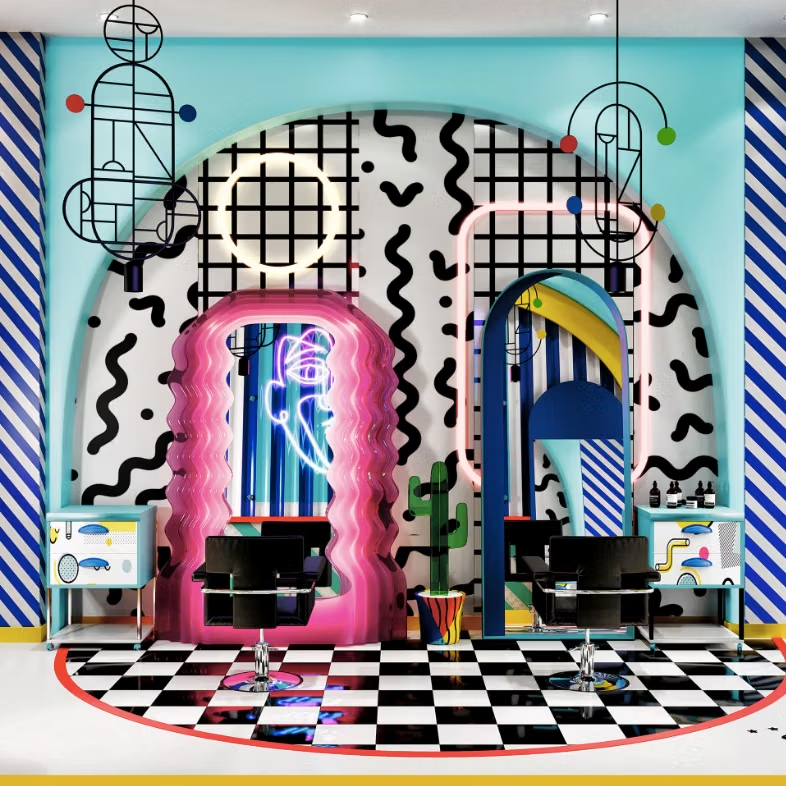
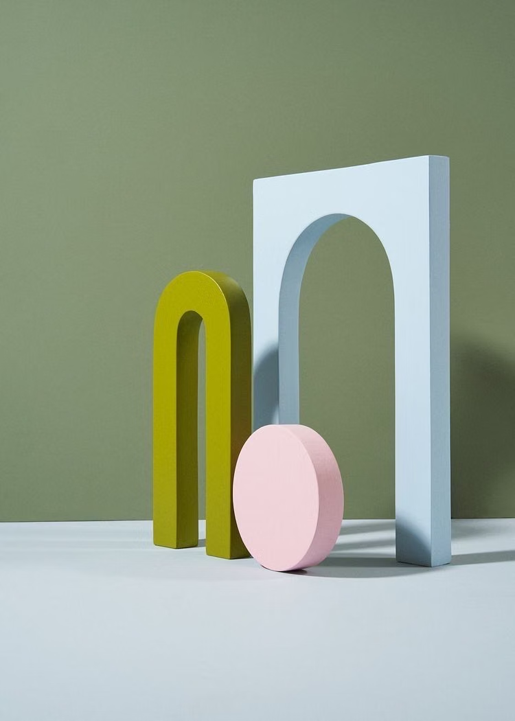
Memphis Design UI design style
Bright geometric shapes, squiggles, dots, contrasting patterns, and playful visual imbalance evoke the 1980s Memphis Group.

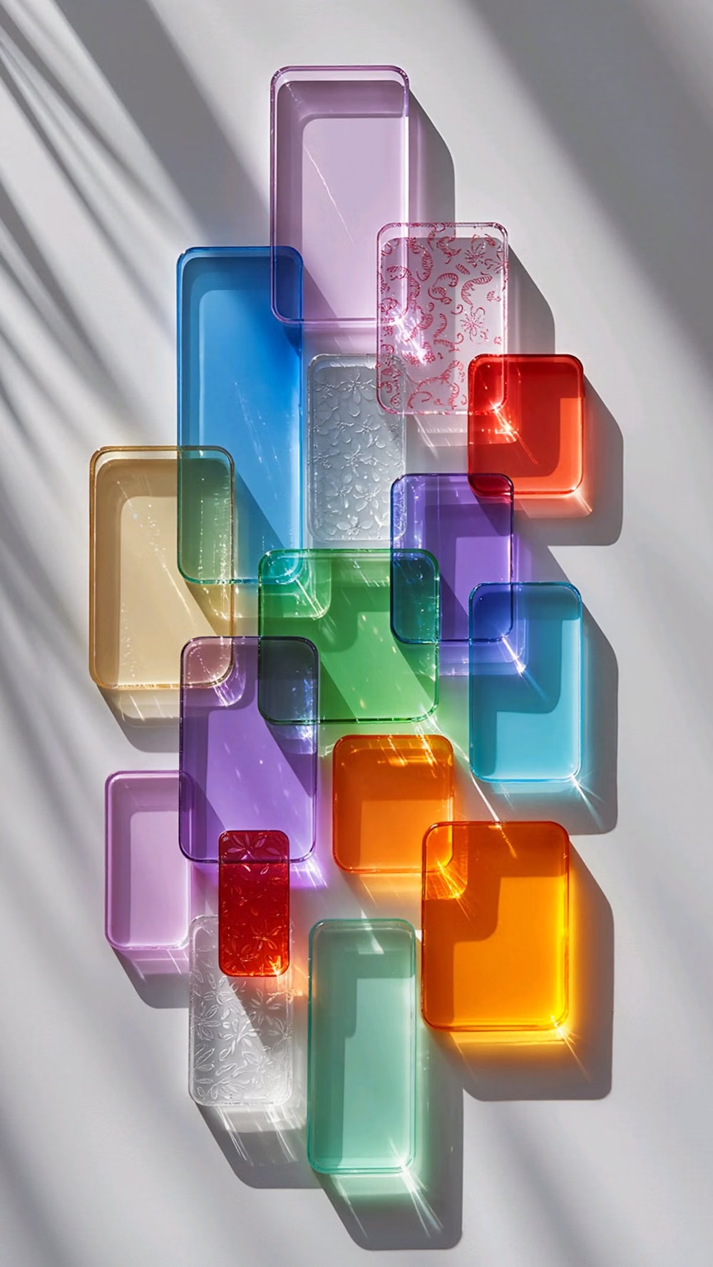
Mesh Gradient / Aurora UI design style
Atmospheric multi-point gradients blending luminous colors into soft clouds, glows, and color fields.