Halftone / Comic Book UI design style
Dot screens, ink outlines, speech devices, panel logic, action marks, and punchy print colors.
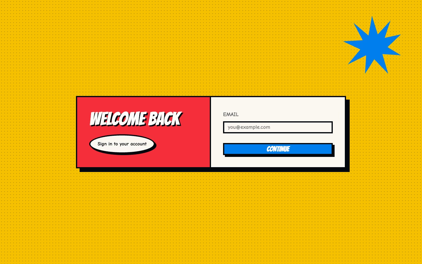
Design overview
- Signature elements
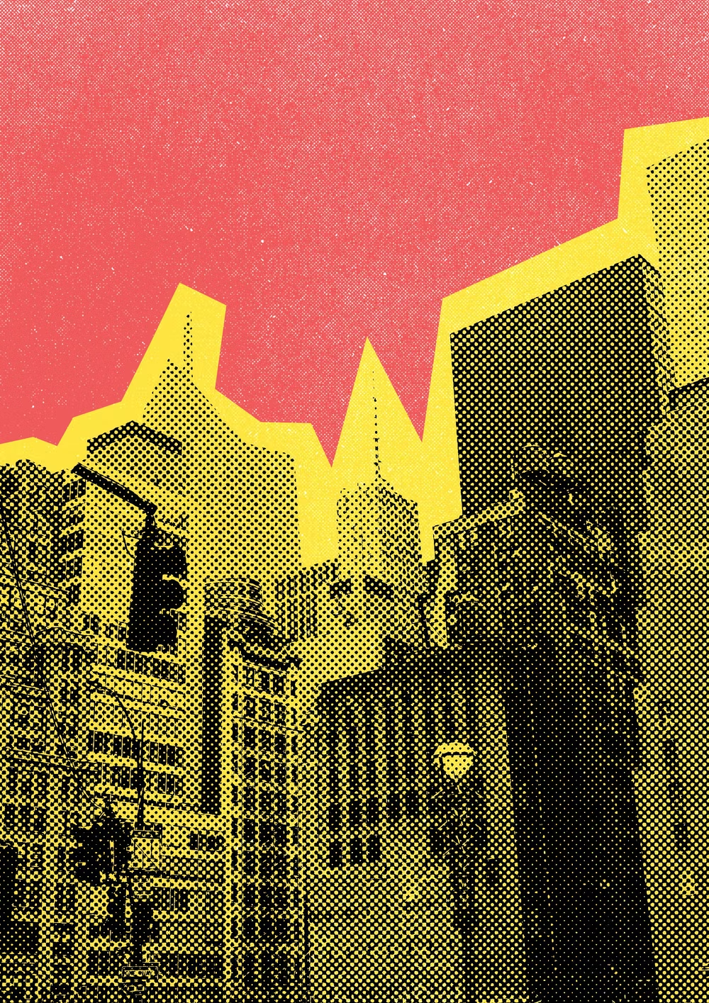
- halftone dots, ink outlines, speech balloons, panel frames, action bursts, punchy colors. In daisyUI themes, set `--noise: 1;`.
- Best suited to
- Entertainment, sports, youth campaigns, games, events, and narrative landing pages.
- Layout principles
- Tell the interface story through ordered panels and gutters, using one splash panel for the dominant moment and smaller frames for supporting beats.
History and origins
A fact-checked account of where this visual language came from, with links to the references used.
- Period
- Commercial printing from the late 19th century; comic-book prominence in the 20th
- Origin
- Industrial print shops in Europe and the United States
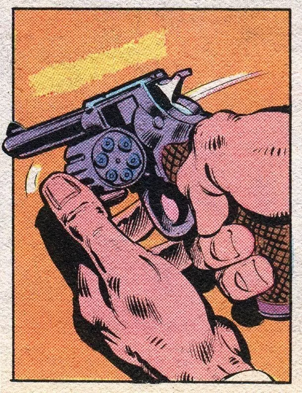
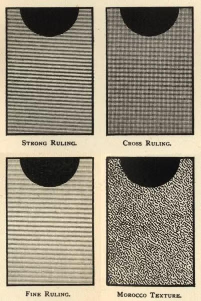
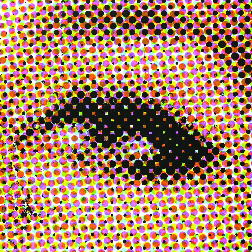
Halftone processes let printers simulate tonal images with fields of dots and became practical in mass print during the late 19th century; Benjamin Day’s related line-and-dot methods date to 1879. Cheap color comics made dot screens, flat separations, heavy ink, and registration quirks culturally familiar, and Pop artists later enlarged those marks into subjects of their own.
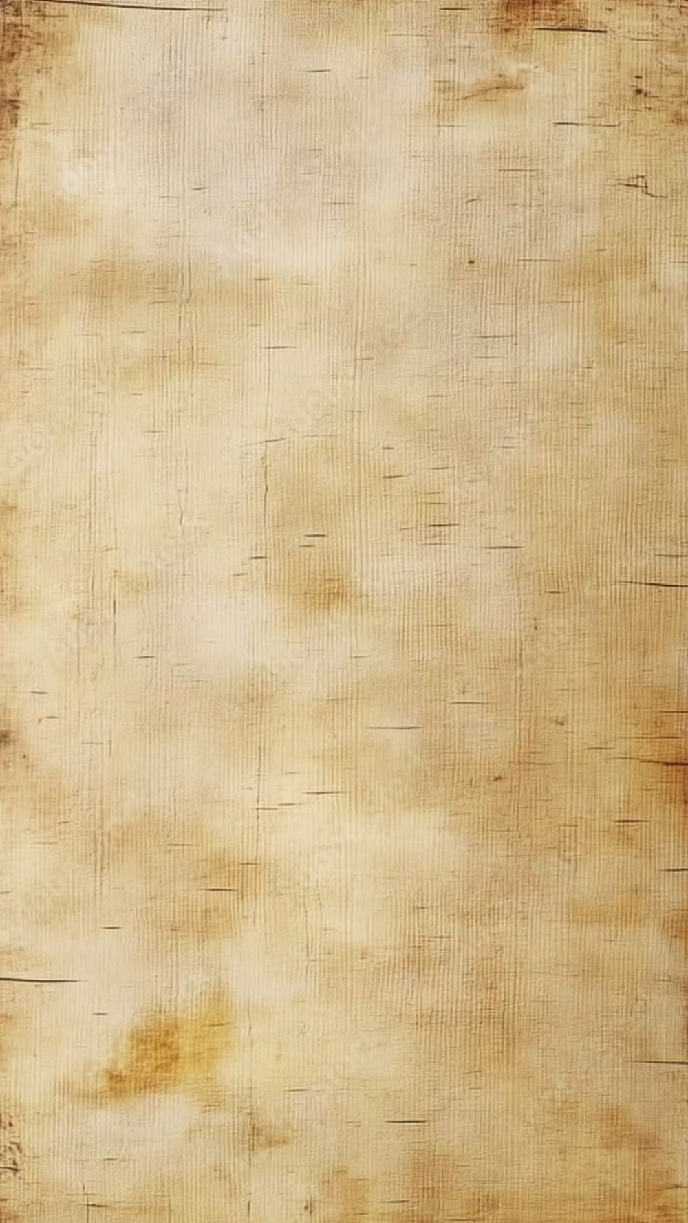
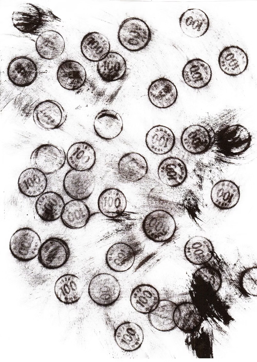
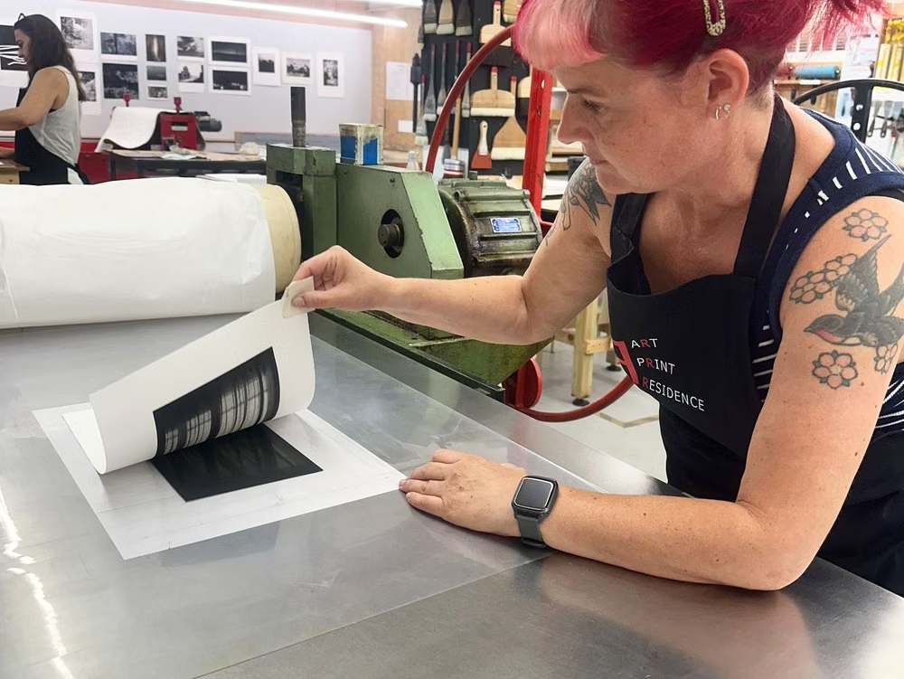
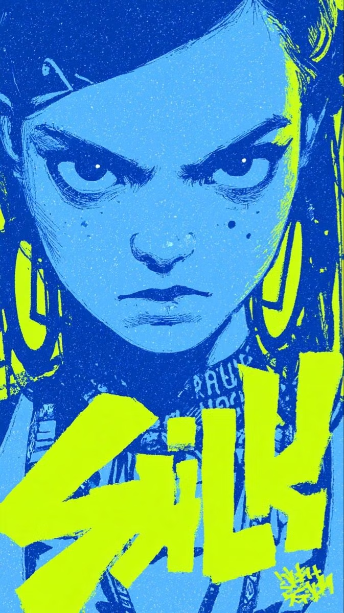
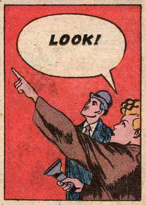
Moodboard and visual references
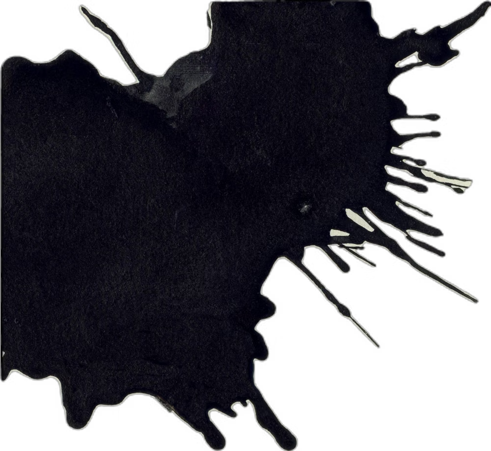
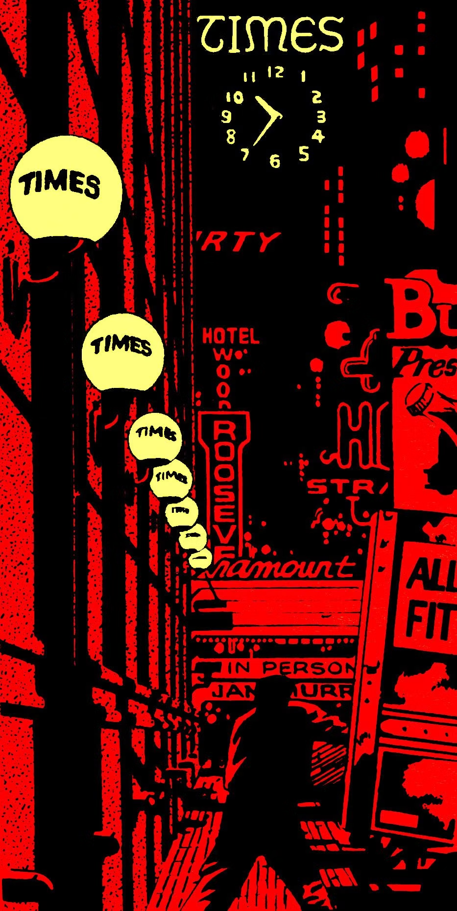
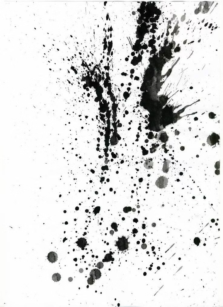
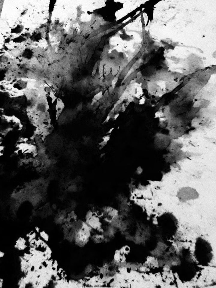
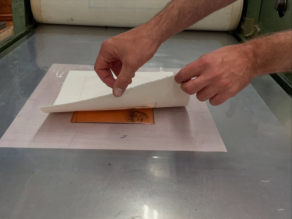
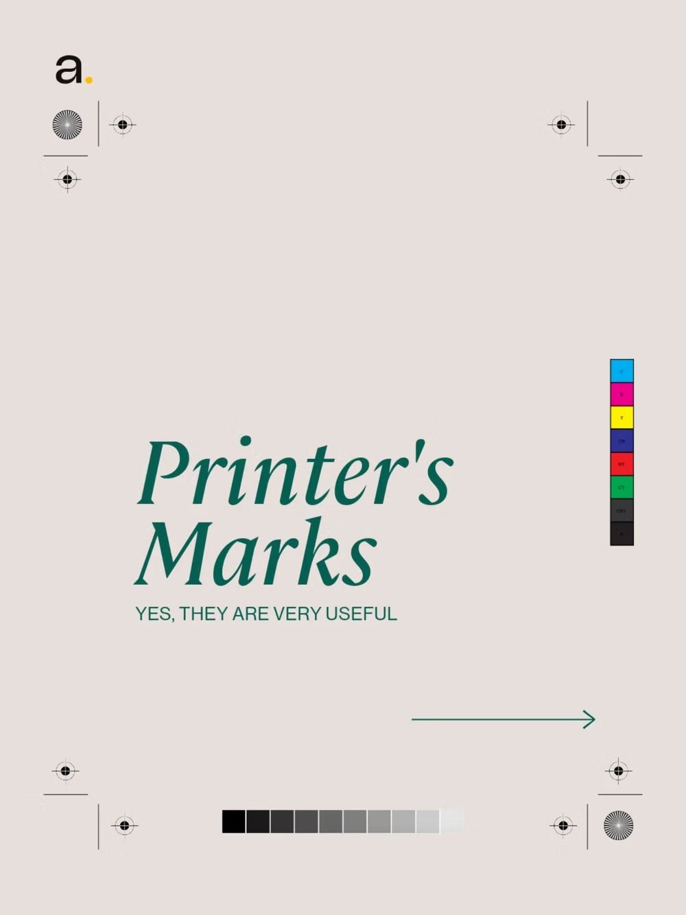
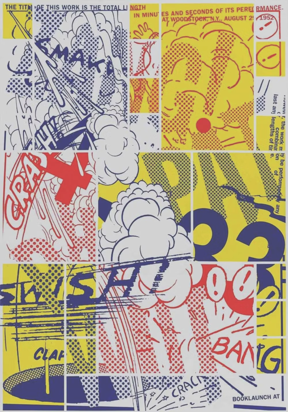
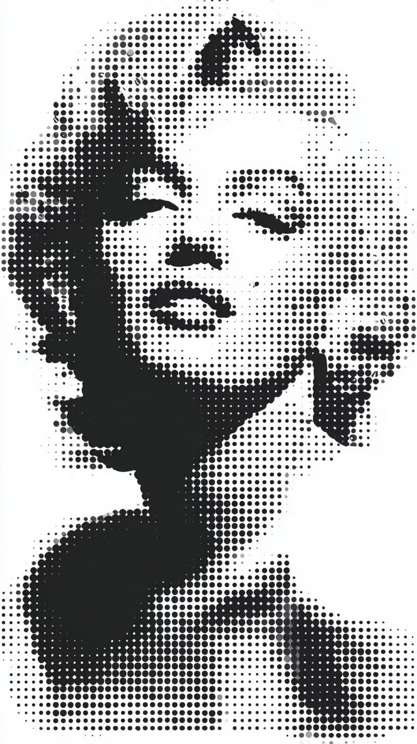
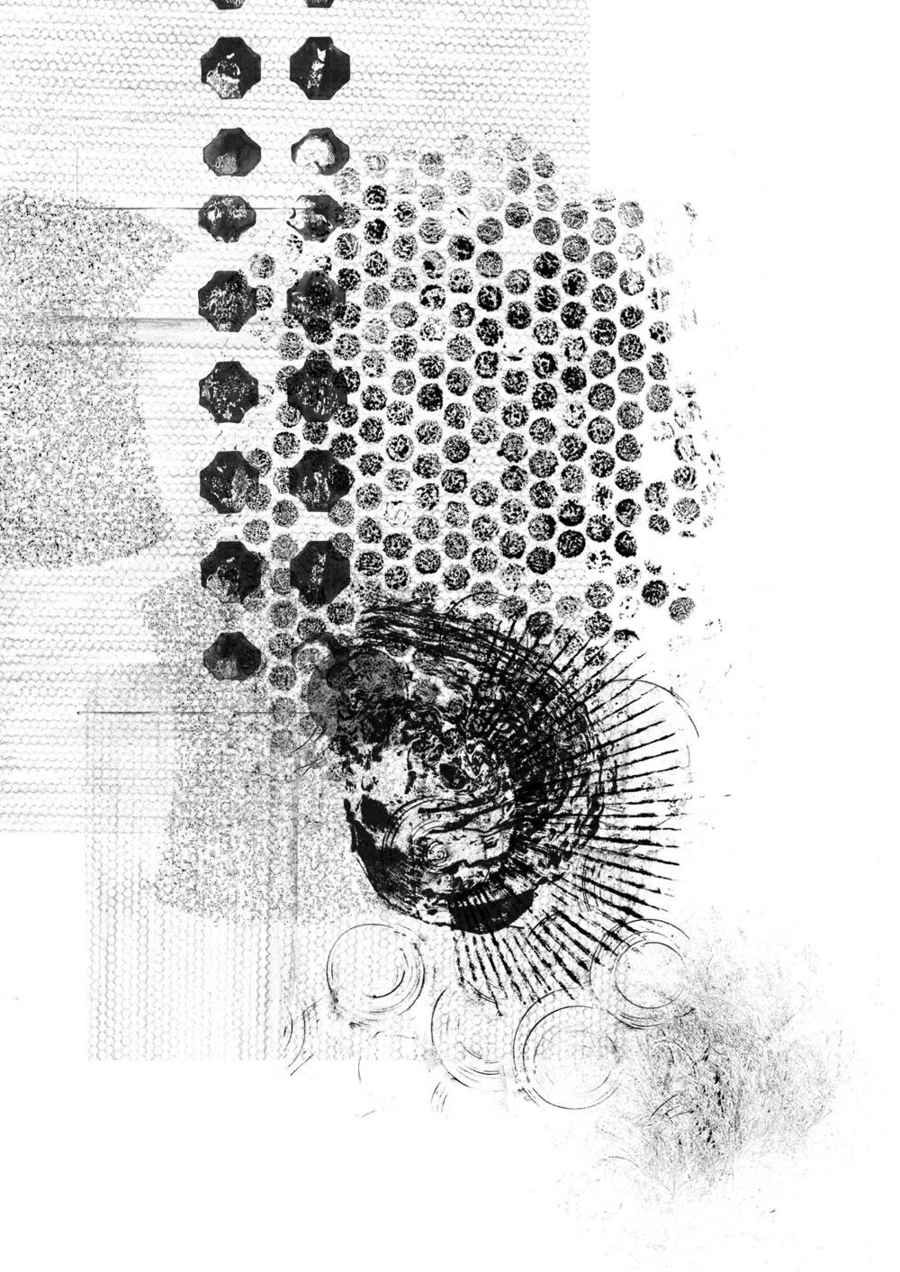
A visual study of the forms, inspirations, materials, colors, type, and cultural references associated with this UI design style.

Design principles and implementation
Use these principles to write a focused AI UI design prompt instead of asking for a vague visual treatment.
Color direction
Use black ink with a punchy limited print palette, separating adjacent fills clearly and applying halftone screens for secondary tones. In a daisyUI theme, use punchy print red or blue for `primary`, yellow or cyan for `secondary`, and set `base-100`, `base-200`, and `base-300` to white paper, warm newsprint, and a light halftone gray.
Imagery direction
Choose inked illustrations, action photography converted to dots, close-up character crops, and sequential scenes with strong focal expressions.
Content density
Support medium to high narrative density, dividing copy into short captions and balloons so no panel becomes a wall of text.
Motion direction
Snap between panels, expand action bursts, draw speed lines, and reveal captions in paced beats without moving every halftone texture.
Shape language
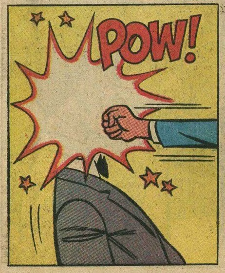
Use heavy panel frames, speech and thought balloons, jagged bursts, speed wedges, and thick contour lines. In daisyUI themes, set the `--radius-*` variables to `0` or `0.25rem`.
Typography rules
Pair expressive comic display lettering with a highly legible dialogue face, keep balloon text compact, and use uppercase only where the genre calls for impact.
Suggested Typfaces
Bangers
Fresh daisies glow in warm sunlight
Fresh daisies glow in warm sunlight
1 2 3 4 5 6 7 8 9 0
Luckiest Guy
Fresh daisies glow in warm sunlight
Fresh daisies glow in warm sunlight
1 2 3 4 5 6 7 8 9 0
Comic Neue
Fresh daisies glow in warm sunlight
Fresh daisies glow in warm sunlight
1 2 3 4 5 6 7 8 9 0
Lilita One
Fresh daisies glow in warm sunlight
Fresh daisies glow in warm sunlight
1 2 3 4 5 6 7 8 9 0
Anton
Fresh daisies glow in warm sunlight
Fresh daisies glow in warm sunlight
1 2 3 4 5 6 7 8 9 0
Build a Halftone / Comic Book interface with daisyUI
The live example translates this direction into daisyUI components and semantic theme tokens.
To generate a full page in the same visual language, give the style name and the design rules above to Blueprint MCP.
Related UI design styles
Compare nearby visual languages that share typography, shapes, use cases, or signature elements.
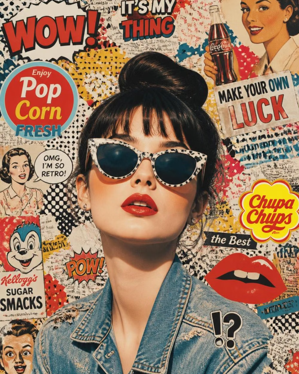
Pop Art UI design style
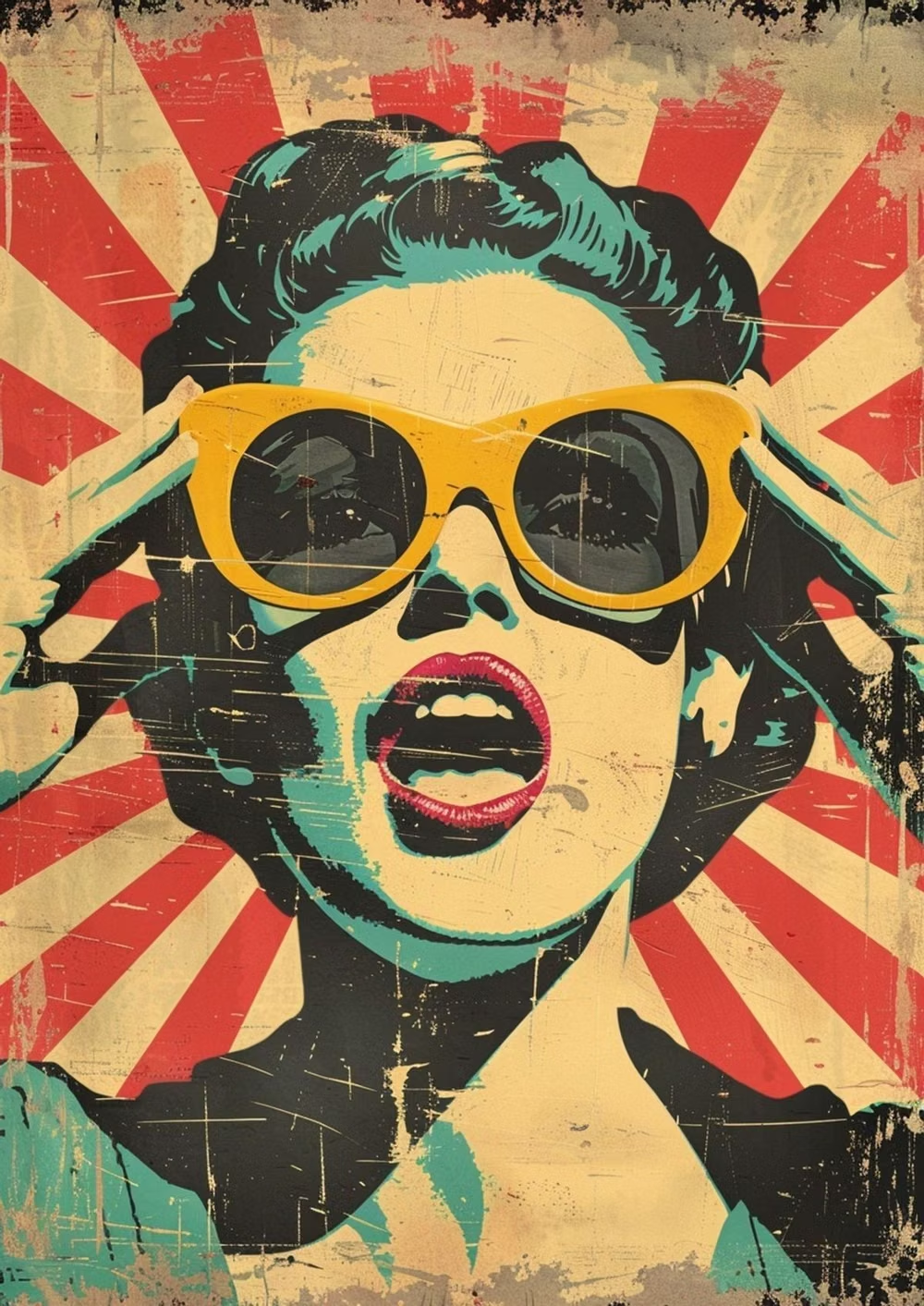
Commercial imagery, bold outlines, repetition, bright primary colors, and mass-media references become graphic spectacle.
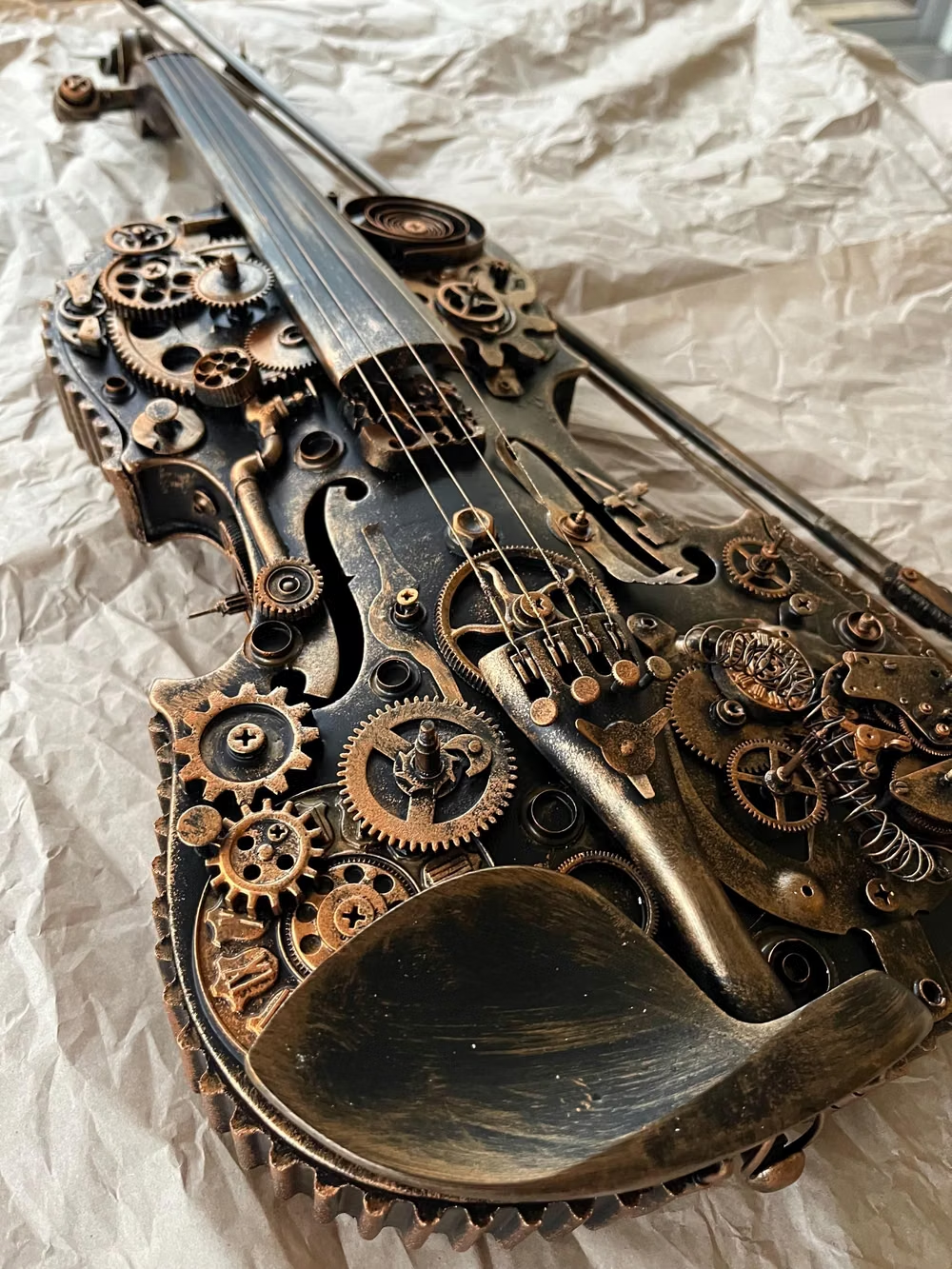
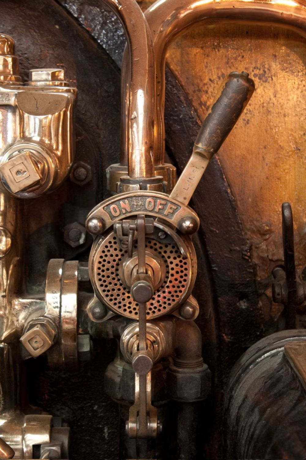
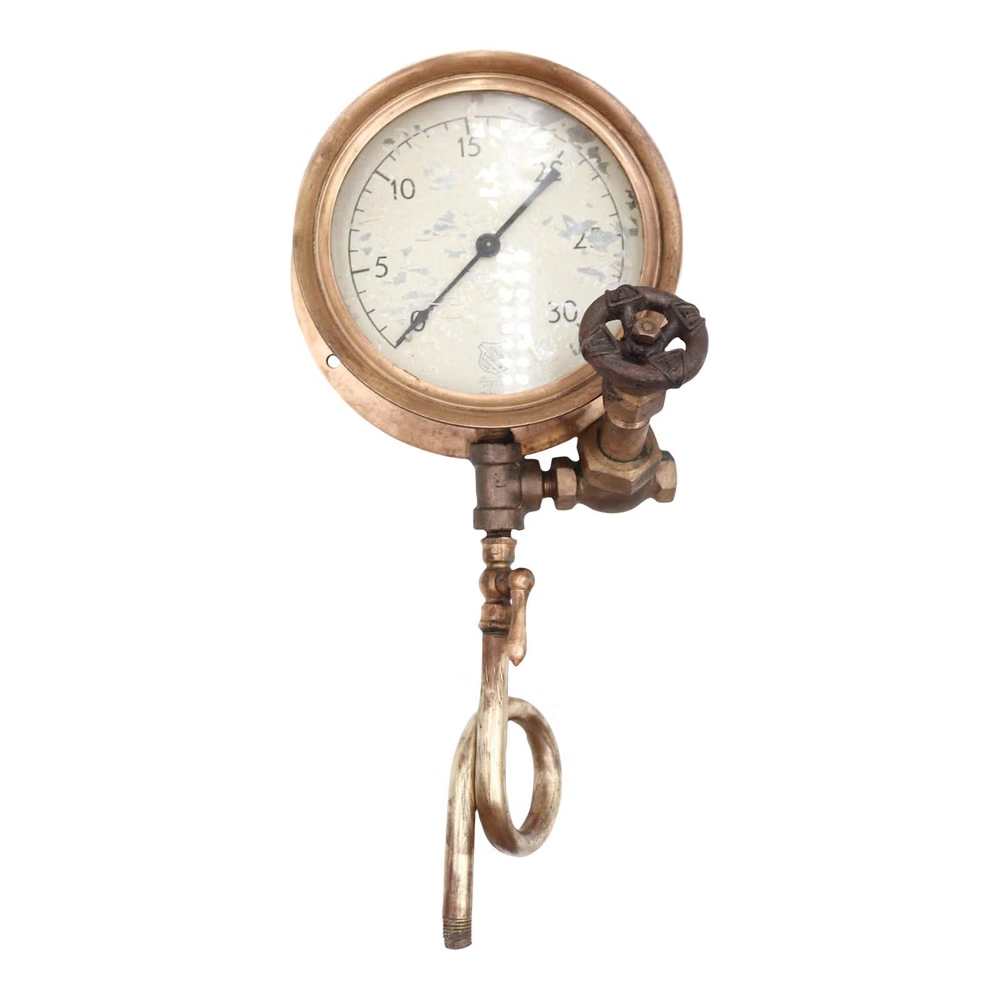
Steampunk UI design style
A hyper-skeuomorphic Victorian machine aesthetic turns the interface into a worn, theatrical artifact built from brass, iron, leather, parchment, glass, and enamel.
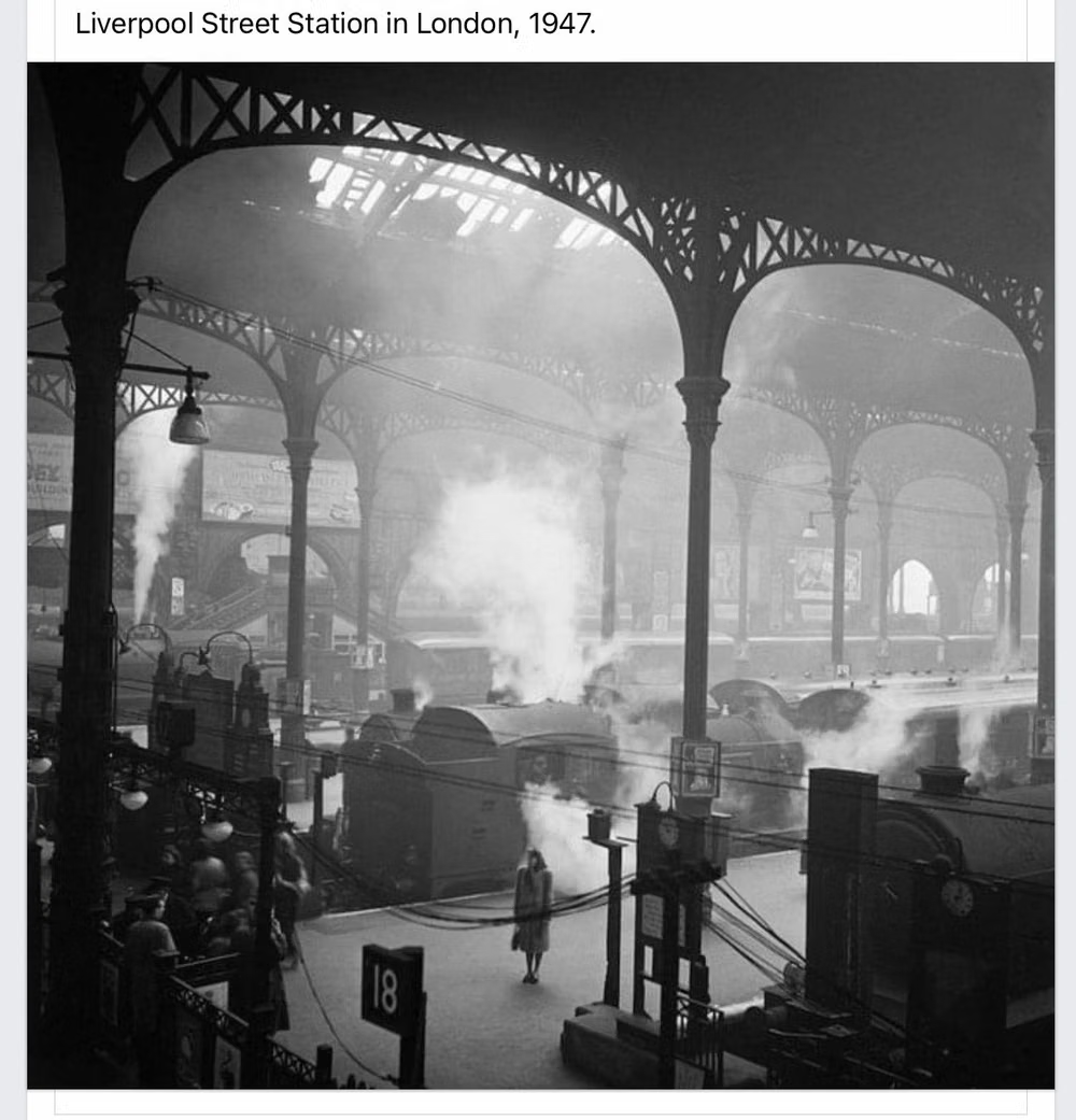
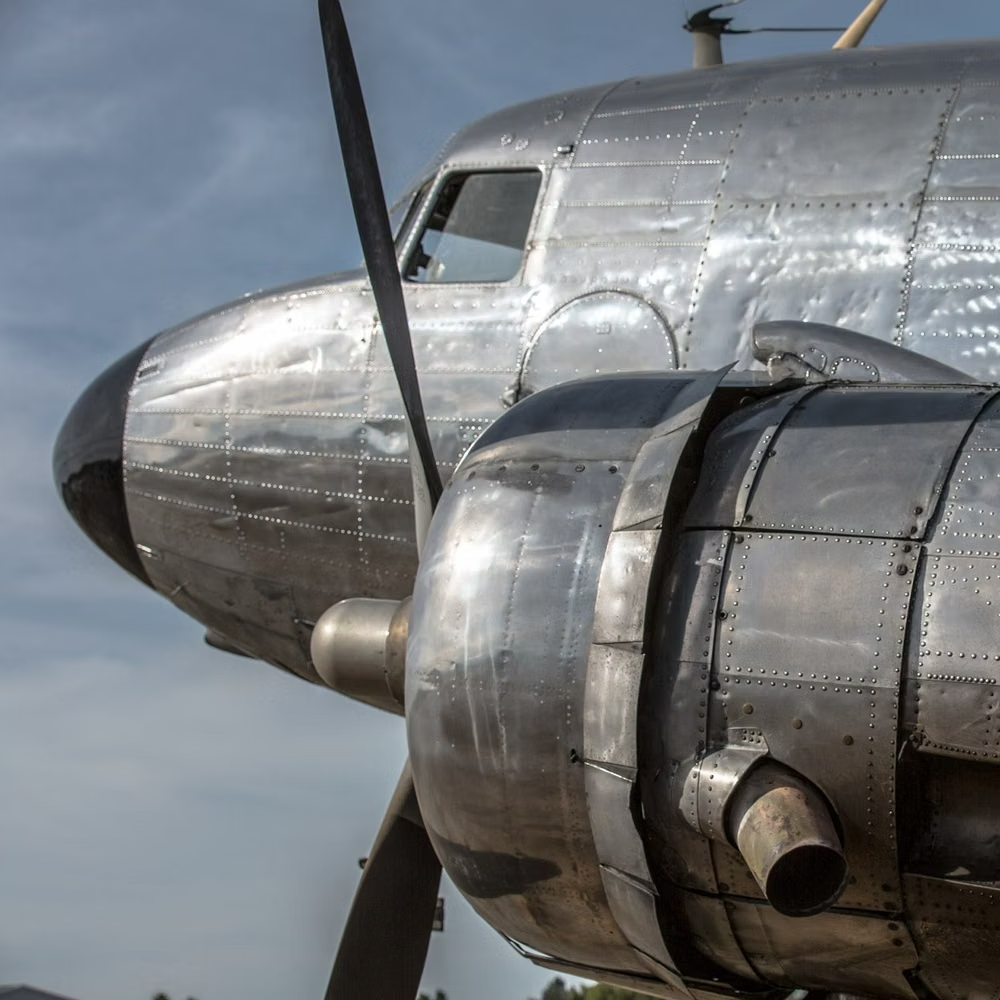
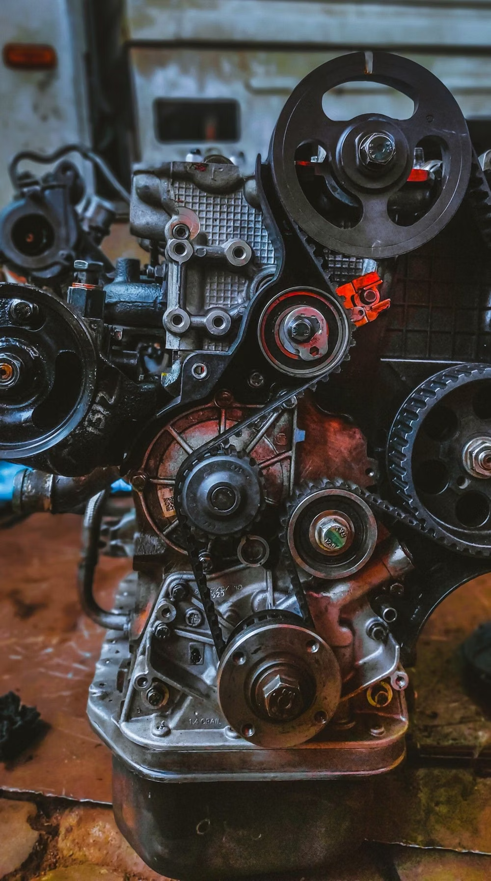
Dieselpunk UI design style
Interwar and mid-century industrial machinery, riveted metal, propaganda graphics, soot, military modernism, and heavy mechanical forms.