Flat Design UI design style
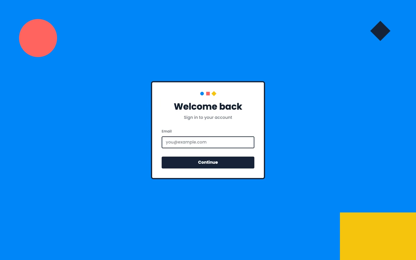
Simple two-dimensional shapes, solid colors, clean icons, and little or no simulated depth.
Design overview
- Signature elements
- solid color blocks, two-dimensional icons, simple geometry, no gradients, little or no shadow, high legibility
- Best suited to
- Mobile apps, dashboards, utilities, and cross-platform products.
- Layout principles
- Divide the interface into crisp two-dimensional zones, align modules to a simple grid, and show hierarchy through size and placement instead of overlap or elevation.
History and origins
A fact-checked account of where this visual language came from, with links to the references used.
- Period
- Late 2000s–mid-2010s
- Origin
- Mobile and operating-system interface design
Flat design emerged as software teams moved away from richly simulated materials toward simple shapes, solid color, and typography. Microsoft’s Metro language on Windows Phone was a major early system-level expression around 2010, and Apple’s iOS 7 redesign in 2013 helped make the flatter approach mainstream across mobile products.
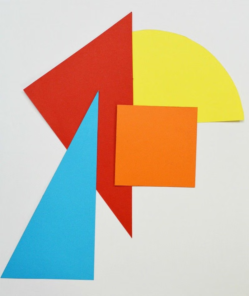
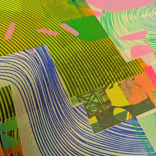
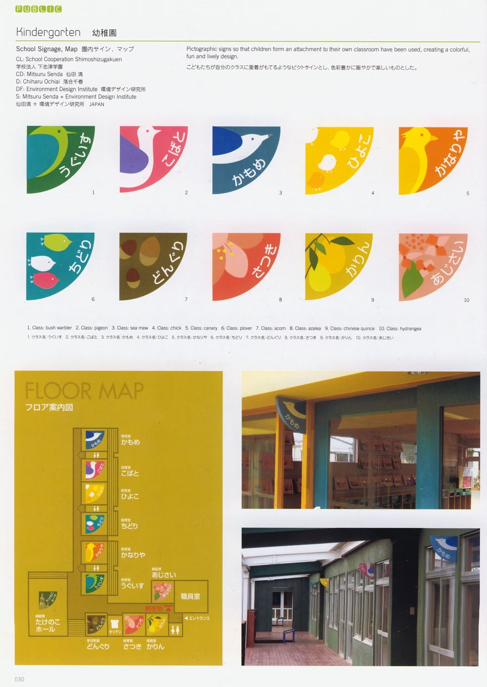
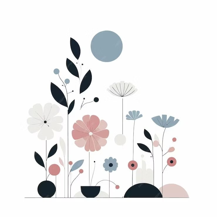
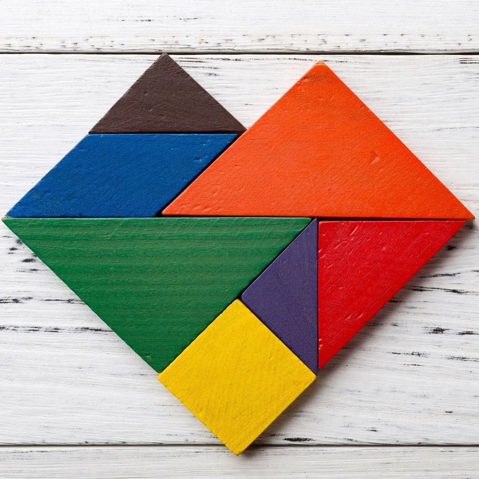
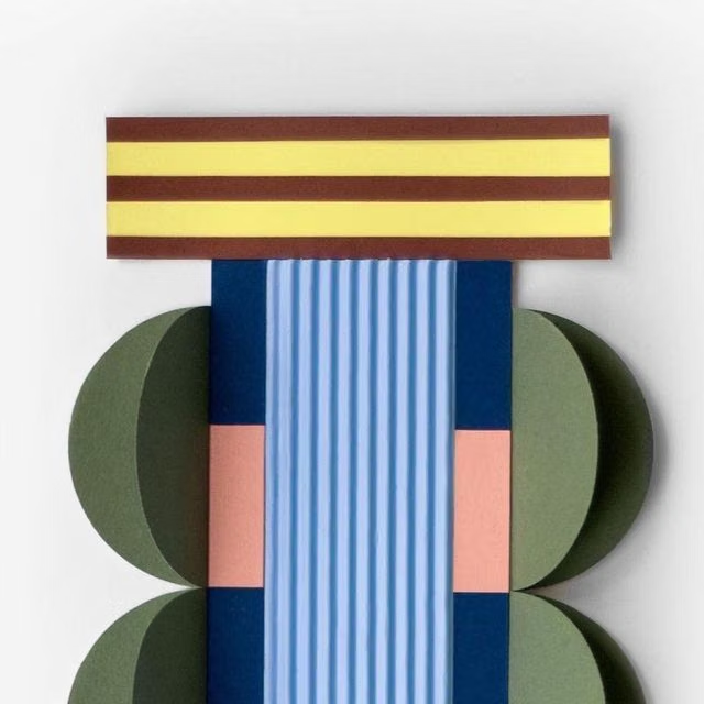
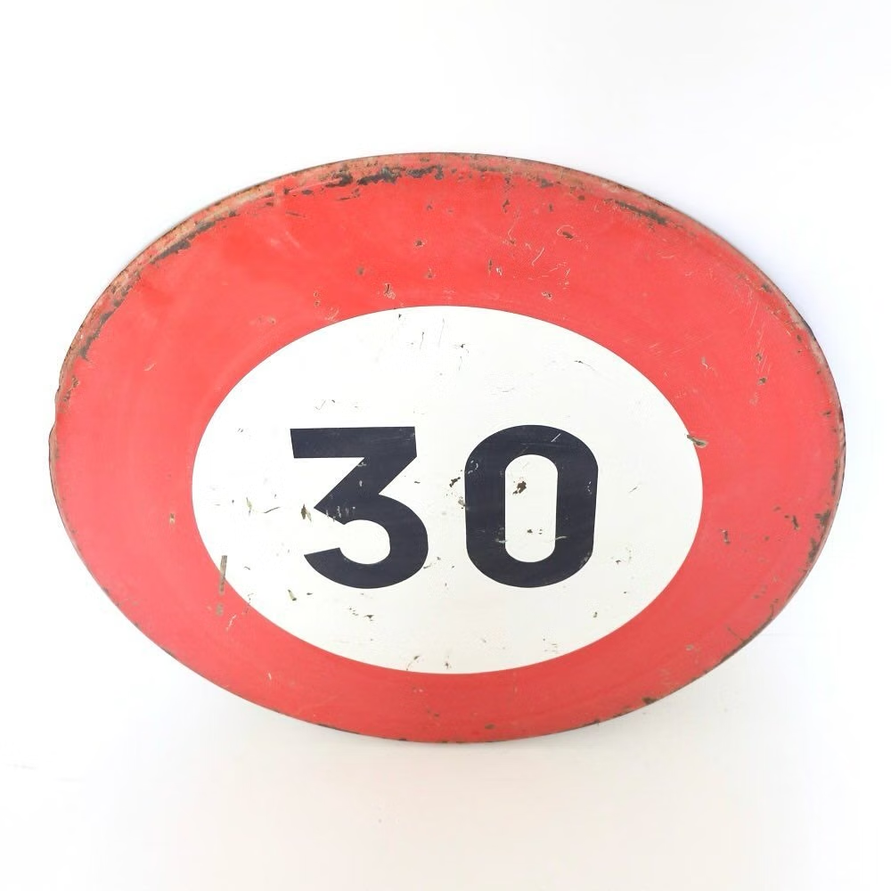
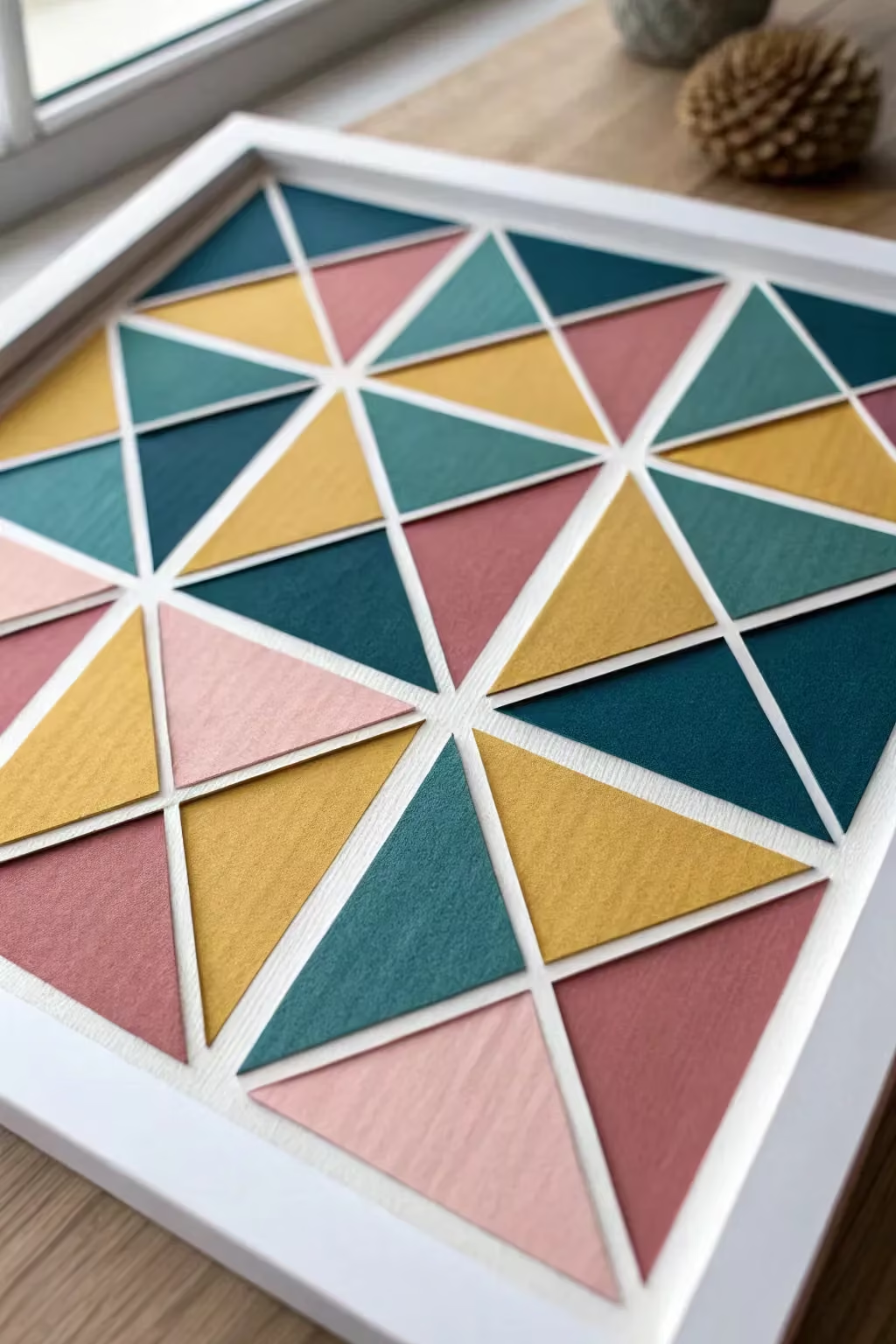
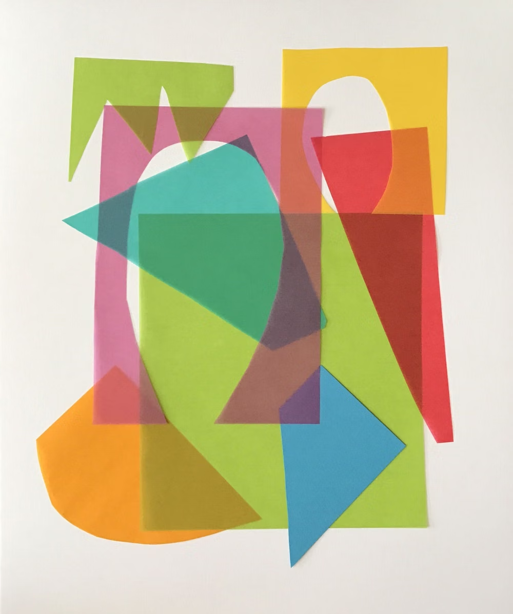
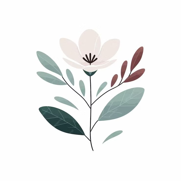
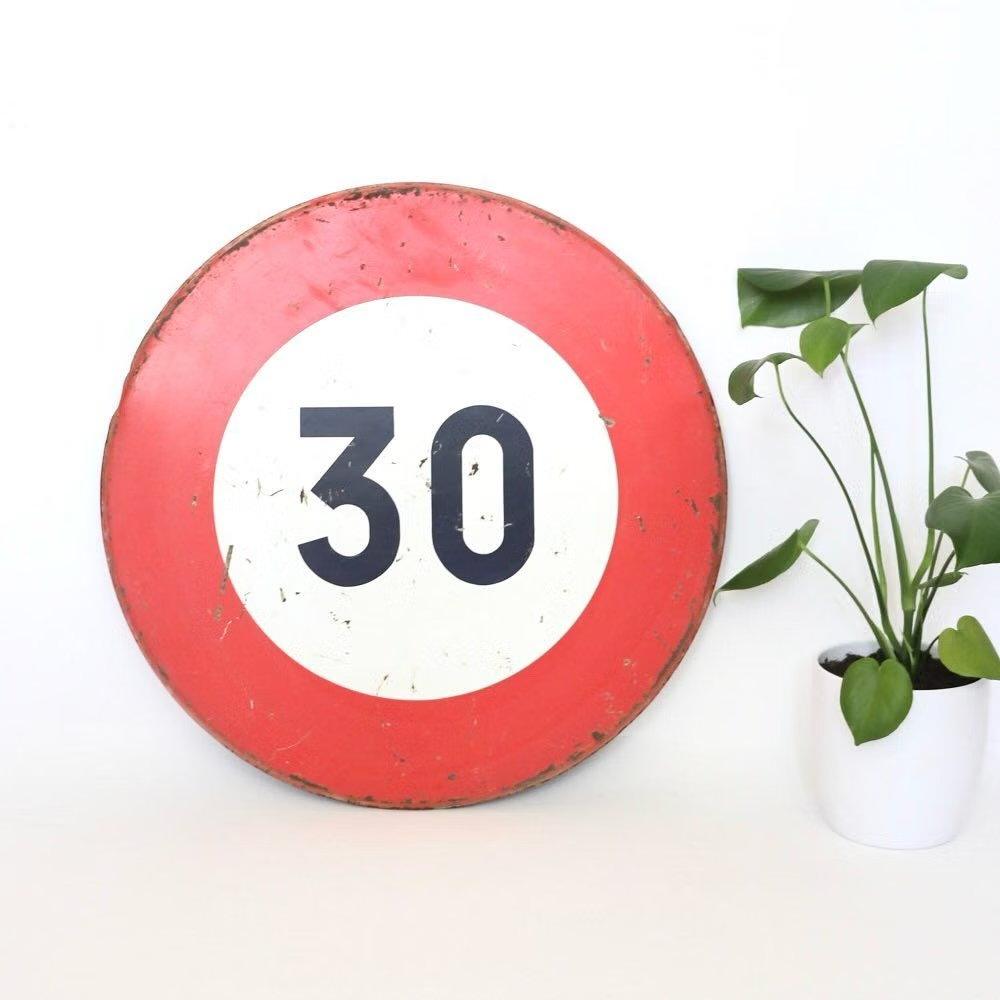
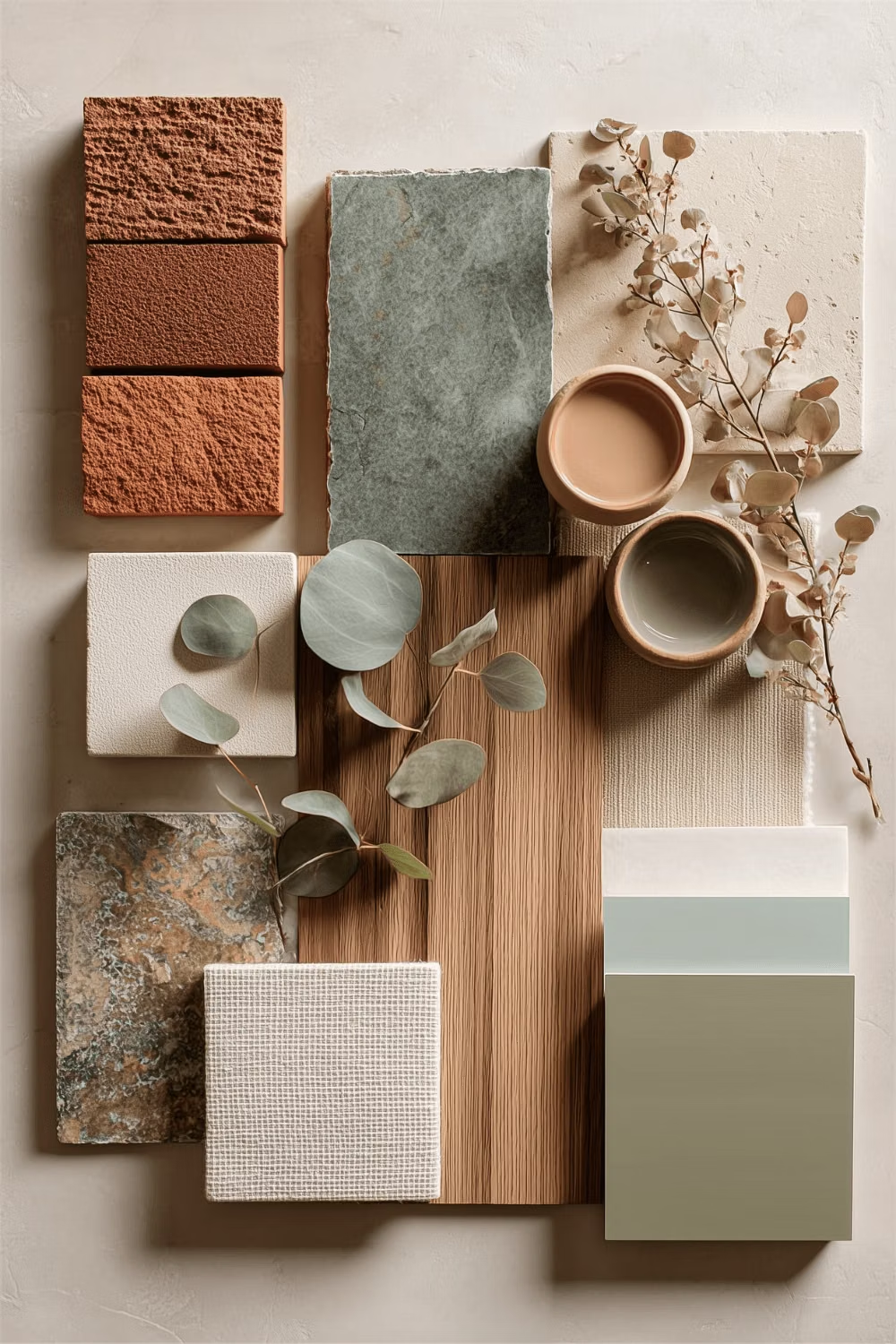
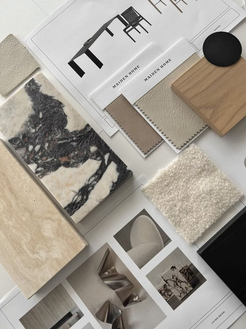
Moodboard and visual references
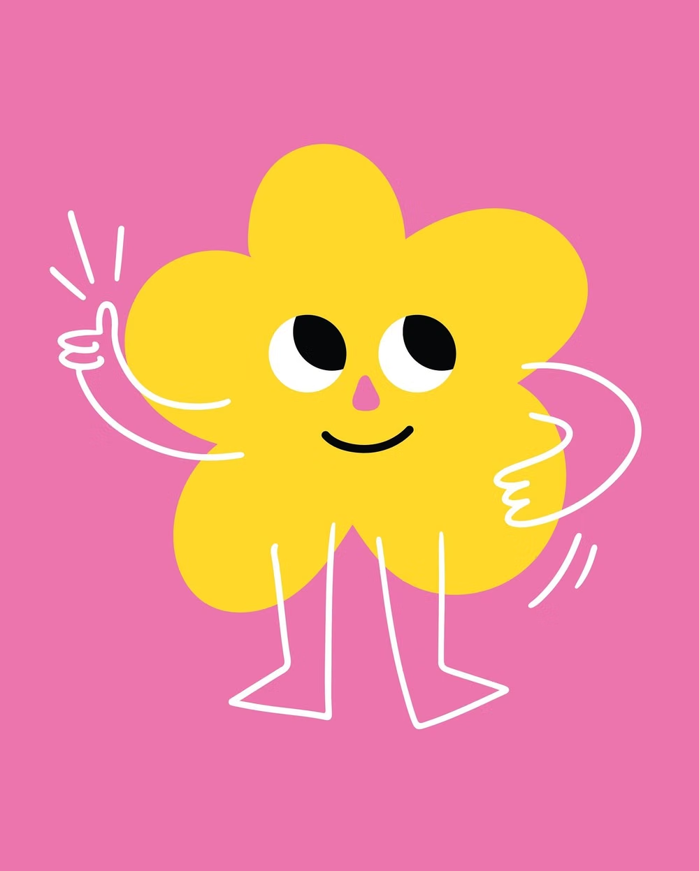
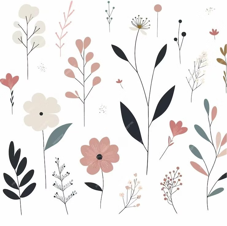
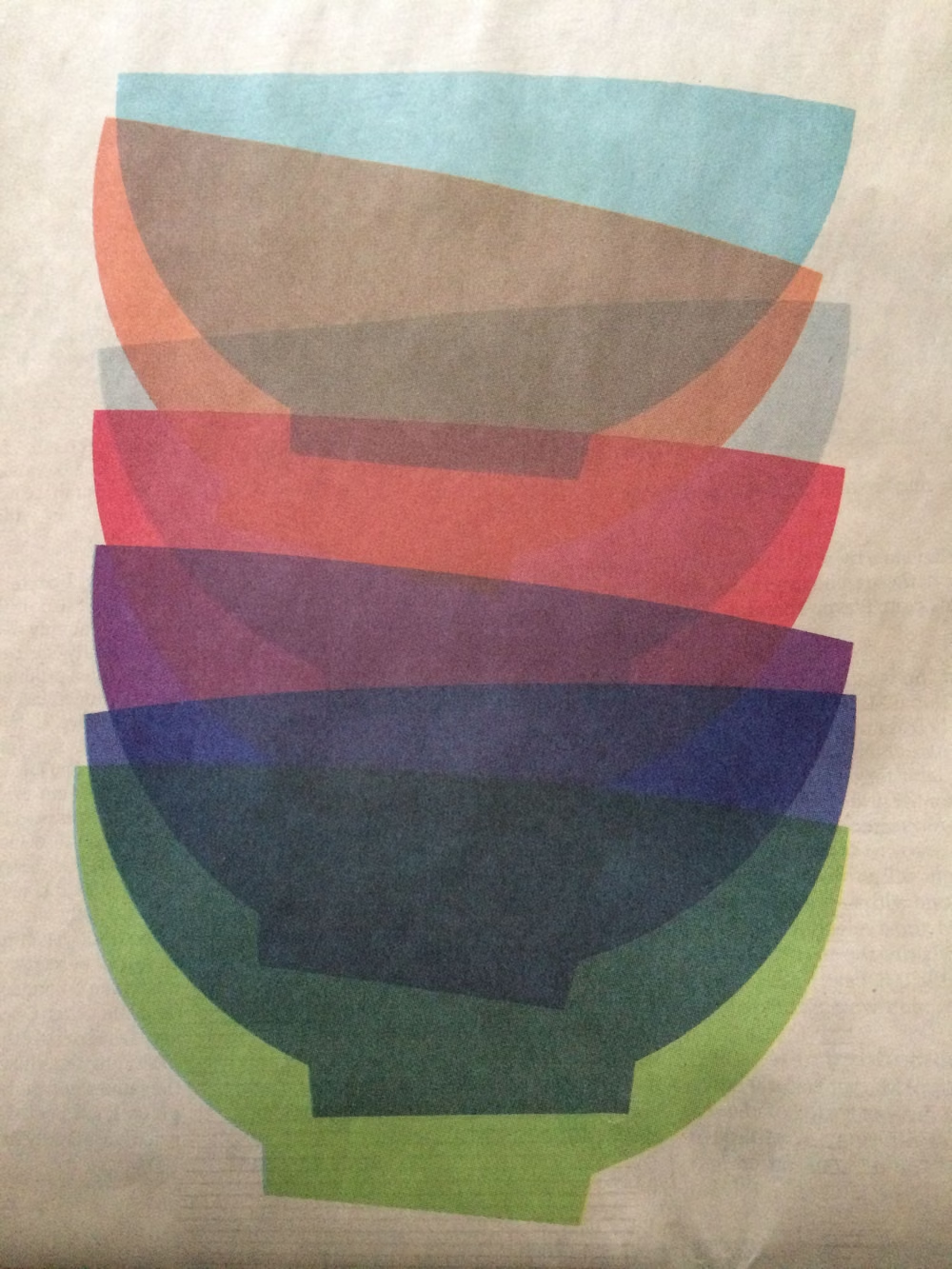
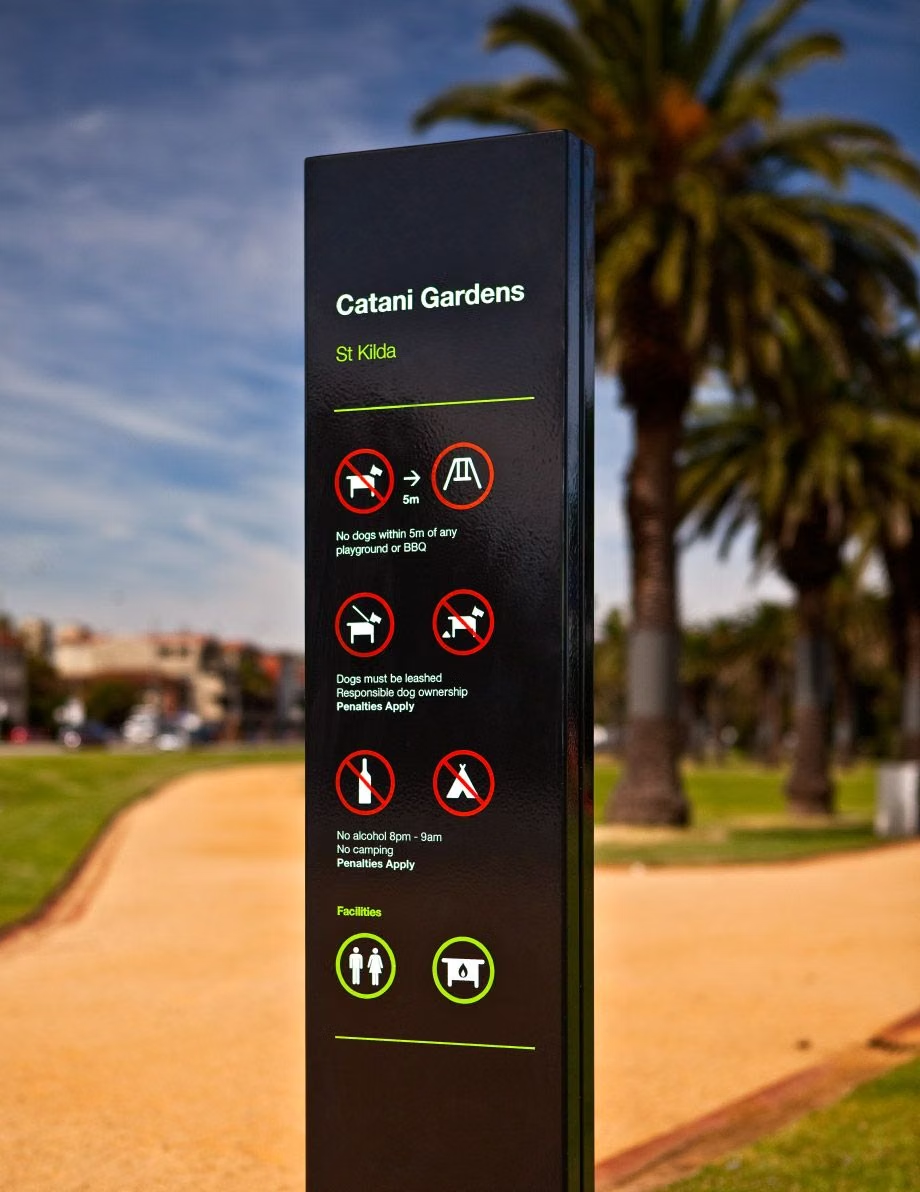
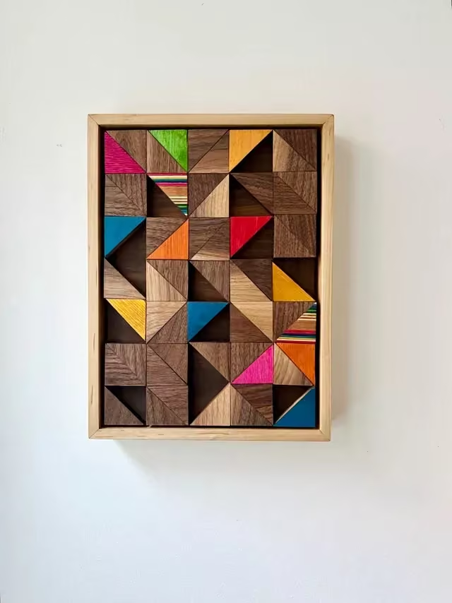
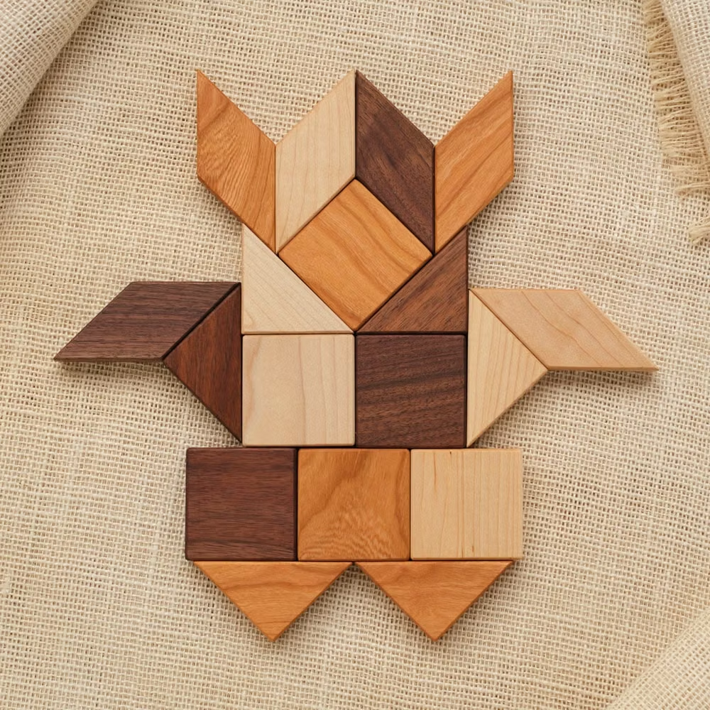
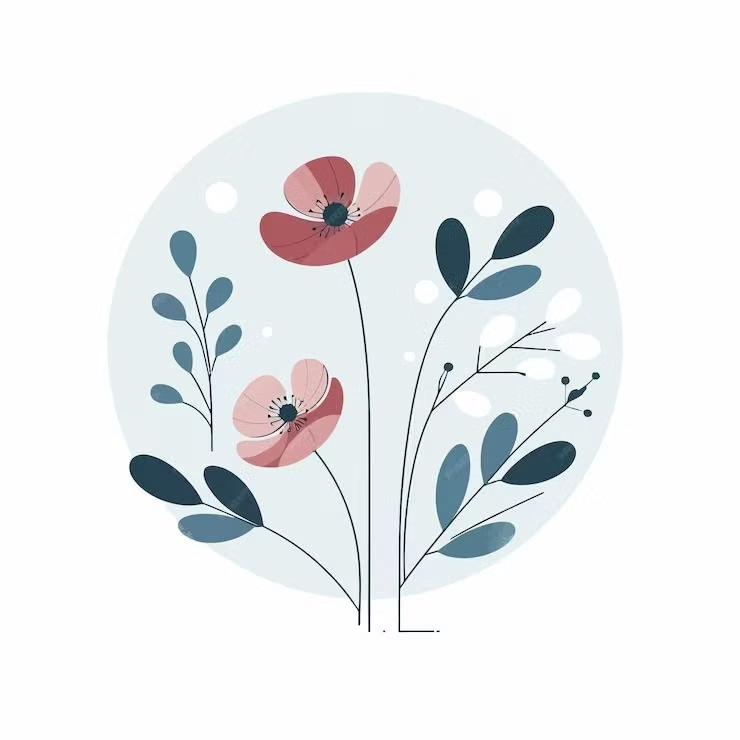
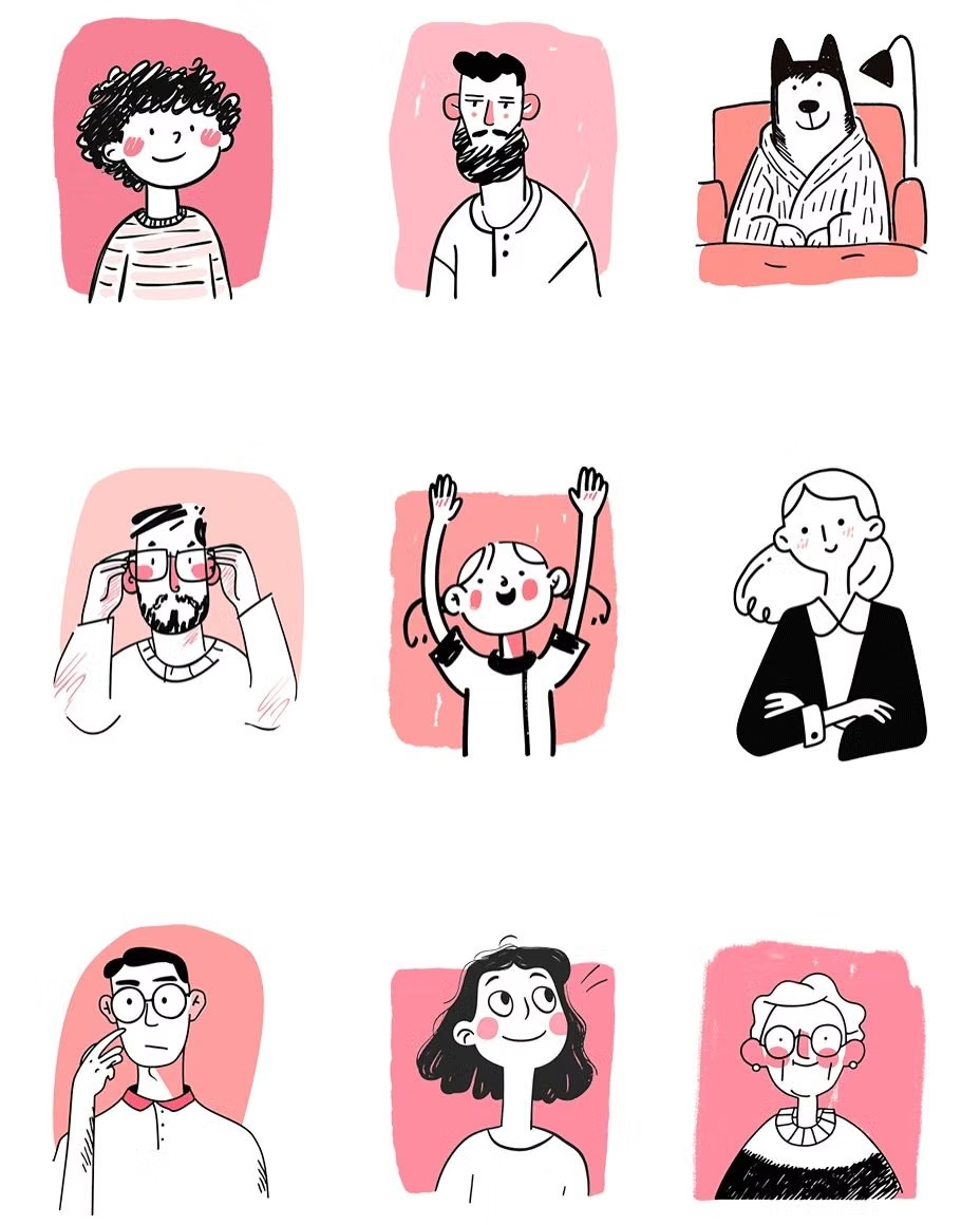
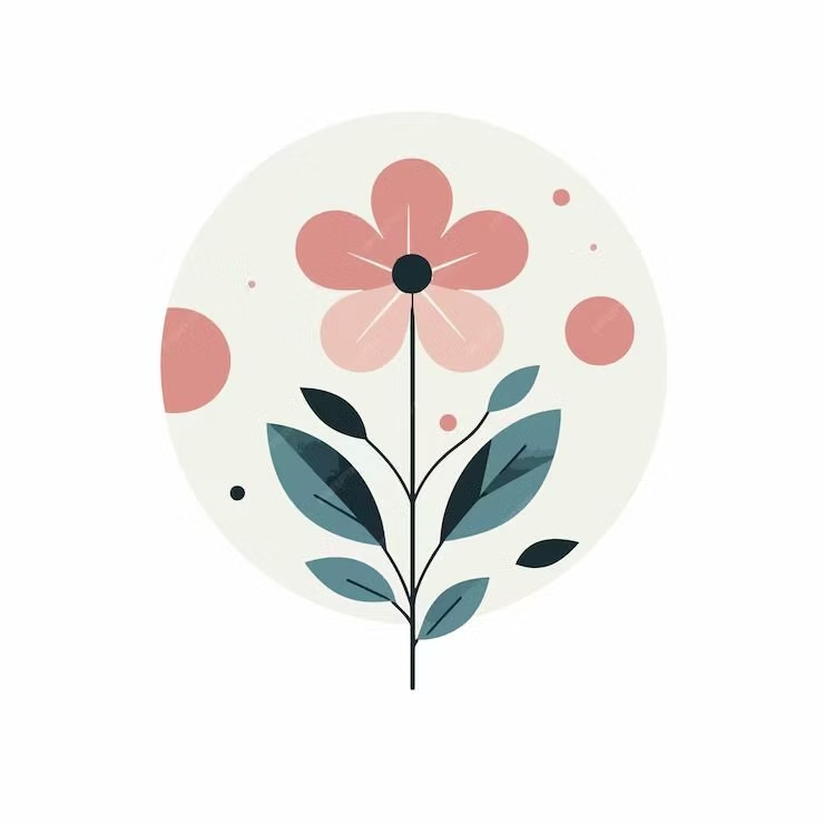
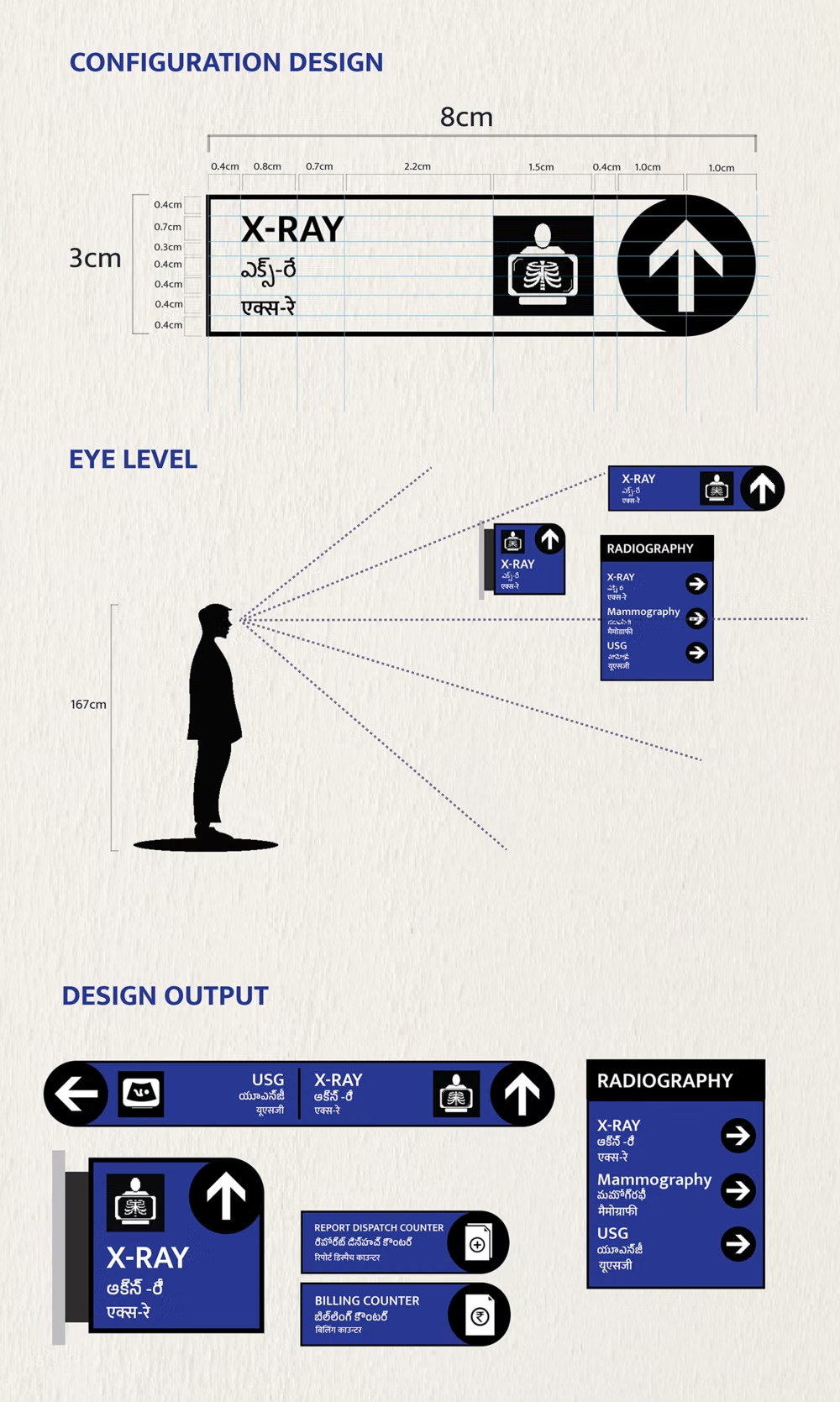
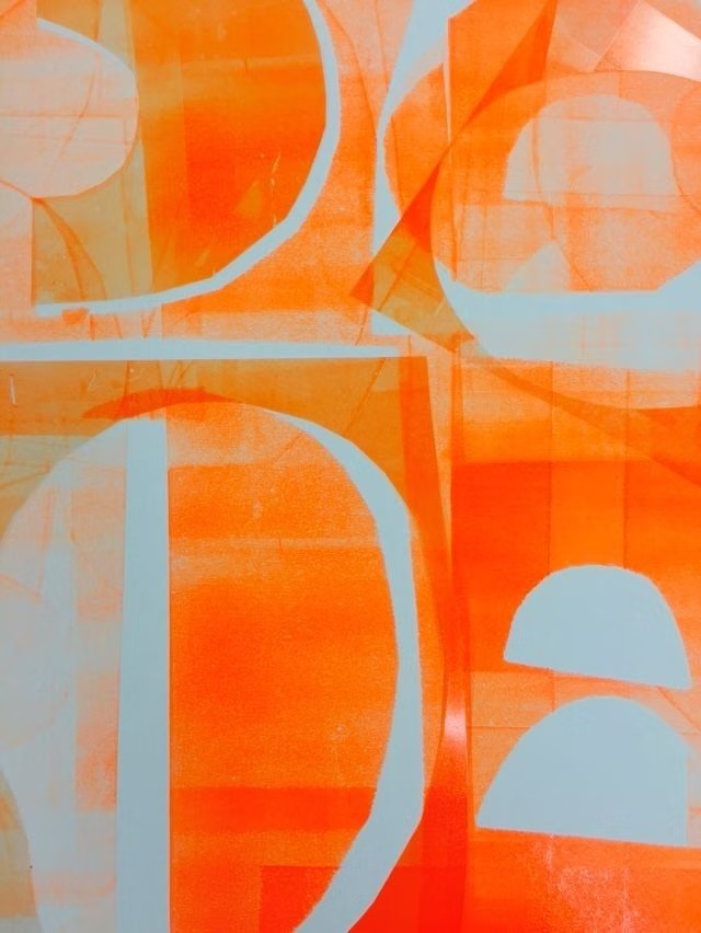
A visual study of the forms, inspirations, materials, colors, type, and cultural references associated with this UI design style.
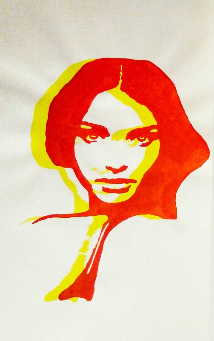
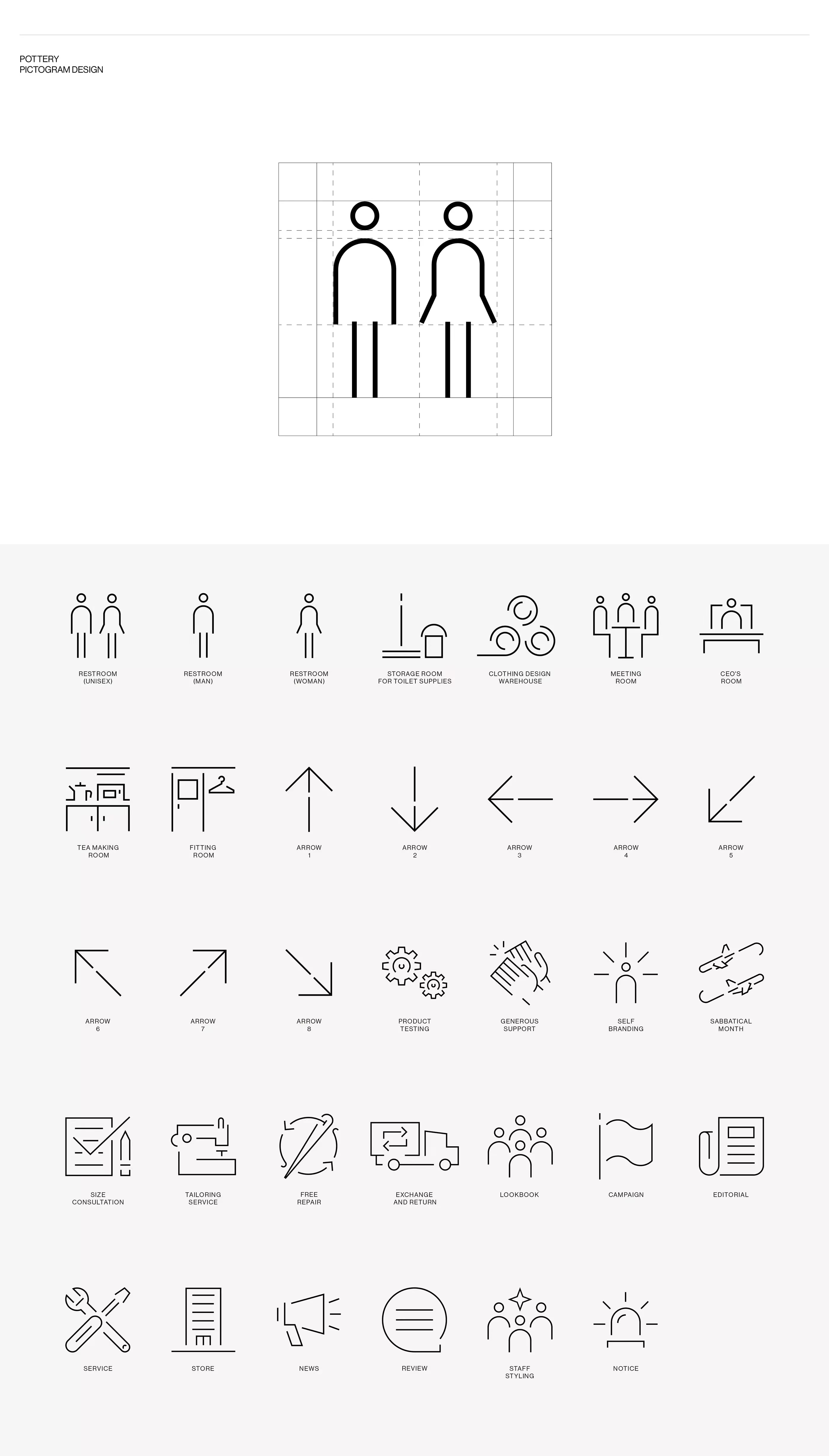
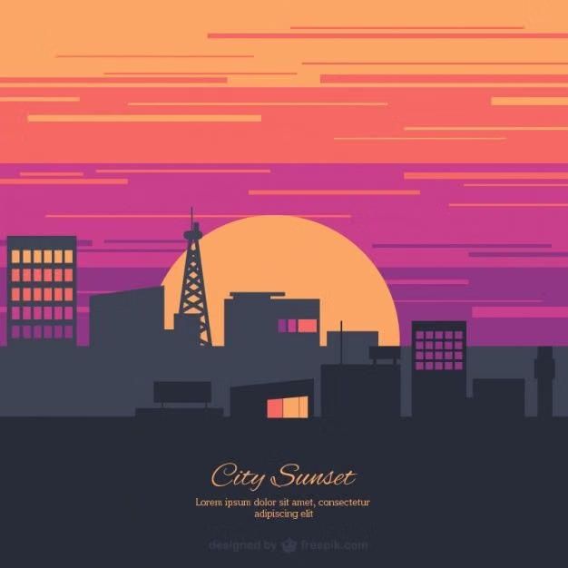
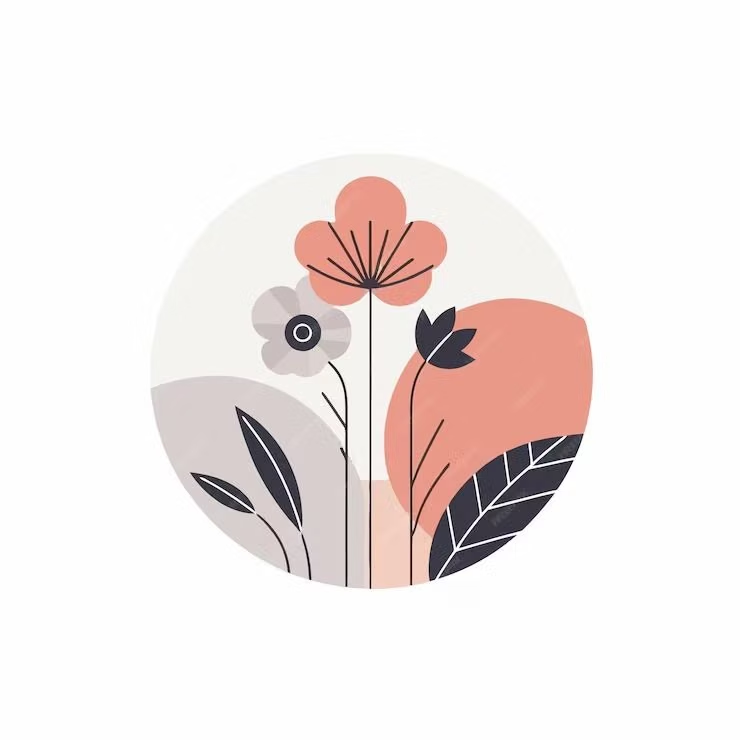
Design principles and implementation
Use these principles to write a focused AI UI design prompt instead of asking for a vague visual treatment.
Color direction
Choose solid, distinct fills for major roles, pair saturated accents with neutral canvases, and make boundaries readable without gradients or cast shadows. In a daisyUI theme, use the strongest flat brand hue for `primary`, a clearly separated complementary hue for `secondary`, and choose solid white, pale neutral, and light gray for `base-100`, `base-200`, and `base-300`.
Imagery direction
Prefer flat vector illustrations, pictograms, and icons built from a shared geometric vocabulary with minimal internal shading.
Content density
Use medium density with compact scan groups; separate related tools through color blocks and spacing rather than nested surface effects.
Motion direction
Animate planar translation, scaling, and color changes with direct timing; elements should move like graphic layers rather than physical objects.
Shape language
Use circles, rectangles, and simple silhouettes with a consistent radius system, crisp edges, and no simulated bevels. In daisyUI themes, set the `--radius-*` variables between `0.25rem` and `1rem`.
Typography rules
Choose a sturdy sans-serif with clear bold weights, keep labels concise, and avoid hairline text that loses definition against solid color.
Suggested Typfaces
Poppins
Fresh daisies glow in warm sunlight
Fresh daisies glow in warm sunlight
1 2 3 4 5 6 7 8 9 0
Montserrat
Fresh daisies glow in warm sunlight
Fresh daisies glow in warm sunlight
1 2 3 4 5 6 7 8 9 0
Rubik
Fresh daisies glow in warm sunlight
Fresh daisies glow in warm sunlight
1 2 3 4 5 6 7 8 9 0
Lato
Fresh daisies glow in warm sunlight
Fresh daisies glow in warm sunlight
1 2 3 4 5 6 7 8 9 0
Open Sans
Fresh daisies glow in warm sunlight
Fresh daisies glow in warm sunlight
1 2 3 4 5 6 7 8 9 0
Build a Flat Design interface with daisyUI
The live example translates this direction into daisyUI components and semantic theme tokens.
To generate a full page in the same visual language, give the style name and the design rules above to Blueprint MCP.
Related UI design styles
Compare nearby visual languages that share typography, shapes, use cases, or signature elements.
Material Design UI design style
Google’s adaptive design system combines clear interface hierarchy, personalized color, accessible components, generous rounded geometry, and responsive behavior. Also known as Material You, it evolves Material Design away from paper-like realism toward flexible digital surfaces, with newer expressive variants introducing stronger typography, contrasting shapes, and more energetic motion.

Clean UI design style
An engineered interface language pairs tightly controlled spacing, measured grids, layered neutral surfaces, and precise micro-details so dense information feels calm, airy, and aligned.
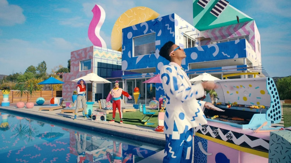

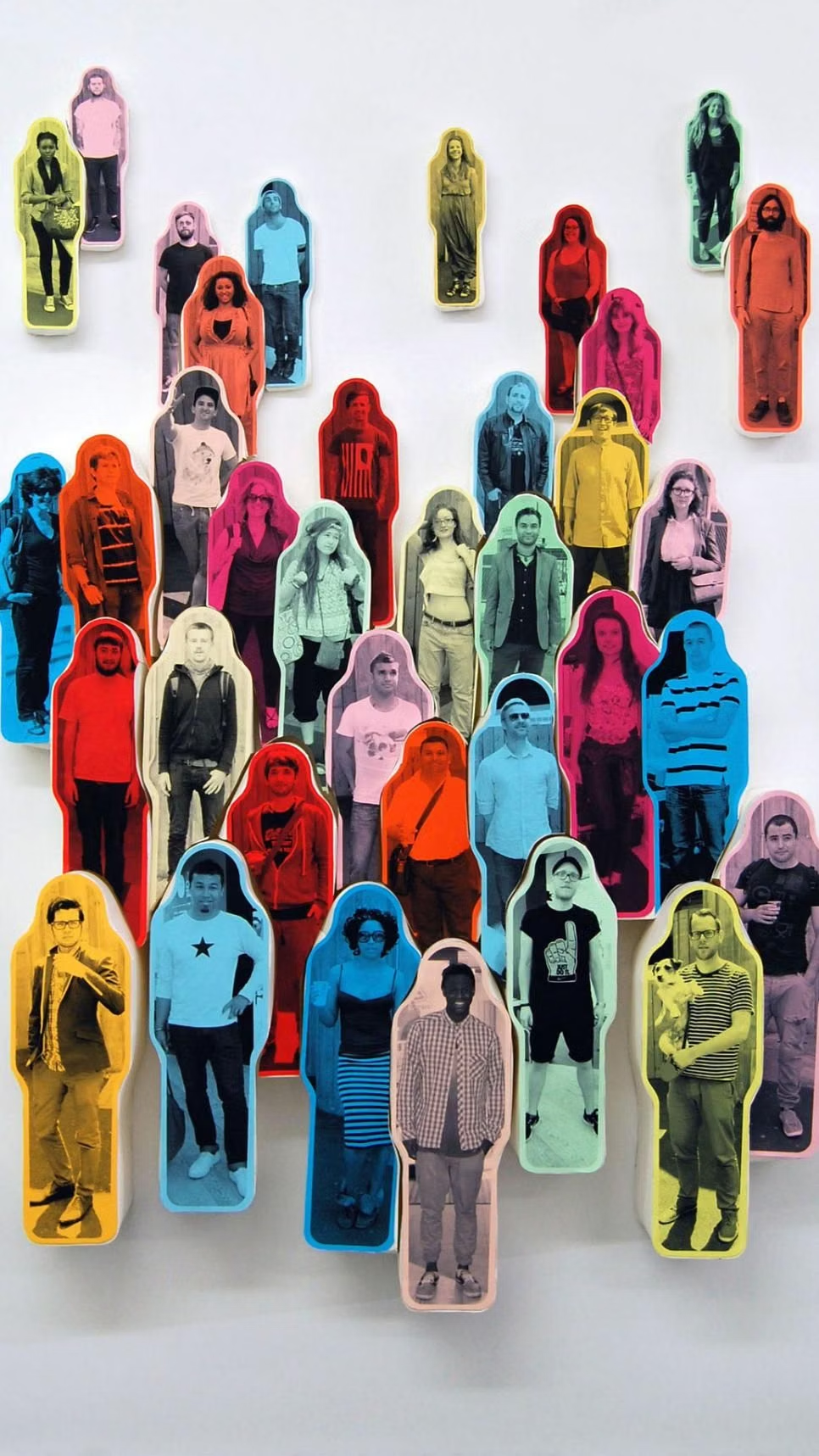
Corporate Memphis UI design style
Flat vector scenes with bright solid colors, geometric environments, and simplified people with exaggerated proportions.