Glitch Art UI design style
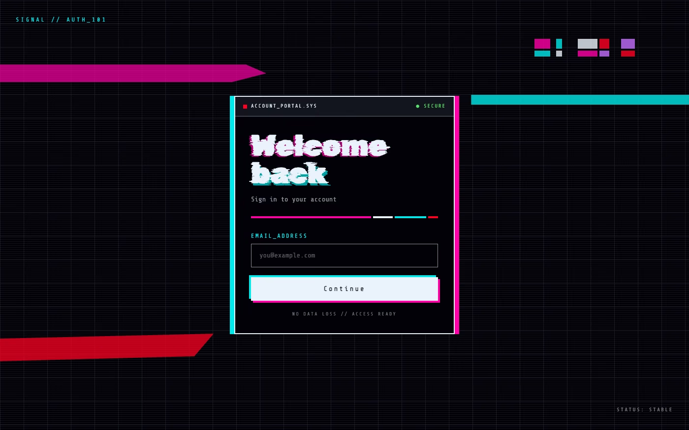
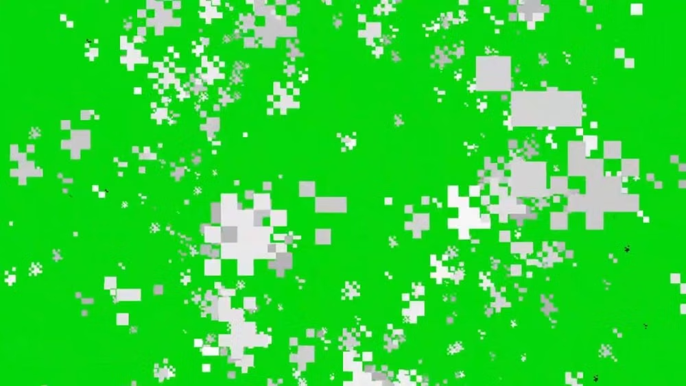
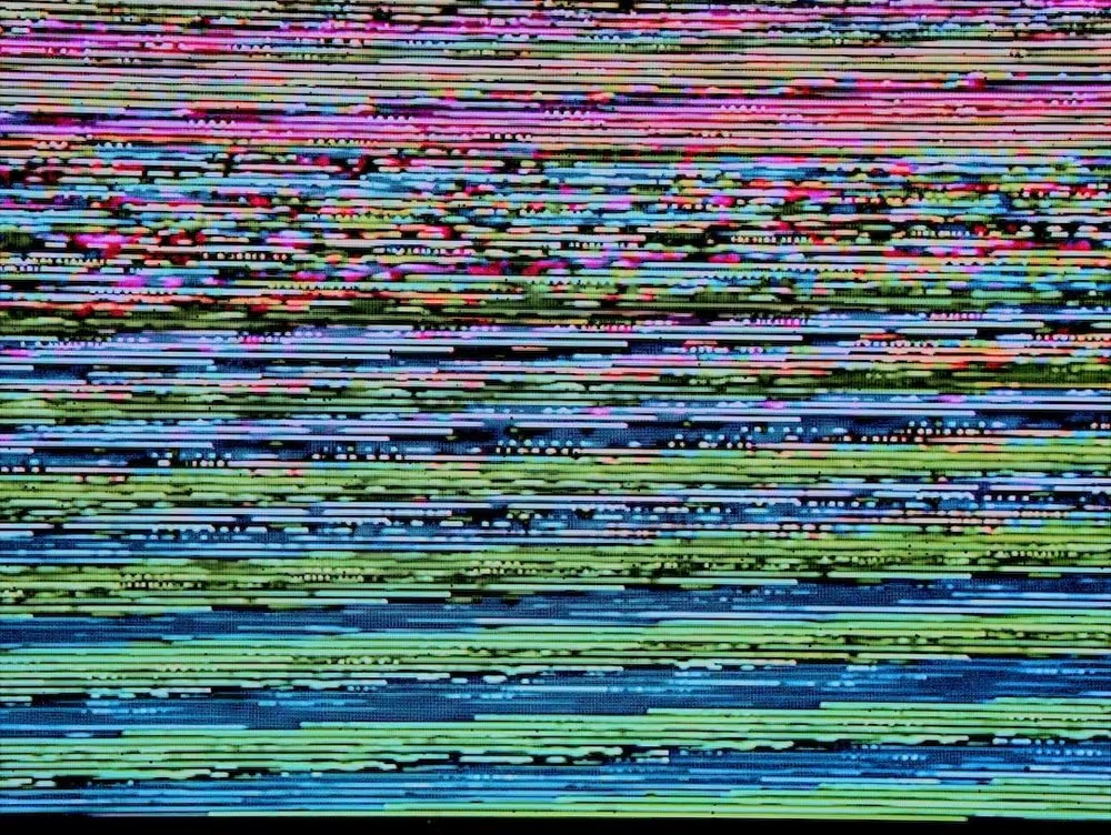
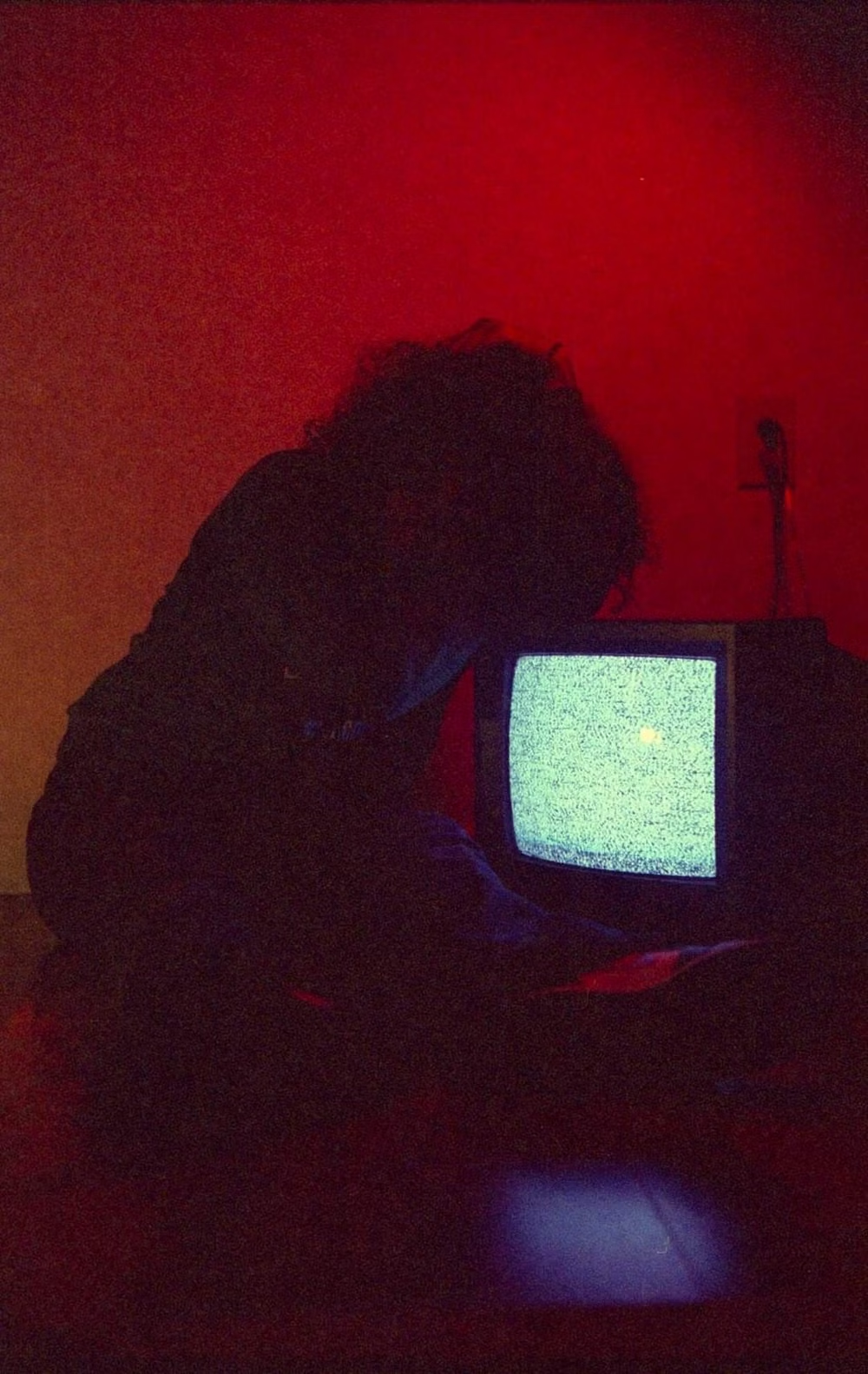
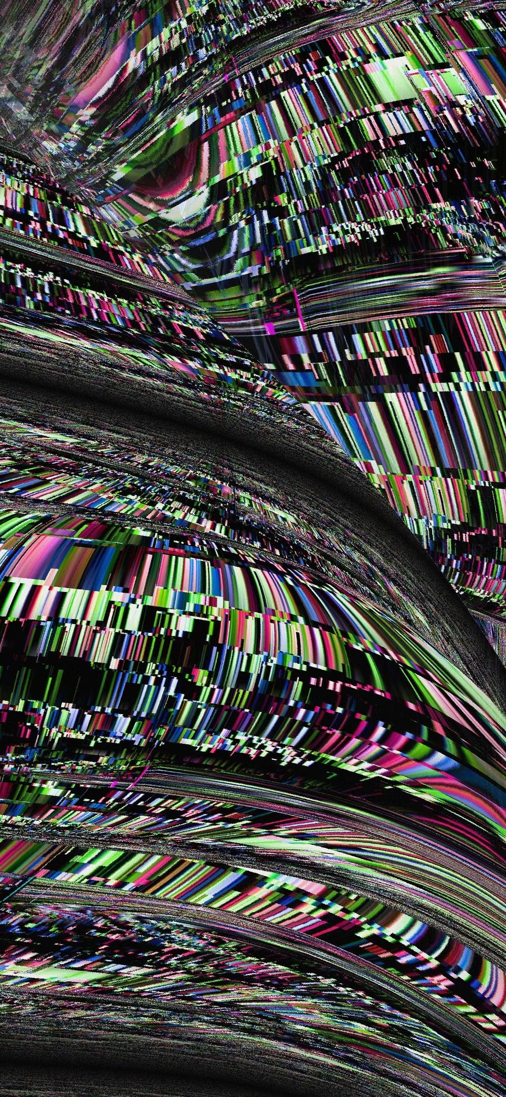
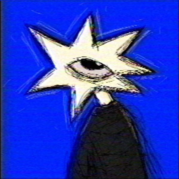
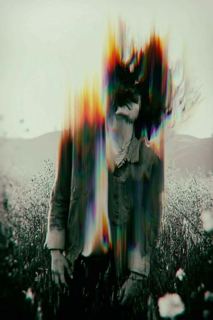
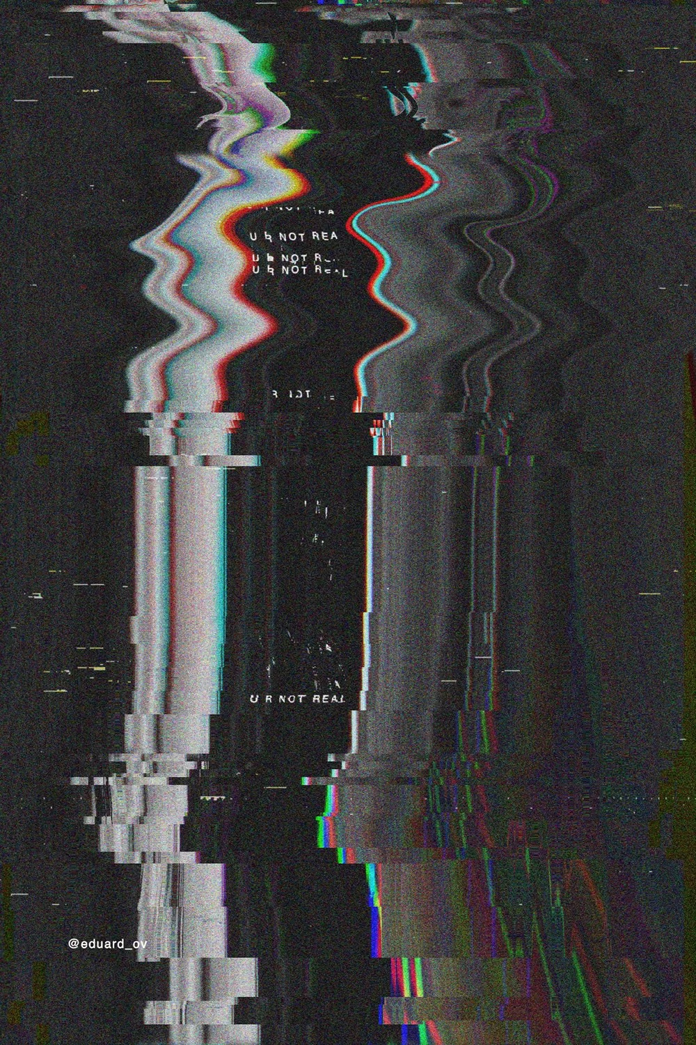
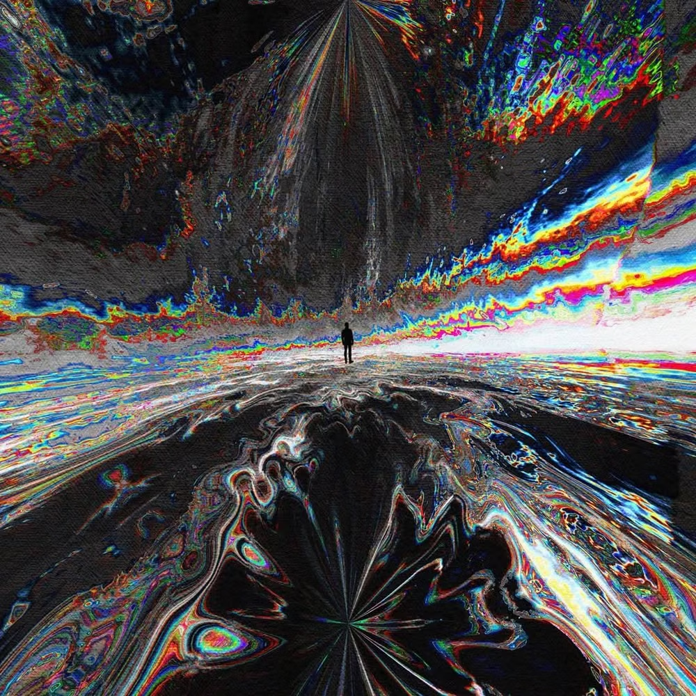
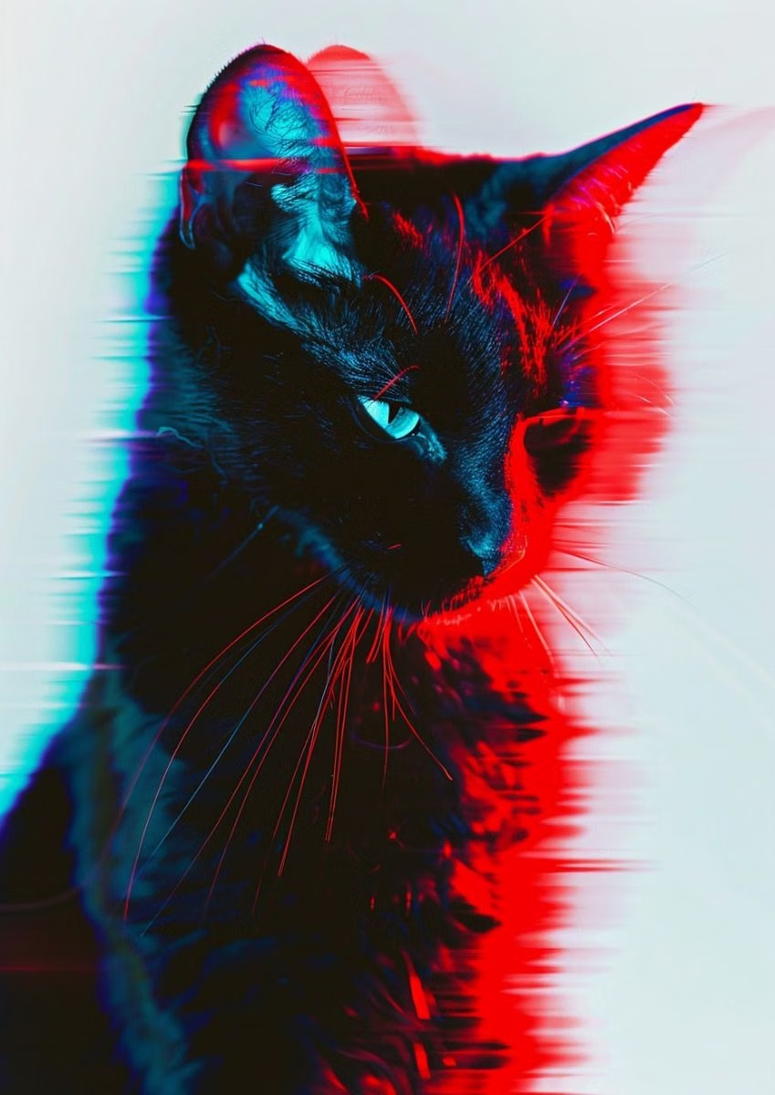
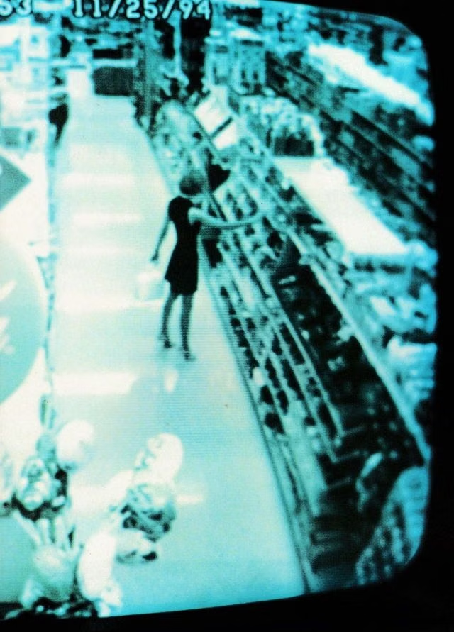
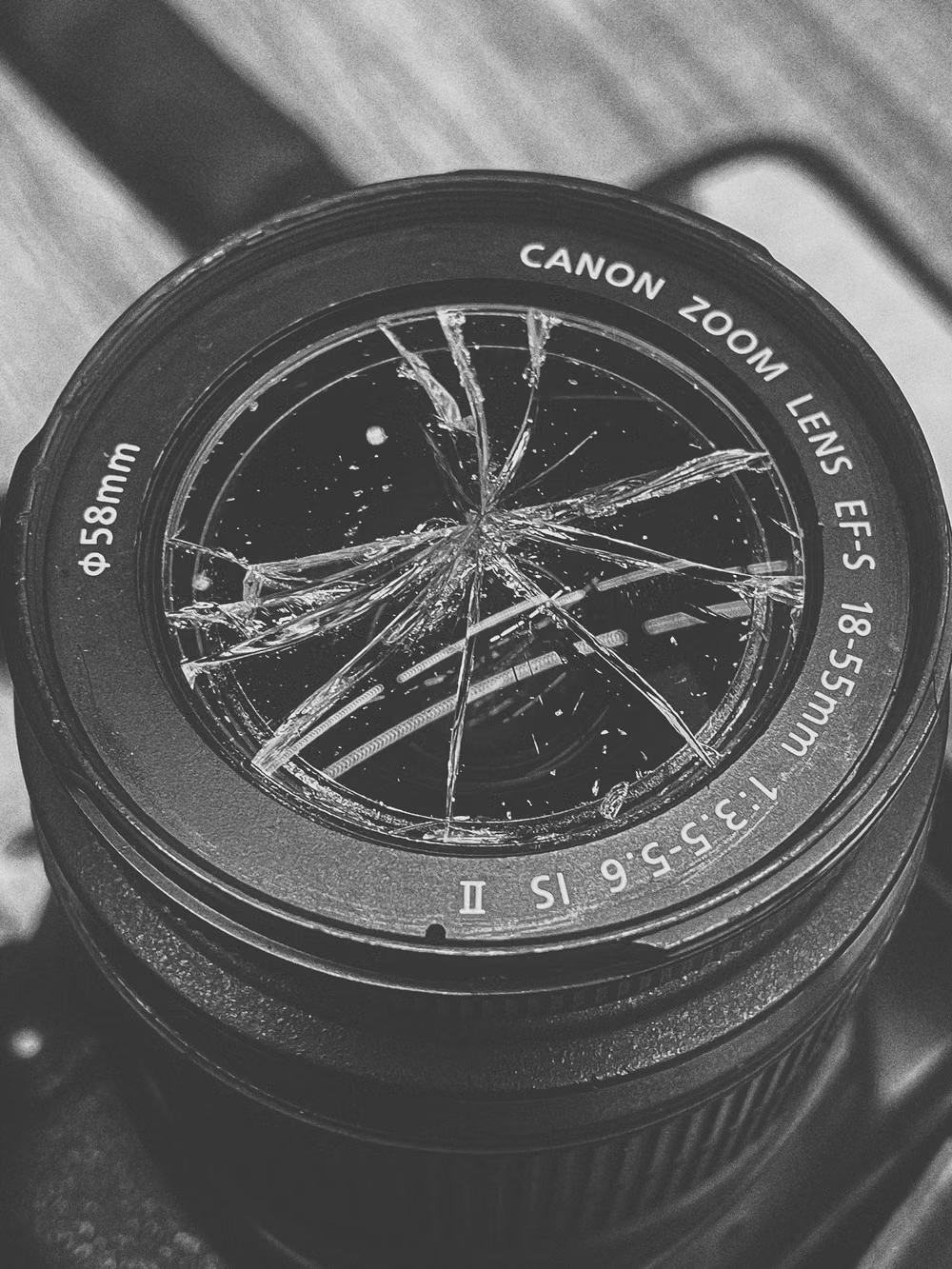
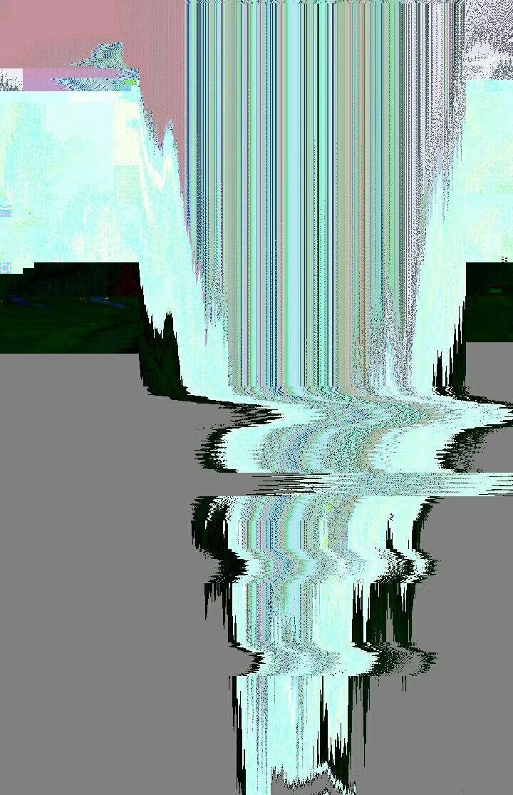
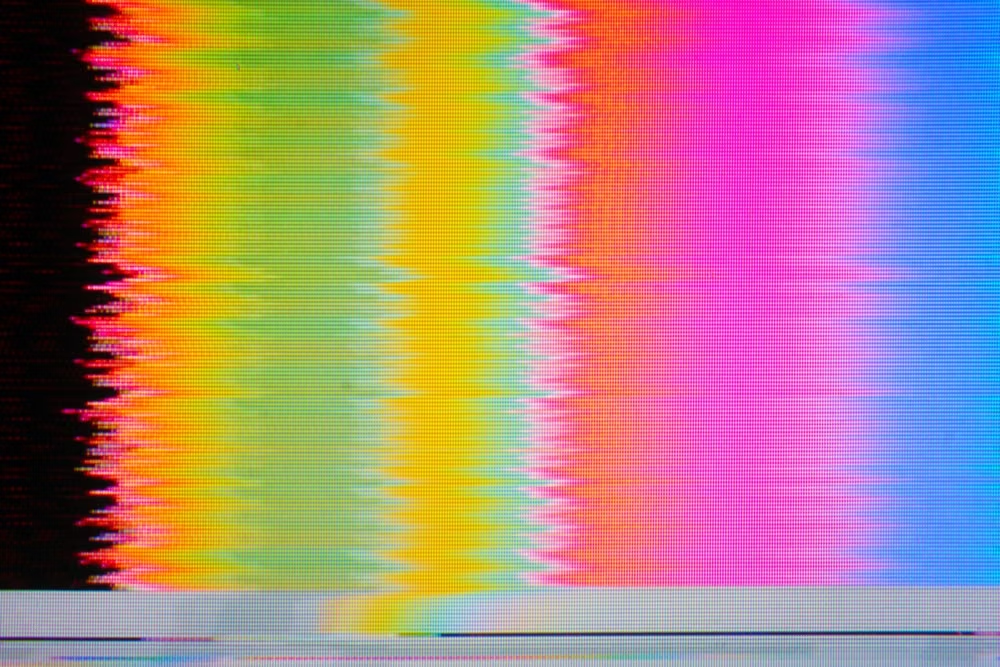
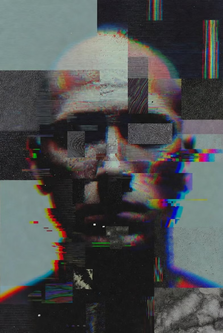
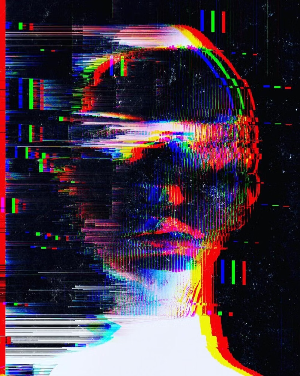
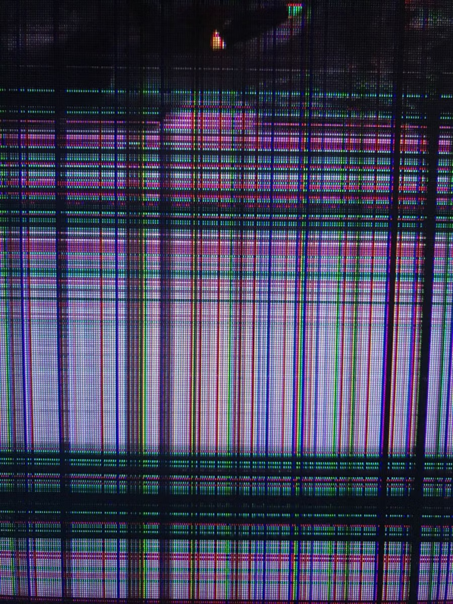
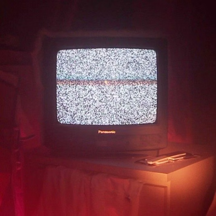
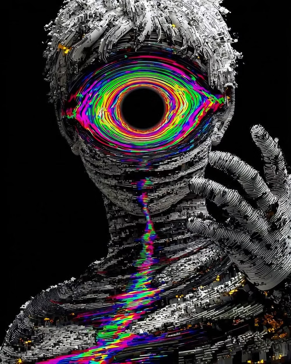
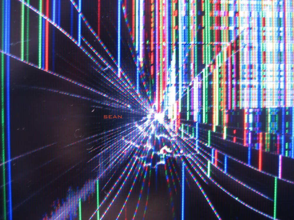
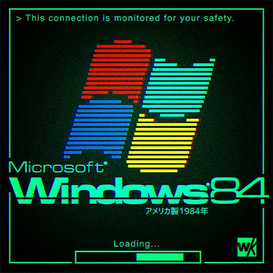
Pixel sorting, signal errors, compression artifacts, scanlines, channel shifts, and broken digital imagery become intentional texture.
Design overview
- Signature elements
- pixel sorting, compression artifacts, signal tearing, channel shifts, scanlines, corrupted imagery. In daisyUI themes, set `--noise: 1;`.
- Best suited to
- Music, games, security, technology campaigns, experimental media, and digital-art portfolios.
- Layout principles
- Start from a stable digital grid, then interrupt selected images, headings, or boundaries with localized signal failure while core navigation remains intact.
History and origins
A fact-checked account of where this visual language came from, with links to the references used.
- Period
- 1960s electronic-art precedents; named digital practice from the late 1990s–2000s
- Origin
- Video art, sound art, software, and network culture
Artists experimented with electronic distortion long before the current label, including Nam June Paik’s manipulated television work in the 1960s. Later glitch artists deliberately exposed compression errors, broken codecs, corrupted files, circuit bends, and software failure; writing and events around artists such as Rosa Menkman helped establish glitch as a critical digital practice rather than a generic RGB effect.
Moodboard and visual references
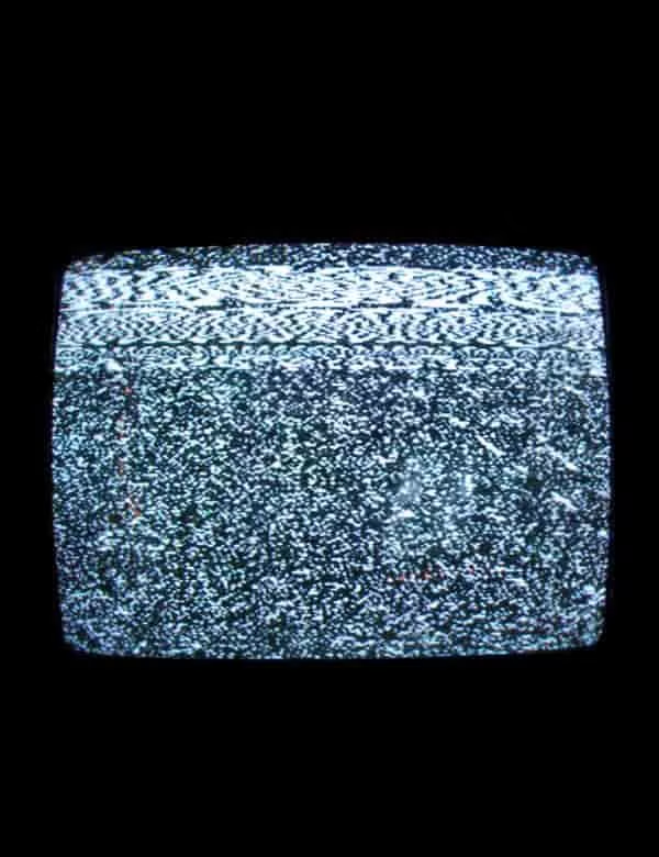
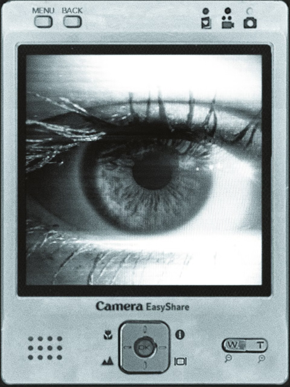
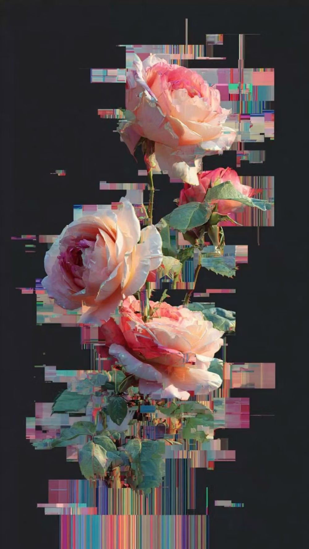
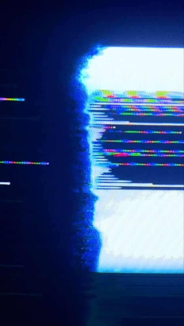
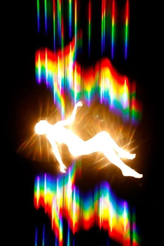
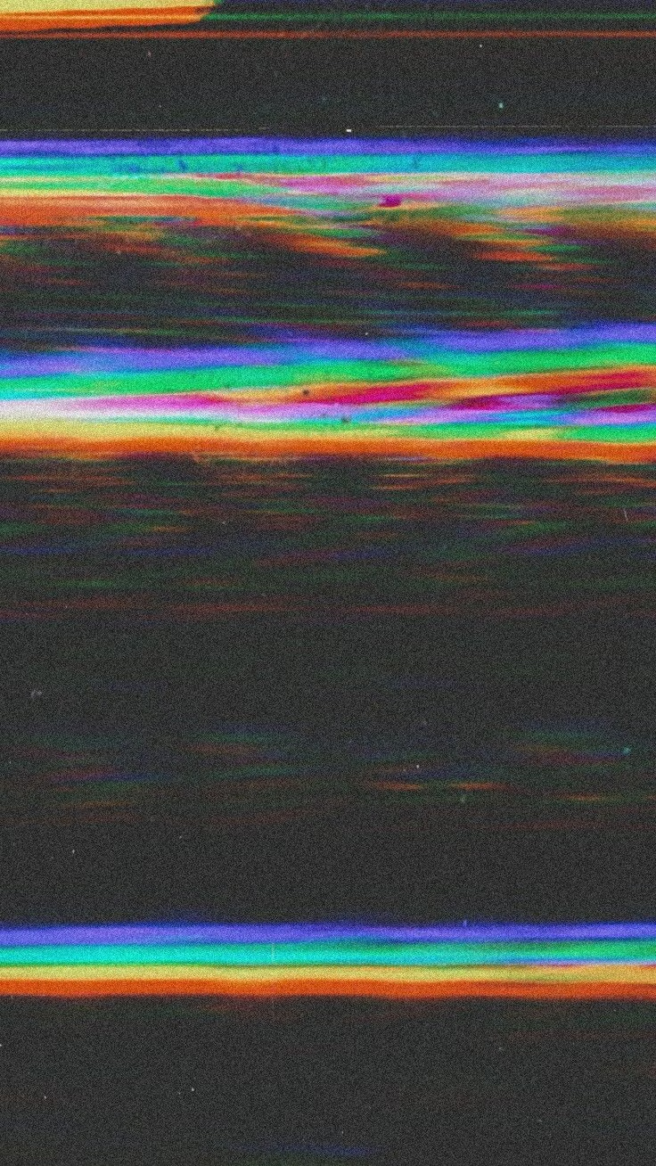
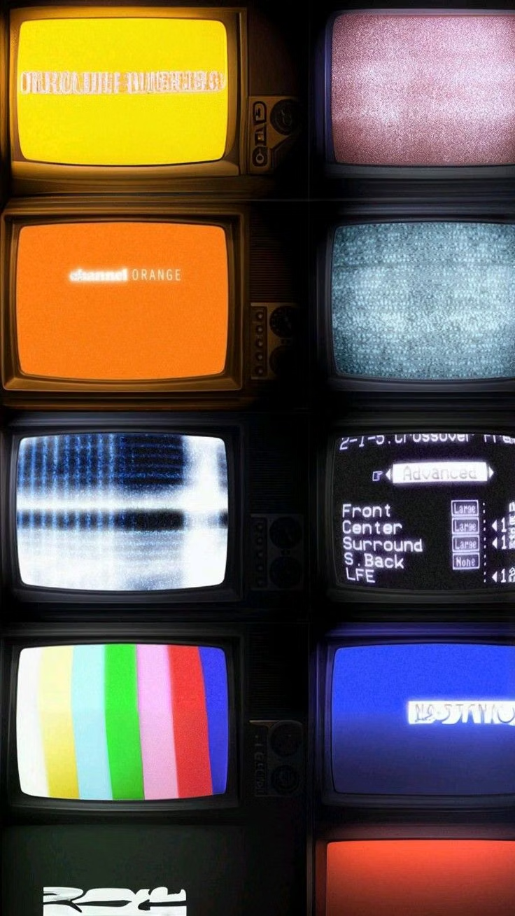
A visual study of the forms, inspirations, materials, colors, type, and cultural references associated with this UI design style.
Design principles and implementation
Use these principles to write a focused AI UI design prompt instead of asking for a vague visual treatment.
Color direction
Use dark or neutral foundations with separated RGB channels, compression blocks, electric error colors, and occasional blown signal white. In a daisyUI theme, use electric cyan for `primary`, channel-shift magenta or red for `secondary`, and assign neutral charcoal, near-black, and signal black to `base-100`, `base-200`, and `base-300`.
Imagery direction
Choose portraits, screens, landscapes, or product media transformed through pixel sorting, datamosh, tearing, scanlines, and codec artifacts.
Content density
Keep density medium, limiting corruption to focal zones so users can distinguish intentional artifact from missing or broken content.
Motion direction
Trigger brief channel shifts, frame tears, buffer skips, and pixel displacement on transitions or system events, then restore a stable readable state.
Shape language
Use sliced rectangles, displaced bands, broken scan fields, pixel blocks, and misaligned channels derived from digital signal structure. In daisyUI themes, set the `--radius-*` variables to `0` or `0.25rem`.
Typography rules
Use a neutral sans or monospace for functional text, applying distortion only to duplicated decorative layers or large headings with an intact readable copy.
Suggested Typfaces
Rubik Glitch
Fresh daisies glow in warm sunlight
Fresh daisies glow in warm sunlight
1 2 3 4 5 6 7 8 9 0
Rubik Glitch Pop
Fresh daisies glow in warm sunlight
Fresh daisies glow in warm sunlight
1 2 3 4 5 6 7 8 9 0
Major Mono Display
Fresh daisies glow in warm sunlight
Fresh daisies glow in warm sunlight
1 2 3 4 5 6 7 8 9 0
VT323
Fresh daisies glow in warm sunlight
Fresh daisies glow in warm sunlight
1 2 3 4 5 6 7 8 9 0
Share Tech Mono
Fresh daisies glow in warm sunlight
Fresh daisies glow in warm sunlight
1 2 3 4 5 6 7 8 9 0
Build a Glitch Art interface with daisyUI
The live example translates this direction into daisyUI components and semantic theme tokens.
To generate a full page in the same visual language, give the style name and the design rules above to Blueprint MCP.
Related UI design styles
Compare nearby visual languages that share typography, shapes, use cases, or signature elements.
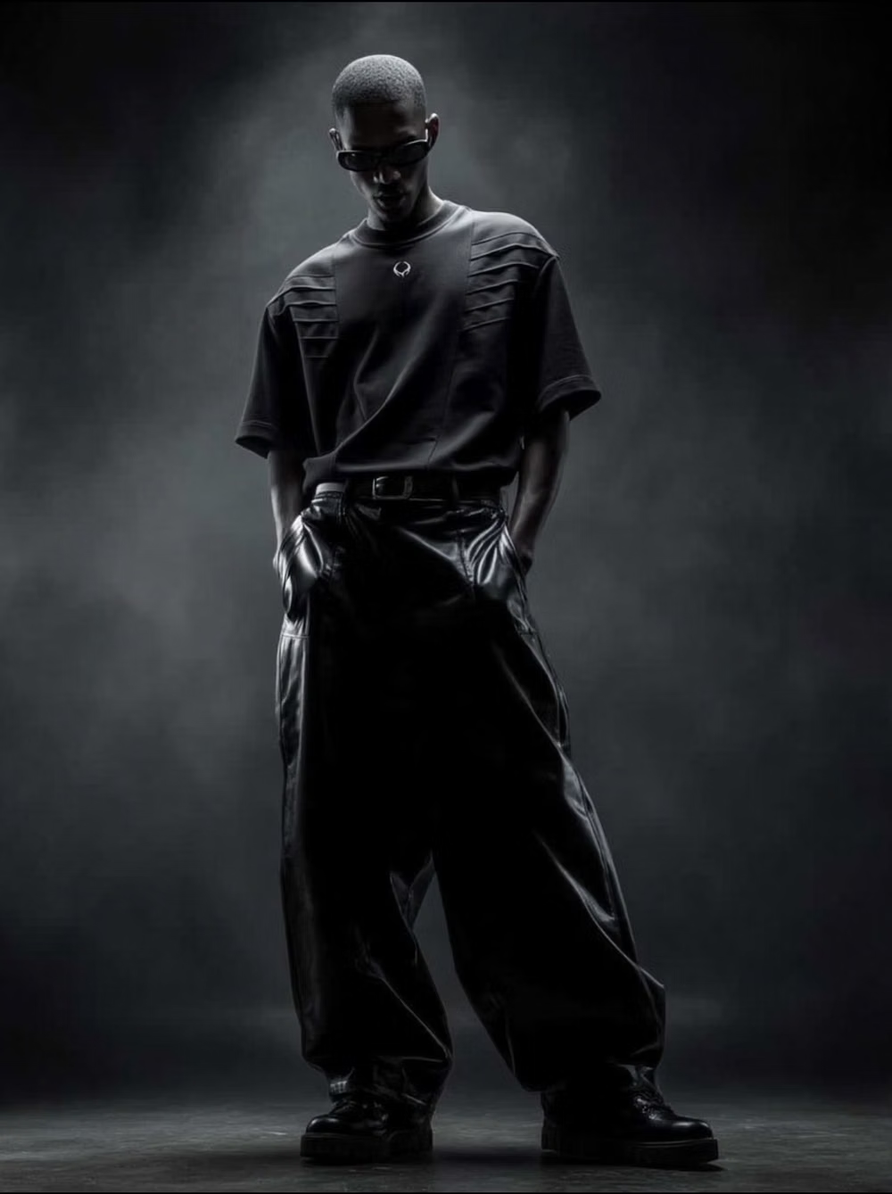
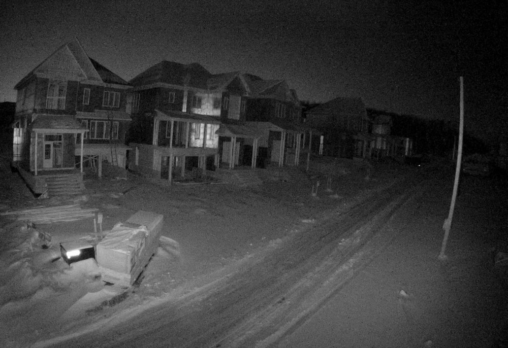
Cyberpunk UI design style
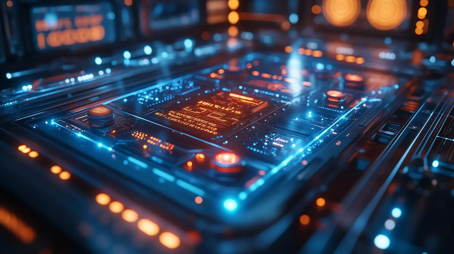
Dense dark interfaces use neon accents, glitches, terminal typography, surveillance motifs, and futuristic HUD elements.
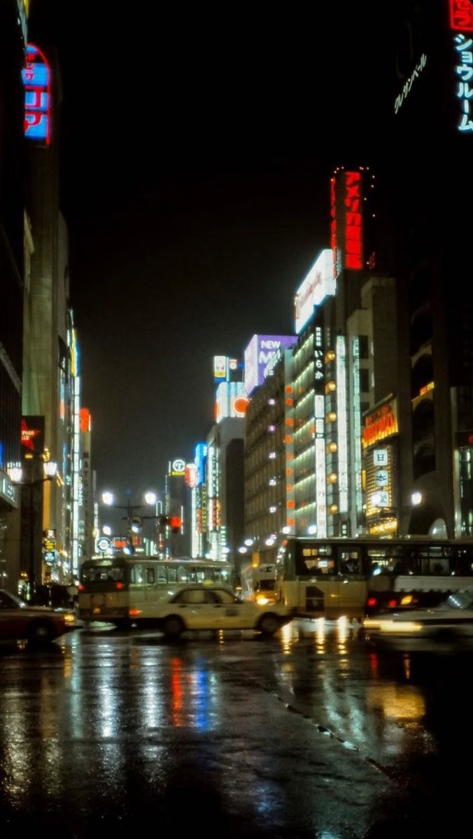
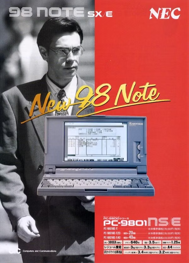
PC-98 UI design style
NEC PC-9800-era Japanese games pair relatively high-resolution 640×400 scenes with tightly limited color, meticulous dithering, detailed anime portraits, and compact visual-novel or adventure-game interfaces.
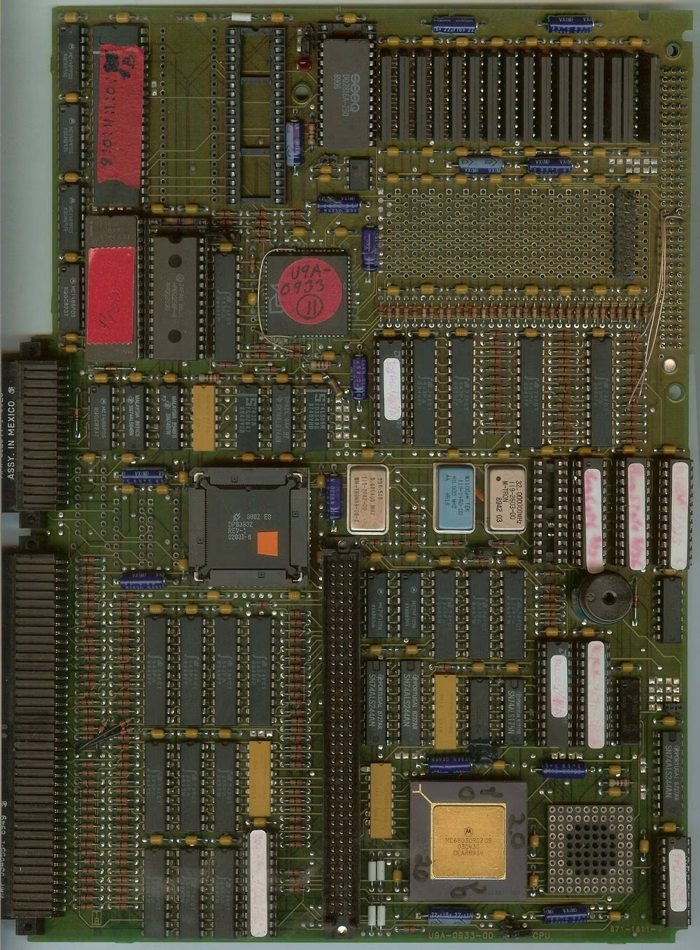
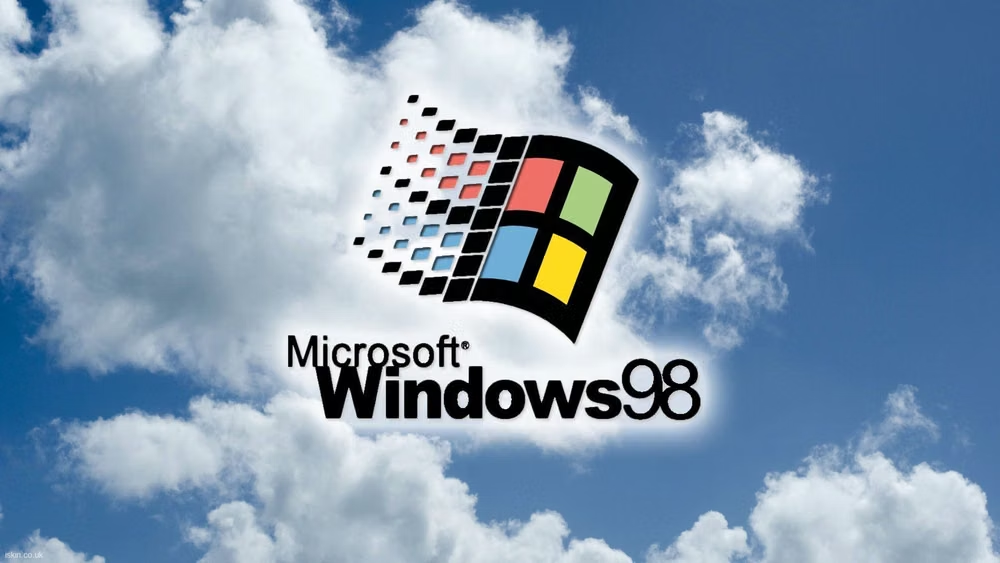
Retro Computing UI design style
CRT glow, bitmap fonts, window chrome, limited palettes, scanlines, floppy-disk motifs, and vintage operating-system conventions.