Seapunk UI design style
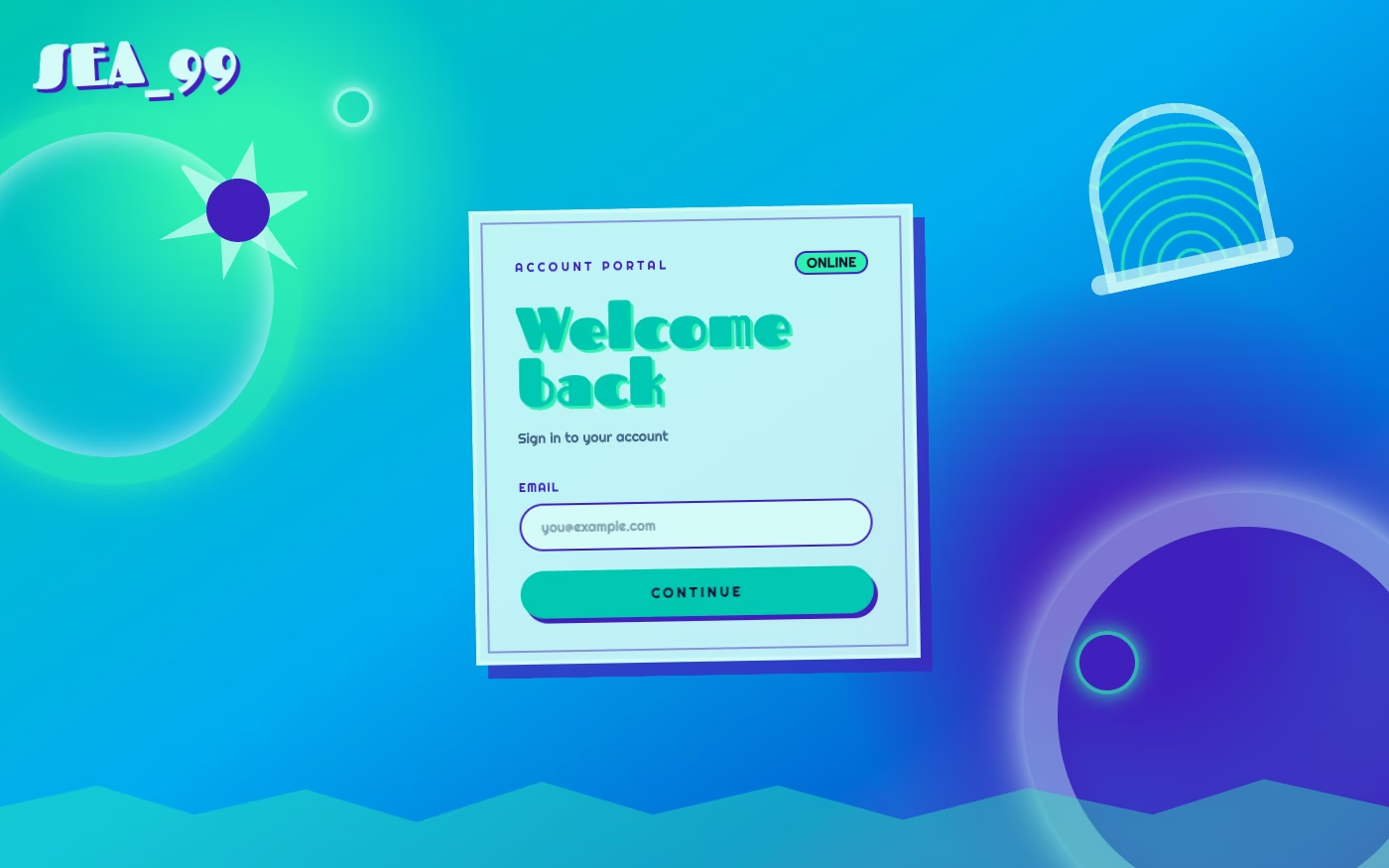
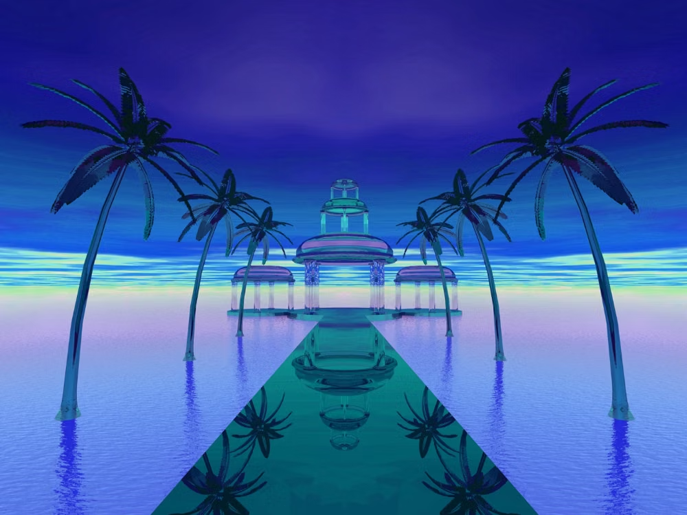
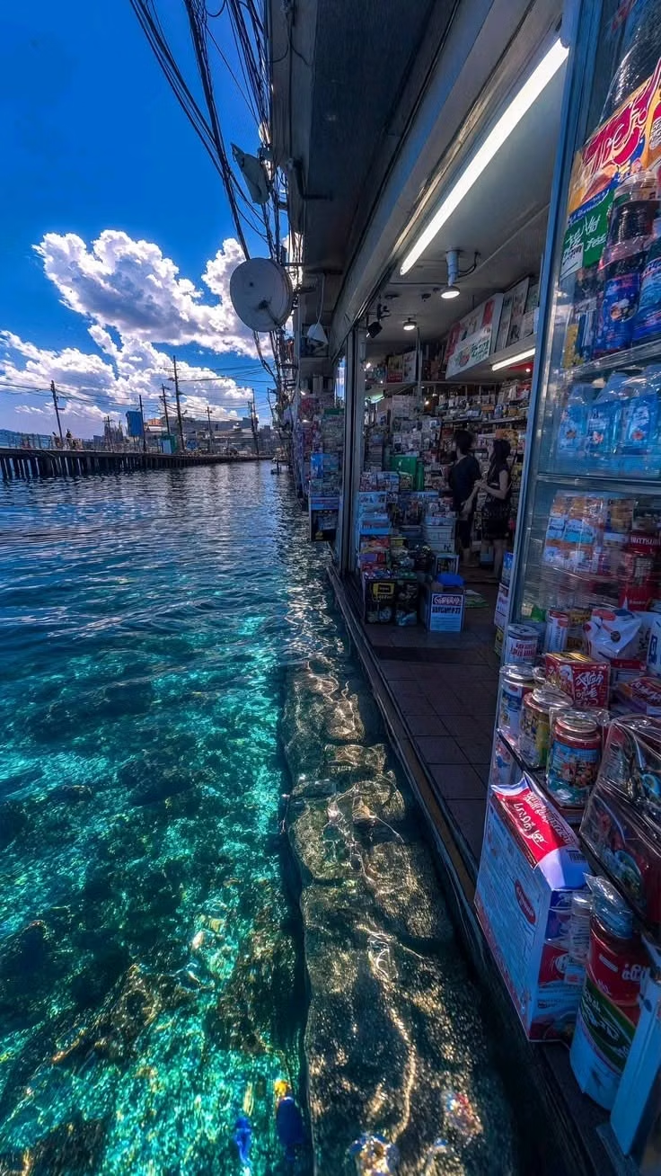
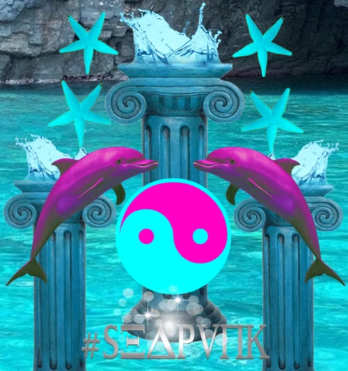
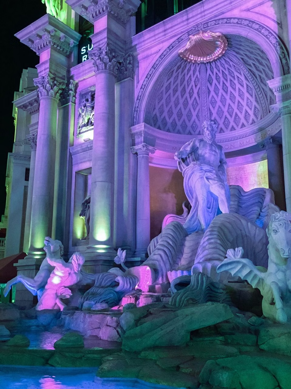
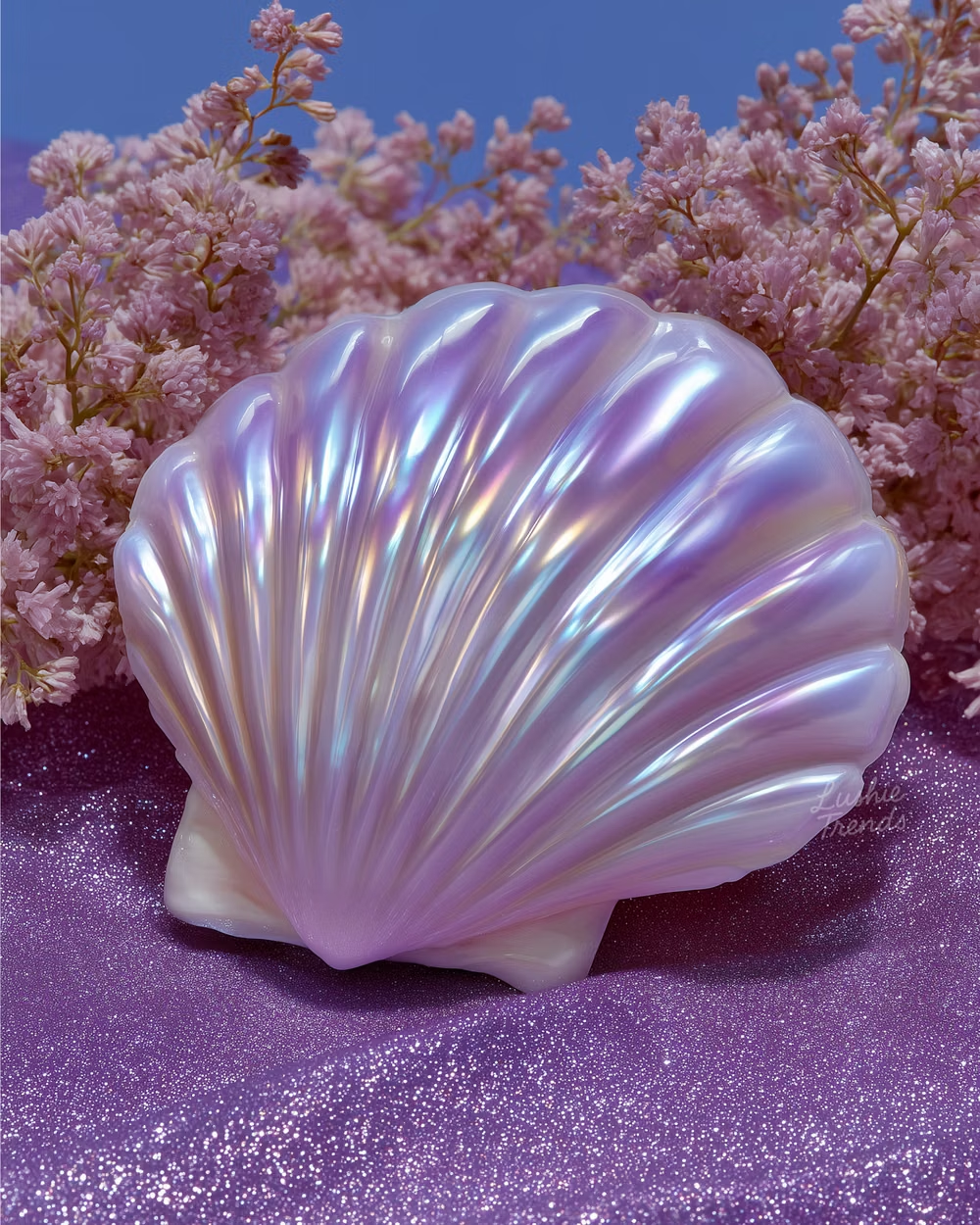
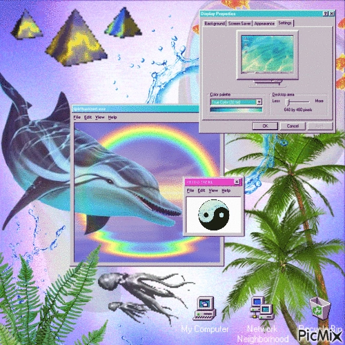
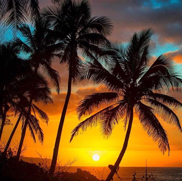
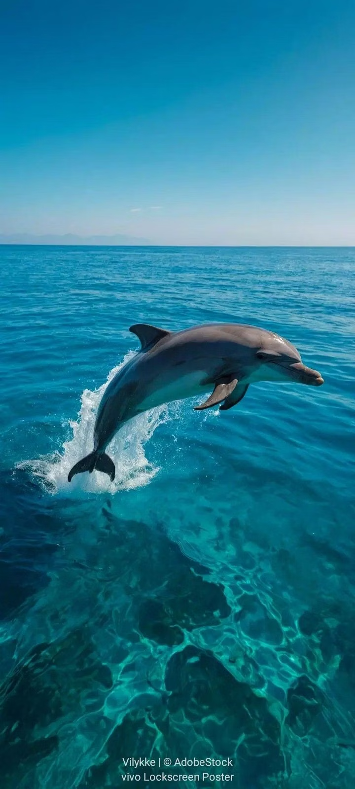
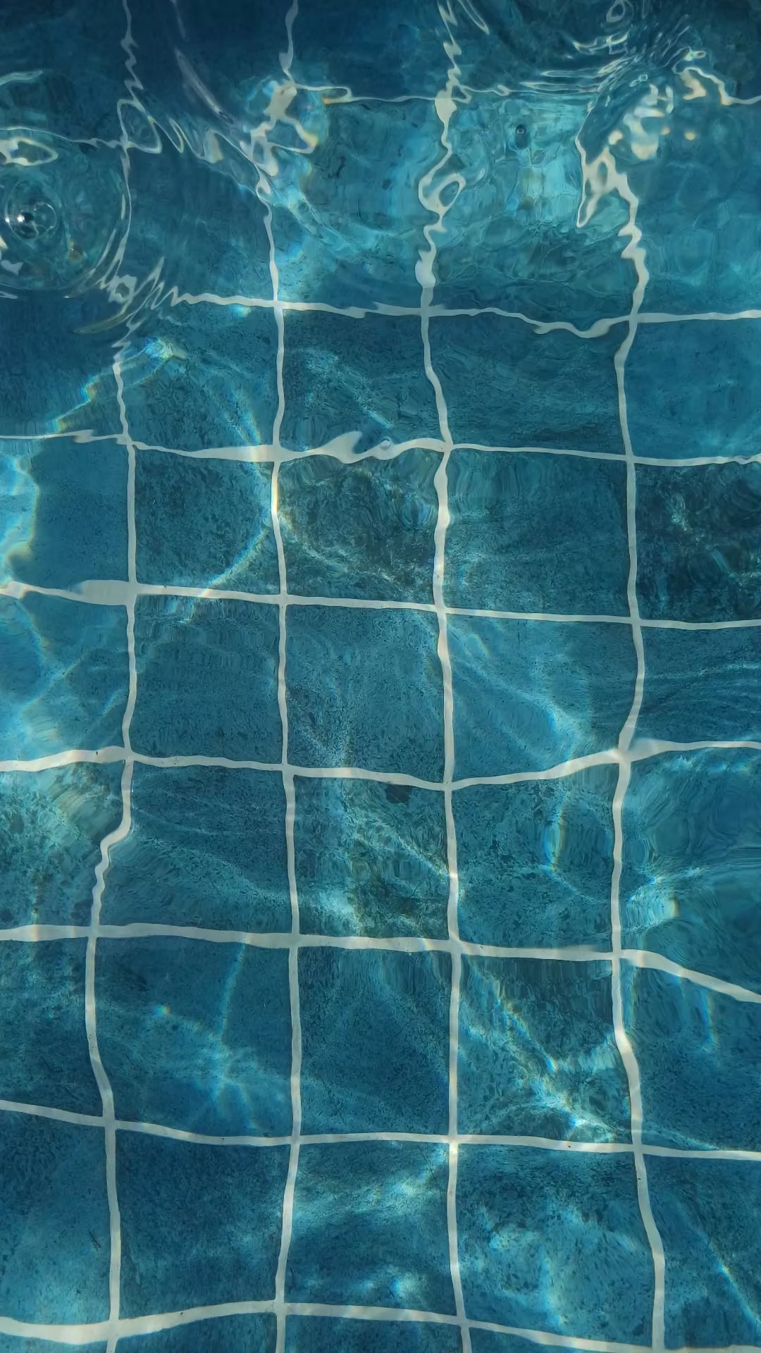
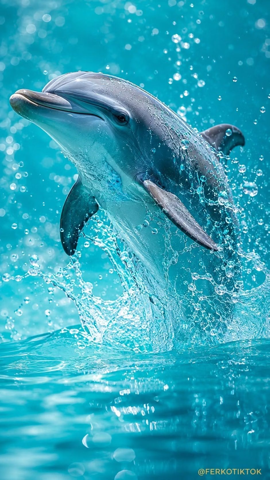
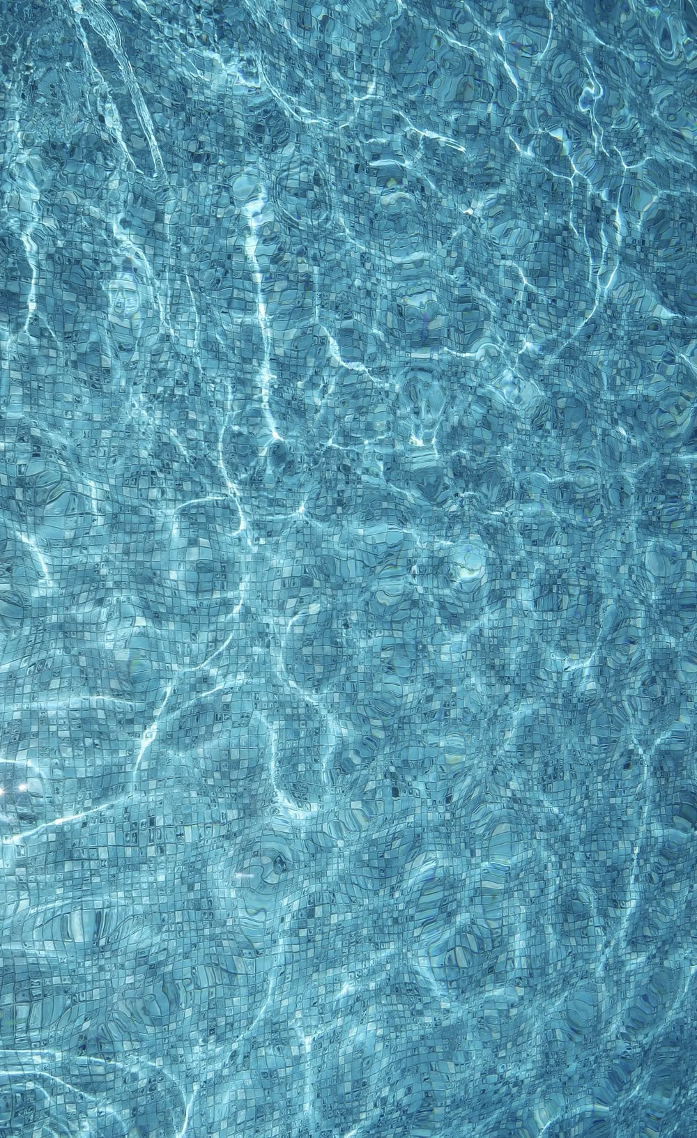
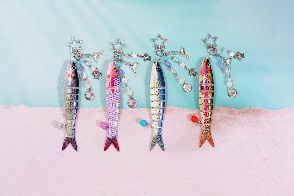
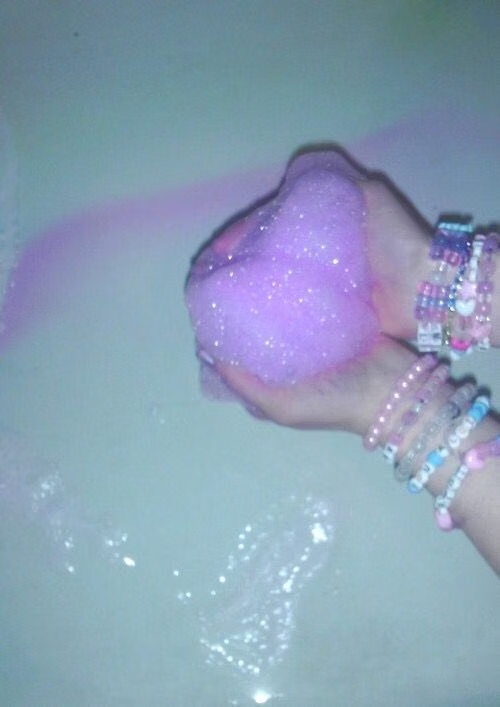
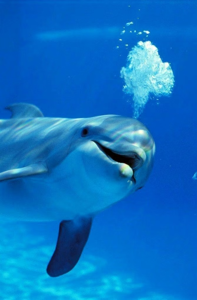
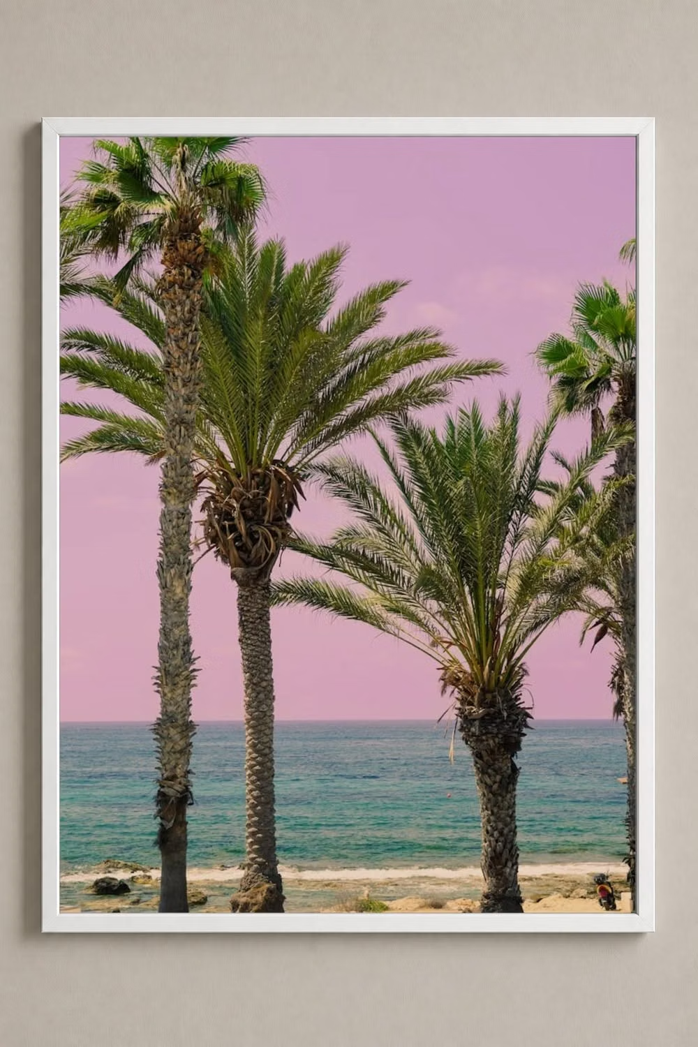
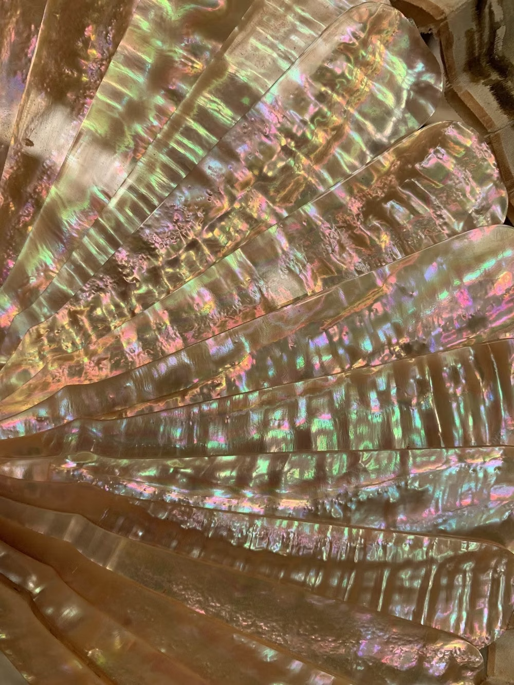
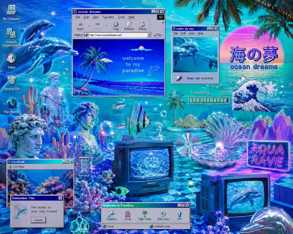
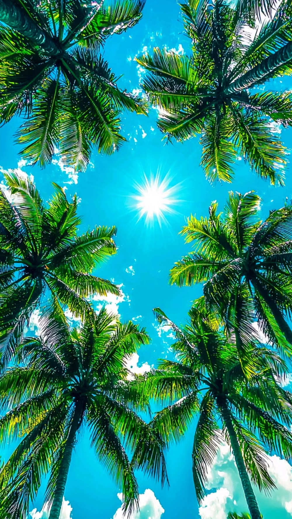
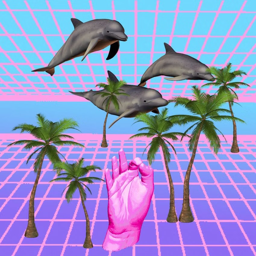
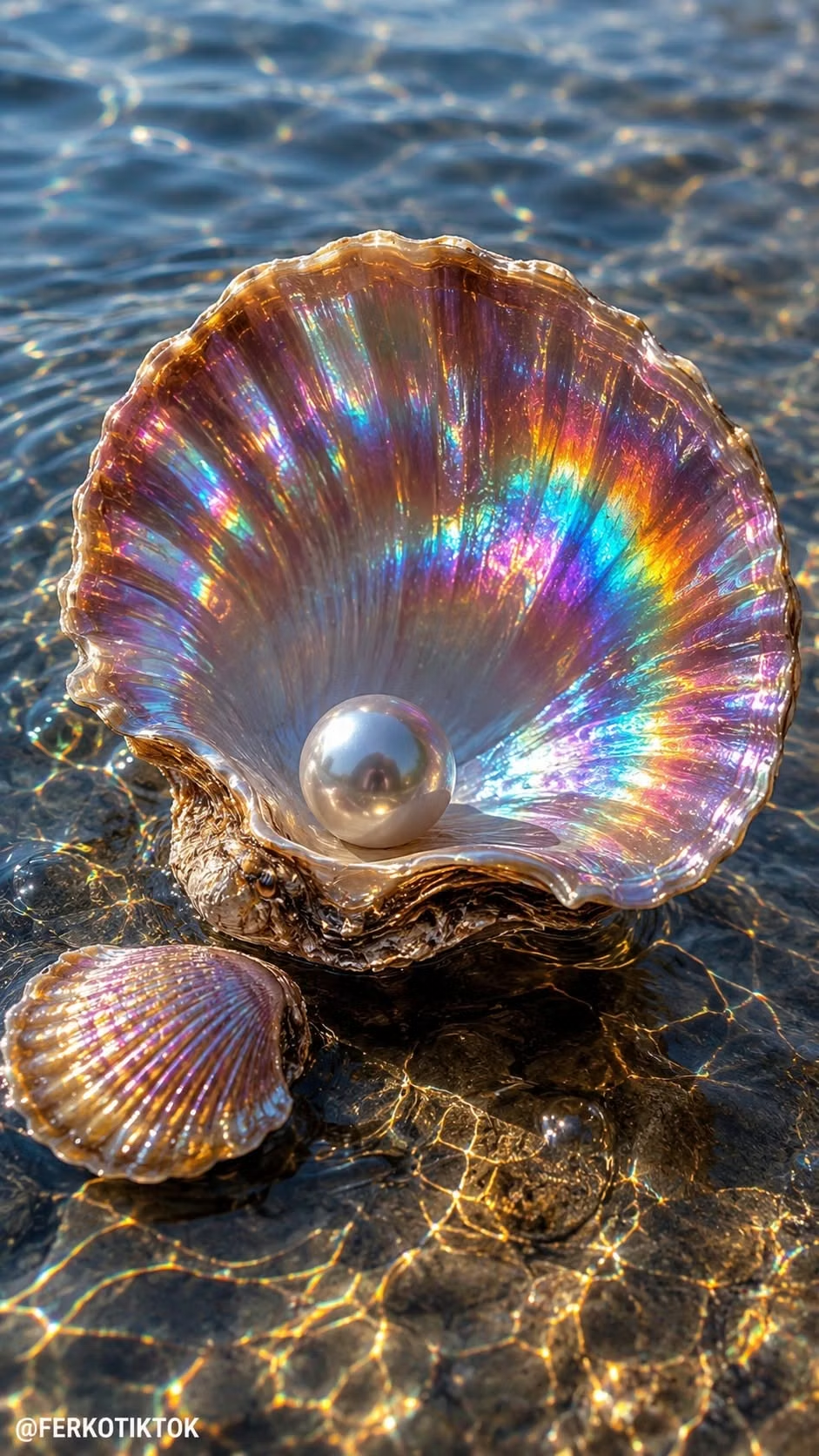
Turquoise water, dolphins, shells, early CGI, chrome, tropical graphics, and playful aquatic internet surrealism.
Design overview
- Signature elements
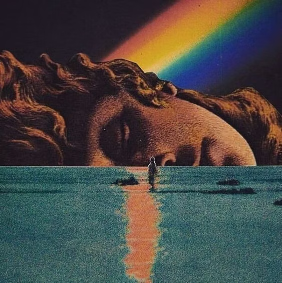
- turquoise water, dolphins and shells, early CGI, chrome objects, tropical gradients, aquatic surrealism. In daisyUI themes, set `--depth: 1;`.
- Best suited to
- Music, fashion, youth culture, events, experimental commerce, and nostalgic campaigns.
- Layout principles
- Float content, chrome objects, and aquatic motifs through layered water-like space, using wave bands and loose collage rather than terrestrial grids.
History and origins
A fact-checked account of where this visual language came from, with links to the references used.
- Period
- 2011–mid-2010s
- Origin
- Tumblr, Twitter, and online electronic-music networks
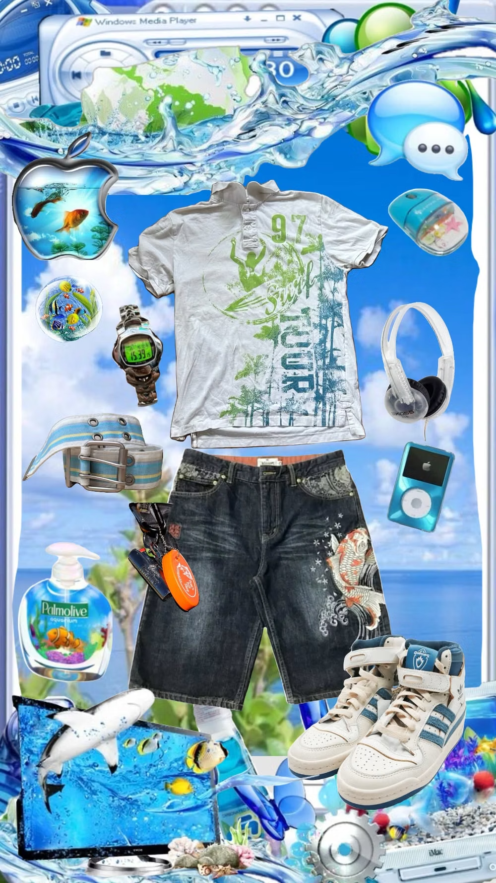
Seapunk began as both an internet joke and a small music-and-image scene. DJ Lil Internet coined the word in a 2011 tweet, after which turquoise oceans, dolphins, shells, 3D grids, Windows-era graphics, and aquatic fashion circulated rapidly through Tumblr and music communities before elements were absorbed into mainstream pop imagery.
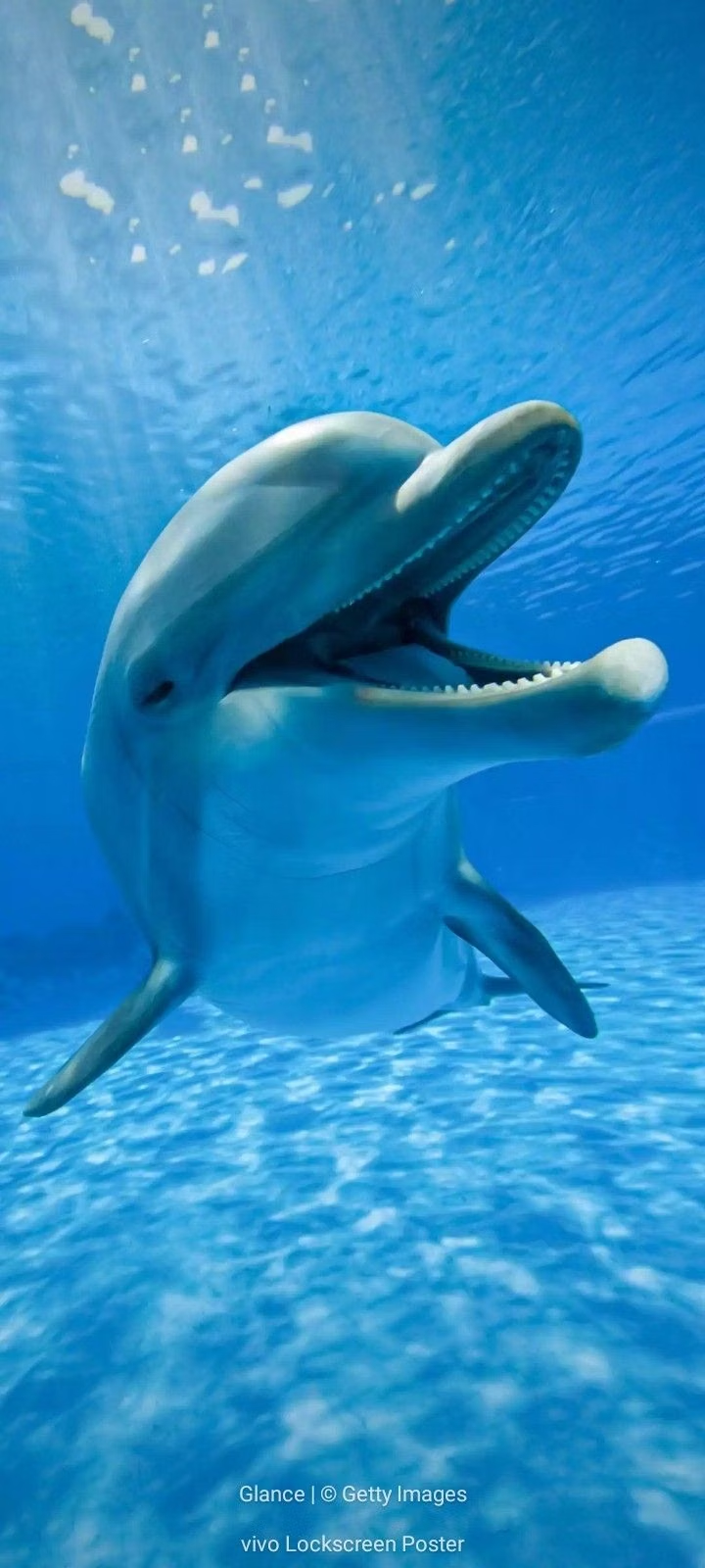
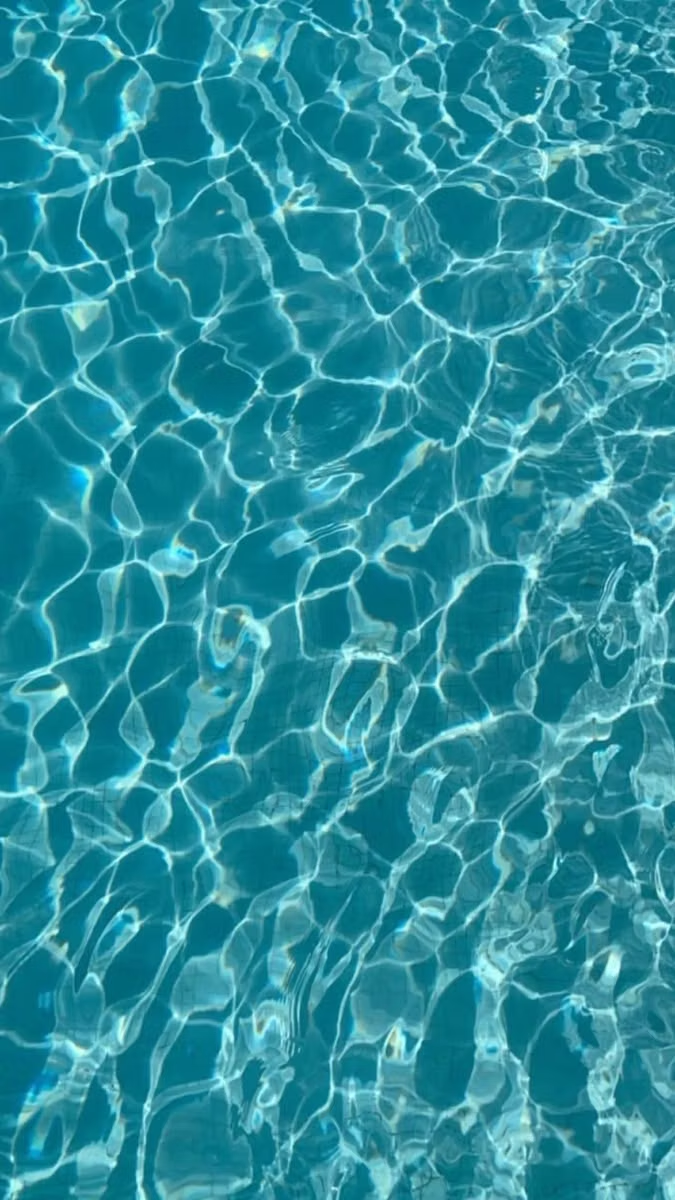
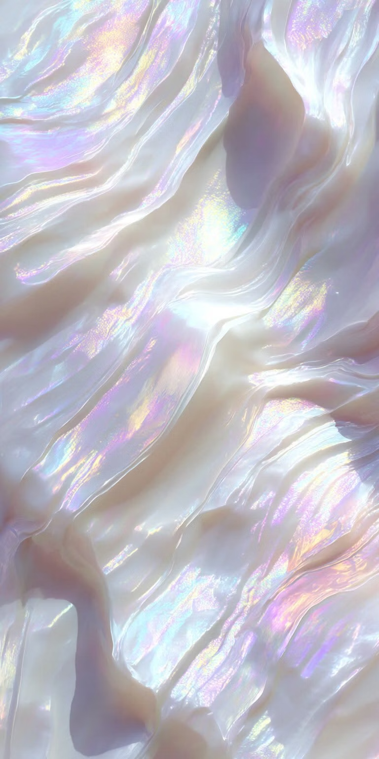
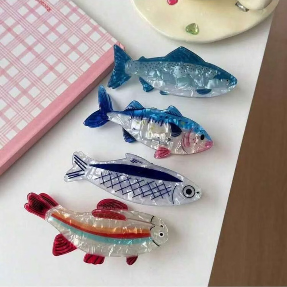
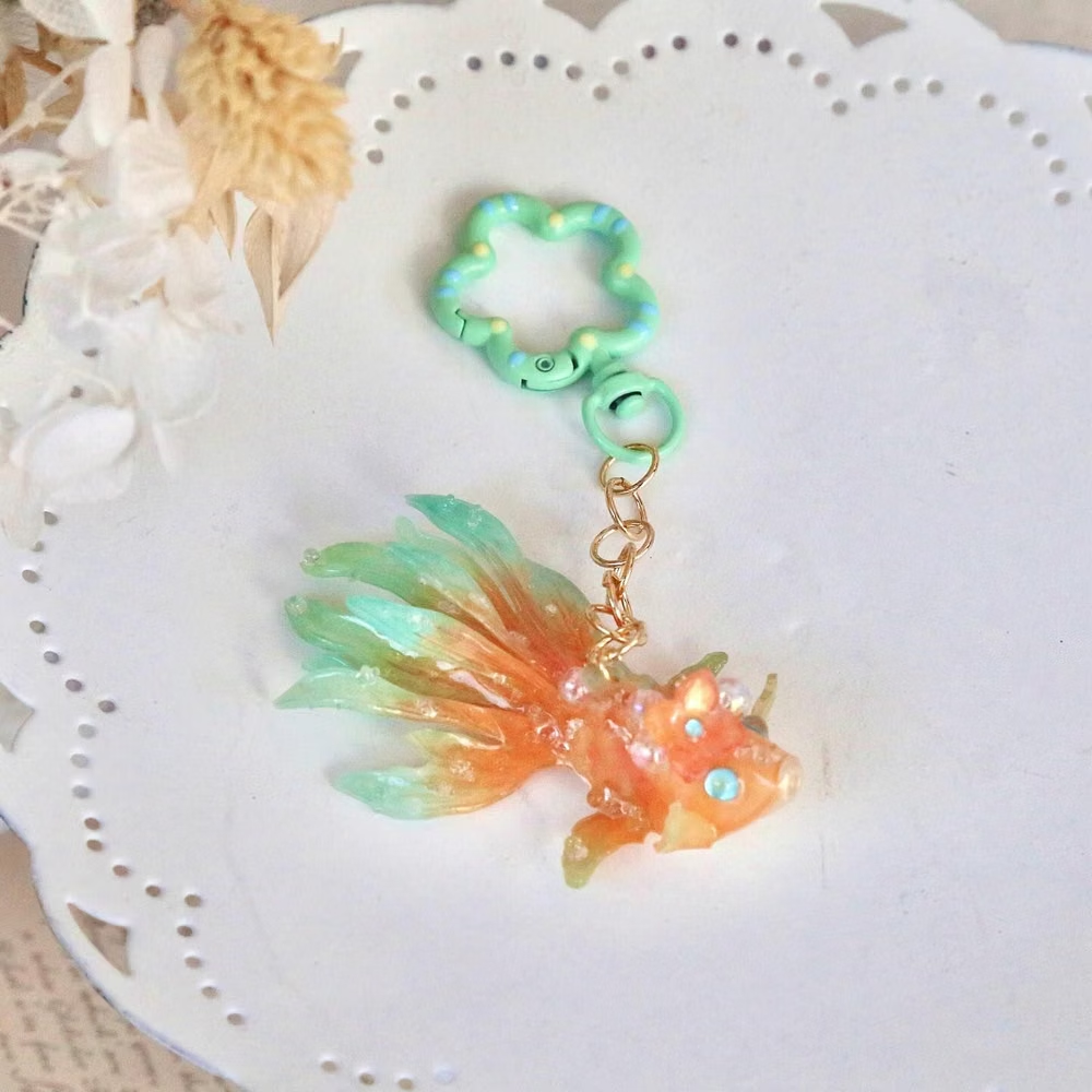
Moodboard and visual references
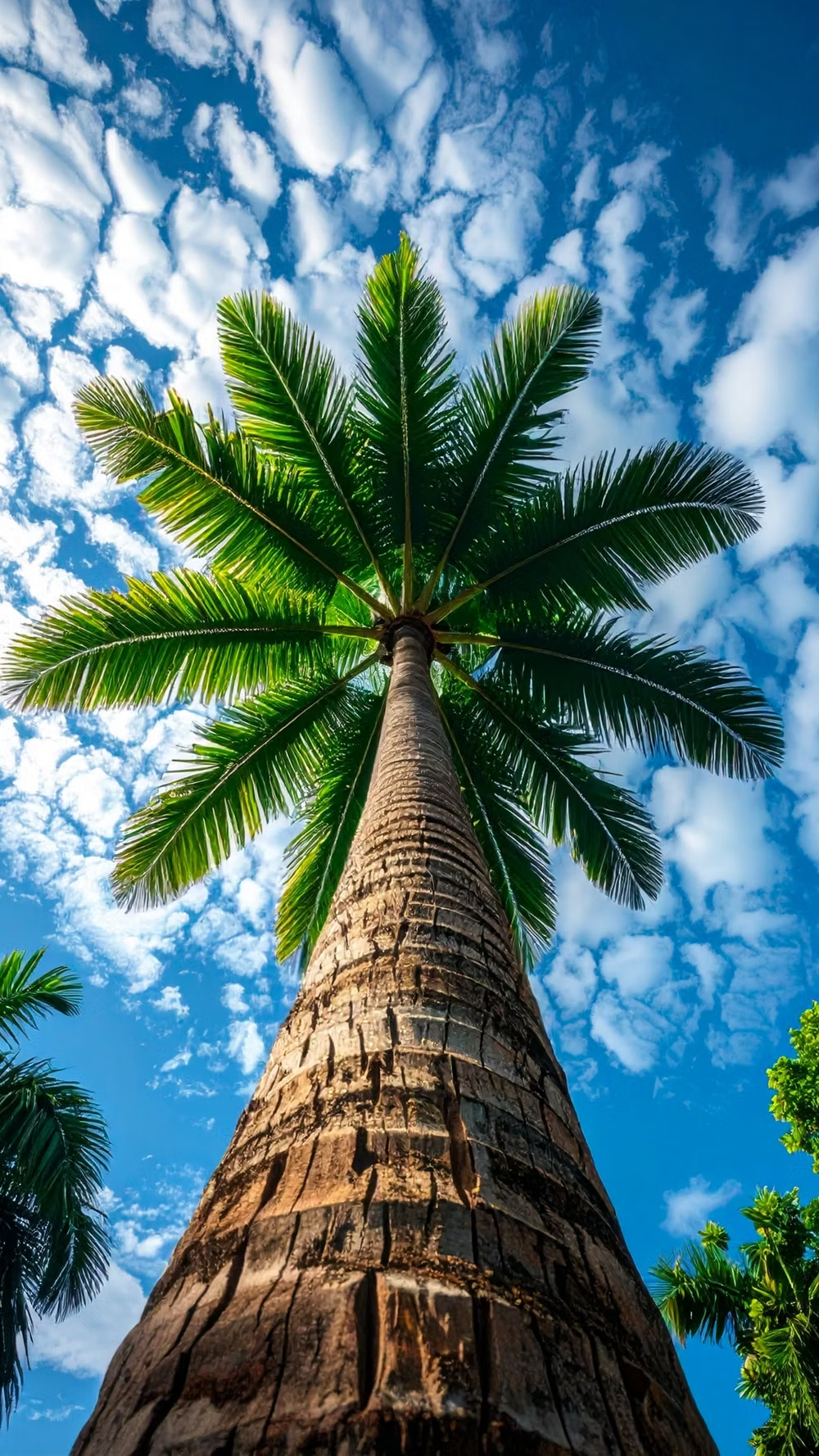
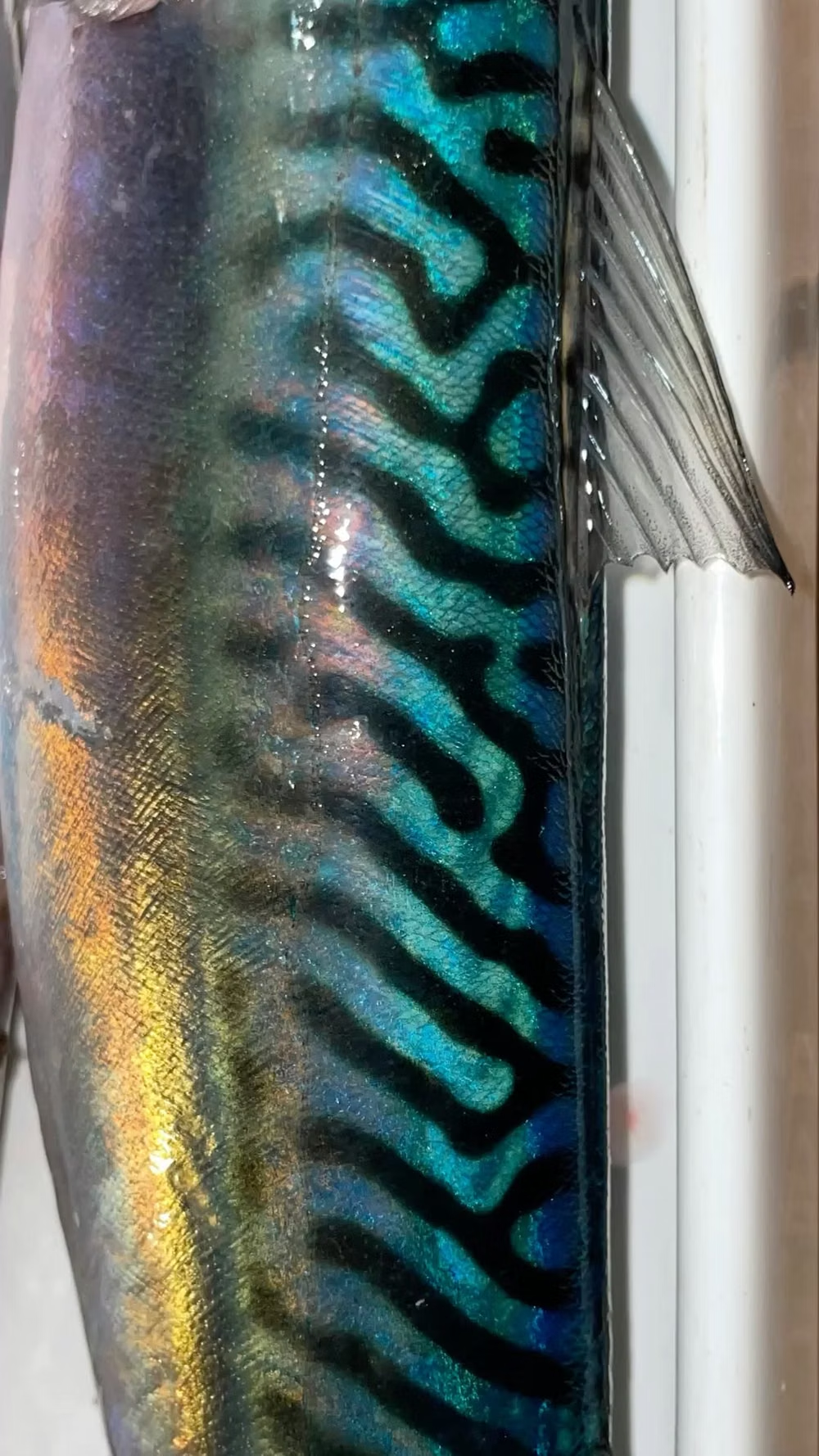
A visual study of the forms, inspirations, materials, colors, type, and cultural references associated with this UI design style.
Design principles and implementation
Use these principles to write a focused AI UI design prompt instead of asking for a vague visual treatment.
Color direction
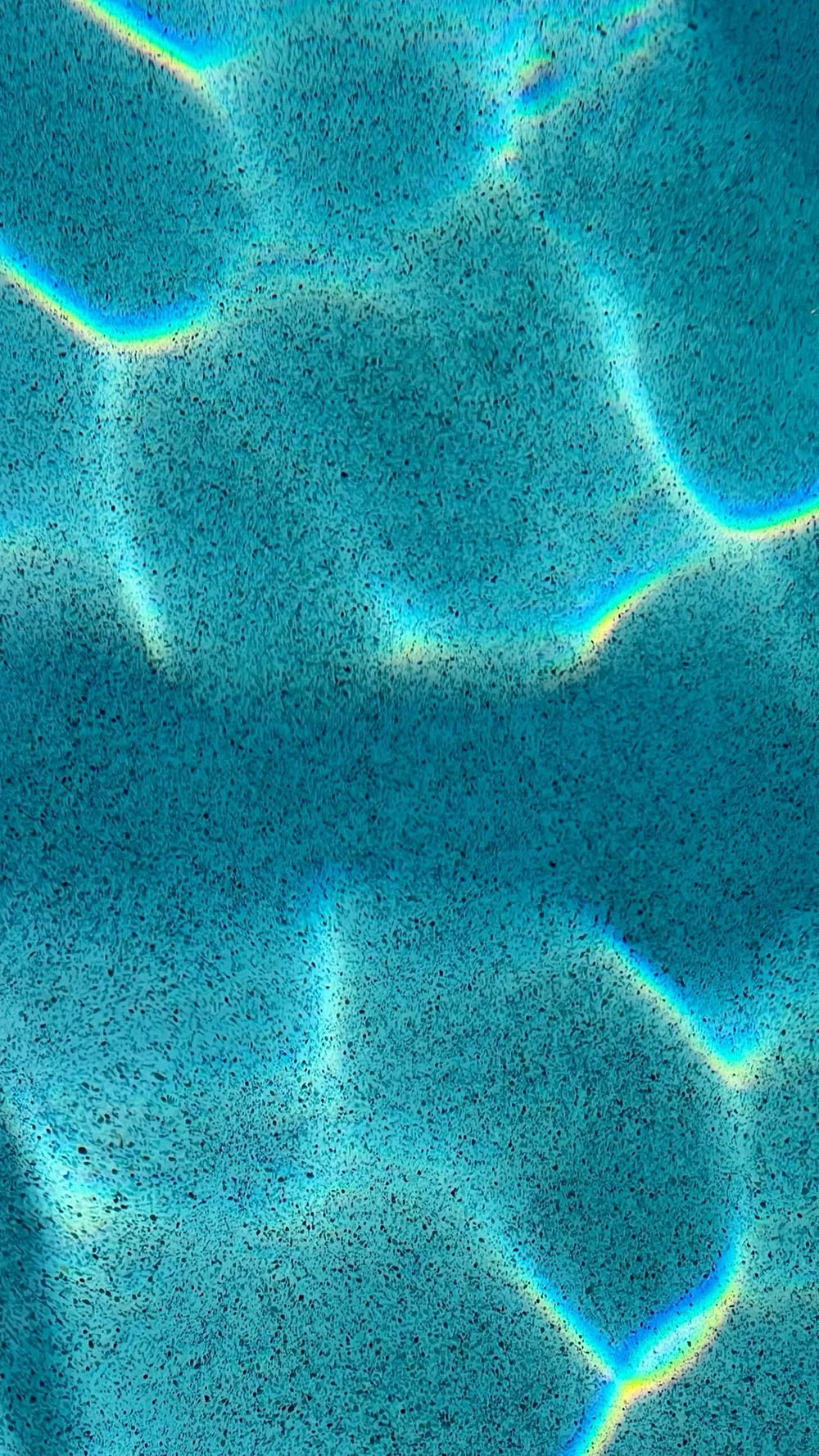
Use turquoise, aqua, seafoam, cobalt, purple, and chrome with tropical gradients and bright watery highlights. In a daisyUI theme, use turquoise or aqua for `primary`, cobalt or purple for `secondary`, and set `base-100`, `base-200`, and `base-300` to pale seafoam, light aqua, and watery blue-gray.
Imagery direction
Choose dolphins, shells, waves, tropical plants, early CGI creatures, reflective objects, and surreal ocean-photo composites.
Content density
Use medium to high visual density with concise copy, placing essential commerce or event information on opaque aquatic panels.
Motion direction
Bob objects, ripple surfaces, rotate early-CGI forms, trail bubbles, and shift underwater light with playful internet-era timing.
Shape language
Favor bubbles, waves, shells, chrome rings, splash contours, fins, and soft early-three-dimensional primitives. In daisyUI themes, set the `--radius-*` variables between `0.75rem` and `1.5rem`.
Typography rules
Use playful rounded or digital display type with a simple sans-serif body, keeping small text dark and crisp against bright water imagery.
Suggested Typfaces
Fascinate
Fresh daisies glow in warm sunlight
Fresh daisies glow in warm sunlight
1 2 3 4 5 6 7 8 9 0
Monoton
Fresh daisies glow in warm sunlight
Fresh daisies glow in warm sunlight
1 2 3 4 5 6 7 8 9 0
Righteous
Fresh daisies glow in warm sunlight
Fresh daisies glow in warm sunlight
1 2 3 4 5 6 7 8 9 0
Bungee Shade
Fresh daisies glow in warm sunlight
Fresh daisies glow in warm sunlight
1 2 3 4 5 6 7 8 9 0
Pixelify Sans
Fresh daisies glow in warm sunlight
Fresh daisies glow in warm sunlight
1 2 3 4 5 6 7 8 9 0
Build a Seapunk interface with daisyUI
The live example translates this direction into daisyUI components and semantic theme tokens.
To generate a full page in the same visual language, give the style name and the design rules above to Blueprint MCP.
Related UI design styles
Compare nearby visual languages that share typography, shapes, use cases, or signature elements.
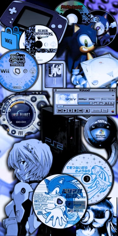
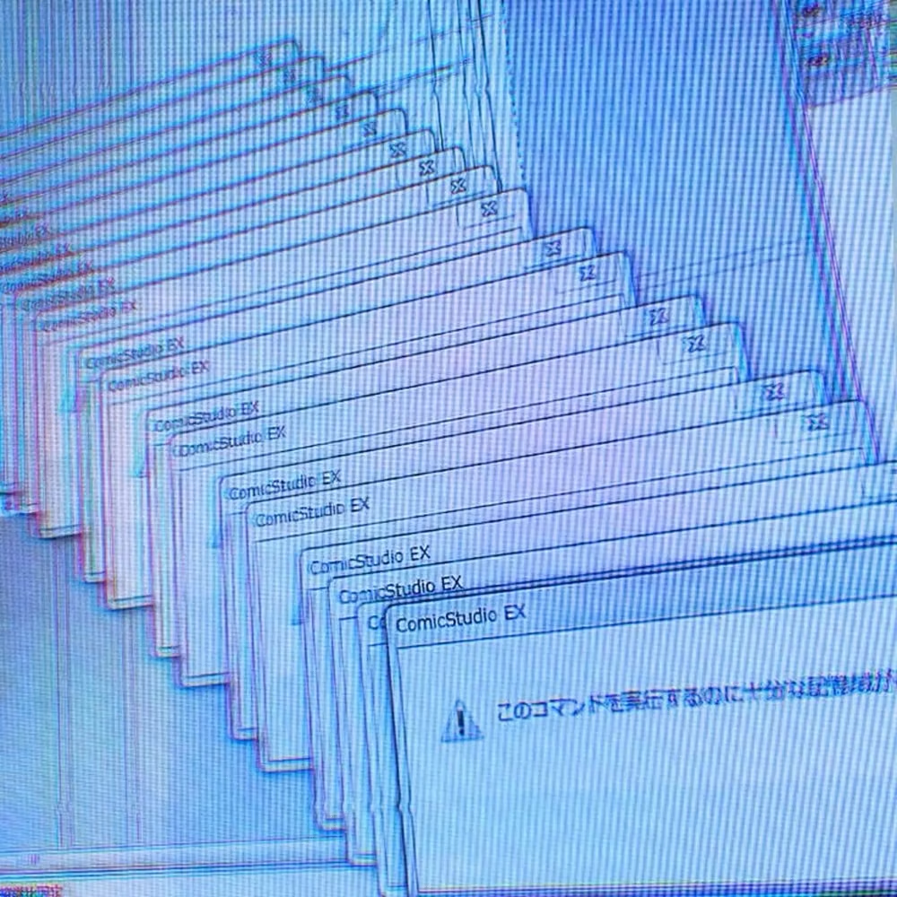
Cybercore UI design style
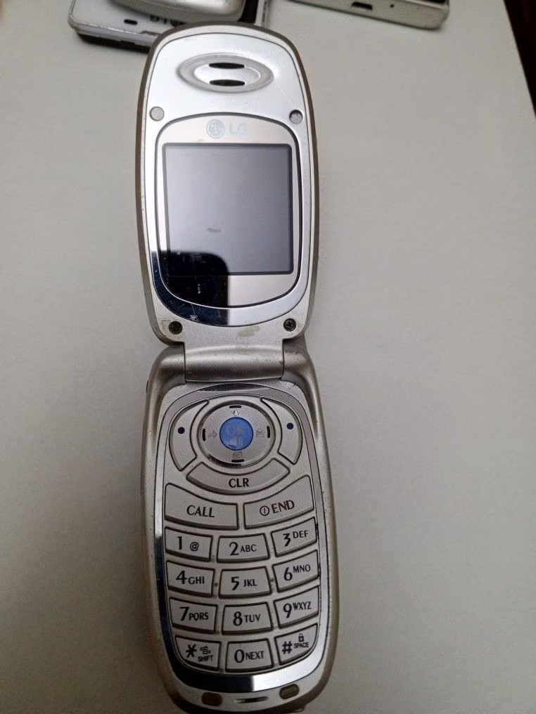
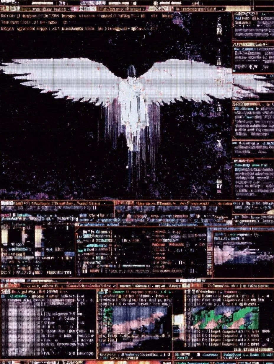
A 2020s nostalgic remix of late-1990s and early-2000s digital culture combines saturated blue and silver with retro anime, obsolete devices, legacy software, and ethereal celestial symbolism.
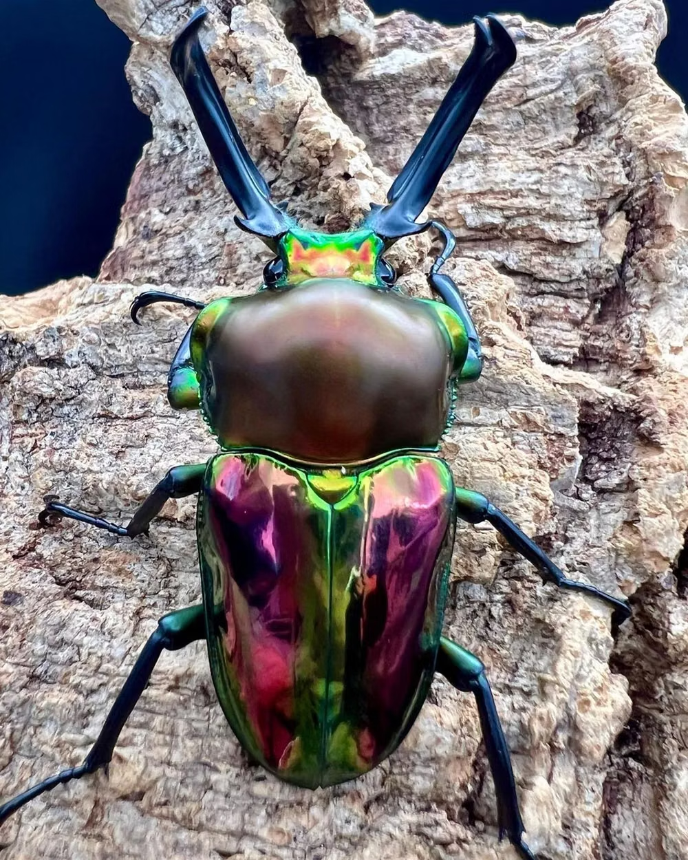
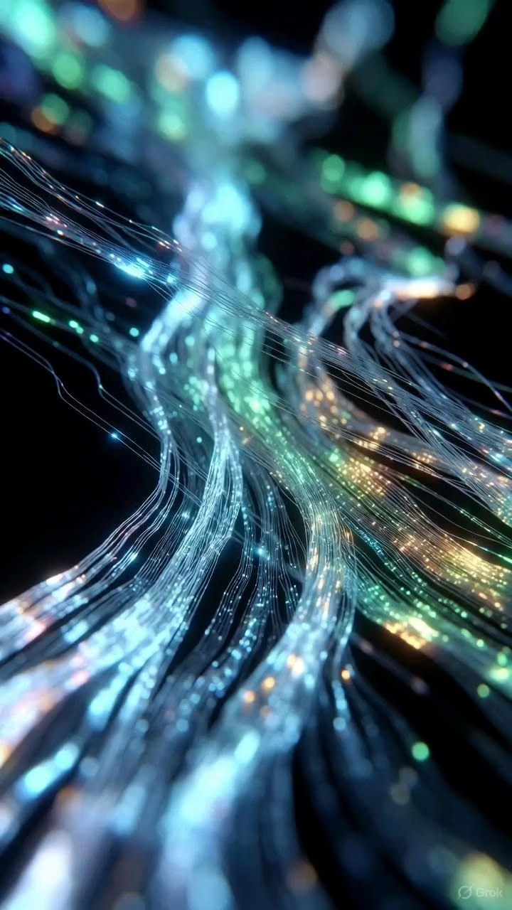
Cyberdelia UI design style
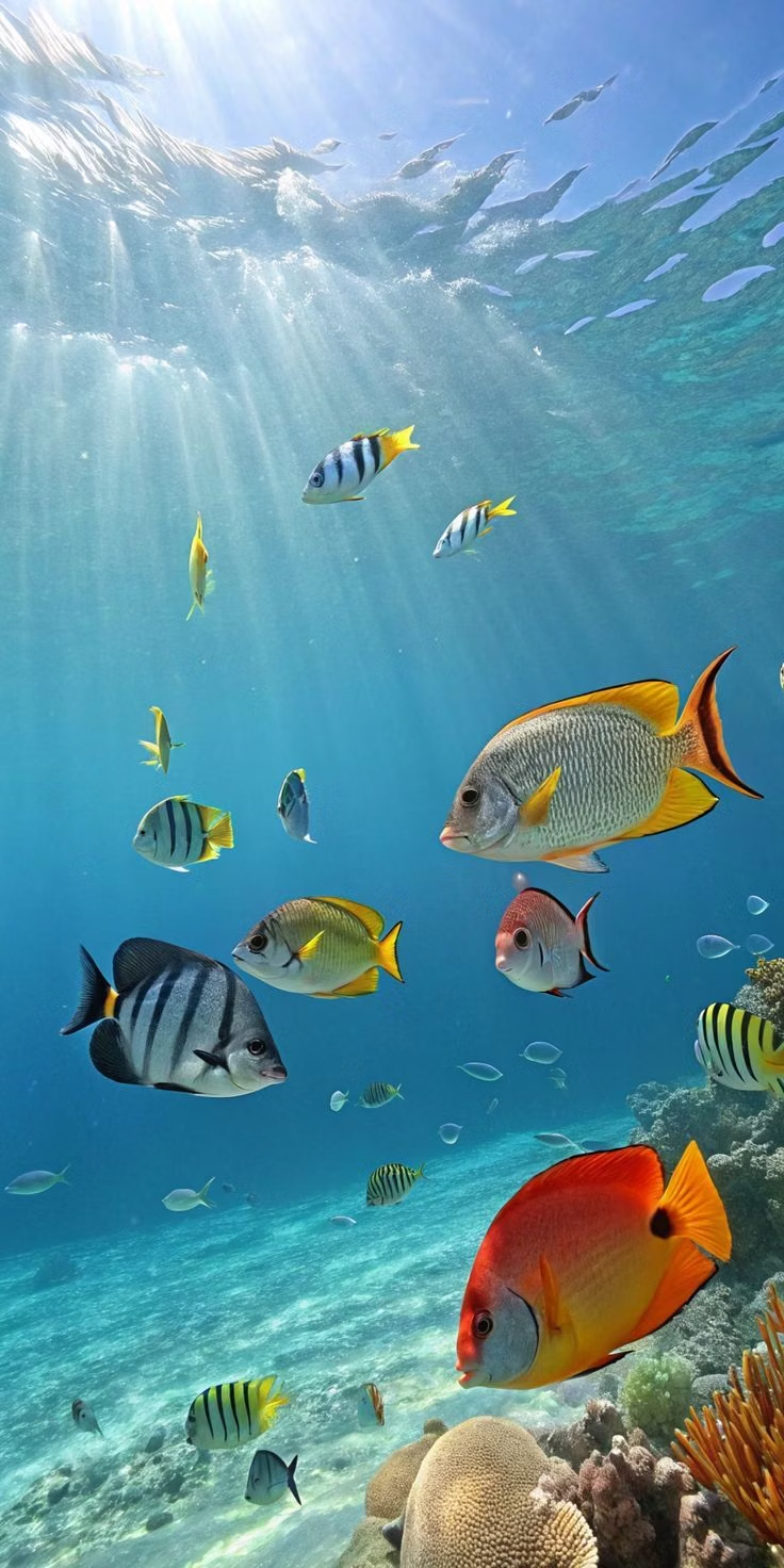
Cyberculture merges with psychedelia through acid color, fractals, kaleidoscopic imagery, early 3D type, and rave-era digital optimism.

Frutiger Aero UI design style
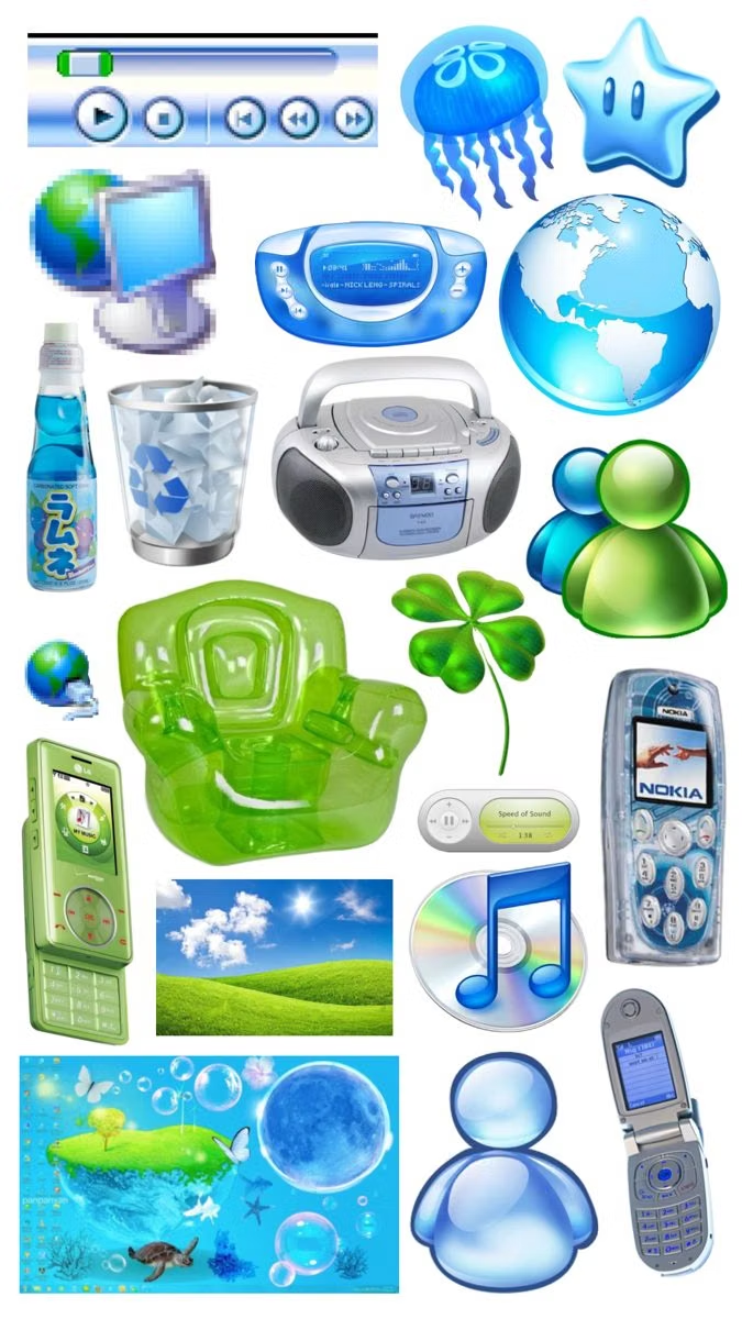
Glossy blue-and-green visuals combine skeuomorphic interfaces, glassy controls, water, bubbles, open skies, nature, and optimistic technology.