Cassette Futurism UI design style
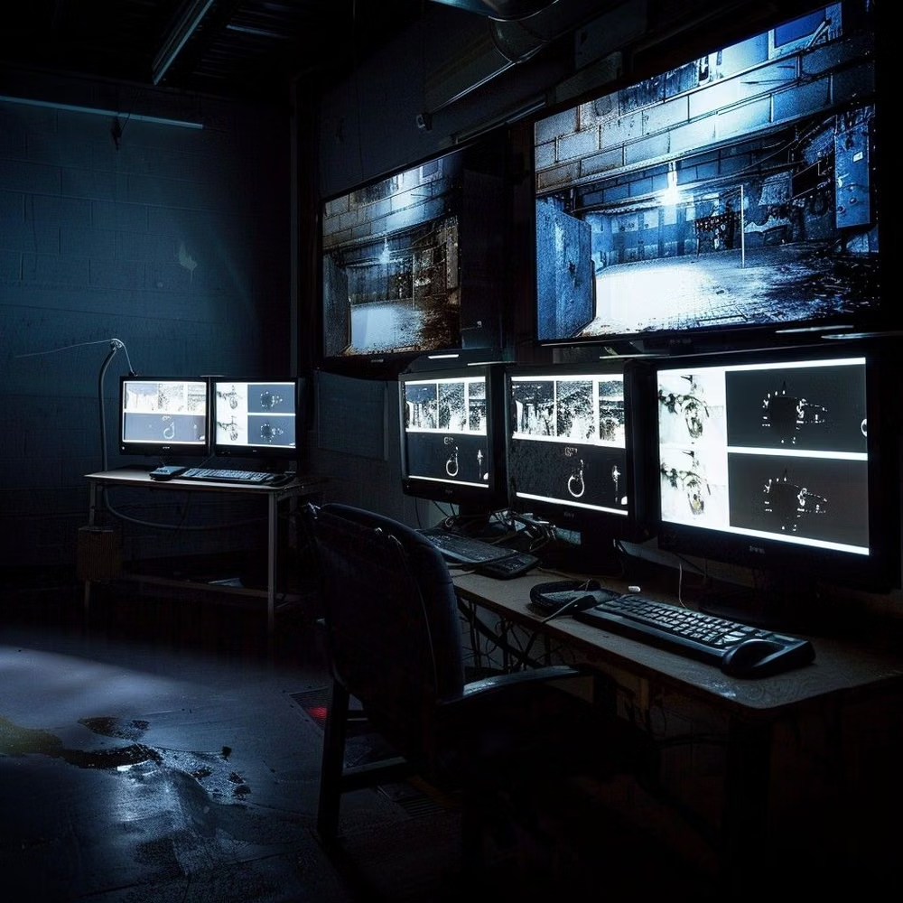
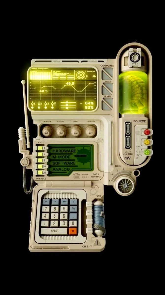
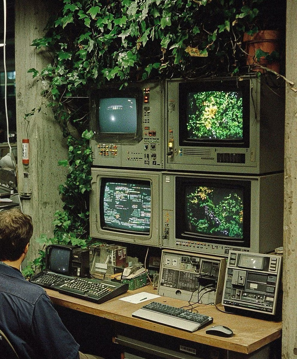
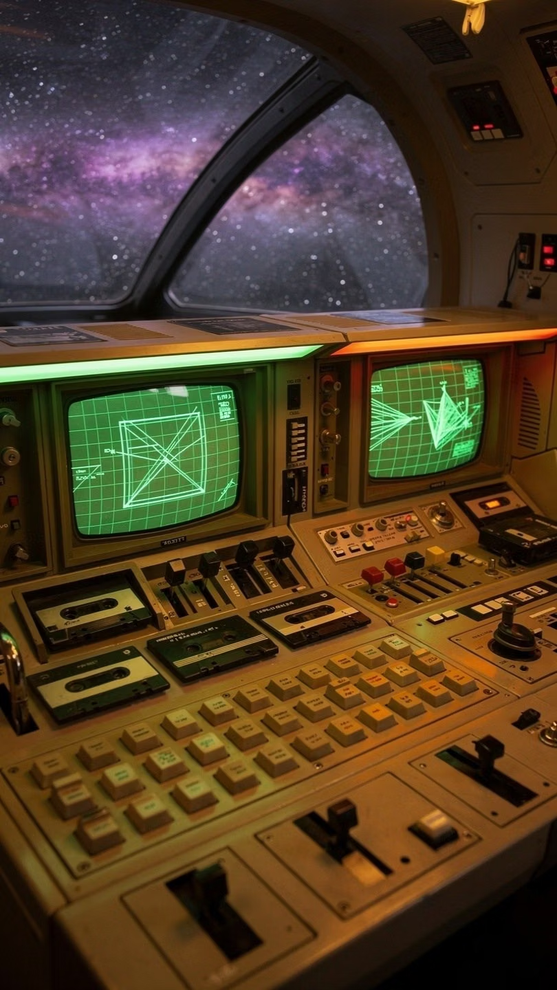
Chunky analog controls, CRT displays, industrial panels, physical switches, amber or green screens, and late-20th-century science-fiction technology.
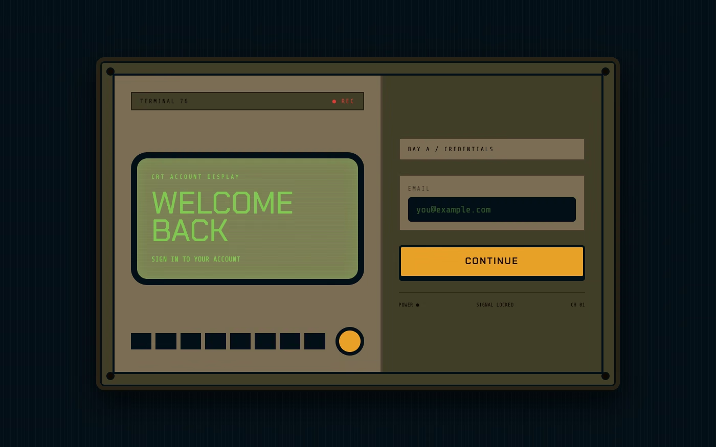
Design overview
- Signature elements
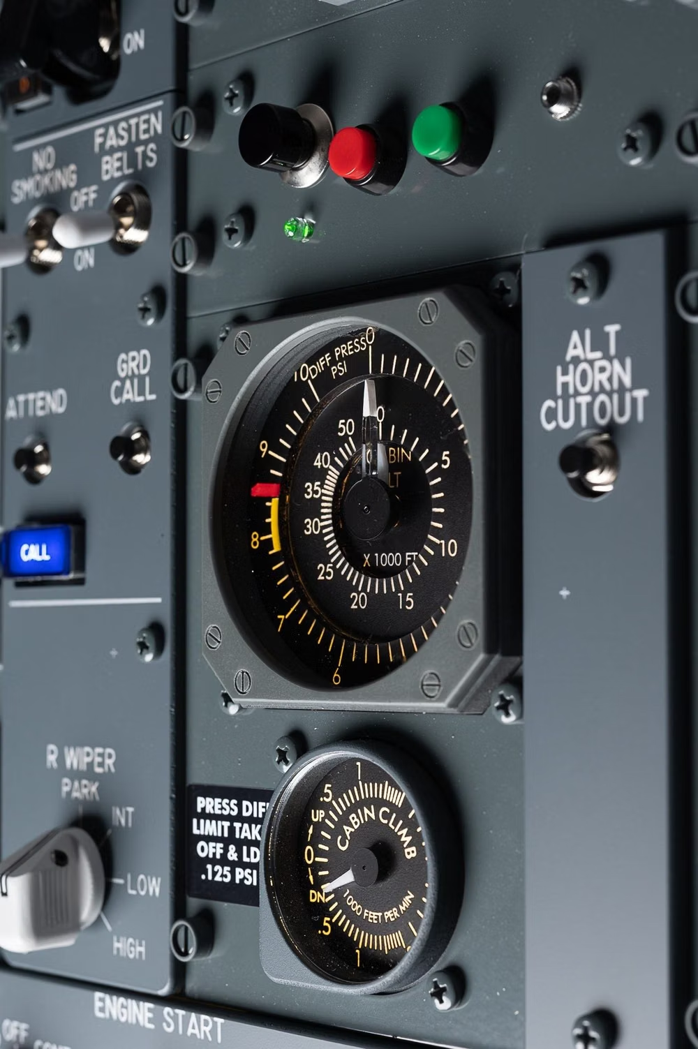
- CRT displays, chunky switches, industrial panels, amber readouts, physical labels, analog instrumentation. In daisyUI themes, set `--depth: 1;`.
- Best suited to
- Games, developer tools, media players, science-fiction products, and immersive entertainment.
- Layout principles
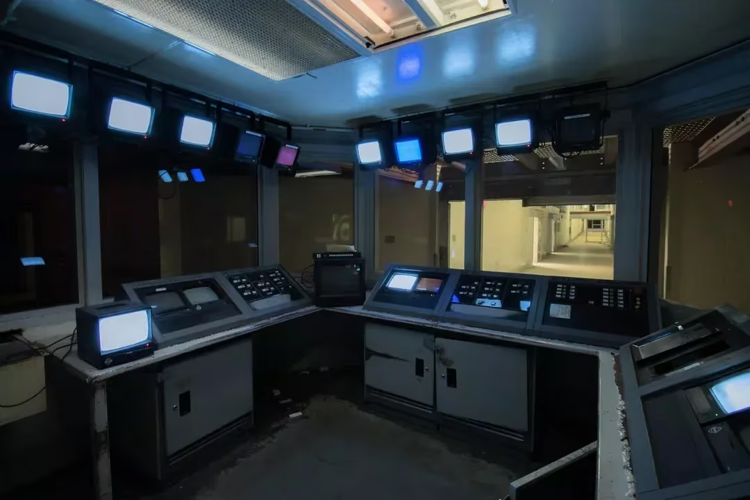
- Build the interface as a heavy modular console with a dominant CRT, adjacent hardware bays, physical status strips, and labels attached directly to controls.
History and origins
A fact-checked account of where this visual language came from, with links to the references used.
- Period
- Source period from the mid-1970s–late 1980s; named retrospectively online
- Origin
- Industrial technology, analog media, film, and television
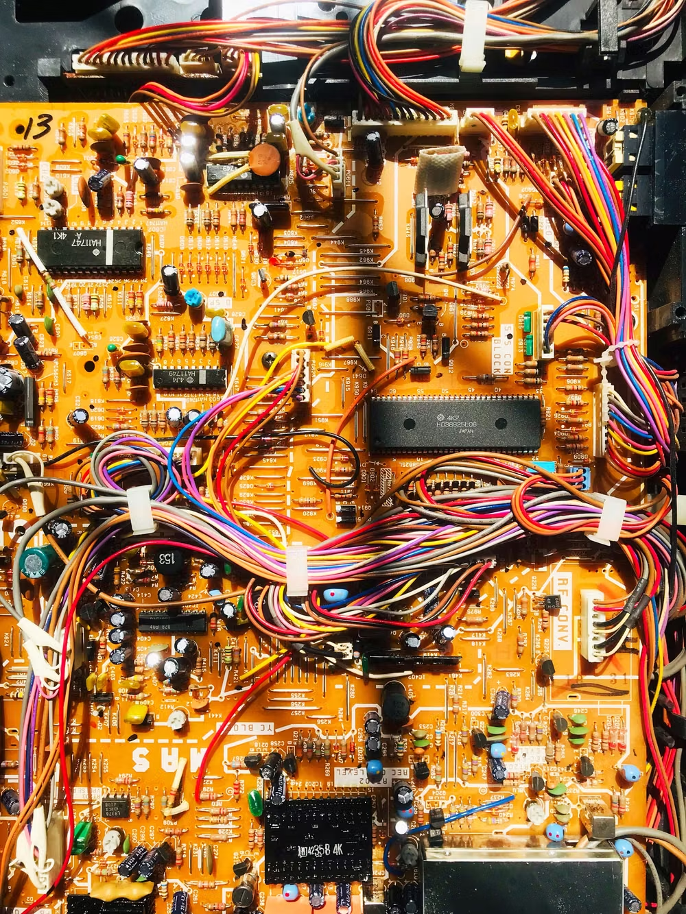
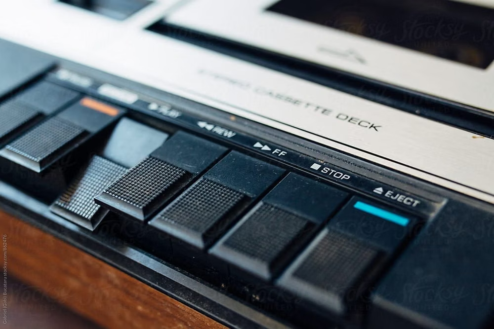
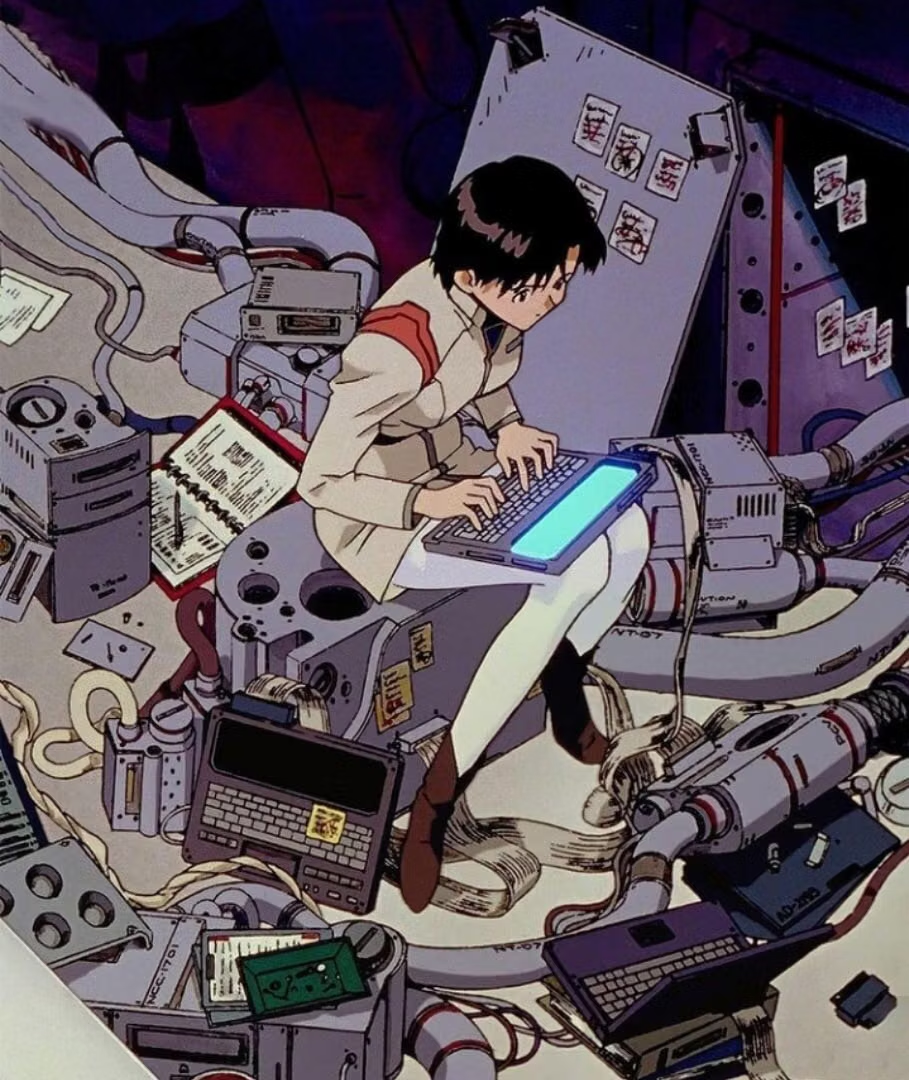
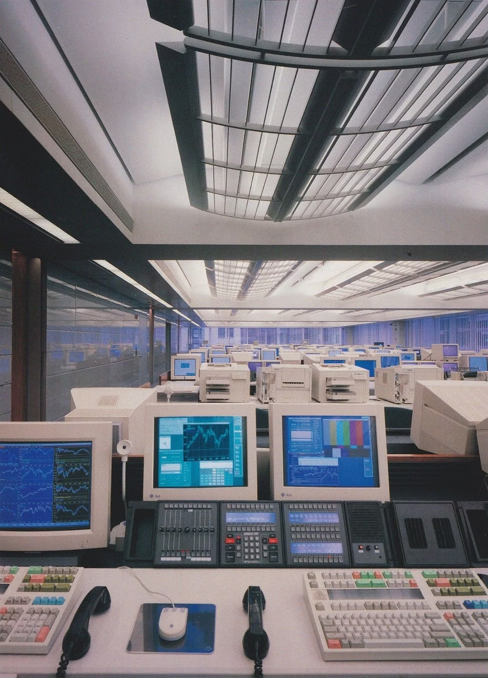
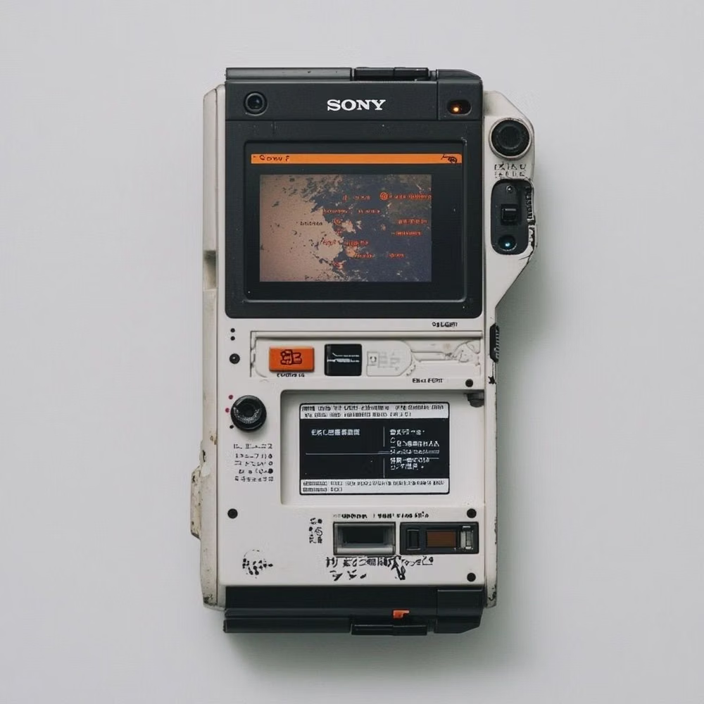
Cassette Futurism is a retrospective internet label for futures imagined with tape decks, CRTs, membrane keys, switches, and bulky modular hardware. CARI places its source period from the mid-1970s to late 1980s and records the name as a later coinage on TV Tropes, meaning the original production designers did not generally use it for their own work.
Moodboard and visual references
A visual study of the forms, inspirations, materials, colors, type, and cultural references associated with this UI design style.
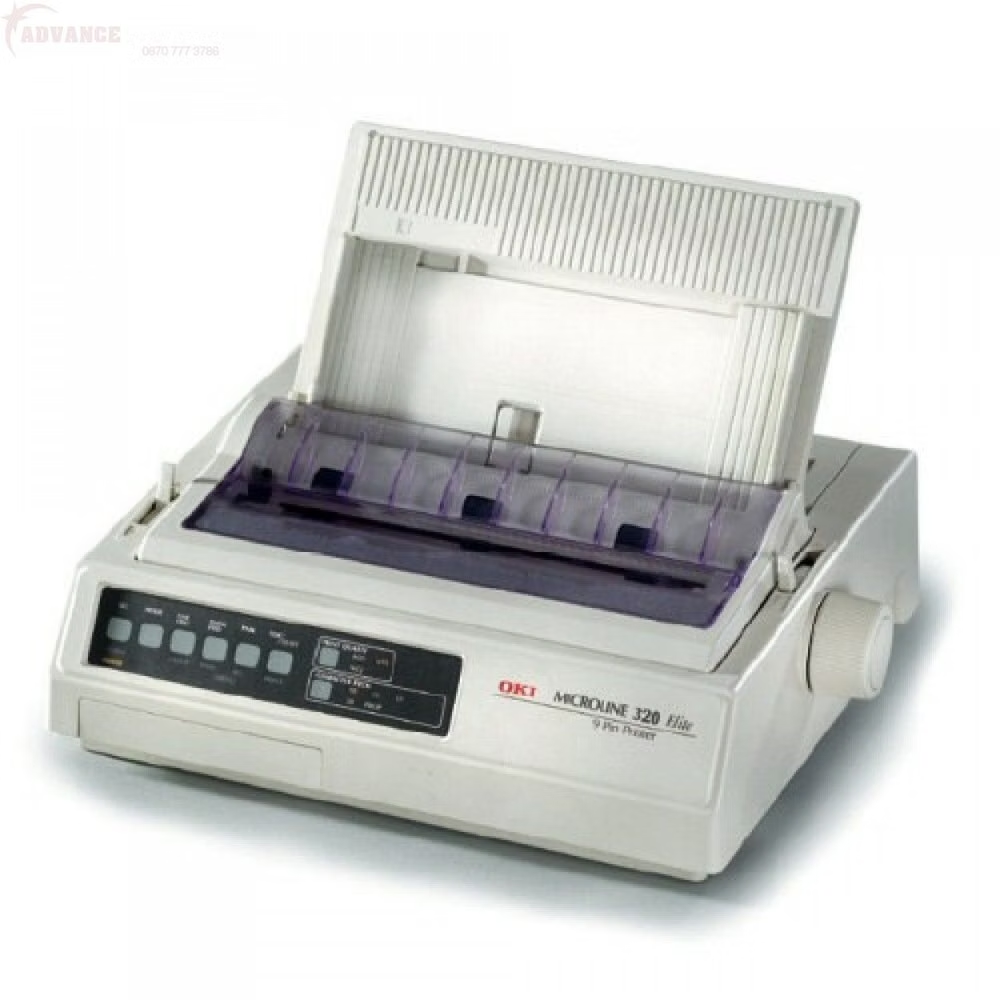
![dot matrix equipment label close up photograph - Source and datasheets linked below I found these QDSP-2273 displays and was interested in trying to drive them. A lot of info about them here: http://www.industrialalchemy.org/articleview.php?item=750 [http://www.industrialalchemy.org/articleview.php?item=750] I found a snippet of example code at: http://huinink.info/hdsp2003/ [http://huinink.info/hdsp2003/] and decided to write a full driver library for it. The driver will show static text, scrolling text, and 'hacker' text like this: https://](../../moodboards/cassette-futurism/28-inspiration-dot-matrix-equipment-label.avif)
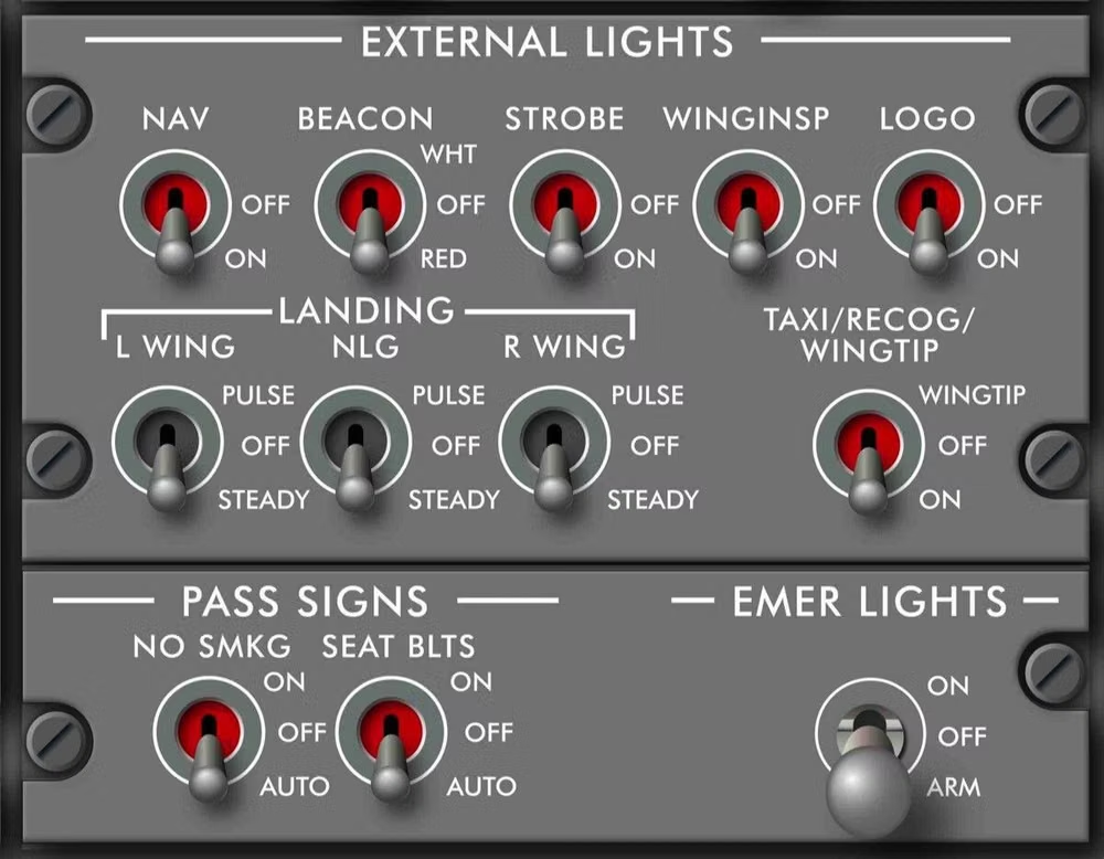
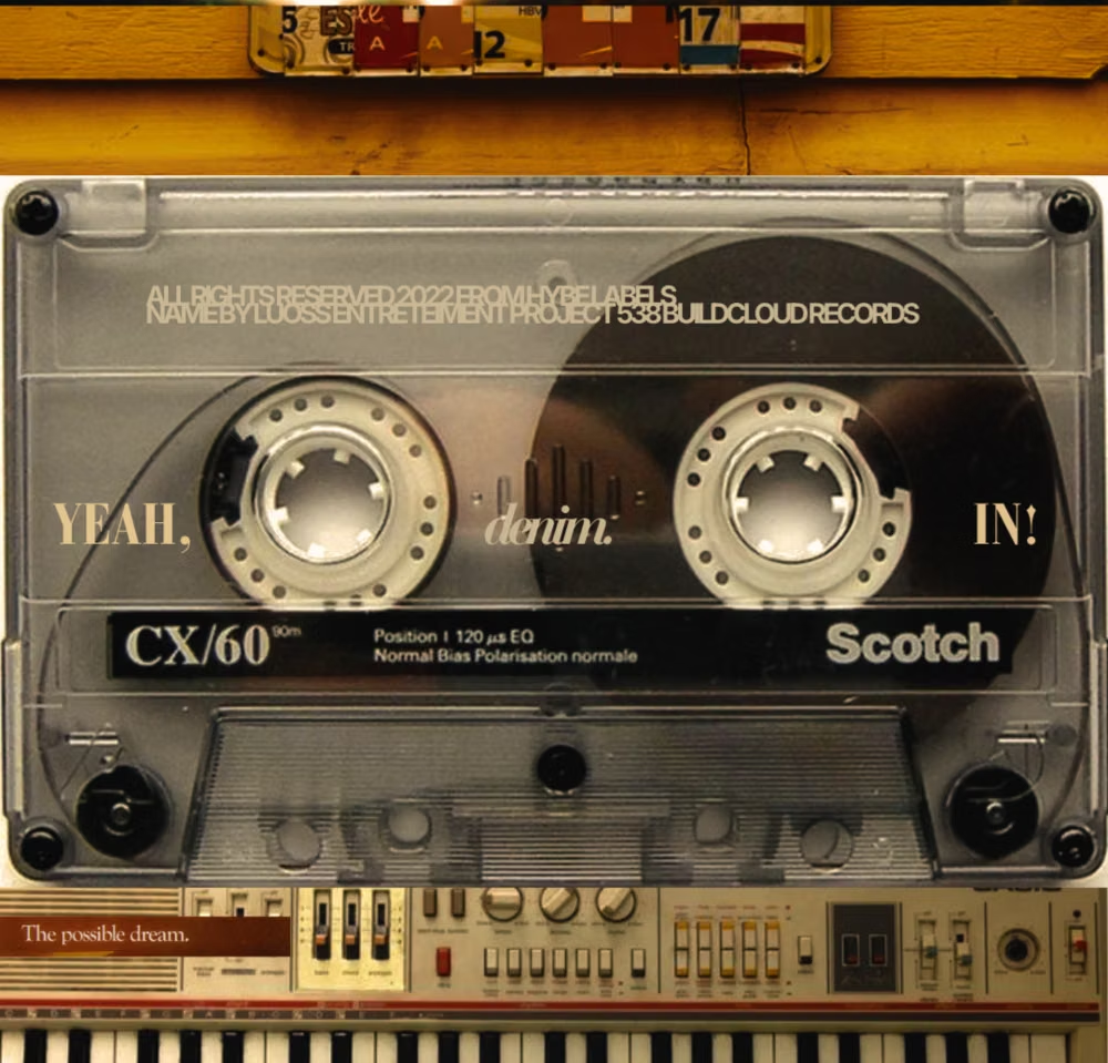
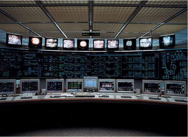
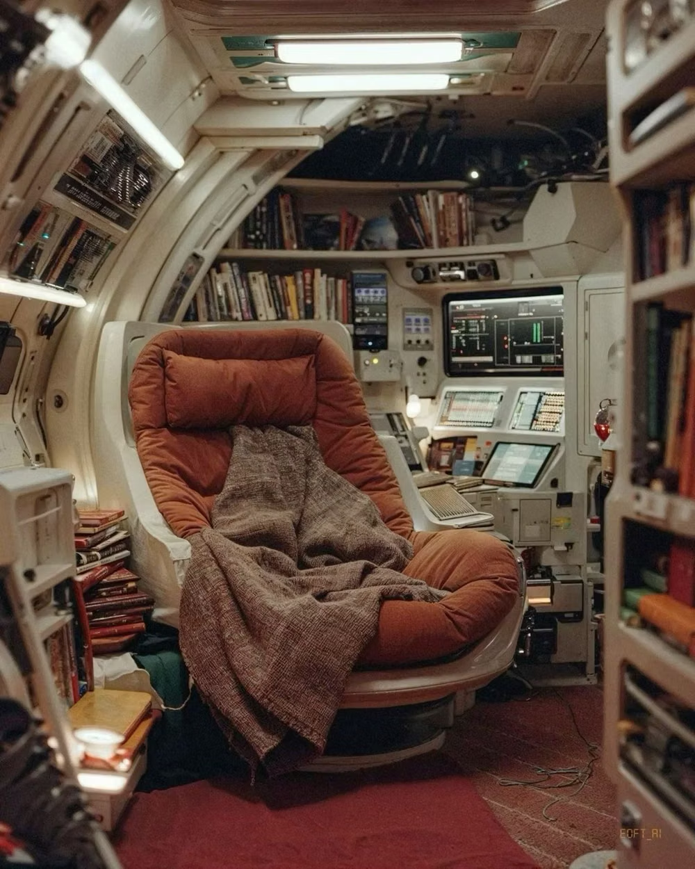
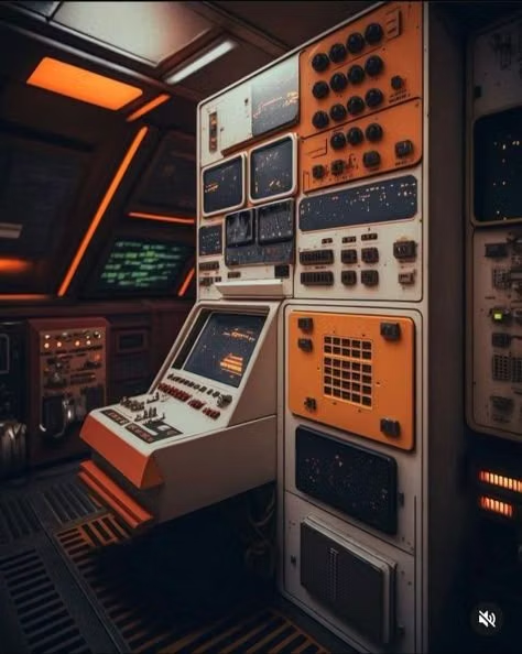
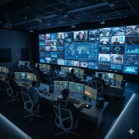
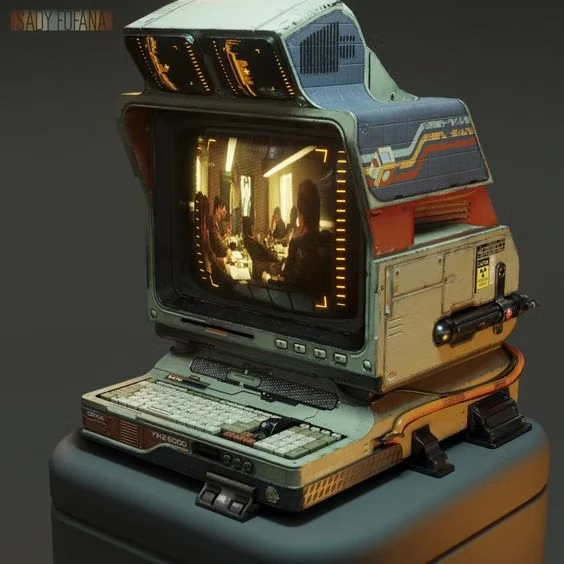
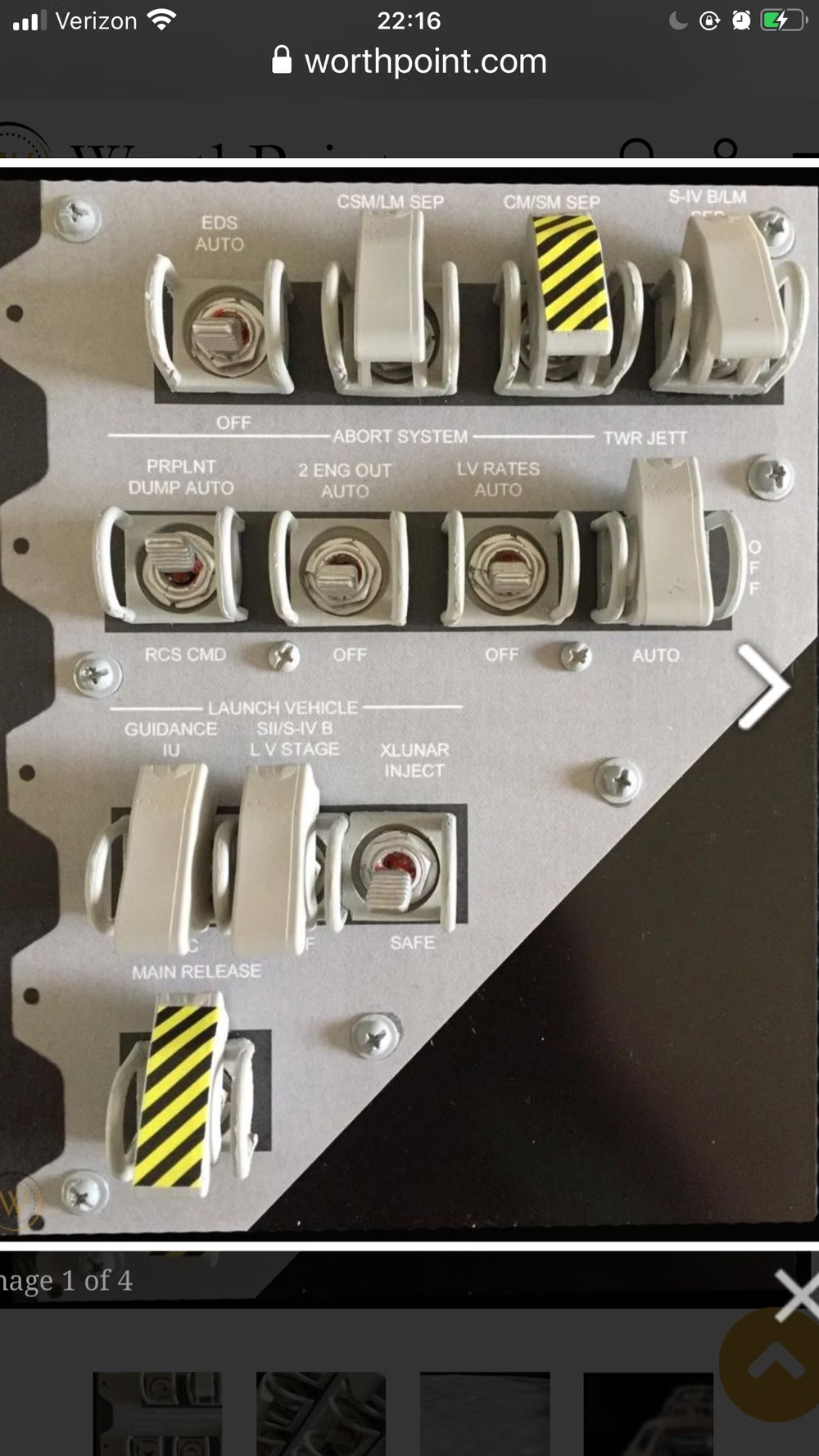
Design principles and implementation
Use these principles to write a focused AI UI design prompt instead of asking for a vague visual treatment.
Color direction
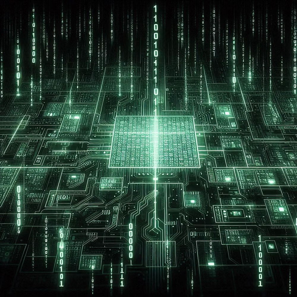
Use charcoal, military olive, beige plastic, and worn metal with amber or green phosphor displays and small red warning indicators. In a daisyUI theme, use amber or green phosphor for `primary`, military olive for `secondary`, and step `base-100`, `base-200`, and `base-300` through charcoal, near-black metal, and black.
Imagery direction
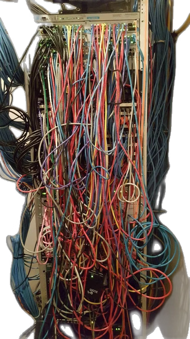
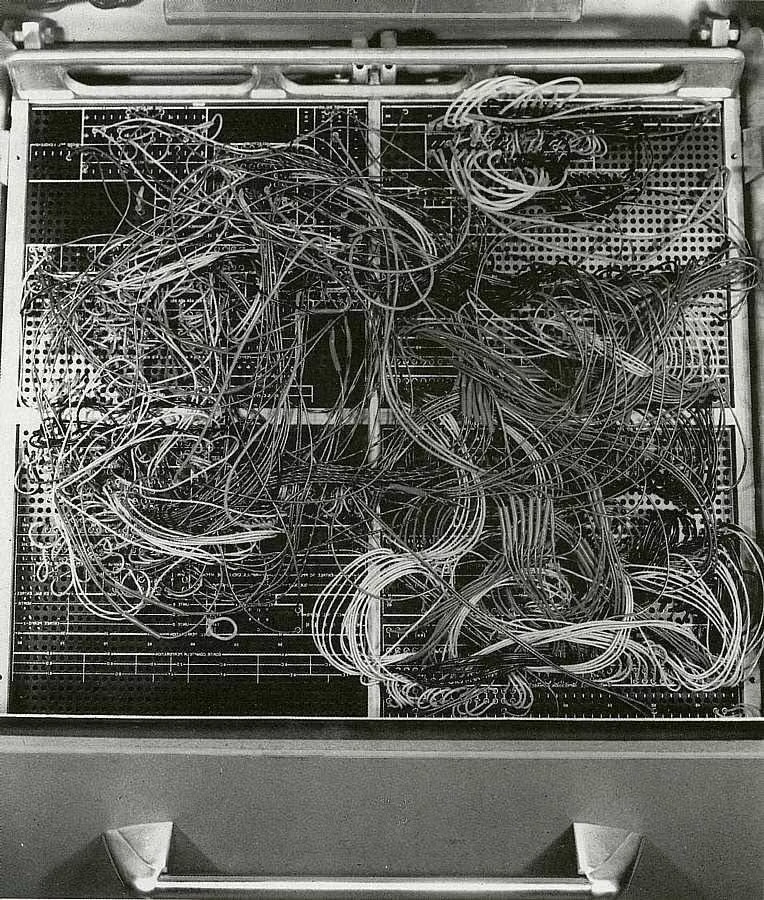
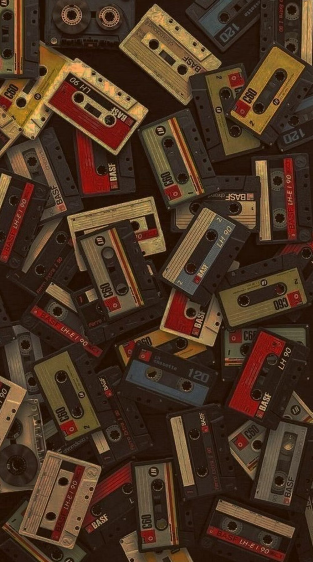
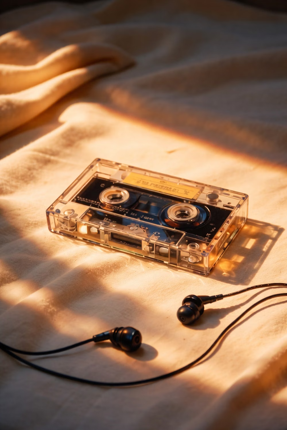
Use chunky switches, tape decks, CRT readouts, cables, vents, industrial labels, and late-century spacecraft or computer hardware.
Content density
Support high density through clearly separated physical panels, engraved legends, and dedicated readout zones rather than floating digital cards. Use the `*-sm` size variants for daisyUI components to preserve this compact working density.
Motion direction
Use CRT boot sequences, scan refresh, tape motion, switch snaps, relay delays, and occasional signal dropout with believable hardware response.
Shape language
Favor boxy housings, vents, recessed screens, chunky toggles, rotary knobs, handles, screws, and thick molded bezels. In daisyUI themes, set the `--radius-*` variables between `0.25rem` and `1rem`.
Typography rules
Use monospaced phosphor text for displays and condensed industrial lettering for panel labels, keeping terminology terse and mechanically aligned.
Suggested Typfaces
Share Tech Mono
Fresh daisies glow in warm sunlight
Fresh daisies glow in warm sunlight
1 2 3 4 5 6 7 8 9 0
Chakra Petch
Fresh daisies glow in warm sunlight
Fresh daisies glow in warm sunlight
1 2 3 4 5 6 7 8 9 0
Oxanium
Fresh daisies glow in warm sunlight
Fresh daisies glow in warm sunlight
1 2 3 4 5 6 7 8 9 0
IBM Plex Mono
Fresh daisies glow in warm sunlight
Fresh daisies glow in warm sunlight
1 2 3 4 5 6 7 8 9 0
VT323
Fresh daisies glow in warm sunlight
Fresh daisies glow in warm sunlight
1 2 3 4 5 6 7 8 9 0
Build a Cassette Futurism interface with daisyUI
The live example translates this direction into daisyUI components and semantic theme tokens.
To generate a full page in the same visual language, give the style name and the design rules above to Blueprint MCP.
Related UI design styles
Compare nearby visual languages that share typography, shapes, use cases, or signature elements.
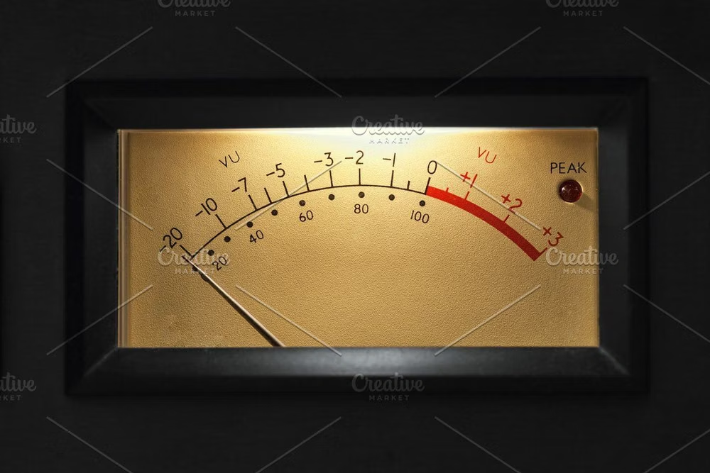
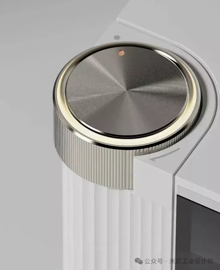
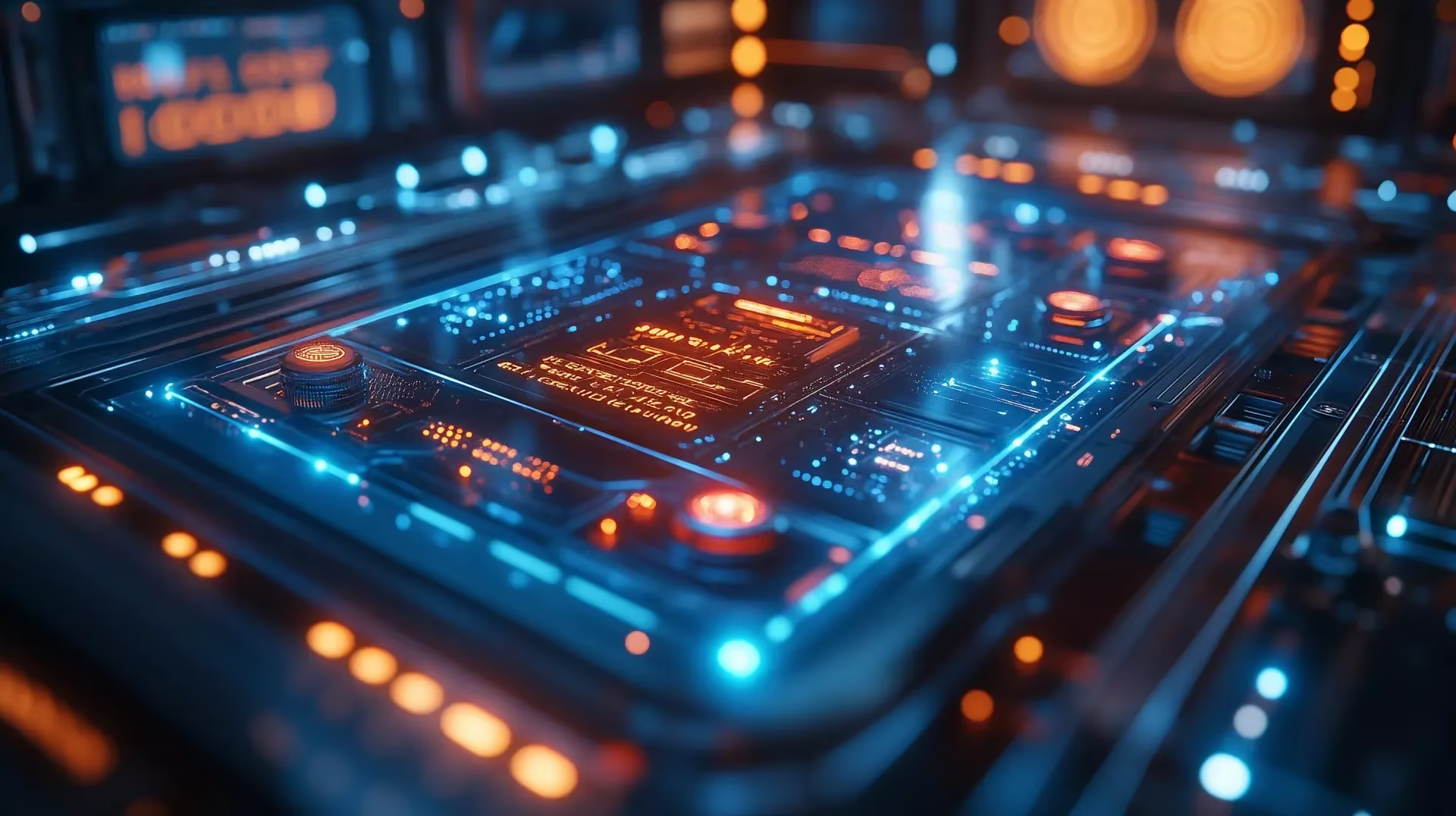
Skeuomorphism UI design style
Photorealistic or softly modeled interfaces use material depth, mechanical controls, and analog-equipment cues, often combining industrial nostalgia with clean retro-futurist geometry.
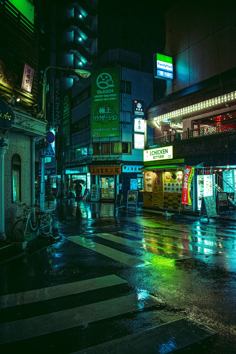
Cyberpunk UI design style
Dense dark interfaces use neon accents, glitches, terminal typography, surveillance motifs, and futuristic HUD elements.
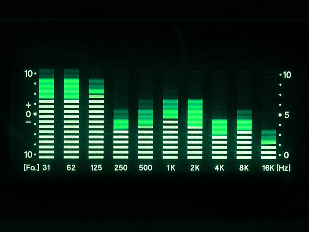
Y2K Techno-Skeuomorphism UI design style
Early-2000s skinnable media-player interfaces model software after futuristic audio equipment; the style is also recognized as Y2K Media Player UI, Chrome Futurism, Skinnable UI, Techno Skeuomorphism, or Millennium Futurism.